#please go apologize
Explore tagged Tumblr posts
Text
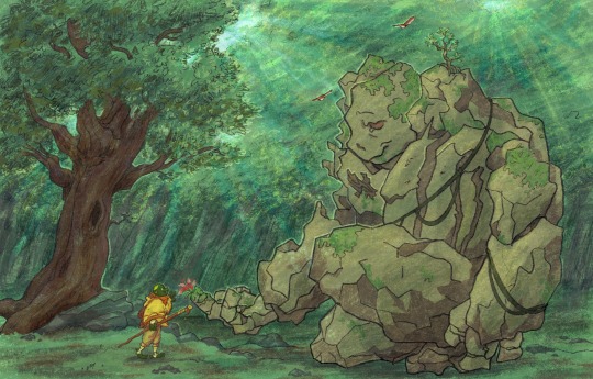
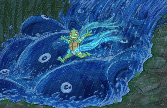
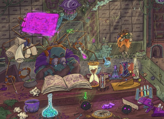
ok but the ghibli vibes of @triona-tribblescore 's wandering guardian au???
like i could live in this world forever tbh
inspo boards/refs below ft trionas SPECTACULAR GORGEOUS AMAZING og works of the au bros
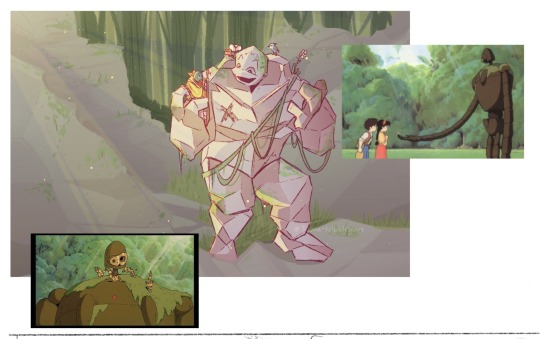
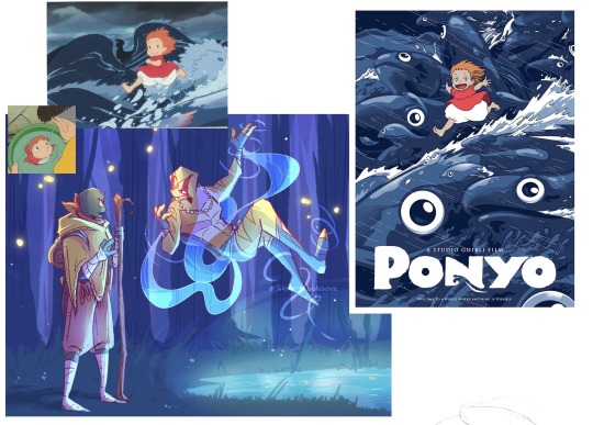
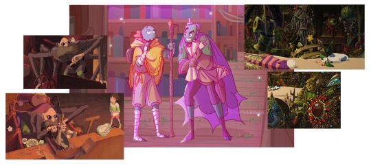
#my art#rottmnt#rise of the tmnt#unpause rise of the tmnt#wandering guardian au#rise mikey#rise raph#rise leo#rise donnie#triona i am throwing these at u smack in ur face /aff#please imagine soft and beautiful ghibli piano music in the bg thank u#leos def isnt as pollished as the other two but alas#and donnies space need about 73% more clutter buT ALAS#also idk if its accurate but#ADORE the concept of this aus splinter having four just fucking god-powered children#like#tiny kiddos causing literal natural disasters#leonardo what have i told you about flash flooding the river?#yes i understand you had the zoomies but now all the fish are dead and raphies upset#please go apologize#donatello i am very glad you had a good day however we cannot keep repeating the same 24 hours again and again#it is making michelangelo nauseous and disturbing the locals#idk in acutuality itd prolly make more sense for the boys to only been given/have begun developing the powers when theyre older#but tiny tot turtles with horrific power is just so fun as a concept
2K notes
·
View notes
Text

“Cut Off Line” by @pngianne ✿
#please go check out the artists other works they’re lovely!!#also to everyone messaging me about forgetting to credit her— i sincerely apologize!
9K notes
·
View notes
Text

spiraling
#my art#jujutsu kaisen#jjk#jjk fanart#jujutsu kaisen fanart#jjk art#megumi fushiguro#fushiguro megumi#gojo satoru#jjk spoilers#jjk manga spoilers#the minute i realized how tg coded the composition n colours were i decided to turn it up to 11#i was racking my brain trying 2 figure out how to get the layered tissue paper look tht i talked abt ishida's cover art having#cycled through all my usual layer modes n nothing ws Quite right#until wouldnt u know it . divide n subtract!!!!! i NEVER use divide or subtract bc theyre impossible#but fr this??? its like they were made for it oh my god#it makes the greys look translucent n all my textures pop in a way that makes them appear splotchy n Bruised#which ws the whole point thts the Look god i am so PLEASED#when the layer modes tht notoriously get No love finally find their niche <33 peace and love <333#filing this away fr later i am going 2 have a lot of fun with this new information i think#im very happy w how the colours look n i dont think anything else wld have kept the right Mood#but i am always so >:/ when i have to use a palette tht forces me into giving megumi blue eyes#had to set aside th green eyed megu agenda fr the Aesthetic unfortunately#anyway i knew from the minute i saw it that i wanted to do smth involving the opening panel of 268#bc that panel is S tier#i figured tht if nothing came 2 me i wld just redraw it as-is bc it's alr so good but as i ws sketching i was like#u know what u havent done in a while? art tht looks like u r going Insane#art tht makes ur family ask whether everything is ok#so i once again tucked megumi's knees up 2 his chest and apologized insincerely to him fr making the third megumi angst piece in a row#:)
3K notes
·
View notes
Text
something about loving you like an alcohol addict
pspsps come get your billford

this was supposed to be longer but dear god that's a lot of work... so here's the storyboard for it:

maybe i'll finish it later,, for the tragic fiddauthor enjoyer in me
ok bye
#jingles a frame from the animatic in front of you to get you to watch it oooooo#also i apologize for my lack of animation skills this is like the first time i've made something like this#and i did it by going back and forth between procreate and knockoff capcut so bear with me#someone please buy me procreate dreams 🙏#i might make this longer if the people want to see it#perchance#but yeah they've been eating away at me and this song is literally Them so i Had to#and i wanted to show off my bill design fight me#also i accidentally made thre last frame with a completely different brush so uh get spongebob high res frame-d#gravity falls#billford#gravity falls fanart#gravity falls animatic#animatic#ford pines#stanford pines#bill cipher#human bill cipher#fanart#s0up1tart
2K notes
·
View notes
Text

i am at the point where if i dont finish now i'll newer finish so yeah the rest of the gaaaaaang
#critical role#the mighty nein#fanart#caleb widogast#mollymauk tealeaf#fjord stone#caduceus clay#the male passing fellas#this was harder then i fuckin thought#i hope someone will make taliesin personally apologize to every animator who will work on molly#caleb my love i adore your palette you look like dirt and smell of cat piss💜#i FINALLY FUUUCKIN FIGURED OUT FJORD O YEA#i was struggling with him for ages#mr duce zero complains absolute ideal of a character#tho i am still not entirely pleased with colors#but fuck it#if i keep going like this i'll just never post anything ever
6K notes
·
View notes
Text


tarpit site.
#personal#delete later#for context a tweet i made in the middle of the night blew the fuck up and brought the attention of anime fans who've been#harassing and hassling me about my big factual blunder for an entire day straight#“ok i'll apologize” “bro it's not that serious.”#“you're right it's not that serious“ ”why won't you just admit that you're wrong and apologize!“#i'm not going crazy right. i feel like i'm getting manipulated into thinking i must've been wrong#it's crazy how twitter hate will trick you into believing saying something someone else disagrees with is a moral failing#sorry i haven't seen frieren i guess but what's it to you. i wasn't making a claim or statement#also because nobody has gotten this in the original post i wasn't talking about the quality of animation i'm talking about solid drawing#which is a very specific principle of animation. dandandan has really good solid drawing wherein all the characters are animated#with realistic and proportional 3d depth. newsflash but trigger doesn't prioritize solid drawing in their animation and that's fine#it's an aesthetic choice and has ties to production limits. none of this is a big deal. this is all so stupid lol#i've dealt with worse and more annoying weebs though it's fine i'll put on my clown nose twitter needs their stupid guy for the day#oh btw at the end of the day this doesn't matter. it'll be over by tomorrow. all that's happening is petty angry emotions.#so please don't involve yourself by jumping into the argument and prolonging this shit#i'm about to go on a date with tulli after being apart for a month this is the furtherest thing from my mind rn
1K notes
·
View notes
Text

The holy trinity (close up ↴ )


#artists on tumblr#fanart#bsd#bungou stray dogs#文スト#dazai osamu#nakahara chuuya#soukoku#Bsd next gen au????#Anyway#Double black#bsd skk#skk#i apologize for taking so long on this piece. It took me a whole month#As usual i dont have name for this girls so if y'all have any idea go ahead#if you are interested in commission i have a single slot open#& for those asking this is transzai but if you wanna be absolutely insane. Omagaverse uwu /j#Back to the cave to draw every month if school doesn't drag me thro the mud#hopefully i will be able to draw more i have a lot of ideas#but i can't promise shit. So please take this meal for now#besitos donde les quepa
783 notes
·
View notes
Text
So y'all have seen the Williams F1 Logo before, yeah?
well get ready, becaues I am about to ruin your day!
where does one even begin with this. i am sorry in advance. -just a poor learning graphic design student, who simply tried to enjoy their saturday evening
The Logo
For anyone that doesn't know, here's the Williams F1 Logo. Entirely unedited, copied straight from Wikipedia:

Now like many fans, I actually quite enjoy this logo. I like the modern, sharp edges of it and it's simple yet intriguiging design. It's memorable, while also easily recognizable as a W. I also really enjoy the colour choice (this, however, is entirely a personal preference.)
(entire rant under the cut. please keep reading this took years off my life span.)
How did we even get here?
Let's start at the beginning. How did we even get here? Well I, a poor poor learning graphic designer, was watching this lovely video from Mr. V's Garage about bad F1 Logo's over the past 35 or so seasons. Very interesting, I can only recommend it (but you don't need to watch the video to understand this post)!
Now, to cleanse the palette at the end of the video, Mr. V included a top 10 GOOD logos from this time span, it was very kind of him.
On P4 of this "Good List," Mr. V placed the current Williams F1 Logo, as pictured above. At first I vaguely agreed with this, believing that he probably simply hadn't noticed one of the things that's been bothering me about that Logo since the first time I saw it up close.
The first sign of Trouble
So, what is this mystery issue, you might ask?
It's simple really. You don't necessarily notice it at a first glance, but something about that logo seems off. Taking a second longer, you may notice it yourself.
No, I mean it, take a minute and go look at the logo. It looks wonky as hell, doesn't it?
Well I can tell you the first thing that I personally noticed. The arms of the W aren't in line with the bottom half, see:

(Graphic by @girlrussell who was so kind to let me use it, as it is way prettier than the one I made)
It's a crooked W. There is no good explanation for this. The rest of the font is perfectly fine, geometrical shapes.

Anyway, the good person that I am I went to point this out to my partner ( @leftneb ) who proceeded to inform me that he, infact, was not aware about this and was, quote, "never going to unsee that."
Now, the good FRIEND that I am, I, of course, proceeded to rush into our broader F1 friendgroup to make them suffer for eternity.
What's the logical next step to take? Of course, fix the logo in Adobe Photoshop, you know, as a joke.
(Disclaimer at this point, I am not necessarily the biggest fan of Williams Management Team. I enjoy ALL their drivers this season. I do NOT enjoy James Vowels. Be warned.)(Also I am aware that he probably did not have an influence on the logo)
Trying to fix it. Oh god, I was so innocent back then
Trying to fix the logo in Photoshop is the worst mistake I could've made. THE worst path to take. I could've just giggled about making my friends suffer (which I succeeded in, by the way) and moved on. Instead I ruined a perfectly good Saturday evening, and for what? I don't know anymore.
Anyway, how was I gonna go about fixing the logo in the simplest way possible? Simplest way I could come up with: slap the thing in Photoshop and put two, mirrored boxes at each side to make the sides line up. Small issue, how do I make the thing actually even? Fix: line them up at the intersecting point with the bottom tips of the W.
Here's the result:

Hey, anyone care to explain to me why in THE LORDS NAME the arms are different sized? I mean, surely they weren't before. Surely, certainly, I must've messed up.
I double, I tripple checked. I made sure everything was lined up and made sense. But no.
It just couldn't be. Something was uneven in this logo, something even deeper. Something I could not have predicted when first taking a closer look. It was at this point I realized I had messed up. What rabbit hole had I stumbled across? Certainly, it couldn't get much worse.
And that's when I noticed.

(pictured above; my genuine reaction)
There's MORE? (oh god, the top isn't lined up)

I couldn't believe my eyes. This is the PINNACLE of the sport, and THIS was the logo of one of the competing teams? I mean, yeah, we have a Visa Cash App RB or a Kick Sauber or even a MoneyGram Haas which are all terrible logos, but at least they're CLEAN. (this has not been checked. If anyone wishes to ruin a nice Saturday evening, feel free to check them and tell me how wrong I was in the previous statement!)
But you can see that there is no end in sight for this post. I'm sure you're as scared as I was at this point. By now we were sitting in VC, discussing the horribleness of this logo. I had long informed my irl's about this, who take said design classes with me. And it was one of them who pointed out the next thing that had been bothering me, but I had not been able to put a finger on up to this point.
thE DISTANCE, HOW DID THEY FUCK IT?

I'm afraid I have to confirm your fears.
Yes, those lines are the same length. According to Photoshop, they're on the same level as well, so no flunking with angles.
The gaps of the arms to the main W are not the same. They're differently sized gaps.
It was clear to us, this logo is inherintely flawed. They're subtle issues, but once you pay attention you start to notice things. It all looks slightly wonky and off centre. And eventually, you get paranoid, and start comparing other angles and sizes. And you will keep finding things. This has ruined my life.
HOOOOOW

Honestly, I don't even know what to say. Yes, yes sadly those lines, too, are the same length. Just copied over from one side to the other and layed over on the same height. I admit, they're not layed over perfectly. I was honestly holding back tears at this point. But the point still stands, you can clearly see a difference in width.
Honestly, the only way I can explain it is that at some point there was a mess up of distance or proportions and whoever was designing the logo couldn't pin it down and tried to restore the visual balance by making manual adjustments. And in all honesty? They kinda did a good job, if that's what's happened. I mean, you notice the crookedness of the arms, and then maybe the difference in height, but the rest you probably will not notice if you don't spend too much time staring at it. (like some of us) And even those issues clearly aren't noticeable to the vast majority, considering I had to go point it out to a group chat for my friends at least to notice.
what the fuck is THAT?
Now, the thing about doing this investigative work of prooving a team you dislike is worse in more aspects than you previously thought, is that you do a lot of zooming in. And zooming in means you might notice bits that yours eyes simply overlooked before, because they were too small.

Here you can witness the top of the middle point, that, for whatever reason, really wants to touch the top border of the Logo. I'm relatively certain that's the highest few pixel in the entire graphic, considering earlier chapter "There's MORE?" I have no idea why it looks like that or why they thought it was necessary for it to not end in a clean point.

I just actually have no idea how to even describe what is going on on the top of the left arm. That left hand side, again, touches the side and is therefore the most-left-pixel in the graphic. I, once again, have no idea the purpose of this. However the RIGHT hand side also makes no sense, as it is the most prominent corner in the whole logo. There's pointed corners, and rounded OF corners, but nothing that is trying to form it's own colony in a distant land that hopefully isn't this god awful logo. I hope that blob gets away. I really do. You go king.
i'm loosing my mind
Anyway, the only reason I could come UP with those weird "reachy-outy-bits" was to establish the dimensions of the logo? But if that was the case, I don't understand why they managed to keep all the other potentially border touching corners clean?


Like, look. Those are clean, sharp corners with some clearance off the borders. I have no clue why they managed it here but not with the others.
guys. please.
Backtrackig a little bit, going back to the positioning of the arms.

Do I need to mention that those lines are both the same length and the same (mirrored) angle? I really hope I don't, because I don't think I could be making this shit up. Like, once you roughly know what you need to look for it just kinda becomes easy to find.
As said before, I genuinely do think that most of these issues happened in a chain-reaction. For example, the distances between the main part and the W wouldn't be as noticeable (and they do get noticeable once you start looking at it) if the angle wasn't fucked. And guess what, there's more fucked angles here! Which ALSO influence this specific area of the logo!
this is just embarrasing for you.

something something same line copied over and mirrored etc etc
It's not as visible but the angles defintely don't line up here as well. As mentioned before, these issues for the most part all influence each other. It doesn't really excuse the issues, in my opinion as a designer, because a big company like this shouldn't have these sort of issues in their logo.
So let's review;
to sum it up,

i cannot even BEGIN to explain to you how big of a fucking JOKE this FUCKING logo is. because, i thought to myself, to round the post out, hey, why not show ALL the issues i pointed out in one picture? that would round it out quite nicely, wouldn't it?
Yeah well, this logo sent STRAIGHT FROM HELL just could NOT let me rest. I had only done the lines visualizing the crooked arms in PAINT up until this point, i.e. I had only pulled both up individually. To make a nice "rounding out" picture I still had to add them into PHOTOSHOP. so i did. i pulled up the line. i mirrored the line.
THE ANGLE IS FUCKING DIFFERENT
none. and i mean NONE of my friends had noticed this before. i need you to understand that we looked at this thing with FIVE pair of eyes, and NONE of us noticed that until i thought to myself "Oh I still need to add these specific lines to have ALL the issues I pointed out in my SILLY TUMBLR POST in ONE image" and i get THAT FUCKING SURPRISE
I was PLANNING to round the post out with a statement on how obviously this isn't a serious post. Here, I even had it all written out already because I accidentally started writing it in the last paragraph:
Of course, this is nitpicking, and it's not that serious. I'm aware of that. AS MENTIONED most of these would not be noticeable if we hadn't gone specifically looking for them.
yeah, well, fuck that. i just spent two hours seething about this logo. i'm ending the post on this instead.

#i am ENRAGED#i managed to actually calm down about it#yk. just typing away#and then i just try to ROUND OUT THE POST#for fucks sake#anyway i know i'm posting this at an hourrendous hour#if you read all the way. reblog? maybe#pretty please#williams f1#williams formula 1#williams racing#formula 1#f1#also apologies for any spelling mistakes i do NOT have the nerve to go back and proofread this
937 notes
·
View notes
Text
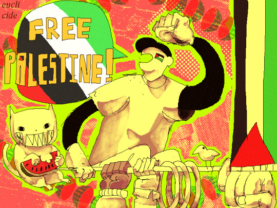
DONT STOP TALKING ABOUT IT
#off#off game#off (game)#off the game#off the batter#the batter off#the batter#off the judge#the judge#off zacharie#dedan off#japhet off#enoch off#palestine#free palestine#from the river to the sea palestine will be free#by the way#i havent been the most vocal on this account abt palestinian sovereignty and i apologize for that.#that being said#if you don't support palestine please fuck off and go away
2K notes
·
View notes
Text

You Should Be Here With Me
A 2024 Advent Fic by lululawrence
Harry Styles/Louis Tomlinson | 29k | 22/25 Chapters
The festive period is a traditionally hectic one in the world of Premier League football, and this year is no different. A lot is riding on how Manchester United is able to come through the fixtures in the coming weeks.
Louis and his teammates know all too well the pressure that is on their shoulders. They need to prove, not just to fans of the club but the entire league, that they still have what it takes to be a team worthy of fighting for the top of the table.
Throw in the fact that Louis is all too aware that he's not getting any younger in a profession that demands your peak physical fitness year round and the incredibly fit Harry Styles, who is part of the club's social media team, and this year's festive period might just be the most important one yet.
🎄1 🎄 2 🎄 3 🎄 4 🎄 5 🎄 6 🎄 7 🎄 8 🎄 9 🎄 10 🎄 11 🎄 12 🎄 13 🎄 14 🎄 15 🎄 16 🎄 17 🎄 18 🎄 19 🎄 20 🎄 21 🎄 22 🎄 23 🎄 24 🎄 25 🎄
#my fic post#advent fic#teaser post#2024 advent fic#fic rec#you guys i have this entire thing plotted out in detail#and i've got most of the first five days written so far#hopefully will get more written over the next few days so i'm not writing the chapters the day of or anything... if all goes well...#please send me good vibes that stress is not how i like to live#but i sure will if i have to#anyway all that to say#this fic... is going to be long#so i apologize ahead of time for the length of the chapters as we go on lol#but hopefully it's a story that you will be just as into as i am#haha#thanks for coming to my ted tags talk
316 notes
·
View notes
Text
Eddie develops a strange habit after sex. It’s not exactly cute or romantic or nice. Nothing bad either. It’s just… well, Steve isn’t too sure what it is. But every time, it’s the same damn thing.
He collapses onto Steve’s chest and says:
“My boyfriend is a cyborg.”
Usually, Steve is still recovering from the fucking downpour of post-orgasm endorphins. So he doesn’t question it. Hell, he stopped challenging Eddie’s tolerance to geek out months ago. Dude holds fantasy knowledge in his brain better than he holds his liquor.
Which is saying a lot.
Anyways, Steve never has the mental capacity to react or respond. Instead, he runs his fingers through Eddie’s sweat-soaked hair for awhile. Scratches out little patterns on his scalp because it always makes Eddie go limp. Quiet.
Quiet is a rarity for him. And while Steve is totally weak for Eddie’s chattiness, the quiet can be nice too.
The only reason Steve finally decides to ask about it is because Eddie slips up. Says it before they have sex.
Steve is against the bedroom door, his nails dragging down Eddie’s back. God, he loves this kind of kissing. The lung draining kind. The type that’s sort of filthy from all the heat and grinding.
Eddie hasn’t marked him up this bad since that time someone at work noticed his neck. Asked if Steve was having an allergic reaction during an office-wide meeting.
And this is going to be even worse. Steve can tell by the sounds and the soft pricks of Eddie’s teeth. He can tell by how long Eddie spends over each spot, like the bruising skin needs more attention than the rest of him. Like licking them over will make the colors last longer.
The damage has been done. Really no point in stopping him when it feels so fucking good. Steve forgets to worry about how mauled he’s gonna look tomorrow because his head is swimming with Eddie’s lips on his neck. His collarbone. His chest.
That’s when it happens. That’s when Eddie’s strange habit makes an early appearance.
He kisses over the blistery mess he made, practically growls the words out this time:
“My boyfriend is a cyborg.”
“Okay, time out.” Steve says. Heaves some air back into his lungs. Pulls Eddie’s face up before he can continue making Steve look like goddamn target practice.
Eddie blinks a few times. “Did I do something wrong?”
“No.” Gonna have to wear fucking high-collared shirts all week, but whatever.
He’ll bring that up some other time. “Why do you keep saying that?”
“Saying what?”
“That… thing.” Steve barely can spit it out. It’s like his throat is physically rejecting the nerdy shit he’s about to say. “You keep calling me… a cyborg or something.”
“Oh that.” Eddie sighs. Casually shrugs to one side. “It’s your fault actually.”
“How is it my fault? I don’t even know what fucking language you’re speaking.”
Eddie walks over to the bed, chanting Steve’s name over and over. Definitely not in the way Steve prefers him to chant his name. Very un-sexy chanting.
“Remember that day you asked me to grab your car keys?” He asks, patting the bed for Steve to join him.
No. “Kinda?”
Steve hesitates before walking over. He didn’t necessarily wanna stop their primal makeout session. But it was bound to lead to the bed at some point, so…
Just not like this. Not talking while fully clothed. Blech.
He sits next to Eddie. Hands awkwardly fidgeting in his lap.
“Well, I couldn’t find them.” Eddie admits. “So I ended up going through your desk drawers.”
Of course he did. Perpetual snooper.
“Ended up finding a binder full of medical records.”
Well shit.
Steve’s throat tightens. Swells around the sudden guilt he feels for keeping this from Eddie.
“Why didn’t you tell me you had a metal plate in your head?”
“Dunno. Hardly even remember it.” That’s only partly true. Steve doesn’t remember the surgery or much of the recovery process. He was only a kid when it happened.
But he does remember the hospital smells. He remembers the sounds of his IV bag dripping throughout the night. All the sensory indicators are still fresh in his mind.
“Well, that’s why. You're part-machine.” Eddie points to Steve’s head, expression softening. “And every time we fuck around, I think about your bionic skull. And how glad I am that it keeps your brain from leaking out when I bend you over the way you like it best.”
Steve laughs. The jokes help lighten the mood. Not enough to replace it entirely, but enough for it to be easy to swallow again.
They’re both quiet as they get ready for bed, folding the covers down. And yeah, sometimes quiet can be nice. Just maybe not right now.
“Hey, Eddie.”
“Yeah?”
Steve stares hard at the pillows. “Are cyborgs like… cool?”
Eddie pauses for a moment, then hops onto the bed. Starts crawling over to Steve with a smug grin. He lifts up to meet Steve’s lips. Kisses him sweeter than normal. Lighter. Starts nodding his head mid-kiss, keeps nodding as he breaks away.
“Yeah, babe. Cyborgs are so fucking cool.”
#steddie#steddie fic#hi it's very late and this is very short#but I had to get it out before sleeps so here you go#so apologies if it's riddled with mistakes#I just missed writing lovebites#and this is the hc that keeps me sane knowing how many concussions Steve has had#like this is how he keeps recovering so quickly from all of them idkidk#okay please enjoy and have nice day xx
3K notes
·
View notes
Text
your twin brother feels guilty.
not about drugging you, and certainly not about getting off using your unconscious body, his leaky cock sliding up and down the fat of your thigh. he knows that you love him—that you would do anything for him. and he’s sure that you would enjoy this if you were awake.
(you’ve never objected to your soiled panties or sticky pussy the morning after; in fact, after he’s ruined you in the dead of night, you often eat breakfast the next morning with a satisfied smile tugging at your petal-soft lips.)
his guilt stems from an absent party: your older brother, choso. yuuji has watched his plum gaze track your every movement, memorizing your figure like you’re going to disappear. and yuuji knows that choso is jealous of the bond that you have with one another—that you spend so much time together, alone, holed up in your shared bedroom. yuuji knows that choso would want—more than anything—to be a part of this.
but yuuji isn’t ready to share you, yet. he’s greedy and selfish in this regard only. it’s why you have to be asleep for this part (you’ve never been good at keeping your voice down). he wants to keep you to himself, for now; before your big brother realizes that you’re both ripe for the taking.
#sorry i’m gearing up for the choso fic this all happens in the same universe#this is something of a teaser#a prelude. an offering from the chef to whet your appetite#it’s going to get freaky and gross so. i apologize in advance and please be sure to filter any cws that make u uncomfy!#cw incest#cw yandere#cw noncon#cw drugging#— musings#— itadori yuuji#— kamo choso#— jujutsu kaisen
305 notes
·
View notes
Text
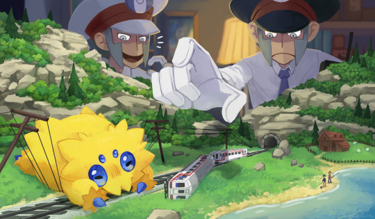
Derailed!
#my art#submas#sbms#fanart#Pokemon#pokemon fanart#subwaybosses#digitalpainting#Model Train fun fact: Electric Model Trains have electricity running through the tracks to make the train go!#and Hungry Joltiks do what a Hungry Joltiks gotta do!#ahha I didnt mean to be gone for so long my apologies!#please enjoy!
3K notes
·
View notes
Text


can i find glee on the shonen jump app
#my art#glee#glee fanart#finn hudson#santana lopez#quinn fabray#kurt hummel#brittany s pierce#brittany pierce#my favorite chars tbh#+ blaine warbler (not pictured)#can we please get a glee anime adaption#or manga adaption#brittana#fuinn#i feel like i should humbly apologize for shipping fuinn#i see 2 gorgeous ppl and i cant help myself#furt#finntana#not shipping those tho dw#i wld never go that far
368 notes
·
View notes
Text
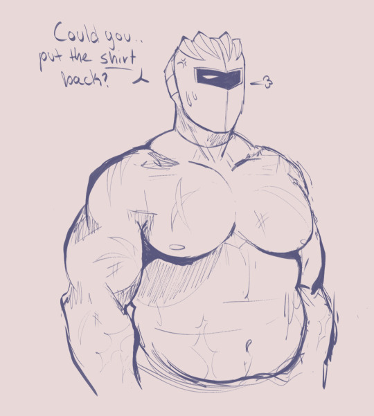
sorry. i had to
also i just cant imagine this man doing an "attractive" pose. he would be so awkward
@that-fanperson-meg im sorry im so sorry here you go
#hes not perfect but im free and happy#i absolutely apologize for you guys needing to witness this#meg please bully your friends now. i shall make more if you desire#meta knight#kirby#kirby gijinka#my art#going back to drawing gaster now#aaaaaaa
296 notes
·
View notes
Text
@wafaaresh6 had to make a new account and campaign due to verification and financial issues. This new gofundme has barely any donations. I have switched the links in my pinned post. Please donate to her.
#palestine#free palestine#gaza#free gaza#vetted by 90 ghost#vetted campaign#vetted fundraiser#legit campaign#legit fundraiser#free free palestine#i stand with palestine#gofundme#go fund her#donations#please donate#donate if you can#keep donating#wafaa abuelreesh#i apologize if i spelled your name wrong wafaa
146 notes
·
View notes