#phonecamers
Explore tagged Tumblr posts
Text

found a starcale-energy pose on x
#lcf#lout of count's family#starcale#cale barrow#cale henituse#random gift for sacri who saved my life bc i was reading kr fic on postype w my phonecam google translate until they showed me a firefox ex#lcf art
185 notes
·
View notes
Text
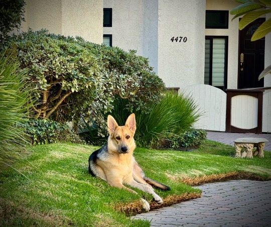


Coco, my 5-month old German Shepherd
7 notes
·
View notes
Text
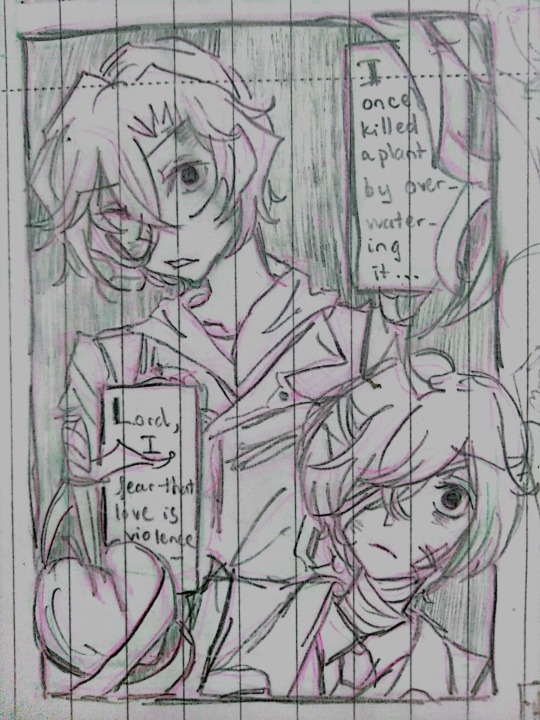
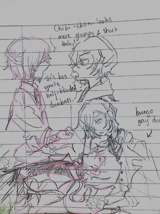
They're just 2 silly little guys
#bsd#bungou stray dogs#chuuya nakahara#dazai osamu#my art#bsd fifteen#the scanned quality sucks augh#at least better than my phonecam#i love them so much#skk#soukoku
44 notes
·
View notes
Text



#u#mine#phonepics#phonecam#australia#dane#tod#ryan#photographers on tumblr#photography#dirtcore#country#rural
24 notes
·
View notes
Text
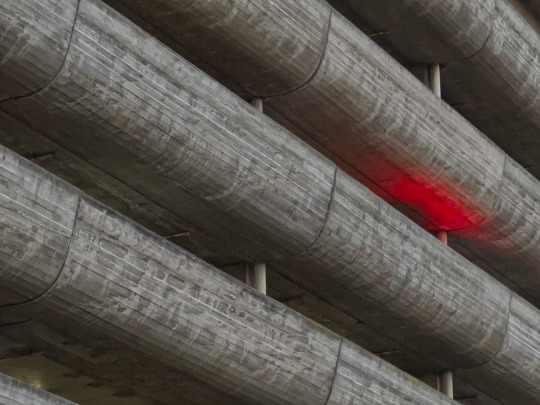
Carlton, Melbourne, Victoria, Australia. 2024-08-08 17:16:10
Brutalist architecture illuminated by a car's brake lights.
#australia#melbourne#victoria#photography#photographers on tumblr#art#iphone#original photographers#outdoors#outdoor#phonecam#phonecamera
4 notes
·
View notes
Text
The Android “Open Camera” app has several grid overlays as options:
3x3 - helps with applying the rule of thirds.
Phi 3x3 - 3x3 grid with ratios 1:0.618:1.
4x2
Crosshair
Golden - displays a Golden spiral (technically, a Fibonacci spiral).
Golden Triangles
Diagonals
This app was mentioned a couple of weeks ago, first by @shelandsorcery on this post, and then by me on this one.
It’s a really good app, especially in a phonecam with over-aggressive processing in the native camera app.

This article was written by Phil Straub back in 2005, and it is as fresh and vital today as it was then. Phil’s tips and trick are timeless, and can help you make your images pop!
Composition is everything! No amount of detail in an illustration or Concept Painting will be successful without a strong composition foundation.
Composition in Environment Concept painting can be quite difficult since your focal point usually isn’t as obvious as in a character piece. In this introduction to Composition we will explore the fundamentals used to create exciting and functional compositions along with a variety of composition techniques. Initially I will show some successful examples of iconic composition, formal composition, the rule of 3rds, the golden rule, etc. There will be a discussion on what makes each piece successful and an explanation on why the artist chose to describe the scene using a particular form of composition.

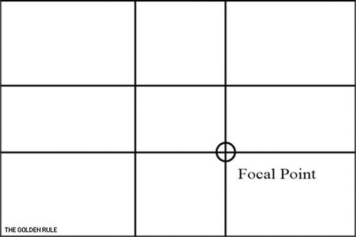
When you take the canvas area and divide it into ‘thirds’ Horizontally and Vertically, where the lines cross in the picture area is a ‘Golden Mean’, or the best spot in which to place your Main Subject or Object of Interest as it is the Focal Point of your picture. The golden rule originates from the Ancient Greeks, since they were great mathematicians as well as artisans, they came to the conclusion that there needed to be a certain balance in composition for it to be pleasing to the eye. They further developed this theory and defined what they called “power points,” Power points are located at the point where the lines used in the golden rule intersect. By placing a main subject on a power point, it further defined that subject as the focal point.
The golden rule can and usually is applied to a paintings canvas proportions. As you read through the following text you’ll notice that most of the imagery presented utilizes similar dimensions and almost all of them fall into the “golden rectangle.” Today you can find the Golden Rectangle almost everywhere: from credit cards to phone cards to book covers, all are shaped with its proportions. The Golden Ratio (the ratio of the longer and shorter sides of the Golden Rectangle) also appears in many natural phenomena. The ratio between the length of your nose and the distance from the bottom of the chin to the bottom of the nose is the golden ratio. The spiral growth of crustaceans follows the golden spiral. The divine proportions are an in-built (or in-grained) aesthetic parameter we judge beauty by.
The imagery [above] represents the division of space when the “golden rule” is applied to a blank canvas. Basically it is the division of a line in two sections, where the ratio between the smallest section and the largest section is identical to the ratio between the largest section and the entire length of the line. In other words A/B = B/(A+B). The ratio is about 1/1.618. Honestly, I’m still not exactly sure what that all means? but, I do know that I used this grid layout a-lot when I first started painting and found it helpful. I still do.
In the beginning you may find it useful to use this as an overlay for every concept piece you do. Having this grid float over your imagery as a reminder of where to place the objects of importance in the scene may help you as your develop your composition.
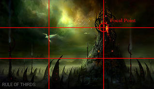
From the golden rule came the “rule of thirds” which is virtually the same concept but slightly altered to fit photographic proportions.I find it a bit easier to follow since it’s very simple in its origin.Here we have a look at the rule of thirds in action.
Notice that the main focal point sits right almost directly over one of the “golden means.” Additionally, other objects are placed near the other converging lines (the bird, for example) but, not directly on them, since that would create competition for the focal point.
There are Four Spots where these lines cross the Upper Left the Lower Left, the Upper Right and the Lower Right. Please note that all the “hotspots” are away from the center position in the picture frame.
The two best “power points” are the Upper Right and the Lower Right because the eye enters the picture frame at the lower left hand corner of the picture frame, travels to the center of the picture area and then reaches the right hand ‘Golden Mean’ position where it stops to look at the ‘Center Of Interest’.
The reason the eye enters a picture at the lower left side is because we are taught to read from Left to Right. This is a psychological fact that has been proven over the years. Next time you’re in an art gallery or art museum that shows the Old Masters paintings, notice how many have the Center Of Interest in the “Golden Rule” positions.
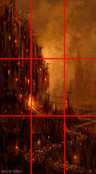

‘Implied Forms’ are a combination of ‘Implied Lines’ and they help to hold a painting together. The eye enjoys these interesting forms and will stay in the picture area to examine each one of them, if they are present. The following text and sample imagery will demonstrate a variety of implied forms and composition approaches.

The Circle is made up of a continuous ‘Curve’ and it’s circular movement keeps the eye in the picture frame. There are many circles in nature and man made objects. You can use the circle in a very obvious way in your composition or simply suggest it.
The image [below] is a very obvious and deliberate usage of circular composition. Notice how the circular shapes created by the dragons also follow a path that leads your eye towards the focal point.
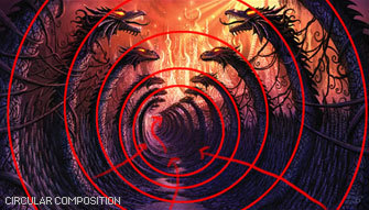
Another example of circular composition! Again, I chose this type of composition to enhance the feeling of motion in the piece. You can see how the eye follows the circular shapes across the picture plane to the focal point. Something interesting to note with this image, it actually uses two composition approaches at one time; circular composition and iconic composition.


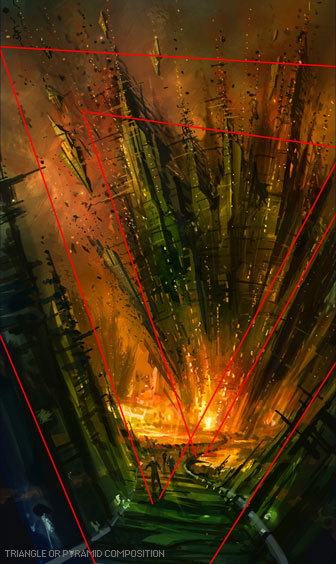
This has a ‘solid base’ and will show Stability. It also has Height and Strength. The Pyramids of Egypt have survived for thousands of years while other types of solid buildings have crumbled in to dust in less time. With the image below I was very deliberate with my arrangement of shapes so the triangle or pyramid composition is obvious. When I began this piece I simply started with a triangle shape as my starting point…nothing more than an abstract composition. I just let everything flow from there….and very quickly the painting began to take shape.

Is a connection of ‘Lines’ meeting in the Center and an expansion of ‘Lines’ leaving the Center. The Radii is usually found in Nature Subjects. The best example of the man made Radii is the spokes of a wheel.
The eye has two ways to go when it comes upon the Radii. It can either be drawn in to the picture area or it can be led out of the picture area. You must be careful how you used the Radii and try to have the eye led into the picture.


A showing of ‘Opposing Force’ that will give the picture a feeling of Cohesion and Relationship. The horizontal bar of the Cross will act as a “stopper’ while the vertical pole can act as a leading line. The windows in a large skyscraper will form crosses and will keep your interest in the building. The Cross also has religious meaning and the subtle use of the Cross can give hidden significance to an image.
In the painting below Hong Kuang uses the cross composition subtly. One could argue this piece is also using an “L Composition.” The strong line across the horizontal center that’s being formed by the characters body suggests “The Cross.” The somber facial expression and subject matter demonstrate an experienced artist’s ability to use symbolic composition to help tell a narrative.
To the right of that is Daryl Mandryk’s work which successfully combines a Cross composition with iconic composition. This is common composition choice for themes of heroism or comics. Fantasy artists like Brom and Frazetta use this type of composition in their work regularly.


This makes an attractive ‘frame’. It can be used to accentuate important subjects. Many times it is a ‘frame’ within a ‘frame’.
A tree with an overhanging branch at the ‘right’ side of the picture area will form a ‘Rectangle’ and help frame the Main Subject in the picture. By doing this you will make the Center of Interest stand out and be noticed clearly.


Some Art theorists contend that the most important information in the image should be placed near the center of the picture plane. This may seem confusing to some students since this contradicts many of the major principles of the “golden rule.” In general iconic composition should and can be used to describe a subject in a certain way. Iconic Composition or “Formal Subdivision” applies best to subjects of a dignified or religious nature. This style of composition was the approach of choice in earlier times and many excellent compositions have been made with it. Usually Iconic composition is used to describe symbolic subjects, heroic subjects, or religious subjects.
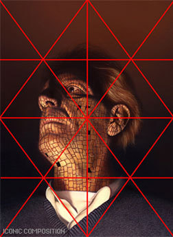
I’ve taken the liberty of drawing over this imagery to demonstrate the division of space in iconic composition. This is a technique used by many illustrators to help define the division of space and focal point when creating an iconic illustration. Well know and renowned illustrator Andrew Loomis used this technique extremely well and his book “Creative Illustration” to demonstrate this further.
Notice, that while the focal point is slightly off center, all the converging lines lead to the center point of interest. Additionally, notice how the figures head sits directly in the diamond shape of the overlay lines I’ve created. It should also be noted that I chose this composition to further enhance the regal and heroic appearance of the character.

Tong Wu uses Iconic composition perfectly here! Notice how the character again falls nearly at center of the canvas. I’ve taken the division of space a bit further on this imagery and have broken down the image into smaller segments so you can so how the artist balances everything in the piece.
Notice how the top right corner is almost a mirror image of the top left corner. In fact, look at almost any opposing segment in the painting, they are very similar! When creating iconic composition, it’s not necessary to duplicate each side exactly, but there should be a feeling of complete equalization of the units or masses, the line and spaces of one side with the other.

So, there you have it, a variety of ways to deal with division of space when you first begin visualizing a painting or drawing. At the end of the day, theses approaches to composition are guides and simply a place to start. Once you become more comfortable with composing a scene you can begin to push the boundaries of formal composition.
Since most Environment Concept Artists work in the entertainment industries, its expected you will be asked to create cinematic moments or “memorable moments” utilizing the environment as a stage.
You’ll want to use your mastery of composition to lead the viewer’s eye and really make the viewer feel like they’re in the scene. The single most important thing you simply must have in any Environment Concept Painting is a clear and dynamic focal point.
Without a place for the viewer’s eye to rest, the painting will lack impact and won’t hold the attention of your audience. It’s the job of the Concept Artist to visualize what can’t be visualized in reality. Concept Artists are the first step in every production and therefore must create dynamic imagery that the rest of the team will be excited to build. There are a few cinematic tricks that you can use as a Concept Artist to make things appear more dynamic.

Sometimes all it takes to add an extra bit of drama to your composition is a simple tilt of the camera. In the image to the right the viewer really feels like they are part of the action, simply by slanting the camera a bit. This approach is especially useful when you are trying to depict action in your environment.


Many Concept Artists today, myself included, use perspective as a tool to create dynamic compositions that appear to have motion and lead the eye to the focal point clearly and concisely.
In the painting below you will notice I’ve used many of the objects that appear in the painting as opportunities to further guide the viewer to the “payoff.” Additionally, I tilted the camera a bit to add to the action.

http://www.cgsociety.org/index.php/CGSFeatures/CGSFeatureSpecial/phil_straub_composition_tutorial
15K notes
·
View notes
Text

Grananje
#branching
0 notes
Text
More on pre-electricity lighting.
Interesting to see this one pop up again after nearly two years - courtesy of @dduane, too! :->
*****
After experiencing a couple more storm-related power cuts since my original post, as well as a couple of after-dark garden BBQs, I've come to the conclusion that C.J. Cherryh puts far too much emphasis on "how dark things were pre-electric light".
For one thing eyes adjust, dilating in dim light to gather whatever illumination is available. Okay, if there's none, there's none - but if there's some, human eyes can make use of it, some better or just faster than others. They're the ones with "good night vision".
Think, for instance, of how little you can see of your unlit bedroom just after you've turned off the lights, and how much more of it you can see if you wake up a couple of hours later.
There's also that business of feeling your way around, risking breaking your neck etc. People get used to their surroundings and, after a while, can feel their way around a familiar location even in total darkness with a fair amount of confidence.
Problems arise when Things Aren't Where They Should Be (or when New Things Arrive) and is when most trips, stumbles, hacked shins and stubbed toes happen, but usually - Lego bricks and upturned UK plugs aside - non-light domestic navigation is incident-free.
*****
Here are a couple of pics from one of those BBQs: one candle and a firepit early on, then the candle, firepit and an oil lamp much later, all much more obvious than DD's iPad screen.
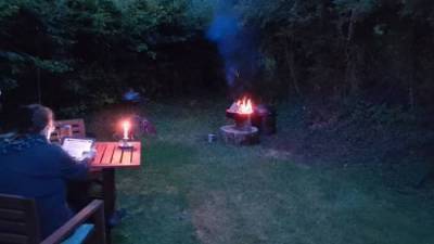
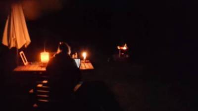
Though I remain surprised at how well my phonecam was handling this low light, my own unassisted eyes were doing far better. For instance, that area between the table and the firepit wasn't such an impenetrable pool of darkness as it appears in the photo.
I see (hah!) no reason why those same Accustomed Eyes would have any more difficulty with candles or oil lamps as interior lighting, even without the mirrors or reflectors in my previous post.
With those, and with white interior walls, things would be even brighter. There's a reason why so many reconstructed period buildings in Folk Museums etc. are (authentically) whitewashed not just outside but inside as well. It was cheap, had disinfectant qualities, and was a reflective surface. Win, win and win.
*****
All right, there were no switches to turn on a light. But there was no need for what C.J. describes as stumbling about to reach the fire, because there were tinderboxes and, for many centuries before them, flint and steel. Since "firesteels" have been heraldic charges since the 1100s, the actual tool must have been in use for even longer.
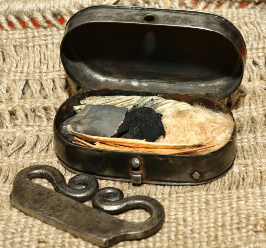
Tinderboxes were fire-starter sets with flint, steel and "tinder" all packed into (surprise!) a box. The tinder was easily lit ignition material, often "charcloth", fabric baked in an airtight jar or tin which would now start to glow just from a spark.
They're mentioned in both "The Hobbit" and "The Lord of the Rings". Oddly enough, "Hobbit" mentions matches in a couple of places, but I suspect that's a carry-over from when it was just a children's story, not part of the main Legendarium.
Tinderboxes could be simple, just a basic flint-and-steel kit with some tinder for the sparks to fall on...
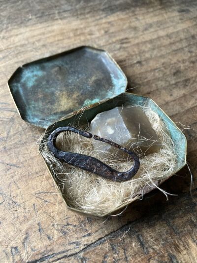
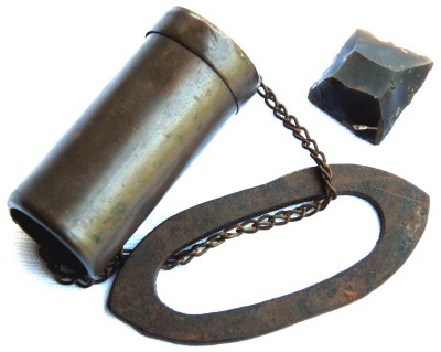
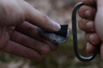
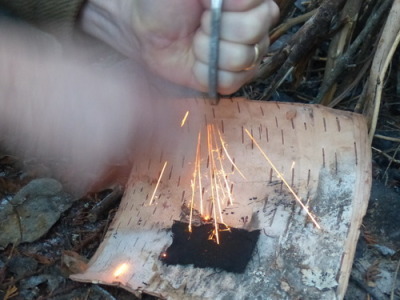
...or elaborate like this one, with a fancy striker, charcloth, kindling material and even wooden "spills" (long splinters) to transfer flame to a candle or the kindling...
This tinderbox even doubles as a candlestick, complete with a snuffer which would have been inside along with everything else.
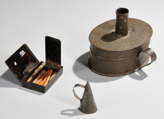
Here's a close-up of the striker box with its inner and outer lids open:
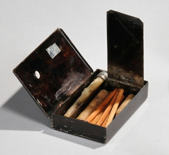
What looks like a short pencil with an eraser is actually the striker. A bit of tinder or charcloth would have been pulled through that small hole in the outer lid, which was then closed.
There was a rough steel surface on the lid, and the striker was scraped along it, like so:

This was done for a TV show or film, so the tinder was probably made more flammable with, possibly, lighter fuel. That would be thoroughly appropriate, since a Zippo or similar lighter works on exactly the same principle.
A real-life version of any tinderbox would usually just produce glowing embers needing blown on to make a flame, which is shown sometimes in movies - especially as a will-it-light-or-won't-it? tension build - but is usually a bit slow and non-visual for screen work.
*****
There were even flintlock tinderboxes which worked with the same mechanism as those on firearms. Here's a pocket version:
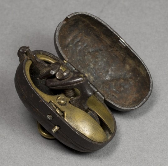
Here are a couple of bedside versions, once again complete with a candlestick:
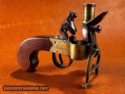
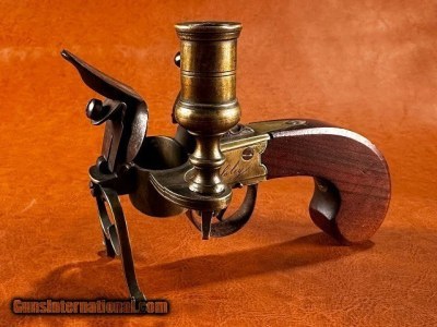
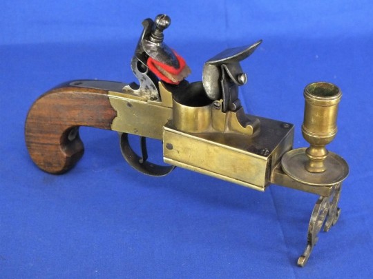
And here are three (for home defence?) with a spotlight candle lantern on one side and a double-trigger pistol on the other.

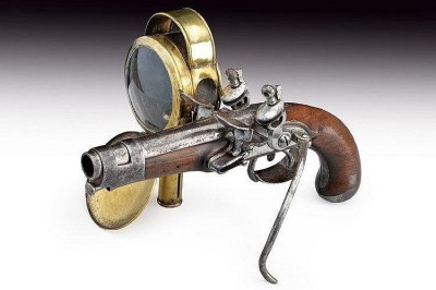
Pull one trigger to light the candle, pull the other trigger to fire the gun.
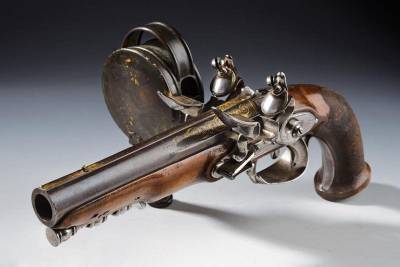
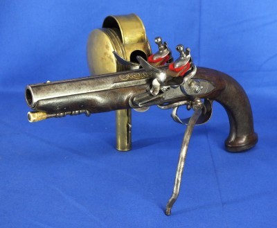
What could possibly go wrong? :-P
*****
Those pistol lanterns, magnified by lenses, weren't just to let their owner see what they were shooting at: they would also have dazzled whatever miscreant was sneaking around in the dark, irises dilated to make best use of available glimmer.
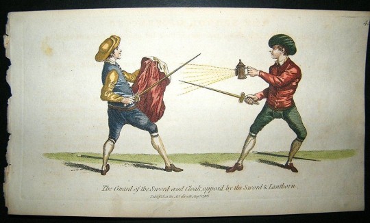
Swordsmen both good and bad knew this trick too, and various fight manuals taught how to manage a thumb-shuttered lamp encountered suddenly in a dark alley.
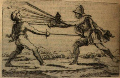
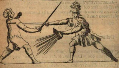
There's a sword-and-lantern combat in the 1973 "Three Musketeers" between Michael York (D'Artagnan) and Christopher Lee (Rochefort), which was a great idea.
Unfortunately it failed in execution because the "Hollywood Darkness" which let viewers see the action, wasn't dark enough to emphasise the hazards / advantages of snapping the lamps open and shut.
This TV screencap (can't get a better one, the DVD won't run in a computer drive) shows what I mean.
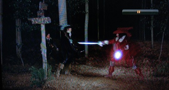
In fact, like the photos of the BBQ, this image - and entire fight - looks even brighter through "real eyes" than with the phonecam. Just as there can be too much dark in a night scene, there can also be too much light.
*****
One last thing I found when assembling pics for the post were Folding Candle-lanterns.
They were used from about the mid-1700s to the later 20th century (Swiss Army ca. 1978) as travel accessories and emergency equipment, and IMO - I've Made A Note - they'd fit right into a fantasy world whose tech level was able to make them.
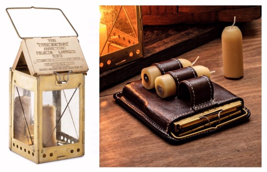
The first and last are reproductions: this one is real, from about 1830.
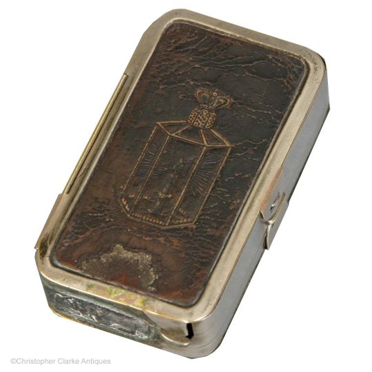
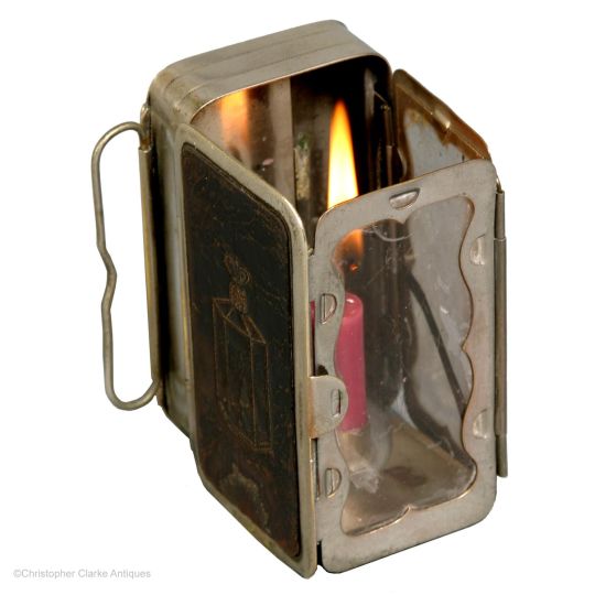
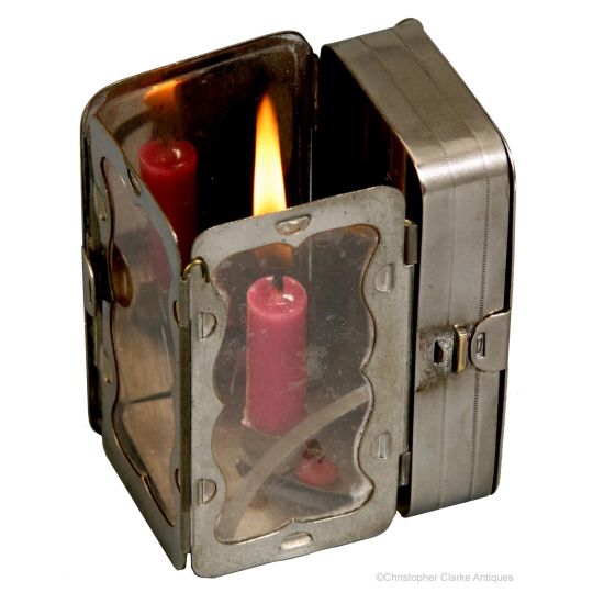
The clear part was mica - a transparent mineral which can be split into thin flexible sheets - while others use horn / parchment, though both of these are translucent rather than transparent. Regardless, all were far less likely to break than glass.
One or two inner surfaces were usually tin, giving the lantern its own built-in reflector, and tech-level-wise, tin as a shiny or decorative finish has been used since Roman times.
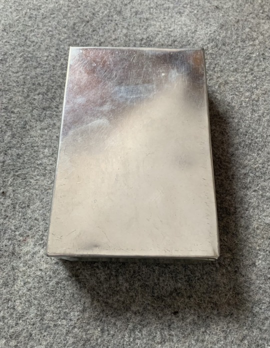
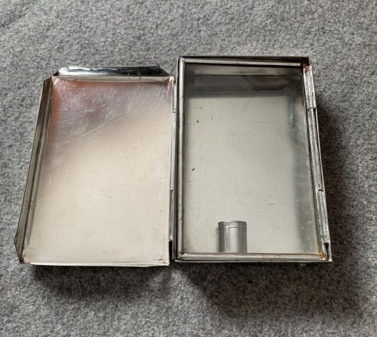
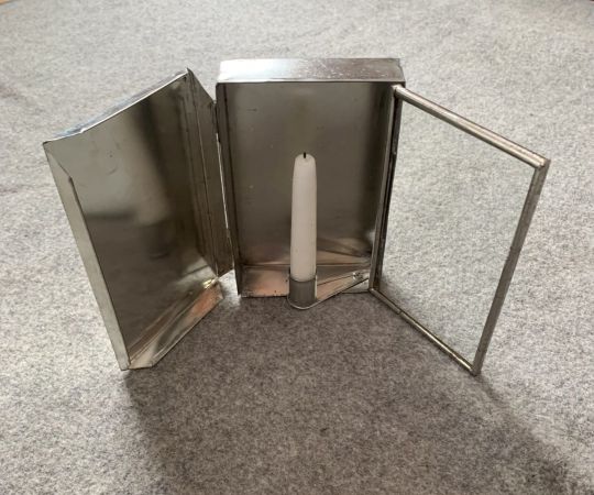
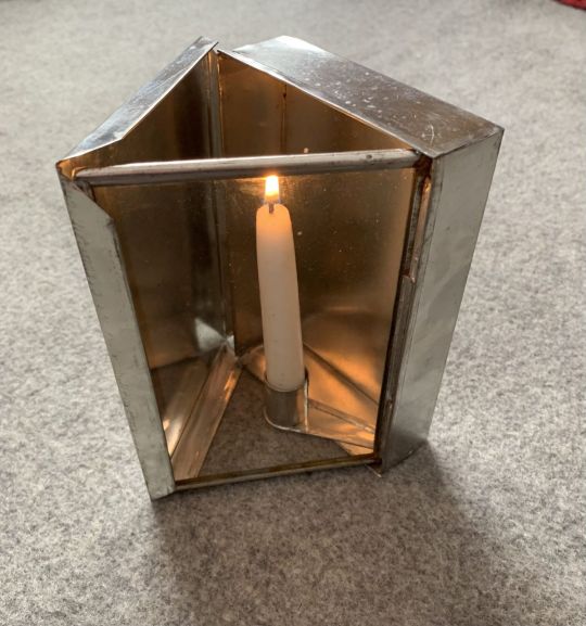
I'm pretty sure that top-of-the-line models could also have been finished with their own matching, maybe even built-in, tinderboxes.
And if real ones didn't, fictional ones certainly could. :->
*****
Yet more period lighting stuff here, including flintlock alarm clocks (!)
#period lighting#tinderbox#too light too dark#social history#writer notes#research#period tech#sword vs lantern#c. j. cherryh
2K notes
·
View notes
Text
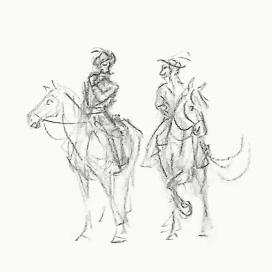
Courtesy of my crappy phonecam and miniature scale addiction, here's a Kmicic and Oleńka on a leisure ride (I like the idea that he teaches her to ride)
#trylogia#potop#the deluge#andrzej kmicic#oleńka billewiczówna#i create#he's supposed to be twirling his mustache. they've been married for years. he doesn't care
26 notes
·
View notes
Text
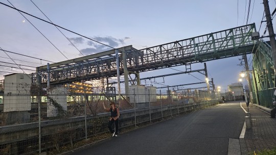
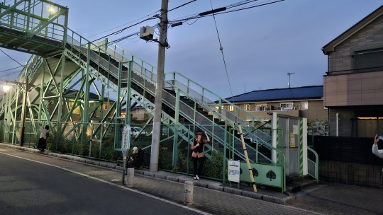
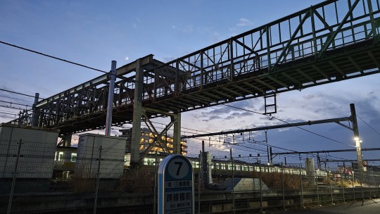
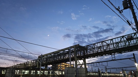
Farewell to Dazai's bridge in Mitaka
It was shut down this week, because it is due to be torn down, presumably starting next week. The city can no longer pay for its upkeep. The bridge was built in the 1920s, and Dazai used it frequently when he was living in Mitaka.
There was a final crossing event held last weekend, and this Saturday, it is already roped off. One stairway has barricades, the other just orange barriers. The only people on the bridge had shirts labeled "Staff," probably doing last inspections.
I didn't know about the final crossing in time, so I rushed out on Saturday to take some final pictures. Arrived around sundown. I did a small Chuuya cosplay with the bridge to remember it, wearing BSD Dazai's bolo tie.
This is the stairway on the south side. Difficult to see the full span from here:
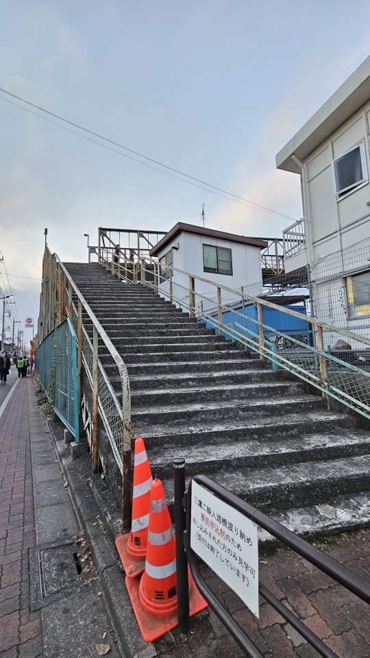
A few shots on the north side as Chuuya. Not a pro shoot, just phonecam, sun already below the horizon by the time we reached the north side. The focus is the bridge, anyway:
Some final shots as the sun sinks away:
Video with a last train crossing. Some comments in Google maps report trains honking as they passed. Other folks taking last photos and videos too:
This last is a screencap of a ghost video of some sort - I swear I remember taking this video and that it was normal, but upon checking when I got home, the entire thing was purple. Weird.
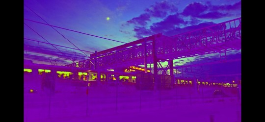
22 notes
·
View notes
Text
Can anyone please tell me any sites that have the Magic Kaito manga from chapter 14 onwards that is in high quality and uses the ebook pages?? I used mangadex the last time I read it, but it doesn't work on my phone now and everywhere I look I can only find the crappy phonecam translations. Pretty please?? 😭
11 notes
·
View notes
Text
instagram
"Excuse me Miss, I know it's not funny, but your perfume smells like your Daddys got Money''
Slide for the full picture!! 👻
Buggy with his hands on my hips, what else could I ask for? (ฅº👅ºฅ) I wonder what he's up to and what kind of stuff he tells Perona...she seems to enjoy it tho.
I'm a bit sad, that the phonecam erased my cute Bottomlashes?! But let's just pretend theyre there!
Buggy x Perona is here! 👻🤡 I love them so much together! They fit so well together aaah ;///;
🤡 @florian_doom
Thank you @famechen95 for taking your time and sewing this together with me! It looks boootieful! 👻
Thank you @cozy_cosplay_ for taking photos!
#onepiece#onepiececosplay#onepieceperona#ワンピース#ワンピースコスプレ#ペローナ#ペローナコスプレ#perona#peronacosplay#cosplay#コスプレ#opla#buggytheclown#buggycosplay#buggyonepiece#buggytheclownonepiece#バギー#buggyrona#ghostclown#germancosplay#c0splay#mexberlin#mexberlin23#cosplaygirl#puricos#buggy x perona#Instagram
4 notes
·
View notes
Text
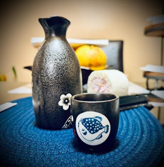
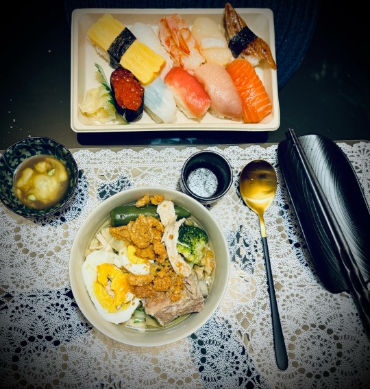
Mami noodles, sashimi & hot sake, perfect for a cold rainy Saturday night.
3 notes
·
View notes
Text
1 note
·
View note
Text
Is taking a bath with your phonecam a common thing?
Must save food provider
(via)
15K notes
·
View notes
Text
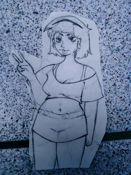
Don't mind this, also my phonecam sucks. I need a new one asap
0 notes