#patternmakers
Explore tagged Tumblr posts
Text


experienced chinese patternmakers post their entries include award-winning works (cr: 七禾页老师, DaRan)
567 notes
·
View notes
Text
青白之魅 5: Clothes & Accessories
1 Introduction & Presentation // 2 Background & Influences // 3 Hair & Makeup // 4 Set Design // 5 Clothes & Accessories // 6 Conclusion
This is the actual hanfu post of the hanfu series on this hanfu account! So if you’re here for HANFU and specifically HANFU this is it >:)))) We’re gonna get deep into the relics & archaeology with this one!
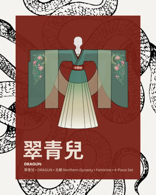
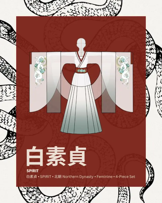
L: Cui Qing'er set, R: Bai Suzhen set, both Cloud9 Hanfu
So before we start. This was supposed to be a four-piece set. However, my dumbass (and Yulan’s dumbass I guess) forgot about the pibo ;-; So it literally just doesn’t appear in the shoot and We Will Not Speak Of It. It still looks pretty great! Just completely slipped our minds amidst the chaos x-x
Anyway: each of these are (SUPPOSED to be) a four-piece set. The four pieces are 大袖褶衣/da4 xiu4 xi2 yi1/large-sleeved top,九破裙/jiu3 po4 qun2/nine-panel skirt,腰封/yao1 feng1/wide sash,and 披帛/pi1 bo2/shawl. The sash & shawl are smaller accessory pieces, so the main two pieces are the top and the skirt: they are completely custom printed and custom patterned, the culmination of months of research. I will be focusing on these two pieces in this post (I’ll go over the last two briefly at the end, they’re just not as interesting).
Background: Northern Dynasty
Background for these sets: Both of these sets are referenced from the 南北朝/nan2 bei3 chao2/Northern & Southern Dynasties, with more emphasis on the northern part. This was a very tumultuous time period that often gets looped in with the 魏晉/魏晋/wei4 jin4/Wei & Jin dynasties for a combination time period known as 魏晉南北朝.
This means two major things in the context of hanfu research: 1) there’s a lot of very fast-paced exchange of culture and evanescent fashion trends going on, and 2) there are very few well-preserved textile relics to work off of. As a result, the sources for Northern & Southern Dynasty clothing often bounce off of chronologically adjacent artifacts. This also means that physical garment relics that we usually depend on to learn about the patterning/construction of hanfu from that time period have to be supplemented with figurines and carvings from the time, so we can see what they were supposed to look like. There’s a lot of educated guesswork involved.
Most types of hanfu have direct garment relics that their patterns are recreated/resized from. The strictest hanfu enthusiasts—called the 形制黨/形制党/xing2 zhi4 dang3/‘form party’ (party as in like political party, not like a rave)—only recognize hanfu that are constructed identically to an archaeological source, because a physical reference is the only surefire way to ensure that the construction is ‘correct.' All other kinds of hanfu are considered hanyuansu or modified, hanfu-influenced versions of clothing.
I used to be stricter about this too, but I realized after several years researching hanfu that when you get really deep into it, the lines become really blurry. So if you’d like to be stricter about it, feel free to consider this set hanyuansu! But because a lot of research went into it, and I personally think it's very very likely that these constructions existed, I feel more confident in calling it hanfu than guzhuang or some kind of ‘costume.’
大袖褶衣
The construction of this top is primarily based off of two archaeological relics from the Northern Dynasty: a sleeve piece and a 褶衣 (!注: 褶 is pronounced xi2 in this phrase) relic. There is very little material out there on the sleeve piece, but the Xiyi is very famous and was restored by the China Silk Museum.
褶衣/xi2 yi1/Xiyi
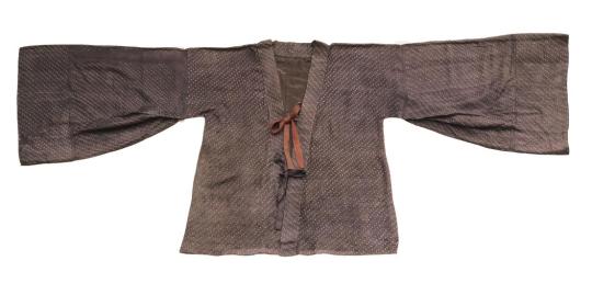
绞缬绢衣, 中国丝绸博物馆/China Silk Museum
This is the Xiyi. Its full technical name is the 絞纈絹衣/绞缬绢衣/jiao3 xie2 juan4 yi1/'twisted knot silk top,' but it's known colloquially as the 褶衣. Right now it's in the China Silk Museum's collection of artifacts.
It was originally excavated by the Gansu Institute of Archaeology from 甘肅花海畢家灘26號墓/甘肃花海毕家滩26号墓/gan1 su1 hua1 hai3 bi4 jia1 tan1 26 hao4 mu4/'Gansu province Huahai Bijiatan grave site #26,' which was discovered in May 2002. The burial site belonged to a woman who died in the year 377CE. A good chunk of clothing artifacts from the 魏晉南北朝 period that have been referenced in hanfu today came from this woman's tomb.
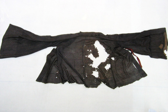
It used to look like this before it was restored by the China Silk Museum. You can read the restoration report here.
There's a whollllleeeeee textile analysis complete with microscope fiber images that I could go through here, but I'll save it for another post since my design doesn't have anything to do with the fabric of this piece, just the structure.
Now, I only used the torso portion of the Xiyi, since I used a different sleeve shape, so I won't be going over the Xiyi's sleeves either. The torso looks like this:
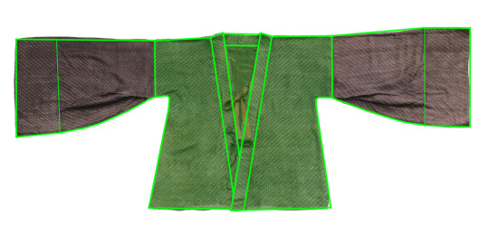
Fairly simple structure! It obeys all the general rules of hanfu construction. There are a few features to note though.
The back of the neck is very wide. Most open-front hanfu garments have a small gap at the top of the neckline. This garment, however, has a particularly wide gap.
There are no vents. I know it's not visible in the flat picture, but there are no side slits/vents, which is one of the main features distinguishing this piece from similar parallel-collar tops from the Song/Tang dynasties (usually known as 褙子/bei4 zi0/Beizi). This makes sense: vents are necessary for longer garments so that your hips don't get trapped, but for shorter garments they're not needed. This xiyi is 72cm long, which is still considered short.
There is no 'lan' piece. Modern convention dictates that a top with a lan piece be called a 襦/ru2 (again, modern convention in the hanfu community!!! This is not necessarily historically true). Since this top doesn't have one, it's not considered a Ru, earning its own name as the xiyi.
The root of the sleeve is narrow compared to the rest of the body. It's only about 1/3 the length of the torso.
Finally and most importantly, it's not a cross-collar garment, but the lapels aren't parallel either. Instead, they slope down diagonally from that wide-set neck and meet at a point at the bottom. There's a tiny portion that overlaps, but if you look closely you'll notice that it's actually only the trim that overlaps—if you took off the trim, the torso pieces would meet at the same point.
Keep these in mind as we move on.
錦緣綾大袖/锦缘绫大袖/jin3 yuan2 ling2 da4 xiu4/'Brocade Trim Silk Large Sleeve'
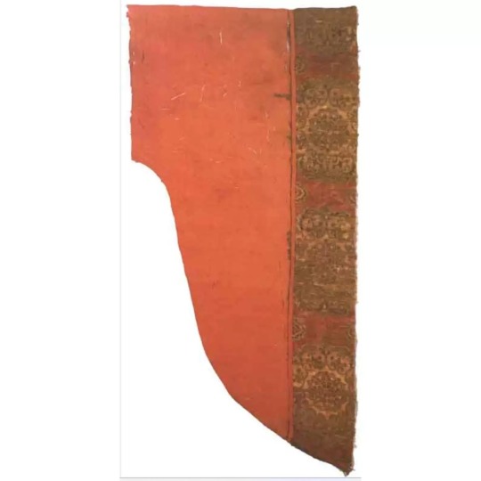
idek where I got this image, sorry
I spent a full three days scouring the internet for metadata on this thing (until I got hit with a 24-hour migraine and had to stop ;-;). It's a sleeve piece from the Northern & Southern Dynasties called the 錦緣綾大袖. Unfortunately, there is very very very little information out there about it.
From what I could find, this is because 1) it isn't a archaeological artifact excavated post-revolution (which is usually the case), it was an heirloom and doesn't have very good digital records, and 2) it is allegedly in Japan, and I don't know Japanese so I'm not very good at finding information in Japanese. Do not quote me on either of those points; I could be misinformed, but I wasn't able to find anything else.
According to 大唐女儿行/大唐女兒行/da4 tang2 nv3 er2 xing2, a book by 左丘萌 (Zuo Qiumeng) and 末春 (Mo Chun) published by Tsinghua University Press, this sleeve piece is in the Nara Shosoin Repository's southern warehouse collection, and was shown during the 58th annual Shosoin Repository Exhibit.
However, I looked up the records of the artifacts shown during the 58th annual exhibit and this artifact is not on the showing list, and I went through three separate databases of Shosoin relics and found nothing, so I have my doubts about the accuracy of this citation.
So all I have is this picture, which has been passed around the hanfu community for ages. Fortunately, that's basically enough: 90% of hanfu sleeve pieces are constructed the same way, just in different shapes. So probably if you unfolded it, it'd look like this:
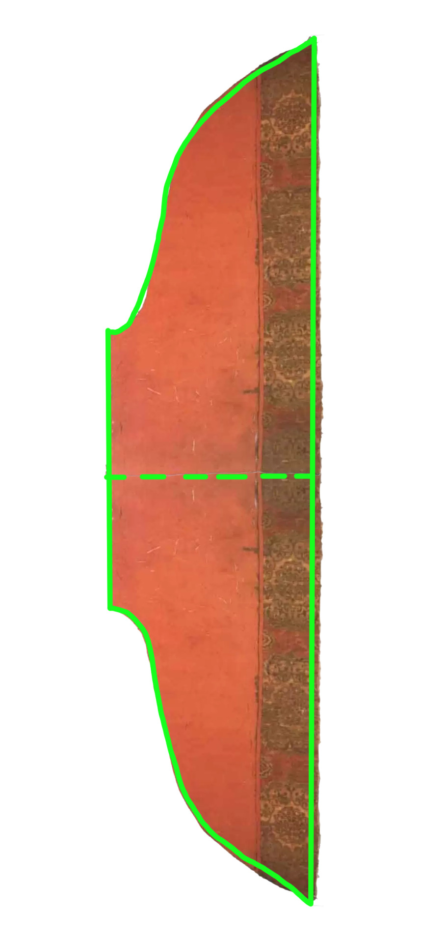
This shape is called 窄臂大袖/zhai3 bi4 da4 xiu4/'narrow upper-arm large sleeve,' because, well, it's narrow at the upper arm but wide at the sleeve opening. This differs from later-dynasty wide sleeves, which do increase in width as you get closer to the cuff, but start out fairly large as well. The shape is backed up by a boatload of figurines wearing the same structure from the Northern & Southern Dynasties.
Putting It Together
Okay, we've got a sleeve reference, and we've got a torso reference, and they both existed at the same time. That's... all of the parts we need to make a whole top! Here is the approximate franken-hanfu chimera we have put together:
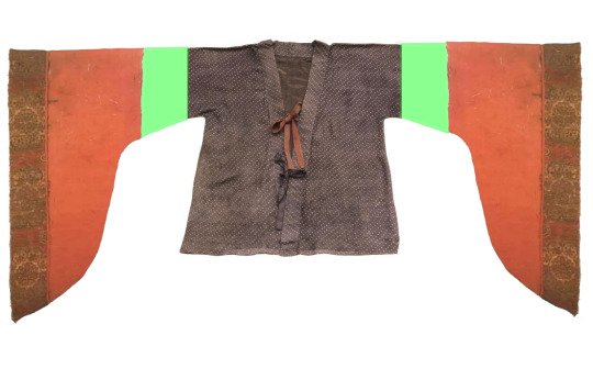
But how likely is it that this combination existed?
Pretty likely, actually, if we look at some corroborating evidence. Here is an article about 袴褶装/ku4 xi2 zhuang1 by the National Museum of China. 袴褶装 is a type of outfit (in the sense that t-shirt-and-jeans is a type of outfit) often worn by Northern & Southern Dynasty figurines. 袴 is the archaic form of 褲/裤 which means pants. 褶 refers to the 褶衣 from the previous section. 袴褶装 is the combination of these two garments in an outfit.
According to the article, 袴褶装 was a clothing trend that originated in the north, where nomadic tribes who were often on horseback (some still are today!) preferred to wear pants and shorter tops for convenience. This later got adopted by the Central Plains people, and the pants and sleeves got wider and wider—so it's very conceivable that a xiyi with wider sleeves than this relic existed.
Here are some figurine pictures from all over China:


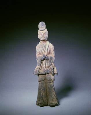
L: 陶文吏俑,北齐,徐州博物馆,1985?徐州狮子山北朝墓出土 (Ceramic Statue of Civil Official, Northern Qi, Xuzhou Museum, excavated 1985?from the Lion Mountain site in Xuzhou, Jiangsu)
C: 侍从陶俑,北魏,中国国家博物馆,1965年河南省洛阳市元邵墓出土 (Ceramic Statue of Attendant, Northern Wei, National Museum of China, excavated 1965 from the Yuanshao site in Luoyang, Henan)
R: 陶彩绘男俑,北魏,故宫博物院 (Colored Ceramic Statue of a Man, Northern Wei, China National Palace Museum)
So! I think that this combination is more than plausible. Take a look at these ones:


L: 陶女俑,东晋,中国国家博物馆,1955年江苏南京出土 (Ceramic Statue of a Woman, Northern Wei, National Museum of China, excavated 1955 from Nanjing, Jiangsu)
R: 彩绘陶女立俑,北朝,徐州博物徐州馆,茅村内华北朝墓出土 (Colored Ceramic Statue of Standing Woman, Northern Dynasty, Xuzhou Museum,excavated from Mao town site in Xuzhou)
Notice how the wide-set collar allows a little bit of the inside clothing (camisole? Undershirt? Who knows) to peek out at the chest. The wide skirt head of this set's skirt peeks out at the top in the same way :)
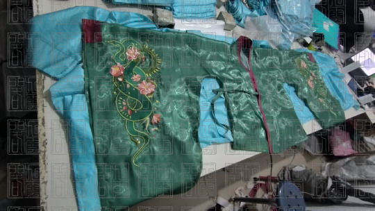
Materials & Details
The fabric used for these tops is called 百合緞/bai3 he2 duan4/‘lily satin’ in Chinese, but a lot of colloquial fabric names don’t transfer well between languages. It’s a sheer polyester fabric that’s somewhere between satin and organza. I’ve heard similar fabrics referred to as crystal organza. It has a very pretty liquid-like shimmer to it on the right side, which I felt was good for representing our ethereal water-bending snake spirits.
I went through dozens of fabrics trying to find the right texture that was available in the green-blue color needed for Xiaoqing, but fabrics of this kind often only come in macaron pastel colors. The targeted color was very specific—too green and it would no longer be 青, too blue and it wouldn’t match Dragun’s coloring. In the end, I had the color’s CMYK code custom printed onto white base fabric, then sent it off to be cut & sewn (by hanfu tailor workshop in Nanjing).
There is also trim sewn onto the collar (出芽/chu1 ya2) and sleeve cuffs, which is made from a beautiful red damask with cloud patterns woven into it. This pattern is a Ming Dynasty cloud pattern called the 四合如意雲紋.
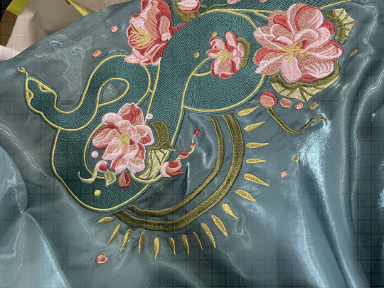
These embroidered sleeves are one of the most costly parts of the set.

I drew the embroidery pattern by hand on a raster file over the course of a few weeks (I use a tablet + Clip Studio Paint pro), then worked with an embroidery workshop in Quanzhou to digitize it.
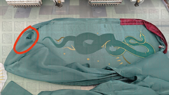
In the process of embroidering Xiaoqing's top, the fabric got snagged in the machine, and ripped a hole in the front of the right sleeve, which was very sad. There wasn't enough time to remake the whole thing before the shoot.
We rescued it by undoing the seam, chopping a portion of the sleeve off, and re-sewing it back together, resulting in a narrower sleeve opening than the white top (thank you workshop in Xuzhou!!!). The difference barely shows up on camera because it was so wide in the first place.
九破後褶裙
This is the garment that has the most guesswork associated with it, so it's the one that's least plausibly 'hanfu,' because I guessed a lot of it and pieced together a lot of sources to make it happen.
I was originally inspired by 玩泥巴的豆角 (user 'String Bean Playing with Mud') on Weibo. She's an incredibly talented historical costume enthusiast who's been the first to recreate tons of rarely-made hanfu pieces in addition to historical clothing from Korea, Vietnam, Japan, Europe, and recently Mongolia. She's also done handcrafted textiles, shoes, and other accessories. If you can read Chinese I highly recommend going through her posts but be careful because if you're like me you'll get sucked in and then neglect your homework for like a week.
This is a post that I saw back in 2023. She points out a kind of skirt often seen in Northern Dynasty figurines that has narrow pleats in the back but not in the front:


太原北齐东安王娄睿墓单螺髻侍女俑(505,508)/ Northern Qi Taiyuan Dong'an Wang Lourui Burial Site(artifact 505, 508)
She posits that there are two likely possibilities for the construction of this skirt: the 破裙/po4 qun2/'broken skirt' structure or the 百迭裙/bai3 die2 qun2/hundred-layer skirt structure (more on that later). Her recreation is structured closer to the Song Dynasty baidiequn skirt structure, with the reasoning that it would be easier to modify into a poqun later if an excavation ever came out confirming that it was a poqun, but it would be much harder to turn a poqun back into a baidiequn.

玩泥巴的豆角's image, linework of figurines with pleated-back skirts
For various reasons, one of which being that I'm not claiming this to be historically immaculate, I wanted to explore the possibility of a poqun structure. In addition, I actually do think that this pleated-back skirt is more likely to be a poqun than a Song baidiequn.
My understanding is that the baidiequn structure, which is essentially a long rectangle with pleats on it that gets wrapped around your waist, only got trendy in the Song Dynasty. There's a report of a few rectangular pleated skirts from the Tang Dynasty Famensi site (Shing Mueller, Center for Sinology, University of Munich) as well, but not much before that, and the pleats are very wide compared to a baidiequn.
Poqun, however, have been around since at least the Warring States period. We know this because of the several excavated artifacts from the Warring States Period, the Han Dynasty, the Jin Dynasty, and the Tang Dynasty. (The Warring States Period is wayyyyy before the Northern Dynasty.) Since time only moves in one direction, I think it makes more sense to assume that an older cut of clothing still existed in a time period after there's evidence that it existed, rather than before.
What's a poqun anyway? I like to describe it as Ye Olde Circle Skirt (sector skirt if you want to be pedantic about it). It's a way to make the flared circle skirt pattern happen at a time when your fabric is only 74cm wide: you cut out a bunch of trapezoids, sew them together, and end up with this sunburst shape. Trim the hem and you've got what's essentially a partial circle skirt.


L: 江陵馬山楚墓深黄絹單裙(N-17-3), 中國古代服飾研究 p. 92, 沈從文 / Jiangling Mashan Chu Kingdom burial site dark yellow unlined skirt (N-17-3), Research in Ancient Chinese Fashion p. 92, Shen Congwen
R: 長沙馬王堆漢墓單裙,中國古代服飾研究 p. 159,沈從文 / Changsha Mawangdui Han burial site unlined skirt, Research in Ancient Chinese Fashion p. 159, Shen Congwen
The two complete poqun skirts excavated before the Northern Dynasty are a four-panel underskirt from 馬王堆漢墓/马王堆汉墓/ma3 wang2 dui1 han4 mu4/Mawangdui Han Dynasty burial site in Changsha, and an eight-panel skirt from 江陵馬山楚墓/江陵马山楚墓/jiang1 ling2 ma3 shan1 chu3 mu4/Jiangling Mashan Kingdom of Chu burial site. Later Tang Dynasty artifacts also show poqun with 12, 16, even 32 panels, often alternating colors. You'll notice that most of these are even-numbered, because the trapezoids are made by splitting one rectangular piece of fabric into two trapezoids with a diagonal line.
So why is my design nine panels?
Here's my reasoning: First, I knew I wanted to stay around 8 panels, which seems like a reasonable number based on artifacts at the time (chronologically 8, 4, 6, 6, 12).
The 9th piece was inserted because of how pleating works. If you want full parallel knife pleats without messing with the symmetry, the fabric has to be rectangular. So one of my pieces has to be a rectangle, and it has to be in the middle. If I want the number of panels on each side of this rectangle to be the same (for symmetry), there's going to have to be an odd number of panels.
Now let's decide what's going on on either side of this pleated rectangle. Say we've inserted the rectangle in the middle of a uniform 8-panel poqun, which was my original intention. That means we get 4 panels on each side of the rectangle:

Traditionally, the panels are always right trapezoids. But now there's a problem: the legs of these two adjacent trapezoids are not the same length, so the angle of curvature on each side of the rectangle is different.
What if we turn the trapezoids on one side around, so that it's symmetrical? Well, now we have another problem: the different parts of the skirt are different lengths.
All right, so the problem is that the legs of the trapezoids are different lengths. Easy fix: use isosceles trapezoids instead.*

*Worried about fabric waste? Don't be! What do you get when you chop an isosceles trapezoid in half! Two right trapezoids. You can still use the same technique :) I just didn't for this skirt because lazy.
Lastly, to make it easier to do math, and since I've already bastardized the traditional poqun cut anyway, I made the last two panels rectangles (these will overlap with each other when the skirt is put on). This is to make it so that the number of rectangles and the number of trapezoids are both divisible by 3 (makes it easier to adjust calculations based on peoples' measurements).
This is the final structure of the skirt body:

What about the skirt head? One of the reference images on the Weibo post clearly showed thick shoulder straps on a chest-high skirt style. This is the style that op recreated. Most people consider chest-high skirts a marker of the Tang Dynasty, but skirt bands were migrating locations way before then.

河南洛阳朱仓北朝墓,新浪河南 / Zhucangcun, Luoyang, Henan Northern Dynasty Burial Site, Sina Henan
In 2022, a stone bedframe (artifact M260) from the Northern Dynasty was excavated in Zhucangcun, Luoyang, Henan. It was carved all over with unusually clear reliefs. One part of it depicted court ladies:

河南洛阳朱仓北朝墓,新华网 / Zhucangcun, Luoyang, Henan Northern Dynasty Burial Site, Xinhua News Network
As you can see, a very wide skirt head is clearly worn and tied over the chest. So let's tack a wide skirt head and some ribbons onto this thing. And because nobody has time to deal with chest high skirts falling down, a pair of adjustable shoulder straps. I wanted them to be adjustable so mine are very thin, but the existence of shoulder straps in general is supported by wall art and figurines, especially in combination with this back-pleated skirt.

Shitty brainstorming pen & paper sketches by me
That's the whole skirt! Congratulations.
After a shit ton of geometry and working with hanfu patternmakers from Fujian to CAD the design out digitally, each of these panels were printed directionally with a custom gradient onto satin, laser-cut (by fabric workshop in Shaoxing), and sewn together (by hanfu tailor workshop in Yangzhou) :)
腰封 & 披帛
I am unbelievably tired after writing all that and also I'm at tumblr's image limit so I will just put these pictures here so you can admire the pretty embroidery on the pretty fabric.
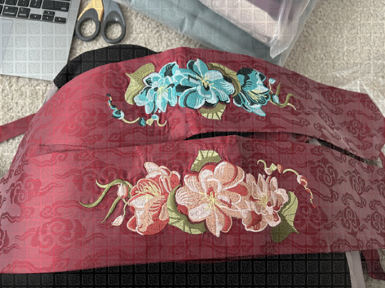
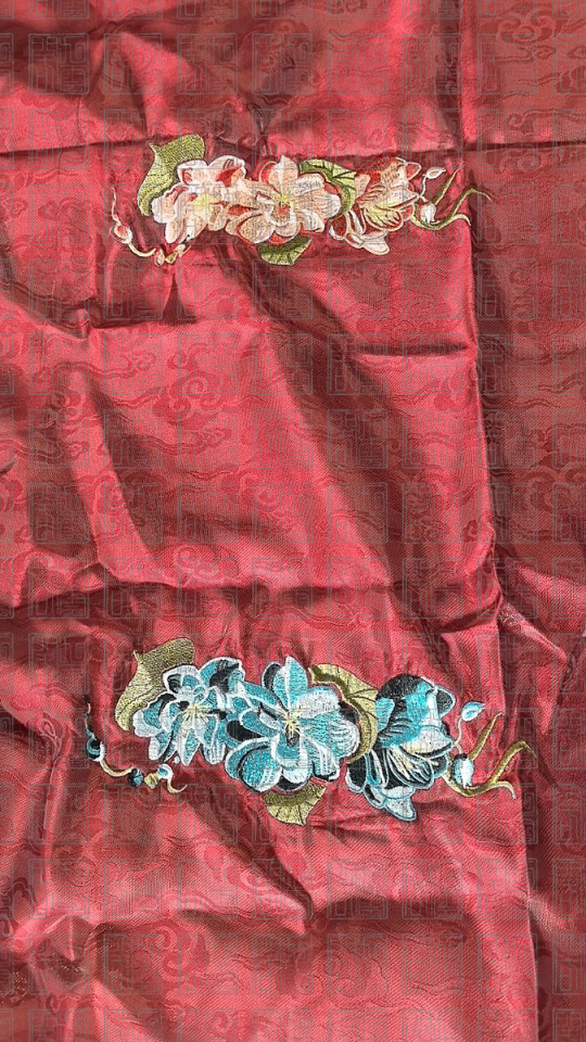
A yaofeng is a wide waist sash or 'corset belt' style thing. A pibo or peizi is a long piece of flowy fabric that acts as a shawl that women carry on their shoulders or elbows. The pibo didn't make it onto the set, but the yaofeng did. Its design is not that interesting (it's an extremely wide hexagon with ribbons sticking out of it to tie on your waist) so I will just let you use your eyes.
-
If you made it this far without your eyes bleeding you're doing better than me! This is the most technical part of the series—not much artsy symbolism going on but a lot of hanfu archaeology work. I am again very tired after writing this and am not sure if some of it is incomprehensible, but feel free to send me asks and stuff about it :) Only one post left to wrap it all together!
1 Introduction & Presentation // 2 Background & Influences // 3 Hair & Makeup // 4 Set Design // 5 Clothes & Accessories // 6 Conclusion
#hanfu#chinese hanfu#chinese fashion#hanfu fashion#hanyuansu#hanfu photoshoot#chinese history#hanfu art#long post#chinese#archaeology#relics#artifacts#northern & southern dynasty#魏晉南北朝#九雲閣#cloud9hanfu#cloud9 hanfu#青白之魅#legend of the white snake#snake#snakes#embroidery#digitizing#poqun#xiyi#褶衣#破裙#museum artifacts#patternmaking
152 notes
·
View notes
Note
Can we see the jacket? Please?
The outside is almost finished!!
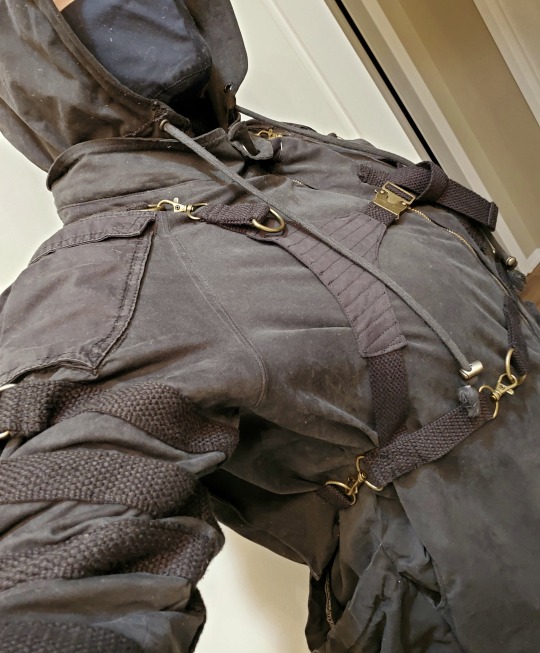
It's made out of multiple jackets so the blacks don't match up but I'm gonna pick up more black dye tomorrow and see what I can do about it!!
#I bought a jacket new and heavily modified it#Actually might have been easier to make it from scratch myself#But patternmaking is exhausting#I'm so excited for this to be done tho the whole thing shreds so hard#Haven't decided if I wanna transfer my battle jacket patches tho#Idk#Asks#teaboot selfies
911 notes
·
View notes
Text
"keep decreasing every fourth row until piece measures 38cm, then follow the armhole instructions while still decreasing every fourth row"
* at the end of the armhole instructions *
"you should now have 22 stitches"
NO. MAYBE I WILL NOT??? BECAUSE YOU GUYS DIDN'T TELL ME HOW MANY ROWS THOSE 38CM ARE. WHAT IF I DID ONE ROW TOO MANY?????????? I CAN'T EVEN
#julia.exe#knitting#psa to patternmakers: PLEASE work with row count and not length if you're gonna expect a certain number of anything at some point again#PLEASE
31 notes
·
View notes
Text
Can you believe it? 20dollarlolita Pattern School Step 2!
Only took me a year and a half. For people who don't remember a year and a half ago, we've started a project about learning to sew from patterns. The eventual goal is to help people become proficient enough at reading patterns to be able to tell what's going on in a pattern with instructions in another language, taking a pattern that doesn't fit and resizing it so that it does, and taking a pattern that isn't technically lolita and make it work in lolita fashion.
Step 1 was to make a non-fitted item from a commercial pattern. There were two goals of step 1: first to ensure that everyone was familiar with notches, grainlines, and other pattern markings; second was to give people experience with selecting fabric and trims to help give a non-lolita pattern a more lolita feeling.

For step 2, we're modifying a commercial pajama pants pattern into bloomers. In this step, we're going to become familiar with how to prepare a commercial pattern for modification, to compare pattern size to body size and to use your tape measure to judge added fullness, and how to do some basic flat pattern manipulation to add in style ease. Bloomers are a great first manipulation/fitted project due to the loose fit and the fact that, in most lolita applications, the vast majority of it is under your skirt and therefore invisible.
For this specific sample, I'm going to use Gertie's Harlow Pajama Pants pattern for this. I'm doing this because I bought a commercial pattern from Green Store and then promptly lost it, and these pajama pants are a free download. If you are printing the tiled version on your home computer printer, you only need pages 41-52 and 58-71, which will save you about 40 pages of printing.

I highly recommed doing some research and having a good idea of how long the bloomers you want to make should be, as well as how they are decorated. This is my research board.
You can use any pajama pants pattern that has a casing (elastic or drawstring) at the top, and no zipper. In this case, pants with a looser fit are going to be easier to turn into bloomers. If you like wearing your pants at a certain point on your body, I'd check for pajama pants that are at that waistline. The pants that I'm using are designed to sit at your natural waist, which might be too high for some people.

Your first step is to assemble and fortify your pattern. If you're printing this on copy paper, it's going to be strong enough, provided you use enough tape when tiling your pattern. If you're using a tissue paper pattern, like the kind you'd buy at the craft store, it helps to fuse some inexpensive interfacing onto the back of the pattern. We're going to work with these patterns a lot, so it's important to make them a little bit stronger.
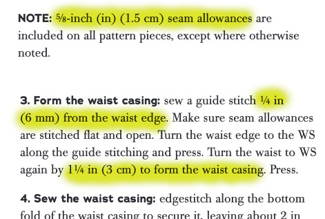
Now, you are going to need to go into your pattern instructions and find two important things. The first is your overall seam allowance. In most commercial patterns, this is 5/8 of an inch. Some other patterns might have different seam allowance.
The second is how big your elastic casing at the top will be. In this case, my seam allowance is 5/8" of an inch. Because my hem casing is .25"+1.25" (the amount you turn up plus them amount you turn up the second time), I know that my elastic casing will take up 1.5".

You're now going to mark on your pattern what the stitching line is. Your pattern has seam allowance included. This is very useful for when you cut out the pattern. However, if we take our pattern measurements with seam allowance, we won't have accurate numbers. So we have to clarify where the seam allowance is.
The first thing that I do (not pictured) is to write how much I'm removing along each line. In this case, I write 5/8" along the side and crotch seams, and "1+1/2" at the top where the casing is. Since we're going to drastically shorten these pants, it doesn't matter what the hem allowance is.
Then, I take my ruler, and I mark my stitching line. I do it in pencil, check that I'm correct, and then go back and re-draw it with a red marker. This helps me make sure that I'm following the correct lines.
Make sure you transfer your notches onto your new stitching line. You can see in the picture above how I'm using the ruler to measure where the notch is going to go.
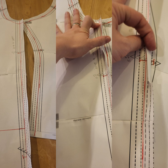
The next step, walking the pattern, is a little tricky to explain. Here's a post that goes into it in great detail.
Basically, you're going to overlap the seam lines, to make sure they line up. The only problem with doing this is that both seam lines are curved. So, instead of lining it all up at once, you're going to go about an inch at a time, letting the pattern rotate so that it stays flat on the table. At any given point, you're only going to have an inch or so of the line overlapping, but that's all you need. If you run into notches that don't line up, cross one out and re-draw it so that it matches the other notch.
If this seems really complicated, you don't really need to do that on this project. It just is a good practice to have.
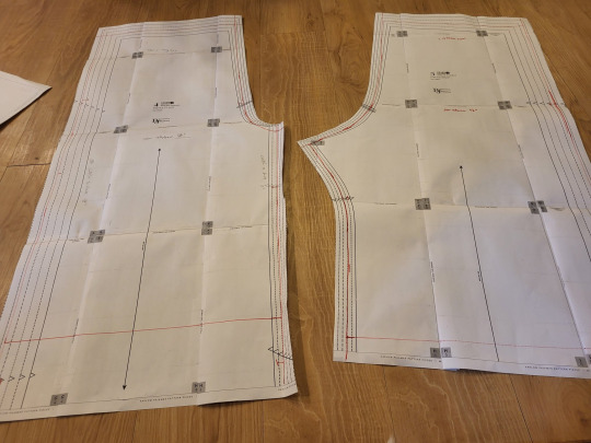
So you now should have a pattern with all the commercial markings, but where you've drawn the stitching line.

So now, you're going to put your two pieces together along the outseam. Since this is a pretty straight part of a pajama pant, it shouldn't be too difficult to get them to line up. Remember to overlap them on your stitching line, and not on the edge of the pattern.
We're putting them together so that you can measure them both at the same time. it saves us some math.

In bloomers, there are three major measurements to take into consideration. You need to know how big you want the leg to be, how big you want the booty to be, and how long you want the leg of the bloomer to be. In addition, you need to make sure that the waist of your pants will be big enough to fit your waist. In most pajama pants patterns, this isn't a problem, but checking it is good practice.
So, in this picture, you can see that I've measured the cuff of the pants. These two pieces together make up one pant leg, so I just need to measure the two pieces to know how big the pant leg will be.

I then take my tape measure and hold it around my leg at the same size that the pattern is at that point. I just use my eyes and judge if I think that'll be enough room to make my bloomers nice and poofy.
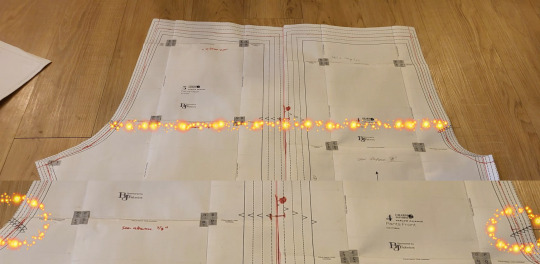
If your pattern doesn't tell you your hip line (mine didn't), it's usually at the point where the two notches on the crotch curve are. One of the reasons why we're doing this on a commercial pattern is that someone did the work for us and put those notches where they should be.
Now, remember, these two pieces are only half of the pant pattern. When we measure the hips of the pattern, we have to multiply this measurement by 2. Half the hip measurement x 2 is the full hip measurement.

Once again, hold this out next to your body and make sure that you like how much fullness you need. Remember that, in addition to having extra fullness because bloomers are poofy, you need room to be able to move and sit down. This measure between the size of my body and the size of the pattern looked pretty good to me. I could definitely have gone a little bit bigger.
The pant leg measurement is okay to be a little bit too long. You can always make it shorter. However, feel free to chop about 18" off the bottom of a full length pant leg. This just makes things a little easier.

Now, we're going to move the two pattern pieces until they're the size we like. If both the hip measurement and the leg measurement are too small, we're going to move both pattern pieces apart. To turn pajama pants into bloomers, this is likely to be the most common adjustment.
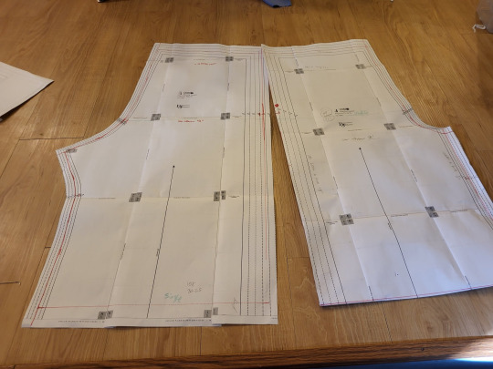
If the hip measurement is pretty okay, but the cuff measurement is too small, you're just going to move the bottom part of the pattern apart.
You'll notice that this is still enlarging the hip measurement a little bit. This is fine for bloomers since the style is for a lot of fullness in that area.

And if your cuff is the correct size, but your hip measure is too big, you can keep the cuff size the same and move the hip line apart until it's the size you want.
This technique of lining up the pattern pieces, and then moving them until they're the size you want, is the basics of flat patterning. As long as you follow the philosophy of keeping the measurements you like roughly the same, and moving the areas that you don't like until they measure what you need, you can easily resize a pattern without having to re-draw everything.
If you had to spread your pieces apart, tape some paper underneath the gap. This piece of paper should bridge the gap between the two pieces, turning them into one piece. Really quickly double-check that these pieces measure how you want. Then, mark a line in the middle of the paper bridge. Draw your notches onto the cut line. Cut the two pieces apart on that line. You've now made both pieces bigger. Tape another little piece of paper onto the cut edge of each piece, mark out your seam allowance, and cut that off.
Bonus points: swap the position of the pattern pieces, so that the crotch curve is one continuous line. Measure the length of that. Then, hold your tape measure along where the crotch curve of your pants will fit, and make sure that you have clearance there. I'm not going to photograph that, andi t's not super necessary with most pajama patterns.
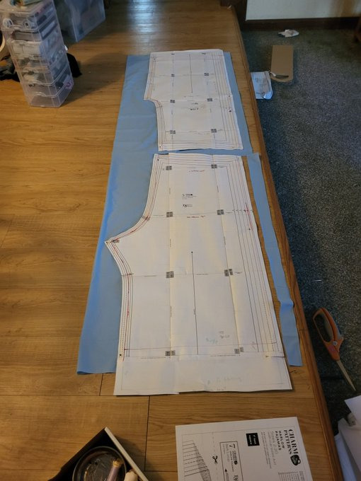
Go ahead and cut your pieces out.Even though I'd shortened the pattern, mine were still too long to fit on a 2-yard cut of fabric. Since I knew that my pants were a little long, I just let the end hang off the edge of the fabric.
Here's the really magical part about this. Even though you've resized your pattern, you still have all your seam allowance, notches, grainlines, and your pattern instructions. Since you kept all your pattern markings consistent, you can now follow the instructions that came with your pattern. Go up until it tells you to hem the pants, and then try them on.
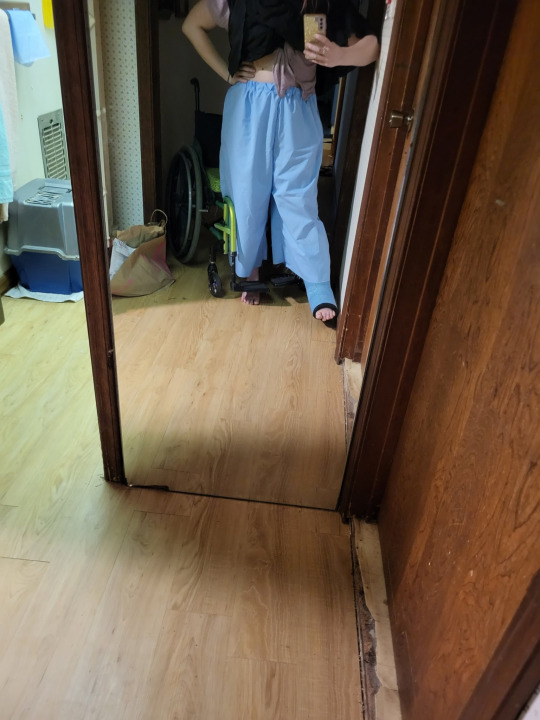
In my case, my pants were way too long to be bloomers. I knew that I wanted to do a casing with a heading, which does use s pretty big hem allowance, but even so, I'd need to shorten them.
Check out your bloomer research board to see how long you want them to be. I wanted some long ones that did the old-school bloomer peek, so I made them on the longer side. I also didn't want them to ride up into my butt when sitting in a wheelchair.
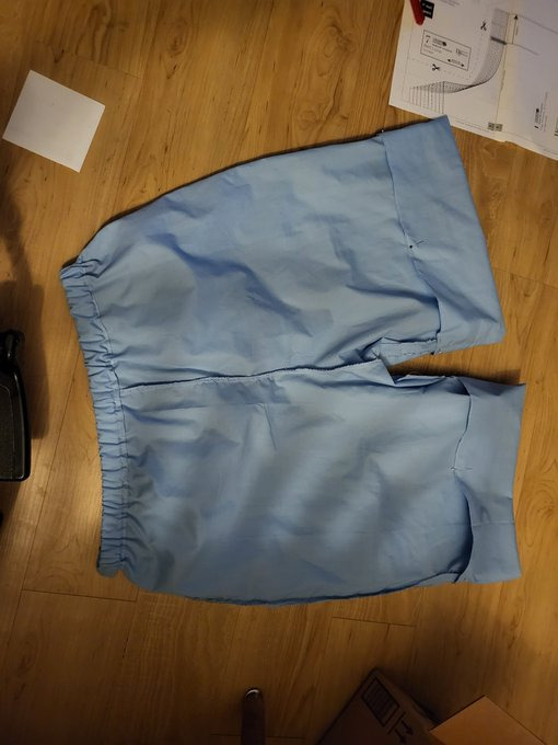
So, time to fold up the bottoms, add my elastic, and call the basic construction finished.
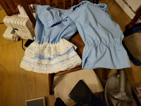
I looked up on my research board to try to find a good way to decorate these. One of the nice things about bloomers is that you can wear them with a wide variety of coords. This makes them one of those items where you can add some extra lace, and then use that lace in multiple coords. I feel like, since these bloomers are a good way of adding detail in multiple coords, it's a good excuse to add a little bit extra lace. You can see how much of a difference it makes in this picture. It really turns them from baggy shorts into real bloomers. I really recommend sometimes investing in a couple of big purchases of lace. If you have lots of lace on hand, you're more likely to include it in your projects, which can really help push a meh project into proper lolita fashion territory. I have a rule that I don't spend more than $1.50 a yard on lace unless it's really fantastic, and I manage to find things at that point on Aliexpress and sites like Cheeptrims.

Now go on and let them peek out of your favorite skirt. And remember, definitely don't press that skirt before putting this picture in your tutorial.
#20dollarlolita#dollar chan's pattern school#step 2#lolita fashion#patternmaking#handmade lolita#lolita bloomers#sewing tutorial#hey guys look i actually made somethign#long post
112 notes
·
View notes
Text
How to Make Your Own Sewing Patterns: A Beginner’s Guide with Free PDF Patterns
In this post you learn how to make your own sewing patterns. Have you ever wanted to sew your own clothes that fit you perfectly and express your personal style? If so, you need to learn how to make your own sewing patterns. Sewing patterns are the blueprints of your garments, and they allow you to customize the fit, length, and design of your clothes. You can create your own sewing patterns…
View On WordPress
#diyfashion#freePDFpatterns#handmadewardrobe#memadeeveryday.sewcialists#patternmaking#sewing#sewingblogger#sewingpatterns#sewingtutorial#sewistsofinstagram#sparrowrefashion#sparrowsews#sparrowstyle
92 notes
·
View notes
Text
Sewing adventures! I made an evening gown for myself, all the way from drafting the pattern to hand-sewing the finishes. It was very fun, challenging and very much not straight forward.
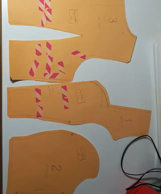
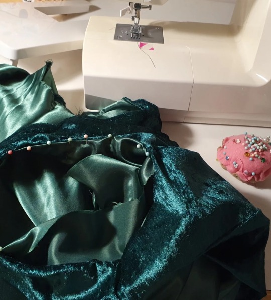
I had the inspiration a week and a half before an event I wanted to wear the new dress to, and I managed to finish it the night before. The first version was ready for fitting after one long day full of sewing, but I had to cut out the bodice and make a new one due to fit and fabric issues.
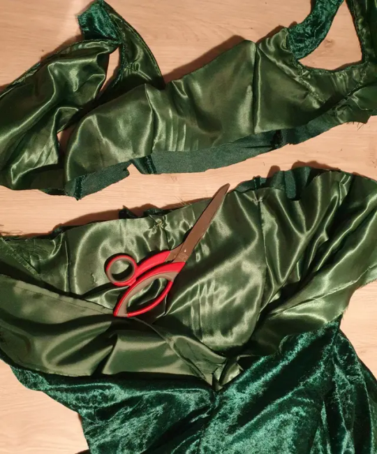
The fabrics were cheap polyester velvet that was knit = stretchy, and a shiny and slippery polyester fabric for the lining that was not stretchy (this stretch mismatch caused problems). The first version had continuous panels all the way from the neckline to the hem, and the weight of the skirt stretched the bodice out of shape so that I had a really hard time attaching it to the lining at the armholes.
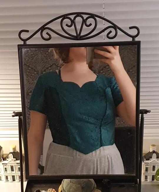
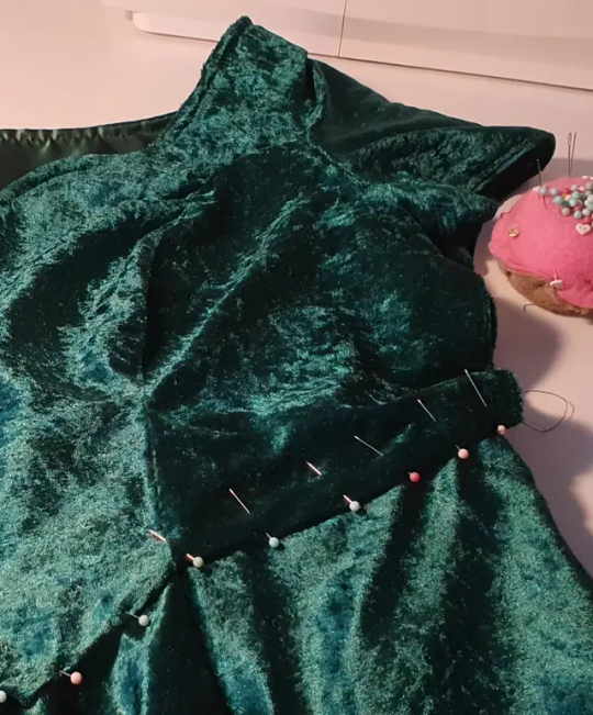
So I adjusted the pattern to have a waistline to help support the weight of the skirt by attatching it to the lining, and added sleeves so that I didn't have to attatch the dress to the lining at the armholes. And I got extra practice with sewing the invisible zipper, which was originally in the back seam, but that I moved to the side for the final version, eliminating the need for a seam at the center back.

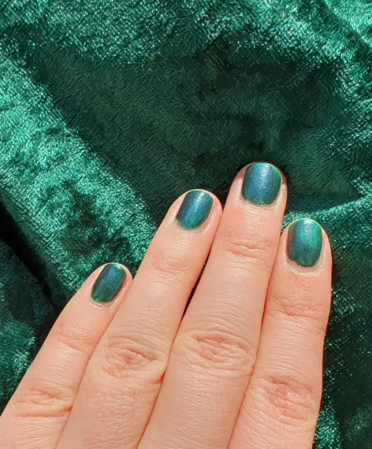
Here's the final outfit! I also painted my nails to match the dress and I was very happy with how closely I managed to match the colour.
The base for the pattern, a princess-seamed bodice block, is from freesewing.org. It's a fantastic website that lets you generate sewing patterns to your measurements, and there's tons of customisation, tweaks and design options to choose from for each pattern. Highly recommend! They also have a paperless option, that gives you all the lengths of the sides and points on the patterns so that you don't even have to use a printer. I traced the pattern pieces to paper by hand that way!
#is this a good way to write image descriptions?#sewing#patternmaking#fashion#fashion design#freesewing.org#freeweing#freesewing noble#freesewingnoble#craftsofsiri#mine#fiber arts#image description in alt
46 notes
·
View notes
Text
wearing my snail bag as a hat as a subtle nod to dadaist and absurdist movements
#purely making this weaksauce post to mention i made a snail bag (for an assignment on zero-waste patternmaking)#but it is a snail!!! and a bag!!! and a hat!!!(not really but it being on my head makes me happy)
8 notes
·
View notes
Text

Another view from the skirt.
#fashion#sewing#craft#sewingpattern#sewingproject#patternlabel#patterndesigner#patternmaker#patternmaking#pattern testing#patterntestingcall#skirtpattern#skirt
5 notes
·
View notes
Text

I’m not avoiding company.
I’m “working.”
Anyways, working on a basic shirt pattern for my big boys.
#adhd problems#she pissed me off last time#bjd#abjd#dragonsdelightstudio#dolls#bjdoll#bjdphotography#doll#legit bjd#legitbjd#dollstagram#patternmaking#bjd sewing#sewing
9 notes
·
View notes
Note
Would you mind teaching us how to make patterns? I've been wanting to do something like that with some of my childhood toys but I can't figure it out :( I hope you have a wonderful day either way!
sure thing!! the way i get patterns from toys (and any other object really) that i don't want to take apart is actually a technique i learned from fursuit making, though it's used in many craft circles!
basically what you do is carefully tape up half of the object (you only need half as long as it's symmetrical) mark them with seamlines and any important stuff (like what the piece is and what direction is up! it may be hard to tell once they're off) and then cut out the tape along the seams, and there you have your pieces! it helps to reference the uncovered side of the plush to see where the seams are.
it can help to put down a layer of plastic wrap before taping so it doesn't stick to the toy. fursuiters will use duct tape, but for small things like dolls i like to use masking/painters tape or washi tape! depending on the material of the plushie you're copying you may not even need to use plastic wrap (as long as the tape peels off of it easily. i wouldnt recommend that for old or delicate toys.) if you don't use plastic wrap you'll just have to stick the pattern pieces down onto some paper afterwards, which works well since there may be some "shoring up" required anyways (making curves nice etc.)
here's a video about it in case you need a visual! starts at 0:45
youtube
and so now you can make fabric patterns of stuff! if you're taping an original sculpture/object to make your own plushie pattern, you'll need some knowledge of where the seams should go so that the pieces lie flat, and for this i have not much advice but to study how other toys are constructed and see what lies flat when you cut it out. you can always tape a dart or seam back up to snip it somewhere else, so go ahead and experiment!
48 notes
·
View notes
Text
Self-Drafting Palazzo Pants for Perfect Fit + Video
2 notes
·
View notes
Text
Chocobo cross stitch finally starting to look like I know what I'm doing instead of Pure Chaos

Shoutouts to my little birb friend the needleminder I got today!

#the blue marker washes out in water#also shoutouts to the magnet board I found between my mom's old embroidery stuff#still not looking too interesting tho#yellow splash with the beginnings of an outline#also mary do not forget that that top row is only half done#mary stitches a chocobo#also yes the pattern itself is a bit of a mess because I adapted it from some free generator#by using ms paint to edit#instead of like#finding actual patternmaking software#cross stitch#embroidery#final fantasy vii
7 notes
·
View notes
Text
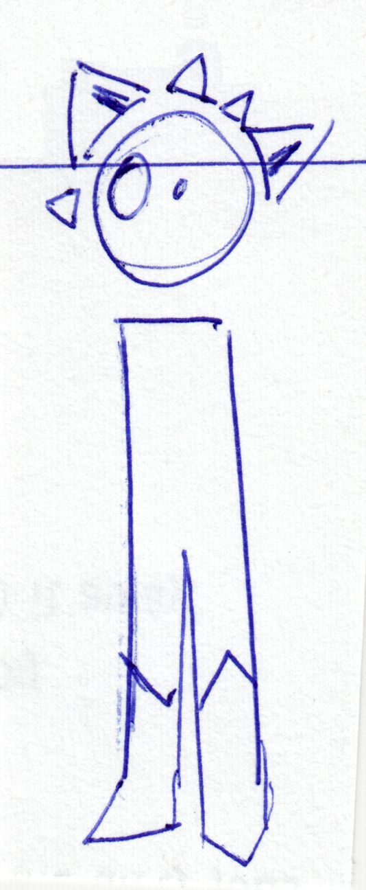

Just a mini Faze post this time, but this one includes my first sketches for a Faze plushie! Which is something I really really want to make and have been constantly looking for materials for.
#mx creations#traditional art#original art#oc#Faze#Fazestory#plushie matters are complicated & the worst part is patternmaking#before I make this guy there's another plushie I'm making for practice though#one that I already have all the materials for too
2 notes
·
View notes
Text
Fast couple of things about fashion flats, specifically inspired by an indie patternmaker who is well known for offering patterns that no one can actually tell what they'll look like when they're made.
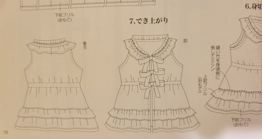
Fashion flats are a kind of fashion illustration designed to accurately show the detail of a garment. It's a picture of the garment, as if it was sitting on a flat surface, where all details are shown. This one is from Otomo no Sewing.
.1. Fashion flats should be drawn in proportion of a real human being. These are not the traditional 20-heads-tall illustration body. Your template that you use (and yes, you should use a template) should have real human proportions.

This specific template isn't particularly ideal, because it's just me tracing a picture of a person. If you're making a flat to communicate things for personal reasons, downloading a mannequin online is a totally good options. If you're a pattern company, you might want to make your own. Please reference a real human when you make your template, so that your flats are actually usable.
2. Your flats should all be in proportion to each other. If you're drawing a collection of garments, each garment should be drawn with the same reference template. If one shirt is shorter than another, then your illustrations should reflect that. If you are a pattern company, all your flats should be drawn as if they're going to be worn by the same model. This will allow people to see that the bustline on some patterns is higher than the bustline on other patterns by the same company.
.3. A flat is not a picture of a garment on an invisible body. A flat is a picture of the garment lying flat on a surface. When you're drawing a garment on a person, the waistline will be curved, because it's wrapped around the person. When you're drawing a garment lying flat, the waistline should be a straight line, because it's lying flat. In the language of fashion flats, a curved waistline means that the waistline is actually sewn with a curve.

.4. Whenever possible, you should draw your flat by laying the actual garment on a flat surface, and drawing what you see. You must still use your template for this, to make sure you draw bustlines at bustlines and waistlines at waists, but you should just draw the things you see.

.5. Trace things whenever possible. If your garment is symmetrical, your flat should absolutely be symmetrical. Draw half of the garment, fold your paper in half, and trace that half onto the other side. The front of the garment will always be attached to the back of the garment, so finish yoru front view, and then trace the outline of your front view. Fill in the details and you have your back view.
.6. While a well-done flat is a piece of art, the art in fashion flats is not in interpretation. It is in accurate and effective communication. Someone who is really good at flats is not pouring their heart and soul and creativity into their work. Someone who is really good at flats is someone who can capture all the detail accurately, and who can do that quickly. A flat is the equivalent of a 12pt Times New Roman document that lists the ingredients you need for zucchini bread: its purpose is to communicate meaning, not to show itself off. Your fashion collection or pattern company can show its uniqueness and style in so many other ways; just let the flats communicate the info they should be communicating. You don't need to typeset your instructions in webdings or the font metal bands use for their names, and you don't need to make your flats kawaii.
#20dollarlolita#patternmaking#not to call c/s out specificaly#unless someone wants a breakdown of where their illustations go wrong
100 notes
·
View notes
Text
SPIDER FIT CHECK: SPIDER-GIRLS
Alright time to do more of these! This post will include Mayday Parker, Anya Corazon, and Annie Parker!

Spectacular Spider-Girl: 12/10
I am incredibly biased towards the Sensational suit on Ben but God damn Mayday wears it so much better. Wearing her Uncle Ben's suit is a great call back to both Peters original inspiration to become a hero in the first place, while also separating her costume from her fathers.

Black Suit Spider-Girl: 10/10
Symbiote suits are tight as hell. Sleek design, sometimes less is more.
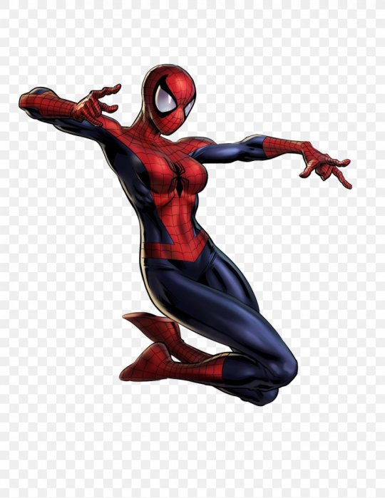
Mayday Parker Spider-Woman: 5/10
I....May, this is just your dad's suit. I dont hate it of course, the Spider-Man suit is a banger but like, there's zero personality here.
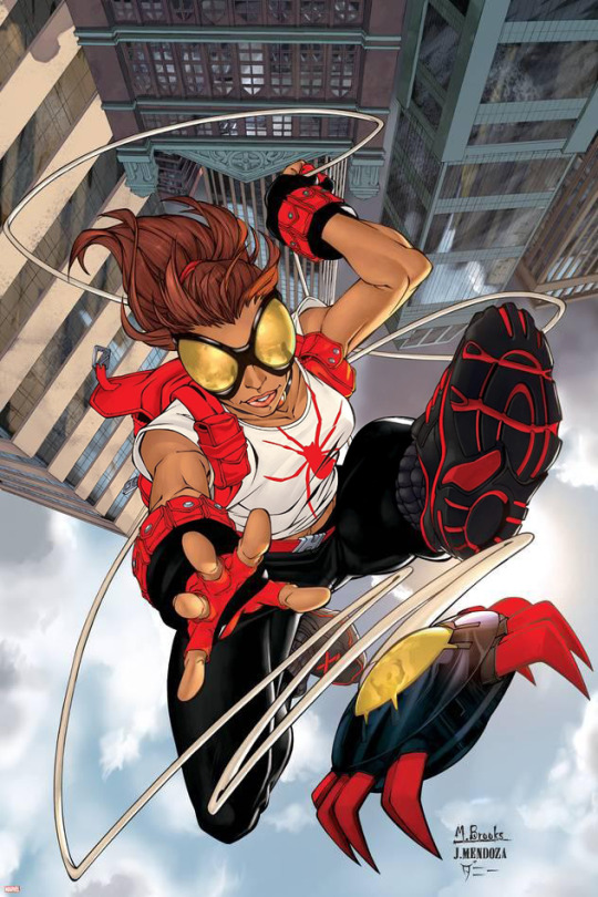
Araña, Anya Corazon: 7/10
I love the Bulky wrist pouches and the red gloves, no clue how no one recognizes her in this though. Still a fun street wear costume!
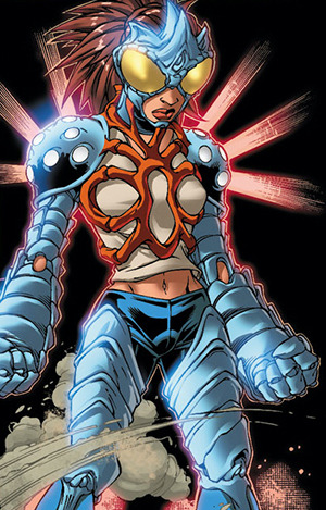
Araña (Exo Suit): 8/10
I love how organic this armor looks, the huge bug eyes are really fun, I just wish she got a mouth covering to go with it.

Anya Corazon Spider-Girl: 10/10
Once again, the black costumes are always sick as hell.

Araña (2023): 10/10
I really like this revamp! Keeps the stuff from the old suot that worked, but actually bothering to give her a super suit this time lol
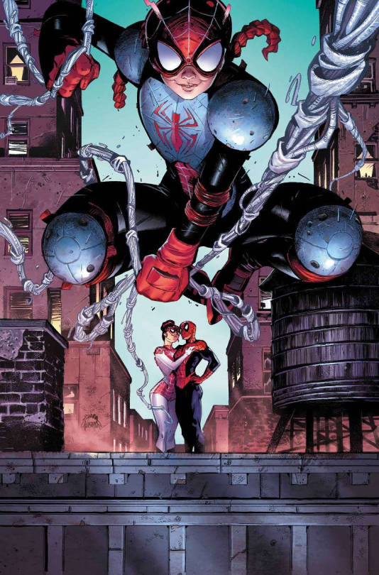
Annie Parker, Spiderling: 6/10
I understand the concept behind this suit, she isn't ready for a full suit just yet. And Peter and MJ giving their daughter hockey pads and a bike helmet is hilarious. Doesn't mean it makes for a great super suit tho

Annie Parker Patternmaker: 7/10
Making her color primarily blue is very nice along with the accents of red webshooters, but- you guys really should've given her a real mask.
#marvel#comics#across the spiderverse#spider man#ben riley#spiderverse#mayday#spider woman#spider girl#anya corazon#annie parker#patternmaker#araña
30 notes
·
View notes