#pantone serene
Note
What is your favourite colour?
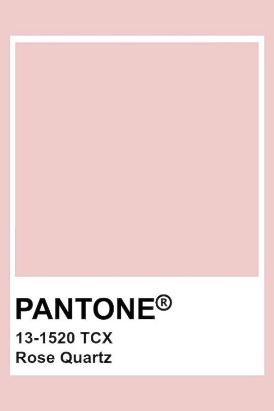
To me it is the most perfect warm and embracing, soothing gentle rose tone ever ♡
#do you remember when#Pantone#color of the year#was#(were)#rose quartz#and#serenity#(or I should say the blending of those 2 colors)#the most perfect combo ever#if you ask me#I think it was back in 2016#thank you for asking lovely anon#answered
25 notes
·
View notes
Text
Prints are finally available!
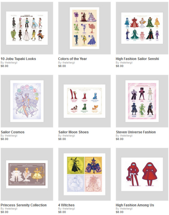
My INPRNT shop is here! If you've been wanting to buy my EEAAO fanart or any of my fashion collections, now's the time! If there's some of my other art you'd like to buy as a print, let me know 😊
#eeaao#steven universe#sailor moon#princess serenity#pantone#pantone color of the year#color of the year
20 notes
·
View notes
Text
Tumblr oldies talk about their custom themes they haven’t updated and are never updating I’ve had Yuri and Kail on my blog since 2015 and I’m never taking them down. “You’re mostly a book blogger now. Nobody even knows who those characters are” who gives a shit. Get niche 90s historical romance josei manga’d, idiot
2 notes
·
View notes
Photo

The Archer’s 1000 Picspam —> 264: Pantone’s 2016 Color of the Year, Rose Quartz and Serenity
As consumers seek mindfulness and well-being as an antidote to modern day stresses, welcoming colours that psychologically fulfill our yearning for reassurance and security are becoming more prominent. Joined together, Rose Quartz and Serenity demonstrate an inherent balance between a warmer embracing rose tone and the cooler tranquil blue, reflecting connection and wellness as well as a soothing sense of order and peace.
Pantone Colors over the Years
#thearchers1000picspam#pantone color of the year#pantone#pantone color#rose quartz#serenity#pillows#cherry blossoms#airplane#person#male#female#group#text#pattern#Japan#paintbrushes#phone#clouds#pool#water#sky#kpop
17 notes
·
View notes
Text
"Will I have the choice to decide?
If I wanna believe like my life is mine"
My (unpopular) take on zodiac vibes, part 7 ♎️✨️
#zodiac#astrology#horoscope#libra#vibe#pantone color: serenity#it speaks for itself pretty much but hashtags are here for a reason and i intend to abuse that#most libra i know give people around them a peace of mind like no others#if you're having a life crisis call up your libra#don't ask them basic questions like where do you wanna hang out or what would you like to eat tho#can't decide shit on spot in their personal life if said life depended on it#it's wholesome & i love them#how do i tag it's 3am#why tho#lyn lapid#infinite#mood#aesthetic#digital collage#Spotify
0 notes

Text
Writing Notes: On Colour
Describing Colour in your Poetry and Stories
BLACK Shadow Black, Dusk, Midnight, Blackbird, Blackberry, Ebony, Black Honey, Darkness, Jet Black, Ink Black, Soot, Onyx, Licorice, Ivory Black, Pitch, Char, Gloom, Outer Space, Creosote Black, Melanite, Goth Black, Gunpowder
BLUE Blueberry, Sapphire Blue Metallic, Tiffany Blue (Pantone 1837), Cobalt Blue, Denim, Aquamarine, Turquoise, Sky Blue, Topaz, Ultramarine Blue, Azure, Cerulean, Oxford Blue, Periwinkle, Electric Blue, Baby Boy Blue, Pthalo Blue, Robin's Egg Blue, Persian Blue, Marino Blue, Prussian Blue
GREEN Leafy Green, Olive, Moss Green, Jade, Lime, Sour Apple Green, Emerald Green, Mint, Kiwi Green, Phthalo Green, Praying Mantis Green, Viridian, Greenback, Shamrock, Sap Green, Chartreuse, Sea Green, Pistachio, Teal, Bamboo, Sea Salt, Celadon Green, Celery, Asparagus Green, Fern Green, Neon Green, Jungle Green, Pear Green
ORANGE Pumpkin, Burnt Orange, Carrot, Sunset Orange, Tangerine, Persimmon, Salamander, Tennessee Orange (Pantone 151), Jack-o'-lantern Orange, Florida Orange, Summer Squash, Pale Daffodil, Smashed Pumpkin, Saffron, Autumn Orange, Macaroni and Cheese, Cadmium Orange
PINK Pink Flamingo, Neon Pink, Bubblegum Pink, Salmon, Peach, Fuscia, Cotton Candy Pink, Rose, Carnation, Thulian, Apricot, Atomic Pink, Barbie Pink, Hot Pink, Amaranth, Flushed, Glitter Pink
PURPLE Lavender, Purple Haze, Grape, Eggplant Purple, Plum, Violet, Orchid, Psychedelic Purple, Amethyst, Lilac, Boysenberry, Mulberry, Wisteria, Bruised Plum, Indigo, Mauve
RED Blood Red, Copper, Maroon, Strawberry, Watermelon Red, Crimson, Candy Apple Red, Tomato, Brick Red, Scarlet, Cardinal Red, Cherry, Ruby Red, Coral, Sunburn, Hot Lava, Cadmium Red, Auburn, Blush, Alizarin Crimson, Fire Engine Red, Raspberry, Vermillion, Lipstick, Burgundy, Magenta, English Vermilion, Mahogany
WHITE Dirty White, Albino, Chalk, Alabaster, Cotton, Titanium White, Vanilla, Bone White Egg Shell, Marshmallow, Ivory, Pearl White, Almond, Champagne, Blond, Cream, Milky White, Corn Silk, Bleach, Navajo White, Ghost White, Light, Cloud White
YELLOW Canary Yellow, Lemon, Banana, Egg Yolk Yellow, Mellow Yellow, Chanterelle, Mustard Yellow, Corn, Goldenrod, Amber, Pineapple, Metallic Gold, Cadmium Yellow, Wheat, Tuscan Sun, Butter, School Bus Yellow, Yellow Ochre, Citron, Dandelion
BROWN Mud Brown, Beaver, Caramel, Rust, Macaroon, Toasty Brown, Coffee, Sandy Tan, Cocoa, Honey, Chocolate, Burnt Sienna, Mocha, Seashell, Antique Brass, Bronze, Brown Sugar, Chestnut Brown, Taupe, Burnt Umber, Khaki, Dark Sienna, Light Chocolate, Sepia
GRAY Stone Gray, Ash, Metallic Silver, Platinum, Smoke, Concrete Gray, Mercury, Steel Gray, Mist, Titanium, Charcoal, Slate, Sterling Silver, Tungsten, Old Coin Gray, Iron Gray, Chrome, Magnesium, Overcast
MIXED Candy Cane (red and white), Zebra (black and white), Chameleon (many different colours), Ladybug (black and red), Wildfire (yellow, orange and red), Tiger (orange, black and white), Yellow Jacket (black and yellow), Christmas Lights (red, white and green), Rainbow (red, orange, yellow, green, blue, indigo and violet), Black Pepper (black and gray), Leopard (spotted gold and black), Creamsicle (orange and white), Candy Corn (orange and white), Iceberg (a bluish gray), Marbled
COLOURS: Symbolisms, Associations & Psychological Effects
Black. Especially in Gothic literature from the West, a black colour choice often represents death, evil, grief, and depression. Associated with fear, the unknown and often has a negative connotation. Black clothes can make you look thinner. A black background severely diminishes the readability of most type. Often the go to colour for funerals and grieving. It symbolizes stability and power, which gives a sense of authority. Thus, the black colour often represents professionalism and expertise.
Blue. Has positive and negative connotations in colour psychology. Some writers may use blue to represent serenity and tranquility, instilling a scene with a calming effect. Blue can also signify sadness, melancholy, or isolation. People who find someone very loyal and faithful are often called "true blue". Blue is often considered to be more masculine which is why it is often the colour of choice when choosing a suit. Lighter blues are associated with tranquility, softness and healing. Darker blues are associated with power, knowledge and seriousness. Blue is actually shown to suppress appetites a bit. The colour blue symbolizes wisdom and hope. It’s the colour of peace and confidence. Blue has been shown to reduce blood pressure and pulse rate. It fosters serenity and a sense of belonging.
Green. The colour green often symbolizes rebirth, growth, peace, jealousy, and greed. Green colours may also represent spring and renewal. It is a colour that is very easy on the eyes. Dark green is often associated with ambition. Green suggests stability, safety and hope. At the same time, it may denote a lack of experience in a particular field. Green symbolizes peace, growth, and nature. It is the colour of success, promoting healing and tranquility.
Orange. The colour orange often represents energy, excitement, joy, and creativity. Since orange is the colour of fire, it may also symbolize heat. Since orange is not as aggressive as red, it can actually stimulate brain activity. It is very useful to catch someone's attention, which is why it's used a lot to advertise food and toys.
Pink. The colour pink symbolizes love, kindness, femininity, innocence, and playfulness. Certain shades of pink can limit aggression. Pink may be associated with unconditional love and caring.
Purple. Often associated with royalty, the colour purple symbolizes bravery, spirituality, and luxury. Light purple usually brings up romantic or nostalgic feelings; while a darker shade can make you feel gloomy or sad.
Red. The colour red symbolizes some of the most powerful human emotions, like passionate love or lust. On the other side of the spectrum, this warm colour is also the colour of blood, often symbolizing anger, danger, and violence. It stimulates the appetite.
Red is an emotionally intense colour associated with energy, danger, anger, passion and determination. The symbolic meaning associated with the colour red is passion, excitement, and love. It’s the colour of urgency, power, and desire. Red is said to boost hunger and is believed to inspire confidence and excitement. This colour has also been found to increase blood pressure and heart rate.
White. This primary colour traditionally symbolizes innocence, peace, and cleanliness. In Western cultures, the colour white also represents purity and virginity, while it symbolizes mourning in some East Asian cultures. Usually has positive connotations when used and thought of as safe. Associated a lot with healing, simplicity and sterility, which is why it's used in hospitals and healing centers as much as it is. The symbolic meaning of the colour white is truth and sometimes even indifference. It encourages feelings of safety and cleanliness. Clean, white clothes and linens show sterility since stains are easily visible. That’s why doctors and nurses frequently wear white lab coats and scrubs.
Yellow. Writers may use the colour yellow to symbolize creativity, happiness, optimism, and warmth—think of a yellow ray of sunlight poking out from a dark cloud. A common negative connotation of the color yellow is cowardice, popularized by the phrase “yellow-bellied.” Warming effect which stimulates body and mind. Gold is associated with the highest of luxury. When bright yellow is used with black it's one of the easiest colour combinations to see from long distances; when uses with lighter colours it's not so easy to see. Yellow ribbons are worn as a symbol of hope and used quite often to welcome home loved ones. Yellow is the colour of warmth, kindness, and happiness. It’s often associated with optimism and well-being and promotes energy.
Brown. This warm, earthy brown colour may symbolize dependability, comfort, and a sense of being grounded. Brown is also a neutral colour, and writers may use it to represent dullness and predictability. Brown is a colour that is related to very grounded traits such as simplicity, practicality, common sense and hard work. Can also be associated with those that are frugal and not too flashy.
Gray. Lighter grays are often thought of as more feminine while darker grays more masculine. Gray is considered by many to be a neutral colour; the perfect balance between light and dark / good and evil. Pop up the lighter grays and add a little shine to it, and thought immediately turns to silver, which correlates to wealth.
Sources & other related articles: 1 2 3 4 5
If these writing notes helped with your poem/story, please tag me. Or leave a link in the replies. I'd love to read them!
#writing#writing tips#writeblr#writers on tumblr#poets on tumblr#creative writing#poetry#literature#writing prompt#words#lit#color#colour#spilled ink#writing reference#langblr#studyblr
176 notes
·
View notes

Text
SERENITY: Cropped Sweater v1 recolored in the Pantone 2020 Palette

all 28 swatches from the pantone 2020 palette by @butternutsims

requires mesh: here by @serenity-cc
download
@maxismatchccworld
(also btw they're add-on swatches)
3 notes
·
View notes
Text

PANTONE Colors of the Year 2016
ROSE QUARTS 13-1520 & SERENITY 15-3919
2 notes
·
View notes
Text
The Impact of Color on Fashion Trends

Color is one of the most powerful elements in fashion design. It influences emotions, defines seasons, and sets trends. From the bold hues of runway collections to the subtle shades of everyday wear, color plays a crucial role in shaping fashion trends. Understanding how color impacts fashion trends can help designers create compelling collections and stay ahead in the competitive fashion industry. In this article, we explore the impact of color on fashion trends and how it drives the industry.
The Psychology of Color
Color has a profound psychological effect on individuals and can influence their moods and perceptions. Designers use color strategically to evoke certain feelings and responses:
Warm Colors: Colors like red, orange, and yellow are associated with energy, warmth, and excitement. These colors often dominate in fashion collections aimed at making bold statements or evoking a sense of vitality.
Cool Colors: Blues, greens, and purples are linked to calmness, tranquility, and sophistication. Cool colors are frequently used in fashion to create serene and elegant looks.
Neutrals: Shades such as black, white, gray, and beige are versatile and timeless. Neutrals serve as a backdrop for other colors and are essential in creating balanced and refined outfits.
Seasonal Color Trends
Fashion trends are often dictated by the changing seasons, and color plays a significant role in reflecting seasonal moods and themes:
Spring/Summer: These seasons typically feature vibrant and fresh colors. Bright hues like coral, turquoise, and lime green are popular in spring and summer collections, capturing the essence of renewal and energy.
Fall/Winter: As temperatures drop, the color palette shifts to warmer, richer tones. Deep shades such as burgundy, forest green, and mustard yellow are prevalent, evoking a sense of coziness and depth.
Pantone Color of the Year: Pantone’s annual color forecast has a significant impact on fashion trends. Each year, Pantone selects a color that symbolizes the current cultural climate and influences design trends across the industry.
Color and Trend Forecasting
Trend forecasting agencies analyze various factors to predict color trends for upcoming seasons. These factors include cultural shifts, technological advancements, and societal changes. Fashion designers rely on these forecasts to align their collections with anticipated color trends.
Influence of Cultural Events: Major cultural events, such as political movements, sports events, and global issues, can influence color trends. For example, colors reflecting social awareness or environmental concerns may emerge as trends.
Technological Innovations: Advances in technology, such as new dyeing techniques and fabric developments, can introduce new shades and finishes, impacting fashion color trends.
Consumer Preferences: Changes in consumer behavior and preferences also affect color trends. Designers must stay attuned to these shifts to create relevant and appealing collections.
Implementing Color Trends in Fashion Design
Designers use color trends to create cohesive and impactful collections. Here’s how to effectively incorporate color trends into fashion design:
Color Palettes: Develop a color palette that reflects current trends while maintaining your unique design identity. Combining trendy colors with classic shades can create balanced and innovative looks.
Fabric Choices: Experiment with different fabrics to see how colors appear in various textures and finishes. The way a color interacts with fabric can affect its visual impact and appeal.
Accents and Accessories: Incorporate trendy colors into accessories, such as handbags, shoes, and jewelry, to add pops of color to your designs. This approach allows you to stay on trend without overwhelming your collection.
Seasonal Collections: Tailor your color choices to the season and target audience. Ensure that your color selections resonate with the current cultural and consumer climate.
Conclusion
Color is a fundamental element in fashion design that drives trends and influences consumer preferences. By understanding the impact of color and staying informed about color trends, designers can create compelling and relevant collections that resonate with their audience. Embracing color trends allows designers to innovate and maintain a strong presence in the fashion industry.
Are you passionate about fashion design and eager to learn more about color trends and their impact? Join the best fashion design college in Kolkata, the Indian Institute of Fashion & Design - IIFD and gain comprehensive knowledge about fashion design, including the crucial role of color in shaping trends. Our expert faculty and cutting-edge curriculum will equip you with the skills needed to excel in the fashion industry.
Enroll today and start your journey toward mastering fashion design with IIFD!
#Fashion Trends#Fashion Trend#Fashion Design Trends#Fashion Designing#IIFD#iifd kolkata#Career#Fashion Education#Fashion Design Future#education#fashion design#fashion
0 notes
Text
0 notes
Text

Finally changing my header image for the first time in… three years? Four?
#could this mean a color scheme update?#for the first time since 2016?#unlikely but#I know it was 2016 because it’s Pantone rose quartz and serenity blue#which were the colors of the year that year LMAO
1 note
·
View note
Photo

The Archer’s 1000 Picspam —> 271: Pantone’s 2010 Color of the Year, Turquoise
Combining the serene qualities of blue and the invigorating aspects of green, Turquoise inspires thoughts of soothing, tropical waters and a comforting escape from the everyday troubles of the world, while at the same time restoring our sense of wellbeing. In many cultures, Turquoise is believed to be a protective talisman, a color of deep compassion and healing, and a color of faith and truth, inspired by water and sky. Through years of color word-association studies, we also find that to many people, Turquoise represents an escape, taking them to a tropical paradise that is pleasant and inviting – even if it is only a fantasy.
Pantone Colors over the Years
#thearchers1000picspam#pantone color of the year#pantone color#pantone#turquoise#blue#tropical#gemstone#water#birds#fashion#dress#candy#stars#lollipops#shell#roses#dye
17 notes
·
View notes
Text
Beating the Heat: Top 3 Trending Colors for Women’s Summer Clothes
As the summer heat intensifies, it is time to update your wardrobe with colors that can deflect sunlight and help keep the heat down. Know about the top 3 trending colors for women's summer apparels at online stores like Columbia Outlet, which can help beat the heat in style.
Icy Blue
Icy blue is a refreshing and calming color and topping the trend chart. This cool hue evokes images of tranquil beaches representing calmness and serenity. It can evoke a sense of sophistication and reliability. It is a popular choice for summer dresses, t-shirts, and skirts. Icy blue apparels from Columbia Outlets Online store can be easily paired with white bottomwear or denim for a classic and effortless look.
Peach Tones
Peach and coral tones are big this year with Peach Fuzz being the Pantone Color of the year in 2024. The different peach tones- from subtle peach or coral varieties to bright tangerine, it is dominating spring/summer 2024 fashion pieces. A chic orange t-shirt from Columbia Outlet Factory, paired with white shorts or pants can make a bold fashion statement.
Shades of Green
Whether it is fresh mint green, khaki green, mixture of gray and green, forest green or emerald green – the color green and its multifarious shades is having their moment now. Green never goes out of style, and you can find exclusive fashion clothing pieces in the spring/ summer Columbia sale collection. The different shades of green represent freshness, renewal, balance, and harmony. Columbia Outlet Online store dresses have a unique collection of dresses and pairs in this subtle color.
Stay cool and stylish this summer with dresses available in these refreshing colors from Columbia Clearance sale, and beat the heat in style.
0 notes
Text
Elevate Your Home with the Latest Curtain and Blind Trends
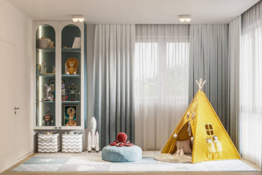
Homeowners are looking into a variety of cutting-edge window treatment solutions this year that combine design, utility, and individual flair. Modernizing your blinds and curtains can completely change the look and feel of your rooms while also providing useful advantages. These are the hottest styles for best curtains and blinds in melbourne in 2024.
Earth tones and Natural Materials
In interior design, natural materials are becoming more and more popular. Deep, rich tones of stone, marble, and terracotta are trendy, and they go well with window treatments made of linen, bamboo, and other organic textiles. These earthy color schemes create a warm, welcoming ambiance by adding depth and warmth. Peach Fuzz, the soft pink-orange Pantone Color of the Year, is becoming a popular option for Roman blinds in Melbourne and drapes that want to add a subtle yet eye-catching detail.
Vibrant Patterns and Maximalist Designs
Against the natural trend, maximalist and aggressive styles are also gaining traction. Vibrantly colored luxurious velvets and eye-catching designs like zebra and leopard prints are returning. Consider combining midnight-blue silk with sheers with Aztec patterns for a striking look. This style promotes audacious texture and pattern experimenting, which makes for distinctive and eye-catching interior design.
Accepting Textured Materials
The capacity of textured fabrics to give a space depth and coziness is making them more and more popular. Textured materials improve the tactile feel of your surroundings; examples include rich velvets and linens, as well as natural open weaves and embroidered fabrics. By layering various textures, you can make your window treatments stand out and create a visually appealing and inviting space.
Stratified Color Schemes
As the appeal of monochromatic interiors declines, layering colors is becoming increasingly common. Various tones and colors combined produce an appearance that is vibrant and rich. Warm color schemes, which are frequently emphasized by colder tones, offer a well-balanced and adaptable look. To give your decor depth and individuality, try combining sheers and curtains in complementing hues.
Shiny Accents for a Glam Look
Window treatments can now sport a glamorous and sophisticated touch thanks to the return of metallic accents. Popular options include metallic-threaded fabrics, glittering grommets, and glossy beading. Your window coverings will appear instantly better with these accessories, creating luxurious focal points for your house.
Light-filled, minimalist spaces
The emphasis on light, airy, and peaceful spaces is what makes minimalism a major trend even now. This style is accomplished with the use of soft finishes, subtle reflective textiles, and crisp whites. Choose light-reflective flowing curtains and textiles for a soft shine to create a cheery yet serene ambiance. While keeping a calm feel, watercolor patterns and subtle abstract prints can improve the minimalist look.
Tailored Window Treatments
Custom window treatments are becoming more popular than mass-produced ones. Customized blinds and curtains offer distinctive looks that complement your interior design and sense of style. Customization guarantees a great fit and makes it possible to create unique designs that are tailored to your preferences and demands.
Sensible and Workable Solutions
The key to contemporary window coverings is practicality. Skylights and motorized blinds are popular because of their low energy consumption and ease of usage. Good curtains and blinds can help control the temperature inside a space, which can save energy by lowering the need for additional heating or cooling. With the ease and improved usefulness of remote control via smartphones or tablets, smart window treatments are available.
Comfort-Fold Roman Shades
Soft-fold Roman blinds are gaining popularity due to their sophisticated and adaptable style. When lowered, these blinds give off a smooth appearance and stack nicely when lifted. They provide a range of textiles, from sheer to blockout, giving you choice in terms of privacy and light management. For living rooms, dining rooms, and bedrooms, soft-fold Roman blinds are perfect since they add a contemporary and sophisticated touch.
Sustainable Decisions
An increasing trend in interior design is sustainability. Eco-friendly window treatments are made to be as low-impact on the environment as possible without sacrificing style. Sustainable textiles are strong and appropriate for a range of climates. Today, many providers promote both environmental responsibility and aesthetic appeal by providing a variety of eco-friendly choices in various patterns and styles.
Makeover Your House Right Now
When it comes to getting the most out of your window treatments, consult with knowledgeable experts who can offer customized solutions. Experts in automated curtains and blinds can assist you in choosing the newest materials, hues, and designs to complement your interior design and way of life. Speak with a design team to learn about unique solutions that improve your living areas' appearance and usefulness.
0 notes
Last Seen Blogs

televisionromance
EVERYTHING IS COPACETIC
landoweat
JILAT CIK KERANG U

stars-of-interpol-blog
Starbound's Dumbest Secret Organization

ilovejoll
Joll + Nuziyuri CEO

starbuckaroo
look at all those weewoos