#painting advice
Explore tagged Tumblr posts
Text
Keep portraits from looking flat (via artwod_)
#art advice#how to shade#shading#art shading#art tips#art help#how to art#art appreciation#tiktok#art class#portrait#paintings#painting#digital painting#painting advice#painting tips#art tutorial#beginner artist#tutorials#tips#video#captions#captioned#closed captions
114 notes
·
View notes
Text
I need art advice 😭😭
what colours should I do this painting 😭😭
(I need the background to be more blue is all I know)
It's an undersea dragon inspired by angler fish, eels, and the like
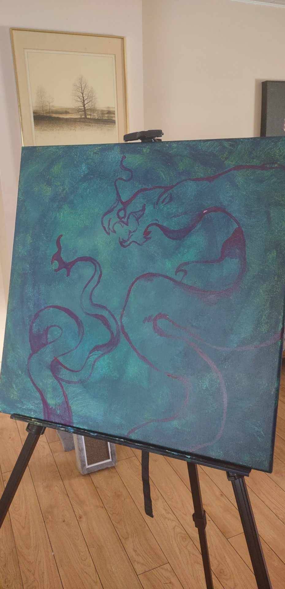
PLEASE I work 20 hours the next 3 days, and am busy one day after work too, before I need to be done the painting and I'm stuck in a colour decision block 😭😭
#paintings#painting advice#art advice#art#please advise#my art#cmtart#dragons#dragon art#im tagging this a lot so i can get fast answers and opinions hopefully#please
7 notes
·
View notes
Note
Hello! I hope this ask is coherent because I am quite sleepy but I wanted to say that I am absolutely blown away by your coffee art, particularly by the hair and the texture of fabric. It looks so so so real and, not being much of an artist myself, I just cannot for the life of me figure out how you've managed it, especially the effect where there are lighter strands of hair on top and darker ones beneath. This probably sounds like a silly question to someone who this is probably second-nature to, but would you have any advice on how to paint with coffee/create these kind of effects, or be able to point me in the right direction towards something that would help me learn? Thank you! Once again your paintings are incredible!!!
Hi! Thank you very much for the high praise 🤗
To be able to capture different textures realistically you need to either study them endlessly, or be able to paint from a reference with perfect accuracy, or preferably a mix of both 😅
To learn how to draw from a reference photo/item, you have to learn to draw what you see, and not what your brain thinks it sees. The brain tends to trick us and say: "Yeah yeah, I know what an eye looks like" and you end up drawing what your brain thinks an eye should look like, but not the eye that's actually in the reference photo. A good exercise, to start forcing your brain to focus on the actual shape, is to turn the image upside down and draw that instead. You can start out easy by using a pokemon, or a cartoon character. It's all about copying the shape rather than what your brain thinks it should look like 😛
As for painting lighter strands over dark hair, that can be accomplished in many different ways. Coffee is quite a forgiving medium, so if I paint an area, I can dip the brush in water and go over it and "erase" the coffee to create a brighter strand. It can't remove all the coffee, so if the strand of hair needs to be the absolute brightest part of the painting, I either paint "around" that strand, or I can use masking fluid. I only started working with that recently, though, and it isn't fool-proof. Before I use any paint/coffee, I'll cover the brightest area with the masking fluid, and when it's dry I can paint over it. Then when I rub off the dry fluid, I'm left with perfectly bright areas, but that requires a lot of blending at the edges to making it look natural.
You can start experimenting with coffee no matter what "level" you are, but the most important part for that type of painting is to learn how to work with only one colour. It's all about contrast, light and dark, shading, etc. You can start with pencil or charcoal, or just grab one colour of pencil/paint and make a picture with that. Before I started with coffee, I made a few paintings using only a scarlet red acrylic paint. It's a fun challenge, and you quickly learn to identify the absolute brightest and darkest area of the reference photo (if you're using one).
Painting with coffee is fun, no matter what sort of art you want to produce, so I say; just go nuts and experiment - there is no right or wrong 😁
8 notes
·
View notes
Text
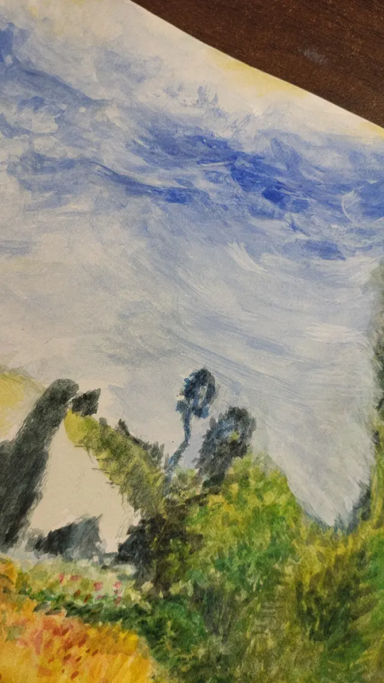
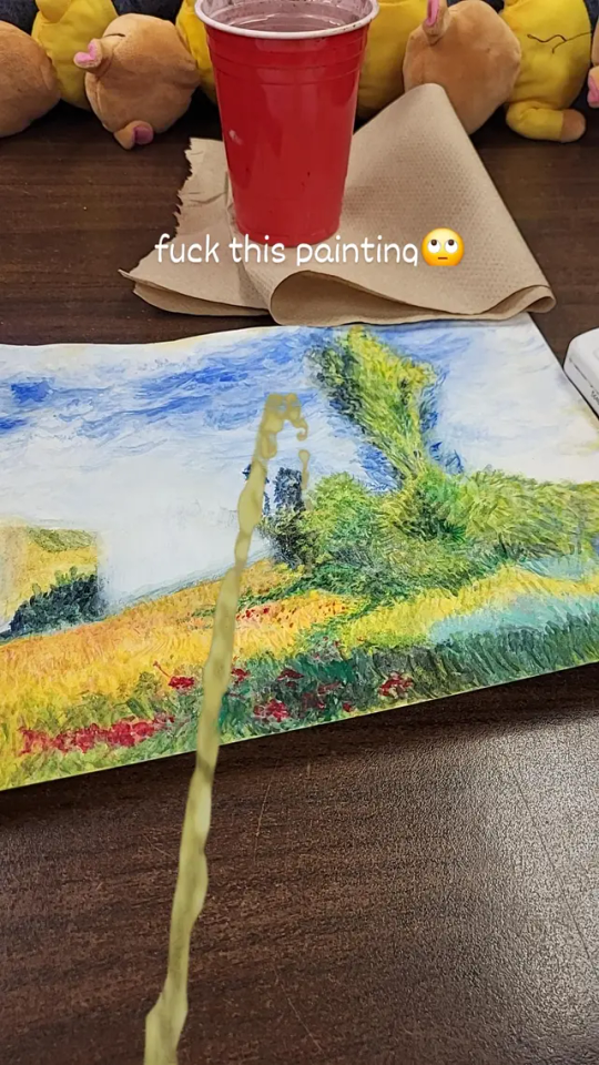
does anyone have tips for painting with acrylic paint? 😓 i usually use watercolor/gouache and idk what im doing.. heres an (unfinished) watercolor painting i did for ref. what are some tips that would help achieve this technique but in acrylic...
i keep accidentally adding a bunch of water to my paint forgetting that its acrylic...
#paint tips#HELP#art advice#painting advice#acrylic painting#watercolor#art tips#how do i make the switch from watercolor to acrylic..#help with art#questions#hi#HELP PLS
3 notes
·
View notes
Text
put a comet in your painting
2 notes
·
View notes
Text
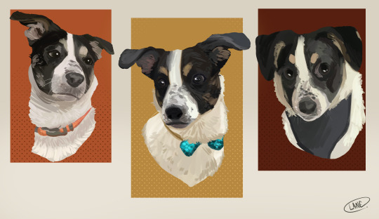
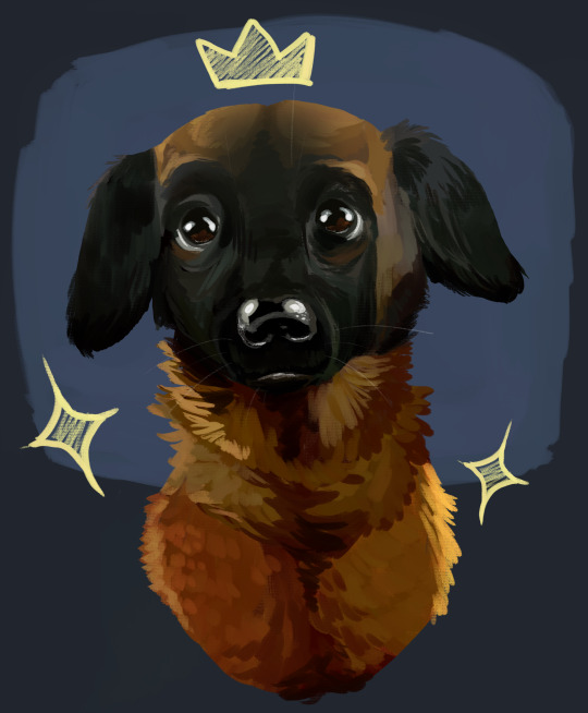
Been trying to get back into painting because!!! I want to get back into touch with my technical skills. I love drawing cartoons it is my passion!! But I find myself missing the more classical forms of art, like the painting and charcoal work I focused on in school. I'm thinking of adding these pet portraits to my Commission rotation! I've had some friends say that 30$ is a good price but I work heavily from the references I'm provided so I'm not sure if that's the best one to stick with? Do you charge more or less for that?? I'm still not sure about the pricing of my cartoons, let alone works like this! If anyone out there in the art community has any opinions, tips, advice, etc I'd love to hear it! A portrait like one of these usually takes me between 2-3 hours, and I use a digital program (Clipstudio) along with a basic oil brush that came with it.
#my art!#art#dog#dog painting#portraiture#pet portrait#commissions open#comissions#painting#oil painting#digital painting#painting advice#looking for painting advice#working from a reference#pricing help#help in general#pls god help me#art practce#working on the fundamentals
6 notes
·
View notes
Text
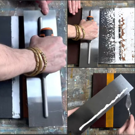
hey friends, what would call this/how would you describe it in search terms when trying to buy one?
it's essentially a thin, flat sheet of metal with a handle on it. used in this case for spreading paint on a canvas, but i'm almost certain its original use is for something completely different.
i've seen it used in a couple different youtubers' videos but i cannot for the life of me find one myself.
13 notes
·
View notes
Text

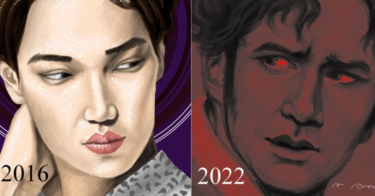

just wanted to share a few comparisons to show how my digital painting skills have developed over the years!
(these were all done with the same brush type on the same program btw!)
see below for a mini kinda Art Advice post where i go into each of these comparisons!
wanna start by saying the brush i used for all these pieces is the 'watercolour' brush on firealpaca... essentially just a default flat brush that usually comes with most software!
the first two are to show unintentional messiness vs intentional messiness. a lot of my early art had a pretty messy quality to it purely because i was still unfamiliar with the mechanics of digital! (though i will say, i think i was going for a more painter-ly style in the 2015 art anyway because i was basing it on pre-raphaelite works)
i think once you become a lot more familiar with certain mediums, you allow yourself to be a bit more confident with the brushstrokes you make! the 2022 piece is one where i wanted to create a sense of texture, almost like a digital version of impasto (aka thick layers of paint), and i know better now how to use digital software to create this kind of effect!
and you can see with the next row & the 2016 piece that i managed to create a much smoother, more blended appearance whilst still using the same brush! a part of my improvement came from me allowing myself to spend a little longer on pieces, especially in those first few years. i think a lot of beginners to digital (or any other kind of medium for that matter) think that if they spend the same amount of time on a piece as they would in another medium that they're more familiar with they'll get the same results, but it doesn't really work that way lol... especially if you're very new to digital... my advice here, then, would be to allow yourself to be slow at figuring out the medium (and let yourself make mistakes!)
going back to the 2016 vs 2022 comparison, i wanted to include this to show how sometimes you can keep things still messy, but still controlled and complete looking! also, remember that in digital most programs will let you adjust the 'colour mixing levels' or another similar 'blending level' option, which essentially just means how much the strokes blend or don't blend into what you've already painted... (knowing this would have made blending a whole lot easier back in 2016 lemme tell you lol.....)
(i also wanted to include that comparison cos it looks like they're looking at each other and i find it funny pfft)
the final comparison is, again, to show how controlled brushstrokes can give a piece a simultaneously painter-ly and smooth appearance! in both the 2015 and 2023 pieces, i wasn't super precise in my painting skills. but the 2023, to me at least, doesn't look as messy purely in the way i've been able to use the brush!
i mainly wanted to share this because i spent a long time trying to make my paintings look smooth, and i definitely do still do this in some artworks (particularly if i'm using fluffy/textured brushes), but i realised that i really enjoyed being able to create messy works that overall feel more finished due to the painting skills i've developed over the years!
i also just want to say that i'm not saying that either of these sides are 'better' than the other, they're just a few different ways i've approached art in my years as a digital artist! my observational drawing skills have grown a lot since the left side pieces, but i still think there's a lot to like in my early works and i'm definitely still very proud of them!
~~
thanks for reading & feel free to check out my other art advice posts and consider tipping me here on tumblr or heading to my kofi if you wanna support me! (no pressure ofc!!) <3
#art advice#digital art#art advice for beginners#digital art advice#firealpaca#portraiture#digital painting#painting advice#i havent actually posted the full 2023 piece yet 👀 so you're getting a sneak preview lol
21 notes
·
View notes
Text
I consider myself a big Yandex Dzen hater, but if you speak Russian or care to use Deepl or Google Translate and are interested in painting advice I really recommend this artist's page: https://dzen.ru/a/YoRxI2_Mow-zSleC
#Art advice#Painting advice#Art fundamentals#Dzen#Yandex Dzen#Russian language#Russian#My advice is don't read the comments if you can#People on there can be. Odd
2 notes
·
View notes
Text
Something I try to keep in mind when making art that looks vintage is keeping a limited color pallette. Digital art gives you a very wide, Crisp scope of colors, whereas traditional art-- especially older traditional art-- had a very limited and sometimes dulled use of color.
This is a modern riso ink swatch, but still you find a similar and limited selection of colors to mix with. (Mixing digitally as to emulate the layering of ink riso would be coloring on Multiply, and layering on top of eachother 👉)

If you find some old prints, take a closer look and see if you can tell what colors they used and which ones they layered... a lot of the time you'll find yellow as a base!
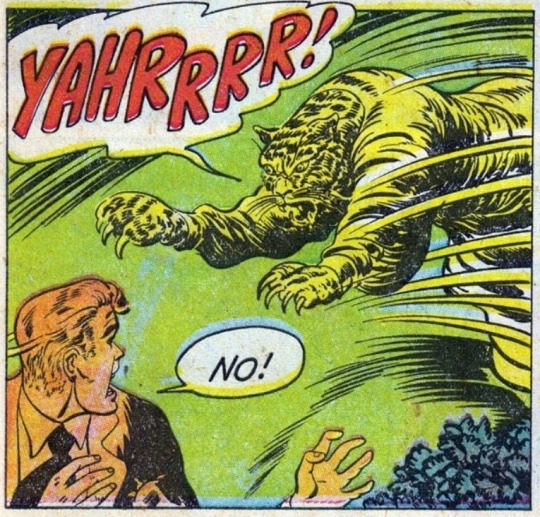
Misprints can really reveal what colors were used and where, I love misprints...
Something else I keep in the back of my mind is: how the human eye perceives color on paper vs. a screen. Ink and paint soaks into paper, it bleeds, stains, fades over time, smears, ect... the history of a piece can show in physical wear. What kind of history do you want to emulate? Misprinted? Stained? Kept as clean as possible, but unable to escape the bluing damages of the sun? It's one of my favorite things about making vintage art. Making it imperfect!

You can see the bleed, the wobble of the lines on the rug, the fading, the dirt... beautiful!!
Thinking in terms of traditional-method art while drawing digital can help open avenues to achieving that genuine, vintage look!
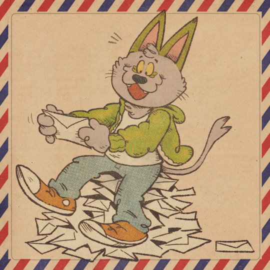
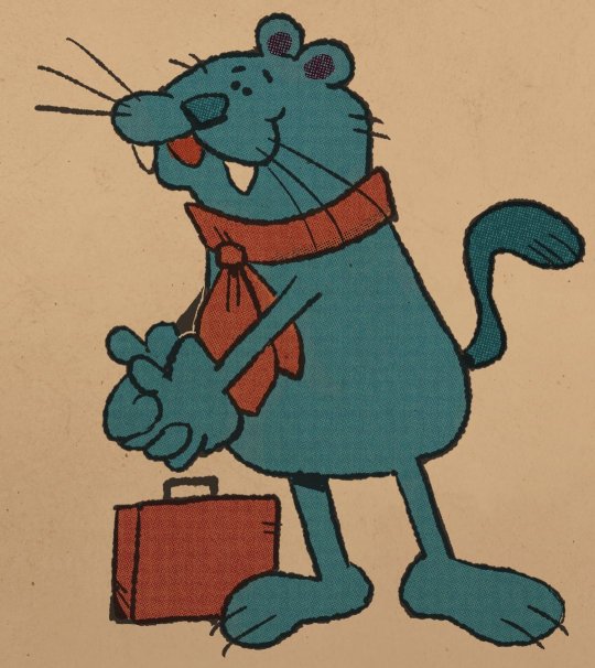
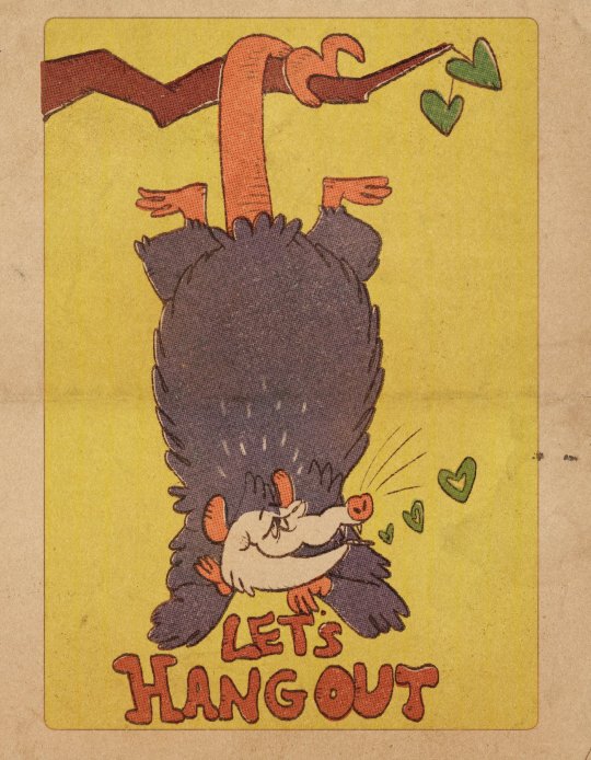
#talkin pasm#art advice#vintage art#the bottom 3 are#my art#but the rest is pulled from old comics :)#also you don't always need halftone or dot brushes to make vintage looking art! most vintage art is painted anyway
52K notes
·
View notes
Text
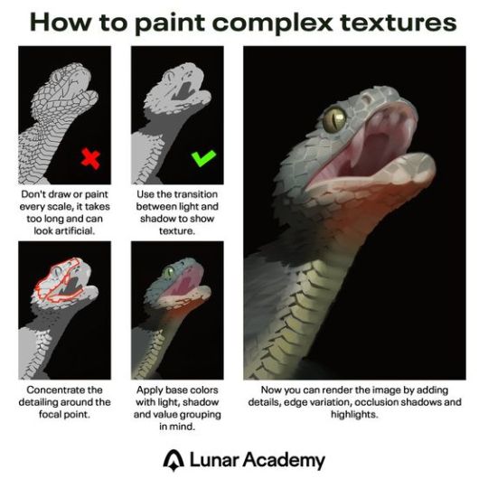
Excellent painting tutorial. In case you don't know the terms in the last description, "edge variation" means having "hard" or "soft" edges, where hard edges are crisp and good for high-detail, and soft edges are more blurry/smudged and are good for giving objects the appearance of receding in distance. In the painting above, the snake's eye uses hard edges, and its teeth and underside of the jaw use softer edges. "Occlusion shadows" are the absolute darkest parts because they are the areas where no light reaches, not even reflected or ambient light. They tend to be small and are used sparingly. Above, there's an occlusion shadow around the snake's eye. However, the shading of the eye was probably exaggerated to make it stand out more, since it's the focal point.
2K notes
·
View notes
Text
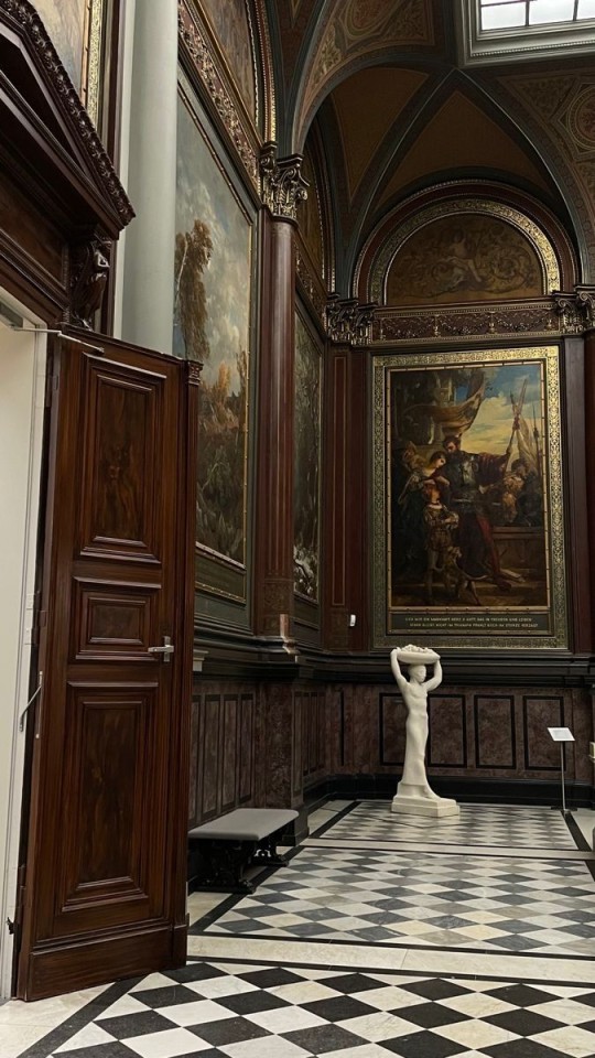
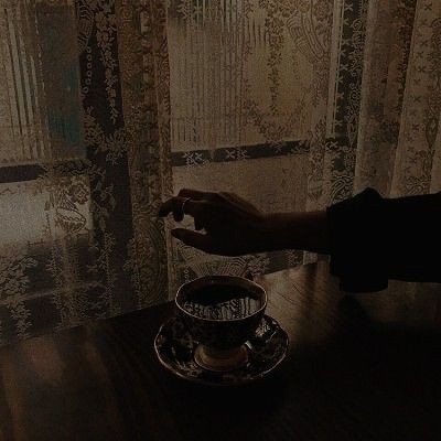
#dark academia#poetry#academia#poems#poems and poetry#quotes#academia moodboard#dark academia aesthetic#literature academia#light academia#romantic academia#books and coffee#painting#spilled ink#pintrest#moodboard#writing#bookblr#litblr#photography#love#the secret history#words#typography#art#museum#writing tips#writing advice#vintage#old aesthetic
839 notes
·
View notes
Text
Expert Advice on Patching and Painting Your Home
Expert Advice on Patching and Painting Your Home From choosing the right paint to patching holes like a pro, this guide has everything you need to know about patching and painting your home. Statistic50 Statistic82 Slider 1ButtonSlider 2ButtonSlider 3ButtonSlider 4ButtonSlider 5ButtonSlider 6ButtonSlider 7ButtonSlider 8ButtonSlider 9ButtonSlider 10Button × If you’re looking to give your…
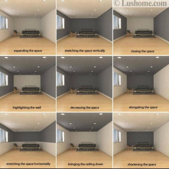
View On WordPress
#accent wall painting#accent wall painting project#drywall#expert advice on painting#expert tips#how to get better at painting#interior#paint experts near me#Painting#painting advice#remodeing
1 note
·
View note
Text
I always forget this when I’m writing but…
drafts are supposed to be ugly. they shouldn’t look like a proper story until you’ve finalized everything. whether that be sketched out comic strips or a jumble of sentences that just get to the point of what you want to happen in the story.
Don’t be discouraged. keep going for as long as you can take it. no one else can tell your stories like you.
#im technically referring to the writing process but this applies to everyone#writng#writing advice#writing process#creative writing#writers#writers of tumblr#writers block#writer#writing#writers on tumblr#writerscommunity#writeblr#writer things#writer stuff#writblr#painting#artwork#artists on tumblr#digital art#art#ugly drafts
846 notes
·
View notes
Text
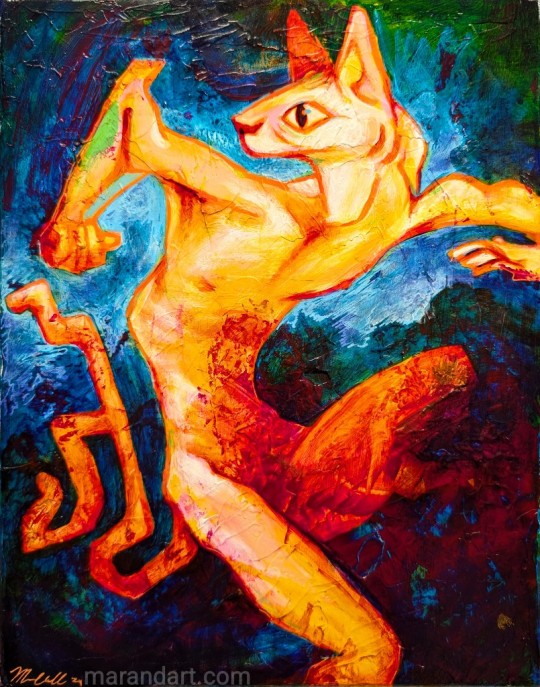
Process for "Back and Forth" and a wee quote about art fears and how to talk to them.
#art process#art video#art advice#fear#art#traditional art#animal art#acrylic#painting#mixed media#anthropomorphic#sphynx#cat#furry#furry art
390 notes
·
View notes
Text


Wanted to draw the weave scene between Layla and Gale but couldn't decide what to do so here are two versions :)! There's some things I like about each, and it was fun to try different things with the same base drawing!
#gale x tav#gale dekarios#gale of waterdeep#bg 3#baldur's gate 3#my art#my fanart#digital art#i'm so bad at coloring and I don't know how people paint night scenes. I am open to any advice!
179 notes
·
View notes