#overdo it with the paper overlays or
Explore tagged Tumblr posts
Text
i neeud to amke more glitchy art... once im done with the rollar piece ill indulge
#my 2 fav styles is like#overdo it with the paper overlays or#indulge in digitallness all bright all glitchy hoo haa eeoo aa#my dearest#i need to do it more often#i just dont know what Guys i do it To
1 note
·
View note
Note
13, 28
13. What pairing/character/subject/body part/object gave you the most trouble this year?
This year -- and it really began last year, but it intensified into this year -- I really tried to push myself on character expression and interaction, both which each other and with elements in their surroundings. In that respect, I feel like I pushed poses and angles a lot more than I did last year, which in turn led to a lot more trouble with anatomy and perspective as I wrangled with the extra challenge. It was worth it in the end, though -- a learning experience, as they say.
28. Did you learn anything about your art/process/style this year?
Quite a few things, yeah! This was a year where I took commissions from people for the first time, something which was a huge learning experience in and of itself. It allowed me to better learn how to incorporate various people's characters into my own style, as well as of the business and communication side of things to ensure that I'm delivering a good product.
In terms of the art process & style and all that:
When doing shadows, it's often good to tint the skin area differently from how you would do other areas in the picture, in order to capture skin's inherent warmth. This applies no matter the tone of skin you're working with.
Adding overlays or gradient maps or paper textures other post-processing effects to pictures once you're done with everything else can really help bring a piece together, or give certain elements just a little extra oomph. However, it's important not to overdo it on this front -- it can lead to a picture feeling over-processed if done sloppily -- and it's key to know when not to apply them as much as when to do so.
This is something I still need to work on and incorporate better, but not every detail needs to be lined. Sometimes it's just better to leave, say, fabric folds or muscle definition out of the lining portion of it and just wait to express it in the shading & details portion.
Patterns are fun to work with! Particularly with Clip Studio's liquefy tool, they can be fun to drop in and modify to give sections just that little extra pop.
Above all else -- and I know it's cliché, but it bears repeating -- don't be afraid to try new things!
2 notes
·
View notes
Note
Hello! May I ask how you draw? I'm currently learning how to myself and would be highly interested into a step to step process by you! Like from sketch to the done thing (no color necessary)
Hello there!
I dunno how I feel about showing how I work/giving advice to someone who’s learning (and I say it as a pro artist who went through years of traditional art education) because when I do the illustrations you see here on my tumblr I BREAK THE RULES you’d learn though life drawing routine, and give in to bad habits, and my methods are rather unplanned and chaotic which makes it difficult to pinpoint significant stages. But I used my portable potato to take some photos during working on my last piece, so I’ll throw it here with a bit of an explanation of what’s going on.
Before I begin - and because you’re about to look at a mess of a WIP - I’d like to give you some general advice that generally makes life easier when you draw (again, things that I learned in traditional arts education - another artist might advise you the complete opposite, dunno!)
Work holistically. Forget them satisfying-to-look-at clips on instagram showing someone produce a hyperrealistic portrait starting from an eye, with each and every element emerging being finished before they proceed to another part. It takes a lot of talent, yes, but these are ppl redrawing a photo in a kind of a mechanical manner. Most artists don’t work this way. Especially if you’re working without a reference, or if you’re doing a life drawing - your process will be layering and changing and finding what works best to give an impression of what you’re drawing rather than reproduce the exact image, and your artwork is likely to look messy most of the time.That said: don’t start with the details. Don’t spend too much time on a particular part while neglecting others. Your goal is to keep the whole piece at the same level of ‘finished’ (even though it’s unfinished - do I make sense?) before you’re confident that everything is where it should be and proceed to the details. So sketch out the composition first. See how things fit, what’s the dynamics. You’ll save yourself from limbs sticking out from the frame, odd proportions etc etc.
Because it’s a game of relationships between different parts of the picture/scene. I ask you not to worry about finishing a single element before laying out the rest because you’ll find that said element will look different once the other part appears! For instance - you might think that the colour you picked for a character’s hair is already very dark. But once you’re done with the night sky background, you’ll find that it’s in fact too light, and doesn’t work well with the cold palette. You’ll have to revisit different parts of the image as you go to balance these relationships and make the picture work as a whole.
Give an impression of something being there without actually drawing it ‘properly’- because details are hard, mate. You’ll see that my lineart usually has hardly any, and my colouring is large unrefined stains, but the finished thing looks convincing. Like, fuck, I can never focus on how Crowley’s eyes are really shaped. So I just turn them into large glowing yellow ellipses crossed by a line, and heard no protests so far.
Don’t panic if you messed up (you probably didn’t anyway). It might turn out to be a completely unnoticeable mistake - because, remember, things work together to balance each other, so another finished off prominent element will probably drown that badly placed line that looked so visible and out of place a second ago.
It might not look good before it’s finished. I’m mostly immune to it after years of drawing, and my recent illustrations all follow a specific method (ykno, my sunset glow effects and all that) so I can kinda predict the next stage. But I do my linearts on a specially picked crap paper, I don’t bother erasing the smudged graphite, and it looks messy af until I make the background white in Photoshop. Conclusion: you might have a moment of doubt as you work through a piece, but try to break through it - I often suddenly start to like what I cursed a minute before! - and try to finish it even if it’s meant to be bad. This way, looking through your past pieces, you’ll see the progress. And trust me, I can’t even look at my art from literally three months ago. It’s normal.
Now, pics! The sketches are paler in real life, but I increased the contrast a little so you can see something.
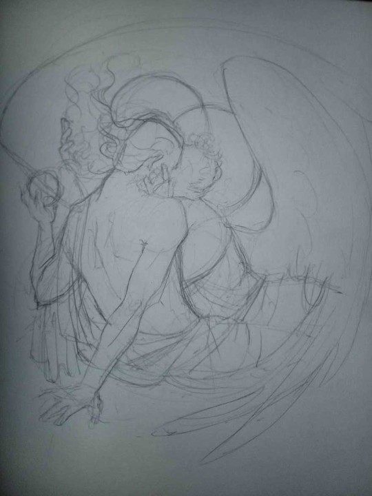
1. Laying out the composition!
I wanted to just show them kissing, but I got carried away due to some Art Nouveau inspiration. As you might have noticed, most of my illustrations are quite self-contained (ykno - they look like a sticker on a plain background). So I wanted a tight swirl bordered by Aziraphale’s wings creating a sort of rounded, yin-yang like bubble around them. Consequently I made the whole composition revolve around their heads.

2. Adding more details to the sketch. It’s messy af. It will be messy until I’m done. It’s fine.
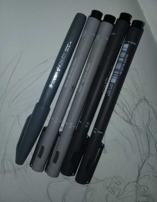
3. These are the fineliners I use for the linearts! They are made by Uni-ball and come in light and dark grey. I also sometimes use the guy on the left - ‘Touch’ sign pen by Pentel, when I want more brush-like, wider strokes. I work in grey because when I scan it and do my usual boring trick with sunlight highlights - which is an Overlay mode layer in Photoshop - the highlights ‘burn out’ the lines too and make them vanish a little, and the lighting effect gets more striking. I also like to use the light grey ones to make something look pencil-y without actually using pencil, because pencil fucking smudges.
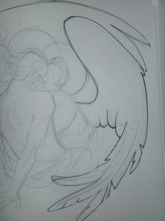
4. It smudges! So because I am right handed, I start inking from the right hand side, no matter how tempted I am to do their faces first.
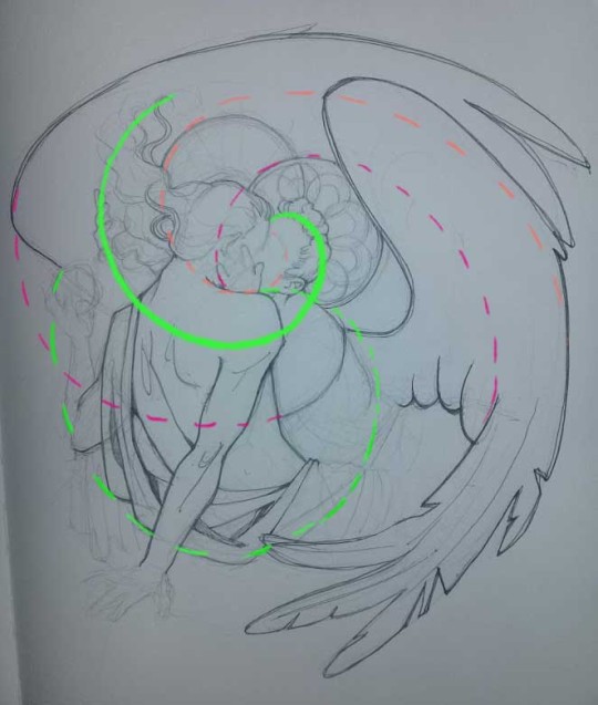
5. You can see the composition directions here. I made it intuitively, but ofc some ppl actually use grids etc to lay out their drawings.
6. See how pale ans thin the lineart was at first? I kept adjusting it as new inked parts were appearing. It starts to look nice and consistent now!
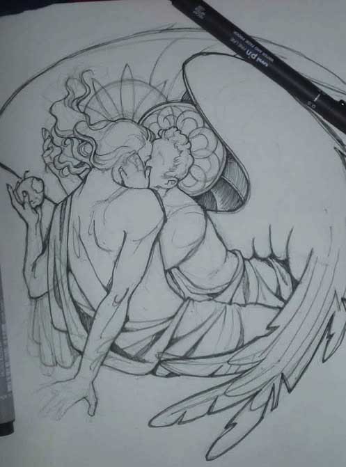
7. Finished lineart? There are some mistakes which I later corrected in PS. Notice that Aziraphale’s face has hardly any details on it - I tried to make the drawing suggest his expression rather than risk overdoing it.
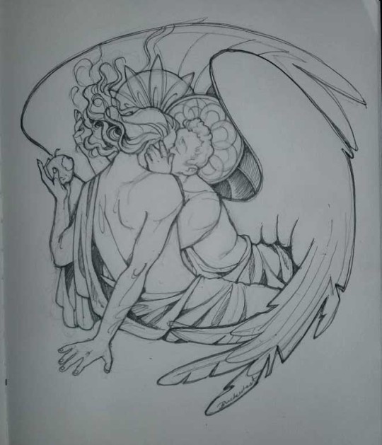
8. Photoshop time!! You can totally do what I did here even if you don’t have a graphic tablet. I used Curves tool to enhance the lineart, then Quick Selection Tool to select the background around around my sticker-like piece and filled it white (on a new layer ofc). I keep this white layer on top of the layer order so it works as a mask as I colour. I decided I did not like the hatching shading underneath Aziraphale’s halo, so I erased it with a Stamp tool (because I wanna keep the textured grey fill my crap paper naturally gives me!). It’s done roughly but won’t be visible once the thing is coloured.
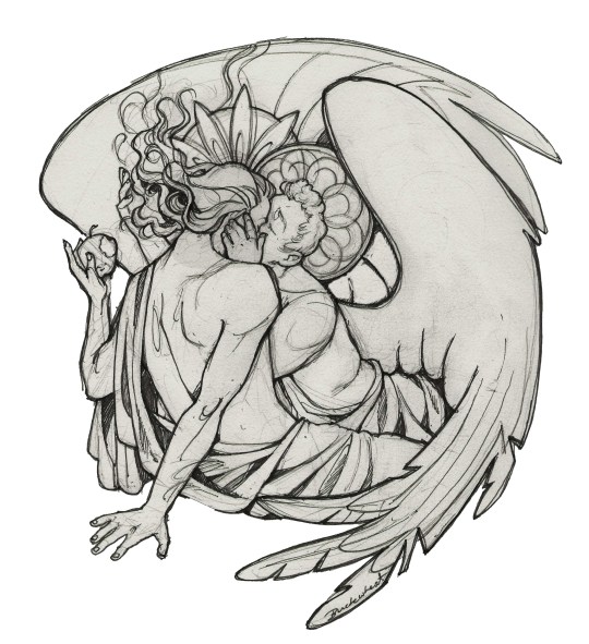
9. And the reason why I keep the grey shade instead of easily getting rid of it by using Curves/Levels is because when I set this layer to Multiply mode and colour underneath, it gives me this nice desaturated look like from an old cheap paper comic page. It works as a natural filter! But of course I can’t do bright colours this way, so all my glowing highlights happen ABOVE the lineart layer - on a separate layer in Overlay mode!
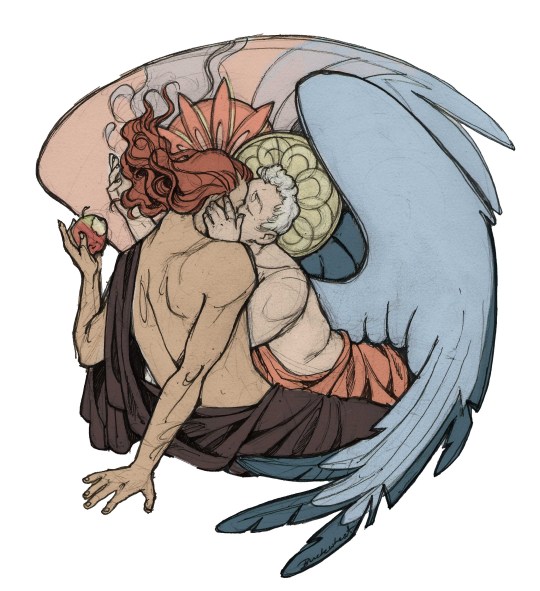
Finished thing here!
_____
Commission infoBuy Me a Coffee - help me with my transitioning expenses!Prints and stickers and things on my Redbubble!
#ask the buckwheat#long post#tutorial#drawing advice#drawing tutorial#good omens#ineffable husbands#good omens fanart#good omens art#my illustrations#doodles#toastedbuckwheat
1K notes
·
View notes
Text
9 Essential WEB SITE DESIGN Methods for DIY Beginners
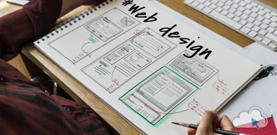
Let’s get right down to it, shall we? Below are a few of the very most useful styles and guidelines to learn when building your first website:
1. SET ASIDE the Mouse, GRAB a Pencil
Your site may already exist as a lovely, complete entity in your mind which is the reason why you immediately leap into Photoshop (or worse, an internet browser and HTML) to plan it out. Whoa, whoa-cool your jets for another! Don’t place the cart before the equine. First, get out a pencil and pad of paper and start putting your ideas into something easily tangible. That is an important stage to map out the framework of your site using only rectangles, doodles and influenced ideas (categorized as wireframing). Things can be very tough at this time; no one’s heading to view it nevertheless, you.
It is more easily at this time to alter designs you originally thought works however now discover are cluttered and confusing in writing. This can save you many hours of disappointment instead of making the same finding after the site is coded and in a web browser. Plus, it can help significantly to create a web page when you have research at hand to seek advice from rather than moving in blind.
2. Follow a Hierarchy
It’s an undeniable fact that a lot of web surfers tend to only check out webpages rather than take time to read everything. You should be ready because of this by placing the most crucial content first. This means that a consumer can break down the most essential information on a full page all in a single screen on preliminary load, and never have to focus or scroll. That is, of course, easier said than done. Here are some tips to help you better understand the significance of the design theory:
Keep Content “Above the Collapse”
We call that preliminary display of loaded content “the fold”-and everything below it that must be scrolled to be observed is considered supplementary. Generally, your most significant information rests “above the collapse”. The crucial thing to perform within this area is to entice a consumer to do this or generate the motivation to scroll down further.
Utilizing a “Hero” Image
A common trend in web site design nowadays is to fill this “above the fold” area using what is named a “hero” image or banner. They are full-screen history images with very succinct and to-the-point overlaid text messages, usually combined with a call-to-action button. Feasibly the whole purpose of the net web page could be included within this banner area, although it also acts as a great primer for this content to follow.
“The Collapse” May Change With regards to the Device
Here’s where things become complicated-and why you shouldn’t overburden yourself attempting to match everything above this marvelous line. Concerning the user’s device, the display screen sizes could differ greatly. A jaw-dropping 5K screen has a vertical quality of 2880 pixels, whereas an iPhone 5 has not even half of this. This means that mobile users just aren’t heading to have the ability to fit as much content to their display real property. (More upon this later.)
3. Typography Is Your Design
Unless you’re owning a photography business, the text is the solitary most important component of any website, so it’s important to get this done part right. Your web page’s hierarchy is greatly reliant on the typography you select: how your headings, subheadings, and body text message follow an all-natural circulation and stay aesthetically distinctive in one another
Make sure the written text is legible (avoid flowery fonts!) and large enough (usually around 16px for your body).
Stick to only two fonts-and make sure they set well together!
Give your paragraphs some room to inhale between one another, and arranged enough top cushioning or margin on your headings to symbolize clear breaks in content.
Avoid long lines of text. It’s easier on the eye for paragraph lines to be approximately only 15 words long-and a little significantly less than that for mobile displays.
Serif fonts are usually best only in print-unless they may be found in large headlines on the net
4. Colors & Comparison Are Crucial
We’ve discussed color mindset at length, however, the idea bears duplicating. The colors you select for your website play a massive role in how users understand your brand, as well as how motivated they could feel in taking action (i.e.: buying things) through your website. Why? Well, every color evokes certain feelings, and either for their natural character or by social fitness, these colors have grown to be associated with certain types of businesses. If a children’s toy company or a financial consultant painted their whole website in the stark dark, it could send the incorrect indicators with their meant viewers. Around the flipside, a shiny orange or an enjoyable blue, respectively, would catch the perfect firmness and consciousness for his or her customers.
If you’ve already established the colors of your brand, use those on your website then. It’s best, however, to keep it at only three colors for your site; like fonts, you don’t want to overdo it here or your site could finish up with multiple personality disorder. Also, be skeptical of way too many splashes of color across your website; our eye is attracted to them like honey traps, plus they could interrupt the natural movement of your articles. Use color only once it is most needed, such as links or control keys.
In contrast, your text message must stick out from the backdrop. Using light greys, yellows or greens for your fonts will likely render them unseen on the web page. Black on the white background is the foremost combination of comparison and is normally what you ought to stick to.
Additionally, you want your text message to pop against background images. Using very occupied photos can distract from the written text, to avoid this issue either use less comprehensive photos or use an overlay of, say, rgba(51,51,51,0.5)to help soften the image within the text.
Contrast also is important in how users are attracted to certain important elements of your site. Your most significant call-to-action control keys must get attention through the use of contrasting colors. A blue “Buy Now!” button manages to lose its urgency and well worth it when it's swallowed by a niche site that uses blue everywhere-but a red button on that same web page grabs a user’s attention by shouting “Hey! Click me!”
5. Using Pictures
Deciding on the best images to use on your website partly boils down to your artistic aptitude, but there are also intellectual considerations to consider that should assist with your selection process. First of all, avoid embellishing your site with extraneous photos because they could look nice. Instead, think of how each image you utilize serves its purpose, and how it functions as content. A well-chosen picture can convey your brand, service, product, or audience a lot more effectively than words. Use photos to help your users understand something, to evoke feelings, or even to inspire trust and self-confidence; with them solely for visual reasons should be supplementary.
Understanding Document Types & Compression
There can be an extra step that must be taken for using images on the net. Those elegant photos you have from sites like Shutterstock and iStock could be very substantial (5,000+ horizontal pixels and 10+ megabytes in proportions) which is okay for printing, but they’re unfit for websites. Not everyone has superfast Dietary fiber Internet, and that means you must decrease the size of your images to support for launching times (not forgetting 40% of site visitors will leave if the website takes much longer than 3 mere seconds to weight!). Typically, you want to keep each of your images at no more than 500 kilobytes in proportions, though your average quality should of times be around 100 kilobytes.
JPEG is the typical format for photos. It is a lossy format, this means its image quality is reduced when compressed. If you’re utilizing a JPEG for a full-width history image I quickly recommend keeping its horizontal quality at a minimum of 1200px. For general purposes, stay away from any image with significantly less than 600px horizontal quality, as it'll likely show up blurry on modern displays.
PNG is the most well-liked choice for images or for images that want transparency. It is a lossless format, which is ideal for keeping image quality but may also greatly increase document sizes. Generally, you’ll use PNG images for illustrations, symbols, or smaller images that may be stacked together with other elements for their transparency. You’ll hardly ever need a PNG to be bigger than 1000px.
SVG (Scalable Vector Image) is a more recent format that is changing GIF and even PNG in some instances. SVG wonders that it could be as large or as small onscreen as you will need it to be, all while keeping perfect clearness and crispness (but still be a little quality). You should think about using SVG for just about any logo design, icon, or vector visual on your website; as high DPI shows are becoming commonplace, the sharpness of SVG provides the best image quality.
6. Mobile-First Design
We’ve now reached a period where most people consume online quite happy with their cell phones rather than on the desktop computer. As a total result, there is much larger precedence in web site design to tailor specifically to the mobile experience, which has resulted in the “mobile-first” design viewpoint.
This means that essentially, throughout your initial sketching and planning phase in some recoverable format, it is best to focus on the site’s mobile layout first. Only the most crucial content necessary for the functioning of your site will be displayed on smaller screens. This causes you to simplify your design and slice out any distracting elements immediately. Think back again to your “above the flip” content: if you first ensure that the important info can fit on the original screen of the phone, then you’ll know for several it'll fit on bigger displays. Once you’ve nailed the fundamental mobile layout, you'll be able to start adding in embellishments or bigger images for desktop displays.
Your mobile layout assumes a far more vertical design that inspires scrolling, as opposed to the wide landscape of the desktop. If, say, your product web page displays entries in a grid of 3 across on desktops, then usually your mobile layout will display them as only a single column.
Yes, which means that you essentially need to produce several layouts for every web page of your website. Fortunately, a worthwhile website contractor should provide reactive templates that change these designs automatically so you’ll then just need to fine-tune them.
7. Keep Things Aligned
When elements appear sporadically laid across your site it is often due to an alignment issue. Imagine your website on the sheet of graph paper. Individual it into even columns by sketching, for example, six right lines. You now want to ensure that the remaining sides of your elements are distributed and aligned to only these six vertical lines.
8. Keep It Simple
It is said that the best web site design moves unnoticed; it is a poor design that phone calls focus on itself. As stated earlier, the main facet of any website is merely its text message. If you can offer outstanding typography that is a joy to learn, you won’t do much more. Wanting to overdesign your site will just mess and complicate things.
Are the package shadows necessary? The crazy, ornate patterns? A large number of colors? Not probably.
9. Big Open up Spaces
Your articles need room to breathe. White space is the prevailing design choice for modern websites: wide, open up areas of nothingness to pad areas between content. It’s a far more pleasant way to process information, looked after stimulates you to eliminate superfluous text messages and images to keep carefully the site clean.
Get more advice Thought Media is a leading Chicago web design providing professional website development services, and one of the top SEO companies. The agency has worked with hundreds of clients all over the world! Creating high converting website designs, providing reliable website hosting, and successful Search Engine Optimization Marketing campaigns!
Conclusion
Web site design can be considered a sprawling field of technology to learn, ideas to practice, dialects to review, and artistry to understand. Only with experience will all of these components start to make sense, however, you already are well on the way simply by grasping the basics of why is a good website work. I am hoping that guide acts as your launching-off point, which offers you the self-confidence to consider your website into the own hands and build it just how that only a business proprietor knows best.
1 note
·
View note
Text
A Quick Almost-Tutorial on My Digital Drawing Process
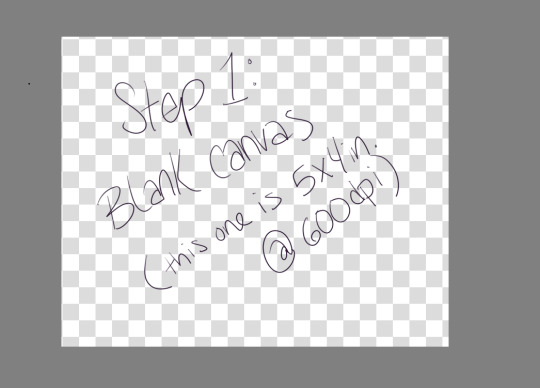
Step 1: Make a blank canvas. My preferred program is Krita, so I open that and make a canvas. I usually do 5x4 inches at 600ppi because when I save PNGs I can upload them to tumblr and the quality is still pretty good.
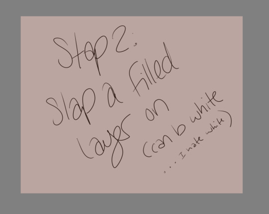
Step 2: Slap a filled layer on that shit. I hate white, but I know a lot of people just use it because it’s easy and also like paper. I tend to go wild with color, and also if you have a colored background already it makes backgrounds easier.
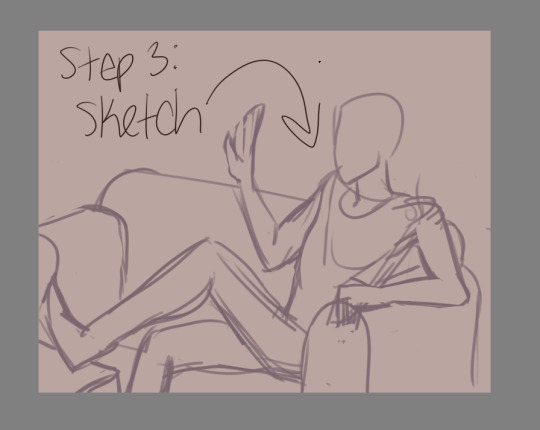
Step 3: Sketch. Use a decent sized brush, but make sure you can still scribble some details (like fingers) if you need to. I use a 27 pixel brush to sketch, just because I can. USE REFERENCES. Think about composition, but not too hard. Then lower the opacity so you can trace over it and still see.27 pixel brush to sketch, just because I can. USE REFERENCES. Think about composition, but not too hard. Then lower the opacity so you can trace over it and still see.
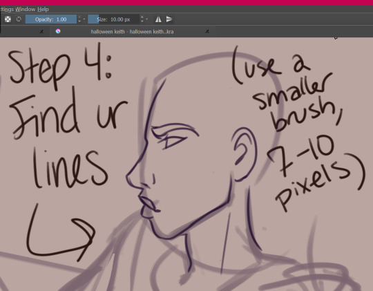
Step 4: find your lines! Sometimes I do this twice, where I use like a 15px brush to get more detail, and then a 7px brush to do my final lines. I don’t use solid black, usually--this one is dark purple. Idk, mang, I just have a hard time with black and white.
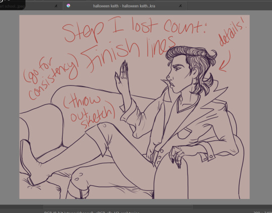
Step 5: Finish your lines with some detail and throw out the sketch (or like... turn the visibility off). If you’re just learning with your tablet, my advice is to focus on consistency. Try to get your lines to all have the same smoothness, opacity, thickness, etc. You can worry about varying line thickness when you have nice, clean lines. ADD CLOTHING FOLDS. ADD BUTTONS. ADD SOME TEXTURE IF YOU WANT TO.
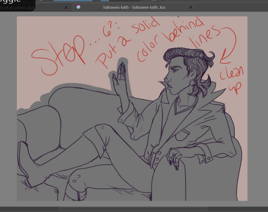
Step 6: Put a solid color behind your lines and clean it up. This is going to make it so that you can put color on top and NEVER GO OUTSIDE THE LINES. LMFAO you don’t have to do this, but I usually do because... erasing............ is hell. I do figures in one color, and furniture in another. Separate layers!!!!!
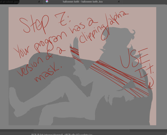
Step 7: Your program, whatever it is, probably has a version of a clipping mask. Krita technically has an alpha channel toggle that does the same thing. It just means that you have a layer/layers on top of your solid color that will ONLY draw where that color is. You can look up tutorials.
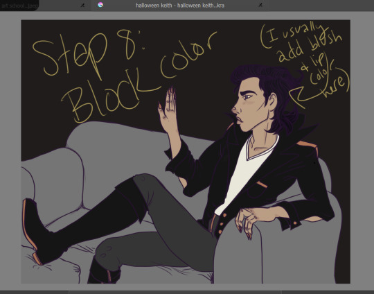
Step 8: Block out your color. I do each color on a new layer. It’s easy to add some variation on the skin here, ie fill in the lips and add some blush. Don’t worry if you can’t really see the lines on top of dark colors! All that detail will come back later.
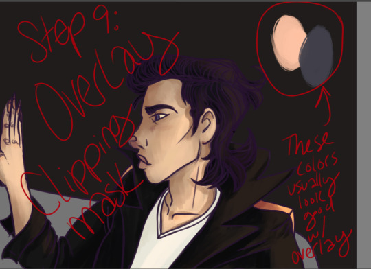
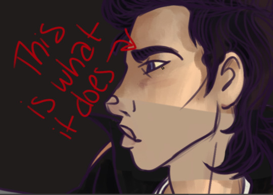
Step 9: Make another clipping mask layer on your color (I usually do it all at once instead of color by color because FAST). Change the blending mode to OVERLAY. Then find your highlights and shadows! A light peachy color will usually look good for the light parts, while a dusty purple looks good for the shadows. Start bringing back the detail! This method really brings life to your colors, so you don’t have to worry about having dull colors. It makes the light parts warmer and the dark parts cooler, which, if you know color theory, makes shadows seem more real.
Here’s where you gotta start worrying about blending. If you’re using photoshop, you have to do it all manually lmfao. The overlay thing might be hard to grasp at first if you have to do all your blending soooooo carefulllyyyyyyy. That’s the reason I use Krita--it has brushes that do my blending for me and make it super easy. This part is the most like actual painting, and not everyone gives a shit. This is optional. You can honestly do cell shading here.
If you want to, however, you can add all your texture here.
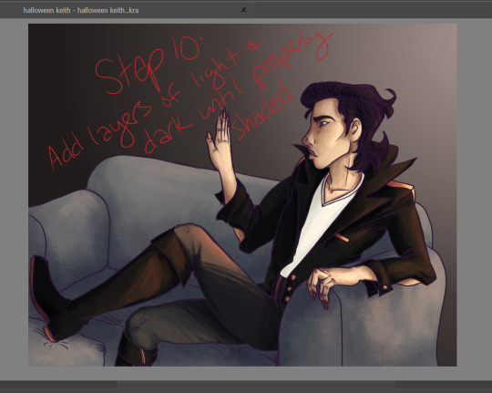
Step 10: You can add more than one layer like this. Add layers of light and dark until it’s properly shaded. See how the detail on the jacket and boots are back? The hair is still flatish, but I wouldn’t worry about that yet. Just think about which way the shadows go, and how much depth you need for your figure to look like they actually exist in their environment! Periodically step back and look at the whole thing to make sure you’re doing it all evenly, instead of focusing on one small area and overdoing it.
You can add a LOT of texture while you do this. The couch here is just light and shadows done with a sponge brush. Fuck around with blending modes, they’re pretty cool.
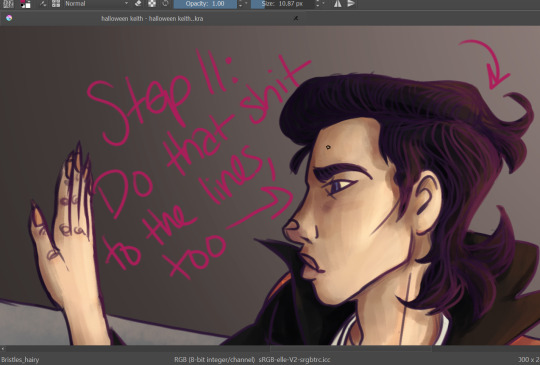
Step 11: You can do the light/dark overlay clipping mask thing to the lines, too! It’s subtle, but it has an effect. Add light where your light source is, add dark on the opposite side.
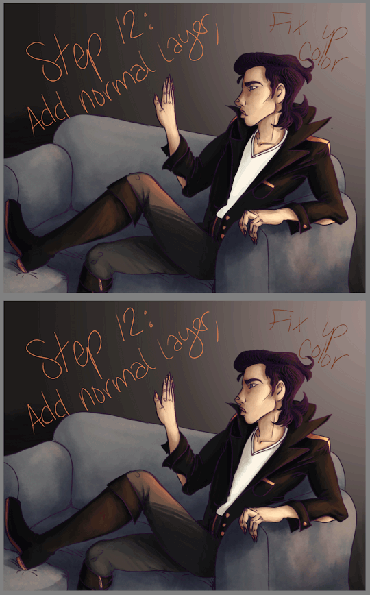
Step 12: Another subtle thing, but now is the time to fix up the color! Add another normal layer, and just use the eye dropper tool to blend your colors until it’s as smooth as you want it. You can also fix up anything that didn’t take too well to the overlay (like that white shirt... sigh). Sometimes super light/dark/bright colors won’t change when you have an overlay layer, so you’ll need to do those by hand. Just eyedrop the color, and nudge it a little up/down on your color picker chart--if you want to be consistent, nudge it a little toward the purple spectrum if you go darker, and a little toward orange if you go lighter. Not much! It’s a subtle difference. You’ll be able to see if it looks waaaaaaay too orange.
Also, if you have a layer that you think comes on a little strong, you can always take down the opacity! REMEMBER THAT!
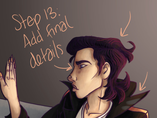
Step 13: Add those final details! The little eye shine, the last hair texture, any other points of visual interest... freckles... etc... add those here. You can do it either on top of the lines or under--i usually just add it on top because heck, it’s easy.
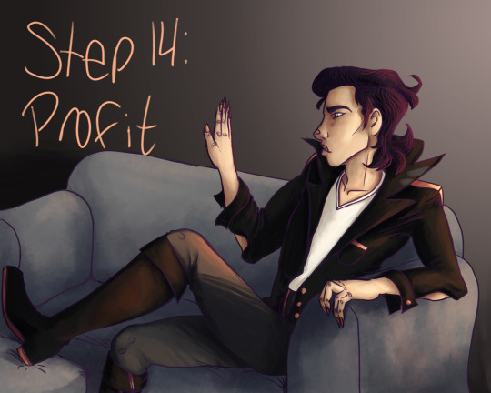
Aaaaaaand... you’re done!
Pretty cool, eh?
49 notes
·
View notes
Photo

So, here's the same area I was working on canvas, and large scale (approx 15" square) as the last Quickie on paper 6" square. These layers of clouds are built up over time. I can overlay some colors together while still wet, but eventually, if I overdo it, things will get muddy, in texture and color. The movement of the brushes on canvas feels very different than on the paper. It's much slipprier! More appropriate for the Quickies then, eh?! A series of big, cloud and sea paintings are in progress for a show coming up! I'm excited! . #cloudstudy #bluesky #clouds #cloudporn #jillthirzacooper #jtcartist #oilpainting #watersolubleoils #painting #art #artshow #artcollection #candianartist #artistsoninstagram #artist #eastcoastartist #novascotia #funinthestudio #loveyourart #lovewhatyoudo
#jillthirzacooper#artist#candianartist#loveyourart#novascotia#funinthestudio#painting#artshow#eastcoastartist#oilpainting#cloudporn#art#lovewhatyoudo#bluesky#clouds#cloudstudy#artcollection#watersolubleoils#jtcartist#artistsoninstagram
0 notes