#orange is the new black headers collage
Explore tagged Tumblr posts
Photo


Credit @collagealaska like or reblog if u save/use.
credit twitter: @shewantscamren
#oitnb headers#headers oitnb#headers collage#collage headers#oitnb headers collage#headers collage oitnb#oitnb collage headers#collage headers oitnb#oitnb collage#collage oitnb#oitnb collages#collages oitnb#orange is the new black#oitnb#orange is the new black headers collage#headers collage orange is the new black#orange is the new black collage headers#collage headers orange is the new black#orange is the new black collag#collage orange is the new black#orange is the new black collages#collages orange is the new black#orange is the new black headers#headers orange is the new black
75 notes
·
View notes
Text




Collage Headers
Saved? Like or reblog
Salvou? Curte ou compartilhe
Credit's twitter @Daraoelho
#collage#collage headers#headers collage#collage art#twitter headers#headers orange is the new black#headers blue#headers red#China header#flowers#flowers headers#sakura#messy headers#random headers#simple headers
221 notes
·
View notes
Text





• donna pinciotti icons
like or reblog if you save
#donna pinciotti icon#donna pinciotti#donna pinciotti icons#that 70s show icons#that 70s show#t70ss#eric and donna#laura prepon icon#laura prepon#laura prepon icons#oitnb#oitnb icons#orange is the new black#mila kunis#collage headers#icons#psd icons
315 notes
·
View notes
Text

TAYLOR SCHILLING LGBTQ+ PRIDE HEADER 🏳️🌈
❤+🔃
#lgbtq community#lgbt#lgbtq#laylor#vauseman#taylor schilling#laura prepon#alex vause#orange is the new black#oitnb#aesthetic#headers#collage#rainbow#pride#pride month#lgbt pride
110 notes
·
View notes
Photo


ruby rose packs
like please
»»— se a header/icon for sua avise —««
#icons ruby rose#ruby rose icons#packs#packs ruby rose#ruby rose packs#headers ruby rose#ruby rose headers#headers random#headers collage#headers oitnb#orange is the new black
64 notes
·
View notes
Photo
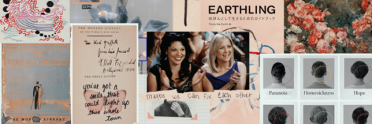
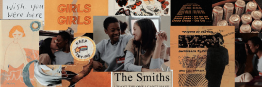

like or reblog
#cosima#delphine#orphan black#tatiana maslany#evelyne brochu#cophine#orange is the new black#grey's anatomy#callie and arizona#arizona#callie#headers#collage headers#lgbtq#poussey#soso#poussey and soso#random headers#orange is the new black headers#orphan black headers#sara ramirez#tatiana maslany headers#lgbtq headers#jessica capshaw#grey's anatomy headers#random#samira wiley#kimiko glenn#samira wiley headers#soul
50 notes
·
View notes
Photo


oitnb (orange is the new black) headers
#headers#orange is the new black#orange is the new black headers#oitnb#oitnb headers#collage headers#collage#series
45 notes
·
View notes
Photo


#oitnb#oitnb header#oitnb header collage#orange is the new black#dascha polanco#danielle brooks#natasha lyonne#laura prepon#header#beige#blue#green#red#gray
40 notes
·
View notes
Photo


Pack Louis Tomlinson + Orange is the new black
Like if you save or credits for @Iarrystuffx on twitter if you use 💕
Headers aren’t mine, send me a dm if you want the credits
#louis tomlinson#orange is the new black#piper#icons louis tomlinson#icons#icons low quality#pack#pack louis tomlinson#pack orange is the new black#oitnb#pack oitnb#headers orange is the new black#headers oitnb#headers collage#louis tomlinson layouts
245 notes
·
View notes
Photo


please like/reblog; c) @harmiley
#lauren jauregui#lmj#lmj headers#lauren jauregui headers#lauren jauregui collage headers#lauren jauregui lgbt#lmj packs#lauren jauregui packs#taylor schilling#taylor schilling icons#taylor schilling packs#oitnb headers#orange is the new black#oitnb icons#oitnb packs
19 notes
·
View notes
Photo


c. @orpanblahck
#orange is the new black#orange is the new black headers#oitnb#oitnb headers#collage headers#aesthetic headers#headers
90 notes
·
View notes
Text
How To Choose Your Website Colors
Color is often overlooked in the business of optimizing websites for better returns on investments. Website sales can be greatly affected by simply changing its colors. Ever come across a website that uses some funky combination of print and background colors? If you ever want to experience an eye-twisting headache, try reading yellow print on a blue background. The reason you see black type on a white background so much is that it is the best color combination for reading, both on and offline. And since it is even harder to read text on a monitor than it is on paper, we must all be especially careful with the colors we choose for our websites, or suffer less-than-optimal site traffic and repeat visitors. Color choice should also be dictated by other, less obvious goals, when designing or re-vamping a website. It’s important to realize that different colors invoke different emotions, are associated with specific concepts and say different things in each society. For instance, green often times is associated with freshness or money, which is fairly obvious if you think about it. But every color does this, and some of the emotions and concepts are more subtle. For example, white means pure, easy, or goodness and purple can be associated with royalty or sophistication. What’s more, each color carries with it both positive and negative ideas. The emotions and concepts that you associate with specific colors may differ from other people’s associations, but there are themes that run throughout each color. Here are some: Red: Positive: Sense of power, strength, action, passion, sexuality Negative: Anger, forcefulness, impulsiveness, impatience, intimidation, conquest, violence and revenge Yellow: Positive: Caution, brightness, intelligence, joy, organization, Spring time Negative: Criticism, laziness, or cynicism Blue: Positive: Tranquility, love, acceptance, patience, understanding, cooperation, comfort, loyalty and security Negative: Fear, coldness, passivity and depression Orange: Positive: Steadfastness, courage, confidence, friendliness, and cheerfulness, warmth, excitement and energy Ignorance: Ignorance, inferiority, sluggishness and superiority Purple: Positive: Royalty, sophistication, religion Negative: Bruised or foreboding Green: Positive: Money, health, food, nature, hope, growth, freshness, soothing, sharing, and responsiveness Negative: Envy, greed, constriction, guilt, jealousy and disorder Black: Positive: Dramatic, classy, committed, serious Negative: Evil, death, ignorance, coldness White: Positive: Pure, fresh, easy, cleanliness or goodness Negative: Blind, winter, cold, distant A major goal of marketers is to invoke emotion in their audience. We know that if we can cause some kind of an emotional reaction in the people we are marketing to and communicating with, we have a better chance of compelling them to buy from us. The battle between logic and emotion that rages in each of is usually won by emotion most of the time. By choosing the colors of our websites and online media with deliberate care, we are purposefully trying to invoke a specific emotional response that will increase sales. So pick your colors carefully. Not only do colors evoke emotions, but they can communicate messages or concepts too. For example, look at http://www.clickitticket.com to see how color is used to communicate the new affiliation between Oak Web Works, LLC and ClickitTicket.com. The blues of Oak Web Works’s logo swirl into the reds of ClickitTicket.com’s logo. This can be interpreted as a melding of the two organizations, which is what the words underneath say, “in affiliation with”. Also, the red of http://www.oakwebworks.com/tickets/ indicates action and passion, two essentials for people who want to attend theater, sporting events or concerts. Another online ticket website, http://www.bestshowticketslasvegas.com/, has a different color approach. Its main colors are blue and purple, giving the site a comforting, secure and sophisticated feel. The main header on each page has all the colors in the rainbow in it, a collage of images, with the word ‘Tickets’ in large, white font. Much of the site is white too, which gives it a clean feel. As a general rule of thumb, when Oak Web Works (http://www.oakwebworks.com) designs websites, one primary color and one secondary or complimentary color will be chosen. These colors are based on the specific audience and market of our client and the messages the client wants to communicate to the rest of the world. If more than two or three colors are used, things tend to look a little messy, and the power of any one color is diluted too much, so we most often stick with two colors. When I am not sure exactly which colors or combinations to use, I often start trying different things, then take a step back and ask myself what my chosen colors are conveying to me. After designing many websites over the years I have realized that going with my gut has often worked when I’m in doubt. You would be surprised at how creative and accurate your intuition can be. However, if the client already has an established brand, we will always make sure to match the colors of the website with the original colors of the company. It is not wise to have print collateral material one color and the website a totally unrelated color. All marketing channels need to remain consistent, with one face only. Since website visitors all have different platforms, different monitors, and different settings for their screen resolutions, the colors you choose for your website may not always be rendered the exact same way on your site visitors’ monitors. That’s why there are “Web Safe” colors that have a much higher likelihood of looking the exact same regardless of the user’s computer, monitor or settings. Many graphics programs, including Adobe Photoshop, have a feature that allows you to choose “Web Safe” colors only. Keep in mind however, that the sophistication of technology today allows for Web designers to be able to stray from the “Web Safe” colors more and more. So don’t be overly concerned if you choose to use “un-safe’ Web colors, chances are that most of your audience has the computers necessary to view your site the exact way you intended. Whether you are designing sites for clients or designing your own business website, your color choice is vital. Be sure to try different colors, different shades, and different combinations before you decide. It’s a lot of fun playing with colors but every choice you make comes with a set of pre-defined societal meanings and emotions, so choose with deliberate care.
1 note
·
View note
Text








• donna pinciotti icons
like or reblog if you save
#donna pinciotti#that 70s show#that 70s show icons#t70ss#jackie burkhart#laura prepon#laura prepon icons#laura prepon icon#donna pinciotti icon#eric forman#fez#collage headers#bravetonkin#icons#orange is the new black#oitnb#oitnb icons#orange is the new black icons#mila kunis#ashton kutcher#eric and donna#donna and eric
208 notes
·
View notes
Text

VAUSEMAN B&W HEADER
❤+🔃
#headers#collage#oitnb#orange is the new black#alex vause#laura prepon#grey#black and white#orange#taylor schilling#vauseman#laylor#lgbt#lgbtq community#lgbtq
41 notes
·
View notes
Text


c: @oitnbstuff @collagealaska @glgicons
like or credits on twitter: @/speatknow
#icons#headers#headers collage#collage headers#headers vauseman#vauseman headers#headers oitnb#oitnb headers#headers orange is the new black#orange is the new black headers#packs#icons nicky nichols#nicky nichols icons#icons orange is the new black#orange is the new black icons#icons ointb#ointb icons#packs nicky nichols#nicky nichols packs#packs orange is the new black#orange is the new black packs#packs ointb#ointb packs#packs vauseman#vauseman packs
26 notes
·
View notes
Text
The Best New Portfolio Sites, May 2017
Hello everyone! This month is a much more colorful month than the last few have been. It feels like designers have been shying away from the monochromatic beauties of months past, and are letting loose with the color palette.
I for one, am not complaining. I love my black-and-white-and-maybe-one-other-color affairs, but it’s nice to see some variety in the mix. And now, the portfolios:
Unconquered
Unconquered is a pretty metal name, and like many a metal band, they include their manifesto on their site. The site, however, touches on post-modern and 90s grunge. Then it slams you in the eyeballs with big, solid type, and striking imagery. You might feel a little bit confused by the time you get to the bottom, but you aren’t likely to forget what you saw.
Dilo
Dilo is a film productions company. Where many others opt for the default dark theme, or the usual video background, Dilo has gone all in on color. Every project page has a different color scheme. They also mix up the layouts depending on the project. It might be overcomplicated, but it shows their commitment to art direction in all things.
usTwo
usTwo is a veritable cornucopia of design trends with background video and all kinds of layout styles. The two things that really tie the whole design together are the typography and the near-constant onslaught of color. The result is playful-yet-professional look that works for them.
Yorh Ekin
York Ekin’s portfolio is an interesting departure from recent trends. It’s got that classic “corporate elegance” with thin type, and the liberal use of browns, beiges, and a little bit of burnt orange. Man, I haven’t seen a brown site this good since, well, I genuinely can’t remember. It’s strange for a site with such deliberately muted tones to stand out so much, but these are the times we live in.
I don’t know if swearing at potential clients in the fine print in the header is the approach I would use, but I respect his candor.
The Soulist
Federico Repetto is just one letter away from me making a Pinocchio joke. His website is an almost perfect representation of the post-modern aesthetic in web design, only a bit more colorful than other examples. This is mostly due to the imagery, but that counts. It’s stylish, it has lots of white space. What’s not to love?
Nahel Moussi
Where the last site was post-modern, this one is almost post-minimal. It starts with a simple horizontal slideshow, and then transitions into case studies that focus almost entirely on the imagery. Text is kept to a bare minimum, but what there there is is beautifully set.
Eien
Eien, on the other hand, uses only typography to make its first impression. There is imagery — you almost can’t have a visual portfolio without it — but there’s a distinct impression of balance. While there aren’t paragraphs upon paragraphs, the text is definitely a part of the story of each design, as opposed to a simple summary.
Other than that, it’s a lot of white space, a little animation, and a fairly standard layout. But even so, it’s so well executed, it’s worth a look.
Bleed
Now Bleed really sounds like the name of a metal band. The logo even looks like one. It’s an interesting contrast to the rest of the site’s design, which embraces the collage-like post-minimalism that we’ve seen a bit of. That said, it looks good.
Chaptr
Chaptr brings us some classic minimalism. It’s got white space. it’s got great typography. it’s got huge images all over. It’s here because it looks good, and works well. I’d pay special attention to the way they organize small amounts of text on large screens, and the way they choose their imagery.
Ruslan Siiz
Ruslan Siiz’s portfolio may engage in some collage-like layout patterns, but the real strength is in the typography. Even with the large empty spaces, the design always feels…full, but never cluttered. And that’s due to the way the designer uses type. It’s a difficult balancing act that Ruslan pulls off well.
Glitch Paris
Well, the horizontal-slideshow-on-the-home-page thing might become a trend. Glitch Paris is doing it too, and combining it with a bit of video. It’s a simple, but effective strategy. Warning: while there is no audio on the home page, clicking through to a project will start the video immediately.
Orthonormai
Orthonormai is yet another example of post-minimalism, but with color! Give it a look. Frankly, I’m starting to think vibrant color is a drastic improvement to this style of layout.
Five & Done
Five & Done is one more Powerpoint-turned-website, and this one experiments with reflections, as well as animation in general. Most of the text is a bit small for a website in this day and age, but overall, it’s a good-looking site. I’m a fan of the art direction they put into it, and the way they change things up depending on the type of content they’re working with.
Yannick Chapron
Yannick Chapron has embraced a trend that we’re actually seeing less of, these days. It’s the Powerpoint portfolio, brought back from near death! I can never recommend these sites as a study in accessibility, but they nearly always have some interesting animation and motion design. This site will be hell on your scroll wheel, but it’s still fun to look through.
Jérémy Levron
Site’s that incorporate playful elements can actually make me overcome my distaste for JS-reliant sites. Jérémy Levron’s portfolio does this by turning the home page into a canvas where anyone can paint. Just click and drag to start.
The entire site is a high-contrast monochromatic affair with good type. That would not be enough to set it apart from so many other sites. That home page, though? That does the trick.
Andy Smiff
This portfolio from Andy Smiff is a good example of a site where the personality is all in the details. The layout won’t win any awards for crossing boundaries, but the use of color to accentuate small elements tells you about the thought and care put into the design as a whole.
Tom Treadway
Tom Treadway’s site gives us that asymmetrical, elements-overlapping, grid-as-the-background feel that we’ve all come to know and…well, I’m not about to make any assumptions about how you feel. I like the aesthetic well enough, but Tom takes a step further by using intensely-colored imagery. Sure, it’s a filter, but that filter is being used artistically, to establish a theme for his website.
eightweb
If eightweb’s site looks a lot like a WordPress theme, that’s because they specialize in WordPress sites. I mean, where else could you get away with intentionally making a site that screams “WORDPRESS!”, right? I have been slowly developing an admiration for designers that play to their customer’s expectations like this. It’s good for business, and therefore, it’s good design.
Bureau for Visual Affairs
The Bureau for Visual Affairs isn’t actually as official as it sounds. But the official-sounding name is just the start of a theme. The whole site has that modern minimalist feel, with sans-serif type, and lots of thin borders all around.
However, thanks to the liberal use of imagery, and some subtle background video, the design feels a lot more “alive” than many of its counterparts. Yes, I said “subtle background video”.
Gigantic Bundle of 1000+ Logos, Elements, Mockups, Textures – only $19!
Source from Webdesigner Depot http://ift.tt/2qSfqJa from Blogger http://ift.tt/2qhDOH4
0 notes