#or making alt designs of my characters. idk.
Explore tagged Tumblr posts
Text
i hope i can feel like drawing again soon
#the bin#everything has been coming out bleh and its been kinda boring to draw which makes me sad#i think i need to open up some old wips and redraw them or smth#its been awhile since i designed many new characters. i try not to make more ocs bc i refuse to let go of them so i have an evergrowing#number and i havwnt made many new ones sinec deciding that but i also miss it so. i should go back to making new ones a lot#or making alt designs of my characters. idk.#i hope when i move back in with my family i will draw more then sinec i wont be working as much#i might even get my own room bc my little sister might move in with our aunt so it might not be so bad as i thought it might#well. im gonan try getting into photography since ill have a camera now and maybe that will help me feel inspired to make stuff#ive been wanting to for awhile so. my family is levaing tomorrow so ill have the time after that to use the camera#theres not much around me directly to take pictures of but down the street theres some areas#ill see. i cpuld probably take some pretty winter snow pictures when it snows#photography makes me sad tho bc i like to take pictures of ppl living their life but i dont have people to yake pictures of#im not gonna take poctures of strangers cause thats rude
0 notes
Text

super disorganized sketch page because i do what i want
#my art#not sure if i wanna tag these... hrm#i wonder if alt text shows up in search results.... shudders#well anyway. i wanna ramble about these!!#for willy mafton: i've been working on designing more of the human cast. mainly all the big name important ones#it's been a slow process + a little challenging but i like getting the chance to practice drawing faces! :]#in regards to His design specifically.. it's very much based off of his movie apperance#but with a reference to that Classic sprite thrown in#bc i thought making him a little cartoony and inhuman would fit him :] but idk im not an expert on his character or anything#about the rabbit lady: i forgot how i had that idea initially but it ended up looking so fucking cool tbh#im always a fan of making her design less of a feminine eye candy type of design and more of a Spooky Murderer type >:3c#it also gave me the idea to try making some similar designs for the glams...#but if i do that im not gonna be giving them that vintage rubber mask look... since they're meant to be super flashy and high tech looking#so i was thinking they could have faces with more of a silicone texture.. and that have a style based more off of their in game art work :]#so they'd be like giant dolls with weird moving faces rather than having a vintage animatronic look#also that van in the bottom middle is 100% a homage to a specific user i wont be mentioning but iykyk HFJZJFJF#ANYWAY the 🌞🌜 stuff: dont be weird about it please HFJZJG#im aware that these tags are very easy to ignore but like. genuinely pls dont be weird about them#dont romanticize it. its not meant to be ''y/ndere'' or anything like that#its actually a bit personal to me so like... interpret it as you like but be aware its not meant to be a happy or positive thing#anyway i think thats all i have to say... i've been trying to branch out a tiny bit regarding the things i draw#it's always nice to challenge yourself even if its tough... especially if its tough!!#i mainly draw just for my own sake but i hope ppl see something they like here#these tags got so fucking long oops... i'll stop now JFKZJFKSJGKSJG
106 notes
·
View notes
Text
This is your sign to make an MLP au of your best friends as the main characters!


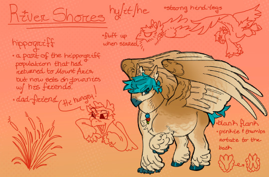
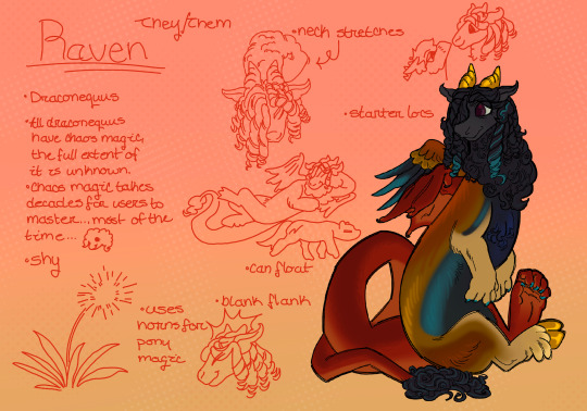

#id in alt text#art#my art#mlp fim#mlp g4#mlp art#mlp oc#mlp#my little pony#batpony#hippogriff#draconequus#changeling#reformed changeling#mlp au#character design#original character#digital art#AURGH idk what to put in the tags im tuckered out from the image ids.. I NEED TO BE BETTER AT MAKING THEM MORE SUCCINCT. plsase let me know#if the ids are too long or cumbersome...
96 notes
·
View notes
Text
Bomby bfb :]

Silly doodle. Hello!


Aaand felt like doing a couple banner things too. :]
#Bomby bfb#Bomby bfdi#Bomby tpot#If I messed up his character design I am so sorry I refuse to look at a reference sheet for my life. But I mean#it's a pretty simple design. It's a bomb. That. That's it#bfdi bomby#Bomby#Bfdi#Osc#Object show#Bfb#Tpot#Silly#Banner#Osc banner#Bomby banner#Somebody get this guy a banana!!!#Doodle#I might make some alt versions for II bomby. I'm pretty sure that's two different designs#Idk maybe later I'm tired I'll probably go to bed soon#it's almost 2am#My art
27 notes
·
View notes
Text
Bangs? Bangs.
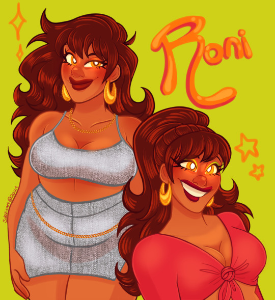
#artist on tumblr#original art#original character#oc art#id in alt#roni helix#digital art#character design#my art#sabz art#for whatever reason roni is the character i draw when i come up with a new method of coloring#i decided i hate lineart and opted to juat not donit her and color over the sketch#i enjoyed this process so much more#i need to practice so i can keep it up#and i think i do prefer the bangs on her#idk i think they just make more sense#i hate drawing bangs mainly because of how they cover the face and can make the expression harder to read#but i think it works well
9 notes
·
View notes
Text

by popular demand, introducing my new character/sona(????) moreau! (they/he)
#my art#art#ocs#might still make some adjustments to this design but idk#just a lil sketchdump to get a feel for the character#so. yea.#thinking of doing an alt design thats like more obviously weirdfur#moreau: scary pig
63 notes
·
View notes
Text
getting a strong urge to design some new ocs
#i need some cool female ocs.... like idk i hate when women are badly written or written for the male gaze#which is unfortunately every single shonen anime woman#like i need to write my own so so she is written for the female gaze (me. my gaze)#but also been rotating a male design in my head that is basically all my favorite character elements wrapped into one#but is it cringe to create an oc you want to selfship with?? lol not that i CARE but like am i off the deep end rn lol#idk just. i need more alt looking characters w tattoos and piercings and fangs and funky hair....#making dry deadpan jokes about murder and adamantly refusing to admit they are in love with you (but still acts like a guard dog anyway)#i just feel bad bc i already have a bunch of ocs i am neglecting lmao. but these i don't think i have any ambitious story for#just want cool new ocs lol#idk i think ocs/character sheets are the one thing i could do commissions for bc i just like making little guys yknow...
4 notes
·
View notes
Text


i finished zi-o. i think its gonna be the only thing i think about for the next month
#well courts is making me watch ultra z so i’m also doing that i guess#so many mixed feelings about the ending of zi-o fr#i haven’t watched any of the movies or other content yet so idk if my opinions would change#i think main 1. i hate the concept of wiping the whole timeline#but 2. it’s a completely new divergent timeline?? so it’s not like they’re starting completely over again it’s essentially an alt universe#???#but 3. I DONT CARE AS LONG AS WVERYONE IS ALIVE AND HAPPY#and 4. WHERE IS WOZZZZZ NOW HES FRIENDLESS AGAIN 😭😭😭😭😭#they literally said highschool au be upon ye#also kamen rider tsukuyomi is so cool….. a super pretty design#me: i love angst *bangs my head into the wall*#ngl i love every character in zi-o#ALSO i have not watched decade but whatever decade and diend had going on was fascinating. r they divorced?#not art#sorry for tag rambling#and like i said before: i literally had only watched revice and double prior to this#u can imagine. how wild every single episode was. to me.#so many guys
20 notes
·
View notes
Text

la bella donna
redraw of this pic from a year ago
floral pattern from picture blue box
#my art#digital art#artists on tumblr#redraw#my character#character: raven#described in alt text#i drew this on the 29th but it takes me forever to acc post my drawings lol#but i'm still kinda stunned by how different these are....#almost exaactly 1 year apart#not just w the way i drew her or even the design#but the style itself!#and my process nowadays#honestly this style of coloring / shading is still vv new to me#like idk it's just what seemed to make sense w the sketchier lines#++ the more design-y elements... i like those :)#i liked doing the flower part#fun fact i was orignally just going to leave the black border as a solid color#but idk i think i just can't abide by so much unbroken solid color lol#so i repeated the bg pattern on it too !
3 notes
·
View notes
Text
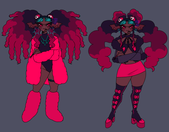
Velvette if she served cunt
Design breakdown below 👇🏾(BEWARE IT'S VERY LONG)


Alright going into detail about my gripes and edits. Like Velvette but her design is just. Not good to me. None of her (main) outfit details look like they fit to me— pinstripe pants + long fur coat paired with black crop top and scene sleeves? Skull earrings? TINKERBELL HEELS????? Tell me how any of that meshes well or even makes SENSE for the social media influencer persona she's supposed to have going on. Now that I think about it I'm pretty sure she's supposed to be clown themed... But I'm just gonna toss that idea out bc being a revered social media influencer and a clown at the same time just seems a bit oxymoronic to me, and the "clown" details aren't adding shit for me.
And don't think I forgot about her features. Pale ash grey skin and wavy hair at best. If she was supposed to be some type of creature where a nonhuman skin tone would make sense then maybe I could let it go?? But as far as I can tell she doesn't have an object or creature or animal theme like the other V's and if she does I shouldn't need to do detective work to figure it out. There is no reason for *any* of these poc characters to have grey skin, especially since they don't have any other poc features at all.
Sorry that shit gets me heated anyways. Onto my redesign. Gave her a more obviously black skin tone and textured hair bc I love a 30 inch buss down as much as the next girl but considering how there are no significant poc cast members with visibly textured hair I think she deserves to flaunt some coils if no one else will.
Ngl I'm not. A fashion girlie. Idk what's trendy idk what screams "influencer" so a lot of this was just throwing shit at the wall that I've seen around recently but it looks cute enough to me. And there was a bit of inspiration taken from Aliyahcore and ghetto fabulous fashion ❤️
If you can't tell this is shamefully inspired by lovesart23's Velvette reimagining because imo they had some outstanding ideas for Vel. I low-key stole their idea for those floating eyes in her hair that follow her around and help her keep tabs on shit it was just a superb idea for a social media overlord to me. I also took some inspo from @furbtasticworksofart 's redesign because vampire influencer sucking up the souls of her followers in exchange for content??? Too good (also the eyes were supposed to have bat/vamp wings I just forgot 😭) So yeah she's a vampire demon now. Without the features she was looking too human anyhow. Maybe she also feeds off of the energy of her followers through tech like after Vox mind controls them or whatever... Idk idk is that anything
Speaking of Vox, the screen glasses are meant to connect her to him w/ their color and shape while serving the purpose of being like a second phone she can post and check the web with. Like lovesart said in their reimagining vid, Vel doesn't really do more than pose for selfies and scroll on her phone when it comes to social media so in my head she's constantly flipping her shades on and off, using them to scroll and stay active, and they can show when she's not paying attention or respect to something/someone bc scrolling is more worth her time in the moment.
The hearts everywhere are also supposed to kinda represent social media likes + connect her back to Val w/ his heart patterns. That might've been what the hearts in her og design were for but. I just didn't like their placement bc I'm a nitpicker and a hater❕
I have so much more I could say about possible ideas for Velvette because I love evil black girls and I only want them to succeed in my media and I could treat her so much BETTER but I'll refrain bc this is way too long anyway.
Alright for reading/scrolling through all that rambling I offer you the sketches + some alt hair ideas I had
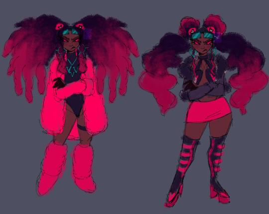
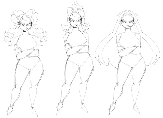
P.S. I'm very open to constructive criticism but if I see anyone just dick riding in my replies or rb's I'm just blocking you on sight ✌🏾
#hazbin hotel#velvette#velvette hazbin hotel#velvette redesign#hazbin hotel redesign#my art#digital art#character design
852 notes
·
View notes
Text
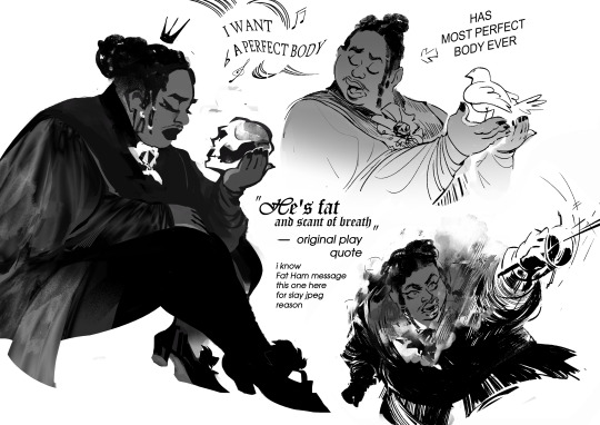
making Hamlet fanart in 2024, slapping Juicy (main hero of Fat Ham, a modern play, Hamlet version, played by black fat queer person) on char design i saw in old b&w film while listening MCR playlist was an experience
highly recommend. also pls watch/read Fat Ham upd: image description added! (in alt text, but also under the cut)
(Image Description: List of sketches with 3 drawings. The textures used here are elegant looks-like photo silk (for clothes), soft shades and gradients. Shapes are sinking in each other depth. No color, black and white
It's fanart depicting Hamlet character being combination of different versions of him from different media: fat black queer masculine person being elegant, wearing mascara and lipstick (took from modern play Fat Ham) wearing vintage royal clothes (took from old classic film). The narrative of sketches also mixed of modern play (Fat Ham) and classic one
There are 3 sketches:
First one. It's the character described above (TC in text further) sitting in side view. His eyes is closed and face has melancholic emotion. TC is holding a scull. There is a simple-shaped silhouette of crown above his head. This image represent classic play melancholic vibes of character fused with modern play appearance
Second sketch. It's TC singing, while holding white pigeon in hands. It had previous classic-modern fusion vibes + a little vibe of disney princess song (because of bird and emotion expression similar to disney musicals). By left side of this sketch is stylized speech babble with music notes symbols and deformed text, visualization of singing. The text saying: "I want a perfect body", quoting singing of TC from modern play. By the right side of sketch there is arrow pointing at character with text "has most perfect body ever".
Sketch Three. It's dynamic sketch of TC in a duel (opponent is out of the frame), waving a thin sword (idk how it in eng, in my first it's шпага, a sword but specific type of it). From the chest of TC it's going steam, like character is heated mechanism pushed to limits. The face of TC is strong and determined, with mouth wide open trying to catch breath. Near this sketch is text: (text starts here) "He is fat and scant of breath" - original play quote. i know Fat Ham message. this one [the sketch with duel] here for slay jpeg reason (text ends here).
End of Image description)
609 notes
·
View notes
Text
PICOS SCHOOL DESIGN DUMP
Pico
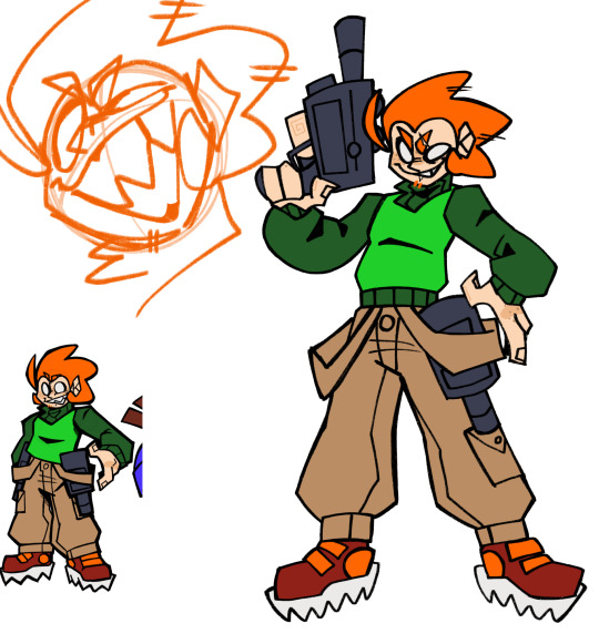
So, I decided that my previous designs for a lot of these characters are going to be more-so their designs during the events of the Pico’s School games. So when they were kids. Like, some will be a bit different, but for the most part, that’s how it is. So then these new designs are them as adults.
When trying to figure out Pico’s design, I didn’t know how I wanted his outfit in this new design to differ from his previous. Cuz like, that’s already the perfect Pico fit. But then I realized “omg, it’d be so much funnier if I DIDN’T change it.” Cuz he is definitely the type of mf to be wearing the same clothes he’s had since middle school.
Like, Cass or Nin come back for a rematch, and they both look super different, and then they look at Pico and he looks NO DIFFERENT than last time they saw him.
Darnell
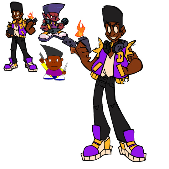
I immediately broke my rule with the previous designs with Darnell, cuz I just really liked the previous design’s outfit and was like “eh, imma use that for his adult design, and just change the kid design.”
I imagine he got that varsity jacket like, custom made, and it was like super fuckin expensive. But like, when he got it, he decided “wait, I don’t want the sleeves” and just ripped them off 💀
Can’t have long sleeves when you’re always working with fire ig.
Nene
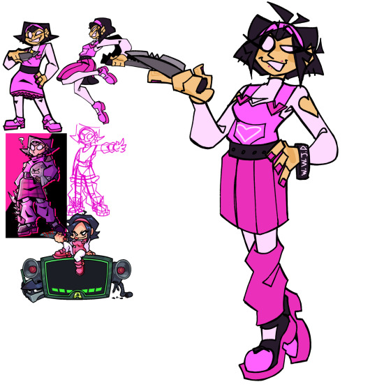
I think Nene is the one I’ve drawn in alt. outfits the most. What can I say, I just really like drawing her and messing around with her clothes. So I had a lot of previous pieces of mine I could look back on for reference.
The main change that isn’t outfit related is her hair. I just decided to dick around and see what looked good, and landed on that. I think it looks pretty good, idk.
Also, gave her a WWJD bracelet cuz sometimes I forget she’s Christian and I thought it was funny.
Reminded me of this one stupid idea I had, featuring my very headcanoned version of the G-Squad:
Like, the G-Squad are doing their whole cult thing, worshipping the Peniliens, when the Pico trio burst in, and Nene says something like “THERE IS ONLY ONE LORD AND SAVIOR, AND HIS NAME IS JESUS CHRIST.”
And then they kick their asses, idk.
Also, here, them as kids. Pico just got spikier as he got older
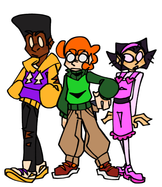
Okay, time for some antags 💥💥💥
Cassandra
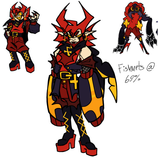
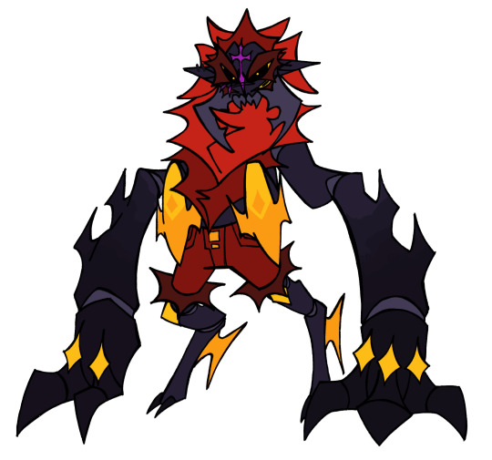
She was actually the first redesign I made in this batch.
Main change: Beard. I just sorta wanted to make the Penilien duo more androgynous. I imagine that they don’t really care about transitioning that much, since they don’t have the same gender roles and stereotypes as humans. Just “I’m [insert gender here], that’s it.” Also, I just think Cass slayed with a beard.
I also wanted to incorporate shapes from their alien forms more into their human disguises. So I gave Cass these big sleeve things to sorta emulate the big bulky arms she has in her true form.
One of her pincers is also chipped. This comes from the fact that in Pico’s School, one of her horn-hair things is shorter than the other, and I wanted to find a way to incorporate that.
Damien


I don’t think there’s much to say here that I have already said while talking about Cassandra.
I imagine Damien does less to hide his alien features, since he has a huge superiority complex and thinks Peniliens are superior anyways, so like, why hide his true colors? Why hide what makes him greater than everyone around him?
So yeah, that’s why he keeps his tail out.
Nin
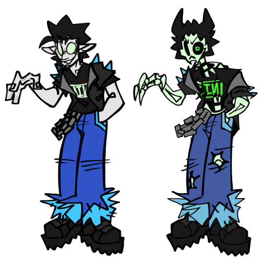
YIPPEE, HEAVYILY HEADCANONED CHARACTER TIME‼️‼️
So Nin differs with the whole “previous design is them as a kid” thing, cuz he doesn’t really age past his age in Pico’s School. Cuz bro dies.
(Also, quick HC timeline: Pico 1 and “Pico 2” (the conflict with the robo-kids) both take place in middle school, while what I call “Pico 3” (the conflict with the G-Squad) happens in high school. So that’s why Nin appears less child-like; he’s a high schooler)
So like, I hc that when Pico killed Nin, Nin pulled some necromancy bullshit and revived HIMSELF. Cuz idk, that feels like some bullshit Pico’s School would pull.
So now he’s undead. His hair also sorta resembles horns cuz it’s sorta to symbolize his devotion to the Peniliens. If y’all are interested in hearing all the HCs I have for the G-Squad (or just PS in general), I might share more at a later date.
That’s all for now tho.
Bonus:
My color palettes for these fuckers. They’re all named after the MSI songs I associate with each of them. I do not support MSI, I just really like the music and it reminds me of Pico’s School for some reason, so I always listen to a lot of it whenever I get sucked back into this fandom
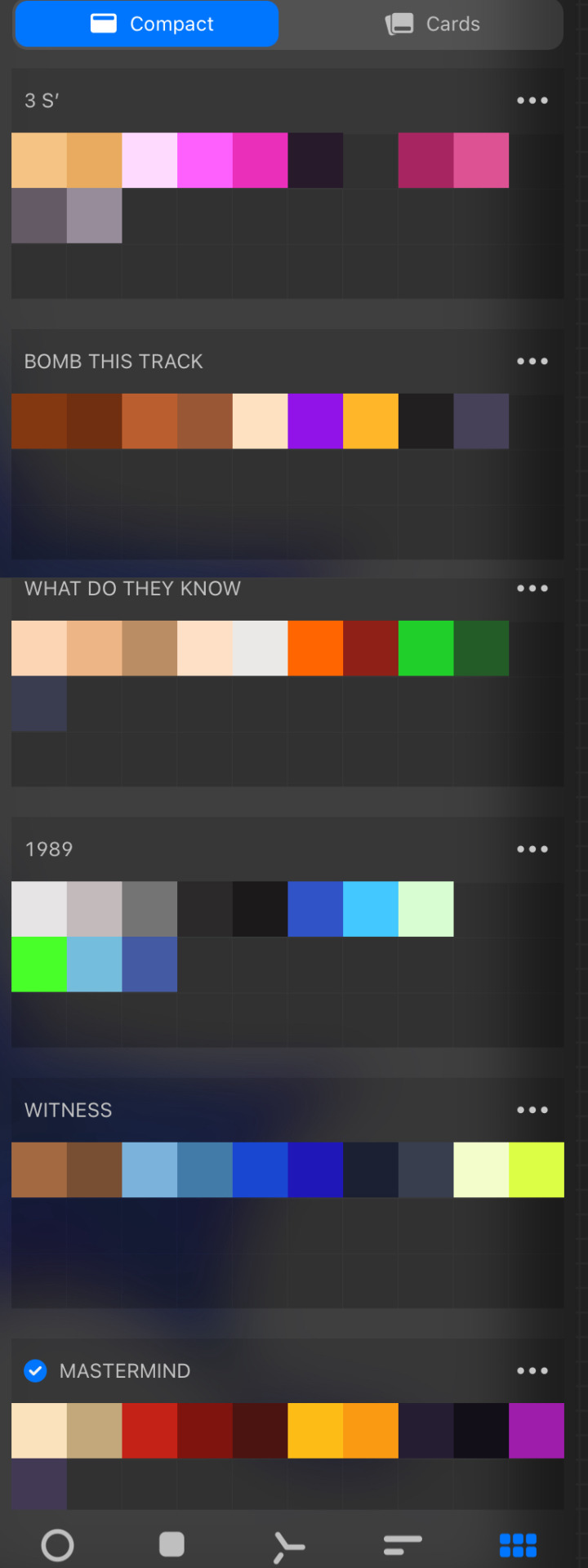
#ashedwings post#ashedwings art#ashedwings ramble#picos school nene#picos school cassandra#pico’s school#picos school#pico's school#picos school darnell#picos school pico#pico’s cousin 2 damien#pico’s cousin 2#pico’s school g squad#darnell pico’s school#nene pico's school#pico pico's school#cassandra pico's school#Wingz!NG AU#ashedwings design
216 notes
·
View notes
Note
Whos the orple hedgehog? She's super cool!?? Is it an AU? What is it about? (sorry for the many questionsssss)
You're asking me about my AU!?? I've waited years for someone to ask me about my AU!!!!
I've had this AU idea since I was little! It's kind of a role swap between Sonic and Amy. (Not a personality swap)
Here, Amy is the main mascot/character instead of Sonic. (Like, Imagine if Amy was the face of SEGA instead)

(The AU was mostly based on SA2 and some other games. I do want to make it clear that the way the canon stories go is not exact to the AU. Idk how to explain it exactly but I'll probably doodle stuff from time to time. And no, I don't plan on re-writing the entire sonic canon just to make the AU work....just pretend it works somehow IDKLMAO. Like I said, I'll be doodling my ideas out from time to time.)
:]
So in this AU there are a few things I changed. Such as characters who are originally based off of Sonic's design like Shadow, Metal Sonic, etc. I would have to redesign them to be based off of Amy's design.
So far I've got "Shadow's" redesign, who is the purple hedgehog you've seen. This is what I meant by being "based off of" Amy's design. This is still technically Shadow, but her name is Sombra Thorn. An opposed name to Amy Rose while still keeping the "shadow" part of the name. ("Sombra" means shadow in Spanish).

I created Sombra's rough concept in 2018/2019-ish on a math homework page. (It's lost)
And made her early design in 2021/2022.


This is old old old art..........her design looks so much cooler now.
I've also got "Metal Sonic's" design already, I just haven't posted it yet. Though its not Metal SONIC here, it's Metal AMI.
(Changed the og name from Amy to Ami for reasons I'll show later) I will explain more about her character soon.
Sonic in the AU is "replaced" with Nicky the Hedgehog (even though they're technically the same character). He does still go by "Sonic" as a nickname.
In this AU, Amy and Nicky are a couple, just like in the Sonic Shogaku Gonensei ("Nicky the Hedgehog") manga. He does have his super speed still, except his personality is a mix of Nicky's and Sonic's. I'll try showing it more when I draw!

A fun little thing I want people to know about are his boots! They are unfolded versions of Sonic's boots.

When he's in battle he'll fold them down, it helps him control his running better. Otherwise they will remain as normal unfolded boots.
I might try re-redesigning him again.
OH YEAH- Sonic and Tails ARE still like brothers here. That isn't replaced with Amy. (I'll doodle stuff about this too)

- • - • - • - • - • - • - • - • - • - • - • - • - • - • -
So YEAH- that's a quick run down on the AU so far. There are still many complications but... that's tomorrow's problem...
These are the characters I've been, and probably will be, working the most with. So expect to see them a lot.
Maybe it's because they are alt. versions of some of my favorite characters (Amy, Sonic, Metal & Shadow)
Just enjoy the characters! That's what I really want!!
I hope I can draw the characters and their interactions more so you can have a better idea of them. But be patient! It will also depend if I feel like drawing them. I'm doing this simply for fun and because I want to.
And since people seem to really love my ideas and designs it's been encouraging me to share more cool stuff like this!

Now, I have to restrain myself from info dumping to the point where it's too confusing or too much to take in.
GRRAHHHH!¡!¡!¡!¡!¡!
#Amy Rose AU#Sonic#Sonic AU#BBQ#DON'T GO TOO CRAZY WITH THIS#ITS STILL A WIP#and i can't promise ill be doing it forever but idkkk
115 notes
·
View notes
Note
Aether and Sunshine designs too please. They are Copia‘s ghouls too


Hey there! first off, I'm wanna note I don't take art requests but I'm making an exception this once because I wanted to add something nice with an explanation as to why I didn't include them to begin with! I'm putting it under a read more in case people want to share just the art though :)
Btw, my commissions are open; you can always choose that route to see me draw fanart you'd like and it would support me!
ID in ALT text!
(EDIT: please read my replies first before making assumptions about me. Thanks!)
So: I normally exclude specific nameless ghouls from my art because the real people behind the characters have some history that frankly isn't our business, but out of respect I choose to leave them out.
there's some uncomfortable air about past members I don't feel like divulging in, and to respect leaving it be I try not to depict members involved with it (not to mention, I don't think some would be thrilled to still be associated with the band at all). Omega is my exception because he didn't seem to be involved; idk about sunshine, but Aether I'd rather leave out. I won't elaborate more than that; sorry!
Nods to Aether and Sunshine in my work MIGHT show up as small cameos, but most former members will never be included.
63 notes
·
View notes
Note
What I can't get my head around is, why didn't Dominus Ambus tell Rewind that he was secretly a turbofox? Like, that's your conjunx, presumably the person you trust most in the whole universe, and you won't even share your secret with him? IDK if you've already done an analysis post on this but if you haven't I'd love to hear your thoughts.
Okay, so. Putting aside any non-diagetic explanations entirely for a moment (that is, my suspicion that the concept was conceived of some way into the comic's run and just proved a really good way to explain Rewind not recognising the Pet once it was settled on)… in-universe explanations, let's go.
Something I do wanna point out here is a thing I rarely see mentioned: in my opinion, Minimus does not act as though Rewind doesn't know. I think he expects that Rewind does, which is honestly sort of wild? In DotL, Minimus isn't like 'oh shit, now you know I guess' when he's making remarks about Dominus being even more insecure about his height than Minimus is (irreducible style), or whatever. I… guess you could argue he thinks Rewind has inferred it logically (Minimus has revealed he was wearing an armour > Minimus and Dominus are spark twins > therefore…) but tbh, he's just. SO casual about it. I absolutely feel like Minimus assumed Dominus had told Rewind! Which. THEY WERE MARRIED LMAO. IT'S A REASONABLE… ASSUMPTION……..
Which definitely suggests there's no reason externally that is all that compelling for Dominus to not have done so. If there was, presumably Minimus would have anticipated it! Realistically, if Dominus couldn't trust Rewind to keep it secret for the sake of public access and ease, why the hell were they married. (Anyway, Rewind is in a far more precarious situation than Dominus is, when they meet; Rewind isn't able to hide and is formally subject to being classified as 'disposable'. I mean!) That's definitely not compelling.
Personally I think the easiest way to reconcile it is to think that Dominus had a personal hangup around his alt, and genuinely wanted people not to know this about him- because he himself was personally ashamed of it, no matter how much effort he put into public work that seems to contradict that. This actually reconciles something else, I think. Why would the sentience test Dominus seemingly designed in part or full be so biased against beastformers? He is one! What! But if that's something he was unable to get over the way he e.g. was able to overcome prejudice of the kind Rewind was facing, it perhaps makes sense to think of it as a kind of 'harder when it's personal' thing. Right? Internal feelings of self-loathing are sometimes paradoxically the more difficult kind to unlearn, compared to changing how you think about other people. Hell, maybe Dominus convinced himself wearing an armour 24/7 meant he wasn't one any more. Maybe he didn't tell Rewind because as far as he was concerned, that was no longer true.
I think this would potentially be interesting in terms of adding actual characterization to Dominus against which you can a) effectively compare and contrast Minimus (since a looot of what we know about Dominus is more or less 'he was made in a lab to induce an inferority complex in Minimus', lmao) and b) open up avenues to question the very idealized view Rewind has of their marriage that don't necessarily require leaning into the trope of 'he was an Evil Liar All Along on purpose!!!', which adds a lot of interesting stuff to that element of Rewind's arc that I'm sad canon never really managed to deliver completely, IMO.
I have actually thought about Dominus in relation to both Minimus and Rewind a LOOOOOT haha. He's such a cipher in the comic; a huge motivating character for two otherwise-unconnected leads AND a cornerstone of our introduction to the Functionist Universe… and yet a character we know very little about the thought processes or feelings of. He's like a void of a character you can reconstruct by looking at what surrounds him. It's very fun to me.
64 notes
·
View notes
Text
so i received the news....... nyon specter is diabolical i can't do this </3
i like the design and stuff... somewhat i guess...... they made nerv more..... healthy looking. but i just can't get over nyon specter stop this nonsense. chat am i just hater or is anybody else about to have an episode

tried to do some nerv drawings............ remembered idk how to draw mohawks.
i think i might just be cursed to hate anything the sims 4 does when it comes to remaking their old characters. it seems like no matter what they do with an old character, it's just bad to me. like they find a way to fuck it up in some way. love the original sims 4 characters, hate when they bring someone old back. and it gets me even worse when they make the worst change ever and go "well it's an alt universe so it can be different" like how about i put my foot in between both of yo asscheeks, leave the old townies alone or do it right
rant over....... i think im just a hater. whatever. old man yells at cloud, something or other
#the sims 2#the sims 4#ts2#ts4#nervous subject#nyon specter#fanarts😏#sims 4 team you stress me out like always#god bless#but i will be enjoying the fuck outta the pack regardless#im genuinely hyped after watching the trailers and stuff
62 notes
·
View notes