#or a jacket to add a bit of shape to the design
Explore tagged Tumblr posts
Visit Tumblr Blog
Explore Tumblr blogs with no restrictions, modern design and the best experience.
Last Seen Tumblr Blogs


Fun Fact
In 2020, 27% of US Tumblr users had an annual household income of over $100,000.
Note
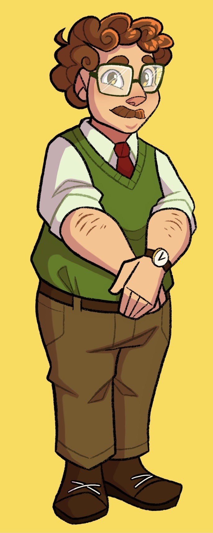
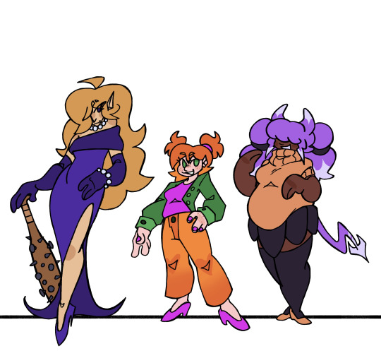
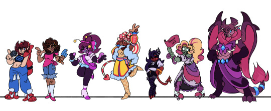
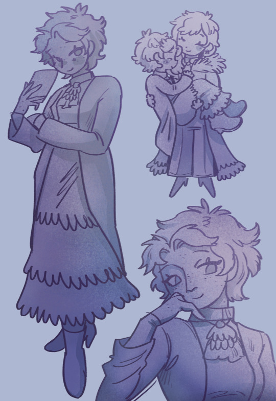
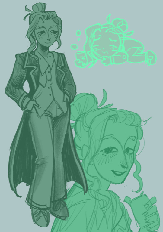
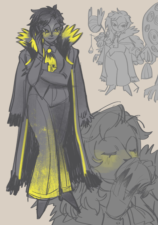
why does your stray tim look like a complete rip off of this? https://www.tumblr.com/mirawwis/732008202881974272/stray-robin
ok i absolutely adore mirawwis and i think their art is fantastic but i didn't rip off their design lol
since i drew up the sketches for his design in like,, dec or jan i dont really remember the exact process i had for his design but i do know i took more elements from catwoman designs for him, like the goggles and the cat ears. like the only reason i changed it into a cat beanie instead of the hood was bc i have a cat ear beanie lol. plus i didnt rlly wanna put him in a regular skin tight body suit like she has so hence the leather jacket
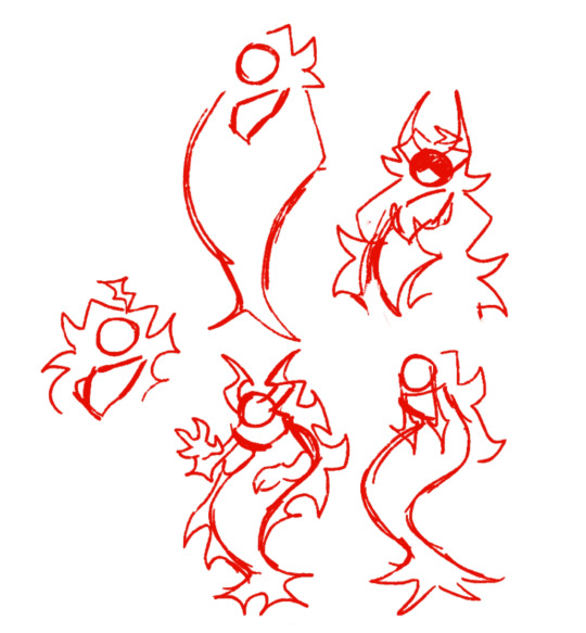
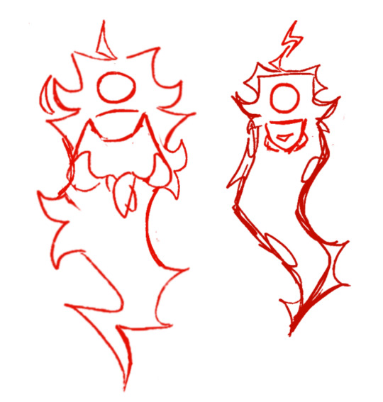
these were the sketches i was talking abt
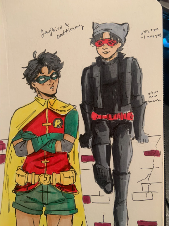
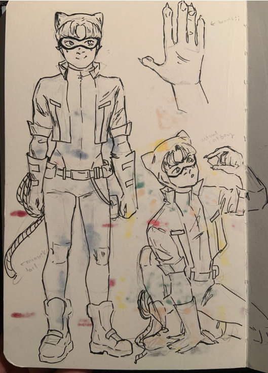
#there are also like... two routes u can go for if u make a stray design and thats straight up black body suit w cat ears#or a jacket to add a bit of shape to the design#and i picked red for the accent colour bc i thought it would be cute if tim took elements from robin's costume for his D:#+ if anything i based him more off of an old chat noir design i had lmao#ash answers#and i think i originally wanted to make his jacket a leather vest instead bc i saw a cute one somewhere#but i wasnt liking how it was lookin so i make it a jacket instead
48 notes
·
View notes
Text
Bridgerton Blue
Pairing: Benedict Bridgerton x fem!reader
Summary: Benedict is stunned by his wife in Bridgerton blue.

Warnings: None, really. This is fluff and a teensy bit suggestive.
Word Count: 0.7k
Authors Note: Request fill for anon; see next post for details. I just had to use a GIF with him in a light blue cravat for the story. This is written from Benedict's POV. Sorry it's so short, but I hope you enjoy it! <3

The air catches in his lungs as he sees you.
Sashaying into the bedroom from your dressing room, a vision in light blue.
“How do I look, husband?”
Your tone is affectionate, tinged with playful teasing but a hopeful earnestness that has a dense warmth spreading behind his ribs.
“Truly beautiful, my love,” he asserts as you swish the fabric back and forth, giving a little flourishing twirl as you draw nearer.
He is captivated by the beauty of your look, yes, but more by you. Simply aglow. A beaming smile that seems to inhabit your whole being. He would do anything to keep you looking like that—as if the sun lives within you. Scarcely believing it is him you have chosen to spend your life with, to share the wonder of yourself with.
“And you are so very handsome,” you wink as you arrive in front of him, hands running up his sharply tailored jacket over the ruffles of his shirt. “This matches my dress perfectly,” you hum happily, him captivated by the way your eyes shine in the candlelight as your fingers toy with the tips of his cravat.
“It is by design’, he confesses. “I asked my tailor to work with your modiste,” he adds, enjoying the way your expression lights up even more at his forethought.
“You are the very best husband,” you attest ardently, and he can feel the sincerity behind your words as he cradles your face, your jaw moving delicately in his cupped palm.
Your hand encircles the back of his head and pulls him down gently but insistently. He happily obeys, smiling against your lips as you push up onto your tiptoes. Sharing a languid kiss that has a tingle running down his spine, your nails a mild scrape over his scalp.
“I wanted to wear Bridgerton blue,” you explain quietly, tilting to bury your face into his neck and inhaling heartily, the tip of your nose pressing under his ear where he dabbed his cologne, just for you, your very favourite scent. “To tell the world I could not be prouder to have your name, to be your wife.”
Your impassioned declaration stirs something profound in his soul—the magnitude of your mutual desire and love. The missing puzzle piece he had been searching for until that fateful day last year when the jumble that was his life suddenly found its shape, its order, its wholeness.
“I am the luckiest man in the world,” he murmurs into your cheek, your eyes fluttering closed as he peppers gossamer kisses over your skin.
His hands slide around you, pulling you closer, loving the slight hitch in your throat as your bodies mould to each other.
“And I could not be prouder to be your husband,” he echoes your words, nuzzling your face until your lips ghost each other, breathing shared air. “I love you so very much.”
“I love you too,” you whisper over his cupid’s bow, arms banding tight around his neck as he lifts you from the ground.
There is a bloom in his chest and a tug low in his gut as the kiss deepens, your tongue seeking his, a sensuous parry that always alights an intense flame within him. A burning want to be with you. Only you. Away from the world and all of its noise. To lose himself in the profundity of your connection when you are intimately entwined, hearts syncopated, bodies alive.
“Must we attend this ball, my love?” he pouts as you break apart, his tone turning mischievous, deploying that crooked smile that always has your pupils rapidly dilating.
“I fear your mother will disown us if we do not attend her ball…” you chuckle reluctantly as he places you back onto your feet. But there is a distinct stirring in his britches as you crowd closer and offer coquettishly: “I will make it worth your while if you do, Mr Bridgerton…”
And just like that, he is putty in your hands. Cannot help but bring your knuckles to his lips to drop a lingering kiss onto the fabric there—a promissory note for what you will share later, his voice husky as he replies.
“Lead the way, Mrs Bridgerton.”
masterlist • wips • taglist (follow this blog to be tagged)
Benedict taglist pt 1: @makaylan @longingintheuniverse @iboopedyournose @colettebronte @aintnuthinbutahounddog @severewobblerlightdragon @writergirl-2001 @heeyyyou @enichole445 @enchantedbytomandhenry @ambitionspassionscoffee @chaoticcalzoneranchsports @nikaprincessofkattegat @baebee35 @crowleysqueenofhell @fiction-is-life @lilacbeesworld @broooookiecrisp @queen-of-the-misfit-toys @eleanor-bradstreet @divaanya @musicismyoxygen84 @miindfucked @sorryallonsy @cayt0123 @hottytoddyhistory @fictionalmenloversblog @zinzysstuff @malpalgalz @panhoeofmanyfandoms @kinokomoonshine @causeimissu @delehosies @m-rae23 @last-sheep @kmc1989 @ferns-fics @corpseoftrees-queen @magical-spit @bunnyweasley23 @how-many-stars-in-the-sky @hanji-emo-blog @sya-skies @urfavnoirette

#benedict bridgerton fanfiction#benedict bridgerton#benedict bridgerton fluff#benedict bridgerton imagine#bridgerton fanfiction#bridgerton#bridgerton fluff#bridgerton imagine#benedict bridgerton x reader#benedict bridgerton x female reader#benedict bridgerton x you#benedict bridgerton x y/n#bridgerton x reader#bridgerton x female reader#bridgerton x you#bridgerton x y/n
745 notes
·
View notes
Text
Hazbin Masterpost
Heavenbound Masterpost
Sir Pentious

So the problems I had with the canon design is that he looked more like a slug than a snake and there were too many eyes. His design just needed to be streamlined. I guess I'm not a fan of the eye motif in general, but that's a personal preference. I altered the colors to add more variety to the hazbin cast, and to reference his early design, which had quite a bit of green.
More notes under the cut, including a human and angel design
I based his design off of the Indian monocled cobra, because the design of its hood was most similar to Pentious', and Hognose snakes. Hognose snakes also have a hood, although not near as impressive as cobras. If that doesn't help to ward off danger, they are will play dead. They are very insistent about playing dead too. It's honestly hilarious. I thought the behavior fit Pentious' overall pathetic demeanor.
Body:
I slimmed his lower body to match his upper body to get rid of the slug look. He also doesn't really have much in terms of shoulders, his suit jacket has padded shoulders to make it look like he has them.
Then I changed the vertical lines to horizontal, which can open to reveal eyes, I guess.
Head:
So a snake hood is literally just their neck. They flatten their neck to make themselves look bigger than they are. I don't have to strictly follow that, since he's a demon and not a real snake, but I felt the need to somewhat allude to the fact. I also liked the animation of his hair/hood as it went up or down and wanted that to stay. So I had the hood part attach to his neck before the collar of his shirt, and the hair is an extra part.
I adjusted the mouth shape to more accurately resemble a snake's, which has a space for the tongue to pass through. The teeth aren't always visible, because snake fangs only show when the mouth is open. I didn't really consider what it would look like for him to unhinge his jaw, but he can totally do that.
Clothes:
I wanted to give him a more clearly Victorian outfit. Specifically late Victorian, because he apparently died in 1888. Fashion was basically transitioning into Edwardian at that point. But the hard part is that men's fashion didn't change as dramatically as women's over time. In a simplified style, I had to make sure it didn't just look like a regular suit. Especially since he doesn't have pants to help complete the look.
I opened his suit jacket to show the waistcoat(vest), and include a chain for a pocket watch. I chose to give him a cravat because it has Victorian vibes, and helped me in my quest to reduce the number of bowties. The tie pin looks like an eye because I didn't see a reason not to.
Top hats were fairly popular in this era. Bowler hats were probably more popular, but the top hat has an older vibe and steampunk aesthetic.
Egg Bois:
I don't actually understand them. He created them, but I don't know how that works. Or why he made them eggs. But they're there. Frank is there. I think one should be named Egbert. Yolkshire(oh, with a Cockney accent too). Um... any other egg pun names?
Mannerisms:
His height is variable, based on his mood and if he's trying to be intimidating.
I didn't consciously decide this, but I kept drawing it and liked it, but he tends to stick his tongue out and hold his hands up. It's pretty autism-coded.

Human: Soooooo. I did see the S2 leaks. I incorporated some things, but changed some as well, so I don't think this will be significant spoilers or anything.
Really long hair was not Victorian style, but there wasn't exactly a strict standard either. So I gave him the longest that I found examples of. Facial hair would have been typical for men to have, but I guess he didn't get the memo. Maybe he was worried about it getting caught in the machinery.
His name is Mr. Pendleton. I don't know a first name, but I sorta like Simon. He was a socially reclusive weapons engineer. To be perfectly honest, I don't have all that much else to say. I'm not sure how deep canon will delve into his human life and I don't want to theorize much at this point. So I'm not sure how he died either. Maybe it was a weapons malfunction.
He might only be in hell because he felt guilty about something that might be spoilers to say. It was honestly a pretty mild sin on his part, and I wonder if he was redeemed because his sacrifice relieved him of that guilt. I'm sure the show will touch on that though.
Redeemed: So the direction I'm going is that angels are more human-like in appearance. Those in hell look different because the place corrupts their appearances. But that mean his redeemed design had to be very different than canon. But it was a chance to give him his iconic hairstyle without worrying about historical accuracy.
(Feb 18, 2025 - added a note to say there are human and angel designs under the cut)
#hazbin hotel#hellaverse#hazbin hotel redesign#sir pentious#hazbin pendleton#human pentious#angel pentious#heavenbound au#a3 art#fanart#digital art#character sheet
83 notes
·
View notes
Text
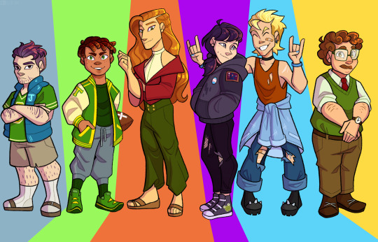
Well since my bachelorette designs were received so well, I decided to complete the marriage set! Here’s my bachelors!
Individual pics and thought processes under the cut:
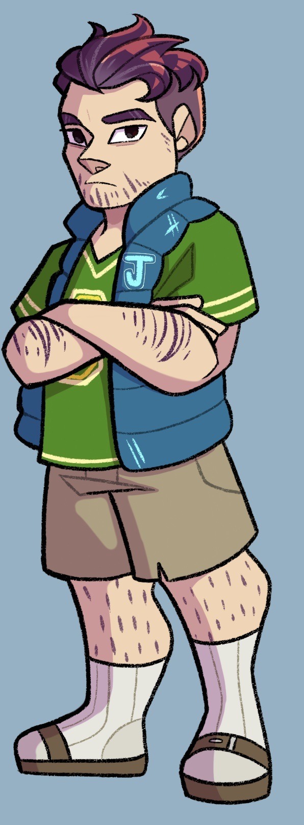
I’m drawing these from the perspective of how they’d look on day 1, but I’d definitely like to do a post-Joja higher heart design for Shane at some point. Overall for this one I just tried to make him look unkempt and dull, I desaturated his skin tone to make him look sickly and he’s the only one without eye shines, signifying how he’s lost the spark for life.
Also sorry about the socks and Birkenstocks.
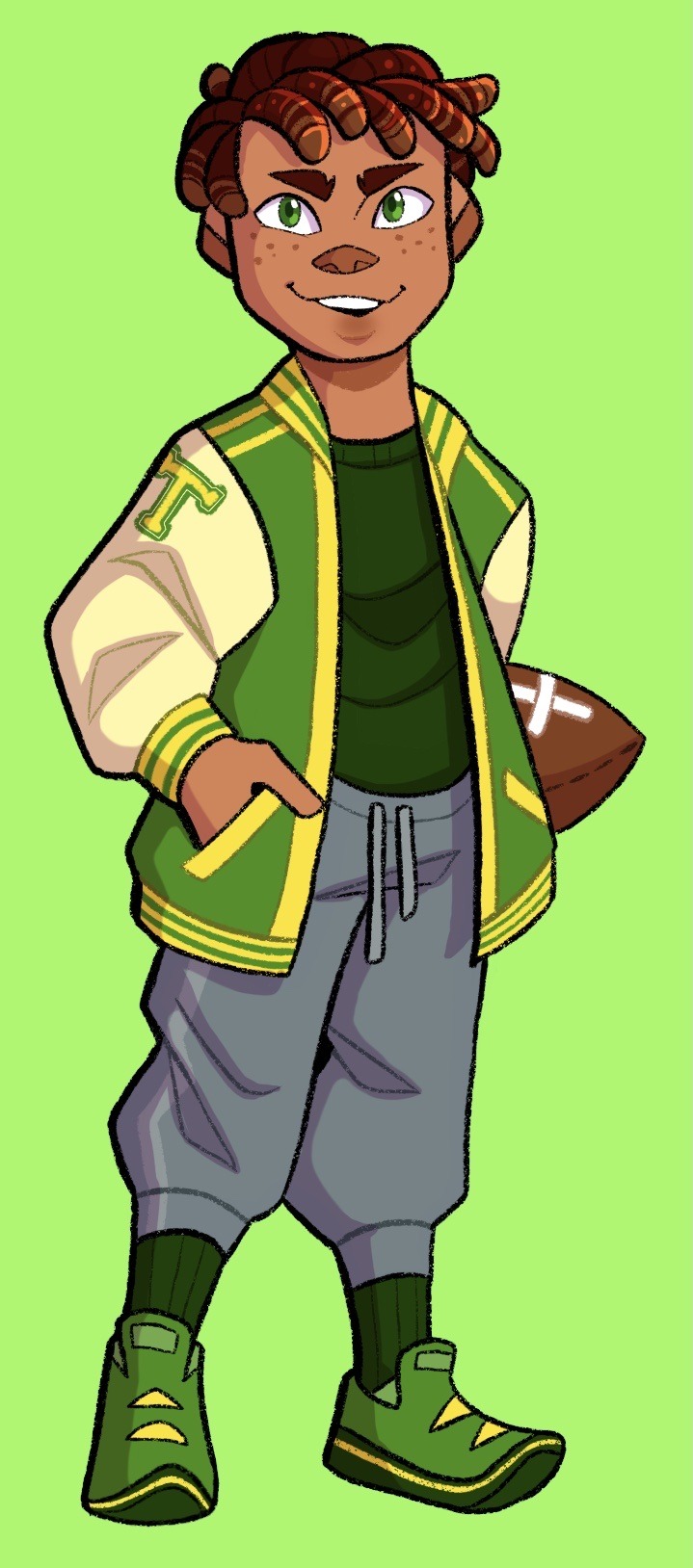
Decided to make Alex mixed, since there’s absolutely no diversity in the bachelors. Had a lot of fun translating his canon hairstyle into those short locs. Other than that the biggest change was turning his jacket into a proper varsity jacket. Short Alex gang unite!
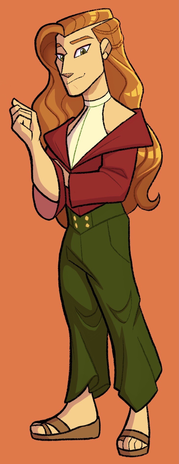
Okay sorry Haley, Elliot takes the win for the most changed design. Like it’s so obvious he’s meant to have a Victorian jacket and fancy trousers and all that, but after I drew him all tall and slender and I gave him little braids and beach waves he just started taking on a Boho vibe? When I drew the jacket it just looked tight and restrictive. So I decided to let the beach influence carry and we ended up with this fancy yet comfy loungewear with sandals. And I love him?
Also this was heavily inspired by ginjaninjaowo’s male espeon design
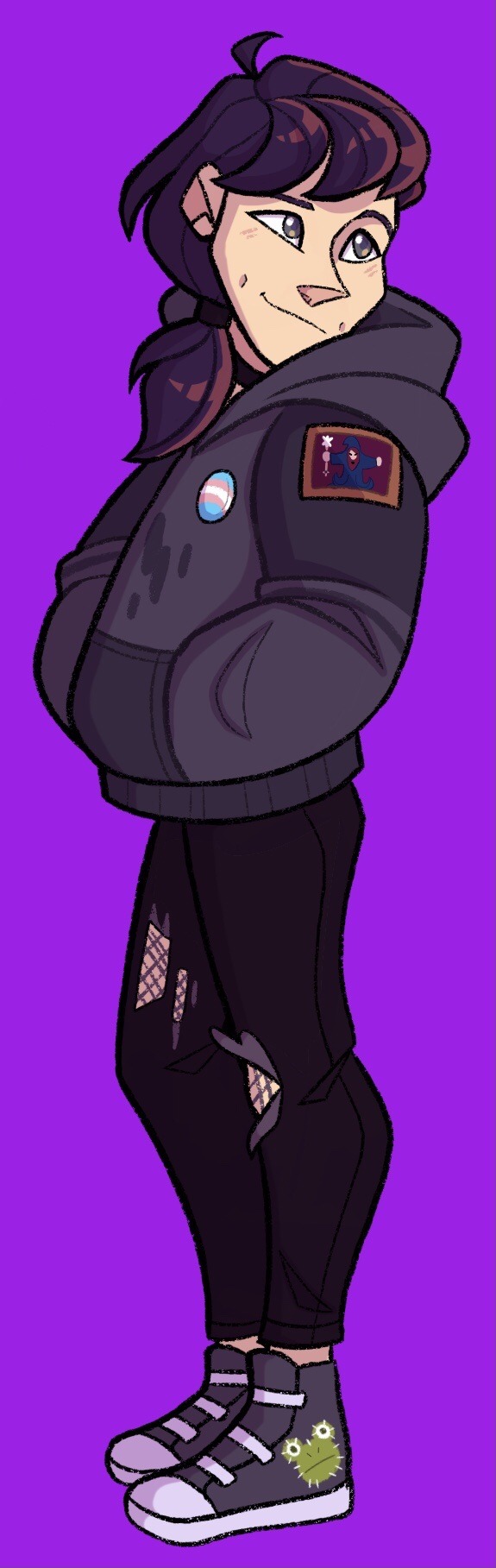
Sebastian was honestly a pain, like I know his design plays off the emo teen archetype, but compared to the others npcs he’s actually got a lot of variety. Like he’s obviously got some emo influence, but there’s also some nerd thanks to his interest in coding and ttrpgs, and he’s also a bit of a tough guy with the bike and the smoking. So there were a lot of directions to lean. Still, his sprite is clearly going for a dark hoodie and dark jeans, so I didn’t think I could change it up without making it not feel like Sebby. Does he have a muscle tee underneath for working on the bike? I’ll never say.
Biggest change is probably the hair, just wanted something less stereotypical, and have some variety in bachelor hair length. Definitely leans into the biker side a bit lol. Otherwise I just tried add detail to his dark outfit and adorn it with his interests. So frog embroidery on his shoes, a patch on his jacket and some motor oil stains on his hoodie. Also as promised he and Maru have matching dimples.
Also happy pride month, enjoy trans Sebastian and also the head canon that he and Sam start dating provided the farmer doesn’t get there first lol.
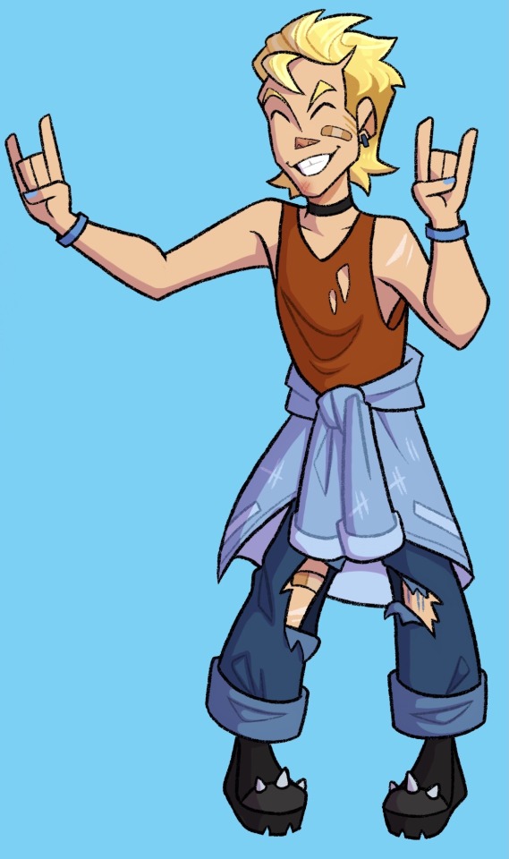
And with Sam the ASS trio is complete! Now with matching chokers because I said so.
Just like with Sebby I wasn’t sure which direction to go for Sam, whether to lean more into skater boy or rockstar. Ultimately he ended up more rockstar, though he’s still always roughed up from skating (probably because he refuses to take off the platform boots). He thinks the torn clothes make him look more legit though.
I had fun making his shape language compliment Sebby; he’s very top heavy from the giant hoodie so I made Sam bottom heavy with the baggy jeans and jacket. Also I had so many thoughts about him and Kent, given that Sam and Sebby are a thing and Sam isnt exactly gender conforming.
And last but not least, Harvey. He’s sweet, he’s simple, all his heart events are charming. And yet he is always the last one I reach max hearts with because I can’t be bothered to go to the doctors office. Sorry bby, I hope I can make it up to you by designing you as an adorable cherub of a man.
I know I’m being super controversial, giving him a pushbroom mustache when the sprite is obviously a handlebar /s. But like, he’s such a square; it fits him so well. My little lawful good guy.
Ya know, I think I gave him a sweater so Elliot’s jacket would stand out, then proceeded to not give Elliot his jacket. Huh.
Anyway bonus of the boyfriends together to close us out, thanks for reading!
#stardew valley#stardew fanart#sdv#sdv fanart#sdv bachelors#stardew bachelors#sdv shane#sdv alex#sdv elliott#sdv sebastian#sdv sam#sdv harvey#shane stardew valley#alex stardew valley#elliot stardew valley#sebastian stardew valley#sam stardew valley#harvey stardew valley#stardew harvey#stardew alex#stardew elliott#stardew sebastian#stardew sam#stardew shane#pride#pride month
287 notes
·
View notes
Text
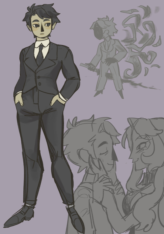
THE SILENCE ALEXANDER DESIGN JOURNEY
lets see if it beats my ass for putting this many images under a readmore
May 2019: fucking around. Barely cursory historical design research for the ghost look. Hair down for fire reasons. She's also as tall as Vlad (shocking). You can't see here, but for a while her eyes are green and her hair is blond instead of grey. Human disguise still has a black turtleneck, but thats a labcoat rather than a blazer. Glasses were a staple though.

August 2019: Major overhaul. New face shape. You can also see that Silence used to have black flames. When I eventually change the Flame color later, it's because I felt it got too difficult to read her powers against her dress. Silence's bun is still in a pretty modern-looking style, though. Silence is still as tall as Vlad.

Later 2019 / early 2020: Still green, still a very simplistic dress, but what would become the final hairstyle emerges! I did a ton of research for that, actually. Lot's of diagrams and videos about 1870-1890 British women's hairstyles that I stared at. You can see here that she's still blond & green-eyed.

March 2020: I become breifly misinformed and give her a more Edwardian, partially let-down hairstyle for a while. This would not have come into fashion until AFTER she died. I finally do some dress research, and decide I like the Victorian dresses which mimicked men's waistcoats. You can barely tell though, because it's still so simplified. Silence's fire is a greenish-black, my attempt to keep it dark while still contrasting her black outfit a bit. Didn't work well enough, imo.

August 2020: THE FINAL HEAD AND NOSE SHAPE APPEARS!!!! I can't quite remember why I changed it...just felt more in line with the show's style, I think? And maybe suited her hair better. Anyways Silence finally becomes a greying former brunette!!!! I start backpedaling the Edwardianness of the hair. I'm still trying to make the black fire work but rapidly realizing it doesn't make sense with the green fire glow effects I want on her face when she's angry. The Amulet has been around for a bit at this point, you can see it in the bottom left, which also features the grid pattern blazer on the human disguise. I think this is around the time I also decided to make her short.
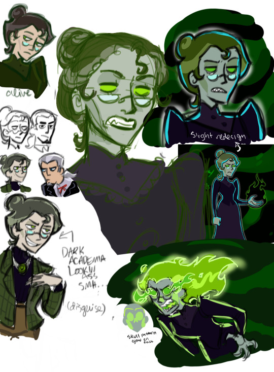
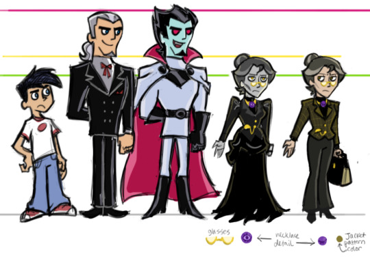
January 2021: NO MORE GREEN!!!!! Yellow eyes / power makes her stick out more among other ghosts, not just to be original but also to indicate that she's pretty weird. Otherwise monochrome so she looks like she's right out of a book! The more detailed waistcoat/jacket-style dress top is beginning to take shape, AND I finally caved to the BUSTLE!!! Because every source I read kept emphasizing how important it was in fashion around Silence's time.
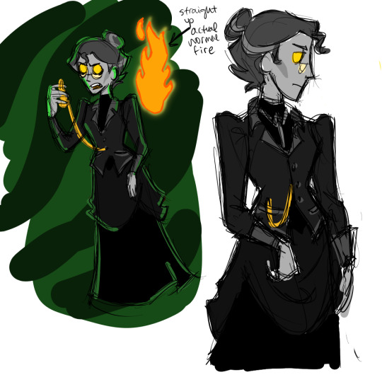
May 2021: trying to finalize my choices. I also test out some eyelashes that I don't end up keeping. The bustle and "jacket" on her dress become shorter. I also try to make her human disguise jacket one flat color for a while. She's been short for a while now but you can still tell that I spent a long time drawing her tall

September 2021: Baaaasically the final design. Except the human disguise color scheme is altogether very light colored.
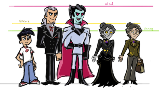
current: Hilariously, I returned the grid pattern to the human jacket because I rewatched Hannibal. It's based on my favorite suit Hannibal wears in the whole show. And it adds just the right amount of visual interest lol
49 notes
·
View notes
Text

Beast Jacket | Glass Diamond
I drew this to celebrate that I FINALLY FINISHED THE FIRST DRAFT of the NeverFell Projects’ first installment. The script is 20 pages long, and I haven’t even added the design breaks yet…is this shaping up to be my first hour-long video…??
In any case, it’s still just a first draft, and it will definitely need some more work before I even start recording it. After I have a nice long break to reset the ol’ brain, of course. ^^
So these designs are successors to these two from before: Adam basically just went shopping for a more protective coat (which he wears on top of his previous outfit) and new shoes. Cinder, on the other hand, jumped into a totally new look as usual. ^^ I love that she’s the Barbie of the RWBY universe, and I’m more than happy to feed the stereotype by giving her lots of different designs~.
This is my answer to her V7 outfit, where she loses the reds in her design as the ‘flame goes out’. Unlike the V7 outfit, however, this design's symbolism is intentional, as Cinder puts this on when she’s at her lowest point. I like to imagine she was meditating over the direction of her life while she crafted all that glass armor…
Anyway, speaking of direction-- just so I don’t forget (and as a small preview of what I’m working on~) here’s some things I hope to improve with my next draft of this proto-story:
1] Emphasizing reciprocity As in, Adam helps Cinder develop AND Cinder helps Adam develop; it’s supposed to be a two way street. Unfortunately, I think the tail end of the story kinda paints Adam as the ‘savior’ in this relationship…and his lingering superiority complex does not help. ^^;
It may be because he goes through a whole arc over the course of the story, while Cinder just starts hers in the last act, but I think if I just add a bit more introspection on Adam’s part, I can probably fix this. I mean, despite having a more stable sense of self that he can rely on, Adam is clearly the weaker half of this partnership-- he gets beaten up twice in a row while Cinder just keeps coming back stronger despite her suffering. Add to that the fact that Cinder can read him like a book and does so constantly, and there’s no reason Adam has to come off as her superior if I’m actually doing my job as a writer. ^^;;
2] Cinder’s turning point I’m afraid that she might have fallen into the classic writing pitfall of “having a bunch of bad things happen to her and then suddenly changing her mind”...y’know, without a clear line of reasoning that takes her from “this is painful but necessary” to “this isn’t okay anymore”. It’s the difference between a character simply running away from something scary (like any animal can do…) vs. actually developing as a person.
There is a final conversation at the end of the story that I was supposed to use to make this clear, but I think I got too caught up in making it ‘realistic’ and establishing Adam and Cinder’s future dynamic. Which was admittedly very fun, but at the same time there’s probably a reason why it feels like a lightweight conclusion to a heavyweight story, and I’ll have to correct that eventually. :T
129 notes
·
View notes
Text
I'm in the middle of writing about the ending of MHA. I wanted to include a bit where I talk about the updates the characters have had to their looks and costumes, but felt that it was too long of a diatribe. Instead, I'm throwing it out here. That may be difficult considering how crowded the final shot is and how there is no official colored version out, but I can do my best.

Mineta: Also barely changed barring the little grape vine on his head and a similar design around his writs and he does his waist. It's more cohesive, I guess, but it's still whatever.
Sato: I honestly thought that Sato only had a pair of gloves as his new costume. Still though, I miss the mask as a part of his look. I would say more, but Sato's design has never been interesting, so I'm not disappointed.
Hagkaure: She has the biggest downgrade. Poor girl lost half of her costume during the time skip. She doesn't even have access to shoes anymore. That or she secretly has the best costume and the lighting was wrong.
Sero: Barely anything changed here. His helmet is sharper, which I could take or leave but do prefer the older one, and he's our first example of characters getting wrist bands. Not the more prominent trend, but one I noticed.
Mina: There isn't any notable changes to her costume, except more wrist bands which you think would just be melted by her acid, but I like the longer hair and horns. Even if the fact that her horns seemingly changed positions and shapes bugs the life out of me.
Kirishima: I don't even think there is anything different about Kirishina's costume. Maybe more pronounced teeth on the mask and making his gears more jagged, but that's about it. At least he has the best hair designs out of the new looks.
Ojiro: I like the changes. He got rid of the silly one sided fur on his neck in favor of a full one. He traded out the white gi for a black one, showing he evolved further in his martial prowess. And again, he has the headpiece like a few of the other characters.
Jiro: She exchanged the leather jacket for the vest. It's a fine trade, giver her more of a proper punk rocker look. Once again though, she is the part of the odd trend of giving characters wrist bands, seemingly loosing her arm speakers.
Koda: The character done the most dirty for design. In both panels he's in, his entire costume is covered by text boxes. At least his lost the mask, both showing him being more open and because it was basically useless now.
Shoji: Odd how one of the few students with their own panels has pretty much nothing changed about their look. And his may be a hot take, but I don't like Shoji with longer hair. I just think it looks really weird on him.
Tsuyu: A very minor change to how her headpiece looks, but I like it. It looks like a cute little summer cap instead of hulking headpiece she had before. The lenses looking like frog eyes were certainly a nice touch and adds to the "cute and friendly" look.
Tokoyami: The only change seems to be that Tokoyami now has a scarf on top of his cloak. I don't really get it. It doesn't look good and doesn't have any particular benefits. Was he really taking tips from Square Enix with wanting more cloaks?
Shinso: Shinso grew out his hair. That's about it. I'm mixed on this. It's not a bad design, but it can make Shinso feel more and more like a clone of Aizawa. So much of his design is already based on Aizawa. Could we maybe do something a bit diffident?
Iida: More of a sidegrade with this one. The extra muffles around his head look silly. I like the more cap shaped helmet, more resembling his brother's costume and looking similar to the cap the Greek god Hermes would wear for neat little visual reference.
Aoyama: I'm conflicted. One the one hand, Aoyama's costume does look a more practical with the removal of things like the cape and sliming down the design, but it loses a lot of the personality. Plus his pants are really dumb. I don't care how they are colored, they just look silly.
Denki: He may just have the most improved costume. His disk launcher has been broken down into a smaller version of it, seemingly with darts instead. The lightning patterns on his pants are nice as well to give his look more flavor. And the headphones work with his design.
Uraraka: I miss the space visor. It really brought the whole them of the costume together. Instead we get another pair of headphones. I do like the little bits of Izuku's costume in the look, such as the metal around her neck and the launchers around her arm looking like his gloves.
Momo: Momo has a proper shirt now. I do wish it has some more design to it. Maybe some white accidents around it reminiscent of her old look to make more like an evolution. Maybe she could have taken some visual ques from Midnight's or Magic's costume to show respect to her former mentors.
Shoto. Not a lot changed here, surprisingly. The most there is Shoto having designs similar to Enji on his chest. Which I do hope has more of the red and white as part of it. It'd be a neat way to represent how Shoto is still Enji's kid who incorporated everything he learned from him, but is more then his own person at this point that can be free of the shadow that Endeavor cast over his life.
Bakugou: I don't much care for this new design. While I like how they intergrade more of his winter costume into his standard look, it loses on a lot of personality that the old costume had. Things like the blast shaped mask and grenade bracers were great additions and it really needs more of that orange and green to break up all the black. The little fuse tassels are nice though.
Izuku: Out of the all the characters here, I find myself the most reserved about Izuku's new look. Because it depends so much on the coloring. The look itself I think is fine. A natural final conclusion to his costume. But the colors have always been an issue for me. I'm just hoping the cape and highlights are plain white as opposed to the clashing orange and yellow of his last look.
#My Hero Academia#Not Quirks#Midoryia Izuku#Deku#Katsuki Bakugou#Shoto Todoroki#Ochako Uraraka#Uraravity#Tenya Iida#Momo Yaoyorozu#Eijiro Kirishima#Red Riot#Mina Ashido#Pinky#Fumikage Tokoyami#Tsuyu Asui#Froppy#Denki Kaminari#Jiro Kyoka#Shinso Hitoshi#Ojiro Mashirao#Toru Hagakure#Mezo Shoji#Sero Hanta#Aoyama Yuuga#Koji Koda#Sato Rikido#Minoru Mineta
111 notes
·
View notes
Note
One nitpick I have about N's design is his feet being so flat and unwieldy looking.. because even though the Worker Drones bare feet are flat, they're significantly thinner (looking more comparable to the size/shape of human feet) and iirc the foot pieces themselves also have joints and can bend, rather than being one solid piece. I can see why they didn't want to give N the peg legs like J and V that evoke stilletos, and I assume the idea with N isn't that he has "bare feet" as much as his sculpt is meant to just look like some kind of shoes. But it just looks so clunky to me. I wish they gave him some kind of cut in his foot shape to look like a heel, even just a small one like the heels of the boots most of the workers wear. A bit of a higher one would honestly look even better though, because it would lend itself well to the way the disassembly drones stand taller (in the same way the female drones' legs look like they're standing on high heels), and imo just have an elegant look paired with the shape and length of his jacket.
When I see fanart giving him a heel, it looks way more natural and adds to the design flow. That little bit of negative space under his feet of him does wonders for taking some of that bottom heavy looking weight off. It also breaks up that bulky ovualar shape into a couple smaller geometric shapes, which match the other parts of his body sculpt and shape of his jacket.
(Character design in animation is my passion ✨️)
⠀
28 notes
·
View notes
Text
My beloveds over @wusialaforeva requested a Jo Kimmich fashion analysis, and who am I to say no to such a genius idea?
I have to admit that although I love Jo, I went into this expecting some teenage dirtbag-level nonsense in his younger years, but for the most part, his style was fairly practical from the start—almost minimalistic at points. Emphasis here is on the “for the most part”, but more on that later 😆
Most of the time, you’d be forgiven for forgetting Jo is even rich. There’s no combo the man trusts more than a light jacket, a simple, neutral t-shirt, and a pair of good jeans. Sometimes he’ll add an extra layer with a hoodie, but that’s about it. There’s little in the way of designer flair; everything’s a simplistic, slightly sporty kind of chic—the kind of clothes you might expect athletes who aren’t making millions of euros a year to wear.


And when he’s feeling extra comfy and cozy and boyfriend-shaped, out come the thick puffer jackets:


Then you’ve got moments that make me think our resident angry chihuahua took a few classes at the Leon Goretzka school of fashion. Note the flat cap, the fashionista jacket, and the flannel:


Much like his boyfriend teammate Leon, Jo also had a bit of boyband phase, though his was a lot more subtle short-lived from everything I could find. Nothing gold can stay, truly.


But last but not least, there’s the outfits no amount of science can’t explain. The glitches in the matrix, as it were.
Sometimes there’s excuses, like the time he let Serge dress him:

Or the times he was just feeling a little silly and a little goofy:


As for the rest, well, I’ll let you draw your own conclusions:


I’d especially like to open up a dialogue on the spiky chia pet hair in the last pic
#sooo I ended up finding a whole bunch of pics for Jo’s style#way more than I bargained for#but I’m planning on doing a Jo’s hair choices masterpost some other time#hopefully you still like it lovelies <3#joshua kimmich#fc hollywood#compilations
23 notes
·
View notes
Text
OKAYOKAYOKAYOAY SOOOOO
i CANNOT stop thinking about musical falls. GENUINELY. it rotted my brain. SO! i've spent a bit of time doodling and coming up with ideas for how BILL would be presented on stage.
firstly, we have 2-D Bill/Pre-Weirdmageddon Bill. the idea i had for this form is that we'd use a spotlight tinted with a yellow gel and on top of that there'd be a gobo (stencil) of Bill's triangular form.
(examples of how that'd look onstage)


pros- spotlights can effortlessly move around stage without physically interfering with actors, also it mirrors how in the show, he's limited to the mindscape and how he doesn't have a physical form yadda yadda yadda (you get my idea)
cons- not much movement/expression. also kind of a disembodied voice? Bill is very expressive so it'd be hard to showcase something like that on a cut out stencil of him.
ANOTHER IDEA (i just had now as i'm writing this): Bill projection !!
so, it'd be a projected image of Bill which would be able to be animated so THAT solves the issue of the previous idea. plus i'm sure there'd be a way to move the projection around the stage if needed.
uhhh anyways !! back to my original ideas !!!!
obviously everything i've just mentioned is for 2-D Bill, but HERE is where it gets exciting. when Bill gains his physical form during Weirdmageddon.
so, when Bill gains a physical form, i had 3 ideas:
IDEA 1- Lin Manuel Miranda as Bill.
now, in my previous post about musical falls, i was kind of /j ing the idea, but i think it'd be genuinely hilarious. imagine this, duing the whole musical, bill is this 2-dimensional projection, kinda eerie. makes you think "how is he gonna look once he gains a physical body?" then BOOM its Lin Manuel Miranda. obviously his costume would be a waistcoat and jacket combo (something similar to how i drew him in my past post) but yeah. that's really the only reason. it'd be funny. idk.
IDEA 2- Puppet Bill.


this Bill would be more canon-accurate, still in his triangle form, except he'd be puppeted by someone. now, this comes with the same problem as gobo-bill. LACK OF EXPRESSION. he's stuck to one emotion/"facial" expression. (also i have no idea how puppets work. if anyone with more knowledge than me wants to add on/constructively criticise, you're welcome to!) i didn't really expand/think too much about this idea either soooo.....
IDEA 3 (my favourite)-


drag. bill.
i really like this idea. now, i'm no costume designer, nor do i do drag (so apologies if i've gotten anything wrong) but i think this would be something really cool to see on stage. the shape language of the costume, alongside a gorgeous makeup look, AS WELL as it being a real person acting, really feels like a good direction to go in, as it would allow full movement, gestures, and expressions !! (hooray!!) also i really need to see an awesome Bill-inspired drag look onstage. it'd be awesome.
ANYWAYS THAT'S IT !! THOSE ARE MY IDEAS !!!
this is all for fun as i KNOW this won't ever become an IRL stage production (probably) but a guy can dream. i just had so much fun coming up with ideas for the heck of it sooo !!!
another MASSIVE thanks to @fordtato for making that video about musical falls. i think i'm obsessed.
AAAA THAT'S ALL !!!! :D
#gravity falls#musical falls revival#bill cipher#yapping#sorry my thoughts are not coherent#i just really had to get my ideas out#i'm sure you guys get it though#right?
121 notes
·
View notes
Text
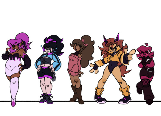
FNF CONNECTED UNIVERSE LINE UP Part 2: The Girlfriends
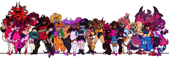
Yippee, new line up. Didn't have as much trouble on this one either.
Idk how much yapping I'll be doing, since I don't really know how much I have to talk about.
But still
Close ups and yapping under the cut
Alternate Universe Girlfriends
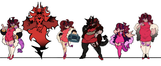
So just like with the Boyfriends, all these Girlfriends are technically all the same person, just from different universes. So I tried some elements of their designs consistent between them all, which stem from my base game Girlfriend design.
Unlike BF, there's a good bit more to talk about with GF since I draw her pretty different compared to her in-game design. The main thing is her more apparent demonic traits, like her horns, tail, and purple splotches. The explanation for this, in universe, is that she doesn't have the full power to cloak herself yet. See, her and her family are "music demons", which gain their power by leeching from music, usually a particular genre. GF hasn't really decided what genre to leech from yet, so she isn't as powerful as she could be. She also has a coat cuz uhhh. Silly. Things like her demonic traits and her coat (Or something of similar shape like a feather boa) would be the things to connect all the AU GFs.
Moving on, we have Herself, who I was looking forward to drawing the moment I started this line up cuz I had just. Such a clear vision of her in my head. Although it was a struggle to put that vision on paper.
It's hard to put the exact vision into words, but it's like having her form become less defined as it goes downwards, until it's just the wispy silhouette of her hair. There's a certain balance you have to strike with the wispy nature of her form and the trademark Girlfriend hair shapes, and that's what ended up being the biggest struggle. Once I figured that out though, it was pretty simple. Shapes were the most important thing since her coloring is pretty monochromatic. Not counting the black, this design only utilizes two different colors, both being shades of red. Her design includes a feather boa instead of a jacket, mainly cuz I completely forgot about that rule when I got to her and the boa was a lot easier to add than a jacket. It also makes an interesting shape I think.
Next is Funkadelix, and she really wasn't too hard. The main thing was giving her traits from my main GF design, which wasn't hard at all. For her horns I referenced her Halloween attire. Her tail too, sorta, but I mainly just referenced the thinness of it.
There isn't all too much to say about MDM. There wasn't a lot to change or add. Main addition was the boa, which was admittedly kinda fun to draw in my style for that AU.
Now onto Mix. If you saw my post yesterday about the doodle/sketch pile for this line up, you might've seen a design concept I did for Mommy Mearest, and that was literally just for Mix's design. Except it was virtually pointless cuz I didn't really include any aspects of my MMM into my Mix design. It's fine though, I think she turned out fine. Might take another pass at her in the future when I ACTUALLY have my MMM design figured out.
Lastly for this section, HD. I actually had quite a bit of fun drawing her. Don't really got much to say about her though. I'm pretty sure she was the first AU GF I gave a boa, so she's the one that started that. It was originally going to be all white, but my good good friend @minxtheeenby suggested it fading into black, and I really like how it turned out.
"Side" GFs
So first is Belladonn (B-Side). I know I wanted her to appear more sophisticated. That's just always how I imagined her, even back well the mod was still a simple recolor remix mod. There's also something so fun about classy characters that are also dangerous. We need more regal women that carry around bats full of nails. I had a lot of trouble nailing (pun not intended) her hair. The main thing that sets it apart from the traditional GF cut is her side bang (idk hair terms, I think that's what it is), but besides that, not much else. So I had to mess with it a bunch to get something I liked.
Amelia's (D-Side) design was pretty straight forward. The main thing was just adding a few more details to spice it up a bit. Which just happened to be buttons on her jacket and lil heart patterns on her knees. I also wanted her to be short. Cuz idk, she gives short vibes. A lil idea for her that isn't showcased here is that I imagine her pigtail buns actually turn into her horns when she is in her demon form. (Bad doodle, but just to show the concept:)

Lizzy (G-Side) was kinda fun to come up with ideas for. Most of her design is taken from the fake teasers for the mod, cuz silly. But because her mom is some sort of light spirit.. thing, I wanted to mix that in somehow too. So that's where the white highlights on her horns, hair, and tail come from, but that's not all it added.
She also has pretty funky eyes, that are somewhat inspired by Shara Ishvalda's eyes
Also, in that doodle, I imagine all of her hair is floating, I just. Didn't feel like drawing her pigtails cuz I mainly wanted to highlight the eye thing.
The New Yorkers
With Shaya, I mainly added a bit of stuff to her outfit, since the original is too simple with my design style. I basically just added a bat wing shape motif to her design. Cuz. Cuz vampire. This is also present in her ear shape cuz I didn't want them to JUST be pointed, cuz I wanted her to stand out a bit more from the demon girls. So different ear shape.
I don't really know how much Azalea (Neo) changed. I know I changed her hair a bit (to further differentiate her from GF) and I altered her top a bit but I THINK that's it. I did change her and her family's lore a bit though. Cuz I made them robots. THATS RIGHT, THIS IS WHO I WAS TALKING ABOUT WHEN I WAS TALKING ABOUT MAKING ONE OF THE GIRLFRIENDS A ROBOT. Azalea's pretty android-esc, but I imagine her parents are just full on robots. I can't wait to design them. But yeah, I imagine Azalea is much more human looking because she just wants to be part of human society and her parents love her so they got her the more human looking body so she could live out her dream. We love supportive parents *explosion emoji* *explosion emoji* *explosion emoji*
Not much to say about Grace. I just gave her a bit of melanin cuz apparently she's mixed. That's all I really changed tho.
I don't think I changed Judith MUCH. Her face is a bit more. Wolf-like? Idk. I also TOTALLY didn't reference Clawdeen Wolf's hair when designing her. Totally not.
Vikki (Minus) is grouped with the New Yorkers cuz. There's only one of her. Unlike the Minus BFs. I just made her a lil more goth, since people literally call her "Goth GF". Also made her hair a bit more blocky. cuz. cuz the minus symbol. Shape *sparkle emoji*
Who the Fuck Knows (Miscellaneous)
So starting with Cherry (Swappin'), in this AU she's actually GF's younger sister. She also already has a music genre to leech from (rap), so she's better at concealing herself. Not much else to say, I did not change her design much.
Nothing much to say about Barbara either, I barely changed her.
Now Astra (Starcatcher) was fun. While I was initially sketching her, I realized that both her alien species and the Alien Hominids have the same style of classic antennae. So I decided "Huh, what if their species are related." So I did that. Not much else to touch on besides that.
Tootsie belongs to @minxtheeenby and is part of their Sunday Night Snackin' AU. I drew her with her wings and tail out, which aren't usually out, but uh. Silly.
Belletrix didn't really change as much as I was expecting her too. The main thing was just. Making her an imp that could exist in the Hellaverse. Which was pretty easy. And then I just made shit up when it came to her outfit cuz it was kinda hard what was going on with that in the first place.
Next is Gabriella, YIPPEE. So she's the GF from Plants vs. Rappers. Vastly different appearance wise though, cuz, yknow. Can't have her look too similar to GF. And just like I did with Dennis, I decided to base her on another zombie from Neon Mixtape Tour: The Glitter Zombie
Idk, I thought it'd be cutie patootie. And it was. I really like how she turned out. I got lazy when it came to her flag, I did not feel like drawing that shit.
Last but not least is Ashley, the GF from my own AU. Which does not have a name. Idk, it's mainly just an excuse for me to draw anthro Monster Hunter monsters. But yeah, she's an intersex Leostra (Gender neutral term for the Teostra/Lunastra species that @sleepymushrxxm came up with) and I love her.
That's all I got. Gonna hopefully start working on the Pico's here soon.
#ashedwings post#ashedwings art#fnf#friday night funkin#friday night funkin’#wingz!ng au#fnf mod#ashedwings design#fnf mods#gf fnf#fnf gf#girlfriend friday night funkin#fnf girlfriend#fnf au#long post#ashedwings ramble
96 notes
·
View notes
Text
librarians redesigned!!! by me!!! :)
the designs are free to use, i used this as a character design exercise for myself while recovering from carpal tunnel issues! read more for all the individual designs + me ranting :*
first off roland!! i included an angelica in here, i designed her before him, shes very triangular to me.. maybe a bit more messed up than roland tells us about, he is a biased narrator afterall. anyways i wanted his design to match hers nicely, so hes like a rounded square type of guy... i think projmoon designed him to be Just A Guy intentionally, so i played into it. overall the least interesting design of the bunch imo. its on purpose :)
angela !!! my baby :) an important thing here is her bangs. i dont want her hair to be able to recover from however many years she spent with the hard middle part in lobcorp, i think its cute to incorporate it still. swoopy, fluffy hair for her! and the clothes are just a bit more casual idk the librarian uniforms were kinda boring and stiff to me, as much as it does go with her character.. if u wanna be human u gotta experience the joy of sweatpants or whatever. also i didnt add color but i dont want her to be fully white<3 or fully clear skinned.. give her sunspots on her face. she finally gets to experience sun. :)
guess ill go in order of appearance lol. malkuth! whats the headband for if it doesnt keep anything out of her face!! since shes a bit more active than some of her colleagues, i also gave her a ponytail(its also for the silhouette...) also gave her some chubbier thighs.. also maybe a butler-esque coat, at least to me; i just made it a bit more form fitting than the original. playing into her personality or whatever. shes cute.. remember to take deep breaths!!
yesod!! i want to play into the skin issues a bit more, i still removed his gloves but i gave him a poncho, not just for the square silhouette im trying to build but for more coverage. also emo hair over eyes was funny. also wide flare pants for you, boy. just very square and put together in general
hod! this ones my favorite (i even cared enough to give her a pattern on that skirt!!) it was kinda bugging me how in the artbook i couldnt tell who was writing because hod's, malkuth's, and tiphereth's colors are so similar. so hod is pink now, and malkuth a bit more orange. i kinda went for a romantic poet thing here, dunno how much that worked out, but i think out of everyone you can tell shes the literature girl. gave her pigtails !! theyre cute :> also since i removed the coat decoration off of angela, i gave part of it to hod in the bottom of her coat :). cute and round!
netzach is a very strange man to me.. ellipse shape and loose fitting clothes for u. if i saw him irl i wouldnt approach him. not to say i dont like him as a character, i love him, but i want him to look like a depressed guy who would pick up art as a hobby to distract himself and it works. bro is just surviving out there. also gave him comfy clothes to make the surviving easier, down to the shoes and wide, id assume non-denim pants - maybe cotton? maybe sweatpants that dont fit around the ankle? who knows.
tiphereth!! since she's like the teen girl of the group i gave her a skater dress, converse, and a tied coat around her waist.. like how i used to wear as a teen when i was being a hater and recovering from a death in the family that changed my entire life (im still a teen ... 9 more days till im 20 as of posting this). also gave her fishnets i think she would like that. i imagine she would get headaches bc of those dumb braids on her head<3 or maybe bc her coworkers are kinda dumb<3
gebura :) round face, reverse triangle shaped body.. like a true butch lesbian stereotype.. i decided a leather jacket, docs and pants i see metalheads wear would fit her! red leather jacket, of course. also gave her spiky hair just like projmoon did<3 my favorite detail here are the eyebrows, i think their shape is rlly neat! nvm i think its just that gebura is rlly neat. anyways the eyebrows fit her
chesed my boy.. idk i just saw him and hit him with the transmasc beam and gave him , as the kids say, wh0re eyes. i wanted him to have rounder hips and just be round in general. turtleneck and cardigan combo also, i think he would like wearing that. also somewhat curlier hair, or at least wavy would do him well! and a tote bag, i dont doubt that he would go out to read in coffee shops if he could - so he gets a tote bag to carry his sociology books. i want him to look like he would give the warmest, comfiest hugs and be friend shaped
binah!! this one was the most challenging, trying to find the right place for the colors - to not use too little or too much yellow. i still dont think i got it right but this is as close as im getting. long face, long nose, siren-ish eyes.. messed up in the head bird lady that speaks like hannibal! i also dont think a dress really suits her so i opted for wide pants and a fancy black button up .. maybe angela styled her, who knows. also black fingertips which is a trait i like to give the arbiters (including an oc).. just my own little consistency thing i like to do :)
hi grandpa! ok for hokma i dont think the changes are that big? i gave him O shaped legs and his sword thing i turned into a walking cane, gave him a vest (didnt want to opt for a corset but i think he would enjoy the back support for proper posture) . also gave him a mild gradient from darker gray to lighter gray, since he IS the gray part of the ABC trio. gave him salt and pepper hair and an older face. forgot to draw it, but i wanted to give him a silicone tip for the sword so it doesnt dull out, which he can take off when recieving guests
honorary mention to go along with the angelica i mentioned with roland, i mildly changed up her twin(k) brother. i gave argalia and angie the same hair but mirrored, his a bit more curly and hers a bit more spikey, his face a bit more edgy, hers a bit rounder and kinder. not much else to say here, i liked his design as is, but wanted to add him here :)
#library of ruina#project moon#art i made#big project done wooo ! :) im proud of myself for setting a goal and sticking to it. are you proud of me. tell me youre proud of me
122 notes
·
View notes
Text
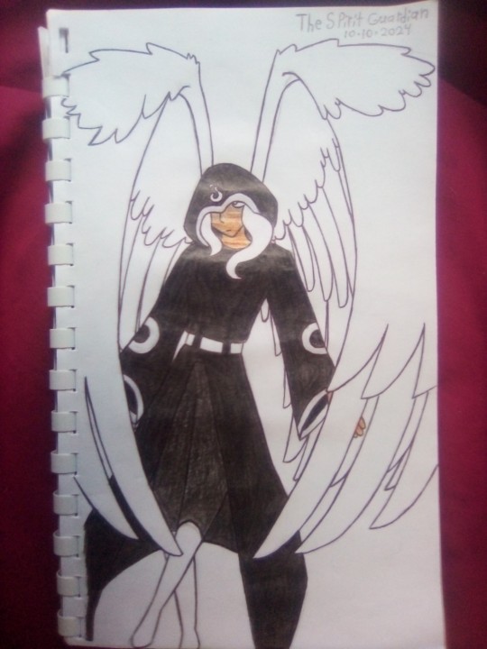
One of my top favorite characters of the entire series, the Spirit Guardian! AKA Guardian of the Spirit World and Guardian of the World Beyond. You get the idea! He's an ANGEL!!!
I kept his design using the original Minecraft skin as a reference, but I just let his hair stick out of the hood a little. I figured he would have white hair to match his big BEAUTIFUL FEATHERY WINGS!!!!! 😍😍😍 I absolutely love big feather wings! Okay, okay, moving on, the colors were easy since he's mostly black and white, I tend to mess up lighter skin tones in traditional art but I managed not to this time! As for making the black stand out so you can see his pants I had to make it slightly lighter than his robe. I'm happy with how all this turned out! I unfortunately couldn't quite get the hands to look right, so I once again saved myself from the trouble of drawing them by covering them up! You can see some of his left hand so you know he has them, but I posed him in a way that would look natural, including his wings flapping in front of his hands, and it feels like he's descending to meet us! Most likely Sabre to say hello or tell him he's caused some more problems and needs to be responsible and take care of it!
I have been drawing wings, mostly feathery ones, for about as long as I have been drawing. Those are probably the most developed parts of my artistic skills since I can't tell you enough times, I love feathered wings! And as proud of them as I am...... I have noticed mistakes over time that really gets under my skin. I can't fathom how this happened, but some how, I MESSED UP THE WINGS!!! 😭☹️ And now I shall point them out as I need to burn this in my memory so I don't let it happen again, and hopefully helps someone else remember to double check your sketch before starting the line art! There's no fixing mistakes if you notice them after that. It's the point of no return.
There is a second layer of feather on the outside of his left wing, I forgot add a second layer on the inside of his right wing, and it really gets me because I haven't made this mistake in so many years! It came back somehow! Now I'll explain what wings are supposed to look like! Or at least these ones since there are many different shapes and lengths wings have.
These wings are supposed to have the longest feathers on the outside, so that second outer layer is not supposed to be there. On his other wing I forgot the second inner layer. The feathers on the outside are like the backbone of the wings, so there shouldn't be layers outside, only inside. There are two inner layers, the second longest being the support and the smallest ones are the softest. They get smaller and softer the closer they are to the flyer. I hope I explained this well as I have done my best to be clear and understandable. It feels good to talk about these mistakes! As much as they bother ,e it is okay, I can redraw him in the digital art someday.
Now I can say my last words about the posing. The wings specifically. When they are curved you can not forget the feathers behind the curve. I'm not good with examples, but the best I can explain this, incase your are still confused, is imagine putting on a jacket or a coat without zipping it closed. The opening in the front allows you to see the back of the inside of the jacket. But some of the jacket is curved as it wraps around you while putting it on. Pretend you're invisible or something, you can see the back on the inside of the jacket while the sides are blocked by the front of the jacket. You can even just grap an object like a cup or ball with a piece of paper and wrap the paper around the object. I feel like I'm over explaining now so I shall stop. Thank you for reading if you got confused, I'm told I can be a bit confusing in my writing so I'm trying to fix that.
Some additional details you can't see in the drawing that I'd like to share with y'all is his eyes. You won't see them often, but when you do just know I'm not holding back with how beautiful they'll be. I initially thought they'd be golden but I've seen many fan animations and drawings of him having blue eyes, which I like a lot too, so I'm asking, and you please someone answer😭🙏, should I make them blue or gold? Maybe mix them? I'll mix them if nobody answers again, I'll probably choose this one now! But one thing is for certain, when he's angry they'll turn red! Luckily it is difficult to incur his wrath.
The Spirit Guardian is a great character that I enjoyed and I loved the interactions the others had with him, he's especially fun to mess with. Out of the arcs I have planned, his will probably be my favorite to write and draw. I'm not spoiling anything buuuut let's just say some Demons were not happy with their punishments. 😈
I will see you tomorrow with another design, there is a shady character waiting for you! 👥
Story: Steve Saga (Fan Rewrite)
Character: Spirit Guardian/Guardian of the Spirit World/Guardian of the World Beyond.
Abilities: can fly with BEAUTIFUL FEATHERY WINGS, travel between dimensions and realms, find lost souls, send souls to be judged, lightning, and powers I added, a HOLY-BLAST-BEAM-WHATEVER-IT-IS, give blessings, make a contract, and can either add or subtract to a judged soul's punishment.
Personality: serious, a stickler for rules, calm, level headed, polite, friendly, gentle, soothing, and of course he's ✨🪽M A J E S T I C🪽✨
23 notes
·
View notes
Note
Hi! I remember you discussing clothes and silhouettes and stuff. I'm looking at doing some trans op shopping expeditions and was wondering how I would find out what aspects of women's clothes are easiest vs hardest to tailor? I'm pretty decent with men's clothes (esp thanks to following S. Bear Bergman over on bluesky) but I know I have a gap around women's clothes and I'd love to be able to give my transfem friends the same level of advice!
The above is the first part of an in-depth style guide I guiltily haven't worked on in a while, but it goes into various aspects of silhouette that are really useful from a gender dysphoria & affirmation perspective, I'm guessing that's the piece you're remembering.
Of my transfem friends, most anxieties normally stem from fears of the shoulders being too broad and the hip-waist ratio being too little, with anxiety about squareness of shape, and to a lesser extent, anxiety about the flatness of the chest and backside.
With a lot of jackets and stuff, you can go one of two ways - you can either focus on stuff that already has exaggerated shoulders if she likes to dress that way, so with 80s style padded shoulders or going for jackets that have epaulettes or can have other details added to the shoulders; or you can focus on a more straight down silhouette that softens the shoulders by adding more flow and motion to the skirts and trousers.
In terms of adding to shape, especially tailoring in shirts and dresses to add a bit more scultping, I always found darts to be an absolute motherfucker. A well-placed set of darts can really elevate a blouse or skirt, especially when you want more shape around the breast and waist, but they're really difficult to place and I always found them to be technically very challenging.
Good tailoring is a little outside of my scope, I'm afraid, I'm not a skilled tailor myself and my sewing skills are quite rudimentary, so that might just be me!
Obviously, lack of pockets is often a difficulty, but those aren't too difficult to add - what is nice is that for the big skirts you do often have a lot more ease in adjusting the waist and hem. With trousers, it very much depends on the shape of them in the first place, and honestly, just how well they're constructed.
You know yourself, I'm sure, that a lot of newer clothes will have less robust fabric and poorer stitching than vintage ones, and this issue is even more pronounced in women's sections than men's ones, but your mileage might vary from store to store, especially depending on your friends' styles.
Most of my friends favour skinny jeans or straight line ones that are quite flush to the leg, and so the amount of alteration they might need is minimal except for maybe stitching a turn-up in place, but for bigger girls or girls with more muscle (particularly thinking about climbers and rollerskaters) around the thighs, it can be absolute hell to find good, well-constructed jeans that won't just immediately either wear away or burst at the seams with the wrong slight squat. If you find good vintage ones in the right size (especially like, early 90s and earlier), absolutely snatch them up, because good denim is a lifesaver and is worth patching and maintaining.
I would also say not to underestimate the value a good bra can add to the shape of an outfit, especially if they can find a good specialist who can measure them properly - the brassiere lady a few of my friends go to recommended them some softer ones when they were early on in HRT, and then once their breast size and weight gain had evened out, recommended for them to come back and pick up the right cups and fit across the shoulders and stuff. There's a huge variety in brassiere design, obviously, and some aren't made with bigger women in mind - if you're on the fatter side, there's sometimes an assumption that you've got larger cups to match; if you're smaller but just broader or more muscular, a lot of brassieres won't have the right band around the middle and/or the shoulder straps will fit oddly.
If they're good with bralettes and off-the-rack support garments, that's great, but if they've got bigger chests or have more difficulty finding a fit, even if they have to travel to find a good person who will measure them and give expert advice, well-constructed brassieres that fit will help a lot when it comes to wearing shirts, blouses, etc over top, and they can always look for similar support in the garments.
As we're coming into the summer, nice sundresses are often great to get hold of, especially because they can be dressed up with a chunky belt - mumus don't always look the most flattering on the rack, especially the button front ones, but they're not too difficult to turn into a nice kaftan with the right cinching and adjustment, and especially for girls who are either anxious about shape and/or tend toward sunburn, big flowy sleeves over the arms whilst bringing in the waist can help a lot with both anxiety and general coverage!
14 notes
·
View notes
Text
Stolas outfit sewing cosplay thought process

(I'm probably not going build this, but wanted to think out all the clothing parts because he looks great).
The jacket
Light weight navy denim jacket (or a cotton drill) cropped with a round neck...
Something like this could work without the beast pockets (or at least on the right side).

Rolling the sleeve (skip if you arms are skinny)
If you're got bigger upper arms (like me) you'd need to either not sew together at the cuffs at wrist for about 4"/10cm buy the button. Or flare the selves straight down from the shoulder (not tapering in)

Or this pattern would probably be easier as no pockets to remove. But it is more fem leaning.
Would need either a wrist slit of 4"/10cm, or sleeves flaring again to help with rolling the cuffs if normally find that tricky.
Closures look like press studs / snap fastenings done down the front, to be able to close it, and as decoration down the bottom edge. These things.

Stolas' Hat shaped design
I've probably paint this in half fabric medium and acrylic.
This is my best guess cus of really blurring pixels. (If someone has high def I'd be ready gratefully).

Used the 3 below to make that guess. As it looks like the artist was asking to make something that fits the others, but isn't an existing one.
Look like it's the hat shape from his top hat. The crown is a simplified mix of the one on his hat and wallpaper. The little diamond shaped beak is also from here.
And the scrolls and little eyebrow flicks are off his heart shaped one.


Shirt
Ok could definitely just grab a plain white collared cotton shirt here, with either sleeveless or caped sleeves at the upper arm. But where's the fun in that.
Will say that Stolas' is absolutely wearing a women's cut shirt here. So it would be easier to get it to look right by shopping in the women's section.

Something like this would work really well.

But if you needed something more masc this could work🙂
That peplum and possibly pockets
This bit

Ok it's a little odd, because it's not attached to the jacket, even though it's the same navy.
It can't be attached to the leggings, because it would interfere with the elastic and would make them fall down.
I guess you could add it to the bottom of the shirt, but it might make it hang strange.
I'd probably make it separate to those and attach it with a belt at the top under the shirt. Or to strong ribbon tape.
Anyway here how to draft one. This is to draft one all around. It'd be easier to follow the method for a 360° one then when you have the made the paper pattern try it on and fold the cut till you get the right shape for you. You should only need a bit more than half to ⅔s of it.
If you cut it out twice and lined it in the same fabric; and leave a small gap at the top on the inside you'd have a sneaking hidden pocket for phone ect.
Looks like it's decorated with studs of stars and moons charms. (I couldn't find studs for stars but these seemed a close-ish).
Legging
Ripped black leggings, crop at the mid calf. Again definitely easier to just buy a pair and cut rips.
Something with a 95cotton to 5% elastine/Spandex mix, would be a good idea for stability (with the rips), and from breathability.

This would probably be a good pattern.
Accessories
Bangles look like brass to me
and a silver dangling Moon earring
#helluva boss#stolas#Cosplay ideas#I'm getting this out my brain as I've got 6 other big sewing projects on the go already
7 notes
·
View notes
Text
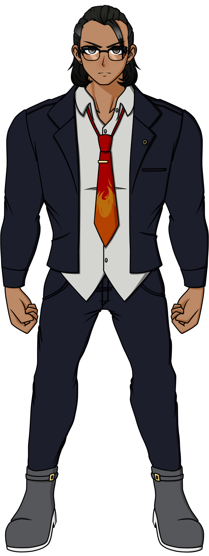
This is for my mutual that requested that I do Kakeru next, so I did! I actually had this finished all in one day but it was very late where I was by the time I was done, so I had to shelve it for today instead.
Kakeru's OG design is just...funny, when you find out his Ultimate Talent. This man does not look like a lawyer and looks like any other muscular guy that probably does sports. Which makes it even funnier when you find out that, no, he doesn't actually do sports, he was literally just born like this! This man was blessed with the best health possible, and yet he feels ashamed for this because his sister was born very sickly, so he blames himself for "taking away her health" when it's not his fault. It's just how life goes sometimes. But anyways, back to his redesign. I chose to base this redesign off of his splash art as he actually looks like a lawyer in that than his in-game sprite, but changed it up and added details to it since I didn't want to straight up copy it. Based off of his OG design, he was dressed pretty casually, so I decided to have his shirt collar slightly unbuttoned and kept it untucked, his suit jacket open, and his tie a little more loose. I gave him boots to add a bit of flair to his design, gave him small earrings, an attorney badge, and a tie pin to keep it attached to his shirt and prevent it from flying off. It's to show that while he's casual, he's still a professional. Also, in his splash art, he's shown wearing glasses, so I'm questioning why LINUJ didn't let him keep that??? What, are those reading glasses, fake glasses to make himself look smarter, or are those glasses that he actually needs to see from? Imagine that those are prescribed glasses, and he's walking around the killing game with blurry vision the whole time he was alive, lmao. But seriously, it's weird cause in one of LINUJ's sketches where he drew what the 79th class would look like if they survived, he has his glasses again so the state of his eyesight is just one big question mark. So I just said, "Fuck it, he has glasses" and that was it. It honestly adds to his professional and smart aura, which actually adds to his intimidation since you'd expect him to be very serious...and then it turns out he's super sweet and shy outside of court. And what helps hint to his softer, sillier side would be the flame design on his tie, as ties with goofy designs like that can show that this person can be silly if they want to be (at least, character wise). And I didn't want to get rid of the flame design on his shirt completely, so I decided to call back to it by moving it onto his tie instead. A tie that his sister probably chose for him, so Kakeru would wear it all the time, hehe. His hair barely changed, I just adjusted it so that it has a better shape. As for the colors, I made Kakeru's tanned skin a bit more obvious, and kept his colors quite monotone aside from the tie and gold metal of his earrings, tie pin, attorney badge, and the buckles of his boots. Fun fact: I originally made his suit blue, but decided that he looked too much like Phoenix Wright and desaturated the colors to look more gray, haha.
Anyways, I love Kakeru. I just wished he acted more like a lawyer in-game, you know?
#DRA#Kakeru Yamaguchi#Danganronpa Another#DRA Spoilers#sprite edit#Star's Art#kakeru is probably gonna be the most changed design yet#cause his OG design just does not look the part of a lawyer at ALL#at least with everyone else you can kinda get an idea#of why they look the way they do#especially when you're given the context of what their talents are#with kakeru you just don't#so him being a lawyer becomes a big surprise#and ends up tanking his design as a result
41 notes
·
View notes