#opening up my photoshop file and forget I was working on this...
Explore tagged Tumblr posts
Text
a very foking detailed GIF tutorial you asked for and how I color my gifs
However, I color them individually, so there will be explanation of tools I choose instead of showing what settings I used for this specific gif in this tutorial.
I will go through entire process of how I create gifs, the process of gifmaking can be different for others and there is no obligation of how to create a gif. Basically, do it however you like and enjoy the process.
this is part I, part II is here\in reblogs.
First, you will need to prepare everything, you choose the moment you want to gif and make screencaps. I use mpv player to create them, here is a great tutorial on how to install it. So I won't go over it, just follow it and or use another player which allows to make screencaps, such as kmplayer.
Once you make screencaps go to photoshop - file - scripts - load files into stack - browse - select screencaps and upload them.
At this point I will also add that I use keyboard shortcuts a lot, you can set them up to your preference, that is much easier for me and might be for you too, and I am so used to them that I forget where are some settings. You can do it from edit - keyboard shortcuts, you may set up anything there.
You will have all screencaps uploaded into one file. Once I have it I change canvas/image size, I also remove 10 pixels from each side, because I hate that some files have that weird black line which looks awful on gifs. But that's up to you. Use proper dimensions for tumblr, that is important since your gifs will look 'not good' when you upload them. I will go with 540x500px this time. (correct dimensions for tumblr are 540px for big gifs, 268px for two gifs along each other and 177-178-177px for the three gifs together)
Go to images - image size (crtl+alt+i) and change the size.
After that I make animation, because without it we would not be able to convert all the screencaps into smart filters. Go to windows - timeline
you will have something like this by default

click on create frame animation - then on 4 horizontal lines which will open menu - make frames from layers

click on convert to video timeline (that 3 horizontal lines and 1 vertical line or whatever it is, right under the first layer) you will get something like this.

now, this will be animated. If you choose convert to video timeline right away it will not be animated.
Now, select all the layers - filters - convert to smart filters
You will have something like this, and if you play it - it will be animated anyway. That way you can edit ALL the screencaps at once.

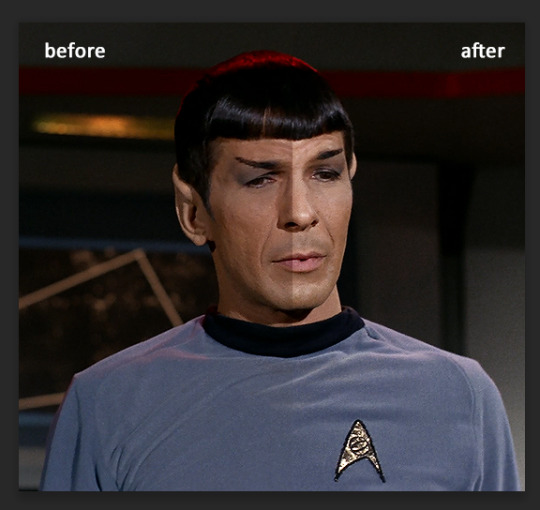
I usually start with sharpening, settings may change according to the files I have, for some you will need more sharpening, for some less. I go with filters - sharpen - smart sharpen and usually that's enough
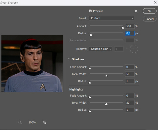
but I sometimes add more sharpening, just change radius to 0,2. So, repeat the action.
You will have it like this
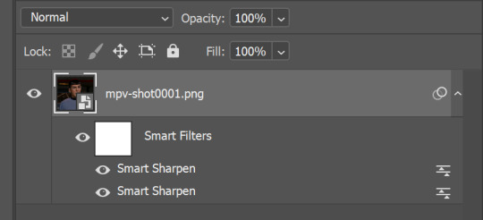
and at any point of making gif you will be able to change settings for it, if after coloring it will look not as good as you wanted to.
I will not go into a lot of details about coloring for this gif, because does not matter how good the coloring on this gif will be, it won't work as good on another gif.
There is no right way to start coloring, you may start with curves, levels or selective colors depending on the screencaps you want to edit.
Well, this time I did start with layer - new adjustment layer - curves. (yeah, i guess by the end of the day we all do lmao) (Always use 'layer - new adjustment layer'. That's the only thing I suggest to remember when you color. ) Just to brighten gif a little bit, but you also can change colors with it.
those are not settings I used for this gif!
Curves have option to edit colors, just press RGB and you will see options for RED, GREEN, BLUE. Upper slider adds the said color, the slider at the bottom removes it. That's a great tool if you have a very red\yellow\blue\green scene, with those settings and moving sliders here and there you will be able to add the color you want, for red scene I suggest to use more green and blue, as well as for yellows but with less green. Just move them to see what fits your gif better.


there are also eyedrop tools which will help you to edit picture, with the first one you need to find the darkest part of your gif and click, it will adjust your picture according to it. If there's too much red, it will make it bluer, etc. The middle one is the one I use the most out of them, cos it changes the midtones, it's great if you have very yellow picture, just press the yellow part and it will make it bluer\greenish, depends on the picture, and then you can adjust it to make it look better. And the last one you can use to lighten picture as well, just find the brightest part of the picture and press it. It will adjust other colors accordingly.
I like to play with settings, I could add more darkness to the gif by levels, by selective colors making dark colors even darker, but sometimes I just use layer - new adjustment layer - black & white. Putting it on soft light blending mode and changing opacity. Idk, I like the effect :D Also, by using these, you will be able to darken part or lighten specific colors
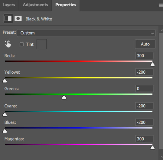
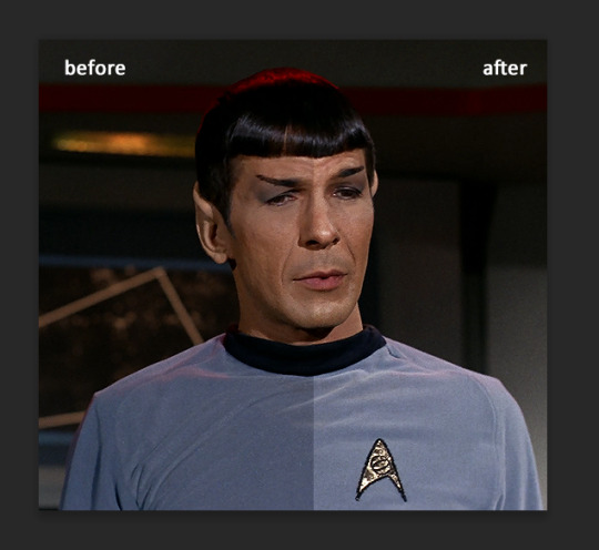
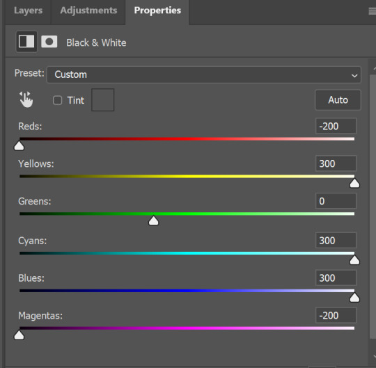
so yeah, play around and figure out what is the best way for you.
after that I used layer - new adjustment layer - selective colors. I think this is one of my favorite tools out there, I love it, I usually end up with 30 selective color layers if I make a super complex gif :D
You can change colors with it, make them more vibrant, or less.

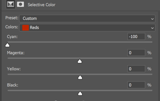
for each color you will have 'cyan, magenta, yellow and black' and by dragging sliders you can change colors, make them darker or lighter for the lovers of those paster gifs :D
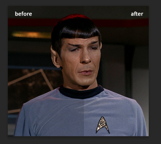
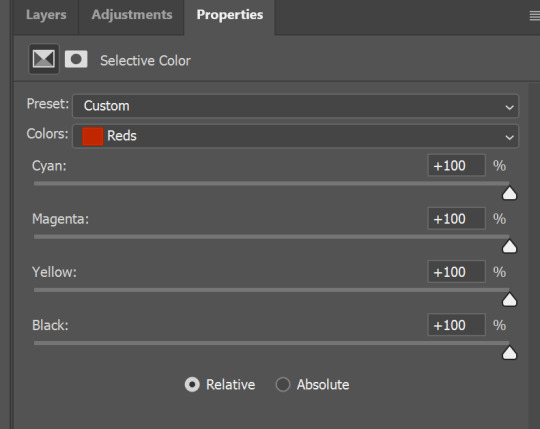
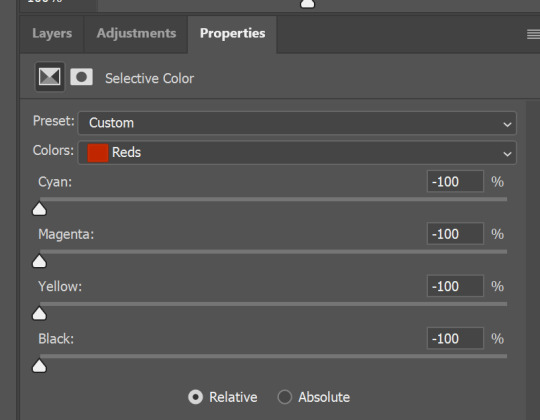

But don't worry, that's not where I will go with the gif, so it will look better, i promise.
You know how much I love making blue even more blue. So I go with more selective color layers to enhance it.
You do not have to use just one, and you won't be able to make it with just one sometimes. So add as many as you like to get the result you want.
next is one of my favorites - layers - adjustment layers - levels
with it you can darken colors or lighten them, there's also auto, as well as on curves, which will find the most suitable settings for your picture.
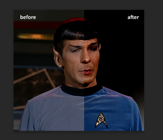
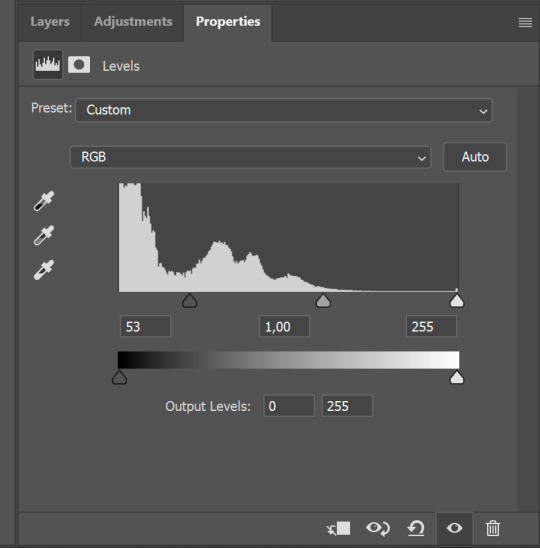

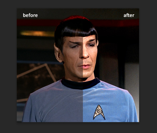
I hardly ever change the middle slider, cos
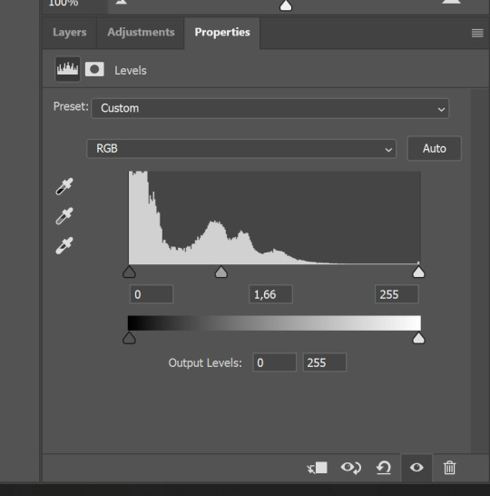
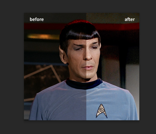
nope.
so, we are at this part of the gif by dragging sliders.
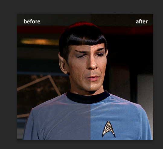
next one I used is layers - adjustment layers - color balance. right now I will stop adding directory, this tutorial is already long enough, so most of the things are there in layers - adjustment layers.
Absolutely love it, most of settings do the same things but a little differently, this one changes colors but also entire picture, not just part of it. You have shadows, midtones and highlights
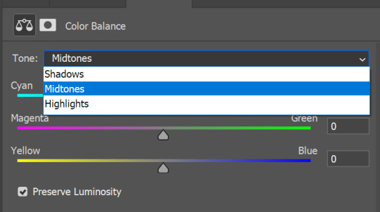
Each of them is really great when you have a yellow\red\blue\green picture to edit. And each of them has 3 sliders cyan\magenta\yellow.
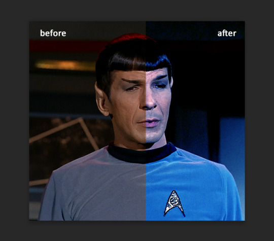
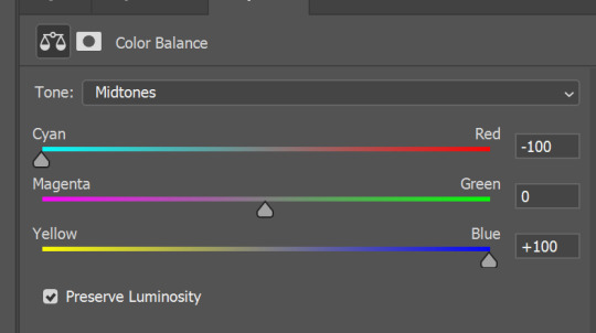
You see, if you drags sliders the other way it will make picture more yellow.
END OF PART I
since tumblr

130 notes
·
View notes
Text
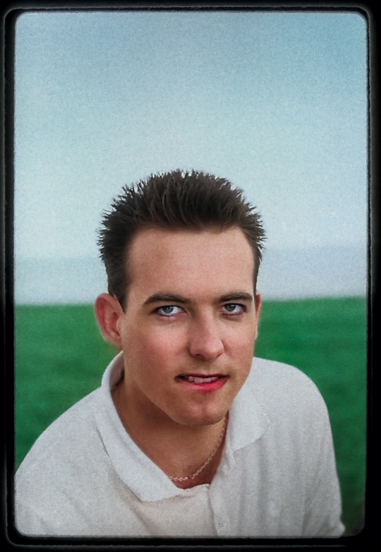
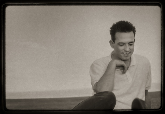
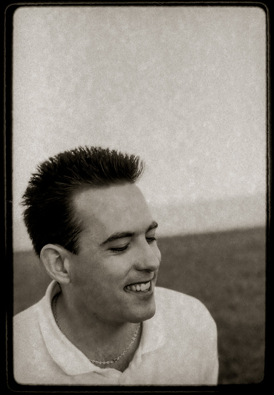
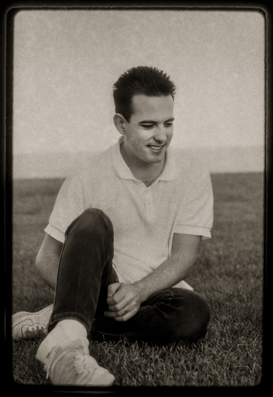
These photos of Robert Smith of The Cure sat forgotten in a negative binder for over 35 years until I rediscovered them last fall while looking for something else. I had, in fact, done my level best to forget about them, as they were evidence of what I remembered as a massive fail made during my earliest years working as a photographer. They were a major stumble on a steep learning curve, and I was sure all evidence had been lost. But let's start at the beginning, when I was assigned to interview Robert Smith and The Cure when they were passing through town on what was apparently called the Beach Party Tour, playing the Kingswood Music Theatre just outside Toronto on July 13, 1986 with 10,000 Maniacs opening.
Another writer at the magazine, Perry Stern, was a huge Cure fan and phoned begging me to let him do the interview; I agreed, provided I still got to take the photos. (I also asked if he could give me a ride to and from the venue.) I had an idea: I'd seen an article in a photography magazine showing how you could get interesting colour washes on your backgrounds by putting complimentary coloured filters in front of your lens and flash. This might have produced interesting results if I bothered doing a test shoot, but I was too cheap/rushed/arrogant for that sort of thing, so I showed up with green and red filters on my Pentax Spotmatic and my Vivitar flash and shot away in a fenced-off grassy area beside the stage.
It's worth talking about the unusual look Robert Smith was rocking during at least part of 1986 - trainers and golf shirts and jeans and short hair. If I still had the transparencies I shot that day including the rest of the band I'd be able to tell you if the Cure as a whole were taking a vacation from their Goth image and dressed down similarly, and if this was one of the few artifacts attesting to a brief sportswear period in the band's history. But the results were awful - overexposed, with a greenish tint, mostly because I had no clue what the ideal ratio between the bright sunlight and the flash strength should have been. The magazine might have reluctantly printed one remotely salvageable frame but my ambition had definitely overstripped my skill and I tried to forget about this shoot.
But at some point a few months after my disastrous Cure shoot I thought I might be able to salvage the results by converting the slides to black and white negatives. I either found someone who could produce an internegative or borrowed the gear to do it myself, but inexperience won again and the four portraits of Robert Smith that I produced were too overexposed for me to work with all those years ago, so I filed them at the bottom of a negative sheet and forgot about them.
Until last fall when I found them again and decided to see if they could be saved with scanning and the neural filters that were recently added to Photoshop. The film grain that was so hard to deal with back in 1986 suddenly became a feature, adding to the retro feel the shots had acquired either with time or in my own mind. With some judicious application of the restoration filter these frames cleaned up nicely, but I decided to push things one stop further by using the colorizing filter as well - making sure Smith's signature smeared lipstick wasn't just retained but highlighted. Now I like to imagine that these shots were taken in 1937 with an old Kodak folding camera like my Jiffy Six-20, and hand-coloured by some underpaid darkroom assistant working for a developing lab in a building down in the warehouse district of town. It's certainly a better story than the one about the kid photographer who screwed up on a big job nearly forty years ago.
#robert smith#the cure#1986#portrait photography#portrait#photography#photographer#film photography#portraiture#black and white#old photos#early work#adobe photoshop#ai filter
135 notes
·
View notes
Text
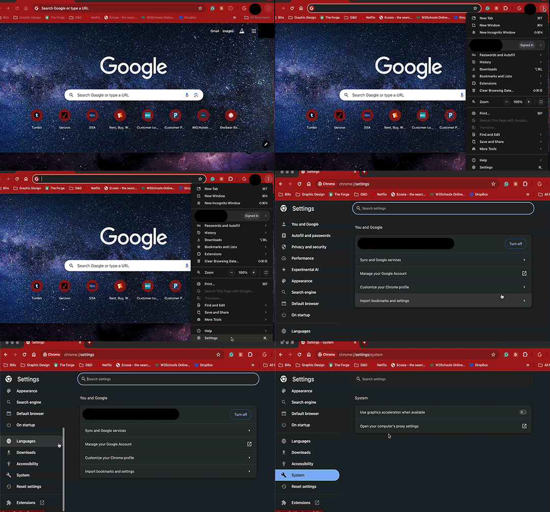
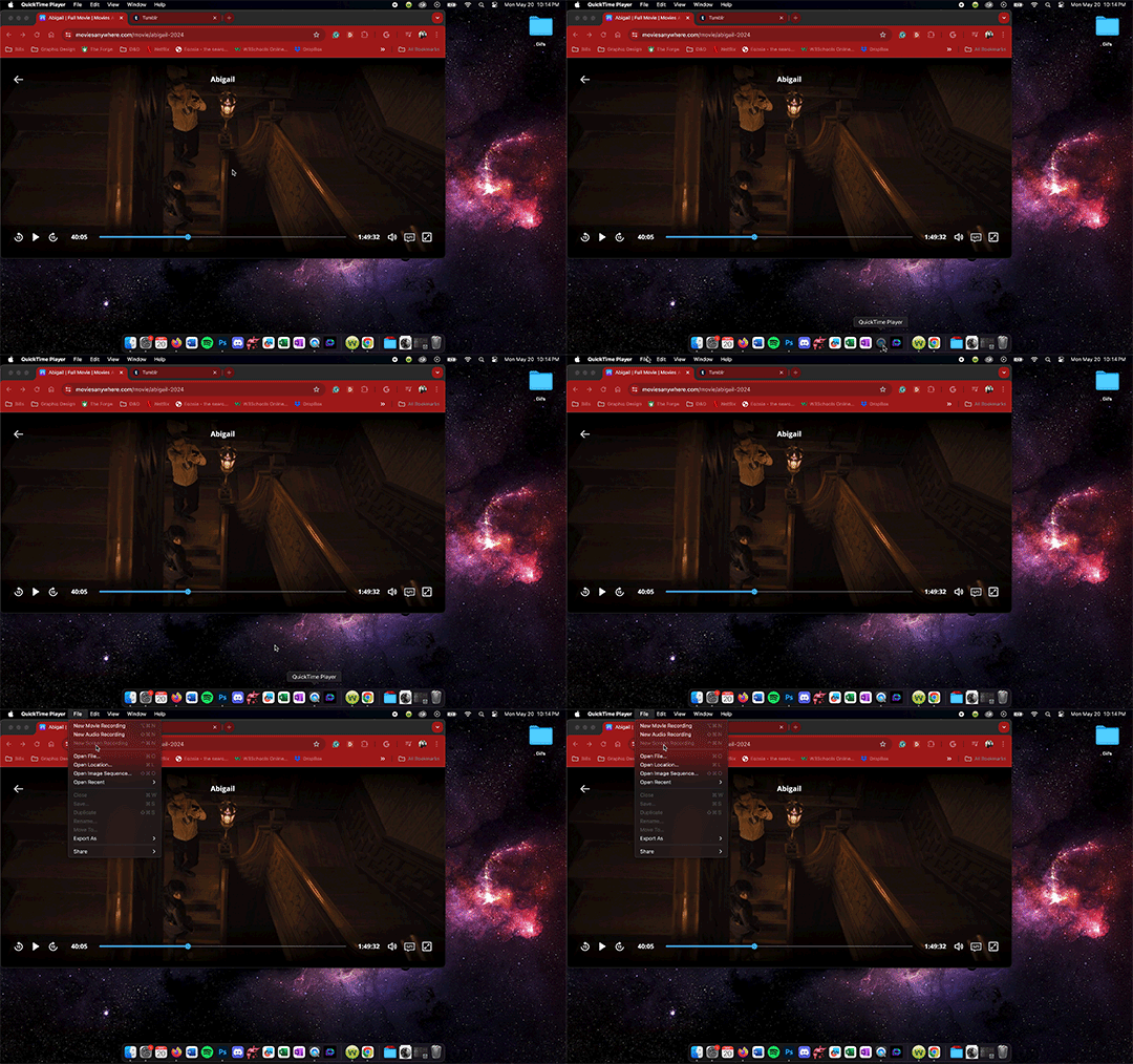
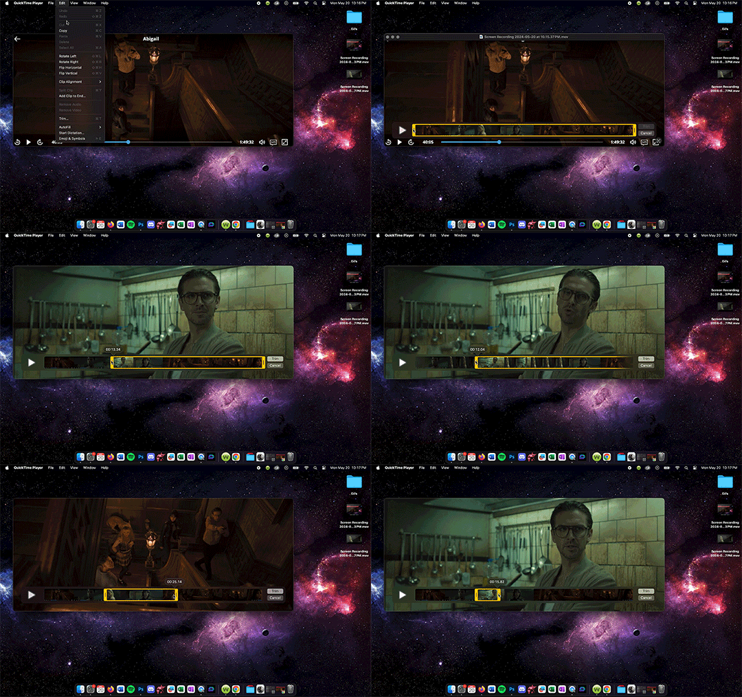
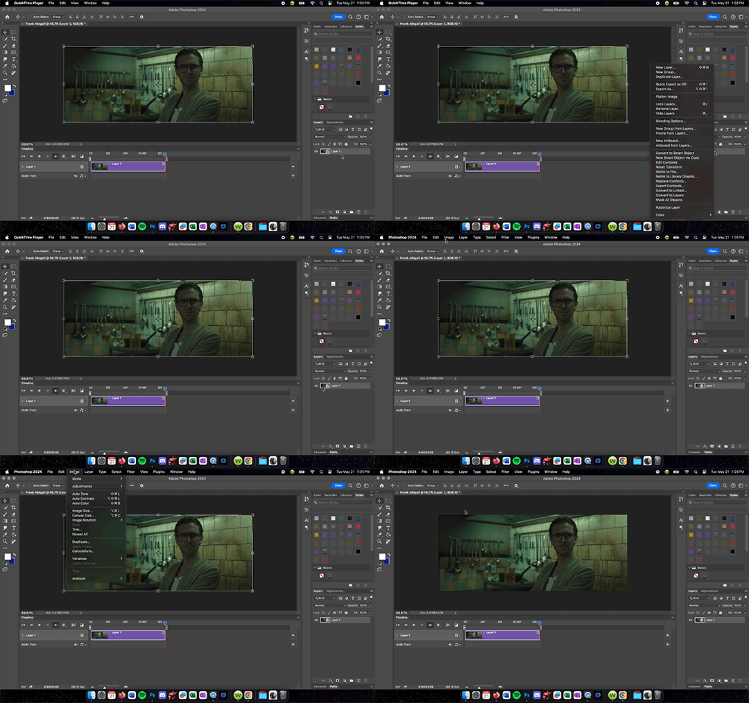
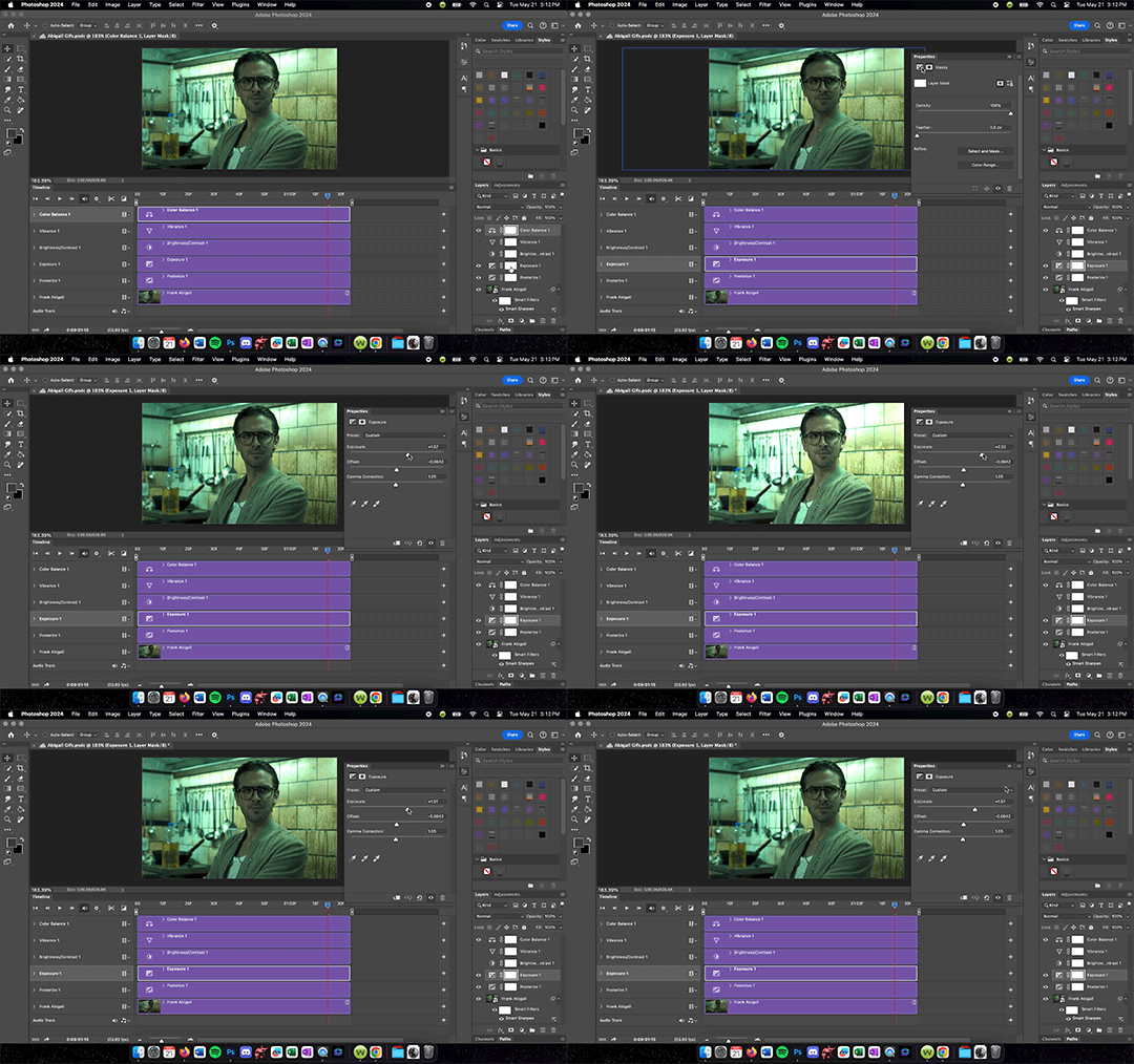

Updated Gif Making Tutorial!
What you will need: Google Chrome. Quicktime Player. Photoshop.
TLDR version
Turn off graphic acceleration in Chrome and relaunch.
Use Quicktime Player to record the screen.
Trim the recording and upload it to Photoshop.
Turn the layer into a Smart Object. Resize Image to 540 width. Apply Smart Sharpen Filter.
Add adjustment layers as needed to correct color. Suggested Adjustment layers: Exposure, Brightness/Contrast, and Color Balance.
Save for Web (Legacy) set to Gif 256 colors Loop Forever. Must be under 10M for Tumblr.
So I have changed my process and I figured I should document it for whenever I inevitably forget how to do it. This is definitely for more intense gifmaking so if you are just wanting to do something less intensive, you can still do step one of this tutorial but then use something like GIPHY Capture to record the gifs. You can do basic gif captures and add text with it but you won't be able to get the same quality without doing a little editing. Most of my older stuff was done with Giphy Capture and some of those gifs I would use this tutorial to edit. Even then, they weren't the quality I wanted so now I use this process.
Anyone who is just starting out doing this, super important first step - you need chrome. It sucks but you need it to do the screen recording later on. Once you have chrome downloaded, go to the three dots in the top right hand corner >Settings> System>make sure that the Use graphic acceleration when possible is NOT CHECKED. You will see in the first gif mine was already turned off (greyed out with toggle to the left side). When you initially turn it off then it should give you an option to relaunch (note that because mine was already off I did not need to relaunch).
Now for the screen recording. First go to whatever streaming site you have the media you want to gif on it. For this tutorial I used Abigal that I streamed through Movies Anywhere. You should be able to screen record from pretty much any site but be aware of the quality. VUDU/Fandago at Home will only let you stream in SD on Chrome so that is why I use Movies Anywhere. I then use Quicktime Player to record. I keep it on my dock so I just go down to it and tap it to open a menu at the top of my screen. On that menu, go to File>New Screen Recording and a menu will pop up on the screen with options of what to record. Use the Record Selected Portion then adjust the size to match the size of the video. Once you hit record you can play the media and then it will record until you hit the little stop button on the top right of your menu bar.
Once the recording is done, you can trim it and save it. I HIGHLY recommending trimming down the screen recording before moving the file into Photoshop. Otherwise it will be such a pain when it comes time to edit. Also, your screen recording original will still be saved usually on your desktop if you want to trim down multiple parts of the video into different gifs.
Next, you drag the trimmed file into Photoshop and turn it into a Smart Object by right clicking the layer and selecting Convert to Smart Object. This will allow you to add filters which you will want to do if nothing else but to sharpen the layer. Then you should resize the image to an appropriate gif size (I use 540 x 335ish for my gifs because I find it just looks nice but you can mess around to find what dimensions work best for you).
After you resize your image, go ahead and go to Filter > Sharpen > Smart Sharpen and set the amount to 500%, radius .3, reduce noise to 10%, and Remove to Gaussian Blur. Hit OK and then you should notice your gif looks clearer. After that, you are free to play with the Timeline to adjust timing (you may have to double click the Smart Object layer to change the trim of the layer but once you have adjusted it just exit out of that project and it will automatically save the trim to the original PS document you are working in), add shapes/text, add adjustment layers, etc. I would recommend an added Exposure, Brightness/Contrast, and Color Balancing layer then play with those settings until the color looks right. Be sure to save the file once you get the coloring down so you can just drag and drop other screen recordings into the PS document and it will copy those settings to it. Just remember to do the Smart Object and Sharpen Filter on every new screen recording layer you drop in.
Once you are ready to save, go up to File>Export>Save for Web (Legacy). It may take Photoshop a moment to load this menu. There will be a circle of loading white dots you will just have to wait out. Once the menu does load, select Gif from the menu just under Preset. Make sure the colors are set to 256 to get the best quality gif. Also check in the bottom left hand corner under GIF that the size is under 10M or tumblr will hate it. You may have to adjust the length of you gif if it is over that size. Also, select Forever under looping options and that the dimensions are reasonable. Tumblr hates anything bigger than 540 wide which is why that is my standard width. Once your settings are right, hit Save and then now you are ready to upload to Tumblr!
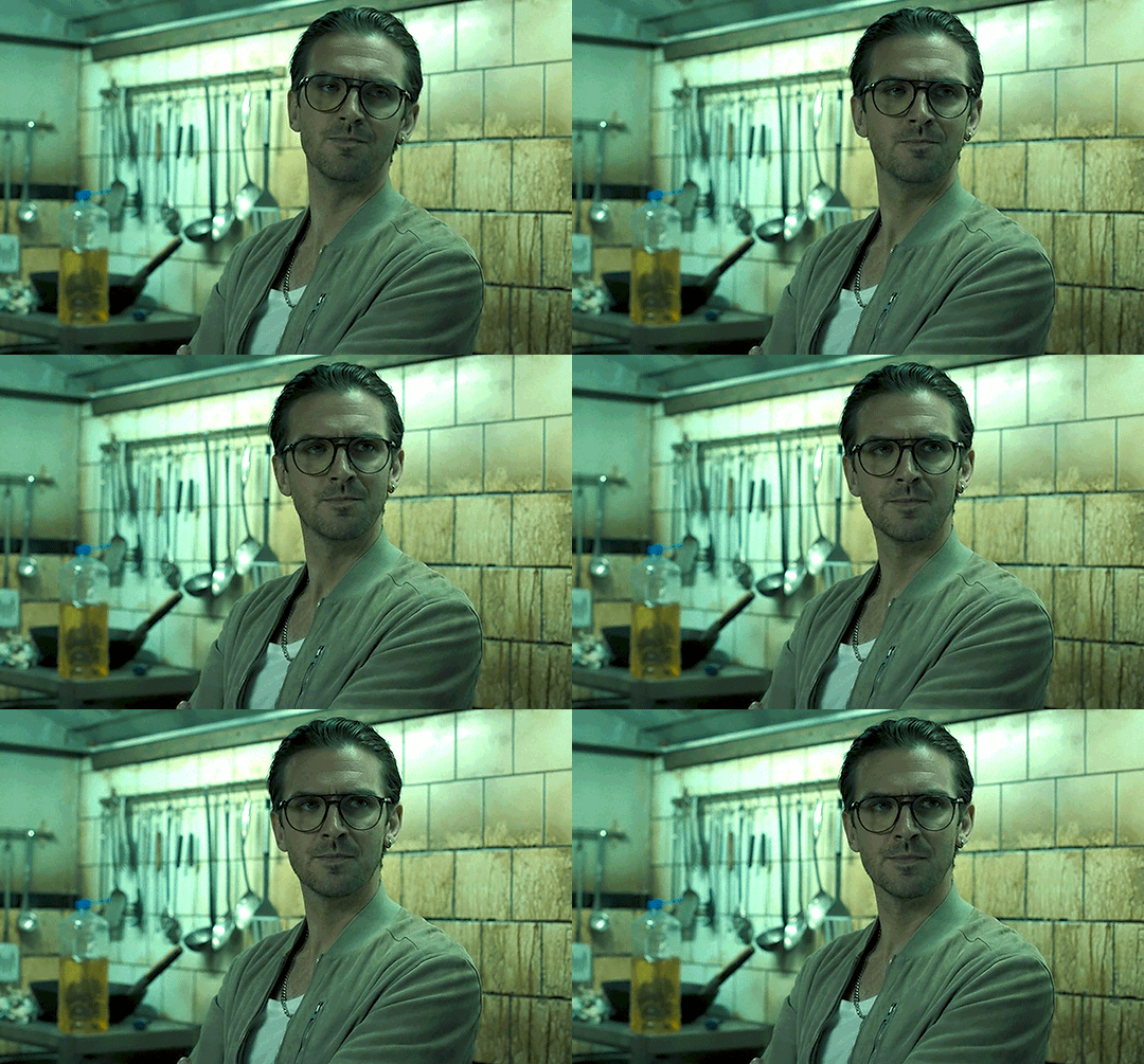
#Gif tutorial#Gif making#I am still learning so this process will get refined the more I practice#Now back to giffing Abigail#Reference#I should also note I DID NOT do any sharpening or adjustments to the tutorial gifs#I was just trying to get this tutorial out fast
13 notes
·
View notes
Text

Hello @crispyliza !! So I'm replying in a separate post because this is too long for a reply on the post. Hope you don't mind. I also think it might benefit others who have asked me in the past and those wishing to start gif making. Especially with whumptober just around the corner.
So here's a full look at how I make my gifs. This got very long so I put it under a read more
A quick thing before I start: I use windows and google chrome. If you're a mac or firefox user I'm not sure of this will work for you in terms of programs. The techniques I use in photoshop should though.
Okay for this demonstration I'm going to show you how I made the gifs for this gifset
To start we need a video. I don't torrent because my internet connection will cut out a random which makes using vpns rather pointless. I've tried. My internet would cut out halfway through a torrent download and then my internet provider was notified to what I was doing. It was just not great. So I found a new way to download videos off the internet! You can use torrents though. If you've got a vpn, go for it.
There are several streaming sites that I go to to get my videos. 1movies, and bstsrs are my go to right now since soap2day is gone (rip i miss you).
Now there are three ways I can get a video depending on what website I'm using. Bstsrs is the easiest because they have a whole bunch of links available. I always go with mixdrop because it has an easy to use built in download button. Unfortunately this site doesn't have movies. Just tv shows and sometimes it's not the best quality or there aren't links available. That's when I go to 1movies. Once you've found your video I use the chrome extension Cococut to download it. Click the extension button to open, then the download button. Then you just have to wait until the video is rendered. Click save. Wait until its downloaded.
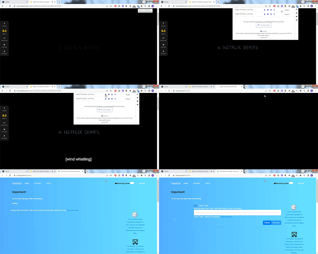
Okay we now have our video! The next step is to turn the scene you want to gif into frames. For this we're gonna need KMPlayer. This video player makes it really easy to turn scenes into frames/screencaps. Open your video. Find the the scene you want and pause the video. Type control-g to open this screen:
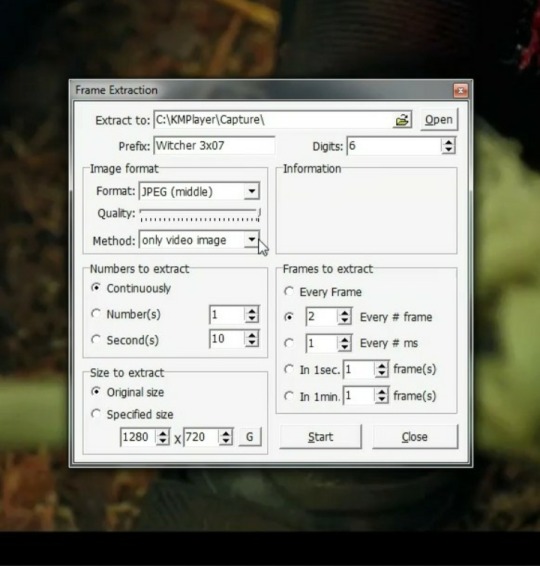
Here you choose the destination you want your frames to be saved. Decide what to name your frames and match up your settings with mine. You want to continuously extract frames, original size, and I stick with every 2 frames. Then, and this is important, choose video images only.
Now click start then start playing your video until the scene you want to gif is done. When you've got everything you wanted, pause the video. Hit ctrl-g again to reopen that screen and click stop. You now have all the frames you need so go ahead and exit out of KMPlayer. You don't need it again unless you need to redo frames or get the dialogue or something.
Next up we are gonna open Photoshop. I use Photoshop CC 2014.
Click on File -> Scripts -> Load files into stack -> Browse.
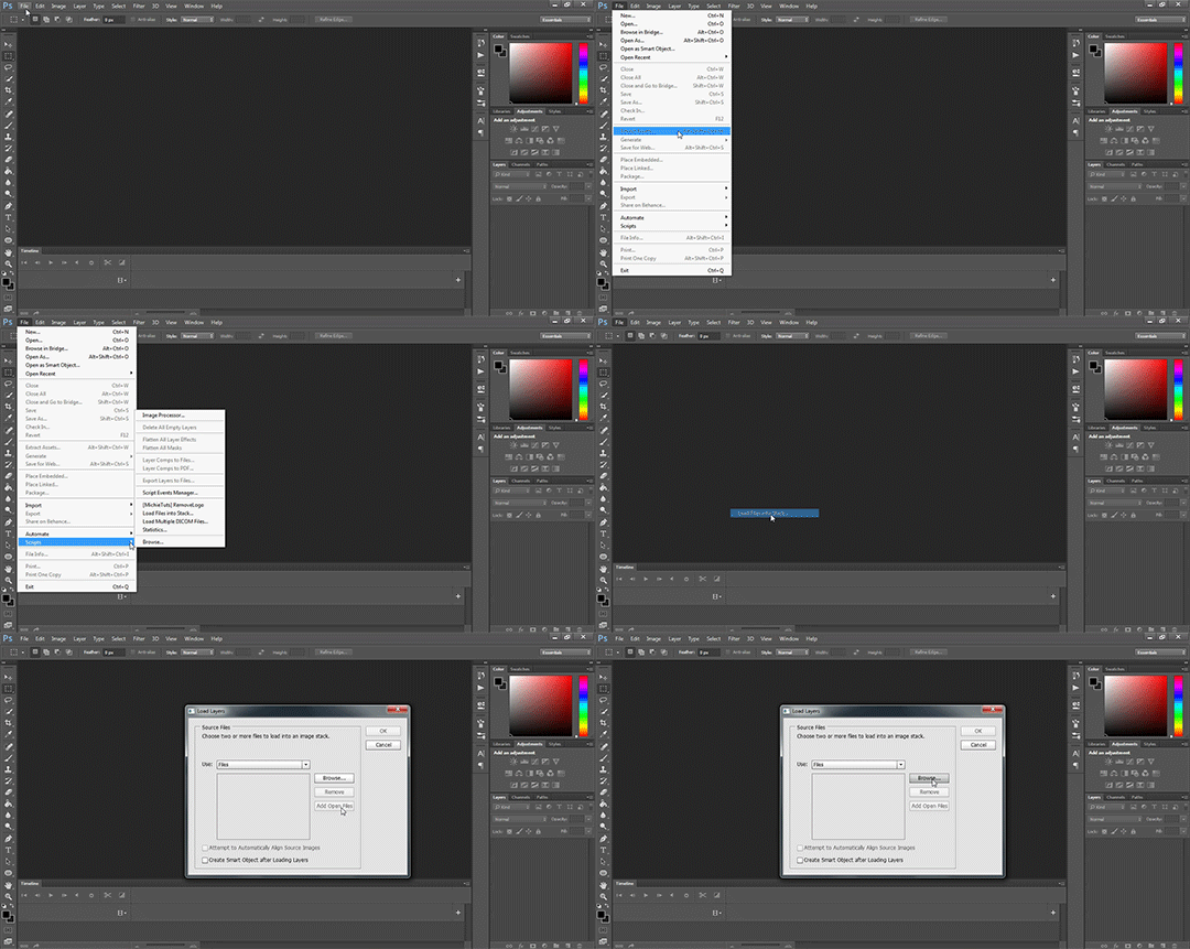
Go wherever you saved your frames and select the ones you need. Click okay and let the frames load completely before doing any thing else. Depending on how many you've selected this could take a while.
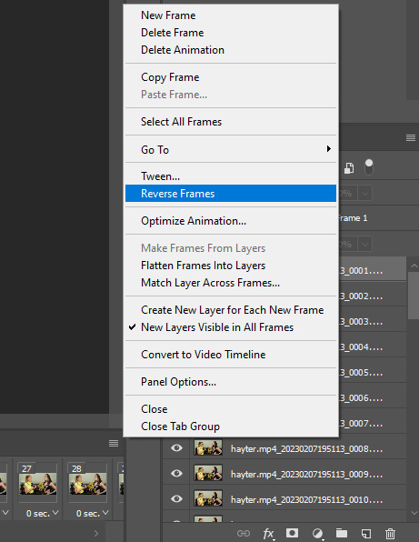
Once all of your frames are loaded, click "Create Frame Animation". Next click the little arrow button on right followed by "Make Frames From Layers" so we have all of our frames laid out. Now we need to reverse the frames because they're backwards so click that little button again and then click "Reverse Frames"

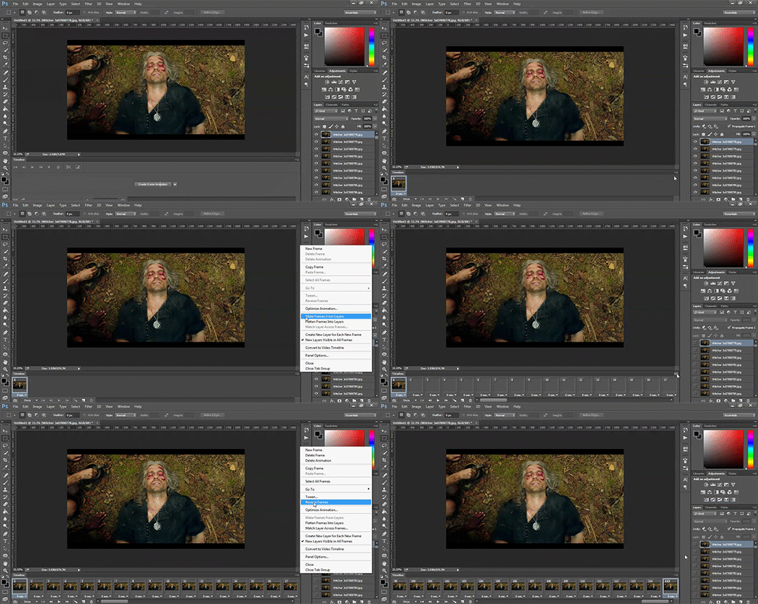
Okay you've got your frames loaded and all set to go. Time for all the cropping, resizing, setting the speed, and editing.
First thing I do is set the speed because otherwise I forget and it's important to do and a pain in the ass to do after all the editing is done. So do it first and get it out of the way. Select all of your frames. Click the little button beneath a frame where it says 0.0 and pick your time. I usually go for .1 seconds but .05 is also a popular speed. Just test one out and see which one you like best for your gif. You can hit the play button at any time to test your gif.
To set speed:
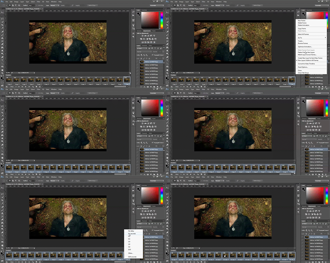
After this I do one of two things. Either I go into cropping and resizing or I separate frames. Depends on how many frames I uploaded. If I uploaded all the frames needed for an entire gifset this is the part where I separate them out onto individual gifs. So let's do that.
Originally I was just gonna do one gif but I have 115 frames uploaded which is waaaay too many for just one gif. I like to keep my gifs between 30 and 80 frames. So I'm going to split this into 3 gifs I think. It'll make a nice balanced gifset.
Select the frames you want for the first gif and copy them using the copy frames option in the same menu as the make frames from layers menu. Open a new document with the same dimensions as your current document. Click "Create Frame Animation" and paste the frames over the selected frame. Make sure that first frame is the same speed as all the other frames. Repeat until you have your desired gifs.
Next up I crop and resize. For this gif I'm going to first crop out the black bars above and below the image because we don't want that in the gif. Use the select tool to pick what you want to keep then "Image" then "Crop".

Now I could leave it as it but I think for this gifset I'm gonna focus more on Geralt so I'm going to crop it in a bit more.
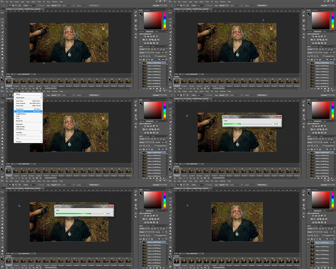
Once cropping is all set i'm going to resize the gif to tumblr dimensions. Click "Image" then "Image Size" and change the width to 540px. The height can be anything and best not to mess with it so your gif keeps it's proportions. 540px is the width of a tumblr post and I plan on making these gifs stacked one on one.
Okay the gifs are all cropped and sized. Now it's time to do some editing. Go back to your first gif. We'll do all the work on this first gif and apply the same things to the other ones later because the scenes are the same. If they were different each gif would be colored and edited individually. First thing to do is turn it from frame animation to timeline. Timeline mode makes applying things like sharpening and brightness much easier and smoother.
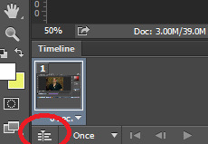
So just click this button in the bottom left corner to go into timeline mode. Next up select all your layers. They're on the right side. Make sure you've selected ALL of them. Then click on "Filter" -> "Convert for Smart Filters" THIS IS AN IMPORTANT STEP! We can't edit until this is done.
This button to switch from frames to timeline:
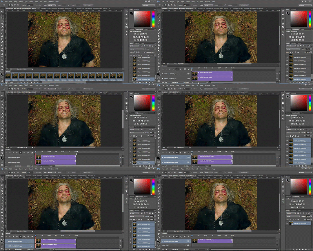
First thing I do is sharpen. You can use one of the presets or try to do manually do it with smart sharpen. I use the preset labelled "sharpen" because I'm lazy and this one does a fine job for my gifs. I also add a layer of surface blur to smooth things out. Just a small touch. Like barely any blur but I think it smooths noise a bit and makes it look better.
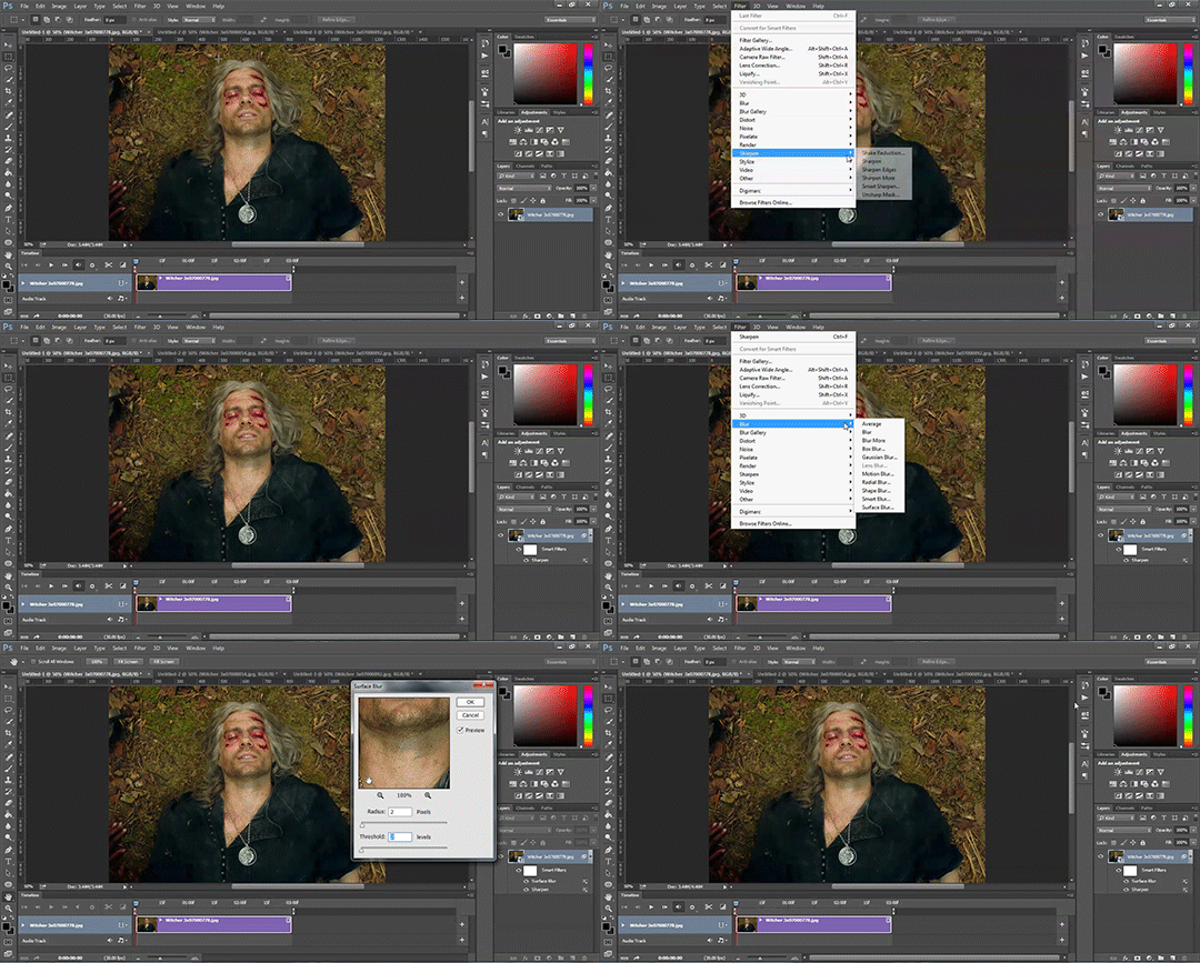
Next up: Editing!! This step is going to be different for each and every gif you make. It all depends on the colors in the scene your giffing so you're gonna have to do a lot of experimenting to get the right look you want. Personally that's what I like about it. Makes it fun.
All your adjustments can be found found on the right side of the screen:
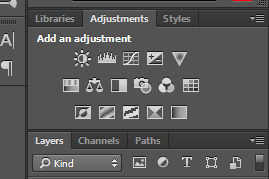
I almost always start with the "Levels" layer to brighten up the image because as we all know, every freaking whump scene is sooo dark. So with levels you just slide the little arrows around until you get a look you like.
Then I add a layer of "Curves". I love curves. With curves you can select the whitest white and the darkest black and the middle tone to change the brightness and colors of your gif. Or you can use this part and just brighten or darken a specific part. It's really versatile and i love it. It does take some practice and experimenting though.
Now a layer of "Contrast" and a layer of "Vibrance".
After this it's all about the selective colors, photo filters, and color balance to work on the colors and brightness. For this gif I'm only doing a tiny bit of editing cause I like the coloring but sometimes I'll have multiple layers of these to create a good coloring.
Once you're satisfied with how your gif looks it's time to save it!
Click "File" -> "Save for Web" and wait until it's all loaded. Important thing too look at here is the size of the gif. You can't upload any gif that is larger than 10mbs so make sure it's under that. Sometimes even 9.8 is too big because tumblr is a butt. I go for anything below 9.8. If your gif is too big try resizing it or removing a few frames. Make sure you gif is set to loop forever. Otherwise it'll just stop after a little bit. Don't forget to change this!
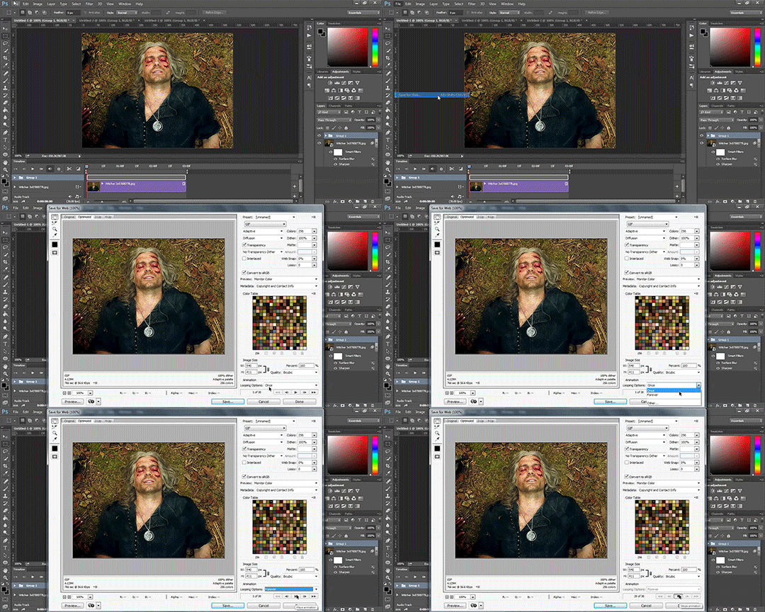
Here are the rest of my settings:
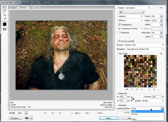
After that you can click save.
And that's it! You've made a gif! Congrats! If you have any questions or want clarification feel free to message me :)
32 notes
·
View notes
Note
Sorry if you’ve answered this question before, but how do you make your gifs?
With an outdated version of photoshop and a lot of patience 😤 my messy process under the cut
let's say i have this movie downloaded in .mp4 i open it in windows movie maker - or any other software that lets you do quick and easy edits and whatnot but me i use wmm even tho it's obsolete i knoooow leave me alone - cut the scene i want to gif out and save it into this tiny little file
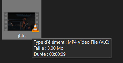
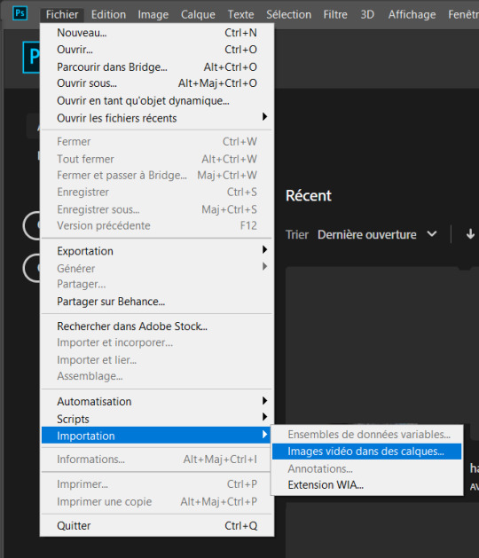
then i open photoshop and go into import > video frames into layers (i may be a little bit off in how things are called on PS in english, but they should be in the same places anyway)
this little popup will open

since my file is exclusively the thing i want to gif i don't need to bother with the little arrow-ish things underneath the video player, they're there if you need to shorten your thing or like cut into it.
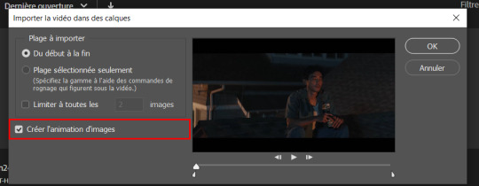
this bit here needs to be checked like this, it'll set up the gif animation or whatever. so yeah then click Ok
bim bam boom photoshop will open like this
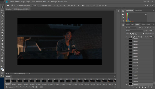
big scary image with many tiny scary images, so first of all what i do is get on the cropping tool

this will show up in the toolbar up top

and in there you set the dimensions of the gif, 1 gif in a gifset that takes up the whole post has to be 540px wide for 2 gif next to each other it's 268px wide and i can't remember 3 by 3 but i never do that so whatever who cares.
once you've set up the dimensions you want, you got this grid thing to move around and set however you want it to be
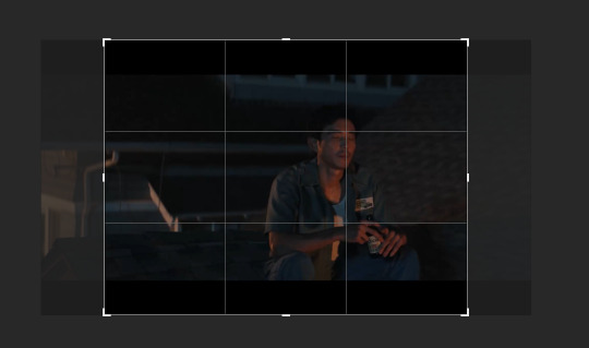
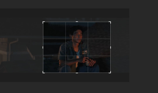
and then you wait as it painstakingly takes its time to do it
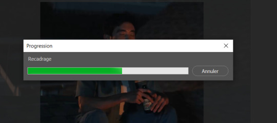
boom! it's done!

so that's your gif raw and unprepared without any filters or whatever, no length, no speed, nothing!
down there you've got the frames of the gif, depending how long is it'll be either a lot or very very short, in this case it's 277 frames, so already you know it's not gonna be just one gif but probably two or three - which i knew btw that's on purpose!!

first thing i do when all the cropping and setting up is done is scroll all the way through the frames to see if there's a bit that won't make it into the gif, and here, there is
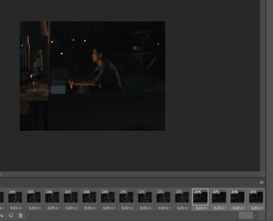
these last four frames show a different bit of the scene because i cut shit very messily and don't check before opening photoshop but you know! trust the process! so make sure to select the unwanted bunch and delete them
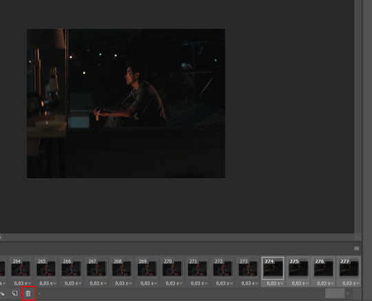
so now hurray the gif is 273 frames and it's only the one scene i want

and now the fun not fun starts!
to the right you got these, the layers
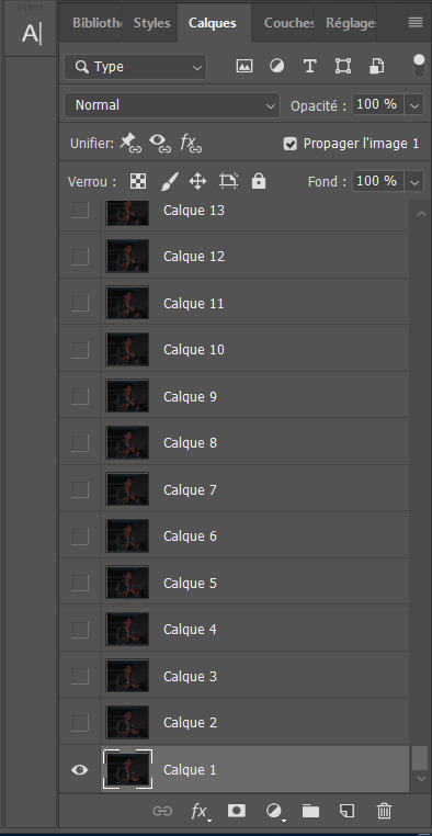
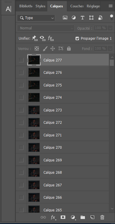
so you gotta scroll all the way up and NOT forget to click on the very last layer before you start playing around with filters and all that

this little guy right here is my bestien he's the only one i use when editing gifs, fuck everybody else on that row. when making gifs i mostly just use a combination of those three things, brightness/contrast, vibrancy and photo filters
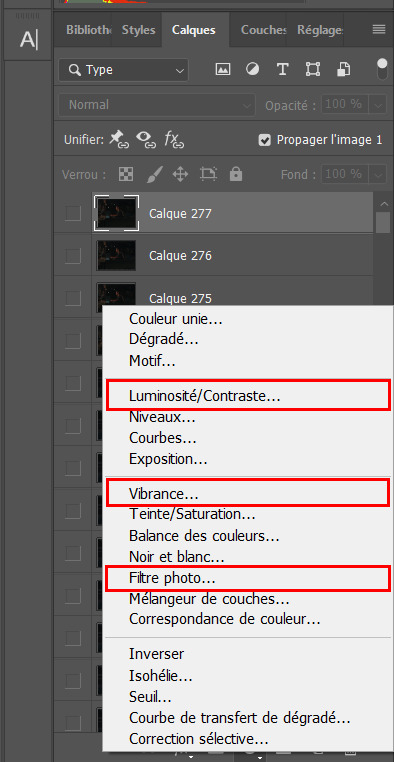
so anyway, let's fool around with those little things and make a gif (i realize now the scene is very dark and it will look very ugly but never mind! we carry on) so there a bunch of random settings added - you gotta make sure they are all the way on top of everything or else they just won't appear on every single frame
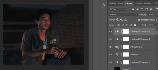
what i do then is probably very stupid and there's probably a better way to do it, but MY PROCESS, so i divide the amount of frames i've got by the number of gifs i want to make in a set, so 273/3 that's 91 (thank you google), so we look back down at the frames

and then scroll aaaaaalllll the way back to frame 91 (if you hold shift and use the wheel it'll be much faster) and while still holding shift pressed down click on frame 92
that will select every frame from the last to that and we delete that shit


so now we only have 91 frames and that's one gif. so let's save it! but wait, no you forgot to do something! see the 0.03s? that's the gif speed or whatever, idk how it works but 0.03s is too fast, me i usually use 0.05s so what you do next is select every one of those frames you've got left and click the little pointing down arrow, that'll open that

click Other... and then set it as the speed you want
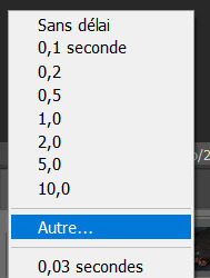
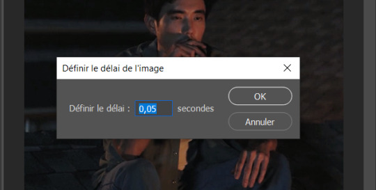
ok so your gif is at the correct speed NOW you can save it so it's file > export > save for web
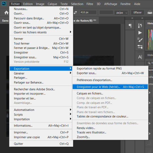
this new popup will appear
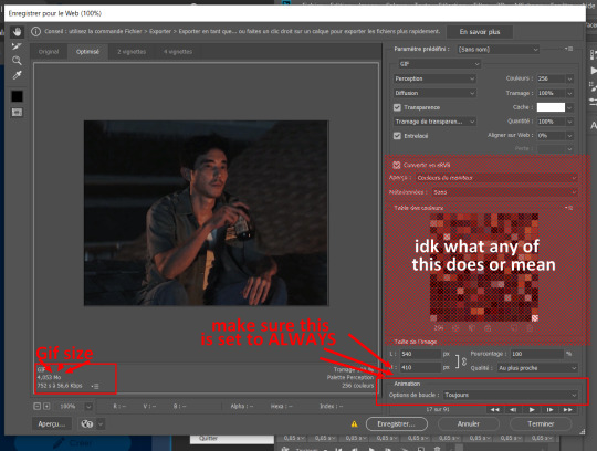
currently as of 2024 gifs can't be bigger than 10Mb/Mo, this one is 4mo

so we're good we're fine. so then you just click save, name the file whatever you want and VOILAAAA, a djeef!

(and then undo the delete and repeat everything for the other two gifs you'd want to make in that set)
7 notes
·
View notes
Text
to anyone genuinely asking if this is real: no im sorry to disappoint i edited this for the bit. to anyone asking how i pulled this off so quickly: i actually procrastinated on this most the day then used some spare 15 mins. anyways im bored so im gonna teach you how to make your own boop o meter memes!
STEP 1: screenshot the boop-o-meter! im using windows' old snip tool lol
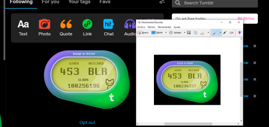
STEP 2: clean up! i'm using photoshop's spot healingg tool but you can just paint it over or use the clone stamp or whatever works for you

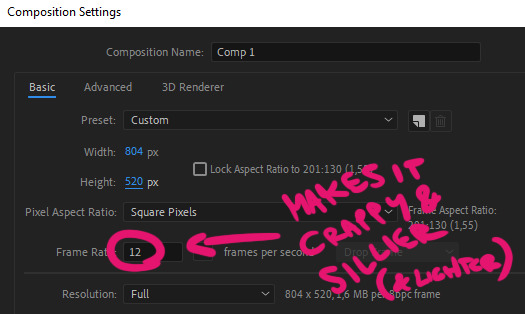
STEP 3: i hopped onto after effects and made a composition THE SIZE OF MY BOOP-O-METER. i set it to 12 fps because i felt it gave it some sort of crappy low quality effect that i felt was fitting (plus i wanted to make the gif as light as possible)
STEP 4: I added both the clear and normal version and animated the opacity of the clear meter with keyframes set on hold so that it flickered on and off.

STEP 5: went on youtube and searched up "never gonna give you up greenscreen". any of these will do
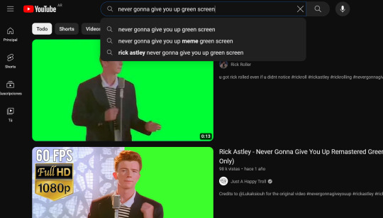
I then of course placed it on my comp on top of the boop-o-meter
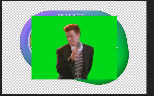
STEP 6: to get rid of the greenscreen, i applied the keylight effect. it's quite straightforward: you go to screencolor, eyedrop the greenscreen color and you have a perfectly transparent rick astley!
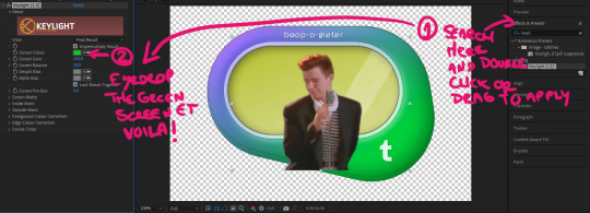
STEP 7: i added the following effects:
-black and white: self explanatory, makes the image monochrome. i left the settings as is

-posterize: makes it so it deals in absolutes. lcd screens like the one the boop-o-meter imitates only had 2 settings: on and off. black or white. no grays. setting posterization to 2 levels does the same.
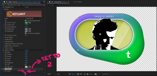
-mosaic: pixels!! play around with the numbers according to the size of your composition.TURN SHARP COLORS ON, otherwise it defeats the purpose of the posterize effect.

STEP 8: from the timeline, i changed the layer mode of the video to multiply and set the opacity to around 60% to simulate the boop-o-meter's style
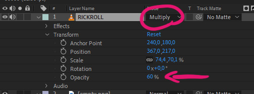

I also noticed that the pixels were ever so slightly warm toned, so i used lumetri to better match it. this is a completely skippable step, im just insufferable like that

STEP 9: Lastly, i used the pen tool to create a mask in the shape of the screen

and that's pretty much it! then i went to composition > add to render queue and exported! these were my particular settings,
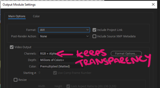
i used avi and rgb + alpha because i wanted to keep the transparency of my boop-o-meter. this is just extra. you can definitely leave it on H.264 and RGB as it comes by default.
STEP 10: we're technically done, but if you want to turn the video you just made into a gif, just open it on photoshop, go to file > export > save for web, and save it as a gif. these were my particular settings but u can play around w these
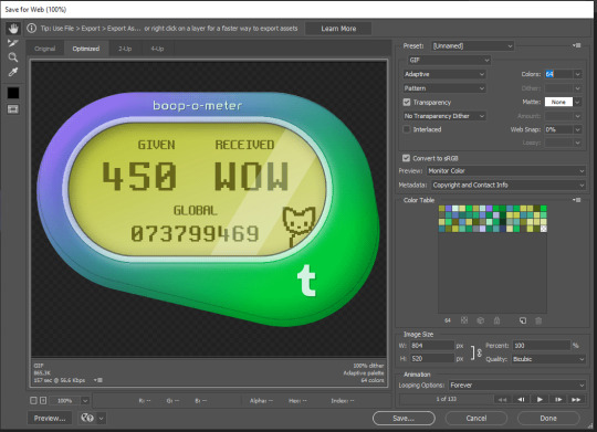
And there you go! thats's how i wasted my years of graphic and multimedial formal studies on a rickroll meme.
If you don't wanna do all that, here's the after effects file so that you can replace the rick roll with anything, such as doom, bad apple, the destiel confession, etcetera
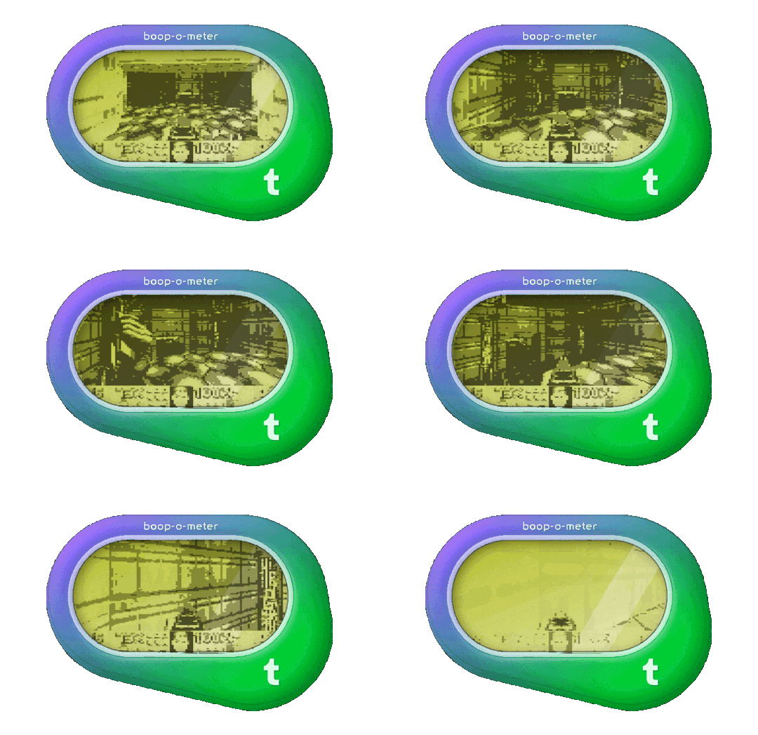


have fun! and don't forget to always play with jpegs (or in this case mp4s) like dolls!!
sorry if this is a dumb question but uhmm is anyone else's boop-o-meter doing this???

52K notes
·
View notes
Text
Photography.
No, really. Not just pictures, but more than can be healthy to know about old film photography.
It has been an obsessive hobby for a while. (*excessive)
[a very long text, but with pictures this time]
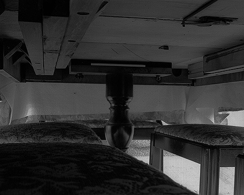
A photo taken under a dining room table in 2004.
Hyperfocal and in low light, on sheet film (using a Shenhao HZX45-iia camera, Kodak TMY / 400 ISO film, developed in HC-110 with minimal agitation), large format (mine is 4x5 inches).
The technical challenge was to take a hyperfocal photograph (both foreground and background are in focus, although my scanner could not capture this as well), but under low light.
Hyperfocal photographs require the aperture to be small, but low light usually demands the aperture be wide open (to capture as much light as possible).
It took about a day to research and to make the spreadsheet to calculate for failure of reciprocity (film exposes exponentially [I think exponentially] more slowly over the time of the exposure). It took four and a half hours to take the photograph (cats and people walked through, but not slowly enough to be captured). I placed the camera, then increased the light until the needle on the light meter just twitched, and I had to calculate from there, since it was not even on the dial when it twitched.
Developing with minimal agitation is a trick I picked up from reading about Ansel Adams, and it is not supposed to work well with modern film, but it takes a little longer to develop. Minimal agitation takes advantage of the developer to widen the tonal range - kind of like HDR, except in the development of a single negative. The developer exhausts itself in bright (or is it dark, I forget) areas of the film, but continues to work on the less exhausted areas.
(I do not have the space or the money for a large format enlarger, so my prints are either direct contact, or digitally scanned.)
--
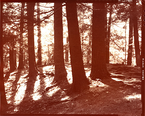
Hemlock tree trunks (2003)
This is an abumen print, from a 100 ISO negative (Kodak TMX as marked on the right edge, also using the Shenhao HZX-iia), also developed using HC-110 (it is safe around cats) (and incompetent amatures like me) and minimal agitation.
I snagged a boxful of premade abumen printing paper from Chicago Abumen Works before they stopped selling. I could make my own, but that will not be needed for a while. I have used Van Dyke solution, but the results are less impressive than this. Most of the photos I print are on albumen or cyanotype (using the premade kind that they sell for sun prints in craft stores).
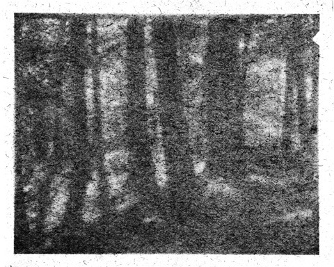
The same hemlock trunks, printed using a different method.
This was printed, over a month, on a green file folder that I noticed would fade in the sun. The actual folder does not appear to have printed, but I was able to "find" it in photoshop. It did print, but the contrast is so minimal that "developing" also drew out the individual grains of the file folder. I direct copied the original negative, because I did not want to expose the original to the abuse of sitting in a sunny window for a month (which is why the notching is different - in the upper end of the right edge, there are notches to help identify the film and its orientation in a darkroom).
Albumen and cyanotype also use sunlight for printing, so this was not far removed from my usual alt-photography methods.
--
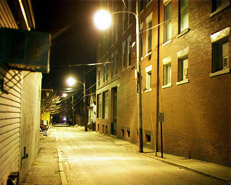
A side-street at night (January 2004).
This does not appear to be a great technical challenge, until I add that it was shot on black and white film (Kodak TMX / 100 ISO).
This process involves shooting three sheets of film, each with a different color filter. When the process was originally developed, it would probably have been gum printed, but I was unsuccessful with this process. My "printing" process was to assemble the three images as color channels in Photoshop.
Being a night photo, but less hyperfocal than the one under the table, the film had to be exposed for about five minutes. In January. I was keeping the unexposed film carriers in my jacket to keep them warm, but this meant opening my jacket to the stiff wind that was blowing up the street at me. I was approaching hypothermic before I was done, but a shady looking man started talking with me and saying that my camera looked expensive, so I walked toward the center of town when I finished, to be sure I was not being followed (the shortest route home is the one in the photograph, but the streets are more darker much quickly).
--
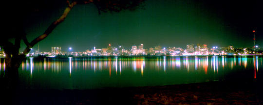
Yet another color photo taken on black and white film. In this one, if you can zoom in on individual buildings, you can see where lights were turned on or off over the twenty minutes or so it took to take the three sheets of film with different color filters. You can also see where the tide was going out, by the color changes. The cyan color reflected nearer the far shore corresponds to the red filter (I always go RGB, so I will be less likely to get confused about which filter comes next in the middle - which is the only reason I know the tide was going out). RGB is the inverse of CMY(K is usually included in the set, but BW film answers for that), so a red filter produces a cyan negative, green produces magenta, and blue produces yellow. (If you have wondered, the red-yellow-blue set is reflective color, red-green-blue is additive, and cymk is subtractive - color is way too complicated.)
--
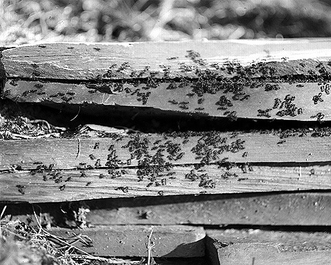
An ant war (2004)
My pictures were horrendously shuffled about by a backup program, so I cannot locate the companion image for this one. Because they are unwilling to sit for a long exposure, I had to throw enough light onto the scene to capture this one quickly. Fortunately, it was in my back yard, so I brought out a large mirror to reflect the sun.
Understand that these are tiny ants, only a few millimeters long. If I could find the companion detail, I could show that the TMX (100 ISO) negative captures the rectangular mirror reflected off the gaster (the ants butt) of several ants.
I originally started with large format, and low-speed, film because I intended to write a plant identification guide for a local hiking trail. The photographs in the guides I had were not very good - they would describe hairs on a stem that the photographs did not capture.
4x5 (four inches by five inches) cameras are about a large as I would care to carry into the wilderness with me, and low-speed film has the smallest grain, which produces higher resolution images. Unsurprisingly, the film I use (or did use, I have not done much with it for years, as the dates on these pictures may show) was still used for scientific images until recently.
--
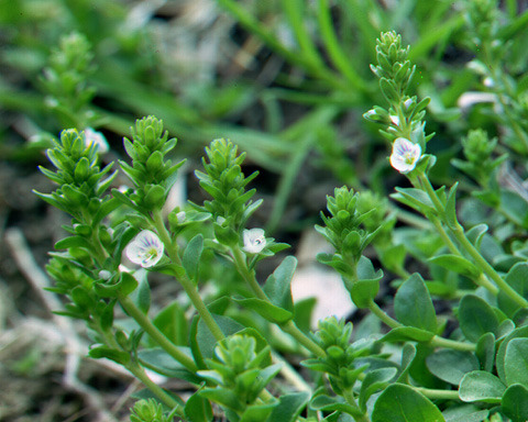
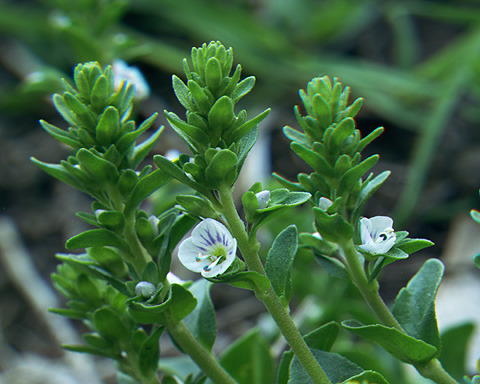
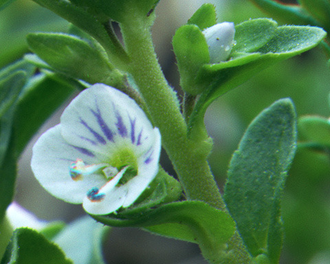
Little white flowers (2004)
Another color image taken on black and white film. But this one shows the strength of large format 100 ISO film that captured my interest. Look at the detail in the detail photo at the bottom. I would not call this stem hairy, but look at the individual hairs.
Also, notice that the stamen were wilting over the course of three photographs, through the color changes as they drooped. This was taken on an overcast day, but still bright enough that it was within the film's speed. It does take time to change the film cartridges, however.
Insert the film cartridge. Remove the dark slide. Snap the photograph. Return the dark slide. Remove the film cartridge. Then repeat this twice more for one color image. Each individual photograph is on its own sheet of film, each in its own film cartridge (although I do use double sided cartridges, the process is the same for each side).
--
And finally, my baby (or the same model, HZX45-iia, since I cannot find my pictures anymore):
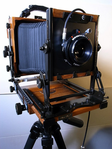
The description I first read of this camera said that "it folds up neatly, like a Hello Kitty lunchbox." It does fold down into a nice little box, but I keep it in a rugged case just to be safe. The perspective of this photo is misleading - the front is smaller than the back and the bellows taper accordingly (or accordianingly).
If you have ever wondered, the bellows allow the focal length, and the focal circle, to be changed. Every photograph in this post was taken with the same lens, which came with my first LF camera (a studio camera that does not fold up neatly, and bears no resemblance to a Hello Kitty lunchbox). I think it is a 150mm, but do not quote me on that. It is the standard for 4x5, whatever it is. I grew so attached to the versatility of a bellows that I got one for my DSLR (also no valid Hello Kitty lunchbox comparison, disappointingly).
A friend was in China on business in 2004, so was able to get the camera for half-price, or I would never have been able to afford this foolish hobby. It took much longer to assemble the darkroom equipment, and even that relied on close-out stock from camera stores that were going out of business.
2004 was also when I first had ocular migraines. Which is why my photography fell off. I hope to start up again, now that the medication is helping.
1 note
·
View note
Text
5 essential Photoshop tools you need to turn your drawing into a beautiful art print
As a self-taught artist, I’ve picked up most the skills I need for things like Photoshop as I’ve gone along. A Google here, a few Youtube videos there. Some notes scrawled on a scrap of paper or tucked away in a file on my computer (where I forget that I’ve put them), but I can usually figure out how to do what I need to do.
And one thing I’ve learned is that for anything you need to do with your artwork in Photoshop, you’ll probably discover there are at least twelve different ways to do the same thing. Eventually, you stumble upon the ways to use Photoshop that work best for you and stick with them. At some point, most of the things you do regularly become second nature, and you forget how you learned them.
It’s easy to assume that everyone else knows what they’re doing when they’re editing their work digitally. But I was talking to a friend and fellow artist recently who wanted to know how I made my greeting cards, and I was reminded that isn’t necessarily the case.
So today I’m sharing the essential tools I use in Photoshop to turn a sketchbook drawing into an art print, or at least a file ready for a printing company to do that for you.
I use 5 main Photoshop tools for this (plus a few others but we’ll stick to the basics here). Before we get to them, though, you’ll need to scan your sketchbook page/drawing so that it’s on your computer, and make sure it’s in the right ‘mode’.
What on earth is a DPI?
DPI stands for 'dots per inch', and the more dots (tiny bits of the image) there are per square inch of the screen, the higher the resolution, which basically means you can increase the size without it getting all fuzzy, and you'll get a higher quality print in the end. Most printing companies will tell you their minimum dpi requirements, so check that before you start scanning.
So the rule is: higher DPI = better quality print. You need to scan at a minimum of 300 dpi - never go below this for printing. I usually scan at 600 dpi.
Make sure the image mode is correct
Once you've got your scan, it's time to open it up in Photoshop and make sure you're using the correct image mode. There are two modes to choose from: RGB is for images that will be displayed on screen (like on your website or social media) and stands for Red, Green and Blue. CMYK is the format most printing companies require and stands for Cyan, Magenta, Yellow and Key (which is black).
We don’t need to worry too much about what all of this means but basically, it’s to do with the colours used to create an image either on a screen or in print and they’re different in each case. If you print an RGB image the colours won’t look right. Just make sure for print to use CMYK, unless your printing company specifically tells you not to (sometimes they’ll change that setting for you). To check/change this, go to Image > Mode > CMYK
Now we get to the tools you need to get your scanned image looking just right and ready to print.
1. Rotate your image
If your scan is sideways or upside down, go to Image > Image rotation and select which way and how much you want to rotate the scanned image.
2. Crop
Hit 'C' to bring up the crop tool, or go to the toolbar on the left of your screen, and you'll find it there - it's the one that looks like two right angles intersecting.
If your scanned image is on a white background, try to crop it as closely as possible to remove as much of the background as you can without cutting off any of your drawing.
If the artwork covers the whole page just crop it to remove any bits that the scanner picked up around your sketchbook/paper and a little extra to remove the curved corners of the pages if necessary.
While you're using the crop tool you can also rotate the image from just outside the corners if it's not quite straight.
3. Levels
The Levels tool in Photoshop balances the tones in an image out by making sure the black, white and grey tones are correct. his affects how all your other colours will appear too so it’s important.
Hit Ctrl + L or Cmd + L on a Mac, or go to Image > adjustments > levels
This opens the Levels panel where you'll see some slider controls and eye droppers.
You can just hit 'auto' and see what the result looks like but if it's not good (and usually I find it's not good), hit Ctrl/Cmd + Z to undo and use the sliders.
Drag the right-hand slider towards the centre to lighten the image, the left hand slider will make any dark areas darker and the middle slider will help you adjust the greys and mid tones. If you've got a nice scan you probably won't need to make any huge adjustments here. So when the colours look good, click OK.
4. Remove the white background
Unless your image takes up the entire page with no white paper showing, you will need to remove the white background. This is true even if you plan to have a white background on your finished print to make sure it's nice and clean.
There are lots of different ways of removing the white background and removing the background on a black line drawing is a bit more complex so maybe I'll go through that in a separate post sometime. But for a full colour image with the white page surrounding it, the easiest tool to use is the magic wand.
Just select the magic wand tool by hitting ‘W’ on your keyboard or selecting the tool that looks like a magician’s wand in the toolbar. Then click on the white background. This should select all the background and what you’ve selected will be surrounded by a moving dotted line (or ‘marching ants’). You can add to that selection or repeat the process later if some of the background gets left behind.
Then in the layers panel, double-click the background layer. This will turn it into a 'normal' layer. Hit the delete key and the white background will be gone. You might need to tidy up the edges of your drawing at this point and you can use the eraser tool for this (hit 'E' on your keyboard or in the lefthand toolbar look for the rectangle that's half black, half grey).
Then, if your background layer isn’t the colour you want in your final print, you can change that now.
5. Clone stamp tool
If you're working with a drawing or illustration that you created across a double page in your sketchbook you are going to have to deal with the 'gutter' where the 2 pages meet. You don't want that on your final print so in my opinion the best tool for this is the clone stamp tool. Inthe toolbar, the clone stamp looks like a rubber stamp.
With the clone stamp, you're essentially copying (or ‘cloning’) a small section from one part of your image and pasting it somewhere else in the same image to cover something up. So for this painting, I used the clone stamp to copy other areas of the sky and grass and stamp/paste them over that annoying seam down the middle of the screen.
Hold down the ‘alt’ key as you click to select the area you want to clone and then click without holding down the ‘alt’ key to paste that clone section over the middle of the image.
I'd recommend making the edges of the brush/stamp soft and varying where you copy from as much as possible, otherwise you risk the middle part of your image looking obviously patched together.
So they are the 5 main tools I use to transform a sketchbook drawing/painting into a file ready to print and frame. There’s a lot more detail I could go into about removing the white background, cleaning up your image and a few other bits and bobs but I’ll save that for another day.
Before I leave you. I’ll share one bonus tool with you.
6. Hue/Saturation
If the levels tool didn’t get your colours looking quite right, you may also want to try the Hue/Saturation tool.
You can find this in Image > Adjustments > Hue/Saturation or by hitting Ctrl/Cmd + U on your keyboard. Now you can play around with the 3 sliders for hue, saturation and lightness to tweak your image a little bit more.
That should leave you with a lovely print-ready file. Make sure you check your print company’s exact requirements before you send it away (they may want a JPEG, PDF or PSD file) and let me know in the comments if you have any questions or if I’ve missed something.
0 notes
Text
A2 Poster
For today I wanted to work on my A2 poster for the collage gallery at the end of my project. I've already mentioned this but at the end of a major project, my college holds a gallery party-type event where they put up all of the work from this course on walls and frames. Each student gets their frame. So today, it is time to design what goes in that frame.
First things first, I opened a PSD file that my teacher gave me so I can understand the layout of the page. I wanted to open it in Photoshop instead of Procreate because I felt like that would be a better idea since a computer feels a lot better to work on when doing layouts like this than it is on a tablet. However, I did open it up in Procreate as well, just in case Photoshop didn't work out for me.


I decided to just put in my cover and nothing else. I wasn't sure how to go about it, the only thing I knew I wanted to do was put in a QR Code that can send people to my webcomic. However, I want sure if I only wanted my cover or some of my other work as well. But first things first, I needed a QR Code, so when I was on my tablet at the time, I figured out how to get a QR Code. I just had to go on Google Chrome and clicked the share button and click QR Code and that would give me one.
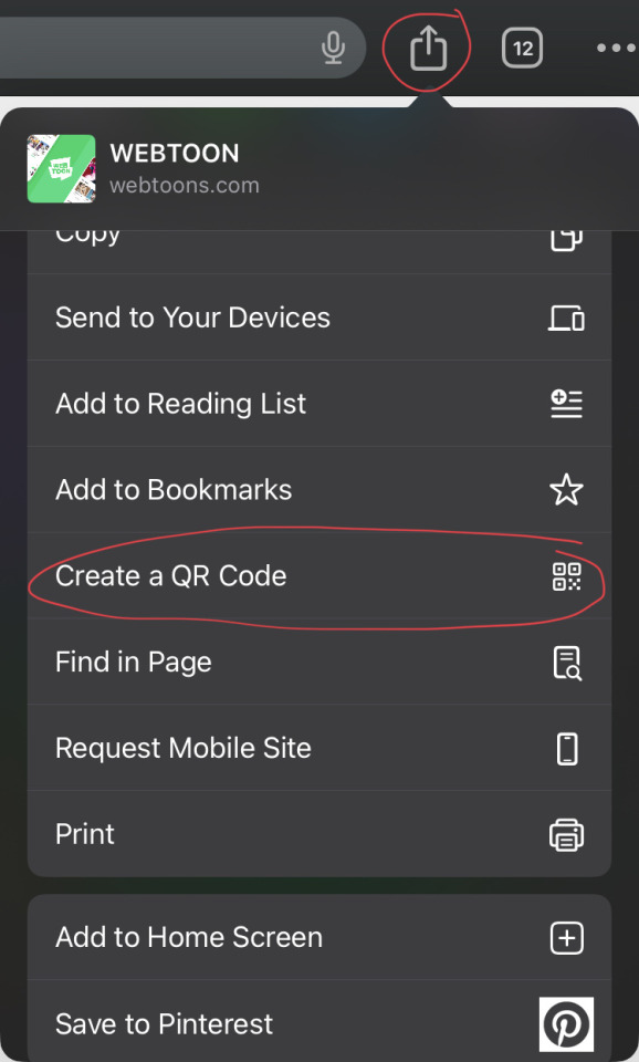
However, when I reserved it and I copied the code, it got sent to my gallery as this...

It wasn't what I wanted, I wanted just the image of the code, not anything else. So I decided to continue on my PC Google Chrome which gave me this...

I then pasted the QR Code and my other artwork onto Photoshop and tried to find layouts that work well enough together, however, they didn't look quite right. I hated the plain white space that was left behind and nothing was working. I also wanted a nice arrow pointing to my QR Code but sadly I didn't know how and all I was able to do was make a line but it didn't have the same effect that I was going for.


So I decided to forget about the other two and just stick with only the cover and QR Code, I also gave up on the arrow. I also made the canvas black instead of white because it suits the aesthetic.

I am very happy with his this turned out, I love how simple it is and how the cover just steals the show which is great since I worked so unberleavebly hard on that and it needs to be the queen of the poster. The QR Code also doesn't cover up a lot of the poster which I am very pleased about.
0 notes
Note
by chance what your process in giffing? i'd be very interested in seeing how i can improve my own practicing in gif making.
I will probably answer this wrong because my brain has never functioned on how to run the process before so bear with me and once I'm on my own computer I can attach screenshots if need be just shoot me a message:
See under the read more for my brainy mess that probably makes no sense to anyone except me but I tried 🤗
Download footage (I always download MP4 if possible)
I cut the video down into clips (between 0-20 seconds a piece)
I go into Photoshop (you can find portable options for photoshop that are downloadable if you cannot afford a subscription) and go File->Video into Layers->Select the File->Clip the scene to whatever you want it to turn into layers->Select Ok
Let the file load and hit save and exit it
Once you have all of your scenes, open up all of the PSD files. Some people are different, but you can crop it manually or you can create a new folder->new action->record->proceed with the cropping and image resizing you want done for all of the files->click save->go to the next document->HIT STOP RECORDING (This is important if you're like me and forget)->Highlight everything that is in your action and then go into the three lines at the top of your actions and find the "Duplicate"->Hit this as many times as you do. For gif packs, knowing I'll have more than 10 PSDs at a time I always have 10 in there and let it play. HOWEVER if you don't want to make an action, that's okay. There's lots of good actions out there you can download (just make sure you credit). One I found just as reference is here: gwennifergifs action
Once you have resized your gifs, begin clipping them and grab the frames you want to use and place them in a new file. DO NOT ADJUST ANYTHING. Just paste. My rule of thumb is there is no more than 140 frames per file, so if you have to split some up, split the scene up into new files
Make your second action for a timing action using the same steps above and duplicate as needed (I have it for 12 gifs). 0.04-0.07 is a good speed for all gifs depending on the amount of files.
Once you have done that, set up your colouring. I have a base gif that I adjust the levels based on the show / darkness that I use for all of mine, but again, you can always search the tags for gif colouring psds that you can use (just don't forget to give credit where credit is due).
After that, you can set up a saving action. I actually use Gwennifergifs saving action that has saved me a MASSIVE amount of time. This will seriously slice saving gifs in half, I made like 100 gifs at a time, and just keep hitting play. Again, this is an another action you'll make.
Once you have finished all of that, upload the gifs to tumblr in your preferred method (post, gif page) and bam! ✨
IF ANY OF THIS DOESN'T MAKE SENSE please just message me--I'll try to go back into this post and update with screenshots if anything isn't plainly clear. Or if I missed something. Or if it looks messy. Or if you attempt anything and it doesn't work out.

0 notes
Text


It's been requested so here it is: my gif tutorial! I hope to make this very simple as I've made gif making very simple for myself with the help of .atn made by myself and others. More under the cut!
First, what you'll need.
Photoshop (here's a link to a masterlist of free photoshop resources from birdysources)
KMPlayer, to get your screencaps.
These PS actions. (My gifmaking one, and this sharpening action from insomniacgifs.)
Some understanding of how to color gifs (I'll be linking my psd shown here, as well as including the process of making one.)
Next, how to get the videos that you want to gif.
I personally source my videos from Youtube, Twitter, and streaming services. (Firefox browser is your best friend, as it doesn't black out the screen that some services have.) If a Youtube Video Downloader isn't working, or if I'm capturing my own footage, I use the Xbox Game Bar's recording feature (windows + alt + r) to capture footage. There's also applications like OBS Studio. For Twitter, I use twittervideodownloader.com
Now, making the gif.
I use Photoshop CC 2018, but any PS with a timeline will work. But first, we gotta take our screencaps. Open your video in KMPlayer, and press alt+v. This will open up this second screen

These are my settings, with an easily accessible folder that I save my frames to. Find the scene you want to clip, and hit start & play your video, then stop when you have the frames you want.
Next up we're going to open up Photoshop. I changed my keyboard shortcuts so all I've got to do is hit ctrl+alt+o, but for you guys, you gotta go to File -> Scripts -> Load Files Into Stack

Select your screencaps of the scene you want to gif. Now that Tumblr allows gifs up to 10MB, the amount of caps you want is totally up to you. I stick to around 45-50, but sometimes there's a scene I need that's up to 150+ caps, and it still fits under the size limit. It all depends on the dimensions and coloring of your gif. I'm loading up 51 frames as the sharpening .atn deletes the final frame of your gif once it reverts back to frames, so I'll have an even 50 framed gif.
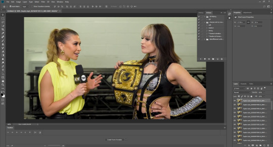
Your PS should look like this. Here comes the gif making itself. You want to hit Create Frame Animation at the bottom, where your timeline is. If your timeline isn't already open, click your Window tab up top, and find timeline in the dropdown.

After you hit Create Frame Animation, you want to Make Frames From Layers, which you'll find when you click the three lines on your timeline.
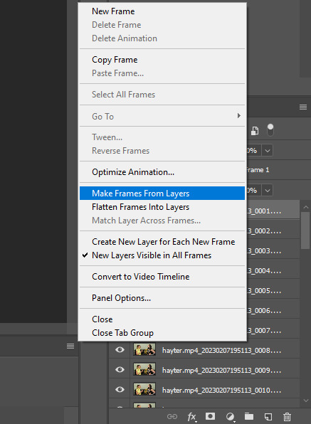
Then, reverse your frames.
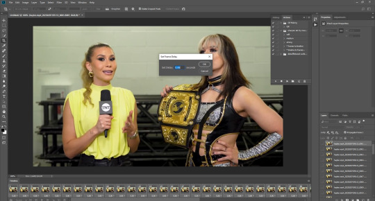
Finally, Select All Frames, click the arrow on the frames, and change the frame delay to .06 seconds.
Way to go! You've made a gif! Now, if you're like me, you'll get tired of having to do that over & over when making a gifset. So, I recorded and uploaded an .atn, which means all you gotta do is load up your frames, hit play on the .atn, and your gif is good to go. I'll link it again so you don't have to lose your place in the tutorial.
So you've made your gif, now what? Now we crop, sharpen, color, and save for the web. Let's get to it.
Tumblr dimensions can be tricky, but they're easy to remember. (I even made a little graphic for it!)

For my tutorial, my Jamie gif will be 268 x 268 :)

Here is my unsharpened, unedited gif of Jamie Hayter. I believe this clip was snagged from YouTube, but it's been awhile since I saved it. I use insomniacgifs' gif sharpening atn, as I hate manually sharpening gifs. So let us run that real quick. (I'll be using the Strong option. Don't forget to delete the final frame.)
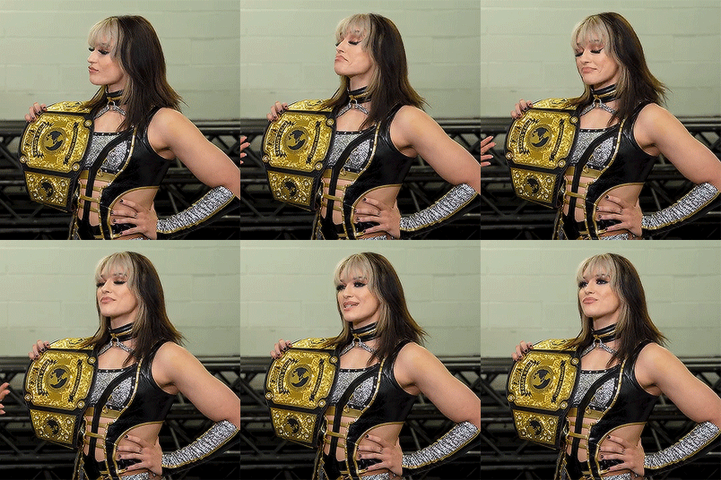
Onto coloring! The example I whipped up for this tutorial is super simple, so let's go!
I typically edit the curves first. I'm not sure why, just something I picked up from my photo journalism class back in HS.

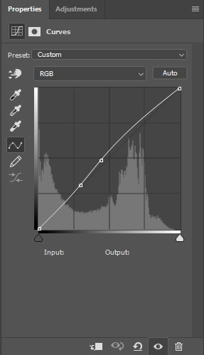
Next, I add a little brightness. (+10)

Then, I mess with Selective Color, just a bit. (Neutrals, Black +10. Blacks, Black +5.)
Now, I don't know exactly what Channel Mixer does, but it's fun. Here's my settings.


Some Saturation (+5)

And lastly, I edit the Color Balance!

Aaaaand here's my final product! I also uploaded this as a PSD for you to save and use yourself!

Once your gif is all done, we need to save it properly. File -> Export -> Save for Web (Legacy). Here are my settings.

Note: Make sure your looping options is set to forever so your gif doesn't loop once and freeze!
And that's it! I hope this helped, and if you have any questions, my ask box is open!
#tutorial#gif tutorial#photoshop tutorial#wweedit#wrestlingedit#aewedit#*tutorial#griff.gif#she's here!!#long post
213 notes
·
View notes
Text
Express Tutorial: How to fix some weird Dirty Blonde textures made by EA or making Dirty Blonde from any texture ever (for recolors)
Hello, so I was asked questions about how to gradient the 13th swatch of the EAXIS palette for hairs to make the recoloring process easier. Therefore here I am with one more specific-ass thing for you to learn.
This tutorial will teach you: Photoshop Gradients Maping and how to disrespect EA color choices properly
Tutorial under the cut ♥
Ok lesgo
Step 1: Get your weird texture. Mine is this one, from the Island Living EP:
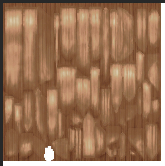
I despise it. ANYWAY, as you can see, the colors are a bit off, the highlights are white and there’s a kind of a “halo” around them that is pretty saturated for no reason. This can make your recolor look weird. So let’s fix that.
Step 2: Open it in Photoshop. Mine is Photoshop CC with a .dds plugin (which makes it easier to work with gradients and not care about the white backgrounds. But if you’re used to the .png files and not flattening your layers, it will work normally.)
Step 3: GRADIENT MAP TIME, BABE. Find it here:
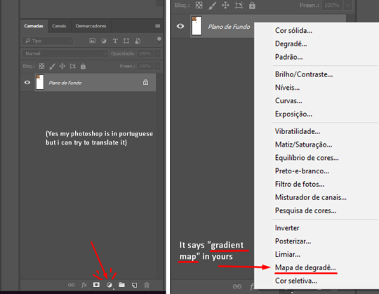
So this nice cute layer will be created for you in some color (will vary depending on what color you have selected at the moment, don’t panic):

Step 4: The Gradient messing up step. So now you have this big window open in your photoshop because you clicked the gradient in the previous step. What now?

Well, now is when the fun begins. You have two sliders there: far left and far right. Far left is your darkest color, the shadows of your hair texture. Far right is the lightest point, the highlights. We still have only two shades, but we will need FOUR. To insert more color shades into your gradient map, simply click somewhere in the map, like this:
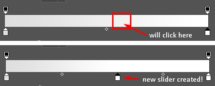
Ok, make it to four and you will have this nonsense here:

You can mess up with the slider positions as you please!
Step 5: Colors! So now you have a gradient map ready to use, all you have to do is to change it’s colors to your preferred tones. To change a slider color, you click it’s little box twice and the color selector will open for you. It’s this easy. Keep in mind that left is darker and right is brighter.
I have my values ready so you can copy and paste in the # section to the color selection:
Deep shadows (far left - value 1): 2e1b15
Shadows (left - value 2): 523830
Base color (middle - value 3): b08d68
Highlights (right - value 4): fff3bd
After you put in your values, you will get this:
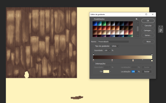
“But Ellen!!! This is dark as hell and not even close to dirty blonde!!” I know dear, that’s why the sliders are for! You can change their positions so if you bring the lighter colors more to the left, the shadows will get lighter! (Notice the extra tip)
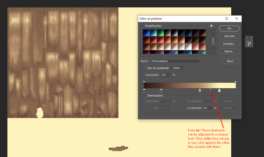
Cleaner dirty blonde!!! Look how soft and pretty it is compared to the EA one:
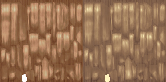
Step 6: Save it. No for real that’s all! Join the layers for png or flatten for dds (don’t forget the mipmap check) and save it as “base” of you’re here because you use my actions. Here’s a sims4studio comparison:
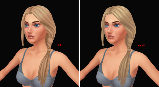
See how it looks easier on the eye? It’s because now the colors are a perfect gradient of each other and they mix up well!
The best part if this, is that now you can grab any texture and turn it to dirty blonde by messing up with the gradient sliders! This makes everything easier, even recoloring clothes or build mode stuff if you want your favorite hair color palette in other parts of the game, assuming they all use dirty blonde as a base. Here’s an example using the teal hair swatch:
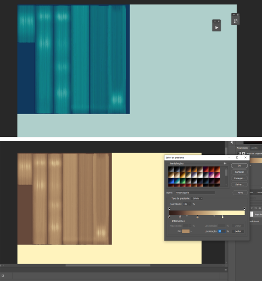
Another tip: Don’t forget to save your new gradient for when you need it again!
♥
That’s about it! Now go on with your recolors! See you in the next tutorial, xoxo
#the sims 4#ts4#sims 4#the sims 4 tutorial#ts4 tutorials#sims 4 tutorials#tutorial#tutorials#photoshop#photoshop tutorial#the sims 4 resources#resources
116 notes
·
View notes
Text

MY GIFMAKING TUTORIAL
hi !! i am finally getting around to making a gif tutorial so here we are, the most i have done is answer an ask about high quality gifs so i’ll just put that link here - x.
i'm gonna try and go over the whole process but i might end up forgetting something so if you need clarification or a further explanation on something feel free to ask i'm happy to help !! also i'm gonna stick this under a read more bcs this is probably gonna end up being quite long.
SOFTWARE
firstly, i have a mac and use photoshop cc 2022 to make my gifs. to screencap i use mpv player. someone made a really good tutorial on how to download mpv player so i’ll link that here - x.
also i use qbitt*rrent to open t*rrent files so you’re gonna want to download that as well if you’re using t*rrent files.
btw for newer versions of photoshop you can’t access the smart object timeline without an action so you’ll have to download this - x. to load an action into photoshop go to window > action and then the actions should pop up next to your history, then you have to press the four horizontal lines next to the arrows (that’s if yours is set up like mine lol) and press on load actions and just select the action you downloaded from me which should be in your downloads and press open and it should appear in your actions section !!

DOWNLOADING THE MEDIA
firstly, you’re gonna wanna download everything in 1080p if possible as this will help to keep the highest possible quality for your finished gif !! now as to where to download media:
- tv shows and most movies: t*rrent from rar.bg with 1080p files with a x264 codec (don’t download x265 as you won’t be able to screencap properly) i try to go for bluray or amazon t*rrents as they tend to have the best quality and most seeders. individual episodes should be around 2-4 GB so full seasons can be anywhere up to 70GB if they’re in 1080p. as for movies i tend to go for files around 10GB, anything under 2GB doesn’t tend to have the best possible quality even if it’s listed as 1080p.
- other movies: some movies, particular older ones aren’t on rar.bg or have literally no seeders so i go to yify. unfortunately the quality isn’t as good as it would be if i downloaded it from rar.bg as the file sizes are made to be as small as possible but hey ho sometimes its the best we can get.
- youtube/twitch videos: 4k video downloader is the best application to use, you do have to download it as software though and you can only do 5 downloads per content creator account with the free version (which i have now run out of :/). so atm i'm using loader.to, for some reason it increases the saturation of the video a little bit but i don’t really mind that cause it’s a lot easier to fix and work with over saturation than under saturation.
SCREENCAPPING
open the file in mpv player
find the section you want to gif (i tend to start a little before said section starts so i can cut it down later)
to start screencapping press option + s (for mac) and then it should start screencapping really slowly but hang on in there it’ll get there. most of my gifs tend to be anywhere between 30-75 frames (per gif) depending on the sizing of my gif and the quality + colouring i’m using.
to stop screencapping just press option + s again. and now you have successfully created your screencaps.
IMPORTING SCREENCAPS INTO PHOTOSHOP
file > scripts > load files into stack

2. browse then use command + a to select all screencaps in that folder then press open then once you get to this (photo below) you can press okay and photoshop will start loading your screencaps in !!

3. your files should now have imported into the bottom far right in layers

PUTTING SCREENCAPS INTO TIMELINE
firstly go to window > timeline

which should then create something like this at the bottom of your screen:

so that’s your timeline ^^. and then for putting the screencaps into timeline: i’ve actually made an action for this so i haven’t done this manually for a while lmfao but this is essentially what it does if i were to do it manually:
click on ‘create frame animation’ which should then create this:

2. command + a on your screencaps in layers to select all of them at once then click on the little four horizontal lines to the immediate left of the layers and press ‘make frames from layers’.

4. then command + a and select all your frames in timeline

5. then press ‘flatten frames into layers’ which is right under ‘make frames from layers’. this should then create layers titled as ‘frames’ in your layers section right above your original screencaps. i then put all my frames into a group and delete the original screencaps to save storage space.

6. make sure to reverse your frames so that the gif isn’t backwards - again command + a and select all your frames in the timeline then click on the four small horizontal lines and press ‘reverse frames’.
*this is future alice coming back and realising that i never cut down the amount of frames for my gif lmfao *facepalm*. so yes after you’ve done this or set your frame delay, either cut down and delete some of your frames from the timeline and/or copy and paste them in another document and repeat the giffing process for each one. now remember that you can drag your colouring from one document to the other so you don’t have to redo your colouring on each one (alas i did not know this when i first started gifmaking 💀 ).
for bigger gifs i tend to use 35-50 frames and up to 75 for smaller sized gifs.
SETTING FRAME DELAY
for most of my gifs i use frame delay 0.05, but occasionally 0.04 or 0.06 depending on the gif. anything slower will end up reducing your gif quality and anything faster tends to look a bit fast imo.
again you’re going to want to command + a and select all of your frames in the timeline and then click on the 0 sec right underneath the frame icon. then press other because the speed we want isn’t in the already listed options.

after you’ve pressed other you’re just gonna want to type in your frame speed - 0.05 would be my optional speed.

then press okay and your frame delay should be set !!

CONVERTING TO SMART OBJECT
for the newer versions of photoshop you’re gonna have to use the action i linked at the top. all you have to do is command + a and select all your frames in timeline and select the group in layers which has all your frame layers then just press play on the action using the little triangle at the bottom:

give it a second and then your timeline and layers should look like this:


my action also turns all your layers into a smart object which is why is has just turned the group into one layer ^^. if you’ve done it correctly the gif should move if you drag the red vertical line across the purple box in the timeline.
CROPPING
okay so tumblr sizing: ava made a good tutorial/description for that here - x. she also goes over sharpening and a few other things. but basically what you need to know is that for one gif it is 540 px in width, the dimensions that i tend to use for one gif horizontally are: 540 x 400, 540 x 310, 540 x 540, 540 x 460.
for two gifs that you’re gonna place next to each other they’re going to have to have a width of 268 px. i tend to use the dimensions of: 268 x 300 268 x 350 268 x 268
and for three gifs next to each other they’re gonna have to have two different dimensions:
so the one of the left is 177 px, the one in the middle 178 px, and the one on the right is 177 px. again a visual representation is much easier to understand so just have a look at ava talking abt it ^^.
COLOURING
okay so colouring is kind of a personal preference and you kind of just have to play around with it til you get something that you like but i’ll walk you through what i did with this gif. (i'm actually using the colouring that i used in this gifset which i saved as a psd).
this is what my base gif looks like without any colouring:

you can find all of these things i used to colour in properties (just hover over each icon to find out what it is):

firstly i'm going to add a curves layer to make it a bit brighter - so i enhanced the highlights and upped the shadows a bit:

then i added a brightness/contrast layer to add more contrast:

increased the vibrance by 15:

added a gradient map to add a bit of contrast which i then put on soft light blending mode and changed it to 15% fill:

fiddled around with the colour balance to balance out the hues:

added a levels layer to increase highlights and shadows:

then i just finished of with selective colour where i went through each colour individually and changed it til i liked how it looked. i change red, yellows, greens, cyans, blues and magentas on absolute and then white, neutrals and black on relative. you can toggle between relative and absolute at the bottom of a selective colours in properties (you can’t change the setting for different colours in one layer, so you’ll have to make another selective colours layer to change to the other mode)

SHARPENING
okay so i actually sharpen my gif before colouring in order to see the colouring better, and then i end up deleting that sharpening and adding it again with my colouring on top of the gif which i talk about further down but for now here are my sharpening settings:
filter > sharpen > smart sharpen:


^^ using legacy and more accurate defines the sharpening a bit more so i use that, you find it by pressing on the little cog at the top of smart sharpening.
another sharpening layer
filter > sharpen > smart sharpen

again using legacy + more accurate
and finally one more smart sharpen layer but this time without legacy so i can reduce the noise slightly:

finally, i add a gaussian blur layer to smoothen out my sharpening:
filter > blur > gaussian blur

then i change the opacity of my gaussian blur layer to 15% by double clicking on the lines on the far right of my gaussian blur:


and that is my sharpening settings and now for when i add my sharpening:
i merge my colouring and gif layers together and then sharpen cause it makes the colouring stick better:
so i duplicate my gif layer and colouring group using command + j while selecting both layers at once:

ignore the current sharpening cause i'm going to get rid of that, its just as i said before to make the colouring process slightly easier.
then cause i have my current sharpening i'm just gonna drag the ‘group 1 copy’ smart filters to the tiny bin icon to the bottom right so it gets rid of my sharpening. and my layers now look like this:

now you’re going to have to select both the ‘group 2 copy’ (my colouring) and ‘group 1 copy’ (my gif) at the same time again using command + a then go to
filter > convert for smart filters

this will the merge the colouring and gif into one layer, do not attempt to normally merge using command + e cause that will stop the gif from moving.
then we add the sharpening as i’ve already shown above. to the merged group so the final gif in layers should look like this:

EXPORTING
now to export the final gif:
file > export > save for web (legacy)

now after you’ve waited up to several minutes for the damn thing to load you should now have this:

these are also the setting i'm going to be using and also usually use. the only things i ever really change are the colouring and diffusion modes

i actually went over this in more detail here - x. i already linked this at the top but here it is again. i do however use pattern diffusion mode now instead of diffusion cause i find it has a better overall finish but again its personal preference.
also remember that tumblr has a size limit of 10mb so keep an eye on the size in bottom left (you might have to reduce the number of frames for your gif if the size is too big):

and now we are done and this is my final finished gif.

i apologise if certain parts of this or none of it made sense lmao i'm kind of tired and i tend to ramble incoherently at times. please do ask questions if you don’t understand or need me to explain something again i'm happy to help.
tagging some mutuals tracking tags (hope that’s okay) <3
#*tutorial#photoshop#photoshop tutorial#gifs#giffing tutorial#gif tutorial#ps tutorial#tutorial#cowboycoven#useralison#arthurpendragonns#ughmerlin#uservalentina#fieryfrankie#seraphcastiel#tuserpris#usersila#bluefirecas#donestiel
585 notes
·
View notes
Text
Specular Maps Tutorial
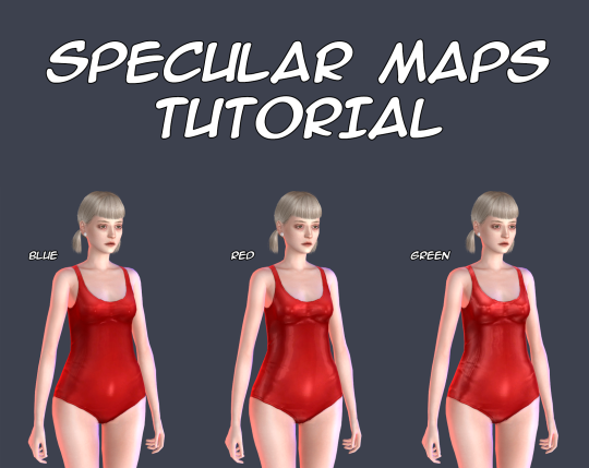
There is no so many information about these maps and most of this information is too difficult for my understanding, so I decided to make my own tutorial about them. This tutorial shows you how to make your own specular maps from scratch without using EA’s maps as a base. You can read it under the cut. Note: English isn’t my native language and I’m pretty bad in writing in it, so sorry for any mistakes. Still hope this tutorial will be understandable for you.
First of all I recommend you to check out this tutorial for specular maps. It’s for build CC and it’s in Russian (still can translate it with google), but it has some nice examples. It also helps me a lot to understand the process.
That you need? Any image editor that supports dds format and alpha channels. In my case it’s Photoshop C6. You also need to download dds plugin for it.
Let’s start!
I’ll be working with this EA’s swimsuit.
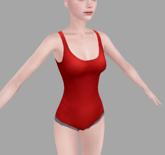
1. Open your texture in Photoshop. For now, we need change image resolution. If you make non-hq texture the size for your normal map should be 512*1024 pixels, if hq then 1024*2048 pixels.
Easy way to doing it is to go to «Image->Image Size», copy the first value and past it in the second. Don’t forget to check out «Costrain Proportions». It should be turn on.
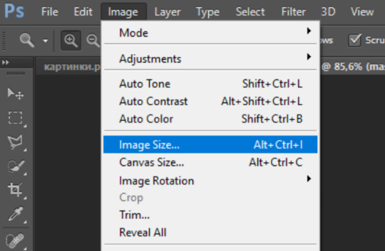

2. Now make new layer under the layer of texture and fill it with black color, lets name it «background» and the texture as «main texture». Then create the another new layer, name it «mask». It should be the plain white copy of the «main texture» like in pics below.
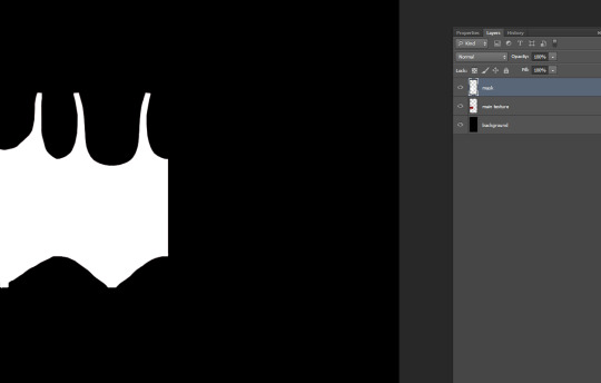
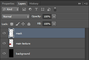
Easy way to doing it in Photoshop:
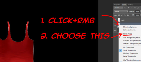
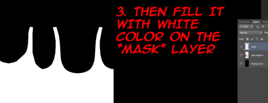
3. Save the file as psd format. This is our base for the specular maps.
4. At the first we should make mask map. This map is needed for avoiding speculars from others CAS items to overlap your own. Examples can be found here.
For mask map you need to delete «main texture» layer, merge remaining layers in one and save file in dds format. Name it «spec.mask».
The saving settings which I use for dds plugin.
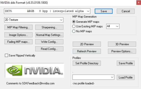
Note: If you want to make your specular map without any shines you need to save your mask map as DXT1 and spec map as DXT5, otherwise your specular maps will be broken in Studio.
5. Close your psd file without saving and open it again. Now we start to make the spec map. It’s responsible for the shine.
There is two ways. You can work with plain texture or with texture itself. The first option is good for clothes with normap maps, the second can be pretty useful for make up, stockings, gloves and ect (the CAS items which can’t have normal maps). In this tutorial I’ll be working with plain texture.
Merge all textures again. Select the layer and copy it (ctrl + A and ctrl + C).
Go to channels and create Alpha channel. Paste your layer in this Alpha channel (ctrl + V). Should be looking like this.

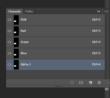
I will use lighter shades of gray to make the tutorial more obvious. But for my CC I personally use more darker shades to make CC barely shine.
Choose “Brush Tool” with black color and put it’s Opacity to 50%.
Note: You also can use “Paint Bucket Tool” or “Brightness/Contrast”, but they don’t always work fine, so be aware of that.
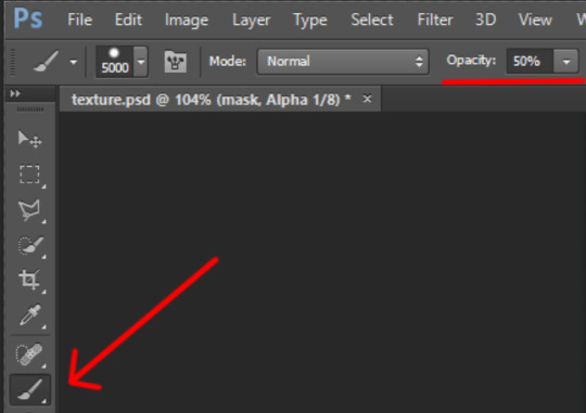
The choosen color should be black! (#000000 color code)
Make the size of brush big enough to color in channels in one touch.
Go to channels. I decided to color in Alpha channel in 50% Opacity.

Red channel in 80%. (Put Brush Tool’s Opacity in 80%. Make sure the color is still black.) The same way with Green channel.
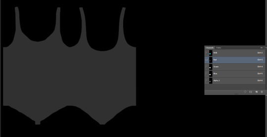
For Blue chanel I chose 30% Opacity.
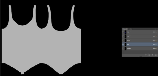
Make all channels visible. The result should be looking something like this. Making different shades of gray in different channels causes the diffent results in game, so I recommed to test this channels more to get more interesting results.
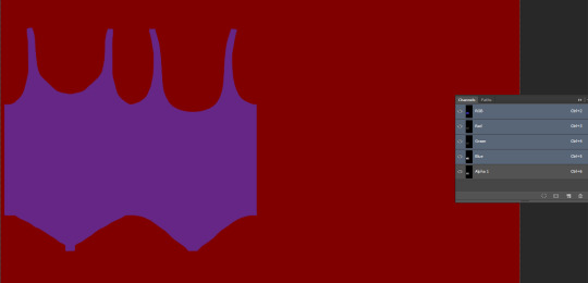
Note: Make shure that the area around your texture is still black while Alpha channel invisible and red while all channels is visible! Otherwise the whole body of your sim and any CC without mask map will be shiny!
6. Save your file as dds format, name it “spec”. You can close your psd file without saving it or saving it as another file, if something goes wrong.
Your specular maps should be lookig like this.
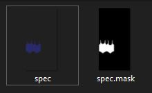
Note: If you name your spec map as “myspecmap”, the mask map also should have the same name, but with “.mask” in the end ( for example: “myspecmap” and “myspecmap.mask”). Otherwise Studio won't see your specular maps.
7. Open your CC in Studio and put your specular maps back. Choose one of the files, the other file will be placed there automatically.
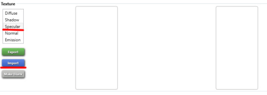
Don't forget to change to dds format while looking for your maps.

Should be looking like this. The first map is transparent and the second is��black and white. It’s important!
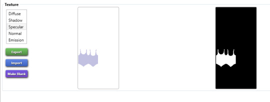
8. Lets check out our maps in game! I also made others specular maps to feel the difference between their effects.
If Blue channel is lighter than others RGB channels. Result of the tutorial.
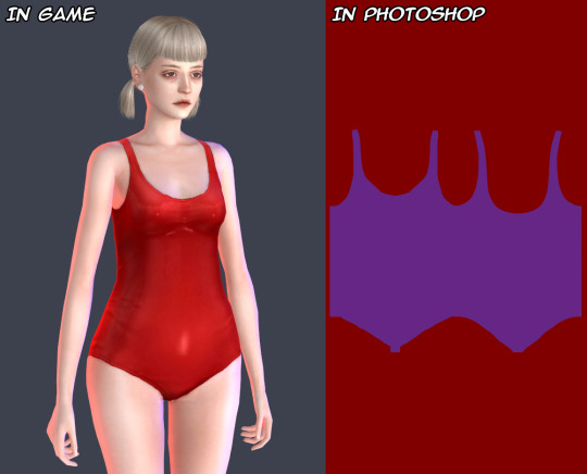
If Red channel is lighter than others RGB channels.
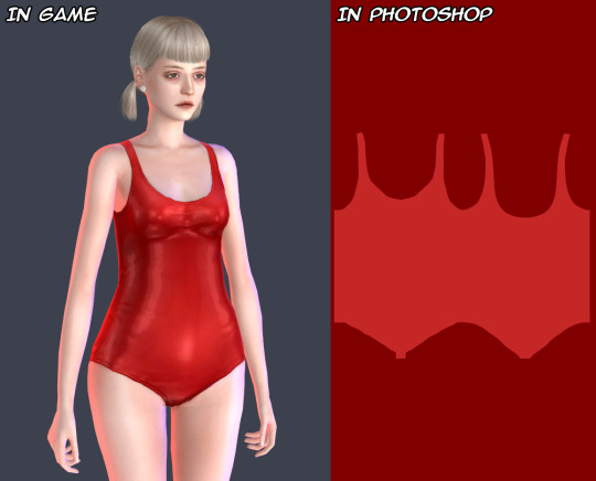
If Green channel is lighter than others RGB channels.

For a better view.
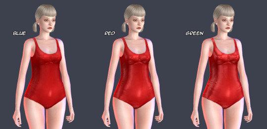
And another example how specular maps can be used. You can make speculars with wet skin vibes for your sim. I used skindetails by obsurus-sims and by me.
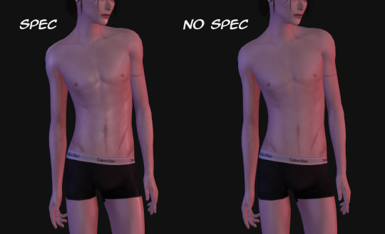
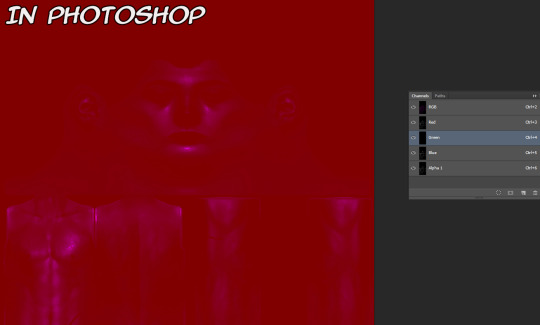
Note: Make shure not posting for public such СС and use it only for personal uses or with creator’s permission! Let's respect the work of others creators!
That's all! Maybe in future I'll add more information about specular maps and some tricks. But for now the language barrier still is problem for me :(
Hope it’ll help you somehow! Wish you good luck and inspiration for your future creations!
543 notes
·
View notes
Note
hi hi first of all I wanna say that i absolutely adore your icons! thank you som much for making them! i was going to ask how you make them if you don't mind? i wish you have an amazng day! <3
Hey Nonnie, thank you so much, I'm very happy you like them! 🥰 I wish I was eloquent enough for a proper tutorial, but I'm gonna try it for you 😌
If I don't make sense, there are a lot of helpful tuts around tumblr, here are some of them: x x x x 😅
Assuming that you know your way around the basic Photoshop tools, let me sum up in a nutshell what my process is:
REMOVING THE BACKGROUND
I usually get a picture or grab a screencap with a good enough quality, open it in Photoshop, and based on its complexity I select the object with my Pen tool, brush tool (on a layer mask), or some combinations of these with other selection tools (magic wand/quick selection tool) - most of the times it is a combination of all of the above. 😅 (watch this tutorial if you want to cut out a subject that is a more difficult shape e.g. messy hair, but there is a contrast between the subject and the background)
I don't erase the background: I cut the object using the layer mask, in case I need to add/get rid of some pixels after colouring and resizing the picture, and it’s also a tremendous help when I use different tools to remove the backgrund.

2. COLOURING
When I have my subject cut out, I create a new file in 150x150px, drag and drop the subject's layer and resize it with the Ctrl+T just to have the freedom to decide which parts to be included in the icon or in case I want more versions of the same picture, just like here (also don’t forget to delete the background by double clicking on it >> Enter >> Del) :

This is when I add/remove pixels on the layer mask if needed, and use some basic colouring on the picture, the layers added as a clipping mask so it will only affect the layer of the subject.

3. ADDING THE BACKGROUND + MORE COLOURING
Then I add some gradient and texture layers below my subject's layer, and in the blending options I add some drop shadow to my subject's layer. (If you're aiming for a more complex icon, there are icon textures around the internet too, here is one.)
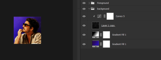
To make the picture blend into the background more smoothly I usually add some adjustment layers as a clipping mask to the subject's layer to adjust the colours more to the background, and/or add some more adjustment layers on the top of all the layers (not as a clipping mask) that will affect the background and the subject as well.

+1 CHANGING THE COLOURS
If I want to blend my subject's clothes more with the background, I add a Solid color layer as a clipping mask somewhere over my subject's layer, using the Eyedropper tool I choose a colour from the background (or something around it), I set the mode to Colour, with the layer mask I remove everything I don’t want to colour, and if needed, I add another layer with Soft Light or another mode that works with my picture.
That's how I changed Javi's originally orange shirt for this set:

Sometimes I add a bit of a smart sharpen on my subject's layer with some fading, so it's not that aggressive, then I save the icon in a PNG format.
Hopefully the tuts and my description could help you a bit, but let me know if you need some more help with any of these steps... if anything, I can help you find a nice tutorial 😅
41 notes
·
View notes