#onpress
Explore tagged Tumblr posts
Visit Tumblr Blog
Explore Tumblr blogs with no restrictions, modern design and the best experience.
Last Seen Tumblr Blogs


Fun Fact
69% of Tumblr users are millennials.
Text
Mobile UI Design

Mobile UI (User Interface) design plays a critical role in the success of any mobile application. A well-designed UI enhances usability, accessibility, and the overall user experience. In this blog post, we'll explore the essentials of mobile UI design and how developers and designers can collaborate to build intuitive and visually pleasing apps.
What is Mobile UI Design?
Mobile UI design is the process of designing graphical and interactive elements of a mobile application, such as buttons, icons, typography, navigation, and layout. The goal is to ensure users can easily interact with the app and achieve their goals without confusion or frustration.
Principles of Good Mobile UI Design
Simplicity: Keep the interface clean and uncluttered to avoid overwhelming users.
Consistency: Maintain uniformity in colors, fonts, and component styles throughout the app.
Feedback: Provide immediate responses to user actions like button clicks or form submissions.
Accessibility: Design for all users, including those with disabilities. Use readable fonts, contrast, and screen reader support.
Intuitive Navigation: Make sure users can easily find their way around the app using clear icons and menus.
Popular Tools for Mobile UI Design
Figma: Collaborative interface design tool popular for mobile UI and prototypes.
Adobe XD: Used for designing and prototyping user experiences for web and mobile apps.
Sketch: Mac-only vector design tool great for UI/UX design.
InVision: Helps with creating interactive mockups and wireframes.
Mobile UI Design Tips
Design for different screen sizes and resolutions (responsive design).
Use a grid system to align elements consistently.
Prioritize touch-friendly elements (big enough buttons with enough spacing).
Stick to platform guidelines (Material Design for Android, Human Interface Guidelines for iOS).
Include microinteractions to make the app feel alive and responsive.
Common UI Components in Mobile Apps
Navigation Bar
Bottom Tab Bar
Buttons and Icons
Sliders and Switches
Cards and Lists
Modals and Dialogs
Example: A Simple UI Layout in Flutter
import 'package:flutter/material.dart'; void main() => runApp(MyApp()); class MyApp extends StatelessWidget { @override Widget build(BuildContext context) { return MaterialApp( home: Scaffold( appBar: AppBar(title: Text('Simple UI')), body: Center( child: ElevatedButton( onPressed: () {}, child: Text('Click Me'), ), ), ), ); } }
Testing and Improving UI
Use tools like Firebase Analytics to track user interactions.
Perform user testing with real users to identify pain points.
Iterate based on feedback and usage data.
Conclusion
Designing a mobile UI is more than just making an app look pretty—it's about creating a seamless, engaging, and efficient experience for the user. By following core design principles, using the right tools, and focusing on the user, you can build mobile interfaces that stand out in both form and function.
0 notes
Text
2/15/25 - B-Sides Progress
Goal: make significant progress on the "Journal" aspect of the program. This allows users to log the physical forms of music they've been listening to in terms of full album, specific songs, and repeats.
Notes: I am working in DartPad for now to code this project because I am having issues importing the flutter package in VSCode. The thing is, this app relies on user input, and that is not something that can be used a lot in DartPad. This will be fun!
Psuedocode: void musicJournal(){
column(
create Widget album(
Text: "Enter Album Name" //takes user input (string)
)
row(
create Widget tracks(
Text:"Enter Track List" //takes user input (string array)
)
create Widget plays(
Text:"Enter Amount of Plays" //takes user input (int array)
)
)
create TextButton(
Text:"Submit";
onPressed: (){
albumInput -> albumLibrary
tracksInput -> albumInput.tracks
playsInput -> iteratively add plays to each tracks data
}
)
)
}
Reflection: I struggled a lot to stay motivated and on task today, especially since my goal of using user input is unachievable with DartPad and I can't seem to get the right packages imported on VSCode. I am really excited to get some work done on this project, so hopefully I'll be able to iron out the VSCode issues soon.
#computer programming#computer science#app development#app developers#app design#flutter app development#coding#web app development#web development#web design#music#physical media#music cds#cassette tapes#vinyl records#music nerd#music appreciation#the lonely bluejay#b-sides app
0 notes
Text
Flutterで位置情報を取得する方法は、locationというパッケージを使うのが一般的です¹。locationパッケージは、iOSとAndroidの両方で位置情報の取得やパーミッションの管理を簡単に行うことができます¹。
locationパッケージを使うには、以下の手順を踏む必要があります。
- pubspec.yamlファイルにlocationパッケージの依存関係を追加する¹。
- iOSの場合は、Info.plistファイルに位置情報の使用目的とバックグラウンドモードの設定を追加する¹。
- Androidの場合は、AndroidManifest.xmlファイルに位置情報のパーミッションの設定を追加する¹。
- locationパッケージをインポートし、Locationクラスのインスタンスを作成する¹。
- serviceEnabledメソッドとrequestServiceメソッドで位置情報サービスの有効化を確認する¹。
- hasPermissionメソッドとrequestPermissionメソッドで位置情報のパーミッションの取得を確認する¹。
- getLocationメソッドで現在の位置情報を取得する¹。
- onLocationChanged.listenメソッドで位置情報の変化を監視する¹。
以下は、locationパッケージを使って位置情報を取得するサンプルコードです²。
```dart
import 'package:flutter/material.dart';
import 'package:location/location.dart';
void main() {
runApp(MyApp());
}
class MyApp extends StatefulWidget {
@override
_MyAppState createState() => _MyAppState();
}
class _MyAppState extends State<MyApp> {
Location location = Location();
bool? _serviceEnabled;
PermissionStatus? _permissionGranted;
LocationData? _locationData;
@override
void initState() {
super.initState();
_checkLocationService();
}
// 位置情報サービスの有効化を確認するメソッド
Future<void> _checkLocationService() async {
_serviceEnabled = await location.serviceEnabled();
if (!_serviceEnabled!) {
_serviceEnabled = await location.requestService();
if (!_serviceEnabled!) {
return;
}
}
_checkLocationPermission();
}
// 位置情報のパーミッションの取得を確認するメソッド
Future<void> _checkLocationPermission() async {
_permissionGranted = await location.hasPermission();
if (_permissionGranted == PermissionStatus.denied) {
_permissionGranted = await location.requestPermission();
if (_permissionGranted != PermissionStatus.granted) {
return;
}
}
_getLocation();
}
// 現在の位置情報を取得するメソッド
Future<void> _getLocation() async {
_locationData = await location.getLocation();
setState(() {});
}
@override
Widget build(BuildContext context) {
return MaterialApp(
home: Scaffold(
appBar: AppBar(
title: const Text('Location Example'),
),
body: Center(
child: _locationData != null
? Text(
'Latitude: ${_locationData!.latitude}\nLongitude: ${_locationData!.longitude}')
: Text('No location data'),
),
floatingActionButton: FloatingActionButton(
onPressed: () {
// 位置情報の変化を監視する
location.onLocationChanged.listen((LocationData currentLocation) {
_locationData = currentLocation;
setState(() {});
});
},
child: Icon(Icons.location_on),
),
),
);
}
}
```
このサンプルコードは、位置情報サービスとパーミッションの確認を行った後、現在の位置情報を取得し、テキストで表示するものです。また、フローティングアクションボタンを押すと、位置情報の変化を監視し、テキストを更新するようになっています。
以上、Flutterで位置情報を取得する方法についての回答でした。ご参考になれば幸いです。😊
¹: [Location | Flutter Package](^1^)
²: [How to get user current location in Flutter - KindaCode](^3^)
ソース: Bing との会話 2024/3/2
(1) 【flutter(location)】位置情報の取得・距離計算 #Flutter - Qiita. https://qiita.com/appzs/items/f6c5afbeaefd6cca7de5.
(2) Location In Flutter. Learn to get current location of user .... https://medium.flutterdevs.com/location-in-flutter-27ca6fa1126c.
(3) 【flutter(location)】位置情報の取得・距離計算 #Flutter - Qiita. https://qiita.com/appzs/items/f6c5afbeaefd6cca7de5.
(4) How to get user current location in Flutter - KindaCode. https://www.kindacode.com/article/how-to-get-user-current-location-in-flutter/.
(5) FlutterのGeoLocationで位置情報を取ってみる #Flutter - Qiita. https://qiita.com/kazutxt/items/1af63e9e32a780daba32.
(6) Flutterの位置情報パッケージを比較してみた |パイオニア .... https://note.jpn.pioneer/n/n25998ea6422f.
0 notes
Text
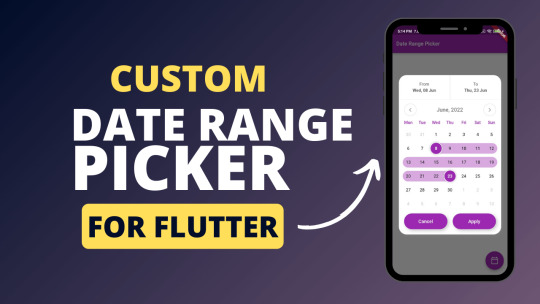
Custom Date Range Picker for Flutter
Custom Date Range Picker for Flutter custom_date_range_picker custom_date_range_picker Usage ... floatingActionButton: FloatingActionButton( onPressed: () { showCustomDateRangePicker( context, dismissible: true, minimumDate: DateTime.now().subtract(const Duration(days: 30)), maximumDate: DateTime.now().add(const Duration(days: 30)), endDate: endDate, startDate: startDate, backgroundColor:…
View On WordPress
0 notes
Text
How to Design Custom Flutter Buttons

Flutter provides a flexible and powerful framework for designing user interfaces, including buttons. While Flutter offers a variety of built-in button widgets, you may want to create custom buttons that match your app's unique design. In this blog post, we will walk through the steps to design custom Flutter buttons.
Step 1: Define the Button Design
The first step in designing a custom Flutter button is to define its visual appearance. Consider the following aspects:
Button Shape: Decide whether you want a rectangular, circular, or any other shape for your button.
Button Size: Determine the dimensions of your button, such as width and height.
Button Colors: Choose the background color, text color, and any other colors you want to use for your button.
Button Typography: Select the font style, size, and weight for the button text.
Step 2: Create a Custom Button Widget
Once you have defined the design of your custom button, you can create a custom widget to encapsulate its functionality and appearance. Here's an example of how you can create a custom button widget: import 'package:flutter/material.dart';
class CustomButton extends StatelessWidget {
final String text;
final VoidCallback onPressed;
const CustomButton({required this.text, required this.onPressed});
@override
Widget build(BuildContext context) {
return ElevatedButton(
onPressed: onPressed,
child: Text(
text,
style: TextStyle(
fontSize: 16,
fontWeight: FontWeight.bold,
),
),
style: ElevatedButton.styleFrom(
primary: Colors.blue, // Set the background color of the button
onPrimary: Colors.white, // Set the text color of the button
shape: RoundedRectangleBorder(
borderRadius: BorderRadius.circular(8), // Set the button shape
),
),
);
}
}
In this example, we create a CustomButton widget that extends the StatelessWidget class. The widget takes two required parameters: text for the button label and onPressed for the button's callback function.
Step 3: Implement the Custom Button
To use the custom button in your Flutter app, follow these steps:
Import the custom button widget into your Dart file.
Add an instance of the CustomButton widget to your app's widget tree.
Provide the necessary parameters, such as the button text and the callback function.
Here's an example of how you can implement the custom button in your app: import 'package:flutter/material.dart';
void main() {
runApp(MyApp());
}
class MyApp extends StatelessWidget {
@override
Widget build(BuildContext context) {
return MaterialApp(
home: Scaffold(
appBar: AppBar(
title: Text('Custom Button Example'),
),
body: Center(
child: CustomButton(
text: 'Click Me',
onPressed: () {
// Add your button's functionality here
print('Button clicked!');
},
),
),
),
);
}
}
In this example, we create a simple Flutter app with a custom button. When the button is clicked, it prints a message to the console.
Conclusion
Designing custom Flutter buttons allows you to create buttons that align with your app's unique design requirements. By following the steps outlined in this blog post, you can easily create and implement custom buttons in your Flutter app.
I hope this blog post helps you in designing custom Flutter buttons. Happy coding!
0 notes
Text
React Native Best Practices

What Does it Mean by Best Practices?
It goes in the coding world — there are no strict rules, but some guidelines (more like suggestions) that many coders tend to avoid while writing code. When you’re first starting out, it can be tempting to skip over coding guidelines. After all, your code might work just fine without them. But as your codebase grows bigger, you’ll start to realize that adhering to guidelines is essential for keeping your code healthy and maintainable.
There are several benefits that we have discussed in our Java blog; you can read our blog about the benefits of clean code and best practices.

1. Use TypeScript with Your React Native App
TypeScript is a statically typed programming language which means it requires explicitly defining the data types for variables, functions, and other elements. This not only leads to more reliable code but also helps developers catch bugs during the compilation process.
Consider the following to calculate order pricefunction calculateOrderPrice(order) { return order.price + 1200; }
The current code works fine, but it doesn’t tell us much about what properties the order object contains, which could lead further to a crash if we try to access a property that doesn’t exist.
To prevent the crash and enhance readability, we can use TypeScript. TypeScript is a programming language that adds types to JavaScript. This means that we can specify the type of each property in the object, which will help us avoid errors.interface Order { price: number; name: string; taxPercentage: number; } function calculateOrderPrice(order: Order) { const { price, taxPercentage } = order; const taxValue = price * taxPercentage; return price + taxValue; }
Here is the same function, but now you and your editor are aware of the object properties and their types in code, which makes it easier to extend the functionality.
2. Functional Components over the Class Components
In React Native, you will have two main components: Functional and Class components. But functional components are the way to go in React Native. They’re simpler, more concise, and faster than class components. This makes them easier to read, write, and test. Plus, they can improve your app’s performance.
If you’re not sure what components are, they’re functions that return React elements. So if you’re looking for a way to improve your React Native code, use functional components over class components. They’re the future of React Native development.
Class Component Exampleimport React, { Component } from 'react'; class ClassComponent extends Component { constructor(props) { super(props); this.state = { count: 0, }; } incrementCount = () => { this.setState({ count: this.state.count + 1 }); }; render() { return ( <View> <Text style={styles.h1}>Class Component</Text> <Text>Count: {this.state.count}</Text> <Button title='Increment' onPress={this.incrementCount}/> </View> ); } } export default ClassComponent;
In this class component example, we’re using the Component class from react to create a component. State is managed within the component’s constructor, and the render method defines the component’s UI.
Functional Component Exampleimport React, { useState } from 'react'; const FunctionalComponent = () => { const [count, setCount] = useState(0); const incrementCount = () => { setCount(count + 1); }; return ( <View> <Text style={styles.h1}>Functional Component</Text> <Text>Count: {count}</Text> <Button title='Increment' onPress={incrementCount}/> </View> ); }; export default FunctionalComponent;
In this functional component example, we’re using the useState hook from react to manage state. The component is defined as a simple JavaScript function that returns JSX to render the UI.
3. Import your dependencies in order
When you have a bunch of imports in one file, it could be a headache trying to find that one specific import you need if you have not organized your imports properly. Therefore it is essential to order imports in a consistent way.
At the same time, you should also ensure that the dependencies have a proper sequence of imports. If the order is not correct, it can affect how components behave and lead to bugs that are hard to find.
Here’s an example of how you can organize your imports:
External imports — react
Internal imports, like relative paths — ../button
In folder imports like ./styles.ts
The imports may be sorted alphabetically in every group
Every group must be divided by white space
import React from 'react'; import { TouchableOpacity, View } from 'react-native'; import { Button, Card } from '../components' import { MainLayout } from '../layouts' import { StyledCard } from './styles.ts'
You can use formatting tools like Eslint and Prettier to automate and enforce the correct import order to avoid such issues.
4. Use Path Alias to avoid long imports
Path aliases are a way to create shorter and more meaningful import paths in your code. This can be helpful when you have a deep or nested folder structure, and it can make your imports easier to read and understand.
For example, instead of writing a long import like this:import { IconButton } from '../../components/buttons'; import { CircleButton } from 'components/buttons'; OR import { CircleButton } from 'buttons';
Here’s how to use path aliases in both TypeScript and React Native to create shorter and more meaningful import paths in your code.
Here’s how to use path aliases in both TypeScript and React Native to create shorter and more meaningful import paths in your code.
Path Alias in TypeScript
Create or update the tsconfig.json file in your project if it doesn’t exist already.
Set the baseUrl to . , which represents the root of the directory. This sets the starting point for all path aliases.
Add path aliases to the paths object. In this example, we have two path aliases defined:
// tsconfig.json { "extends": "expo/tsconfig.base", "compilerOptions": { "strict": true, // Path alias config "baseUrl": ".", "paths": { // This needs to be mirrored in babel.config.js // Components is a directory with sub directories "components/*": ["src/components/*"], // We want to expose the exports of the buttons index file "buttons": ["src/components/buttons/index"] } } }
Now, TypeScript will be able to understand and parse the following imports:import { CircleButton } from "components/buttons" import { CircleButton } from "buttons"
2. React Native Path Alias
First, install the babel-plugin-module-resolver as a developer dependencyyarn add - dev babel-plugin-module-resolver npm install babel-plugin-module-resolver - save-dev
Now we can update the babel.config.js file to use the **module-resolver**plugin and point to our directories.**// babel.config.js** module.exports = function (api) { api.cache(true) return { presets: ["babel-preset-expo"], plugins: [ [ "module-resolver", { alias: { // This needs to be mirrored in tsconfig.json components: "./src/components", buttons: "./src/components/buttons", }, }, ], ], } }
Responsive style properties in React refer to the use of functions to create an adaptive user interface or a layout that adjusts to various screen sizes and orientations. Developing a responsive React Native app can be done in multiple ways, and one of them is by using react-native-normalize. This handy library offers functions that help you create responsive layouts effortlessly.
5. Implement Crash Analytics Tools
Crash analytics tools are like your magic tools that keep an eye on your app 24/7. They do real-time monitoring to help you identify crashes and errors. These tools analyze the crash data and give you the lowdown on what’s causing the chaos.
So, if you’re in the development process, and suddenly, the app crashes out of the blue. With the implementation of crash analytics, you can easily find the root causes of these crashes.
There are a bunch of awesome crash analytics tools out there, like Sentry, Firebase, Crashlytics, and more. They’re like your trusty companions, helping you debug and rescue your app from potential crashes.
Read more at https://www.brilworks.com/blog/react-native-best-practices/
#react native#reactnative#react native app development company#react native developers#react native mobile app development
0 notes
Text
Flutter and Material Design: Perfect Partners for UI/UX
Welcome to the world of Flutter and Material Design—where code meets creativity and pixels dance to perfection. In this blog, we'll take a trip into the world of UI/UX design, where Flutter and Material Design prove to be the ideal partners for designing apps that are not only functional but also aesthetically beautiful. So buckle up as we explore the fascinating world of Material Design and Flutter, where technology and fashion converge.
They say, "Two heads are better than one," and that's certainly the case when it comes to Flutter and Material Design. Flutter, Google's cross-platform app development framework, works in tandem with Material Design which is also a Google's design system. Together, they produce an aesthetic and practical symphony that is perfect.
The Flutter Advantage
But why choose Flutter in the first place? Here's a tangy tidbit for you: Flutter is the "fast food" of app development. It's quick, efficient, and satisfies your craving for speedy UI/UX design.
Code That Paints the Screen
In Flutter, you paint the screen with code. The declarative UI approach allows you to create visually stunning interfaces using just a few lines of code. Let's dive into a quick example:
class MyApp extends StatelessWidget {
@override
Widget build(BuildContext context) {
return MaterialApp(
home: Scaffold(
appBar: AppBar(
title: Text('Hello, Flutter!'),
),
body: Center(
child: Text('Welcome to the world of Flutter and Material Design!'),
),
),
); } } You see, Flutter makes it a breeze to design your app's structure.
The Material Design
Let's now add a little Material Design magic to the mixture. A set of design concepts and user interface elements provided by Material Design make sure that your app not only looks fantastic but also complies with accepted standards for user experience. It's like having a qualified designer at your service.
Ready-Made UI Components
You can save time and effort by using the built-in Material widgets in Flutter. From buttons to cards to navigation drawers, you'll find a plethora of ready-made components to make your design process a breeze.
Here's a snappy code snippet using a Material button:
ElevatedButton(
onPressed: () {
// Action to perform on button press
},
child: Text('Click Me'),
)
Flutter and Material Design aren't just a partnership; they're a dynamic duo! This combination delivers a beautiful marriage of design and functionality, whether you're creating slick software for your firm or a feature-rich application for a client.
Flutter and Material Design Services by Magnigeeks
Before we go, if you're looking for professional help to unlock the full potential of Flutter and Material Design, look no further. Magnigeeks is here to give top-tier UI/UX design services using these dynamic technologies. Your app idea can become a magnificent reality with the help of our talented designers and developers, who will also guarantee an unparalleled user experience that complements the personality of your company.
Join Magnigeeks in leveraging the power of Flutter and Material Design, and together, let's build an app that not only performs flawlessly but also captivates customers with its elegant, user-friendly design. Visit https://magnigeeks.com/ to get in touch with us right away and start your UI/UX adventure!
So there you have it, the journey into the world of Flutter and Material Design—a delightful blend of tech and style. These two partners are your best allies in creating apps that not only work flawlessly but look fantastic while doing so. Get ready to embark on your UI/UX adventure with Flutter and Material Design, and watch your app come to life in style!
0 notes
Text
The Eternal Question:Biological variations on a Platonic dialogue
:Jakob von Uexküll, Thure von Uexküll
Abstract. The reinterpretation of Nature by biology, which will prevail inspite of all obstacles, has brought our thinking closer to antiquity, giving usthe chance to reinvigorate our perused terminology with the help of theresources to be found in the thoughts of the greatest minds of mankind. Theway to Plato thus being cleared, I perceived the idea to seek enlightenment onpressing biological questions from the great Sage. As means to this end, Ichose to make Socrates continue one of his dialogues, with the adjustment ofgiving him the knowledge of our contemporary biological problems. Thussome kind of interaction between the Ancients and ourselves is created, to ourconsiderable benefit.
0 notes
Text
A Short Intro to Flutter Cupertino Date Picker

You may have seen a menu in the apps where you can navigate through the day, month, and year to choose the date. Technically, that is the date picker. If you’re a Flutter developer, you could be worried about learning how to make a date picker in Flutter. Everything you need to know about the Cupertino date picker in Flutter will be covered in this post.
Let’s first learn more about Cupertino Flutter before moving forward. Also you can read this blog from our official website A Short Intro to Flutter Cupertino Date Picker.
Overview of Cupertino in Flutter
In Flutter, “Cupertino” refers to a collection of widgets and design elements reminiscent of Apple’s iOS interface. We utilize it to build an app that closely resembles an iOS app by using widgets like CupertinoButton, CupertinoAlertDialog, and CupertinoNavigationBar. However, the Flutter framework, which aids in creating cross-platform apps that parallel native iOS apps in appearance and functionality, includes the Cupertino library.
What exactly is this Cupertino date picker? Find out more about
Flutter Cupertino Date Picker
A user interface (UI) element in Flutter called the Cupertino date picker enables users to choose a date from a calendar-like layout. This picker is a beautiful choice for programmers wishing to create apps with a similar style because it is made to be comparable to the date picker seen in iOS.
You must first create a new project to use the Cupertino date picker in Flutter app development. After setting up your project, you can include the Cupertino date picker flutter in your app’s design.
Let’s look at an example to help you better grasp how date pickers function.
Example of a Flutter Date Picker
We’ll use the CupertinoDatePickerMode.date attribute to create a Cupertino date picker. It will be possible for you to select a date.
This is the code.
import 'package:flutter/cupertino.dart';
import 'package:flutter/material.dart';
class CupertinoDatePickerDemo extends StatefulWidget {
const CupertinoDatePickerDemo({Key? key}) : super(key: key);
@override
State<CupertinoDatePickerDemo> createState() =>
_CupertinoDatePickerDemoState();
}
class _CupertinoDatePickerDemoState extends State<CupertinoDatePickerDemo> {
DateTime date =
DateTime(DateTime.now().year, DateTime.now().month, DateTime.now().day);
@override
Widget build(BuildContext context) {
return Scaffold(
appBar: AppBar(
title: const Text('Cupertino Date Picker Demo'),
),
body: Center(
child: Column(
mainAxisAlignment: MainAxisAlignment.center,
crossAxisAlignment: CrossAxisAlignment.center,
children: [
Text(date.toString()),
ElevatedButton(
onPressed: () async {
await showCupertinoModalPopup<void>(
context: context,
builder: (_) {
final size = MediaQuery.of(context).size;
return Container(
decoration: const BoxDecoration(
color: Colors.white,
borderRadius: BorderRadius.only(
topLeft: Radius.circular(12),
topRight: Radius.circular(12),
),
),
height: size.height * 0.27,
child: CupertinoDatePicker(
mode: CupertinoDatePickerMode.date,
onDateTimeChanged: (value) {
setState(() {
date = value;
});
},
),
);
},
);
},
child: const Text('Show Date Picker'),
),
],
),
),
);
}
}
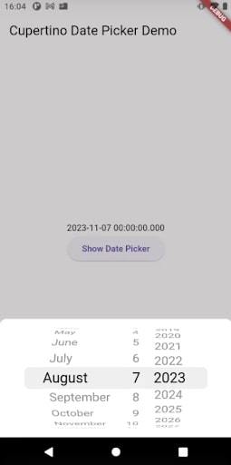
Output
Properties
The CupertinoDatePicker’s essential characteristics are as follows:
1. mode: CupertinoDatePickerMode.date, CupertinoDatePickerMode.time, or CupertinoDatePickerMode.dateAndTime are just a few examples of the modes that can be defined for the date picker.
2. initialDateTime: When the picker is opened, the initial date and time are set using initialDateTime.
3. minimumDate and maximumDate: You can specify a range of pickable dates.
4. minimumYear and maximumYear: Minimum and maximum years can be used to restrict the available range of years.
5. minuteInterval: It is between the minutes displayed in the picker specified here.
6. onDateTimeChanged: Whenever the specified date or time changes, a callback method called onDateTimeChanged is called.
How to Customize the Flutter Date Picker?
The Cupertino date picker look can be easily customized. In addition to changing the picker’s backdrop color and font size, you can also alter the color of the flutter date picker. The “Done” and “Cancel” buttons at the bottom of the picker can also be added and modified.
Isn’t it fascinating? You must agree.
It’s crucial to consider your app’s flow and general design when integrating the Cupertino date picker into the layout. The date picker should be put in an appropriate location that is simple for the user to access. It should also be planned so that it doesn’t interfere with the other components on the screen or take up excessive space.
How to Change the Color of the Flutter Date Picker?
The date picker modal popup menu in Flutter is transparent by default. Depending on whether the color of your app screen makes the modal popup less visible or for any other reason, you might need to adjust that as well. So, how do you modify the color of the Flutter date picker?
As you can see in the code below, you must assign any other color from the backgroundColor property to accomplish that.
CupertinoDatePicker(
backgroundColor: Colors.deepPurple[100],
mode: CupertinoDatePickerMode.date,
onDateTimeChanged: (value) {
setState(() {
date = value;
});
},
),
Output

You should be aware that using the Flutter custom date picker to create a seamless user experience requires providing users with an interface that is simple to understand and navigate. This can be accomplished by emphasizing the chosen date, offering clear and concise instructions, and simply enabling users to move through the various months and years.
Unique Features of the Cupertino Date Picker
We can build a dynamic and responsive user interface for your app using the Flutter date range picker in combination with other Flutter widgets. Users can choose the date and the time, for instance, by combining the date picker and time picker. Additionally, you may add more complex functionality, such as the ability to create recurring events, by combining the date picker with other UI elements.
Using the picker in conjunction with other widgets and components in your app and being aware of the overall design and layout are two tips and tricks for enhancing the performance of the Cupertino date picker. To ensure that the picker functions as intended, evaluating its performance on various hardware and in different scenarios is crucial.
Conclusion
The Cupertino date range picker offers a consistent and familiar user interface, one of the main advantages of utilizing it in your app. Users are more likely to understand how to interact with the date picker if it is comparable to how they are familiar with it, which can help improve the overall user experience. The Cupertino date picker is also very adaptable, enabling engineers to quickly change its appearance to match the overall design of their app.
The Cupertino Flutter guide ended with this, so we did our best to hide it. You are welcome to ask any further questions or offer any recommendations. Alternatively, you can hire Flutter developers to assist you in solving any complex technical problems your app may have and make it a valuable product.
Frequently Asked Questions (FAQs)
1. How can I choose multiple dates in Flutter Datepicker?
Using the date range picker’s ��enableMultiView’ parameter, you can add more than one picker in the Flutter date range picker.To display the Multiview picker, put the picker inside the Scaffold widget’s body, enable the ‘enableMultiView’ property, and set the value to true.
2. What distinguishes the DatePicker from the date range picker?
The single date picker’s functionality is quite similar to the date range picker; however, instead of selecting just one date, the user can choose a start date and an end date. Users can manually enter the date in a text box or select the date on a calendar for each date in the range.
3. How to display a Cupertino date picker as a dialog ?
To show cupertino date picker as a dialog you need to wrap CupertinoDatePicker inside CupertinoAlertDialog and then display it using the showDialog(). This should display the CupertinoDatePicker as a modal dialog.
#FlutterDevelopment#hire flutter developers#mobile app development#bosc tech labs#CupertinoDatePicker
0 notes
Text
Handling Events and User Input in Flutter

This blog article will explore the exciting topic of handling user input and events in Flutter.
You’ll discover that user interaction is critical to developing exciting and dynamic Flutter mobile applications as you progress in your app development journey.
Let’s get down to the very details of how Flutter handles user input and events so that we can develop responsive, user-friendly apps. Also you can read this blog from our official website Events and User Input in Flutter.
Understanding User Input and Events
In Flutter, user input is any action a user performs responding to interactions like tapping buttons, typing text, or scrolling.
On the other side, events are the responses triggered by user input.
To deliver a seamless user experience, you must record these events as a Flutter developer and manage them accordingly.
Handling Button Taps
The user interface of any application must include buttons. Let’s look at how the ‘onPressed’ property may be used to manage button taps:
import 'package:flutter/material.dart';class ButtonTapDemo extends StatelessWidget { const ButtonTapDemo({super.key}); @override Widget build(BuildContext context) { return Scaffold( body: Center( child: ElevatedButton( onPressed: () { // This function will be called when the button is tapped print('Hey There! How are you?'); }, child: const Text('Tap Me'), ), ), ); }}
In the above example, when the user taps the button, it will print ‘Hey There! How are you?’ to the console. Other than the print() function, we can perform many more actions when the button is tapped like, navigate to another screen, update the content, etc.
Handling Text Input
The TextField widget can be used to manage user-provided text input. Here is an example of how to retrieve user input from a text field:
import 'package:flutter/material.dart';class TextFieldEventDemo extends StatefulWidget { const TextFieldEventDemo({super.key}); @override _TextFieldEventDemoState createState() => _TextFieldEventDemoState();}class _TextFieldEventDemoState extends State<textfieldeventdemo> { String input = ''; @override Widget build(BuildContext context) { return Scaffold( body: Center( child: Column( mainAxisAlignment: MainAxisAlignment.center, children: [ TextField( onChanged: (value) { // This function is called whenever the user types in the text field setState(() { input = value; }); }, decoration: const InputDecoration( labelText: 'Write something', border: OutlineInputBorder(), ), ), Text(input) ], ), ), ); }}</textfieldeventdemo>
In this example, we have used a StatefulWidget which shows that the TextField widget takes the input from the user and updates the text below it. Whenever the user will type in the textfield, the onChange method of the TextField will be triggered and the state of the text below it will be changed.
Gestures Handling
Flutter has a variety of widgets to handle various gestures, including tapping, swiping, and dragging.
Let’s look at an illustration of how the GestureDetector widget handles a tap gesture:
import 'package:flutter/material.dart';class GestureDetectorDemo extends StatelessWidget { const GestureDetectorDemo({super.key}); @override Widget build(BuildContext context) { return GestureDetector( onTap: () { // This function is called when the user taps anywhere on the widget print('Screen tapped!'); }, child: const Scaffold( body: Center( child: Text( 'Tap anywhere on the screen', ), ), ), ); }}
In this example, we have wrapped the whole screen in the GestureDetector. So, when the user taps anywhere on the screen, the ‘onTap’ function is triggered and ‘Screen tapped!’ will be printed in the console.
Handle Slider Changes
Sliders help choose a value from a range. To track and react to changes in slider value, utilize Flutter’s Slider widget.
import 'package:flutter/material.dart';class SliderDemo extends StatefulWidget { const SliderDemo({super.key}); @override _SliderDemoState createState() => _SliderDemoState();}class _SliderDemoState extends State<sliderdemo> { int _value = 35; @override Widget build(BuildContext context) { return Scaffold( body: Center( child: Padding( padding: const EdgeInsets.all(15.0), child: Center( child: Row( mainAxisAlignment: MainAxisAlignment.spaceEvenly, mainAxisSize: MainAxisSize.max, children: [ SizedBox( width: 70, child: Icon( Icons.volume_up, size: _value.toDouble(), ), ), Expanded( child: Slider( value: _value.toDouble(), min: 10.0, max: 60.0, divisions: 10, activeColor: Colors.deepPurple, inactiveColor: Colors.orange, label: _value.toString(), onChanged: (double newValue) { setState(() { _value = newValue.round(); }); }, semanticFormatterCallback: (double newValue) { return '${newValue.round()} dollars'; }, ), ), ], ), ), ), ), ); }}</sliderdemo>
In this example, we have a sound icon and a slider next to it, based on the slider’s value the size of the sound icon will be changed. When the user drags the slider’s head, the onChanged() function will be triggered and the size of the sound icon will be changed.
Handling Checkbox Changes
Binary choices are frequently selected using checkboxes. You can monitor changes in the checkbox’s state and respond to them using Flutter’s Checkbox widget.
import 'package:flutter/material.dart';class CheckBoxDemo extends StatefulWidget { const CheckBoxDemo({super.key}); @override _CheckBoxDemoState createState() => _CheckBoxDemoState();}class _CheckBoxDemoState extends State<checkboxdemo> { bool? valuefirst = false; bool? valuesecond = false; @override Widget build(BuildContext context) { return MaterialApp( home: Scaffold( body: SizedBox( child: Column( mainAxisAlignment: MainAxisAlignment.center, crossAxisAlignment: CrossAxisAlignment.start, children: <widget>[ const Text( 'Checkbox without Header and Subtitle:', style: TextStyle(fontSize: 15.0), ), Row( children: <widget>[ Checkbox( // checkColor: Colors.greenAccent, // activeColor: Colors.red, value: valuefirst, onChanged: (bool? value) { setState(() { valuefirst = value; }); }, ), Text(valuefirst.toString()) ], ), Row( children: [ Checkbox( value: valuesecond, onChanged: (bool? value) { setState(() { valuesecond = value; }); }, ), Text(valuesecond.toString()) ], ) ], )), ), ); }}</widget></widget></checkboxdemo>
In this example, there are two checkBoxes whose byDefault value is false and when tapped, the onChanged() function is triggered and the value of that particular checkbox is set to true.
Conclusion
Handling user input and events is essential to creating responsive Flutter applications. Using several Flutter widgets and callbacks, we explored how to handle button taps, collect text input, detect gestures, respond to checkbox changes, and handle slider interactions.
Congratulations on mastering the art of using Flutter to handle user input and events!
Hence, these abilities enable you to develop responsive and responsive and fascinating apps. Visit www.flutteragency.com to stay updated on the latest Flutter trends, best practices, and development tips.
Frequently Asked Questions (FAQs)
1. Which widget does Flutter use for user input?
Flutter uses various widgets to handle user inputs such as, gesture detector, inkwell, textfield, checkbox, button, etc. The most popular widget for user input is textfield.
2. How does Flutter handle user input?
Flutter provides us with a very rich set of widgets and event handling mechanisms. Using these widgets and event handlers, developers can easily capture and respond to user input which makes the application user friendly and responsive.
3. How to Handle User Input and Events in Flutter?
To manage user input and events in Flutter:
1. Select the appropriate widget based on the desired user input, like TextField, GestureDetector, InkWell, Checkbox, Radio, Switch, Slider, DropdownButton, etc. 2. Attach event handlers to widgets that respond to user interactions. These handlers, or callback functions, execute when the corresponding events occur. 3. Use the TextField widget to capture textual input. You can provide a controller to track and manipulate the input and define callbacks for text changes.
By following these steps, you can efficiently handle user input and events in Flutter, creating a seamless and interactive user experience.
#FlutterUIEvents#FlutterUserInteraction#FlutterEventListeners#UserInputInFlutter#FlutterEventHandling#hire flutter developers#hire flutter developer
0 notes
Text

Poster on press for Pieter Hugo’s Polyphonic exhibition at Stevenson Johannesburg.
2 notes
·
View notes
Photo
Just got my #AZTDR BOOK! 👽👽👽 My biggest #inspiration came from @thedesignersrepublic™️ 🖥 @iantdr #thedesignersrepublic #tdr #designfeed 📚🔪💻 #angryman #bookcover #graphicdesign #graphicdesignbooks #onpress #printers @uniteditions #pantone #metallics #fluorescents #iantdr #disinfotdr #typography (at Frog Town) https://www.instagram.com/p/B3XFKlIF4MN/?igshid=307jax6nksme
#aztdr#inspiration#thedesignersrepublic#tdr#designfeed#angryman#bookcover#graphicdesign#graphicdesignbooks#onpress#printers#pantone#metallics#fluorescents#iantdr#disinfotdr#typography
0 notes
Photo

#onpress for the stupendous @frogandtoadstore!!! it's hella hot. my inks hate me. I'm making it happen - slowly, but surely!!! #toohottoprint (at Frog and Toad) https://www.instagram.com/p/Byl00q6BqY3/?igshid=gczl2tha43ux
0 notes
Text
Flutter のトーストとは、画面の一部に一定期間表示される小さなポップアップメッセージのことです。操作の確認や短い情報の提供に使われます。Flutter では SDK 標準のトーストは用意されていないため、別途ライブラリを組み込んでやる必要があります。一般的には **fluttertoast**¹ というライブラリを使ってトーストを表示します。以下は fluttertoast を使ったコードの例です。
```dart
import 'package:flutter/material.dart';
import 'package:fluttertoast/fluttertoast.dart';
class Sample extends StatelessWidget {
@override
Widget build(BuildContext context) {
return Scaffold(
appBar: AppBar(
title: const Text('サンプル'),
),
body: RaisedButton(
child: Text('トーストの表示'),
onPressed: () {
Fluttertoast.showToast(msg: 'ボタンがクリックされました');
},
),
);
}
}
```
¹: [fluttertoast | Flutter Package](^3^)
ソース: Bing との会話 2024/3/2
(1) [Flutter] トーストを表示する | BUILDBOX.net. https://buildbox.net/flutter-toast/.
(2) 【Flutter】Fluttertoastの使い方|トーストを表示する - Code .... https://coderenkin.com/flutter-fluttertoast/.
(3) [Flutter]トースト(toast)を表示するには? - ちょげぶろぐ. https://www.choge-blog.com/programming/fluttertoastshow/.
(4) flutterでトースト表示|blue - note(ノート). https://note.com/blue_69/n/n0fb83e03541a.
(5) Flutterで簡単にToastメッセージを表示する方法とカスタマイズに .... https://gr-st-dev.tistory.com/2901.
(6) undefined. https://pub.dev/packages/fluttertoast.
0 notes