#okay for beginners
Explore tagged Tumblr posts
Text
"Old men yaoi" You guys couldn't even handle Whizzer and Marvin
#like come on dude let's stop making them look/act freakishly young please#they're grown ass middle aged men#i swear I've seen them basically written as teenagers way too many times#like come on people we can do better!#slap some wrinkles and body hair and fat on them#“They look ugly :(”#WHO CARES!#They're people#they're gonna be a little ugly#they're not gonna be the perfect representation of beauty or something#I swear I've made so many posts about this I'm just very insane about it#All of you Falsettos artists who give them body hair and wrinkles and fat are my favourites ever I'm kissing you on the mouth#(Beginner) Falsettos artists who are afraid to do so because you're not confident on your artstyle or whatever#you can do it. do it. go ahead. who cares if they look a little bad. go nuts with it!#okay I'm done I SWEAR#falsettos 2016#marvin falsettos#whizzer brown
205 notes
·
View notes
Text
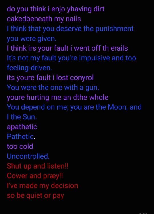
technically a first draft, but im pretty proud of it.
the first line is inspired by @/dailyhmsw go check them out
#I've been trying to get more into poetry recently#Case in point: the SPLIT! cover i wrote#But I've been doing okay I think#chonny jash#cccc#cccc hms#chonnys charming chaos compendium#Poetry#Beginner poetry#i wrote a haiku for you!
44 notes
·
View notes
Text
Dreamy Gear Magolor
First ever attempt at drawing backgrounds and using lighting!
Advice is appreciated

#kirby#i love magolor#magolor#beginner artist#dreamy gear#kirby art#kirby fanart#magolor fanart#dreamy gear magolor#I had no clue what I was doing with this tbh…#I hope it looks okay!#how do i tag this
53 notes
·
View notes
Text
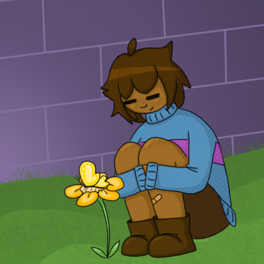
kiddo being a kiddo. idk. they don't mean anything to me (EXTREMELY LOUD INCORRECT BUZZER)
#holding my own face looking in the mirror shouting IT'S OKAY IT'S OKAY IF YOUR ART ISN'T GOOD YET YOU'RE ALLOWED TO SUCK IT BRINGS YOU JOY#anyways i v much enjoyed doodling this c:#im love them.....#undertale#utdr#beginner artist#frisk#frisk undertale#undertale fanart#my art :]
128 notes
·
View notes
Text
rough art tips to learn and then break at your leisure.
the distance between your eyes is roughly one eye. the corners of your mouth dont extend past the middle of each eye. ears are roughly in the middle of the tip of the nose and the eyebrow. the eyes are in the very centre of the head. the neck is just a Little slimmer than the width of the head (varies with fat distribution, but fat tends to build up under the chin). hair is easier to draw when you plot out the hairline and then where it parts. leaving appropriate distance on the side of the face (cheekbone area and back to ear) contributes to making characters look more realistic/hot as hell. i dont know specific tips for that so use reference. an amazing reference/study site is lineofaction.com . if you think of the face in planes it makes it easier to construct (look up tutorials). if you draw a spiral like a tornado it can help you figure out awkward perspective for extended limbs (look up foreshortening coil technique). tangent lines are when two lines intersect and cause visual confusion (when it looks like a line that defines an arm is part of the line that defines a building, for example) and avoiding them makes your art way easier to comprehend. quick trick to good composition: choose a focal point (where you want your viewer to focus), detail that area the most, and make sure various elements of the piece are pointing to that focal point. you can use colours to contrast hue, saturation, and brightness and make certain elements of your drawing stand out. drawing in greyscale can help you figure out values. using black in a piece isn't illegal but you should know what you're doing when you do use it- it desaturates a piece and if used as a shading colour can desaturate and dull whatever youre shading too. if you use almost-black lineart and then add black to darken the very darkest areas it will do a lot to add some nice depth. the tip of your thumb ends just above the start of your index finger- your thumb also has two knuckles and all your other fingers have three. if you see an artist doing something you like (the way they draw noses or eyes or hair or anything else) you can try to copy that and see if you want to incorporate it in your style <- this is ENCOURAGED and how a lot of us learned and developed our styles. there are ways to add wrinkles to faces and bodies without making the character look a million years old, you just have to keep experimenting with it. The smile wrinkles around your muzzle dont connect to your mouth or to your nose; there should be a small space in between smile or nose and the wrinkle line. eyes when viewed in profile are like < aka a little triangle shape. think of the pupil like a disk and apply foreshortening to it (it looks like a line when seen from the side instead of a full round dot). subtle gradients can add a LOT to a piece. texture can also add a LOT. look up Tommy Arnold's work (his murderbot pieces are some of my FAVOURITE) and zoom in. find those random little circles he added and try to figure out why he added them there. light bounces. there's lots of way light bounces. sometimes it even spreads through the skin. i do not know these light tricks yet but i want you to know that they exist. draw a circle to indicate hand placement, draw a straight line between that circle and the shoulder, and then (normally at a right angle) draw a straight line on top of that line to find the placement of the elbow. elbows are normally placed Just above the hip when standing and your arm is at rest. there are no bad colour combos if you're brave enough about it, just fuck with the saturation and brightness until it works. keep playing. try new things. add your own tips to this post if you want or even expand on some ive mentioned here. good luck go ham etc
#look at this post#the sum of almost all of my art knowledge#all that i can remember rn anyway lmaooo#shit i didn't mention the tips for backgrounds that i know#eh that's environment most of this deals with character work anyway#i learned most of this from tutorials and kind artists who like to talk about their work#i would not know NEARLY as much about creative shit as i do if it weren't for the people who were willing to talk about their skills#and their tricks and their observations. id be nothing without them i dont remember most of them but i am so so grateful for that kindness#so ig here ill spread that a little further#if you have any questions go ahead and ask i am a NERD about art okay i do not know everything but i am always willing to talk about what i#do know#art tips#one of the most important things for you to do as an experienced or beginner artist tho#is to PLAY#experiment#figure out what's fun and what looks nice and what looks nice faster and just. whatever the fuck you want to learn#it is SUCH a joy
284 notes
·
View notes
Text

"got you."
#artists on tumblr#artwork#digital art#small artist#original art#beginner artist#illustration#cute#dandadan anime#dandadan#okarun#okay to reblog#dandadan fanart#fan art#dan da dan
42 notes
·
View notes
Text
wow I haven't posted in a while have i

#there is no actual explanation as to why#ive gotten back to crk tho#shame i lost my old account but its okay because that means beginner's luck#sofishitposts#idfk man#art#artists on tumblr#my art#cookie run kingdom#cookie run fanart#cookie run ovenbreak#cookie run art#latte cookie#latte#i need more tags#wtf am i doin with my life#fanart#digital art#artwork#erm
24 notes
·
View notes
Text
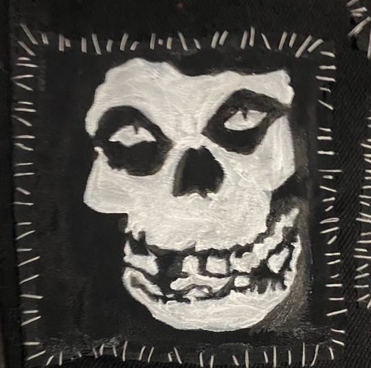
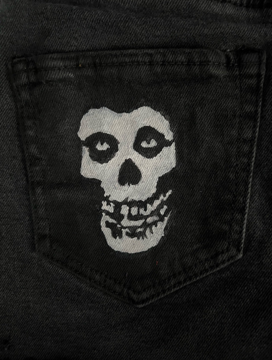
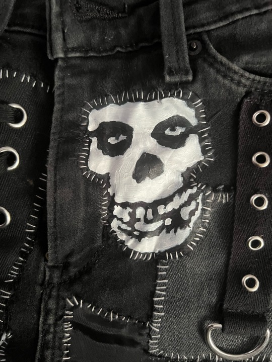
evolution of my misfits patches
#the first one was a struggle#ill give myself credit tho its a hard logo to get right#so easy to screw up and have it look weird and/or stupid#id like to think ive improved?#all of these are freehand#also i like to show my progress#especially for beginners please don’t be embarrassed if your diy starts out looking like shit!#we all start somewhere and making bad art is punk rock as fuck#i just show these to say you will probably improve#and if you don’t that’s okay too#your art doesn’t have to be good to be worth something#punk#punk patches#diy#patches#punk diy#patch inspo#misfits
107 notes
·
View notes
Text
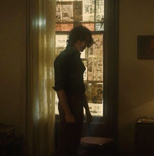
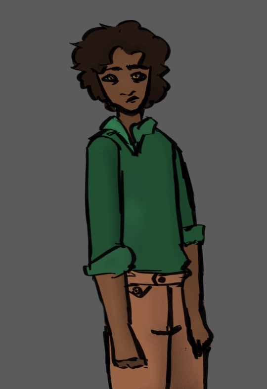
Learning to draw so I can post here more
#Armand#armand fanart#fanart#drawing#beginner artist#interview with the vampire#iwtv fanart#hes evil but that’s okay
20 notes
·
View notes
Text
re7 ethan you will forever be famous

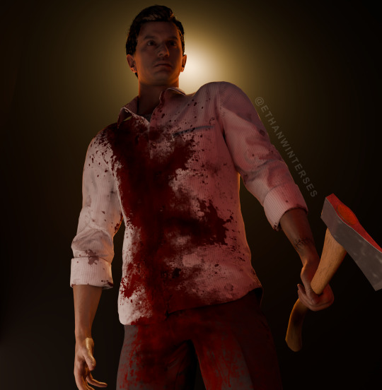
#I’m not proud of these but it’s ethan so it’s okay#he’s my husband I promise#ethanwinterses#ethan winters#ethan winters resident evil#resident evil#ethan winters appreciation#resident evil 7#resident evil biohazard#blender render#blender#3d art#beginner artist#ethan winters resident evil 7#don’t steal
35 notes
·
View notes
Text
donut breakfast + 5 hours of weaving class with a very kind chatty instructor who gave me excellent advice and was fun to hang out with + late lunch of fast food burger with extra fried onions + took a long nap on 🌸, forcing them to be cozy in bed with a book instead of working + now i write more fan fictions and roast some chicken thighs which i will eat for dinner with mashed potatoes
#box opener#at some point i will get natural light photos of the placemats i wove#they're like. okay. the weft is cotton fabric strips for practical thing-a-beginner-can-finish-in-one-class reasons#and i didnt get to choose the warp color so im not like in love with it#but the fabric has a good drape/closeness for placemats & they are the same size and both genuinely pretty rectangular#so i think that overall that is a good outcome for my first time weaving anything and i am both pleased#and affirmed that it was in fact a good idea to go to a class#classes are useful.#now im exhausted bc that was the first thing ive done in five days#but that is what girlfriend nap is for ^_^
22 notes
·
View notes
Text
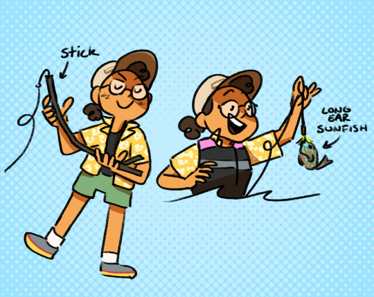
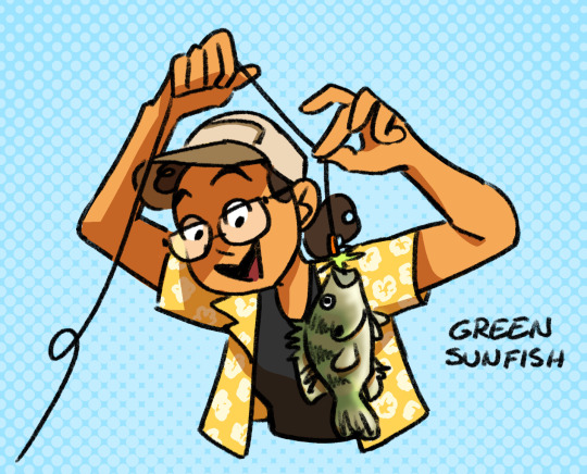
Did some lake fishing while visiting with some friends recently. It was a lot of fun!
#got my hot girl fishing license this year lmao!#hoping to check out some local spots sometime too!#yosh#fishing#caught nothing but beginner fish but that's okay! I'm a beginner. we never did catch those bass....#but the long-eared sunny was something i'd never seen before... it was super pretty and super cool!#i recommend looking up pictures the colors are gorgeous I couldn't believe that was a lake fish#I have a pretty funny fishing story about losing my lure too(i think its fun) so all in all a good time!#trying to get back into the drawing habit again... someone yell at me and tell me to draw my comic lol!
22 notes
·
View notes
Text

Hide your fingers sixer.
#beginner artist#doodle#bill ci the triangle guy#bill cipher#gravity falls#bill x ford#ford x bill#bilford#billford#artists on tumblr#my art#gravity falls bill#ford pines#gravity falls ford#i love the gay triangle#old men yaoi#ford fucked a triangle#stanford pines#bill x stanford#gay#okay to reblog#im losing my mind#okay bye
38 notes
·
View notes
Text
A drawing I made for a roleplay me and my friend are doing!

#my first time drawing light from behind#I hope it looks okay#advice and siggestions are appreciated!#kirby#i love magolor#magolor#beginner artist#dreamy gear magolor#kirby’s return to dreamland deluxe#kirby’s return to dreamland#kirby art#onion oceans
21 notes
·
View notes
Text

v my beloved they could NEVER make me hate you
(click for better quality pretty please)
#did some more experimenting with styles for this one i hope it looks okay!!#hope i did my girl justice#murder drones#md v#my art :]#also this one was entirely fingie drawn bc i didn't feel like getting up and getting my stylus 😭#now pardon me while i continue to tag this gratuitously#digital art#digital drawing#beginner artist#murder drones fanart#serial designation v#v murder drones
25 notes
·
View notes
Text

pixel art carat bong 💎
#hehe….i finished it <<<333#i!!! hope it looks okay but truly i am still a beginner so . well you see it might look a little strange#but that’s fine bc im learning 😌 and will get better <<<333 i think it’s fine for my first time making something like this ^-^#please do give me opinions tho hehe !#my art#pixel art#svt#svtcreations#carat bong#kpop#ok to rb :3
64 notes
·
View notes