#oddbird
Explore tagged Tumblr posts
Visit Tumblr Blog
Explore Tumblr blogs with no restrictions, modern design and the best experience.
Last Seen Tumblr Blogs


Fun Fact
Tumblr Inc. is funded by 13 investors.
Video
tumblr

Super OddBird?
Friends of mine own a pizza place and have a few arcade machines in there. Years ago I built a tabletop “arcade” and haven't done anything with it...
https://funhaversclub.tumblr.com/post/35130939687/this-is-part-1-of-2-ive-been-somewhat-shadowing
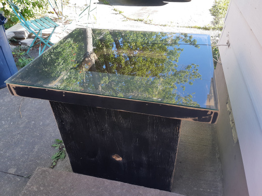
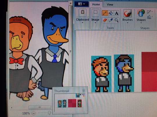
I figured I’d donate it to them... But I couldn’t just let them have any normal game! I waned to give them something special! Before the pizza place they started their bar OddBird so I wanted to make a video game for that. After pulling my hair out trying to program a game from scratch I decided to just take Super Mario World and make the characters look like a sketch I had done for them:

The old title screen and first level rough layout:

I Have most of the Small Mario sprites done. In Super OddBird you start as a little chick!

Ideally Mario and Luigi will look something like this. (These were from the custom game before I kiboshed that)
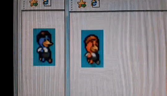
(sorry for the potato quality gif)
Remaking the Logo was a bit nutty...
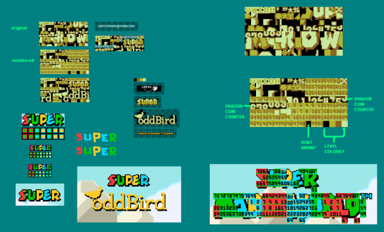
...Hopefully I’ll finish this sooner than later. In the meantime if you’re in the area defiantly check out their establishments.


PS: If you bring your own eggs and ask for a “Low Key Triggered” you’ll receive one of the best eggs benedict I’ve ever tasted... But that’s a secret... So good I had to sketch it.
PS2: I almost forgot... I also painted one of their washrooms with this neat animal theme!

1 note
·
View note
Text
Wednesday, November 23, ‘22
I apologize
for these wild antics heard while
I’m jamming my jaw.
-DMRoberts-
0 notes
Text


JASON LEE as Jeff Bebe
ALMOST FAMOUS (2000) dir. Cameron Crowe
#mygifs#userk#filmgifs#filmedit#film#moviegifs#tvandfilm#movies#tvfilmgifs#filmandtv#movie#movieedit#cinemaedit#cinema#almostfamousedit#almost famous#cameron crowe#jason lee#jeff bebe#almost famous 2000#2000s#i was on the fence about buying an oddbird robe until i saw fucking jason lee on the site and my lizard brain told me i'd be cool like him#turns out i do. i feel so fucking cozy and cool in this thing#to be fair i don't think anyone will ever be as cool as jason lee
214 notes
·
View notes
Text

This Infinite Love
~Fic Fully Posted~
Hello! It is my honor and pleasure to kick off this year’s @tarlos-santa Secret Santa Event!! I’ve got a seven chapter fic for my giftee @emsprovisions, so I’ll be posting a chapter a day til Friday. Seven Days of Tarlos Christmas & Hanukkah joy! Note for Em: I hope you enjoy this one! I tried to incorporate all the soft holiday feels you wanted 🎁
T | 30k | Canon Compliant
Three years after adopting TK’s little brother, the Strand Reyes family has settled into a happy life. But when Jonah gets sick and is devastated to miss his big class Christmas party, his extended family rallies together to throw him a holiday party he’ll never forget. Join Carlos, TK & Jonah as they celebrate the holidays, reflect on the life they’ve built as a family and navigate some big life decisions along the way.
Chapter One: Baby, This Love I Have | Chapter Two: Love Is… | Chapter Three: LOVE. | Chapter Four: Melody of Love | Chapter Five: Get Down (With My Love) | Chapter Six: Sunshine of Your Love | Chapter Seven: The Sun Will Never Set on Our Love
Infinite thanks to @tarlos-santa for organizing and for allowing me to kick off the event! And to @bonheur-cafe for being an amazing beta! Thanks to the people who have encouraged me, let me bounce ideas off them, answered questions like what is the hot snack amongst the first graders and what Pokémon game Nancy and Mateo would play with a bunch of six year olds: @chicgeekgirl89 @shes-an-oddbird @carlos-in-glasses @guardian-angle22 @thisbuildinghasfeelings @laelipoo 💕
🎧 Playlist here!
Read on ao3
#911 lone star#tarlos#tarlos fic#tk strand x carlos reyes#911 lone star fic#tarlos fanfic#this infinite love
200 notes
·
View notes
Text

As we approach the end of our beloved show, I thought it would be fun to do a little reminiscing! The end of the show certainly doesn't mean the end of the fandom, but it does move us into somewhat of a new phase. Before we get there, let's reflect on some of our favorite memories!
Describe one or two or three or more (it's up to you!) of your favorite fandom memories! It can be something really general and fandom-wide, like liveblogging a particularly good episode or the mass freakout after a really good still/clip/piece of BTS dropped. It can be something related to fanworks you or others have created--your favorite fic that changed the way you looked at the show, a piece of art you posted that got a really good response, or participating in a fic exchange. It can be something more personal, like fandom friendships you've formed or even a really good post you made that you're particularly proud of. ANYTHING GOES!
This is open to EVERYONE who considers themselves even remotely part of the fandom--whether you've been here for 5 years or 5 minutes! I'll be tagging a bunch of people and leaving an open tag as well. If you decide to share, feel free to tag others (or not)! And if you want to participate, there's no need to wait for a tag! (but I'd like it if you at least tag me because I want to read everyone's memories!)
OPEN TAG and
@lemonlyman-dotcom @ladytessa74 @carlos-in-glasses @heartstringsduet @she-walked-away
@annoyingcloudearthquake @lutavero @guardian-angle22 @reasonandfaithinharmony @paperstorm
@reyesstrand @strandnreyes @shes-an-oddbird @nancys-braids @captain-gillian
@morganaspendragonss @everlastingday @welcometololaland @rangersoup @rmd-writes
@hereghostslive @herefortarlos @theghostofashton @unstatedmartini @eclectic-sassycoweyes
@bonheur-cafe @literateowl @happilylovingchaos @carlos-tk @tellmegoodbye
@doublel27 @lonestardust @goodways @tinyluminaryzombie @carlossreaders
@chicgeekgirl89 @alrightbuckaroo @mrs-corrections-78 @firstprince-history-huh @fitzherbertssmolder
@freneticfloetry @henrygrass @whatsintheboxmh @laelipoo @lightningboltreader
@the-126-family @emsprovisions @ironheartwriter @nisbanisba @goldenskykaysani
74 notes
·
View notes
Text
WIP Wednesday
It’s Wednesday my dudes! Unfortunately no writing for this week, instead you get a mood board because i suddenly had an idea for a LS fic based off a movie (Baker au and Single Parent au fans I promise I’ll get back to it later) :] thanks for the tags @henrygrass @heartstringsduet @bonheur-cafe and @nisbanisba!
Can you guess the movie? 👀

A team of four who couldn’t be more different. A shared connection amongst magic and illusions. The curiosity that surrounds an infamous corporation, the Eye. A team of four who become The Four Horsemen, ones who steal from the corrupt and give to the innocent through a series of shows. A pair of FBI agents who are hunting down these thieves, unknowingly falling into the magicians traps. A pair of agents both searching for answers to different questions.
Little did they know, everyone and everything was connected. It all had a purpose.
They just had to step back and see the bigger picture.
@lemonlyman-dotcom @shes-an-oddbird @vulcanmourns @she-walked-away @ladytessa74 @thisbuildinghasfeelings @lonestardust @everlastingday @rangersoup @paperstorm @chicgeekgirl89 @tailoredshirt @firstprince-history-huh @carlos-in-glasses @doublel27 @pimento-playing-hopscotch @salty-autistic-writer @goodways @whatsintheboxmh @emsprovisions @neversleepuntilfive @eclectic-sassycoweyes @liminalmemories21 @tellmegoodbye and as always if you wish to be removed or added just let me know!
36 notes
·
View notes
Text
Lone Star Season 6 Challenge
(Had technical difficulties with og post) I am fully aware it’s hasn’t even been a day after the finale and you’re probably thinking “wtf???” (Eh they usually would announce the renewal near the end of the season, right?) Well I cooked up a possible challenge for us to do to either A. Distract ourselves from the end or B. To just have fun
Basically the idea is like the game Exquisite Corpse (thanks @nisbanisba for letting me know the name)
Someone writes the starting plot lines for the first episode of “season 6”. They tag someone to continue episode 2 and that person adds onto the plot and proceeds to pass it onto another person and they add their own continuation until we reach a full season.
It wouldn’t have to be super detailed or anything, just a simple idea for an episode and would have connecting plot lines. It’s basically to get a season with everything we wanted but also it’s a challenge because you have to figure out how to continue the storylines other people created.
The hypothetical season length is currently 25 episodes but tell me if it’s too little or too many!
If anybody is interested in this just let me know and I’ll probably post the rules in like a week! It’d be at least 2 months before the actual challenge would start because I have other challenges I want to do but it would give time to get ideas going! Or tell me if this is a stupid idea lol
tagging @lemonlyman-dotcom @shes-an-oddbird @the-126-family @whatsintheboxmh @rangersoup @nisbanisba @she-walked-away @tellmegoodbye @doublel27 @bonheur-cafe @lightningboltreader @eclectic-sassycoweyes @pimento-playing-hopscotch @paperstorm @ladytessa74 @thisbuildinghasfeelings @tellmegoodbye @marjansmarwani @tailoredshirt @carlos-in-glasses @lonestardust @everlastingday @guardian-angle22 @heartstringsduet @firstprince-history-huh in case you’re interested but if not or you don’t want to be tagged just let me know
34 notes
·
View notes
Text
We have a bit of a different game this week to help us all engage in some final season 5 speculation! Send some asks with emojis to get the speculation conversation going:
3️⃣ What are three things you’re hoping to see in season 5?
👬 What Tarlos moments are you most looking forward to?
🤗 Which character are you most excited to see in season 5?
🤏Which minor character(s) will we see again?
🍭 What new terms of endearment do you think we might hear from TK and Carlos?
💔 Which couple is most in danger of breaking up?
💒 Who is most likely to get married?
🔫 Who murdered Gabriel?
🔍 How will Grace’s absence be explained?
👩🚒 Who is going to take Judd’s lieutenant position?
🩹 How is Robert’s death going to impact Owen?
🚑 How does Nancy become captain?
🤠 What are your thots on the two belts and the rest of Carlos’ Ranger uniform?
💍 How will TK and Carlos celebrate their anniversary?
🧑🍼 What is going to happen with Jonah and Enzo?
👶 How old is Jonah?
🗻 How do you think Tommy and Trevor’s relationship will progress?
☎️ How will Wyatt do as the new dispatcher?
🕺 How does Judd make it back to the firehouse?
⚰️ Will anyone die this season?
Tagging some people who might be interested to help get us started:
@lemonlyman-dotcom @strandnreyes @she-walked-away @ladytessa74 @herefortarlos
@thisbuildinghasfeelings @paperstorm @heartstringsduet @alrightbuckaroo @happilylovingchaos
@fifthrideroftheapocalypse @literateowl @birdclowns @nancys-braids @emsprovisions
@tellmegoodbye @ironheartwriter @bonheur-cafe @tkslittlesway @theghostofashton
@goldenskykaysani @toomanycupsoftea @carlos-in-glasses @guardian-angle22 @reyesstrand
@welcometololaland @rmd-writes @lightningboltreader @tinyluminaryzombie @sugdenlovesdingle
@shes-an-oddbird @decafdino @butchreyes @corsage @the-126-family
#911ls season 5 countdown#911ls season 5 countdown tag game#911 lone star#911 lone star season 5#Season Five Week
58 notes
·
View notes
Text

Airsllide No. 10138: N510DA, Boeing 727-232 Adv., Delta Air Lines, San Diego, February 6, 1994.
Take a second look at this Delta Boeing 727 - did you notice the winglets? N510DA was one of two 727s the carrier fitted with winglets in 1993 in order to test the effects in terms of fuel savings. Given the short service period left, the benefits compared to the investment did obviously not justify re-fitting the rest of the fleet, and N510DA together with her sister N511DA remained the only two oddbirds in Delta's 196 units strong Boeing 727 fleet.
4 notes
·
View notes
Text
Hc: In terms of children's books, I think Kid Caleb would like "Oddbird" (the birds are so pretty and colorful + he likes the ending) and "Giggle, Giggle, Quack" (it's super silly + he finds the duck funny) and Kid Philip would like "The Artist Who Painted A Blue Horse" (the book features a blue horse and other colored animals) and "Where the Wild Things Are" (the boy is feral and so is he).
#the owl house#owl house#toh#caleb wittebane#emperor belos#belos#philip wittebane#headcanon#headcanons#writing#my writing
7 notes
·
View notes
Text
@shes-an-oddbird
nothing scarier than being a fan of a fic and then becoming mutuals with the author. like hi shakespeare. big fan of your fake dating au
43K notes
·
View notes
Text
Fredag 15 mars 2024
Mötte precis JS för andra gången den här veckan, han står och röker med en kaffe från 7-eleven bredvid Margareta Krook-statyn. De människor man samlar på sig genom åren blir ens crowd, ens crew, ens lokala kompisar.
Ljust, blåsigt, knastrigt på gatorna av gruset.
Fin kväll. Vi skålade i Oddbird alkoholfritt vin för att fira Bs jobb. FaceTime med morsan, bild till Fam Gang i Whatsapp. Sedan såg vi Divergent-filmen, S hade fått den tipsad av sin PI-assistent. Pizza till.
Trött nu, såsig i huvudet. Önskade att det fanns klarhet, men man fick luta sig mot tillfredsställelsen att man jobbat hårt hela veckan, tränat, utvecklat familjen, jobbat på sina svagheter och styrkor.
S peppad på Divergent-serien. Shailene Woodley bra faktiskt. Påminner mig om att jag måste se Ferrari, nya Michael Mann, den flimrade förbi på Apple eller någon av streamingtjänsterna.
Börjat se She Said, bra journalistfilm, måste vara inspelad på New York Times-kontoret, ser i alla fall exakt ut som det, minns det från någon dokumentär jag såg för 15-20 år sedan.
Cary Mulligan oerhört bra. Sugen på att se Maestro. Så mycket att se.
Borde man se fler dokumentärer? Såg en Andy Warhol-doku på Watchlistan på Netflix. Man kommer aldrig till dessa.
Progressbar på Instagram säger: 2024 är 20% complete
0 notes
Text
Hello Fire Fam!!!!
Oh my gooooooooooosh 😭 We are ONE HOUR out from the FINAL episode of 9-1-1 Lone Star 😭!!! BRACE FOR IMPACT ☄️!!!!! I am once again asking you to tell us about your snack situation for tonight!!!

Are you admiring a beautiful soft serve ice cream cone with two thirds of TNT 👆 or are you bouts to dive into a hot pot with Carlos 👇

I have a burrito situation myself buuuuut will probably just be sadly sipping my lemon La Croix 🥺
Rb and let us know what your set up is!!!!!!!!
Tagging some folks who I know are watching live but everyone, if you see this, please participate 🥰
@herefortarlos @reyesstrand @chicgeekgirl89 @guardian-angle22 @thisbuildinghasfeelings @ladytessa74 @tellmegoodbye @emsprovisions @sapphic--kiwi @lonestardust @literateowl @lightningboltreader @paperstorm @bonheur-cafe @honeybee-taskforce @heartstringsduet @nisbanisba @she-walked-away @shes-an-oddbird @firstprince-history-huh @reeeallygood @laelipoo @the-126-family @alrightbuckaroo @everlastingday
70 notes
·
View notes
Text
Rayakan Ramadan Perdana di 25hours Hotel Jakarta The Oddbird dengan Pengalaman yang Unik dan Tak Terlupakan
Menjelang bulan suci Ramadan, 25hours Hotel Jakarta The Oddbird dengan penuh sukacita menyampaikan Ramadan Kareem kepada para tamu dan orang-orang terkasih mereka. Tahun ini menjadi momen istimewa, karena The Oddbird untuk pertama kalinya merayakan bulan penuh berkah ini. Menjelang bulan suci Ramadan, 25hours Hotel Jakarta The Oddbird dengan penuh sukacita menyampaikan Ramadan Kareem kepada para…
0 notes
Text
Work Is Published Wednesday
Happy Wednesday! Have some art for this time around!

This one was for and based off of @the-126-family’s headcanons of Paul having two cats named Sherlock and Waston and then Asha having one named Arthur! They’re super sweet and their headcanons are awesome too!!

This piece was for and based off of @shes-an-oddbird’s fic “It’s Not So Weird Afterall” It is such an amazing Nanteo fic and it shows all the little moments the show skipped over and how the twos relationship grew! Honestly yall need to check out all of their fics, they’re amazing especially if you like nanteo
No pressure tagging @lemonlyman-dotcom @shes-an-oddbird @vulcanmourns @whatsintheboxmh @she-walked-away @ladytessa74 @thisbuildinghasfeelings @bonheur-cafe @lonestardust @everlastingday @rangersoup @paperstorm @chicgeekgirl89 @nisbanisba @tailoredshirt @firstprince-history-huh @heartstringsduet @carlos-in-glasses @doublel27
40 notes
·
View notes