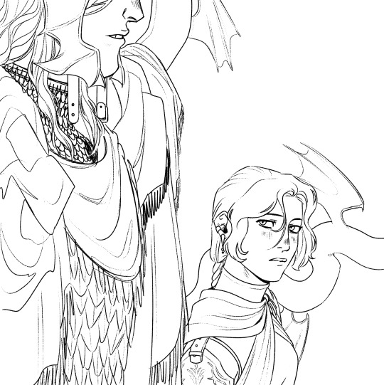
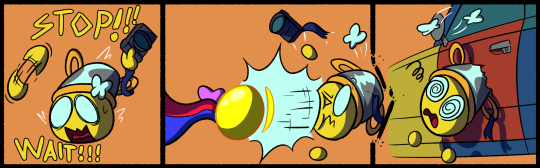
#now I just have to do the lineart for the background...
Explore tagged Tumblr posts
Visit Tumblr Blog
Explore Tumblr blogs with no restrictions, modern design and the best experience.
Last Seen Tumblr Blogs


Fun Fact
Tumblr is used by 21% of adults online aged 18-29 years.
Text

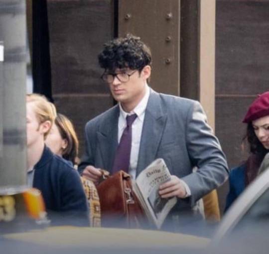
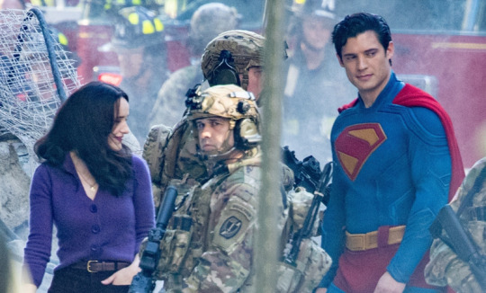
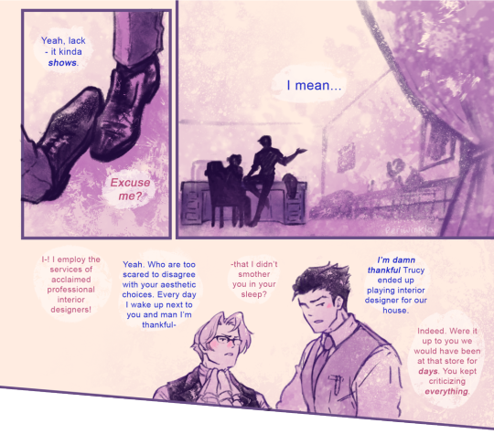
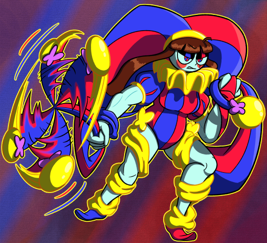
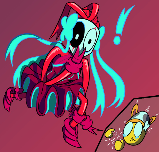
I've had this pose ref saved for a while and the Superman set photos just gave off the same energy 👉🏻👈🏻
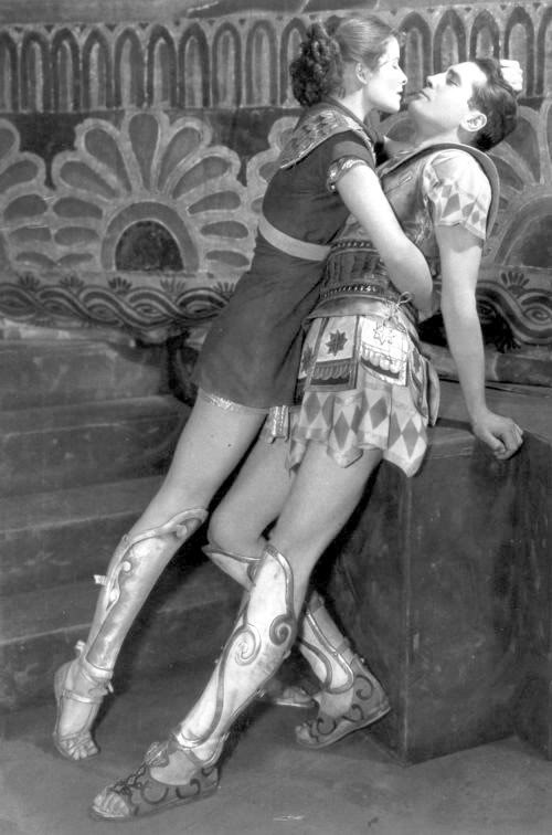
The reference is this photo of Katharine Hepburn as Antiope and Colin Keith-Johnston as Theseus in the 1932 play 'The Warrior's Husband' (and I'd love for people to turn into a draw your otp meme pls pls pls this pose is so good)
And also, of course, the Superman (2025) set photos
#superfamilyweek#superman#dcu#clois#lois lane#clark kent#i was actually gonna post this a few days ago but then i found out about the superfamily week#it wasn't made for it but i hope you can accept this humble offering even if it doesn't really fit the prompts#art#digital#fanart#live-action#dc#regular#final#colour#this actually from june when the set photos came out and i just got completely obsessed and went into a clois haze#it all looks so good though!! the whole thing!!!! i'm vibrating with excitement just thinking about it!!!!!!!#if this film isn't good i'm gonna be sooo disappointed you guys have no idea how much i'm looking forward to it#but anyway. ART RAMBLES: as i mentioned on the tags of my last drawing this piece gave me SUCH a headache#i think it's probably cos it was just supposed to be a quick sketch so i used a more stable pencil brush#but then i really liked it so i decided to properly colour it instead of just doing the watercolour thing i usually do for sketches#but with finished pieces i like the lineart to be kinda messy and the sketch to even show through bit#and since i used the more stable brush for the sketch it ended up looking WAY too clean. not like my stuff at all.#so i just started throwing stuff at the wall to see what could make it more interesting. full background! actual lineart! texture layers!#and this here is what i was the happiest with. i don't... love it though. it should be looking way more interesting given the pose#and then i also did the purge girl halfway through this and it looked SO good right out of the bat (pun intended)#so i went a bit into a spiral. did some realistic stuff i'll post soon. and now am trying out a thick black lineart style.#(i'll definitely still use the coloured lines for the sketchy watercolour stuff though. it just looks way too cute)
488 notes
·
View notes
Text

A Thousand Lifetimes
Drifter appreciation piece :3
#Hopefully fun to visually explore#tried to stuff in as much of the canon drifter’s lore in here as physically possible#probably missed a few things but that was mostly due to space constraints#just needed a thing to do vibe restoration and I was having fun with one of my favorite brushes#originally just started out as a portrait of him and then it got a bit out of hand as I started messing around with the background#Definitely out of my usual style#its been a long time since I did a strictly lineart focused piece#but I used to do line practices similar to this pretty frequently so its fun to see the difference in my current skill in line#We got uhhhhh recursive angels and tau and wally and the lotus and the void and entrati and duviri/undercroft#and the protoframes as designs on his collar and space and the lisset/ordis and the deal/timeline split and the mask/operator/thrax#and stalker/hunhow and the orowyrms and more narmer stuff and recursive void angels and void flow and as many spirals as I could stick in#and hollvania/techrot and my signature also on his collar and umbra earrings and the black/white motif and yadda yadda you get the picture#far from perfect but I worked on it till my apple pencil died and I'm chilling with how it is now#or... forcing myself to be chill with it and not go back in because its 3 am#warframe#warframe art#warframe 1999#tennocreate#warframe drifter#guardian spiral#warframe fanart
159 notes
·
View notes
Text
her lord
#my art#my oc#oc art#tee hee... canon x oc so fun#digital art#artists on tumblr#illustration#i didnt feel like doing a background so its just color shapes rip#messmer#messmer the impaler#messmer x tarnished#ER Eirunn#i might change her name i havent settled on that yet. but for now its eirunn#elden ring#elden ring dlc#elden ring sote#shadow of the erdtree#elden ring tarnished#tarnished#technically? she still has her grace but i think tarnished is the tag ppl use for elden ring ocs?#i like the lineart so u can have it with the colored vers :3#fanart
245 notes
·
View notes
Text
im really normal about them <- lie
#ace attorney#mia fey#diego armando#miego#lorillee.png#THATS RIGHT BABY. AFTER -um . hold on. *checks notes* - SIX MONTHS. LORILLEE IS BACK WITH PHOTOSHOP ART 💥💥💥💥💥💥💥💥💥💥💥💥💥💥💥💥#every now and again i like to put effort into something just to remind everybody that i can actually draw#well i say that but to be honest i put a lot of effort into those ms paint ''diego fey REAL'' doodles#but half of that is just because humans are a . something. to draw. and urban backgrounds are my worst nemesis#and also trying to work with ms paint to like slightly transform things is an incredible pain in the behind#anyways. yeagh 😎👍 behold the power of miego. getting me to actually finish something in photoshop for the first time in months#anyways. ive discovered the secret to getting me to draw stuff on photoshop. prepare yourselves accordingly#what i need to do is sketch & line something in ms paint. and then directly trace it over into photoshop#and then i can go ham#see because the reason i never did this before was because i would sketch things in ms paint#and try to line them in photoshop and it simply Wouldnt Work.#so i had assumed that if i wanted to draw in photoshop id have to sketch in it first. yknow. which i cannot do for some reason#something about the way the pen feels and the . its like the smoothing setting is on even when its on 0 percent. you know. anyways#but with this one i drew mia in ms paint as per usual . and i wanted to mess around with color & light#and i triedddd to do it in ms paint but unfortunately as you can probably imagine. doing stuff like this without layer filters#can get a little difficult. if you know what youre doing its obviously going to be easier but that being said i do not#when i pick colors i am literlaly just wildly guessing 😭🙏 which is fine for more straightforward coloring/shading#but not quite here. which is why i wanted to take a stab at it in the first place#so anyways i was like FINE WHATEVER and tried tracing the lineart in photoshop so i could take a stab at coloring in there#and i was . enlightened. (no pun intended). it WORKS#so anyways . you may actually be able to expect. some photoshop art from me#well ok thats a lie never expect art from me. but we can all dream together#anyways they really are the star-crossed doomed by the narrative romance ever. everything to me
189 notes
·
View notes
Text
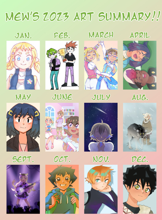
my art summary of 2023 :3 this year was the year i started digital art (which is why the first three drawings are traditional) and im really proud of how far ive come!
please ignore the fucking pokefic blog drawing i genuinely couldn't find anything else for february
the last two drawings aren't that interesting because ive just been doing reference drawings of my ocs lately but that's OK :3
ive learned so much and while i still have a LOT to learn i think im pretty happy with how my art currently looks.. i hope i will keep improving in 2024!!
#mew.txt#mew.jpg#as you can see i haven't practiced backgrounds a lot this year#i mostly focused on characters and tried to figure out what kind of lineart and coloring i like#june doesnt count i just traced a screenshot from the sims LMFAOOO#and july august and september don't count because they feel pretty abstract#i didn't have to use perspective or anything to draw them they're fairly simple#but yeah. hmm#maybe my resolution for 2024 will be to stop being such a perfectionnist#i need to get more comfortable doing art that isn't perfect and posting it (or at least sharing it with friends)#and hopefully family#okay that's it for now#have a nice day everyone! love you
12 notes
·
View notes
Text
i just woke up and realized my art did developed holy crap
#girl what drawing tf2 does to a mf fr#since i have been drawing tf2 my artstyle just developed better and now i finally have found an original artstyle compared to the ones#i had back in the beginning of 2023#IF ONLY I WASNT SO LAZY and so distracted holy shit i could make it more better like studying backgrounds ugh#and keep practicing my coloring girl i have been drawing a lot but not coloring i need to start painting before i forgot it#but oh my god i swear it developed bc i am drawing a little more fast than before and my lineart is more bold than before#guys fucking practice with tf2 characters and ALSO dorohedoro that is also my main inspo too#i feel like also w dorohedoro i developed my style but back then i was still more shaky than bold#but now i can happily say i am no more embarrassed in my artstyle of how i draw characters like i used to be before#i was always so goddamn negative for no reason with myself but i guess the negativity helped me develop my artstyle#but gave me artblock sadly… and often issues w self esteem but aaaa idk i think i’m doing much better i can do better yes just…#need to draw more and that is the actual nightmare huh
7 notes
·
View notes
Text
i hate drawing but man do i love coloring
#another reasoni miss my friend ... lineart is so hard for me and they could do it but coloring and backgrounds i loooveee doing#ive spent 15 hrs just coloring one and now i have to figure it out out to actually draw to get to the color part sighs.#ant posts shit
0 notes
Text
I'm in thatttt
New multi-animator project drops December 27! Our biggest one yet!
#lmk#lmk reanimated#lego monkie kid#hahahahaha it took half a year but it was so fun this is the first time i didn't feel lost at a discord server (they scare me oops)#also i can make a full and FULL animation (oh god i hate it) gonna stick to my beloved storyboard or rough lineart from now on#(me who signed up for a gravity falls reanimated one day after sending my parts) ... not gonna lineart again... sure#but it's so awesome#UGHHH i love the lego style i love flying bark so much they're so insane#and the people on the MAP are insanely talented GUSH i need to eat some of those parts YUM YUM#i have never in my life been interested with learning after effects before seeing what some ppl do#my and my 5 minutes computer time every weekend only🥲 miss computer time no fair I'm not with it all week🥲🥲#anywho YEAHHHHHH#making something part of bigger something it's way more fun sometimes#i forgot to post wips anywhere but I'll do like a presses video because I'm so proud of my backgrounds and the lineart is good :P :)#it was just such a pain to do I'm a slow drawer with lineart#animation sketch? that i can do#well time to go back to not drawing ever (buuut I'm working on a project with a friend so that will be cool in a few months hopefully)#I'm doing a lot of animation side quests this year#it's fun#well#art side quests actually;; i made so much random new shit this year#sculpting is incredibly fun#coloring is my enemy#I'm way off track these are not my hours#lego monkie kid animation#!!!!!!!!!!!!
161 notes
·
View notes
Text
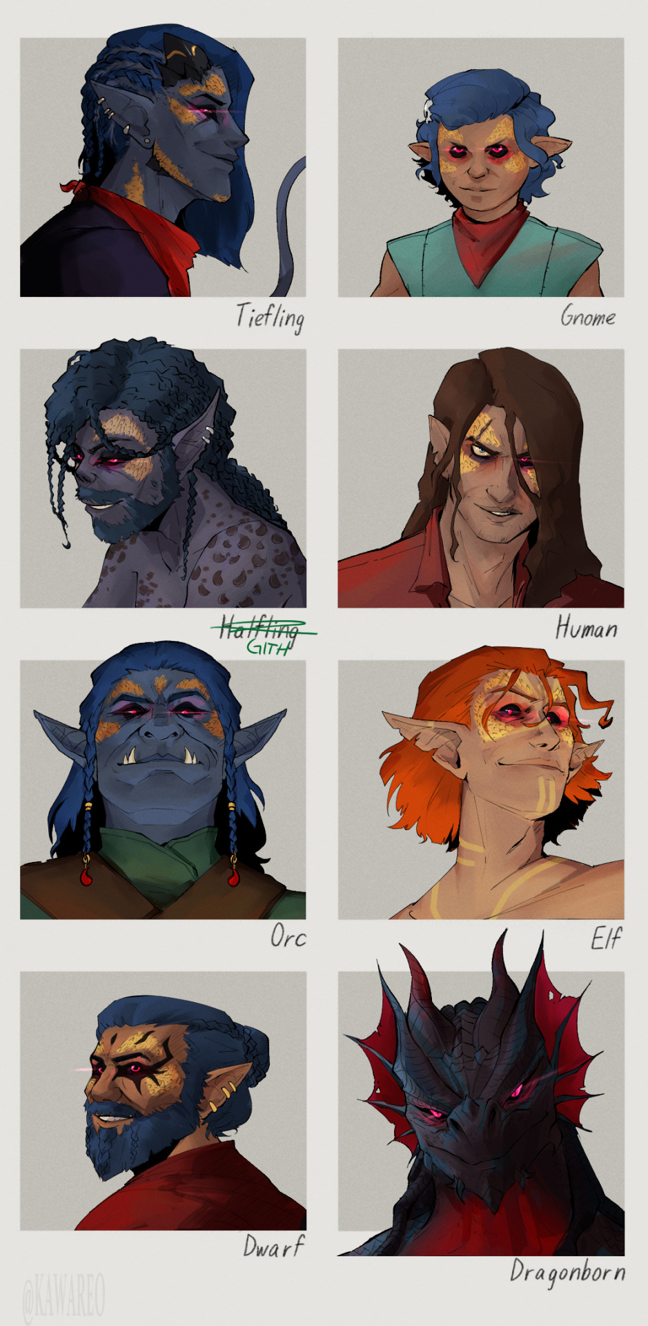
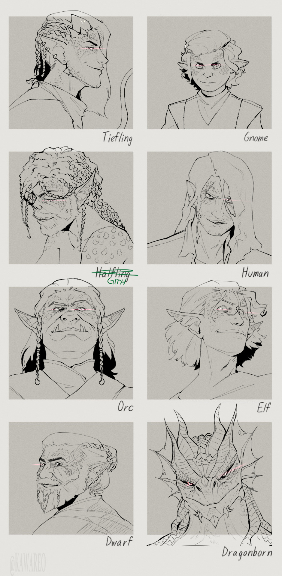
Thank you @hellothisisangle for the template! click for better resolution
This was very fun, loved thinking about how being a different race would affect Strike. He canonically didn't have any ties to 'his' race, being raised for a few years by a tiefling and a halforc before he got snatched up by the cult, and his background is the same no matter the race. He's always primarily a sorcerer, but multiclasses into something else
Tiefling - Closest to canon, behavior wise. Funky and smug dude. Same multiclass as in canon, battlemaster fighter
Gnome (Assassin Rogue) - Do I know the difference between an adult gnome and a human child? Yes. Does Bhaal? Probably. Does he care? .... No clue, but Strike as a gnome is a grown man who can easily pass as a child if he tries, and he plays heavily into that. He's still almost forty and his personality is the same, he's just creepier about it.
Gith - (Bladesinger) Not nearly as charismatic as in canon, because being basically the only Gith in Baldur's Gate didn't give him many chances to learn to socialize. In canon he 'makes up' for being a drow by being charismatic enough to get away with pretending to be an elf, but as a Gith, he just embraces being a scraggly street rat. Braids his hair when fidgeting.
Human (Monk, Way of Drunken Master) - Found a way to monopolize his drinking habits. By far the messiest version. Without elf genetics, his age and consequences of his lifestyle actually show on his face.
Orc (Cleric of War) - he grew up with his orc mum telling him of what people thought of their race, so he purposefully went against that. Very suave, put together. Can rip you apart with his bare hands but prefers to do it in a fancy way.
Sun Elf (Paladin of the crown) - Take all of his daddy issues and multiply them severely since now Bhaal is also his patron. Version that is by far the most like Orin and has killed both her and Gortash before the Plan ever could happen. Just barely keeping it together. Ginger.
Dwarf (Spore Druid) - very friendly, trustrworthy and polite. His favorite food is still roasted dwarf.
Dragonborn (Storm sorcerer, no multiclass) - Canon personality but without the silly little guy persona. Ruthless and functional. Sometimes puts his whole mouth around Gortash's head and that is considered affection. Tbh his personality is usually the same, what changes is the act he puts on over it. Both tiefling and dragonborn can disappear completely if they close their eyes in the dark. Just lineart under cut
533 notes
·
View notes
Note
If your requests are still open, can I ask for a Shadamy piece?
Also do you have a page with your commission prices?
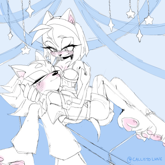
Yippee!! More Shadamy! I love them so much, I hope you love it too ♡♡ °(ᴖ◡ᴖ)°
I haven't made an official page for my commission prices yet, but I can give you my simple rundown
Base Prices:
lineart = $10 USD // simple color = $20 USD // fully rendered = $40 USD
Add-on Prices:
2+ characters = plus $15 // detailed prop = plus $5 // background = plus $5-20 (depends on complexity)
I can humans, furries and sonic characters! I will draw almost anything so just feel free to ask. I plan on making a more official commission sheet soon, I just don't have enough time right now!
#digital art#lune doodles#fanart#sonic#sonic fanart#art#sonic ships#sth fanart#shadow the hedgehog#art requests#amy rose#sth amy#amy the hedgehog#sth shadow#amy x shadow#shadow x amy#shadamy#sonic the hedgehog#sth#sth fandom
184 notes
·
View notes
Text
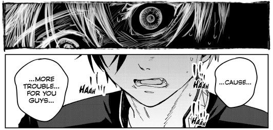
Can we talk about chapter 60? I'd like to talk about chapter 60: A Place I Belong.
I specifically want to talk about the sections with the tightrope. It's one of my favorite parts of Wind Breaker and I could praise it for ages. I know it's a kind of common metaphor for struggles and isn't anything too special, but I really do adore it.
And whoever decided to add that anime only scene to the start of the first episode? Absolute genius and I love them for it. It works beautifully without it in the manga, but I think it's going to add a little extra something to the anime!
But for the tightrope section in the manga? It's so good and so well executed!! I absolutely love the way the style changes throughout the chapter!!
We start with white lineart on a black background. The lines are messy, sketchy, and even the boxes don't have clean lines.
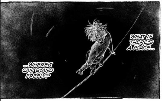
I also want to point out how the only clean lines we get from this section are from the adults in his life, as well as the wind chime and the sprout pushing out from the ground.
The wind chime and the sprout clearly allude to Furin and the way both Furin and the rest of the town have shown that he, too, can be loved and accepted as he is.
The wind chime is also the thing that seems to be the transition to Sakura going from walking along the tightrope to considering that there might be another path for him.
I'm going to be real here and say that I don't have a lot to say about the other adults also having clean lineart. I'm sure there's someone out there who'd have something really smart to say about it, though. If I were to say something about it, it'd be that I think it might represent his shaky sense of self, compared to other people who have it figured out.
After that we get to the middle section, with Sakura in the "real world" again and with the rest of the class. I won't focus on the dialogue itself too much, but I'd like to talk about the way we go between the tightrope and reality.
I really like how the panels with the tightrope are woven in. They show us what's going on inside his head while also showing us how it looks like in reality. We see visual representation of how this feels like to him.
It's shown in how before he speaks, as he's gathering the courage for it, we can see him changing his stance on the rope. We get shown the way this is him preparing for that leap. He also mirrors himself with the way he's clenching his hands both in reality and around the tightrope.
A little later, as he's talking, we can see him directly mirror himself in both realities.
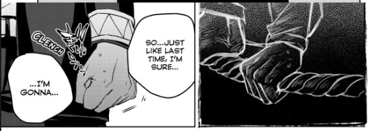
We see the way he's holding on preparing for that leap, as well as the way his face is split in two here. It doesn't directly match up, but it doesn't have to, because it already works so well here. I'd maybe even argue that I prefer it this way around as opposed to if this was a direct split of his face.
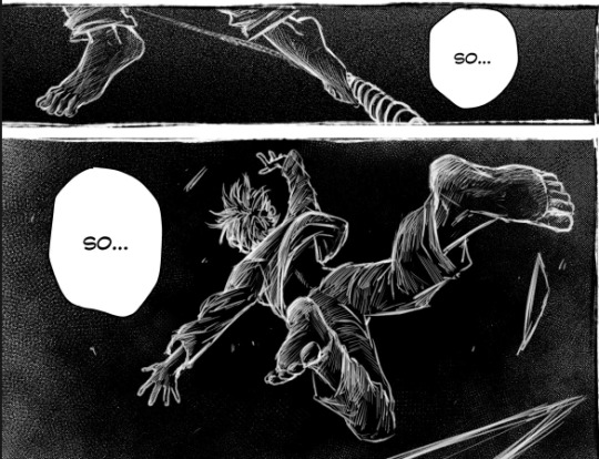
And then we see the leap itself, the way he throws himself into the unknown.
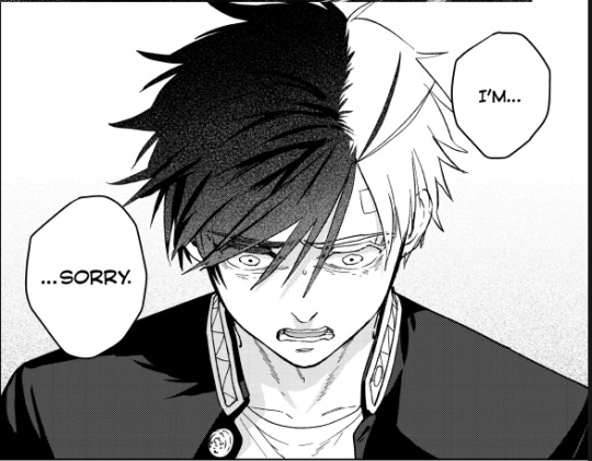
And then he gets called out on his bullshit, gets told that he's insane for thinking they'd cast him out. That they love him as he is and that they want him around. They actually want him. For maybe the first time in his life, he's wanted, appreciated, and needed.
And it's just this "Oh." moment for him. You can see the way it just clicks for him.

And after this we get to an absolutely beautiful scene, the part that makes me love this chapter so much.
We see that it all isn't so terrible after all, that there is hope. The tightrope isn't a drop to certain death, just a drop.
The colors have changed and we're now looking at Sakura on a white background with black lineart. Though at this point Sakura himself is the only part of the scene with messy lineart. The field of flowers and grass, as well as the edges of the panels, are all cleanly lined. Except for Sakura. Even if it's still messy, I'd say it's definitely a little cleaner than it was before.
You can see the way he's a little more faint, a little less solid than the rest of the lineart.
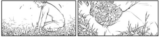
And then we see Bofurin, the rest of his class specifically. They're all there and they're all cleanly lined. And as Sakura reaches out to grab the hand he's offered, his lineart becomes clean. His lineart is no longer messy, it's no longer a sketch. This is him finding and accepting himself.
And as he grabs that hand, his clothes also change. Before all he was wearing was a plain shirt with plain pants, nothing remarkable, just plain clothes. But as soon as he takes that hand, his clothes change to a Furin uniform.
This entire chapter is so beautiful and I cannot wait to see it animated. I really hope the anime does it justice. From the lineart to the colors swapping around to the dialogue, it's an amazing chapter overall. I know I didn't really talk about the dialogue, but it's also good :)! I don't have much to say about it, though.
Moral of the story is that I really love this chapter and just wrote around 900 words about it.
#this chapter is so so good and i almost cried at some point lmaooo#i thought about the last part of it a little too hard and teared up while making this#the colors.. the lineart.. the composition.. its all so good#i looove the way the wind chime also kind of . breaks it up . its in between panels#its just such a good chapter i love love love it#i absolutely lost it the first time i realised his clothes change#wind breaker#sakura haruka#laauranenn
315 notes
·
View notes
Note
Don't wanna be a bother but I bumped into ur touchstarved oc stuff and do you have any pointers for drawing in the touchstarved style? I can't really nail it down 100% but you do so... pretty please?
Hii yeah ofc, it's no bother at all no worries! You sent me this at the right time actually jsdhksd I'm in the middle of redesigning Emma right now and I've been taking a close look at the art style again, so it's all fresh in my mind!
Assuming you already have your design ready and have found a pose or composition you like, replicating the art style will probably come down to getting the lineart and shading to look similar.
About the lineart:
Probably goes without saying, but you'll need a pen with the opacity turned off to get the clean, ink-like lines. If you use CSP I recommend the default textured pen, which I think has a similar look, but honestly any pen will do.
The thing you have to look out for the most when doing the lines is the darkest shadows. It's a bit tricky to explain, and I think a lot of it comes with practice, but you have to look for the places where the darkest shadows would be, or where the light could barely reach. Once you spot them, instead of shading them you create a sharp shape and paint them black, like so:
I also recommend varying the thickness of your lines, but not at random. Instead, try to keep lighting in mind while you draw them. You could draw one continuous thin line for something, and then only thicken it where it falls away from the light, or where it'd create an occlusion, or wherever you want a shape to stand out from another. A thick line will essentially either "push back" or separate things in space, while a thin line will pull it forward or make things look like they're closer together.

You can also exaggerate the shadows in order to create more contrast. Like in the case of Kuras' sleeves and coat, for example- you could argue that some bounce light could still get in there, but with the shadows exaggerated it creates a really nice, clean shape. You can also separate these shapes from other lines by leaving a small space between them and the lines.

The metal might look a bit different, but it follows the same logic as everything else- your darkest shadows will be pure black. It might look like it has more shadows but that's just because it's more reflective, so the light is usually concentrated on highlight and bounce light areas, so the tones around those areas will be darker.
About the shading:
From what I've noticed, it's all about keeping it subtle and simple. If you color pick the characters, you can see the variation between light and shadow is subtle and not all that contrasting. Most of the contrast is done with colors, not values.


The light source is usually from the top right, characters are pretty well lit, and there's a little bit of a blue backlight from the left that helps them stand out against the backgrounds.
The shading is mostly sharp, cel shading, rarely blended. Wherever there's blending, it's usually subtle or a gradient
They also use gradations to indicate color shifts, like the colors in Leander's coat. You can do this with the gradient tool or an airbrush.
I recommend picking 1 color for light, 1 color for shadow, and maybe 1 inbetween midtone to use sparingly in places where you want a very subtle shadow. You can go more fancy if you're trying to create something that looks more like the game's CGs, but if you're going for the same look as the sprites, it's better to keep it simple.
You can shade manually each part of the character, or you can try using a multiply layer. For multiply, I like shifting the color towards a warm or pinkish tone and keeping it light and desaturated to get a similar look as the sprites.
Highlights are used very sparingly, only on a few places like the nose, mouth, eyes, and a few on the hair. Maybe occasionally somewhere else, but only if necessary, like in the case of very reflective materials like metal, gold, glass and leather.
The characters also usually have subtle textures on their clothes, and you can quickly create something similar by using a textured brush and an overlay or multiply mode. Like so:
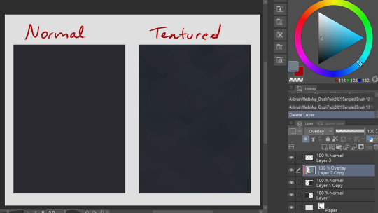
It's subtle, but makes a difference in my opinion! You can try this with a lot of different textured brushes to get the exact look you're going for.
That's all I could think of right now! If you have any questions or wanna know anything specific I didn't mention here, let me know!
152 notes
·
View notes
Text
Random banter from the comic that may seem nonsensical but I promise it makes sense in context. Maybe. And I promise it's actually very sappy. But you need comic relief (ha!) sometimes. And of course, I'm experimenting at painting these panels before I have even finished the 'lineart' of the other pages, why do you ask- ...Under the cut, stuff.
This is with and without color:
...Can you tell I haven't even attempted at comic-making in like, a decade? I have no clue what I'm doing. There's also the problem that I'm strangely adverse at using BW. I love using color too much... so that's why I chose light yellow for whites and purples for gray/black. (I mean there's also the fact that I get eyestrain fairly easily so I prefer not to use white backgrounds... while drawing I would need to stare at them too much) What do you think about the medium tones? I'm not sure if they're too warm, or too cold, or just right. My eyes are very confused right now. So much so they hit themselves in their confusion (I know, I have the worst humor in existence).
#ace attorney#narumitsu#miles edgeworth#phoenix wright#wrightworth#periwinkla#periwinkla wips#also I really need to fix the text formatting...
437 notes
·
View notes
Text
Heroes of the Dragon Age
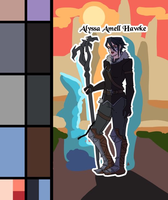
An animation I've made for Dragon Age Day 2023, featuring my main Warden (Alyssa Cousland-Theirin), Hawke (Eleena Amell Hawke) and Inquisitor (Sulevin Lavellan)!
It's to this day one of my best artwork and I thought I should share it here too! 90+ hours between the original sketch, outfit design, the rough animation, rotoscope, inking, flat-colours, background shading and even the audio :')
Interested in the process? I detailed it below since it was my first time doing something like that:
I would like to start by saying I'm not a professional animator!Everything you've seen here is the result of experimentation and a lot of practice to learn and understand how 2D animation works.

My first idea started in May 2023. I just finished rewatching DA Absolution for the X time, and wanted to analyse why I loved the intro so much. (Even after countless rewatch, I never skipped it once.) I was inspired to study it with my main three protagonists!


Then came the first test with Alyssa Cousland-Theirin, my Hero of Ferelden! I tried to understand which part to separate for the animation. Mainly the hair and cape because it flows a lot more than the rest! If I recall, my first idea here was to make her counter flame attacks (?). Then, as the camera turns around her, I tried to add a grid to know how the camera would work around it.
I ended up making the clip longer, so she could position herself to the further left and leave space to the two other protagonists.

Now it was time to try to animate Sulevin Lavellan, my Inquisitor. I really kept that quick doodling style just to capture the vibe without putting too much time/effort into it! The background would be static to contrast with Alyssa's. I also loved the idea of a rogue sneaking!

Instead of working on Eleena Amell Hawke, my Champion of Kirkwall, I went back to Alyssa and started working with Clip Studio Paint 3D models (this entire animation has been done on the EX version of the software!) It helped for rotoscope animation and maintaining likeness! That's when I got the idea to make the background swirl around the character to let the eyes be guided by the rest of the screen!

After a couple more hours, I planned the entire animatic with 3D models and quick doodles! I finally found a cool pose for Eleena Hawke, which was honestly the hardest of the three to imagine for some reason? I tried many other poses but ended up picking an animation from the game!


This whole time, I was studying a bunch of background ideas and how studio Red Dog Culture House (who made Absolution) work! Thankfully, they have a YouTube Channel where they shared some BTS content so I could analyse it!


Then, I simplified my character and their original designs in the style of the studio! These outfits are how I imagine them after Trespasser. Alyssa as the Queen of Ferelden, looking for a cure to the Calling, Hawke following Fenris to Tevinter & Sully as a Red Jenny Inquisitor!


The idea for Sulevin's animation actually came from a piece I doodled on a live stream, when I was drawing pose studies and turning them into finished artworks haha As for Alyssa, I wanted to draw the fight that got her facial scars!

Once their designs were ready and the background ideas too, I made the rough version of the animation! Basically a sketch done on top of the 3D models to add the details, staying pretty rough just to capture the idea and movements.


Then it was time to start the lines! I decided make a folder per frame, so I could separate all he main elements and draw them one by one. It helps keeping the likeness of a character in the different frames without having big "jumps" between frames! In fact, every parts were coloured differently to recognize them, and then I used vector erasers and masks (Ah yes, the entire lineart is done in vectors of course! It's easier to adjust and save time when working on similar frames!)


At first of course, everything overlaps! But I find it easier to draw too much and erase after, just to make sure everything is coherent in each frames! The cool thing about CSP is how you can change the colour of the layers in one click! So all the coloured lines turned into black in one second, and I could reverse it just as quickly to double check!

Then I started working on Sulevin! I made a blue line to mark where her feet were, as the sketch in the background wasn't perfectly straight! (Like Sulevin's sexuality 🤭😂) The silhouettes were very quick to do, but I had fun adding more & more details as she came closer to the foreground!

I really wanted to add that little dagger trick, but I remember it required me to change the pacing of Eleena's apparition, as it was recovering her arm too quickly! I had to change the pace of multiple frames quite a lot during the project, to make sure the flow was right! For Eleena, most of her animation remained around her arms and the staff itself, as magic would be the most difficult part! That way each character has their own focus: Alyssa has a very animated background, Sulevin got the grappling hook and Eleena the ice!

Then it was time to start adding colours! Just like for the lineart, I separated every colour on it's own layer, so I could easily adjust the colours later if needed. I added one colour at the time, going through all the frames, and then another colour!
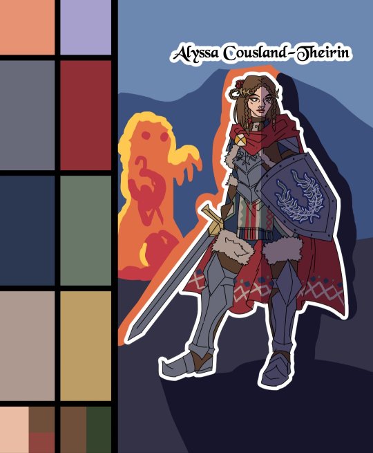
I made full palette tests with the colours I would use for their background at this point, checking if the details remained readable! Alyssa was the most challenging in terms of clothes, because I made her a very detailled armour! I had to simplify the Theirin heraldry, vectorize/redraw the Cousland, and make a brush for her cape's pattern!

Once I was done adding the flatcolours, I started the background, and oh boy it was a wild ride. For the cave, I painted multiple tests. I imagine was to use CSP panorama tools, which transform a texture into a 3D sphere, so each corners must match to look good. Sadly, it made the background very blurry, so after hours of testing, I changed ideas. Instead of the random fire balls (?) I originally imagined for Alyssa, I made three simple frames of a Rage Demon to attack her.


I ended up using the cave as a repeated pattern to make it turn 360° around the character. For Eleena, I mixed inspiration from the comics, Dreadwolf & Absolution, using warm colours matching Hawke's signature red. Just like I made the cave very grey/blue to match Grey Wardens. For Val Royeaux, it was more complex because I wanted to make it green, matching the Inquisitor's signature green. But bright green couldn't work, and the original colour during day time was blue/white/gold. So I added more leaves, played around the design a bit! After adding the rage demon, I made the shading! It was surprisingly easy and quick to do now!

I clipped a white layer on the flatcolours to not be distracted by the colours, and made thin lines to separate the light/shadows, then simply filled everything with the bucket tool! Then you set the layer to multiply and remove the white layer, and you have celshading shadows! Now the character looks out of the picture, so I added layers of blue in color burn, saturation and substract blending modes to make her look like she's in the right setting! Of course, I did the same with the other two, giving Hawke a red overlay and Sulevin green shadows!

Then I added the details, it went from white irises, to sword/staff smears to earrings and smaller finition that goes on top of these layers. To add the lights, I simply selected the shadows and reversed the selection! Using warm and cold tones to create contrast with the purple/bluish shadows! I also added more ambient light layers for Alyssa to reflect the Rage Demon fire. Now it was time to add ice magic! My first attempt had too many frames, making it look weird! Sometimes it's better to lower the frame rate to make things less bumpy!

Then I downloaded some cool ice brushes on CSP assets that made it look less like blue magical flames! But when I covered the screen in ice, I realized "Oh wait, I could make a cool transition from the ice, to blue lyrium turning red?"Red Lyrium truly links these three games and The Veilguard somehow! I spent the next hour painting over the idol and putting it in a black background, with lyrium and then the golden Dragon Age title text.
For the SFX, I used free youtube libraries sounds & "Darkspawn!" comes from the violent human female voice set (iconic for ""Can I get you a ladder? So you can get off my back!"😂🤭) After editing all that, the animation was finally done!

Here's the final math:
About 15 hours for the sketching/rough/animatic phase, 30h for the lineart, 25h for colours, 10h for backgrounds, 5h for details & 5h for music & SFX, for a total of 90 hours. Aka the same amount of time it took me to finish Baldur's Gate 3 the first time lol
If you have any question regarding the animation or the softwares etc. do not hesitate to ask, I'll do my best to answer!
#dragon age#dragon age origins#dao#dragon age 2#da2#dragon age inquisition#dai#da4#dragon age dreadwolf#dragon age the veilguard#animation 2d#original character#tutorial#warden#grey warden#warden cousland#alistair x cousland#alistair x warden#ferelden#hero of ferelden#queen of ferelden#hawke#fem hawke#eleena amell hawke#mage#warrior#rogue#lavellan#inquisitor lavellan#solavellan
323 notes
·
View notes
Text
Another Amazing AU
I never know what to write here… so let's get straight to the point then. A while back I found another amazing AU that belongs to @chez-cinnamon and I liked it … a lot.
And as always, If I liked something, I can't just be normal about it and comment something nice, I had to draw something. Long story short, first sketches were terrible, that took me on a long trip of re-learning some things and learning a couple new things. Overall, making these drawings was one looong roller coaster.
And as always . . . THAT LITTLE YELLOW SON OF A GUN WAS PUSHING ME TO DRAW THE MAIN 6 HE LIKES SO MUCH. So this time I gave him a camera and made HIM do all the work. Let's see how it went.

Well, the camera experienced Mach 1 speed, so I think that's all
.
.
.
Now, that's all.
In the end I want to say that I love what you did with these characters and I'm sorry if i messed up any of them.
And now off I go cause honestly I'm a bit stressed about posting this. So I'm pressing the publish button and I'm signing off. I'll be back soon.
As always have a Good Night/Day!
And If you want to read a bit of my rambling about this whole drawing process It's all down there. Just be aware that I write these things mostly for myself.
When I did the first sketch I realized that my old method of drawing poses (which was just sticks and orbs) won't work here. So i started to learn and re-learn some basics, and I tried to remake those sketches at the same time.
In the end there were like 5 different sketches for each character and to be honest, I was really close to just throwing it all out the window because it felt like i was going nowhere. But I found the problem.
My brain just couldn't comprehend that REFERENCE is just a REFERENCE not a fucking guideline that you have to hold on to for your dear life. It's okay to mess up here and there and that no-one is going to kill me for that. And when that thought clicked in, it felt amazing. I finished sketches, then lineart, heck I even drew all these in-betweens with Valdi (that yellow potat).
And then there was time for coloring . . . and that fear of messing up came back. That's why there's not much going on in that department. I'll keep working on fixing that, but it might take a while. And these backgrounds were a complete experiment. I'm not even sure myself if they're any good.
All of this felt like I threw myself in the deep water, but somehow I did it and I'm really glad all of this happened. Comparing these to my previous ones, I really see some improvement, and I did these MUCH faster. Even counting in all the learning i did. (plus building up courage to post these)
I still wish these drawings turned out better, the lines feel stiff, there's nothing to interesting in terms of colors or shading, but even with all that, for the first time in a while I think that these drawings aren't that bad.
And now for the AU. Why this one? I just stumbled upon it one day and I really liked the idea of switching up the one who controls the whole circus. And all those changes to the characters, their style, the clothes, colors and all those little details, I just love everything about that AU. All these characters feel really calming/relaxing to draw If these are the right words to use. (I really hope it doesn't sound too weird) I don't know if I would've learnt the things I did if I didn't find that AU.
So I want to say THANK YOU @chez-cinnamon for creating an Awesome AU and all these Beautiful drawings, and for giving me that bit of inspiration I needed.
If anyone decided to read all that and somehow survived, know that I'm sorry if all of that looks like bunch of random thoughts cobbled together (I bet that my english didn't make this any easier) As I said earlier, I write these thing mostly for myself so I can come back and read them in the future (It just helps me sometimes).
And I just want YOU to know, whoever you are, I'm really glad that YOU are here, reading this.
Thank You for being here!
137 notes
·
View notes
Text
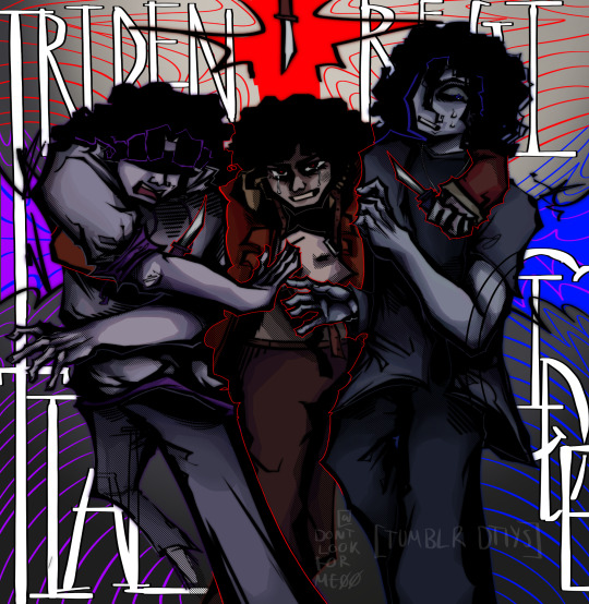
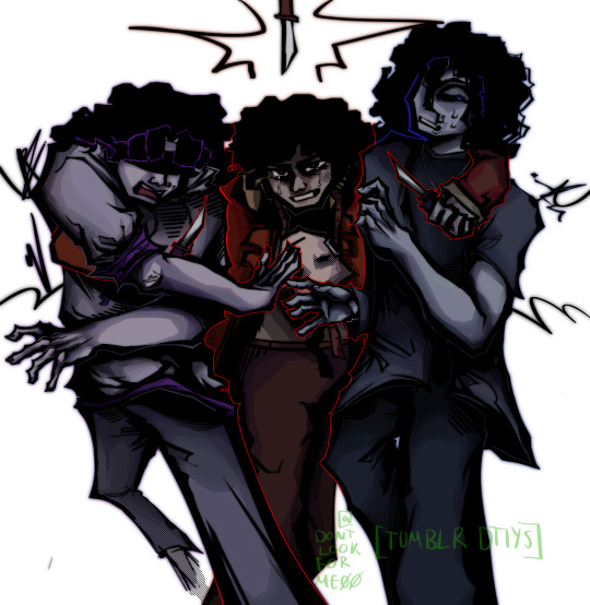
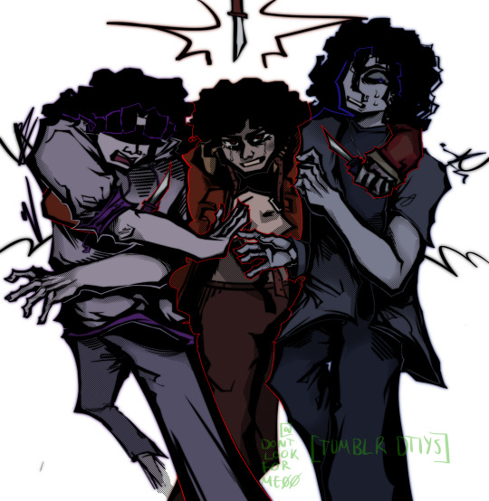
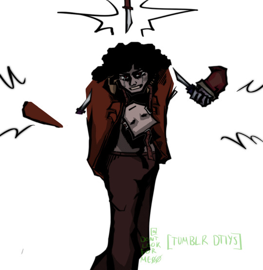
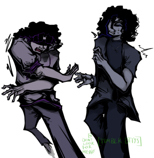
Tridental regicide,
I won't hesitate to kill my Heart and Mind.
MY 300 FOLLOWER DTIYS IS FINALLY HERE!! Info and alt versions below the cut!!
Helloo!! I hit 300 followers a good while ago now but I'm only getting to the DTIYS now lmao. About half of those were ninjago followers, and the other half were chonny jash followers, so I was gonna do a sort of mix between the two fandoms, but just decided on plain old HMS, sorry!!
If anybody at all entered I'd be honoured :] because last time I did this I only got one (admittedly amazing) entry lol.
> also this took me thirteen hours jfc. I haven't spent this long on a drawing for monthssss.
Here's some notes if you plan to join!!:
You can use any iteration of any HMS designs, it doesn't have to be my ones.
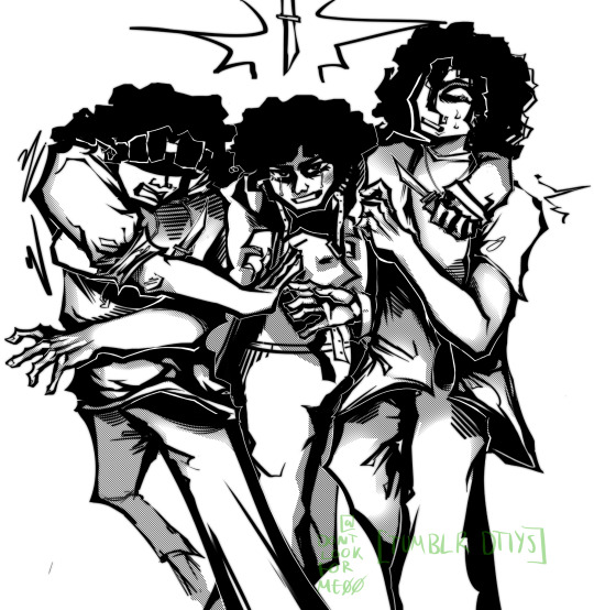
But by all means, if you do wanna use mine/my colour schemes, there's some clearer images below.
The text in the background says "Tridential Regicide". It'd be nice if you included it!!
What the entry does have to have is Heart, Mind, and Soul, with Soul threatening the other two.
I once saw someone enter a dtiys by making a plushie lmao??? So just gonna put down that ur entry can be whatever
If you have any questions or wanna extend the deadline, send me an ask.
Feel free to change any details not mentioned, or the poses that they're in.
Tag me in any submission!
Use the tag #donniesDTIYS300
Prizes (??) and deadline:
The deadline will be (checks watch) two months from now, so, the 14th of July.
Again, if anyone needs more time for an entry they wanna do just send an ask.
Uhhh I have no idea how many people will actually enter, and I've never actually drawn DTIYS prizes.
So I suppose I'll go with the standard??
1st (chosen by me) fully rendered drawing of any character or OC.
2nd, just coloured in drawing of any character or OC.
3rd, doodle or lineart of any character or OC.
(Keep in mind the characters have gotta be sfw though!)
Here are some other versions of the image:
Thanks for reading!! :D
#my art#donniesDTIYS300#chonny jash#digital art#artists on tumblr#cccc#chonnys charming chaos compendium#cj soul#cj heart#cj mind#mind cj#heart cj#soul cj#cccc soul#cccc mind#cccc heart#mind cccc#heart cccc#soul cccc#chonny jash fanart#dtiyschallenge#dtiys#chonny jash dtiys#cj hms#hms#chonny jash heart#chonny jash mind#chonny jash soul#soul chonny jash#cw eyestrain
452 notes
·
View notes