#not saying to absolutely don't use an airbrush
Explore tagged Tumblr posts
Note
i think you really need to know that your art is so so so pretty 🥺❤️ you deserve thousands and thousands of notes for each and every piece you make because its all breathtaking!
(also, hope this doesn't annoy you, but do you have any advice for getting started on art? i've been trying it out recently, and i kind of suck but wanted to know if you have any pointers to improve. feel free to ignore this part if you don't want to answer, though! <3)
once again, i just LOVE your art OMG ❤️
Sjkhwkaaawjh
Thank youuu :'))💕💕
Oh and this definitely doesn't annoy me! If you want to ask anything that you think i have answers for, ask me!
For getting started on art, first thing i want to tell you is when it comes to art, never, EVER push too hard. Coming out of your comfort zone? Experimenting? Sure go for it. But don't overdo it. Don't traumatize yourself, Ive done that it sucks. Keeping your art fun, is what will make you improve on the long run.
You don't have to attempt a master piece every single day to improve, just sprinkle art around your life. Doodle things, draw memes, draw for your friends, do silly things with it, this will help you much more than you might think!
Also have confidence in your art, it's normal to think your art sucks I always think my art sucks too its an everybody thing ig,
But what i specifically mean is, don't draw shaky, short lines, go for many (lighter), stronger and longer ones till you find your forms! Don't erase every single thing that you find slightly unperfect, go on with it, some 'mistakes' are what make your art, art!
Lastly, the internet is your best friend, my mom is an art teacher, but i would def say most of what i know, comes from the internet! You don't necessarily have to watch long ass tutorials that are 1,2 hours or more, short art tip videos on tick tock or youtube here and there between your daily dose memes will do!
Basically, TAKE IT EASY
#oh and if youre a digital artist please please don't shade with black or an airbrush#airbrushes are cool but they give your art a very unpleasant look#try figuring out paint or watercolor brushes#not saying to absolutely don't use an airbrush#just know when youre using it#same with the blurring tool use a preferably textured blender instead#hope i helped!#ask#again thank you for your kind words! ilu#long post
10 notes
·
View notes
Note
i know you have probably been asked this so many times — but what brushes do you typically use? any helpful videos i can reference to get portraits and overall realism sketching down, maybe ones that you used starting out? or just.. tips overall?
artists like you and m0cktails really inspire me to try and pursue a different route with my art, one that was totally unexpected but pleasantly rewarding when i tried it out!!! you have a great eye for features and overall composition of a piece, i started being a fan due to your ghostsoap art but i honestly think ive started to like seeing your OCs too haha
please don’t feel pressured to answer i know i kind of asked a lot!!
Hey there! I've briefly reviewed some of the brushes I use in some posts here and here! For the most part, I stick to one standard brush, as well as the airbrush and some other 'effect' brushes as I need them. I'm a photoshop devotee, unfortunately 😔, so a lot of my process is futzing around with their admittedly stellar editing tools
Truthfully, I don't have any concrete tips or videos for this sort of thing. I started out as a pencil artist, doing more and more realistic portraits the better I got, and then eventually turned to digital art (a bit reluctantly) So a lot of that was just self-taught; finding my own way how to implement certain techniques, and amassing a foundation that would allow me to draw all the stuff in my brain, lol
As for advice--I'd say to learn how to evolve out of your comfort zone. It's good to know what type of style or subject matter you feel you're best at--this is a natural inclination most artists have, and it informs the pieces your mind wants to create. But try pushing the limits of what you think might be 'too tedious' or 'too advanced'. More often than not, the thing holding your art back is that gut instinct of 'I can't do this, so why bother trying'. I used to feel this way about hands (enemy of the state, confirmed) And yeah, the easy cop-out is to just shove them all in pockets or behind backs etc. But in learning how to overcome that obvious challenge, I grew to really appreciate the way a hand can shape a composition. In fact, I have to hand it to--💥 ✋
Anyway! My next bit of 'advice' would be to go absolutely bonkers nuts with references. Don't listen to any fraud or fool who says using references is cheating !!!!! They lie!!!!! I swear, my art only looks the way it does because I am a reference hound who spends hours and hours on google/pinterest/stock sites for the perfect angle of the perfect pose, just so I can relate it to the image I have in my head.
For realism--look at real stuff! This sounds dumb, but it helps. Start paying closer attention to people around you; their faces, the way the light accents certain things, unique features, etc. I'd suggest figure studies if that's something you're into (I don't do studies, personally, because I just jump into massive pieces and can't do anything simple 😅 welp) but it does help immensely to study humans in real life and try to translate that onto the page
So yeah. Tbh, the best method for improving art is to simply DO IT. And the fact that you're seeking out further advice and tips means that you have some motivation--so use it! Hope this helps <3
30 notes
·
View notes
Text
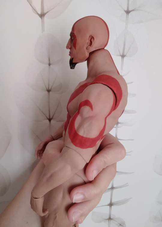
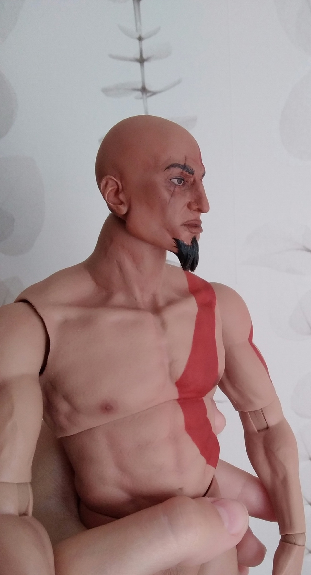
General Kratos (no-ashes OOAK, part 1)
The headline is a spoiler itself, but whatever, because today is the day, when i finally can share the part of my latest work!
This is going to be my second custom of the action figure and long story short. When I had a first thought about having a tan-skinned human Kratos, I was blessed with rare enthusiasm, because we don't have any official figures of Kratos in his "golden ages" as a human and general of the Spartan army (WHY).
It would be easy just to repaint figure from mass production, but those figures are all post-vow-to-Ares. And we need to be canon. If we make Kratos from the timeline when his soul was still his, we make him fully-General!!
Why not to go under the cut to see how is it going?

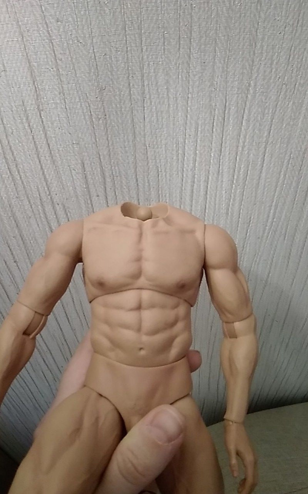
Everything starts with the head as usual. I bought it last fall, I guess? You have no idea how hard it is to find a bald head with a beautiful scull. With the right proportions of the face to match the body and to match Ares. (They are going to stand together). All "action heads" are different and rarely interchangeable and I guess I used all my luck at this step, because things became so problematic after, that I nearly lost my mind. In a time I also bought a head of a nordic Kratos in a hope to make my life easier, and oh god it is giant even for a giand body I have.. This head now in my scrap.
Anyway. Let's look at our donor. Don't know who is this...


You probably think 'meh he doesn't look like Kratos' and you are right! But what do I have here? A KNIFE!
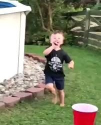
The plan was simple, I just needed to cut off his neck and face and re-sculpt this head entirely.
Step. By step. I cut and build again his eyes, eyebrows, nose, lips, chin, cheekbones, jawline, forehead, nape... until I started to see him. Hi~
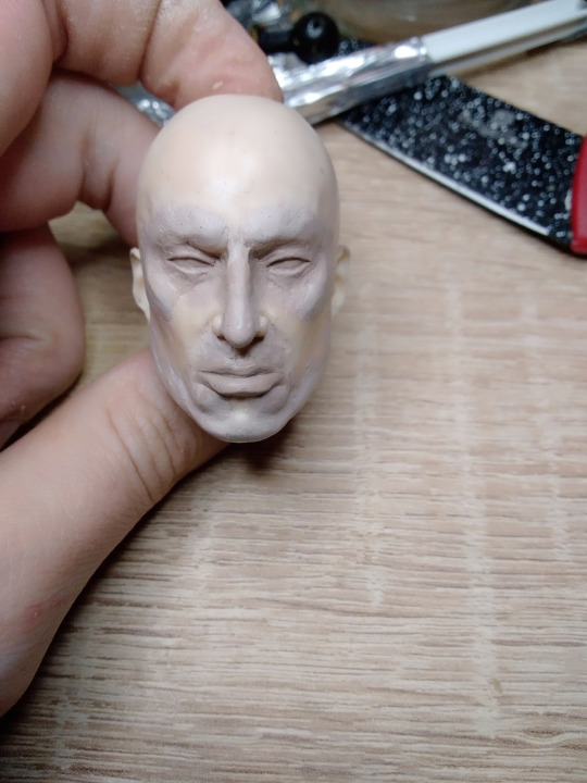


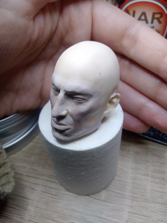
Actually, you never can say, how the sculpt will show itself after painting. It is the most cruel and frustrating thing, you can like the result, but the face easily can play uno reverse card with you in the end. With those thoughts I made a new neck for him. Because default neck of the body I chose was too long and wide and has an absolutely useless point of artuculation. First try, second try, and after curing it still seemed a bit too long, so after passing some time I cut the bottom of the head a bit to set it deeper.
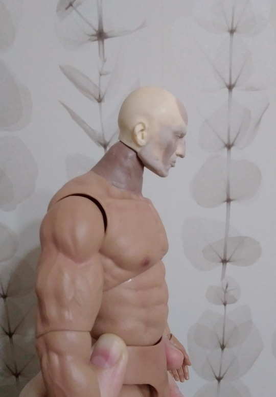
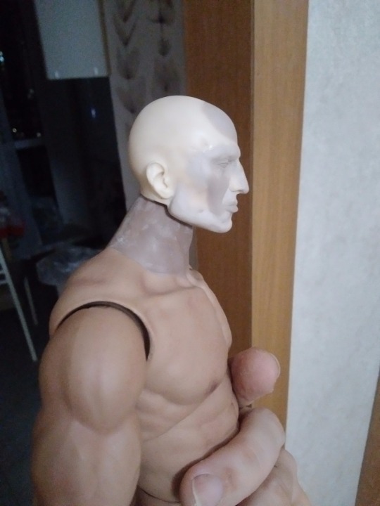
After finishing the sculpting I sended all and prepared everything for toning head and neck with the airbrush. Aaaand here my airbrush died. When I bought a new one with a normal compressor, I proceed. Somehow I repaint it 5 or 6 times in a row. God bless my "red stone" primer, really. Quick color match test! Nice?
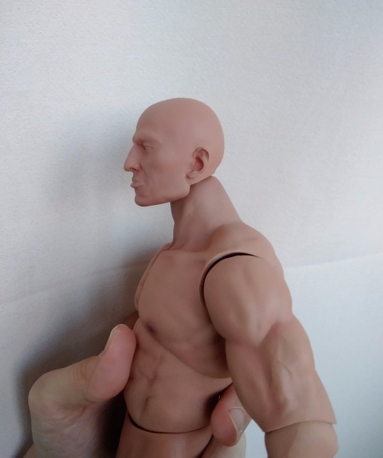
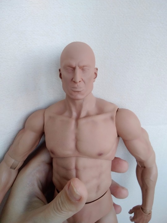
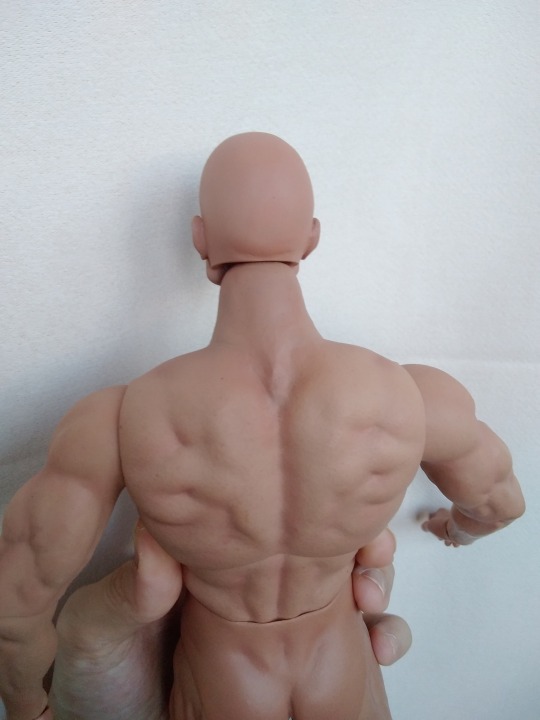
Nice! Now we can finally paint his face and body. Really I have no idea how doll customizers uses pencils for such a small faces. How! Brushes and a liquid paint is the only option for me. And I am happy about improving my technique since I painted Ares! ❤
By the way, his scar is carved, you can feel it, it is just hard to see it at photo.

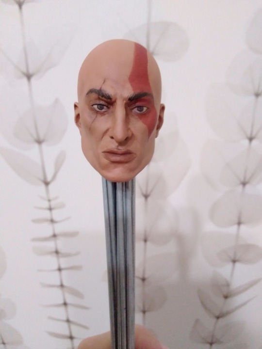
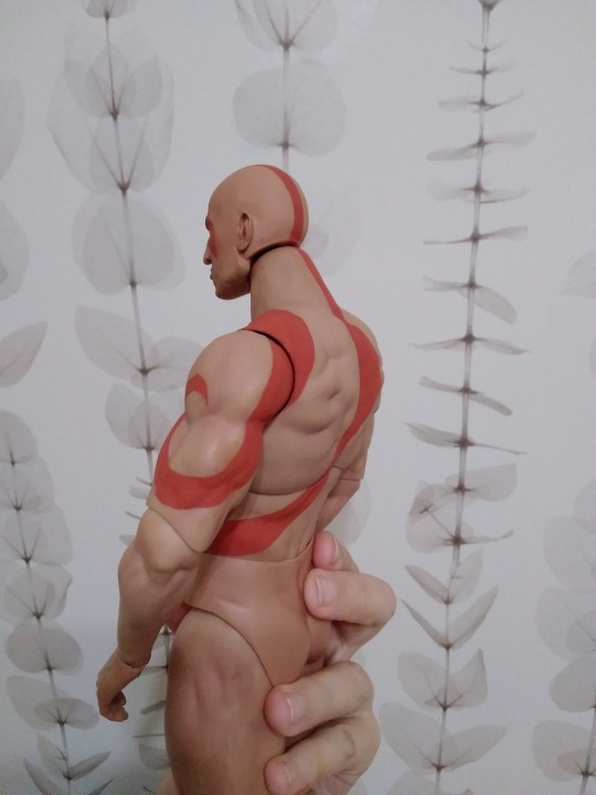
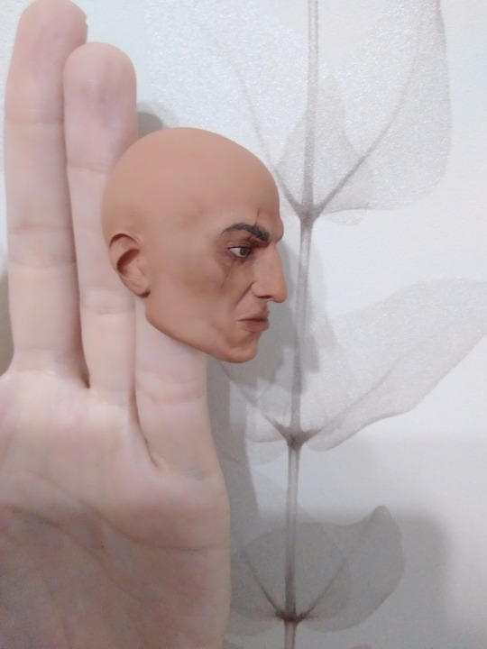
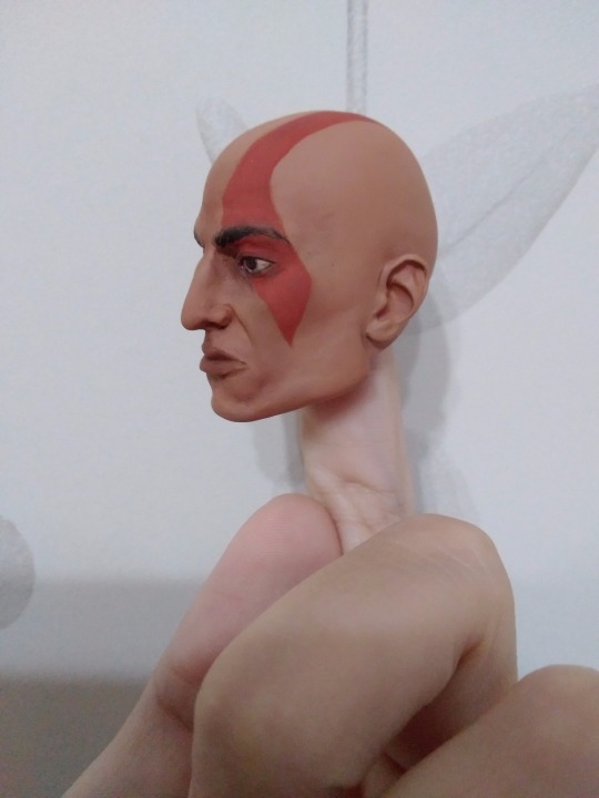
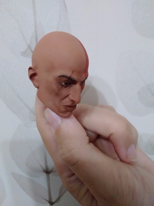
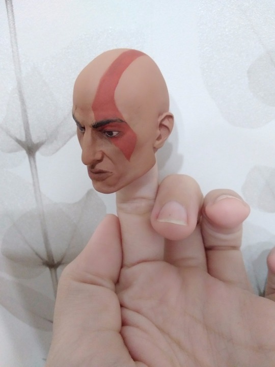
Oh gosh here I had a big exhalation, because sculpt didn't do a sucker punch to me, while it could. I didn't give him a too angry face for a yet-secret reasons, but wow.. he is.. so young. ?? and.. human-like It is easy to forget that there were time, when Kratos wasn't 200% done. It is so mind-wrecking. I.. it is hard to show at the pictures how much life and personality he actually has irl. I will gave you a better pictures next time, when I get used to him, I just see now how easily electric and natural lights and shadows change the perception of his face. But.. still wow.. He needed the last thing. His beard. Here could be a lot of curses, because it ate 3 days and 4 tries to glue and form it, but it won't be here! Let's just have a small laugh, because I used actual goat wool for his goatee. And we finally can assemble him!



What's next you ask?
I kinda have nothing to say except 'I am making his Dominus armor now 👺'.
Thank you for watching and commenting in tags if you did it when I made Ares doll, I love you guys
Stay tuned! Skeletor will return very soon!
24 notes
·
View notes
Text
Sunny's unnofficial rendering tutorial because idk why but people say they like how I color
Hey kid. So you got your drawing, right? And you have your flat colors, now you gotta render 'em, right? Then you find that BAM, you have no idea how to make it look cool? Neither do I! But here's what I do (I've been told that my coloring is cool)
1. Place your flat colors
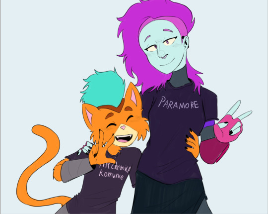
Imagine these are your flats. A few things: you want your base colors to be all around the same hue, that way they look better together. See how all the blacks, greys and whites are purple/blue-ish? That's on purpose babey! But how do you acheive this? idfk. jk, you have to stay on one (or two) areas of a hue wheel.
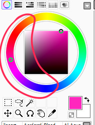
This way, all the colors look like, nicer around each other. You're not FORBIDDEN from going outside an area you picked, but you should still try to make sure everything is in the same hue so you have to do less overlay layers later.
(FYI: I do this because it saves me time on rendering. I don't think it's mandatory, there's no rules to art. Go crazy!)
2. Shading
I think shading makes or breaks a drawing. Personally I don't have a lot of rules about it, but there are still tips I can give.
So here's what you gonna do. You're gonna pick a color that's somewhere on the opposite of your main hue, alright? Here, my hue is mostly cold colors, so I'm going to pick a warm tone. You're gonna make sure it's dark enough so it's like, a shade, but not enough so it becomes black when you set the shading layer to multiply.
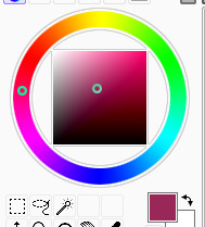
(Note: I never get this right on the first try)
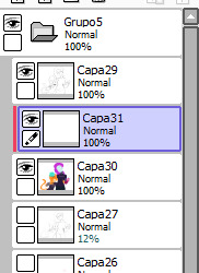
(Another note: as you can see, I have the entire drawing, including the lines, inside a group. Don't worry! I'll explain this later)
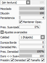
Personally I like to use a paintbrush-esque brush because I like the look of it being hand-painted that it gives my art. Mine is the default paint tool sai brush, but I'll leave the settings down here just in case.
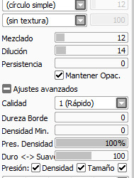
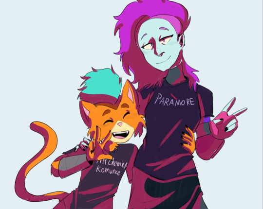
I don't. Really know how to explain the way I shade, I mostly follow the lines I already placed in the lineart phase, and give them depth. I guess my biggest tip would be to FOLLOW THE CLOTHING FOLDS!!!

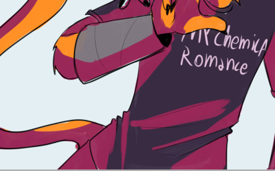
Idk how to explain this. But people always tell me that they like how I shade the clothes, it's because I follow the fold lines I place on the lineart phase! Not only does this give the clothes depth, it also makes shading a lot easier. Follow your lineart, idk what else to tell ya.
Now you're gonna set the layer to multiply...
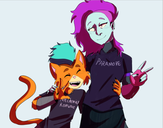
And lower the opacity as much as you want until it looks good. No real rules to this, it's kind of depending on the vibe you want your piece to have.

Now, and stay with me here, grab a blending tool, okay? This is the one I use, I have a textured version for when I'm feeling brave, and a regular, flat version (the one I use the most) Here I'll use the flat version.
And. Stay with me here. I want you to blend the FUCK out of this. Just absolutely destroy those borders. Okay? Trust me. If it looks messy you're doing it right. You're gonna want to follow the shape of the shadows tho, this way you don't lose the shape of the objects you're shading.
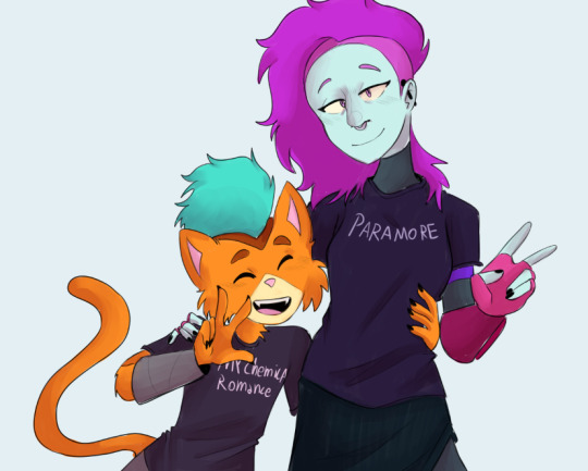
Woah! Suddenly everything has depth! Let me go back to the clothing folds, because holy shit, the clothing folds.
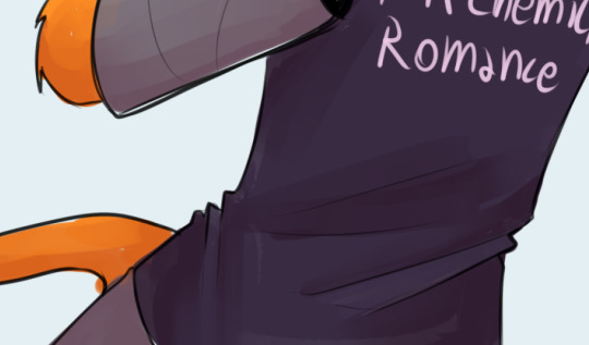
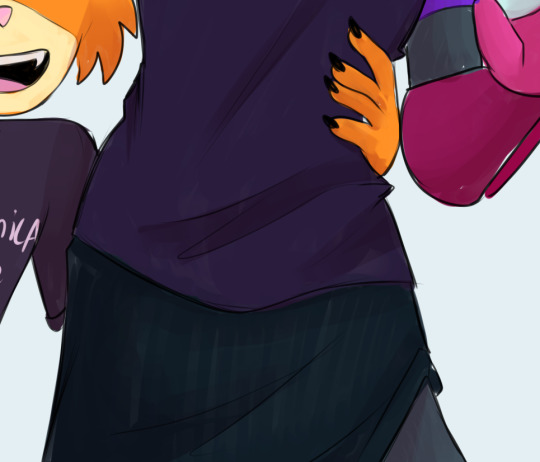
See how I'm adding depth to the shadows I placed by kinda. Following the line I drew and blending the outside? Idk how to explain this. You blend whatever isn't touching the line, okay? Trust me.
3. Lighting
Ok. I'm holding your hand gently. You have to do lighting on your art, okay? You have to. It adds depth to the shapes and also is sososoososo easy. Here's how. It's so easy.
Grab your airbrush tool. Yes, that one. Hear me out okay?
Pick a light, warm color between yellow and orange.
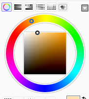
Stay with me. Make a new layer, set it to whatever lighting mode you prefer. I use luminosity because I live dangerously.
Now.
Airbrush everything that the shadows aren't touching. Yes. I'm serious.
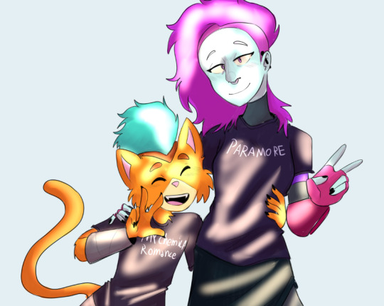
It's gonna look ugly as shit. DON'T BE ALARMED. This is part of the process. I want you to take the blur tool. And blur the ever loving fuck out of this. Just go fucking ham.
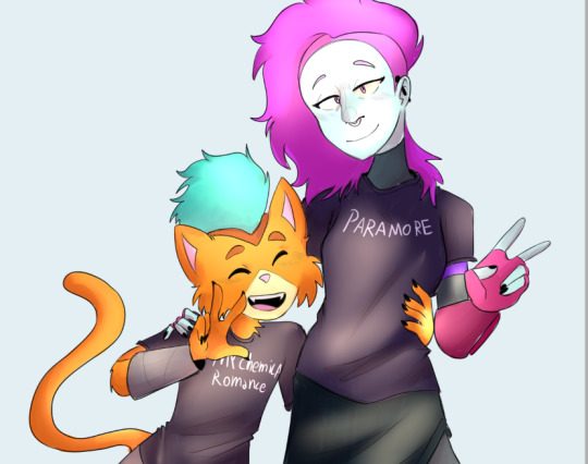
Good. You're doing so well. You're being so brave. Now lower the opacity as much as you want, until you like the way it looks.
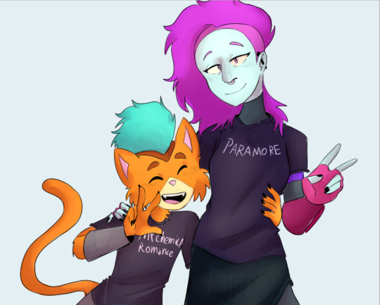
Like so. I also like to add a few brush strokes and blend them on an up-and-down motion for the hair and certain details, but this is optional. Same as before, you're gonna take a (slightly warmer, but still bright color) and make a new layer on luminosity mode.
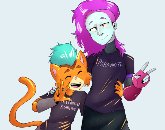
Take the blending tool and make it small, only slightly bigger than the brush strokes, and blend these lines until they look nice. Adjust the opacity, and voila!

Now, I could stop here. But I'm extra so I keep going.
4. The pizzazz
AKA, "Ah fuck the colors don't look the way I wanted them to!"
Do not worry! I have a solution that's almost never failed me.
Overlays. Just a whole fuckton of them. I don't really have a method to this, I just kinda try colors and layer modes until something looks good.
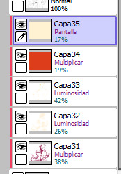
For this one, I felt like I wanted the colors to be warmer, so I picked a warm color and overlayed it on multiply. Then, I noticed that the darker colors came out darker than planned, and you couldn't really tell them apart, so I picked a light warm color and overlayed it on screen.
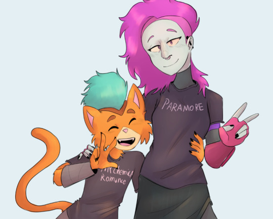
Voila! We're not done! There's one more thing I like to do, and here's where the layer folder comes in!
Remember how I said I keep everything, including the lines in a folder? This is why!
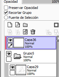
Make a layer that's on top of everything, like this. Pick whatever color you want, make sure it's bright. (Personally I like using pink). Take the airbrush tool again and airbrush whatever edges you want to give a little more pizzazz to.
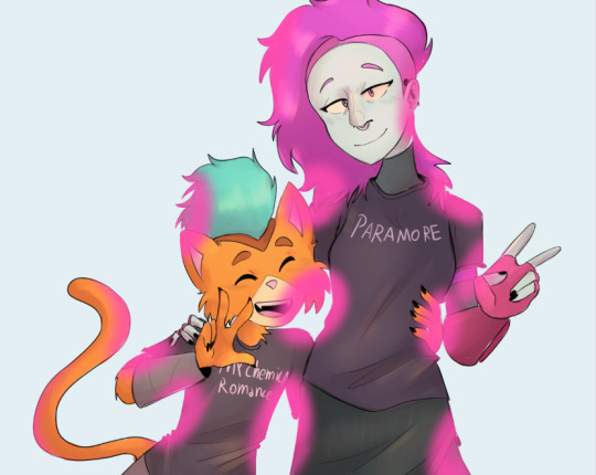
Blur it as much as you'd like...
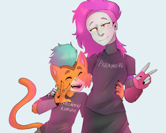
And adjust the opacity and layer mode however you like!
5. And done!
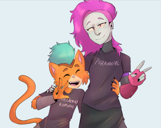
Sometimes I add white highlights. Sometimes I add more shading, or more lighting. It depends! But this is the method I use in a nutshell.
Hope you enjoyed it, or at the very least realized idk what the fuck I'm doing!
21 notes
·
View notes
Note
Hi!! I just wanted to hop in and say that I love your art / style so much!!! Do you have any advice for newbies to procreate? No worries if not! I just *clenches fist* you're art is so fucking good and I just love it a lot, it brightens my day
RAAH TYSMMMMMM ur too kind :') <3
putting the yapfest under a cut /o/
honestly i'd say number one is to learn all the shortcuts for actions (two finger tap for undo,, three finger tap for redo, etc) to speed up the whole process. there's lotsa tuts on yt that go through them all!!
i'd also just generally learn what everything is/what it's function is. like if you don't know what alpha lock is you might be torturing yourself with cleaning edges when you dont need to kinda thing, or trying to blend with colours when you can try the smudge tool instead, or not using clipping masks to make your life easier, and so on
i know everyone says this and it sounds tired but i promise you, reference and practice work. you're fueling your brain's internal library and learning way faster!!
id prob play around with brushes and find a handful to favourite and play around with the most when you start off, it has a lot of choices but it can be a bit overwhelming so i'd stick with a few to start with, and switch up if something doesn't feel 'right.' (it has a lot of cool texture brushes but imo it's better to start with the simple brushes and move up) this is a personal thing, but as someone who gets brainbored when sketching sometimes, i throw effect layers over top to make it feel more appealing to me. whether it's a colour wash or something that creates a neat contrast, i think it helps me feel like it looks more neat/slightly more finished?? idk if this is just a me thing but it makes me feel better when i'm playing around lol
i would also recommend duplicating brushes you kinda like but dont feel quite right, and play around with the brush creation settings! it's pretty thorough and fun to see what you can come up with. some of my staple brushes are just basic default airbrushes that i tinkered with a bunch. there's also a tooooon of free brush packs online, would recommend browsing and see if any speak to you!!
i will say procreate is pretty fantastic with the price/usability balance, but the thing that's made me steer away from 'finishing' pieces in it over the last 6 months or so is it's colour blending can be fuuuunky and it doesn't have correction layers (yet?). which is why i will send my procreate sketches to my comp to finish them in csp x) tis absolutely a banger to learn digital in though!! play around and have fun!!
#im soooooo sorry this took me so long to respond to i highkey forgot to check my inbox on this acct for months at a time :''')#kai talks#procreate
6 notes
·
View notes
Text
Animation
Reinvention in story telling
Three Blind Mice, Epic/Historical, Space Age (1957-present)
Week 3, 22-28/04/24
Monday
Did a zine workshop during the morning, I made a sad little zine with some bits of rough potential visuals for the project.
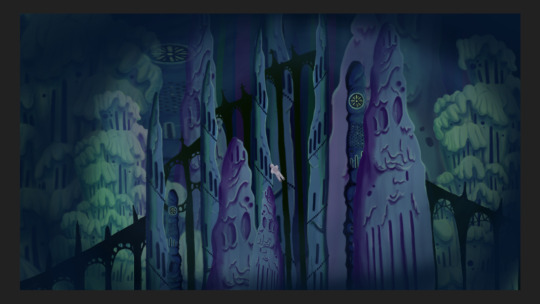
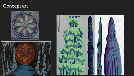
I then jumped straight into creating concept art and trying to figure out how to combine natural cave formations with architectural features. What I ended up doing that day was creating this rough pencil of some stalagmites and drawing arches and doorways on top of it.
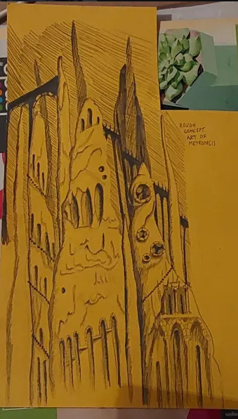
Using this as a starting point I went off and photocopied it a few times, which I then cut up and collaged together on a page to gain a rough idea of what this metropolis could look like.
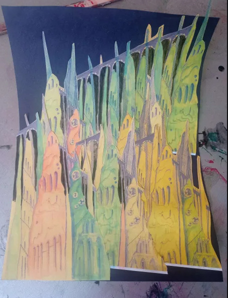
This is what I ended up with. I love how the buttresses came out but the perspective of the piece looks completely wrong, making it look cluttered without purpose. I tried colouring parts blue and pink to separate it a small bit, but I think the main issue is that all of the structures are the same size even at a distance, in future I'll have to make the ones in the back larger and more hazy looking whereas the ones in front smaller and more detailed. This was just an experiment so its not too important.
Later that evening I did a colour study of scenes from Akira to develop my understanding of cel shading, I also watched a few videos on the production of Akira. It ended up being very useful and I found myself very surprised with Akira's colour palette. I quite literally colour dropped the colours from the scenes and and did rough drawings of the scenes using them, I was really surprised to see that the colour I dropped was the same as the one in the scene. It was absolutely fascinating.
Tuesday
I further looked into combining architecture with cave structures by doing a quick study on Antoni Gaudi's building designs and did a study on different stalagmites.
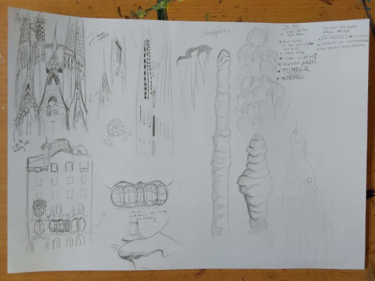
Looking at Gaudi's designs was interesting as he uses lots of organic shapes that almost look like they're melting in a way, and in other works like the Sagrada Familia he has lots of towers with unique features.
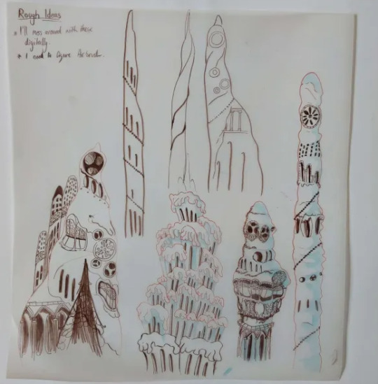
I tried combining these features to the stalagmites I studied to gain unique structures that would be believed to have belonged to an underground metropolis. I ended up with some nice designs, I worry a small bit that they might be too detailed but overall I'm happy with them, I still think these designs would have to be further developed but I don't have the time to do so.
At the moment my plan is to individually recreate these digitally and then photoshop them together in different ways to gain the illusion of having more designs than I do.
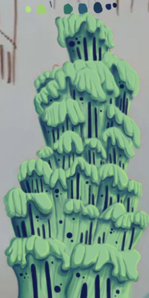
The photo is a small bit fuzzy but this was the first structure I recreated digitally. This took me around 6 hours to do, which was mainly because I've never done a proper digital piece before, so it took me a bit of time figure out what worked best and what short cuts I could take. I actually drew on top of a picture of my original paper sketch instead of redrawing it.
I created this solely using the air brush tool, and I love how it turned out, it looks so drippy. The only thing I can say really is that I wish I got it done a bit quicker, and that the values were much darker on my personal monitor.
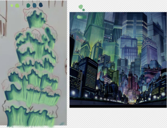
I used the background from Akira as a reference for the colours.
Thursday
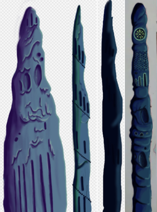
I made 4 more structures, significantly much more quicker too. While I spent too much time on the first one it gave me the experience needed to bang these ones out quickly and more efficiently. These were also done using the airbrush tool. For the backgrounds we actually made it a point to solely use airbrush as a way to commemorate the animations from the 70's/80's.
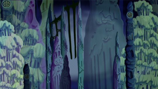
Since most of my pieces were done I got started on piecing them together. I tried making the buildings further back bigger and transparent and the ones closer to the viewer bigger. This was as far as I got on Thursday. If I'm being honest I'm not happy with the layout. I was using the Akira background as a reference but then realised it wouldn't work as the light source in the background is from behind, in my background the light source is from the front. I knew I definitely had to redo the layout.
Friday
We did a pitch workshop with Paul and Yvonne and then as a team discussed how we would go about our pitch . We discussed who would say what, what we thought a funder would want to know before investing in a project, we worked out costs, how many episodes, how many animators it would take to animate it in a year and ect...
We also did a few rehearsals in the studio improvising our lines and timing ourselves to get a feel for it. We decided that I would open and close our pitch, introducing our Nursery rhyme, genre, & time period while also setting the scene for our animatic.

Before work I managed to redo my background, I thought this one turned out way better. The perspective looked way better than last time too. I feel like with more time I could develop this further but I don't have that time so this is what I have and I'm happy with it.
Sunday
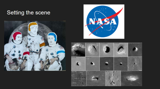
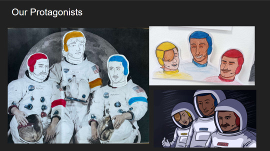
youtube
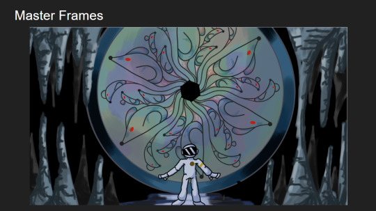
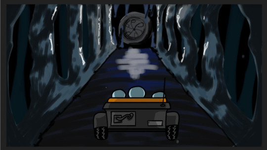
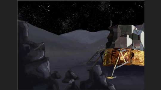
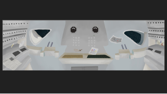
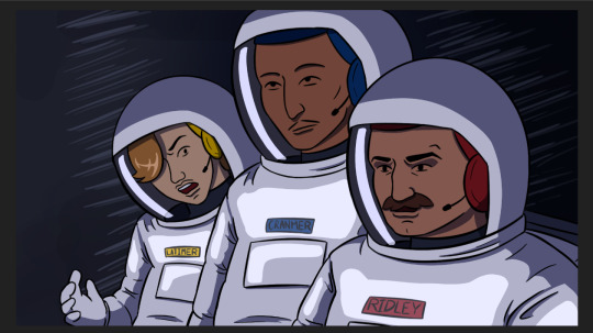
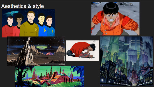
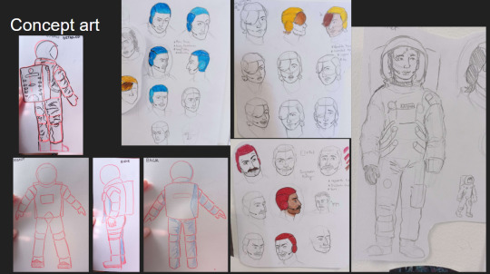
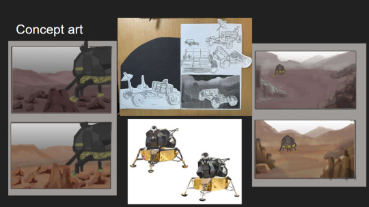
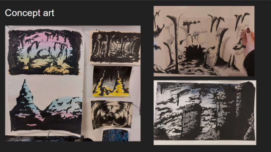
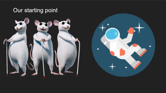
I made the presentation for our project, and the team went on call to rehearse our pitch. We did this twice.
2 notes
·
View notes
Text
How to Build Your Own 'Augmented Super Wife Supersoldier From The Future' Funko Pop.
A Semi-Coherent Guide By RC.
This is a long one. A loooooooong one.
I meant to do this like two and a half years ago, but in the spirit of keeping this fandom's head above water, and the fact I'm at the hospital (nothing serious!) with nothing to do for the next couple of hours, I'm doing it now.
So if, like me, you are still bitter that Grace and Dani didn't get official Funkos, or official *anything* due to manufacturer short-sightedness, why not say 'fuck it' and build yer own?
This rambling tutorial will attempt to demonstrate how to build Grace from the 'when they start to kill me, run' scene.
Like, literally that bit 😋.
Anywho. Let's do this!
You will need:
- Funko Pop DIY (female)
- Polymer clay (eg. Sculpy, Fimo, CosClay). I'd advise against cheapo no-name alternatives purely because in my experience the baking times/temperatures stated are absolute garbo. Also, polymer clay will give off quite gnarly fumes while curing, so better to use a trusted source. But if cheapo's all ya got, it's all ya got.
Other modeling materials you might consider instead of polymer clay include...
Epoxy clay (eg. Milliput, Apoxie Sculpt, The Army Painter 'Green Stuff', even something like J-B Weld or similar 2 part plumber's/repair putty).
Plain ol' air drying clay (eg. DAS, FimoAir, Gedeo).
You could even whip up a batch of 'cold porcelain', or an oven cure salt dough from ingredients you probably already have at home. Make sure you clear coat any salt dough creations properly after curing as over time ambient moisture may mess with it.
Each option above has its own pros and cons. Do your research if you aren't sure. Me? I used Fimo.
*ahem* Carrying on...
- Masking tape
- Hobby knife
- Pin vice
- Kebab skewer (wooden), or styrene rod
- Paint brushes
- Primer (plus dust mask if you're using a rattle can indoors)
- Sandpaper (around 400 grit oughta do it but you could probably go 200 either side of that and get a good result)
- Acrylic paints (optional: Posca PC-1MR pens in black and white for fine detail).
- Crafter's heat gun, or a hairdryer
- Varnish/clear coat.
Optional extras: Airbrush, spray booth/cardboard box, rotary tool, oven thermometer, artist's/cake decorating turntable, UV resin, silver leafing pen, jeweller's files, jeweller's wire, acetone, superglue or 5 minute epoxy, a lil piece of sponge, pearl mica powder, scavenged Funko Pop head 😈.
Step One: Grab your Funko DIY and separate the head from body using heat to soften the vinyl enough to wangle it off the neck post. Shoving it in a mug of hot water for a few minutes should do the trick. Make sure to dry out the head as much as possible. Last thing you want is mould growing inside it. This is Terminator, not The Last Of Us 😉. Alternatively you could use your heat gun/hairdryer, but I explain in Step Six why the water bath approach is a better option (imho) at this early stage.
(You are giving this entire thing a quick read through before you start, right? I dunno about the rest of you but I like to have at least a basic idea of the work ahead before I get stuck in. Saves finding out you're missing a necessary tool/material at an inopportune moment and all).
Stop rambling, RC. Sorry. It's easier to be succinct when you haven't lost half your photos 🤦♀️. Moving on...
If you don't wanna attempt to sculpt the hair yourself you can, as I did, take a kitbashing approach instead of using the supplied DIY head. Grab one of the many commercially available Funkos with a decent approximation of the hairstyle you want and then go Step One on em. Buy 'pre-loved', buy BNIB, dig one out of a dumpster, steal one from your lil cousin, it doesn't matter. Procure as your time/budget/situation dictates. Improvise where necessary.
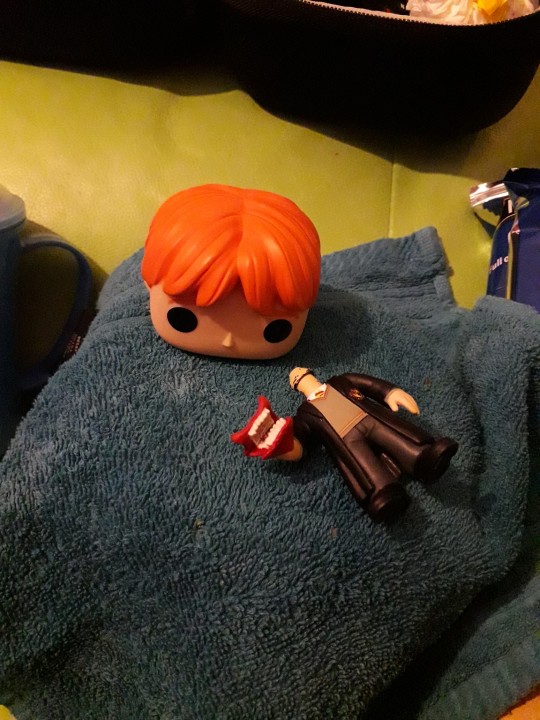
Sorry, Ron. I need your floppy hair. I do not need your clothes.
Or your boots. Or your motorcycle.
...😋
Step Two: Take the body of the Funko DIY and mark out the position of the tank top and the cuffs of the jeans. These will be used as guides for when you add the clay.
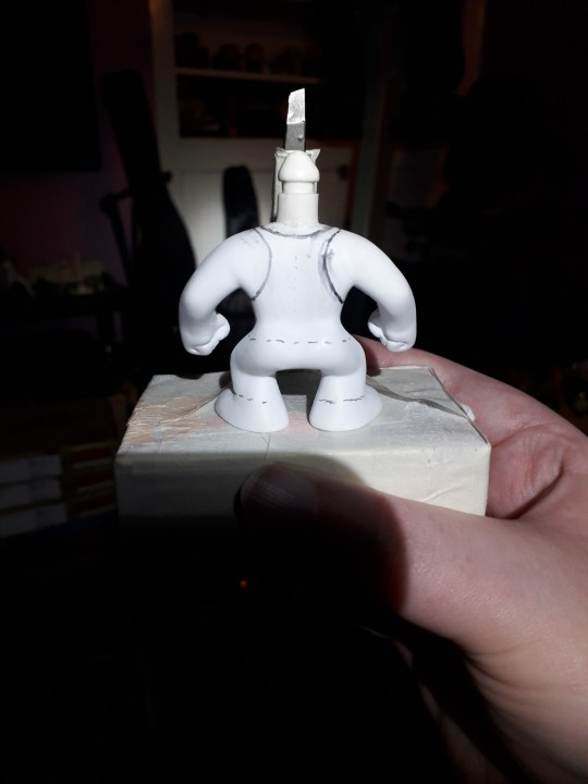
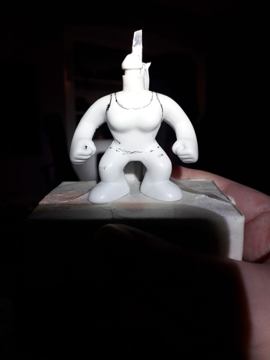
At this point I used a pin vice to drill the hole thru the fist for the rebar. If you're a crazy person you could use a rotary tool with an appropriately sized bit attached.
To make the rebar I fashioned a mould from a drinking straw and filled it with UV resin. Because I'm awkward. A wooden kebab skewer, or some hobbyist's styrene rod (eg. Evergreen Scale Models) would work just as well. Just cut it to size, paint it silver and you're golden. I used a metallic leafing pen. You use whatever you've got handy. Doesn't have to be shiny. A flat grey acrylic would work just fine.
Use jeweller's files and sandpaper to make small adjustments to the hand hole and rebar respectively in order to get a good press fit. There's always glue if you overdo it 😉. But don't add the rebar to the model just yet, as you're gonna need room to manoeuvre for the next bit.
Step Three: How do you make it look like your figure is wearing clothes when you don't have much real estate to work with?
You fake it, that's how.
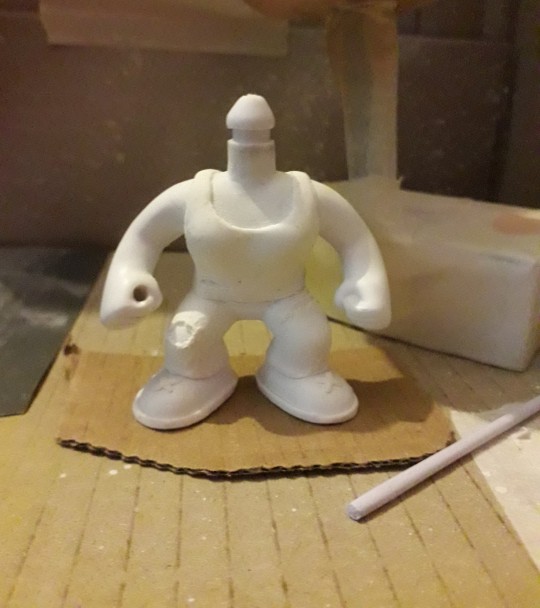
You do not need to model an entire set of clothes! It's an arse ache, and we're all about working smarter not harder on the RC channel.
So, take your modeling compound of choice, roll a chunk of it out to the desired thickness, and then cut into strips, say 2-3mm wide. Use your best judgement here.
Now, using the jeans as our example, wrap a strip around the bottom of the leg where the cuff would sit. Cut off any excess and blend out the join. Just give it a lil rub and it's like it was never there. Like magic! You should have a nice defined edge at the bottom, just above the foot. Now see the top edge of your lil clay strip? Well, you wanna start pushing and flattening the clay to blend the edge right out so it fades back into the body.
Repeat for the other leg, and the bottom of the tank top. The straps are relatively simple, tho the bits that pass under the arms can be fiddly due to lack of space. Use a hobby knife to shape and crisp up those edges and then blend out the extraneous edge. Same thing with the neckline.
Run a strip around each foot to form the soles of the boots, and a lil 'x' on the top of the feet to give the impression of laces.
For the rips in the clothing you can simply gouge out a little of the clay. If there isn't any on that part of the model (the knee for example) roll out a little wormy dealie (for you North of the Border fans 😉), position it as needed, blend out the edges, then gouge as required.
If you're playing on hardcore mode, this might be the time to start piling clay on the Funko DIY head and sculpting the hair. You may prefer to leave it til the head's re-attached tho. It depends on the material you're using. If you don't think it'll stand up to a bit of manhandling while pushing the head back onto the body, save this step til that bit's done.
Cure according to the clay manufacturer's instructions. The vinyl will not melt at the temperatures required to cure polymer clay, but if you don't wanna risk it or you don't wanna use your food oven to cook plastic, with all the gnarly fumes and stuff, I've given you plenty of air dry and/or non toxic alternatives. Consistent temperature is key with polymer clay. Undercooked, it's quite brittle. An oven thermometer comes in handy here if you've got one.
Step Four: Primetime!!! Some like to brush on primer, which is fine if you're painting a fence or throwing gesso on a canvas. Not so fine if you're painting a figurine imho. I mean, unless it's Cassandra from Doctor Who. A good rattle can of spray paint is what you want ideally, but again, it's about what you can afford/wangle/manage with your crafting space, so feel free to ignore me and brush away!
First rule of Primer Club: several light coats are better than one heavy coat. Second rule of Primer Club: knock each coat back a lil with sandpaper before applying the next one. Third rule of Primer Club: sit your rattle can in a warm water bath for five minutes before shaking it up to improve flow.
You can get primer specifically for plastics but while I would recommend it, it's not absolutely necessary.
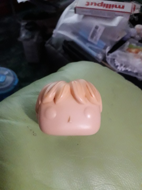
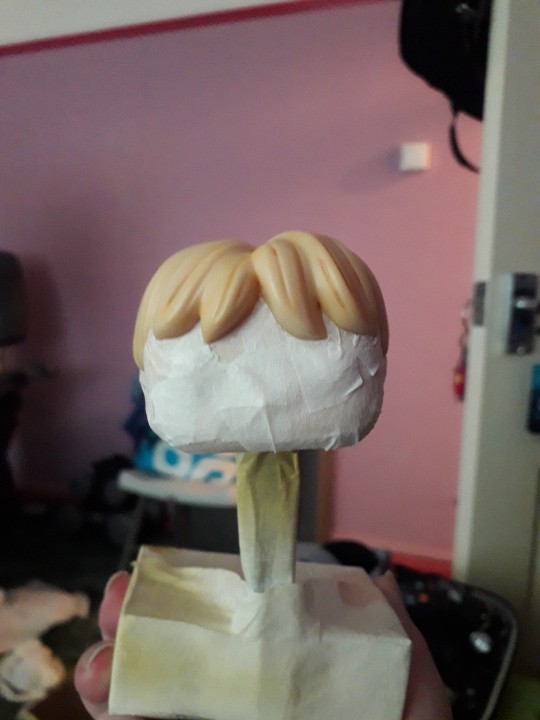
A scavenged head may need masking off if the base colour already matches the skin colour of your character. Save yourself a bit of painting innit. You can get really tight, clean edges against the hairline with a hobby knife. If the hairstyle, hair colour, and skin colour match straight outta the box? Congrats! Why are you even reading this? 😜.
That thing in the background is a portable spray booth (that other thing is a turntable). A cardboard box is also a portable spray booth if you want it to be. Only thing it doesn't have is an extractor fan. So put on a dust mask, and open a window or work outside.
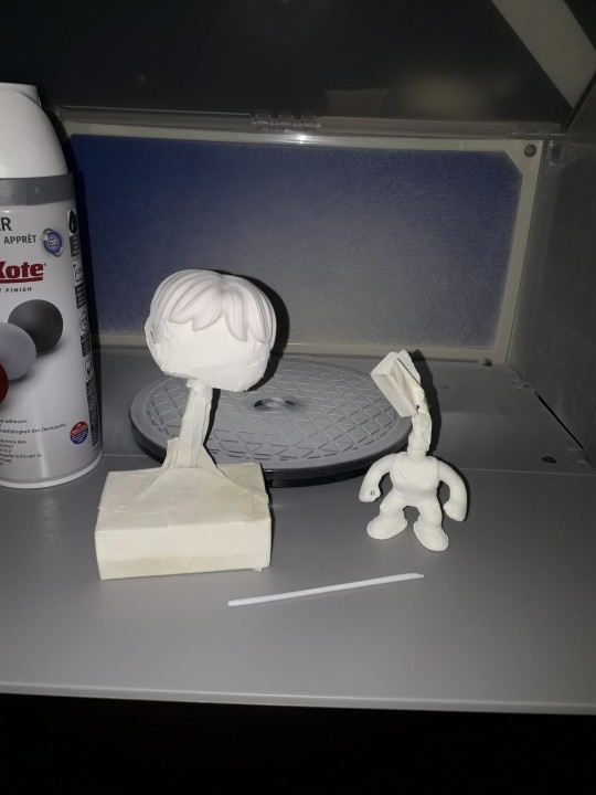
The DIY figure comes primed outta the box, so if you're using the DIY head and are planning on sculpting the hair after re-attachment you don't need to prime it. Unless you want to.
Step Five: Time to paint that shizz. You don't need me to walk you thru this bit, right?
Right?...
Masking is your friend if you don't trust your ability to freehand with a brush. If you're masking over a part you've already painted and are afraid of pulling the paint off, you can knock the level of tack on the tape down by sticking it to yourself (or your clothes) a couple of times before applying it. Some prefer to add a light layer of clear coat to 'lock in' the underlying paint. It's like a real life 'save point'. Some people do both. Some use masking fluid. Some use silly putty/blu-tac/plasticine. Play around, see what works. You do you.
I painted Grace's eyes blue coz Grace is extra and so am I. I threw a lil bit of pearl powder in there to add a subtle shimmer, as I thought going full metallic blue might be a bit too extra.
Lady Funkos have eyelashes. Don't forget the eyelashes.
(I nearly forgot the eyelashes).
A fine tipped Posca pen comes in handy here if you've got one.
Ditto the eyebrows, tho those aren't just for the ladies obvs.
For Grace's augmentation scars, again I recommend a Posca pen but a brush will do.
DO NOT PAINT THE NECK POST. Don't even varnish the neck post. Keep that bitch masked up until you're ready to reattach the head. Like, you can get away with painting the very bottom if you're worried the bare plastic will show even with the head attached, but that's it. Any more will be making a rod for your own back.
You have a choice now. Whether to weather your figure. I chose to add that extra level of detail as it made sense to me. Use a combination of dark washes, dry brushing, and/or sponge stipling to add dirt, blood etc. If ya want.
When you're happy with your paint job, give everything (except the neck post!!!!) a couple of layers of clear coat.
Step Six: When it comes to reattaching the head you probably don't wanna be dunking anything in water by this point, just in case. So we're gonna soften the neck post (and around the base of the head if necessary) with hot air instead. Use a hairdryer if you don't have a heat gun. DO NOT use an industrial or decorator's heat gun for the love o' god. That shit's meant for stripping paint, not gently warming vinyl figurines. It'd be like using a nuke to shake a cherry tree, and you'd likely burn yourself. A hairdryer is more than capable of doing the job.
Why did we not use the hairdryer for Step One? To be honest there's nothing stopping you if that's what you wanna do, but as you don't have direct access to the bits that need softening at that point you will have to wait for the heat to penetrate. You could be doing other things in that time by letting a water bath do the work for you.
Now, however, you do have direct access, so you'll probably find you only need to blast the hot air for 10 seconds or so.
Step Seven: So, you've got the head re-attached, and your paint job is finished and clear coated. That means it's time to add the rebar. If you went a bit too far with the drilling or sanding now's the time to get your glue on. As an final extra touch you can spiral some thin jeweller's wire around the length of the rebar to make it look more rebar-y. I didn't do this bit as the wire I had in my possession at the time was too thick for my tastes.
But whether you opt for that or not, congratulations on making your very own Grace Funko Pop!
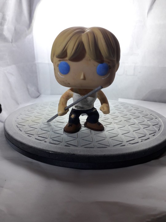
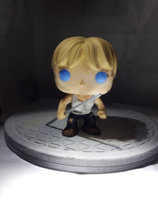
I'm still planning on making security guard and future war versions of Grace, and at least one version of Dani. Yeah, I've been saying that for the last two years, but it's still absolutely happening, trust me.
Anyway. That'll do it. If you have any questions, or you need further explanations or recommendations etc. y'all know where to find me.
8 notes
·
View notes
Note
Heard you were looking for some anon hate, so here's some that I've thought about over the past few years 😉
Your art is pure garbage. Your shading is so basic and yet it looks worse than the drawings on wikihow articles, and your colors are an abhorrent mix that looks like neon puke. Literally one of the first tips beginner artists get is "don't use the airbrush". And what do you do? Airbrush the fuck out of your markings and shading! Your older anatomy and character designs were far more superior while the newer ones are a bastardized version of their former glory days. I'm younger than you and I can actually paint and pick good colors lmao
You haven't improved at all in 5 years. You actually got worse! You're drawing the same snarling cat 20 times a month instead of working on your backgrounds, shading, anatomy and compositions, and their jaws still look crooked with displaced teeth Every. Single. Time! I wonder how strong their bite force is when the lower jaw is at a 45° angle from the upper one?
All your characters look crazy and deranged and like absolute psychopaths. It's not a good look for your "brand" <3 And their torso takes up 90% of their body. How are they supposed to be strong beasts when their stumpy legs can barely hold the weight of your bad stylization? And you call that an improvement instead of godawful anatomy!
And then, and then!! Y're constantly making new characters, drawing them a bunch and forgetting about them! Algernon, Jarith, Lucia, Geneph, Xiaoya, Bailey, Jicama, Utah, Felin, Civen, Afryea, Thyodore,.Tyson (Aster's pet Inostrancevia), Donnie... And you have even more that you haven't even posted about? How does it feel to know that someone knows your characters more than YOU do? Talk about being an irresponsible artist
You're not even creative enough. "Here's a species that looks exactly like a cat but trust me guys it's not a cat, see? it has two extra arms!" "Here are 20 smilodons that are yellow-brown and have spots, but I love all of them and can differentiate between them!!" "Here's a leopard seal who's bigger than the natural ones and is a made-up species (who's supposed to be part bear and I definetely didnt forget about that) even though nothing is different between her and a regular anthro seal!!!"
I hope you give up on art. It won't take you anywhere in life, just like your autistic interest in paleontology won't help you. You didn't even get a superior education, so it's clear you'll live your life working minimum wage jobs because you're not qualified to do anything better. You’re lazy as fuck and you have no excuse for how weak you are.
You say you have 1000 followers but you barely pass 10 notes on your art and even less on your vents, and whenever you demand people to send you asks daily, nobody says anything. So not even your followers like you. They're just observing your every move and are laughing at your pain. The only thing you're good at is being daily entertainment for me and hundreds of others like me.
All your "female" characters loook like males regardless of what they identify as. It's as if you're incapable of drawing women.
Hooray for making all your best characters trans since you seem to be allergic to normal people. I'm glad you confessed that you support the mutilation of middle schoolers / transing gender non-comforming females (Azure).
You call yourself a "he/they" but you're still competing in the women's category cuz you know you wouldn't last in a fight against real men. You're such a failure that even your step father calls you his daughter publicly. (Your parents surely are disappointed in what you've become. I wouldn't be surprised if you were the reason for their divorce)
Only a few years back you were a proud tomboy girl, but I guess you hate yourself so much that you project your self-misogyny through self-identification and an atrocious art style.
You even chose the name “Tyson”, like that troon Chris Tyson. Considering the recent controversy, that’s what people will associate with your name, not whoever “Tyson Fury” is, and truthfully you deserve it.
You're so fragile being called a girl when you look, sound and act like one. Girl. Woman. Female. Dike. Lass. Lady. She. Wahine. Kaikamahine. Did this make you cry some pathetic manly tears? 100% sure you look like the soyjak in the soyjak vs chad meme right now. Can’t wait to read your breakdown on tumblr, if you’re not going to outright delete every account you have to escape me
Typical white girl starving for attention online behavior lmao.
You boast that you are "hot" but you are objectively ugly, not even mid. Your undercut is shit and your face is so damn bland. Your fursona is strong and beefy but you have a thin female body with stick arms and visible breasts. Talk about projection and an inflated ego. You're oozing with narcissism, and I wouldn't be surprised if you got diagnosed with it. It would 100% suit you.
Your "girlfriends" are still lesbian women, but you’re not one? “Transmasc butch lesbian” my ass, you absolute pooner. It’s not that hard to be a regular woman. Pretty sure you're not even dating them, you're just friends who haven't even held hands. And you’re still a virgin lmao. No bitches? 🥺 And you have not one, but two, because you're insecure in your feelings and can't commit to only one person since you need that external validation. I'm sure they're cheating behind your back because they know you wouldn't check on them.
I hope your sleep apnea kills you in your sleep. You deserve it.
L + ratio + you’re a loser + cope and seethe
Don't bother blocking and reporting me, I said all I had to say, I don't plan on interacting with you anymore and I don't have this level of hatred against anyone else.
Now, have I stalked your accounts until their beginning, or have I followed you for a really long time? Or a secret third thing (I stalked you for a really long time)?
the color thing is true but you should get a job
19 notes
·
View notes
Note
i like your art style a lot–have you always drawn this way, or is it something u developed over time? do u have any tips for drawing in the general sparklecat/old internet art style or similar?
1. Thank uuuuu <3
2. Under cut ⬇️
It's a mix of both- my current sort of diary art/stress relief/ wholesome style is a replication of my elementary school art style! (Like 5th grade, not 2nd lol. I was still drawing stick guys blowing up zombies with tanks and crap back then)
Otherwise, my other styles are style emulations, essentally!
I'll break it down rq:
Mostly based off my own childhood art:
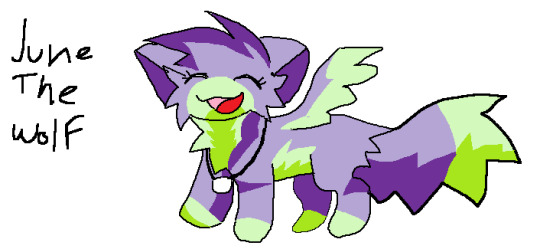
Natural progression of my art as I grew up:
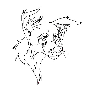
Style "emulation" (le me making an amalgamation of liek 20000 old deviantart artists into one image)
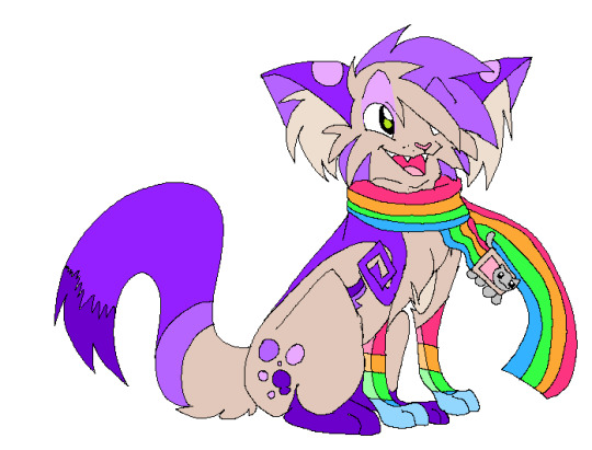
Most of the sparklecat and scenedog art I draw like the above, is inspired by the works I stockpile from deviantart deep dives, and archive blogs. They're not emulations of one style, but multiple styles, taking parts I like or think are the most 'authentic'- essentially, I do what your young brain would have done without thinking, but I have to do it on purpose haha
My tip: while practicing, I'd say absolutely do studies of peoples entire DA galleries and figure out what works best for you.
Above all else I can't say anything else but like. Age regress lmao. If you can't do that, just do everything you can otherwise to put yourself in the headspace of the art you're emulating.
Put on old Amnesia playthroughs on YouTube, listen to Yaoi Nightcore playlists, edgy scourge AMVs, Naruto YTP, the whole Twilight movie- really whatever you listened to back in the day. Put that back on in the BG. Open current MsPaint or your preferred emulation of old MsPaint, or a free art software like medibang. (Don't download cool brushes. Work with Pen 1 and Airbrush or whatever.)
Use references of the era you want to emulate and use only those. Take all your current knowledge of art and BIN IT. The #1 problem in most emulation art even I have a really, really hard time with- is your stuff looking too modern because your art style is modern. Your tools are modern. Your mindset is modern. It will make your art look uncanny.
Don't try hard. It's really temping to draw the most rawrxd scenecore webcore hot topic revival 100 gecs whatever, I get that I guess- but it won't look like it's from the era. It's really hard to get x3randum ☆~ iTs rAinIng TACOOZZZZZZ ~☆ humor right, so don't try it for your first and submerge yourself in the era first. Tryhard sparkles are a real issue and you risk making your art look like it's snark.
Small canvases and or destroy your image quality. I don't do this as much as I should but it definitely adds to the look LULs
I will say, I have no idea otherwise because I come from a very privileged background when it comes to style emulation which is that I grew up planning to be an animator and thus, in my critical years, I was basically 100% drive on the ability to draw characters in many styles, on model. If you don't have this skill, it'll be a lot harder I'm sure.
Use your non dominant hand for especially young looking art. (If you have one. If not... uh... try your mouth?) (~that's what she said~)
(I mean. If you're *going for* the look of 'yes it's 2023 yes I'm bringing back this' go ahead, it just won't look genuine in the slightest and I am someone who's art journey is about doing all I can to emulate authenticity. Just adding this because I know a lot of people are! Go make that modern sparkledog eyeburner mary sue antisnark! It's just not my cup of tea. And I can't really give any pointers kthxbai)
#its kinda hard to say im always at least waist deep in the simulacrum#i basically run vista and play early xbox and playstation games while drinking mtn dew all day#ride my dirt bike. watch twilight and the hunger games on my#portable dvd player. play on one of my DS.#listen to scremo posthardcore crap on my ipod. epic fail on my skateboard (tfw no paved driveway)#for all intents and purposes i am a 20 year old adulthood dropout and professional teenager who dabbles in toddlerhood#when i draw idk... broseph. jesus takes the wheel#just stare at some black airbrush shaded firestar on deviantart for 300 hours and eventually itll click#wishing you the best of luck and please update me im always lewkin for ppl to colab wit and stuffs#but yea#go study the art of being a kid and im not joking#adulthood? poisoning my art? morelikely than u think...#but if you buy old rubber meme bracelets with grumpy cat or troll faces before me im PUNCHIN YR LIGHTS OUT#roflroflrofl
11 notes
·
View notes
Note
hi TT! can I ask you for some advice? I'm a teenager who is really insecure about how i look. i don't really think there's anything wrong with my appearance per se, but everyone around me does. my dad keeps recommending me fairness creams (even though he is dark skinned himself) and my mom keeps telling me to lose weight (even though she is fat too). i have been dealing with some health issues for the past couple years that have led to a LOT of weight gain. i now have stretch marks all over my body and my friends always comment on it and make fun of me for them. it makes me wanna never show even an inch of skin again. what do I do?
Hello love,
First of all, big hugs. 🤗🤗🤗 People (who are supposed to love you regardless of how you look) are being shitty to you and you absolutely do not deserve that crap. I'm here to tell you they're wrong. You are good the way you have been, are right now, and however you will be in the future.
i don't really think there's anything wrong with my appearance per se, but everyone around me does.
I'm glad you have accepted the way you look. You realise that the problem is with the people around you. Good. That's a massive step 1 already sorted. Because so often, we start believing what people tell us, and it becomes the "truth", when it's absolutely not.
Tbh, I'm a rudeass bitch and I'd let off verbal zingers at everyone, including parents. idgaf about politeness when someone's coming for me like that. But perhaps you're a much better person than me, lol. So maybe when your dad tries to push fairness creams on you, you just reply with a curt but polite "No, thank you!" and end the conversation right there. Walk away. With your mom and the weight loss, ask her if she's willing to take on a "get healthy plan" with you, where you both eat better and exercise TOGETHER. If she's unwilling, then ask her why she has expectations of you that she's not willing to subscribe to personally. Again, walk away. Don't let them think they can just say these things to you and you'll sit and listen like a good bachcha. And boy oh boy, your friends. To them, I say be straight up rude. Like, call them out. Say "What makes you think you can talk to me like this about my body? Why are you so obsessed with the way I look? How does this affect your life in any way????" coz literallyyyyyy; friendship doesn't mean a free pass to talk any shit, that too such superficial garbage. Everyone's body has something or the other wrong with it. EVERYONE. (Another thing almost everyone has???? Stretch marks. I've had them since fucking puberty, still do in my 30s. They're as much a natural part of your body as body hair.) That is just the nature of the flesh prison we reside in. This is just a pile of fucking electrified meat that holds our brain and soul, which is what really matter. To have someone who calls themselves a FRIEND talk to you unkindly like this should make them ashamed, and honestly, make you reconsider if you even wanna be friends with that person if this is how they choose to behave.
This is the outside stuff. Now for the inside stuff - the internal work you do. First, make sure you watch and subscribe to media of people who look like you, and make you feel "hey, they look just like me and they're so pretty, so that means *I'm* beautiful they way i am too!" I'm telling you as someone who grew up in the pre-social media age; I had zero representation of ppl with my body shape/size and hair texture. It wrecked my self esteem. I spent hours poring over magazines and looking at airbrushed models thinking "why don't i look like that too????" even though I KNEW they were digitally altered images. It just got into my head SO MUCH. One good thing about social media being in the hands of EVERYONE is the ability to see such a range of people from all over the world, looking amazing in their own ways. Follow a diverse looking set of people and see the beauty in them, and thus yourself. Second, do some minor work to alleviate your health issues if you can. Be regular with your meds if you take any, do some daily movement to the extent you can, eat mostly healthy and stay hydrated well, etc. It won't change the way you LOOK, but it will make you FEEL better about your body, and how you are doing your part in taking care of it like it needs. Third, only if you choose to, feel free to beautify the flesh prison as you see fit. Wear whatever you like. Colour your hair. Get a piercing or tattoo. (Obv. wait till you're a legal adult!!!!!! Also, never get names of people or something that is just a ~~phase or trend you're into at the time. Aesthetics come and go. Body modifications like these are forever. Choose wisely. Very very prudently.) Do things that make you feel like "this is MY BODY, and *I* GET TO CHOOSE what kind of pretty it is". Take agency and make your choices and be proud in them, and fuck literally everyone else's opinion. They're LOOKS. The least interesting thing about you. They don't matter in the larger scheme of things, and they'll keep changing as you go through life. Just do whatever makes you feel good to be in this body at the time!!!!!!!!
I love you lots baby sibling. 👩🏽🧒🏾👩🏽🧒🏾👩🏽🧒🏾💗💗💗💗 I am threatening everyone shitty around you with angry laser eyes as I protectively wrap an arm around you.
9 notes
·
View notes
Photo
Since I see a lot of people in the replies asking questions about these, here are some answers and resources:
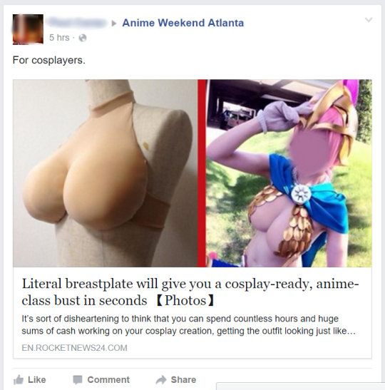
You don't buy this exact version, but you can make them yourself! Here's the article from the screenshot, and here's the original tutorial.
Since you're making them yourself, you can absolutely have them in different skin tones. I'd recommend getting your fabric from Blue Moon, since they have a decent selection of different skin tones of matte spandex. You can also dye your own spandex for a more custom color.
If you are doing multiple characters with unnatural skin tones (say, a green character), yes, you would need to make multiple pairs. You can also make multiple pairs if you want to permanently attach costume pieces to one, which is an advantage of this type of breastplate.
You can buy an extremely similar product, but you need a shopping service. It comes in only three skin tones that don't get very dark, which is unfortunate, but you might be able to airbrush them (never tried myself, but worth a shot). You can get the Neo Oppai Sister from Classe wigs.
I don't recommend this type of product for daily wear or anything you want to look realistic. The shape is extremely anime, they're a bit flat looking due to the fabric (as in, not shaded, not as in flat chested), etc. For daily use for trans women and anyone who just wants big booba for a while, silicone breastplates tend to be better. These have more realistic shapes, skin texture, the neck hides better, there's collarbones molded in, the edges hide well with straps and bra bands... They tend to be uncomfortable since it's like wearing a silicone shirt, but for special occasions and cosplay, they're great, and some brands have them in "cool" versions with an open back (I have this type). I got mine from Roanyer (extremely NSFW website, caters to crossdressing fetishes), and they have good quality and a LOT of styles, but are pricey. Look for seasonal sales. I can't vouch for the quality of cheaper alternatives, but they're out there on places like the River Site -- still pricey but less so. Japanese cosplay brands have also started making this style.
THAT SAID (and keep in mind this is a cosplay blog so that's what I'm focusing on), this style of breastplate is going to be more comfortable and less than half the cost of even a cheap silicone one, so ymmv and it depends on what you value and the look you are going for.
To make these look more realistic: you need to have neck coverage and coverage of the edges (the halter neck sides, the bottom edge) to hide that it's a breastplate. You can also possibly use airbrushing to add some shading and dimension to them. This classic KLK tutorial uses the same method but covers them in liquid latex for a more skin-like texture.
Brands also make no breasts but yes muscles silicone plates! (Same NSFW site as above, different section) Great for transmasc folks, cosplaying muscular male characters, etc. Again, very hot and sweaty (it's wearing a non-breathable silicone shirt), but they're out there.
Hope someone finds this helpful!

#helpful things#breastplates#foundation garments#i have a silicone one#but i want to make some fabric and foam ones#and lmaooooo at anyone who thinks cosplay#is anything other than drag-tier fakery#fabrickind gives unsolicited advice#I sould do a comparison post#of this type vs silicone type vs other breastforms
497K notes
·
View notes
Text
What is the Best Art Software for Digital Illustration?
If you're trying to mimic traditional media, using charcoals, oils, watercolor, pencils and brushes, then you want a drawing software specifically for painting!
With so many options available, it becomes hard to make a choice that would best suit the kind of art you want to make, whether you're just starting as a beginner or are a professional.
What you'd generally want is a digital illustration software that is compatible with the device you're using, supports the kinds of tools you need for the art you create, the cost, and any additional features that a creative can play around with.
Some digital art software may even be outdated, while others keep experimenting and keep further development at the forefront.
Different digital artists look for various features in the software they'd prefer to use.
In addition, The price point is always something to consider, but not to worry, there are just as many free alternatives to good quality software as paid ones.
Considering all of this, here's a comprehensive list of the digital art software that has the potential to be the right fit for you.
10 Best Free and paid Art Software for Digital Painting & Illustration
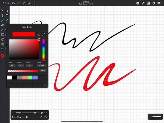
These are the 10 art programs that I personally like and would recommend:
If you want more info about them, I suggest you visit pctechtest site.
1. Photoshop
Photoshop is the industry standard, and preferred among most professionals, but it costs an ongoing subscription fee.
Photoshop's brushes work so much better, virtually no lag and a lot of variety. Importing brushes from pros also works easily because.. most pros use Photoshop.
2. Clip Studio Paint
Clip Studio Paint is the best for doing Line Art, Paintings, Comics/Manga, and even 2D Animation.
Clip Studio has a lot of the tools Photoshop does, but is just more intuitive for the average artist. Also it is a one time buy, you don't need a subscription.
Users value its quick loading time, lack of lag, pen stabilization for clean line art, and ability to export in PSD format for easy editing.
3. Krita
A lot of people use Krita as it's free and have plenty of useful tools and brushes, but there is some learning curve to getting the most out of it.
4. Corel Painter
Corel Painter feels like an entire art store full of stuff, very realistic brushes especially for water colour and charcoal etc.
5. Rebelle
Rebelle is a top choice for artists seeking a realistic, versatile, and user-friendly digital painting experience that's competitively priced.
Rebelle is really amazing at making painting feel very close to what is to paint on an actual canvas. The products you use like the paint and the canvas have an amazing interaction.
6. ArtRage
ArtRage is also an excellent and easy to use paint app that does a great job of simulating the flow and texture of real oils and watercolours.
7. Sketchbook Pro
Sketchbook Pro is a great tool to sketch when it comes to freehand drawings. Airbrush feature along with copic colors makes it perfect for art.
8. Medibang Paint
MediBang Paint is a free, lightweight and easy to use art program suitable for users who loves to illustrate!
9. Procreate
Procreate is a premium quality, low-cost app on Apple ipad for artists of every kind.
With abundant customizable features, expandability, and an attractive and intuitive user experience, anyone can create 2D and 3D paintings, drawings, hand lettering, and animations.
10. Paint tool SAI
Paint tool SAI is absolutely amazing for digital painting, but only available on windows devices.
It is so responsive to the pressure and movement of the pen and it's great. Once you get the hang of it, it isn't hard to use at all and you make amazing paintings.
What's The Difference Between Digital Art and Graphic Design?
Digital art is a form of art that involves the use of digital tools to produce images and videos.
Meanwhile, graphic design is a profession that combines artwork, text, and typography for use in advertising, web design, and other forms of communication.
Digital Designers rely on graphic design software to create, edit, and view graphic art.
Krita vs Photoshop - Which Program is for You?
If you're into basic drawing and sketching, A simple painting program like Krita might be enough.
But if you're a professional artist needing advanced editing, photo manipulation, vector graphics, or extensive text tools, then a photo retouching software like Photoshop is the best.
To let you know, Photo Editing software allows users to stitch images the way they want, which can make all the difference in the final look of your photos. such as online photo editor, RAW photo editor, etc.
Do I need a pen tablet to use with art program for drawing?
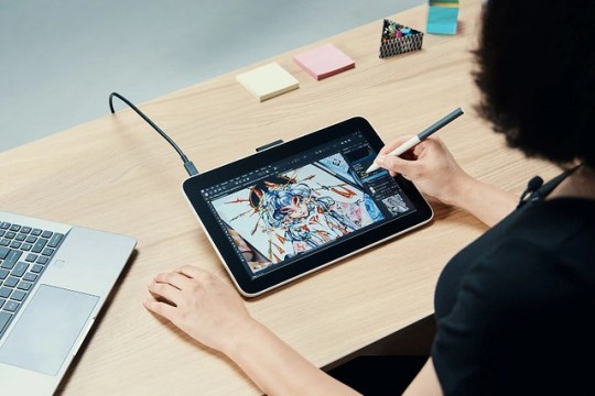
For hardware, outside of a half-decent computer and monitor, you may eventually want a drawing tablet with pen, whether that's a screenless (such as classic Wacom tablets), or a drawing tablet with display.
You don't need one to get started, and they take some learning of their own, especially screenless. Screenless graphic tablets for beginners are available for under $100, screen-in start around $200 for a very small decent one and go up from there.
Conclusion
Drawing software is an essential tool for an artist or illustrator, professional to novice wishing to create digital art.
The most important thing you need to consider when choosing the best drawing software is that you're comfortable with it.
If you want a powerful drawing program that will give you the best possible experience you want Photoshop, Clip Studio Paint or other paid software.
If you can't afford them, I recommend going with free software like Krita or Medibang Paint instead.
Free software can sometimes be less intuitive, but with use, you'll get used to it instantly and let your creativity flow.
1 note
·
View note
Text
Limited Slots Available - Reserve Your Airbrush Bridal Glow Now!
Planning your dream wedding is a whirlwind of excitement, and every bride deserves to look and feel her absolute best on that special day. If you're a bride-to-be, you understand the importance of flawless makeup that enhances your natural beauty.
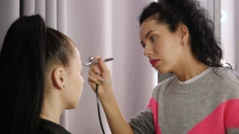
The secret to achieving a radiant and long-lasting bridal glow? Airbrush makeup. And here's the best news: Limited slots are available for our exclusive Airbrush Bridal Glow service. Don't miss the chance to reserve your slot and make your wedding day makeup dreams come true!
What Is Airbrush Makeup?
Airbrush makeup is a revolutionary technique that uses compressed air to spray a fine mist of makeup onto the skin. Unlike traditional makeup application methods, airbrush makeup provides a flawless, lightweight, and natural-looking finish. It's the go-to choice for brides who want their makeup to last all day and night without the need for constant touch-ups.
The Benefits of Airbrush Bridal Glow
1. Long-lasting Perfection:
Airbrush makeup is formulated to last for up to 12-24 hours, ensuring that your bridal glow stays fresh from the moment you say "I do" until the last dance of the night. Here is our one of the best blog: Bridal makeup also visit our homepage: Prachi Gandhi
2. Customized Coverage:
Airbrush makeup allows for customizable coverage, from sheer to full, so your makeup artist can tailor the application to enhance your best features and camouflage any imperfections.
3. Photograph-Ready Finish:
Airbrush makeup is camera-friendly, making it the ideal choice for brides who want to look flawless in every photograph. The makeup sits evenly on the skin, reducing the appearance of blemishes and ensuring you look stunning in every shot.
4. Comfortable and Lightweight:
Unlike heavy layers of traditional makeup, airbrush makeup feels light and comfortable on the skin. You'll forget you're wearing makeup while enjoying the day's festivities.
Why Choose Our Airbrush Bridal Glow Service?
At our studio, we specialize in creating the perfect Airbrush Bridal Glow for brides. Here's why you should reserve your slot with us:
1. Experienced and Professional Artists:
Our team consists of experienced makeup artists who are skilled in the art of airbrush makeup. They understand the unique needs of brides and can create a customized look that enhances your natural beauty. Click here for our other blog: Professional makeup artist
2. Personalized Consultation:
We offer personalized consultations to understand your vision for your bridal makeup. Whether you prefer a natural, romantic, or glamorous look, our artists will bring your vision to life.
3. High-Quality Products:
We use only the finest airbrush makeup products that are renowned for their longevity and flawless finish. You can trust that your bridal makeup will look impeccable throughout your special day.
How to Reserve Your Slot
With limited slots available, it's essential to act quickly to secure your spot for our exclusive Airbrush Bridal Glow service. Here's how you can reserve your slot:
Visit Our Website: Go to Makeupbyprachigandhi.in to learn more about our services and view our portfolio of happy brides.
Schedule a Consultation: Contact us through the website to schedule a personalized consultation. During the consultation, we'll discuss your preferences, wedding theme, and desired bridal look.
Secure Your Reservation: After the consultation, you can secure your slot by making a reservation. A non-refundable deposit will be required to confirm your booking.
Don't miss this opportunity to achieve the Airbrush Bridal Glow you've always dreamed of. Limited slots are filling up fast, so reserve your spot today and let us enhance your natural beauty for your special day.
0 notes
Text
Your honor
Your honor
Your honor
I feel like I lost some other lines but ok let's start with this one
It’s only after she’s set her phone back down that she remembers there’s a third package, hidden among the wrappings of the first two she’d opened. Her eyes widen as she unwraps it. Agent Provocateur. Aemond has sent her lingerie.
YOUR HONOR ITS NOT THE SAME NOW THAT I KNOW WHAT I KNOW ID ONT FUCKING REMEMBER WHAG I SAID WHEN I READ RHIS. OOOH SAUCY??? I DONT KNIOW
“Daddy been spoiling you? Lucky girl!” Mysaria says with a grin, which disappears when she sees her worried expression. “What’s the matter?”
Your honor I no longer feel mysarias excitement HUHUHUH HELPPP AHAH
“Nothing needs to happen until you feel ready. Why not just try it on and see how you feel?”
DAMN STRAIGHTTTTTT REALLLLL
They’ve had to boot up her laptop and look up the lingerie on the Agent Provocateur website in order to figure out the intricate series of straps and clasps, and she can’t help but notice the eye watering price that’s listed alongside it online. Fuck. There was no way Aemond wasn’t expecting to sleep with her.
No cuz chill (As I say with no chill) he said nuffin. But also same, they make clothing for women like they make fucking 100 move puzzles or whatever the fuck
Mysaria snorts derisively. “Girl, please, that model has been airbrushed to shit. You are real and you look hot as fuck. Daddy’s gonna lose his mind when he sees you in that.”
MYSARIA GIRLS GIRLLLLLL
Her nerves disappear the moment Aemond steps out of the car to greet her. His long silver-blonde hair is loose. She has never seen it all down at once, it falls thick and lustrous, well past his shoulders. Yet another well-tailored black suit hugs the broadness of his shoulders and the length of his long legs.
HEY DADDIE 😋 HOW ARE YOU TODAY
“I took the liberty of choosing this place because it has a Michelin star. Never actually tried it myself.” He tells her as they walk in.
💀💀💀💀💀💀💀💀 at least he's honest but it's giving I chose this just cos I can and I wanna flexxxxx
He smirks, watching her take in her surroundings with wide eyes once they are seated, his one seeing eye studies her closely. “I hired the place just for us for tonight. Wanted you all to myself.”
DAMN DADDY YOURE REALLY OUT HERE FLEXXXING OKKAAAYGG
They dine on Kindai bluefin tuna and oysters, paired with crisp white wine and the conversation flows as effortlessly as the wine.
Ange, did you know this at the top of your head 🤨 my brain turned off when I saw kindai I have no idea what that is
She finds out that there isn’t much in the country from a business standpoint that the Targaryens and Hightowers don’t have a hand in.
I hate that for Westeros 💔💔💔💔💔💔💔 down with the corporations
He listens intently as she tells him more about her history degree and love of fine art. It saddens her when he tells her that originally he’d wanted to study history and philosophy, but had had to give that up to pursue a career in law when his family’s expectations were laid out to him.
I want to say I do feel for aemond as well, but he's giving very much
So yeah I'm so sorry, don't be a millionaire instead?
“A pity.” He says, taking her hand and tugging her from her seat towards him. “I’m still absolutely ravenous.”
BOWCHIKAWAWOW
“For what- oh!” She gasps as he sits her on the edge of the table in front of him, lifting the skirt of her dress to the side by its thigh slit.
“Well, I suppose we’d better put on a good show for them.” He tells her with a raise of his eyebrow.
Free live porn ig🥳🥳🥳🥳
She finally falls apart, shuddering atop the table with a strangled cry when uses the tip of his tongue to draw tight circles against the most sensitive part of her. He pulls away, his face shining with her slick as he lifts her underwear back into place. He grins, wiping his mouth with a napkin.
Aemond chuckles, smoothing her dress back into place. “Understandable.”
HES BEING SO ANNOYING SOMEONE GET MY CHAINSAW I GOTTA HUMBLE THIS MAN REAL QUICK WAIT THERES NO CHAINSAW EMJOI IG WE DOIN THIS MANUALLY AITE BET 🪚🪚🪚🪚🪚🪚🪚🪚🪚🪚🪚🪚🪚
Aemond lives in the penthouse of a modernised high rise. It’s minimalist. All of the fittings and furnishings are a combination of matte black and shiny silver chrome. It’s clean almost to the point of feeling sterile. It’s obvious he doesn’t spend a lot of time here.
STOPPP YUCCKKKK AEMOND IS A MINIMALIST GIRL RUN RED FLAG RED FLAG EWWW NAURRRR 💔💔💔💔
“She’s not normally fond of strangers.” Aemond muses, as he kneels beside her, ruffling Vhagar’s head.
I'm not like other girls
“The trick is to approach from their level and offer your hand before you try to touch.” She tells him. “Most animals that don’t like people just haven’t been approached by the right ones.”
Ok Cesar Millan
She topples back onto the bed at his soft but insistent shove. Black sheets of a no doubt ridiculously high thread count feel like buttery silk around her as Aemond kneels before her to tug off her dress.
IM SCREAMINNGGGGGGGGGG NOT THE HIGH THREAD COUNT 😭😭😭😭😭😭🤚🤚🤚🤚🤚🤚🤚🤚🤚🤚 HELPPPP YOURE READING INTO EVERYTHING TOO MUCH. PEASANT CORE IS REAL
“Fuck.” He mutters as she lays before him in the lingerie he’d bought for her. “Yeah, we’ll be leaving this on. And these.” He grips the heel of her shoe, as he places a kiss to the inside of her ankle, before letting it drop again.
THE ANKLE KISSSSS FUCKKKK I. SI WEAK FOT HATB RHWYHSNJD. RBUCJ FUCK ITS NY FAVORITEJT
She watches, transfixed as he sheds his own clothing. Aemond is a work of art. His chest and abs subtly toned, he is all lithe, corded muscle, and she clenches at the sight of him. He is already hard when he strips all the way off, and nerves nibble away at her as she looks at the sheer size of him. Long and thick, lightly veined with a blush pink tip, her mouth waters slightly at the sight, yet there is a part of her that worries it might hurt. She had only ever slept with her ex before, and despite her inexperience she knew enough to know he wasn’t well endowed, nothing compared to this.
☺️sister this is it
“Oh she likes that.” He hisses, almost mockingly, placing one of her legs over his shoulder and pounding harder into her.
OH SHE LIKES THAT?????
IM SO GAGGED DAFAQ
He moves down the bed, unbuckling each of her shoes and removes them. He ushers her to the bathroom with a firm tap to her thigh. Once she’s finished and settled back into bed with a glass of water, he begins to slowly unclasp each of the straps of her body suit, softly rubbing and kissing each of the indentations made by the bones of it as it falls away from her body.
Fuckkkkkk fuckkkkkk fuckkkkkkkk fuckkkkkkk fukckkkkkk my aemond when
Sorry, had to run. Have transferred you money for cab fare - A.
NO CUZ I BEEN KNEW AT THIS POINT
BORN TO BE WIFEY MADE TO BE PROSTI I MEAN GIRL GET THAT BAG AND MAKE HIM BEG FOR YOU TELL HIM NO IM TIRED OF YOU DO MIND GAMES NEVER LET HIM KNOW YOUR NEXT MOVE YOUR HONOR
Ok I've thought about it. You gotta remember aemond is a man and men are fucking stupid and he paid you because that was the agreement yeah it hurts but realizticuhly girlie he just bein a good employer a 'fair man' and you didnt really talk about anything and as this one girl said nothings personal don't take it personally just get his money and steal vhagar' and move countries ruin his life nothings personal
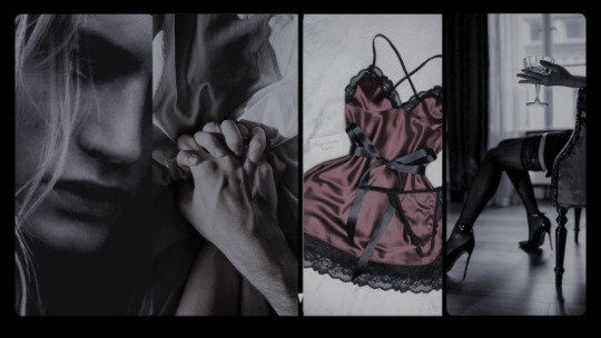
Who Taught You How to Love Like That? - Chapter Three
Pairing: Modern!Aemond Targaryen x female character (third person) Warnings: Sugar daddy/sugar baby dynamics. Smut. Oral (f receiving). Mild angst. Word count: ~3.1k Series masterlist
Chapter summary: The dinner date happens, and much more besides that.
Author's note: No gods, no masters, no tag lists. Only scabs community label fics. If you find yourself tempted to slap a label on this, please block me instead.
She hasn’t been able to shake the memory of Aemond’s lips since they kissed on Wednesday evening. He’d dropped her home shortly afterwards, letting her know he’d pick her up at 7pm on Friday. Since then her tummy has fluttered every time he crosses her mind. If she closes her eyes she can almost taste the red wine and cigarettes on the plushness of his lips as they’d pressed eagerly against her own.
She knows it is foolish to wish for something more, to expect their arrangement to be something other than transactional, but that kiss had felt like he meant it, so she allows herself a tiny slither of hope to believe there is the possibility for a genuine connection to blossom between them.
Relieved when her last minute annual leave request for Friday is approved, she gets to work on making sure she looks her best. She intends to spend the day face masking, exfoliating and shaving until she is the very picture of perfection for her dinner date.
She’s startled by the buzzer to the flat, rushing to the door to answer the intercom. She lets the delivery driver up, assuming it’s something Mysaria has ordered, but balks when three parcels are handed to her, each of them with her name on.
She opens the first, it contains a black floor length Ralph Lauren off the shoulder gown with a thigh high slit. She holds it against herself in front of the mirror, she knows Aemond is generous to her, but she is still awestruck by the sheer extent of how much he is prepared to spoil her.
The second package is a pair of Jimmy Choo black suede open toe platform sandals with a stiletto heel and delicate ankle strap. She turns the shoes over in her hand, marveling at them, but also wondering how on earth she’ll ever manage to walk in them.
Her phone vibrates and she’s unable to keep the Cheshire cat-like grin from her face as she sees it’s from Aemond.
I saw the tracking information for my gifts update to state they had been delivered. Do you like them?
She fires off a quick response.
I love them :) Thank you xoxo
It’s only after she’s set her phone back down that she remembers there’s a third package, hidden among the wrappings of the first two she’d opened. Her eyes widen as she unwraps it. Agent Provocateur. Aemond has sent her lingerie.
Her palms grow sweaty as her heart races and her thoughts travel faster than her mind has the capacity to keep up with. This clearly meant he anticipated something happening between them this evening. What man sends a woman underwear if he doesn’t expect to see her in it? She isn’t experienced at all. What if he’s disappointed? What if he asked for a refund? Fuck, can sugar daddies even ask that of their sugar babies?
She is broken out of her mild panic when Mysaria comes home. “You in?” She calls out as she closes the front door behind her.
“In here.” She shouts back from her room.
She hears her flatmate toe off her shoes and then pad towards her. She leans against the doorframe, eyeing the packaging and clothes that lay scattered on the carpet and lets out a low whistle.
“Daddy been spoiling you? Lucky girl!” Mysaria says with a grin, which disappears when she sees her worried expression. “What’s the matter?”
She holds up the Agent Provocateur lingerie box by means of response and Mysaria nods in understanding.
“Nothing needs to happen until you feel ready. Why not just try it on and see how you feel?”
She sucks in a steadying breath, attempting to calm herself. There was no harm in trying it on.
It turns out to be a playsuit of sorts. An underwired, padded quarter cup bra with a basque constructed using satin covered black boning and satin straps to create a cage-like effect, complete with suspender straps with gold-toned sliders, with subtle, matching black satin bows. Inside the box is also a flimsy black lace thong and black silk stockings.
“The man’s definitely got taste.” Mysaria says, helping her into it.
They’ve had to boot up her laptop and look up the lingerie on the Agent Provocateur website in order to figure out the intricate series of straps and clasps, and she can’t help but notice the eye watering price that’s listed alongside it online. Fuck. There was no way Aemond wasn’t expecting to sleep with her.
She stands in front of her full-length mirror and runs her hands over her body, looking at the way her breasts sit within the cups of the bra and how the straps of the basque dip and flare with the natural curve of her waist and hips.
“It looks different on the model on the website.” She says nervously, chewing her lip. “What if Aemond doesn’t like it?”
Mysaria snorts derisively. “Girl, please, that model has been airbrushed to shit. You are real and you look hot as fuck. Daddy’s gonna lose his mind when he sees you in that.”
“You really think so?” She asks, turning slightly, still studying herself in the mirror.
Mysaria gives her a playful swat on the backside. “Oh, I know so. Now let’s finish getting you ready.”
Two hours later, her hair and make-up have been perfected by her flatmate, and she stands wearing the dress and shoes that Aemond had gifted her - she has done several practice laps of the living room in the heels, to ensure she doesn’t fall over - the lingerie is snug to her body underneath.
Her nerves disappear the moment Aemond steps out of the car to greet her. His long silver-blonde hair is loose. She has never seen it all down at once, it falls thick and lustrous, well past his shoulders. Yet another well-tailored black suit hugs the broadness of his shoulders and the length of his long legs.
Any uncertainty as to how she ought to say hello dissipates as he cups her jaw and presses a soft kiss to her lips.
“Hi.” He murmurs, keeping her close. “You look beautiful.”
“Hi yourself.” She whispers back. “You don’t look so bad either.”
He helps her into the passenger seat and the drive is spent in comfortable silence, though this time his hand lays a possessive hold on her knee whenever he’s not shifting gears. It leaves tingles across her skin in its wake and the gesture makes her feel lightheaded.
They pull up outside a restaurant called SOLA and Aemond takes her hand as he opens the car door for her.
“I took the liberty of choosing this place because it has a Michelin star. Never actually tried it myself.” He tells her as they walk in.
The dining room is small and intimate, elegantly decorated with an abundance of leafy green plants and sculptural lighting, but she is struck by the distinct lack of other diners.
“Why is no one else here?” She whispers to him as they’re ushered towards their table.
He smirks, watching her take in her surroundings with wide eyes once they are seated, his one seeing eye studies her closely. “I hired the place just for us for tonight. Wanted you all to myself.”
She giggles at that. Such a show off. She expects the food to be equally as flashy, a display of wealth for the sake of it. However, Aemond has ordered ahead of time for the both of them, with choices that suggest a more refined palate that goes beyond merely wanting to splash his cash.
They dine on Kindai bluefin tuna and oysters, paired with crisp white wine and the conversation flows as effortlessly as the wine.
She finds out that there isn’t much in the country from a business standpoint that the Targaryens and Hightowers don’t have a hand in. His father had worked to build an empire alongside his partners Otto and Daemon, prior to his death, and much of it has been left for his children to take care of now that he’s passed. Aemond oversees most of the legal aspects of the business, which is unsurprising to her considering how sharp his mind is.
He listens intently as she tells him more about her history degree and love of fine art. It saddens her when he tells her that originally he’d wanted to study history and philosophy, but had had to give that up to pursue a career in law when his family’s expectations were laid out to him.
It’s obvious there is an abundance of complexities and drama surrounding his family, but she knows better than to attempt to unpick all of that now, especially when the evening is going so well.
Her skin feels heated every time he reaches across the table to gently stroke the back of her hand with his thumb. His eye contact is intense and with every moment that passes she finds any apprehension she had about sleeping with him simply fading away. She wants him.
“Dessert?” He asks, as the meal draws to a close.
She shakes her head with a slight smile. “Couldn’t eat another bite.”
“A pity.” He says, taking her hand and tugging her from her seat towards him. “I’m still absolutely ravenous.”
“For what- oh!” She gasps as he sits her on the edge of the table in front of him, lifting the skirt of her dress to the side by its thigh slit.
He hums in approval as his eye roves over the bottom half of her lingerie. She feels like there isn’t enough air in the room, her heart hammers wildly against her ribcage as his hands run up and down her legs. His thumbs stroke the creases where her thighs meet her pelvis as he drinks her in.
“W-what if one of the waiters sees?” She asks nervously, squirming against the heat that pools between her legs.
“Well, I suppose we’d better put on a good show for them.” He tells her with a raise of his eyebrow.
He hooks two fingers into the lace of her thong, pulling it to one side before he leans forward, groaning appreciatively as the flat of his tongue strokes gently through her folds.
A soft moan escapes her. No one has ever taken the time or care to do this to her before, she is unsure of what she’s supposed to do in this situation, but the thought leaves her mind entirely as Aemond begins to flick his tongue against her bud before suckling it harshly. She leans back on her elbows as he devours her with his lips and tongue, doing her best to stifle her noises by biting her lip, her chest heaving with the effort to stay quiet.
Her hands fly to his head, burying themselves in his hair as she bucks against his face when he speeds up his movements. Sounds of enjoyment rumble in his chest, sending shockwaves all the way through her body, causing a telltale tightness to rapidly build within her lower belly.
She finally falls apart, shuddering atop the table with a strangled cry when uses the tip of his tongue to draw tight circles against the most sensitive part of her. He pulls away, his face shining with her slick as he lifts her underwear back into place. He grins, wiping his mouth with a napkin.
“You okay?” He asks.
She nods, feeling dazed. “Yeah…just…I need a minute.”
Aemond chuckles, smoothing her dress back into place. “Understandable.”
“That was…wow.” Is all she’s able to say once she feels lucid enough.
Aemond stands, helping her from the table. “The bill was taken care of in advance. Let’s head back to my place. I want to be somewhere where you don’t have to stifle those pretty noises you make.”
His hand sits higher on her thigh on the drive back. A mixture of nervousness and excitement has her pulse thrumming from thoughts of what he’ll do to her, of what he’s just done to her. Nobody had ever gone down on her before, but now Aemond has, and on top of a fucking restaurant table of all places.
Aemond lives in the penthouse of a modernised high rise. It’s minimalist. All of the fittings and furnishings are a combination of matte black and shiny silver chrome. It’s clean almost to the point of feeling sterile. It’s obvious he doesn’t spend a lot of time here.
She grins when she sees the elderly doberman raise her head from her bed as they walk through to the living room.
“You must be Vhagar.” She coos softly, kneeling and offering a hand for her to sniff. She scratches gently around the dog’s ears, giggling at the way she narrows her eyes in satisfaction, lifting her salt and pepper snout towards the ceiling.
“She’s not normally fond of strangers.” Aemond muses, as he kneels beside her, ruffling Vhagar’s head.
“The trick is to approach from their level and offer your hand before you try to touch.” She tells him. “Most animals that don’t like people just haven’t been approached by the right ones.”
He stares at her for a few moments, a small smile upon his lips, before he finally breaks the silence.
“Can I get you anything?” He asks, standing and walking towards the kitchen.
“I’m good, thanks.” She follows him and they hover by the kitchen island, simply looking at each other before he surges forward to kiss her.
The force of it feels like it knocks all the air from her lungs, it’s hungry and possessive and she returns it with equal enthusiasm, whimpering as her tongue meets his. He dominates the movement, his hand cupping the back of her head as he backs her into the bedroom.
She topples back onto the bed at his soft but insistent shove. Black sheets of a no doubt ridiculously high thread count feel like buttery silk around her as Aemond kneels before her to tug off her dress.
“Fuck.” He mutters as she lays before him in the lingerie he’d bought for her. “Yeah, we’ll be leaving this on. And these.” He grips the heel of her shoe, as he places a kiss to the inside of her ankle, before letting it drop again.
She watches, transfixed as he sheds his own clothing. Aemond is a work of art. His chest and abs subtly toned, he is all lithe, corded muscle, and she clenches at the sight of him. He is already hard when he strips all the way off, and nerves nibble away at her as she looks at the sheer size of him. Long and thick, lightly veined with a blush pink tip, her mouth waters slightly at the sight, yet there is a part of her that worries it might hurt. She had only ever slept with her ex before, and despite her inexperience she knew enough to know he wasn’t well endowed, nothing compared to this.
Aemond crawls over the top of her, trailing hot, open mouthed kisses to her neck and collarbones that make her writhe beneath him, each one sending warm ripples of arousal through her.
His fingers dip between her legs, pushing past her thong to stroke at her. “Shit,” He hisses. “Still so wet for me, I don’t even have to prepare you.”
He takes a condom from the nightstand, tearing it open and rolling it over the length of him before repositioning himself between her legs.
They both suck in a sharp breath as he begins to push inside, the stretch of him against her sensitive walls is both too much and not enough all at the same time.
“So fucking tight.” He grits outs, his grip on her hips vice like as he bottoms out.
He lays like that, forehead rested against hers as they both adjust, only daring to move his hips once she relaxes.
His strokes are smooth, even and precise, tapping a spot inside of her with every thrust that has her clutching his shoulders and moaning his name.
“Feels so good.” She mewls desperately as his hips piston against her own.
“Oh she likes that.” He hisses, almost mockingly, placing one of her legs over his shoulder and pounding harder into her.
Her eyes roll back at the sensation, her hands grip frantically at Aemond’s biceps and then the bedsheets beside her as he rubs at her clit with his thumb in tandem with each of his thrusts.
“You gonna cum again for me, pretty girl?” He asks huskily. “I can feel you squeezing me.”
“Fuck!” Is all she’s able to cry out in response as she feels herself tighten and spasm around him, her back arching off of the bed with the force of the pleasure that washes over her.
Her own release triggers Aemond’s and he snarls, holding her tight against his chest as he stills and spills into the condom.
He pulls out, depositing it into the wastebin and pulls her into his arms.
She feels utterly spent, boneless and dazed in the wake of what she’s just experienced, but Aemond isn’t prepared to let her doze off just yet.
He moves down the bed, unbuckling each of her shoes and removes them. He ushers her to the bathroom with a firm tap to her thigh. Once she’s finished and settled back into bed with a glass of water, he begins to slowly unclasp each of the straps of her body suit, softly rubbing and kissing each of the indentations made by the bones of it as it falls away from her body.
“You’re gorgeous.” He whispers to her, stroking her hair as she drifts off to sleep.
She awakens the next morning, surprised at how refreshed she feels considering the events of the previous evening. She smiles to herself as she snuggles into the luxurious feeling plushness of the bed, thoughts of how good Aemond had made her feel playing on a loop in her mind. She is startled slightly when she rolls over to find his spot empty.
A note has been left on the bedside table.
Sorry, had to run. Have transferred you money for cab fare - A.
She sighs. She hadn’t expected breakfast in bed, but she can’t deny the sinking feeling in her stomach at the fact he hadn’t bothered to stick around. Rummaging through her things that lay scattered on the floor, she retrieves her phone to look at the time when she sees the banking app notification.
£5,000 from A. Targaryen. Her heart twists painfully in her chest. That wasn’t cab fare, it was payment for last night.
733 notes
·
View notes
Note
Well, I honestly haven't played the finished version either, but my friend is playing it with their partner so I usually get their reactions, but the overhaul has caused some really funny bits of miscommunication, because sometimes they were telling me about something and I was like "??? Huh. That doesn't sound right." And I only found out that they just rewrote that guy nearly from scratch earlier today. Or, for example, I was really surprised that my friend seemed to be getting along really fine with most companions, and then I found that they made getting trust points like WAY easier.
I'm also a little surprised that Raph isn't a romancable options tbh. Like come on, people can rail Minthara but I can't have the cambion?? No shade to Minthara, she's a cool character, I'm just saying that maybe some of us would rather take Raphael lol. But hey, I have faith in the modders XD.
Otherwise I think that, from what I've gotten second hand so far, the game is pretty impressive, I understand why they changed some things like the trust points, tho when I'll play it I'm pretty sure I'll install the mod that makes it a little more difficult again, simply because I'm used to it being that way from the early days of the EA. I also think the finished companion models look great. Karlach got such a glow-up oh my god. Gale looks really great as well (imho he always did but I know that that wasn't always the universal opinion). I think they made Astarion a little less airbrushed, which is good imo.
Most of my criticisms are just "details" - for example I am a little disappointed that they didn't add more body types. For a game that has so many options, to only offer you to be either a twunk or a gigachad, or an "average" woman or a bodybuilder woman...that's kinda...I don't know. I know it's a petty criticism to have, a lot of games will not even let you pick a body type, but these are just my two cents. I think the race options are pretty solid, tho I admit that I'm a little surprised since back in EA there were a lot of datamined dialogue options for Warforged so...what happened to that? I'm wondering if Larian has plans for any DLCs with more races or something, because it just seems odd that they'd just scrap it?
Like rn I guess it must sound like I don't like the finished version and that is absolutely not true - I really like it, I think it's great, I think it's incredible that it's being sold for 60 dollars because the game is LOADS of play time and a lot of replay value, I think the music is wonderful, I love the way they improved the animation, the voice acting is incredible, the new Dark Urge backstory is fantastic, etc etc. But I just have, you know, a few nitpicks, like what I described above. At this point I am actually literally not sure HOW MANY companions there actually are, because back in EA Larian said that the companions released during EA were the ones designed for an evil playthrough. Ok, but...if I am not wrong, the only added companions are Karlach and Halsin? And Minsc, I assume? Which is enough I suppose, I guess I just expected the number of good companions to equal the number of the evil playthrough ones. I have one more nitpick that one is actually a spoiler so I can't say it.
But anyway #modders_give_us_Raphael_romance_2k23 kjdfhkdhd
Yeah!!! I remember in EA, it seemed like getting and maintaining approval was honestly a bit of a nightmare; it definitely seems like it's been made easier in the finished product (and honestly, thank fuck ALSMAOXNSJX)
It always struck me as a bit weird that they would include romance options that aren't companions (like Minthara etc.) and just— completely avoid Raphael, I was 1000% sure as soon as I saw him that he'd at least have a spicy scene
I am... honestly surprised about the body types too? Like, the game has one of the most extensive and in-depth character creation systems I've seen, I'm not throwing any shade at it either; but considering how in-depth it is, it seems odd that there aren't more body types, like... they could've done it; the differing heights on the playable races were done super well, they could've easily included more body type/shape options imo. (I was wondering the same thing about DLC; there definitely seems to be some stuff that was datamined and isn't in the game so far so— ig either there's Quite a bit on the cutting room floor or there's DLC coming at some point)
Ooooooo I am. Very Curious about the spoiler one! I personally do not mind spoilers (in fact, I welcome them, I always end up spoiling myself on everything anyway ALDKALXNSN) so you can absolutely tell me if you'd like to, but! If you'd rather not then that's 100% valid too!
But yes! In general, I do have those thoughts in my mind, but the game seems to be absolutely incredible from what I've seen; the fact it's like $60 for a game that seems so huge and looks so beautiful is really amazing, it's been really amazing to watch the progress through the alpha versions to the full release; almost kinda sentimental in a way alsnalxnanx 😭🙏
(#LarianLetUsKissTheCambion 😔 ALAMALXNAXNA)
1 note
·
View note
Note
About your point on stage makeup: you are probably right about airbrushing making a mess, and looking at Celine Van Gerner's makeup it could easily have been airbrushed. But as someone who is really into Cats and has watched a lot of "getting ready to perform" videos, theatrical makeup doesn't need to be airbrushed. In fact, in the case of Cats, which is literally what Celine was trying to recreate, Broadway performers don't use airbrushes at all, they do everything with facepaint and brushes; which is not necessarily more messy than normal makeup. So technically it would be enough to ban airbrush makeup, not all theatre-related makeup, which is more an aesthetic than a technique.
That said, I agree it would be very long to put on: Cats performers talk about their makeup looks (which are, to be fair, a lot more elaborate than Celine's) taking up to an hour. It would be absolutely impossible to do if the gymnast has another final before that. But I'd argue that is a decision that the athlete and the coaches can take for themselves...
I suspect it's a combination of a lot of things. If it was airbrushed or not there are venue mess issues, timing issues, as I recall Donatella was really complimentary and called it special but sometimes you just gotta be the adult in the room and say "this is not the purpose we're trying to achieve here".
1 note
·
View note