#not gonna be a huge change
Explore tagged Tumblr posts
Visit Tumblr Blog
Explore Tumblr blogs with no restrictions, modern design and the best experience.
Last Seen Tumblr Blogs


Fun Fact
Tumblr Inc. is funded by 13 investors.
Text
ooc:
Yall! due to family reasons I haven't been going to school the past two weeks, well that's over.
I've gotta face my demons (and my mountain of makeup work) amd go to school!
So, I won't be answering many questions till after I get home from school!
#not gonna be a huge change#ive been waking up at noon anyone#just wanted to let yall know#mod speaks#mod answers#ooc#tf2 askblog
14 notes
·
View notes
Text
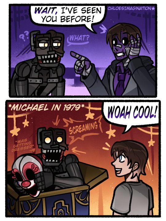
Michael Afton knows the FNAF Mimic’s secret..
#myart#chloesimagination#comic#fnaf#five nights at freddy's#fnaf fanart#mimic#the mimic#michael afton#fnaf puppet#security breach#secret of the mimic#fnaf sister location#fallfest#I can’t believe I still haven’t drawn everything that was announced during the anniversary#IM GETTING around it it folks 😭 so much to draw!#it’s a good problem to have BAHAH#SO steelwool dropped a trailer for their new game!#the secrects of the mimic LETS GOO#like huge day for book truthers first off#second of all I’m glad we’re gonna get more info on the mimic in game#plus fallfest moment it was so real#WITH ALL of this I can’t wait to play it#ITS FUNNY though if the game is set in 1979 like the trailer hints#that means Michael could of totally met the mimic#NOT saying they will but just they could#and that would be so funny Michael upon meeting the mimic already knows em#Lil Michael caught the mimic while it was changing into costume oops!#also a smaller Michael design compared the one I usually draw before he got all moody#maybe that’s the mimics fault BAHAH
5K notes
·
View notes
Text
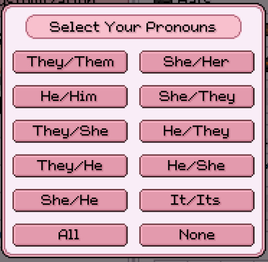
Apparently I didn't know but Fields of Mistria had an update that added more pronouns options for the player and ngl I'm tearing up a bit because no game ever had let me do he/she or she/he pronouns together before and I've always had to conform to one or the other or just they so this is like... huge to me, it's insanely important no matter how small it is so I'm just like- on my knees rn
#demos ramblings#fields of mistria#there havent even been that many conversations where my characters pronouns come into play#but knowing that theyre there and exist and gonna be used is just...massive#and you can change them WHENEVER YOU WANT TO#which is also huge!!!!!!!!#im just... god this is absolutely huge to me#sobbing crying screaming on the floor
955 notes
·
View notes
Text
TWST OC INTRODUCTION - TCOAV
Aurelia Sidheline - Tales of Scars


Name: Aurelia Sidheline
Nicknames: Aura, Triggerfish, House cat, Sidhe
Gender: She doesn't know or care <3
Pronouns: She/her (But any gendered language is fine. ex: ms. mx. or mr are all good!)
Sexuality: Pan-Greysexual
Birthday: February 10 (Aquarius)
Age: 19 in canon TWST age, 21 in TCOAV AU
Height: 5'4 or 162cm
Voice Claim(s): Emilia Clarke
Twisted from: Captain Amelia of Treasure Planet
Unique Magic: She hasn't found hers yet.
Grade: Junior
Class: 3-D
Hobbies: Sailing, Spelldrive, acrobatics, flying(broom), swimming, reading, studying, sparring.
Likes: Smoked salmon, astrology, astronomy, summer, sunbeams, the ocean, strategy games, dogs.
Dislikes: Any soup, inability to read a room, misplaced immaturity, snap judgements, snow, the unrelenting pressure to conform to the shackles and rules of a inherently flawed system in order to succeed in the eyes of others but allows no room for those who are unable to 'get in line' 👁️👄👁️, sand or glitter✨
Fears: Blood, not meeting expectations, being unable to make a difference in her or others lives.
Summary: Descendant of an esteemed noble family of diurnal fae. She intends to dedicate her whole being and life to regaining her family's pride after being unfairly dishonored due to her beastman blood. Nevertheless, she welcomes these trials as a highly adventurous, passionate, and energetic soul.
Her strength in the face of adversity is something she takes a high amount of pride in, even as it is her greatest source of frustration. She had to work harder than most to get to where she is now due to the lowered positioning of her family, but nonetheless, after an ungodly amount of work for someone her age, she's getting there... no, not got. Getting. It's still happening, and it's exhausting. Her greatest strength is also her greatest weakness: after all, one who is known to show strength in adversity will eventually meet too big of an obstacle.
While she struggles to get a handle on her diurnal side, even being delayed in the development of her unique magic, she still has managed to become the captain of RSA's spelldrive team and amass a large amount of respect from the student body. Her admission into RSA cemented a change in allowing any and all genders to apply to the academy (another thing it did before NRC in my au, har har), to the point where she has become a bit of a celebrity on the island. She actively encourages any crowd questioning her admission as well as their own to "get loud and mad and unapologetic" about how the system was allowed to stay so closed off for as long as it did, because "this is what will inspire change in the world, not changing yourself."


CHARACTER PLAYLIST
Author's Notes: meow meow meow meow meow meow meow meow meow meow meow meow meow meow meow
meow meow meow meow meow meow meow meow meow meow
meow meow meow meow meow meow meow meow meow <3
Tags!
@lowcallyfruity @kitwasnothere @cecilebutcher @justm3di0cr3 @skriblee-ksk
@techno-danger @the-trinket-witch @thehollowwriter @distant-velleity @scint1llat3
@beneathsakurashade @qsoap @kathxrat-01 @prince-kallisto @twsted-canvas
@twstinginthewind @tixdixl @sillyslipperybananapeel @jadelover69 @inotonline
#aurelia sidheline#boopshoopsoc#boopshoopsart#boopshoopswriting#twisted wonderland#twst oc#twst#disney twst#oc#original character#oc art#character profile#oc character#character art#twisted wonderland oc#meowm eowm eomewomeowmeoewow#digital doodle#digital drawing#digital art#digital illustration#artblr#artists on tumblr#as of this moment in tcoav- jocia and her are the only ones in rsa who arent men#its not gonna be a huge focus during the story-#but i do want it to be acknowledged to some degree that change is taking place#anywho#are u ready for meow meow x meow meow
215 notes
·
View notes
Text

finn redesign (of this) bc i forgot he had water in him ;_;
#his tail is a prosthetic btw. bc he's a huge nerd /pos#and barnaby wilikers is a wind-up fishy!!!#i was gonna keep the plant in his head (n change it to kelp) but i felt like it made the design too cluttered ....#the design choice is still cute tho!!!! o7 to ppl who draw him w/ it C:#my art#finn#finn dandy's world#dandy's world finn#dandy's world#dandys world
172 notes
·
View notes
Text
What if we were both magic prodigies and it otherized us in different ways and we devoted ourselves to protecting a family member who has general other goals & priorities. What if we both did self-sacrifical devotion in opposite ways.
What if we were dark mirrors of each other and where I've grown overcontrolling you've grown complacent. What if, bought as a servant into a pretty loving home, ownership and control is what love looks like to me, and to you neglected and lonely growing up, love is gratefully taking any scraps of it you’re lent.
By belonging to someone, even if she comes back injured or fails at finding Delgal, she feels like she belongs and is cherished, by owning someone he feels safe in them not leaving him.
She’s what’s tethering him do you see… And he’s the only thing giving her direction and purpose in her state. She needs a compass and he needs a support.
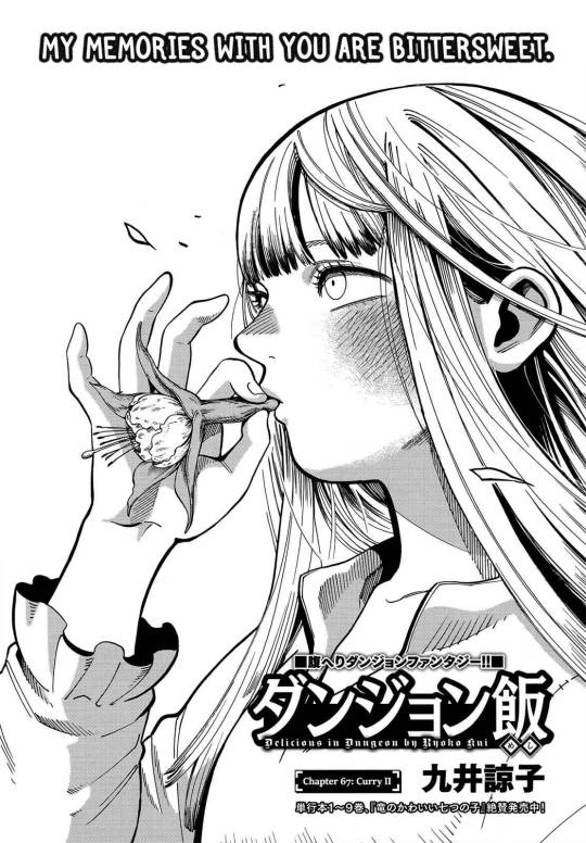
They’re both so out of it 😭 It’s the weirdly intense and unearned mutual trust and reliance on each other?? They’re each other’s weird little comfort codependent teddy bear. Or at least they were headed towards that before SHE DIED THEN HE DIED THEN THEY BOTH FORGOT ABOUT EACH OTHER AND NEVER MET EVER AGAIN. Though she’s also the guard attack hound keeping him safe… And vice versa he heals her and can rewrite her very being with just one wave of his hand. They’re both so so mentally and physically vulnerable both but they cling onto each other. They can’t perceive things accurately but despite it all someway somehow they stumble into something closer to resembling companionship just before they both die. Falin is just that kind and Thistle is just that lonely. Overworked.
We both haven’t lived for ourselves in a very long time, haven’t we.
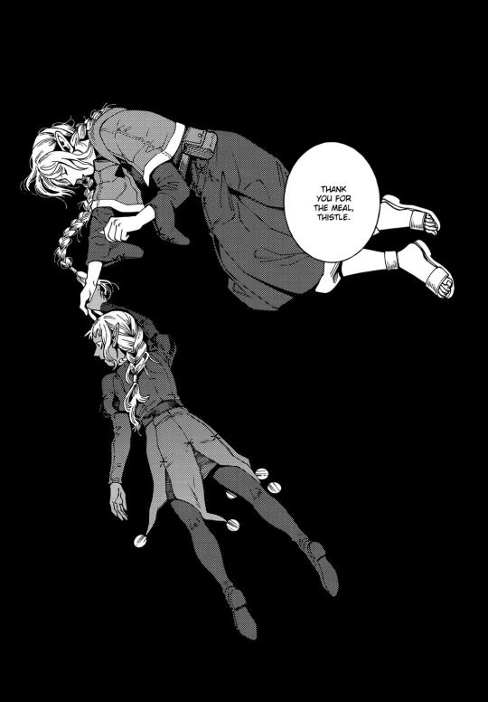
They both have a similar devotion to the people they love but again the difference is that Thistle starts overtsepping while Falin is self-effacing. The other difference between them is that people care about Falin <3 People have given up on Thistle long ago, and he has given people reasons to, while people refuse to give up on Falin. Yaad has a mini arc about it dw about it it’s ok he’s not all alone in the end 😭😭 He reached out for Marcille’s hand but they already all wanted to help him, they just had to be given the chance to, Yaad just had to be given the chance to, it’s okay I’m okay
Hey what if we learned to get in touch with our own identity and the world around us and living in the present again through being in the worst codependent situationship ever.
Falin and Thistle sitting in a tree, sucking on flowers together because they’re h-u-n-g-r-y 💕💕💕
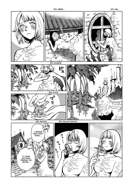
I bet he’s only ever thought of flowers as useless ornaments. Weak weeds. But she shows him they’re tasty and useful and good and pretty in their own right too and deserve existing without proving their worth and waaa <33 Thistles…... Did you know thistles taste sweet if you remove the thorns and eat them?
"Even as a chimera, her kind nature remains" you can’t suppress her in the way that matters. You can’t soothe him in the way that matters. It’s doomed. You’re doomed. It’s all doomed. Save me.
#Spoilers#dungeon meshi manga spoilers#Thistle#falin touden#thistlin#OOOOH UNHEALTHY RELATIONSHIP THAT SOMEHOW WORKS OUT SAVE ME#I need them to be traumabonded kittens to not separate post-canon#I’m seeing a raise in post-canon thistle content/interest which makes me v happy#Fumi rambles#Falin learning to disobey orders with Thistle is one of my fave things. EAT THAT CURRY GIRL!!!! Nvm that it’s gonna get you killed#It’s good for the character arc#Falin and thistle sitting on a web o-b-s-e-s-s-i-n-g <3#This is somewhat of a tldr of my huge thistlin post. Plus some thoughts i had in discord or twitter#Keeping it for another day but tbh if you see their dynamic in canon as her thinking/having picked him as her mate it changes nothing#about her behavior which I find funny. Thistle accidentally claimed himself a parrot mate bc he’s bad with monsters confirmed#Ik my thing of them learning to relax and live in the present moment again is pretty fanon BUT IT’S WHAT KUI POINTED TOWARDS#With her calming him down from a panic attack and eating berries. With the baths for dandruffs. Etc. Thistle hasn’t socialized in a long#time and he wouldn’t if it wasn’t a tool he needed to interact with BUT it’s still socialization and it’s getting him in touch with his#surroundings again even if just a bit slowly but surely!! The Toudens have a superpower in reaching Thistle. Bless#How’s that one post go again. he refuses to develop he's part of the problem he maintains the cycle he's trapped in the cycle.#she's growing she's finding her place she escaped her original role she wants to help people she will never save him she will never save hi#Something something they have to abstract each other bc relationships with humans have always been too charged and unsafe#Only by seeing each other as more concept than person more object than peer can they truly be vulnerable#Like the fuckedupness lf their dynamic and state is WHY they’re so attached. Why their dynamic could be so raw and needy#The stars aligned in the worst way. Mission successfully faile#Tfw we both need to feel needed
235 notes
·
View notes
Text
you’re always changing, rearranging, calibrating, you think far too much
#caption was gonna be marie saying “you can’t keep changing into a dude every time you wanna make a point”#which is HUGE for jordan. but i need to be on my web weaving shit#i wish they didn’t give fem jordan a fuck ass bob girl you can be butch!#but i respect it.#anyway lovee them so cute#caption is marika is sleeping by the Japanese house#gen v#the boys#marie moreau#jordan li#london thor#jaz sinclair#limoreau#marie and jordan#tv stills
496 notes
·
View notes
Text

this blog is 11 years old now 🎉
I drew the siblings ever to celebrate as usual
#loz#wind waker#legend of zelda#toon link#aryll#I wasn't gonna draw anything but then I sketched link real quick and I was like okay wait i can do this#and then my brother dragged me outside ☠ but i still got it done today!#the anniversary is today. tumblr sent me a notification like ravio is 11 years old now! ravio the character is actually 11 years old.#albw released in2013. i received two reminders this morning. ravio drawing soon maybe. coming this year definitely. maybe#arylls like big brother use a damn fork#<- that was the tag when I first started drawing them in 2018#also i noticed when I draw aryll i always draw her in her blue dress so i decided to change it up. i only play 2nd playthroughs of wind wak#r because fun fact: i hate link's green tunic and hat. i finished a first playthrough years ago with a finished nintendo gallery#and then when i want to start a new playthrough i fight ganondorf again go through the credits cry and then BAM new game no-plus#i miss link's green tunic now though. its been so long. im so sick of champions garb...............idk the green is iconic idk#im not a huge fan of it but i think his base form should be green again. with the hat. let him look doofy as a default again#he was green in echoes of wisdom but i need them to follow through after again.#i didnt finish echoes of wisdom yet (SOON IM TRYING IM STUCK I NTHE SONIC ADVENTURE 1 WEB HELP) but what I saw of Link there?#he was kinda terrifying lmao its always funny to see that link is so extremely competent because i am not. that boy efficient#im stuck in the sa1 web because everyone is always talking about how good it is. so i played the pc port and. its apparently awful idk it i#thats just what sa1 outside of emerald coast plays to me tbh. but the dreamcast is supposed to be better. and i own a dreamcast. free me#i played on gamecube too. 12 years ago. it made me sick. maybe one day i'll install some mods that make it play better#why does it feel like the month is over when its only january 6#i played sa1 as a kid btw. just emerald coast tho. ALSO I DIDNT BUY A DREAMCAST FOR THIS I ALREADY OWNED ONE
56 notes
·
View notes
Text

yeah this is gonna take forever
#behind the scenes#it's gonna be a while yet till I show this house again so I'm ok sharing#but there's a reason I don't really make generational houses lol#3 huge bedrooms 3 bathrooms and a garden dear god#also the light there is so funky the color of house change between this kinda green yellow you see to the exact blue of garden gate
61 notes
·
View notes
Text
nickel and balloon would be so much more interesting if people explored the way nickel became everything awful that balloon used to be but so much worse ironically all in the name of "protecting" everyone from that history repeating. and not softboy tsundere yaoi or whatever is going on in those tags rn
#meeple.txt#inanimate insanity#iii they could so easily make me hate you.#nickloon arc was the worst thing to ever come out of iii#unnecessarily long and stupid and hilariously poorly written#i actually feel insane seeing how many people just accept it at face value as The Canon#i know it Is canon but i dont care. Heart❤️#we need to bring back the fandom energy of collectively rejecting the shitty writing#nickloon arc did not happen its ok. take my hand#in my heart nickel digs himself a deeper hole of denying he did any wrong and everyone at most tolerates him#fits his character built up by s2 so much better and parallels other characters too#somewhere deep in his head i feel like he knows hes wrong. but by god it should not have been that easy to ''fix'' him#hes going to deny it until it kills him bc that means facing any regret or deeper feelings he doesnt wanna deal with#and that means admitting he made mistakes which is a huge blow to his ego#and his Cool Tough Leader personality#hes not gonna give that up so easily#and i dont think its in character for him to change within the timeframe of the show tbh . at least with the time they have left now#thats like a post canon Maybe to me#the only way ill accept it really
75 notes
·
View notes
Text


wait, that elias?
#huge shoutout to @sepezzz elias design this is very much inspired by it. go look at it#im so serious if i never draw another person manspreading in a fucking office chair it’ll be TOO SOON#anyways.#the juxtaposition truly is crazy hahaaha right people change in the weirdest of ways#i like thinking about how they both present themselves. elias understands he works at Important Academic Research Facility so he still#sooort of tries to look somewhat official. but well he also gets away with what he can#he has that vibe of Yeah i work here and im kind of important but i’m chill. i know how to chill#meanwhile that other freak is just like i am going to make this body look presentable or so help me god.#he’s the Head of the Institute he can no longer have whimsy okay. and listen it’s not because i think jonah is that boring and would#dislike piercings and funny socks or whatever. i think he’d like those. but see he needs to make this believable that elias truly has#changed okay. and also like i said he is the Head of the Institute he needs to look Super Normal And Unremarkable#anyways i think it’s funny how elias’ whole thing is that he tries to distance himself from his family image and tries really hard to Not#end up like a rich asshole. and then. well.#(looks around) So i think about this man a normal amount.#i could write like 20 thinkpieces on both of them but instead they’re gonna make me do college essays about like language and shit.#myart#the magnus archives#tma#elias bouchard#oh my god it is actually un fucking believable how much i think about him every day#if this becomes a daily elias blog yall will just have to deal
63 notes
·
View notes
Text
i know i shouldnt dwell on stupid opinions like this but a while ago i saw someone complain that Applin was a boring concept bc its just a worm in an apple and i was FLOORED. this iirc was in response to smth about gen 1 designs being boring as well
its not just a worm its a Wyrm its a pun. that is a concept. maybe you don't like it personally but to say its objectively bad is certainly Something. not every pokemon has to be based on a myth or something else fantastical to be a good concept. you Need "boring" pokemon for the dex to feel complete, if Everything is Cool then nothing is actually cool
"gamefreak is running out of ideas" yeah there's a billion fish pokemon but they're all actually very different to each other, lanturn is an anglerfish and lumineon is a butterfly fish. say what you will abt gamefreak rn its probably warranted but imo the one thing they still do right 100% of the time is unique concepts for each pokemon. the execution can be debated but the fundamentals are always there
#clai speaks#does this make sense#i get so annoyed every time i see the ''they're running out of ideas!!!!'' thing parroted all the time i had to say SOMETHING#like yeah you're gonna find some pokemon boring. theres a thousand of them now with all different designs#theres no way all 1000 are going to cater to you specifically. impossible#but to then fault the ENTIRE THING. get mad at people when they like the mon you think is lazily designed or boring or whatever#sorry not every pokemon can have the lore relevance of cosmog or reshiram or ogerpon? i guess????#you Need some toned down concepts for a good creature collector. or any game with a vast array of enemies to fight#are you expecting to go to route 1 and find reality-bending dragons there?#honestlyyyyy i don't actually even think gen 1 designs are Boring. yeah they aren't at the same standard as modern mons#but for the time they were perfectly acceptable. its been almost 30 years yeah things will change#maybe i;m just mad bc i'm a huge fan of several ''boring'' mons. fearow is so bland but i love it a lot#all the regional birds actually. no 1 unfezant defender#idk i should stop here i'm rambling too much. point is. i just wish people would stop treating opinions as objective fact#you dont like applin. thats cool. others do tho stop being pushy about it ok#i realize now maybe its hypocritical to complain abt others having these opinions its just. the way they always present it irks me yknow???#ahhh whatever. i think i;m making myself mad now JHDBJHBHJF#guy cares too much about pokemon opinions pt 126736
28 notes
·
View notes
Text
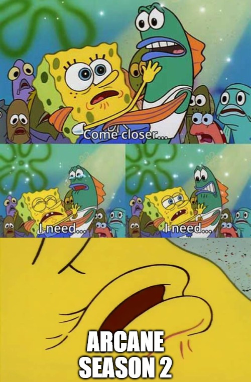
#BRUHHHHHH I NEED ANOTHER TEASER I BEG YOU RIOT#ITS BEEN THREE YEARS I CANT WAIT TO USE NEW CONTENT FOR GIFS LMAO#personal tag#dont look at me im just here to complain about content drought lmao its really not good in fostering a healthy fandom ngl#because ppl will just hyperfixate and consume media for like a month and then the fandom goes poof right after lol#i miss all the people scrutinizing media every week i miss all the essays pumping out when content arrives#these days its just.... nothing lmao i only really still have arcane in my mind because of fanfiction and a lot of fics have been inactive#ik we're getting new stuff in a few months#and ik we're not in canceled shows hell but like#i really hope that if theres season 3 we're gonna get it a bit more regularly#i really miss it when content was like weekly or every 2 weeks because ppl and the fandom are wayyyy more active during those times#binge culture and netflix sort of changed it lol#i miss it when fandoms were huge!!! i miss it when it was so CHAOTIC lmaooooooooo#I MISS WAITING FOR LONG ASS HOURS WAITING FOR CONTENT TO RELEASE EVERY WEEK!!!! I MISS IT!!!! that was like what 12 years ago LOL#I KNOW arcane is special with their 3 year drought because it takes time to make arcane#but like..... idk man i miss content lmao#iirc they took too long to make s2 bc they have no idea if s1 would be even renewed#so i hope s3 will be a bit more regular now#anyways im gonna go bye bye
95 notes
·
View notes
Text
Ough tomorrow if ppl are interested i can talk abt my new oc ideas from today bc Im actually really excited about them 👉👈
#thunderclap#i know I can't draw as fast or as much anymore but hopefully i can show stuff soon even if its from my sketchbook#which ive taken up again at least for a little bit#i have plans for HR that I mentioned earlier today and i also have plans for CD that Im really hyped about including a bunch of design#tweaks and i also started working on a new map for it too! which im really excited about bc I'm putting more thought into it#and im gonna change graves' hairstyle too and im rly excited for that as well#and also back to HR im really hyped to be putting the other ocs in it and having everyone fight and interact it really fit so well instantly#its actually making me crazy like if this works im gonna feel like such a huge genius fr
139 notes
·
View notes
Text
🪄Happy Birthday to the best human sorcerer ever!!!🌟

Ok here I go rambling about him you can skip
Ahem As I have said on Simeon BDay I ADORE smiley characters mostly and sure Solomon is one of that with his various versions of smile from sweetly cutely to that suspicious smug even the cast said it's like he hiding something.
And I like all of that if it's his happy smile or that means he's having I love it all no matter what. He can shove his homemade food into my mouth and weak stomach and I will still appreciate every bites of it. As long as that cute smile is on his face
Cmon you already saw how down bad he is and how protective he is, I love when he calls MC his adorable apprentice like wow this guy THIS GUY.
Anyway I'm still mad at that NB lesson I can't stand seeing him sad AT ALL. If the bracelet gonna break and I can't form a pact then whatever WHY IN THE WORLD DID I HAVE TO SAY HIS FOOD IS AWFUL that's sound like "Solomon you're awful" to me and I don't even see any choice to apologise him afterward. You see how much he's down after MC said that?? It breaks my heart
Also I love Kawata-san voice so much I even have debate inside my own head whether I like Simeon or Solomon more and jump to conclusions that I just like them equally.
As Kawata-san got that gentle and soft voice how can I not fall for this sorcerer (said about Kawata-san everyone should listen to his songs about fish it's fun I like his uta no onii-san mode)
I love sanma no samba(sanma's samba) lately it's fun you should listen to it not sure if he uploads it anywhere else aside from Instagram but yea you should
This might not be it about him but I will stop here for now
#solomon bday countdown24#obey me fanart#obey me solomon#obey me bd#happy birthday solomon#guess who change draft for this in the last minute after having a huge exam#me yes#speed run and im gonna sleep now
53 notes
·
View notes
Text
nick’s voice lines got me like
#TO THIS DAY#always gonna be nick’s girl fr#he was like my first HUGE fictional crush#he changed my brain chemistry i think#left 4 dead 2#left 4 dead#l4d2#l4d#nick left 4 dead 2#nick l4d2
56 notes
·
View notes