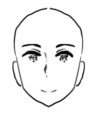
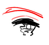
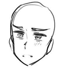
#nose and mouth and eyes here are really simplified
Explore tagged Tumblr posts
Visit Tumblr Blog
Explore Tumblr blogs with no restrictions, modern design and the best experience.
Last Seen Tumblr Blogs


Fun Fact
Tumblr has been providing a Korean-language service since 2013.
Text
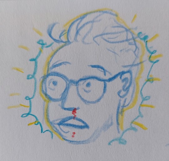
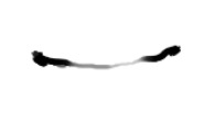
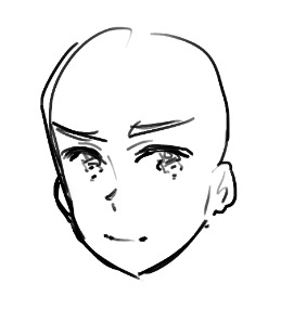
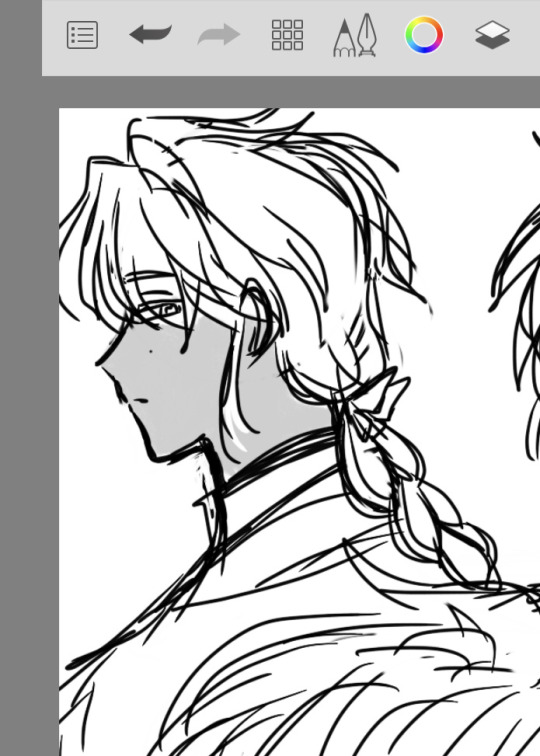
a newt sketch!
#i got his face shape right!#pacific rim#newton geiszler#it's that jaw curve that's key to making him look like himself i think#and his forehead#nose and mouth and eyes here are really simplified#my art#unscientific aside
25 notes
·
View notes
Text
Rating the FFXV official minecraft skins
Of course ffxv has a fucking minecraft crossover, but since theres not really that many popular major characters they have made some.... interesting picks for this. let's take a look


the chocobros. the guys. yup. thats them. its hard to see gladio's nose so it kinda looks like his eyes are hella far from his mouth.
either way they all look gay as usual 10/10

ardyn's look here is a little less detailed than i'd want it to be. it doesnt capture the look of all the layers he wears (maybe it needs more contrast?). his mouth is so wide for what. also i want his hat. where is it.
give me the hat. 7.5/10


lots to talk about here. regis is looking pretty damn accurate. luna is a little bland, even with her normal clothes being white i feel like there could've been more detail. the rest of these capture the general vibe tho the level of detail is unequal smh. i like how cute iris's outfit is.
overall, luna 6/10, the rest 8/10.

i was lamenting the lack of tits on cindy but the wise @orangenuggets let me know its bc of the top surgery. 10/10

aranea, wedge, and biggs. i pretty much only remember aranea, and honestly there should be another version of her skin with the helmet that shit went hard. i like the hat on biggs, even though i had to double check which one he was oops. the helmet for wedge looks a little awkward it doesnt feel like he's a character here
10/10, for aranea and biggs, 7/10 for wedge


this is what i call the "why are you here" section. we have evil science guy, that one blond bitch who like immediately explodes and dies, the fucking nifflheim emperor, gilgamesh??? daemon ravus??? whoever the fuck this is???? why are you here. who wants to play as any of these guys except for like. ffxv minecraft roleplayers.
the skins are accurate i guess. 5/10


they decided to put some of the enemies from the game in here. as someone who hardly remembers any of them its similarly as "okay. why" to me as the last group. the tonberry is cute and kinda dinky looking. i really like the mindflayer design surprisingly... that def brings it up a point
overall 8/10 for these guys


MASCOTS YAY, these are all pretty cute and bulky, really gives off the costume feeling. the chocobo bigass beak is adorable i like it a lot 11/10

gentiana's design here actually goes way harder than i thought it would. she slays 20/10

now for the astrals! shiva is so blue. i need like 10 more of her thank you. 10/10

the god of being sososo mad at everyone. i think if there were more raised textures on the body it'd be cool ykwim? 9/10

its ramugh. if only you could remove the leg walking animation so he floats ominously. i suppose there's mods... 9/10

titan. his design was pretty simple already but somehow this doesnt look like him to me? am i crazy? 7/10

bahamut that stupid god that i hate. i hate how sick this looks. i hate him. 10/10
and last but not least.... the design that sucks the most......

LEVIATHAN. WHAT THAT THING. 10000000000000/10
i think the lesson to be learned here is that you can tell how good the original design is when you're forced to simplify it. and also dont make minecraft skins of an angry water snake thing.
#shitpost#final fantasy#final fantasy xv#final fantasy 15#ff15#ffxv#noctis lucis caelum#prompto argentum#ignis scientia#gladiolus amicitia
155 notes
·
View notes
Text
Bolts4Brains Update 1/31/25
Expect me to babble about every detail whenever I post a 2 second WIP.
This is the Paranormal Powerhouse Chica solo of Bolts4Brains. It was really vivid in my head. I just used the instrumental. There's no lipsync here. If anything, it's more synced with the beat.
As you can clearly see, I only have Ballora's roughs done. Funtime Freddy is warning her of the technician's presence.
Her normal spin before she whips around like "what!" at Freddy was a bit tricky, but then I remembered her spin from SL is a straight-on full body animation. It's mostly a silhouette, but there are indicators of which way she's facing. So I pulled the frames I needed and used them for reference.


You may or may not have noticed the way I drew her neck.
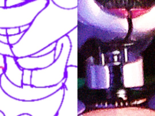
Her neck casing is very segmented, and her actual endo neck is a bit of a complex shape. So in my cartoon translation, I turned it into a sort of shirt collar. The fancy kinds that flare out in the back. I may or may not close the gap in the plates. The one right before her neck starts however, I'm keeping and just coloring in black. Her endo neck will just be funny tube shape.
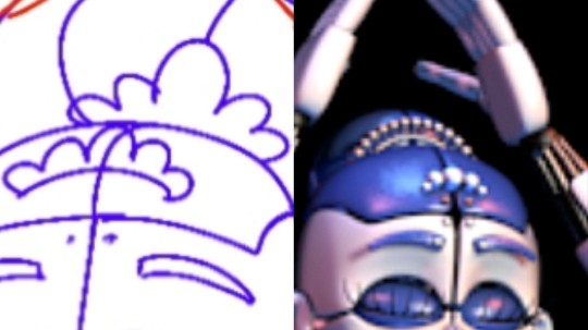
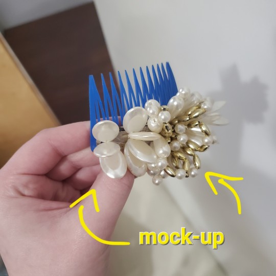
I simplified her hair beads to a one-shape tiara that, realistically, would be held in with a comb.
It's very easy to want to draw Ballora's skirt like a normal tutu, because yknow, ballerina. But her skirt is even more a simple shape than Baby's. I'll only draw the skirt on a compete X-axis if it's a squash frame. I also got rid of the puffball extenders. [Remember, I'm going for model accuracy with a few tweaks to make it cartoon friendly.]

Man I thought the paper sketch for the storyboard was good, lmao.
It was important I pull this expression off, because her face is built for a smile. I don’t want to the animatronic's expression to carry too much facially. They have to be robots in ways other than design. I'll break this rule entirely if it's for one big expression, as shown here. Rarely will I make their mouths move like humans.
This is pretty self explanatory.
Gotta change a couple'a things, but Ballora has the easiest endo face to cheese. All those wires are on points of expression. You can tell I did it from memory, because I defaulted to Ennard around the nose bridge. You might be surprised Ennard isn't the easiest for me, but that's because his weird mouth and jammed-in eye make for some perspective obstacles.
#fnaf#five nights at freddy's#fnaf sister location#sister location#ballora#2d animation#masq draws#bolts4brains
75 notes
·
View notes
Note
How do you recreate the Hetalia artstyle so well
ok so.. .uhhhhhhhhhh honestly i dont even know how. which is why i am obviously qualified to make YOU, yes you, the person reading this, a tutorial
i psoted an incomplete tutorial on the hetalia art style some few months back and when i look back at it now, some things are just straight up wrong or need clarification (also its the same post where i accidentally sent multiple death threats to a random sex worker thinking they were just a porn bot oopsies) so if you guys still remember that, forget about it! all of it!!! this is a brand new, more accurate guide on how to draw himas style!
(quick warning though im just a weeb not a professional teacher by any means so dont take this as gospel and dont get mad if i got something wrong or something is confusing)
himastyle tutorial! (the better one) part 1
(link to part 2 here)
ok lets start off with the
HEADS

this is just the way i start drawing my heads personally. if i had to describe it, its basically a simplified stylized version of the loomis head method. proko has a good video on it! just give that a quick watch then take a look at my step by step guide
but besides this, there are some important things about the head that you should remember
the shape of the head is generally rectangular
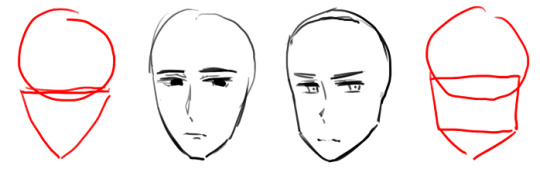
compared to more typical ikemen styles, hetalia characters have a more rectangular head. HOWEVER their chins taper off to a very triangular shape. rarely do the chins flatten out like the guy on the left.
2. shorter face = younger/more feminine appearance

well... self explanatory. you can see in the diagram how changing the length of the face gives a character a more feminine/childish look.
if you feel that something looks kind of off, feel free to change it, but if it looks okay then lets move onto facial features!!!
NOSES:
ok so this might seem a little weird but i like drawing the nose first. its right in the middle of the face and is generally the easiest to get right. it also kind of acts as a divider between the eyes, especially useful when you're drawing in a 3/4 angle

which kind of look something like that i guess.....
or that if you want something less extreme
anyways while hetalia noses are kind of inconsistent they generally have the shape of these three lines. feminine/childlike characters have a smaller and subtler nose though
noses also never face fully straight ahead, so when drawing a front view, the nose slightly faces right or left (tbh himas characters rarely face the camera head on, so id refrain from drawing frontal views altogether but thats just me)
anyways lets move on to my second favorite part of the hetalia art style
EYES:
the eyes are the most important part of himas style. if all else fails, you can always recognize the style by the eyes. luckily for you, the eyes really arent complicated compared to other anime styles :D here is how i do it:

(feminine and childlike characters have bigger eyes)
you have probably noticed this but the pupils hima draws now has a more squiggly teary-eyed look compared to the pupils he drew then...

i subcounciously do a mixture of the two because i got used to drawing the old type, but if you wanna draw the new type of pupils just take note of their squigly shape and that they have one dominant highlight in the upper-middle area. uhhh.. or if youre like me just draw the old eyes as if you have parkinson's
anyways heres a step by step guide

and some fun eye variations!!! you can try using variants if youd like to give an oc a more unique look (you can also try making your own variants too but be careful of straying too far from the style)
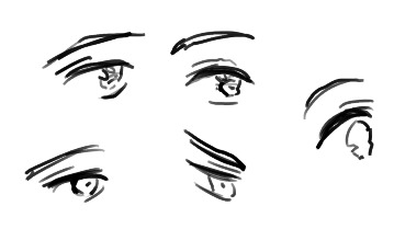
so now about the eyebrow and the eyelid.... uhhh the eyelid doesnt really have a consistent length so just draw it however. feminine and childlike characters have thinner eyebrows but even then eyebrows should never be drawn as just a single line
we are close to finishing the face!!! now we can move onto
MOUTHS:
if you know how to draw a typical anime mouth, then hima mouths is easy peasy!
for closed mouths just draw a curved line with two dark blots for the corners of the mouth

i think that giving them a shaky look makes them look more expressive
open mouths are just random blobs, dont close off the bottom though, and theys till have those dark blots at the corner of the mouth

now then i'll move onto the
EARS + CHEEKS:
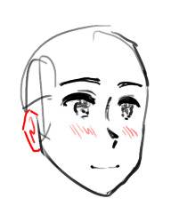
i decided to combine these two since these are probably the easiest parts of the face
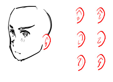
hima's ears are pretty round and don't really vary in shape. inside the ears though....
it isnt very consistent, so don't think too hard about "getting them right". above are some ear variations i drew from one of the latest chapters of the manga

the cheeks are just a bunch of lines that can appear fully, or only on one cheek, or don't appear at all. i think it depends on level of detail, angle, or the character's emotion
these lines do not appear on rendered pieces
also if a character feels especially displeased they will gain heavy eyebags

so yay! we're pretty much done with the face!! look forward next time to where i cover hair, the body, and other stuff idk... i'll link the other parts to each other when i complete them
121 notes
·
View notes
Text
Making Humanoids Less Human
I did make a small post on this, but now I've got the art for a much bigger and more detailed post! so here we go.
I had several anonymous asks that all came in quick succession weeks ago. Every single one of them was basically just a variation on "how would you take (typically humanoid) fantasy being, and make them look less human?"
This blog does not exist for me to just give people original designs for free, my goal is to show off my own personal thoughts about fantasy design and help people figure out how to adjust their own designs to fit their vision better. That means when people ask me questions about how to do something, I want to give them things to think about so they can come to their own conclusion. I don't mind making original designs to illustrate concepts, but a whole flood of "show me how to make this specific thing look different" all at once like that was too much. I'm not answering them all individually, it's just not what I want to do.
But what I can do is show my own thoughts and ideas about how to take any fantasy design and push it further away from "human", and you all can look at my ideas and figure out your own way to do things!
So here are the main 4 methods I've come up with to make humanoids look less human.
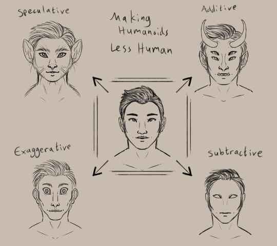
(image description: a simplified drawing of a humanoid face surrounded by four altered versions of the same face. clockwise starting from the top left, they are:
Speculative, drawn as a cat person. Additive, drawn with horns, pointy ears, sharp teeth, and a second pair of eyes. Subtractive, drawn with blank eyes, no nose, and no eyebrows. Exaggerative, drawn with a long face and huge eyes, as well as a wide mouth, narrow nose, and big ears.
end description)
I am personally a fan of the speculative route, which means exploring an alternate root of evolution to create a new design. Through this method, I've created monkey elves, frog goblins, and pig orcs.
the additive option is the most common, I think. adding new feature or doubled features to a humanoid form is a very intuitive way to change the design and make it look less human. you see this in most fantasy and scifi designs, like star trek aliens and the dnd player races.
subtractive and evaggerative are the most common options for people that like the uncanny valley. it's really easy to make uncomfortable designs by removing or exaggerating recognizable features, and they're often used together. Slenderman, for example, removes all facial features and skin color but also exaggerates the limbs and body.
Combining the four methods will give you a really interesting design as well! So for practice I decided to explore an alternate design for Tieflings, the part-demon player race in dnd.


(image description: four examples of differnt tiefling designs using the previously described methods. the additive example is just offical dnd art of a tiefling woman with purple skin, horns, and a long tail.
the subtractive sketch looks very alien, with a bald head, empty eyes, and no other facial featuers aside from a small mouth. it has three fingers per hand and two toe per foot.
the exaggerative sketch shows a hunched humanoid figure with huge eyes and big ears. the neck, limbs, and digits are all long with claws at the ends of the fingers and toes, and the limbs are also quite muscular.
the speculative sketch shows a bipedal figure with features similar to a giraffe, including a long neck, ossicones, and hooves.
end description)
now, because tielflings have such a distinct look to them, obviously my new sketches don't really look like tieflings, do they? the only one that comes close is the giraffe. relying only on one type of alteration to the human form has left the designs rather empty and lacking in the more iconic traits of the original concept. so i tried a sketch that combined my ideas! it came out looking like a completely different creature lol, like it could be a kobold or something, still not really a tiefling.
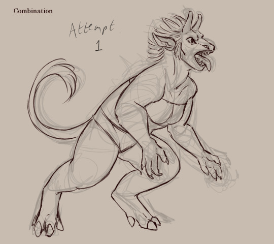
(image description: a sketch of a creature with a giraffe-like head, long tongue, and sharp teeth. it appears to be roaring at something and stands in a half-crouch. it has long limbs with hoof feet and clawed hands, as well as a long tufted tail curled behind it. end description.)
didn't work out. too far into the animal side of the speculative evolution, I think. so I tried again and got a design I liked much better!
(image description: a digital painting of a tiefling leaping back and casting a glowing orange spell. she is wearing a tunic with a corset and detached sleeves, as well as several pieces of jewelry. Her skin is purple with dark patches like a giraffe's spots, and she has a giraffe's ossicones as well as hoof-like hands and two-toed hoof feet. Her tail is long with a tuft at the end. She has glowing eyes and a flat nose, and there is a single sharp tooth visible poking out of the side of her mouth. end description.)
Brought the face back into slightly more human proportions and that helped a lot. Sometimes designs just take a few tries! that's normal.
and hopefully this is helpful to all of you! there are so many ways to alter humanoid designs to come up with something original and unique to you!
#humanoids#making humanoids less human#altered humanoids#non primate humanoids#tiefling#long post#my designs#and btw ai cannot do this#does not matter how detailed you prompt it#it can't really get things to look this original and unique#it can't really blend different features like this in a way that makes sense#you have this power#the computers cannot replicate it
294 notes
·
View notes
Text

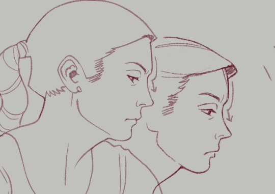
Some studies when I was watching BCS for the first time. I really enjoy getting a good likeness, not just because it helps with recognizability of the fanart but also because it's a really fun challenge. Some tips on how I approach this:
You can see how I work through Kim and Jimmy's faces here: First I trace directly over screencaps from the show, focusing on marking the distance of each feature and its placement on their head shapes. How close is the brow to the eye, nose from the middle of the mouth, etc.
After tracing it out, I do some freehand sketches relying more on the shapes and proportions I've mapped out. The little arrows I've drawn next to some of the faces help me remember to keep note of the way certain lines or shapes curve into others. These are great things to exaggerate, because when you keep these things accurate and intact, the illusion of likeness comes through.
Whether you actively recognize it or not, your brain is always making connections to the negative space relationships between features almost as much as the shapes and positions of the features themselves.
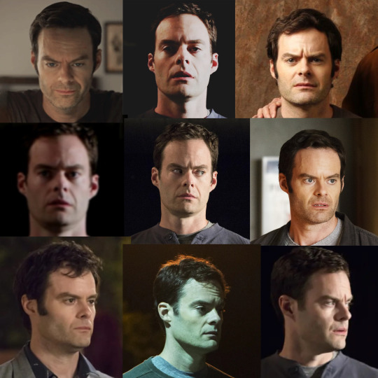

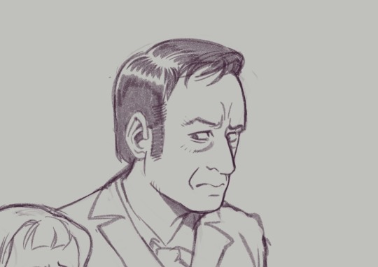
Another thing I like to do is collect much more detailed, organized reference of the character I'm drawing and figure out the harmonies of the face. This is kind of a bastardized and oversimplified Reilly method, where I'll draw straight lines connecting each feature of the face to build landmarks. You can see me working though that here, with Barry.
I started figuring out his head shape, but I also found that the midpoint of his furrowed brow creates a triangle shape with the shape of his nose down to the edges of his mouth. Keeping this shape consistent, even in simplified/stylistic depictions of the character, means he will always be a little recognizable, because the part of your brain that knows what Barry looks like connects with that existing shape.
Playing with those abstractions can help you experiment with how you want a character to look. Don't worry if they don't look perfect. That's the fun of study. Here are a handful of Kimmies, each varying in % of likeness (and degrees of success), but all keeping some key points of her "design". You can see where I start to play with features, removing some things, tinkering with others.
Another little note...since we view these people through cameras, different focal lengths can affect the way their features are proportioned (take a look at the perceived width and height of Hader's enormous fucking head in the upper right corner compared to the adjacent images, for example)–– so this is a good way to keep that in check when you're doing studies. As always, this isn't drawing law. Draw fanart however you please, and feel free to discard all of this information! This is simply my approach, and it is fun for ME!
Thanks for reading.
This post brought to you by my Patrons, who saw this first on July 4 2023.
673 notes
·
View notes
Note
Hiii! Obsessed with ur art style and ur character design skills
Do you have any tips or tricks for depicting different body types and also specifically drawing wrinkles bc it never turns out for me (sad) and I need to draw hot older women
Omg thank you sm ! <3 And if you want some tips, I can give you a lot jfifkd I went to art school for way to long and I'm not one for gatekeeping
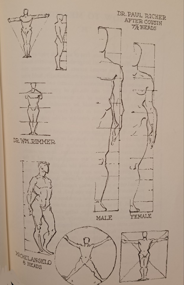
For different body types, just practice figure drawing (and learn simplified anatomy) ! Here are some great resources to do it online (because finding real life models when your not in school is hard)
Figure drawing :
Timed figure poses (nude) on ytb / line of action / sketch daily
You can also look at the books "Morpho", tho it's not free
Artistic anatomy :
You can look at books from Paul Richier (tho he was a doctor not an artist so a lot of it is way too detailed, but you can find some very useful drawings) -> general stuff (p53 for a full man, the rest is more specific but you can find some zoom on specific muscles in movement) (also oops sorry all in french), specifically woman's anatomy p65 (tho it's practically the same thing but this ones more wordy so less fun to look at)
Anatomy for sculptors (great 3d models)
And now old people ! Wrinkles can happen in a lot of different circumstances : when showing emotion, depending on the angles of the face, on fatigue, on weight, if your skull is more or less visible...ect...
But if you want to learn how to draw specifically wrinkles that appear with age, there is multiple things to know :
(Very long talk about lines on faces below, I'm sparing you all not interested to have to scrolls through all that fjdkdk)
-wrinkles show in the areas of the face where there is repeated movement that create a fold that, with time, makes a permanent mark.
-when drawing, you should more or less mark them depending on their deepness. For the deeper ones draw with a black line, less deep a colored one and very subtle just using shading (at least that's how I do it in my style). Also ! They are certain lines that are normal to see on faces of every age, but tend to make them appear wayyy older in stylized drawing (especially with lines). For example, I have pretty defined lines going from my nose to the corner of my mouth because I have defined cheekbones. But if I where to draw them as marked as they look irl, I would appear way *way* older than I am. So unless you want to go for realism, go a bit lighter on the ones going from nose to mouth or the crow's feet (unless laughing) for someone under the age of ~50
- Not everyone get the same wrinkles, faces can tell a story ! For example if you choose to accentuate more the ones at the edge of the eyes and corner of the lips, that could mean your character spent a lot of his life smiling and laughing. In contrary, if you accentuate the ones between the eyebrows and around the nose, that means he sneered and scowled often.
And tips specially for senior citizens (after like 60)
- The quality of skin in older people is different ! The skin is thinner and drooping down (interesting detail, that you prob won't use in 2d art but, around 80yo the skin becomes once again a bit more taut and smooth (this is very subtle) before once again degrading further ! Source : my old sculpture teacher- he used to teach in med school, but I can't find a source online so take this with a grain of salt).
So learning the zones of the face where fat accumulates, then making them shift downwards can be a way to show age. They are some people who have very peculiar faces or don't have much fat there (ex Peter Cushing), but in *most* people it's the case, even if it's subtle.
- You can also make the skull more visible : sunken eyes, hollow cheeks... Even if your character isn't particularly thin, it will make them appear older. But obviously the more fat there is, the more subtle it is.
But really the best tips of all : look at old people :) in pictures or irl
Oops this is very long fjfknfk
#look at my french ass struggling to explain shit in english jfkfof hope it's not too long or incomprehensible#couldn't share what was specifically made by my professors but I did my best sharing shit that was free and usefull#hope that helps jfjfjf#can you tell I'm currently applying to try becoming a prof (maybe)#got a bit carried away I fucking love artistic anatomy and figure drawing and charadesign gjfjkfkf#art tips#art ressources#ask answered
35 notes
·
View notes
Note
Wait but how do you draw faces???? ): Do you have more suggestions for that sort of thing?
oh faces! i'm going to assume you're drawing in a semi(?) realistic/ anime-ish style? that's kinda the style i'm familiar with, if you're going for a super 2D graphical style then a lot of my advice won't really apply! i'll put it under the cut
1) I think the most important thing for faces is to always keep in mind the 3D form and planes of the face. Looking at a lot of simplified art (like anime) is a little detrimental for this because it's easy to think the features of the face are just kinda pasted on
Here's a tool from William Nguyen that lets you play around with any angle and light source you desire for heads! It really emphasizes the 3D form and especially the planes of the face. It's helped me out a ton!
Sinix has a video on drawing faces from any angle from imagination (no reference), again focusing on the 3D nature of faces. For individual features of the face (eyes, nose, mouth, etc) he has a playlist of anatomy tutorials!
- I advise against turning to memory and iconography for features of the face (like 👁️ and 👄) Icons like these are useful when the 2D shape is more important for communicating information quickly like in standardized hazard signs. But for more realistic drawing, you want to rely on the 3D form so these simplistic drawings can be jarring in certain styles when in the context of a full human face. This Proko video mentions that you should treat the features of the face like the eye as just another abstract form and not think of it specifically as an "eye" (Proko's channel is also a good general art resource)
2) basic proportions
This is about where specific features of the face are located. I never really studied this on its own, but I think drawing a lot just got me familiar with it. I'm hesitant to link a specific resource here because I didn't really use any myself;; while this isn't as exhaustive as I'd like, I like how Marc Brunet explains it! (Although I'm not a big fan of how he delineates male/female faces and facial features so black and white...? like don't feel obligated to stick to that specific face shape for female characters TTOTT i think it can get pretty redundant compared to the diversity of the male faces he draws)
- Facial proportions change with age! So you should be mindful of it depending on how old the character that you're drawing is
3) expressions
Drawing faces means you're gonna have to draw expressions, even if that expression is a neutral face. I'm admittedly not the best at this, but try pushing the expressions to their extremes to make them more interesting (of course depends on context). 2D disney expressions/concept art accomplish this perfectly and are a good reference to study from (I personally enjoy Shiyoon Kim's concept art!)
- Note how when you cry, the entire face (+body) moves to create that expression. It's not just a tear falling down the cheek, it's the eyebrows furrowing, the muscles around the eyes scrunching in(?), mucus running down the nose, mouth and lips tightening, eyes and nose becoming red, shoulders hunching up, etc.
- as a small aside I want to emphasize the importance of eyebrows because I avoided drawing them/ moving them around more when I started learning to draw, don't do that!! they're crucial for drawing expressions!
4) diversity
Try depicting facial diversity to make a character unique and more interesting!
- semirealism helped me turn away from the hyperstylization of certain anime styles where a lot of these unique features are smoothed away. Things like wrinkles around the brows/eyes/mouth, eye/nose/mouth shape and size, facial bone structure, facial hair, etc really help to individualize a character/ capture their likeness
- also people of different races have different facial features that you should be mindful of. I don't feel knowledgeable enough to give specific advice on this, but if you're unfamiliar with something please use references!!
This can be challenging especially in stylized drawing, since you tend to have to pick and choose what you choose to depict. For example, I find that trying to draw out all the wrinkles of a character, while it may be accurate, it just doesn't fit my style. I therefore have to balance the amount of details to include to achieve a character's likeness. However, stylization also allows you to emphasize those unique features which makes a character more memorable to me!
as another example this is a personal trick i use but i've found drawing the bottom lip helps make a more masculine face, and drawing the top lip as well for a more feminine face...??? idk why this works for me (and it may not work for you!) but yeah try playing around with what details you include/exclude and see what you end up liking!
okie I think that's all I have for faces..? hopefully i'm not missing anything... again I prefer to let actual teachers give specific advice on how to draw, I feel more comfortable talking about general ideas and referring you to better sources that you can learn from first-hand!
also I think in my efforts to explain the key aspects of drawing faces I've kind of made it seem like I follow strict delineated steps... no I truly just wing it every time I draw TTOTT I just think these points are important to keep in mind so that when you amass more knowledge about them you can internalize it to become a habit!
enough yapping from me thank you for your ask! i hope this can be of help to you 🫡💞
#my asks#art resources#edit just realized this may have been more about how i draw faces like step by step and not so generalized TTOTT#i'm sorry if i didn't really answer your question correctly TTOTT;;;
83 notes
·
View notes
Note
Hi! I was wondering how you draw people’s faces & bodies (specifically babe but thats just cuz I like him :3), I kinda struggle with the proportions of stuff relative to each other, and your art always looks so good! Both like, the style, but also getting them to look consistent. (Also it is in fact me who asked about copying your art again, hi :D) Love your stuff man 🫶
hi anon!!! my art is pretty stylized, and im not the best at explaining but ill briefly explain my process to u!!
this is a p long one so
okay! so!
here are the babes i quickly scribbled up

usually the very first thing i establish is the face shape! i usually do a very vague oval that extends from a circle (generally the eyes are around/ slightly above where the circle crosses the overall oval shape.) depending on who u wanna draw, the oval can be long or roughly square,,, treat it like a playdoh in which u can mold it
* generally i keep the eyes where the ears are, and realistically the tip of the ears is where the eyebrows end but i always break this rule LOLOLOL
THEN i try to figure out the key features of the face: the eyebrows, the nose shape, the eye shape and if there are any other visible feature like deep smile lines or moles
* i draw the mouth around where the bend of the jaw is, and eyebrows are around the same length of the eye (sometimes slightly longer and it ends bending w/ the eye shape). make space for the gap between the nose and the mouth, and the chin
try not to line out every detail cuz it'll look. off??? treat ur lines like shapes and shadows. the eyes are semi circles and the lines of the nose are shadows and stuff like that,, its really about simplifying what u see
style is also what u wanna emphasize. i emphasize their eyes and ears (?) to be bigger and to stick out more. i also shrink necks to emphasize their heads. i also make hair messier and in a sense,, bigger,, than they usually would be.
its all about playing with proportion until whatever looks right to u 🤑
i added a speedpaint below,,
ON TO THE BODY PART!
firstly when it comes to proportion i really recommend practicing figure sketching 🧘🧘 it was super helpful for me when i was still figuring out how to draw anatomy and stuff
i was also gifted this book called bridgman's life drawing WHICH IS SOOO helpful and interesting! not saying u have to buy it, cuz there's plenty free resources to help u like youtube tutorials
i took pics some of the pages
again its all about breaking the body down into bendable shapes and depending on ur style how long these shapes are
and then getting familiar with how it bends and where each part ends in comparison to the rest of the body.
i always start from the head, then the upper torso to get a grasp of how i want to draw a figure's body!
i tend to draw really long limbs, but to keep it looking anatomically accurate enough that it doesnt rlly look "off" i generally keep to these rules
>split the arm into two equal parts at the elbow
>split the legs at the knee, where the thigh + knee is equal with the foreleg (??? the yellow part in the image below) (but i break this rule alot LOLOLOL so. as long as it looks okay)
>the torso length generally varies but imagine it as 3 shapes strung on a string. the middle shape is the smallest and acts as the "knee" of the torso,,
once u get a sense of how the body works shape-wise, u can go silly with the poses (first with reference, then when ur confident enough try without, just to build confidence)

i connect the shapes that dont bend and where many lines connect with a strong line
its important to not treat every line or shape u lay down as the final line. ITS SO EASY TO FORGET THIS!!! u can always erase or redraw or repaint until u get the character right
and then draw everything over and over and over again
thats how u build consistency HAHA
OF COURSE every body is different so mold the shapes to whatever ud like.
++ the key to the confidence in ur figures and posing (dynamic or not) is all about control
and u can really only get that thru experience and practicing and experimenting 🤑🤑
im not a pro (yet) so this is all just from someone who draws too much for my own good.
hope this wasn't too confusing!!!! thank u for the ask anon!
16 notes
·
View notes
Text
WASP REVIEW - CHARMY BEE (SONIC THE HEDGEHOG)


[Image IDs: A piece of official Charmy Bee artwork and an official 3D render of the same character /End IDs.]
Apologies in advance to fans of Charmy Bee. I will preface this review with this: I really love the designs in the Sonic franchise, and I'm perfectly fine with Charmy as a character (apart from some weird things that are supposedly in the comics), Chaotix wouldn't be the same without him! but uh... Yeah, of the characters in the main Sonic games, this is probably one of the Least Good designs. The designers of Sonic Team already don't have a perfect history of making their anthro animal designs as accurate as they could be to the real thing, which usually turns out fine, but how do they fare when making an insect in their trademark style?
Well, let's get straight to it, with this bee's physical appearance. When it comes to the aspects that are fairly acceptable to me, we got only four limbs, and the lower pair appear to technically be misplaced on the body, but that's perfectly ok, given this is an anthropomorphic design. I'm not gonna get mad over a bug with human hands either, given the fact I've done that myself, quite a bit, although I do think it would be fun if they gave him an extra set of arms just to add to the bee aspects of the design. Furthermore, I'm fine with an arthropod mouth being simplified or altered into a more cartoony and/or mammalian mouth, although they could have given him big ol' mandibles and had him be just as cute!
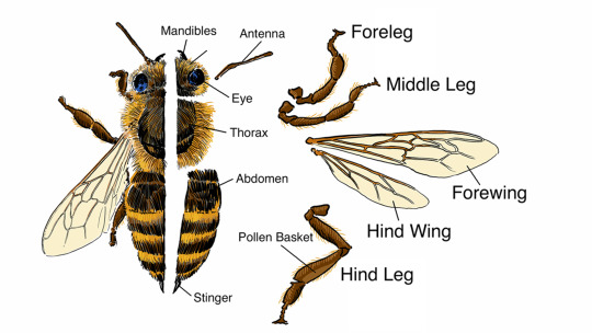
[Image Source: PBS, Nebraska Public Media | Image ID: An illustration of a honey bee (female, worker) showing its body parts as labelled. Mandibles, antennae, eyes, thorax, abdomen, stinger, foreleg, middle leg, forewing, hind wing, and hind leg (with labelled pollen basket) /End IDs.]
Moving on to the rest, though, it's unclear whether or not his mesosoma/thorax and metasoma/abdomen are properly segmented with the shirt on, but it appears as though they might be fused into one segment? His body doesn't seem to have much in the way of segmentation in general, which is strange. The antennae are striped all the way down, which, they should be one solid color. He has only two wings, as opposed to the four on a real bee. He also shouldn't have a stinger, only females such as the queen and the worker bee have these, as the stinger is a modified ovipositor, built to inject venom, as well as for its primary purpose, that being, to lay eggs. Oh, and his helmet would be covering up his ocelli as well!
But then, we get to the most egregious aspects, and... I mean, do I have to say it? Take away the tacked on stinger, antennae, and wings, and this is just another hedgehog. Little guy is about 80% mammal. His arms and mouth area are colored like human skin, and seem to be just as smooth, no chitin nor setae to be found. He has a nose, which, he really shouldn't! He already has antennae with which to smell things!! And the only thing about his eyes that can be called "compound" is the classic Sonic character feature of having gigantic mammalian eyes that are fused straight down the middle like a visor.
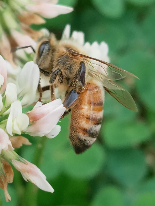
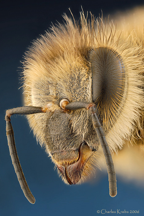
[Image Sources: Jupiter's Wasp House, ie Myself, and photomacrography.net forums, Charles Krebs | Image IDs: Two photos, one of a black, yellow, orange, and white feeding from a pink and white flower, followed by a closeup of a honey bee's head /End IDs.]
It's unfortunate, because I think they could've done something really unique, especially considering how uniquely shaped his fellow Chaotix member, Vector The Crocodile is!
Another thing I have to question is, how exactly does he age? Barring the comic canon here, and the weird and insulting brain damage storyline within, he's canonically very young in the games, roughly 16 in Chaotix according to the English manual, though in Heroes he's instead seemingly portrayed as being about 6. Which brings up the question of if he was ever a larva. My assumption, if he was more like a real bee, would be yes! If we're scaling things up, then probably from birth through toddler age. But he's not quite like a real bee, is he? Maybe he was just, essentially, a smaller version of his current self, as is the case with many other types of animal.
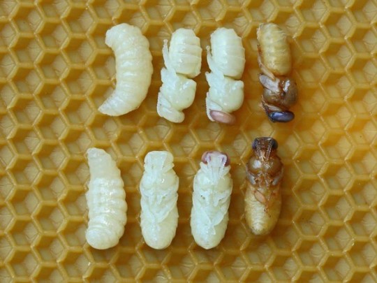
[Image Source: Wikimedia Commons, Waugsberg | Image ID: A photo showing eight bee larvae arranged in order of age as they mature and harden into their pupae /End IDs.]
Small side note, apparently, in the comics, he was a prince, which I suppose it's fair enough if we're translating the many social structures of other animals to something more recognizable to us humans, but if every child of the queen became a prince or princess, then every bee in the colony would be a royal, as all honey bees are the young of a queen. Also, the colony wouldn't have a king! A honey bee hive is a matriarchy through and through! If you want an insect king and queen pairing, you'll have to turn to the termites of Blattodea, as Hymenoptera tends to be a bit of a girl's club. Yet again, this is Ken Penders lore we're talking about here, so it matters not.
So, what can be said about his abilities and behaviors? We already covered that he, strangely, has a stinger, which he uses to attack as most stinging bees do, though he's not very aggressive, which is about accurate. I don't think he's ever shown making honey (like a worker bee) nor feeding on honey, or nectar, nor directly from flowers, but do correct me if I'm wrong! He has, at least, been shown to be able to mysteriously warp between flowers, which is quite odd, yet also quite cool, I would say.
He is also, or at least was originally, quite a fast flier! As the Japanese manual of Chaotix supposedly states "He was the first insect to cross the speed of sound", or alternatively that he was the first to break the sound barrier, depending on which translation you read, although this is clearly not quite the case later on. He's still fast, but not enough to break the sound barrier. Honey bees are, in fact, quite fast for their size, reaching a top flight speed of about 20mph (~32kmh), and this is a series where the fastest thing alive is a damn hedgehog, so I can let this one slide. Though, it does seem like a bit of a missed opportunity to make seemingly the fastest insect in this universe a honey bee rather than, say, a dragonfly, the fastest of which, reach about 35mph (56kmh).
All in all, though, Charmy Bee, while a charming fellow, isn't quite up to snuff when compared directly to the real thing. Understandably enough for the Sonic universe, but still kind of disappointing, taking all things into consideration, and the near complete departure from arthropodal anatomy is enough to dock a significant amount of points. So, sadly, I'll have to give him...
-
Overall: 3.5/10
-
Leave your wasp review suggestion in the replies, tags, or askbox!
16 notes
·
View notes
Text
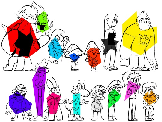
Fifteen Mario Characters in My World of Mario Style
I can’t draw Bowser’s face for the life of me, so I always give him a more simplified facial structure. Similarly, his shell only has four BIG spikes instead of a bunch of smaller ones. His long tortoise neck adds to his body language and makes his “sleep-mode size” look more imposing. I added fangs to his lower jaw compared to how I used to draw him, so he looks less like a guy in a costume.
Junior’s more a manner of stylization than an outright redesign, but the massive ponytail was a fun addition.
Kamek has ganglier proportions and pupils visible through his glasses. A slouch both shows his age and emphasizes his shell.
The underside of Toad’s cap is visible to make it more obviously part of his body. Also, you can’t tell in the above image, but I both darkened Toad’s complexion and made it so that the spots on his cap are permanently blue.
Toadette is one of the more drastically different characters in how I portray her, punctuated by a less chibi-esque look and a single ponytail. Note how the front of her cap is scored, making it look more like hair.
Rosalina has a slightly more gothic look about her, complete with the star tattoo on her shoulder. There’s also a lot more soft shapes here.
DK borrows Donkey Kong Junior’s tank top and conjoined eyes since some adaptations essentially merge the two, most recently the movie.
Wario takes the goggles from his WarioWare outfit and tacks them onto his cap. Rings around his eyes become discolored eyelids and his stubby legs become disproportionally gangly ones.
Waluigi would really rather be anywhere else, as evidenced by his preppy tennis outfit. Better posture makes him look even taller than usual.
Birdo, also known by her stage name “Birdetta”, adopts the conical mouth of her earlier designs, slightly mismatched eyes, freckles for extra cuteness points, and a little jacket.
Yoshi looks like a deformed Zbornak with more of a theropod-like build and a longer tail. Also, he’s totally wearing dinosaur slippers.
It’s hard for me to draw Mario’s mouth under his mustache, so it’s parted a little. Drawing his nose a separate circle with a mustache added on makes it easier to break up his face into a manageable design.
Luigi has a drooping mustache, heavy slouch, and oblong eyes, all to make him look as awkward as possible.
Peach’s VERY stylized bangs and ponytail make her easier to draw, while her minimized nose harkens back to the toads that raised her. Not pictured for spacing purposes is her floaty, crowny thing that I don’t draw the other princesses with.
Daisy goes for more of a youthful, androgynous look with more exaggerated facial features. Still cute, though.
#dullsville#super mario bros#super mario#smb#mario fanart#bowser#bowser koopa#bowser jr#kamek#smb toad#toad#toadette#rosalina#dk#donkey kong#wario#waluigi#birdo#birdetta#yoshi#mario#smb mario#mario mario#luigi#luigi mario#peach toadstool#princess peach#princess daisy#daisy
110 notes
·
View notes
Text
Post-Fall Falls False Starts- Chapter 2: Nightmare Fuel
Previous Chapter | Next Chapter
His first two thoughts on the back of the red van were wordless, pure emotional bursts that he couldn't have described eloquently with a million years to think about it. Anyone trying to simplify those feelings must first acknowledge that no set of words can ever be exactly equivalent to those sorts of unfiltered emotions, and approach the task with that in mind.
The first one was roughly, "Heh heh, pretty clever of me, huh?"
The second one was roughly, "OUCH!"
The universe tore up around him, he hung on for dear life, and his knuckles went white with exertion at about the same time his vision went white from overstimulation. It had been a few seconds- or a few hours, or a few millennia- when he realized how tight his grip was, how much his fingers ached, and how much longer he could hold on- only a few seconds. Hoping desperately that the stillness around him was real stillness and not the product of his fragile polygonal brain shutting down in the face of incomprehensible speeds, he let go and tumbled down onto what felt almost like asphalt, but more alive. He opened his eye. There was another eye staring back at him from the ground.
"Agh-!"
He stood up involuntarily on shaky legs, wringing his hands, adjusting to the feeling of being on solid ground once again. It was solid ground! And the sky wasn't TV static! It was... reddish-pink in some parts and orange, like the color of fire, in others. Another universe, surely, and one where the ground had a heartbeat. Or had that been his own heartbeat playing loudly in his head? He reached down and felt the warm blacktop beneath him. No, it really was pulsating- besides, he hadn't had a heartbeat since the day of his disfigurement. Was this place alive? That explained the eye. That also explained the small mouth he now noticed a couple of feet from him, and the pair of noses growing from the ground several feet beyond that. This place had a lot of orifices, and though he knew it wasn't too different from the faces that adorned many of Elmore's objects, he still found himself averting his gaze.
He turned his attention away from the ground and the sky to check out what was in between them and found a sight both familiar and unsettling: a gas station! Its name: Gas Giant. Its logo: A star with a big red X through it. The exterior was almost fleshy. Everything here was either almost fleshy or entirely fleshy. No way could he stay here, but that was alright, all he had to do was hang on again when the shopkeeper left. All he had to do was go through that vertigo-inducing nightmare of an experience a third time. "Toughen up, stupid, you're almost to safety," said the little demon version of himself on his right shoulder. "Maybe you should run for the hills and stay in this dimension," said the other little demon on his left shoulder, who really should have been an angel, right? Why were both of them demons? Because he was evil? What did that say about his mental state? Oh, well, it was just a creative visualization of his subconscious, and that meant he could reach up with both hands and crush them into dust. He took great pleasure in doing so a few seconds later.
A grotesque, four-armed monster with an eye where its mouth should have been left the convenience store portion of the station with a shopping bag in his telekinetic grasp. It was followed by a more humanoid armless being who glowed white and had an electrical socket-shaped face. In other words, nothing too out of the ordinary. It was much more concerning for Rob to see the shopkeeper, who stood taller than he imagined and wore a black hood that made him look like a cultist, leaving the store with a party-sized bag of chips and a gaze that could fall on him any moment! He ducked behind the van, mind racing. This was bad. He couldn't be found out, not now! Not so close to salvation, to starting over. What had his plan been? How had this ever seemed foolproof? He scouted out a path away from the van and realized to his horror that there was a sheer drop on the horizon. This was a floating island. It was far too large to see what exactly was beneath, but he also had no time to run to the edge and find out. There was nowhere to hide.
Rob steeled himself and decided not to try.
He stood next to the van, looked down at an invisible watch, leaned one elbow on the hood of the van all cool-like, and glanced up for just a second to meet the left eye of the shopkeeper as he returned from his snack run- meeting both eyes had always been a challenge for him, of course.
"Hey there, man," said Rob, voice faltering ever so slightly. For a long while, it seemed like he wasn't going to get a reaction.
Before he received any kind of verbal response, his arm was grabbed, the door was opened, and he was painfully yanked into the shadowy store within once again. The shopkeeper's shoulders slumped and he let out a loud, vulnerable sigh as his silhouette faded into the darkness.
"How did you follow me? Did you steal something back there when you tried to attack me? A portal replicator, perhaps, or one of those keychains that links your soul to the first person you inflict pain upon?"
"No! No. I just held onto the back."
"You-"
The shopkeeper slapped his knee, or at least that's what it sounded like. He laughed! Hard. And then he glared disapprovingly.
"You've got to be messing with me," he said, sounding defeated. "It was really that simple? I'll have to remember to install barbed wire on the back door."
"You were about to leave me in that crumbling static wasteland. You would have done the same if it had been you out there!"
"Why would I have hung onto the back of my own van?"
"I don't- I mean- It's a hypothetical, okay?"
The shopkeeper ate some chips sorrowfully. There was a loud crunching noise, and Rob pondered his lack of a visible mouth, but decided it would be rude to ask his potential ticket out of here about the details of his strange shadow man anatomy. Finally, the crunching slowed, the van- which had been slowly moving- came to a halt, and the shopkeeper opened the doors again.
"No, no, no, wait! Please! Don't leave me here-"
"Go fill up the tank."
Rob gulped, wondering whether this was the mercy it appeared to be.
"Is this- is this goodbye? After I'm done, are you just gonna-"
"Come back after you've filled the van up and we can talk."
He nodded wordlessly and made his way to the pump. The hose also felt alive, but he pretended it was just the diesel coursing through and the idea calmed his nerves a little. As the tank filled up, his emotional state changed, but he found that he couldn't tell whether he was getting more anxious or less, much to his discontent. The machine beeped, the flow stopped (though the pulsating of the hose didn't), and a gaping maw opened up in the fueling station where a card reader might have been. A shadowy hand tapped him on the shoulder and passed him a small velvet sachet that he quickly emptied into the hole, flinching and stepping back when he realized the bag was full of teeth.
"Will the place we're going be as freaky as this place? For that matter, what is this place?" Rob asked, head in his hands, sitting on the floor of the van a few moments later.
"A dimension with no rules and cheap fuels," said the shopkeeper in response. He shrugged. "And, no. Where we're going-"
"Where we're going? So that means I'm coming with you, then! Why didn't you say so earlier? I was so worried, and surely you could have seen that!"
"Don't test my patience, young man. I'm taking you along on a one-way trip, free of charge, out of the kindness of my heart."
"And where was the kindness of your heart back when-"
"I said not to test my patience!"
"Fine, fine. Tell me about where we're headed."
The van pulled out. It was far easier to stomach the feeling when you were inside of it rather than hanging onto the back for dear life, Rob found. How different would his new home- he had taken to thinking of it as a home already- be from his original home? Would there be buses there to ride? Coffee to drink? It seemed like the shopkeeper wasn't about to answer for several long moments, but he piped up with perhaps the least helpful piece of information possible.
"It's a place where you never have to pump your own gas."
"So, are we talking some sort of sci-fi future dimension, or...?"
"No, no, they've just got attendants! It's not the future."
"Does this place we're going have a name? Would I have even heard of it?"
"Perhaps. Well, if I'm being honest, definitely. It's called Oregon."
"Huh? But- I thought you said we were going to another dimension."
"We are."
The all-too-familiar feeling of the universe tearing up erupted around them for just a moment and then, though it wasn't visible from the store, a road stretched out before the driver, and the first vestiges of daylight spilled up over the silhouette of a dark forest into a starry night sky.
#the amazing world of gumball#tawog#tawog rob#rob tawog#gravity falls#the awesome store#van shopkeeper#nightmare realm#postfallfallsfalsestarts#postfALLOFIT
12 notes
·
View notes
Note
this might sound dumb... but how do you do noses? I have a style similar to Adventure Time. But sometimes, I just wanna draw a character with a nose, but it never looks right. Any tips would be greatly apprciately!
Well uh... idk, really. The style I use here is pretty simplified so the nose is too. One trick I have is to draw the nose as if seen from 3/4 even when the character is facing mostly front, so you can keep the shape defined, and it works well with a cartoony style. Use simple shapes, too. Most of my noses are just a L shape or a d shape (or even just a little "o"), with sometimes a dot for the nostril, depending on how it looks.
Something to do is also make sure the other parts work well with the nose. In adventure time, there faces are drawn around the fact that there are no noses, so the eyes and the mouth are very close to each other most of the time. If you'd try to add a nose there, it would look weird a lot of times. So for example make sure to elongate the face a bit, or just space out the eyes and the mouth to make room for the nose.
#idk if that was clear#I feel I am always very bad at explaining my process#especially for something that comes naturally to me like I always drew noses and they're not really the part I struggle with#ask
23 notes
·
View notes
Text
Gola
New BoKris fic hehe.
So...this is like a follow-up to "Romeo and Juliet" (you don't need to read but it's just so you know).
Fluff :D
Synopsis: This is my take on how Kris got Bojan to stay in the band after their hiatus (highly inaccurate because the information about this event is all over the place)
Disclaimer: Please think of these as characters and not the actual people. I don’t encourage anyone to send this to any of the actual JO members nor do I encourage people to force any type of relationship between anyone.
“Saturday, at 10 am.” That’s what they agreed on.
It was 10 am. No sight of Bojan.
Kris sat down at the café terrace... Patiently waiting.
It had been a little over a week since he had been with Bojan. He told him to wait on his decision to leave the band for a while longer because he was going to try and convince him to stay once, and only once.
“And try you will”, Bojan told him, and that sentence has played in a loop in his head ever since.
- Hey. – Kris heard a voice coming from behind.
He looked at his “date” who smiled as he sat down, immediately taking a cigarette out.
- Sorry for being late, I was talking to the producer to wait for just a little longer. – he offered Kris a cigarette, but he refused given he didn’t want to smoke where people could recognize him – I can show you some of the songs I’ve been writing after this.
Bojan glanced at the table: there were two coffee cups, both empty.
- How long have you been here?
- I just got here, the table was just dirty. – Kris lied.
He had been there for about an hour because he couldn’t wait in his home for this meeting... It was his one chance. Bojan chose to ignore the fact that no waiter came to pick up the dirty cups or that the table shook because of Kris' legs' frenetic movement and proceeded.
- So... I’m assuming there’s no song? I don’t see your guitar.
- I figured that would be too on the nose. – Kris smirked.
- What do you have planned for me?
Kris took out his phone, and a pair of earphones and put them on Bojan’s ears.
- I want you to close your eyes and imagine whatever you feel like it makes sense. – Kris told him – but I also want you to think of the sensation you felt when this happened.
Kris pressed the play button on his phone and a voice recording started playing.
“Wait wait wait” Kris’ voice played on Bojan’s phone “I’m just setting this here. Done! Ready when you are!”
“One, two, three” Bojan counted, and Kris started playing on his acoustic guitar.
Bojan remembers that day. He was - and is – stuck composing Gola and he and Kris were trying to find a way to work out the song by simplifying and figuring out what to do next from then onwards.
“Zimsko jutro, hladno gre skoz mene”, a winter morning seeps through me coldly, “Pojejo ptički pesmi pridušene”, the small birds are singing muffled songs, “Ti pa gola tečeš čez valove”, and you're running over the waves naked, “Brez odziva na poglede vse surove”, not minding all the nasty looks.
Bojan felt a hand in his... He wanted to see Kris’ face, so he opened his eyes slightly. Kris had closed his and he was mouthing the words along... He was really into it, wasn’t he? Did he memorize this audio? How many times had he listened to it?
“Gledaš v sonce, svetloba te ne moti”, you're staring into the sun, unbothered by the light, “Prihaja konec ti pa tečeš mu nasproti”, the end is coming and you're running towards it, “Ne skrbi te kaj za sabo boš pustila v trenutku na vse boš pozabila”, You don't care about what you'll leave behind, you'll forget it all in a moment.
Bojan remembers writing this song for his girlfriend at the time, but then they broke up and he lost his inspiration to write the rest...
“Neki se dogaja dej mi zmer utrip”, something's happening, check my pulse, “Berem ti iz ustnc kakšen je tvoj tip”, I'm reading your lips, I know what your type is, “Zdej gledava se, gledava se”, now we're looking at each other, looking at each other, “Čakam da se zgodi”, I'm waiting for it to happen.
He had avoided this song for so long because... he needs a muse.
“I don’t know more”, Bojan, in the recording, jokingly sang.
“What if we go like this?”, Kris played a little bit.
“Boo, too angsty. What about this?” and they went back and forth until they had the final version.
“When will you work on lyrics?”
“I’ll get them by the end of the week. Just gonna study for my finals first.”
“Promise, Bojči?”, he joked.
“Promise, Krisko.” and the recording ended there. Bojan never came back with the lyrics and after months the song is still unfinished.
When Kris opened his eyes, he saw Bojan put his cigarette into the ashtray and he noticed his red cheeks.
- Bojan, are you blushing?
- Sorry, I just... – he looked around – Can we go somewhere else?
After paying, they went back to Kris’ house and settled themselves in the garage. Bojan looked mesmerized at Kris as he tuned the guitar. They were really doing this, uh? Finish “Gola”?
- Why are you using your old guitar? – Bojan asked.
- It just feels appropriate... I started playing guitar with you, so my first acoustic guitar should be used for this.
- Wait, there’s something inside. – Bojan reached for it but was stopped by Kris.
- It’s the receipt.
- Come on, Kris. You are not returning the guitar after so long. Also, receipts aren’t that big.
Kris took a letter out of the guitar.
- I’ll give you this letter when we fill Stožice.
- WHAT!? THAT’S NOT FAIR!
- You don’t believe we can do it?
- I believe we can do it! But I’ll forget about it until then! – he pouted.
- Then stay in the band and we can do this journey together.
- Deal. – Bojan said it imminently – And I hope you keep that letter intact.
- It won’t leave the guitar, promise.
- Hello, Bojan. – Kris’ mom entered the room – Do you want to have dinner with us?
- Of course. – he smiled.
- He’ll take any opportunity to not cook. – Kris commented.
- Hey!
- But it’s true!
That night, Bojan finished Gola next to Kris, and Kris’ mom invited Bojan to stay the night. His mom called him “Kris’ boyfriend” and when a flustered Kris protested saying “That’s embarrassing!”, she replied with “Then you don’t want him sleeping here?” which led him to insist Bojan slept there.
Now, lying next to each other, Kris asked him.
- What did you feel when you heard that recording?
- I felt like I wanted to compose music with you guys for the rest of my life. - Bojan turned to him and grabbed his hand – Everything I wrote without you was soulless... I don’t want that.
Bojan kissed Kris on the cheek.
- I’m sorry for leaving you. That was so stupid of me.
Kris hugged him and they both fell asleep in that embrace...
♫♩♫♩♫♩♫♩♫♩♫♩♫♩♫♩♫♩♫♩♫♩♫♩♫♩♫♩♫♩♫♩♫♩
Afternote: ✨I don't know what to write here ✨
Polaroid Photos Universe | Recommended next: All I know
#joker out#joker out bojan#bojan cvjetićanin#joker out kris#kris gustin#kris guštin#bokris#joker out fanfic#fanfic#writing#polaroid photos universe
10 notes
·
View notes
Text
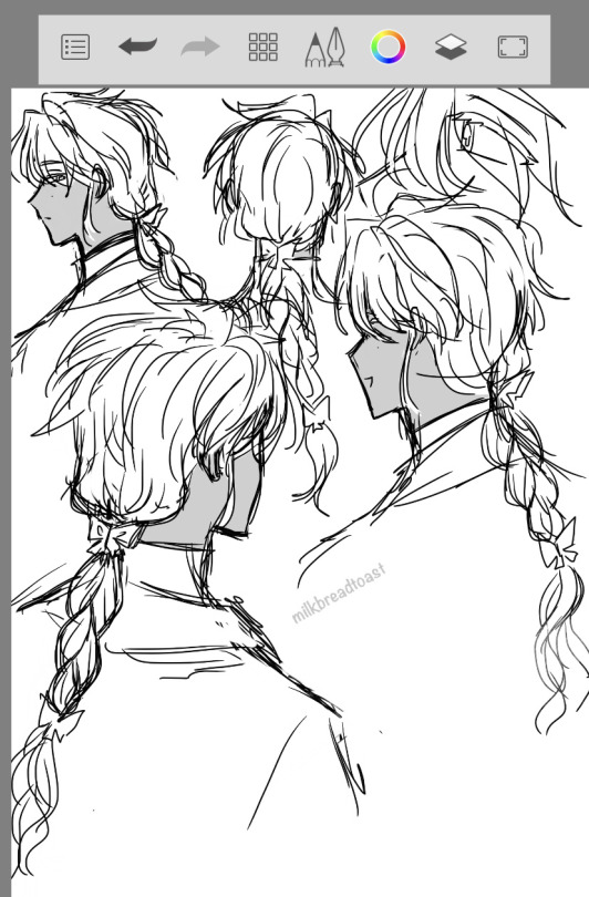
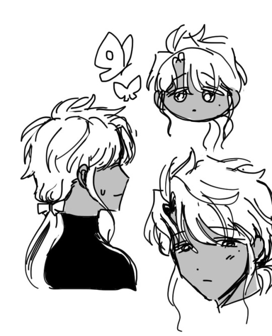
more oc doodles... tested a braid for him!! also made the butterfly motif more obvious w the butterfly clips... i rly wanted him to have them but rarely drew him from the back so...
this post is kinda short so gonna post some old art w commentary under the cut bc i dont think i posted them here before🤧 thought i did but....
(oct 2020) happy to see visible improvement from then heh... this is where i first got him closer to his current design/palette + decided on the purple/yellow palette and the inverting eye color idea... normally pretty and shiny but w a creepy spotted butterfly eye look when using his powers (simplified the dots to just 3 in his current design)...
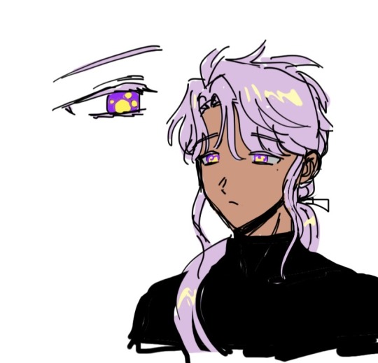
more recent doodles (apr 2022)... these r cute tbh i like the 2nd pic, he looks so fluffy + u can see the butterfly hairtie... but i still wasnt satisfied w his design...
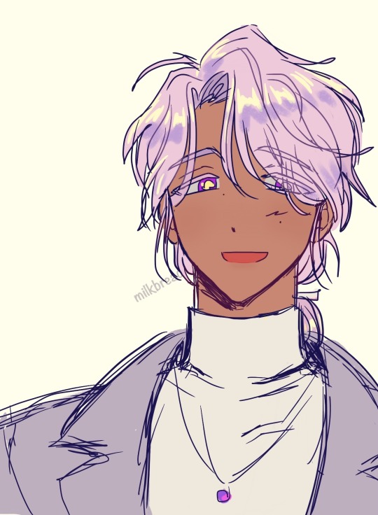
in my most recent attempt at designing him(aug 2023) i changed several things... made his bangs longer for a more elegant look(which is actually closer to how it was before)... figured out how to draw his eyes + eyebrows better + more consistent(had been going back n forth btwn double/mono eyelids and thick/thin eyebrows... finally settled on sleepy double eyelids + thick brows) + i also changed the placement of his moles... (used to be right under his eye; changed to middle of cheek + another near the nose.. aka the txt soobin mole KFJKS I like how this new placement gives him a softer and gentle elegant look?? it's subtle but I like it a lot better... Oh also I made his sideburn locks shorter instead of long and curly and I like this change a lot too... idk it looks cuter to me KJFKS I gave him the long curly ones before bc i thought it'd look more unique but... i decided it's more important that I personally like it rather than just give traits to set him apart... he already looks plenty flashy w his eyes and colors anyway🤧
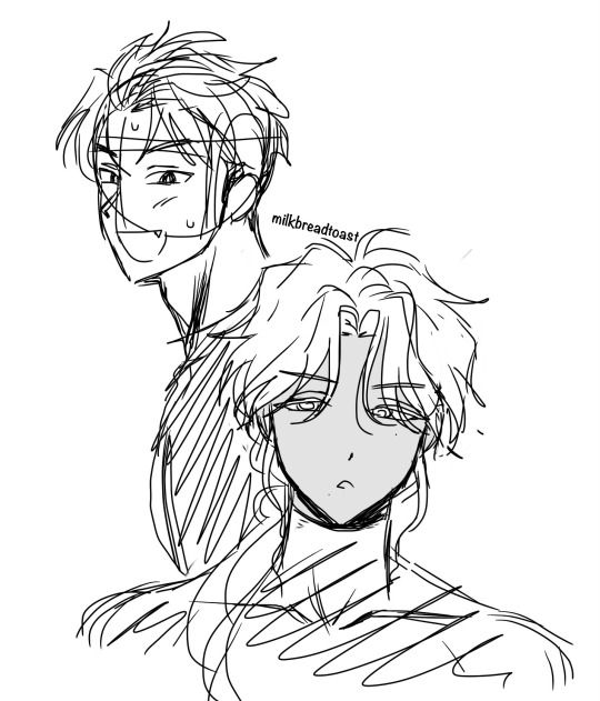
bonus: another pass from p recently (may 2023) where, unsatisfied and wondering how to fix his design, attempted straying further from prev attempts by testing a middle part (and also a mole near his mouth)... but I was actually getting colder and not warmer.... I don't like these but at least I tested it to know that I don't like it!! u can also see a test doodle of the spiky green guy (hyojun) here lol
And finally, here's 1 of his very first design attempts from way back in aug 2019!!! (u can see early hyojun too...)
This was back when I was just starting to figure the current ver of his chara/personality/role in the story... not fleshed out at all but i at least had a vague idea and this was when I decided he would be purple (instead of other palette ideas i had considered earlier like brown hair, orange coding...) But at this early stage I hadnt come up with the butterfly motif, or the purple/yellow palette (he was purple/magenta here) or darker skin... Tbh I consider this a "beta design" bc theres sm thing that were diff/not decided yet but it's technically the same chara ckdbf
I can't fit any more images ㅠㅠ but u can see more concept sketches in this twitter thread... and yea I was testing an inverted eye concept even back then... I really liked this idea so I didn't want to abandon it, and im happy I made it even better since w the butterfly concept *_*
#OC#my art#im happy that im p satisfied w his design now... T^T IVE BEEN TRYING TO DESIGN HIM FOR YEARSSSS#i think the braid is pretty tho... i like that doodle i did on the top left heh#theres no reason for the braid to be upside down but i just like the shape kdjfd#o yea i tested a braid here but#theres no reason why he has to stick to 1 hairstyle...#hes the type to care abt/for his appearance and he has pretty long hair so why not switch it up from time to time#i like keeping a low ponytail look just for consistency but he could have variations of that#+ maybe diff types of braids#the important thing is just keeping the 'cut' fairly consistent
20 notes
·
View notes
Note
do you have any tips on simplifying a person's facial features into a drawing? i love your art because it is so simple yet so evocative, and though your style is fairly cartoon-y, your characters always look like the people they represent. i've been doing portraits for years, and i have a very difficult time letting go of the details and simplifying. it's one of my biggest challenges. if you have any tips or could go over your process for doing that, i would be super thankful. (and no worries if you're not up for it, i just always think "how?!" when i see your drawings! )
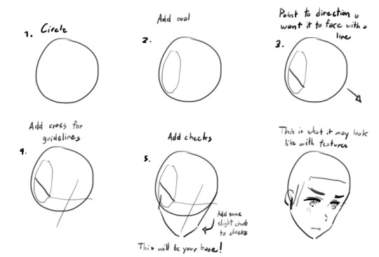
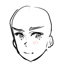
Helloooo!!! Thank you so much! And thank you for the question! I tried doing a step by step thing to show you how I approach drawing a face!
(This goes for anyone I try to draw)
Step 1: Find a ref pic and train your eyes to not complicate stuff!
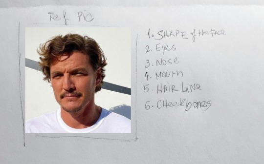
After I have a ref pic I look for what I've decided are the important things in a face that makes it a face (I listed them on the image).
But you may say: well, that's the whole face! Everything on the face is important!
Well, yes. But if you have a list of things you should focus on, makes it simplier!
Continuing!
You must focus on studying the person's:
1. Shape (Face. This also includes the understanding of how the jawline is shaped)
2. Eyes (shape and also placement)
3. Nose (shape of the nostrils, the side lines and placement)
4. Mouth (placement under the nose; the shape of the mustache if they have one; until where the corner of the mouth goes, usually I use the eyes as ref)
5. Hairline (this one is not on number 1, because I usually leave it for last. Drawing the hairline close to what it looks like in the ref, helps you neat the shape of the face, because forehead makes a total difference as I've learned along the years lol)
6. Cheekbones (I do like a good blushing and this could be used as a tool to try saving a doomed drawing lmao *cries*)
Ok! So accessing these elements, let's try drawing it!
Step 2: Doing the drawing.
2.1. It all starts with a ball.

So, like everybody tells you to, I start with a ball.
This helps you not go crazy and limit you area of work! I also devide it in 4 and use the line in horizontal to place the 👀's
2.2. 1st sketch
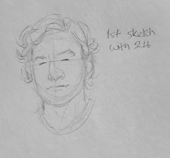
The first sketch is really a moment of trying to control your anger:
- It won't look like anything
- It'll look bad
- You might question life
On the first sketch I use 2H because it's soft and you can work through it on the next steps.
This is where I put all the elements of the list and only them. It's very simple and cartoonish.
(The thing is: I only focus on them and forget the other details you could work on)
2.3. 2nd sketch
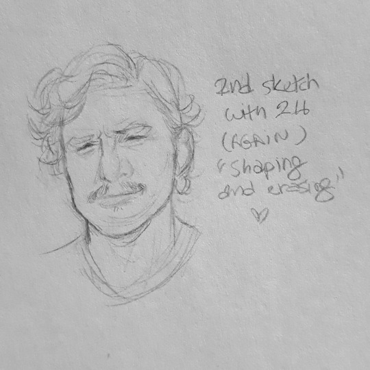
Ok, now things are suppose to look right.
On second sketch, still using 2H, you gotta work more on the same elements, shaping it to look more like the ref pic.
Here is also where I draw eye bags, lines and dimples. But only the ones that are close to the eyes, the nose and the mouth! The ones you can't ignore because they ultimately make the person look like themselves.
2.4. Line art ✨
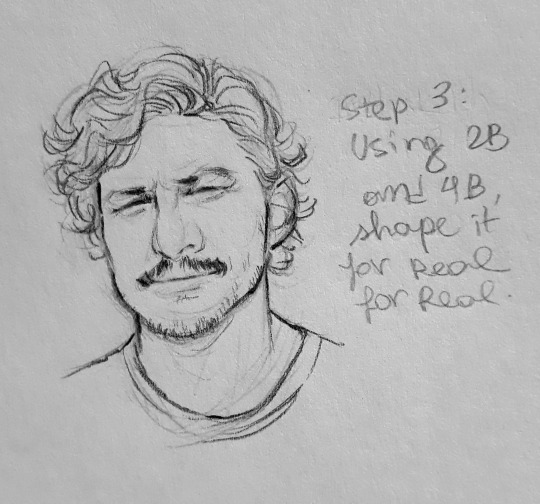
Line art is also where you take a pencil with darker graphite (like 2B/4B) and pray to the gods that you won't ruin everything.
The line art is where you hightlight stuff (imo) and you also give depth!
So focus on places where there is shade... to highlight. (Does this make sense? Absolutely not)
This is also where you gotta work on the hairline.
2.5. Finishing you drawing!
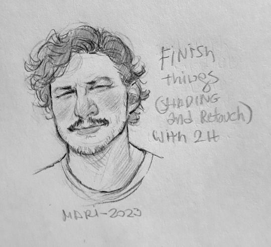
With H2 I just shade during the finishing process.
You shade mouth, under eyebrows, under eyes, nose and cheekbones!!!
So, that's it!
I hope this makes sense and helps you in anyway! This is what I do and what I focus on when I draw faces!
83 notes
·
View notes