#no i have used indesign before but it's been years
Explore tagged Tumblr posts
Visit Tumblr Blog
Explore Tumblr blogs with no restrictions, modern design and the best experience.
Last Seen Tumblr Blogs


Fun Fact
There are dozens of funny blogs to kill time on Tumblr.
Text
i would explain exactly why (except for the shadow ban) it's taking me several days to contact everyone about their recipes but i fear someone would have me admitted
#i swear to god the actual Designing The Book part will be a lot less chaotic than this#i can do impromptu teaching myself a new adobe software to make an entire book. i cannot do social interaction <3#no i have used indesign before but it's been years#p sure ive got it down already now though turns out its piss easy if you know photoshop and illustrator
26 notes
·
View notes
Text
(Re)Bound: Polar Night/Midnight Sun by me (@toomuchplor)


It’s been nearly a year since I started bookbinding, so I decided it was time to revisit the first fic I ever set.
I'll do a post with side-by-side photos another time but suffice it to say, it's not so clear to me that it's like 'first book bad, this book good'.
And if you're like, wow, Plor is posting a lot of binds this week -- you are correct. I'm on vacation this week, but also I'm wrapping up a few things that were WIPs for weeks. Lots of victory laps, but this is the last one!


I did my first typeset in Word before quickly switching to InDesign (which I have for work reasons anyway) so I wound up designing from scratch. (By the way, I’m very happy to share typesets if anyone is ever interested — for personal use only, of course!)
I used Canva to create the cover page and chapter headers in this cute watercolour style. And the end papers are pretty chiyogami from a paper store in Toronto.


I rounded the spine, but it didn’t need backing as the swell wasn’t much. I am still figuring out rounding for sure — the hardest part is getting the text block and spine stable enough to trim the head and tail straight afterwards, at least for me!

Sewn faux double core silk endbands on a 2 mm leather cord core.
I dithered about the case cover art for weeks while I did a million other projects. I knew I wanted to try something new but couldn’t find the right approach or technique to inspire me. Then I randomly tried a paper onlay for a blank book I was making and had my eureka moment.
The cover design is drawn by me in Illustrator, then cut from chiyogami by my cricut. I used a PVA/corn starch paste 50-50 mix to glue on the paper directly to the cover before the gold HTV outline was applied. The gold is partly decorative and partly to protect the edge of the onlay from friction/wear.
I am obsessed with how this looks. It’s quilting and paper art and mosaic all together? I can see myself doing this style more for sure.
One challenge is that once it’s glued up, you have exactly one chance to place the paper onlay on the cover — you can’t pick it up and try again because even with mix, the glue marks the fabric. So you need steady hands and good planning. I’m wondering about transfer tape or maybe even post it flags to help guide me in future projects? I'm pleased with the result but it could be better.
After all that sweating and work, I was paranoid about wear and tear on the paper, so I made a dust jacket. (Shout out to @citrusses for advice and emotional support during lamination time, and to lately for chatting with me and advising me as I did the paper onlay design and work!)
#bookbinding#fanbinding#case binding#drarry fanbinding#sewn endbands#hp fanbinding#drarry#toomuchplor#polar night midnight sun#legal quarto binding#rounded spine#dust jacket
99 notes
·
View notes
Note
That National Geographic leather binding for Yellowstone is fucking Gorgeous!!! (Pardon my Language)
How long have you been binding, and what would you recommend to someone who wants to try it for themselves?
hello and thank you so much!! I worked really hard on that one (and no pardon needed haha)!
I started binding in February of 2021, which means in a few months I'll have reached 4 years. It's been an awesome journey!!
If you'd like to try it for yourself, I'd recommenda few things!
1) You can 100% try out the basics with near free or cheap materials. People typeset in Word or Google Docs or Pages. You can print on printer paper & use regular sewing thread & scavenge board from old books or notebook backs or do a limp leather binding & use no boards at all. You can make paper pamphlets. Any comments I make following this are about my preferences for best results. The most expensive part that cannot be avoided is printing. On the other hand expenses can wildly escalate if you're committing to it; once you are doing leather it becomes somewhat unavoidably expensive.
2) Check out some tutorials from SeaLemon or DAS Bookbinding on YouTube for the physical construction. SeaLemon is really clear for a beginner starting out, but then I'd move to DAS for better technique (DAS also has a beginner series though). I watched DAS Bookbinding videos for three weeks straight before I was able to start, & while that doesn't maybe work out for everyone I do think it gave me a pretty strong basis of understanding for structural techniques. DAS is *really* good at explaining why he thinks you should do something. The structure of the NatGeo bind is basically DAS's video on a rounded & backed bradel binding (but with leather & sewn on recessed cords). There is some good stuff on Tiktok/IG, but watch short-form videos/reels with caution. They move a little fast and I've seen a couple give instructions that can result in structural flaws (not that this is unique to the form, cross-referencing on instructions from any source is a good practice). They are good for if you're looking for a specific technique (particularly modern decorative ones, like cricut use, edge gilding, HTV application). There are also published books you can buy or maybe request through your library, such as Hollander's Introduction to Bookbinding. Renegade Bookbinding Guild runs a whole bunch of technique-specific in-house zoom classes annually.
3) Look to other fanbinders for tutorials on how to format the text (this is because most pro bookbinders do not do both text design & book creation! it's a pretty unique feature of fanbinding). @renegadeguild has some publically provided resources on our website here and more typesetting tutorials for a whole host of softwares (Affinity Publisher is my choice - one time purchase, fuck you very much Adobe InDesign) located in the discord server. Anyone 18+ can join the Discord. The NatGeo inspired book (text & dust jacket) was created in Affinity Publisher.
4) Join a community of fanbinders! It's really lovely. The space has exploded & there are tons of people to be friends with, trade tips, & cheer each other on. I'm part of @renegadeguild and we do a whole bunch of events throughout the year, and we have an in-person retreat every other year. I've met with over 20 different renegaders so far, in three different countries, and it's been such a blast. Definitely the community helps keep up the motivation. Renegade isn't the only community out there though! There's groups more rooted in IG/tiktok circles that have their own discords, plus a number of FB groups. I do think most people who are comfortable on tumblr enjoy Renegade's vibe.
5) While I learned most of what I do online, some things really benefit from in-person learning. If you want to do leather binding I would really recommend trying to take an in-person class. I did two attempts at a leather binding on my own before I decided to hold off until I'd had at least one in-person class. Leather binding can be extremely frustrating, especially when you can easily end up with a book that looks worse than a cloth binding at your same skill level but for double the cost. Imo this is mostly because the leather specific skills like paring, warp management, and assessing a random piece of leather for bookbinding suitability are all pretty tactile experiences, all of which are difficult to assess through a screen and can result in an unpleasantly bulky/stiff/shapeless book if ignored. For example- while this book of mine is a pretty popular post, I don't enjoy holding it and reading it, especially in contrast to the NatGeo bind. Part of this was the material I chose; part was not being able to adhere to the instructions quite well enough; part was just not knowing enough about what I was doing; part is they're different constructions. This might just be a me thing though; I'm sure others have had success with online only tutorials for leather.
6) I'm not going to get into specific tools bc that could be a whole post, but some things are necessary (printer access), some things are necessary depending on style, some things are "makes life easier but only drop the money if it's stopping you from making books out of frustration", some things are just technique-specific tools. Examples - sewing frames are often brought up but are never necessary unless sewing on cords; cricuts & cutting machines are commonly used in fanbinding circles but I don't have one (& don't intend to atm).
7) Don't be shy to offer the author a copy!! Like other fan activities, fanbinding is part of our fandom community ecosystem. Your fanbinding is in communication with the author's story. Giving a bind to the author is a great way of keeping the ecosystem going. I tend to think of binds as a combo of comment, fic rec, and fan art inspired by the fic.
8) Paper grain sounds stupid but it IS IMPORTANT! My personal hierarchy of give-a-fuck for grain: Board grain, spine card grain, endpaper grain, cover paper grain, text block grain, book cloth grain. The only thing I personally sometimes ignore is book cloth grain; but many people will not worry too much about text block paper grain.
Gonna stop there for now. If you've got specific questions or want elaboration, feel free to ask. As with all things, YMMV, this is my own opinions/experience and may not apply in all cases. There's a whole lot of different techniques out there, and it's hard to ever say something is wrong, per se - but I think it's important to understand if a method has an outcome you may want to avoid. Prioritize your goals & adapt for them - what's your goal? Longevity, readability, aesthetics? You might make different choices depending on them. My choices influence the techniques I chose to focus on, the tools I buy, and thus the final aesthetic of my binds.
32 notes
·
View notes
Note
Hi uzlolzu! Your art is so unique and captivating you've been my favourite artist since I was a teenager! I've recently graduated uni now and have done some freelance jobs here and there and I'm wondering how someone goes about building a stable freelance career as an illustrator. Can you share how you started?
Hello and thank you! That’s flattering and I’m very happy to hear it.
I can! Or I will try. It’s a pretty tricky question to answer, because my path into this has been organic and, in a way, one of least resistance.
In short: I was born into it.
Not in an “I’m the chosen one” way, of course, but in that my parents are artists and designers. Both currently work as graphic designers and have worked with illustration in the past. My mum is also a tailor and my dad is a wood carver (my sister does wonderful ceramics and has an education in tailoring too). Art and design, and working in those fields, is a core pillar of my family life.
All of this was pretty convenient for me regarding pursuing a career in illustration; I’ve always had access to all digital and traditional materials I’ve ever needed to draw or paint or do any craft (my first tablet was a 1999 Wacom Intuos 1), I grew up in an environment that was encouraging even when nothing was said, AND I had my parents’ extensive professional network available to me as soon as I was old enough to work. That last part has probably been more important than my level of skill ever was. I was lucky. I hit the ground running. So I can’t really remember a time where design or art of some sort wasn’t already my “career” (in my mind, I had an art career when I was four). It took quite a few years before I understood that I could technically have other jobs.
That said, my first paid jobs were photo editing ones that I got through my parents, not illustration. They were touch-ups, extending, cropping, resizing, masking… Those things that Photoshop often can do on its own now (or at least streamline) but couldn’t when I started almost 20 years ago (though PS and I have been friends for almost 30). Eventually, I got to do small illustrations for the same publications I had edited photos for, as well as some others. These kinds of illustrations still constitute a large part of my work hours, though in greater numbers and larger batches. They aren’t the flashiest, but they pay well. I also still work with my parents often. We’re all self-employed, but it’s really a family business setup at the core.
Moving outside of my inherited network…: I got my table top RPG-jobs by becoming part of the Swedish indie and semi-indie TTRPG scenes, which aren’t very big. It was straightforward to be visible enough and many people had their own (often tiny) projects that needed illustrations. Some of them contacted me. I think a not insignificant portion of the Swedish TTRPG game designers know who I am now, but I started small. Role-playing is one of my biggest hobbies, so networking came naturally. In my experience, these are flashier pictures to make, but rarely pay well (with some glorious exceptions). Anyway: If you have a specific field you want to work in, get involved in that field. There’ll probably be more people who want illustrations than people who illustrate in it.
Then there’s the concept art. I worked as a concept artists for Ubisoft Massive for a few years, and got this job partly through the game developer school (The Game Assembly) that I went to and partly because of my skills, I guess. But TGA and its proximity to Massive was instrumental. Game art is the only profession I have a formal education in.
So, when I started “officially”, I was already in a pretty good situation for it. Another important factor in my case, I think, is that I’m comfortable with many illustrator-adjacent disciplines as well, since the “packaging” or context of an illustration has always interested me. I use Adobe Illustrator and InDesign every week. Sometimes I do design work (layouts, logotypes, powerpoint presentations, annual reports, diagrams…), and I often do the in-betweens (infographics. Icons, patterns, other kinds of logotypes…). I prefer illustration and the in-betweens, but being open to branching out has given me more clients and, as a result, the ability to choose more freely which jobs I accept.
Either way. It’s really helped me to know a little something about all parts of a project, planning phase to phinished product. It makes it easier to talk to everyone involved, whatever their position and profession – programmer or printer. I know how to make a book from start to finish. It’s neat.
And, as you can see, there’s a lot of luck involved here and even if I know when I started getting paid, I can’t really say when I started developing the skills and the network I needed. That’s been a life-long process. And, of the two, I think the network has been more important for landing jobs than the depth of any particular skill of mine (though the variety of them might have helped). The more people who know you, the easier it’ll be, and that number of people will grow with the number of jobs you do. And I might as well add that physical meetings have worked better for me than just online contact. It’s easier to remember someone you’ve met, even if it was just for a few seconds.
And to finish off, I’ll add a few work samples that differ from what I generally post on Tumblr, since the ability to work in many styles has also benefitted me:
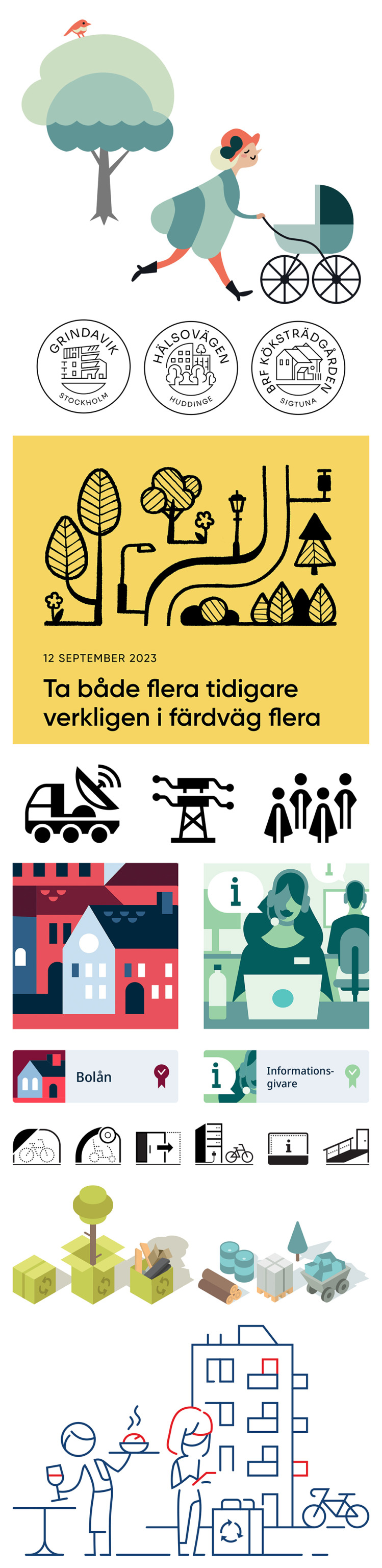
(Don’t let the text in the yellow box fool you. It’s Swedish lorem ipsum.)
19 notes
·
View notes
Text
10 things for 10 people you'd like to know better
Tagged by @sylvies-chen, thanks for thinking of me!
Last song - Francesca by Hozier.
Last TV show - The Last of Us, and before that The Pitt, the latter being one my current obsessions.
Last book - Jfc I'm boring but Book Wars by John Thompson. It's on the publishing industry. I just finished it actually, if anyone is interested it's a great; I was reading it for work.
Last movie - Cap 4. I'm more a TV person tbh.
Favourite colour - This colour
Sweet/savoury/spicy - Savoury & spicy, I don't really have a sweet tooth.
Relationship status: Long-term partnership; for about four and half years.
Last google: Lol where to find the settings for margins in InDesign (one of the many hats I wear, includes designing newspapers and magazines). Boring I know!
Current obsession - Frank Langdon, Michael Robinavitch, Trinity Santos, and Samira Mohan as well as anything to do with The Pitt. This is the first show I've truly been invested in, in a while! Also Lestat de Lioncourt, because I've been obsessed since I was 11.
Looking forward to: In terms of TV, in 2025: The Last of Us, Ransom Canyon and maybe Doctor Odyssey, idk that show yoyos between good and bad. In 2026: The Pitt and Interview with a Vampire!
I'm going to tag a mix between people I follow and people I've seen in the tags, that i'd like to know more about: @drfranklangdon @hart-kinsella @eveningspirit @silverhandy @honorarybimbo @repressionmd , @garymerlow, and @lesbianpraetor + anyone who wants to do it.
5 notes
·
View notes
Note
What equipment and programs do you use to make your art? Your about says you're self taught, what helped you learn? And does anything specific give you inspiration for your current style or what you'd like to achieve in the future? I really like your art❤️
ahh!! hey, thank you so much!! <3 that's so kind of you to say!!
easy questions first: for digital art i use a wacom intuos tablet and paint tool sai, which is the only setup i've ever used. i've been trying to get into clip studio paint but something about it just doesn't stick with me. i think i need more practice.
for comic panels and lettering i use adobe indesign, and export as png to before putting them in sai.
everything else under the cut so this post isn't miles long
i've been drawing ever since i was a kid, but until middle school i mostly just drew animals or little notebook paper comics about animals. i grew up on a farm so there were lots around, and drawing from life is something i think really helped. like, there's a difference between knowing what a cat looks like and being able to pick one up and see how its bones and muscles fit together, being able to watch it change how it moves around depending on what it's doing, whether it's catching a mouse or playing with another cat or curled up asleep, and being able to break down that anatomy and movement into simple shapes. i'm a pretty visually oriented person so knowing how a thing functions or fits together as simple shapes helps me visualize it in my head and imagine how it would look in different poses or from different angles.
around middle school i moved onto drawing people, again from life while sitting in a cafe or at a park. actually being able to get what's in my head down onto paper in a way that satisfies me is something that i think just took practice. only recently (like, late last/this year) have i been consistently satisfied with the way i draw things.
sorry if that sounds weird or clinical--this is the first time i've been asked to explain how i learned to draw and this is the best way i can think to say it.
honestly, finding my own style has been looking at what i like about other artists' styles and trying to figure out how they achieved that. i did a lot of redraws of other peoples' art as a kid. for me, trying to replicate something makes me really think about why i like the way it looks. i try to lean towards a semi-realistic style--i don't like drawing super realistic all the time, i love cartoons and think they have a lot of character--but i also don't want to lose the underlying anatomy or structure because it helps my brain make sense of stuff. so i try to find the middle of the road, where things are simplified but still structured, if that makes sense.
brief tangent... that's why i draw pokémon the way i do. they're not on model, they're how i imagine they would look if they were real animals, based on the sort of animals they're... uh, based on. so like for this piece, because camerupt is a cow/camel hybrid, i looked at a bunch of pictures of cows laying on their sides, what their hooves and skulls looked like from certain angles, etc. and then i could draw what i wanted.
as for improvements, i need to get better at backgrounds and realistic coloring/lighting. color theory is one of those things that i understand... well, in theory, but when it comes to practice and paying attention to it when i color, i need work. and because i've mostly drawn animals and people my whole life--organic stuff--i find buildings and backgrounds difficult, so i tend to avoid them. and i need to not do that.
#thank you for the ask!! this one really made me think#let me know if you'd like me to clarify anything... i tend to get longwinded and distract myself with tangents.#so idk how clear this is? i really look like the charlie conspiracy board meme trying to explain anything to anybody#bc like there's CONTEXT alright#like i deleted a tangent about how much i love hiromu arakawa and fullmetal alchemist and it was a huge inspiration and#like damn dude that amount of granular detail was not asked for lmao#autumn.ask#autumn.personal
15 notes
·
View notes
Text
I am just so, so, so pissed right now.
Two days ago, when I opened Photoshop, it suddenly showed me an error message that the timeout for activating had run out, or whatever, because it was already installed on two computers.
Which makes fuck-no sense. I have actually installed this on... at least four computers, since they tended to die over the years. But never before has it shown me an error message. And there's no reason for it to do so now, since I installed it on this computer well over a year ago, so... why now.
And I can't even do anything about it, since Adobe fucking gatekeeps its support.
If you go to the Adobe website and want to talk to support, you only get the dystopian experience of talking to a chat bot that will tell you that you can only talk to a real human person if you have a subscription.
Bitch, I paid over 600 Euro for this fucking Master Collection, that should have been enough to let me talk to a real person. I should not need to additionally make any subscription, not even the "free trial", to get to talk to actual support.
And that's just the thing. I paid for this shit, I paid ridiculously much money to have these stupid-ass programs on my computer and for no reason whatsoever it's now giving me an error message but despite being a paying customer, I do not get customer service.
The most fucked up thing about it all is that... you can't seem to even buy licenses anymore? There seem to only be subscriptions and... if I only get to use this for a month and then have to pay again the following month, then I did not buy this. Nevermind how fucking overpriced these subscriptions are.
I just want to keep using the Photoshop, InDesign and Illustrator that I already paid for, what the actual, ever-loving fuck.
#Adobe#Adobe Illustrator#Adobe Photoshop#Photoshop#Adobe InDesign#Customer Service#no fr this is beyond dystopian#you are told by a chat bot#that you will ONLY get to talk to a real person#if you get a subscription. even though you ARE a paying customer#what the fuck what the fuck what the actual fuuuck#you shouldn't need that AT ALL because you might have#problems INSTALLING it already? and need support?#how are you gatekeeping Real People from your customers#I just want to go back to using my programs you ASSHAT of a business
4 notes
·
View notes
Text


PARAMORE RELEASED THEIR A24 TRIBUTE COVER TODAY. AND I GOT INSPIRED BY THE LYRICS AND THE VISUALIZER.
youtube
IMAGE CREDITS BC VERY OBVIOUSLY THIS IS AN EXPERIMENTAL PIC COLLAGE PIECE PRIMARILY BELOW DESC (I DID NOT TAKE THE COOL PICS OBV.)
OK GIANT CREDIT BLOCK GO (Freepik and pexels my beloved saved my entire college year lmao):
1 OCEAN WAVES
2 OCEAN WAVES AGAIN
3 YES A THIRD OCEAN WAVE
4 VERY COOL DROPLETS
5 FLAME. OO FIRE PRETTYYY /POS
6 BG I CHEATED YOU INTO BELIEVING IS RAIN
The drawing though is made by my acoustic arse /lh
THE LYRICS ARE TAKEN FROM THE VID I LINKED. HAYLEY'S VOICE MY BELOVED AND FOREVER DEAREST ENTIRE BAND /POSPOSPOS. I wanna sing like Hayley so badly, she is such an idol to me, when it comes to vocals and I wish to sing as expressive as her some day 🤧✨💖
--
WHAT MORE CAN I SAY, OTHER THAN I'VE BEEN EXPERIMENTING WITH SHORT DRAWINGS, THAT TAKE UNDER A DAY TO COMPLETE TO FIGURE OUT SOME THINGS I WANNA DO AS AN ARTIST AND POSSIBLY COMMISSIONS. + These drawings genuinely kinda de-stress so it's been free therapy too, oops. I wanna do more of these vector-style drawings, that are just me taking lyrics and creating these fun collages, of things that inspire me or I like. It's a chill practice and lets my creativity actually do the work for once, instead of my usual need to outdo myself in every drawing and improve lmao. Improvement is cool and all, but dear god did I not realise how hard my need for perfection last year stress and strangle me tf out. I seriously need to re-evaluate the way I approach art as this massive, intimidating medium, when most artists literally draw for fun, and for me it's been like...A Sisyphean task.
--
If you enjoyed seeing this, I might make a sequel with C'est Comme Ca and w/ Marco in it instead and a red BG,, if I want to, I might turn these into a series, just like those aesthetic icon drawings I made of my 2 boys, started Lotta, and IMMEDIATELY lost that sketch due to my USB's death back in 2022 and lost all motivation for art due to that massive loss /neg
--
Not sure what else to add here other than my thoughts that I already did!! Other than ofc, the usual, MASSIVE thank you to my friend Hollowed-Hartlocke for introducing me to Paramore back in 2019 <3
Think I'm done rambling now tho!! OH WAIT. I can add, that I had to actually pull out Adobe Illustrator just to add stretched text for aesthetic purposes. Then I got so impatient with the effects panel not showing me the usual layer-effects and me being too lazy to look up, whether InDesign was the one, that had the usual layer effects I use in an Adobe program or not. Btw still mooching off my college acc that shoulda been dead long ago but just isn't??? LMAO I'M STILL GONNA USE IT IF I CAN ALRIGHT.
OH YEAH BTW. This drawing took 3 hours. NO I'M NOT KIDDING. PEOPLE WOULD PROBABLY BE SHOCKED THAT SUCH A LAZY LOOKING PIECE TOOK SO LONG. BUT I GENUINELY AM RATHER SHOOK THAT I TOOK SUCH LITTLE TIME TO CREATE THIS. TBF I threw MOST proportion checks and canvas flips I do out the window, so there's a BIG chance I will hate this, if I flip the canvas xD ANYWAY I RAMBLED LONG ENOUGH I THINK NOW. JUST ENJOY EXPERIMENTAL ART
^Before-bed edit; Yeah his torso's a TAD too much leaning to the left, it's off-center to the rotation of his pelvis to be in fact, but maybe? I'll roll with this mistake. It kinda gives the piece its abstract nature..I kinda like the mistake?? This is the first time in my life I ever tolerated a mistake I did and now declare it on purpose and will probably build one into the next piece as well. Hell, maybe it'll yield an interesting result. Anyway, it's 12PM as I write this, and I have to get up at 4AM for my train soOooo, yeah, gotta sleep ASAP for school.
I have NO clue again what to 100% accurately tag this, so forgive me if the tags are wrong LMAO, I just will believe what I believe it has overlaps w/ within art-genre.
This piece kiiinda gives pop art??? So I'm gonna tag it as such as well, but but might be incorrect. If a pop-art enjoyer wants to correct me, PLEASE DO. I'm going off the definitions of pop-art I learned in high-school. So I could most def be wrong about me adding this tag in particular. How tf do people confidently tag their posts when I doubt almost every tag I add man. Tagging is the worst part of uploading art to me due to how hard it is to label art really, not meant to be in a genre. xD
Def adding Paramore tags tho bc I NEED to know more Paramore fans out there bc we feel like such a tiny community, when they're literally one of the most influential rock bands of the 2000s and 2010s imho AUGH
#collage#digital collage#my art#digital art#art#artwork#artists on tumblr#character art#original art#vector#vector art#sonic fan character#sonic oc#sonic fandom#sonic original character#experimental#experimental art#abstract#pop art#paramore#pmore#Youtube
2 notes
·
View notes
Text
My process annotation
Process:
I have done some exploration using indesign exploring with shapes, line, colour, opacity. I have done some print testing so I am able to understand how to use the printers when it is time to submit assignments. Processes I have found extremely helpful when creating my design drafts was sketching my ideas out before creating them on indesign and further developing them from the original sketch. I have tried using a variation of techniques when creating my designs, one I have quite enjoyed is playing around with the opacity to create depth and contrast. A challenging aspect was using InDesign for the first time. I was able to learn how to use it in detail by following the step by step instructions during the class. This has been important so I can use InDesign to the best of my current ability. I hope to further improve my knowledge and skills in InDesign as the year goes on. During this process so far I think one of my weaknesses is figuring out what colour to use because I believe that the placement of colour has a high impact on whether the design looks good. A strength I think I have is being able to play with hierarchy in my designs, creating a focal point of text where the eye is drawn. When developing my ideas I tried to make them so they would represent my place in some way even if it is indirect. I made my colour palette match the colours of my building (Mairangi bay art centre) . I did this by using the eyedropper tool to pick up the colour. Whenever I would get stuck when creating a design I would take a break and start a new design so when I went back to the design I was struggling with I would be able to think more clearly as i wouldn't have been looking at it for an extended time period. During the overall process of creating these designs I have learned that my best work is created in black and white (in my opinion). I think a few of my layouts of some of my designs need improving as I don't think they are the best they could possibly be. I have started to incorporate a gradient into my design and I think it works very well with the rest of my poster and helps capture the feeling I'm trying to portray.
0 notes
Text
(ARTS345) Chapter 5 of EDITORIAL DESIGN: DIGITAL AND PRINT by Cath Caldwell & Yolanda Zappaterra
Week 12
Textbook Reading: Chapter 5: Creating Layouts
This week's textbook reading discussion focuses on editorial layout design. I must admit that this entry will be shorter than my previous ones, as I have an event called Arts and Draughts at the Columbia Museum of Art on the day this is posted, and my group has been assigned the closing shift. Nevertheless, the textbook readings are a valuable resource and are required for my coursework. I have struggled with this subject during my college career, but I found this chapter particularly helpful, offering valuable tips and insights into layout design.
To begin with, having a well-defined template design is essential for setting a publication up for success, as it ensures consistency throughout the entire project. I have found that template design closely resembles the way I organize my general grid design files in InDesign, which typically utilizes a modular grid with 1-inch margins and pre-set gutters. This approach allows my designs to be well-organized and maintains consistency across my portfolio.Typography is another crucial element of layout. Establishing guidelines for font sizes and types is important for ensuring uniformity throughout the publication. For example, in the X Fest project, I made early decisions regarding the headline, subheadline, body copy, and small detail text in terms of fonts, widths, and point sizes. This advance planning helped maintain consistency across all my deliverables. While this system isn't perfect, it serves as a valuable guideline as I move quickly from one deliverable to another.
One element that Professor Valdes has emphasized on multiple occasions is the use of pull quotes and sound bites. Before taking his course last year, I had no idea what a pull quote was until the very end when he suggested that I use quotes from my body text to help guide readers through my lengthy writing. According to the textbook, pull quotes are snippets taken from the main text and presented in a separate, floating textbox on the page. They direct the audience's attention and provide an overview of what your publication is about.I found pull quotes especially useful in my recent process book for Typography I and II, which contained excessive text about each project. To address this issue, pull quotes helped balance the elements on the page and conveyed the key ideas without requiring readers to go through the entire text. While these are just a few noteworthy elements from this chapter, I will definitely keep them in mind as I continue to design in InDesign and Illustrator for future projects.
0 notes
Text
As scared as I am of graduation and finishing my portfolio on time bc I was procrastinating all semester bc my mental health has been all over the place loll!
Working on my portfolio to prove I meet the graduation requirements has shown me that I’ve had a lot of these skills for a long time, like having degrees is nice and all bc I feel like they just validate that I know what I know.
But a lot of these skills I started developing when I was just a 13 year old running a tumblr blog loll! Like thinking critically and checking sources, or when I used InDesign at the school paper in high school, and all my work on youth liberation that’s based on my experiences growing up.
It’s validating bc sometimes I still get a lot of imposter syndrome being in grad school at 25, when most of my classmates already have jobs and children and multiple masters degrees.
I struggle in academia bc I feel like I have to tailor my writing to what people want to hear from me all the time so it’s hard to lose the “why” behind what I’m doing, but realizing I have so many skills already, and I had them before I even made it to academia is so 🥺 after feeling like I have to prove myself to everyone my whole life, it’s like “no I am that smart and cool actually”
#self confidence what a concept loll! all I had to do was let myself be angry at people#who keep trying to make me feel like I’m not as capable and smart as I know I am now loll!#personal
1 note
·
View note
Text
2024 in Binding
I started bookbinding back in April, so it's been about nine months of learning. Here are the stats:
Fanbinds: 29 30 complete binds of 18 19 different typesets. (Mostly one typeset = one fic but I have a couple of compilations of shorter fics in there.) I might actually eke out one more before January 1, which would make the total a pleasingly round 30. Done!
Blank book binds: 21 blank books of various sizes, mostly gifted to friends.
Rebinds: Only 2! This is a great way to practice making cases, though. I will do more in the year to come.
Public Domain/Non-Fannish Binds: 8 books -- two public domain binds, two copies of a book of plays written by a friend's parent, and four copies of a book of stuff from a parent of mine.
Total binds: 60! 61! Whoa.
Some photos!
First book, feat. very ugly cover paper, scorch marks, and terrible hinges.

Fave book (that can currently be shared publicly):

Latest (fannish) book:

More rambling under the cut.
With my typical ADHD-style approach, I definitely didn't hone one style/technique at a time. Things I've learned/tried in binding include:
case binding (with and without bradel-style construction)
three-piece bradel binding
coptic binding (a journal, I didn't share it)
sewn-board binding
criss-cross binding (haven't shared yet!)
sewn pamphlet binding
stab binding
double fan/Lumbeck binding for paperbacks
many quirky small binding styles in my weekend course (matchbook, accordion, dos-a-dos, origami, and more)
In terms of finishing techniques, I've tried:
Endbands from bookcloth
Sewn endbands (French faux double-core) with cotton and silk
French link
Sewn on tapes
Made endpapers
Tete-beche binding (haven't shown y'all that one yet...)
Paper-covered boards
Homemade bookcloth
Hot foiling onto cloth (yet to be featured on a fanbind)
HTV on cloth (of course)
Toner-activated foiling
Wrap covers
Dust jackets
Box-making (for spouse - a card game needed a box)
I have acquired/made lots of equipment but my faves currently are:
Cricut Maker 3
HFS guillotine (love/hate relationship)
homemade book press out of cutting boards
Wrapped bricks for weights
Bone folders - real bone and teflon
Epson ET-15000 colour printer (still getting used to it but it's nice)
And of course I've honed and improved on typesetting and design skills using InDesign, Illustrator, Bookbinder.js, and (recently) Canva.
What do I want to do in 2025?
more gift binds!
thermal-bound paperbacks (binder acquired via Xmas!)
slipcases
a fanbind with foil-quilled covers
inlaid bookcloth covers
embroidered decoration
rounded spines
backed spines??? Maybe?
edge gilding/painting
bookmark charms
laser-cut insets on covers
a magnetic closure on a bind
get better at coptic binding
learn how to make straighter cuts with the stupid guillotine
learn how to marble papers (paper-marbling starter kit acquired via Xmas gifts!)
End of ramble.
#fanbinding#bookbinding#this is a niche bookbinding post#case binding#sewn endbands#handmade journal#drarry fanbinding#hp fanbinding
23 notes
·
View notes
Text
Blog 2

This week’s reading on grids was interesting, especially since it relates to the mounting aspect of the 9-square project, which we are working on. It was interesting to read about how grids changed throughout history. Before the twentieth century, grids only acted as a frame for text. For example, in classical books, grids were just margins around large blocks of text. However, through the futurist movement and constructivism, grids began to expand and focus not only on symmetry but balance as well. This related to what I learned last year when making layouts in InDesign, so it was interesting to see the history behind the concepts I learned.
My 9-Square has been going well, and I am almost ready to start mounting. Cutting squares 4-6 was challenging because it was tedious, but I am happy with how they turned out. I had fun thinking of concepts for squares 6-9. For square 6 I used sparkly and teal paper to reference Audrey Hepburn’s role in Breakfast at Tiffany’s. For square 7 I made a collage with three of her faces to represent her career as an actress and her many roles. She had three roles that she is best known for, so I thought having three faces would represent her career well. For square 8 I colored in parts of the image and left some parts in black and white. This is because some of the earlier movies she acted in were originally in black and white and then were later colorized. It also represents that she was an actress during a transitional period in Hollywood when colored movies were becoming more popular. For my final square, I created a digital illustration that represents her most iconic look from Breakfast at Tiffany’s.
0 notes
Text

Unsecret Identity: Eric Icarus - Book One is now available in print as a paperback edition, but it was a rocky road getting there. The ebook Kindle edition was released close to a year ago, and at the time of the initial digital launch, I knew that a print version would follow. What I was not aware of, though, was just how long it would take to make the paperback.
Ideally, I would have preferred to have released the hardcover and ebook editions simultaneously, with a paperback version shortly after. Also in this perfect world, I would already have the audiobook version ready to go. Here in reality, however, it’s a DIY operation that takes time - with production rates that rival geologic ages in speed (or the lack thereof). From writing, editing, designing the cover, and finally to illustrating the interior art, finishing the book has been a gradual and often times frustrating process. Ultimately, though, releasing the print edition, to go along with the Kindle version, has been greatly rewarding.
Hardcover and audiobook editions are in the pipeline, but as I’ve said, it will simply take time. On top of this one full-length novel, I am writing other stories while committing to other personal, day-to-day engagements. For those who are interested in this first book, I thank you and want you to know how exciting it is to see people enjoy the story.
As stated above, the paperback journey was rough. In addition to simply spending hours and hours formatting the new edition and all the curveball lessons that entailed, there was getting more familiar with Amazon itself. Specifically, the Kindle Direct Publishing online book manager. Indie authors know KDP well, and even though it has Kindle in the name, this web-based program covers all available formats. Prior to uploading my manuscript to KDP, I, of course, used Microsoft Word (and Google Docs here and there) to actually write the content, the book itself. Once the text was edited, it was time to fire up the Adobe suite of design programs including Illustrator, Photoshop, and InDesign. As a graphic designer, I already possessed a working knowledge of using these programs, but formatting a full-length manuscript required a few rounds of further self-education.
Creating more drawings for the interior art delayed completion but eventually everything got done. I posted with excitement about the paperback release date and even took additional precautions the night before the big day to ensure there would be no hiccups. Then KDP dropped a huge LOB on me: Learning Opportunity Bomb. The launch date came but the printed book did not. When you submit something via KDP, the review process time can vary, but for me it is typically around a day. So, when I resubmitted the PDF of my manuscript, I would wake up to an email informing me of whether or not my latest version made the cut.
This took about a week. What was intended to be released on a Monday didn’t go live until that Friday. The recurring error message involved images/text not being completely within the “live” area of the margins. This means that the central portion of the page, within guidelines, is what the content should be in. Only two pages repeatedly earned me these error strikes, and it baffled me as to why. The printed proof copy I ordered came out nearly perfect.
I had images that purposely extended beyond the live area, as well as the trim, which is considered to be the edges of the physical sheet of paper. My artwork even went beyond the bleed, the safety cutoff borders. While imagery that takes up the width of a page is common, Amazon seemingly wants content to be within the appropriate lines. This was fine by me, and I even liked how it made things more consistent throughout the book, but as a designer, it left me confused and embarrassed. The humiliation did not last long as I was happy to simply understand the problem.
With the issue resolved, the paperback was launched and I received my own copy and it is perfection. After a dismal week of awaiting the crucial judgment from KDP, the book gets a new life in the printed world. And I can breathe a little easier.
In a city of heroes with super-suits, fourteen-year-old Eric’s powers are the real deal—he can fly, or rather, he must. He literally can’t stop. As if high school wasn’t hard enough.
Order your paperback copy or read the digital version on your Kindle ereader device, the Kindle web browser, or in the Kindle app on your phone or tablet.
Stay in the loop for more details by following Jonfiction Blog on Substack and be sure to check out jonmcbrine.com for more info about this and all my books.
Unsecret Identity: Eric Icarus - Book One is available now from Amazon.
https://a.co/2XAtxvH
New blog every Monday. Newsletter first Monday of the month.
#author#booklr#books and reading#fiction#indie author#book blog#writers on tumblr#writerscommunity#novel#reading#blog post#blogging#blog#author journey#indie authors#print#paperback#ya scifi#ya fiction#amazon#kindle#ebook
0 notes
Text
Week 4: Burnout, Books and the Big Bad Charger Stealer™

Left: A beautiful tree that I’ve watched flower each day I went into campus.
Right: My haul of Arsenal books I was sent!
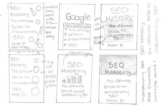
Bottom: The first round of sketches for SEO Mastery that I started on.
This week I’ve been really unmotivated. I think it's just the time of year where the burnout of the second semester is finally settling in. I was talking to my sister about it and she’s feeling the same tiredness and unmotivation so at least I have some comradery. Knowing my tendencies when I get burnt out, I have really tried to stay on top of work despite it. I’ve been making the effort to go into school everyday this week so I can have interactions with peers and have some social time as well (remote is very isolating). Though now I’m a bit discouraged as the last time I was there someone stole my charger. So there goes a wasted $150.
As a result of the mood during the week, I felt a bit lacking in my work in all honesty. My host was working on projects independently that we had talked about collaborating on, but due to my pace, I was on other things and the due dates just kept coming up. That's one big difference I’ve noticed: Industry moves FAST. I mean, so did IDEA, but it's almost a different kind of fast. It’s definitely something I know I’ll improve on over time—I mean we’re always told that for the first few years of your career you’ll be losing your employer’s money just based on how fast you work. However, it's rather discouraging when I don't want to let people down. That also plays a part in how many projects I take on. My host is very generous with checking in if I have too much going on, if things are doable in a certain timeframe, but it’s my own thinking that is making me say “yes i can take on more.”
But! Despite all that inner turmoil, I have been making progress with my assigned projects. We went through a very intensive typesetting lesson on Tuesday and let me tell you, working on the whole book versus the sample pages is VERY different. I was almost too scared to touch anything ha! I was also introduced to the concept of GREP styles and how they really improve the automations in indesign, but for now it looks like gibberish and is incredibly daunting. I was talking to my host about it and she shared that it's something she is also still learning. The fact that she's been using this program for so long and is still finding new things to learn about it was exciting for my career.
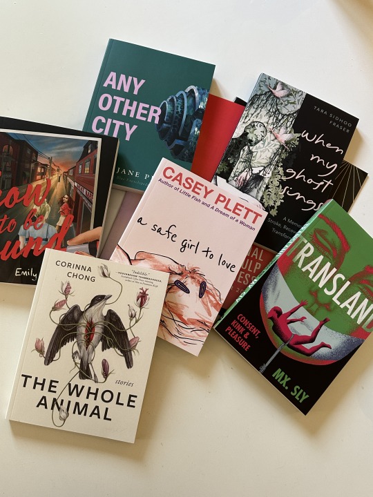
One very positive thing about this week was that I received a package. Arsenal was INCREDIBLY generous and sent me some books! I was not expecting any books and was just told to pick some out of their catalogs and that was that. Like what? It’s like a second Christmas! I am already a big lover of the types of books Arsenal publishes, but it's a smaller press so its authors I haven't read before. I am so excited to read them and also know that I’m working on those author’s future books (Bad Land is by the same author as The Whole Animal).
0 notes
Text
While I wasn't around for the "photography will kill painting" panic, I have been around for the 3d animation, desktop publishing, and digital art panics.
They all follow the same pattern, and that's what happened with each of those.
Yes, even desktop publishing. When Adobe InDesign hit the market I was getting my BFA in graphic design and everyone was losing their goddamn minds because professional graphic design and typography had been protecting itself from amateurs through various "tells" like "that's a hyphen not an EM-dash" and "those are inches marks, not quote marks."
The previous go-to software, QuarkXpress, required you to go through and manually replace them with multiple-key shortcuts, so anyone who wasn't a "real graphic designer" could be identified.
Real Stonecutter shit.
Adobe bursts in in the early 2000s with InDesign, and it does all that stuff automatically. It figures out from context whether you want apostrophes or foot-marks and changes them for you. A few settings and it manages the line-hyphenations and kerning almost entirely on its own.
And the industry was really salty about it, for about two, maybe three years, then everyone forgot about it an moved on. The industry didn't collapse, graphic design didn't vanish, but it got easier and required less tedium and specialized education.
But even more recently we saw the same things about people who drew on tablets and how it was a false, too-easy method of art creation that was going to destroy traditional art.
After all, "real art" didn't have layers, or undo features. If you wanted to trace over a photograph, you had to get an overhead projector or a light table. If you wanted a color you had to buy it or mix it. Want a straight, smooth line? Good thing you have the steady hands of an artist. Oh, you don't have those and your hands shake? Illustration ain't for you, bud.
Also, digital art is infinitely reproducible. No scarcity. Like, <disdain> commercial art </disdain>. The "soulless" arguments also popped up because of course they did.
Before photography, if you wanted a scene captured as a still image, your options were illustration or painting. The advent of photography did not destroy those other options, but instead added an additional pathway to get to the goal of a still image.
It also created the option of blends and combinations of those mediums. Traditional animation is painting, illustration, and photography, after all.
I use an AI/traditional workflow blend. If I want to have direct control or just think it would be fun to do an aspect the old fashioned way, (and if my bones are cooperating that day), I do it. I just have the option of using AI for some aspects.
And that's where most people are going to land in a few years. It will be like the smart-brush or the auto-tone/color/contrast buttons in photoshop. They won't care how much effort and know-how would be required to do either the old fashioned way, even if doing it the manual way would technically produce a better result.
And having those buttons doesn't prevent me from using the manual methods, in the same way that having access to IKEA doesn't keep thousands of people from building furniture by hand in their garage workshop.
"if we wait long enough eventually the camera will lose its moment and people will un-invent the portraiture plagiarism machine and no longer use it". you guys are really funny.
1K notes
·
View notes