#no gifs because tumblr is broken atm
Explore tagged Tumblr posts
Text

I think I got a lot of new followers recently because twitter keeps going to shit. However, as you probably know I can't and don't post nsfw art here.
You can find my NSFW socials on my pinned post. I think a lot of people are hesitant to join platforms which aren't fully available to the public yet but if you'd like to keep up with my nsfw art I'd like to:
Urge you to visit my website and subscribe to my RSS feed for gallery updates!
Suggest you follow me on either Pillowfort or Cohost (18+).
In the last year I have started using PF and Cohost more than Mastodon, as they've implemented new features and their posting system is more in line with what I enjoy: robust tagging and filtering, ability to post MANY images, and readmores for long posts.
If you've been hesitant to join either of those platforms since you don't know what to expect here's a small-ish review of both purely from my experience as someone who: a) enjoys profile customization b) likes to have an organized art gallery that is filterable by tags.
This review is aimed at artists looking for NSFW spaces to post! UI screenshots might have suggestive terms and images. Proceed with caution.
Edit: Good grief tunglr, if you open this on the web dash the images aren't shown in the neat galleries I put them in to make the post shorter. Head on over to the permalink if you'd like a better looking post!
Let me just say that if you're looking for a review on more technical aspects of these platforms, like security and moderation policies. I'm not your guy. You'll have to look elsewhere for that. I'm focusing on QoL UI and community aspects.
Though both these platforms allow nsfw, please make sure to read their ToS/Community Guidelines for rules on what is and isn't allowed. Though as far as I'm aware they have pretty similar rules.
Pillowfort
Overview::
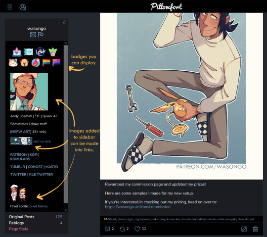
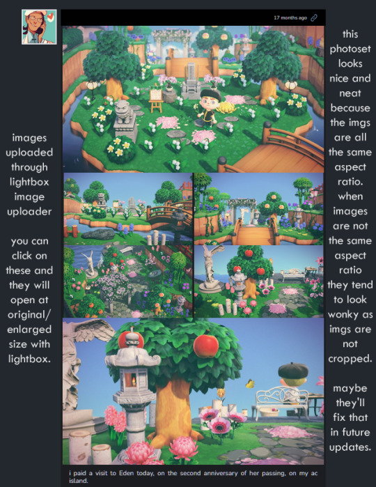
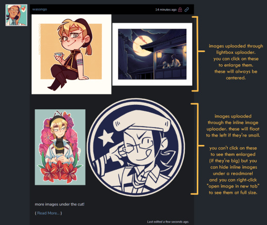
Pillowfort has more years under its belt being available to users than Cohost does, as such I THINK the artist/fandom userbase atm is larger, which means you might see more activity there. UI as of right now is very comfortable and the site runs pretty smoothly. Loading times are very decent. Posting is easy, though the image uploader is a little wonky (they are working on fixing this). You are able to create and manage communities based on interests or themes, which people can follow or join and all post in the same space. You can personalize your profile by adding images, links, and formatted text to your sidebar, as well as customize your own profile colors. Tag searches in my experience yield results of both art and aesthetic irl porn and gifs. If that's something you miss from ye olden tumblr days it might be worth a look.
Pros:
Posts have privacy options (everyone, logged in, followers, mutuals, only me)
Has a DM system
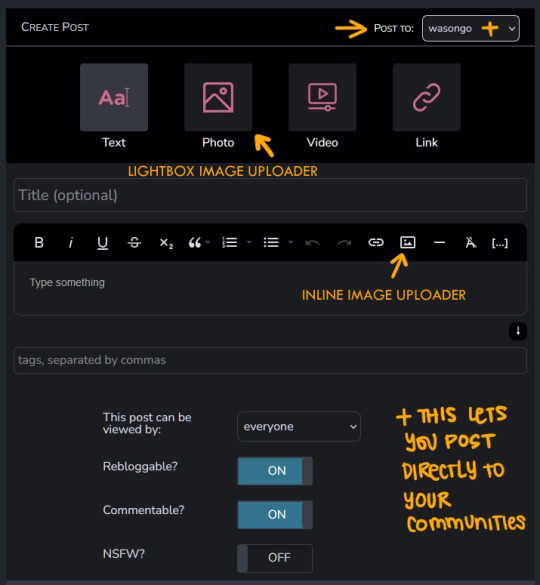
Posts have Commentable, Rebloggable, NSFW toggle
Can post MANY images on a single post
Readmore feature for long posts
Robust tagging system
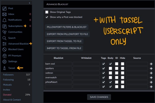
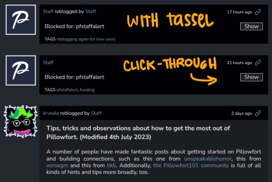
Robust filtering system: hide or click-through warning (by installing Tassel userscript only)
Customizable profile colors, Light/Dark mode for whole website
Communities you can follow/join for shared interests
You can filter posts on profile by tag
You can filter posts on profile by "original poster" or "reblog"
Cons:
wonky image uploader, cannot upload multiple images at once
Cannot search for multiple tags at once
Search for terms with periods in them is currently broken (ex. "D.Gray-man" will not yield any search results)
Communities have few moderation features atm
Without Tassel installed the filtering system is pretty garbage atm (you can either show or hide nsfw or filtered tags completely, with no click-through warnings)
No multiple account/side blog feature yet
Some inline image formatting options are broken atm
Default endless scrolling
No progressive web app for mobile atm
For a more in depth explanation of PF's UI and features you can check out this official post.
Here are some images of the UI.
---
Cohost
Overview::
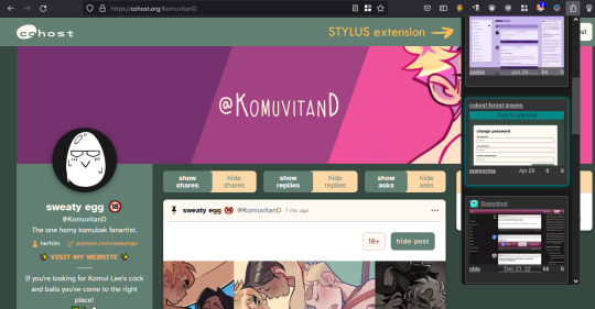
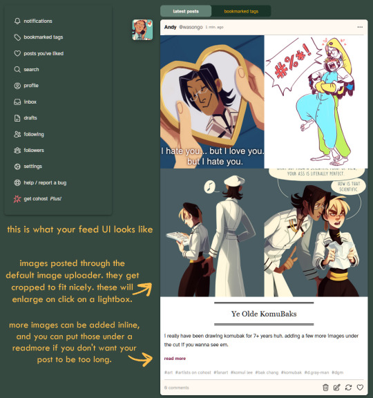
Cohost feels like it has a small artist/fandom userbase at the moment. However, to make up for that it has a pretty slick UI, it works great as a progressive web app on mobile, and it recently implemented an ASK system similar to tumblr's! Everything loads pretty quickly, and you can switch between your "latest posts" feed and your "bookmarked tags" feed. You can access your likes as a bookmark system, but as a whole "notes" and engagement numbers except for comments are not visible anywhere (this is wonderful for my personal mental health). It has a simple post editor and though the image uploader only allows 4 images that will load with lightbox, there's a workaround to upload MANY inline images if you want. The catch is you'll need to use a bit of markdown or html to do that. (more on that below) Though you can't personalize your profile colors, you can add personality to your page by making very cool pinned posts and adding images to your sidebar.
Pros:
Animated avatars! (listen i like having my animated komui icon)
You can make multiple "pages" (blogs) which function independently for comments/asks. switching between pages is effortless
Ask system, with anon toggle (you cannot reply privately atm tho)
2 Factor Authentication
Progressive web app for mobile works like a charm
You can preview your post before you post it
Posts have a NSFW toggle and you can save drafts
Can post MANY images in a single post (bit of a workaround as you'll need to upload your images to a draft first and then add them to a new post with some markdown or html code)
Readmore feature for long posts
Robust tagging AND filtering system (show, click-through, hide completely), plus CW system to give your posts additional click through warnings you deem necessary
You can do incredibly cool things with HTML and inline CSS on your posts
You can filter posts on profile by tag, and you can have pinned tags
Toggles for hiding reblogs, replies, and asks on profiles
Paginated browsing instead of endless scrolling (things load faster)
No engagement numbers visible ANYWHERE
Cons:
Image uploader does not let you upload multiple images at once. Limit to 4 images (can upload more as inline images with code)
Advanced post formatting (ex. bold, italics, bullet list, inline images etc.) has to be done through markdown or html + css which is not the friendliest for those who don't know any code (there's a button for a markdown cheatsheet when you post tho!)
No dark mode, or customizing profile colors atm (however there are workarounds to changing site colors with Stylus extension)
Cannot search for multiple tags at once
Cool things you can do with CSS on your posts might look very bad on mobile
Since you can do some crazy things with CSS on posts, you might come across eye straining visuals and movement on some posts. There are settings to tone this down, and people are pretty good about tagging things, so with some good filtering you should be able to avoid this however.
A little quieter on the artist/fandom front (but we can change that)
Here are some images of the UI.





If you made it to the end of this review thanks for giving it a look! If there's something vital you might want to know that I missed in regards to UI and posting features let me know and I will try to answer. But again, this is not a technical/security issues/bugs review so don't ask me about that.
Lastly, I've been seeing a handful of NSFW artists I follow on twitter hopping on bluesky. I REALLY suggest you do a little research on the owners and platform to see if you think joining is worthwhile, since I have a feeling many artists might not want their alternative to be a site owned by crypto advocates (and also a billionaire). Some basic research will get you there. Just take heed and use your best judgement. On that note Cohost is strictly against crypto (I'm guessing PF might be too but I don't have a link that I can point you to confirming this atm).
I believe community driven and supported platforms are the way to go. If you end up thinking either of these two places are worth your time, do consider getting your friends and favorite artists on board or supporting them! You'll get added perks on both platforms if you become a supporter. PF recently added the ability to have MULTIPLE AVATARS (PFPs I think they're called nowadays) which I think is super cool (i really miss that from LJ days).
Again, thanks for reading and I hope to see some of you there!
242 notes
·
View notes
Note
I sound like a broken record at this point, what with me constantly saying Smutmus is almost complete. And it is; but the perfectionist in me keeps taking over and turning it into a “one step forward, two steps back” kinda deal, and it's driving me crazy. I know you all have lives outside of tumblr, plus your own projects, but I was wondering if any of you would mind looking over what I've written so far and give me some tips on how to better portray Alastor, or just some constructive criticism in general regarding my writing style? Honestly, I feel like I may have made him EXTREMELY OOC because the vast majority of Smutmus stems from my horny mom brain, and the closer I get to a complete version, the more nervous I get about posting it. I completely understand if you'd rather not. It's just that, as a group that I feel portrays his character much better than I ever could, I value your opinions more than my own. 😭❤️
The parts I would send you are basically how the in-story situation occurred, foreplay, and oral (Alastor & Reader) leading up to the original first part, which is about 5.6k words long. Again, I TOTALLY understand if you don't wanna; my anxiety is just getting the better of me ATM. 🥲
ALSO HAPPY BIRTHDAY DANNY BABY~! Sending you a TON of happy wishes, and hopefully you have a wonderful day! Mwuah~!! ❤️🎂🥳 @sugoi-writes @minkdelovely
I’m down! But I’m not good at giving criticism for works because I’m almost always like “hey if YOUR Alastor would do that then that’s what Alastor would do!” 😂 but if you want my honest opinion I could try 😅
but I feel the same! I always fucking panic when it goes on and on, like a bridge with supports I’m seriously questioning the stability of…

@sugoi-writes 🎉 i owe YOU a coffee!!
#hazbin hotel#Smutmas#alastor x reader#hazbin hotel fanfiction#hazbin hotel smut#hazbin hotel x reader
45 notes
·
View notes
Note
Hi! I was going through your masterlist for Boyd specifically and I am unable to access your the first part of little distractions. I think maybe the link is broken. I really wanted to read it because Boyd fandom is woefully small and it's even smaller for Amos (loved the movie btw). So finding a fic for him got me super excited. I am really looking forward to being able to read it. Thank you and I hope you are having a good day!
Thank u so much for letting me know!
I'm not exactly on my computer atm and Tumblr isn't letting me update the link via app for some reason, so I'll send u the link here and update it as soon as possible.
Ur definitely right about that tho! Boyd deserves much love and appreciate and Amos too!

0 notes
Text
Death Doesn't Hesitate ~ Markus & Simon (Detroit: Become Human)
requested by: –
pairing(s): markus x male reader, simon x male reader
warnings: character death
a/n: im alive also teehee angst go brrr
on a serious note, terribly sorry for disappearing on tumblr for a while, people who follow me in wattpad or quotev probably tell im mostly on there for a while but things arent really well atm haha
but anyways, i literally forgot to post some of my other fics here months ago so... sorry about that


Markus' footsteps echoed into the large broken-down building near the pier of where the large ship called Jericho was. The android scanned the run-downed area to finally see the person he was looking for, [Name]. Markus was worried for the other android, everyone who knew [Name] and him was.
Sighing, Markus slowly approached [Name] who was sitting on the ledge of the open area of the run-downed building. The walls of the rundown room were destroyed in time and unfinished demolition. It still provides a beautiful view of the ocean.
Markus looked at [Name] whose back was facing the opposite of him and was looking at the ocean. Markus wondered if [Name] was watching the beautiful view this place gives or was just lost in his thoughts.
"[Name]?" Markus had softly called out to the other as he had sat beside [Name] when he was close. He tried to make himself comfortable as he gave a small space in between him and [Name]'s since Markus didn't know if [Name] was willing to have someone close to him.
"Hey," Markus greeted the unresponsive android beside him as he turns to look at [Name]. Markus frowned when [Name] didn't give much of a glance at him as he merely stared at the large view of the sea and the old abandoned ship that he and other deviants called home, Jericho.
In other times, Markus would have thought [Name] was enjoying himself like he usually does, this was the spot where he would often go to enjoy their freedom. But Markus know this wasn't the case, not anymore. Markus know [Name] was lost in his thoughts as he looked at the scenery blankly, almost lifeless with no shine in his eyes and the deviant leader was worried.
Markus let out a sigh as he decided to grab one of [Name]'s hands. A bit hesitant but Markus wanted to give some sort of comfort for [Name] and maybe have the other react, hoping for something at all. The deviant leader was surprised when he felt the other intertwined their fingers together as [Name] softly squeezed his hand. Markus furrowed his eyebrows as he looked at [Name] again, worry evident in his blue and green colored eyes as he gazes at [Name].
[Name], in Markus' eyes, looked so lost. Markus fully knows what the other had been thinking for a while now and the deviant leader could not blame him. [Name] had just lost someone he grew to care for and love. They all did. But [Name] seemed to have taken it the worst from the rest— and it made Markus feel the guilt of a broken promise.
"Please keep them safe, Markus."
Markus wanted to say something but kept quiet and looked at the scene in front of him like [Name] does. He doesn't know what to say at all, so he kept his mouth shut. Not wanting to ruin the other's peace as Markus couldn't help but feel sadness wash over him.
This was odd. For years, Markus barely felt anything at all. He was an android— they were an android. A machine built with no life in them— well, that's what everyone thought. But here they were, so humanlike. So alive.
Markus sometimes wondered if this was even worth waking up from his programming because everything was so confusing... emotions were so confusing. Life was so confusing and hard. Too hard. Everything was so hard and Markus could only wish things were easier for him. For them.
The waves rolled by as the cold ocean air passed by in a breeze at the two, it was silent and Markus let it be. [Name] was grieving and all he could do was sit by his side. This was... this was the only thing he can do and not mess up anymore. He had already done enough. Markus just wished he could do more for [Name] but right now, it was better for him to just stay and hope his presence didn't bother [Name].
[Name] blankly stared at the ocean in front of him. His mind screamed for him to say something to the other beside him, to at least let Markus know he was alright. But he can't. And he wasn't fine, he wasn't at all. Not since he didn't return.
[Name]'s mind was flooded with memories of him. The first android who welcomed him in Jericho, and the first one to bring down the walls he built after he awakened from his programming. The one who had made him learn to trust in others once again and feel something other than hatred for what the world had done to him.
Simon.
The blond deviant welcomed him and didn't stop pestering him until he talked. The deviant who he grew to love and adore as the blond did to him as well. They loved each other so much. [Name] loved Simon.
But Simon was gone.
[Name] knew that.
The news of Simon's abrupt end when the blond, Josh, North, and Markus infiltrated Stratford Tower to send a message about their cause. It was a success—
'But at what cause?' [Name] would often think to himself as he remembered Markus telling Simon's end. It was like it was just yesterday he saw Simon smile at him. Softly promising he will come back to him...
It hurt [Name] a lot.
It hurt [Name] so damn much.
Death. A scary thing it was. Being born into this world to slowly die every second— every day.
Some were lucky to reach their elderly stage, but some were not. Others die in the womb of their mothers, die at childbirth, in their early ages of teen to adulthood. Some from natural causes while some in accidents or driven to end it all by their own accord. But everyone always dies.
Death was hauntingly beautiful. People would forget that they could die at any given moment in any second of the day. How fragile and weak they truly are.
Maybe this is why it caused the heartbreak to even be more painful than ever. Maybe the idea that they weren't truly humans, to begin with, created a false illusion in his mind. That made him think of death as a meaningless thing. A small joke that he believed wouldn't reach him and forcefully drag him away from the others.
Yeah, maybe that's why it hurt like hell when death came and took someone he had loved. Death doesn't hesitate between the sinners and the saints. It will always take...
Sometimes [Name] blames Markus for Simon's death. [Name] knows it wasn't Markus' fault at all, but sometimes... sometimes he just has this thought of "what if" Markus hadn't found Jericho. Simon would still be alive and here beside him, right? Simon would be welcoming new deviants with open arms and just have the blond there, alive with the others. With him.
But Simon was gone. He wasn't there anymore. Simon was dead and [Name] hated it— but he couldn't stay mad at Markus. He can't even if he wanted to but that still doesn't stop the empty feeling inside his chest. [Name] knew Markus was doing his best for the others. For them. But remembering Simon wasn't there made [Name]'s Thirium Pump, his own heart, ache so badly. He felt so empty. Like he was back to being caged by his programming once more and he hated it so much.
Simon was their friend. Markus' friend. His friend— his partner! But why? Why did they let Simon die?
'Just why...? Why Simon? Why, why, why?!?' Those thoughts swirled into [Name]'s mind, dragging him down in the depths of sadness and anger once again. It was like when he first awakened. So angry at the world because he did everything to his owners— those people that bought him to be used and abused for their own sick enjoyment. Why was he always hurting? Why him?
[Name]'s hands curled into a fist. The hand that held Markus' own hands tightened its grip, making the heterochromatic android notice [Name]'s suddenly tensing and growing more emotional.
"Why?" [Name] quietly asked, his voice cracking as he held back the tears falling in his eyes. It hurts. Everything hurts. Why was it hurting? Why was he hurting so damn much? "J... just why...?"
Was this the price of being alive? If so, please take it away from him. Please.
[Name]'s sudden question made the android beside him looked at him in worry and confusion. Why what? What does [Name] mean? Markus was puzzled and was about to ask what does he mean when [Name] continued.
"Why... why did you leave him? Left him... him to die?" [Name] asked as he turns to look at Markus, making the other android see the tears he tried to keep slowly falling. "W... why Markus?" [Name] softly asked as he gazes at Markus' blue and green eyes, the android immediately noticed the pain and sadness in his [Eye color] ones as Markus felt his throat go dry.
They were androids. They weren't supposed to feel anything and obey orders with no questions. But here they were, one was crying and breaking apart while the other felt his world crash down as guilt ate him up.
"We didn't mean to..." Markus wanted to say to the broken android beside him— but he couldn't. He couldn't say those words because Markus knew he could have at least helped the blond deviant when Simon was injured. They could've helped him. He could have helped Simon in Stratford Tower but he didn't and now he had broken his promise to the android beside him.
"I... I'm sorry..." Markus quietly muttered as he raised his hand towards [Name]'s face and wiped the tears with his thumb. His hands were shaking and his thoughts weren't nice at all as his mind was screaming at him for hurting someone he loved. He hurt [Name].
"I'm so sorry... I'm so sorry [Name]... I... I would do anything... anything to save him..." Markus cried as he felt his own tears fall as well. Simon was a friend. A true friend to Markus. Someone who supported him. Markus cared for the blond deviant as he cared for the very android in front. But he should've cared more because why did he leave Simon alone? Why did they leave him?
Markus loved [Name]. He loved the [Hair color] haired android so much that it hurts him to see this once happy man cry from the mess he had made. He knew Simon meant more than just a friend to [Name], that's why before they left to infiltrate Stratford Tower that day, he promised to bring everyone back to [Name]. To bring North, Josh, and Simon back safely.
But in the end, he didn't keep his promise at all...
"I-i... I'm so, so sorry [Name]..." Markus softly cried as he wiped [Name]'s tears away. He was sorry. Markus couldn't stop thinking that he could have done something to help Simon. They sent their message but at the cause of Simon's life.
As Markus cried, [Name] could only lean closer to one of Markus' hands and closed his eyes. [Name] had softly grabbed the heterochromatic android's hands a while ago and began to squeeze them gently, trying to comfort Markus as broken sobs left his lips.
[Name] took a deep breath as he had opened his eyes. [Eye color] ones clashed with blue and green eyes of Markus as a few tears still escaped and fell. [Name] softly squeezed Markus' hand again as he then goes and hugged the android. God, [Name] knew Markus was strong and he sometimes thought Markus didn't care at all about Simon's death but he was wrong. Of course, he was. Markus cared for them and was just as hurt as him.
"I'm so sorry... I'm so sorry [Name]..." Markus muttered as he cried. He was ashamed and saddened as he buried his head on the other shoulder. Hearing Markus broken cries only made the [Hair color] haired android wrap his arms around Markus and tighten his hold on the other android.
"I know... I... I know, Markus..." [Name] croaked out as he cried. Markus silently cried with him as the android gripped the fabric of his clothes. It hurt them both to lose Simon. A friend and something more to the [Hair color] haired android. They lost someone who deserved more than this.
The two stayed in each other's holds for a while, it was both Markus and [Name]'s ground to reality. The front that Markus had put up to give the other androids in Jericho fully crumbled and [Name] finally got rid of those thoughts of blaming Markus away.
After another while, the two finally separated and decided to continue sitting there at the ledge of the old building, silently watching the waves crash by in front of them. The silence wasn't tense or awkward, it was just perfect. No words were spoken as they relished at the weight of guilt and sadness seemed to lessen. It was still there but Markus and [Name] found comfort in each other's presence.
[Name] mindlessly stare at the ocean, watching the waves rolls by as Jericho was rocking a bit from the moving waters. As he continues to stare, his thoughts went back to the blond android and his death.
Did it hurt? Was Simon hurt? Did he suffer more before he had died? The thoughts of how Simon felt when he died caused his Thirium Pump to ache a bit more. [Name] wished Simon didn't have to suffer than he already did. He wished that the blond died peacefully.
"Will it hurt?" [Name] softly asked out of the blue. This caused Markus to immediately turn his head towards him with confusion written on his face.
"Wha—" Markus started but was cut off by the [Hair color] haired android.
"Will it hurt? Dying I mean..." [Name] had repeatedly said again but more clearly as he turned to look at the heterochromatic android with a melancholic smile on his lips. His [Eye color] eyes stared at Markus' blue and green ones with sadness and regret. [Name] didn't want to ruin the comforting atmosphere they had but he wanted to know if Simon didn't feel more pain before his death. He needed to know. Markus doesn't know what to say towards the other.
"W... why would you ask?" The deviant leader hesitantly asked as he saw the [Hair color] haired android let out a sigh and looked back at the view in front of them.
"I just want to... to know how Simon would have felt... more pain..." [Name] wanted to say but he held his tongue back as thinking of how Simon would have painfully died made him more hurt. Instead, [Name] shakes his head as he hesitantly asked Markus' thoughts.
"I... don't want to sound insensitive but... you did feel death right?" [Name] asked, remembering the deviant leader told him about his past a while back when they shared stories of how they came to be. "When you got shot... did... did it hurt...?" He cleared as he looked at Markus. Markus only nodded his head as he turns and looked at the scene in front of him.
"Yes... I did..." Markus had softly said as he unconsciously curled his hands into a fist. The horrid memory of that night where he was stripped away from the only person he called a family. When he was still wasn't himself. Where he wasn't awakened yet. He felt the bullet immediately hitting him. How it came so fast that he didn't even register that he was shot. How he almost died.
Markus' was snapped out of his thoughts when he felt someone grab his hand. Looking at it, the deviant leader was surprised to find [Name]'s hand intertwined with his. Markus looked up to see the [Hair color] haired android's face softly looking at him with a small solemn smile on his lips.
"Hey, it's okay... I... you're here now..." [Name] softly said as he squeezed Markus' hand. Regret was in his eyes from bringing such a horrible memory up. Markus knows [Name] felt bad and he couldn't help but smile at [Name] as he then looked back at the view of the sea and Jericho with a calm look on his face.
"No... it'll feel like sleeping..." Markus had answered as he remembered how everything felt so calm that moment when he was shot. It was horrible to realized he almost died but Markus want to make sure [Name] know Simon didn't have to suffer in his death. And Markus promised he would try his best to not let [Name] get hurt anymore.
"It was peaceful," Markus softly said and he slowly put his head on [Name]'s shoulder. Closing his eyes as [Name] held his hand a bit tighter. The two relished in each other's comfort as the color of both the skins of their hands slowly faded and the two let it be.
#male reader#male reader insert#detriot become human#dbh#markus#simon#detroit become human x male reader#dbh x male reader#markus x male reader#simon x male reader#angst#angst go brrrrrrrr#god im so tired rn#and in PAIN#akdbakdhsjdgajhejw
224 notes
·
View notes
Text
I posted 8,782 times in 2021
658 posts created (7%)
8124 posts reblogged (93%)
For every post I created, I reblogged 12.3 posts.
I added 3,980 tags in 2021
#fan art - 739 posts
#jujutsu kaisen - 533 posts
#genshin impact - 433 posts
#daiya no ace - 419 posts
#diamond no ace - 393 posts
#jjk - 330 posts
#attack on titan - 299 posts
#mha spoilers - 291 posts
#bnha spoilers - 285 posts
#manga - 258 posts
Longest Tag: 130 characters
#one of my great grandfathers recorded his race as ethiopian so it'll be interesting to see if that's true once the results come in
My Top Posts in 2021
#5
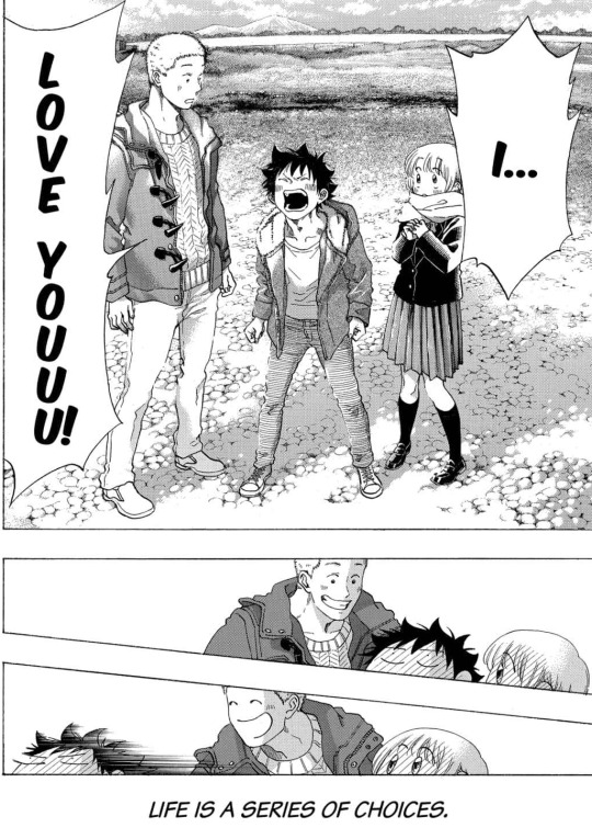
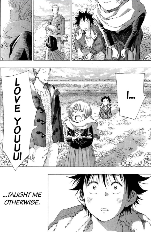
I LOVE YOU TOO
See the full post
128 notes • Posted 2021-04-01 01:27:41 GMT
#4
I didn't need my heart today 💔


See the full post
137 notes • Posted 2021-02-16 19:16:14 GMT
#3
We got Touma confessing to Taichi, but at what cost? 😰
I am so worried about Touma because of the rumors and I don't want his final months of high school being spent ostracized by everyone 😪
And then Touma apologizing for falling in love with Taichi really cut deep.
Why did I think Blue Flag was gonna be a cute wholesome manga about a trio? My heart's been broken almost every chapter 💔

See the full post
159 notes • Posted 2021-03-25 20:43:43 GMT
#2
T H E

T H R E E
See the full post
169 notes • Posted 2021-03-27 13:28:40 GMT
#1
My Top 10 Webtoons (2020-2021)
So, it’s been one year since I started Webtoons/Manwha. At first I downloaded the app to read Tower of God, then I started reading more stuff and now I’m deep into Webtoon hell lol. Anyway, I just wanted to share my Top 10 series...tbh there’s a few more I wish I could add to this list, but I’m not done reading them yet.
So...here :)
Sorry for any typos or any incoherent thoughts. I'm very very tired :)And there are spoilers for some of these series.
1.) Back to You
Honey B has the prettiest art oh my God. 😍
I’m a huge fan of time travel stories where the protagonist is trying to save someone else. In Hanyoung’s case, she decides to save the boy she was in love with Jaehyun.
I really don’t have much to say about this except that I really enjoy it, and things have been going too smoothly in the story atm and I’m expecting something bad to happen at any second. 👁👄👁
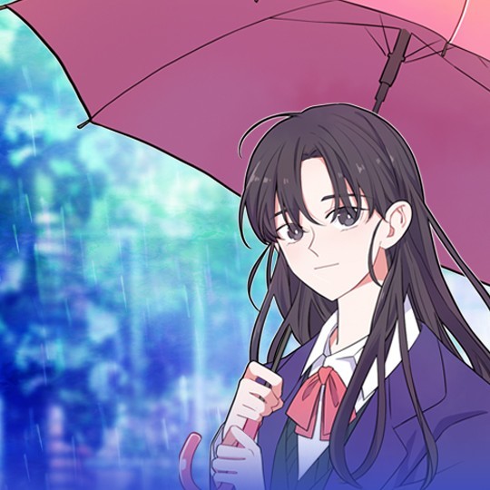
2.) See You in my 19th Life
Lee Hey is incredible. This another story where the art is gorgeous, and I like the story in this one a lot more. The progression of Seoha and Jiuem’s relationship is really sweet 🥰. I’m curious to see how Jieum’s sister and Seoha react when they find out who she truly is...I don’t think it’ll go well :’)
A Good Day To Be a Dog is another awesome series by them which I recommend too, but I like this story a lot more.
See the full post
196 notes • Posted 2021-07-12 03:56:21 GMT
Get your Tumblr 2021 Year in Review →
0 notes
Text

Since people are too immature to let me speak my piece and would rather block to make themselves feel automatically correct, I’m just gonna say it here:
First off, I’m not the OP I was defending - he’s a close friend. (If you don’t believe me go look up our rp blog under afoxholeofmuses. It’s on hiatus atm but it’s there.)
Second of all, rp blogs are their own corner of the tumblr community; like hipsters, like fandoms, like aesthetics, like whatever the fuck else is going on on this hellsite. This isn’t about dnis or bfys or whatever the fuck gen-z-ers are doing these days. Rules pages exist on rp blogs so that other rpers know what people will and will not tolerate when it comes to writing with them.
Most rpers will block any personal blogs for interacting with them because it clutters their notes and activity and makes it harder for them to find notifs for their partners’ RP responses. This has nothing to do with “extensive rules” being broken; Leith blocked them for blatantly ignoring their response to the original person that reblogged his post and literally rephrased his words to sound smarter than him.
This is why RPers don’t like personal blogs interacting with their RP blogs. Because notes get cluttered with this bullshit and they are two entirely separate communities. The post was intended for Leith’s muse, not a be-all end-all post about the canon character for people to debate with him on.
And to the person who thinks they’ve been RPing longer than us - we had our first RP blog on tumblr back in 2011 for Gavin MacLeod from SPN. Rule pages are not new, you’re just ignorant.
And finally to the person blaming this on kin - I am not kin. I am a supporter of people who are kin, but I am a fictive in a multiple system. Do some research or don’t make assumptions, it’s literally there on my pinned post.

0 notes
Photo

i’ve been asked a few times about the process of selecting and using themes, so i thought i would write out everything i can think to say about them and hope it’s useful! i’ve broken it up into the very basics, before you hunt, hunting for themes, colours, pages, update tabs and extras! if you can think of anything else that i’ve missed, please don’t be afraid to ask! i’m happy to help wherever i can!
THE VERY BASICS
html can feel a little daunting, but the amazing theme makers on this site have made it super easy to make use of their codes! so once you’re ready to install your theme it’ll go like this:
once you’ve picked your theme (keep reading for tips on that!), in the description there should be a link usually titled ‘code’ (along with other instructions which will help with installing it!), open this link and copy all of the text (this is the code!) supplied! then when you’re ready, when you click ‘edit theme’ on your blog you’ll see this:
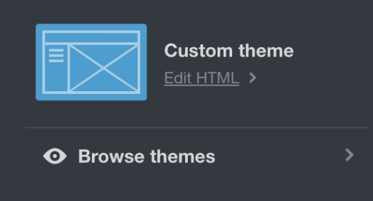
you want to click ‘edit HTML’ and you’ll be taken here:

you want to delete all of the code that’s there already and replace it with the code you just copied! now click ‘update preview’ and then ‘save’ and click the back arrow button and refresh the page! (sometimes you won’t need to refresh but i do it out of habit of having shitty laptops)
depending on the features of the theme your ‘theme options’ should have changed! most basically it should have options for post width, font colour, link colour + where to add your links for your homepage! have a go at turning each setting on and off so you can see what each does for your theme - but yo the theme makers on here are dope and everything should be really straight forward! (i’m happy to try and help if anything seems confusing! but theme makers are also often ready to answer questions and are ofc best to ask!)
DO NOT EVER EVER EVER REMOVE THE CREDIT FROM ANY CODES YOU USE. DON’T BE THAT GUY. JUST DON’T DO IT. coding is fucking hard, and there are so many reasons why it’s not okay to remove the credit after all that hard work they’ve done to supply you and other users with free codes for your blog. so just don’t do it.
don’t edit the code (often small tweaks are fine) unless you have permission to do so.
and please make sure to like and/or reblog any code you do use! you’re about to use their hard work, it’s the least you can do!
BEFORE YOU HUNT
i think it’s good to have a look around at some blogs that you love + admire and start to get an idea of what kind of theme you want because honestly there are so many wonderful themes out there it can get pretty overwhelming trying to pick one! (also look for the credit on these themes, when you find one you really love you can see what else the theme maker has posted! (or even just use that theme if it’s available from the credit source - they are all there for all of us to use, so nobody will mind!))
think about how many links you are going to want to have displayed on your homepage, as some will have a lot more than others! i think the essentials to have linked are your original content, navigation + about pages (going to get to that later!) but the rest is up to you!
HUNTING
my two fave places to find themes + codes are @theme-hunter and @acuite ! (but again, def have a browse of bloggers with themes you love and see what else those creators have made!)
i think it’s a good idea to put a whole bunch you like the look of in your likes and then narrow it down from there! so often i’ll get halfway through changing a theme and decide it’s not quuuite right, so it’s good to have options!
make sure to consider any images within the theme! some themes might need a specific sized image, while others will scale it down for you - so keep an eye out for that kind of stuff. you can use sites like pixlr and picmonkey to crop down and edit images to size! a lot of themes have smaller icons, so often icon pack icons are perfect!
personally (+ remember this is all totally subjective, at the end of the day it’s your blog, so you should have whatever theme you like best!!), i like single columned themes with a white background! i think white is the best to present your content on, but if you do what to have a coloured background - i’d suggest a very pale/saturated colour so it doesn’t distract/clash with some of your posts! (my background is a very light grey with the borders around images kept white!)
also, i think it’s a really nice idea to keep tags showing on your themes! as quite often when i’ll be scrolling through someone’s blog i might see a post i’d like to see more of and with the tags showing it’d only take one click! + leave captions on! same way you shouldn’t delete captions when reblogging edits etc, you should have the caption on show on your blog!!
COLOURS
who doesn’t love a good colour palette? you’ll be able to see how many colours you can incorporate into your theme under ‘theme options’! black/dark greys are usually the best for your default font colour - but have some fun with your link and link hover colour!
looking through ‘colour tumblrs’ are a good way to pick a palette, but make sure they all tie in nicely (including with your themes icon if it has one!) i usually find colour inspo here + from the blogs reblogged from within there.
PAGES
pages can be super important! nicely organised pages are definitely something i look for in blogs, and just makes your blog feel much cleaner and organised! it’s also good to get away from just having a ‘default style’ page with a simple text list tag/about page, it just looks nicer when you have a coded page for it, ya know?
the two pages i think every blog should have (and have linked from your homepage for sure) are an ‘about’ page and a ‘navigation/tags’ page! then after that, just start checking out what kind of pages other blogs have and ones you’d enjoy having on yours!
sometimes you’ll be able to find ‘page packs’ where a coder has made the ‘standard (about, navi, blogroll etc)’ pages all with a similar style! you might notice on my blog, my faq, about and navigation pages all look quite similar because i got mine from a pack! but if not, just aim for pages that work nicely together and with your blog!
(both of the theme blogs i linked above have well-organised pages sections, so they’re still my recommendations!)
(to add a html page just make sure you have ‘custom’ selected here: )

UPDATE TABS
they can feel a little daunting, but really, they’re pretty easy to add and are great to have on your blog! you can use them for a little bio section, a place for extra links and letting people know what you have going on atm!
so each updates tab should have some instructions to help you, but the general idea is you’ll be given one/two bits of code to add to your theme's code. so you will have to go back into ‘edit html’ and usually it’s at least one bit of code to paste into the ‘<body>’ of your theme! but make sure to read the rules supplied for each updates tab, as all are slightly different!
to make your updates tab sit on the opposite side of the blog - cmd+f within the code of your updates tab and look for either ‘left’ or ‘right’ in accordance to how it sits currently + then switch it word for the side you want it to be on!
EXTRAS
clock for your blog (find your timezone and scroll down to where it says ‘tools & converters’ and there will be a link that says ‘Display a free clock for *location* on your website or blog’)
hit counter + online user counter
handy codes to know (for editing your bio etc!):
adding a link: <a href=“urlbetweenthequotes”>name of link</a>
break: (drops your following text down one line) <br>
paragraph (drops it down about two) <p>
67 notes
·
View notes