#no darker skinned character though..
Explore tagged Tumblr posts
Text


i am not gay. i am not gay. i am not gay. i am not gay. i am not gay. i am not gay.
#THE GIRLS WIN TODAY#CHEWS ON NAILS AGGRESSIVELY#i'm skipping 2.0 just for this whole patch#i'm goinf to put argus in my pocket#BARBARA TOO!!!#no darker skinned character though..#2.2 sneaky peak is set somewhere near the equador so i have really high hopes#can i order more poc rep next patch please bluepoch. please.#might change my theme after this trailer sizzles for a couple of days#— ena's shenanigans ; 🦢#reverse: 1999 cn#reverse: 1999#okay fine i'm gay#re-did tags because i was exploding when i posted this
40 notes
·
View notes
Text
i once thought i was misremembering how light kristoph's skin was because i saw someone say something like no one ever draws him as dark as he is in the game and i got worried i was drawing him too pale. so i tested it out. biggest surprise here is that phoenix (who i thought was pretty tan) is actually about the same value as apollo and kristoph

#.docx#klavier is still obviously the darkest here#kristoph's about average i guess. not that dark though#but otherwise he's about the same as other light-skinned characters#probably just has something to do with how dark his shadows are#ofc no one comes close to how pale the women of aa4 are for some reason#comparing them to trilogy colors though the average skin tone is definitely much darker for aa4 so maybe that's what they were talking abou#everyone is tanner now :3 i prefer that actually
55 notes
·
View notes
Text
No offense but trans-masc/trans-man headcanons about Arya are so incorrect, I'm sorry. I can't even take them seriously considering this fandom's desire to separate Arya from girlhood/womanhood. I would love it if people would stop trying to divorce female characters (and real women) from their identities as women just because they aren't traditionally feminine.
If we're talking about actual good-faith interpretations, ones that actually work with how Arya is written, then trans-femme is a much better fit. Arya has never had the desire to be a boy or be seen as one, she is fiercely insistent on her identity as a girl and corrects people several times, she doesn't consider herself a "real" Lady because she's not one in the same way her mother and sister are (!!!), she has self-esteem issues from her looks and ability to perform feminine tasks, she actually spends time pretending to be a boy but never considers herself one or enjoys doing it, as time progresses she loses the ability to pass as a boy (!!!), etc. Look at the material!! There's so much there to discuss from that perspective! Arya's non-conformity and how that fits into a society with such strict gender norms is fascinating and there's a lot to discuss there, but calling her trans-masc is one of the laziest interpretations to come up with.
#arya stark#asoiaf#It's wild cause I literally never see any other character separated from their gender identity like Arya is#Arya isn't even our most non-conforming character (female or otherwise) and yet it feels like she gets singled out for this treatment#probably because characters like Brienne + Asha + Sam are more associated with romance than her and as progressive as people claim to be#they aren't actually interested in queer identities + relationships and their larger implications go figure 🙄#her feelings about being a Lady are so intertwined with society's (misogynistic) expectations like ughhh it's such a well-done conflict#I just wish people weren't such illiterate clowns about it#Arya doesn't like sewing or wearing dresses and wants to be more than a housewife and people go /this is a man/ :/#it's like seeing people portray Arya with darker skin than her siblings...the way this fandom acts I know it's not being down in good faith#can it be done sincerely by people interested in exploring queer subtext? 100% is it often done so? almost never#no hate to people who genuinely make these headcanons this is for the people who hate viewing Arya as the girl she actually is#justice for trans-femme!Arya cause it works so much better then any other identity people force on her#though it is hilarious to me that people act like complicated feelings towards gender are impossible for cis people to have lol
106 notes
·
View notes
Text
maybe this is a bit of a useless point to make but it does bother me sometimes that estinien’s skintone gets lightened quite a bit. I don’t necessarily blame fanartists for this bc some renders/cgi trailers make him look paler than his in game model, but I just wanted to draw some comparisons. now the lighting can vary quite a bit, but I tried finding pictures in multiple lightings for comparison
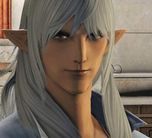

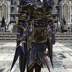
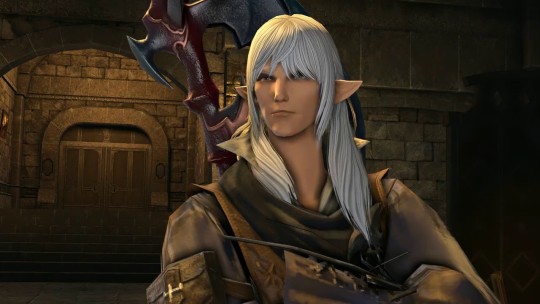
he looks a little washed out/not well lit in this image but you can still tell its the same skin tone
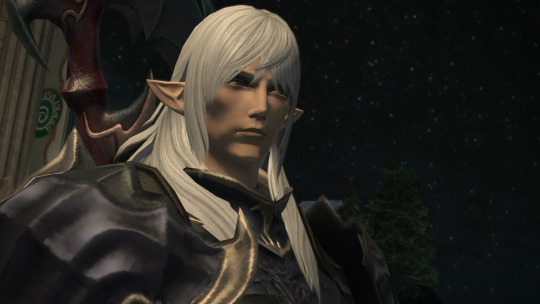
Furthermore, here’s him next to fourchenault, who we know is meant to be somewhat darker because his dad is louisoix.
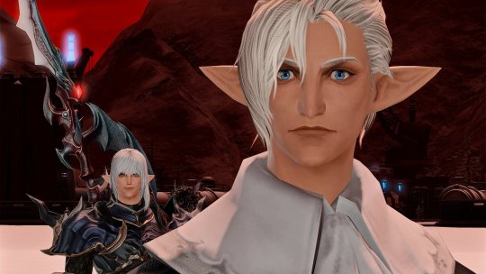
Here they are in the endwalker trailer
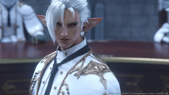
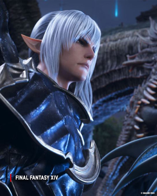
I don’t think this but specifically is that bad, there’s still a notable contrast between his hair and skin tone even if it looks to be a bit more tinged pink than he usually is, but it’s still comparable to fourchenault. The render though is eeeeeeeh

his most prominent render isnt necessarily inaccurate but the lighting feels like its on full blast
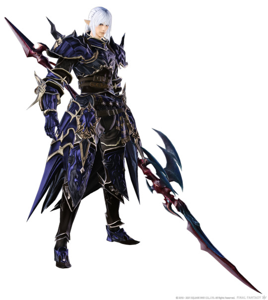
The countdown art also DEFINITELY makes him look a little paler. it resembles the previous render

I also wanted to point out this happened to y'shtola too somewhat. look at her renders compared to her model compared to the end walker trailer

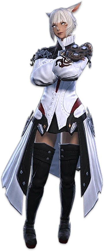


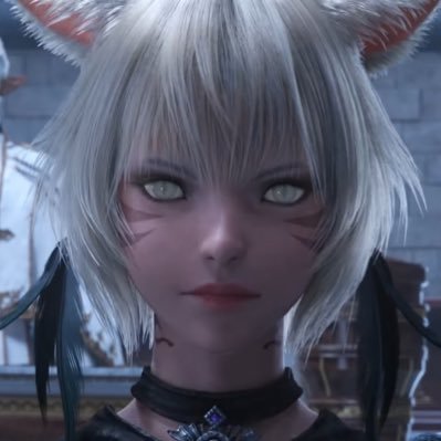
ike she is distinctly pinker/paler as well. im not sure how the process of making the cgi cutscenes works but im fairly sure they use different models, so I generally accept that they lost some specifics in translation. there are other differences people have pointed out such as Zenos' nose being shaped differently in the end walker trailer so its bound to happen.
Here are their figures too

yshtola has a skin tone somewhat accurate design but estinien is DEFINITELY lighter. his eyes are off too, being a weirdly deep blue when his canon eyes are grey, so again it can be chalked up to lost in translation aspects but its still disappointing to see
im not really trying to argue that estinien or yshtola aren't "white" or white passing by our standards, but they really aren't pale and its kind of weird that they often get lightened in trailers/renders in estinien's case. especially when I see so much fanart drawing estinien as super bone white pale because they're probably looking at the renders that pop up first online if you search and show his whole outfit for design reference.
I do really appreciate it when I see artists draw them darker, it makes me very happy.
#PLEASE dont clown on this post we see several much darker skinned ishgardians so 'its fantasy france' isnt an argument here. also dont come#here and act like im policing artists just by pointing out trends and the portrayal of certain characters. I mostly am talking about the#various official depictions and WHY that would lead many to draw him as so pale and why thats disappointing and jarring to me#I am maintagging this though bc I want people to see this so. saying that at my own risk lol#final fantasy xiv#ffxiv#estinien varlineau#estinien wyrmblood
34 notes
·
View notes
Text
i understand that with the themes of mistborn and the conditions of the skaa (read: chattle slavery) it would be a little? fucked up? to portray skaa with afrocentric features but honestly for the fact that scadrial is so Hot and Hot and Sun and Hot its weird most the characters are depicted with straight hair and paler skin. anyways all this to say one must imagine kelsier fortnite mistborn sunburnt to all hell and back
#i listened to the audiobooks tbf#so i never saw any of the art of characters until i was later in the series#will never not visualize lestibournes with curly hair and a tan though sue me#mistborn#mistborn era 1#guys i dont remember how to use tumblr#im scared of you all why do you follow me am i in trouble. please dont call my parents#theres this one fanart of kelsier w/ darker skin and locs though and i think about it very much
4 notes
·
View notes
Text
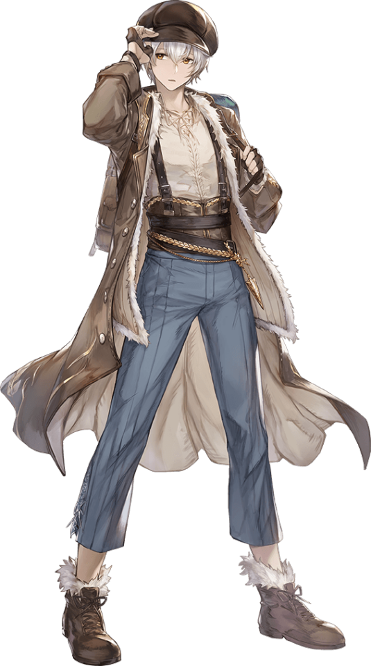
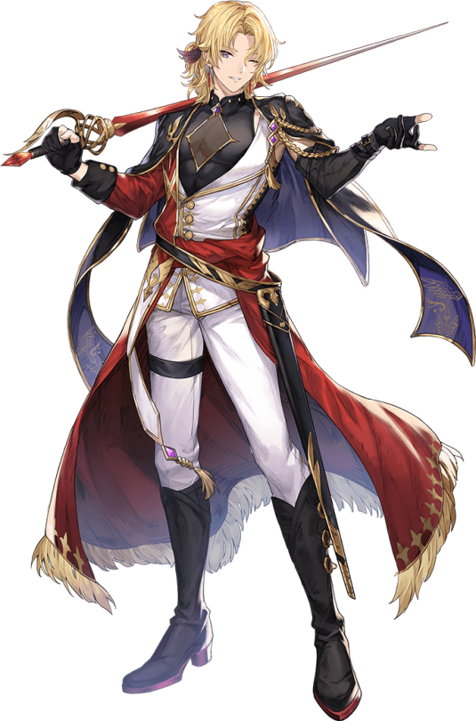

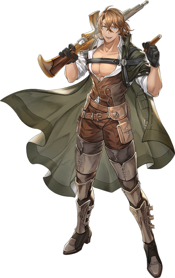
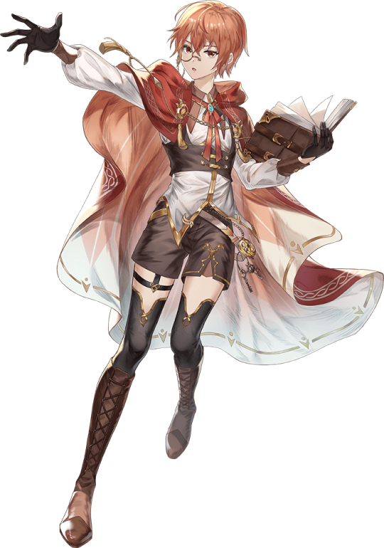




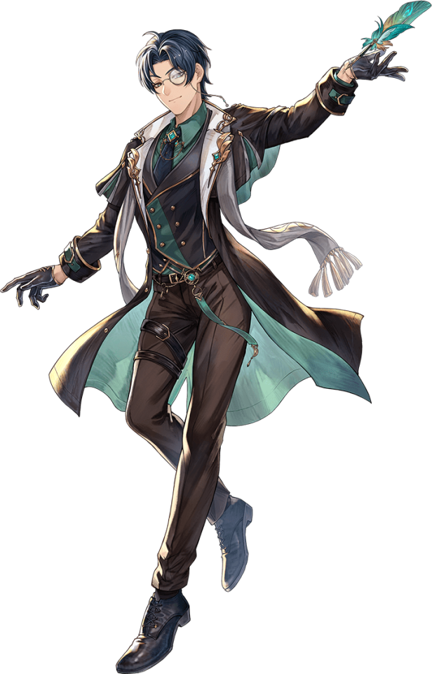

ohh...... oh, these are some great character designs....
#THEY ACTUALLY HAVE AGES TOO#though i'd like to see some darker skin tones :///#and there's what appears to be a gnc character?? i s2g erolabs u better treat them right or so help me#noctilucent#minors don't look ///
44 notes
·
View notes
Text
yes i know that in anime having the characters be japanese is a default bc most of the time the anime is set in japan but would it really be too much to ask for darker skinned characters who aren't treated horribly/are shitty rep??? please???
#like. i do know that there are quite a few manga/animes that treat their mixed characters well but god the fucking ratio to animes that-#-treat darker skinned characters badly is just. fucking annoying#like. i really dont think its that hard.#rants#nyx yells#yutaka re:main my fucking beloved though. i miss him every day he was so good
46 notes
·
View notes
Note
Omg I hope you're not overthinking this, because your art is wonderful, and I get you on shapes being hard!! and getting someone's likeness being hard, body type included, augh. It's scary when you know people can interpret Shapes Being Hard as you having the wrong image of a character, perhaps even out of maliciousness (!). Feel free to ignore the unsolicited "advice" of the rest of this ask, even delete the ask if I'm bothering you , I hope I'm not <3 But I think even if his tummy isn't visible you should make him just more broad in general. I get your intention soo much, but he definitely isn't broader on the shoulder area than the rest of his body I think, he's just broader in general than Crowley is, from any view. If you look at the photo where they're both standing together holding hands (I googled Aziraphale full body loll 😭) you can see that he's just... broad the whole way down if that makes sense. And if you look at the part where they're eating ice cream body swapped he looks broader from a more side view too. Anyway it's fine if this doesn't help at all either haha. Just wanted to say again that I love your art <3
I had to look up that picture of them holding hands immediately LMAOOOO anyway yes you're right, mr michael sheen has quite narrow shoulders and then the lines of his body sort of just go straight down from there hahaha! in my drawing I accidentally gave him more of a triangle body shape.
I moved the seam of his trousers here (in my slightly unfinished lineart left in my files) and that alone gives an impression of general broadness already! it'll be fun drawing aziraphale again in the future, one of the reasons I love drawing is little problem-solving moments like these!

#people on this website have gotten a lot nicer towards artists in matters like this#bc of some mistakes like this i made in the past (when i was way younger) i get a bit panicky#when i was 14 i really fucked up the colouring of some darker-skinned characters and people were understandably like wtf#but while people these days come to you nicely like hey heads up the skin tone is off! or hey this character looks a bit skinny!#back then you got quite bashed overnight#though!!! it was made worse by my american friends at the time who were awake swooping to defend me#like SHE'S FINNISH SHE DOESN'T SEE A LOT OF BLACK PEOPLE IN HER LIFE!!! and i was like NOOOOOOO??? WHAT???#it was a wild conversation to read in the morning#but a good experience in that now i'm really aware of bias. and also have improved as an artist a lot hahah
24 notes
·
View notes
Text
i mean. the trix look good
#i... dont Love the voice acting idk man#flora's voice is still cute i like that :)#i dont know how i feel about them Looking for bloom but i think itll grow on me#i liked it being random and bloom unlocking her powers because she wanted to help a random girl#But... Fine#the trix look AMAZING im obsessed#looks like the boys are here too!! i tried to slow down the video to see them as best as possible#i think sky looks good??? huge if true ahdl#riven might have darker skin !!!!#i like it but im hoping this doesnt become dark skin = aggressive evil asshole :')#like please please dont reduce his character and make him worse :')))#brandon might look good too!!#im.... still tentative....#the training exercise/adventure suits are cute...#stormy def has darker skin but maybe darcy does too?? could just be the shadows though idk#i Love their outfits though the vibe is vibing#faragonda looks good!#idk.... i am..... Tentatively looking forward#knowing me ill love it ajfljflg#i can def see a lot of this growing on me once its released :)#okay looking back i think it Is just the lighting? i dont think darcy or stormy have darker skin !#which considering rainbows track record of treating their darked skinned characters im good with ahfkjf#speaking of which flora is still too light :(
2 notes
·
View notes
Text
I think transmascs will truly have rights the day this website stops hailing Ozma as a trans woman icon and recognizes him for what he really was; a boy forced into detransitioning back into a girl because ‘it wasn’t honest for him to take the throne as a boy’ or whatever that bullshit was in the writing.
#Hayley Speaks#I saw that post on mobile a few days back and it made me mad#Yes he was changed into a boy at birth and raised as one but he was HAPPY with being one#He expressed UNHAPPINESS with being transformed back into a girl#And the one time he was like 'well if I don't like it; can I change back'; Glinda said 'No'#Listen I know there were a ton of issues within the stories themselves and with the writer himself#And I'd be a hypocrite to say 'Oh you can't just reinterpret the story how you want to make the characters trans'#(I do that with Chihiro so I get it)#But also maybe we should stop hailing characters who express discomfort with being seen as feminine as trans women icons#Especially if they express happiness with being male but are unfortunately not allowed to express themselves as male-#-due to certain circumstances in the writing/media#Sometimes.......people who don't want to be seen as girls and are uncomfortable with being seen as girls....aren't girls#Also there was some racist undertones about Tip having darker skin but then having lighter skin when he became Ozma#But that's another topic#I will acknowledge it though because what the fuck
13 notes
·
View notes
Text
I’m also still pissed about Candace. She’s a lovely and awesome character and I love her design except for you know, the fact that she’s supposed to be Nubian and looks like a tanned white woman
Update:
THIS IS EXACTLY WHAT I MEAN. She could’ve had this. They really just care about sales dont they
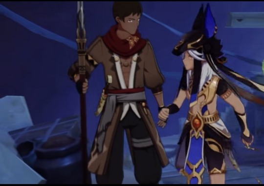
#I just wanna enjoy this game man#I wanna play the world quest but I also don’t want to#I want to have fun with alhaitham but they white washed him so bad too. like he would so much better with a darker skin tone#I’m just gonna sit through it and try and enjoy myself. I’m going to be critical though#I was looking forward so much to 3.4 too but that place in the new area named after those islamic figures#plus the racism towards jeht#like fuucking hell ugh#I love a lot of the characters but they were done so dirty it’s kinda infuriating#candance#genshin impact
16 notes
·
View notes
Text

got bored in class so have a doodle
#project purple#technically this was supposed to be gabrielle#skin tone ended up a bit darker than i meant cuz i did the fabric last though#she’s getting executed bc why not i guess???#i’m not usually a digital painter i like my line art but this honestly turned out cool#my art#original character art#original character#oc art#digital art#digital artist#artists on tumblr#medieval oc#fantasy character art#fantasy oc
1 note
·
View note
Text
Redesigning the Fentons!!
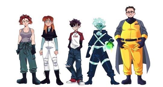
Hi yes this is for yet another Danny Phantom AU of mine it has nothing to do with the Apprenticeship AUs but unlike that batch I actually wanna turn this AU into a fic eventually once I get through a few other big projects I have *sobs*
Anyway individual files for each character under the cut along with my obligatory rambling about all the choices I made ;)
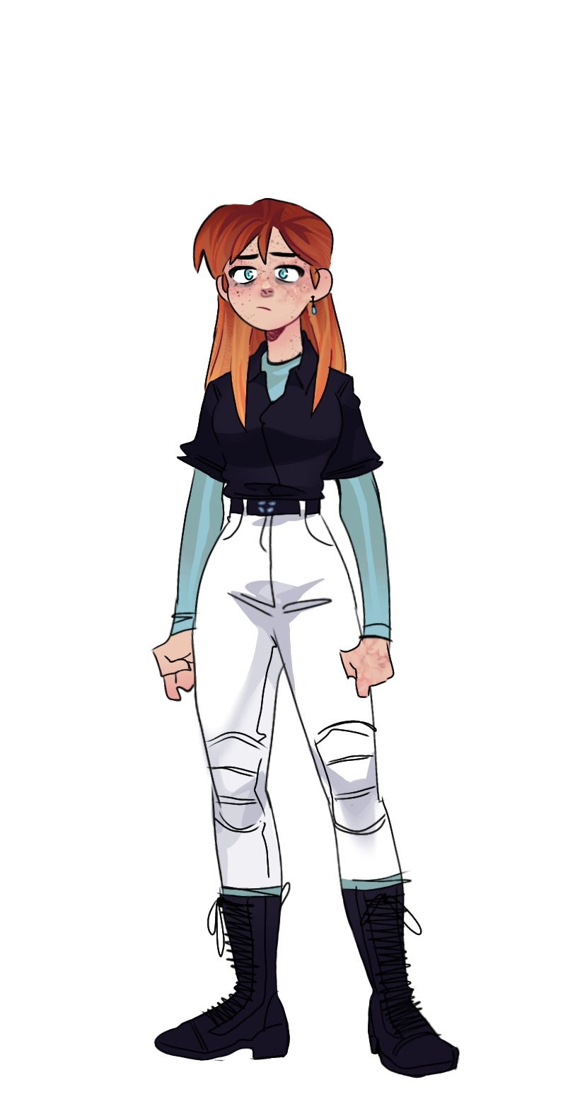
Jazz! Honestly, when I was a kid, I always thought she was 18 not 16 so it was kind of a shock when I started rewatching the show about a yr ago and heard that. Anyway, she's 17 in this AU but already moved out to college on a scholarship bc living in FentonWorks is kind of hell and she has that Older Sibling Guilt for leaving Danny there. For her clothes, I wanted it to be a mix of tactical and preppy.
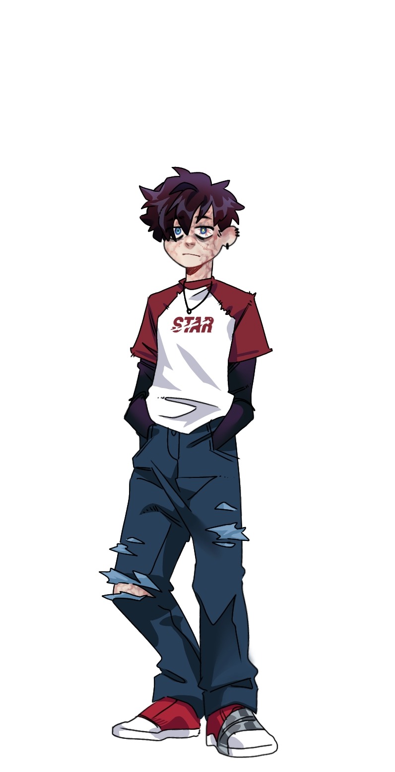
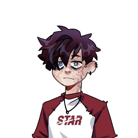
Danny! (Fenton) The effects of FentonWorks hell is much more visible on Danny than Jazz because she got out of there as soon as she could. Because of that though, a lot of the chores in the lab got pushed onto Danny, without passing on many safety tips, like replacing the ecto-filtrator, cleaning contaminated tools, organizing ecto-weapons, etc. And because he doesn't know any better when it comes to safety, he has many symptoms of radiation poisoning: visually, this comes through in the discoloration/scarring on his skin (Jazz has some slight scarring on her face and hands as well), the cataract on his left eye, as well as burst blood vessels in that eye. For his clothes, I wanted them to look a bit ragged and worn through ripped seams, tears in the jeans, & duct tape around his shoe.
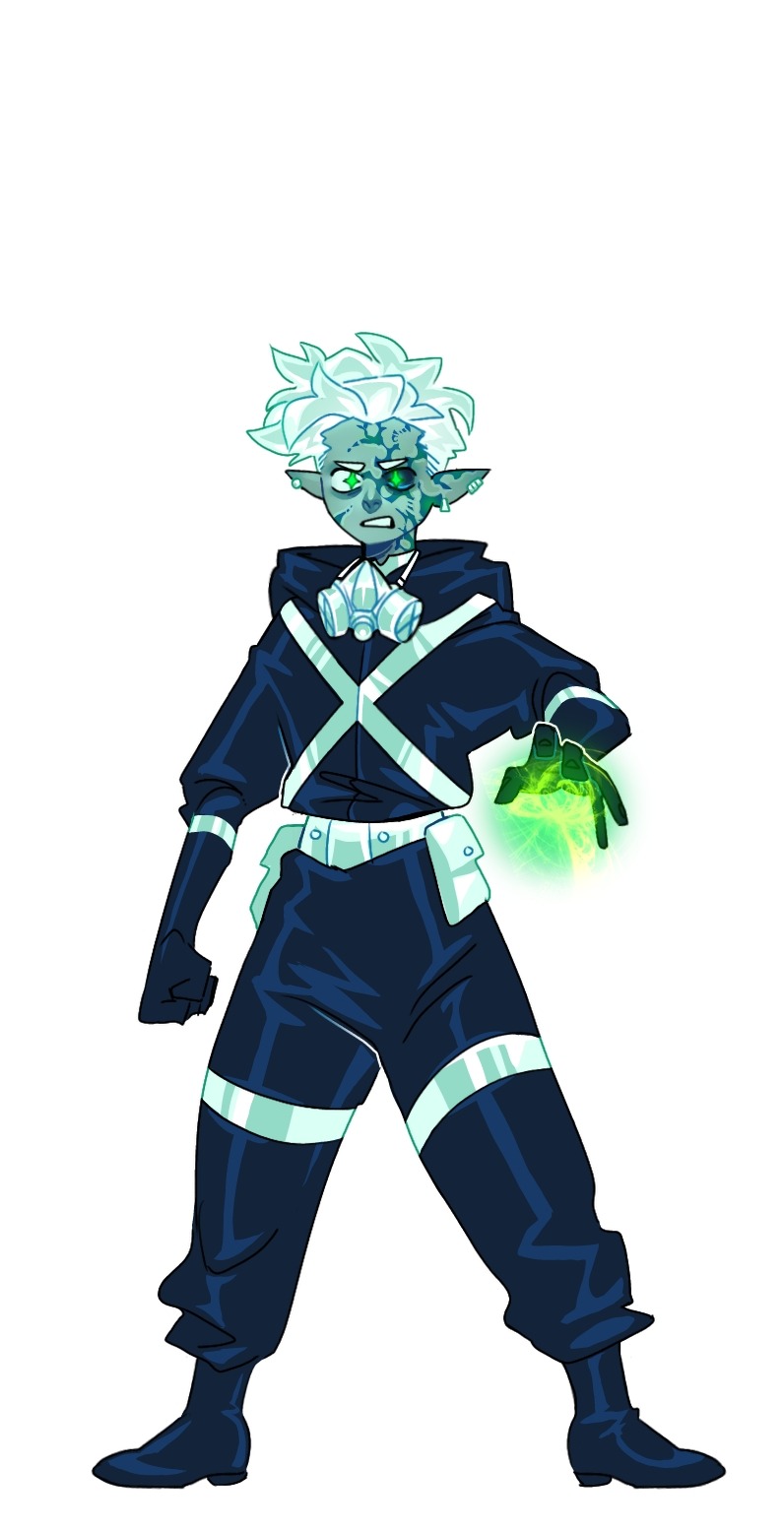
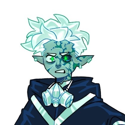
Danny! (Phantom) I don't actually have a lot to SAY about my choics, but I am really happy with it. There are still a few things. I wanted his hair as Fenton & Phantom to be different but still reminiscent of the simplistic rendering of the original show: Fenton is kind of timid so his hair falls over his face, & Phantom is more active/aggressive so his hair is pushed upward. The only other thing I want to comment on is his skin: it's kind of about how I usually stylize Phantom (and I mentioned this when I redesigned Dani a while back) but a "healthy" Phantom in my style would have more bright cyan skin and an unhealthy Phantom has a more dull/zombie green. And lastly, as a ghost, the radiation poisoning kind of cleans up into more neat scarring rather than the muddy/bleeding look as Fenton.
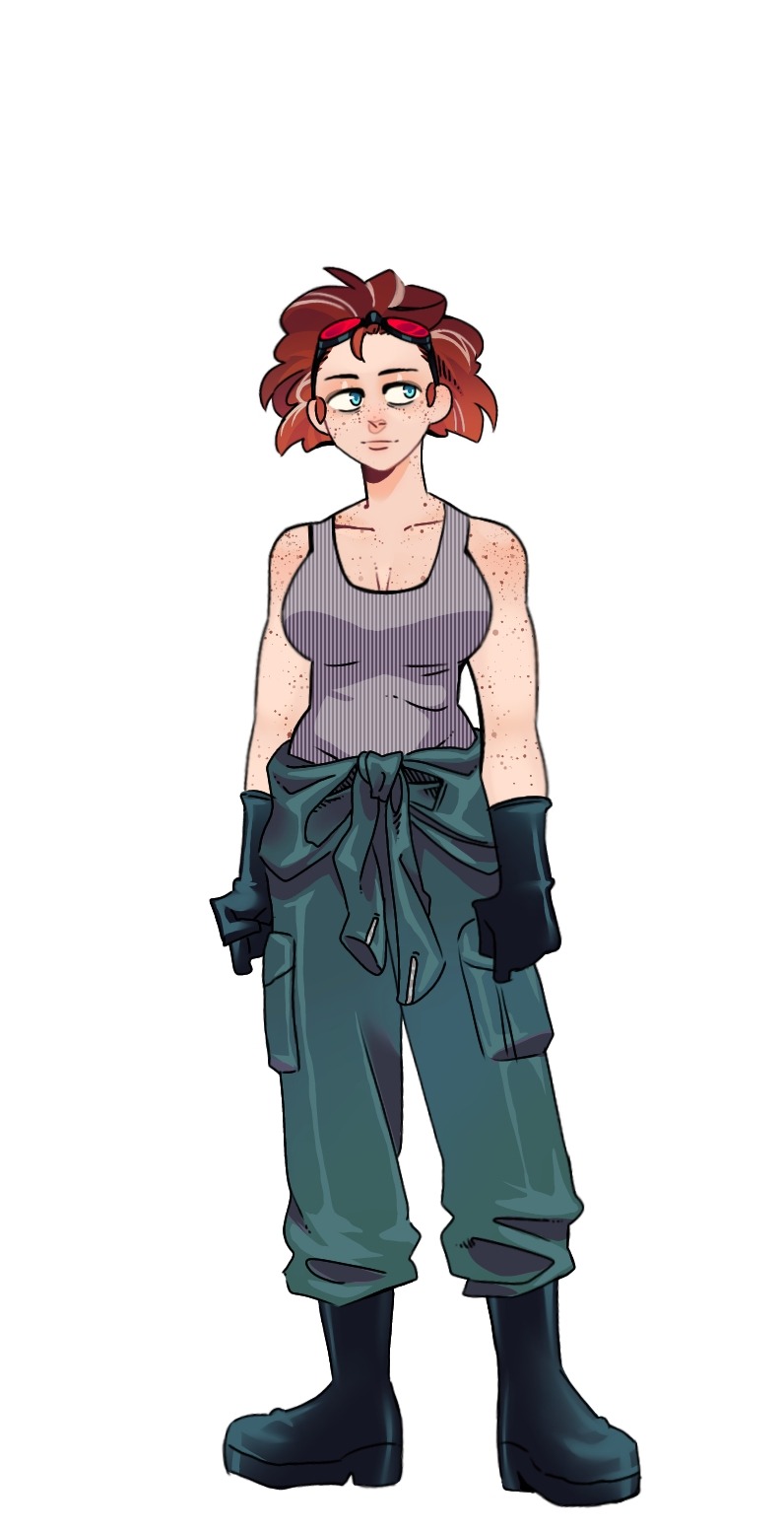
Maddie! Now, I'm gonna be honest, real vulnerable here,... I hate Maddie's canon haircut. It's ugly, I'm not sorry. But I can modify it, so it's fine: now it's curlier, a bit darker, and has a few grey streaks bc she's a genius and constantly pulling long working hours. And, it didn't come across as much as I wanted, but she's got some biceps, strong lady. Now, I'm not really sure why, but I wanted to shift the color of her and Jack's jumpsuit, making hers much more desaturated.
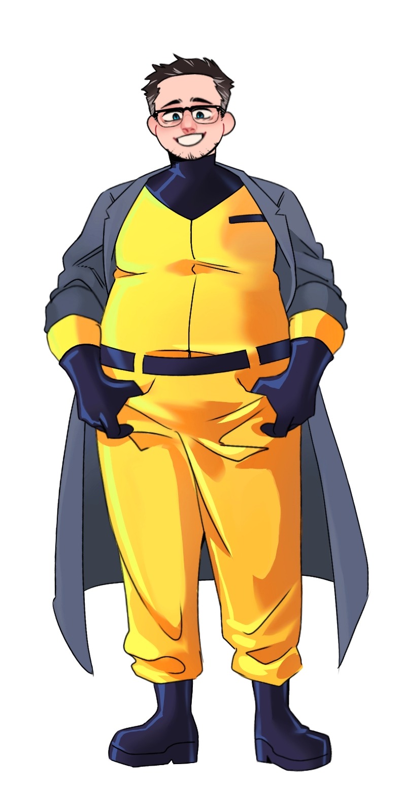
Jack! Big guy. I don't have many thoughts about him either, but I did give him glasses and some stubble for a little bit more dad energy (?) I mainly changed the color of his jumpsuit bc Orange is an extremely hard color for me to render for some reason, so now it's the classic Hazard Yellow. Finally, the most notable difference is the coat I put on him for a bit more scientist energy but my main reasoning for it is the potential visual of him being an absolute tank jumping from overhead with the ghost gauntlets and his coat flapping behind him. Also, I generally like the idea of him presenting himself as a big, dumb teddy-bear, always smiling, but completely unhinged below that facade: dropping the smile or not while towering over you in shadow. Wild imagery.
FINAL THOUGHTS: Do not count on any actual steps towards creating this fic in the near future, it's just on my mind right now, but I NEED to finish my other projects first 🙏🙏🙏 That said, I will (eventually) get around to a handful more character redesigns for this AU including: Vlad, Sam, Tucker, Valerie, Paulina, and maybe Lancer & Dash
#danny phantom#fanart#my art#33xhausted art#character redesign#Radiation!AU#maddie fenton#jack fenton#jazz fenton#danny fenton#bad parenting
2K notes
·
View notes
Text
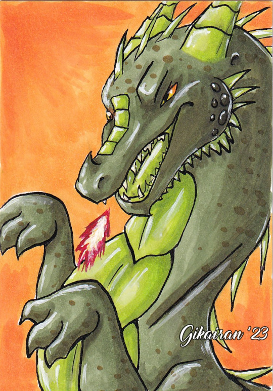

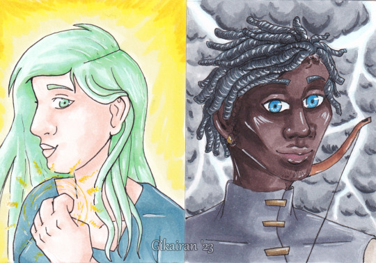
I brought some Nice paper, but theres not a huge amount of it and that gives me some kind of paralysis to use it....
So I cut a sheet up into trading card sized pieces and theoretically i can turn 1 sheet of a4 into 9 whole arts!! In reality, I got 4 pieces of art out of it and 1 piece i still havent actually drawn on....
#sometimes i draw things#oc: bas#oc: auri#oc: ide#and also a random dragon that is not a character#i just wanted to make a dragon#i dont feel Very Good At This....#i find it hard to look at them bc i dont feel these are up to scratch#im not used to drawing this small#and also i really DID try to push myself with every single one of these....#i dont often draw side profiles#i am embarrassingly not very experienced with darker skin tones - especially with markers#and i can never seem to draw Bas RIGHT....... hes a difficult bastard for me to nail down for some reason I:#his expressions never come out right#dragons alright though. Not perfect. But alright
1 note
·
View note
Text
The trace of you
Author: bvidzsoo
Pairing: psychiatrist!Jeong Yunho x patient!female reader
ꕤ Warning: bullying, mistreatment, ptsd, mentions of insanity & abuse, mental health talks, psychiatric diagnose, unethical thoughts and actions ꕤ Word count: 25.1k ꕤ Rating: mature ꕤ Genre: dated around the late 1800's, psychiatrist x patient, lots of yearning, mutual pinning, forbidden love, inspired by Alias Grace, angst ꕤ Summary: Being caged inside your home for a wrongdoing you can't even remember seems to not have the effect people have been expecting. With the arrival of a foreign doctor with studies unheard of before, your life takes a new turn. Will Doctor Jeong prove your innocence, or will he fall into your web like everyone else? Are you sane, or is he just as insane as his patients?
A/N: Helloo, my lovelies! ^^ Wrapping up this story took way too long due to me having some unplanned health issues that are still (?) kicking my ass...anyways, keep in mind while you're reading this that there are probably historical inaccuracies to this story, especially to South Korean history that I briefly read through when constructing Yunho character's background. The dresses MC wears also aren't the most accurate, but I hope you can look past that and imagine instead whatever you'd like. I watched the mini-series Alias Grace and was rather inspired by it, so you will find similarities to it within this story. I am no medical professional, so the diagnosis MC is given might be inaccurate even though I have taken my time to research these things. Let me know if I should tag anything else as a warning, and I really hope you enjoy this story as I have tried making it a bit different. Let me know your thoughts about it, I am always excited to read your feedback! <3 Oh, and, I hope Santa brings you something sweet tonight, this is my not so small present for you all! ^^ divider

The old clock’s ticking seemed to only get louder by the second. The sheer curtains were pulled to the side to allow more sunlight inside the tea room, the grand doors opened to let in the late fresh summer breeze. The white hydrangeas lining the paths leading towards the back garden were gorgeous and carried a strong scent with them, I could smell it from my spot on the soft faded pink cushion of the sofa brought all the way from France. The tea room had been remodelled not long ago. There was something about it that gave old cottage vibes, but it has now been upgraded to a more fashionable Parisian feel. It was pretty, with hues of light peach and a darker coral, however, I used to like more the cosy feeling of the sage green and baby blue colours that had decorated the room once. Karina liked it more this way, she had said something about the lighter colours giving the impression of a bigger room. I did not understand why the tea room was required to look grander than it already was, but I didn’t question her judgment. It was best if I didn’t, not out loud, at least.
The servants were quietly waiting outside the room as my mother paced in front of us, Karina perched on a fancy chair with an abandoned book in her hands. I knew the ticking of the old clock and the silence was driving her mad, but I remained silent as I gazed forward, eyes on the gravel path. I longed to walk in the meadow close to our house, but I wasn’t allowed to roam around on my own. Even inside my own home, I was under constant surveillance. The doctors have said it was for my own sake, but it felt like I was in a continuous cage. It was suffocative, I couldn’t sleep some nights due to it, not even after drinking Mrs. Humphrey’s delicious camomile tea. My last hope resided in summer, in the warm breeze that kissed my cold skin, everything a lush green where I looked, to keep me sane. As sane as it could, since I was deemed a madwoman long ago.
Unlike the others who hired chauffeurs and dated carriages with old horses, this doctor arrived by a fancy patent motorcar. It wasn’t him driving it, at least the servants had whispered that to each other, but his long wool coat looked expensive too. My mother finally stopped pacing and Karina sighed in irritation when there was a knock at the front door. One maid stepped forward and opened the door for the doctor, gently greeting him. I couldn’t hear his voice, I was trying to catch the song of the birds outside, but I could feel the shift in the air. It was warmer inside as if the sun had stepped through our threshold. It warmed my skin like none other. Finally, the doctor was led towards the tea room, my back to him as my lips moved in a whispered song that comforted me. If I ignored the coil of my stomach and the sheen layer of sweat over my brows, I could convince myself that I was fine. That whoever came to check on me wasn’t another vicious man eager to torture a damned soul like mine.
“My apologies, ma’am, I am unfamiliar with these roads.” The man’s voice was deep yet soft, like honey, thick but inoffensive. At least if I told myself that, it calmed my rapid heartbeat. As I continued sitting rigidly, my fingers wrung together, the tremors never disappeared. It was something natural, the other doctors have concluded, something they couldn’t fix about me. Another thing they couldn’t fix about me. It was fine, I knew I had been damned a long time ago.
“Oh, it is no issue, we are glad you made it, Doctor.” My mother’s voice was filled with deep relief as the crease between her brows finally disappeared, hands locked behind her back as she rushed towards the entrance. Karina was surprisingly silent, but her expression spoke volumes. Her eyes had widened and her mouth had parted, fingers barely clutching the book in her hands anymore. I gulped, trying to steady my irregular breathing. I knew what was coming, the same questions and objects this doctor, too, would use to check my stability. I dreaded it all, I wanted to scream and throw a vase and make it shatter against the ground, but I would only be deemed even crazier. My eyes shook when I heard footsteps approach, heavier than those of my mother or Karina, it was the man. The Doctor. He was coming further inside, I could feel his eyes trained on my nape, no doubt curious and with a glint madder in his eyes than in mine, here to dissect me, pick me apart just to never fix me. I saw polished black shoes stop before me, and the lump in my throat almost made it impossible to speak up.
“Miss Harold, my name is Doctor Jeong Yunho.” Then, unlike any other doctor had done, this one’s knees bent until he was crouching in front of me, looking at me. His eyes were round and kind, a dark brown unlike my icy ones, and they were filled with warmth and softness I hadn’t seen in any other man. His nose had a perfect slope and his fair skin was sun-kissed, the apple of his cheeks a rosy red. His lips weren’t too big but pouty and full, asking to be traced gently by soft fingertips. I shuddered, completely taken aback by his youth and beauty. The man was from faraway lands, yet judging by his speech, you couldn’t tell until you saw him. He was gorgeous, he was breathtaking, “Would you feel safe if it was just the two of us in this room?”
No, I wanted to scream. My fingers tightened against each other, I gulped and hesitantly nodded, our eyes spilling into each other’s as if a spell had them locked together. His features were serene and sincere, not a frown on his beautiful face to create creases, just a soft smile pulling at his lips. It was disarming and frightening at the same time. Then, the doctor smiled even wider as he stood back up, his height intimidating. My heart raced as I watched him, unable to take my eyes off him. And he was still looking at me as he spoke up, “If you could excuse us, I’d like to speak to Miss Harold in privacy. It won’t take long, I promise. I’m only here today to familiarise myself with her.”
“Good, yes, Doctor, whatever you need.” My mother sounded reassured as she gripped Karina’s arm, yanking her out of the tea room as she seemingly didn’t want to go. Her eyes were fixed on Doctor Jeong, and her cheeks were blushed, “Would you like a cup of tea before we leave?”
“No, but thank you, Mrs. Harold.” The doctor hummed, his voice warm, as he sat across from me. He had no leather tool bag, nothing. He only carried a ragged satchel bag, a dark green with patches made to it, and it seemed mostly empty. My heart couldn’t settle down, not yet. Maybe his tools were hidden in the pockets of his long black coat. He hadn’t taken it off, and he looked like he wasn’t planning on staying for long. I couldn’t decide whether that thought reassured or unsettled me even more. Silence stretched on as we stared at each other, my throat dry, but I made no moves to drink from my fine China cup. I gulped when the doctor finally moved, reaching inside his bag. Here it came, the torture for the next hours, he was just like all those other doctors. I could feel tears prick at my eyes and my chest felt on fire, my lungs constricting, but the world seemed to stop moving when the man finally retracted his hand from inside his ragged bag. He held no tool to harm me, instead, a slightly withering daisy was gripped daintily between his long fingers.
“I plucked this for you on my way here, Miss Harold.” The doctor spoke, leaning forward to extend his hand towards me. A daisy, from a man like him. A man who felt like the sun itself, warming my cold particles, how unusual. When I did not move to take it from him, his happy expression seemed to fall slightly. Before he could feel more disappointment, I quickly leaned forward and grabbed it from his hand. Our fingertips brushed for a second and the doctor gulped, loudly. I loved wearing my copper hair in a simple bun, lined with fresh daisies. How coincidental that I had made myself a daisy crown just this morning, and now, the doctor had brought one for me. It would’ve been endearing if it was from a suitor, but I haven’t had one since I was sent to the asylum.
“Everything has a price, Doctor, what must I offer in exchange for this?” I found my voice, less shaky than I had expected. My insides were twisting in every possible direction, my heart hammering so fast it made me feel lightheaded. I wondered whether I’d remember the doctor tomorrow morning still. It wouldn’t be the first time I experienced sudden memory loss.
The doctor frowned, sitting back on the couch stiffly, “Perhaps, your honesty? Will you answer my questions?”
“Will you measure my head and poke at my skin like all those other doctors?”
“No, I’m not here to physically evaluate you. I’m here to glance inside your mind.”
“That unsettles me more than getting cut open to determine whether my blood is still red or not.”
“Had they done that to you?”
“Yes, you should rather ask what had they not done to me, Doctor Jeong.”
The doctor gulped, his dark eyebrows pulled together now and his lips downturned. He fished for something in his pocket, and a small pair of spectacles were placed low on his nose. It made him look more mature, more serious. I wondered if he wore it so that the other doctors would take him seriously, or whether because his eyesight wasn’t the best.
“I won’t cut you open, Miss Harold, I won’t even touch you during my examinations.” My heart skipped a beat despite hammering uncomfortably against my chest, and I wondered why. His words, however, did bring a little comfort.
“How will you determine what is wrong with me, then?” I raised my eyebrows, my fingers popping when I released the tension from them. I laid my palms flatly against my sage green dress, and the doctor’s eyes fleetingly glanced at them.
“By talking, by listening to your stories and thoughts.” The doctor spoke of a practice I hadn’t heard of before, “If you trust me, that is, your secrets will be safe with me.”
“Will they be?” I smiled, a little ashen, “The committee will want to hear what I said, there are no secrets we can keep with each other, Doctor Jeong.”
The doctor hummed, an almost amused smile pulling at his lips, “My profession requires me not to disclose anything personal, so, even if the committee wants to hear it, I won’t relay our conversations word for word, Miss Harold.”
I gulped, analysing the man’s face. He looked sincere, his eyebrows didn’t twitch and he wasn’t sweating despite the coat still around him. It was summer, and it was warm outside, albeit not inside the tea room, that is why the grand doors were opened to let the warmth in. This room reflected a lot about how I felt on the inside, always cold and hollow, waiting desperate for the warm sun to fill me up with its hotness until it burned me away. I wanted to burn, I wanted to be freed of all I had to endure until now.
“You need my honesty, but are you willing to be transparent with me?” My question seemed to take the doctor off guard as his eyes momentarily widened. Then, he clasped his long fingers together and placed his arms on his thighs, leaning forward in his seat.
“As long as it helps us move forward and remains professional, I can be transparent with you, Miss Harold.”
“You must’ve read the reports about me, do you think I’m mad, Doctor Jeong?”
“Isn’t everyone a little mad, Miss Harold?”
“I don’t know, you are the doctor between the two of us, Doctor Jeong.”
“Indeed, and I claim that nobody is without faults or sins.”
“Then you must be a religious person, no?”
“My profession contradicts my beliefs, yes, but I do believe there is something stronger and greater than us, Miss Harold. If we ask for forgiveness, we shall be pardoned.”
“Father Leon would love to have you at his service, Doctor Jeong.”
The doctor chuckled, a small smile settling over his lips as I realised I hadn’t looked away from the man since he had sat down on the couch. That was news. I never looked anyone in the eyes, as I didn’t feel comfortable. I had been told by previous doctors that they could see straight to my soul, my wicked mind and rottenness in the blueness of my irises. Now I never looked long enough to let them see what was inside my eyes, but this doctor didn’t seem to be afraid of me, of what he might find inside my eyes. Could he not see the darkness of my soul? Or was his faith so strong he preferred to spot the brightness before he was proven wrong by the wicked that permeated those like myself?
“Do you believe in God?” Doctor Jeong’s voice was louder than before, more filled with emotion as if my answer was crucial to him.
“I suppose I must. Everyone says the devil was the one to make me act like this, and I wonder where had God gone to let the devil do this to me.” Doctor Jeong’s cheeks became a darker colour as he licked his lips, mouth parting, but no words left it. I hummed, placing my right hand over my left one. Doctor Jeong wore one single band of silver ring on his middle finger on his right hand. He couldn’t have been married, then, I concluded.
“Perhaps you’ll find an answer to your question once I have done my job here.” Doctor Jeong’s tone caught a solemn note, but I said nothing as he grabbed his satchel bag and adjusted the collar of his white shirt. I watched the motion, eyes glued to the fair skin of his neck even as the man stood. His ears were flushing red too, I wondered why. I suppose the summer warmth had gotten to him at last.
“You are leaving already, doctor?” I asked as I looked up, standing when I realised he was about to depart. My mother had raised me with good manners, I would have even walked him to the front door if it weren’t for Karina suddenly barging inside, her jawline set tight as she sent me a fierce look of displeasure.
“Eager to have him all to yourself, sister?” Karina’s voice dripped with venom as she rushed further inside, rudely grabbing the doctor’s arm. What if he didn’t want to be touched? Karina lacked the awareness to consider that for a second. The doctor remained silent as he looked between me and Karina, and I just chuckled, looking down to the floor.
“I already have him all to myself, no need to be eager about it too.” The forced smile on Karina’s face would’ve satisfied me, but now I wanted both her and the doctor gone from my sight. My heart was racing again and I couldn’t breathe well, the tremors of my hands would’ve made me spill my tea if I were to drink from it. Perhaps Matilda could accompany me around the gardens, I wished to become one with nature for the remainder of the day.
“I shall see you tomorrow, Miss Harold.” Doctor Jeong bowed his head slightly before he let himself be dragged away by Karina, who sent me a glare that would’ve scared anyone else but me. I let them leave as I crumbled back onto the sofa, suddenly feeling faint. I couldn’t decide whether the doctor would pick my mind apart or not, and it was scarier that I had no idea how he’d do it.
The air felt oppressive and thick, yet I could see the doctor’s motorcar approaching in the distance. Matilda had been kind enough to accompany me on my walk around the gardens, but she had rushed me back inside the tea room when my mother sent a butler to alert us that the doctor was fast approaching. Now, sitting on a chair by the open grand doors, I could see the dark clouds gathering around in the distance. It was as if they were trying to chase the doctor away, but he kept approaching until the motorcar's engine died down and his heavy footsteps echoed around the house. There was a knock at the door as my eyes watched a small white bird on a branch of a tree, my mind absent. The heavy footsteps approached further inside, and I turned my head to look up at the doctor.
“Hello, Miss Harold.” He said with an easy smile on his lips, holding his satchel bag in both hands. He didn’t wear a coat today, and the sleeves of his white shirt were rolled up. His nape was sweaty as the top buttons were unbuttoned. The heat had finally gotten to him, it could get rather cruel in this part of the county.
“Hello, Doctor Jeong.” The smile came easily to my face. Despite only meeting him yesterday, my heart wasn’t racing like before. Perhaps it was the absence of his leather tool bag and the fact that the man was so young and innocent-looking. Before we could proceed, however, there was a knock at the door.
“Doctor Jeong,” Karina’s unmistakable voice called out with a shake to it, “Would you like some tea before you start your…examination?”
“The heat is already killing me, but thank you.” He declined with a gentle flick of his wrist, yet Karina lingered in the doorway. She was only looking at the doctor, her favourite dress ironed out and tightly cinched at the waist. I turned in my seat and watched her with amusement. She wasn’t subtle at all.
“May I help you?” The doctor asked, sounding confused as Karina stood still and slightly jumped, looking down abashed.
“No, I’m sorry.” Then she finally departed, closing the door behind her as Doctor Jeong had asked. I slowly looked up at the handsome doctor, finding his eyes with ease as his spectacles were close to slipping off his nose again.
“Won’t you sit, Doctor?” I pointed towards the chair, which was placed a decent distance away from mine, just by the other door. The breeze had picked up into a strong wind now, it blew inside and rattled the sheer curtains. I welcomed it with closed eyes while the doctor settled in, the rustling of paper caught my attention as I slowly fluttered my eyes open once again. It was silent for a second as I looked at the doctor, who was already watching me. His pouty lips were parted and his ears seemed to be red. As my eyes travelled all over his fair skin, I noticed the glint of something silver underneath his white shirt. It appeared to be a necklace, and once he leaned forward to retrieve a pencil from his satchel bag, I spotted a silver cross hanging off it. He really was a believer, then.
“Did you want to sit here?” The doctor asked as he leaned back in his chair, crossing one long leg over the other. I hummed, clasping my hands together in my lap as the tremors slightly subsided. My heart was at ease, it finally wasn’t frantic like during breakfast and my walk in the gardens.
“Yes, I find nature most beautiful during this time,” I answered the doctor, turning my head to gaze at the white hydrangeas. Their scent was so strong I could almost taste it in my mouth.
“So, you like storms, Miss Harold?” The doctor asked and I chuckled, turning my head away when there was lightning in the distance.
“No, doctor, I’m terrified of storms.” I smiled as the doctor paused, he was jotting down my words in his notebook, I came to realise. He quirked an eyebrow, so I continued, “My father died saving me after I had fallen off the ship, the storm was terrible.”
The doctor hummed, his eyebrows slightly furrowing as he quickly noted what I had just said, “Are you afraid of water, then?”
“No,” I shook my head, our eyes meeting and staying locked as if we had been hypnotised by each other, “I’m only afraid of the destruction a storm can cause, even on land.”
“Have you seen many of those?”
“Yes, our neighbours’ barn was destroyed just last month, it was terrible.”
“Have you helped him?”
“As much as a woman can help, yes, I offered them my servants to help rebuild the barn.”
“Then you’re caring.”
“I suppose, if you say so, Doctor.”
“Do you not consider yourself a caring person, Miss Harold?” I smiled, watching the doctor’s expression even out as his pencil pressed a hole into the thin paper of his notebook.
“As a doctor, do you care for your patients?” I raised an eyebrow, genuinely curious since I hadn’t met anyone like him. If he dissected the mind, he must care for his patients, no?
“Within the limitations of my oath and law, yes, I do care for them.” Then the doctor seemed to consider his next words, licking his lips as his eyes bore into mine. They were wide and dark, and it was easy to get lost in them, “All I wish is to do is find a cure for them, to see them walk free of their shackles.”
“Can you cure madness, Doctor Jeong?” My voice sounded small, almost afraid. The doctor’s eyebrows furrowed as he averted his eyes, messily scribbling something down in his notebook. As I peeked at it, I realised the alphabet I was familiar with blended with one I did not know. Perhaps it was his mother tongue, then.
“Every person has a trigger, Miss Harold, if I find yours, I can cure it.” Then, he bit his bottom lip, and the added words were silent, “If you’ll let me.”
Silence stretched on, and I felt my heart race for the first time since I had seen the doctor today. It was unsettling, I felt my cheeks warm up. The redness from the doctor’s ears seemed to spread down towards his neck and chest, I wondered if his skin was as smooth as it looked at first glance. Then, without considering my next words, I let the truth slip past my chapped lips.
“I want to be free, sir, I don’t want to live like this for the rest of my life.” I had been young when I was convicted. My fate could have been much worse, but the men my father had been once acquittanced with owed him one, so they came to my aid. My sentence was very generous, the judge deemed me mad and unfit to be locked up in a women’s penitentiary, and instead, I was bound to constant surveillance for the rest of my life. Even when I slept, Matilda was there with me. Or my mother when the maid was too tired to continue keeping watch.
The doctor wetted his lips again, leaning slightly forward in his seat. The pencil was clutched tightly between his long fingers, and his tone had dropped lower too, “I can rid you of your burden if you’re honest with me, Miss Harold, I can set you free. But for that, you have to tell me everything that happened and made you do what you did.”
“Why won’t you say it, Doctor? Have you not read the reports? I was the talk of the whole town, still am, actually.”
“Something isn’t right about the reports, have you been truthful in your testimony?”
“Wouldn’t I be breaching the law if I wasn’t?”
“People lie all the time, Miss Harold.”
“May God forgive me for my sins, then, Doctor Jeong.”
A vein in the doctor’s forehead bulged as his jawline strained, mouth open but no words leaving his pretty lips. He huffed, then leaned back in the chair, eyebrows furrowing deeply as he wrote messily in the notebook once again. I smiled as I watched him, his black hair fell into his eyes as he looked down. His spectacles threatened to slide down his nose altogether, and I itched to fix it for him.
“Let’s start at the beginning, then, shall we?” The doctor’s tone had turned uncharacteristically soft as if he was talking to a frightened child. There was a fire in his eyes as he looked up once again and I gulped, feeling unsettled under his sudden undivided attention. His left palm pressed into the side of his thigh, his fingers tapping his black slacks rhythmically. I gulped, then nodded.
“What would you like to know about me, Doctor Jeong?”
“Tell me about your childhood. Your likes and dislikes, who is most dear to you and why. Have you loved before? Do you feel lonely now? Just tell me everything that crosses your mind.”
He wanted to know everything about me. It felt unravelling, dangerous. He had said my secrets would remain with him, would he note them down in the language only he spoke? Or would he tell the committee right after he was finished with his examination? Taking a deep breath, I turned my head to gaze outside once again, my lungs deflating as I exhaled long and loud. The lightning was closer now, the little birds were nowhere to be seen. Something coiled in my guts as my father’s face flashed behind my eyes, his warm smile and his kind tone still so present in my mind. If he were still here, perhaps nothing would’ve happened. There would be no Karina and Mr. Brooks, I wouldn’t be condemned for life.
“Much like I am afraid of storms, Doctor Jeong, I’m afraid of solace. It hadn’t always been like this, while my father was alive, I had never felt alone for even a second. He’d take me to the woods on horseback, we’d pluck flowers for my mother and he’d teach me everything he knew about the fauna and the poisonous mushrooms. He’d read stories for me before bedtime, and he had even taught me how to read. He was my favourite person, now it’s my mother and Matilda. She’s a young maid, we had found her hiding in the stable last winter. She was almost frozen to death, I thought I might be giving her a second chance at life if I took her in as my personal maid. She doesn’t speak much and I can’t tell whether she hates me or not, but I know she loves it when I take her on walks in the garden. I think she’s a little bit like me. Out there, in nature, we can both pretend to be free, just two girls roaming between flowers and giggling about the future.” The doctor’s hand seemed to be moving with my words, it was as if he tried to capture and note down everything I said. For that sole reason, I didn’t speak quickly, I let the words settle both in his mind and on his paper.
“I suppose my childhood isn’t anything special, I come from an aristocratic family, you must imagine what it was like. I was raised to have good manners and bow in front of men, but not without having an opinion and a mouth to voice them with. My father had been a fair man, he and my mother had always made every decision together, so he raised me to find a man who sees me as his equal and his other half. There had been moments when I had rebelled, I think that is only normal, but I was never a moody or explosive child. You can ask my mother about that, she’ll tell you so too.” I said as the doctor nodded along to my words, his eyebrows furrowed in concentration. I took a deep breath and watched his face as I continued talking, “There was only one thing I loved as much as I loved my father, and it was ballet. But that, too, was taken away after I was admitted to the asylum. Ever since then, I haven’t touched my pointe shoes. I had even asked Matilda to hide them deep inside my closet, my heart breaks anytime I catch a glimpse of them.”
A lump formed in my throat just from speaking about it, I could feel tears in my eyes as I watched the tree branches move violently with the strong wind. The willow tree looked gorgeous in the wake of the storm, and I wished nothing but to step under it and close my eyes, let the wind destroy my bun and rip the fresh daisies out of my hair. I took a deep breath, trying to ignore the dark flashes of memories I had tried to forget so badly. The asylum was a cursed place, filled with evil people who only caused more harm. I hated it and everyone that was associated with it. I could feel the doctor’s eyes on me, and he gulped, inhaling sharply. I glanced at him, and he looked amazed for some reason.
“Can you tell me about the asylum, Miss Harold?” My muscles tensed despite the doctor’s soft tone, and my heart started racing painfully in my chest. I thought wringing my fingers tighter together would stop the tremors from worsening, but it didn’t. I felt lightheaded as my own shrill screams echoed in my ears, but I couldn’t speak. My bottom lip shook as I took a breath through my mouth, and shook my head frantically, “Alright, it’s alright, Miss Harold. We won’t speak of it, take deep breaths.”
The doctor leaned forward in his seat and I rigidly turned to face him, my eyes wide in fear as I waited for him to strike. Maybe his mask would finally slip, maybe the tools were hidden inside his satchel bag. The notebook, his scribbling, my stories…maybe they were all just distractions. And yet, the doctor’s eyes remained kind and ridden with worry as he seemed to breathe through his mouth as well, as if he was mirroring my actions. I closed my eyes as the first thunder shook the ground, and inhaled deeply, keeping the air in my lungs until I couldn’t no more. I released the shuddered breath and opened my eyes again, only to see the doctor gulp, loudly. His pupils were dilated and made his eyes seem completely black, his fair cheeks flushed deeply as his long fingers tightened around his pencil once again.
“Perhaps we should end the examination here, Doctor Jeong.” My voice was strained as I gulped around nothing, “The storm is here. You should head home before it worsens.”
As if nature had agreed with me, the air filled with electricity as lightning struck not far away, the thunder loud and following shortly after. Doctor Jeong’s jaw tightened, but he nodded, humming approvingly. He swiped his bottom lip with his thumb before he grabbed his satchel bag, adjusting his spectacles as they did slip off the slope of his nose. Thunder wracked the earth again as a colder breeze billowed past us, ruffling my dress and the hair that had fallen out of my bun. It also moved Doctor Jeong’s messy hair, jelled back and out of his eyes in an attempt to make him look classy. As the doctor stood, slipping the notebook inside his satchel bag too, I mirrored him, smoothing down my dress.
“I call what we do here sessions, Miss Harold, and not examination.” The smile was easy on his lips and I hummed, flinching when the wind slammed the grand door of the tea room against the wall. Perhaps it was time to close them, “I shall see you tomorrow?”
“Of course, Doctor Jeong, please take care on your way home.” My eyebrows furrowed in worry as Doctor Jeong nodded, opening his mouth to say something just as the door to the tea room was yanked open. The man in the doorway was unfamiliar, but he looked worried.
“Mr Jeong, we should go now if we don’t want to be stranded somewhere on the road during the storm.” He must be the doctor’s driver, then. My mother appeared behind the driver, looking as worried as if the doctor was her own child.
“We have guest rooms, Doctor, you could always stay.” My mother was a kind and loving woman, her intentions hardly questionable, “I would hate it if something were to happen to you.”
“Thank you, Mrs. Harold, but I shall be on my way.” Doctor Jeong smiled widely, then faced me once again, and bowed his head much like yesterday. Perhaps it was their custom to take farewell like that, so, I bowed back to him. The doctor’s eyes widened for a second before his smile widened just slightly, and then he and his diver were gone, my mother’s expression was worried as she watched them leave from the front porch. Big droplets of water started falling from the dark clouds, and I quickly closed the grand doors as Matilda rushed inside to assist me. The rhythmic fall of the rain was a glaring reminder of my irregularly fast heartbeat.
The eyes were windows to one’s soul, or so Yunho had been taught. He had dealt with many cases during his practice period, and now as a certified psychiatrist, he had gained even more popularity in the West. He had no choice but to move at a young age, the world was an ever-changing place. He was young and curious, he wished to explore and find people that needed his expertise. But there was something so mesmerising about her eyes which left him unravelled and flustered like nothing else. Her words dripped with honey, and Yunho could swear he heard angels singing, accompanying her soft tone whenever she told stories. He was captivated. He ached to write down every single word she uttered, he felt desperate to pick apart her brain, to look inside it, to fix her. He was desperate to understand what had triggered her manic episode, he was desperate to tell the committee that she was innocent. But he was a doctor first and foremost, and his job forbade him from any personal attachment towards his patients. But whenever he looked into her icy blue eyes, the breeze brushing the fallen copper strands of her hair against her sun-kissed cheeks, he felt his very own soul stir and reach out in desperation to connect with hers, to possess it. She was a madwoman, and he was a man desperate to stay sane in her company.

Another thing I completely wished to be free of was dinners, where I was forced to sit with my so-called happy family. The bags under Mr Brooks's eyes had been getting darker and darker lately, and the creases in his forehead were an obvious sign that something was worrying him. But it wasn’t my place to ask questions, so I continued to silently notice the small changes in his mood and behaviour. He had stopped pampering Karina, which was completely unheard of, and she was loud and clear with her complaints. She had wanted a silk nightgown just last week, but her father had denied her of it. He didn’t mention the cause, he only said she already has more than enough nightgowns. The clinking of silverware gave me something to focus on as my eyes were cast on the brussels sprouts on my plate, pushing around it as I didn’t enjoy their bitter taste. But Mrs Humphrey had cooked dinner with love, so I didn’t want to leave anything on my plate tonight. The silence around the table was broken as my mother grabbed her glass of wine, her kind eyes settling on me.
“Y/N, my dear, how are your examinations going?” I paused, feeling everyone’s eyes in the dining room on me. I gulped down the food I had in my mouth and tapped with a napkin at my lips, letting my hands fall in my lap as I hummed. Doctor Jeong’s words rang clearly in my mind, what we were doing was called sessions.
“They are called sessions, ‘ma, and they are going well,” I spoke gently, hoping she’d find my words reassuring. I knew she was constantly worrying about me, always fussing and around thinking I wouldn’t notice. I might be absent-minded a lot these days, but I’m mostly aware of my surroundings still. Mr Brooks nodded once, looking pleased as he wolfed down the steak Mrs Humphrey had made to be spicey, just like Mr Brooks liked it.
“That is lovely to hear,” My mother beamed at me, meanwhile Karina scoffed under her breath, “Do you find communication with the doctor difficult, perhaps? Or is everything clear between you two?”
Mr. Brooks nodded along, one eyebrow raised as he watched me curiously. I adjusted myself in my chair and plastered on a little smile, “Doctor Jeong is well-versed and rather attentive. He notes down everything I say in his notebook, and meanwhile, I have noticed he scribbles along in his mother tongue as well, I find no difficulties understanding him. He’s coherent and speaks English as if he was born around here.”
“That’s a very reassuring thing to hear, my dear.” Mr Brooks spoke up with a smile, the corners of his lips tugging up. Karina’s jawline was set tight as she let her fork clamper down loudly against her plate, her eyebrows raised mockingly.
“Why are we letting her spend time alone with that doctor, again? How is that helping her?” Her tone was high-pitched, filled with blatant jealousy that Mr Brooks and my mother remained oblivious to.
“Sweetheart, we’ve discussed this already,” Mr Brooks said with a tired sigh, giving his daughter a disapproving look, “Y/N needs a new medical approach, and Doctor Jeong is the best in this field. He came all the way here from South Korea when he was still just an apprentice. I’ve read up on him, he’s solved cases of mass hysteria and other mental issues no doctor could even come close to. Let’s not have this conversation again, Karina.”
Mr Brooks was mostly calling me insane to my face, but his words held no malice and I knew his intentions were pure. I couldn’t resent him for wanting to find a cure for me, something that could finally fix me. He had no obligation to look out for me like this, I wasn’t his daughter by blood, yet he had only treated me with kindness and understanding my whole life. He was a good man, perhaps a bit too absent from the household, but I could see in his eyes that he loved my mother dearly, and that was more than enough for me to accept him into our home. He couldn’t replace my father, but he filled the void that sometimes got too much.
“I think she just needs attention,” Karina hissed under her breath as she slammed her fist on the table, making the maids behind her jump, “What are you waiting for, stupid cunts?! My glass is empty!”
“Karina,” My mother muttered, her eyebrows pulled together as she gave her a displeased look while the poor maid scurried to fill Karina’s glass with wine, “A lady shouldn’t use such vulgar language, nonetheless in front of her elders.”
“Yeah, whatever Mrs Harold.” She scoffed as she glared at the maid, taking big gulps of her wine. I watched with distaste, catching Leia’s gaze for a split second. Her eyes were tear-filled and I bit my bottom lip to stop myself from speaking up, it would only start an argument I didn’t have the mental capacity for right now. But Karina wasn’t done as her sharp gaze fell on me, her tone harsh when she spoke again, “I know you enjoy spending time with the doctor alone, it makes you fantasize, doesn’t it? You’re just playing with him like with everyone else around you, sister, aren’t you? How long do you reckon until you get him riled up enough to get underneath your skirts—”
“Karina!” Mr Brooks's voice was loud and stern, his eyes set on his daughter with disgust in them, “How dare you say such things to your sister? In front of me and her mother, nonetheless! You should be ashamed, is this who I raised you to be?!”
Karina chuckled, humourless, “Right, father, you didn’t raise me at all, perhaps that is why I am like this. Maybe you shouldn’t have admitted mother into an asylum because she didn’t know how to silence a crying baby, hm?”
The silence that settled over the table made my skin crawl. If anyone would’ve dropped a pin, everyone could’ve heard it in the dining room. I released a shaky breath, the tremors worsening as Mr Brooks seemed to be struggling with containing his rage in front of my mother. Her mouth was open and a hand pressed against it, eyes shaking with pain and incredulity as she looked between Karina and her second husband. I took a deep breath and pushed my chair back, grabbing my plate to try and stabilise myself, to stay in the present. Eyes fell on me, and before Leia could come to approach me, I shook my head with a small smile, “I’ll let Mrs Humphrey know she outdid herself once again, then I will be retreating for bed. Matilda will accompany me, sleep well tonight, mother.”
As I left the dining room, I heard Mr Brooks weakly whisper a good night, then Karina’s sobs as she raced up the stairs, slamming the door to her room loudly. The chatter and good mood died down the second the kitchen door swung open, Leia following inside after me. Mrs Humphrey looked concerned when she noticed me holding my plate and went to stand up and take it from me, but I quickly shook my head.
“No, stay seated, Mrs Humphrey, dinner is absolutely delicious.” I said with a smile, and the other servants and maids seemed to relax as well, “Would you mind…if I finished my dinner here, with you?”
“Oh, come here, my dear.” Mrs Humphrey’s frown was deep as she beckoned me over, making space for me between herself and our butler, Jesper. He was still a young boy, his eyes filled with a youthful spark, full of life and happiness. He offered me a small smile and placed mushrooms filled with cheese on my plate, knowing I loved them. I chuckled and thanked him, then looked over the table and realised I felt most comfortable when around these people. They were simple, they were happy, and they made the most of their days. They were free, away from society’s judgemental eyes, and they lacked the prejudice the other aristocrats hadn’t even tried to hide around me. I felt like I belonged at this table, and as the happy chatter picked up again and Jesper made small talk with me, with Carla eagerly interjecting sometimes, I could feel my tense muscles relax and the void in my chest disappear. For a little while only, while I was still at this table, enjoying my dinner with the people who looked at me as if I was just a human too.
The doctor was quickly growing on me. I couldn’t trust him, not yet, it would be too soon. It’s been only a week since he started visiting me for our sessions, but I started believing that he wasn’t playing a character when around me. He was genuine, his eyes sparkled curiously with each question he asked, his frown was always worried and it downturned his pretty pouty lips, and when he smiled, something warm seemed to flood my chest. I could only compare it to the sun, for I have never felt such warmth when gazing upon a man before. Not even when suitors were lining up in front of our house, asking for a chance at marrying me. The doctor was considerate and kind, he hung on to my every word. It was his profession, I knew he was only doing his job, but I couldn’t help but imagine he was a man interested in me, his notebooks filled with poems and sketches of me. It was a far-fetched fantasy, but it managed to warm my cheeks anytime I dwelled on it.
I was out in the back garden as I found myself thinking about the doctor again, excited to see him today as well. We had left off at a rather culminating point of my story yesterday, I wondered if he was as eager as I was to hear the rest of it. Matilda wasn’t feeling well today, and as my mother was in town, Carla was the one supervising me. I didn’t mind the change, she was a chatty girl and easily kept me from detaching from reality. Here, in the garden, as I thumbed at the leaves of the flowers, Carla was still speaking about an encounter with a fairy. A supposed fairy as she believed in God and deemed the little creatures spawns of evil.
“Tell me, young miss, do you believe it was Satan sending those fairies my way?” Carla’s voice was full of wonder, “Have I done something bad to attract his attention to me?”
“I don’t believe so, Carla.” I answered her quietly, my eyes following a bee as it flew from flower to flower, “You go to church every Sunday.”
“Perhaps I should go from now on every Wednesday and Sunday, too.” Carla huffed, hands on her hips as she tried avoiding the bee that was flying towards her. I chuckled, straightening up. The scent of the hydrangeas was familiar as I closed my eyes, inhaling it deeply into my lungs so that they would stay there for a long time.
“I don’t believe fairies are inherently evil, Carla.” I mused as the breeze brushed upon my cheeks, already flushed from the great heat. My dress was thin and simple, I couldn’t wear pompous dresses during summertime, they were too hot. I would often feel lightheaded from the strong sun, the thick dresses would only make me faint. The white fabric was soft against my skin, and the white ribbons brushed against my nape as my hair was pulled into two small buns at the base of my neck. I could’ve performed on stage looking like this, but even so much as looking at my pointe shoes would’ve hurt my soul. I didn’t let the memories resurface despite the sudden melancholia that wished to break through my emotions, “Fairies are small creatures that protect nature, maybe you had done something they didn’t approve of. Did you disrespect their land, perhaps? Or did you step on a flower they had blessed before? Fairies are territorial beings, and they are also quite vengeful. But if you ask Father Leon to bless you after service, I’m sure you’ll be just fine, Carla.”
The scoff that followed my words wasn’t coming from Carla. I didn’t open my eyes as I became aware of heavier footsteps approaching, I had completely missed the engine of his motorcar. I felt Karina stop behind me, but I turned my head towards the sun, basking in it. I couldn’t touch the celestial without burning to a crisp, but perhaps the one it had sent to me in human form was really here to save me. A clear of throat made me blink my eyes open, and I turned to look over my shoulder.
“If you have nothing else but fairies to talk about, then I don’t see why Doctor Jeong should entertain your madness any longer.” Karina’s eyes narrowed at me, “You belong in an asylum, sister.”
I smiled, a little amused, as an ugly grimace appeared on Carla’s face upon Karina’s comment. The maid made to open her mouth, which would’ve landed her in trouble, but the doctor beat her to it, “Thank you for walking me here, Miss Brooks. But I’d like to be left alone with Miss Harold, now.”
“Right,” Karina muttered, shooting me a jealous stare, “She gets to have you all to herself, as always.”
Then, she turned around and raised her skirt above her ankles to storm off. Carla nodded her head and followed after Karina, not in a hurry so that the woman wouldn’t pick a fight with Carla as well. The doctor sighed, pushing his small glasses up the bridge of his nose, looking a little bit bewildered. Then, he looked at me and the crease from his forehead disappeared. I was already smiling at him, my hands behind my back to hide the bad tremors. I had felt faint all day, but the doctor was here finally and I could finally take my first breath of fresh air of the day. I couldn’t help but smile widely at him, and watch as the flush from his ears quickly travelled down to his chest. Even more buttons of his loose white shirt were undone, the silver cross sitting against his chest now glinting under the sunlight. His trousers were high-waisted and the shirt was tucked neatly into it, a leather belt pulled around his waist. And there, in his right hand, was something white. I tilted my head in wonder as I looked at it, curious about what it was. The doctor liked bringing small gifts, mostly silly, but memorable.
“Hello, Doctor Jeong,” I spoke up, and the doctor released a loud breath.
“Hello, Miss Harold.” His voice shook slightly, then his fingers tightened around the strap of his satchel bag, “Here, I have something for you.”
Then he extended his right hand out towards me, and my eyes widened in surprise. I could tell the ballerina was made out of a napkin, I hadn’t seen anything like it before. My hands shook despite trying to ease the tremors, and my fingers hesitantly curled around the present as our skin brushed together. The doctor’s cheeks flushed rapidly, and I found myself unable to look into his warm eyes. I wondered if it was the heat that made our hands so clammy. I looked at the ballerina in my hands, melancholy overtaking me once again. I longed to dance around in the garden, Mrs Humphrey and my mother as my audience now that my father was gone, but it only brought back bad memories. I was too faint to twirl around now, my legs weren’t as strong as they once used to be. I would fall even before doing my first pirouette, it was depressing.
“How are you feeling today, Miss Harold?”
“Faint, but it’s from the heat, Doctor Jeong.”
We stood unmoving, our eyes boring into each other’s. I didn’t want to move to the tea room just yet, perhaps I longed to sit under the willow tree. The doctor made no moves, and so I said nothing about heading for the house. We were in eyesight if anyone were to look through the kitchen window, and we weren’t doing anything wrong.
“Thank you for the gift, Doctor Jeong, did you make it yourself?” I asked with round eyes, unable to keep the smile off my lips. The doctor flushed darker and averted his eyes, thumbing at his wet bottom lip.
“Yes, I thought it would cheer you up. I hope I wasn’t wrong.” His tone was tender and just a little hesitant, the doctor was almost cute like this.
“It did cheer me up, sir, I was thinking about ballet just now.” I paused, and waited for the doctor to look up into my eyes, “It seems you can already read my mind, I wonder how you do that.”
The doctor smiled, his forehead exposed as his dark strands were brushed away from his eyes, “We are making progress, then, reading your mind isn’t as easy as one might think.”
“And why is that?” I asked curiously, fiddling with the napkin in my hands.
“Because it’s very complex, you like to speak in riddles, and you evade most of my questions.” Then the doctor chuckled and I bit my bottom lip, averting my eyes in embarrassment, “You’re cunning, but I’m good at catching all the little hidden messages.”
I grinned at the doctor’s words, my suspicions confirmed. I knew I could play around with him, he seemed like a very smart man. Hearing he could read between the lines was more than satisfying. My heart skipped a beat, but it didn’t start racing like before.
“Do you like hydrangeas, Doctor?”
“Their scent is too intense for my liking, but they are pretty flowers, Miss Harold.”
“They symbolise purity and gratitude, even vanity in some cases.”
“What do they mean in your case, then?”
“Gratitude, Doctor Jeong, towards you.” Our eyes met again as I looked away from the white flowers, a sudden calmness settling upon my racing thoughts, “I hope the end of my story will be satisfying to you.”
The doctor gulped, loudly, then motioned towards the house, “Would you like to continue inside? Did you remember something of importance, perhaps?”
“Can we sit under the willow tree?” I raised an eyebrow, “Mrs Humphrey can see us from the kitchen if that’s of worry to you.”
“Sure, if you’ll feel comfortable.” The doctor nodded, fishing for his notebook and pencil as I hummed, leading us down the pebbled path, the willow tree was just by the end of it. The territory the house resided on came with a small pond, I liked watching the still water while sitting by the trunk of the willow tree. The doctor followed after me quietly, and he watched me settle down into the green grass, dress splaying out around me. It had ridden slightly up, exposing my shins as I pulled them underneath myself. The doctor seemed to be frozen, eyes glued to where my legs had been just seconds ago. Then, he gulped loudly and settled down next to me. He sat a little closer compared to the usual distance between our chairs, but his presence was soothing. I smiled as I faced him, eyes falling on his long fingers as he got comfortable, opening his notebook to where we had left off yesterday.
“I don’t remember anything new, doctor, but we haven’t reached that part of the story yet.” I smiled, then turned my head to gaze out at the pond, “Would you like to hear what happens next?”
The doctor exhaled, “You told me this noble boy barged inside your house in the middle of the night? He must’ve been madly in love with you to do such a thing.”
I chuckled, eyes focusing on the dragonflies above the pond, “I suppose he was at one point, yes. But men are easily converted, I find love like my mother and father had once shared hard to find, doctor. Our love didn’t last long, but I’m getting ahead of myself. It was a cold spring evening and he had been visiting, drinking with Mr Brooks to ask for permission to marry me. My mother was present too, of course, but she couldn’t say much against Mr Brook’s words. In the end, the proposal was accepted and the man left, only to come barging inside hours later.”
“Why did he do that?”
“Because he was drunk, and because he had something to say.”
“Did you hear him out?”
I chuckled, facing the doctor. His eyes were wide as he was watching me, pencil pressing against the white paper, “Yes, I did hear him out, but his words made no sense. He said something about a lavished lifestyle and a farmhouse, and something about being happy together even in a later age, it was endearing but very inadequate.”
“So, what did you do, then?” The doctor wasn’t even writing down what I was saying, it made me chuckle. The corner of his lips lifted subconsciously, he looked amused too.
“Nothing, I just kicked him out and told him to come back when he’s sober. His drunken words meant nothing to me. I did not want to marry a man who made foolish confessions in an inebriated state of mind, besides, he was a gentleman. He should have known better than to barge inside a lady’s home well past midnight, no, Doctor Jeong?” I quirked an eyebrow, my question seemed to snap the doctor out of his staring. He cleared his throat and looked down at his notebook, pausing for a few seconds before he jotted something down. I couldn’t read it, it was in a foreign language.
“N-no—I mean, yes, Miss Harold. That was rather inappropriate of him, I must imagine the discomfort he had created for you.” He had barely finished his sentence when a giggle bubbled past my lips.
“On the contrary, Doctor Jeong.” I grinned, ducking my head down to hide my amusement as confusion crossed the doctor’s features, “It was the most fun I’ve had in a while. Mrs Humphrey, my mother, and I had stayed up for hours giggling about it afterwards. We even made jokes about it and Mrs Humphrey let us drink her very secret brew that tastes like flowers but could knock out even a sailor with just two jugs. I have no idea what it is, but it’s very strong.”
The doctor’s eyes were filled with awe as I laughed, memories of easier times never failing to bring me in a good mood. It would’ve been easier like this, if things stayed put and if Karina wouldn’t have meddled with everything. I have faced hardships before, but having the person I considered my sister to betray me had stung like none other. In the end, neither one of us got what we wanted, just a lot of animosity and a tension-filled relationship. Sometimes I wanted to ask Karina if all of it was worth it, but I knew not to entertain an already greedy person.
“And how does this memory make you feel now?” Doctor Jeong’s tone was airy, and he wasn’t looking at me as he was scribbling in his notebook. I pondered for a second before I placed my hands on the grass, gripping it tightly between my fingers. Sometimes the tremors stopped when I grabbed something too hard.
“Bittersweet, but mostly happy. I’m grateful I was able to experience all of that at least once in my lifetime, others aren’t as lucky as I am. I am well aware of that.” The doctor nodded along as I spoke, but then he paused writing and looked at me with a frown.
“And when you think of that man? How does he make you feel, Miss Harold?” I gulped, not having expected that question. But it was easy to answer, I’ve pondered many times over this specific question, there wasn’t anything the doctor could surprise me with anymore. I smiled softly but knew the doctor could feel the shift in my mood.
“Mostly angry that I wasted years on that man when I could’ve found someone more decent, more loving.” Then I shrugged and watched as the doctor licked his lips, adjusting his spectacles on his nose, “Do you believe that God has everything planned for us, Doctor?”
“Mostly, yes, but we have enough free will to change the direction of our lives.” The doctor answered, his eyebrows furrowed in thought. I hummed, plucking the grass from the ground forcefully. My knuckles ached from how hard I had gripped onto it.
“You can’t run from what is meant for you, Doctor Jeong, we would’ve never met if I wouldn’t have gone mad.” But Doctor Jeong didn’t seem to be too convinced by my words. He chewed on his bottom lip, sweat rolling down between his pecks. I gulped, then averted my eyes from his exposed fair skin, and instead focused on his beautiful round brown eyes, “Are you glad we got to meet?”
The man’s eyes widened at my forward question, but I meant no harm nor did I have questionable reasons to ask such a thing. The doctor cleared his throat, playing with the pencil in his hands as he thought his answer over, “I’ll be glad once you are back to being yourself, until then, I cannot allow myself to feel any sort of satisfaction.”
“Don’t you think my madness is part of me, now?” I muttered, gazing off towards the house. The curtain in the kitchen moved, but I knew it wasn’t Mrs Humphrey. She was out in town with my mother at this hour. Doctor Jeong inhaled sharply, then closed his notebook loudly. The paper made a noisy sound, making me look over to him. The man looked aggravated as if my question had bothered him immensely, but I was merely curious about how he viewed me.
“Perhaps we should continue tomorrow, Miss Harold, and we must proceed with the story. The committee is pressing me with questions, they are very curious to hear the full story.” The doctor was avoiding my question, that was unusual. He stood, brushed the dirt off his trousers, then hastily grabbed his satchel bag and clumsily placed the notebook and his pencil inside.
“Thank you for indulging with me, Doctor Jeong.” I looked up at him, and had to shield my eyes from the sun, “I love sitting under the willow tree.”
“I will keep that in mind, Miss Harold, have a nice afternoon.” The doctor then bowed his head and I mirrored his actions, then he was rushing back towards the house, looking a little rigid. Karina stood in the doorway to the tea room, a tray filled with cookies and lemonade in her hands, but Doctor Jeong merely nodded at her and left the house in haste. Karina’s glare could be felt even from the distance, and I gently stood to head back inside, keeping the arrangement in mind. I wasn’t supposed to be unsupervised, I knew Carla would be in the laundry room if she had nothing else to do.
Yunho couldn’t sleep. He kept reading over and over his notes, all the small hidden messages making his head ache. His stomach growled in hunger, but he was physically unable to stand from his study and ask the housekeeper to prepare dinner for him. The girl was frail, she was soft-spoken but witty. She liked to keep him on his toes, and she was great at making him lose track of what was most important. He felt like he was making no progress, yet the committee kept pressing him for an answer. Father Louis was understanding enough not to ambush him with questions daily, but the rest of the officials weren’t. They wanted a diagnosis of Miss Harold already, they didn’t want to understand that Yunho couldn’t give his verdict in anything but a week. Building trust took time, getting to hear the unfiltered truth from someone who loved to play with her words took patience. Yunho was a patient person, but he wondered how long he had until he’d break. Whenever he closed his eyes, he felt as if she was watching him, standing over him, smiling at him. Her skin was sun-kissed and sometimes her cheeks were burnt from staying out in the sun for too long, but Yunho knew her skin would be soft. When he had twisted and turned his napkin into shapes, absentmindedly, he realised he had made a ballerina out of it. Thus, he had made his first mistake as a professional. He had allowed himself to sympathise with Miss Harold. He had allowed himself to notice her smile was brighter than the sun itself, and that she smelled an awful lot like those hydrangeas that Yunho was allergic to. And he had allowed himself to notice the tremors of her hands, making him yearn to hold her frail hands between his with the hopes of soothing her nerves. Yunho wondered if she yearned for him like she had yearned for her once lover.

The clouds were almost black as they expanded over the horizon. The wind was too cold for us to keep the grand doors of the tea room open, so they remained closed as I sat on the soft sofa, gazing out through the glass. Matilda had left the curtains undrawn for me, and a few scented candles were lit to ease my muscles' tension. I couldn’t focus lately, these past three days my mood had quickly reclined. I know the doctor had noticed it too, but he didn’t prod more than it would be considered rude. I was reluctant to tell him the cause of my moroseness, he wasn’t here to listen to me weep about how unfairly Karina treated me. She had been ruthless these past three days. I knew she had a vendetta against me, but ever since the doctor started coming here, she had been progressively getting worse and worse. I could handle it until I couldn’t. If I ignored her and got lost in a deep spot in the back of my mind filled with happy memories, I would end up with a backhanded slap to my face. If I talked back and stood my ground, I would only fuel her fire, giving her power over me. Karina was clever, she knew when to strike. If my mother was around us, she was an angel. If the servants were watching, she’d be sharp and arrogant towards me. If Mr. Brooks was present, she didn’t bother hiding her disdain, but she wasn’t as straightforward as around the servants.
She didn’t hold back one bit if it was just the two of us. My eyes were lost on the gloomy visage, eyes tracking the swaying vines of the willow tree. It was even more beautiful in the eyes of the storm, I could’ve stared at it for hours on end. My mind was silent like this, absent of all the turbulent thoughts that shook me to my core and kept me up at night, when Matilda, poor girl, struggled to stay up and look over me. Just last night, she had fallen asleep, and I was grateful because I had a moment to myself where I could secretly slip away and walk through the gardens in hopes of clearing my mind. It wasn’t a smart decision, however, because I couldn’t remember anything after I stepped through the threshold of the house. I just know sometime later I was gasping for air as my arms were restricted and my throat was scratchy, Mr Brooks desperately trying to hold down my trashing body. My white nightgown was dirty with mud and the ends of it were dripping wet with pond water. It wasn’t foreign that I would lose consciousness if something lay heavily on my chest and gnawed at my thoughts, but it had been long since I had lost track of myself so deeply. Not since the incident, at least.
And Karina was enjoying it, her lips pulled into a nasty smirk as my mother cried by my side, asking Matilda and Leia to bring cold towels and help me clean up. Mr Brooks had looked tired as he gently helped me back to my room and tucked me into bed, his eyes pained and suffering as if I was blood-related to him. His expression made me feel guilty for worrying not just my mother, but also him. I felt terrible, yet I couldn’t control my mind or my body when these episodes happened. Even now, as I sat on the sofa waiting for the doctor to arrive, I felt lightheaded and on the brink of losing consciousness. My body felt light and heavy simultaneously, and I could feel my pulse in my neck. My lips felt chapped no matter how much tea I drank, and my throat was tight. I wanted to see the doctor, I needed to tell him why I had done what I had done. I had always been too afraid to confess the truth, not wanting to hurt my mother and break up the second family she cherished. But I also couldn’t continue living like this, not when Karina prayed for my downfall. Her harsh words from yesterday were still fresh in my mind, and I had to blink the tears away for a second.
“I know you’re just a whore, desperate to find another man to toy with.” She had spat with flushed cheeks, a cup filled halfway with wine in her hand, “Do you seriously think that doctor wants to touch you? You’re a deranged woman now, Y/N, nobody will want you. Not even Doctor Jeong Yunho, you whore. I won’t let you have him too, you always get what you want—but not this time, Y/N, mark my words.”
And just when I had thought she was done, she had marched up to me and grabbed me by the throat harshly, making me gasp, “If he doesn’t send you to an asylum, I will kill you myself, Y/N. You’re an abomination and a disgrace, even your own mother hates you, whore.”
The knock at the door startled me, I had been lost deep in thought. I turned my head and noticed Matilda giving me a small smile, “Young miss, the doctor is here to see you. Would you like me to prepare anything for you two?”
My heart skipped a beat, but I couldn’t tell why. Perhaps because I knew he’d take my mind off things, even if I was forced to relive the past I tried to bury deep down, sequences I couldn’t even remember anymore. Or, maybe, it was because I desperately wished to gaze upon his soft face, lose myself in his warm and round eyes peeking at me over his small spectacles. I couldn’t decide which was the reason, but I needed his presence to calm my turbulent mind and body finally.
“Thank you. I will welcome him inside, and you can take a break.” I stood up, hands balling into fists as nausea washed over me, “We won’t need anything, but I hope you get some sleep, Matilda. You’ve been watching over me for three days.”
“That is my duty, young miss.” Then she bowed her head before I could tell her she needed to take care of herself, and she took her leave. I smoothed down my long-sleeved dark blue dress now that the weather wasn’t as warm as days ago. I hadn’t pulled my hair into a bun today, even if it was not ladylike, I wished to feel my copper strands brushing against my cheeks when I moved my head. It shielded my face like a curtain if I didn’t want to be seen, I hoped Doctor Jeong wouldn’t mind.
Sucking in a deep breath and bracing myself, I left the tea room in search of the doctor, who should have been in the foyer, getting rid of his coat and dress shoes, but instead, he wasn’t there. I paused for a second to listen for his voice, and a smile pulled at my lips when I realised he was in the living room. Perhaps we could hold our session inside there today, I could play the piano and show him my favourite piece, if that, of course, was deemed fine by the doctor. As my fingers brushed against the wooden door, about to push it further open, I realised the doctor wasn’t alone. Karina’s sweet giggles flooded the room before she continued speaking.
“Surely, Doctor. I am pleased to hear you do not burn yourself out by coming here daily. I can only imagine how tiring it must be to listen to my sister, she’s rarely coherent. You must have noticed, given that you are a doctor, that she often has no idea where she is or who she is talking to. She tends to get lost in her own mind and blabber on about nonsense.” Karina then paused as my heart raced, my eyebrows furrowed in distaste, “She looks completely normal upon first glance, but it quickly becomes obvious she’s—well, she’s insane, you know?”
“I’m sorry, Miss Brooks, I cannot be discussing this with you.” Doctor Jeong’s voice was neutral, and cold, unlike the tone he used with me, “But as a licensed doctor, given that I am one, I can tell when her surroundings influence her mood, or why she is in a bad headspace.”
Karina scoffed, sounding a little offended, “Are you insinuating anything right now, Doctor Jeong? I don’t need a license to be able to tell that my sister is insane. How long until you realise she’s just trying to trap you here, twirl you up into her web of lies and fantasies? If you think you can help a mad person, Doctor, I fear you should seek help too. She’s beyond help, she’s desperate and pathetic, and as I have stated, she’s mad—”
“I am not mad!” Before I could stop myself, I let my anger take over me as I barged through the ajar room, “I am not insane, Karina, you’re always putting words in my mouth! Who has ruined everything I have ever had, huh?! You, you did, so don’t call me your sister. I am not your sister, and I will never be, you filthy skank!”
Karina gasped loudly, her hand flying up to her mouth. The doctor’s eyes had widened too, clearly taken aback by my outburst. I had been soft-spoken and kind in front of him, careful to not show anything he could incriminate me with in front of the committee. Karina had gotten what she wanted all this time, I suppose. Now, the doctor would make an early report that wasn’t favourable for me without even hearing the truth, or as much as I could remember of it. I gulped, feeling ashamed as tears filled my eyes, but I tried to keep myself from crying. Karina wailing like a banshee next to Doctor Jeong was more than humiliating enough to force me to keep myself in place.
“Enough,” The doctor snapped, his friendly and soft features morphing into something of anger and vexation. For a second, I thought it was directed towards me, but then he turned his head and his warm chocolate brown eyes fell on Karina, now sharp, “This is the last time I let you off the hook, Miss Brooks. If you don’t stop treating your sister so poorly, I will have to write you up on the board as the main suspect that causes Miss Harold’s turbulent manic episodes to occur, is that what you want? Do you wish to also be psychologically evaluated? I can do that, I can get one of my colleagues to come out here and question you, but you might be surprised to find yourself deemed insane too.”
Doctor Jeong’s words visibly shook Karina as she crumbled into an armchair, fingers sinking into her hair as she shook her head at the doctor, crocodile tears streaming down her cheeks pathetically. My heart was racing in my chest, the doctor was all I could see. His flushed cheeks from anger, his whitening knuckles around the strap of his satchel bag, his rapidly rising and falling chest—Jeong Yunho had stood up for me, taken my side. He was my doctor, he was supposed to look out for me, but he wasn’t obligated to protect me from claims that might be true. I didn’t feel insane, I never had, but Karina might still be right. Maybe I was a danger to society and Doctor Jeong hadn’t discovered why yet. It was only a matter of time until I exploded in his face, showing him my true colours. I had no idea what I was fully capable of, that part of my memory was still absent, but I could never forget the feeling of pure satisfaction and elation as I watched Karina lay on her back, gasping for air as blood trailed from her nose down to her mouth, chin, and then neck.
Doctor Jeong sighed loudly, his eyebrows furrowed as he licked his lips, shaking his head in almost disappointment at Karina. Then, he faced me and his features instantly softened. My heart raced again, and I hid my hands behind my back. Then, without many words, he came closer to me and nodded with his chin towards the stairs, “Would you mind if we skipped the tea room today, I’d like a more private setting.”
I gulped, feeling lightheaded once again, “No, the storm ruins the pretty visage either way.”
The doctor hummed as I turned around and took off towards the stairs, his strong footsteps loud behind me. My hands trembled as we ascended the creaky old stairs, my fingertips tracing the old railing. Doctor Jeong’s fingers were close to mine, tracing the same pattern as mine, so close yet so far away at the same time. I exhaled softly and tried to keep a clear head, but my nausea was getting worse as I led the way to my bedroom. My mother would’ve been outraged by the idea of leading a man inside my room, but this was the doctor, he was here to help. I couldn’t think of a more private room than my own bedroom, the heavy door closed and locked once we were inside. The doctor seemed to tense when he heard the lock, his back to me. I felt exposed, a little naked, now that the man was in my intimate space. There wasn’t much to my room except for a desk filled with books and poorly done sketches, and a vase filled with daisies and tulips. The doctor headed for my desk, meanwhile, I headed for my bed. The sheets were satin and silky as I lowered myself onto the edge of my bed, letting my hands sink into the fabric. With a questioning glance, the doctor turned my chair around to face me and sunk into it with a heavy sigh.
“I apologise.” My eyebrows rose in surprise as I tilted my head in question, “For letting your sister speak like that of you, I should have never let her go that far. I shouldn’t have even let her corner me like that and-and—it doesn’t matter. I understand if you need space after this, I might be able to convince the committee to give me a few more weeks.”
“She’s not my sister.” I whispered as I wrung my trembling fingers together, looking down in my lap, “Karina is not my blood sister, Doctor Jeong. I might have viewed her once as a sister, but not anymore.”
The doctor fumbled around for his notebook and pencil, which had gotten smaller from having sharpened it so often. The doctor’s eyebrows were furrowed as he pushed the spectacles up on the bridge of his perfect nose.
“Does this have to do anything with what happened on that day?” The doctor’s voice was gentle, understanding even. I bit my lower lip and nodded slowly, feeling my head swarm around uncontrollably. Would he know what to do with me if I were to pass out? He is a doctor, after all, but Matilda is the one who knows me best, perhaps I shouldn’t have locked the door.
“She-she really—hurt me that day, and I—” My throat felt dry as my lungs started heaving for air, “I don’t know—maybe I did want her to di-die—I can’t do this right now, Doctor Jeong, I’m sorry.”
Doctor Jeong’s bottom lip was between his teeth as he suddenly let his notebook rest on the desk behind him. He leaned forward, lowering his head as he tried to make eye contact with me. I gulped and kept my gaze focused on my tremor-ridden hands, “Listen to me, Miss Harold, we don’t have to talk about it today. I’m just here to chat, I can tell you are not feeling well. Your mother informed me through a letter that you had hurt yourself last night, may I know what happened? Can you tell me? I won’t even take notes, just this one time.”
I gulped, slowly raising my eyes to look up at the doctor. He wore a tight beige shirt today with a dark blue vest over it, his pants snugly fitting his long legs. The sleeves of his shirt were rolled up to his elbows, showcasing his fair and smooth skin, veins bulging through. The wristwatch on his left hand looked fancy, the leather a very dark blue to match his vest. Doctor Jeong’s dark hair was swept back once again, but it looked fluffier today. I itched to reach out and run my fingers through his hair, wanting to feel its softness for myself. I tensed my muscles before I could do anything stupid like that. The doctor’s cheeks were slightly flushed, and his tooth was leaving a small white dent in his bottom lip. Because he was leaning forward, there was less distance between us, but still respectable. Like between doctor and patient.
“I—” I chewed on my bottom lip before taking a deep breath, “I haven’t been feeling well lately, Doctor, so I couldn’t sleep last night. I went for a walk and…I don’t remember what I did or what happened. Sometimes I lose consciousness while I’m awake, it’s frightening. I woke up with a muddied nightgown and a cut on my arm, Matilda had patched me up though.”
“How often does this happen?”
“Not that often.”
“Do you have an idea what may cause it?
“Well, yes. I think it’s Karina, she’s been antagonising me for the past three days and I’m so tired of it all. I just disassociate when I see her approaching me now, I’m sorry.”
The doctor sighed, rubbing his bottom lip with his thumb. His spectacles had slipped lower once again, “Do not apologise, you haven’t done anything wrong. I’m just glad you’re alright, Miss Harold.”
“The thought of you visiting daily keeps me afloat, Doctor Jeong, I have something to look forward to now.” I smiled, widely, and the doctor’s eyes widened before he blinked rapidly, looking stunned. Afraid the moment of lightness would pass by before I could grasp it, I continued, “Would you mind telling me your story today? What it’s like where you are from? How you were as a child? Is that…is that unprofessional? Are we not allowed to speak about you, Doctor?”
Doctor Jeong’s gulp was loud, then he took a deep breath and slowly leaned back in his chair, his legs spreading wide. He looked conflicted for just one second, but upon a glance at my face, he gave in. I couldn’t help but beam at the doctor as he chuckled, taking his spectacles off to place them on the desk behind himself.
“Where should I even start?” He hummed, looking towards the window, lost in thought. He was gorgeous, and he was kind. I hadn’t met a man like him before, I wished to trace my fingers along his jawline, but Karina was right. I couldn’t be a whore, not with this man, “As a child I was energetic and always blabbering on about whatever was inside my mind. I liked to ask a lot of questions, but I was reprimanded often for being too curious. Life is…different in South Korea at this time, very much different compared to how things run here. I am lucky I managed to sail so far away, my family has made great sacrifices for me to end up here. I’m not even able to send them often letters, it’s too risky.”
“Why?”
“Because they are in hiding, our belief in God is frowned upon, Catholics aren’t safe there now.” To prove a point, Doctor Jeong grabbed the silver cross underneath his shirt and brought it forward, clutching it tightly in his hands, “I can bravely say it here despite the other religions that exist, nobody has tried to murder me for it, so far. Besides, I cannot tell whether they still live where we did before I managed to sneak onto a French ship and escape. The elite class isn’t like the one here, it’s falling apart and I cannot be sure that my family are still part of it today.”
My eyebrows furrowed as an ashen look crossed the doctor’s face, “Do you miss your home?”
“Yes and no,” The doctor answered truthfully, “I was young when I sailed here, I had nothing and no one until my foster father found me. He was a Dutchman, very kind but unforgiving. I got lucky because he was a doctor and I came here to study advanced medicine with the hopes of once returning home and spreading the word, but I cannot go back, not yet. They’d shun me away, shame me and possibly kill me. South Korea isn’t welcoming of strangers yet, and in their eyes, I’d be one too for leaving our homeland only to return with new doctrines. Even if it means saving hundreds of lives. Not that I work with the physical body, but everyone needs someone who can soothe their soul once in a while.”
“You’re beyond courageous, Doctor Jeong, I admire you.” I sounded breathless as I closely listened to the doctor, making sure no word he uttered slipped by my ears. I wanted to know more about him, who he was and why he chose to be here. I couldn’t imagine being on my own, out on the streets, away from my mother, “I promise not to waste your time here, I’m almost at the end of my story.”
“I know, Miss Harold,” Doctor Jeong smiled softly, “Rather an acquittance than your doctor, I’d like to tell you that I look forward to our sessions. You are easy to connect with, and you don’t make it hard for me to glimpse inside your mind. I cannot say I understand each choice you’ve made, but that’s the beauty of having free will and individual thoughts, it sets us apart and makes us unique.”
I couldn’t help but blush as I averted my gaze from his intense one, feeling shy all of a sudden. The doctor wasn’t calling me specifically unique, but the implication was there, and I couldn’t help myself but imagine, “What about your home? What was that like, Doctor Jeong? And your family?”
For a second, he was silent. It made me think I had offended him in some way, but then his eyebrows slightly furrowed and he looked serious, “Since I am not talking to you as your doctor, you should just call me Yunho, if I may…Y/N?”
Hearing my name fall from his lips had my heart racing and my breath shuddering. I gulped, feeling speechless for a second as my eyes bore into Doctor Jeong’s, wondering if the man knew what it meant to drop such drastic formalities. But I obliged because I wanted his name to roll off my own lips like mine had done on his, desperate to fortify this frail bond between the two of us, doctor and patient, “Right, of course…Yunho.”
Doctor Jeong’s eyes fluttered shut for a second, his gulp was loud. I watched redness coat his ears down to his neck, his fingers digging into the wooden armrests. He was still wearing the silver band around his middle finger, I wondered whose it was. Was it from someone back home? Or was it from his foster father?
“Right, Y/N, well my home certainly was smaller than your house, and also built with different architecture in mind. And people don’t wear these fancy suits at home, we have our own traditional clothes that we proudly wear. I still have the one I arrived in tucked away as a means to never forget where I come from.” Doctor Jeong—Yunho—smiled softly, eyes glazed over with memories as he spoke quietly, almost as if to himself, “I have a younger brother, he’s the loveliest. I didn’t want to leave him home, not even my father and mother, but we would’ve been discovered if we were to run away together. My mother sent me off sobbing, clutching me to her chest and wondering if we’d see each other ever again. My father was a stoic man, but he had cried too. He had enough faith in me and God to know I’d make it out alive and become what they sent me away for. I left a dear friend behind too, but he promised to follow me one day. I do not know if we’ll see each other, perhaps he’s wandering around on a completely different continent, but at least I have something of his with me.”
My eyes flickered towards the silver band Yunho was absentmindedly playing with, his lips set in a tight line. So, the ring was from someone he dearly loved and cherished, I wished I could reach out and pat his hand to offer him comfort. But Yunho’s solemn look switched into one of contentment as he looked at me again, “Our house was in a lovely neighbourhood, filled with silence and the chirping of birds each early morning. Our servants were few, so they lived with us, and they had quickly become part of the family too. I would play in the dirt with my brother when our mother was busy in the kitchen, overlooking the cooks while also helping out. Our father worked long hours but he always returned with fresh flowers for my mother and some sort of western delicacy nobody was allowed to know about. I would often take walks on the beach, if there’s anything I miss terribly, it’s the wide sea and the calmness it brought with itself.”
“I love sailing,” I muttered, tucking my hands underneath my thighs as I hummed, “Despite what’s happened to my father, I find solace in the sea. It silences my fears, much like taking walks in the garden does. I feel like I belong to nature, that I can easily become one with it.”
“Nature is a beautiful place,” Yunho hummed, swiping his thumb against his bottom lip, watching me closely, “You’d love exploring the world.”
I chuckled sadly, “I would, Yunho, but I’m forced to rot away in this house under the very eyes of my servants and family. I can’t even be left alone here, sometimes I want it all to stop. Tell me, have you travelled a lot?”
Yunho looked abashed as he shrugged one shoulder, “Enough to see all sorts of places, people, and cases. Not each one had a happy ending, but I had learned something from each of them, so it was worth it in the end.”
“I wish to see the world, Yunho. I don’t want to be caged in here anymore. Could you set me free—no, will you set me free, Yunho?”
“I—I’ll try, I really will, Y/N. If you tell me the truth, I can help you and write a promising report on your case. But you have to be transparent with me for that to happen.”
“What if they don’t agree with you? See me as unstable and a danger to society, what then? Will I require a caretaker still?”
“I’m afraid, yes. Perhaps you’ll have even more severe surveillance, I’m sorry. I truly promise to do my best, but you have to trust me.”
“And what if…what if you became my caretaker?”
The silence that followed my question felt heavy, it felt wrong. I shouldn’t have asked that, but I was desperate to know how far Doctor Jeong would go to prove I wasn’t insane. And perhaps, a hidden sadistic part of me wanted to know just what exactly the doctor would do for me, to me.
“That would imply you are very unstable, I don’t think I’ve ever heard of such a thing.” Doctor Jeong breathed out, reaching for his spectacles.
“But would you become my caretaker?” I whispered, gazing up into his eyes with yearning as the doctor abruptly stood, “I wish to see the world, the places you go to. I wish to see South Korea once you’re allowed to go back, Yunho. Would you take me with you?”
He was packing his things frantically, breathing through his mouth loudly, “I cannot tell, Miss Harold, it implies great responsibility to look over someone unstable. Given if you were the object of my desires, I wouldn’t even consider becoming your caretaker, but I’m your doctor and it’s inappropriate.”
“Isn’t it only inappropriate if you make it that?” I stood, facing the doctor before he could run off. He looked conflicted and angry, so I backed off, “My apologies, I have taken you for granted and stepped over our boundaries as doctor and patient. I hope I haven’t made you too uncomfortable, Doctor Jeong, that’s not what I wished to do. I hope you can forgive me.”
“I will be back tomorrow, and you must tell me what happened, Miss Harold.” With a nod of his head, the doctor was at my door, quickly unlocking it, but he didn’t twist the knob right away. He took a deep breath and released it with a whisper, “And I would become your caretaker, if I could.”
His footsteps echoed through the house just as lightning struck in the distance. I walked to the window and watched the doctor get onto the motorcar as his butler drove away, trying to avoid the storm. And then, just like that, the world started spinning as blackness threatened to coat my vision.
My knuckles were bloody from having picked at the skin consistently since I was awake. The tremors from my hand have extended to my whole body, my head felt underwater. I couldn’t understand what was happening around me, but I jumped each time thunder rumbled the earth. I know I had been placed on a chair in front of the window in my bedroom, Matilda sitting in the corner with my mother regularly checking on me, but I couldn’t tell what was being said to me or done around me. I didn’t have an appetite this morning, and getting out of bed was harder than ever before. I knew something was wrong, that something had disturbed my peace of mind, but I had no idea what this sudden change in my mood meant. I tried to break through the veil of haziness and speak to Matilda, tell her that my head was throbbing and my joints ached from how wrung up my body was, but my lips formed no words. I tried using the breathing technique Mrs Humphrey had once taught me, but nothing was working. I wasn’t able to control my body, and it was only making me more anxious.
The door to my room opened, but I continued to look out the window absentmindedly, bracing myself for the loud rumble when lightning struck again. After the doctor left yesterday, it hadn’t stopped raining ever since. I knew he couldn’t make it today, but he was determined enough to push through the storm and visit me. Unless it was a serious issue that needed to be urgently taken care of, the doctor never cancelled our session. The thought of seeing him when I felt so unwell managed to calm my racing heart, but until he was actually standing in front of me and I could gaze into his deep eyes, I couldn’t help but take shallow breaths as my muscles tensed up even more.
“Look at you,” It was Karina’s voice unmistakably, “trembling and sweating like a dying child, aren’t you? Who are you acting for, hm? The doctor isn’t here, Y/N, no need to act all pitiful like this, nobody in this house cares about you.”
Her voice was crystal clear for some reason, it made my ears ring as I released a shuddering breath. My mind was so askew that I couldn’t even answer her, I just needed a warm embrace and a deep voice to whisper that everything was fine. Did nobody care about me? That was so depressing, it brought tears to my eyes.
“Besides, he’s not coming today.” I failed to inhale as Karina continued to speak, “He sent a letter to your mother that he couldn’t find a carriage in time, so he isn’t coming. How tragic, all this acting only for him to not witness it…”
The sound that left my mouth was quiet, but unmistakably a whimper. Matilda shifted in her armchair and cleared her throat. I could see Karina through the reflection of the window, she was smirking maliciously as she stared at the back of my head. She looked so pleased with herself, that it made tears stream down my cheeks. I wanted to say something, but the lump in my throat was getting tighter and tighter, I realised I had stopped breathing. Why wouldn’t Yunho come? Was he like Karina too, did he not care about me? Did he lie to me yesterday? Was I worth so little that he couldn’t take on being my caretaker? Why must this be my fate? Why must I be forced never to leave this estate, this house, trapped under the eyes of people who either hate me or pity me? I wanted to sob, but the more I tried to breathe, the quicker I realised dark spots had started appearing in my vision.
“I don’t know what you two do during your little sessions, but the committee has given him one more week before he has to make his final report,” Karina chuckled, I heard her coming closer, fingers gripping the back of my chair, “And then, he’ll be all mine. I already talked to my father and he considers Doctor Jeong a nice suitor, how exciting. You can’t have him, Y/N, and he won’t have you either. I see the way you look at him, you are pathetic.”
Karina’s warm breath fanned my ear and cheek as she whispered her last words, cackling like an evil witch in all those fairytales my mother had told me about. My mouth parted to inhale deeply, but the spots grew darker, becoming more.
“Miss Brooks, please,” I heard Matilda plead as she sprung up from her seat, “Leave young miss alone, she isn’t feeling well.”
“Oh, shut up, you silly goose!” Karina snapped at Matilda, throwing her a disgusted look, “You and everyone else who feeds into her delusions should be admitted to an asylum, get a grip! She’s fine, she just needs her daily dose of attention, stupid girl.”
Hearing the word asylum cracked something further inside me as I sprung up from my seat, eyes wide and body cold. I looked at where Matilda was standing, but all I could see was the face of the man who found great pleasure in cutting me open just to leave me bleeding and helpless. A scream tried to tear through my throat, but I lost my balance as I tumbled to the floor, fingers digging into the floorboards painfully. Someone shrieked as my stomach heaved, but there was nothing to empty. I could hear the man’s words, his tone unbearable and scratchy as he told me I was worthless and a whore, hungry for male attention ever since my father had died. It made my skin crawl, it made me feel dirty and disgusting as I tried to scrape at my arms.
“Mrs Harold!” I could hear the panicked screams, but I couldn’t tell where I was anymore. I felt caged and in danger, like someone was leering over my shoulder, waiting for me to pass out so I could be targeted. I whimpered when I felt hands on my back and tried to slap them away, but I was forcefully hauled up to my feet. A wail finally tore through my lips, and I started trashing around when I felt myself being lifted off the floor and carried somewhere.
“No! No, stop!” I screamed, my voice nothing but a screech as my nails sunk into whoever was carrying me, “Don’t take me back there! I haven’t done anything, please! No—no! I didn’t mean to—I don’t know—wait, no, please, I’m sorry, stop!”
My body sunk into something very soft and warm as fingertips pressed into my skin, forcefully prying my eyes wide open. My lungs heaved for air as I tried to get away from whoever was touching me, but I couldn’t, they were stronger. They were always stronger, I could never get away. They would never leave me alone, I was always their little experiment. They would cut me open as if I was a rat, they would ask me questions and whip me even if I told the truth, they liked to touch me and make me beg for them to stop…I wanted to die. I couldn’t do this anymore. Why would they torture me like this? Did my mother not love me? Had my father’s ghost abandoned me?
“Please.” I managed to whisper when my body finally froze up, all fight leaving it. My muscles and joints ached, my heart thumped wildly, and I couldn’t hear my thoughts anymore.
“My baby, please, stop.” A female voice pleaded above me, “Nobody is hurting you, tell me what’s wrong, baby. I’m here, your mother is here, please.”
How could my mother be here? The asylum didn’t let anyone visit us. My eyes burned when I opened them, but I couldn’t see well, they were filled with tears. There, looming above me stood the one man I yearned for. His eyes were kind and brown like the most expensive Swiss chocolate, his skin fair with a rosy flush to his cheeks that made him endearing, small spectacles slipping down the perfect slope of his petite nose. The doctor was here.
“Yunho, save me.” My voice was barely audible as I croaked out my words, but I noticed my mother’s eyes widening before I drifted off to the darkness that had come to claim my body. Here, nobody could hurt me.
But even in my dreams, the miscreants wouldn’t leave me alone. I couldn’t tell where I was due to the darkness that enveloped me, but I felt frozen down to the bone. My summer dress did nothing to keep me warm, and the little friction to my arms only caused me to shiver more. I tried to call out to see if anyone was there with me, but my vocal cords wouldn’t even croak. My heart was racing and my eyes burned, I could tell I was in danger but I couldn’t see because of what. The impending doom I felt, however, said to me that I needed to run and that I needed to run now. So, I didn’t wait around as I grabbed the skirt of my dress and aimlessly took off, unable to see anything due to the permeating darkness. My feet hurt from all the little rocks that cut into it, and then something touched my cheek that made me cry out. It was warm, almost scorching hot against my frozen skin. There were whispers around me that I couldn’t make out, or understand even if I concentrated on them, but then one of them started making sense. It made more sense than the others, its timber familiar and warm, kind. Then, I could feel fingers tracing my left cheek, a calming hum easing my tense muscles until I could finally take a deep breath. It burned my lungs, it felt as if I was inhaling for the first time.
“Open your eyes, Miss Harold.” Then, just so that I only could hear it, the familiar voice whispered, “I’m here.”
A gasp tore through my lips as my eyes flew open, jolting me awake as I sat, frantically looking around. It was a lot darker in the room than the last time I was conscious, and the rain was hitting the roof of the house harder than before. Matilda, my mother, Mr Brooks, and Mrs Humphrey all stood at the foot of my bed, different emotions reigning on their faces. As I made eye contact with my mother, she let out a loud sob as she fell into Mr Brooks’ arms, and I felt my lower lip trembling. I hated seeing her in a state like that, worrying over me. Before I could cry too, my head was gently turned to the side until all I could see was the doctor. My mouth opened in shock as the doctor looked at me with sad, but worried, eyes, a wet rag clutched tightly in his other hand.
“Yunho.” My throat felt scratchy as I reached out incredulously, wondering whether I was just hallucinating. I noticed my bloody knuckles were bandaged now, ointment placed on the nightstand table next to my bed, “You are here? Really here?”
“Yes, Miss Harold.” He smiled gently, hesitantly letting me touch his jaw, “How are you feeling?”
“Sick,” I said before I could mule over my answer. My stomach was aching and my head was thumping, “I don’t know what happened to me, Doctor, I cannot remember.”
“Don’t try to remember now, your body and mind are overwhelmed,” Doctor Jeong then gently guided me to lay down in my bed once again, “You need to relax, Miss Harold. You fainted, and Miss Matilda has told me you haven’t eaten all day long, that’s unhealthy.”
“I’m sorry.” I felt like a child being chastised by their parent for the first time, except that Doctor Jeong’s face didn’t look even a little bit angry like my mother’s had back then, “I thought I would throw up if I ate anything, still do.”
The doctor hummed, then slightly turned to look back at the others in the room, “Mrs Humphrey, can you bring me that tea I asked you to brew? It will greatly help Miss Harold right now.”
“It’s storming outside, why did you come?” My eyebrows furrowed as I watched the doctor’s serene face, his spectacles were missing and his hair was a wavy mess on top of his head. Looking further down, I realised he wasn’t wearing his fancy suit. Instead, the doctor wore a beige tunic with the strings undone, showing a silver of his collarbones and chest. His silver cross dangled between his pecks whenever he moved forward to check for my temperature, letting the cold rag ease the thumping of my head. The doctor’s boots were still on his feet and looked muddy, but nobody was paying attention to that as he sat on the edge of my bed, taking care of me.
“I’m a doctor, my duty is to ensure my patients are healthy and safe.” Then he glanced back at my mother and Mr Brooks, Matilda had left the room with Mrs Humphrey, “You scared everyone, you scared me, Miss Harold.”
“Thank you for coming, but what you did was unsafe, Doctor Jeong.” I gulped, eyebrows furrowing in worry, “How will you get back home?”
“He will sleep here tonight, sweetheart.” Mr Brooks answered for the doctor, looking just as worried as I felt, “Can’t let him go out in this bad weather, it’s risky. I will ask the maids to make dinner for you, Doctor Jeong. The guestroom is already being prepared, your butler can sleep with the rest of the servants, if that is alright.”
“Yes, thank you for your hospitality.” Doctor Jeong bowed his head, smiling at Mr Brooks, “I’m sorry to say this, but Miss Harold should rest now and the more of us are in the room, the bigger the risk of overwhelming her is.”
“Oh, of course.” My mother whispered, her eyes glossy again, “Rest, my dear.”
I hummed as I watched her and Mr Brooks leave, leaving me alone with Doctor Jeong as the door closed after the two exited the room. I sighed long, looking at the doctor as he removed the rag from my forehead to wring it in more cold water. We said nothing as he placed the rag back onto my forehead, gently removing wet hair strands from my cheeks. He sat close to my body, but his eyes avoided looking into mine. I gulped, trying to find the right words to say just as there was a knock at the door. Doctor Jeong told them to come in and Matilda came inside with a tray and a cup of tea. She offered me a sad smile as she placed the cup of tea on the nightstand.
“Get some rest tonight, Matilda.”
“But you are not feeling well, young miss.”
“This is an order, how long until you faint from exhaustion? Please, I won’t leave my bed tonight, you shouldn’t either.” The maid looked hesitant, but didn’t say anything other than a quiet ‘thank you’, and then she was out of my room, closing the door after herself.
“Someone should check on you tonight, though.” Doctor Jeong said quietly as he helped me sit up, puffing up the pillows behind my back. He grabbed the cup of tea and handed it to me. It was still hot, its scent herbal. My nose twitched as I took a whiff of it before tasting it, cringing away from it, “It tastes horrible, I know, but it’s very good for your health. Drink it.”
It tasted so bitter I thought I would throw up on the spot, but it was supposed to make me feel better, so I toughened up and drank it as quickly as possible. The doctor watched me as I placed the cup on the nightstand, looking a little amused. I wrung my fingers together and placed them in my lap, looking down at my hands. I felt guilty for having forced the doctor to come all this way in such bad weather, yet he was looking at me with kind eyes and a soft smile.
“How do you feel now?” He asked, turning his body more to face me.
“Slightly better, my head isn’t thumping as violently as before, thank you.” I answered, sinking back into the pillows and cushions, “I think—this could be a grave accusation, but what if Karina is the reason I am like this?”
I couldn’t meet the doctor’s eyes as I chewed on my bottom lip, my thoughts whirling around too quickly for me to comprehend them. The doctor froze for a second, then I saw a hand reach out, only to settle on the blanket next to my thigh. I could feel Doctor Jeong’s body heat through the blanket, I wished he had placed his hand over my thigh instead.
“Why do you think that, Miss Harold?”
“May I call you Yunho?”
“Of course, Y/N.”
For a second, I paused and looked up with a smile. Yunho was already looking at me with a small smile on his lips, and I huffed a little embarrassed. Seeing him dressed so casually was doing something weird to me, my heart raced from excitement as I felt shy all of a sudden.
“Just like on that day, she was saying bad things to me again, antagonising me. I know she hates me, but I get so angry around her that sometimes I can’t even form words.” I gulped, eyebrows slightly furrowing as Yunho’s fingers twitched next to my thigh, “I wasn’t feeling well all day, but then she started speaking and I just—she brought the asylum up and I was back there again, being terrorised and touched—I can’t talk about it, I’m sorry, Yunho.”
“Let’s not talk about it, then.” Yunho’s jaw was clenched as he licked his lips, his forehead creasing as he leaned slightly forward.
“I don’t remember anything after that, even her words are muddy.” I felt helpless as my eyes bore into Yunho’s understanding ones, “Matilda was there the whole time, you can ask her what happened, I’m sure she’ll tell you everything. She hates Karina as much as I do, she wouldn’t lie for her.”
“I’ll keep that in mind, Y/N.” Yunho nodded once, then tilted his head to the side. I gulped, feeling nervous for no reason, “Do you think you’ll be able to sleep tonight? Are you feeling tired?”
I hummed, playing around with my fingers as I looked down at my lap again. Yunho’s fingers were tapping the blanket, his breaths audible but even, “I feel spent, and I know I will be able to sleep, but I’m…scared to fall asleep alone.”
“I understand, I’ll let Mrs Harold know. Perhaps she could keep you company.”
“Yunho?”
“Yes, Y/N?”
“Can you stay until I fall asleep?”
My voice was quiet as I glanced up at Yunho through my eyelashes, feeling my cheeks heat up. He looked taken aback, then something I couldn’t recognise crossed his features for a split second. He exhaled through his mouth and gulped, loudly. He hummed, deep in his chest, and flattened his palm against the blanket as he shuffled his feet around until his muddy boots hit the ground. I realigned my pillows and crawled a little further away on my bed, to make more space for Yunho as he made himself comfortable, still on the edge of it.
“But I cannot stay once you are sleeping, I’m sorry.”
“I know, it’s alright, Yunho.”
Our smiles were small but appreciative. Yunho nodded and chewed on his bottom lip, his eyes raking over my face as I watched his cheeks flush a deep shade of red. It wasn’t warm in my room, but I suppose the sheets could make him feel warm too. His hand balled into a fist, grabbing a tight hold of the blanket as I glanced down at it.
“Sweet dreams, Y/N.”
“You too, Yunho.”
Every waking moment he spent thinking of her. Even in his dreams, she appears as a vixen, tempting Yunho to do unforgivable things. He knows he cannot, he’s her doctor and she’s a patient in desperate need of treatment. Yunho knows this, she isn’t his first case. He’s met people with manic episodes before, potential dissociative amnesia too, but something sets her apart from the rest. Yunho has never once in his life wanted to reach out and cradle one of his patients to his chest and tell them everything would be alright now that he was there. But when he saw her, so frail and generous, soft-spoken and kind, he couldn’t help but feel anger whenever she told him of Karina. Yunho had a feeling she wasn’t like that unprovoked, and the more he heard of Karina and her schemes against his patient, the more convinced he was that Karina had lied in the first place to get her into that asylum, far away from the safety of her home. Yunho knew what went down inside an asylum, he’s treated many mentally unstable patients before, straight inside those horror houses, and his blood boiled anytime he saw pain and terror strike upon her face whenever the asylum was mentioned. Yunho didn’t want to know, truth be told, what had happened to her there because he was sure he’d march up to that asylum and strangle every man who had hurt her. He was a doctor, his ego and fame protected him from making a mistake, but when she had led him inside her bedroom, Yunho was close to throwing it all out the window, quite literally. Her unique scent of hydrangeas had been so potent inside her bedroom, and her sitting daintily on the cushions of her queen-sized bed had his thoughts going haywire. Yunho wanted to touch her, not just tell her that she was safe and sound with him, but show her too. He was wanting and wanting, and he wondered if her story would have a happy ending. Could he save her from the madness they plastered over her head? Or would he dig her a bigger hole once the committee hears his verdict of her mental state? But what Yunho most importantly needed to sort out with himself, was the question that’s been mulling over in his head ever since she had uttered it. Would he be willing to become her caretaker? Just to keep her safe and away from Karina, of course, Yunho was a professional, above all. He told himself he didn’t have second intentions with her, but the more days passed by spent in her company, he couldn’t tell for sure anymore.

Karina was right about one thing, the committee had given Doctor Jeong one more week to sort out everything. He was right, I couldn’t beat around the bush anymore, besides, we had gotten close in my story to that faithful day. Doctor Jeong knew this, I knew it too. Because he was afraid of overwhelming me again too soon, he had given me two days of bed rest before he’d return to resume our sessions. The two days had gone by and I was nervously waiting for him in the foyer. After the storm passed, the heat returned even stronger. I didn’t wish to stay in the house, it aggravated me anytime I glanced towards the stairs, Karina’s injured body lying by the foot of it too clear in my mind. The doctor’s patent motorcar was louder today than other days as it rolled to the front of the house, where he was welcomed by Mr Allen, the gardener. He was an elderly man who had grown fond of Doctor Jeong like many others in the household. Myself included, which would explain why my heart was beating uncontrollably once again, sweat brimming my eyebrows.
“Will you be alright?” Leia asked as she shuffled past behind me, fresh bedsheets in her arms, “I don’t think Matilda will survive one of your episodes.”
Leia had no mal-intentions, she was just honest down to a pulp. I chuckled, glancing at her as she had stopped in the doorway to the laundry room.
“I might not survive another episode, too.” Leia’s eyes widened guiltily, but I continued to smile, “If the doctor writes a good report about me, I’ll finally be out of your hair, Leia. Pray for it.”
“I don’t believe in God, young miss.”
“Don’t let Doctor Jeong know that.”
Speaking of the devil, his knuckles rasped against the sturdy front door as Leia grinned, disappearing inside the laundry room. I opened the door before the doctor could knock again, welcoming him with a bright smile on my face. He paused, looking taken aback.
“Good morning, Doctor Jeong.” I greeted him, stepping aside to let him walk inside.
“Good morning, Miss Harold, you seem to be doing fine.” He returned a small smile as he shrugged his blazer off, wearing another tunic but fancier this time. It was a deep green, paired with his brown trousers which made him look like he was a huntsman returning from a long hunt to his wife, jittery to have her in his arms. I gulped, feeling embarrassed by my thoughts when I realised, I had imagined myself as the wife Doctor Jeong would return home to. It was inappropriate, but the thought was intrusive and fast before I could stop it.
“Thank you for letting me rest, it has helped.” I hummed, raising a hand when the doctor went to step out of his polished shoes, “Do you mind if we sit underneath the willow tree today?”
“Not at all,” The doctor beamed, taking me off guard, “I was just about to suggest it, you know we cannot postpone today’s topic. Being in a place you love might bring comfort, I hope, at least.”
“You are thoughtful,” I smiled, then led the way towards the tea room, the grand doors were pulled open, letting inside the fresh warm breeze. Mr Allen was in the doorway, trimming the bushes, but he made way for us when he spotted us. I offered him an appreciative smile as he raised his hand in a silent greeting, a straw of wheat between his teeth as he tipped his hat towards Doctor Jeong. The doctor bowed back to him politely before we made our way down the gravel path, headed towards the willow tree. The warmth today made me feel hot despite the thin summer dress I wore, its sleeves short with a sweetheart neckline. It was a sage green, a pretty contrast against my copper curls. Without needing to ask, Matilda has made a daisy crown to wrap around my bun. I felt pretty and safe covered in my favourite things, sitting underneath the willow tree as frogs ribbited down by the pond, bees buzzing by. The doctor got ready as he opened his satchel bag, taking his notebook and new pencil out. As we sat, I noticed our thighs brushing together, the doctor’s now musky cologne invading my senses. When he placed his notebook on his left thigh, twisting his upper body to face mine, the pages of it brushed against my own thigh too.
“In our last session, you spoke about visiting your father’s grave with your mother. You made him a daisy crown since he loved the flowers just as much as you do, and then, when you returned home, your once lover was waiting for you in the foyer.” Doctor Jeong’s tone was gentle but impersonal, he was a professional after all, “You stopped after you said you were fighting and it got…violent? You must elaborate on that, did nobody hear it? Did nobody help?”
I sighed, picking at the grass, “It didn’t get violent in the sense of a physical altercation, but our words were harsh and unforgiving. He called me many names that day, he broke my heart, Doctor Jeong. I know you are curious about what was said, and because it leads up to what happened between Karina and me, I shall tell you.”
The doctor was jotting down my words in his notebook, his hand flying over the page. His bottom lip was between his teeth as he pushed at his spectacles with his other hand. He hummed and briefly glanced at me when I remained quiet for too long. I had to brace myself, so, I took a deep breath and gazed at the doctor instead of at the house, finding my nerves calmer if I gazed at his beautiful face, and his chocolate brown eyes whenever he held eye contact.
“Matthew, the man I had once loved, was my fiancé. He had asked for my hand while my father was still alive, our love story goes way back. We’ve grown up together due to our father’s being friends, and chancefully had fallen in love too. He was always sweet and loving, he respected me, and always heard me out. I suppose that is what attracted me to him most, I could see a glimpse of how my father treated my mother in him. But we had our ups and downs too, he was way too jealous and hated it when I spoke to other men, meanwhile, I had no problem if he had female friends. After my father died…it was hard for me to come to terms with it, I was sad every day for a very long time. I didn’t want to see anyone but my mother, not even Matthew. He knew I needed time, but he was getting impatient, he was bringing up marriage more often than not, but I wasn’t ready yet. I had just lost my father and the thought of not walking down the aisle with him by my side just hurt too much.” I paused and licked my lips, pulling my knees up to my chest as I felt the doctor shift and lean even closer, “And then as my mother and I healed together, she found Mr Brooks. It took them a while to settle down, paperwork and whatnot got in the way as well as people talking nasty behind their backs, but when I found out Mr Brooks had a daughter too, I felt hopeful. I thought I would finally find a true friend, someone to share everything with. Karina was lovely at first, very kind and funny, I could easily consider her my sister even if we weren’t related by blood. But then, one evening we went out to a pub where she finally met Matthew, and things just…changed.”
Doctor Jeong hummed, still writing as I let my eyes take in his focused expression. His forehead was creased slightly as he chewed on his bottom lip, his neck flushed from the heat. I had also shifted more into his space subconsciously, and I had to refrain from tracing his brows before sinking my fingers into his smooth-looking hair, “You see, it wasn’t Matthew who had changed, but Karina’s attitude towards me. She became snappy and rude, she didn’t make it obvious, but I knew she was looking down on me. She barely talked to me now when my mother and her father weren’t around, but she somehow always found time to ask about Matthew. At first, I thought nothing much of it, I figured she might’ve not liked him too much and was looking out for me in an obscure way, but then I found their letters. Mr Allen was bringing in the post and I told him I would sort them out, so when I saw Matthew’s letter, of course I had assumed it was for me…except, it hadn’t been. It was addressed to Karina, and there were all sort of weird questions about me as if whatever Karina had said before had upset him.”
“Has Karina been sending him letters behind your back?” Doctor Jeong looked confused as he looked up at me, his round eyes narrowed and void of kindness. When the doctor was this serious, he looked almost frightening. But I knew he was kind and caring underneath that mask, so I didn’t care. I hummed and nodded, absentmindedly picking at the scabs that had formed over my bruised knuckles.
“Yes, and she was lying to him, saying very ugly things about me. Still to this day, I don’t understand why she did all of that. Leia says she’s blinded by jealousy and wants to be better than me, but unless Karina says it, I don’t want to believe it. Anyways, I didn’t confront Karina right away, I hurried over to Matthew’s house to talk to him.” I huffed sadly, looking at the doctor again, “He was just about to mount his horse and leave for the city, but when he saw me, he knew we had to talk. It turns out, Karina has been lying about me for months now, saying I was seeing other men behind his back and somehow even made up some evidence of it. She had sent him handkerchiefs that had been my father’s, claiming they were of those I was—sleeping with. She even told him I was badmouthing him and that I was only marrying him out of pity, and because my father had made me promise I would marry someone richer than my family. But—it was all lies! I loved Matthew, I always have! I wanted to marry him and have a nice household, but Karina took it all away from me. What he said to me…it had hurt a lot, and it still does, so I won’t repeat his words, but he broke off our engagement and told me to never appear in front of his eyes. I had loved him, Yunho…”
My throat clenched as I took a shuddering breath, eyes filled with tears. Yunho had stopped writing and looked at me with pain in his eyes, bottom lip between his teeth, “I’m sorry, you deserved better.”
I hummed with a sad chuckle and quickly wiped my eyes before the tears could fall. This was it, this is what Yunho had been desperately wanting to hear for a month now. I lowered my legs and looked at Yunho with a neutral expression, making his eyes widen minutely, “I know, but it’s okay. If God is watching like everyone claims him to be, Karina will be punished, and so will Matthew. I was a mess after that conversation with Matthew, and I cried all the way back home. My chest was clenching and my heart was thumping wildly, I thought that was what heartbreak felt like, and I still believe so. When I stumbled through our front door, Karina was just…there. Waiting for me in the foyer with an amused smirk. She didn’t even feign innocence as she asked what happened, she could clearly see Matthew’s crumbled letter in my hand. I won’t deny it, I said some very ugly things to her. I didn’t even let her speak as I exploded on her, I’m still surprised the house staff didn’t try to stop me. I have said this in my report too, but I struck first, I slapped her and pushed her back when she started laughing. She was only doing it to make me even angrier, and it was working.”
My muscles tensed as I closed my eyes and took a deep breath, keeping it in my lungs as Yunho’s jaw was clenched, his eyes focused on my face as I continued talking, “I needed space, so I backed away before I could do anything really hurtful. My head was thumping and my body was shaking, I felt like I was suffocating. Karina just continued laughing as I hurried to the stairs, wanting to lock myself in my room and cry myself to sleep. She was following after me, now cackling instead of laughing, and then she said something—something that I’ll never forget, ‘All that courting and playing around each other just to never even fuck him? Don’t worry, you’re not missing out on anything, sister, he’s not even good in bed.’ I saw red when I heard her say that, my thoughts were a mess and I didn’t even doubt the accuracy of her words. I just reacted, I know I slapped her again as I stopped on the stairs, but I couldn’t say anything as I was close to sobbing, so I just ran up the rest of the stairs, but she was still following after me. She was saying something, and I was screaming at her to shut up, but she wouldn’t. And I—I just really wanted her to shut up, to not look at me with those eyes and I just—I don’t know, Doctor, I don’t know. My whole body was shaking and I couldn’t see clearly, my head was aching and I couldn’t even hear anymore, I just—I just remember suddenly coming to myself again when there was a shrill screech. And then I remember Matilda looking at me with terror in her eyes as she called for Jesper and Mr Allen to come help, to call for a doctor.”
“In your report, you said—”
“I know what I said, Yunho, I said I turned around and gave her a backhanded slap, yanked on her hair and bashed her head against the wall before pushing her down the stairs.” Yunho’s eyes were shaking as our faces were close, “But I don’t remember doing any of those, the lawyer told me to say that to protect myself from a serious accusation. Matilda lied for me, and so did Mr Allen. In the end, Mr Brooks paid the judge and I was simply classified as insane, the case was swept under the rug and I’ve been forced to live like this ever since.”
“I knew there was something wrong with that report,” Yunho muttered under his breath, “But why did you lie?”
“I was young and scared,” I sighed, my eyes searching Yunho’s face for any judgment, but it wasn’t there, “I thought they would lock me up if I didn’t make up a story. But in the end, I was locked up in my own house for six years, a prison still, just different. I fainted in the court too, I don’t remember much from there either.”
Yunho looked troubled as his eyebrows were deeply furrowed, his bottom lip thoroughly chewed on, and his spectacles pushed up on his nose. With his free hand, he reached forward, but stopped just before his fingertips could touch my hand and instead balled it up into a fist and lowered it back into his lap. His jaw clenched as he gulped, shaking his head as he looked down at his notebook.
“I have a scar on my abdomen,” I whispered, hand pressing against my covered stomach, “from having fallen over and cutting myself, do you believe me, Doctor?”
When Yunho’s jaw just clenched and he didn’t look at me, I gulped nervously and reached towards my sleeves to pull them off, to let the dress pool at my waist, but one fleeting glance at me had Yunho reaching forward with a panic-ridden face, his eyes widening, “Stop, what are you doing? I believe you, Y/N, I do.”
His hands were big and warm, wrapped completely around mine as the sleeve of my dress swiftly slipped off my left shoulder. His thumb rubbed my bruised knuckles, and despite the sting, I welcomed the affectionate gesture as it covered my arms in goosebumps. I released a long breath, my eyes boring into Yunho’s. His eyes were easy to read, he looked conflicted and confused. I had no idea if he believed me, but I wanted him to. Hurting Karina was wrong, but she deserved it, and I was glad I managed to make her hurt at least once compared to how many times she had hurt me. But I remained silent as Yunho leaned even closer, our faces a breath away from each other. He gulped, loudly, then frowned. As I opened my mouth, he looked alarmed and scrambled backwards, letting my hands drop into my lap as he gasped, grabbing for his things frantically. I didn’t understand what was happening, but when I tried to help, he just pushed my hand away. My heart hammered in my chest nervously as sweat rolled down my temples, and I stood so quickly I got whiplash. Doctor Jeong was just about to take off towards the house when a desperate question left my lips.
“Will you save me, Doctor Jeong?” My voice was trembling just as much as Yunho’s hands, “Will you become my caretaker and take me away with you, will you?”
My questions went unanswered as Yunho ran off, not even bothering to go inside the house as he followed the cobbled path to the front of the house. The engine of his motorcar was loud as I slumped back against the tree with a dizzy head.
The committee was more eager than I had thought at first to wrap this whole thing up. Just two days after my last encounter with the doctor, a letter came at an early morning hour that the verdict would be given today. I was nervous, but I braced myself for the worst possible ending, which would be me being sent back to the asylum. I doubted I would survive that once again, so I could only hope the doctor had taken pity on me and would be generous in his report. My mother had been buzzing around the house all morning, making sure everything was perfect for the arrival of the committee. Cookies had been baked, fresh tea was brewed, the ground floor aired out with every corner dusted off, and the tea room was decorated with vases of freshly picked flowers. The grand doors were opened, creating a serene surrounding as I sat on the sofa by myself. Nobody was inside the room except for me, something which was rare. I gaze forward, at the visage, trying to commit it to memory. I wondered if I would get to see it tomorrow too.
Matilda had dressed me in a dainty white dress to feign innocence, with my hair pulled in a low bun, and daisies hanging out of it. It felt as if the ghost of my father was here to cheer me on, to offer me some braveness before everything would unfold. And it would, way too soon. There were loud knocks against the front door before it was opened, and six people piled inside our foyer. My mother and Karina quickly walked inside the room with my mother sitting next to me, meanwhile, Karina took her spot in her favourite armchair. The image was eerily similar to the first day the doctor had arrived, it made my heart race. The rest of my future was in the hands of another man, and I couldn’t do anything about it. I knew what I had done to Karina was wrong, but a small part of me knew that she had deserved it. My muscles tensed when Mr Brooks’ voice carried inside the tea room as he led the committee and Doctor Jeong inside. My jaw clenched and my hands balled into fists as they each walked in, eyes on me as I remained unmoving.
The committee consisted of the town mayor, the judge who had handled my case, the town’s richest married couple, and Father Louis, the head of our church. My stomach churned as the familiar faces sat down surrounding me, leaving space for Doctor Jeong at the front. Mr Brook sat next to my mother and held her hand, making my mother sigh loudly. I didn’t want to look at anyone, I was afraid to see what they hid in their eyes. The doctor seemed tense as he rolled his shoulders a few times, then cleared his throat and accepted the tea from Mrs Humphrey, who had insisted on staying in the room, in the back where she didn’t bother anyone. I couldn’t focus on anyone else but the doctor as he finally seemed like he was ready to speak up. He faced the room and his eyes took in everyone, staying on me for a second too long. I could see Karina sneer from my peripheral vision, but I didn’t care. I was just as curious to hear what Doctor Jeong had to say as the committee.
“Dear committee, Mr and Miss Brooks, Mrs and Miss Harold, and of course, Mrs Humphrey,” Doctor Jeong bowed his head lightly, “Thank you for coming, and I’d like to thank the committee for entrusting me with this intricate and peculiar case. I must say before I begin, that I have encountered cases like Miss Harold’s before, but neither one has been as complex as hers. I trust my personal judgement and everything I have learned up until this point, that my verdict is the right choice, and that if the committee sees it fit as well, it shall proceed with Miss Harold’s sentence accordingly.”
Doctor Jeong’s fingers were wrung together in front of him, his dark blue suit was perfect. He looked dashingly handsome with his wavy hair falling all over his forehead and into his eyes, his spectacles perched into the pocket of his vest. His warm eyes found mine for a second before he looked around the room again, nodding to himself. He took a deep breath and continued his speech, starting to pace around the front of the room. Him standing in front of the garden and the path that led to the willow tree was dreamy, “We all know that Miss Harold had lost her father when she was young, which would be hard news to swallow for a person at any age. I assume that his early death left Miss Harold traumatised in a way that could go unnoticed unless looked upon by a professional, which didn’t happen. Her stress and repressed pain had accumulated, waiting for a small spark to ignite the explosion, which did happen as we all know it. I spent a month daily by Miss Harold’s side, listening to stories of her childhood, and her adulthood, all leading up to the moment we’ve all been curious about. During my time studying her, I’ve come to observe that she is a very kind soul, attentive, and a generous person. She is soft-spoken and very sensitive to everything that happens around her, it is rather hard for me to imagine she could even as much as hurt a fly.”
I gulped, feeling my heart hammer in my chest as Yunho spoke with much conviction, his eyebrows furrowed as he stopped moving around, his eyes settling on Father Louis, “Her mental state, however, fluctuates a lot based on her surroundings, she easily reacts to the change of weather and the change of mood of a person. People like Miss Harold aren’t only in touch with their peers, but with nature as well, as insane as that might sound, it’s a rather special attribute to have. She’s had bad days during our sessions, and I had the chance to further observe the cause of this. As a psychiatrist, I do not enjoy lightly throwing out diagnoses, but I have to ensure the health of my patients. Miss Harold suffers from manic episodes that get triggered by certain words, environmental changes, and people. In Miss Harold’s stories, I have found one person who seemed to be always around her when these episodes happened, making me confident in my theory that she is Miss Harold’s trigger.”
The people in the room gasped as they looked around. My heart was hammering, I could feel my pulse in my throat, but I couldn’t help but let out an amused huff. Karina’s eyes were wide and her knuckles white as she gripped the armrest of the armchair, fear painting her face. It felt satisfying looking at her, and if I hadn’t known the doctor better, I would’ve missed the satisfied smirk on his lips there for a millisecond, “If this wasn’t about the health of Miss Harold, I wouldn’t be throwing out names so unabashedly, but this is to ensure her safety and health. Miss Brooks seems to like to pick on Miss Harold whenever she gets the chance, and she likes provoking her sister. Before anyone could deny my claim, I was witness to such a thing happening, Miss Brooks herself has said some very rude things about Miss Harold that no lady should utter, less about their sister, even if not related by blood. That being said, I cannot throw all the blame on Miss Brooks since Miss Harold is traumatised and doesn’t know how to handle it, or how to control her outbursts.”
Then, as if there was nobody else in the room with us, Doctor Jeong’s eyes found mine, his expression softening. Karina had started crying next to me, but I couldn’t care less as my mother was glaring at her, the committee didn’t look very pleased either.
“What she said in her report…” Doctor Jeong loosened his necktie a little, licking his lips, “Turns out to be true. In a fit of rage, she disassociated and acted upon instinct. I do not know if she had told anyone, but Miss Brooks had come between Miss Harold and her fiancé, breaking off their marriage. As someone who had been in love once, much like all of you in this room, I’d like to assume, we all know what it means to experience our first heartbreak. For someone who had grown up with this boy, loved him with their whole heart, and was supposed to grow old with them, to hear their engagement was broken off based on some lies made up by Miss Brooks not too soon after Miss Harold’s has lost her father must’ve been devastating. Thus, the trauma she had experienced before due to her father’s untimely death combined with another tragedy has made Miss Harold’s mind break, lose its bearings, making her unable to tell right from wrong.”
I couldn’t breathe as my eyes bore into Yunho’s, filling with tears. I had expected him to go against me for having lied in my report, or to try and go around the topic without bringing it up much, but no, he was actively lying for me and keeping up the image that I had a lapse of judgement all this time. My mother’s hand found mine as she squeezed it reassuringly, tears streaming down her cheeks. I glanced at her fleetingly, my body buzzing with life as my hands trembled. I wanted to see the faces of the committee members, but Yunho was all I could look at. There was a heavy sigh in the room, it could’ve come from Mr Brooks or someone else, I couldn’t tell.
“I’m very close to giving my verdict, so allow me to say this before that,” Yunho smiled softly, looking towards the committee with a gentle look on his face, but with a steely look in his eyes, “Miss Harold’s is a human like all of us in this room, and she is allowed to make mistakes. She’s been punished for her mistakes, probably unfairly, and we mustn’t make the same mistake again. I have concluded, that Miss Harold needs an environmental change for her to fully heal. This house no longer feels homey to her, she feels caged in and watched all the time, plus now you all know that Miss Brooks won’t leave her alone either. As a verdict, I have concluded that if the committee and her mother agree, Miss Harold could be assigned a new caretaker. And…before you make suggestions as to who could fit this role best, I would like you all to consider me as her new caretaker for the next year. I am a doctor, I know what to do and how to act in case she is having another episode. I will be leaving the country in a month to return to France, where my foster father has requested my presence. The environmental change would benefit Miss Harold greatly, that is, if you trust me, of course.”
I felt close to fainting by the time Yunho had stopped talking. Him, Doctor Jeong Yunho, my new caretaker? Could that be possible? Would the committee even let it happen? I had no idea, but I wanted to fall in his arms and sob as I thanked him for his effort, for listening to me, for trying to save me from this place. The committee erupted in whispered mutters amongst themselves, but Father Louis seemed more than pleased with Yunho. His brows were sweaty as he dabbed at them with the back of his wrist, his arms covered with the sleeves despite the heat. My mother wasn’t moving next to me, and Mr Brooks had turned his body away from Karina, who was trying to catch her father’s gaze insistently. Then, there was a tsk as the judge rose to his feet, all eyes falling on him.
“Thank you. Doctor Jeong, for your in-depth analysis and for the tabs and reports you’ve been keeping on Miss Harold this month, we appreciate it.” He rubbed at his chin, his hair already silver from age, “We have selected you, Doctor, to treat this delicate case because we have heard of your expertise. You have never once failed to treat your patients accordingly, and I find no reason to doubt your verdict, however, wouldn’t it be risky to take Miss Harold away from here? Couldn’t that trigger her madness even more? And if Mrs Harold won’t agree, she cannot go. Either way, we cannot let her go unless you promise to report back to us monthly, Doctor Jeong, and once the one year is up, you must return her home. She shall be reevaluated, then her fate will be decided for the future.”
When Yunho and my eyes met again, I knew my fate had been sealed. France, a new beginning by his side, sounded like a far-fetched dream that was now within my reach.
Yunho was a professional, except when it came to her. The lines had blurred long ago, he couldn’t tell who was the doctor and who was the patient when it came to her. All Yunho knew was that he could never let her go, not when she clung to him as if her life depended on him. Her lips tasted like honey and her moans were the prettiest music he had ever had the chance to hear, her skin soft and warm and her body so pliant underneath his. All it took was one touch from her for his whole being to crumble, he felt drunk on her, insatiable. Yunho knew he couldn’t let her return home, not now that he’d found Mingi too, not when the three of them were living in a tucked away village in a homey cottage, away from prying eyes. Yunho finally had what he’d been yearning for his whole life. His family was back, right within his reach, and even when he missed his home, he’d gaze upon Mingi and her, and realise that his home was here with them. And she was sweet like nectar, Yunho’s guilty pleasure that he just couldn’t get rid of—didn’t want to get rid of. He was a bad man for preying upon the innocent and unassuming ones, but may God forgive him for his sins, he was just a man after all. He knew he was bound to become insane like his patients one day, but Yunho was already a madman for her, and he didn’t care. Profession be damned, only the four walls of their cottage would truly know the truth, much like her amnesiac brain that had no desire to return to a land and home that’s treated her so horribly once. Here, Yunho was a complete man and he had wowed to protect what was his…no matter what it took. Mingi and her were staying there with him, forever.

ꕤ Masterlist ꕤ

↳Perm. taglist: @orshii @jjoongstar @tinyelfperson @thestarskiller @zuuhaa
@aaa-sia @gong-fourz @a-tinycarat @sooberryworld @hopefulrascalstatesmantoad
@anastasiamin860 @yunhogrippers @vcutparis @tunaasan @blvckarabixnvoid
@yusalterego @arigakittyo @slowee00 @jaerisdiction @hey-syia
@vnessalau @oddracha @chatsgotmytongue @potatos-on-clouds @yunhowooyo
@watermelon2319 @yoongzsmile28 @klllerwaifu @apriecotte @hwasbbyg
@kyeos4ng @samiiy20 @woosanhobros @aswho1estuff @khjoongie98
@ateez-main-yapper @kang-ulzzang @felixs-voice-makes-me-wanna @ginger-mingi @redzie02
@unholywriters @autieofthevalley @roomsofangel @peachyy-joonie @baeksofty
@tunafishyfishylike @syubseokie @jycas @fandom-freak-geek @intaksfav
@itswaffleberry @e3ellie @skz1-4-3 @hoe4yunho @kyeomooniee
@winklehwa @eyesonlyformingi @khjssss @torieisawesome99 @amrose8
@faeriehwa @hongjoongsprincess @iceteainsummer @lac3ybow @aurorajoye
@londonbridges01 @hyukssunflower @hwashua-luv @halloweenbyphoebebridgers
❀ complete the forms if you're interested! ^^
#bvidzsoo#cromernet#yunho x reader#jeong yunho x reader#yunho angst#jeong yunho angst#yunho smut#jeong yunho smut#yunho fluff#jeong yunho fluff#jeong yunho#yunho ateez#yunho oneshot#jeong yunho oneshot#ateez smut#ateez angst#ateez fluff#ateez fanfic#ateez oneshot#ateez x reader#ateez scenarios#ateez imagines#yunho fanfic#kim hongjoong#park seonghwa#kang yeosang#choi san#song mingi#jung wooyoung#choi jongho
882 notes
·
View notes
Text
Sighs. Okay yeah i have thoughts about cgi toothless.
First of all, why does he look so... slimy? He feels too smooth. Like they just stretched some scaly skin over a skeleton and let it walk around. Immediately offputting.
His body language is. Fine? Am i being nitpicky or does it seem just the tiniest bit less expressive? I'm guessing this is either the scene right after hiccup cuts him free, in which case he should be way more intimidating, or the fish-sharing scene, in which case he should feel a little friendlier and more curious around hiccup. It's a quick shot so i won't put a ton of expectations onto it, but i think it's worth noting.

Okay this is a legitimately cool detail though. He has a secondary eyelid!! You can see it slipping away when he opens his eyes. That's a detail exclusive to the books so i like that they included something as small as that.
Sighs again. And this is the shot that prompted me to make this post.
Look at the original, and then look at the cgi version. I could write an essay about how inferior the cgi version is in comparison.
First off, they flattened his face. I swear every iteration of night furies after the first movie has just been compressing their snouts until they're sufficiently 'cute' enough for the audience to forget they're supposed to be sleek and aerodynamic.
Second, his eyes. Absolutely radioactive. I understand using a brighter colour for his eyes, especially in a relatively darker environment to make him stand out and seem more fantastical. But. They're just so bright. It's mildly unsettling how saturated they are compared to everything else.
Third, his eyes. Again.
Toothless is supposed to be terrified but still threatening in this scene, and the original shot conveys that perfectly. If it's a threat, then by all means hiccup should kill it or at least run, but instead he draws a connection between both of them being scared of the other and decides to cut him loose instead. And that's the core of their relationship. Toothless is staring him down with a slitted pupil that could just as easily be interpreted as "fuck around and find out" but hiccup just acknowledges that there's a frightened, injured animal in front of him that needs help, and he helps.
Is any of that conveyed in the cgi version? No!! It's trying so hard to be cute that it's gone full circle back to just being scary. The wide-eyed stare, the dilated pupil, he's basically just saying "🥺🥺 uwu pwease i'm so cute and innocent don't kill me aha 👉👈". Which is a lot less of a compelling reason for hiccup to free him!! Plus the fact that toothless turns up to look at him instead of lying and accepting his fate like in the original, which only makes it seem even more like he's trying to show off how apparently adorable he is.
Idk. Just the difference between the in-your-face sanitised cuteness of "teehe you wouldn't kill little old me would you? 🥺" and the expert subtlety of his "please don't hurt me" of the original doesn't give me high hopes for a toothless that stays true to his character from the first movie. Even from something as small as this. He's gonna get woobified. I can feel it.
#httyd#how to train your dragon#gekkering#i'm yelling into the void. i have Thoughts about the live action
1K notes
·
View notes