#new mobile and desktop themes too
Explore tagged Tumblr posts
Text
Nooooooo Tumblr is doing the thing where it automatically deleted the sideblog I just made a few minutes after I was starting to edit the themeeeee
#💭#i'd hoped that was resolved when i was un-shadowbannedddd#and NOW i'm terrified that the issue will somehow cause me to be shadowbanned again LOL#no but seriously right before i was shadowbanned i was trying to make a sideblog and it kept deleting it it happened like 4 times#and then i tried to repurpose a pre-existing mostly active sideblog instead and then it deleted THAT ONE#and then the whole shadowban thing happened etc etc and i haven't tried again till today#although i did make a few new sideblogs for urls when i was flip flopping around with my url and those are still there/fine...#but i didn't really touch the themes on those ones at all at least nothing more than the mobile theme#i've unrelatedly edited the (desktop) themes of a couple sideblogs today too and they seem to be literally fine... knock on wood#I DON'T GET IT#i'm literally just trying to make a tadc aesthetic ish sideblog what's the issue 😭
3 notes
·
View notes
Text
New blog theme after years of thinking "I should change the theme". It has a light and dark mode. I'll maybe change the light mode if I find a nicer image to use.
Would be nice to have a fandom-themed theme, but I genuinely don't know what it would be.


#text#sade speaks#i've been on/off doing a new giant tags page too so i'll add that when it's ready#maybe i'll do something about the mobile theme too though i don't really care about that because i'm primarily a desktop version user
2 notes
·
View notes
Text
alright i’ve decided to try posting my art to my sideblog and then reblogging it here instead of just posting here 💀 i’ll see how it goes! maybe i switch back!
but if you want to follow my art sideblog directly you can hit up @palecryptid ⬅️
#yay! 🫶 first art post directly on there goes up tomorrow be there or be square#im still in the middle of updating everything visually but yeah. i actually redid my tumblr theme here AND on that blog!! on desktop#and i tweaked it on mobile too. also set up a dedicated art email. next order of business is making a new icon 👍#personal
8 notes
·
View notes
Text

liv ★ 25 ★ she/her (carrd | main)
self shipper, rockstar girlfriend, hair metal enthusiast, first lady of the hellfire club.

#NEW PINNED POST!!!!! :)#you are free to rb if you'd like but it's not necessary!!! i just wanted an update!!!#i updated my desktop theme and my carrd a lil too!!!#gonna do my mobile theme next!!!#it's nice to get a change you know <3#live#otp: semi-charmed#alcohol tw#just in case???
24 notes
·
View notes
Text
heheheheeee
#i've been doing some house ((blog)) cleaning and finally made a new mobile header and switched out my icon#maybe i'll update my desktop theme too while i'm at it.....#*txt
14 notes
·
View notes
Text
Reasons Discord's New Mobile Layout Update is Bad
The reply function is redundant, as most people are used to just holding down and tapping the reply option at the top. If they're going to change it, they shouldn't have gotten rid of the member list for this functionally bad option. It also doesnt line up with any other platform in terms of swipe direction.
The member list is gone from easy viewing
It doesnt auto open your last group chat/DM making multiple simultaneous conversations far more difficult and longer
It's already broken my app once (Locked all channels including other servers' to one channel. I could not access anything except that and my DMs.)
You can not see images that have been pinned in the pins tab.
The search function was fine before. Where did your before, during and after date search go??
All of Discord's individuality is disappearing.
Getting used to a mobile format actually impedes usage of the desktop format and likely discourages people from multiplatforming discord because theyre so used to the "intuitiveness" of the new "tailored for mobile" experience
There is no way to CHANGE IT BACK. This is like Tumblr rolling out Tumblr Live without any Disable button At All.
Why are they marketing midnight mode as Something fucking ENTIRELY new??? It has always been a feature on Android as the AMOLED theme???????
DARK MODE IS NO LONGER LOW CONTRAST AND DISCORD IS DEVOLVING INTO AN ACCESSIBILITY NIGHTMARE
Disable swipe-to-reply by activating full-screen Launchpad in Advanced Settings
Discord’s new layout is apparently permanent. Keep sending feedback and rating it one star on all appstores; if you get redirected to the advice article, double tap gove feedback.
If you, too, dislike the theme, head to settings (you can double tap your account picture) and go to Appearance, scroll to New Layout and Send Feedback.
Overall, what they've done is disorientate every single current user on discord, and you cannot avoid it unless you've not updated to the latest discord because this is not an update. It is a feature that has already been on the latest update and is being slowly rolled out, like Tumblr Polls.
Good Luck, and may we send as much feedback as possible and have them make it optional or at the least, revert it. I've already sent in at least seven complaints to discord, commented on their instagram post about the layout and I'm about one star review it on google play and app store.
This isnt just the appearance and vibes being off like the new (ish) app icon, this is a matter of functionality.
11K notes
·
View notes
Text
wiiish i could use vampire pallette without. serif font
#its just harder to read but i love black red white#also new icon and title/bio quotes :3 quotes still mad house by creature feature lyrics just different ones lol#plan to change theme colors too but they changed mobile browser editor to fucking SUCK a bit ago so ill do tht next im on desktop#it speaks!#bitching bench
1 note
·
View note
Text

Chop Shop is strictly 18+ for language, themes, and potential explicit content.
🔗 - Game Intro | Bug Report | ko-fi
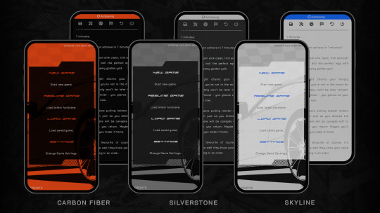
WE ARE LIVE!!! Chop Shop has officially relaunched on Itch.io! Available to play on desktop, tablet and mobile.
Prologue - EP .02 are ready to play - the same as the previous demo - with a new word count of 120k. The choicescript demo will be taken down at the end of the month.
Thank you so much to those who have helped me during this transition period of development! It has been crazy frustrating but I am so much more in love with the game than ever. And thank you to everyone who has been patiently waiting - hope you enjoy all the new bits and bobs!!
PLAY THE NEW DEMO NOW!
AN: CS has had some significant rejigging and rewriting. You can read the authors notes under the cut.
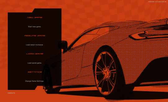
chop shop now has it's own UI! woohoo! (totally did not kill me) this, of course, will come with teething problems and accessibility issues. i am welcome to constructive feedback!
there are a lot of new dialog boxes to explore, especially the dashboard, which includes the PC's profile, inventory, contacts and a glossary page. (the stat definitions page from the old choicescript demo has been scrapped, too much text that wasn't needed.)
chapters are now called episodes! not a huge change but i prefer the vibe yknow.
there have been some extensive rewrites - especially in ep .01, the bar scene got a lot more fleshing out - so i expect typos and grammar errors have slipped through. this doesn't bother me too much but i appreciate any one who spots them to send them in!
there is now an 'end game' scenario in ep. 01. i won't be providing a walkthrough as i think it's relatively obvious given the scenario but it does give you an achievement!
i've kept achievements like the old choicescript demo but it no longer rewards points. maybe i will think of something to reward the player with later down the line?? who knows
i don't want to explain ALL the new details as i really encourage people to go find all the new flavour text and other things etc!!
next -- if you have not noticed, i have added a bug report to the links list. all issues, bugs, and errors found in the public demo can now be reported via the new bug report form.
in terms of writing, i am now porting episode 3. i have had rewrite plans for this chapter for a while, so i imagine this port will take some time. i was in the middle of writing episode 4 when i decided to make the twine jump lmao, so it hasn't been touched for a LONG time, probably since march. i plan to jump straight back into writing when episode 3 is all done!
like before, ep 3 won't be released until ep 4 has a first draft and i'm happy with the shape and direction. so it will be some time before i am able to release new content. but - we ball!
thank you for reading this far and i hope you enjoy the new and improved demo! happy reading! - becky :^)
#cs update#chop shop#chop shop game#interactive fiction#twine game#itchio#i am going to have a nice lil drinky
592 notes
·
View notes
Text
an overview of my progress on the new site over the past 5 months of building
i decided i would put together a big post compiling all of the things i have currently implemented to the new site since at the moment it's scattered amongst a million small update posts. i feel like this will be good reference for anyone who has ideas that aren't included yet
the comic reader
you can now change the placement of the comic pagination arrows to be above, below, or on both the top and bottom of the comic page.
you can search for individual page numbers via a search bar (and also search 'cover' 'back cover' etc)
you can bookmark pages and save your place at any time in any series, and the home landing page will give you a link to your saved page when you revisit the site so you dont have to go all the way to the read section just to access your place. saving your bookmark tells you what page you're saving (or clearing if you're removing it)
you can now select individual scenes in the volume that have non-spoiler names but proper associations to the content for returning readers to quickly find specific scenes
on desktop you can change the size of the page on your screen
on desktop you can hide the site header (this is not necessary on mobile)
there is a legend explaining what each button does
new comment service that does not have ads
transcripts now come from the sides of the screens and do not require scrolling down to read them, and they are correct and no longer inaccurate on certain pages
tooltips that explain what each navigation arrow button is for
content warnings
you can select individual categories of content you do or don't want to see via switches
you have the ability to disable warnings entirely if you wish, just turn all of them off
you can choose between verbal warnings (stuff in dialogue) or visual warnings (things seen on-screen)
you can suggest adding content warnings to specific pages if there are errors OR if there is something major i overlooked
there is a page that lists every content warning in a volume with contexts for each individual warning, whether it's verbal or visual, and links to the pages
there is a pre-moderated comment section that allows anyone to ask questions about content warnings (for example, asking if something will ever be in the comic or asking what category something specific would be listed under).
there is a list of things that do not get warnings and a list of things that will never be depicted in the comic
scenes that did not have content warnings before now have them to match the proper category system
archives
volume archives are now images instead of links, and they are displayed in a grid format which is mobile-responsive so it doesn't take absolutely forever to scroll through an entire volumes archive
volume summaries are more easily accessible
the new transcript archive which is a text-only version of the entire comic, including a clean version in case you need things in dialogue filtered out
mobile devices/tablets
the website is now properly mobile responsive and designed to function like a regular mobile website and is not unbearable to use anymore. it just feels and looks like any other mobile site!
comic pages now touch the edge of the screen and do not always require zooming in to read dialogue
transcripts are now more device-friendly and do not appear broken on small screen devices anymore
all comic reader features work on mobile (except the 2 desktop-only features)
content warnings do not take up too much space or overflow the comic page box
margins are improved to make basically everything more mobile friendly
you can still see page backgrounds faintly on mobile, but they have an overlay to make reading the comic page contents easier. this was not originally planned but i made it happen! yippie!
display
the site now has a built-in dark mode that works for every site theme, however, keep in mind that due to the nature of dark themes they are obviously not as colorful as the main site themes
there is now a saturation slider which changes the saturation of the site to whatever percentage you wish
saturation affects the background and does not ignore it
the screen does not flash as new elements load in, however, images specifically may take a moment to load depending on your internet speed. this is something i'm trying to fix but i can't guarantee it because it's not entirely in my control how websites load images depending on your internet speed
secrets!
cast page
cast page for each series is divided by individual character type (main patients, side patients, main staff, side staff, family, outsiders etc)
cast profiles are mobile responsive in an easy-to-use way and do not take forever to scroll through on mobile devices, instead they are collapsible and you only have one open at a time.
desktop has anchor links to specific profiles using my cute emoji edits :]
search bar on the main cast directory page that takes you to specific characters by entering their name (or variations of it)
profiles include allotpuns, genders, pronouns, nouns, sexuality, species, age, hatchday, height, and a list of all of their afflictions
there are popups that explain the meanings of certain phrases or words (like specific sexualities) and neopronoun usage explanations and examples
cast page profiles for all of the currently public cast members
biographies that contain character history (or at least the currently public history) and a detailed explanation of their personality that replaces the trait system for simplicity's sake
secrets!
comic itself
pages with errors have been corrected
pages with improper characterization/retconned information have been updated and replaced with new dialogue
character card intros now contain pronouns and retconned pronouns have been corrected
uni is no longer referred to with exclusively he/him anywhere except in the comic itself to avoid confusing new readers/people who do not look at other areas of the site
scenes that did not previously have site themes now have them, for fun!
secrets!
FAQ
the FAQ is no longer a million miles long despite containing all of the questions it originally had. it is now collapsible sections that make accessing certain question types easier
pre-moderated comment section that allows anyone to ask questions about the comic, even if they do not have a tumblr account. these questions are directly on the FAQ itself. it is pre-moderated to keep things on-topic.
bug report page where you can describe problems you're having if the site isn't working right for you. this is also pre-moderated. common/important issues will be pinned
navigation bar
there will be links to all of the ask blogs on the navigation bar, including the AUs
there is a link to the spinch lore page directly at the top. no more digging through the FAQ!
navigation bar has dropdowns to specific types of pages to increase the link count without cluttering/taking up too much space
the links are no longer poorly sized images, instead they are actually made with html
landing page
when you first open the site, you will be linked to a settings page that allows you to set your display settings and content warnings in advance
you can set saturation and select dark mode if you want
this landing page is not bright and has an overlay to prevent it from immediately forcing you to see bright colors
this is everything that is currently implemented. there may be things added in the future, this is just all of my current progress.
what do i have to finish?
uploading the comic. i currently have volumes 1-2 fully uploaded and transcribed, v3 is fully uploaded, and v4 is undergoing the upload process.
finish the archive pages to include all of the volumes
finish the cast profiles
work on the spinch lore page
do proper beta testing with the crew to make sure everything works on as many devices as i can possibly test it on
thank you to everyone for being patient with me over the past few months as i work hard on this. i feel really good actually writing out everything i've done overall because i have more progress than i actually realized!!! i hope everyone is excited to see all of this in action because i can't wait for you to see it either!
57 notes
·
View notes
Text
NEW EDITOR 101: A GUIDE FOR GIFMAKERS by v @shangs
Hi friends! I know I said I would do this way back in April/May when this change was announced but I've been massively busy lately so thank you all for being patient with me :)
Based on the results of this poll, I will be trying my level best to help make a guide for gifmakers to best deal with any problems that have been present with the new editor. However, it's worth noting that I have personally not experienced any of these problems myself and I have no record of any problems from other people that I could send to staff and get guidance on, so for some of these issues I will unfortunately be a broken record.
That being said, I have been using the new editor for a few months now and it hasn't been too bad. So don't be discouraged by the new editor if you still love to make gifs and share them. You may need to adapt a bit, but it's doable!
This is meant to be comprehensive and will be explanation and image heavy. Full guide under the cut.
CONTENTS:
What is the new editor?
Steps to take before posting
Making a post
Troubleshooting
01. WHAT IS THE NEW EDITOR?
Some of you may be asking yourselves what the point of the new editor even is and why it's being implemented in the first place when we already had a (mostly) functional editor. My very limited understanding of it as a CS student is app compatibility and flexibility. I'm not totally clear on the details nor am I 100% certain this is the case, but NPF posts (basically, posts made with the "new editor") first started with the mobile app. I'm unsure if the different post types were simply too unwieldy to transfer to the app - having to make a whole bunch of post types when with the new editor you can now have posts with any elements you want without the rigidity of a set post type - or if it was simply not able to be implemented, but the apps have always used NPF. The majority of Tumblr users are coming from the mobile apps. Then it became a case of having the legacy editor for the web users (which were fewer in number) and the new NPF editor for everyone else. That takes resources to keep around and it's pretty inefficient. Naturally the older editor that was used by less people was going to get the axe, especially since you couldn't tell on mobile that there was even a difference between NPF or legacy posts.
So now here we are and the posts are NPF. This means they're in "Neue Post Format." Basically, every post you make is by default a text post, containing "blocks" of other media - as gifmakers we will primarily be dealing with photos.
I understand that it's frustrating to many to see "our gifs are now rendered as text posts" and ask WHY it's happening when photos should logically be rendered as photo posts - but the fact is, there's now no real delineation between a "text post" and a "photo post." The reason NPF posts are now "text posts" is because that's how they are rendered for desktop themes, not because everyone is going to see your post as text and your gifs are going to be compressed into the quality of a potato (though I know some have seen this issue - more on that later.)
02. STEPS TO TAKE BEFORE POSTING
The long and short of it is that you may have to update your theme. More detail here for those who are interested, but check that your theme supports "new editor posts" or "NPF posts" AND that this is true for original posts (you can read more about why in this ask and, although this may be a bit time-consuming, test it out on your blog). I can say with certainty that my second theme Cygnus supports original NPF posts. This is NOT true of my first theme, though.
You can try to add the NPF Fix by @glenthemes to your own theme (beware if you don't know HTML/CSS) or try this tip by @burningblake for original posts.
Feel free to add theme makers with fully NPF-compatible themes in the notes! I have been happily using my own theme so I can't say to what degree others' themes are NPF-friendly.
03. MAKING A POST
If you're sticking around to post on the new editor and you have trouble ordering your gifs around, here's a little guide on how to post.
If I click on "Photo" from web and open up the editor, here's how it looks:
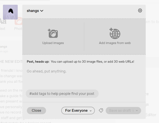
I went ahead and added three full-width gifs and the editor put them in like so:
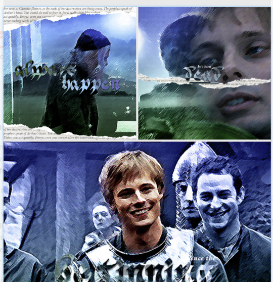
You'll most likely also have to order your gifs around in the way you want them. You can go ahead and hover over your gifs to see the button to orient them (the four dots in the top left corner) and the button for an image description (the three dots in the bottom right corner). I've attached images of all three below:


If you hold the orientation button, move your gif around until you see the blue line that shows where your gif will end up in the spot that you want it. For example, I wanted to move the second gif below the first one, so I oriented it so that the blue line would show the marker between the two gifs:

Now my gifs are oriented nicely! Of course, this is a simpler layout, but the principles still hold.
If you save your gifs as a draft and reopen them or you just notice a large gap like this in between your gifs when you're in the editor, don't worry.

This will not show up in dash view or on a desktop theme that supports original NPF posts. For example, this is how the gifs' gap (without modification) looked in my desktop theme:

With your gifs ordered, the final step is to add alt text. You can read more about alt text and why you should use it here. (Feel free to ignore the sections about the captions on the legacy editor since it is no longer relevant. It's also unnecessary to clearly mark descriptions if they're not in the caption of your post because they will clearly show up under "ALT" on Tumblr.)
If you click the three dots in the bottom right corner as seen above, and click "update image description:"

You can add the description you like and click "update." Your photos' alt text will show up under the "ALT" bubble on Tumblr. This is generally a good practice to get into to make your content more accessible, so I hope you guys will consider using alt text regularly :)
Also, I've noticed that in the editor, if you go back and edit something it will take some time to show up. You may have to refresh the page or load it again after some time, but your edits should be there. I would not go back and edit posts again if you see your posts haven't shown up. I also advise against editing your posts on mobile because it's easier to make a mistake.
And there you go, you've successfully made a post with the new editor!
04. TROUBLESHOOTING
I'm sure you've all been waiting for this. Unfortunately I am probably going to be extremely unhelpful if the editor hasn't been refined in the last few months for those experiencing issues. I'm going to go in the categories that I listed out in my original poll, but keep in mind that I haven't personally seen any of these issues on my end so I haven't been able to contact staff with any evidence that this happened other than my poll.
Dashboard view quality issues: I haven't noticed this issue. I'm not sure if this has been fixed since the original poll was posted. If you're experiencing this issue, this is not something I know how to fix so I would contact staff with screenshots of the issue.
Desktop theme side padding: As noted before, this is a theme issue. If you change themes to something that is NPF-compatible with original posts, there shouldn't be any more issues here.
Small gifs on mobile: In my experience this was happening regardless of what editor was used; it's a bug that seems to have been fixed since this poll was created. If you're still experiencing it, at the risk of sounding like a broken record, I would advise contacting staff.
New editor doesn't accept gifs of size 9.8MB < x < 10MB: I haven't experienced this issue so I would say the only workaround would be to either trim the size of your gif so that it is under 9.8MB or whatever threshold seems to be the cutoff or contact staff (I am so sorry for constantly having to suggest this 😭 unfortunately there's no trick I can offer because the new editor has been taking all my gifs just fine)
Logistical issues ordering gifsets: I hope this guide has been able to answer the majority of questions and shed some light on some of the more buggy behaviors of the new editor, but if you have any more specific questions you can feel free to shoot me an ask!
HTML issues / colored text: Unfortunately it seems colored text may be deprecated entirely? This could be for accessibility purposes because I believe screen readers would read out every single letter of gradient text in captions which I imagine can get quite frustrating for users of this technology. I recommend just using the normal rich text editor. If you want small text, you can highlight and click the <s> button!
Other: If it seems like something I may be able to answer, please feel free to ask me. Otherwise... hound staff 😭
Here's where you can hound staff, btw. If you're having major issues I would advise you guys to submit support tickets. That way if there are any widespread bugs, staff will hopefully be able to fix them.
I hope this guide was helpful to you guys in dealing with the new editor, and happy giffing <3
#gif tutorial#new editor tutorial#completeresources#userphotoshop#resourcemarket#userrobin#userbells#arthurpendragonns#ughmerlin#userbecca#usersameera#usermarsy#alielook#tuserlucie#tutorial
552 notes
·
View notes
Note
How old does your blog have to be to see the desktop blog view thing?
You can just make it happen whenever you want!
In your browser, set it to desktop mode (available in the dropdown dots menu) and then just type in a user's name first, then tumblr.com
Example:
Fangirltothefullest.tumblr.com
If they have set up a desktop version it'll show
Users older than when mobile became a thing will have desktop versions as they are more customizable. You could even add music if you had the html code for a player.
If you wsnt one yourself, you have to enable custom themes.
Log into tumblr on your browser either on desktop or on mobile. I suggest logging in through desktop mode on your phone's web browser and opening the log in in a new tab so it stops trying to pop up the app.
Once logged in you can disable desktop mode in your browsers drop down to see things easier.
It'll probably up like this otherwise and be a formating nightmare.
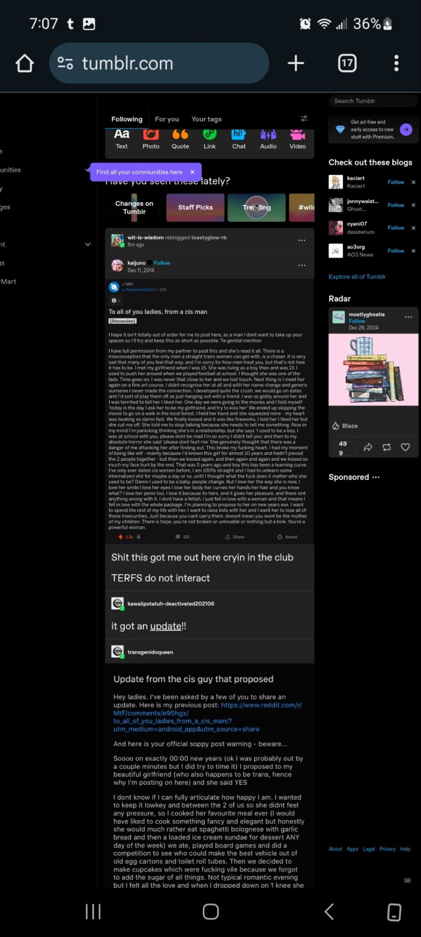
Now.... once it's OFF desktop mode,
Go to the blog you want and hit blog settings in the drop down.
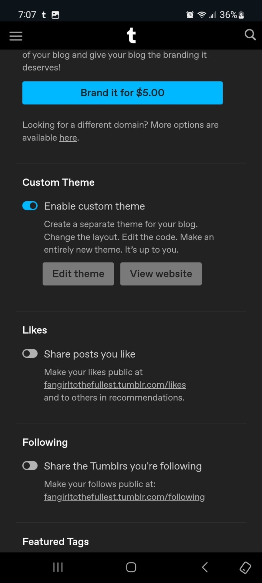
Enable the custom theme and hit the edit theme button. You'll be taken to a place that looks likethis:
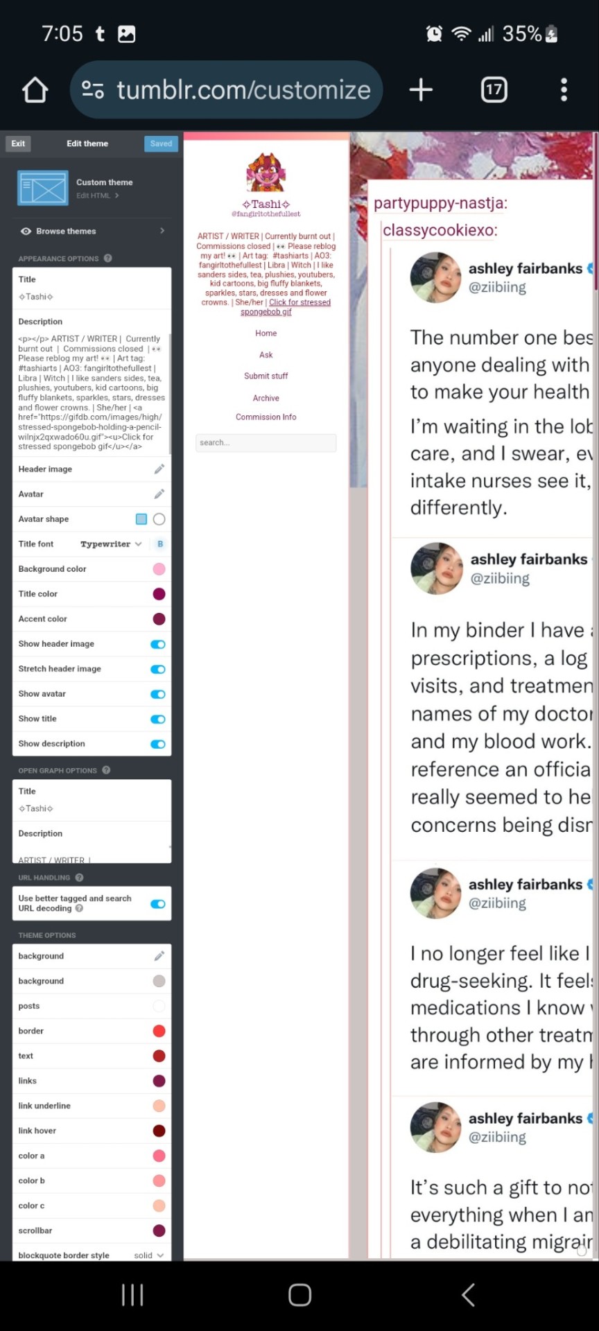
You can zoom in to hit the browse themes button:
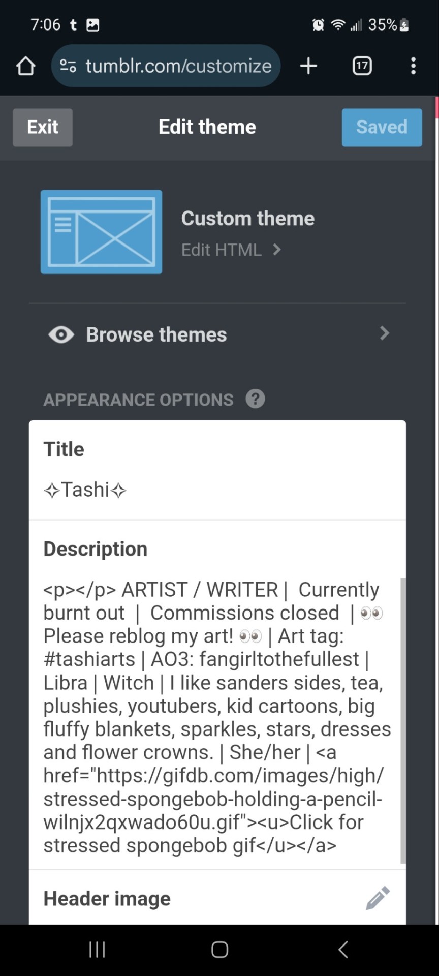
It'll bring you here:
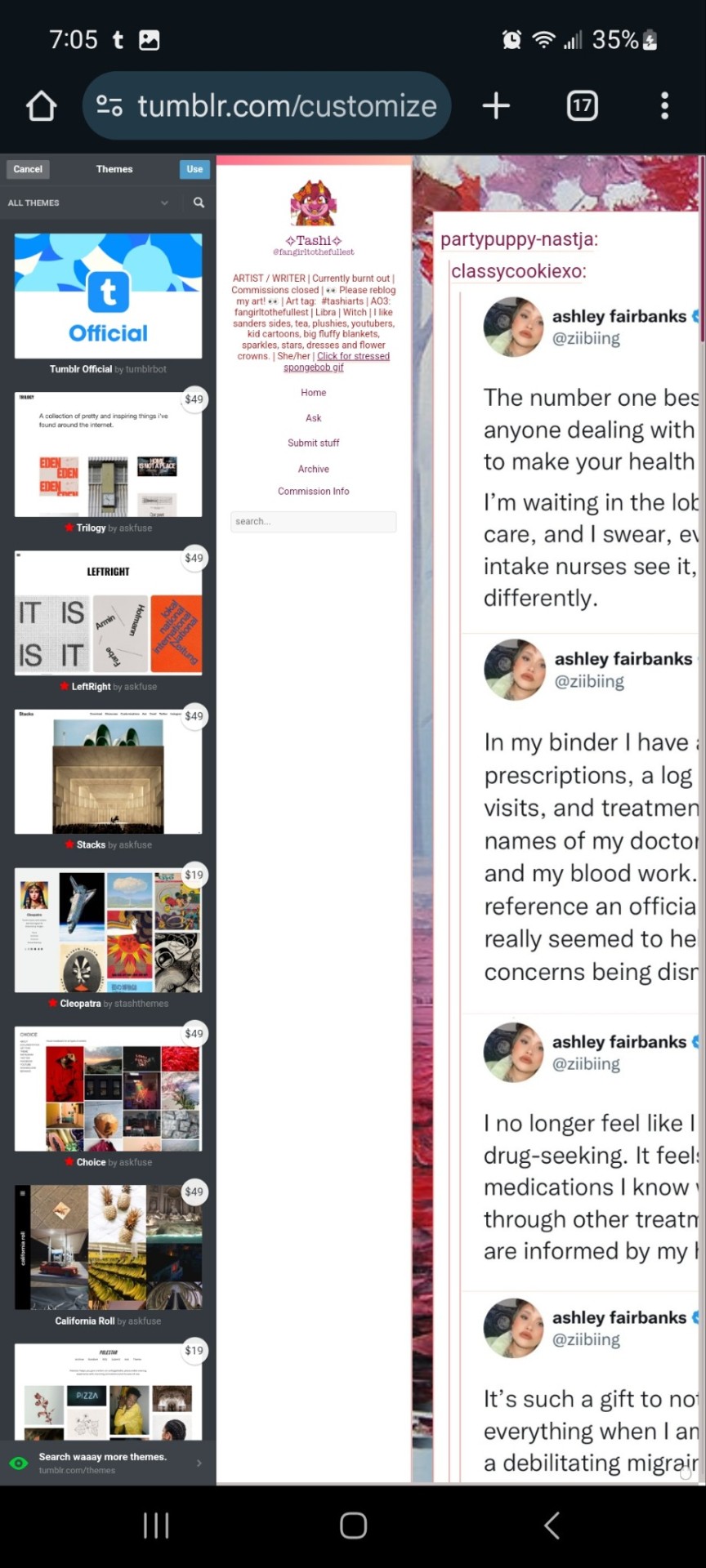
And you can choose what style you want! Hit save and you'll notice it gives you options to play around- choose a background, colour scheme. Fonts etc. Play with the html!
On a regular desktop this is easier to see so I suggest doing this on a laptop or pc.
Also fun fact you can hide secret messages in the html coding and if someone pops open the page source they'll see the surprise message in the code. XD just a fun thing if anyone wants to... say... make their own arg or send out secrets etc.
You CAN create whole pages with this feature too but they are unreliable and after this long it might be broken? So... yeah.
NOW REMEMBER: TO ACCESS THE DESKTOP PAGES YOU HAVE TO CHANGE THE LINK!
Forfeature. As a said above, my desktop link is fangirltothefullest.tumblr.com
I believe the mobile version has it as tumblr.com/fangirltothefullest.
Only people who have made a desktop version will have their blog show up if you'd like to test this festure.
Also this is how you access everyone's blog archive! Because blog archives exist!
Mine would be:
Fangirltothefullest.tumblr.com/archive and you can't open it in mobile or it'll just pop up the mobile version which doesn't exist.
You wsnt this page which let's you find the earliest things a blog has posted. So I created this blog in june 2012 lol.
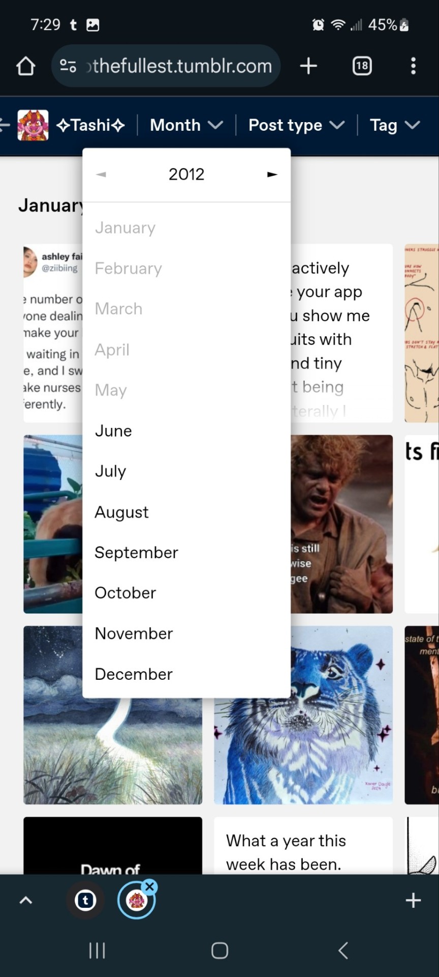
It works for tags too to show you ONLY the contents of that specific tag
Fangirltothefullest.tumblr.com/tagged/tashiarts/
And if you want a tag in order you add /chrono to the end to get it chronologically sorted from the earliest posts in the tag.
Fangirltothefullest.tumblr.com/tagged/tashiarts/chrono
I hope this helps!
NOW EVERYOE GO HAVE FUN MAKING COOL DESKTOP VERSIONS OF YOUR BLOGS!
29 notes
·
View notes
Text
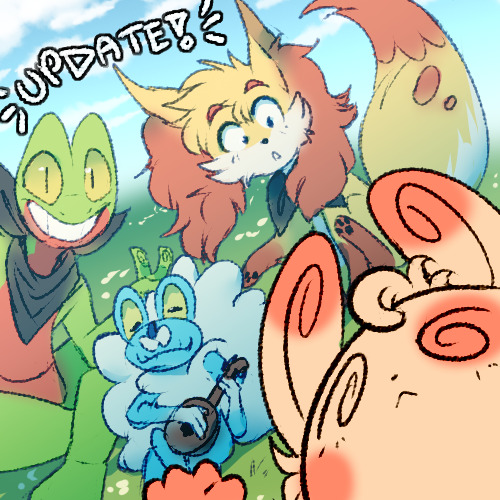
Henllo followers! This is the author speaking! Yes!
Unfortunately, PMD: The Rogue Team is still on hiatus. Real life has been too busy!
This update is to inform you all of some changes made to the comic's website on tumblr, as well as some new things going forward!
>> I've added navigation links to every comic page! As much as I liked the old webcomic theme, it started to bother me that mobile users could not use the desktop navigation, and that the chrono tags did not work. Hopefully this makes your reading experience better! >> I've also updated the website theme! It's really pretty and made by glenthemes on tumblr. Pages are displayed at a bigger size on desktop, so I think it works really well! >> With the theme updated, you now have the ability to send asks to this blog! I've always loved to hear readers' thoughts on the comic in other platforms, and I missed this kinda interaction on tumblr. So feel free to share your opinions! Any not-a-comic-page post will be tagged as "not comic", so you can block the tags if you only want to read the story. >> I also plan to reblog fanart and post my random PMD: The Rogue Team art here! >> Most importantly: even though the comic is on hiatus and life is too busy, I am still working on drawing the comic pages little by little, because this comic never leaves my mind for a second :') So I'm also going to post little cropped WIPs here! And maybe updates on how far along production is going, whenever I reach a milestone.
That's all, folks!
Thank you very much for your support and faith in my little baby project. I hope you enjoy what I have in store ;v;)b
134 notes
·
View notes
Text
Theme: social media / modern media AU
Don’t Hate the Player by daynight (Ao3) @daynightinc (tumblr)
M | wc 6,373 | minor cw cut scene cyber sex (I read it at work 🫡)
Steve Harrington doesn't really play video games. Not his thing.
Somehow, however, he's ended up in an utterly delusional, one-sided relationship with an NPC.
This is so fucking unique I’m literally hanging it up Video Game Hall of Fame. Rochester, here I come. Steve is bullied into playing ‘Upside Down’ an 18+ MMORG, as Dustin tells him the most efficient way to get a hold of him is through [reads notes] the in-game messaging system. Sounds right. Steve gets enamored with the game, playing hours on end even without Dustin. And Steve finds Keswardia the Banished, an NPC merchant, that he can’t stop visiting.
I’ll be honest I fucking love video game lore. It’s one thing that sucks me into games so hard. The world building in this fic just for the video game is so good!! I want to eat it up. And the fact that Steve stumbles into Keswardia destroys me. Read it, you’ll get it.

Gareth the Matchmaker by Steviesbicrisis (Ao3) @steviesbicrisis (tumblr)
G | 15/16 chapters | no cw
Gareth is in charge of the Corroded Coffin official TikTok account, he's playing Fuck Marry Kill with the three random celebrities filters and trying to make the other guys join as well.
When it's Eddie's turn, he's having none of it until he sees the three celebrities on top of his head.
He has no clue who these people are, but the one in the middle? Eddie is sure he's going to marry him someday.
Eddie has yet to find out that the guy is none other than baseball player Steve Harrington, 1/3 of the "Ladykiller Trio", currently playing for the Yomiuri Giants. In Japan.
And when things get too complicated for Eddie's liking, thankfully he has Gareth on his side.
I honestly think this is the first time I’ve ever read a social media AU that’s only through images and with a complete story. There’s screenshots of the text messages, Instagram, news articles, TikTok’s. This is such a unique storytelling method and everyone is so in character, you forget that it’s not real screenshots. (I hardly ever read anything that’s incomplete but I made sure to hit subscribe when I first saw it was on Ao3.) It’s a WIP, but chapter 16 is supposed to be an epilogue, so even if you don’t like reading WIPs, I highly encourage this one!!

WHO IS EDDIE MUNSON FUCKING by beetlesandstars, witchjeons (ao3)
M | wc 2,445 | no cw
Summary: eddie: oh god
oh no god please no
FUCK
FUCK FCUK FUCK FCK FUCK
NOBODY LOOK NOBODY SCROLL UP
PLEASE
nancy: did you actually just sext the fucking group chat
eddie: so. like
Or, Eddie accidentally sends a sext to the group chat. Chaos ensues.
I fucking die reading this. This is an entire fic made of chat rooms and it’s so fUCKING funny I’m not even joking.
Eddie accidentally opens a can of worms when he sends the wrong message to the wrong chat and chaos ensues. All of their personalities fit so well in a modern setting and it feels like you’re snooping in someone’s phone. I really recommend anything that Jo writes that has chats (and in general)!

Eddie Munson/Hotdude Official Megatherad! By MixAddams (ao3) @mixsethaddams (tumblr)
T | wc 1,906 | cw Reddit simulation
Summary: The general public spent 30 years thinking nothing of Steve’s presence in pictures beyond him being ‘that one hot dude in the background’ because whatever, he was just another part of Corroded Coffin’s entourage.
Imagine the scramble on the band’s subreddit to reexamine every picture he’s ever been in when, the day gay marriage gets legalised in Indiana, Eddie posts a picture on Instagram of the two of them with the caption “Finally. We’ve been engaged since 1989.”
(Because of the formatting is infinitely clearer on desktop or tablets than on mobile)
I absolutely love this. This is literally peering into the Stranger Things universe in 2Kwhatever and peering into the mess that is Reddit and the Corroded Coffin fan base. This is so fucking brilliant I just !!!! Please read.
Seth tbh I don’t think I realized this was your fic I love your brain, I’m kissing your brain.

Consensual Catfishing by foresthearts (ao3)
M | wc 32,108 | cw miscommunication
Summary: When Eddie gets a message on instagram from an account claiming to be the famous pop-star Steve Harrington, he knows immediately it's a catfish. He's not dumb. The account has no pictures and people like Steve Harrington don't just randomly DM guys like Eddie.
Still. What would be the harm in letting it play out? It's not dangerous if he knows he's being catfished. No, if he knows about it, then it's basically like a fun little roleplay. No harm, no foul.
(Eddie is not, in fact, being catfished)
*slaps the screen of Ao3* This baby can fit so much into it! Mistaken identities, identity porn, mixed media, famous Steve, slightly less famous Eddie, podcasts, text messages, tumblr posts, and dungeons and dragons.
Eddie, a DM for a Dungeons and Dragons online podcast (vodcast? wtf do you call it when it’s a video series), gets a message from someone pretending to be his (slightly former) celebrity crush, Steve Harrington. Eddie goes along with it, joking about it on his show, and maybe he kind of falls in love with the catfisher…
While Steve Harrington finds out an internet celebrity is into him. He reaches out to the famous DM Eddie Munson in hopes he can get over his former relationship with his bandmate.

This Untitled modern AU by @steddiealltheway
G | ficlet sized | no cw
Summary: A wrong number leads to Steve making an unlikely friendship.
This fic rattled my brain so much, when I was searching for it I thought it was on Ao3/10K fic. I absolutely love this piece! Robin goes out on a date and Steve (lovingly) jokes that Robin is going out with a serial killer. Steve texts Robin’s new number, just to ensure she’s safe and not actually with a serial killer… only to find out that he has the wrong number. He creates a friendship with Not Robin (of course, after finding out Robin was indeed safe), and maybe he falls along the way, too.

Found God in a Tomato by beetlesandstars (ao3)
M | wc 5,725 | no cw
Summary: Eddie: just met the cutest guy on god’s green earth and i didn’t get his number
basically it’s over for me
Steve: Oh? Where?
Eddie: at this little coffee shop i like
i’ve never seen Tall Pretty Gorgeous here before though so. i will probably never see him again.
shoot me
Steve: Tall Pretty Gorgeous huh?
He must’ve been something
Eddie: YES Steve. he WAS
operative word being WAS!
i can’t believe i didn’t ask for his number
Steve: What’d he look like?
Eddie: oh, you know
his beauty was beyond compare
with flaming locks of chestnut hair
with suntanned skin and eyes of roasted beans…
his smile soft like summer rain
his voice was like a breath of spring
and i cannot be normal now, joleeeeene
I actually found this fic while searching for the above untitled tumblr fic (when I thought it was on Ao3) and stumbled upon another great Jo creation!
A text to the wrong number creates a friendship through sending songs back and forth (the best kind of friendship). And ugh!!!!! I just love this so much.

i couldn’t see (you were always right beside me) by oriscribes (Ao3)
T | wc 13,609 | cw they’re fucking idiots
Summary: Three hours later Steve logged off to get ready for his shift at the hospital. He was several levels higher and had finished the quests in Darkshore with the help of Greyhawk. He also had a friend listed in his friends list.
Greyhawk had said that being friends would let them be able to tell when the other was online so they could quest again. Steve really liked the sound of that. He didn’t have many friends his own age. He and Robin basically lived in each other’s pockets at work, but with Robin’s new girlfriend and their sleep schedules, they didn’t end up getting to hang out more than once a week.
A new friend sounded really nice, especially given that it was unlikely he would ever get along with his neighbors. The only resident Steve’s age on this floor was the neighbor he hated and that was very unlikely to change anytime soon.
OR
Steve hated his neighbor. And then Dustin and the other kiddos left for college and Steve signed up for some online game called World of Warcraft. Which was how Steve met a Night Elf druid named Greyhawk.
Oh my god did we ask for more mistake identities because THIS FIC IS LOADED WITH THEM!!! I cannot stress how much I loved this fic. I just discovered it two weeks ago and it is embedded so deeply into my brain I just !!!!
Steve decides to join Dustin and the rest of the party on WoW, to bridge the distance college has created, but somehow never joins their party as he makes a new friend online. Steve uses WoW to relax from the real world of his stressful job at the hospital, the ongoing feud he has with his neighbor and his cat (Cowboy!!!!!!), and the constant nagging he gets from Dustin to meet his other older friend Eddie.
Eddie, on the other hand, found a newb on WoW and somehow adopted him as a new friend, helping him level up and teach him the game. If only friendships work out this well in real life, then maybe he could help his grumpy neighbor not be so … well… grumpy.

Please remember to leave kudos and comments on the fics you read/enjoyed! Support your writers 🖤
Prev fic rec: fics that fucked me up (so you should read them too)
#steddie#stranger things#eddie munson#steve harrington#steddie fic recs#fic recs#novacorpsrecruit fic recs#lmao I left my note to find the untitled tumblr fic so that tells you how much it rotted my brain
47 notes
·
View notes
Text
the cockles masterlist, part 6
now split in SIX parts for link limit reasons
WARNING: this post glitches and crashes on mobile. it’s recommended you view this on your desktop, or at least on your mobile browser rather than the app. if my desktop theme is hard on your eyes, try an extension such as Just Read or Reader View to customize the layout and colors.
if you’re still having trouble viewing, or if you don’t want to have to switch between the five posts, here’s all of the links compiled into a google doc.
welcome to the cockles masterpost, a labor of love/insomniac hyperfixation.
i recently wrote this cockles manifesto, but after it got a lot of notes and i kept adding more links to it, i decided i should just go through my 8 years of archives and compile all the cockles posts in a much more accessible and navigable way. after everything with the series finale and destielgate, i figured we could use some happiness, and it turns out there are a lot of people who’ve never heard the cockles gospel.
important disclaimer: yes, i do think that jensen and misha have a private romantic/sexual relationship, but no i do not, in any way, think that they have ever cheated on their wives. we think they are polyamorous, which is a real and valid thing, and misha is openly poly. some people love more than one person, and that’s okay. their families are close and we love and support all of them.
second important disclaimer: despite the amount of innuendo below, this is not about fantasizing about two hot guys fucking. cockles is about the joy of witnessing two people who love each other and make each other happy and are disgustingly cute together. we’re not fetishizing, we’re just appreciating what they publicly share with us.
third important disclaimer: because some of y’all don’t know, the cardinal rule of cockles is that we don’t talk to cockles about cockles. DO NOT leave any comments on their social media accounts implying anything. not even green and blue hearts. they know that we know, but it’s on us not to make it weird. if we’re too obvious and say too much, they might start sharing less. don’t say anything.
for the sake of my sanity, these are in no particular order.
last updated: 3/8/23
🐚 denotes new content
part 1 (That’s Suspicious, mishananigans)
part 2 (#pray4jensen, gag reel hijinks, some posts i’ve written about cockles and rps)
part 3 (know your cockles history, the intimacy)
part 4 (the glory of jibcon)
part 5 (just for cute)
the glory of jibcon continued:
jib11 opening ceremony whispers and giggles
jensen turning his back as misha walks up to hug him | more gifs | video
"just swallow it" "he's always giving that advice" | video
"[danneel] does refer to misha as her boyfriend. which is funny, because so do i." | more gifs | video | fan discussion of this moment
misha sitting on the floor to watch jensen sing, jensen getting shy
jensen serenading misha with "angeles" | video angle 1 | video angle 2 | video of jensen looking at misha, getting flustered, and stopping suddenly | more gifs | photo | misha sitting on the floor watching | another misha photo | the significance of ‘angeles’
"i think you look nice and dapper" ... "then [jensen] went in for a kiss and i was like, whoa!" "hey, when in rome!"
the destiel song they improvised together | video | gifs minus lyrics
big dad angry machine
"i've been haunted by those bear underwear for some time"
jensen "woo!"ing when misha mentions gotham knights
jensen's face going soft when he looks from jared to misha | video
after misha says a unicorn toy is vibrating "for her pleasure", jensen pretends to sit on it | gif
misha moves his chair further away, jensen scoots his closer | video | “what are we doing? am i coming over?”
jensen spinning the wheel then staring at misha for ten seconds straight | video | photos
jensen tells everyone to stop cheering for misha to sing after misha makes it clear he doesn't want to | gifs + bonus “there goes jared with his job security” 👀
jensen winking at misha
jensen saying he's going to plan a big birthday party for misha's 50th, which is more than a year away | video
"you're my canary" | video
whispers and laughing (feat. misha's missing tooth) | photos
"i love those dishes" "you love those bitches??"
misha hyping jensen's new album | video
"my caretaker tells me i had a very nice birthday."
jensen staring at misha’s ass when he bends over
"this is our song"
roasting jared for bragging sam is tougher than dean | gifs
jensen staring at misha before making a birthday wish
riffing on “the european version of spn”: one, two, three, four
chatting about taking their families to amusement parks, jensen refers to misha as ‘daddy’
jensen’s nickname kink in full swing at jib11
12 years of jibcon secrets
head-leaning selfie with briana buckmaster | edit
2023 jibcon11 tag
just for cute (continued):
adorable photo ops: 70 71 72 73 74 75 76 77 78 79 80 81 82 83 84 85 86 87 88 89 90 91 92 93 94
2012 spn wrap party photo
300th episode red carpet flirting
"misha decided jensen was the gift" photo op
hand measuring photo op
360 notes
·
View notes
Text
How to have your own blog page on Tumblr
Hey, tumblr users!
This post is specifically for users who joined in 2023 or later. Because I'm realising there's a very important feature older blogs have that you don't.
More recent blogs don't have their own URL.
What this means is, where I am findable on tumblr.com/none-ofthisnonsense like any other tumblr user, I also have a URL - my own page assigned to me, which is none-ofthisnonsense.tumblr.com. (I invite you to click on those links if you're on a computer and see the difference. It's very obvious.)
So what features are in this own page? (And how can you get it?)
You can search things that are tagged and see them on your own page! You can enter your URL and type [URL]/tagged/pride and all the posts that you have tagged with #pride will appear. Here's how the link looks: https://none-ofthisnonsense.tumblr.com/tagged/pride ^ This works even if your blog search is turned off! If you know this shortcut you can search for anything anyone has ever tagged, as long as you know the tag and their URL.
You can see things in chronological order! Tumblr by default is in reverse chronological order, which means you see newest things first. But if you want to see the FIRST thing I tagged with #pride, you just type the link you would to search my #pride tag - so https://none-ofthisnonsense.tumblr.com/tagged/pride - and then add /chrono at the end. And this is a link to show you what it looks like: https://none-ofthisnonsense.tumblr.com/tagged/pride/chrono
By having your own page, you can also customise it! That's why many blogs have themes. I don't really have a theme, but if you're on your computer and you move your mouse pointer around, little sparkles will follow you*. Other blogs have way fancier themes that look great! For example, Diane Duane (dduane) and Peter Morwood (petermorwood) do. And these are relatively simple themes! You can fully customise your theme. There are loads of resources out there on how to do that!
Perhaps most importantly: you can access your blog archive.
Your blog archive is one of the Tumblr features that makes Tumblr great. You can every post you've ever made without scrolling through every single post. You can filter posts by type and by tag. It's awesome. Here's what my archive looks like right now:

You can filter by date! By post type! By tag! This is really useful if you're looking for one specific post but you've got a solid tonne that are tagged with that tag. It's an amazing and I don't even know just how useful it is because it can be used for other stuff too!
Having a blog archive like this is useful for you and for other people. You can see what you've posted per month, every year, and it's just a very pleasant and useful thing to have.
But... not everyone has it now. Because Tumblr removed every blog having a URL, not every blog has an archive anymore. But I have GOOD NEWS! You can have your own URL!
If you go into Tumblr settings:
Go to the settings for your blog. (This is for each individual blog. You can have this turned on for one blog and off for your sideblog. You need to enable this for every blog you have if you want this on every single blog, which I recommend.)
It should be a page like this: https://www.tumblr.com/settings/blog/[USERNAME].
(I very strongly recommend being on desktop for the rest of this because I'm not sure how it works on mobile.)

Enable the custom theme. Do NOT do the "address" thing because that's different and that is NOT what you want and you need to pay. Custom theme is free. Enable custom theme.
Once you do that, it'll create the address for your blog at [username].tumblr.com! And you can customise your theme and see your archive!
It's really easy, and it makes for a more pleasant experience :)
*That is with this extension: https://www.snazzyspace.com/tumblr/mouse-sparkles.php. And guess how I found it? By looking through my blog through my own page and looking at my posts tagged #tumblr in chronological order!
15 notes
·
View notes