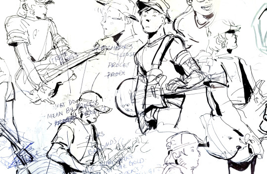
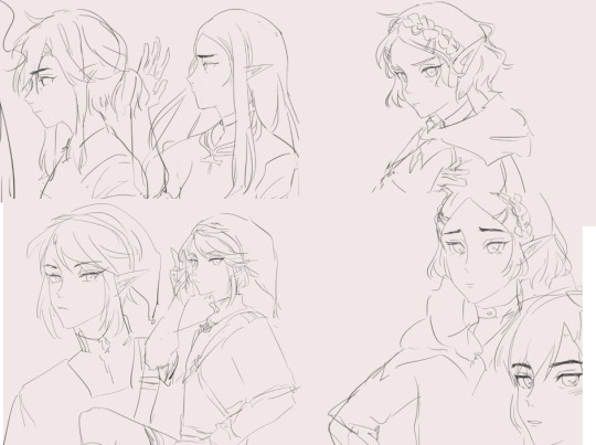
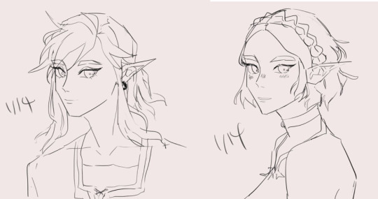
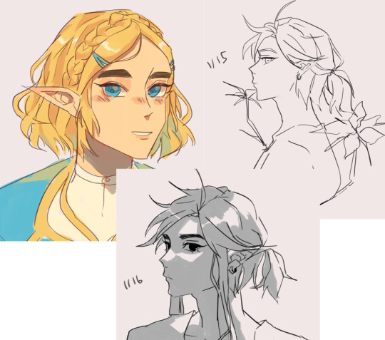
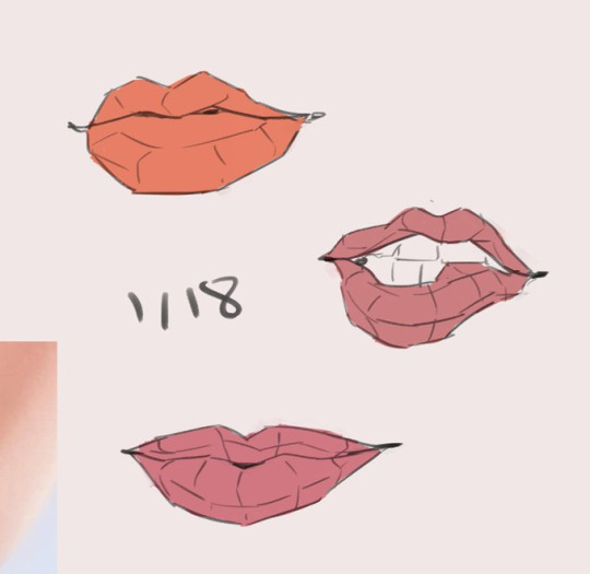
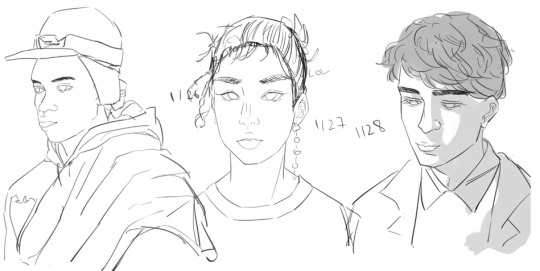
#needed a break from drawing like 2 sets of sketches for stuff so heres a breathe doodler
Explore tagged Tumblr posts
Visit Tumblr Blog
Explore Tumblr blogs with no restrictions, modern design and the best experience.
Last Seen Tumblr Blogs


Fun Fact
There are dozens of funny blogs to kill time on Tumblr.
Note
I adore your style and content - I’m considering doing masters studies of some of your pieces just to try it out, but I’m still fairly new to art. I was curious if there’s any part of your process or any particular advice you’d have?
Gave this answer before to someone who asked me the same question, and I think it still counts! 1) Build stamina. You can do this by drawing often- and with intention. Start your drawing with a warm up- something light, not overly serious. Focus more on the literal mechanical feeling of your hand moving to draw. Then focus on the heavier stuff after you’ve both literally and mentally warmed up, setting the stage for more involved drawing. Make this a routine and drawing overall will be less tiring over time.
2) Focus on replicability, not detail. This goes hand in hand with the previous point. A lot of people develop a kind of perfectionism early on, where they get overly attached to a specific sketch and don’t wanna budge from it, and put details until it “looks good,” even when the subject as a whole is wonky. I like to equate this to “too much icing, not enough cake,” or “building on sand foundations.” I’ve been there before, and it can hold you back. Instead of focusing on a specific piece and how you rendered it that one time, focus on how you render it such that you could do something similar, easily replicate the concept. Once you’ve built more stamina, you can open up the gates to tackling the same subject matter in different ways.
3) Mind your mark making. Some folks agonize over the tiniest detail, sometimes for hours. At the end of the day, that itself doesn’t necessarily bring improvement- that’s more of a test of patience. Unless someone specifically asks, you don’t- for example- need to draw every single ridge of every knob on a switchboard in great detail. These things can be implied through mark making. Remember, a lot of drawing isn’t about literally making something for people to see- it’s tricking the eye into believing what’s drawn is actually there. You’ll be amazed at what detail can be like even when you don’t define every part.
4) Drawing is more seeing than “making it up.” * Don’t be afraid to use references and such. It’ll help you render form than imagining it- sometimes the imagination can conjure things incorrectly. *Even seasoned artists who don’t typically use too much references need to do studies from life or books every now and then to reinforce skills.
One point I didn't add before for style things specifically is: 5) Look where the artist got their inspirations from if you want to learn from them. No art exists within a vaccuum, everyone has their influences. Trying to do a study from someone's art will only take you so far- because then it'll feel more like mimicry than actual, learned study. Research or try to see parallels with artists that you might think had a hand in influencing a given artist's style. Notice the patterns there- certain textures are invoked here, this form was defined like this, etc. A lot of folks confuse wanting "more of a thing" as opposed to "what makes that thing desirable/unique." If you'd like to know where some of my influences come from, I'd say look at the works of Squiddy, covers for Hellboy comics, and the Snowpiercer graphic novel.
Addendum: If you're looking to draw anatomy specifically- study from real anatomy, and learn how to do those before you begin to "break the rules" (exaggerate, anthropomorphize, etc). For resources on that, I'd recommend the Morpho books (all of them haha) and Dynamic Human Anatomy by Roberto Osti.
Hope this helps somewhat, feel free to ask if I missed anything.
46 notes
·
View notes
Photo

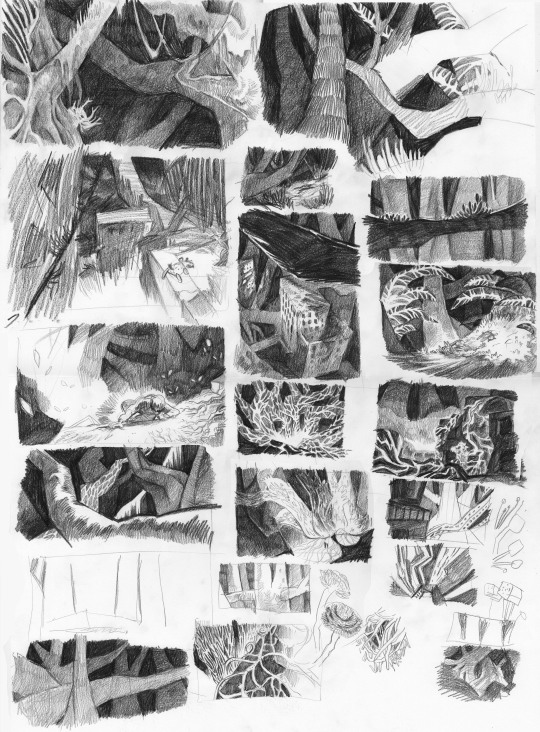

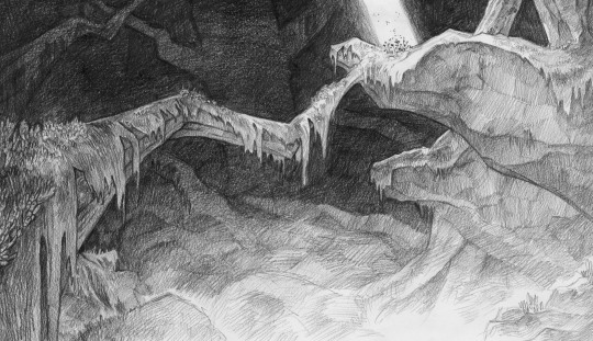

Phew, I’ve uploaded some concept art on Twitter, breaking my chain of endless fanart with some professional seeming stuff, and I wanted to show you here, too:
These are sketches for the concept art I’m doing for my master thesis project! I’ve got 2 main settings in my hypothetical 2d movie, the Forest and the City, and I wanted to work out the visuals of the forest by going for some atmospheric drawings. Overall there is only few light shining through the branches, so the deeper and lower you are, the less light from the sun is there, until only mushroom will illuminate the area. I wanted to give it this vast, eerie feeling. Though at the bottom of the forest, you will find the ruins of the old world on which it is rooted, and the heart of the fungi network, a rather magical looking place that I wanted to make the setting for the finale of the story. I will make one properly worked out illustration for that place and then get back to the city, before I lose too much focus of my time frame that I still have left..
(for the fungi core, the bottom drawings, I am referencing the Kulturpalast Dresden, a philharmonic hall with quite interesting architecture! It fits perfectly with the stage and the different layers of the seats!
(on another note: everytime I look at other amazing art/movie references I get another cool idea how or what I want to do. I recently watched The Emperor’s New Groove and let me tell you, every background in that movie is just soo amazing, and the movie works so well with these stylised bgs, that I got the idea: Maybe I could go for smth more stylised, and not try to make the scenery seem so much like a “real” room, but more think about how the characters could be placed in it and then think about creating the better effect. Know what I mean? The more I learn and see the more I find out how little I know about this, but it’s all interesting and fun to work out! I just wished I had more time, not really needing a result in..uhm 2 months. *sweats* )
184 notes
·
View notes
Text
Enigma, The Machine’s Masterpost
Ok, there’s a lot that I have to talk about, brace yourselves
Art stuff
La Gloire à mes genoux
Take Me Out
Detroit Become Human AU
Disco Elysium styled Q
Bond/Alec collab #1
Sandman AU
Lineless
Paper
Villain!Q comic
One line
Vampire
Shapeshifter!Alec
Leyendecker Q
Black and white
Paper gun
Elf!Q
Take care of yourself
Bond/Alec collab #2
Sketch dump
Bladerunner 2049
Goldo/Silver (Emilia's OC) collab
Merman
Wizard
Pixie
The Yellow King
Engie!Q
One day I'll return to your side
A KNIFE!
Alec/Boris
Silent fury
TOTK 00Q
Mood indigo
ポルノグラファー
透明人間18号
Be water, my friend
The Little Prince
I don't want to set the world on fire
00QAD chat night doodle
I never say goodbye
Quatre mains
Chess Grandmaster
Fics
I'm so sick and tired
Linked haiku
Non-art things
Incorrect quote 1
Incorrect quote 2
Incorrect quote 3
Incorrect quote 4
Incorrect quote 5
Q cosplay
Total points: 1470
!!!Rambling ahead!!!
So, I was captain for team villain this year, and I'm probably the youngest captain there ever was lmao. I tried my best and I hope I did ok.
But here's basically how my leadership went throughout fest

Yeah...
Prompt table ramble
I also made a prompt table. The "art challenges" one and surprise surprise, it's difficult. But when I made it, each square had a goal in mind.
Black and White only: the goal was to strengthen your sense for light and shadow.
One continuous line: Strength sense for form, some what like a blind-contour
Draw in a different style: Forcing you to do art studies
Based on a painting: Also forcing you to do art studies
3 colours only: Value studies
10 minutes: speeeeeeeed
Use a different medium: break your habit of using the same thing over and over again
Yeah. I was lowkey worried that no one was gonna do this table.
Art stuff ramble
I have made so much this year. And I have thoroughly enjoyed making people cry with my art. I don't wanna explain anything lmaoooo (I'm so tired).
Closing remarks
As of writing this, I'm recovering from a cold. I'm very tired, constantly sleeping at some ungodly hour.
I feel like I've improved a lot in terms of art. i pushed myself in terms of quality, but I am really tired.
I need sleep. I have a flight to catch tonight.
Thank you to everyone who have participated 007 fest 2023.
#007 fest#007 fest 2023#teambondvillains#masterpost#thank you everyone#I hope my leadership was sufficient#00Q#james bond#007#q#quartermaster
28 notes
·
View notes
Text
Hi! @velvetcloak asked me to do some kind of lineart tutorial/step-by-step, I'm by no means an expert so don't hesitate to ask if you need some things clarified! Always glad to help.
I use three different methods that are pretty much trial and error, depending on what works best for the artwork but I'll do my best to explain with screenshots - these were taken on photoshop, I draw with procreate, but I'm guessing the layer modes are similar on other softwares. (Also mine are set in french, sorry in advance for the confusion.)
If you're already familiar with digital lineart and softwares, this probably won't be of much use, it's very basic stuff.
Otherwise, more below the cut! (It got a bit long.)
I. Solid black lineart, with this illustration used as reference.
I used the basic gesinski ink brush in procreate, 100% opacity in normal mode to get pure black. Very basic, it's set on top of the colour layers, everything above that is just additional effects and filters + textures. Note that I always draw separate elements on different layers and fuse them later, it's easier to deal with details this way. The isolated layer looks like this (I changed the colour of a disappearing hair lock, more on this later):
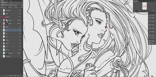
And the colours without it, like this (my style relies heavily on lineart, lol):

Both:
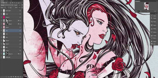
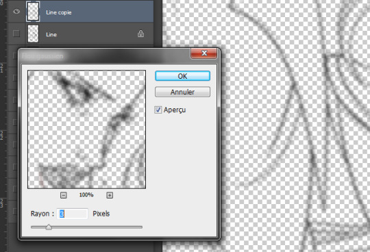
Good! It's a bit harsh though, I like to add a second layer to soften things up, set in 45% opacity multiply mode right under that. I duplicate the main lineart, and add a gaussian blur to the copied layer (between 3 and 5px, values vary from one artwork to another, same with the layer modes.)
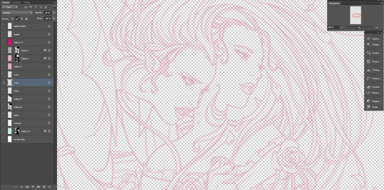
Not done yet! I use the blured lineart as a colour filter by locking it to pixels only and filling it with the tone I want. In this case, red. Isolated layer:
And the end result:
The second method, I tend to use more on sketches and loose drawings to get a better blend of lineart and colours:
II. Semi-transparent lineart, with one of these sketches.
Basic 6B brush in procreate (my fav), quite thin here but you can get great results with a larger brush. It's not really obvious looking at this scale, so here's a comparison between a black solid lineart (1 layer, normal 100% - the scars are on a separate layer because of the colour, otherwise it's the same setting) and a semi-transparent one (2 layers), especially visible in lighter areas, note how the second one lets hues show through. I find this to look a bit less stiff.
Now for the method! Since this relies on the layers underneath, you want your colours to a bit more precise than the previous example. Without lineart:
TBH it's also a two layers solution, super easy. Once you're statisfied with your basic lineart, set the layer to overlay 100%. You'll get something like this:
Then duplicate this layer, put the copied layer above the overlay one and set it to normal 70% (or whatever looks best, this is 67%) and you'll get the final result as previously shown! In this particuliar case, I erased the black circle around the iris in the normal mode layer to keep the blue of the overlay one. You could also skip step two depending on the desired rendering.
The third method is a blend of the other two result-wise:
III. Coloured lineart, with this illustration. (tw: a bit of gore and blood in the full artwork, I'll crop it out of the screenshots. Poor guy can't get a break. It's the only file in this style with a semblant of organization, don't be like me, rename your layers and use folders.)
Fountain pen toothy brush, from the MaxPack watercolor set. It has a bit of a texture to it, and isn't entirely opaque so it blends nicely with the layers below. The lineart is set to normal 100%, for this method it's preferable to have separate layers for each elements, since you'll be recolouring them individually. Here, the hands, skull and additional details are all on individual layers.
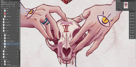
Just like the blurred layer in the first method, you need to lock your pixels (the little grid to the left on photoshop):
And either fill you layer with colour, or paint on it with an opaque round brush/a soft one depending on the desired outcome. (Some zones might need a gradient, or various colours.) You can also use another normal layer on top of a black lineart and set it as a clipping mask, same result, different method. But I prefer to keep the layers count to a minimum when possible. With the layers below, it will look like this:
You can notice a bit of lineart transparency over the skull colour layer, cool stuff. (The shading of the skin is set on top for some reason, I don't remember why but surely there was a reason.) However! In this illustration, I need a yellow glow for the fire so let's create yet another layer, shall we? This affects the whole rendering. I painted a diffuse light source using a soft gradient brush, and set the layer to hard light. Isolated layer:
End result:
All done!
Now go create!
9 notes
·
View notes
Text
okay this is the whole rules tm for the exchange
To participate in the Exchange:
1) Fill out the application.
3) Confirm gift pairing within 48 hours of receipt.
4) Notify mod of all tumblr URL changes.
5) Complete a gift by December 22nd.
We recommend that you follow the exchange blog (here) for updates, however, this is not required :))))
Gift Requests*
No OCs or crossovers Alternate Universes are allowed
In the event that an applicant asks for gifts that are too difficult to fill or violate one of the above rules, mods will contact recipients for amendment.*
Gifts
Fanart: Must be a finished drawing, coloured, or rendered black and white - not a sketch. Fanfic: Must have 1000 words minimum, with no obvious spelling or grammar errors.
NSFW: out right im not allowing nsfw related stuff unless someone else wants to mod it. i will be allowing gore related junk since im okay to moderate that gore: although i am allowing it based off of what the source media is i am going to put a 16+ barrier on this one. you can also opt out of making content for these types of gifts if they come up.
Not allowed:
Hateful or abusive content like ship bashing, racism, transphobia, bullying, etc. spam applications will be blocked
Posting.
Put content warnings if applicable. Tag applicable characters and ships. Post between December 23th and 31st. DM or @ mention your gift recipient when you post! Mention @talesfromthegasstationexchange and use #tftgs23 in the first five tags! (Just in case.)
Gifts that do not meet requirements or break rules will not be reblogged.
some may be missed through time zones and tumblr being tumblr but feel free to reach out on here or through my personal in DM,
What is the tftgs Exchange?
A Secret Santa-type event where like minded fans create content for tftgs.
What kind of content is allowed?
Either a finished drawing (as determined by the artist) or a fanfic with a minimum of 1000 words. Can I ask for my designs from tftgs to be used ? Yes you may do so. though you will have to have easily accessible references publicly available for your gifter to use can I ask for another set of designs that are not my own ? again yes, of course but they do still have to be openly available online and you need to mention the artist/ blog that has them in the application
Can we ask for gifts with tftgs ships?
You can ask for any ships, as long as it is with canon characters
Is N.S.F.W. Allowed?
hard lines no. i allow gore based on the source media but nothing beyond that. as well if the gift you create does contain gore it should be tagged and cropped accordingly, and the full piece put under a read more or linked off to another page
If you post something in violation of these rules, we will ask you to fix it prior to reblogging it :)
Can I ask for a gift featuring my tftgs OC?
No. ocs are super valid and i love them. but i do feel though it is very unfair to the gift maker to try and visualise a character they may not know well enough to depict. Can I ask for a gift featuring book related spoilers?
yes! applicants will be separated out into 2 main categories, the audio series and the books. So that no one ends up getting asked to draw or write from part the either haven't read or heard.
How are pairings made?
Applicants will be paired with other tftgs Gift Exchange recipients. it will take preference into consideration; further, i will not force people into making content for their NOTPs and hated characters. Outside of that, please be open to exploring new people and pairings to spread the happiness this holiday season.
i dont want the same person to make for or to be given from last year
thats completely fine, ill try my best to work around it an make sure you get someone diffrent.
I’m not sure if my recipient will like the gift I want to make them. What should I do?
Easy! Anon ask your giftee if you need clarification about what they would want.
If their anon is off, contact me explicitly explaining this, plus any questions you may have. We will reach out for you :>
What if I have to dropout?
it’s sad to see you go!
In the event that you cannot finish your gift, OR something comes up that will delay your gift (even writer’s block!), please DM either ASAP so that we can find a substitute.
Okay. You’ve convinced me. Where do I sign up?
Applications open November 14th! aka today
I posted my gift hours ago, but it hasn’t been reblogged. What gives?
feel free to dm it to my main. ive probs just missed it because my brain is fried @theredheaddevil
Disclaimer:
i cannot be responsible for any applicant that falsley claims to be a legal adult, if you are found out to be lying about your age you will be removed and banned from any following years that i continue to run this. and your pairing from the exchange will be remade
4 notes
·
View notes
Note
sorry for disturbing you! i was just wondering what you use to draw? and your favorite brushes? and, um, maybe how you make your lil comics? or how you plan out your comics? - fellow shy artist
Absolutely no worries whatsoever, I love answering questions from other artists. ^_^
Art program - Like a lot of anime artists, I enjoy Ibis paint. It has a few limitations here and there, but I personally find it’s one of the quickest art programs to use because of everything being easily accessible and not having to do weird inputs or shortcuts to use different tools. It’s also super cheap!
Brushes - I use the same type of brush with different settings for sketch, line art and rendering. (Makes it way easier to convey the feeling of your original sketch when it’s the same kind of line weight and texture) Here are the settings I use on my wider line art brush in particular;

Comics - There are 3 main steps for comics, 1. Planning dialogue, 2. Mapping sketch and 3. Just polishing everything. (line art + proper speech bubbles)
When I make comics I always sketch out every page first before I line art anything, which might seem a bit obvious, but not doing it can lead to pretty bad continuity errors in poses etc lol.
Something that I don’t do (because I am very lazy) but that I would strongly suggest is making quick speech bubbles IN the sketching phase, so that you don’t finish line art and colors and then realize: “huh… I needed… another panel here…….” Speech bubble spacing and room to breathe in between sentences can make or break comics!
As for panel shapes, I am unfortunately not very good at that stuff, so you’d have to ask someone else. (;ω;)
My main tip for making a fun to read comic is different camera angles. Shift the POV based on what the person reading should be looking at, which character is talking or maybe what a certain character is thinking about. Having the POV be the same in nearly every panel gets very uninteresting to look at after a while, so it’s important to keep things fresh!
Sorry if this was a lot of text, but I hope I at least answered one of your questions lol. If there’s anything I missed or something else you’re wondering, always feel free to HMU.
1 note
·
View note
Text
Anyways!


So I’m calling this little experiment finished. I learned a lot, and if you’d like to learn them with me I’m about to ramble!
:readmore: <- buddy. Why. Why don’t you work?
Starting with supplies:
Book, obviously
Sandpaper (I think I used 80 grit for sanding the edges of the pages before painting and 120 grit after)
Clamping device (I used a set of 4” spring clamps and it worked fine, just make sure you’re getting your pages as tightly together as possible for the best working surface. I’ll probably still get a book clamp eventually for that even pressure.)
Painters tape (taping off the headband and securing protective paper without damaging your book)
Scrap paper (this gets taped over the edges to protect them during painting)
Pencil (if you want to sketch things before you go in with paints. You could also just use a pen)
Watercolor paints (I managed to get a set that was entirely pearlescent. That’s not great if you want to do a hidden image like I did, but I don’t think it’s an irrecoverable mistake. Maybe don’t use them though to make this process easier.)
Acrylic paint (this is for gilding the edges of the pages. I saw recommendations to stay away from anything other than matte paint, but 0 reason outside of it making pages slightly harder to separate. So I used a bottle of Folk Art Color Shift in Silver Flash.)
Paintbrush(es) (for the watercolor, NOT THE ACRYLIC)
Sponge or sponge brush (for the acrylic (and maybe watercolor if you like? I don’t know you. Paint how and what you want, it’s your stuff and your vision)
The process:
I started by removing the dust jacket and clamping the pages of the book shut, getting all three exposed edges at a flat 90 degree angle. I sanded all of them until there were no bumps and everything felt smooth to the touch, then played with the inside pages until I liked the angle they were at. Forty-five degrees is the recommended angle, but I’m working with $25 bucks of materials from a walmart levels of material and also I was sobern’t. Slap paper and painters tape on the edges of your cover to keep them safe in the next bit.
Clamp your pages at an angle you can draw on, making sure that a tiny bit (like a millimeter it really doesn’t need to be much) of each page is exposed. Draw something. Do it in pencil for sketching, pen and watercolor for keeping. If you got to this point and realized you didn’t actually think you’d get this far, congratulations! Look up pictures of dragons, make em fatter, and pop those bad boys onto the edge of your book.
If you like what you drew or painted and want to be done now, congratulations! Let everything dry and then remove the clamps. Flip through the pages just to make sure nothing is sticking together, remove the protective tape, and you’re good to go! If you’re insane like me, take a shot and make sure every little thing you don’t want painted over is COVERED. Check your headband. Check it again. It’s a bitch, but make sure there are no gaps, tears, or breaks that could lead to you painting the cover, unless you want to do that. That’s not what this is about though this is pages.
If you’re painting the edges of all three exposed sides with acrylic paint, close your book so the pages are at a flat 90 degree angle again, and then add weight. You could use the clamps here, but this was where I was most worried about uneven pressure so I just stacked a bunch of hardcovers on top of this one. Make sure they’re covered if you’re a messy person, or don’t if you’re doing this at 2 am and would like to be done soon and you’re absolutely certain that stacking all these books on the cat scratching post will have 0 negative repercussions while you’re working with wet paint.
Get your sponge. Don’t use a paintbrush to apply your acrylic paint or else the bristles might encourage paint between the pages and then they’ll for sure stick. You’re going to use the sponge to drag your paint up and down the edges of your book gently to get an even coat on each page, making sure not to apply too much. Work slowly, take your time, make sure each page gets painted, don’t freak out when you paint over your watercolor or doodles. Too thick of a layer and you’ll just paint your book shut, too thin and it’ll just be a color dusting which could be cool too!
Let it mostly dry (like 95% dry, if you touch and the paint transfers, you’re still waiting for it to dry more), remove the weight, and open the cover. Keep the pages pressed together (use your fingers or pop some clamps on the corners if you want the extra security, and just give your pages a little wiggle. I don’t know how to explain better than that. Give em a wiggle to make sure they’re still bendy and to make separating them out in a bit easier.
Once everything is fully dry, you’re done! Go through and make sure your pages all cleanly separate from one another, and see if your hidden picture is still there. If you have any bubbles or lumps in the paint you can gently sand with some high grit sandpaper to get rid of them, just don’t apply too much pressure or you’re going to remove more than the bumps and bubbles. Remove your protective paper and tape (carefully!!!), slap the dust jacket back on, and voila! You’ve customized a book!
Enjoy!


up to something...
#book diy#book modding#this took maybe 4 hours so it’s not even that long of a project#go wild go crazy#sorry my readmore didn’t work and idk why
10 notes
·
View notes
Text


alternative ways to say "i love you" (MANTIS ver.)
#honkai impact#kosma#yae sakura#vill-v#honkai eden#honkai su#pardofelis#fu hua#kevin kaslana#aponia#kalpas#elysia#honkai ato#honkai dystopia#honkai mobius#griseo#a-u doodle dump#alternative ways to say i love you#needed a break from drawing like 2 sets of sketches for stuff so heres a breathe doodler
880 notes
·
View notes
Note
hi kyle, please explain your process of making graphics! <3
hi anon! I definetely will, I'll walk you though how I get to a graphic like this:
(warning, half of my process is just 'throw it at the wall, see what happens' so like, idk how easily explainable it is.)
first off, I get all my inspiration from pintrest, instagram graphics artist and random stuff I find. inspiration is everywhere and I always keep a notebook with me where I draw/write what I come up with.
all my photo's are from pinterest and google, I dont sell these, if you're going to please make sure the photo's you're using are free use.
all my fonts come from dafont.
the program I use is photoshop.
now, I'm going to break up my editing process into 7 parts.
inspo
images
editing
colouring
font
colour blocking
textures
hopefully it's clear enough
gather inspiration.
so I really like this and this edit I made before and they're pretty easy so I wanted to make a new one.
but normally if I wanna make an edit I scroll through my poster/edit inspo pintrest board which you can find here.
normally if I dont have such a clear way I want to go I'd make some sketches to see what works and how to get the idea out of my brain.
2. gather images.
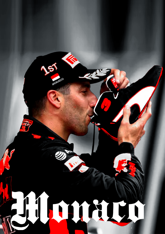
I wanted to make a Danny one so its not to hard to find stuff as I have a specific search for this edit but I also have a growing archive of folders of drivers full of pictures ive found over time that I'd normally go through to find good stuff.
when you use google please remember to click on 'tools' and select 'size' and big otherwise you'll cry because of the bad quality
this is the picture I wanted to use for the danny edit.
I thought this would work well because it has depth and so will show the colour blocking well, it also has the flag and the shoe which is clearly recognizable.
3. trow it into photoshop baybee.
this is going to be hard to explain but I basically jsut fuck around. most of the time I kind of know what I want to do and the way I want to go but one of the first steps is always to raserize the layer.
I also make sure to copy the original picture for later so you have the same picture twice
I do this so i can be lazy and go to quick actions and remove the background because then, I get this.
without basically any work. (it's almost never perfect so after I let photoshop do it's work I fix up the parts that need it.)
this is what your layers should look like fter.
that lil black and white thingy is really useful and if you select that and go over it w the erase tool it doesnt permenantly change anything.
next thing I do is smart sharpen to spice it up, here is the sharpening settings I use.
a small problem with this picture is that it's to small for an A4 size (which is what I'm making it on) so I need to extend the background a little. which I do in the laziest way.
I select the most of the top of the picture I can and copy paste + extend it out. like this:
then, for this edit, I'm gonna add a black and white filter to the background so everything behind daniel is in black and white with an adjustment layer. I do this to keep the focus on our subject and remove any and all focus from the bg.
I also add a guassian blur to the bg to once again, keep the focus on daniel.
this is the before and after of that.
now, kinda boring right? yeaaah so now onto
4. colouring
first off CLIPPING MASK IS YOUR BESTIE!!!. if you right click on the adjustment layer and click on clipping mask it will ONLY grab the picture right below it, this way it wont affect everything else you've added to your edit.
anwyay. this is the fun part, and the only way I can explain it, is fuck around, see what you wanna do and what works.
I always add, levels, curves etc to just deepen the blacks and add some contrast. heres the before and after of that.
for this edit I kind of wanna focus on the contrast of blue and orange, kinda like the seb one but a lil different so what I'm gonna do is add hue/saturation and remove the yellow and blue from the picture.
you use this adjustment layer by grabbing the little hand and selecting the colour you want to change.
so I'm gonna play around and remove the blue and yellow from this picture. here's the before and after of that.
now I'm going to add selective colour, i wanna up to an extreme the reds in the suit. this is kinda hard as you'll obviously grab his skin with that too so I'm gonna use that black little mask on this too, it already exists when you add an adjustment layer
it's that little white box, if you select that and ue the erase tool you can basically remove that adjustment layer in places you want to, this is what it looks like on my layers and on the picture.
I want to upp the red even more then this so I'm gonna copy paste that layer two more times and THEN add a non erased selective colour and play around with the depth of the skintone until I'm happy with it.
now I'm almost happy with the colour, I want it to be a bit more blue so I'm gonna go to 'colour balance' and play around with that a little more.
this is the before and after of all that
then I'm done with the colouring on the picture itself. I'm also gonna put all my adjustment layers into a folder to make my layers less busy
I'm also going to add noise to both the BG and front picture. it just gives a bit more texture and grain that I like
5. typography!
now the stressful part lol.
I know what I'm gonna add so that makes it easy. the name of the race, place and year. this is hard to explain, I know where I'm gonna put everything because off the other edits so it's just about finding a good font.
for this I'm not gonna fuck around with shapes and text layers and adjustments etc. if you want me to explain that please ask away that's just a whole other 5k worded essay.
I know what kinda font I wanna use at first already these choices have to do with a few things which is basically one questions I ask myself:
is there a vibe that already exists around the race and/or win and how do I translate that into the font? (is it fancy, cool, magical, incredible, bold etc etc)
here's an example of how a font can change the vibe
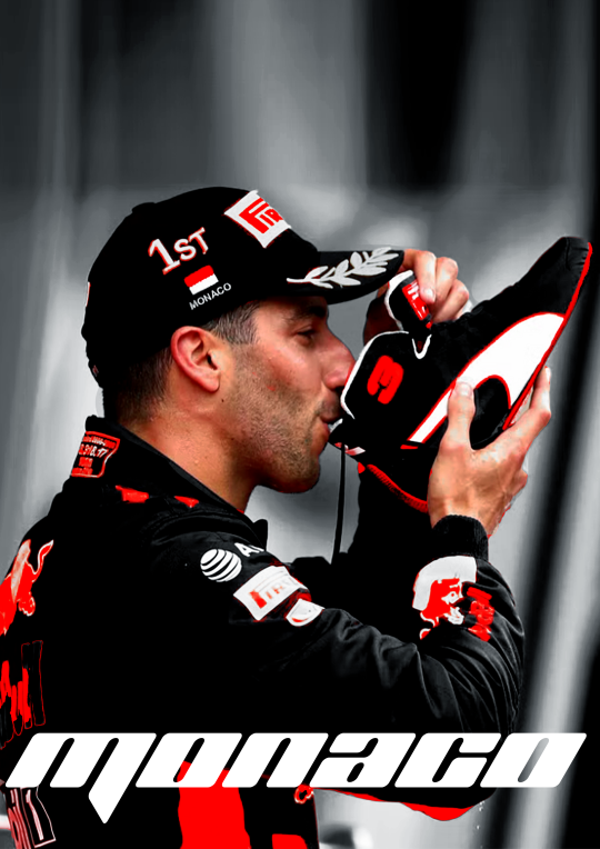
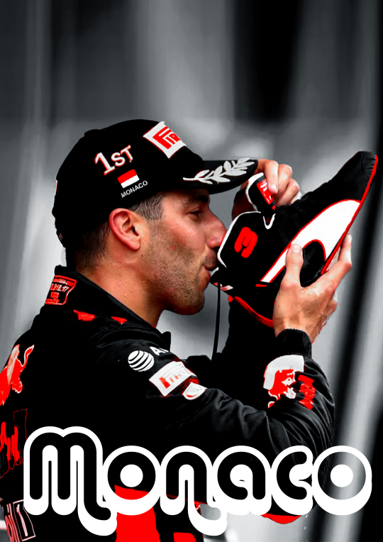
so the vibe I want to go with for this edit is fancy smansy n stuff so I'm thinking of flowly maybe 1930s vibes this is the font I ended up with
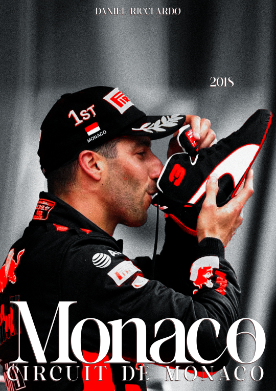
I'm still gonna move the place around but the idea if there.
(I change and play around with my text a lot so, again, ask if you want me to go deeper into this)
6. colour blocking
now for this edit I'm going to add a box of colour, I do this if I want to add a bit of an oomph and contrast to it, I like what I have now but I want to add some contrast to make the colour and him pop even more.
this is petty easy I'm basically just going to add a colour box behind him, I'm gonna do blue as well, thats the opposite of red on the colour wheel AND its the other colour red bull is associated with, also colour theory and all that etc.
I'm also going to add gaussian blur and noise to add some texture and use and overlay. heres the diff in with and without that to show the use of it.
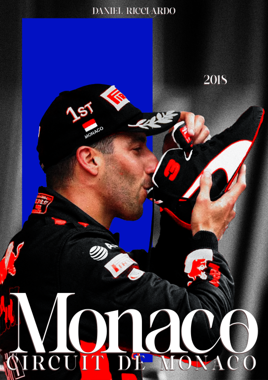
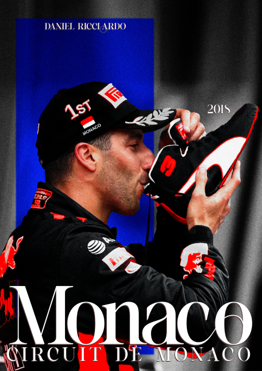
at this point I'm also going to move the text around (as you can see) to make it fit better with the added box
7. texture
the moment where it starts feeling like its finished.
for this edit I kinda want to add some photo texture and more grain. here are the textures I used:

I added these and put it on a screen overlay layer and added some adjustement layers to tweek the last few things.
you can find different textures on google, pinstrest and some awesome artists have texture packs you can pay for w just a few bucks. for these, again, if you're going to sell your work MAKE SURE ITS FREE FOR USE!!!
THATS it!
I add my watermark and maybe fix a few little things but thats all and then I'm done, I reccommend playing around and seeing what works for you.
enjoy and have fun <33
33 notes
·
View notes
Text
once again i am answering asks in a big compilation post. included is... gotham, patrick stump, tips about drawing backgrounds, tips about drawing in general, links to my faq, and infinity train
like.... the tv series? No... I’ve drawn dc comics fanart before, though. But it’s been years since I’ve been really into it. I like jumped ship like 10 years ago when the New 52 happened LOL.

AFJHDSLKGH I’m sorry I (probably) won’t do it again??
Actually full disclosure I have a truly cringe amount of p stump drawings/photo studies in my sketchbook right now LOL. He’s just fun to draw... hats, glasses, guitar, a good shape... but I don’t think I’ll rly post those until I can hide them in another big sketchbook pdf.. probably Jan 2022. Stay tuned........ (ominous)
(ominous preview)
These are all sort of related to backgrounds/painting so I grouped them together even though they’re pretty much entirely separate questions.... ANYWAYS
a) How is it working as a BG artist? Is it hard? What show are you drawing for?
I think you’re the first person to ever ask me about my job! Being a background artist is great. It’s definitely labor intensive but I think that could describe pretty much any art job (If something were rote or easy to automate, you wouldn’t hire an artist to do it) and I hesitate to say whether its harder or easier than any other role in the animation pipeline. Plus, so much of what truly makes a job difficult varies from one production to the next, schedule, working environment, co-workers etc. But I will say that I think while BGs are generally a lot of work on the upfront, I think they’re subject to less scrutiny/revisions than something like character/props/effects design and you don’t have to pitch them to a room like boards. So I guess it’s good if you don’t like to talk to people? LOL
A lot of my previous projects + the show I’ve worked on the longest aren’t public yet so I can’t talk about em (but I assure you if/when the news does break I won’t shut up about it). But I’m currently working on Archer Season 12 LOL. I’m like 90% sure I’m allowed to say that.
b) ~~~THANK YOU!! ~~~
c) What exactly do you like to draw most [in a background]?
@kaitomiury Lots of stuff! I really like to draw clutter! Because it’s a great opportunity for environmental storytelling and also you can be kind of messy with it because the sheer mass will supersede any details LOL.
I like to draw clouds... I like to draw grass but not trees lol,,, I like to draw anything that sells perspective really easily like tiled floors and ceilings, shelves, lamp posts on a street etc.
d) Do you have any tips on how to paint (observational)?
god there’s so much to say. painting is really a whole ass discipline like someone can paint their whole life and still discover new things about it. I guess if you’re really just starting out my best advice is that habit is more important than product. especially with traditional plein air painting, I find that the procedure of going outside and setting up your paints is almost harder than the actual painting. There’s a lot of artists who say “I want to do plein air sometime!!” and then never actually get around to doing it. A lot of people just end up working from google streetview or photos on their computer.
But going outside to paint is a really good challenge because it forces you to make and commit to lighting and composition decisions really quickly. And to work through your mistakes instead of against them via undo button.
My last tip is to check out James Gurney’s youtube channel because hes probably the best and most consistent resource on observational painting out there rn. There’s lots other artists doing the same thing (off the top of my head I know a lot of the Warrior Painters group has people regularly posting plein air stuff and lightbox expo had a Jesse Schmidt lecture abt it last year) but Gurney’s probably the most prolific poster and one of the best at explaining the more technical stuff - his books are great too.
e) Do you have tips for drawing cleanly on heavypaint?
@marigoldfool UMM LOL I LIKE ONLY USE THE FILL TOOL so maybe use the fill tool? Fill and rectangle are good for edge control as opposed to the rest of the heavy paint tools which can get sort of muddles. And also I use a stylus so maybe if you’re using your finger, find a stylus that works with your device instead. That’s all I’ve got, frankly I don’t think my drawings are particularly clean lol.
f) Tips on improving backgrounds/scenes making them more dynamic practicing etc?
Ive given some tips about backgrounds/scenes before so I’m not gonna re-tread those but here’s another thing that might be helpful...
I think a good way to approach backgrounds is to think of the specific story or even mood you want to convey with the background first. Thinking “I just need to put something behind this character” is going to lead you to drawing like... a green screen tourist photo backdrop. But if you think “I need this bg to make the characters feel small” or “I need this bg to make the world feel colorful” then it gives you requirements and cues to work off of.

If I know a character needs to feel overwhelmed and small, then I know I need to create environment elements that will cage them in and corner them. If a character needs to feel triumphant/on top of the world then I know I need to let the environment open up around them. etc. If I know my focal point/ where I want to draw attention, I can build the background around that.
Also, backgrounds like figure compositions will have focal points of their own and you can draw attention to it/ the relationship the characters have with the bg element via scale or directionality or color, any number of cues. I think of it almost as a second/third character in a scene.
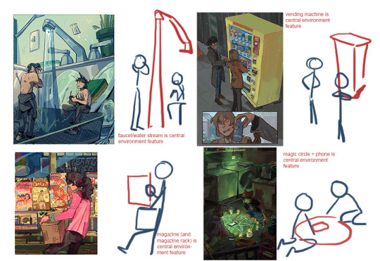
Not every composition is gonna have something so obvious like this but it helps me to think about these because then the characters feel connected and integrated with the environment.

Some more general art questions
a) Do you have any process/tips to start drawing character/bodies/heads?
I tried to kind of draw something to answer this but honestly this is difficult for me to answer because I don’t think I’m that great at drawing characters LOL. Ok, I think I have two tips.
1) flip your canvas often. A lot about what makes human bodies look correct and believable is symmetry and balance. Even if someone has asymmetrical features, the body will often pull and push in a way to counterbalance it. we often have inherent biases to one side or another like dominant hands dominant eyes etc. you know how right-handed artists will often favor drawing characters facing 45 degrees facing (the artist’s) left? that’s part of it. so viewing your drawing flipped even just to evaluate it helps compensate for that bias and makes you more aware of balance.
2) draw the whole figure often. I feel like a lot of beginner artists (myself included for a long time) defer to just drawing headshots or busts because it’s easier, you dont have to think about posing limbs etc. But drawing a full body allows you to better gauge proportion, perspective, body language, everything that makes a character look believable and grounded.
Like if you (me) have that issue where you draw the head too big and then have to resize it to fit the proportions of the rest of the body, it’s probably because you (I) drew the head first and are treating the body as an afterthought/attachment. Sketching out the whole figure first or even just quick drawing guides for it will help you think of it more holistically. I learned this figure drawing in charcoal at art school LOL.

oh. third mini tip - try to draw people from life often! its the best study. if you can get into a figure drawing/nude drawing class EVEN BETTER and if you have a local college/art space/museum that hosts those for free TREASURE IT AND TAKE ADVANTAGE OF IT, that’s a huge boon that a lot of artists (me again) wish they had. though if youre not so lucky and youre sitting in a park trying to creeper draw people and they keep moving.. don’t let that stop you! that’s good practice because it’s forcing you to work fast to get the important stuff down LOL. its a challenge!
b) I’ve been pretty out of energy and have had no inspiration to draw but I have the desire to. Any advice?
Dude, take a walk or something.... Or a nap? Low energy is going to effect everything else so you gotta hit that problem at its source.
If you’re looking for inspiration though, I’d recommend stuff like watching a movie, reading a book, playing video games etc. Fill up your idea bank with content and then give yourself time/space to gestate it into new concepts. Sometimes looking at other art works but sometimes it can work against you because it’s too close.
Also something that helps me is remembering that art doesn’t always have to be groundbreaking... like it’s okay to make something shitty and stupid that you don’t post online and only show to your friend. That’s all part of the process imo. If you want to hit a home run you gotta warm up first, right? Sports.
I should probably compile everytime i give tips on stuff like this but that’s getting dangerously close to being a social media artist who makes stupid boiled down art tutorials for clout which is the last thing i want to be... the thing I want to stress is that art is a whole visual language and there are widely agreed upon rules and customs but they exist in large part to be broken. Like there's an infinite number of ways to reach an infinite number of solutions and that’s actually what makes it really cool and personal for both the artist and the viewer. So when you make work you like or you find someone else’s work you like, take a step back and ask yourself what about it speaks for you, what about it works for you, what makes it effective, how to recreate that effect and how to break that effect completely, etc. And have a good time with it or else what’s the point.
for the first 2, I direct you to my FAQ
For the last one, I don’t actually believe I’ve ever addressed artwork as insp for stories/rp but I’ll say here and now yeah go ahead! As long as you’re not making profit or taking credit for my work then I’m normally ok with it. Especially anything thats private and purely recreational, that’s generally 100% green light go. I only ask that if you post it anywhere public that you please credit me.
(and I reserve the right to ask you to take it down if I see it and don’t approve of it’s use but I think that case is pretty rare.)
a) @lemuelzero101 Thank you!!! I haven’t played Life is Strange but actually that series’ vis dev artist Edouard Caplain is one of my bigger art inspirations lately so that’s a really high compliment lol. And yeah I hope we get 5-8 too...!
b) Thank you for sticking around! I’ve been thinking about Digimon and Infinity Train in tandem lately, actually. They’re a little similar? Enter a dangerous alternate world and have wacky adventures with monsters/inanimate objects that have weird powers... there’s like weird engineers and mechanisms behind the scenes... also frontier literally starts with them getting on a train. Anyways if anyone else followed me for digimon... maybe you’d like Infinity Train? LOL
c) @king-wens-king I’M GLAD MY ART JUST HAS PINOY VIBES LOL I hope you are having a good day too :^)
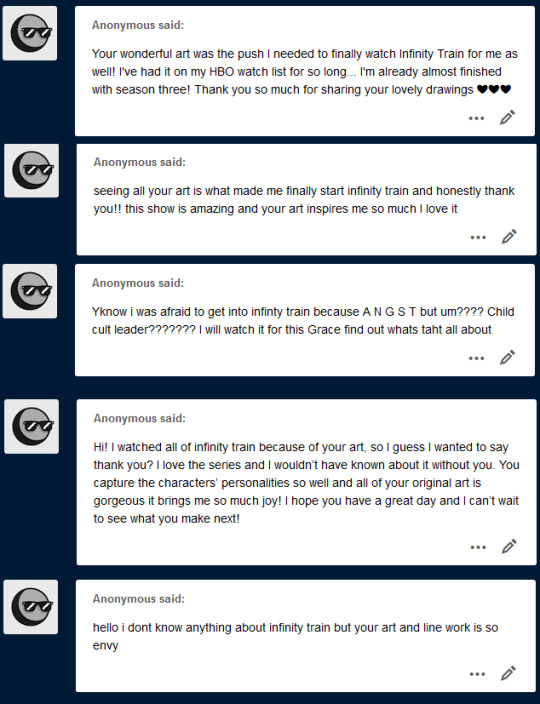
a, b, c, d) yessss my Watch Infinity Train agenda is working....
e) aw thank you!! i think you should watch infinity train :)
357 notes
·
View notes
Note
Forgive me Father, I have no awful headcanons for you, only a general question on comic making. How do you do it, writing-wise/how do you decide what points go where, how do you plot it out (or do you have any resources on the writing aspect that you find useful?) Not to get too bogged down in details, but I attended a writer’s workshop and the author in residence suggested I transfer my wordy sci-fi WIP into graphic novel script, as it might work better. (I do draw, but I don’t know if I have it in me to draw a whole comic—characters in motion? Doing things? With backgrounds? How dare, why can’t everyone just stand around looking pretty)
I was interested but it quickly turned into a lot of internal screaming as I tried to figure out how to compress the hell out of it, since novels are free to do a lot more internal monologuing and such compared to a comic format (to say nothing of trying to write a script without seeing how the panels lay out—just for my own sake, I might have to do both concurrently.)
As an aside, to get a feel for graphic novels I was rereading 99RM and was reminded of how great it was—tightly plotted, intriguing, and anything to do with Ashmedai was just beautifully drawn. I need more Monsignor Tiefer and something something there are parallels between Jehan and Daniel in my head and I don’t know if they make sense but it works for me. (As an aside, I liked the emphasis on atonement being more than just the word sorry, but acknowledgment you did wrong and an attempt to remedy it—I don’t know why that spoke to me the way that it did.)
I thought Tumblr had a word count limit for asks but so far it has offered zero resistance, oh well. I don’t have much else to say but on the topic of 99RM, Adam getting under Monsignor’s skin is amazing, 10/10 (about the Pride picture earlier)
wow tumblr got rid of the markdown editor! or at least in asks which means the new editor probably has no markdown....god i hate this site! anyway...
Totally! So first, giant thank you for the compliments! Second, I have a few questions in turn for you before I dive into a sort of answer, since I can give some advice to your questions in general but it also sounds like you have a specific conundrum on your hands.
My questions to your specific situation are:
did the author give any reason for recommending a, in your words, "wordy" story be turned into a graphic novel?
is the story you're writing more, like you said, "internal monologuing"? action packed? where do the visuals come from?
do you WANT it to be a comic? furthermore, do you want it to be a comic you then must turn around and draw? or would you be interested in writing for comics as a comic writer to have your words turned into art?
With those questions in mind, let me jump into the questions you posed me!
Let me start with a confession...
I've said this before but let me say it again: Ninety-Nine Righteous Men was not originally a comic — it was a feature-length screenplay! And furthermore, it was written for a class so it got workshopped again and again to tighten the plot by a classroom of other nerds — so as kind as your compliments are, I'm giving credit where credit is due as that was not just a solo ship sailing on the sea. On top of that, it got adapted (by me) into a comic for my thesis, so my advisor also helped me make it translate or "read" well given I was director, actor, set designer, writer, editor, SFX guy, etc. all in one. And it was a huge help to have someone say "there is no way you can go blow by blow from script to comic: you need to make edits!" For instance, two scenes got compressed to simple dialogue overlaid on the splashpage of Ashmedai raping Caleb (with an insert panel of Adam and Daniel talking the next day.) What had been probably at least 5 pages became 1.
Additionally, I don't consider myself a strong plotter. That said, I found learning to write for film made the plotting process finally make some damn sense since the old plot diagram we all got taught in grammar school English never made sense as a reader and definitely made 0 sense as a writer — for me, for some reason, the breakdown of 25-50-25 (approx. 25 pages for act 1, 50 for act 2 split into 2 parts of 25 each, 25 pages for act 3) and the breaking down of the beats (the act turning points, the mid points, the low point) helped give me a structure that just "draw a mountain, rising action, climax is there, figure it out" never did. Maybe the plot diagram is visually too linear when stories have ebb and flow? I don't know. But it never clicked until screenwriting. So that's where I am coming from. YMMV.
I should also state that there's Official Ways To Write Comic Scripts to Be Drawn By An Artist (Especially If You Work For A Real Publisher As a Writer) and there's What Works For You/Your Team. I don't give a rat's ass about the former (and as an artist, I kind of hate panel by panel breakdowns like you see there) so I'm pretty much entirely writing on the latter here. I don't give a good god damn about official ways of doing anything: what works for you to get it done is what matters.
What Goes Where?
Like I said, 99RM was a screenplay so it follows, beat-wise, the 3-act screenplay structure (hell, it's probably more accurate to say it follows the act 1/act 2A/act 2B/act 3 structure.) So there was the story idea or concept that then got applied to those story beats associated with the structure, and from there came the Scene-by-scene Breakdown (or Expanded Scene Breakdown) which basically is an outline of beats broken down into individual scenes in short prose form so you get an overview of what happens, can see pacing, etc. In the resources at the end I put some links that give information on the whole story beat thing.
(As an aside: for all my short comics, I don't bother with all that, frankly. I usually have an image or a concept or a bit of writing — usually dialogue or monologue, sometimes a concrete scene — that I pick at and pick at in a little sketchbook, going back and forth between writing and thumbnail sketches of the page. Or I just go by the seat of my pants and bullshit my way through. Either or. Those in many ways are a bit more like poems, in my mind: they are images, they are snapshots, they are feelings that I'm capturing in a few panels. Think doing mental math rather than writing out geometric proofs, yanno?)
Personally, I tend to lean on dialogue as it comes easier for me (it's probably why I'm so drawn to screenwriting!) so for me, if I were to do another longform GN, I'd probably take my general "uhhhhhh I have an idea and some beats maybe so I guess this should happen this way?" outline and start breaking it down scene by scene (I tend to write down scenes or scene sketches in that "uhhhh?" outline anyway LOL) and then figure out basic dialogue and action beats — in short, I'd kind of do the work of writing a screenplay without necessarily going full screenplay format (though I did find the format gave me an idea of timing/pacing, as 1 page of formatted script is about equal to 1 minute of screentime, and gave me room to sketch thumbnails or make edits on the large margins!) If you're not a monologue/soliloque/dialogue/speech person and more an image and description person, you may lean more into visuals and scenes that cut to each other.
Either way this of course introduces the elephant in the panel: art! How do you choose what to draw?
The answer is, well, it depends! The freedom of comics is if you can imagine it, you can make it happen. You have the freedoms (and audio limitations) of a truly silent film with none of the physical limitations. Your words can move in real time with the images or they can be a narrative related to the scene or they could be nonsequitors entirely! The better question is how do you think? Do you need all the words and action written first before you break down the visuals? Do you need a panel by panel breakdown to be happy, or can you freewheel and translate from word and general outlines to thumbnails? What suits you? I really cannot answer this because I think when it comes to what goes where with regard to art, it's a bit of "how do you process visuals" and also a bit of "who's drawing this?" — effectively, who is the interpreter for the exact thing you are writing? Is it you or someone else? If it's you, would you benefit from a barebones script alongside thumbnailed paneling? Would you be served by a barebones script, then thumbnails, then a new script that includes panel and page breakdowns? What frees you up to do what you need to do to tell your story?
If I'm being honest, I don't necessarily worry about panels or what something will look like necessarily until I'm done writing. I may have an image that I clearly state needs to happen. I may even have a sequence of panels that I want to see and I do indeed sketch that out and make note of it in my script. But exactly how things will be laid out, paneled, situated? That could change up until I've sketched my final pencils in CSP (but I am writer and artist so admittedly I get that luxury.)
How do I compress from novel to comic?
Honest answer? You don't. Not really. You adapt from one to another. It's more a translation. Something that would take forever to write may take 1 page in a comic or may take a whole issue.
I'm going to pick on Victor Hugo. Victor Hugo spent a whole-ass book in Notre-Dame de Paris talking about a bird's eye view of Paris and other medieval architecture boring stuff, with I guess some foreshadowing with Montfaucon. Who cares. Not me. I like story. Anyway. When we translate that book to a movie any of the billion times someone's done that, we don't spend a billion years talking at length about medieval Paris. There's no great monologuing about the gibbet or whatever: you get to have some establishing shots, maybe a musical number, and then you move tf on. Because it's a movie, right? Your visuals are right there. We can see medieval Paris. We can see the cathedral. We can see the gibbet. We don't need a whole book: it's visually right there. Same with a comic: you may need many paragraphs to describe, say, a space station off of Sirius and one panel to show it.
On the flip side, you may take one line, maybe two, to say a character keyed in the special code to activate the holodeck; depending on the visual pacing, that could be a whole page of panels (are we trying to stretch time? slow it down? what are we emphasizing?) A character gives a sigh of relief — one line of text, yeah? That could be a frozen panel while a conversation continues on or that could be two (or more!) panels, similar to the direction [a beat] in screenwriting.
Sorry there's not a super easy answer there to the question of compression: it's a lot more of a tug, a push-pull, that depends on what you're conveying.
So Do I Have It In Me to Write & Draw a GN?
The only way you'll know is by doing. Scary, right? The thing is, you don't necessarily need to be an animation king or God's gift to background artists to draw a comic.
Hell, I hate backgrounds. I still remember sitting across from my friend who said "Claude you really need to draw an establishing exterior of the church at some point" and me being like "why do you hate me specifically" because drawing architecture? Again? I already drew the interior of the church altar ONCE, that should be enough, right? But I did draw an exterior of the church. Sorta. More like the top steeple. Enough to suggest what I needed to suggest to give the audience a better sense of place without me absolutely losing my gourd trying to render something out of my wheelhouse at the time.
And that's kinda the ticket, I think. Not everyone's a master draftsman. Not everyone has all the skills in every area. And regardless, from page one to page one hundred, your skills will improve. That's all part of it — and in the meantime, you should lean into your strengths and cheat where you can.
Do you need to lovingly render a background every single panel? Christ no! Does every little detail need to be drawn out? Sure if you want your hand to fall off. Cheat! Use Sketchup to build models! Use Blender to sculpt forms to paint over! Use CSP Assets for prebuilt models and brushes if you use CSP! Take photographs and manip them! Cheat! Do what you need to do to convey what you need to convey!
For instance, a tip/axiom/"rule" I've seen is one establishing shot per scene minimum and a corollary to that has been include a background once per page minimum as grounding (no we cannot all have eternal floating heads and characters in the void. Unless your comic is set in the void. In which case, you do you.) People ain't out here drawing hyper detailed backgrounds per each tiny panel. The people who DO do that are insane. Or stupid. Or both. Or have no deadline? Either way, someone's gonna have a repetitive stress injury... Save yourself the pain and the headache. Take shortcuts. Save your punches for the big K.O. moments.
Start small. Make an 8-page zine. Tell a beginning, a middle, an end in comic form. Bring a scene to life in a few pages. See what you're comfortable drawing and where you struggle. See where you can lean heavily into your comfort zones. Learn how to lean out of your comfort zone. Learn when it's worth it to do the latter.
Or start large. Technically my first finished comic (that wasn't "a dumb pencil thing I drew in elementary school" or "that 13 volume manga I outlined and only penciled, what, 7 pages of in sixth grade" or "random one page things I draw about my characters on throw up on the interwebz") was 99RM so what do I know. I'm just some guy on the internet.
(That's not self-deprecating, I literally am some guy on the internet talking about my path. A lot of this is gonna come down to you and what vibes with you.)
Resources on writing
Some of these are things that help me and some are things that I crowd-sourced from others. Some of these are going to be screenwriting based, some will be comic based.
Making Comics by Scott McCloud: I think everyone recommends this but I think it is a useful book if you're like "ahh!!! christ!! where do I start!!!???" It very much breaks down the elements of comics and the world they exist in and the principles involved, with the caveat that there are no rules! In fact, I need to re-read it.
Comic Book Design: I picked this up at B&N on a whim and in terms of just getting a bird's eye view of varied ways to tackle layout and paneling? It's such a great resource and reference! I personally recommend it as a way to really get a feel for what can be done.
the screenwriter's bible: this is a book that was used in my class. we also used another book that's escaping me but to be honest, I never read anything in school and that's why I'm so stupid. anyway, I'd say check it out if you want, especially if you start googling screenwriting stuff and it's like 20 billion pieces of advice that make 0 sense -- get the core advice from one place and then go from there.
Drawing Words & Writing Pictures: many people I know recommended this. I think I have it? It may be in storage. So frankly, I'd already read a bunch of books on comics before grabbing this that it kind of felt like a rehash. Which isn't shade on the authors — I personally was just a sort of "girl, I don't need comics 101!!!"
Invisible Ink: A Practical Guide to Building Stories that Resonate: this has been recommended so many times to me. I cannot personally speak on it but I can say I do trust those who rec'd it to me so I am passing it along
the story circle: this is pretty much the hero's journey. a useful way to think of journeys! a homie pretty much swears by it
a primer on beats: quick google search got me this that outlines storybeats
save the cat!: what the above refers to, this gives a more genre-specific breakdown. also wants to sell you on the software but you don't need that.
I hope this helps and please feel free to touch base with more info about your specific situation and hopefully I'll have more applicable answers.
82 notes
·
View notes
Text
january: an art retrospective
i did some stuff last month (but it’s a lot of stuff and there’s a photodump + some Serious Fucking Reflection, so it’s all below the cut)
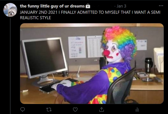
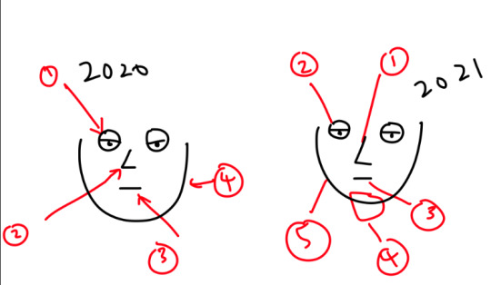
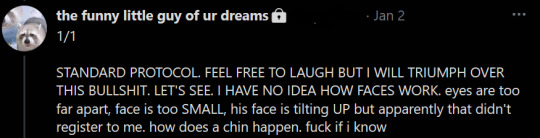
so ok, let’s start with this. here are some heads. each head has a red arrow. that red arrow is what i call the red line of the devil. it’s the slope of the face from the side of the eye to the cheekbone and then down towards the chin. up until like 2 weeks ago, i couldn’t draw it. i couldn’t fucking draw it. i would edit over that part of the face over and over again until i was frustrated and tired and i had a raging homosexual headache and it still never looked right. notice that each head is different. notice that each head looks wrong.
at the start of 2021 i finally admitted to myself, as per the image above, that i was deeply, deeply unhappy with my art. what was the problem? i dunno. but i decided i was going to fix it and i was going to do so via another one scribble a day event wherein for every day of january i would find a photo of a human head, and i would draw it.
january 1st, 2021. i was embarrassed to tweet this even on my private account where like 5 friends and a rock would see it. in retrospect, you can also see all of my bad habits emerging like dicks from a hole in the ground. it’s disproportionate. the brows look flat. the eyes are slanting upwards. the entire drawing looks flat, like this isn’t a 3d person but a caricature of one.
january 2nd, 3rd, 4th:

on the 2nd i decided to start a separate thread for doodles and applied learning. here’s the first set of tests
the rest of the week is kind of uneventful so we’re going to skip those. fast forward to january 11th
this one is especially bad. i am acutely aware, suddenly, that i am not changing anything at all. i’m stressed and miserable about it because i’m still trying to see people as people and trying to draw people that look attractive and proportionate and hot. my friend, leny, reminds me that i need to think about faces in terms of planes. i have a moment. my other friend masha sends me some links to anatomy tutorials. i have another moment.
january 11th. applied sketch
january 13th is when i start the troubleshooting process. the link above drives me mad because i’m pretty happy with the face but then i realize that there’s something very fucking wrong with the shape of the head LOL and then i realize that i’ve never had any idea what the proportion of the face to the rest of the skull is so i grit my teeth and i open a new canvas and i

bald studies. it seemed like the right thing to do. can’t draw heads? ok draw some heads. look at some photographs. i traced each photo but tried to stick to straight lines so that i could replicate the shapes more easily. i broke each face down into shapes. i thought about airplanes
i got really excited. i started doing studies, then applied studies, then stylized studies.
sketches. i’m not sure what’s going on (as always) and it’s very rough, but they look different from the sketches i did on january 2nd. that’s a start
january 16th’s daily study. looks more like a person now. juuuuuust a bit
more applied studies
on the 18th i take a break and go stare at some lips because i don’t understand how the fuck they work. again, i focus on shapes, on volume, on the fact that these things exist in 3d. holy fuck lips exist in 3d. holy fuck we are real
january 19th. i’m working on it.

january 22nd. some sketches + a daily study. it has finally occurred to me that heads can tilt up and down and that things look different accordingly. yes i was not aware of this before. yes i have been drawing for over a decade.
january 23rd. by this point after doing my daily sketch i almost always go back and do an applied study which is basically to say i drew a lot of fucking links. this one looks kind of okay. i’m kind of proud
january 25th. links. trying to make sense of everything i’ve learned
26th, 27th, 28th. daily studies
january 1st. january 31st
The End Of The Photo Dump (dab)
ok NOW i get to talk about what i discovered while studying the shit out of human beings
FIRST OF ALL, there is something precious and magical about drawing shit without the explicit knowledge that you’re going to tweet that shit out to 45 people later. it takes the burden of perception off your shoulders and that does something to you, or at least that’s my theory. i told myself i wouldn’t post any of this stuff until the end of the month (if i wanted to post it at all) and kept everything off my public social media accounts and that meant i could draw ugly as hell without worrying about who would point and laugh, which i absolutely fucking did. a lot of these are fucking trainwrecks. most of these are fucking trainwrecks. why do they look like that?? why??? this doesn’t look like the work of someone who’s allegedly been drawing since they were in kindergarten, does it?????
here’s why: because that person took a huge motherfucking swing at everything they’d ever known about art and spent a month building something new in its place. the abstract explanation is that i grew up on shoujo and weird old anime and my understanding of anatomy was unironically kamichama karin and while i love kamichama karin, when kamichama karin is your rule even if you try to break it, you’re going to end up going nowhere. “you have to know the rules to break them”, yeah? well i didn’t know shit. the abstract explanation is i’ve been miserable about my art for a few years now because i saw other people doing things effortlessly which i couldn’t and instead of going back to the basics, i tried to do what they did (not plagiarism, mind you, i mean i literally tried to copy the red line of the devil i mentioned above because i couldn’t even make that happen) and then i fucking failed.
the simple explanation is this. i had to unlearn everything, and relearn it again (like some kind of new renaissance clown, what the fuck is this?)
take this for example. all my life i’ve drawn faces in the order: eyes, nose, mouth, face shape, head. this works for some people, im aware, but it was something central to how i had always drawn, so i decentralized it. i said fuck you to the old me and changed the order up. now i start with the nose, then the eyes, mouth, the chin line, and the sides of the face. now i force myself to think about the human head as a series of parts interacting with each other instead of a bunch of disparate features which i want to look pretty.
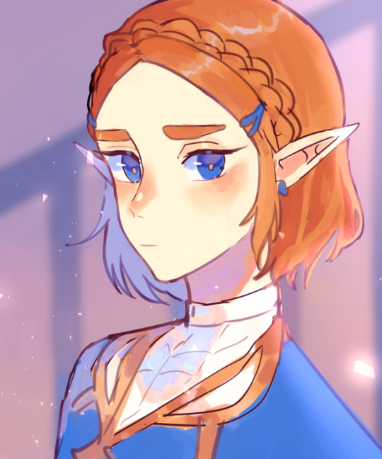
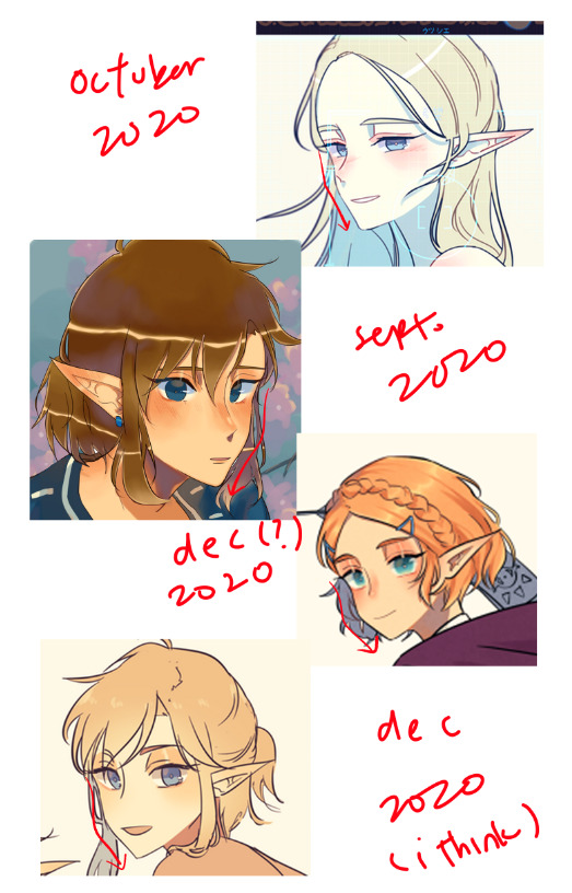
or let’s use this zelda from last year. something about this looked wrong last october, the way something about all of my drawings looked wrong, but i couldn’t pinpoint it for hell the way i couldn’t articulate Any of my feelings about the visual arts. now, looking back, here’s what i see. that nose is sticking out far too much given how she’s not really facing very far away from the camera. that ear at the back shouldn’t be there. her forehead is too big. she doesn’t have a forehead. what the fuck is up with the shape of her head?
so apparently reject modernity embrace tradition has its roots in alt-right terminology and i’m not very horny for the alt-right (you understand), but the spirit survives here. you know sometimes you have to admit that you have no idea what the fuck you’re doing and draw people for 31 days. i’ve spent my whole life drawing stylized people and while again there are artists who have no issue with this, i veered off the track of the Good and the Holy and couldn’t get back on. i had no point of reference because i’d never thought about what an actual human being looks like, so i had no way to fix what i knew in my gut looked wrong but wouldn’t come out better.
this was hard. this was like oikawa tooru swallowing his worthless pride and admitting that ushijima wakatoshi had gotten the best of him for the last time in his high school career, but in haikyuu!! by furudate haruichi oikawa tooru fucks off to argentina and then joins the argentinean national team, and you know what, i think i’ve made it to argentina (not the team just the country). as per the golden rule of dont fucking move until you’re at least two thirds of the way through the month, i only started trying to draw Shit shit on like the 22nd or something, but i was happy with that i created. i am happy with what i’ve done. i’ve posted like 2 things this month that involve people with what i now call ~applied Knowledge~~ and they’re, like, not perfect obviously (perfection is an unattainable ideal), but i’m fucking proud of them. i didn’t spend 5 hours hunched over my laptop adjusting the red line of the devil because it’s not a devil’s line anymore. because i finally sorta get how people work. because i sat down and i said ‘we are not going to fuck with this misery shit anymore’ and then i did that. it’s just a line now.
here are 2 collages tracking my painstakingly carved out progress from january 2nd to february 2nd because i’m a slut for collages
and here’s what i’ve done to my art! the same person drew these but also Not Really! you know! for the first time in a year i don’t immediately hate what i’ve drawn. you know what guys? art is fucking fun. zelda’s forehead doesn’t scare me anymore because i know how foreheads fucking work now, and i don’t know everything, and i’m going to keep troubleshooting stuff as i go (i want to draw a skeleton. like a. i want to draw a goddamn skeleton guys) but i’m honestly and genuinely proud of what i’ve done in the span of a month, and i’m also in disbelief. i started this month-long challenge out as a last ditch effort to make peace with my art because i’ve been tired for a long time and i was ready to kick the bucket on drawing people altogether. i didn’t think anything would happen. nothing’s happened for years. i’ve been miserable for years.
this was the caption for january 1st, 2021. i was super, super fucking embarrassed and it looks like super fucking shit, but you know what, i think i did in fact triumph over the bullshit. surprisingly enough, when you put in consistent effort into something, You Will See Results. didn’t see that coming, did you? i know i didn’t.
this isn’t a success story. it’s a happiness story. i never gave a shit damn about the institute of art or whatever, i was just mad at myself because what i saw in my head didn’t match up with what was on the canvas. and now it’s getting better. now i’m calibrating the compass. now drawing not just backgrounds but also people is exciting to me, and i can stick my links in your face and tell you ‘they hot’. i’m going to keep doing that. i’m going to keep going until i drop off the side of the earth and then spiral towards mars like some kind of fairy, and then i’m going to create something beautiful.
thanks for reading. here’s a pr department link for sticking around until the end
207 notes
·
View notes
Text
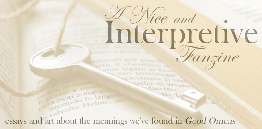
[ID: A cream-colored banner that says "A Nice and Interpretive Fanzine: essays and art about the meanings we've found in Good Omens." There is a photo of a book page with a key on it behind the banner text. The photo source is rosy_photo on Pixabay. /end ID]
A Nice and Interpretive Fanzine: Information Masterpost
Welcome!
This is a zine for those of us who love the subtle, complex work that is Good Omens, and who’ve enjoyed the thoughtfulness of the fandom as people interpret how the many moving pieces of the story come together, creating a slightly different meaning for each of us.
To put it simply, it’s a book full of the fandom’s own analysis and commentary about the Good Omens TV show, enhanced with illustrations from our brilliant artists.
This zine is analytical in the sense that all the writers are expressing their own nonfiction thoughts and feelings about the show, rather than writing fanfic, but it is not meant to be heavily academic. Anybody who likes to pick apart the series and discuss it should be able to enjoy it.
The zine will contain essays by fans who are passionate about analyzing and interpreting different parts of Good Omens - the characters, the plot, the writing techniques for the book and script, the cinematography of the TV show, the popular content of the fandom itself. Accompanying these essays will be black and white illustrations from our artists.
How are you organizing this process?
May 1-May 15: Everyone submits their application to do writing or art through a Google form. Behind the scenes, I’ll be setting up a separate email and Discord.
May 16-20: Applicants will be screened during this time.
May 20: I’ll email everyone to let them know the outcomes of their applications. The final participants will get a link to the Discord server for the zine (totally optional, of course).
May 21: If there’s any clarification or solidifying of ideas that needs to happen, I’ll contact you and discuss with you by this point. This is also when artists will be matched up with essays.
May 22 to August 14: This will be a period of just working on our essays and art. The Discord chat and Tumblr will be there for support and for exchanging ideas!
August 15: Participants need to email their full works to the zine’s email address by this date. No special formatting is needed; I’ll do that in InDesign.
August 15 to August 31: I’ll be putting the zine together in InDesign.
September 1: Preorders will open.
September 30: Preorders will close.
October 1: The zine order will be placed!
October 15: Assuming all goes well with printing and shipping, the zines will be shipped out in waves starting on this date. If the printing or shipping from the manufacturer is delayed, then shipping will just start ASAP.
Writer Application HERE Artist Application HERE Asked and Answered Questions on Tumblr The Fanzine's Page on Twitter
Read below for more detailed information about the zine in a Q and A format!
What are the specifications for the zine contributions?
For writers, I’m starting with 3k words or fewer per essay (approximately 10 pages at the size of this book). This depends heavily on how many participants we actually get, so it may change!
For artists, I’d be looking at black and white works, 300 DPI, 5.5 x 8.5 inches or smaller. If your art is supposed to fill up the entire page (i.e. no white space), please make it a total of 5.75 x 8.75 inches with nothing too important around the edges to account for bleed during the printing process.
Can I submit an essay to this zine if I’ve already posted it on Tumblr?
Not as you’ve already posted it. We don’t want to just copy/paste the exact thing that hundreds or perhaps even thousands of people have already read.
However, it IS fine and maybe even a good idea to take the same thought from your post and refine it, preserving your same thesis. For example, a lot of Tumblr posts are just us fans jotting down 5 or 6 paragraphs of random thoughts at 2 AM, but some of them are really cool thoughts! Expanding them and turning them into a bona-fide Essay would make those posts into excellent zine chapters. And you can copy small pieces of your own language as long as the whole thing isn’t just pasted word-for-word.
How long do essays have to be? Is there a limit?
With the number of writers we have, I've calculated that each person should ideally keep their essay to about 6000 words. There is wiggle room.
There’s no real minimum for your contribution; some analytical ideas are really good but can be expressed concisely, so it’s okay if your essays only come out to a few pages typed. For reference, with our book size, a page is about 300 words.
What happens if the zine sells a lot and you end up not only breaking even, but turning a profit?
It’ll go to charity. While I’ll ask the participants what they want to do for certain if we do make enough money, my suggestion will be donating it to Alzheimer’s Research UK in honor of Sir Terry Pratchett.
I’m not really comfortable calling this a “charity zine” up front since I simply don’t know if it will raise a significant amount. For the most part, I just want the thing to physically exist, which means breaking even, and don’t want to make it more expensive for buyers than it needs to be to afford the printing costs.
What kinds of essays are you talking about? What could be included?
In short, any analytical thoughts about the Good Omens TV show - and possibly even the fandom as it interacts with the show - are possible inclusions for the zine.
To expand a bit, think about the meta posts you see floating around Tumblr. Often these involve analyzing characters, or picking up on patterns in the plot. Sometimes fans use their own background knowledge to write posts about the significance of certain costume choices or the way music plays into each individual scene. Some posts examine the ways the series approaches gender, while others might discuss ways that the characters present as neurodivergent. That’s how diverse the pool of possibilities is for subjects in this zine.
How does art come into this?
Images will be black and white, to match the bookish mood of the project overall. Images can range in size from a half page to a full page.
I’m planning to talk to the artists and authors and loosely pair artists with essays that appeal to their personal interests.
I know how to illustrate a story, but how do I illustrate an essay?
There are infinite answers to this! I’ve seen some beautiful symbolic artwork in the fandom already (e.g. a number of takes on Aziraphale munching on an apple with Crowley in snake form curving around him), and there are tons of symbolic motifs to draw from, but these are not the only options. An artist illustrating an essay about cinematography, for example, could draw a well-known scene from an alternative angle. An essay about Heaven as a capitalist corporation could be illustrated with a cartoon of Gabriel giving some sort of excruciating PowerPoint presentation. A character analysis could be accompanied by a simple portrait. And on and on. I’m not interested in limiting the possibilities by trying to make a list, but just know that there are many and you don’t have to make it complicated if you don’t want to.
If the writers can reuse their essay ideas, can artists reuse their drawings?
Similarly to the writers, if you already have an interpretive drawing that you’re in love with, artists can use the same ideas and the same fundamental composition that is present in their own existing work. However, it has to be redone in some significant way. Whether it’s taking something you drew in 2019 and redrawing it using an updated style, taking a sketch and turning it into a lined and shaded piece, or redoing a full-color drawing so it presents more strikingly in black and white, it shouldn’t be identical to the thing you’ve already posted.
So how are you choosing participants here?
It’ll be based on what people are interested in writing about (or illustrating). I’ll be looking for people who are passionate about their essays, but I’ll also be looking for variety. It all depends on what people want to offer, so I won’t know for sure what it will look like put together until everyone’s application is in.
For artists, I’ll be trying to figure out whose style looks like it would adapt well to illustrations in black and white, and also who demonstrates an interest in the same subjects as the writers.
If we don’t get a lot of applicants, I’d love to simply include everyone, but I can’t commit to that without knowing for sure how many people are involved.
Do I have to use a formal writing style to participate?
No. You should use a style that makes your thoughts and ideas as clear as possible, but as long as it’s understandable, you can also get a little artistic with it. You can “write like you speak,” though perhaps in a more organized way. You definitely don’t need to worry about stylistic rules like not using the first person. This is not academia.
Is this zine going to center only on Crowley and Aziraphale?
That remains to be seen! It depends on what ideas show up in the applications. There will be a lot of the ineffable partners for sure, but whether the whole zine will center on them or whether there’s plentiful stuff about other characters will depend on what the participants suggest.
Do we have to agree with all your personal interpretations of Good Omens to be in the zine?
No! In fact, I’m assuming that a number of essays will contradict each other, too, and that’s perfectly okay. The zine is a sampler of fan interpretations meant to inspire, not instruct. It’s not “Here’s a fan-made guide on how to understand this TV show,” it’s “Look at all these moving parts and how many meanings we can find in them. What does it mean to you?”
However, there are some basic rules and assumptions by which I’m working here.
I don’t personally have the energy to include essays that are highly critical (“negative”) in this zine. It’s analytical but also meant to be fun.
I’m pretty focused on the TV adaptation. This isn’t “no book analysis allowed” but just that the essays will end up being weighted toward subjects that apply to either the TV show or both the book and the show.
Each writer should focus on making their own points over disproving other fan interpretations. If you’re writing in an expository style, it’s normal for the essay to contain rebuttals to opposing ideas, but these should be minor supporting points, not the heart and soul of your essay. For reference, I’d say the majority of meta I see floating around on tumblr would follow this rule just fine.
Essay ideas that seem to contain bigoted or exclusionary sentiments will not be accepted (no TERFy stuff, for example).
What kinds of editing will go into the zine? Are you going to argue with us about the contents of our writing?
While I might ask you to elaborate on certain points in your writing or clarify your thoughts about your subject, I’m absolutely not here to ask you to change the thesis, opinions, or headcanons on which your writing is based. If I really have a problem with your initial idea, I’ll tell you that up front and politely decline the contribution.
While formatting the zine, I’ll make minor edits if I think I see a typo or misspelling, something small and obviously unintentional. As with any other zine, your content won’t be changed without consulting you.
Is this a SFW zine?
Yes. If people want to discuss sexuality in a theoretical way, like erotic subtext, that would be allowed. There are canon references like Newt and Anathema’s moment under the bed that might come up, too. But there will be nothing explicit, and since these are essays instead of stories, there will be no “action” going on between characters. Let’s just say sex isn’t a forbidden topic, but it will be like discussing it in English class.
As for other topics that could make the zine NSFW, like gore or extreme language, I don’t think they will be an issue. Some dark topics, like abuse by Heaven and Hell, may be discussed, but they will be warned for, and these are not stories, so you aren’t going to see violent actions playing out.
Will there be any “extras” like charms or stickers?
I’m not sure yet. I’m most inclined to keep it simple, because of the nature of the zine, but would be open to including some bonus items if there’s an artist who’s really passionate about it.
With that said, I am pretty committed to making a hardcover edition of the book available, in addition to the standard softcover version.
You’re doing this with only one mod?!
Yes. I personally find it easiest. While I’ve worked on multi-mod projects in other domains and adore all of my co-mods, it’s a little bit different when it’s a project with this many moving pieces that includes real-life components like printing and shipping. Though there are a lot of individual things to be done, I am experienced with all of them, so it’s less overwhelming to just take on the whole project. That way, I know exactly what needs to be done and when, and there are no issues with assigning tasks.
What qualifies you to run this zine?
The résumé answer: in fandom, I successfully solo-modded a large not-for-profit zine in the past, the @soulmakazine2018, and while I can’t speak for the whole fandom, it definitely seemed to be well-received. <3 In real life, I’m a case manager and this involves coordinating and communicating with a lot of different people including my 100-person caseload, budgeting services, and filling out all kinds of paperwork on the fly, all skills that can be imported into zine work.
The practical answer: well, I’m the one who decided to start this project, so if you like the sound of it, you're stuck with me. I say with encouragement and enthusiasm that if you’d like to do a different take on a commentary zine, you should absolutely do it.
89 notes
·
View notes
Text
I suppose you could count this as an apology...for not posting art for almost a week cause I know you guys live for that stuff, so I feel like I owe this to you.
I'm gonna be honest with all of you, after the last 2 big comics I did, which was my part of the crossover and Mewtwo's love confession my motivation started going downhill, I'm not a fast drawer, sometimes it takes full days of work to finish just one. And because I was rushing to get them posted I was losing sleep. I lost 5 days of sleep alone to get Gwen and Mewtwo's confession done. So I tried doing little sketches after that but I was immediately hit with a major mental burnout, on top of that I've recently gotten the flu and I'm still suffering with lingering symptoms of that, as much as I've been trying to sketch here and there to get back into the groove, I'm simply too exausted to and need to take a break all together from drawing for awhile until I can get in the right mind set to start again. Hope you all understand. I can still answer all your amazing questions, I just can't draw for any right now. I hope to be better soon. 😊
101 notes
·
View notes
Text
Art Advice #3 - Drawing tips!
Hi everyone!
As you may know, every week or so I’m writing blog posts with art advice hints and tips for artists of any skill level in the hopes of helping some people out a bit! The tag is here so feel free to check out some of my other posts!
This week’s post is going to be some drawing tips I’ve picked up over the years that could hopefully be useful for beginner artists!
(this is about 1800 words altogether btw)
Drawings tips!
I’m going to split this post up into little sections which will hopefully make it easier for you to scroll to find certain advice you’re particularly interested in!
Part 1 - How to get started?
I’m a firm believer that anyone can be an artist, regardless of what materials or equipment they have. So when it comes to my advice on what kind of materials I recommend for beginner artists, I’d mainly say ‘whatever you have’.
But if that’s a bit vague, I’d essentially recommend you have a set of pencils which you can usually get relatively inexpensive online or in craft/art shops which range from 6B all the way to 6H (’B’ being for softer, darker pencils, often good for shading, and ‘H’ for the harder pencil leads which are best for much lighter shading or if you want a really faint sketch. Something important to note about ‘H’ pencils is not to press too hard with them since they’re a lot more likely to leave indents in the paper than ‘B’ pencils! For general sketching I personally use 2B or 3B pencils since they have the perfect balance of soft & hardness in my opinion!)
Of course, you can just draw with whatever pens or pencils you already have, so definitely don’t feel you have to go out of your way to buy something new or expensive just because your favourite artists use a particular brand of pencil or pen... Of course, often higher quality pens or pencils (especially colouring pencils) will have better pigment payoff than the cheaper alternatives, but as someone who’s been using the same WHSmith pencils they got when they were a child, I definitely think that as long as you have something to draw with, you’re all set to produce masterpieces of your own!
A lot of my art education got us using charcoal for a lot of our drawing practise. It’s not a medium I’m particularly fond of personally, but it is a great way to practise being a lot quicker and expressive with drawing, so definitely if you’re up for the challenge you can try some charcoal stuff! Only piece of advice is that I wouldn’t really recommend those ‘charcoal pencils’ you can buy in some shops, since they mostly just break apart every time you try and sharpen them... Regular charcoal is messy, though, and smudges very easily, so if you are interested in using it I’d say to do a little bit of research before hand!
(Or feel free to send me an ask if you want any further advice on using it!)
If you’re wanting to get into digital art, I’m planning on making a post discussing my tips for beginners to digital so... keep an eye out for that in the near future lol!
~
Part 2 - Getting over ‘Drawing Anxiety’
Drawing can be a daunting thing, particularly when artists who are already pretty good at it can seemingly produce a perfectly proportioned face out of thin air. But these artists weren’t magically born with this skill, of course, so with practise and some perseverance, I can assure you that you’ll be at that stage one day!
So my first piece of advice here is to be patient with yourself. Don’t expect yourself to be perfect straight away.
Second piece of advice is to sketch constantly!! I notice a lot of people who haven’t been drawing long are really careful about how they draw, almost like they’re afraid to be rough with the pencil. So I’d really recommend just starting to sketch a lot: be rough, be messy, draw things you can see and things from your imagination!
Observational drawing is another thing I think is crucial in improving your drawing skills (and I’ll go into more detail with this in a bit), but honestly just sketching things you like is such a great way to help you grow as an artist! And yes this includes drawing anime fanart or drawings of your original characters!
Below is some comparisons of my attempts at drawing Freema Agyeman from 2013 to 2019... Is the latest version of this perfect? Of course not. But I just want to show what constant practise can achieve!
~
Part 3 - Observational drawing
I honestly think that observational drawing was one of the most important things I learnt in my years of art education.
Observational drawing can take on many meanings. Perhaps it’s drawing a still life of a fruit bowl, or a life drawing class with a naked dude in front of you, or even drawing from a photo. The point of observational drawing is to improve how you translate the world around you onto a 2D surface, essentially.
And you don’t need anything fancy to do observational drawing either! Just placing an array of things in front of you and trying to sketch them (try and focus on a mix of textures and surfaces for the objects. So, for example, including a cup along side a woolly hat will help you get a handle on how to create texture with your drawing, and drawing anything with a reflective surface like cutlery is both challenging and interesting to do! Basically just use what you have around you!)
If you’re lucky (or unlucky, depending on how fond you are of seeing naked people lol) enough to have the chance to do life drawing, I would honestly recommend it! Often the final results aren’t great, but it’s a really good way of practising your observational skills! And even if you don’t have the opportunity, just trying to sketch a friend or family member from across a room, for example, is something that can really help you improve!
Top tip: a teacher once told me that when you’re drawing something like a face, for example, a way to improve how you draw is to see the face not as a ‘face’, but instead as a collections of shapes. Because our brains have a preconceived idea of what a face looks like that we end up drawing what we think we can see rather than what we can actually see!
There’s a lot of art snobs who believe that drawing from reference images is ‘cheating’ in comparison to life drawing, Of course, this is bs, and I’d say I’ve learnt just as much from using reference photos for the basis of my art as I have from drawing from ‘real life’. For more information about my thoughts on references and how to use them, see This post!
~
Part 4 - Drawing from references: Tracing, Grids and Freehand (which is best?)
Tracing in the world of art is a ... Contentious subject to say the least. And I’m not really interested in getting into the ‘moral’ implications of whether it is ‘cheating’ or not.
Instead I want to focus on the pros of using something like tracing when you’re starting out. I think particularly if you’re trying to improve how you shade things, colour things or how to get better at blending, then I do think that tracing can be a useful tool! Even I used tracing in the very start of my delve into digital art, but soon found that tracing wasn’t really something that was helping me in the long run so moved onto freehand stuff.
Overall, I think tracing is good as a starting point when you’re still learning about art, and also if you’re not too comfortable with your freehand drawing skills yet. I’d also recommend you mention if you have traced a piece if you share art to social media. Of course, no one is obligated to do this though!
This is an example of an artwork that I traced (it’s from 2013, hence why it looks... like That lol)
But if you’re someone who perhaps has used tracing in the past and found it doesn’t really work for you, or if you don’t want to start with tracing at all, then a good ‘next step’ I’ve seen other artists get into is using grids.
Now I have to admit, I’m not the best person to talk about grids since I’ve actually never used them lol... But I know a lot of artists who do, particularly people who do a lot of traditional work, since it makes it a lot easier to translate the reference image to your piece of paper or canvas.
And in a way I would recommend grids more for people starting out in drawing than tracing, and this is mainly due to the fact grids force you to use a lot more observational drawing skills than tracing! If you’re interested in getting into using grids I’d recommend doing a bit of research yourself!
The final technique of drawing from references I want to talk about is freehand! Now this is the one I’ve been doing for the majority of my art ‘career’ and honestly is probably the most ‘difficult’ to do of the three techniques.
But I find freehand drawing particularly rewarding with the ways it can make you reimagine an artwork in ways you never intended! Like what I mentioned in my Reference advice post, I have found that making ‘mistakes’ in freehand drawing can actually lead to more interesting and unique works of art than tracing or grid work could ever do!
I also think that freehand allows you to create your own characters or concepts in a much more free way. For example, my Spirit of Somerset piece was something I created from a variety of references (I seem to remember I used Isak from SKAM’s mouth as a basis for the girls’ mouth?) and the dragon was based on a real mishmash of references, which is something that I I feel I couldn’t have done if I’d have been using grids or tracing!
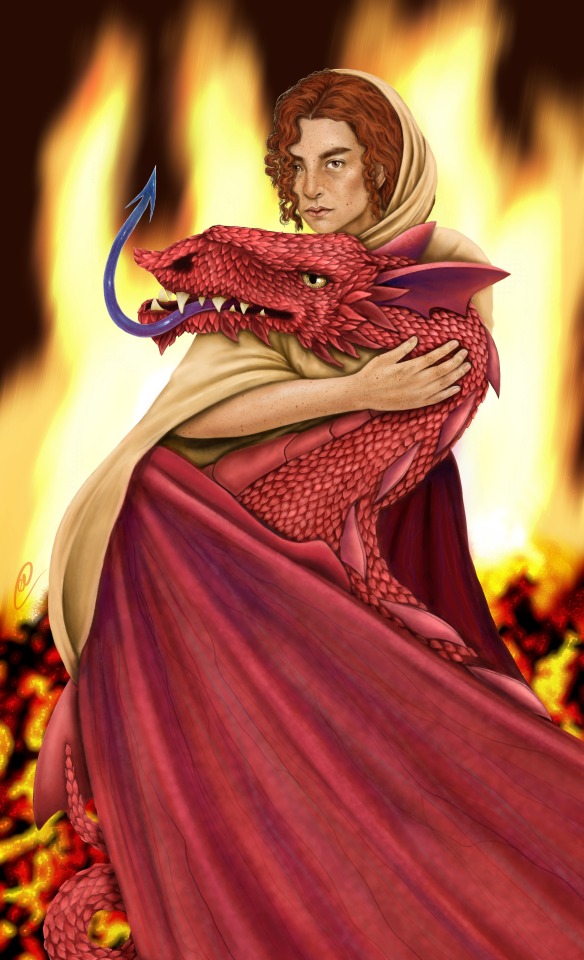
With this I’m not trying to say that freehand is the ‘best’ way of drawing, it is just the one that I personally have found to fit me the best, which is the entire point of this post! All of my advice is just pointers I think could be useful for new artists, it is up to you to find which ‘path’ in art suits you best!
And of course, I’ve phrased these techniques as separate purely for the sake of explaining them easier, but the fact of the matter is that you can use a combination of these in your art if you wish!
If you struggle with drawing the outlines of hands, perhaps use tracing as a way to get a handle of the shape and then maybe use freehand to fill in the colour of them! Use a grid to draw a tree but freehand the leaves and bench below it!
Remember that your art is your art, and no one can tell you how to draw things!
~
I think I’ll leave this here for now! But I may do a part two at some point in the future! & my ask box is always open for anyone who wants any specific advice!
I really hope you found this at least moderately helpful, and a massive thank you to everyone for the constant support of these posts and my art!
#art advice#drawing#drawing tips#art advice for beginners#drawing advice#artists on tumblr#art#i SWEAR i am trying not to ramble in these i just... have a lot to say lol
55 notes
·
View notes
Text
ANSWERING WILDCARD QUESTIONS
For the first time in about a year maybe??? Some of these might be even older than that.
Yes, it is Korka! I definitely want her involved, she’s a wonderful character and there is a *lot* of fun paranormal stuff going on in this setting that she can help them research. Also, I’d just love for her and Nelson to become friends!
Thank you! I love him a lot, and it’s fun to picture him interacting with the other guys. They’d all make for some interesting uncle figures, but they might not be that great in terms of role models.
OHOHO. Devilish laugh. That’s a wonderful idea, and a good way to keep him occupied at some point. He’s a great character, but he’s incredibly powerful, and I want these dudes to solve their own problems whenever possible.
A good question! I don’t remember most of my dreams, but there’s usually a consistent look to the vivid ones. Lots of water, mountains, creeks, and high, winding roads. There are also a lot of buildings that are closely integrated with nature, even though I have almost never seen construction like that.
I had not, but now I have! Here’s a trailer, for anyone else that missed it:
https://youtu.be/33HXHaaagsw
I really like these new models! I’m looking forward to watching a playthrough when that’s available. Just like with Rhombus of Ruin, I don’t think I’ll be able to play this one myself.
DOUBLE FINE, I WISH TO SPEAK WITH YOU- no, I’m kidding! I think great minds think alike. But I’m really excited to learn more about that character and possibly involve them in this whole au eventually.
I’ve actually tried to avoid almost any info about Psychonauts 2 so I can go in mostly-blind, and a lot of the characters are vague to me. It’s fun to look forward to, but it’s also a little harrowing because I don’t know how to anticipate for it!
N...NO..... I NEED TO... Honestly those are old enough that it might be a good idea for me to re-make them, as well as the playing cards I made for the mega playlist cover. I think it’d be nice to remake them as vectors... that might make for a nice art stream sometime. I’ll mention publicly if I start doing that, and sharing any of these conceptual Wildcards arts when they’re done.
And if you’re just curious about what the tarot cards for the other characters are going to be, it’s this:
Eddie: Judgement, The Magician, The Emperor
Manny: Death, Justice, The World
Sam: The Chariot, The Tower, Strength
Max: The Devil, Wheel of Fortune, Joker
Although! I may actually give the Moon card to Max instead of the Devil, and replace the missing card from Nelson’s selection with the High Priestess? 🤔 I’ll decide when I get to it.
Could be! I’ve flip-flopped occasionally on if I want the split-a-cab gang to participate much in the story. I think they deserve a break, and splitting an apartment in New York seems like a good situation for the four of them.
Oh boy, that must be so disorienting for him. The Psychonauts deal with a lot of hippy-dippy weirdness in a seemingly organized way, but it seems like they’re not as paranoid about safety as a real federal organization would be. Not necessarily a good thing, considering one of their camp counselors went AWOL one day, and the head of the Psychonauts got kidnapped the next. They kinda need to get their act together.
Fun fact, in one of the earlier drafts of Chapter 3 I was actually going to make Nelson get scanned by the equivalent of a metal-detector for malevolent thoughts at the door and get really spooked by it, but I decided against it.
YEAH IT’S ON THE LIST
Honestly, a big bulk of the plot in this just regards characters having to face their mental health struggles... via facing it as literal internal demons, unstable powers, etc. It’s going to take a little while for any of Eddie’s teammates to realize how MUCH he has going on under the surface because he does a pretty good job of hiding it. “Needing to help others above ever helping themselves” is a hard issue to notice if you’re not looking for it. But it’s a guarantee that once they find out he needs help, they’ll give it; whether that’s making sure he’s not working himself too hard, or fighting off demonic cultists. Care comes in many forms.
SHE NEEDS TO REST.... POOR SYBIL (on the upside, they don’t TECHNICALLY work there, so she might be fine most of the time.)
Strong Bad isn’t a Psychonaut! He’s just a vlogger and a petty (psychic) criminal. It’s honestly not very different from canon.
Free Country, USA is a smalltown hotbed of psychic activity. Nearly everyone there has some mild capacity for supernatural powers, but nobody really notices or cares. Strong Bad just pops the tops off of cold ones and.... sometimes alters reality, a tiny bit. But mostly just in regards to media. The cartoons, comics, etc, that he invents and talks about have a tendency to suddenly voip into existence and nobody knows how. I swear, there’s actually a line of him saying something to this effect, but I can’t find it anywhere. Don’t worry about it! Nobody in town is ever going to do anything truly nefarious with their powers, so it’s not a high priority on the Psychonauts’ radar, just a weird footnote.
The only reason Homestar is an actual agent is because he seems like exactly the kind of guy to sign up for a job like that on accident and then stick with it. And he’s a talented telekinetic! None of his other friends know about his job or notice his absences.
And just for fun, here’s some weird instances of psychic overpowering that happened in the cartoon:
---
(Poor Strong Sad)
I’ve actually answered this one before! BAM Pretty sure all of it is still accurate.
Nelson: He sees floating sheets of paper containing notes, questions, etc. Anything that he wants to know more about regarding that person. The notes are subject to edits, cross-outs, ripped pages, etc.
Guybrush: He sees the item that the person is carrying that he wants most. As he gets to know people better, he sees them for their useful skills first.
Manny: His view of most living people is not very kind...
The people he’s closest to will eventually look a lot less garish. More like a flattering, camera-ready versions of themselves.
Eddie: Sickass sketch drawings that look like they belong in the margins of a composition book. The illustrations improve as he gets a better picture of where they’d fit in the internal lore of his mental world.
Sam: A lot like Nelson; Sam pictures case files, though his are a bit more in-depth.
Max: Max’s visions of people are highly personal and uncomfortable for those who witness them. He sees Nelson as a puzzle with a piece missing. Guybrush is a ripped up voodoo doll. Manny is a forgotten ofrenda. Eddie is a powder keg with a long, lit fuse. Sam is Sam, but he’s the wrong one.
I also got two questions that were pretty big subjects, or that I didn’t want to repeat, so I’m gonna cover them pretty broadly:
REGARDING [X] CHARACTER OR SERIES INCLUDED IN THE AU
Sure, I support it! I’ve gotten this question a few times in regards to things that I haven’t had time to delve into yet, or I’m not interested in, so I’m not going to include it into the AU myself. But if you want to explore an idea like that, feel free! This AU is pretty dang collaborative.
My main focus is just on the main 6 properties: Psychonauts, Puzzle Agent, Monkey Island, Grim Fandango, Brutal Legend, and Sam & Max.
But my general rule of thumb for “characters that exist somewhere within the background of this story” are any other properties owned by Telltale, Lucasarts, or Double Fine. And considering all of the licensed games that Telltale was getting into before it kicked the bucket, that includes some really weird characters, even up to the Venture Bros. I loved that series, but I’m not really interested in doing anything with them for this story! Partly for my sanity, the canon I’ve picked are already a lot of content to play with.
ASSORTED QUESTIONS ABOUT THE WILDCARD AU DISCORD
There’s no particular criteria needed to join the discord, and it’s not strictly on a need-to-know basis! Because it’s been a long while since anyone has joined, I've been hesitant about adding new people in... But I‘ve decided to try sending invitations again! Everyone who had asked about it in the past will be getting a ping by me in about a day or so, since I want to double-check if you’re still interested. If you’ve been nervous to ask you can reply to this post or message me privately.
Some things to keep in mind before asking or accepting the invite:
If you’re not a friend or a follower I recognize, I will likely double-check your tumblr along with some other current members before sending the invite.
Here’s the Rules page, so you know what to expect before you join:
Be Mindful - Respect other people's boundaries, don't do or say things that would cross the line. If your behavior makes other people feel uncomfortable or unsafe, I will remove you from the chat. In most cases I will try to resolve things with you and offer a chance to do better, but that will depend on the severity of the situation. And if you have any concerns regarding another member of the chat, you can contact me privately.
Health Boundaries - While discussions of mental health do occasionally pop up, do not rely on the chat for help. None of us are equipped to handle serious mental health concerns, and it will only cause distress for everyone. Please seek real help if it is needed! If you rely on people beyond the point that they have asked you to stop, I will remove you from the chat.
NSFW - Generally speaking, try to keep NSFW talk to a minimum. Swearing and humor is fine, but don't get too explicit please! Discussions should usually keep to a PG-13 / occasional R, but no NC-17.
Spoilers & Censorship - Please use the spoiler function to hide story spoilers, as well as discussions and graphic depictions of gore/excessive blood/body horror/severe psychological horror. Include a content warning so that people know what they could potentially be seeing when they click on the censored content. If the spoilered content is the subject of a back-and-forth discussion, please use another warning when you are switching to a different spoilered topic. (Note that these rules were added to the chat later, so be careful when using the search function or back reading.)
The canon series involved with the Wildcard AU are Psychonauts, Puzzle Agent, Monkey Island, Grim Fandango, Brutal Legend, and Sam & Max. Please be mindful of story spoilers!
Channel Organization - Also be mindful of which channel you're in and move a discussion over if need be! That way they don't get too clogged with unrelated info.
Creative Criticism - When it comes to writing, art, or character creation; try to be open to suggestions from others! Nearly all of the creative work in the chat is collaborative, so input from others is important! Creative criticism is not the same as judgement, and is not a personal attack.
Have fun! - Discussions move quickly in this chat! Don't feel bad if you ever need to step back, whether it's because of the speed or a disinterest in whatever current topic we're focusing on. If you ever want to come back, we're happy to have you and can give quick explanations if you feel out of the loop! :thumbsup:
We’re a group of approx. a half dozen to a dozen people, either posting very very quickly in a span of a few hours or barely anything for a few days. We’ve been in an activity uptick lately and there’s about a year and half of back content, too. If it’s hard to keep up on, not that interesting to read through, or you just have a hard time gelling with the group that's already there, there’s no shame in just lurking or dipping out if you need to.
We also talk a lot about Psychonauts OCs, so anticipate that.
31 notes
·
View notes