#need to do more w/ bg elements!
Explore tagged Tumblr posts
Text
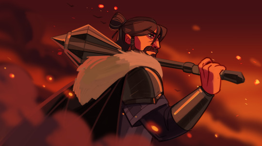
#centaurworld#centaurworld the general#the general#my art#I feel like his face is still a little funky here but yk what I'm still gonna declare this one ok enough to post#getting better at depth of field/field blur is one of my lowkey art goals for this year#tho I think doing it w/ just particle effects is kinda cheating#need to do more w/ bg elements!#also no one give me any props on the mace it is absolutely traced LMAO
152 notes
·
View notes
Text
[ReShade 5.1+] Hide CAS UI & More
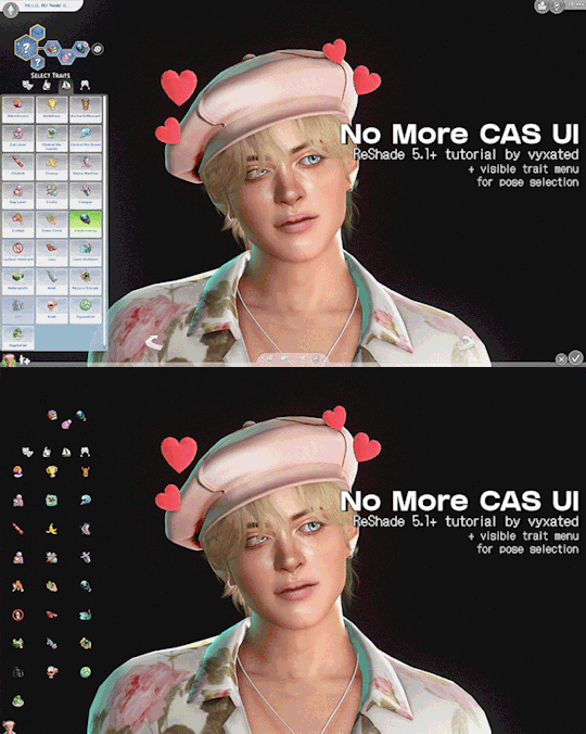
Unlike build mode & live mode, there's no shortcut to hide CAS UI, which is much needed for taking screenshots with Reshade. With this ShaderToggler add-on (made by Frans Bouma/Otis_inf), you can easily hide the UI! This guide will cover how to install the add-on and showcase its features.
If you find this useful, do share the word around! All I ask is that you link back here if you want to share outside of tumblr :-)
📌 UPDATE 03/03/2025: updated only the DX11 file to add a new toggle to hide all UIs except the headline effects. Please redownload and scroll down to see the preview.

How it works:
One of the features of this add-on is the ability to toggle on/off in-game shaders: UI, geometry, post-processing effects, and more (not reshade shaders). You do that by putting certain shaders together into a group which you can then toggle on/off. This is quite useful for CAS shots as you can't hide the UI when you use ReShade/GShade (unlike build/live mode where you can simply press tab).
This add-on is made by Frans Bouma/Otis_inf so huge credit to him as without this add-on this wouldn’t be possible.
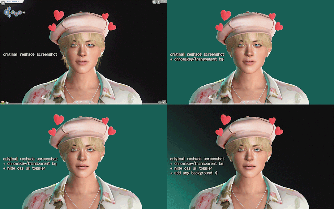
Keep in mind that this add-on doesn’t prevent shaders (bloom/dof/mxao) from affecting the UI, it just hides the UI shader from view. This, along with a shader like ChromaKey/DepthAlpha that allows for transparent backgrounds, makes a great duo! No more cropping to exclude the arrows and editing out the background manually 🙌 (unfortunately alpha hair suffers a bit from it.)
What you’ll get by the end of this post:
A ShaderToggler.ini file that will hide CAS UI elements with the option to either leave the sim/trait icons and trait selections intact for posing your sims, or hide everything except for your sim. Great for taking close-up shots.
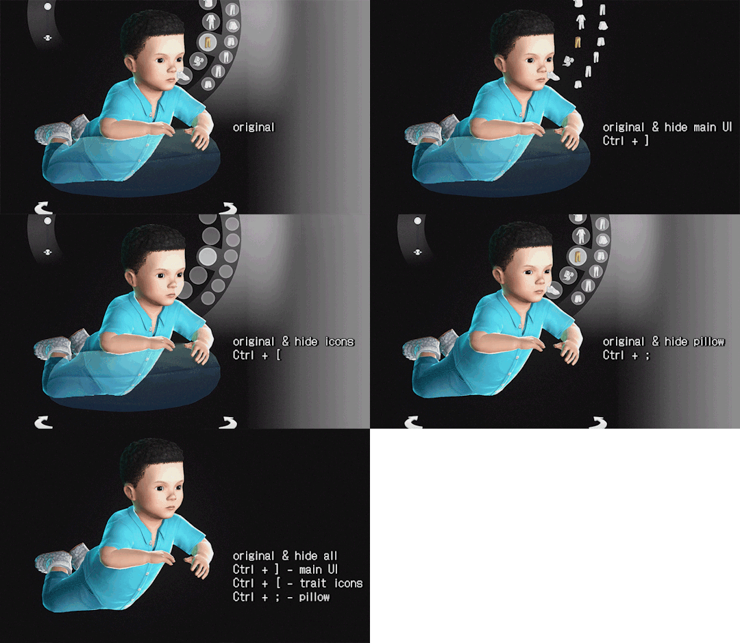
There'll also be a toggle to hide infant pillow in CAS, hide CAS BGs & mirrors, and hide camera UI when your sim is taking a selfie/picture in-game.

// ReShade/GShade requirement:
For Reshade users: tested on Reshade 5.8.0 (w/ full add-on support), but it should be compatible with ReShade 5.1+.
For GShade users:
To check if your GShade supports add-ons: check the ReShade version it's based on in the shader notification at startup, similar to the menu here (GShade x.x based on ReShade x.x). You can also check in the reshade panel and see if there's a menu for add-ons.


📂 DOWNLOAD .ini file:
SimFileShare / Google Drive
🆕 DX9 & DX11 support
ShaderToggler.ini : DX9 version
ShaderToggler_DX11.ini : DX11 version (updated)

// Installation:
First, make sure that you have the correct ReShade with full add-on support!
Grab the add-on from this github release. For non-legacy players, grab _v121.zip. For legacy players, grab _x86_101.zip
Extract the ShaderToggler.addon file into the game’s \Bin folder where your TS4.exe/TS4_64.exe is (where you had also installed ReShade/GShade).
Still in the \Bin folder, drop the ShaderToggler.ini file you downloaded. You’ll end up with both ShaderToggler.addon and ShaderToggler.ini in the same folder as TS4.exe/Reshade.ini.
The .ini file should be named ShaderToggler.ini for the add-on to recognize it and the toggle groups to show up. If you downloaded the DX11 version, remove the _DX11 suffix.
If you’re a GShade user: there’s a folder called gshade-addons; this is where you should place the ShaderToggler.addon file. Just move the add-on from the \Bin folder to the folder mentioned and you’re good. If this doesn't work, keep it in the \Bin folder.
Open up your game. If you see the add-on & list of toggle groups in the Add-ons tab, then you’ve successfully installed the add-on & settings! Restart if needed.
// Shortcuts (Updated):
Toggle main CAS UI (traits & trait selections excluded): Ctrl+ ]
Toggle sim/trait icons & trait selections: Ctrl + [
Toggle pillow for infants: Ctrl + ; (semicolon)
Toggle camera UI when sim is taking pic/selfie: Ctrl+ ' (apostrophe)
Toggle CAS BG mesh: Alt + ]
Toggle mirrors: Alt + [

Previews:
in CAS:
Hide CAS BG & mirror reflections:

in Live mode (for Camera):
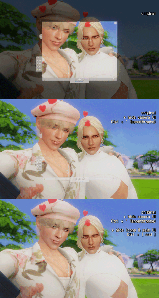
note: you can use the hide pillow toggle to hide the phone object.
in Build/Buy mode, use caps lock to hide the lot outlines:

🆕 in Live mode, use Alt + ~ to hide all UIs except headline effects (available only for the DX11 file):


// FAQ
Issue: add-on works, but the list of toggle groups doesn't show up.
This is likely caused by my config (.ini) file not being installed correctly. Put the .ini file where the TS4.exe file is, which is under the /Bin folder.
Issue: Add-on failed to load with error code 193.
This is caused by downloading the incorrect addon file. If you're a non-legacy (x64) player and downloaded the x86 addon file, you will encounter the error. Download the right version (_v121.zip) and that should fix the error.
Issue: everything shows up & are installed correctly, but the toggle groups don't have any effect/hide the UI.
This issue only happens if you installed Reshade/Gshade and selected Vulkan/DXVK. You need to select DirectX 9 or DirectX 11 instead for it to work.

tagging @thefoxburyinstitute :-)
#ts4 tutorial#ts4 resources#ts4 reshade#ts4 cas#the sims 4#tutorial#t: shader toggler#reshade tutorial#t: reshade add-ons#hide cas ui#sims 4#vyx.resources
2K notes
·
View notes
Text
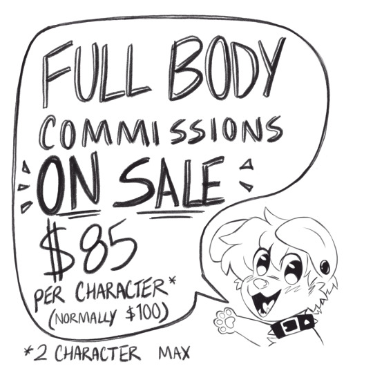
Hey friends! I'm running a small sale on full body commissions, I'm taking 5 slots at $85 a character (down from my standard price of $100). I need more examples for my website, and I just want to draw some characters :3c alsooo if anyone's interested, I'm offering discounts on commissions of your character with my sona Sammy! PLEASE NOTE, Your character *must* have a ref sheet or full body image I can work from. I'm not designing characters for these, sorry! ALSO, please have an idea or pose in mind! It can be generic, like "playing a switch" or "enjoying the outdoors" but I need to have an idea to work from ^_^ LAST THING, I'm changing my shading/background style a bit from my past work, I'm not going to be offering detailed cel shading or backgrounds. Minimal shading and simple bg elements are fine! I've just been way too overwhelmed lately to take on complicated projects. Sale prices are as follows: - 1 character: $85 - 2 characters: $170 - Your character and Sammy: $145 Some more rules: - my regular ToS applies! - sfw and nsfw allowed! (ToS still applies) - again, must have ref sheet or image of character. - payments through Paypal invoice only. - turnaround time will be 4-6 weeks! - I may be slightly more picky than usual with these, I might pass up more complicated characters or ideas. Feel free to run ideas by me though! DM me if you're interested in grabbing a slot, or have any other questions! ^w^ Stylistically they'll be similar to this! I can do a bit more detailed bg too, feel free to ask to see more examples.

#furry#furries#furry art#furry commissions#commissions#my brain has just been#Not Good lately#but i still need tax money! 10 days left >_>#and just general living money#so come get a full bod!#support your local dumb gay ass dogy
220 notes
·
View notes
Note
Since you uploaded that MMJ Miku beta design, do you know if there are other beta designs of the characters?? I'm curious since there's a little bit of concept art of project sekai.
Ah well project sekai featured in this one issue of a Japanese magazine called CG WORLD which is where I got that art from. That magazine is more focused on the costume designs though but it does have some concept art, but aside from WIP costume designs using the final character designs, all of it is blurred out unfortunately.
You can find some WxS beta designs, a Shiho beta design and some low quality MMJ beta designs out there (not entirely sure how people found these, I think they were left in a beta release and got datamined), but that’s all the unblurred stuff you can find.
And there are no VBS beta designs available. There’s some WIP costumes for Akito, Kohane, Miku and MEIKO (i posted her one ages ago), but there’s no actual concept art of them available anywhere.
I can go through what we do have though because they’re probably too low quality for me to post as an actual fact.


So these three images were in the CG WORLD magazine. You can tell who the members of Leo/need are based on the instruments (L->R: Saki, Honami, Ichika, Shiho, Miku), and MORE MORE JUMP! (L->R: Miku, Haruka, Airi, Minori, Shizuku) isn’t too different from the final designs aside from Shizuku, who’s blonde (probably because Shiho is). Niigo is harder to identify outside of Kanade and Miku. This art was also uploaded on TCRF and whoever put it there said that Mizuki is the brunette, Mafuyu is the one sitting next to Kanade and Ena is the one in the purple cardigan. It's not stated who is who in the magazine.

And here’s some actual beta assets. You’ve got WxS and Miku (there's two people in the back) here. Emu didn’t really change much aside from the eyes, but other than her...? (I edited this since it was posted don't mind the change)
We have the leader, who is literally just a palette swap of Rui's initial 2* with Tsukasa's face (excl the eye color which was given to Rui) and hairstyle. Possibly Tsukasa bc leader, possibly Rui bc design, possibly a scrapped character who was split in two
There's someone in the back behind leader boy and blonde girl wearing a pink-purple shirt and white jacket with a yellow tie. Clearly their color palette was used on Rui later down the line. Other than that there's nothing we can tell about this character, not even their gender. Possibly Rui, possibly Miku, possibly a third character who was scrapped/reworked
We have blonde girl, who's hair color and eyes seem to have been reused for final Tsukasa. Usually this is assumed to be Nene due to not resembling any finalised designs for the most part. I think she was probably scrapped, or heavily reworked and became Nene with some design elements passed onto Tsukasa (or Tsukasa was a girl?)
And in the back behind Emu is a girl in a green blazer and grey skirt that looks like a school uniform. Maybe this is Miku because the costume doesn't really match with the others? She doesn't have pigtails though, but no one here has pigtails. There's literally nothing identifiable about her.
Whoever these people are there were clearly a lot of changes made to WxS and these might not even be Nene/Rui/Tsukasa. That's definitely Emu though.


And here's a gacha bg and live bg demo for MMJ. The screen on the first image seems to be displaying a less-blurred version of their concept art. For the record, the illustrations in the second screenshot are from idolm@ster, they are not MMJ concept designs, but part of Shizuku can be seen to the right of the pink haired girl.
Possibly might've been named RE:START given the neon lights in the second image. Has some backing: their first event was called RE:START from Here!, and NaytalieN said in an interview that there was extremely little development on MMJ outside of character illustrations when he was commissioned for that event (and a couple statements imply the game was still in fairly early development too). Or it might've just been a catchphrase for the group or something.
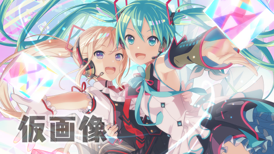
And this. High quality beta-Shiho. This was used as a placeholder card art (surprisingly finished for a placeholder) for MMJ!Miku’s initial card, which by the way, looks exactly the same as the final version only it hasn't been finished yet. I’m pretty sure this is Shiho and not Shizuku because of the side ponytail and image color. But Miku is wearing a similar costume to the one in the MMJ concept art. I mean it was marked as placeholder and was not intended for use, it doesn’t really have to make sense. Also what seems to be a costume for Miku based on this card was left in the game and is on TCRF I added the screenshot below.

I haven't finished translating the CG WORLD article yet, but there's not a huge amount dedicated to character design, as I said earlier it's mainly about costumes. What I can tell you though is that VBS and WxS apparently took longest to finalise, specifically Akito and Tsukasa.
TCRF page for anyone interested
#asks#i read on twitter that when Yukkii was cast as Shiho she apparently wasn't even shown a character design because there wasn't a finished on#though i don't have anything to back this up it was just a random tweet i saw
133 notes
·
View notes
Text
my whb progress 2
as of apr 7, 2024
since whb's half anni has passed, i thought i'd do a progress check to reflect on how much has happened btwn now and this post
general info
lvl: 47
status: 🤨 mostly f2p
i say mostly cause i just recently broke the f2p status and bought bp for ppyong
i refuse to buy packs and in the future i'll prob be very selective over who i pick for bp (aka i wont buy every bp), so for the most part i'll just be having the f2p experience
when i started: launch (10/03 my timezone)
ver: erolabs
team setup
i finally have levi now lmao
sometimes i'll switch out one of the levis for attacker satan but this is what i use generally
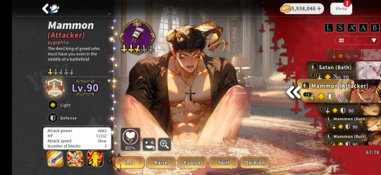
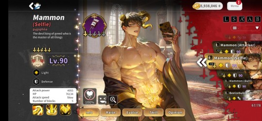
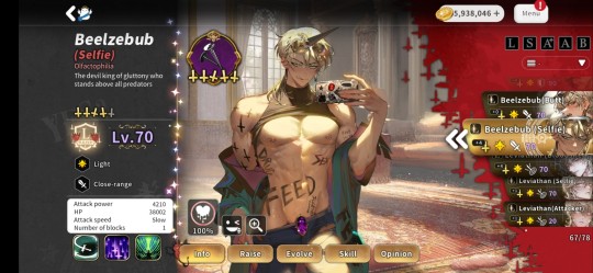
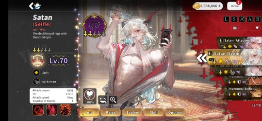
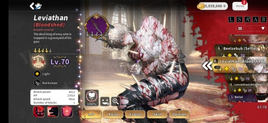
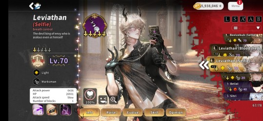
everyone's lvls and artifacts
skill lvls (normal atk-ult-passive)
attacker mammon: 1-3-1
selfie mammon: 4-5-4
selfie satan: 4-4-1
selfie beel: 4-4-4
bloodshed levi: 3-3-1
selfie levi: 3-3-1
secret club
i only work on completing mammon's unholy board
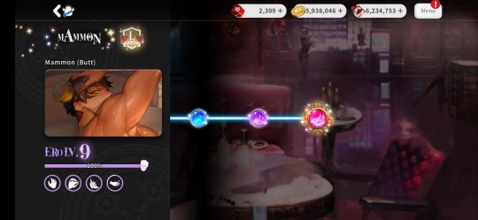
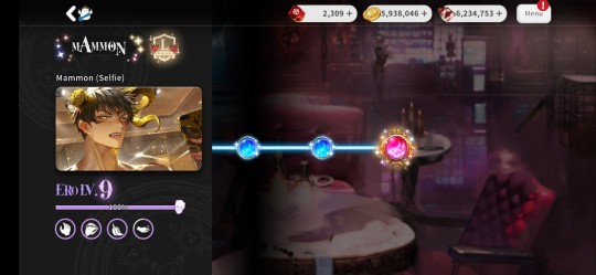
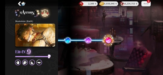
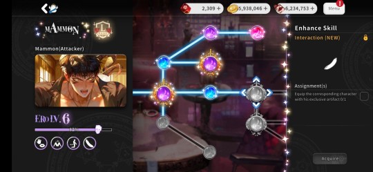
stuck on needing attacker mammon's sig atm :'))
materials
too lazy to screenshot it all but im basically broke on pies, tears, pretzels (tbf i dont play the minigame whatsoever), red keys, yellow keys, and seals
everything else im either ok in supply or overflowing w it
overall thoughts / reflection
this section is for me to look back on in the future when i do progress posts. i'll break down this section into multiple parts similar to my prev post for consistency
STORY
honestly, its interesting in concept. since sadly only 1 chapter has released btwn now and my last post so thoughts havent really drastically changed
ch5 imo wasnt really a full on hades chapter. yes, it takes place in hades and yes we get some intro abt hades, but i think this was supposed to act more like a bridge to tartaros, which is prob why we didnt have any h scenes w any hades chars aside from levi. ofc we'll get back to it being hades-focused eventually, but the story for a while is most likely gonna pivot to tartaros bc of that big lore drop abt mammon at the end
i assume we'll prob be introduced to the cherubs in tartaros bc of selaphiel txting us near the end + it being mentioned at the end that theres a hub of angels in the lab, and hopefully part 2 of mammon's h scene. it was strange at first for mammon to only have 1 h scene, compared to satan or levi that had 2, but w him implying theres probably gonna be a part 2 in his h scene + we'll most likely see him again in ch6 (or however many chapters tartaros will be played out), we'll prob experience part 2 in his home country. tbh that prob just me inhaling MASSIVE hopium since mammon isnt rlly that popular but i can dream ok-
i hope us being in tartaros doesnt last for just 1 chapter. you cant condense the experiments tartaros went through to create a clone of mammon only for them to fail + bring up the fact that the seed is prob also in tartaros in just 1 chapter. well— technically you can, but not at the pace chapters are at atm. chapters have roughly 15 parts of story on the main branch, and imo that much info abt tartaros cant be condensed into 1 chapter unless if they make the story bits like WAY longer than what they normally do
GAMEPLAY
tl;dr as an endgame player, its too easy 💀
working on the spreadsheet ever since the games 1st month of release and now just recently testing multiple team comps, the "meta" is so monkos HSHFJDJ
this game is INSANELY dependent on you having more than 1 dps/tank light card. light is also just an unstoppable element and i wish the game was balanced a bit more to let other elements shine
enemies are now way too easy to defeat. ik i prob shouldnt be complaining abt this but pls im a pgr and neural cloud player at heart I NEED SOME CHALLENGE
ch3 and ch4 were prob the most tedious and awful chapters, but at least they actually made me think when it comes to battles. now i just place down chars and let it play in the bg while i go do smth else. ofc this may just be bc i have a team that im comfortable w using everywhere, but id like to see at least a bit more "challenge" outside of holy coin portal
also, for weekly achievements, lvling artifacts is not a great requirement
i only pull when theres a new s rank or when mammon is moved to standard, so its very, VERY rare compared to avg users. having the artifact req is essentially forcing me to pull during those gaps just so i could fulfill a weekly req which sucks. i also dont need to lvl anymore artifacts in general for my team comp. lvl 15 is the bare minimum i need to get through all content w ease, anything after that is just a small boost tbh
on the note of daily/weekly requirements, there needs to be more of them
i mean in a sense of theres still gonna be 9 daily achievements, but you get more options on HOW you get to the 9 daily achievement req. most gachas that ive played always have more options than necessary to fulfill the overall requirement to get all rewards, so having this strict number w strict reqs is rlly not that great tbh
RESOURCES
thoughts from last time still havent rlly changed. pies and candies especially are still rng dependent which sucks, and now there gonna revamp pancakes while also keeping the old pancakes ???? theres way too many currencies (w some even having very little to no use) atp which can and will get overwhelming for new players
GACHA
i hate solomon seals. you can tell that red keys were supposed to be the main gacha currency if you ever look at old packs, but smth happened along the way and now we have seals
pity is also way too high for what we're earning atm. based off of f2p earnings, every week we get roughly 1 pull of red keys, maybe 2 pulls of yellow keys (red and yellow keys are more dependent on the key boxes which again, dependent on rng), and 1 pull of solomon seals. this doesnt include the stuff earned outside of dailies/weeklies, and i think there should be more ways to earn said currency through dailies/weeklies and not be so dependent on either paying or pulling chars
speaking of pity, i wish we had pity for both of the standard banners
i also wish theyd separate char and artifacts into their own banners. that way, if someone has a char but needs their sig, they can just pull in the artifact-only banner and try to get said sig
tl;dr in general i wish everything wasnt so strict and rng dependent, also wish numbers made sense like why do we get at least 5 red keys a week when 1 pull is 3, JUST GIVE ME 6 KEYS ATP
so yeah thats all for now lmao. im pretty sure i have a lot more to say abt this game but my minds at a blank atm, so ig thatll be saved for the next progress post which will be around 1st anni
7 notes
·
View notes
Text

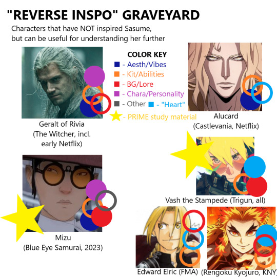
//I DID THE THING FINALLY!! 😭😭😭The years on first one indicate when they first inspired me/influenced how I wrote/saw Sa!! Hence them being absent on the latter
Elaborations/details below the cut!!!
Element Valkyrie: (Kit) Literally how/why Sa has her main gimmick of fire + water/ice lmao!! In fact I think fire was her original main...? Ice became a focus post-atla (all of like... a year later lmfao)
Link (Twilight Princess): (Aesth) What can I say I really loved TPs, well, 'edgier' aesth (my second zelda after all of wind waker). Also, probably the first wolf association...? Less consciously, perhaps the first taste of cryptid drifter that goes around solving problems? (Kit) Why Sasume has a sword!! And why it's at her back/shoulder!! Also, sort of, ass kicking with said sword, but as a video game YMMV lmao. (Chara) The silent protag stuff could not hurt? Esp w the contrast with being good w kids, implicitly (Heart) WHAT CAN I SAY I'VE SAID IT BEFORE Sa is very much HeroTM, in broader loz/link sense, at heart. Saving and helping people is her priority!! Even when it's hard!!
Naruto: (Kit) Tbh... the source of Shinrei's aesthetic effects wrt eyes, teeth, claws, etc? (Bg/Lore) Samehat with her bg. With an emphasis on samehat, as the two were connected 1:1 in those early days. But unlike canon Naruto even baby Nori went 'reality ensues' 'edgier' variant where shit is traumatizing as fuck. (Heart) As I've also Also stated elsewhere... she's very much a shonen protagonist at heart??? A Knight in Sour Armor but a Knight all the same
Sasuke: (Aesth) Do I even need to say it...? The grumpy/angsty edgelord Lancer surface level absolutely came from here, lmao. Not as conscious as Naruto (iirc, I gave her blue hair bc my brown marker ran out when doing that design? lmfao) but definitely couldn't hurt. (Bg/Lore) Probably colored/inspired taking the aforementioned 'reality ensues' traumatic framing for Sa's bg. And a bunch of other plot-y stuff that's sliding scale of preserved to scraped entirely (ie being Nth distant relative survivors to the Uchiha clan lmfao). (Chara) What can I say... aren't we all familiar w the broadstrokes atp?? Loner angsting edgelord who's just afraid of letting people in... A staple of the archetype, and undoubtedly helped staple that archetype onto Sa. (Other) Far more nebulous, but did inspire a general 'special heritage/family line' power stuff. Though what said family line stuff was wouldn't be figured out 'til further down the line.
Kanda: (Aesth) For a hot second I literally intentionally looked to Kanda for aesth inspiration for Sa lmao... in my NLOG phase I even did an inverse of him being confused for a woman by having Sa be more Bifauxnen bc 'feminine = weak' lol (gag). Also, while from DGM's uniform as a whole rather than Kanda specifically, codified Sa's token look of skintight slevelees turtleneck + fingerless gloves— as well as remove previous aspects of color from her wardrobe. (Kit) Again, a side effect of DGM as a whole rather than Kanda specifically, but this is why Shinrei's kit isn't just so thought out but so specifically staggered (the 'Levels/Stages' aspects present across many Innocence). As a direct inspo, though, Mugen fucking with his pupils/eye is what I used to preserve Sa's emotive angy vfx (and what made it, and her entire kit, 1:1 with her sword rather than being innate). (Chara) Do I need to elaborate...? Lol. He also fits into the archetype of Sasuke that Sa was already in, so nothing too big, particularly as DGM made me develop Sa so much more and breakaway from copypasting him. However, he's liably the source of her more overt tsundere tendencies, as well as her aversion to using people's names (also for tsun reasons). Also probably why Sa's surface level is outright Jerkass and not just ominous stoic dude deal lmao.
Dean Winchester (s1-5): (Aesth) Gets some lite points for styling themselves against/for a parent, jerkass with a reckless heart of gold, and bravado/masculinity that oft loops back around to disingenuous/insecure. (Bg/Lore) What can I say? The idolization of a lost mother, comparing oneself against a parent (derogatory), the deadbeat dad (who's like the younger sibling), and the parentification and resulting over-protection and -devotedness toward their younger sibling/'child'. However, not much direct inspo here, especially since one of his hallmarks is his dysfunctional jackassery toward his sibling and one of Sa's is that her jackass exterior breaks away for hers. (Chara) While I remember Sasume's snark being unintentional irp, passive Deanfluence def couldn't hurt to cement the snark, lmfao. (Heart/Other) Lumping these two together bc man!! Man!!! What if you were forced into a life of violence and endangerment and self loathing and you 'reclaimed' it by putting how much you hate it and life and yourself into something meaningful, heroic. What if you were meant for greatness and it destroyed you. What if you wanted nothing more than a life of domesticity as a partner and parent and thought your only way to get there was through dreams and death. What if the only way you can get through the day is by chasing thrills and throwing yourself into risk after risk for others and half-hoping it kills you.
GRAVEYARD/REVERSE INSPO BOOGALOOS!!
As these are blorbos you can use to 'find Sasume in' instead of vice versa, these'll hopefully be more brief...? Things to make you point at and go 'omg just like Sa :)', rather than unpacking the building blocks of inspiration that helped codify her into how she is.
Geralt: (Aesth) The wandering enigmatic monster hunter with an extremely dangerous rep but with more heart/morals than you'd think... yk? Bonus spn gold eye points. (Kit) Nothing overt, but general hyper-competence wrt combat. (Bg) Witchers' sliding scale of dubious rep, yk? As well as his Butcher legacy. (Chara) As stated, gruff bastards with a caring heart that's variably concealed, depending on the moment. Notably (vs some prev examples), very okay with killing human monsters, even if it's not ideal.
Alucard: (Aesth) Pwincesses The supernatural & enigmatic auras that are both intimidating and inspiring reliance/protection yk? (Kit) Again general combat competence, but also healing factor and resulting being a gd tank, relatively. (Heart) Hearts of gold!! More overt since he's not a tsun though lol
Mizu: (Aesth) Edgelord wandering blue eyed 'samurai', lol. (Kit) Violence hypercompetence, pragmatism, and being a disturbing levels of tanking severe wounds. (Bg) What can I say Mizu's entire traumatic backstory and hardening into who she is is because of being othered and seen as nonhuman (if due to racism, vs Sa's). Plus some spoilery stuff I'm not gonna say bc oh my god guys go watch BES :') Esp if you like Sa. (Chara) The terrifying determinism, raw brutality/pragmatism, being stubborn idiots who need to be forced into accepting help... but also going to extreme lengths once the loner walls are breached. Also, the sass and taunting and blood knight aspects??? Peak Sa. Chef kiss. (Other) Holy fucking SHIT the insecurities? And self perception?? Seeing oneself as monstrous and inhuman and that inhumanity linked with an 'inability/failures of' being a woman yk......... augh,
Ed: (Kit) Having fun with 'bending' elements in utilitarian ways. (Bg) Orphaned big siblings whose main priority is saving/helping baby sib yk... Also, in retrospect, the hypercompetence being developed for the sake of said sib. (Heart) Again!! Shonen protagonist at her core!! Though ofc focusing more on the unironic softness, as well as her 'aspiring' for pacifism and hating having to kill but having no qualms doing so when necessary.
Rengoku: (Kit) Badass swordsmen with fire related aesth? Badass swordsmen. (Bg) While far more... mundane in the tragedies of his upbringing, the overlap in the themes and impact of their traumas are :') very much similar :'))) (Heart) Shonen protags but also mentors!! Staring very loudly at and ignoring even harder how as a kid my intent for Sa's story would be to kill her off. Tbf she's a very solid candidate for the Obi-Wan type 'crutch' characters whose death symbolisms an emblematic turning point...........
Vash: (Kit) Again: See: Hypercompetence in combat, now with more overt inhuman uncanniness!! (Bg) While far more fantastical and sort of... spread out? Impersonal? Than Sa's, it's impact and his view on it are very Sacore!! (Heart) SHONEN PROTAG OF ALL TIME??? And also see: aspirations of pacifism and how, just like Vash is able to be so extremely pacifistic because he's nonhuman levels of sturdy... Sasume cannot be because she's still very much human, and so can only take so much before she's forced to retaliate :') (And also being long past the point of breaking pacifism for sake of necessity/saving others... and p much Only breaking it to protect others... yk.......)
#mun babbles //#dash games //#about // sasume#meta //#meta // sasume#lays on the floor :'))))))#hope this makes sense!!!!!!!
6 notes
·
View notes
Note
OH MY GOD THE RHYMING PING PONG one — my Karasu looked so STRESSED, I think Nagi said “orange” (I think?). I can sooooo see it Karasu going like “bro what are you doing!?” Given his competitive nature🤣 betya he cheered THE LOUDEST when Nagi hit a strike and it shows (i can see his oesophagus wait what— that was an expression hahaha)

I just love these tiny panels of them (i cannot wait for this to be animated 🥺 this is honestly what I am most excited for in S2 hahaha). When I saw that panel again, i immediately thought of you tbh 😆
Karasu — looks like could kill and is actually a cinnamon roll. I wanted to think that Karasu was trying to pull the same treatment with Hiori to Nagi when he said “those who seldomly think that they’re prodigies arent the real deal” (something like that). To me, it felt like he was trying to tell Nagi to be more confident??
The gaming aspect — Karasu only plays like idle/management type of games, i guess not so much RPGs?? He attracts the gamers to him HAHAHAHA the fact that he is sooooooo into stocks makes sense why he be networking and learning from Reo.
Also also, been thinking lately— if episode nagi had chigiri in vol 5, maybe maybe we’ll get a Barou and Nagi cover too? 👀 its a given I can just tell.
On that note, I might… and probably getting there slowly but surely, when I decided I wanted a jumper like Nagi’s lol because I just changed my phone bg to a nagi themed one (used to be chigiri, then karasu lol).
Jee wheeez my asks are getting longer hahahaha
LMAOOO no karasu was sooo mad!! and yeah nagi did say orange 😭 they’re literally opposites like dark haired competitive ass vs pale haired idgaf warrior HAHA that panel also cracks me up because nagi is just like 😟❔ and everyone else is losing it meanwhile barou is trying to give off nonchalant and cool vibes but yk deep down he’s proud of nagi 🥹 they give such sibling vibes i love them
YESS i love the cute small moments in the u20 arc!! like nagi calling barou the stripper king 😭 there’s this element of all of the players somehow being friends and having their own individual dynamics that isn’t there as much in nel sadly
it feels like he was probably testing nagi too a bit!! like trying to see if he would live up to the hype or not LMAOAO he also gives very much older sibling vibes his trash talk is actually just him being a bossy big bro
yeah iirc he plays like hotel management games and whatnot 😭 imo he def says he games though so the gamers (nagi niko hiori) are like “oh word??” and ask him what he plays and he’s just like merge mansion or hay day or smth and they’re like WTF you’re not even a gamer stop calling yourself one 😓 LMAOO but him being friends with reo is so real like YES tabito get that linkedin!! build your network bby!!
BAROU AND NAGI COVER MIGHT BE THE END OF ME like actually i’ll scream…epinagi covers are always slays i love the one w rin especially because it gives such manhwa vibes JFKDSK like looks-wise those two are THE male leads ykwim
LMAO if you ever need help converting lmk i’m always happy to yap abt nagi 🤩 and dwww i think my responses are always 10x as long as your asks so it works ✊🏻
2 notes
·
View notes
Note
FOR THE ASK GAME!!! 6, 11, 12 <33
YIPPIE!!!!
6. favorite thing to draw?
infinite<33333 NJDSNCJKDNKJ furries<3 specifically dogs but ive been obsessed w n drawn animals almost exclusively my entire life i love me a funny creature :3 im big into speculative biology esp in horror n sci-fi contexts, so like. ANY TYPE of weird animalish creature im hugeeeee fan of drawing i luv thinking abt alien anatomy..... so like: furries<333 aliens<3333 alternate fucked up beasts n the likes<333333 and blood n guts >:3
11. do you listen to anything while drawing?
YESSS it feels weird to draw in silence i need bg noise for 95% of all tasks i do lol. usually i listen to music that itches my brain/inspires me in that moment r watch video essays!
12. describe your process while drawing
hrmmmm, i think my process is pretty simple kjnjkjbk usually when i go to draw ik likeee kind of know what i want to draw? if i dont have a clue ill just start doodling different characters/shapes i like to draw r have thought about recently. but otherwise its just, drawing approximately what i see in my head, n making changes where i see fit n whatnot. im a VERY VERY visual thinker n have eyeballed shit all my life so like i really do just wing it for the most part jdjcdkjbjcbj
i spin 3d characters n environments around in my mind until i get a frame i like/looks interesting and then. draw. i wish i could go into more detail here but in all honesty i try not to think too much when i draw. BJCDBJCVJBDJJ
in terms of like how i actually go about drawing things ummmm !!!!! i do REALLY messy sketches w a bigger brush, just trying to position elements n get proportions down and the rest is sortof a drawn out cleanup process. i erase a lot when i draw n often block out entire shapes getting the silhouette/contours of the subject done first and then erase inside the lines where needed and add details! i value being able to draw fast and efficiently while also telling a story n i def think that shows a lot in my works n how i go about drawing !
#asks#possum#art#teehee<333 tried no to ramble too much lol but one must understand im sooooo fucking weird about my art and at in general i can go on#forever n ever about this shit mann<33#a lot of the ways n techniques i use to draw is informed by like. how i percieve art in general n my ideologies...... and whatnot........#drawing can sometimes be soooooooo [ersonal<33333333 to me<3333333333333333333#lol<3333#should also be noted that i think most oftenly in terms of like comic/movie frames so everything i draw also has a cinematic aspect to it...
3 notes
·
View notes
Text
do you guys want my jjk bg3 builds. Trick quastion ur getting them
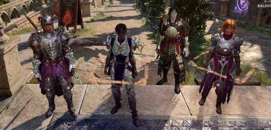
⬆️ just killed orin.
Yuji
- oath of vengeance paladin (could go oathbreaker if ur silly). Should be zariel tiefling but bc the hireling races are limited he's a mephistopheles tiefling + folk hero background. All of which I think works for him...
- feats are alert gwm savage attacker
- final gear: armor of persistence, helm of balduran, amulet of restoration, cloak of elemental absorption, boots of persistence, gloves of hill giant strength, callous glow ring, ring of elemental infusion. Weapons: sword of chaos, hellfire engine crossbow
- not a complicated build. Light sword on fire. Hit things with sword until dead. Occasionally heal party members. profit.
Maki
- battlemaster fighter. Seldarine drow. Don't ask how the patriarchal zenins are part of matriarchal drow society I just wanted the clan outsider thing for her. Haunted one bc durge bc I wanted deathstalker mantle. her dream guardian is mai :). BM fighter self explanatory.
- feats are alert gwm ability improvement (str, con, I used hags boon str for her too) savage attacker
- final gear: reaper's embrace, sarevok's helm, broodmother's revenge, deathstalker mantle, disintegrating nightwalkers, helldusk gloves, killer's sweetheart, ring of regeneration. Weapons: balduran's giantslayer, fabricated arbalest. Broodmother's revenge and ring of regen is great permanent +1d6 poison damage.
- also a simple build. Spawn in, smack with sword of 30 kinds of damage, turn in visible, spawn somewhere else, smack with sword again, profit.
Megumi
- 8 beastmaster ranger, 4 thief rogue. Seldarine half-drow (toji left + wife was human). Again bgs limited bc of hirelings but I think criminal works for him. beastmaster bc of 10 shadows animals rogue bc of sneaky shadow boy.
- feats are alert sharpshooter and ability improvement (dex)
- final gear: regular +2 splint armor (intended to use elven chain but I gave him ranger knight so this was better), circlet of hunting, amulet of greater health, helldusk boots, caustic band, risky ring, fleshmelter cloak. Weapons: knife of the undermountain king, crimson mischief, hellfire hand crossbow, ne'er misser
- this is basically my astarion build but more ranger-focused. Pretty simple. apply hunters mark shoot the hell outta them. profit.
Nobara
- light cleric of bahamut. Human, urchin bg. Yes I know this is not very nobara but I needed a support and she has a very specific power set that does not translate well so now she just gets to set shit on fire.
- feats are alert, war caster, ability improvement (wis)
- final gear: dark justiciar half-plate (helldusk armor better but it's ugly and the fit > everything) circlet of mental anguish (or wapira's crown if you need stronger healing), spineshudder amulet, cloak of the weave, boots of stormy clamor, gloves of belligerent skies, whispering promise, ring of salving. Weapons: blood of lathander, viconia's walking fortress, gontr mael
- one of my favorite builds. Classic I'm a healer. but. The spineshudder amulet/belligerent skies/stormy clamor combo is basically an additional 5-10 thunder damage w any element based attack it's great. Blow everyone around you up with holy flame + resurrect all your buddies = profit.
This was actually the worst campaign I've ever done everything that could go wrong has but I'm ridiculous ways. Accidentally chose the wrong dialogue option when entering the myconid colony and turned it hostile before I got of my gear there and had to send in disguised gale. Decided I didn't need to turn minthara invisible when springing her from moonrise, turned the whole place hostile .2 seconds into act 2 (+ minthara got obliterated and I hadn't recruited her yet so DEAD). Accidentally stole smth from sorcerous sundries and turned half the city hostile. Brought one scroll of globe of invulnerability to the house of hope and then yuji got mind controlled by haarlep and used it so I had to suicide bomb the raphael battle. Less said about the cazador battle the better. Just now when trying to duel orin I used mind blast on her, caught some invokers of bhaal in the blast, turned our one on one battle into a free for all in the entire temple. Excited to discover the new and unusual ways I can fuck up fighting the brain.
1 note
·
View note
Photo
saw this via the #graphic design tag (lol)—I'm not familiar with the subject but it's a v cool illustration. Here are my notes as a designer:
of the 2 options here, the black backgrounds show off this illustration best, imo, whereas the light backgrounds give more emphasis to the type. You could probably also achieve a pretty cool look by colour-picking one of the rich accents, like that forest green or navy blue, to use as the background. However using a colour that's already dominant in the illustration, like the bronze or yellow, would make the illustration stand out less vs the type (similar effect to light bg)—can work in some cases but I suspect not what you're aiming for here
the pill-shaped frame similarly pulls the type to the foreground; this kind of shape works better for images that are "fillers"/decorative and not the focus.
Quick aside: in general, it's more common to find rounded shapes on elements with lower hierarchy (at least in contemporary design). Take a look at the UI of whatever you're reading this on right now—you'll likely notice that the innermost/smallest elements, like buttons, have the most rounded corners (or are totally circular), mid-level elements are slightly rounded, and outermost elements are the least rounded or totally squared off. It's barely relevant here as you don't have much hierarchy to worry about, but it really is everywhere—our brains love putting round things inside square boxes, but not square things inside round ones; we associate "round" = "inside". Square corners = main object.
pay attention to your kerning!! aka spacing between individual letters. This typically needs to be handled manually when working with large/display type, especially with serifs & caps, and even more so when setting type on a curve. You've got a bit of a gap between the "R/S" in "CURSED" that breaks the word up a bit awkwardly; something similar is happening to the "U/I" in "KUIPER" and "W/H" & "A/T" in "WHAT". No fault of yours—usually the computer knows how letters should fit together, but it's not great at visual balance and not all fonts are well-coded. You're the only one on that project with eyeballs, so def don't be afraid to step in and adjust!!
I think the left-aligned arches could work but you'd need a bit more whitespace to balance them; as they are, the type is a bit overwhelming and makes your dude look kinda cramped :(
imo the first two do the best job at achieving the effect I think you're aiming for. I love the lil ring through the middle—it does a great job of tying the frame to the illustration & adding intention to your design. I do think you're better off sticking with a single colour of type; I totally see why you did both white + black on the light background, but it's making things bit busy when (I think) the type is intended more as decoration for the image, not as the focus.
my last 2 cents: I don't think this particular typeface works very well at small scale—the ultrafine parts make it very hard to read on the left-hand side of those first 2 images. That lettering could probably stand to be bumped up a few sizes or else swapped out with something graphical to balance the frame. Actually, now that i have squinted at it, that's a sick line—you could probably break it in half and do "what a cruel fate" // "for one so curious" on either side of the arch (& drop/move the "melody" line). Though as noted I am unfamiliar with this character so that might be a dumbass suggestion! Pls disregard this steam-of-consciousness bullet point if you prefer 😌


Hi! Need some help…
Here’s me using my graphic design skills to somewhat edit this Sigma piece into some graphical-print variations with an editorial style. It’s funny as this is something I would use more for a book cover but hey it’s an experiment and I like the brutalist serif-type to compliment the illustration.
Which one looks better?
88 notes
·
View notes
Photo
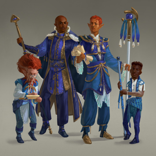
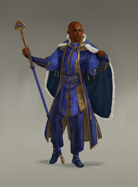
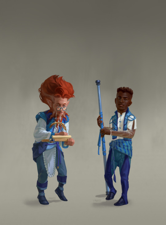
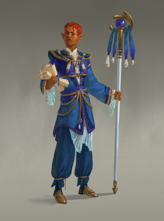
My second contribution for the Autumn Season of @tgtw-project featuring variations in Cobalt Soul formal clothing ✨
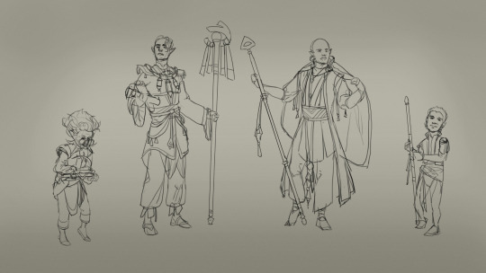
I wanted to portray formal clothing of various members who all have different positions in the Cobalt Soul. On the first image, they are from left to right: Demid Sunlash, Dairon, Yudala Fon and Tubo.
Notes about my process are under the cut.
So, here’s another post with a bit of insight into how I approach things. Hopefully it’s helpful or interesting!
When I chose this subject to draw it I knew I wanted to portray variations in formal clothing throughout Cobalt Soul (part of Critical Role Campaign 2 setting lore) hierarchy. My idea was to convey station through detail level and the variety and intensity of the color scheme. With just that I set out to draw a sketch.
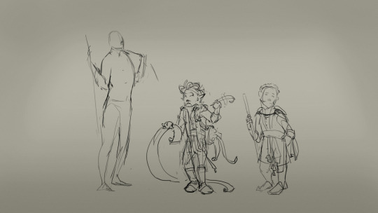
(yes, it was a very bad idea to just go sketch it and it went very poorly. Some people can fly in blindly but that never works for me. Chaos reigns in vague directions and is my biggest nemesis.)
Halfway through drawing the figures I realized the outfits felt very same-y and lacked unique shapes. I also wasn’t pleased with how tense the poses looked like so I abandoned the sketch and went on to do a separate sketch for the outfit designs. Sometimes you just have to scrap things and start over with better preparation.
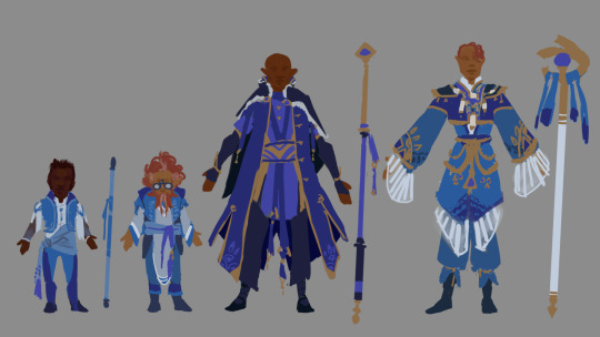
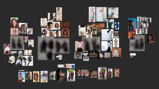
While making these I kept in mind my goals for each outfit and had one eye on the cut and detail references below, which I gathered just before sketching.
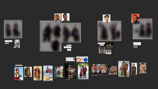
I knew I wanted to have some elements inspired by Eastern European traditional clothing so I gathered those images specifically, and wanted to have eye and triangle motifs in there since they are associated with Ioun (patron Goddess of Cobalt Soul). I also looked up the wiki for Cobalt Soul and determined which named characters from Critical Role Campaign 2 I’d like to portray, then added stock photos of models that had similar features that I wanted to paint.
Another thing I did while gathering references was to shoot my own with a few poses that I thought might work best. There were many broomsticks in there as stand ins for staves 😔
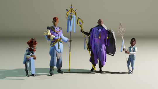
I don’t own any lighting equipment, and I wanted a clearer idea of how colors and light interact, so I mocked up a scene in Blender. I used DAZ for figures and the Sketchfab addon to quickly add stand in props made by other people, then very roughly blocked in the clothes. I am sure anyone who actually does 3D would recoil in horror at it.
This time I had all the things I needed and finally produced a good sketch. Some elements of it I traced off of the Blender render to save time; models were posed off of photos so risk of making things stiff was minimal and anything that was off I just corrected while drawing over because I have enough figure drawing experience to spot it.
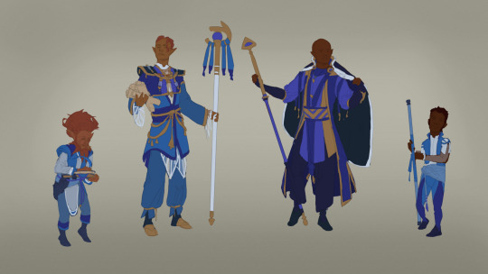
I like to keep my blockin process very organized and very similar to how I approach it while working in different styles so I don’t get overwhelmed and lost. First I lay down flat local colors and then on top add shadow and light with Multiply and Hard Light layers.
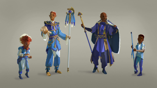
With the initial blockin done, this is where A Lot of Rendering begins. While I’m at it I keep finding things that need more detail or specificity so I’m constantly looking up images to help me. Below you can see how my reference board looks after the entire process. This piece was very heavy on clothes so there are many references of fabrics and folds. I also wanted to push myself with painting skin so I gathered quite a few photos that gave me a clear idea of color shifts.
While rendering the outfits many times I noticed some elements were too much or needed a bit more detail, so I deviated from the original outfit sketches where necessary. None of it was a big change so the general feel of the outfits wasn’t disturbed, but that extra bit of accessories or stitches really helped the clothing feel more lived in.
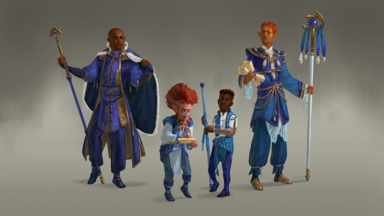
(I redid that BG so many times because I couldn’t settle on a look for it...)
And then some 20 hours later we have this! That probably would’ve been half as much but I had things going on IRL which kept distracting me from work and then I struggled to focus while trying to get back to it.
I’m fairly happy with how this turned out and it really made me think more about how I use my brushwork to convey detail, along with making me pay more attention to how much detail I add. One thing I noticed that I should work on improving is my values because until the very end some of them were quite murky and made some important details and edges unclear.
Overall I probably spent around 25 hours working on this piece. I did all of my painting with Wacom Intuos graphics tablet, in Clip Studio Paint, with 3 custom brushes.
79 notes
·
View notes
Note
pentagon and itzy for the ask game? :)
already did itzy so i'll do ptg <3
favorite member / bias line hongseok, yeo one & wooseok
which member I’d fight (& why) yanan even tho he's like a giant compared to me... he just has annoying sibling energy so i want to fight favorite song(s) shine, naughty boy, sha la la, dr bebe, the black hall, you like, do or not, 1+1 (i still need to listen to a lot of their discog.. especially bsides) favorite thing about the group absolute clowns we love chaotic energy <3 but they also so very deeply love each other and again they each bring something to the group.... also the music absolutely slaps.. also they rly own the cute bg concept
something i’d like to see from them another dark concept or if they stick w the lighter concepts maybe just a more upbeat title track (that has that danceable element to it?) send me a kpop group for this
#when i tell you im gonna struggle with that last question#also feel free to rec me some quality bsides of theirs <3#jenny#yejiswife#ask#answered#kpop group asks
3 notes
·
View notes
Text
v force episode 1 (part 1)
finally got around to watching the first episode, so here are some Thoughts™ and Initial Reactions™! also i am watching the english dub so i am referring to characters w/ their dub names.

first off, the opening didn’t change at all which was. a little weird imo? i’ve got nothing against the song (it’s a banger) but why didn’t they change the visuals?? it’s so jarring to see the season 1 style in the op and then being slapped in the face with the s2 art.
my roommate said maybe they’ll change it for the next ep but still. i’m not a fan.
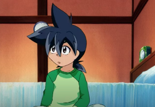
roommate: ah yes, i devoted myself to studying the blade, and now i’m going back to school!
jokes aside, i think it’s good he’s going to school. let tyson learn how to read it can only help him
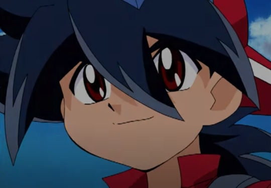
okay HERE is where i rip on the s2/3 art style a little bit. i really, really do not like it. i hate how flat it looks, and i’m not a fan of how similar some of the characters look. it’s still beyblade, but in all honesty, i’m VERY attached to the s1 art style. it looks a lot more unique and really gives the characters space to stretch out and have unique designs, whereas this season doesn’t do that to the same extent, at least from what i’ve seen.
i’m not above being proven wrong or having my mind changed about this but. it’s gonna be a no from me thus far
also, the way they do the eyes in this season is just. no. the skin lightening isn’t a fantastic look either, i will say.

1, 3d dizzy looks Bad™. 2, what is this lineup??? why are they all so small??? why didn’t they keep THESE designs for this season?
kai is rocking that crop top tho. good for him!

“it’s only a local competition. it’ll be a piece of cake winning it after all, since i’m, you know, the world champ!”
...so he’s going to lose. granted, it is the first ep and the writers need to set up some tension somehow (tyson can’t go in swinging right off the bat, obviously), but this just made me laugh. i’m interested to see how he loses, though.

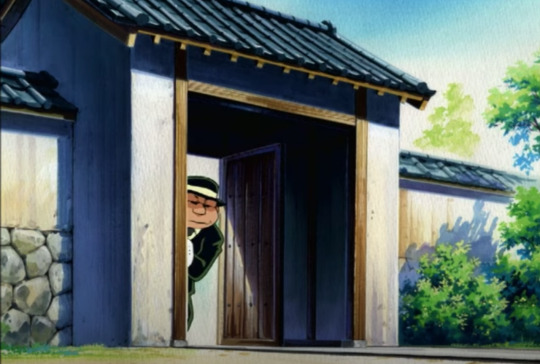
i just thought this looked nice!! beyblade has some very excellent bgs in some of their eps. the wall from ep 36 (??) of 2000 lives in my head rent free
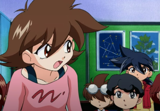
aaaaaand here’s hillary! i’m not clear on what exactly she’ll be doing in the main group (is she just supposed to be the voice of reason?? chief already kinda does that, though), but eh. it is only the first episode after all, so maybe i’m jumping the gun (again).
roommate: she’s like the amy of beyblade. everyone hates her but loves her at the same time.
WHOMST????????
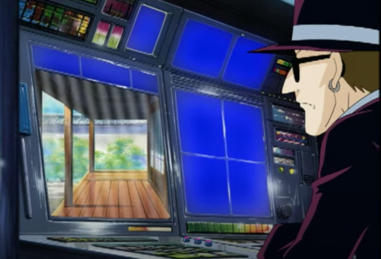
this is giving me abbey vibes. already don’t trust these guys. their suits are immaculate, though.

HMMM!!! okay here’s another gripe i have with s2/3. 3d beyblades were a terrible idea. there’s no sense of weight, they’re not grounded in the slightest, they literally look like they’re FLOATING like????? who gave this the green light. who decided on this i just want to talk. i get wanting to include 3d elements in an anime to make some things easier, but this just looks like shit. and how much easier was it??
not to keep being like “in season 1...” BUT in s1, the beyblades looked unique. they looked like they had power and weight behind them. they were grounded in the stadiums and actually WORKED within the backgrounds. and it looks incredibly jarring when the REST OF THE SHOW IS ANIMATED IN 2D.
this is bad. i will not change my mind about this. art style, maybe. 3d beyblades? terrible. horrible. very bad idea.

“how’s this? is this good enough for the wicked witch of eighth grade??”
I’M SORRY, THEY’RE IN 8TH GRADE??? were they TWELVE in the first season?? why do they look so much younger now?? no wonder kai was such a sourpuss all the time, having to look after twelve year olds. i get it now.
jokes aside, this makes no sense. granted, it’s a show for kids so i get making them still be in middle school but man!! that’s such a shock.
20 notes
·
View notes
Note
ok perth u probably didn't see the oneus cb yet but i gotta give u my thoughts please take my thoughts.
black mirror: it feels a little atrocious and cheesy and i actually love it like it's just a catchy song!! they could have gone harder but i'm okay with it. the mv is VERY valkyrie which is cute but also boring. none of the shots really wowed me also rbw tanked their budget for this cb.. and some of their fits suck. for me this is a step up from banbakbulga though
connect with us: letdown letdownnnn i would honestly rather listen to the outro version of this song. there is no movement there is no buildup. but xion has a verse so 🥰🥰 i guess
polarity: THIS IS THE ONE.. catchy as hell mwah
happy birthday: save me. save them. the chorus is nice honestly and i like this producer but the aggressively heterosexual corny english interjections really took me out of the vibe.. it's not my birthday i'm not your girlfriend shut up shut uppppp
valkyrock: mixed feelings bc it really just feels like valkyrie with poorly arranged hard guitar in the bg there were some weird instrumental choices too. it serves its purpose which is to be a cool concert remix. there are some cool moments tho especially with the main guitar which i can only assume is kanghyun just shredding it good for him. could have gone harder with the rock concept
so overall this cb... just okay. i'm okay with it! it's def not a come back home or a tbontb (i actually LOVED tbontb era sfsgdfdgdg even the acoustic guitar in the chorus) but frankly it wasn't trying to be that. still feels pretty oneus. anywayyy this is long! i just wanted to like. open a discussion lol don't feel pressured to respond!! -tt
i can finally start answering this ohohoho
hi tt anon my beloved!!! i am ready to answer to these thoughts (aka compare them to mine hSDGHSDKJGH. also i’ll be writing like, each ThoughtTM after i’ve listened to each song, so while i’m typing that i’ve only heard black mirror)
ok so i’m done typing my thoughts and. it got VERY long. don’t apologise for length i’m also wordy <3
now connect with us. so far i didn’t like the voice editing on keonhee’s voice but the song sounds... alright... not groundbreaking but it’s alright. seoho my beloved <3 WAIT THERES NO DROP IN THE CHORUS???? WHAT THE FUCK? i don’t really like the typical kpop drops always used now but come on?? oh wait there’s a? ugh. that was nothing. well i guess it’s a song and dongju got a verse for sure. i don’t have a lot to say on it i don’t know if i’ll add it to any playlists IS THAT HWANWOONG’S FIRST LINE?????? what the hell is any of this DSKJFHKJHD i may not have noticed him before but huh what. eh. it’s a song. again maybe it’ll grow on me! but right now yeah it’s a letdown i agree.
so for black mirror i agree the mv was... cheaper than what we got with gaja, twilight & etc. like they used all the budget on their first mvs DNSKJFHKJ (and to be or not to be... i guess? i don’t remember much except Guns And Blood Bath). i don’t really mind it in itself bc i don’t watch mvs much anymore and i’ve accepted that sometimes companies will just throw whatever at the audience for the sake of money (see also: ugly dance by onf letting me down in great part bc it acts as a followup to beautiful beautiful but is literally just a performance mv with no storytelling elements whatsoever but eh what can you do right) but for someone who likes cinematography it’s definitely gonna be disappointing if they were expecting something like gaja or come back home. as for the fits i didn’t really look at them, mostly their faces? and ough they are pretty <3 but yeah i wanted to get the more negative criticism out of the way so i can talk about The Song because unexpectedly i actually really like it!! and we can thank the bassline for that LMAOOO honestly this is gonna sound mean for no reason but this is what w*nho (censoring in case it gets in tags... i do NOT need mbbs after me on this fine day) thought he was doing with his debut song (not losing you that one made me cry. the one that i forgot the name of). i really enjoy the vibe of the song even if imo it doesn’t really fit the visual concept very much? but it has strings and i’m not gonna say no to strings. strings and a sexy bassline. and yonghoon’s whistling. SHFSDHKH
no but it’s a really good song imo! it’s not... as good as say, twilight (maybe it’ll grow on me idk we’ll see but twilight really was one of their best so), but it’s still a pretty solid song and while i do like banbakbulga a lot now it feels a lot less oneus than black mirror. oh wait i have something else to say, they really should leave the rapping to ravn bc like we know kpop rappers are not really rappers but i. really don’t wanna hear leedo rap anymore. he has great vocals there’s no reason for that... ravn is genuinely enjoyable to listen to so i don’t mind him but pls rbw give leedo more vocal lessons so he can sing more (and also give dongju vocal lessons at all?? why does he get two lines per song??? they’re a 2 yr old group now there’s no excuse. is he that bad? i don’t buy it he sounded good in the rtk gaja)
black mirror also very vaguely reminded me of run away by got7 during the chorus for some reason feel free to ignore that HFKJSHKFJ
onto polarity! shit i really need wrist braces. well this is like an improved connect with us? it’s definitely catchier sdnfsjkdfh and definitely a oneus song tho that means i don’t really like what their style is headed toward... one of the percussions they keep using, i really don’t like it!! i hear it everywhere and i don’t like it! not bc i hear it everywhere but bc it’s used for anything and everything like u should be more careful with what sounds u use for what songs. but i’m also very picky in the little details when i’m focused on something i guess sndfjskh. keonhee sounds really good in this song thank u mr lisp for my life i love u :) OH WAIT LEEDO IN THE CHORUS??? VERY GOOD LET’S GET MARRIED jk not to a leo man.
then we got happy birthday....... um... i was gonna say this is fine then he said you’re my goddess and. let me out <3 NOOO KEONHEE SOUNDS SO GOOD THIS IS EVIL... WHY DOES HE SOUND SO GOOD ON THIS SONG NANODNONDD LOVE LOSES </////3 i wouldn’t say it’s unlistenable for me like english girl but i’m gonna have to turn off my english speaking brain to listen to it yeah. it’s a good song otherwise what a shame... stop pushing ur heterosexual words onto me i’m just trying to listen to a song!!! do songs have to be gendered!!!!!!!!!
valkyrock here we go. last one. last one boys & not boys. so far it’s nice tbh. HUH? they lost the vibe with ravn’s verse. okay i guess the prechorus is alright i can hear the faintest hint of strings. the chorus... the percussions should not be like that... like idk how to explain it but the rhythm is too regular and not spaced out enough, if they were gonna do it like that it should hit a lot harder. don’t give me just the big boy (idk the english name but u know the one on the drums) and the small cymbal sound... that’s not loud enough bring out the damn gong (ok i may exaggerate but like it sounds more dancey than rock either way). uhhhhh overall though i really like the mix of the heavy guitar & strings i think that’s great and they should do that more. i can only assume onewe took care of the instruments LMAO harin u should’ve gone harder than that king i know u can...
so uhmmm for me this cb is... better than the previous one. which is sad bc it was a full album. i also liked it better than tbontb bc i felt that one didn’t go hard enough and black mirror wasn’t trying to go hard in that way so it doesn’t bother me 😭 yeah it’s not light us raise us fly with us level but it’s really good still. i can’t wait for oneus to finally release something that makes me insane but tbh? tbh? the bassline might get me there anyway. sexy bass makes me deranged and i think that’s at least a little bit relatable. still... when oneus get back to their roots in ways other than valkyrock maybe we’ll ascend to a better plane. much love 💕
2 notes
·
View notes
Text
PolyShips w/ the Kids! [I]
—I’ve been thinking about some multi/poly relationships within the fandom with the LIs and their apprentices.
I’ve been wondering how these dynamics would work with Lyra and her kids from the other parents!
First one of the bunch—
Asra/Lyra/Muriel:
How It Happens: Honestly this is the one of the polyamorous relationships that has a high possibility of happening.
It comes about from when Lyra and Asra first become a couple, and eventually Muriel joins the relationship.
Muriel feels really awkward and feels like he’s intruding on his best friend’s relationship.
The feeling eventually goes away, because no matter what—and it took a while but it worked—Asra and Lyra involve him in everything.
When they do go out together, Muriel tends to be in the middle, all of them within arms reach.
Muriel made the rings for Asra and Lyra for their wedding, and eventually he was gifted a ring from them.
He teared up. They all did.
Muriel divides where he sleeps at the shop and in his hut.
Lyra’s uncle Bảo helped them get a custom bed in the shop so the three of them could fit on it.
Muriel was sure it was magic somehow, even if said uncle isn’t magically inclined.
The topic of kids coming up made Muriel wary to say the least.
Still, he was the one that made the cribs, giving each kid a custom headboard designed with their names surrounded in protection spells.
[More under the cut!]
⁂
The Kids Themselves
Hải and Noor are the older set of kids to happen first, a set of fraternal twins. Parents are Lyra and Asra.
They’re older than Iris (Muriel’s her father) by about four to five years.
Iris grows tall really, really fast.
She’s born as a really big baby: Lyra needed to get a C-section (both in-game/in the Modern AU)
Muriel felt awful and wasn’t in the room when it was happening, but once all the blood was mostly cleaned up, came back in and cried upon seeing this little tubby baby of theirs.
Asra was sniffling in the background and the twins are just in awe.
Also slightly terrified since they saw a part of the procedure before running out of the room.
⁂
The Parents’ Relationship With The Kids:
Lyra:
w/ Hải
She is really worried about him in general.
He’s not the most social.
She’s the one that has to nudge him to go outdoors more often than not.
Painfully, socially awkward to the point he’d hide under the bed in order to not have to go out.
Her son didn’t really want to have friends.
It seemed the case until she found out about the bullying.
Modern AU: She went to the principal’s office about it but not much was done.
In-game: Pulled the parents aside to talk. Pretty much the same results.
Lyra was with him when he found his familiar: Scheherazade the Earless Monitor Lizard.
Scheherazade is a much older little lizard—Hải named her that because she had many a story to tell his curious little self.
She is usually the third person—it’s a toss-up between the Countess or his grandpa for first and second—to see his designs for prosthetics.
He’s working on models geared to be affordable to the general populace and with less expensive materials than the metals his grandparents work with.
Bounces ideas off of each other for his sketches of possible toys for kids.
He uses wood usually, and he makes steel tops for kids.
w/ Noor
The baby can do fire and water magic?? Oh dear.
Lucky for Lyra and her partners, Noor wasn’t too out of depth with her magical capabilities.
Noor took an instant shine to dancing when she saw Mom, Dad and Zaza doing so.
Noor compares marriage to having a life-long partner—or partners!—that would each take turns catching the other, be it in the highs or lows.
When she is old enough is able to handle herself on her own, Noor takes trips all over the place to learn dances from all the regions she can.
Lyra: “Please show us signs of life through letters.”
Noor: “I promise, I promise!”
Noor keeps her promise, and always returns within a handful of months from each departure.
Noor does have trouble with finding a place in Vesuvia.
She gets a bit mad about it, and Lyra pulls her over to Selasi’s in order to beat the shit out of some dough.
Most of the time the dough is too overworked to be given to paying customers, but she still eats it.
Has a little too much fun being a tester for any of the toys her twin creates, so Lyra usually follows along to make sure no one loses their eyebrows, again.
It is a looooooooong story.
w/ Iris
Oh she was so heavy as a baby.
Julian talked to Lyra about her options in terms of delivering, and they agreed upon the C-section procedure.
Iris was a whimsical child.
Learned to crawl, and then run before walking.
Often gave her mom heart attacks when she’d walk off into the Forest, forcing Lyra, Muriel and sometimes Asra—Inanna was always in tow, sniffing her out—to go and bring her back to the safety of the city.
Makes friends with a baby Pika who eventually became her familiar.
Lyra: “Honey, why is he named Flower?”
Iris: “He had a mouthful of them when I met him!”
Lyra: “Fair enough.”
Wanted to be as strong as her Papa.
Lyra often secured places for her to work out as a teenager.
Lyra even convinced Nadia to allow Iris to sometimes attend training sessions of the Palace Guard.
Was offered a position many times, but Iris preferred to help out in the shop.
Biggest sigh of relief for Lyra, to be honest.
Lyra is often greeted by this child in the way of being picked up and swung around.
She’s learned to become a noodle when Iris swings her around.
Is deeply amused by the fact she’s fallen in love with Noah, the blind son of Julian and @vesuvianoak‘s apprentice Ąžuolas.
More often than not is a silent observer of their interactions from afar.
Was the one to get Noah’s ring size from Ąžuolas and nudged Iris with it so she could get the ring bands.
Muriel:
w/ Hải
Their relationship doesn’t have a lot of spoken dialogue.
Hải can be having a really bad day so Muriel goes to where he’s sulking with a pair of whittling knives and blocks of wood.
They carve together in silence, with Hải holding up his work so Muriel can give pointers.
Muriel is the one that takes him and his siblings out into the woods to get ingredients their Zaza can cook for meals.
Helped Hải get over his fear of moving water.
He taught him to swim.
To be honest, it’s just a doggy paddle.
No one is willing to point it out though.
He was the first parent to learn that Hải was aro-ace.
Muriel reminds him that Lyra is ace as well. Being aromantic didn’t change the fact his entire family was going to support him no matter what.
They hug it out a while and Hải is really thankful for it.
Mun note: I deeply headcanon Muriel is biromantic ace.
Became good friends with Scheherazade when Hải came back from his trip with his mom and grandpa—Salim took him to see and learn from some other alchemists in Zadith.
Was worried Scheherazade was truly a very small dragon, but Hải assured him she wasn’t.
When Hải needs something heavy to be held down or picked up, he turns to Iris and Muriel for help assisting with the task.
Muriel enjoys watching Hải in his element. It’s the most peaceful state he’s seen his boy.
This includes on the annoyingly complicated commissions he works on with his grandparents.
w/ Noor
Was not at all surprised of the magical aptitude she has as a child.
Deems Noor the one with the flashiest tastes in fashion.
Being family friends with the Countess does not help things.
Seriously the kid’s like a beacon or an explosion of colors wherever she goes.
The Masquerade is a big one.
Noor tries to get her Dad to dance a little more.
Works as well as you think.
Is the shoulder and warm arms she cries on when things don’t go well with any of her romantic relationships.
Muriel: “...I could have Inanna scare them.”
Noor: *through her tears, she manages to laugh*.
Usually the first one to see her coming back on her little trips, be it with Asra or by herself.
Also makes sure she eats after her rigorous routines.
She forgets to a lot and he will keep poking her about it until she eats.
This goes for also making sure she doesn’t eat too much or too close before a performance too.
Makes her flower crowns, and was the one to teach her as a kid.
w/ Iris
Muriel was scared he was going to lose his daughter and his wife when Lyra was getting closer and closer to her due date.
It didn’t go nearly as planned with the twins, how could the pregnancy with his child end well?
Luckily, the C-section was a success and Lyra wasn’t in too much pain after the fact.
Iris always points out the scar on Lyra’s abdomen when she does get a glimpse of it.
Was not expecting Iris to want to be like him in two distinct ways: Very Tall and Very Strong.
She tops off in height at 6 feet tall as an adult and she is very strong.
Carried her over his shoulder on the way back home when she snuck off to The Forest.
Iris: “I wanna see the Peryton!”
Muriel: “No they’d chop you into pieces and have you for snacks.
Iris: “DAAAAAAAD! I’M A WHOLE MEAL.”
In the bg, Asra and Lyra are dying with laughter.
*Siiigh*
Unlike Noor, Iris’s style is more in the realm of the feminine: poofy skirts, princess-sorta ball gowns, etc.
Again with the Satrinavas, they spoil her time to time.
The tailors have a good time with Iris, since she has so many anecdotes to tell.
Muriel reassures her each time she puts on a special outfit that yes, she looks beautiful.
If anyone says she ain’t pretty enough because of her muscles, Noor and Hải would look for Auntie Nahara to prove them otherwise.
When Iris starts dating, Muriel asks her to keep a protection charm on her at all times.
It’s a little charm made of twigs, some flowers and a couple of smoothed stones from the river.
Then she up and goes dating one of Julian’s kids.
It’s a funny dynamic, really.
No one had a dry eye at her wedding though. N o o n e.
Muriel: “I’m proud of you. Congratulations, sweetie”
Iris: :D!!
Asra:
w/ Hải
Is not surprised by anything in terms of Hải’s interests nor secrets.
He’s the most chill of all the parents: most things don’t ruffle his feather in comparison to his spouses.
Scheherazade was a bit unexpected, but she’s good friends with the Stove Salamander.
Was very, very proud of the fact his child was able to discover what his magical abilities were, even if he started late compared to most magicians.
If said customers ask about his kids, Asra regales the story of the magnetized spoon to the kitchenette upstairs to every customer
Asra: ✧٩(ˊωˋ*)و✧ “I’m so proud of him! He was really worried about it for a while but—”
Hải: ( ̄  ̄|||) “ZAZA YOU’VE TOLD THEM A HUNDRED TIMES. STOP, PLEASE!!!“
Gets him things made of various metals on his trips.
Upon the return trip Asra either sends them in piece by piece or they all arrive at his father’s shop at once in a number of sacks.
Hải: o(≧∇≦o) | o(*>ω<*)o | (ノ^∇^)ノ゚|
Will help Hải paint any and all his projects, because while the kid is great at building and assembling things, his knack for painting is left to be desired.
Asra: “Are these colors okay?”
Hải: “Zaza, we’re trying to not blind people. Switch out the blue with...green?“
Asra: “Dark green, got it. I’ll make it match your Dad’s eyes.” (≧∇≦*)
Muriel: (>.<);;;
Asra always encourages Hải to do what he loves.
Gets into arguments with Noor about the toys time to time, the disagreements over the size, color and shapes.
w/ Noor
Asra’s the one she goes to for pointers on how to dance.
Noor: “Am I angled right?”
Asra: *makes the necessary adjustments.*
Noor: “Ohh, right. Thanks Za!”
Asra: o(*>ω<*)o
Was the parent that was happy to allow Noor to go on a trip by herself.
He went around in circles with his spouses for about a week until Muriel and Lyra relented.
Before she left though, Asra added in a punch of reminders of protection spells, just in case.
Every time a romantic endeavor went sour, Asra was the one to make her favorite comfort foods while the others huddled around her and hugged out the sads.
Faust was usually mysteriously gone until she returned, looking too pleased with herself.
Lyra: “Faust? Where have you been?”
Faust: Crimes!
The next day Noor would find out her ex(es) had a terrible incident happen to them.
Nothing major mind you, but they looked ridiculous for about three weeks or so.
Helped her to pick out her outfits for performances.
Lyra and Muriel helped to subdue the technicolor ‘monstrosities’ if they deemed it too much.
Noor’s loudest cheerleader in audiences.
One time he got ejected from the area for being as such.
Muriel and Lyra get a kick out of pointing it out, much to his chagrin.
Asra: “I love seeing you perform and having so much fun!!! I’m sorry...” ( ͒˃̩̩⌂˂̩̩ ͒)
Noor: “It’s okay, Za.”
w/ Iris
He asked the cards what sort of a child she was going to be.
He did not expect a jumble each time he asked.
Asra: “Even the cards couldn’t predict you, sweetie.”
Iris: “Good!!”
Is the victim of all the ‘short’ jokes from the kids to the parents, despite the fact Lyra is only two inches shorter than him.
Iris has used him as a weight when she was pulling carts around, or helping some of the neighbors with fixing up their homes.
Goes to her if he can’t open jar or two, or seven.
Iris: “Papa’s not around?”
Asra: “In the woods with your mom and siblings.”
Iris: *pops them open with ease*
Asra: “Thank you, sweetie!”
Iris: “You’re welcome.”
Oftentimes finds Faust curled up around Iris’s shoulders, because she runs the warmest in the house, second to Muriel.
Will join them, and subsequently, so will the rest of the family.
Will help her do makeup on the occasions she wants to look extra pretty.
Asra: “Glitter or smokey eyes?”
Iris: “Both!”
Asra: “Alrighty, let’s see...”
With any of the seemingly random color combinations she imagines, it turns out better than expected!
⁂
Miscellaneous Details:
Levels of confidence from most to least from childhood to adulthood: Noor, Iris, Hải.
Hải gets better with his self-confidence years down the line. It’s a long process, but he will get there.
As teenagers Iris offered free piggyback rides to her friends and siblings—the twins of course always called first dibs.
Being aro/ace, Hải never looked for any partners in the romantic or sexual sense.
[Modern AU]: His sisters defend him to the point of were Noor almost threw hands with a belligerent, willingly ignorant S.O.B.
Iris was happy enough to let her sis whup the asshole’s ass but Hải had to pull her back.
Also if Iris gets physically combative with anyone it would end up with a hospital visit for the other dude.
Hải is the Best Man at both of his sisters’ weddings.
Everyone cries, because goddamn it we love it all.
And that’s it for this post!
Next: Muriel/Lyra/Julian—TBA
#The Arcana#fan apprentice#Asra#Muriel#asra x muriel x apprentice#asra x apprentice#muriel x apprentice#magicianapprenticelyra#the scribe writes#The Mind: Hải#The Heart: Noor#The Forthright: Iris
43 notes
·
View notes
Text
32 Commander Decks
I mentioned some reasons as to why I have been absent lately in an earlier post. What I did not mention was I have also been working on a very large scale Magic: the Gathering project. Over the 20ish years that I have been playing Magic, I have mostly played commander. I tried standard and modern and pauper and while all of those formats are great, they lack the multiplayer aspect, which I find very appealing about the commander format. Not to mention, when I was a kid, I didn’t have access to a lot of money, or even online card shops. Everything I got was from trading with friends and scouring any LGS I had heard about.
Over the years, and once since I started this blog, I have attempted to narrow down my collection of commander decks. Making lists about which ones I like the best, how to condense less powerful ones into a single, optimized power-house. However, I always find myself wanting to make another, wanting to create something new. I had thought about the idea of sleeving all of my cards in the same color, so that I could continuously tinker and swap cards around from deck to deck, but instead, chose a different path. I decided to build a commander deck of every color combination possible.
Truthfully, the cycle is not 100% complete and this is due to the lack of diversity in commander decks that are of four colors and colorless. In theory, I could make all six of those decks, but the world doesn’t need ANOTHER Atraxa deck. Maybe if they make more four-color and colorless legends, but not until then. However, I have multiple five color decks, and at least one of every three, two and single colored decks.
Part of why I did this is so that, in the future, I can just swap out the commander and some key cards if I want to make a change. Another reason is that, I like trying out different strategies, finding new ways to play the same game that I was playing as a child. On top of that, all of my decks are at varying power levels. At my LGS, the play group is ever expanding, and there are often people who are new to Magic as a whole, who wish to learn. I can hand them a more straight forward and simple deck and teach them as we play. It also helps if someone forgets their deck, or would like to try out a new strategy. These decks aren’t just for me, but for my friends.
Now, comes the list. I am not going to go into major detail about all of my decks. That would make this arricle so long, I would possibly break this site. The decks will be rated on the 1-10 power scale, along with a very short description of what the strategy it uses. So, without further ado, here are all of my commander decks:
W - Avacyn, Angel of Hope - 8
Angel tribal with mass boardwipes
U - Taniwha - 7.5
“Big Blue”, mass bounce tempo
B - Bontu, the Glorified - 7
Aristocrats
R - Lathliss, the Dragon Queen - 7.5
Dragon Tribal, fast aggro
G - Gargos, Vicious Watcher - 5
Hydra tribal, mass ramp
UW - Temmet, Vizier of Naktamun - 4
Tokens and copies
UB - Oona, Queen of the Fae - 9.5
cEDH combo/control
BR - Xantcha and Chainer - 7/7
Xantcha is a politics and control deck
Chainer is reanimator
RG - Hallar, the Firefletcher - ?
Kicker synergy, have not played it yet so no rating.
GW - Dragonlord Dromoka - 8
Stax control/midrange
WR - Tiana, Ship’s Caretaker - 6
Voltron equipment
UR - Jhoira of the Ghitu and Adeliz - 6/4
Jhoira is suspend big nonsense
Adeliz is pauper spell-slinger wizard tribal
BG - Ishkanah and Slimefoot - 8.5/7.5
Ishkanah - dredge/graveyard combo (favorite deck)
Slimefoot - Fungus tribal, token combo
WB - Tymna & Ravos partners - 5
Cleric tribal
UG - Experiment Kraj - 7
Combo and +1/+1 counters
WUG - Angus Mackenzie and Phelddagrif - 8/how do you rank group hugs?!?
Angus - Bant Superfriends
Pheldagriff - OLD SCHOOL group hugs
WUB - Varina (upcoming, Alela) - 7
Tribal Zombies (Tribal Faeries)
UBR - Admiral Beckett Brass - 5
Vorthos Pirates
BRG - Wasitora, Nekoru Regent - ???
Dragons/goodstuff (too early to rate)
WRG - Zacama, Primal Calamity - 6
Dinosaur tribal
WBG - Doran, the Siege Tower - 6
Tribal Treefolk
WUR - Pramikon, the Sky Rampart - 5
Chaos and group interaction. Walls
UBG - Yarok, the Desecrated - 8
ETB value, Primal Surge
WBR - Alesha, Who Smiles at Death - 8
Reanimator combo with ETB value
URG - Animar/Omnath, Locus of the Roil - 6
Elemental Tribal (still debating commander)
WUBRG
Sliver Overlord - 8.5
Sliver Tribal, combo, toolbox
Reaper King - 7
Scarecrow Tribal, artifacts, control
Golos, Tireless Pilgrim - 5
All foil, lands matter
So there we go! All 32 of my current commander decks ranked. I still have some cards I want to acquire for these decks, but for the most part, I don’t see myself building a new commander deck from scratch in the future.
29 notes
·
View notes