#need to also find a nice font for the website
Explore tagged Tumblr posts
Visit Tumblr Blog
Explore Tumblr blogs with no restrictions, modern design and the best experience.
Last Seen Tumblr Blogs


Fun Fact
The Tumblr app for Google Glass was released on May 16, 2013.
Text

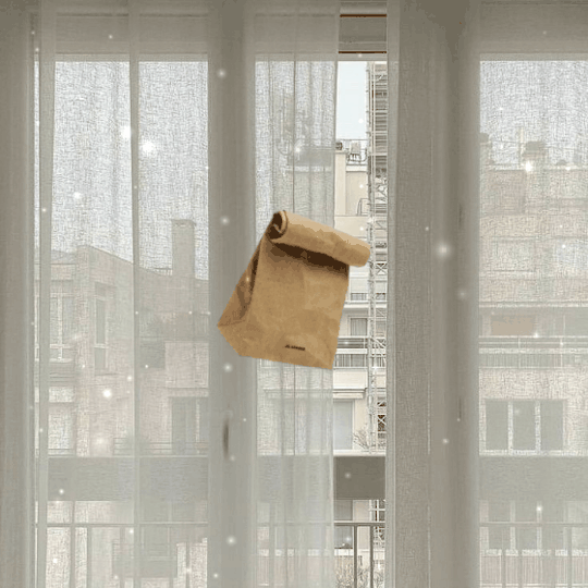
Progress on the interaction page!
#thank you A for volunteering you can leave now#anyways it's plain rn and awkward looking#but I spent several hours getting the locked checkbox to work properly so good enough for now lol#i can feel a break needing to come on soon tho#for a few days#i also need to change the color on the hug button#its hard to see#need to also find a nice font for the website#but yea i feel like i got the worst of everything done for the first version of the site...maybe?#hopefully the merge page isnt a pain to set up....#so im assuming im getting my barebones website pushed in February#the site will be kinda janked and far from where i want it but its a project i do in free time so its not the end of the world#i have a lot of stuff i still wanna add in the future hopefully!#like the option to sort everyone into groups#i play a lot of chicken smoothi3 and my fav part is organizing everything#so want that here#also a search bar would be nice to make it easier to find specific bfs#oh man actually like the worst thing is gonna be when i have to try to get forums working on this site#cause forums are more of an old internet thing#and im using newer stuff to build#i found a possible solution#and praying it works cause if not any other option is probably gonna involve me making things from scratch#with few existing resources...very scary#and dont even get me started on the idea of trying to set up my own server...#its not on the table unless i get like a stupid amount of traffic so i can sleep easy but still scary to think about#okay done yapping im gonna go sleep now#gamedev#webgame
1 note
·
View note
Text
📚 A List Of Useful Websites When Making An RPG 📚
My timeloop RPG In Stars and Time is done! Which means I can clear all my ISAT gamedev related bookmarks. But I figured I would show them here, in case they can be useful to someone. These range from "useful to write a story/characters/world" to "these are SUPER rpgmaker focused and will help with the terrible math that comes with making a game".
This is what I used to make my RPG game, but it could be useful for writers, game devs of all genres, DMs, artists, what have you. YIPPEE
Writing (Names)
Behind The Name - Why don't you have this bookmarked already. Search for names and their meanings from all over the world!
Medieval Names Archive - Medieval names. Useful. For ME
City and Town Name Generator - Create "fake" names for cities, generated from datasets from any country you desire! I used those for the couple city names in ISAT. I say "fake" in quotes because some of them do end up being actual city names, especially for french generated ones. Don't forget to double check you're not 1. just taking a real city name or 2. using a word that's like, Very Bad, especially if you don't know the country you're taking inspiration from! Don't want to end up with Poopaville, USA
Writing (Words)
Onym - A website full of websites that are full of words. And by that I mean dictionaries, thesauruses, translators, glossaries, ways to mix up words, and way more. HIGHLY recommend checking this website out!!!
Moby Thesaurus - My thesaurus of choice!
Rhyme Zone - Find words that rhyme with others. Perfect for poets, lyricists, punmasters.
In Different Languages - Search for a word, have it translated in MANY different languages in one page.
ASSETS
In general, I will say: just look up what you want on itch.io. There are SO MANY assets for you to buy on itch.io. You want a font? You want a background? You want a sound effect? You want a plugin? A pixel base? An attack animation? A cool UI?!?!?! JUST GO ON ITCH.IO!!!!!!
Visual Assets (General)
Creative Market - Shop for all kinds of assets, from fonts to mockups to templates to brushes to WHATEVER YOU WANT
Velvetyne - Cool and weird fonts
Chevy Ray's Pixel Fonts - They're good fonts.
Contrast Checker - Stop making your text white when your background is lime green no one can read that shit babe!!!!!!
Visual Assets (Game Focused)
Interface In Game - Screenshots of UI (User Interfaces) from SO MANY GAMES. Shows you everything and you can just look at what every single menu in a game looks like. You can also sort them by game genre! GREAT reference!
Game UI Database - Same as above!
Sound Assets
Zapsplat, Freesound - There are many sound effect websites out there but those are the ones I saved. Royalty free!
Shapeforms - Paid packs for music and sounds and stuff.
Other
CloudConvert - Convert files into other files. MAKE THAT .AVI A .MOV
EZGifs - Make those gifs bigger. Smaller. Optimize them. Take a video and make it a gif. The Sky Is The Limit
Marketing
Press Kitty - Did not end up needing this- this will help with creating a press kit! Useful for ANY indie dev. Yes, even if you're making a tiny game, you should have a press kit. You never know!!!
presskit() - Same as above, but a different one.
Itch.io Page Image Guide and Templates - Make your project pages on itch.io look nice.
MOOMANiBE's IGF post - If you're making indie games, you might wanna try and submit your game to the Independent Game Festival at some point. Here are some tips on how, and why you should.
Game Design (General)
An insightful thread where game developers discuss hidden mechanics designed to make games feel more interesting - Title says it all. Check those comments too.
Game Design (RPGs)
Yanfly "Let's Make a Game" Comics - INCREDIBLY useful tips on how to make RPGs, going from dungeons to towns to enemy stats!!!!
Attack Patterns - A nice post on enemy attack patterns, and what attacks you should give your enemies to make them challenging (but not TOO challenging!) A very good starting point.
How To Balance An RPG - Twitter thread on how to balance player stats VS enemy stats.
Nobody Cares About It But It’s The Only Thing That Matters: Pacing And Level Design In JRPGs - a Good Post.
Game Design (Visual Novels)
Feniks Renpy Tutorials - They're good tutorials.
I played over 100 visual novels in one month and here’s my advice to devs. - General VN advice. Also highly recommend this whole blog for help on marketing your games.
I hope that was useful! If it was. Maybe. You'd like to buy me a coffee. Or maybe you could check out my comics and games. Or just my new critically acclaimed game In Stars and Time. If you want. Ok bye
#reference#tutorial#writing#rpgmaker#renpy#video games#game design#i had this in my drafts for a while so you get it now. sorry its so long#long post
8K notes
·
View notes
Note
hii! i absolutely love your work. i've been getting into trying to make borders myself, and i was wondering if you had any tips on where to find good pngs or do you create everything yourself? i feel like my luck so far hasn't been great but maybe i just don't know how to search for it correctly!
Hello, nonnie! I'm so glad you enjoy my work; thank you for your kind words. ( ˶ˆᗜˆ˵ ) And oh my gosh, it's so nice to see a new GFX creator in the making! One of us, one of us, one us. ~ Welcome to the wonderful world of editing, hehe!
I've compiled a list of websites that I use for my graphics, but please do let me know if you need anything else and I'll be happy to assist!
For general assets, as well as inspiration, I generally use these websites: behance (which is pretty much the industry standard when it comes to graphic design in general, they have cool studios or experienced designers that post their works and/or assets), booth (an independent japanese resources hub with many free and paid assets), huanban (an independent chinese resources hub, same proposal as booth), abdz (mostly focused on typography and branding), dribble (more focused on web applications and design) and envato (templates).
Since I'm colourblind, I'm not always confident about how to compose colours together. So whenever I'm in doubt, I use coolors (to get palettes from images and browse through palette ideas) and colorhunt (which gives ideas for palette themes and motifs).
I love typography a whole bunch, but sometimes it's hard to find that one right font for your project. Whenever I need to look for something else, I always run to these websites: google fonts (when I'm on a budget and want to use 100% free fonts, including for commercial use), 1001fonts (to quickly find fonts based on themes, it has a great tag system), dafont (a big classic huge dabatase of custom fonts), befonts (for more industry standard-leaning fonts) and kerismaker (for those magazine looks). When I want to identify a font used on an image and where I can download/purchase it, I use myfonts and font squirrel. They even give you similar options for free, too!
Suppose I'm specifically searching for illustrations/PNGs I can use on my upcoming project. In that case, I'll either go to flat icons (for websites, applications or presentations), vertex (for 3d icons and/or general vectors), graphic burger (for logo making), cleanpng (for I want a tree PNG and do not want to clean it myself, for example), pngtree (same idea as the previous one, you just search for a word and will see all PNGs related to it) and pngall (self explanatory).
Regarding backgrounds, textures, and photography in general, I rely on websites like pixabay, vecteezy, 3d ocean, morguefile, freepik and isorepublic. They have high-quality photos and videos that you can use on your projects. However, if I specifically need mockups or patterns, I turn to unblast, pacage and ava.
Besides those, you can always search for things on Deviantart and Twitter! Though I do not use those much, I think Instagram and Threads also have pages dedicated to sharing resources. Discord can be a nice place to search for graphic design servers, too.
However, if I cannot find specific resources for a commission/project for whatever reason, then I will make them myself. Be it through photography, drawing or anything else I can get my little hands on.
For the more technical/applications side, the programs I use for my graphics and edits are Adobe PhotoShop 2020, Adobe After Effects 2020, Adobe Illustrator 2020, Clip Studio Paint (for when I need to draw or polish something for specific projects/commissions), and HandBrake (for when I need to make screencaps). My drawing tablet is an oldie, Wacom One.
Hopefully, this can be a nice starting point for you! Please feel free to reblog and/or like this post if you'd like to save it for whatever purpose. ~ I hope you enjoy this journey ahead, and if you need anything else, let me know! You got this! ദ്ദി ˉ͈̀꒳ˉ͈́ )✧
#♡: answered! *#graphic resources#gfx resources#roleplay resources#rph#rp resources#editing resources#carrd resources#editing
111 notes
·
View notes
Text
Some of my favorite writing tools
Just Write: a website, or an app you can download. My favorite thing about Just Write is it only lets you backspace a few spaces. So if you need that motivation to just KEEP writing, to not edit until you're done, Just Write is perfect. It's just text, limited backspace, no distractions. You can copy-paste text when you're done writing or download it as a txt file. I usually type // after I make an error that I want to edit later, since there's limited backspace. I bookmarked this on my phone's Home screen, so it looks like an 'app' and I can just click to open the site.
My Noise: this is a website and app too, I just use the website version. Like with Just Write, I bookmarked this website to my phone's Home screen so I can just click to open the site. It has a ton of sounds you can play, I find many of them help with focus: there's classical music, the sound of water, white noise, adhd focus sounds, coffee shop ambience, binaural beats, tinnitus relief, Dark Dungeon (noises of fictional settings), and all of their sounds are customizable. I usually use Irish Coast or 88 Keys just because the sounds of water and pianos tend to help me focus most. There's a ton of sound options on here. Good for if you haven't already made a focus-music playlist, or if making such a playlist would distract you from writing, or if you just need to pull up a noise quickly.
Lite Writer: an app. I write on my phone a lot, so this is the app I organize everything in. It lets you import fonts, so I can use a font that's difficult to read (to prevent myself from going back and editing/re-reading while writing), and then use an easy to read font when I edit. It has customizable colors (I just use regular dark mode). It lets you make project folders, and then txt files inside each project folder, and number the chapter txt files so they're listed in order. It lets you export project folders as txt files (or other types of files), so I can write a book chapter by chapter in 1 project folder, then export the whole book to edit in a different program. It lets you upload cover images for each project folder (which visually helps me), it's layout is very minimalist (which helps me focus - I get distracted so easily I can't write in something like Google Docs because there's too many non-writing-area things to look at). It also counts how many words you've written each week/month, and in which project and which individual txt file. So you can see how many total words are in a project folder, what the individual chapter word counts are, and how many words you've written total. The app also lets you search for a word within an individual text file or a whole project folder, so if I change a character's name (for example from Varric to Varris) I can just use the search tool to search 'Varric' in my entire story, and then use the replace tool to put 'Varris'. I know you can do this easily in a Word processor program on a computer, but it's nice to be able to do it in Lite Writer while all my chapter files are still separate txt files. Lite Writer also lets you set up an auto backup to locations of your choice, and auto saves, so you can get backups of everything you wrote in multiple places even if you're not actively remembering to back up your writing regularly. The app is free, I believe I paid a one time fee so that I could use a few optional features (like text to speech audio file export, more visual options), but it was a ONE time fee. I paid once for additional features (I think maybe 5 dollars) and then never had to pay again. Which is worth noting, since I hate monthly subscription models. I think the app is useful if you write on your phone or a tablet, not so useful if you don't. I use the app for pasting in writing I've done online (on Just Write) so that all my writing is saved in one central place, and to re-order chapters, to add story notes within the project folder, so for organizational purposes. It's my favorite organizational writing app for the phone.
98 notes
·
View notes
Note
hi I really like your mb and I'm new here. Do u have any suggestions or tips to make mb? like where did u get the pics and the captions.
𝓜oodboards: a guide for beginner blogs!


I decided to bring here a small tutorial that can help other blogs that are starting out and still have questions that need clarification, with tips and links that you may need. I wrote this from my point of view of creating moodboards and I tried to be as brief as possible in my explanation, there may be errors in English as I'm not fluent in that language and everything here was translated using Google Translate, any questions you can contact me via asks or by message.
how do I find pics for moodboards?
Pinterest is where you'll find most of the images you'll use on your moodboards, so create boards on Pinterest separating by color and aesthetic to make it easier to find. On Tumblr there are some blogs with cool stuff too (like @/m0ney, @/angelicdewdrop, @/rkivo, @/ohimesama-okinawa and @/bambiiis for example), but in this case I recommend putting the credits in the alt text.
Some blogs have a pinned post or carrd where they put the link to their Pinterest account (my Pinterest here). You can follow them and save the pins they post/save on the app. I also suggest looking at the other profiles they follow on Pinterest to find more photos to use. By doing this, you will influence the Pinterest algorithm, which will recommend more related pins in the feed.
You can also search on Pinterest for the aesthetic and color you want (like hime gyaru, y2k, dollcore, coquette pink aesthetic, coconut girl e etc.).
how to make moodboards + tips:
Well, it's not such a complicated thing for me. I generally make moodboards with 6 or 9 images, taking inspiration from the moodboards of other blogs that I admire, so I can get an idea of how to make the captions and how to position the photos in a way that matches them.
To make it easier, first I create the moodboard and then I look for an icon of a kpop idol that can match the aesthetics and color of the moodboard. The reverse can also be done: first choose an icon and make a moodboard for that image, paying attention to the color palette and tonality (and for some reason, for me it's better to create moodboards in Tumblr's light mode instead of dark mode).
When I finish the moodboard, I add the caption, the hashtags (which will be very important for your post to reach other blogs) and a divider or blinkies. Dividers can be found on tumblr by searching for "dividers", on my blog there are some (other blogs with beautiful dividers that I recommend: @fairytopea, @v6que, @plutism, @h-aewo).
If you need png, I recommend these blogs here: @slipng, @pngcabinet, @heemeiji, @honeyluvsw, @hibscubus. Tip: If you want to add more than 10 photos in a single post, add it via Chrome.
tutorial on how to make this gif here


tutorial on how to make this gif here

tutorial on how to make this gif here
tutorial on how to make this gif here
tutorial on how to make these gif here

website to split a photo into two or more parts
how to create captions:
To make the captions, I use parts of songs that I like, but they can also be album or song names, movie names, a phrase you thought, etc. The symbols you will put in the caption can be found on this website or just by searching for "symbols", "kpop symbols", "kaomojis" on tumblr (blogs with cute symbols that I recommend: @v6que, @l-unitas)
If you want to use a different font for the letters, there are these two websites (01 and 02). And to change the color, there are also these two tutorials (01 and 02).
what to do to make your blog "popular":
Add popular hashtags that relate to the content you are posting. If you use almost the same tags as other big blogs, your posts will have more reach. Posting frequently and your account looking nice and organized helps too.
Ask several other popular blogs to promote your account. This was very important for my profile to grow in the number of followers and engagement, Also make friends with other blogs that make moodboards, reblog and comment on their posts and tag them in your own moodboards.
Join the events that some blogs do, as they offer good prizes like reblogs if you win and join some tumblr communities. And remember to have patience, as it often takes a while to get good engagement on Tumblr.
360 notes
·
View notes
Note
may I request headcanons for the turtles w/ a younger sib (same age as mikey) who’s a jeweler? like they’ve got their own little workshop in the lair to make really nice stuff from old silverware scrap metal and glass, clean up old jewelry they find in the trash, and sell most of it online 💍
please, and thank you
ahhh!!!!! yes yes yes!!!
you didn’t specify which version, so i went w/ the rise!boys since that’s what i’m ‘known’ for (i think?)

your workshop, the boys— they but it all themselves!! they heard you talking about jewelry making with april and was like ‘ayo what if we just…’ and BOOM. built.
it was SO HARD to keep it a secret!!! especially since raph and mikey are AWFUL at keeping secrets. AND!!! the process wasn’t exactly quiet— it took forever cause they had to work on it when you were out.
but hey! they got it done!!!
donnie gets you the metal and glass. he lets you use some of his equipment too. he also uhm… ‘bought’ the packaging used for shipping… iykwim
sometimes you go to the repo place w/ mikey and donnie!! and people tend to leave jewelry in their cars (which is lowkey upsetting!! like why are you leaving beautiful rings, bracelets, and necklaces lying in your car!?)
and and and mikey will help you with blue print designs!! (i have no clue how jewelry making works)
if you engrave your jewelry, he’ll design the font for it!! which he absolutely loves doing because it’s bonding time and we all know he loves bonding time!!!
leo would definitely model your jewelry for you. give him some bracelets and necklaces— that mf will already have a whole ass outfit ready!!! we love him for that!!! (and we love that he’s canonically into the glam rock look!! ie; david bowie, elton john, queen, duran duran, etc)
he’s always leaving reviews on your websites and telling people which items go with what kind of outfits!! (i just think he loves fashion)
now when it comes to raph— he’s the one that breaks apart the metal for you. sure donnie’s machines can do it but, you know he wants to be a part of this somehow!!
he feels so useful when he does it— he feels like it’s a very important part of the process in jewelry making!! which it is cause like— you need metal!! and he’ll sometimes go on little walks with todd and find small gems for your jewelry too!!!
ahhh i hope this is what you were hoping for!!
163 notes
·
View notes
Text
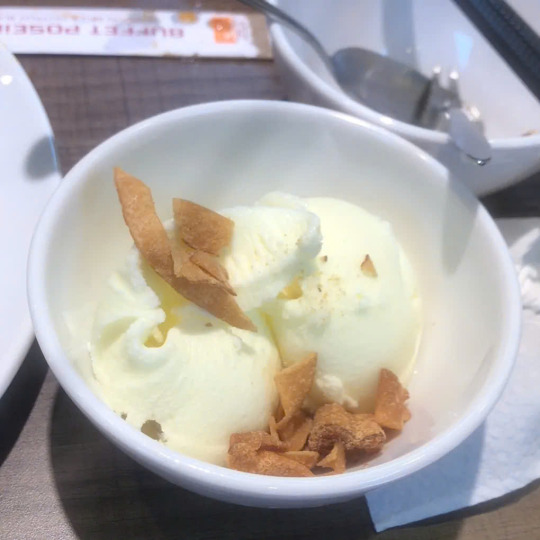
sunday recap 🥓😽
so many things today but more importantly SO MANY CATS LET GET THIS THROUGH SO WE GET TO CATS
fit check, i changed like 5-6 times wanna lean into a coquette style but sadly this the shirt with the closest match I could find
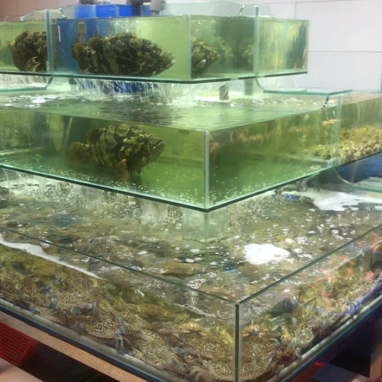
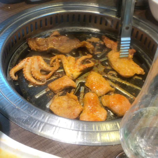
seafood buffet because we didnt have any breakfast so this kinda our brunch. this just opened in the mall near where I lived lmaoo, basically they served seafood in any kind, and also there bbq and hotpot too but we didn't take the hotpot. all seafoods are very fresh (look at that tank!!!) again ranking
grilled shrimp and oyster with cheese: 8/10, the cheese is like too sweet and fatty
grilled snail with scallion: 8/10, good but nothing special
sashimi: 9.2/10, very solid!!! and u can get as many as u want
sushi: 7.8/10, idk I dont grab those much there not much variation also it can make u full quick
grilled abalone (not pictured): 9/10, for the price we can get as much as we want and I think its neat! also it got run out so quick lmaoo
seafood soup: 9/10, phenomenal, like I had two bowl of these
grilled everything (had pork chest, pork, beef, octopus, grouper fish, okra, eggplant and cheese fish ball): 9.5/10, I love the way they marinated the meat!!
durian ice cream: 7.5/10, nothing special also it all durian which I dont like and they run out of chocolate ice cream :((
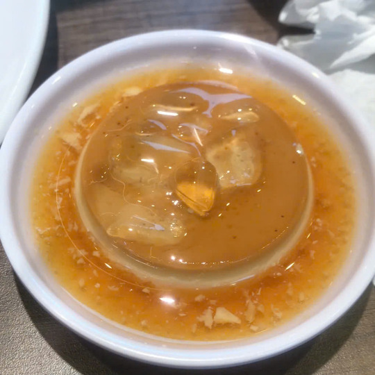
flan with coffee sauce: 9.2/10, smooth, creamy with that bitter sauce like it just top notch flan, literally one of the best I've ever eat
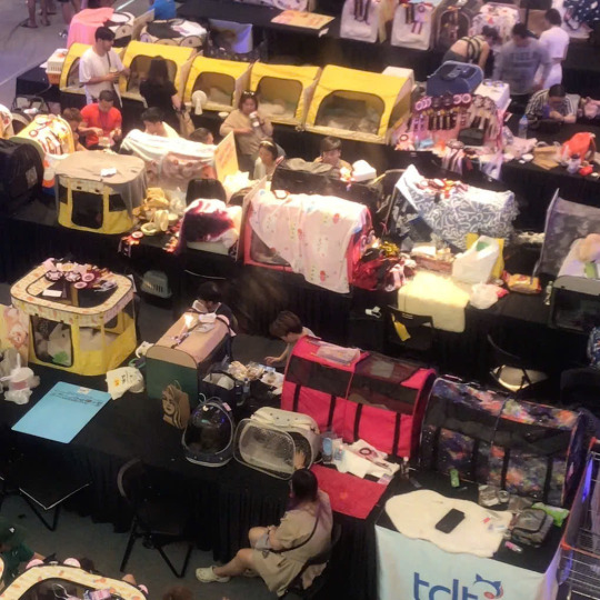
also on the way down i saw they're having this cat contest thing like there so many booths it looked so fun (pictures later cuz I took like A LOT)
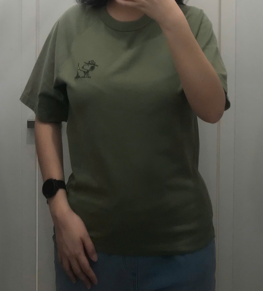
first tried a bunch of stuff at uniqlo, obsessed with these snoopy shirts and these cutest zip up, like the zip up are clothes for children but there big size and I can fit in there too
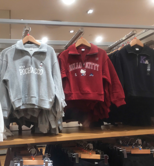
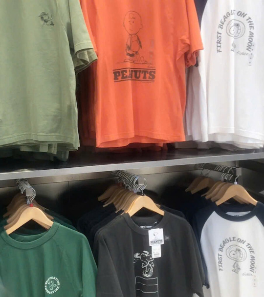
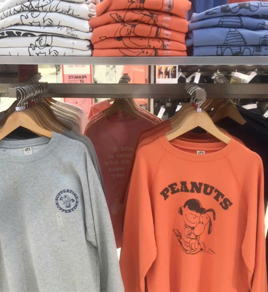
trying on, the shirts is from the male section and the zip up and hoddies are from children section biggest size they look so cute tho icant think of the way I would wear the white zip up a lot and the green shirt is xs so I def need a size bigger
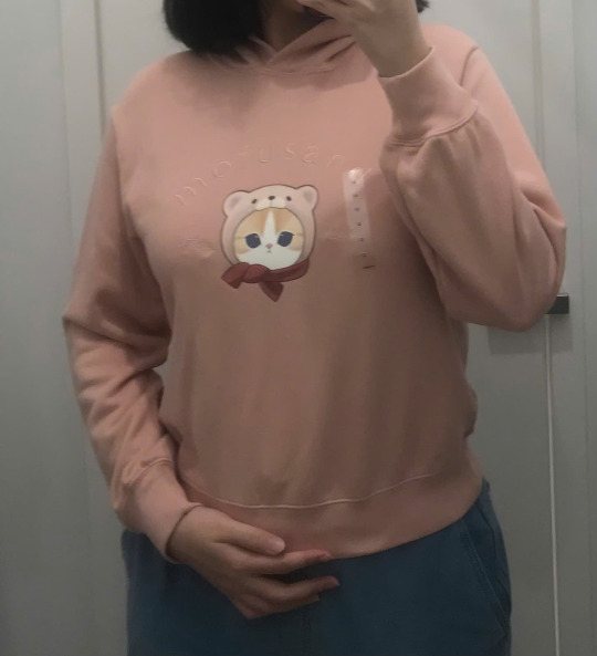
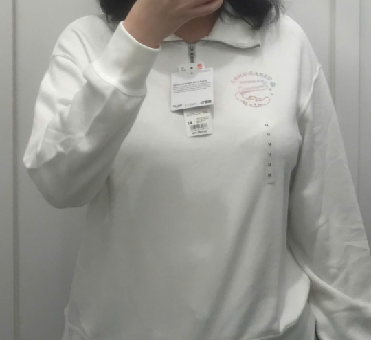
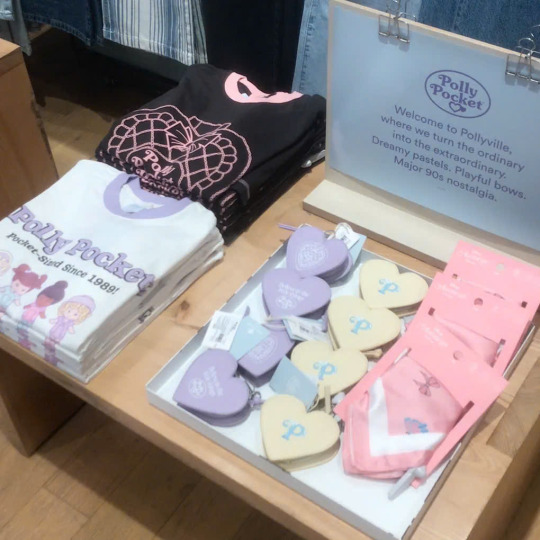
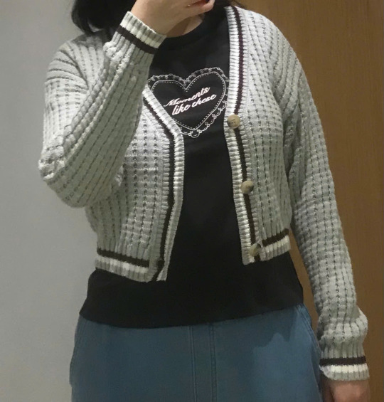
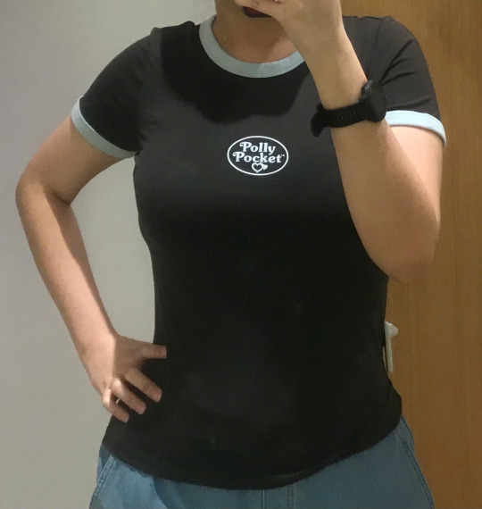
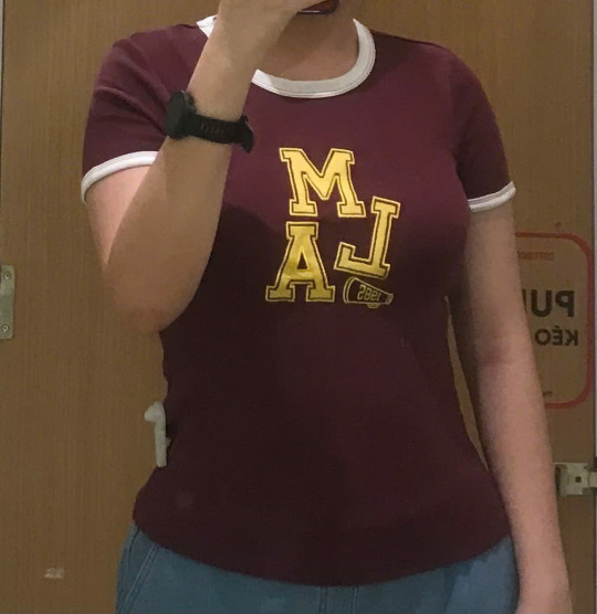
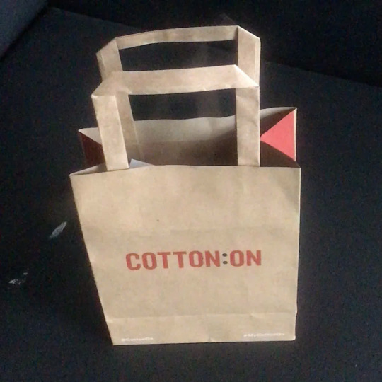
next is cotton-on, they're having this collab with polly pocket which is sawr cute if only they're not like fucking expensive, like why is that shirt 30$ and that tiny MICRO purse 28$ like I dont get it, it not even real leather! also oversea website having XL size but vietnamese store doesn't is criminal
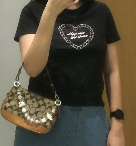
tried on a bunch of stuff the sale associate was looking at me like crazy also the price there has only gotten more ridiculous with time. the black shirt was giving sabrina carpenter and there another one with blue background and red font just like short n sweet aesthetic lmeow. the cardigan looked so close like that coloring the cutest but it looked wear on my body. the mentioned polly pocket shirt, I mean idk it fit but it expensive and also I dont like too much figure hugging in my clothes. same with the other shirt who I think the color pretty nice
can you guess which one i got hehe
8 notes
·
View notes
Text
Webflow Ecommerce Template for Fast Sales
Your store needs to stand out in today's crowded online world. Customers can leave a website that is slow or messy very quickly. That's why it's important to have a fast website and a good design. It's as simple as that: you'll sell more if your online store looks good, loads quickly, and makes shopping easy.

A Webflow ecommerce template can really help here. The right template can help you get your store up and running quickly, whether you're selling digital downloads, physical goods, or even subscriptions. It can also help you make more sales right away.
Why Should You Use a Webflow Ecommerce Template?
Webflow is a website builder that doesn't require any coding skills. You can make great websites without hiring developers. The built-in features of its ecommerce templates make it easy to start selling right away. Setting it up is easy. No extra tools are needed. Just a smooth way to open your store.
Here are some ways that a Webflow ecommerce template can help your store grow faster and make more money:
1. More sales when sites load faster
Did you know that you could lose customers if your site takes too long to load? People don't stay put. Webflow templates are designed to load quickly and work well. That means your customers will stay longer and be more likely to buy.
Most templates come with features like smart loading and image optimization that make sure your website feels fast, even on mobile or slow internet.
2. Shopping on the go
A lot of people buy things on their phones. Your website needs to look and work great on mobile devices. When making Webflow templates, they think about mobile. They fit any screen and have buttons that are easy to tap and menus that are easy to understand.
This makes it easier for your customers to shop, whether they are on their laptop or scrolling through their phone.
3. Sales Tools That Are Ready to Use
A good online store doesn't just look nice; it also makes people want to buy. Webflow templates often come with built-in features like:
Features of the product
Banners for sales
Timers for counting down
Reviews
"Buy Now" buttons
And the best part is? With just a few clicks, you can change all of these parts. No need to write code.
4. Simple to Fit with Your Brand
Your brand should be shown on your website. Webflow lets you change the fonts, colors, images, and layout to match your style. You can make your brand your own, no matter if it's bold and bright or clean and modern.
You can also manage your products, discounts, and promotions all in one place with Webflow. You don't have to switch between tools.
5. Helps You Get High Rankings on Google
You don't always have to pay for ads to get people to visit your site. A Webflow ecommerce template has great SEO tools that will help Google find your site. That means more people can find your store on their own.
Templates have clean code, load quickly, and places to add SEO-friendly tags and content. This makes it easier for people to find your products.
6. Editing in Real Time Look
You can make changes in Webflow's editor and see them happen right away. Want to put a product at the top? Put up a banner for a sale? Change the color? You can do everything by looking at it—no guesswork and no waiting for developers.
You can easily change your site for sales, holidays, or new product launches whenever you want.
7. Safe, expandable, and made to sell
Webflow hosts your store on top-of-the-line servers (with AWS support), so your website is always online, safe, and fast. Free SSL is included with every site to keep customer data safe.
Webflow also works well with tools like Mailchimp, Shopify, and Zapier, which can help you automate emails, link different platforms, and grow your business without any problems.
Last Thoughts
A Webflow ecommerce template is a great place to start if you want a website that helps you sell more without the stress. It's quick, adaptable, and simple to use, even if you've never made a website before.
The right template can help you turn visitors into happy customers faster, whether you're just starting out or growing a brand.
Are you ready to sell more? Give your store the smart, stylish boost it needs with a Webflow ecommerce template.
2 notes
·
View notes
Note
Wait how do you make a font of your handwriting???? I've been wanting to do that for so LONG but i could only ever find weird sketchy websites and apps that didn't work :(
i think i used calligraphr! its been a while since i actually made my font, but the basic steps of it is
》 find a typeface grid where you can write out your alphabet
》 fill in all the letters
》 scan it into a font maker
》 dowload the svg or ttf file
》 i had to look up how to do this but you can upload it to your comp's default fonts! and it should come up in clip studio from there
calligraphr is free to use, there's an option to upgrade but it provides a template and creates the file for you. there's also a Microsoft Font Maker! i havent used it but i found out abt it thru this post that gives you a quick playthru on how to make your font!
for reference, this is how the original font came out thru calligraphr
it's a nice personal touch, and makes it blend into my art more than a serif or sans serif font. it looks like Mine and i didnt need to write it out by hand :>
#ask#surprise! that font was my handwriting the wholw time#ill have to use a new pen for it bc i dont use that brush anymore but. u know.#also. might make more of them now that i have calligraphy brushes dhhdhd
22 notes
·
View notes
Note
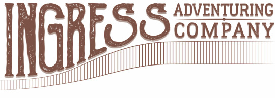
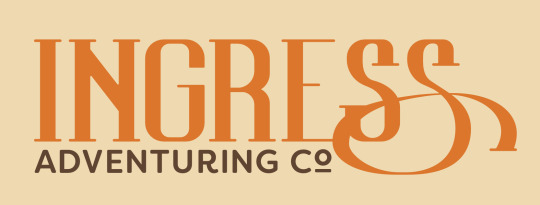
This is a pretty random one, but how did you design the logo for Ingress?
Little did you know, I love to answer questions about ~design~.
The Ingress logo has gone through about 3 different official versions, but at least 50 different conceptual iterations. I'm a graphic designer by trade and profession, so I approached it any other way I would approach making a logo.
The first iteration of the logo I have less information on the development of, but I was looking at a lot of advertising from the late 1800s to early 1900s. For example, these advertisements have a lot flourishes on the text and warping letters, as was common in that era.
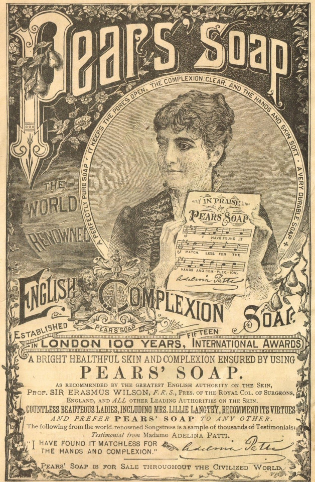
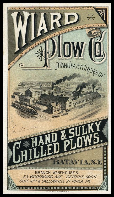
I took that concept and made the first iteration of the ingress logo at the comic's inception in 2017. My graphic design skills weren't as strong then, and I mostly just took a font I thought fit and slapped it around a little bit to try and get the look I wanted.
I wasn't particularly happy with how this one turned out, and it only ended up being used for a few months on the first version of the website and on a single printing of the first chapter of the comic, but I also didn't put a ton of time and energy into making this one. So, I went back to the drawing board soon after I made this first one.
The second iteration of the logo took a lot of inspiration from the same sources, but I first took a lot of time drawing out concepts in my sketchbook to try and get the right visual look for how the logo should be.
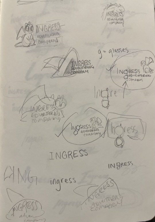
At first I played with the idea of including a little picture along with the logo. I thought maybe Toivo's glasses would be a good thing to try to include in the 'g' in Ingress, or that Rocky or Toivo's hat should appear in the logo. These were all discarded for cluttering up the logo, because the words themselves are all pretty long. Eventually, I started playing with the shape of the word itself, which very quickly lead to the last S becoming the signature swirl.
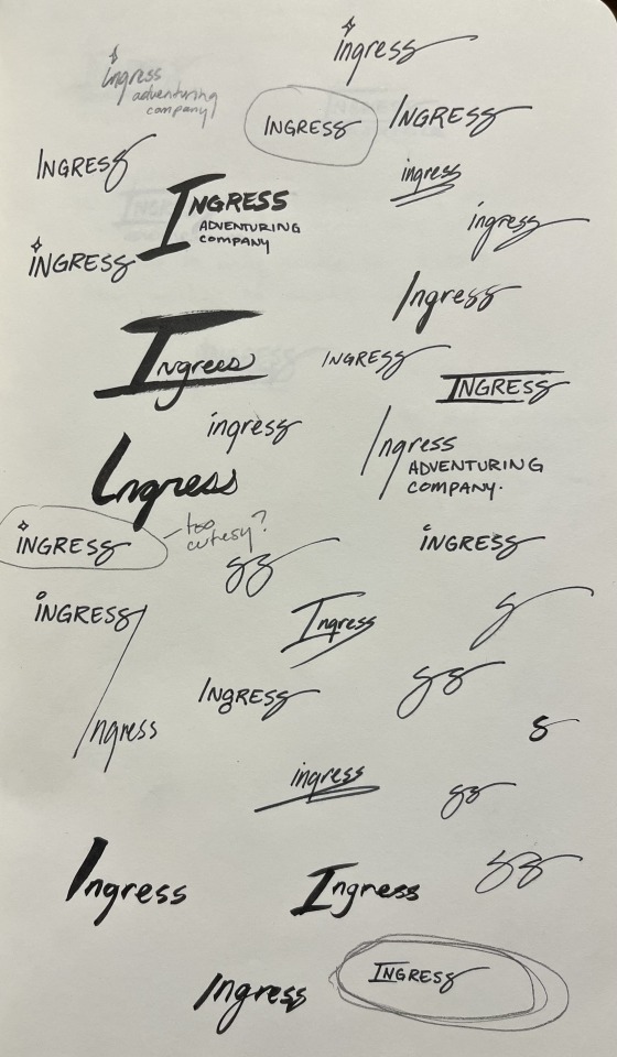
Next was iterating on this concept with fonts.
That lead to the second iteration of the logo, and the longest running version of it.
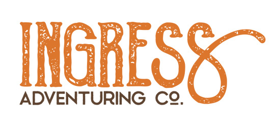
I chose a textured font to give it that "worn" feeling that was so popular in the design world in 2018. There were a ton of brands doing textured stuff to give their brand an edgy feel, but I did it to make it feel old and like it was from the late 1800s.
This would still be the logo today, but I ran into a problem: the font I used, Goldsmith Vintage, had a limitation on how long you could use their font for free and for printing. Fonts aren't particularly expensive, but if you want to use a font for publishing, you need a special license and those fees can rack up in price pretty quickly. It was unlikely that the people who made the font would come after me for using it, but I decided to not take that chance and instead refresh the logo one more time, this time putting more of my own hand in it.
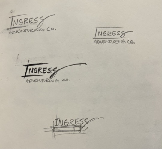
This time, I took a different approach. I liked the old logo, but I was having a hard time finding a font that I really liked and would get the same feeling as the old logo... So instead, I decided to use calligraphy to draw it myself.
I rewrote the word Ingress Over and Over and Over, and specifically I rewrote the S's to try and get the perfect shape of it. Then, I picked out specific letters that I liked.
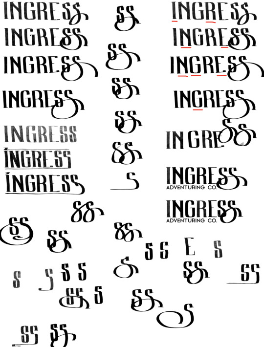
From those letters, I picked the ones I thought looked best, and smashed them together into one rough version of the logo that I liked.
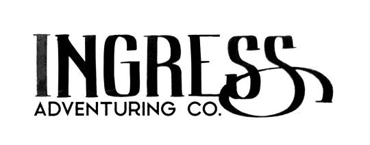
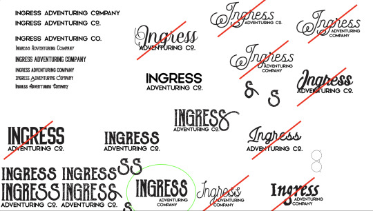
And then from here, I made a digital version of the logo in Adobe Illustrator so I could get a nice crisp vector version. Also, I made rough versions of it, so I could keep doing the same 'old' look.
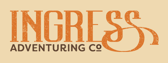
And... that's about it!
Ultimately, I think the new one is really fun, and I really like the fact that the latest one was made with my hand directly. Those aren't letters you can find in any font, they're my letters.
Maybe you can tell but, I have a lot of opinions on letter shapes.
Anyway, thanks for asking, and I hope this was as entertaining for you to read as it was for me to blather on about.
18 notes
·
View notes
Text
To new tumblr users:
please turn on custom blog theme in your settings. custom blog theme is something that is actually so wonderful about having a tumblr, and we need to show @staff how important of a feature this is to this site.
Propaganda:
Having a custom blog theme gives you a yourURL dot tumblr dot com site. Having your very own website is cool as fuck.
Having your own site makes it much easier to search and view your blog, and use tags to sort posts.
Another fun thing that you can do is create custom side pages for your blog with useful static information, like an about page or a tags page.
show off your personality and interests with a cool site. organise your posts to find them later, and to give your followers the ability to view all the posts on your blog with a specific tag, like a tag for your writing or your art. This can be done by providing a link to a specific tag that looks like this: yourURL dot tumblr dot com/tagged/myCoolTag
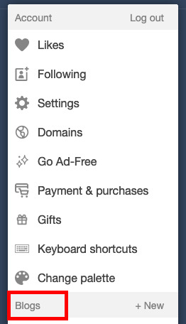
You can have a cool site, even if you don't know how to do web code, I promise. Here's how your turn this feature on:
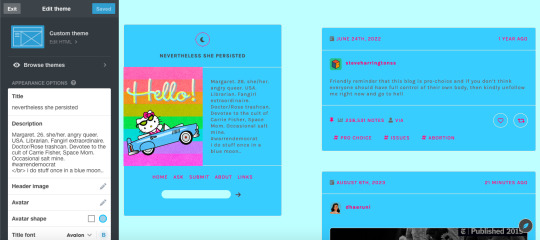
go to the little person icon in your top ribbon (circled in red):

2. in the resulting pop up, scroll down to "blogs" < yourBlog (highlighted in red):
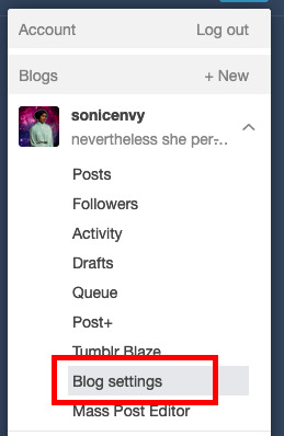
3. click on "blog settings". This will take you to a new page. (highlighted in red)
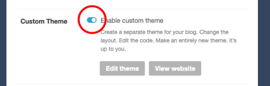
4. on this new page, scroll down to "custom theme" and flip the toggle switch to on. (circled in red)
5. now click that "edit theme" button. This will take you to a new page that will look something like this:
depending on what theme you end up using, the options in the white sidebar will be different. For now, that's not what we're actually interested in though!
6. to get started with your theme, click the edit HTML button.
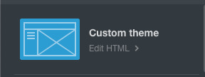
7. This pops open a thing with the code from your blog. This is where you can edit or paste code into to customize your blog. This is where the fun starts!

If you know code, you can write code yourself, but I'm going to just assume that you don't know enough code to write a tumblr theme. Fortunately for you, there are lots of people out here on tumblr dot com that do know how to write code and make tumblr themes and do this AND make these themes publicly available for anyone to use.
8. Where do I find this, you might ask? Great question! A good place to start is Theme Hunter, which is a blog where they share lots of independent theme creators themes. Typically when you use someone's theme, you should reblog their post about it, as this is often a term of use. Theme hunter is nice because they are really organized so you can find some nice categories to start you theme hunt in their "more" drop down:
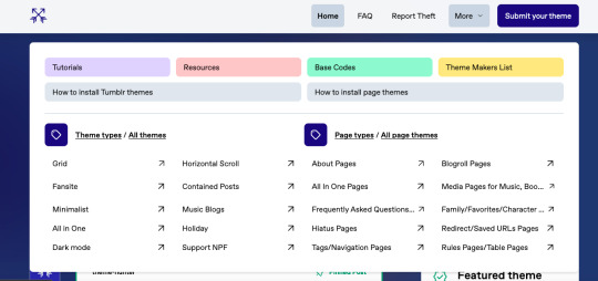
you'll notice that they also have pages about how to install tumblr themes. The "page themes" section is for side page themes. We'll get to that in little bit, but for now what you want is the "Tumblr themes" Most themes will have a set of easy to use customization options for stuff like background colors, font sizes, sidebar images, links, accent colors, etc. Most theme posts will have an example or "live preview" of the theme in question so you can play around with it and see if you like all of the features. Remember that you can change all of the colors and the font sizes if you like.
9. Once you find a theme you like, click on the "code" link in the post which typically takes you to a pastebin page with the code of the theme.
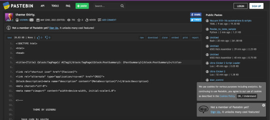
10. click "raw" in the top ribbon, which takes you to a new page that has nothing but the code on it. (highlighted in red)
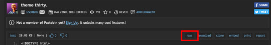
the new page will look something like this:

11. click anywhere in this page, and hit ctrl + a (on windows) or command + a (on mac) this selects all of the code. Now hit ctrl + c (windows) or command + c (mac). This copies all of the code to your clipboard.
12. Now go back to the theme editing page for you blog and click anywhere in the code box. hit ctrl + a (windows) or command + a (mac) to select all of the text in the code window. hit backspace (windows) or delete (mac) to erase the text.
13. now that your code window is empty, click in it again. Hit ctrl + v (windows) or command + v (mac), which should paste all of that code that you copied before into the code window.
14. Now hit "update preview" (highlighted in red)
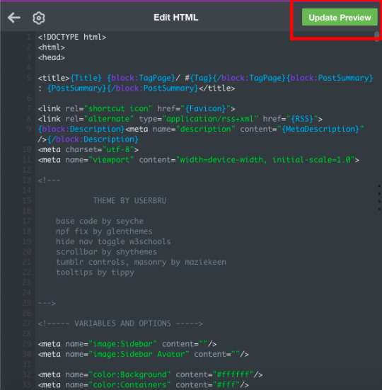
this will update the preview of your blog so that you can now see it with the theme! It may not look quite right yet, but that's because you haven't set up all the customization options yet! Note that until you hit "save" the theme does not become live on your site.
15. hit "save" then hit the back arrow on the code window next to the gear symbol.
16. Now for the fun part! Customizing! Scroll down In the little sidebar to the section called "theme options." This is where you'll get to select stuff like colors, sidebar images and fonts. Sometimes, things still won't look right in the preview, but once you go to your page, you can see what it actually looks like. I recommend having a copy of your blog page open in another tab that you can refresh every time you hit "save" while customizing your theme, to make sure that things look right.
Tadah! you have a new cool website. share the news with your followers.
If you want to get into learning how to make your own themes, check out buildthemes or buildatheme or theme-hunter's tuts page. To learn about web code in general you can sign up for an account through codeacademy or dash general assembly or W3Schools or html dog
#tumblr#tumblr guides#new to tumblr#themes#how to tumblr#resources#ref#long post for ts#learn tumblr#tumblr for newbies series
40 notes
·
View notes
Text
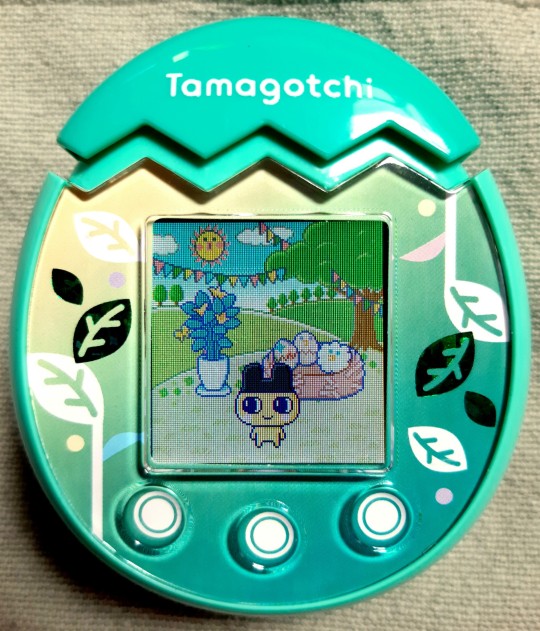
Tamagotchi Pix review!
Yes, finally! Not only did I get the model I wanted for over a year, but also I've finished taking care of the first generation and discovering all the functions. That's why I've decided to make this review post, where I explain what I like and dislike about it.
General score: 9/10
Design
I really like the shell design. At first, I was a bit disappointed with the simple faceplates (I still think they could've gone with something more complex), but now I see that this design matches the rest well.
I got the Nature shell and I must admit, this might be my favourite one. They all look nice, but there is something special to me about green Tamas. The thick plastic of the faceplate gives a bit of depth to the pattern and the gradient is nice. I also love the eggshell-shaped cap used for taking photos. Top 10 designs - super cute. I slightly miss the old Tamagotchi logo (the connection one), but here the simple font matches the rest better than the Connection one would.
The touch buttons look very nice. I got the second wave Pix, which means improved reactivity. I don't have problems with the buttons at all. However, my fingers are quite small, and I'm used to being precise (I work with electronics.) I'm not sure if this is the best design for children - I have no idea if it's possible to break the buttons by pressing on them too hard. Generally, I love the change. The buttons are fast and I have no issues with the swiping motion, another cool feature.
The screen is set quite shallow in the shell, so there might be problems with it getting easily scratched.
The most characteristic element of the Pix model is the ability to take photos. At the same time, it's probably the most questionable one to me.
2. Unique mechanics
The camera works fast, however the colour recognition (needed for cooking) is pretty poor. It has problems especially with warm colours. Its favourite shade to see is grey lol. That might be annoying when you're trying to cook, aka make new food from the colours you collect from the photos. Also, you can use colours to make new items and furniture - this is an amazing feature and I'm all for being able to customise my stuff.
Activating the toy by clicking the top shell is super cool, however there is one problem - it makes travelling with Pix quite difficult. I see many possibilities for the toy to get damaged. Also, the top shell might be accidentally pressed while in the pocket/bag - then the touch buttons will pick up on even slight presses. I was travelling with my Pix on the very day I activated it, and let me tell you what - you need to be careful with it. I highly recommend getting some sort of cover for it, either silicone or knitted one.
The swiping motion on the touch buttons is used quite a lot. In my version, there are no problems with the sensitivity, however I see how troublesome it can be in the first wave, where the buttons didn't function that well.
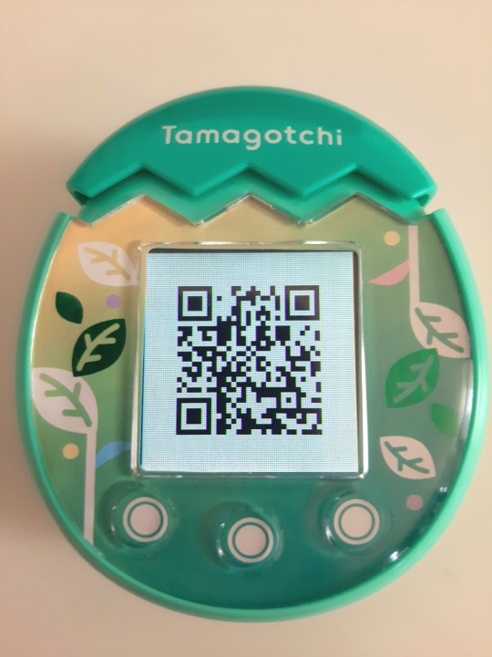
The last feature worth mentioning is the QR code system. It allows you to download additional food, accessories, wallpapers and furniture. It's a quick and amazing system. Mr. Blinky made a whole website where you can find all the stuff you want. Make sure to give it a try!
3. Characters and growth cycle
The QR codes are also used for connection with other Tamas. To be fair, Pix is a self-sufficient toy. You don't need two of them to have fun and connect - the QR codes can be photographed and posted online, so everyone can meet your pet. I love this feature - it allows you to briefly meet people from all of around the world. My pet once played with a Tama from Italy!
I like the characters available. There are quite a lot of them. I think that the new characters are sweet. Pix introduced Weeptchi (in Japan he was introduced in Smart) and gave a global debut to Himetchi (she was available on iD L 15th anniversary edition in Japan.) There are a few others, and they all look sweet.
An interesting thing is that with every next generation, you can obtain one of 3 eggs (blue, pink and green.) The evolution of your character is dependent on it - Pix brings back the "families", grouping characters by their personalities. Blue is Smart, pink is Charming and green is Creative. In my first generation, I got a green egg (it's based on the quiz you answer at the beginning, while setting your name etc.) However, the egg colour is not the final decisive variable in your pet's development. Despite having a Creative egg, I ended up with Mametchi, a Smart character. It's probably because I would give him the Science Project item many times.

Pix has an additional life stage connected to jobs. Each character can obtain one of 3 jobs. They can train for them as adults, in a special room. The room you get is dependent on how you raise your character - how you play with it, how much you explore the world using the camera and how much you cook. I like this idea, though I slightly miss the regular secret characters from the older models. It's a feature that's always been present in Tamagotchi and I hope it will make a comeback soon. Jobs are cute and personalised, the games are fun and give you Gotchi Points as well.
My biggest problem with the growth cycle is how fast it is. I have this problem with all new models - I wish the stages lasted longer than only one day. To me, it's not enough to enjoy the younger characters, which I often like a lot.
4. Games
There are a lot of games on Pix. And I love it. The previous models were disappointing due to very few games, even though they certainly would be able to support more. I think that Bandai took note from complaints about slightly boring gameplay and decided to make a model, with which you can't get bored. There is always something to do. Some games give you Gotchi Points, some simply raise the Friendship Meter.
The arcade games change every day. It's cool, like a fresh breeze. But worry not, the choice isn't enormous (since many other games are either in the room or the jobs), so your favourite themed games will be back soon.
5. Aesthetics
Pix looks cool on the outside, but the real beauty in on the screen. This model introduced the new, super-smooth animations. The character moves on the screen so smoothly, that sometimes it might be hard to take good photos lol.
The colours are vivid, the rooms are super detailed and there are many wallpapers to choose from (and download.) You can put 2 pieces of furniture in the room as well. This simple customisation adds a lot to the aesthetics.
You can give your Tama accessories, some of which you can colour yourself.
There is a garden. Every 3 days, I believe, you can obtain fruit from the tree there. You just need to go outside at least once a day to water it.
From time to time, some characters will come to visit your pet. However, I haven't encountered the annoying animations from Meets (they were one of my least elements of that model.) The walking animations are quick and can be easily skipped, the same goes for dialogues.
6. Battery life
The first wave Pix had a big problem with poor battery life. The second wave improved it greatly - I've been running my Pix for a while on pretty cheap batteries and it's still doing well.
My honest recommendation is investing in AAA rechargeable batteries. They last longer and are environmental-friendly. And they will save you up a lot of money.
7. Conclusion
All in all, I'm loving Pix and I recommend it to everyone, no matter if you're an old collector or if it's your first contact with the Tamagotchi franchise. It's a great gift for someone you want to introduce to the world of Tamagotchi. However, I highly recommend getting the second wave Pix due to the improved buttons and battery life.
10 notes
·
View notes
Text
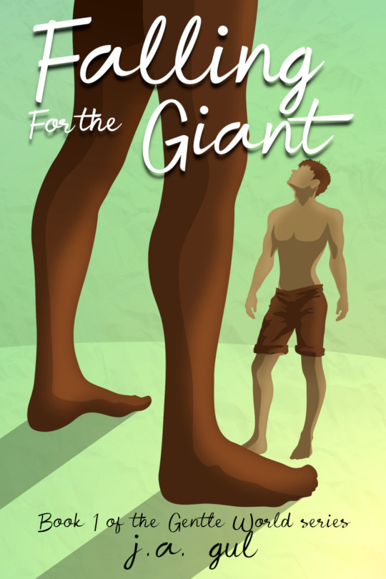
This is the cover for the first book in my series. The little guy is actually just a normal guy, and his name is Leon. He's from our world, and is a tired, overworked and underpaid janitor who's boss was being a total jerk (and should have totally been sued for sexual harassment). Leon's secret kink has always been size difference, and he just wanted to take a giant dick, ya know? Totally reasonable!
Well, then he suddenly gets transported to another world (yes this is an isekai) right in front of a horny, lonely giant named Zayan who thinks humans are just the cutest fucking things on the planet, who also thinks that this human in specific is offering himself to the giant.
I dunno why but Tumblr has made the image look a little blurry to me.
Anyways, making this cover was really hard because I was using vector graphics and it DID NOT scale properly and I had to export every single colour and shadow layer as a separate image so that I could do colour adjusting in a different program. It's the same method for the other covers in this series, but once this series is done I am totally going to find a different art style.
... Does anyone want to hear me rant about book covers? No? Okay, I'll go on then.
Did you know that if you were to use stock photos to make covers, depending on where you get it from you need special permission to use a person's face on the cover of a book that has queer content? Yeah, that's stupid, because the same rules do not apply to straight content. Got a straight couple on your book, no big deal. Got a gay couple, well make sure you have special permission. Oh and sometimes you can't even put anyone's face on the cover of a book at all. And you probably have to pay the licensing fees to get that stock photo. And there's a chance someone else has used it on their book cover too.
It's in some ways a lot easier to have a drawn cover. Because even if you visually used a reference image for a character's pose or proportions, reference images do not need to be licensed. And if you've drawn it all yourself, then you own the art and can do whatever you want with it, whereas if you've paid an artist you might be limited to what you can do with it.
The one thing to look out for too is fonts. If you download fonts from a website, make sure to filter by fonts that are 100% free for full commercial use, meaning you can use the font on the cover of a book you are profiting from and don't need to pay anyone for it. Because some fonts are free ONLY to use for things that won't make you money, or if you do make money you owe the font-maker royalties. And when you're writing books and making very little money, paying anyone a royalty from your earnings could be a deal-breaker. Avoid the pitfalls of this by only ever downloading 100% free fonts. Doesn't matter how nice the licensed fonts are, just don't download them, that way you don't have to remember which ones you have are free and which ones are licensed.
BTW, here's the programs I used to make cover art, write book, and format it. The programs are free and open-sourced.
Inkscape for vector art: https://inkscape.org/
GIMP for colours (it's a photoshop type software): https://www.gimp.org/
LibreOffice for writing (and they also have spreadsheets): https://www.libreoffice.org/
And for formatting, because I publish on amazon I used amazon's Kindle Create which helped format the book.
5 notes
·
View notes
Text
I just read a comment on a post that made me very concerned, so I wanted to put out a PSA.
Someone was panicking during the recent AO3 outage, where the DDoS was trying very hard to put the site under for good, because they didn't have any way to recover their fics. Which is terrifying, sure... if all you ever do is write directly into the draft page on AO3.
But. Why would you do that?
Like. OK. I know I'm old, and I'm also privileged to have a desktop PC that I use for the majority of everything online. I understand this is not as common a circumstance as it used to be. But if you're using a laptop or PC, you should REALLY be writing somewhere else first. Even if it's just the native notepad program. Anything that allows you to save the file. You don't need something expensive like Scrivener. I personally use a text-based program called NoteTab, which is inexpensive, reliable, and has lots of nice little extras. Of course there's Word and OpenLibre and things like that. Even Google Docs if you're in a pinch (though I can't recommend it given that they're now starting their own AI-theft program).
I'm not as well versed in apps for phones and tablets. But even so, I beg you to find something to write on that isn't directly into AO3. The notes program? Email yourself? A physical notebook?
And there is a reason for this. Purely aside from the fact that the draft will only save your text for 30 days -- and was NEVER meant to be used as a word processor to begin with! -- you should always have a backup of your work somewhere, in the exact case of circumstances like this.
Many moons ago, I used a free site called Crosswinds to host my website. (There were a lot of these, like geocities, tripod, & so on.) One day, there was a server glitch and lots of my files were wiped from creation. I didn't keep copies of them anywhere else, and so they were just gone. I was able to recover some of it, but most of it was just. Gone. Forever.
These days, I edit my stuff on my PC first, and then upload it. I should also probably have another backup of some kind, because I have had catastrophic hard drive failures and lost everything. You think it won't happen to you. Then it does, and your stuff that you've labored on is just gone.
Plus, it's just good to be able to have the text in a location where you can easily read and edit; on top of that, you know that trick of putting it in another font so you can catch mistakes? That is exactly what happens when I get the fic into the preview page on AO3 and I'm able to see all those goddamn typos and missed italics tags and so on.
For the love of whatever you love, friends, you must keep your own backups. You will lose your data at some point. It's going to happen. Or a site will go down. Or something crashes. And it'll all be gone. You really can make sure that doesn't happen, and it'll take less time than you think.
But I will be over here begging on my arthritic, ruined knees for the rest of time: NEVER WRITE DIRECTLY INTO THE AO3 PAGE. EVER. DON'T FUCKIN DO IT.
#psa#public service announcement#ao3#use backups#use some other writing program#use something else for god's sake#writing advice
5 notes
·
View notes
Text
in the ether, there is a website
read it here on ao3
in the afterlife, regulus finds a website.
by: inthesquare
Words: 2,393, Chapters: 1/1, Language: English
Fandom: Harry Potter - J. K. Rowling
Rating: Not Rated
Warnings: Creator Chose Not To Use Archive Warnings
Categories: M/M
Characters: Regulus Black, James Potter, Sirius Black, Remus Lupin, Peter Pettigrew, Mary Macdonald (Harry Potter), Lily Evans, Dorcas Meadowes, Marlene McKinnon, Pandora Lovegood, Evan Rosier, Barty Crouch Jr., God
Relationship: Regulus Black/James Potter
Additional Tags: regulus is dead, this is always a nice way of starting this, but Regulus in the afterlife, finds a website, yep that’s the whole plot, don’t know how to explain this except I could not sleep and wrote this between midnight and two am, James and regulus are very in love, Regulus is tired, Mr. James Fleamont Potter has loved Mr. Regulus Arcturus Black in every lifetime, mentions of God - Freeform, or a website “lady”, that might be God, or it might not, references to other jegulus fanfics, such as just lovers by zeppazariel, this was very self indulgent tm of me, very short nostalgic and slightly sad story, Light Angst, Reference to Death?, as a question because honestly I don’t even know, Regulus is talking to a website in the afterlife so yes, it might have references to death, etc - Freeform, If you squint it enough you will see James and Regulus owned a cat, If you squint it even more you will see wolfstar taking care James after Regulus passes, but it’s so brief I didn’t even put them as a tag, but knows that Sirius and Remus also found each other in every lifetime, mentions of the other characters, Angry Regulus Black, you need to read in between the lines, written in folklore’s font because at this point is basically a tradition, Read my notes, it’s important, I love to think of fanfics as all the lifetimes this couple got to love each other in the multiverse, LOVE AS DEVOTION, The ways Mr. James Potter loved Mr. Regulus Arcturus Black
3 notes
·
View notes
Note
hey! your books are beautiful! could you share a bit of your process on binding? how do you decide which fic to bind? how do you plan your cover and typeset design etc. thank you
heck yeah i can!! i'm putting this under a readmore because it's so long haha
**this may go without saying but this is just how i personally choose works to bind - i'm sure everyone's process is different.
I only bind fics that like. REALLY stand out to me. I have read an uncountable number of works in my life but my to-bind list only has 5 things on it. It's a combination of: 1) It has to be a really good quality work - characterization I agree with, an interesting plot or insightful observations of character, and I love most of all when I haven't read anything like it before. 2) If it hits all those criteria AND I have a strong idea for a book design while I'm reading it or thinking about it later then it's a good candidate for binding!
For me, the choosing of a fic and the design of the finished book (90% of the time) go completely hand-in-hand - I'll be reading a fic and imagining it as a book at the same time. What design motifs occur through the story that could translate to a physical object? What's the vibe of the work? Is it a dark brooding emotional story or is it a fun happy rock climbing AU? Even before you start typesetting or designing the cover, these questions will inform the final design.
To give you a more specific example, I'll step through the design of one of my books so the whole process is outlined!
Even though No Fixed Ropes was only the second book I ever bound, the design is still one of my favorites! It's a rock climbing AU set in Yosemite in the 1970s... and already you can see that summary could inform a host of design decisions!
The vibe of the story is pretty fun - a little sad (times and people change over the years) but mostly happy (sometimes that's a good thing). The vibe of the story is the thing that informs my typesetting the most!! I set this work in Crimson Text, which to me is a font that has the same vibe as the story. It's a really nice serif font so you can take it seriously (because the POV character is very serious) but it's also a little round and soft and cute (because this story is about finding new friends and coming to terms with change in a soft and understanding way.)
This way of choosing a font will almost certainly be different for everyone! Some people might only use their favorite single font for every work they typeset; some people might say Crimson Text is inappropriate for use in a printed book since it was designed for the web - everyone has a different way of approaching typesetting, and this is mine! But every way is valid, especially if you're the only one reading your books.
For No Fixed Ropes, I wanted the book to have some 70s flair! I spent a lot of time on the website fontsinuse.com looking at book covers printed in the 70s. That's how I landed on Monoton as a secondary font, which I use for chapter headings and the title page. I found an old picture online of rocks in Yosemite, and that became my title page!
I also choose the cover paper based on the story! For No Fixed Ropes, I chose a paper that reminded me of the rocks in national parks. The paper is also made from recycled ropes, which was too perfect to pass up! The spine is covered in leather paper - this wasn't based on the story necessarily, but I needed a spine reinforcement and the black paper brought out the black lines in the cover paper and had a nice feel to it.
Another aspect to ficbinding is deciding what information you want to include in your bind. Since the works exist originally on the internet, there's a lot of info you can choose to include or not - there's the AO3 metadata (publication date, URL, ratings, warnings, etc); there's any information the author might have shared on social media (epilogues written as threadfics, a playlist they made for the character, etc); there's any number of things that are very easy to include on the internet that may not translate so well to a physical book.
Personally I don't find it necessary to include most of this stuff - I'm printing the work for myself and maybe the author and I don't like to clutter it with info I don't need. That being said, the one exception I will always make is for a playlist - I love to include the playlist link in a fun and thematic way!! For No Fixed Ropes, I put the Spotify link on a vintage Yosemite postcard, imagining an ending where the characters stay in touch with each other even though they're not together anymore.
From there it's just a matter of proofreading your text and putting it all together!
Hopefully that answers your questions! If you want more info or you have more questions, definitely ask me more!! I love to talk about this stuff haha
6 notes
·
View notes