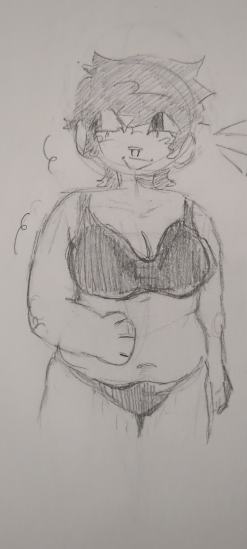
#my traditional artstyle is so different from my digital one
Explore tagged Tumblr posts
Text
0 notes
Note
I understand that Psychopomp was born out of necessity due to the policies put in place by Unity, but alot of the story and designs for environments and characters are incredibly thought out. Were these ideas retooled from previously scrapped projects or ones you worked on before the Unity debacle (Mechana/Dreamwild)? What are your influences on some of the more esoteric concepts/mystical oddities within the stories of your games? Also, why is the moon's design one of the main unifying factors in your games? (Atleast that i know of, I only played Dashbored, Dreamwild, and Psychopomp.)
I had the idea for Psychopomp a few months before the Unity policy debacle, so when that all happened, it ended up being more of an opportunity to revisit that character and idea again (though at that point it was really just the one character design and the idea of the helmet)
For the most part, the ideas from Psychopomp weren't borrowed from my other games. There are a few however. In the 2014 early development version of DashBored (Then called "Drive") the second level was a factory run by a giant severed head. You would have to mercy kill the head to continue on. This was removed pretty quickly from the game, but I wanted to revisit it, because it made one of my highschool friends really uncomfortable. The head came back ten years later for Psychopomp, and the design is even taken from Drive.

(The old sprites. I didn't really know how to make digital art at this point)
The King of Mercury and King of all Dogs were originally from an idea for a separate video game. However, I really liked them, and I didn't want to wait to have to wait for years to be able to potentially make something with them in it, so I worked them into the story of Psychopomp.

(The original drawings that would become the King of all Dogs and King of Mercury. The King of All Dogs inner face here is inspired by traditional Haida art. This influence was dropped for Psychopomp because it didn't fit the grimy artstyle, but I'd like to bring it back in the future.)
I grew up in a household surrounded by a lot of spiritualism and various eastern philosophies. A lot of my youth was spent in spiritual shops and various shrines of different denominations. I ended up with a lot of esoteric concepts in my head and came to really appreciate a lot of the various spiritual aesthetics of the world. It's hard to come to terms with a world that's brimming with so many concepts, many of which contradict and attack each other, and that spiritual anxiety makes up a lot of my feelings in Psychopomp.
As for the moon, all I can say is: Note who it appears to, and when and where it appears. The moon is watching.
Thanks for the ask! This is a really great question! I hope you enjoyed the games, and I hope you'll enjoy what I have in store for the future!
137 notes
·
View notes
Text
My first ever digital art!!! (Guys, it had to be Robstar)
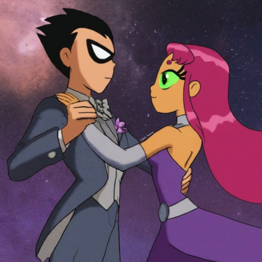
This took me 3 weeks to complete 😭
I struggled a ton because of the lack of light pen thus leading me to just use my own fingers for the whole thing 💀 (I initially wanted to draw a pretty background depicting a ball room too but gave up on it and just went on with a generic galaxy bg but also made a ball room version using this image )
Here's the ball room version!
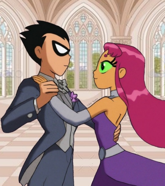
I experimented a lil with the shading and uh let's say digital shading is a lot different than traditional art lol I struggled with some aspects like hands because it's a lot hardee to manuever in digital art (and I already suck ass in drawing them in traditional art 🫠) just like shading and again, I'm very new to this haha (there are just so many tools and options like it's kinda overwhelming)
The dress worn by Starfire is inspired from the one she wore in that one TTG episode where she became the Tamaranean Queen and Robin's one is a combination from the one he wore in one episode of BTAS and "Date with Destiny" from TT03. I went with TTG artstyle because of simplicity reasons-
Do lmk your thoughts!
#teen titans#dick grayson#robin#starfire#koriand'r#kory anders#robstar#fan art#fan art by me#Dickkory#digital art#shading is a bitch#dick x kory#dickory#guys please dont be me and buy a light pen for doing digital art#its gonna make your life so much more easier#ngl i'm proud of this one#my favourite ship#them ♥️🫶✨#my fav otp#lesson learnt for life#I just realised I forgot to colour Robin's chest collar thingie of his suit and his small finger 💀#changed em now tho#thank God I noticed#Why do you find all the mistakes AFTER you post?#like whether it be fanfic or art 😭#robin is definitely on stilts btw lmao
89 notes
·
View notes
Text
i had a lot more free time than usual today..so i ended up completing a request with even more detail than what i typically go for.
not to say that it was far from my artstyle- in fact, it is somewhat a 'variation' of my style, as this is how it looks only when I've finished rendering n all. basically, the difference is that this was done in achromatic.
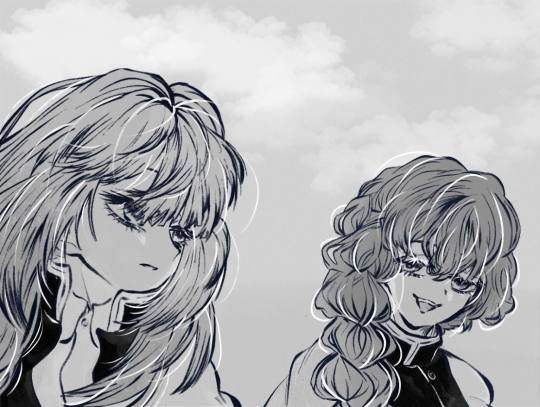
@night-mince0, i'm kinda dissapointed with how the mouths turned out ngl
a riri and asai interaction! I'm guessing this is supposedly when their about to bid farewell, but ended with one last greeting before they actually do part ways.
in all honesty, i would've colored this with actual life instead of greyscale if i wasn't gonna celebrate a birthday today. but hey, it is what it is.
based on what @night-mince0 perceives their interaction would've gone, i tried to convey that it was an overall chill chat between the pair. that's why went to focus on the eyes the most, and least to say, i am rather satisfied with how this overall piece finished as....EXCEPT FOR THE FKNF MOUT-
( edit ) almost forgor to add these failed attempts at retrying traditional art after ditching it for digital a year ago;
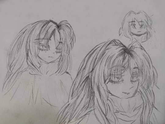
who is this? idk, she just popped up on my head and i drew her!;o
the mentioned (tagged) ones have full authority to save the requested work and do whatever they want with it.
indeed, references were taken inspiration from.
as per se, no stealing yadaydayaya. thank you!
#❄️ 𝐫𝐢𝐫𝐢𝐭𝐬𝐮𝐤𝐢⎯⎯#❄️✏️⎯⎯#demon slayer#kimetsu no yaiba#demon slayer oc#original character#kimetsu no yaiba oc#kny oc#demon slayer x oc#kimetsu no yaiba x oc#kny#ds#art#artists on tumblr#digital artists on tumblr#digital artist#I DIDNT REALZIE ASAI WAS BUFF JACKED#MAKES HER EVEN BETTER#OMGKGOREH#I LOVE HER SM#eyeyeeyeysysysysys#eyss donte lie#👀#was this scheduled?#maybe#just maybe..#i want to color the other requests too#maybe i will make a redemption arc of my previous requests??!192279#definitely.
99 notes
·
View notes
Text

First of all I need to thank my artist friends @meizze-art and @annarielmidori for leading me into this brilliant software... (it's so much better than Photoshop goddang)
Like I mentioned in my previous post, I was doing a "research" this morning...😂I took notes of artworks that I really love the style of, and then also took notes of the ones that I wasn't a fan of. I also wrote what feature I'd like to learn. My note looked like this... (please don't misunderstand, these artworks are all amazing in their own way, I'm only making notes on their artstyle to decide my personal preference)

And second of all sorry it's not a Hogwarts Legacy character😂When it comes to the process of learning, I'd prefer practicing on the faces I'm most familiar with, and...that's just Dan. I'm not sure if I should switch to my Dan Stevens content only account because if I tag my friends there it'll be a bit weird...so...
Anyways, because this is literally the first time I actually do a rather "serious" colored digital art (previously my experiences in drawing are only limited to traditional methods, and most of them are either b&w pencil sketch or copying manga panels/manga art with colored pencil/copic marker), and I just got this pen tablet a week ago, so umm...I'm still exploring. This one took me too embarrassingly long, idk exactly when did I start but probably 6 hours or something. I used this photo (my favorite screenshot from "The Guest"...) as reference:

I admit that I acturally traced some part of it (like the sihoutte of his hoodie, and hair shape overall), however during my drawing I realized I actually cannot directly follow his face's jawline's contour, because the proportion would look a bit weird...so I sort of redrew that. Also on the eyes, originally I wanted to do a full realistic size, however I noticed that if I used the actual eye size, there won't be enough space for me to emphasize his eyes, so I enlarged them a little bit. I guess I'm still...leaning towards modern anime style more?
I checked my "research notes" (🤣) for many times and in the end I basically just did a 4:6 mixture of Vinland Saga and Variable Barricade (???), I wasn't planning to reference Vinland Saga in the beginning but I really really want to add his unique "aegyo-sal" in my drawing but most of the works mentioned in my notes don't really have it, so I experimented a lot and...well, Vinland Saga's method sort of works...
Managing layers is a real pain in the ass. Like previously when I was only working on Photoshop I didn't really have to deal with so many layers that constantly requires modification, and now it's like...I need to remember which is which and the logic and order of putting different parts into different layers.

(This screenshot was taken before I changed the gaze direction. In the original screenshot he was not actually looking at viewer, but I feel like it's gonna be more "fetching" (???) if he's looking at viewer, so I basically just cropped out the eyes and paint the area white and masked the cropped out eyes and fixed some details )
Well, this is only my day 2 of using CSP and I haven't even watched any tutorials of what's the proper way of drawing this kind of anime...hopefully I could get the hang of it soon.
13 notes
·
View notes
Text
Little rant about drawing/asking for advice
>So my main thing is how do i make my art look ''neater'' and stay in one style (my style).
-So i use reference photos whenever a draw a sonic character or I just copy a screenshot from a game or Tv show to practise/analyse but when i use say, a Sonic Boom photo it will always have the look of Sonic Boom and the same with Sonic prime or Frontiers. They always look similar and never in my ''own style''. I put my own style in quotations because I'm still trying to find my art style and it's starting to seem like copying/using reference photos doesn't help. However, when i use many different references from different games for sonic it never feels like MY style, i never end up liking fully there's always a part i want to change but have no clue what.
My question for that paragraph is: Do i need to experiment more? And do i need to stop using as many references?
-My second point is: I want to be a digital artist but don't have the money for it yet (hopefully in the future i'll get an ipad or drawing tablet). But, how do traditional artists make their art look like it's done more ''digital''. For example, with the shading or the colouring or the outlining.
What is the best way to improve and find MY artstyle? What's the best stationary to use, do i need to experiment with that to?
Just to add on to this, the characters are mostly Sonic, Shadow and Tails not so much Knuckles (I don't really draw Amy or Rouge). Any advice would be really appreciated even if it's small :]
#Drawing#Sonic#sth#asking for advice#advice#drawing advice#sonic the hedgehog#sonic art#sonic fanart#sonic drawing#artstyle#fanart#my fanart#my artstyle#my art#questions
19 notes
·
View notes
Text
So I've been working on a artstyle that's kinda simple but also messy but clean enough I can make serious stuff with, and also one I could use for animation/animatics bc some of my artstyles it's kinda hard to do that
And out birthed this style
(And what better way to practice than drawing the only person I can draw in all my styles)
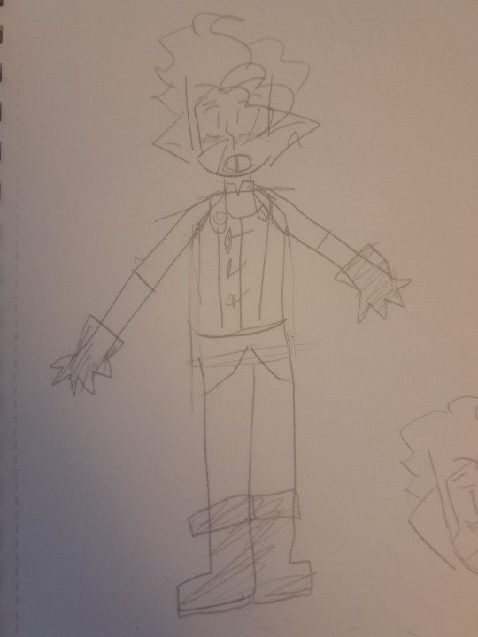
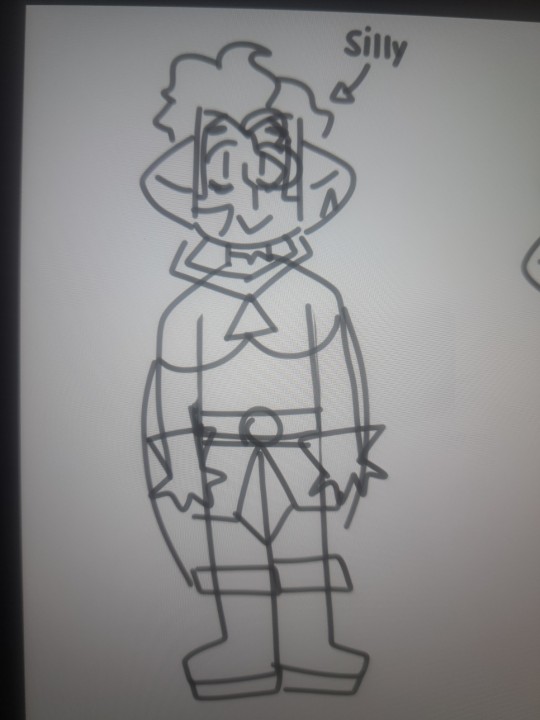
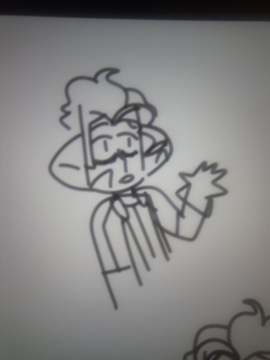
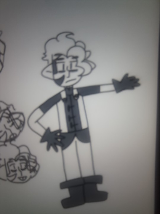
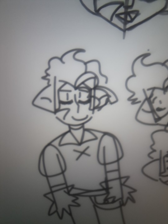
Idk if everything for the style Is gonna be final (especially the eye style and torso) but this is what it is rn
Also ik it is gonna look a little different from traditional and digital (all my artstyles do)
#the owl house#toh#owl house#hunter toh#hunter noceda#drawing#toh fanart#toh hunter fanart#art style#traditional art#digital art#digital drawing
12 notes
·
View notes
Note
For the feedback on the brush: I personally think it makes your art seem a little more cartoon-ish, which I think suits your style (which is amazing by the way, I just wanna, wanna squish) (Also! The brush reminds me of the artstyle in Gravity falls)
I know the kinda struggle one may have with the line weight (I use brushes like these all the time, they can absolutely get frustrating at times)
I know tons of artists (or rather artsytles) that use a brush that doesn't vary depending on how fast you draw with in or how much pressure you're putting on it, and it doesn't look cheap at all!
I think the other brush looks very good as well, but if I had to choose, I actually think I'd rather have the new one that doesn't vary depending on how you draw (I personally would draw thicker lineart with a brush like that, or atleast on the outside, but you do you and your art is amazing :] )
Long story short: I like both very much, your artstyle is squishy, and respect you've been doing this for 500 days and have literally been one of the hughlights of my day (I don't watch Etho too often, probably should, but still :D)
This ask made me think so much about like my art style and like why does the pixel brush just.. feels better. I think it has to do with my transition from sketch to line work
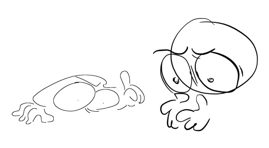
Heres a random sketch (not the best example but work with me.) Both are pretty expressive i think

And here’s the line work with both of them. I noticed with the line work one I was so focused on trying to make some of the line weight makes sense that I lost some of the expressiveness of the original sketch. Meanwhile with the other one i was able to keep some of that expressiveness??
Idk, this is just for me. I love using brush pens in real life but i think with digital art I tend to be overly perfectionist. Meanwhile with traditional art i have a mindset of “if it’s on the paper it stays on the paper” So im less likely to be all focused on mistakes? Idk if this is even true, it could be a completely different reason that i didnt catch when i was drawing but this is my best guess atm. ALSO TYSM FJDSKFSJESKD honestly im just happy that other people are still interested in my silly little ethos and people are willing to give feedback on my art and help me improve. Thank u for such a detailed ask :3
23 notes
·
View notes
Note
Hi Gomz! Been so inspired by your art, I'm considering picking up digital drawing again haha. What device and app do you use? What would you recommend if I wanna restart drawing? Would be great if you can answer with doodles :D thanks!
Hello Cumi! Thank you very much for this ask, to think I can inspire other people with my doodles means a lot to me <;3 ((def not cryin rn))
In this ask response, I'll include some links that you can check out for the appropriate stuff! I hope you can understand some things by the end of it :D
Disclaimer: im no professional, so most of this is just based on my experience!!
Okie dokie first off:
What device and app do I use?
I draw using a drawing pad, the Deco Mini7 on my laptop, and I use Krita to draw :3
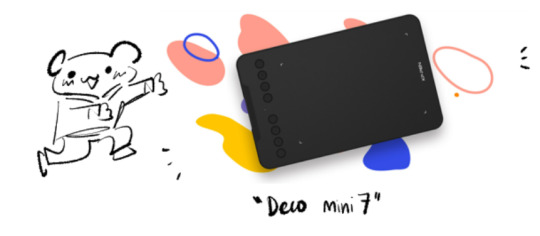
Krita is free to use! You can download it here, or if you can afford it, clip studio paint is definitely a popular choice out there, some people use adobe too!
I will say it may seem complicated at first BUT it is relatively easy to learn once you get the hang of it, there have a full tutorial on their website with videos included if you wanna know more! digital art apps usually works the same way, once you get the fundamentals you can draw on any app tbh
Or if you do want to start using Krita, then you can send me another ask in the future and I'll share you my tips and tricks (which are honestly pretty scuff HAHA))

Other recommendation if you want to draw on phone/tablet/ipad!

2. I know you didnt ask this, but I wanted to share my experience starting out with digital painting/using the drawing pad for the first time
the thing about digital painting is that there's a lot of features here and they serve to make the process easier, but it can be quite overwhelming when you start off! examples are layers

drawing pad also means getting used to not looking at the pad and the screen at the same time + getting used to the pen, I had a hard time with it but the more I use it, the more i got used to it :D
funnily enough, I actually gotten this drawing pad bcuz I started using lecture notes online through pdf and such xD
3. What would you recommend if I want to restart drawing?
Not really sure what you mean about restarting, but Im assuming like finding a new artstyle or trying out different art medium is it? (like from traditional pencil doodle to stylus pen) but if you mean literally restarting then uhhhh XD I guess you gotto start drawing then haha?
I think my motto when it comes to drawing is that no matter what it is, just do it
"its gonna look bad" its okay bcuz at least I drew it, yk? xD the thing with art is the more you draw, the more you're familiar with it, the less intimidating it will become(tho it can still be scary, but hey! baby steps right?)
perhaps what I would recommend is testing out all kinds of artstyle, ask yourself:
what am I going to draw? ex: I wanna do self potraits! I wanna do silly doodles of my favourite characters!
what style do I wanna do? ex: Chibi, non-chibi, landscapes
Sometimes, you won't know those answers to those questions until later on, which is exciting dont you think? one day I said "im gonna draw Ghost in full gears" then the next I decided "actually nah screw that im gonna make Ghost cute" -w-
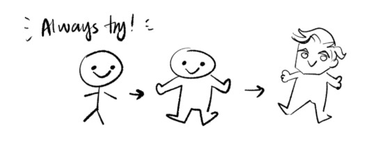
didchu know my first few digital doodles were done on OneNote? haha yes! and on my lecture notes nonetheless pfttt (this was around october 2022)

When in doubt, always ALWAYS start small and simple. Draw a circle, draw a blob, anything! Make it manageable :D
You can, of course, challenge yourself and go big! the most important key is you're drawing for yourself :3 and you should do something you're happy with!
well, sometimes there are moments where you wont like what you draw or artblock, when it comes to those time Id recommend taking a break xD
Finding your artstyle is an ever growing journey, I would suggest looking through websites like Artstation or Pinterest and collecting artstyle that you like! then learn from it, replicate it, trace it(AS LONG AS YOU DONT CLAIM IT AS YOUR OWN AND YOU DO IT FOR PRACTICE PURPOSES!!!) and study it :3
like heck I just found a new artstyle yesterday literally HAHA so you know, enjoy the fun!
4. Other helpful links and video for starting out digital painting:
Marc Brunet, has a ton of tutorials that are useful! my fav one being this one about face drawing and cell shading

Bluebiscuits, very cute artstyle and the videos are always soothing and calming to watch! they did this video about finding your artstyle which I highly recommend! their face drawing tutorial is also really good :3

I also watch tppo occasionally, his video focuses more on how he study other people's artstyle and then implementing it on his own! If you like art studies you can give it a go, like this one!

practice, practice and practice! things like art takes a while to master and get happy with :) like i said, keep trying and dont forget, all of this is for fun!
have a good day! feel free to ask me anytime if you want if you want some clarification <3
9 notes
·
View notes
Text
(WIP) Wally’s parents as humans + prom = Young Wally’s parents. (IGNORE MY HAND) (No Wally, only tagging him cuz it’s his parents)
Yeahhh, uhh, I just don’t have a laptop designed for this type of stuff and well I don’t get enough money from my allowance plus I have a lil spending money habit, so I never get to save enough money for a new laptop designed specifically for this stuff, I especially cannot buy and will mostly likey never afford a tablet designed for art, so bad quality :’) And yeah, different artstyle, digital art and traditional art can be very different. This is literally all I have to draw, so my digital art can be very bad. (This is obviously not a picture of my laptop, but of one that I got on google)

Also, I’m really sorry about the weird obsessive, stalking Wally dad- While creating + drawing him I was listening to the songs listed here: 1. A Match Into Water - Pierce The Veil 2. Closer - Nine Inch Tails 3. In My Room - Insane Clown Posse And I don’t remember the rest, but listening to those songs on repeat can mess up your thoughts a bit!
#welcome home arg#welcome home puppet show#WELCOME HOME WALLY#wally darling's dad#wally darling's parents#wally darling's mom#welcome home oc#oc art
3 notes
·
View notes
Text
shoutout to all artists who:
feel they have a 'beginner artstyle'
are still at a beginner skill level despite being 'too old' or having created art for years
can only draw a few characters
can only draw from one perspective
can't draw poses/anatomy
can't draw pespective
can't draw something correcty the first try
can't draw something without a reference (USING A REFERENCE DOESN'T MEAN IT'S NOT YOUR ART. IT'S JUST HELPING)
can't draw it the way it looks in their head
just start drawing with zero plan and see what comes out
don't work on improving their skills (if you don't want to, not because you're procrastinating. DO YOUR WORK GUYS)
can only draw a certain thing/are only interested in drawing a certain thing (i don't and can't draw backgrounds)
feel pressured by the 'need' to improve! even if your art sucks you shouldn't be stressed about how fast you're improving :3
don't have expensive art supplies (traditional)/a stylus or tablet (digital)
What matters about YOUR art is that YOU have fun making it! No matter how many stupid thoughts about how it doesn't look how it does in your head and that it doesn't feel right show up, PUSH THROUGH IT!!! You're doing this for YOUR enjoyment. And whatever that means for you IS OKAY!!! If that means you don't improve? Fine! If it means you have to ask other artists for help, or use a reference, maybe even trace a part of the pose (with credit)? ALSO FINE!! Do whatever you need to for you to be happy! Because if you consistently feel like shit creating your art, it'll stop being a hobby and just become another chore for you, ART IS FOR YOURSELF FIRST!!!
And to all my artists that do prioritize improving their art: I love you too!! Both ways of creating art are completely fine! There's just different goals behind them, and any combination of these can work too! How you choose to create art and what you do it for depends entirely on your own funky little brain :P I don't mean to discourage learning with this post- In fact, I'm damn envious of those who do, keep up the good work - What I do mean to do is calm down all the little silly goobers who look up to all these other artists so much they hate their own art! Because honey, that's now what you should be doing - Creating, and getting better at creating, art has to come with some level of fun too! I'm gonna have to start my own learning journey at some point in the future- but when? I'll see! C:
0 notes
Note
as someone with visual processing issues, i really appreciate your descriptions when my brain isnt cooperating <3 i was wondering if you had any tips on creating ids? it sounds like a fun skill to learn and also very useful!!
Hi! Thank you for reaching out! I will try to give some help. I personally do have low vision and rely on screenreaders sparingly, though I've started using them on mobile more often.
First I'm gonna give you some general advice that could apply to most descriptions, and then focus some more on content commonly shared in the Hollow Knight fandom.
General Concepts
"ID" stands for Image descriptions, and they exist to make content available to those that cannot perceive visual content properly for different reasons. Usually, these descriptions can be found in two places, right below an image in plain text, or in the "alt text", which is a feature that allows you to describe visual content in a way that's available to the screenreaders, but where the wall of text doesn't obstruct the rest of the post. In my personal opinion. it is generally preferable to put it below the image, just so people without screenreaders can still benefit from it, but there is nothing wrong with leaving more detailed descriptions in alt text.
My personal advice for you to start a description is to ask yourself:
What do I see at first glance?
What is the purpose of the image? / What do I think the purpose is?
What information do I need to state so the image achieves this purpose?
Let's talk a little more about this, using fanart, with the consent of @silkysong
What do I see at first glance?
When you look at an image, there are certain things that stand out at first glance. Our brains tend to process things as a whole, we see certain objects in the middle, and how they interact, then we can note some specific features of an image, then we can focus on the context, the background of an image or the colors used. Basically, we must try to describe things as we see them
An easy list that can help you decide what to say first:
What kind of image is it? Digital fanart, traditional fanart, an edit (image created pasting assets made by others together), a photo, a screenshot, etc.
What is the main object seen? Or what are the main characters seen? If it belongs to a specific franchise, name it here.*
Where is it? (Short answer: like a location name, a plain background.)
How do the objects or characters interact? Describe actions like: "the Knight swings its nail towards Hornet."
Is the appearance of the object or character different? How?
What is the background like? What is the lighting?
(*) While everything else can be optional, if you're low on spoons this can be a quick description that lets others know what the image is about.
But what defines what info needs to be there?
Time for question 2 and 3!
What is the purpose of the image? /What do I think the purpose is?
Ok, so, why am I sharing this image? Or why do I think the original poster shared it?
If it's a meme, then focus on what elements are needed to tell the joke, if it's an edit, then focus on what makes it different. And if it's fanart: what things would you like people to notice about it? A specific artstyle, the poses in a scene, the colors it uses, a new design, you decide.
As you can see, this is what can make descriptions so different. If you're the person who made the image you know best how much you want to focus on details. In other words, if a detail will have a meaning or an impact to the viewer, then try to describe it.
What information do I need to state so the image achieves this purpose?
Let's look at an example:
The image descriptiion is: "[Start ID: A drawing of the Broken Vessel and the Radiance from Hollow Knight over a white background. The broken vessel stands looking to the front, one of its eyes is black, while the other, next to where its mask is cracked, is bright orange. The end of its cloak twist and are colored orange as well. A tiny version of the Radiance seems to be sitting on its head, where its mask is shattered and full of infection. /End ID.]
First sentences gives us:
Medium (what kind of image?)
Characters (main objects)
Franchise (context for said objects)
A quick description of the background. (where are the objects?)
If for any reason you're not interested in any of those elements, you can already skim past it or press skip in a screenreader.
The next sentences describe what pose the broken vessel has and any relevant details of their pose and their cloak. Then we describe where the Radiance is and what she's doing. This lets us know what the drawing is trying to focus on. If we had a background, that would be the next element to describe.
Finally, we see the "/End ID." which helps people using screenreaders know when the image description ends and any other caption you add starts.
EXTRA NOTES, Hollow Knight edition:
Describing canon characters in detail is optional. It can be useful if you want your art to be enjoyed by people not familiar with Hollow Knight, but it is not necessary. Original characters do need a better description, however, since people aren't familiar with them. If you think it's relevant for you, add any style choice that differs from the canon designs, such as adding limbs on Hornet, among others.
If you do not have the energy to describe much you can say things such as:
-An anthropomorphic [insert a bug]
-A fictional creature with [base features such as scales, wings, legs or any other recognizable elements]
-An insect-like character with a white, horned shell and a dark cloak (to refer to vessels).
#hollow knight#acessibility#image descriptions#described#Also support your local accessible artists#I literally get so happy whenever flame-shadow or fly-sky-high-bug-games or others upload described art#you all are the world#i will SCREAM if this has any typos#also sorry to the anon for keeping this unanswered for almost 3 months
75 notes
·
View notes
Text
Attention, Pmtok Artists!
UPDATE: Applications are closed now! Thank you!
Are you interested in joining an art collab for the 2nd pmtok anniversary?? Well, look no further, as I have just the thing for you!
Starting today I'm going to host a pmtok anniversary collab, asking for any sort of artist who would like to join in!
Essentially, this project is going to center around the idea of all the major pmtok characters, however, taking inspiration from last year, all wearing very Fancy and Unique outfits!
Does this peak your interest? If so, read further to learn more details!
Overview/Guidelines
-As stated prior, the plan is for every participant to draw their assigned character, but in a Fancy outfit! This term is vastly loose, the character being allowed to dress as modestly or flashy as you'd like! Only rule to that is that it must be some form of an alteration to their normal appearance/outfit
-Also note that the character that you're assigned with must assimilate with their canotical appearance. Different artstyles/redesigns are alright, however gijinkas are not- sorry, but that's largely for the purpose of staying generally close to canon and seem less "out of place" with one another <:o)
-Characters assigned to people will be chosen at random, as to make sure all the picks of characters are fair and without conflict
-People shall only be excluded from the project should they display any bigotry or unacceptable behavior
-I'll try my best to post news and updates here and on discord, so do try to follow along with such (a separate tag will be made for these posts, #anniversary-outfit-collab)
-Any sort of art is acceptable! Traditional, digital, anything goes!
Now , onto the more important matter of Time Frames and How do you join....
-From today, from May 13th - May 28th, there will be 16 slots open for participants (These characters being Mario, Luigi, Olivia, Olly, Bobby, Bowser, Professor Toad, Captain T. Ode, Origami Craftsman, Kamek and/or Bowser Jr., Colored Pencils, Rubber Band, Hole Punch, Tape, Scissors, & Stapler.)
-Once all the participants will be found, I will either publicly post or dm everyone's assigned character
-In order to actually join in, please let me know in some form, whether it be via dms, asks, or comments on this post as to know who is participating and whatnot
-Of course, due to outside circumstances, should you need to back out of this project at any given time please let me know immediately, preferably during the May 14th-28th time window, but if not, that's alright too
-Most importantly of all, this project and your submission will be due on July 15th-16th, and all entries must be privately submitted to me in some form. Late additions are acceptable, just not necessarily recommended.
-Not a rule, however it is HIGHLY recommended you do not post your submission until after the finished project is posted
-(Not necessarily required, however, feel free to join my little pmtok server as it's easier to communicate and announce news there)
Anyways, that is all! If you have any questions, comments or concerns, do let me know and I'll try to get back to you as soon as I can! Thank you for your time!
#i am so so excited for this guyysssss!!!#i-use-my-words-to-express-myself#pmtok#paper mario the origami king#origami king#legion of stationery#legion of stationary#and i gotta take my mind off things so this should be fun!!#anniversary-outfit-collab
22 notes
·
View notes
Text

I posted 85 times in 2022
79 posts created (93%)
6 posts reblogged (7%)
Blogs I reblogged the most:
@vexederolo
@araliadon
@sixofbabycrows
@river9noble
@nightlybirdie
I tagged 85 of my posts in 2022
#art - 79 posts
#artist - 79 posts
#my art - 79 posts
#drawing - 79 posts
#digital drawing - 70 posts
#my artstyle - 27 posts
#fanart - 24 posts
#anime art - 22 posts
#jujutsu kaisen fanart - 21 posts
#fan art - 19 posts
Longest Tag: 68 characters
#yes i gave percy scare based on his backstory from the animated show
My Top Posts in 2022:
#5
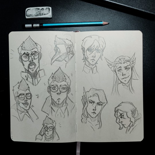
Sketches
Since I have no new art to post I am posting here some very bad sketches of Vox machina
I mostly practice different emotions
Yeah I am horrible at traditional art I know
226 notes - Posted February 25, 2022
#4
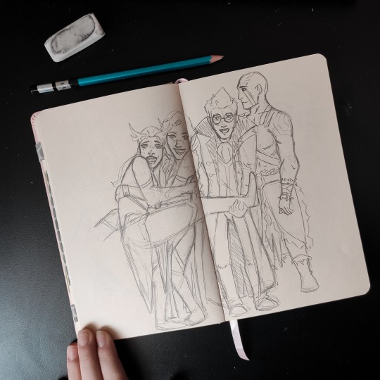

Oh look I learned to also use sketchbook 😂 And the moment I saw the photo I had to re-draw it as their characters ❤️ Not sure if I will finish it or draw it digitally but maybe one day
276 notes - Posted March 3, 2022
#3

Percy & Trinket
Some bonding between Percy and Trinket while Percy get some studying done for Vex’s arrows
This idea came out of nowhere but I am glad it came ❤️
375 notes - Posted February 21, 2022
#2

Percy & Vex
I live for this two ❤️ I know them for only couple of days but if something happened to them I will rage ❤️
I also dive into Critical role ❤️ I am currently on campaign 1 episode 5 and I am having so much fun ❤️ Once again entering a new fandom ❤️ I hope I can provide more art with critical role characters in near future for you all ❤️
406 notes - Posted February 19, 2022
My #1 post of 2022

I was just messing around with Percy design of my own 👀 and I mean…. Well let me know what you think of this demo version of my Percy design ❤️
426 notes - Posted March 12, 2022
Get your Tumblr 2022 Year in Review →
4 notes
·
View notes
Note
you.
Y O U .
about your post (link below), about the art style of the characters,
YO IVE BEEN WANTING TO TALK ABOUT THAT BUT SO FAR YOU ARE THE ONLY ONE IVE SEEN NOTICE IT. After reading the last few chapters, I did notice the art style of the series has been changing. At first I thought it was a different illustrator or a new assistant or something but I didn’t have a recent book to check. Maybe the guy is stressed with deadlines but he BUTCHERED a couple of the characters. Kimizuki I noticed the most since I uh- pay attention to him a lot, but the pictures you added really sealed the deal for me. I do hope it can “go back to normal”, since the art was part of what made me check out the series. I just feel like it doesn’t look as refined as it used to, and I definitely missed Yu’s old expressions. The eyes drew me to the characters. Maybe they’re using a different way of drawing things, like switching from traditional to digital, which could explain why the eyes aren’t as detailed anymore. I’d like to know which chapter you think this started in, as I’m looking though my physical copy of book 15 to see if it’s different around then. hopefully it gets turned around, but there’s obviously no guarantee. I really appreciate you posting about this.
https://distinguished-slacker.tumblr.com/post/650704413986521088/dont-you-miss-those-old-days-when
Hi :3
First things first, I just want to tell you that the artist, Yamato Yamamoto sensei, is not a ‘he’😅 Their gender is unknown but it’s most likely that they are a woman.
Now, onto your question, I think you are looking through the exact volume where I think the art style started to change. Volume 15 contains chapters 56 to 59. Chapters 56, 57 and 58 possess the same art style as those of the previous volumes and it’s right at the end of this volume, in chapter 59, where I notice that the faces and eye shapes started to become rounder.
However, you would barely notice this very subtle change unless you are looking through the chapter with the intention of dissecting the art😭 The panel where I go like “Yes. The art style is definitely starting to change.” is this one right at the end of chapter 62⬇️
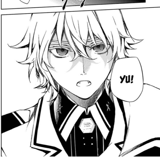
I can notice it since usually Mika would have sharper features. Artstyle started to change since the early chapter 60s but it wasn’t until the 80s that the quality started to downgrade and especially the recent ones suffered a more severe blow.
I really don’t want to break your hopes but I am still going to speak and say that it’s highly unlikely that the art style will go back to what it was once :(
There is a difference between art style and art quality. Art quality is dependent on the choice of the brushes, the level of shading and of course, tiredness. If you compare these recent chapters with the ones from years ago, you can notice that the brush Yamamoto is currently using for drawing the lineart seems blurrier and so less defined. It seems like, as you say, Yamamoto changed their method of doing art to digital, and this problem can be easily changed if they try another platform or a different method. Then, level of shading can be improved if more time is given to focus on shading (therefore less tiredness).
However, art style is not something that can significantly improve with more free time. Art style is like handwriting; it either changes over time at a very very slow pace or it doesn’t change but it never abruptly changes to something different (it requires a lot of time to change your handwriting and get used to do it like that all the time). The artstyle has been changing since the early 60s, which were written like 4 years ago. Those are 4 years of Yamamoto getting used to drawing like this, with stiff positions, lack of body curves, excess of eye brushes lashes and more which has been getting worse as the manga progresses… It’s hard to expect them to draw like how they used to 5 years ago.
Still, the current artstyle is much better than many shonen mangas out there and I know the artist works very hard but when the plot narrative is being executed so poorly, you at least want to rely on the beautiful art of the manga…but…you know… ;-;
Anyways, I am glad that you liked my post (I really chose some good pictures right?😋) and even if the possibility is low let’s hope that at the very least Yamamoto realises that this is not how Yuu’s face looks like😂💔⬇️
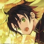
#I get it; Yuu’s smiles don’t feel genuine anymore#No sparkling eyes or blushes#And I am happy that someone notices Kimizuki :3#I hate seeing my favourite characters being butchered up#I’m so picky about artstyle I know💅#owari no seraph#seraph of the end#ons asks
23 notes
·
View notes
Note
what are your opinions on the different artstyles throughout the seasons?
I'll go through each season!
Season 1 is my favorite in everything. There's no competition. I really adore his design. Tbh his character design changes a bit every episode in this season and I'm not going to go through which storyboard artist's style was in which episode. That's a hassle. But I like the pilot. It looks like Hillenburg's concept art. Looks very gummy and squishy. I like how odd his style looks. But I also like the more consistent style we see in Reef Blower, Valentine's Day, Hooks. It has a thick outline.
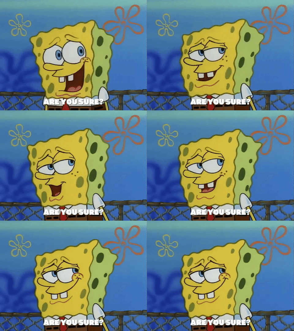
There's another style from season 1 where the outline is very thin. You can generally tell because his eyelashes are drawn very thin. I've seen in some episodes like FUN and ScaredyPants. It's a weird look that I kinda like. Though his toothgap is so wide that it looks like he's missing a tooth.
Season 2 - his design is more angular. The transition from traditional to digital shows. They don't have to constantly redraw each frame. Which allows for a more homogeneous design. I miss how each frame looked different but that's okay. His style is very sharp and square. Similar to the end of season 1. But a lot more stiff. He's more narrow around his waist so he isn't actually Squarepants. More like upside down trapazoidpants. Also idk if this is about early digital animation but Spongebob looks very gray throughout the season. Still I'd rate this my second favorite style because it has the best parts from his season 1 design.
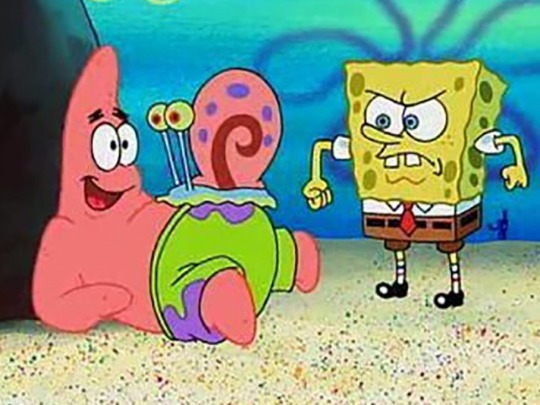
Season 3 - hes more square here. A lot more yellow. Season 3 has the best colors. Hands down. He's even more square and sharp. Surprisingly his expression doesn't change much. Mostly because of Hillenburg wanting spongebob to always be drawn on model. But the charm of his design is how off model he looks and how every frame looked so unique noooo. Jokes aside, I know this design is what most classics fans consider the best design. It's paired with his personality in this season which was more of a young adult with occasional childish tendencies. He seems the most mature in this season. Seasons 1 and 2 is a lot more kid-ish in a way. Idk why this brings up a random thought of seasons 1-2 SB are how kids think they are vs 10-12 is how adults view kids. I'm getting off topic. This design leads to what we get in season 4.
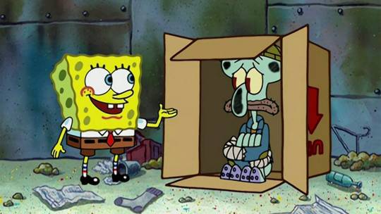
1st Movie - very square. Pretty much doesn't have that narrowness towards the bottom like seasons 2/3 has. Now he's not trapazoidpants but actually Squarepants. I've noticed some of Hillenburg's sketches of spongebob post the movie era look pretty much like the movie. That off model, really square shaped look.
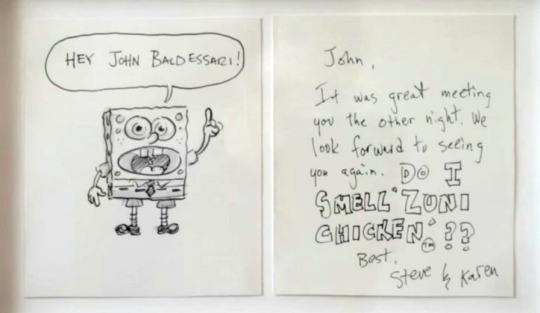
Season 4/5 - this style actually reminds me of the modern style. Very square and spunky. Only difference is he occasionally has black brows. I like it a lot actually. Look at this boi!! He's adorable!! One of the better styles. I'd rank it high up there.
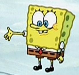
Season 6 - slight transitional style. Between seasons 4/5 and 7/8. I don't have a particular opinion on it tbh. I guess I don't like what would later become his design for 7/8
Season 7/8/9a - ehhh don't really like it. I have a personal bias tho. I didn't like much of these seasons when I was a kid and I think that childhood bias is clouding my view. But anyways I'm gonna talk about why I don't like it. He's so stiff in these seasons. I feel like his expression doesn't change much. His nose is drawn wider, I don't like that chubby cheeks look he does.
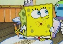
This one. His arms are drawn so high up. He's very rectangular. His eyes are smaller. I feel so nitpicky but he looks so dead. I feel like my love for the later seasons is kinda reactionary towards these seasons since they feel so opposite to me. So extreme blankness shifts over to extreme expressiveness.
Season 9a actually gets better but it still has remnants of this design.
2nd movie - follows the style of season 9a which was already starting to transition styles to the one we have in the modern era but I will make a pass because this is my comfort movie. Sponge out of water my beloved.
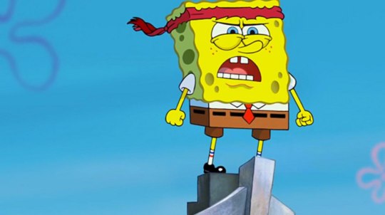
Season 10/11/12 - love it. Adore it. One of my favorite styles. He's so spunky and definitely a lot more angular. A lot of people complain about the expressiveness. I'm not really talking about it here but uhh I do like it. With digital animation, its a lot rarer to have unique frames. Everything is so on model. It's a bit boring. I understand the expressiveness can be too much for some people but it does remind me of what I found charming about the first season. No frame looks exactly the same. It's so stretchy. It only doesn't have that unique gummy squishy look, reminiscent of Hillenburg's art style in his concept art but none the less I like it. Also something worth mentioning. Sponge looks more shorter throughout the seasons. He's not really drawn shorter but him being more rectangular throughout the previous era and here he's slowly getting more and more square.
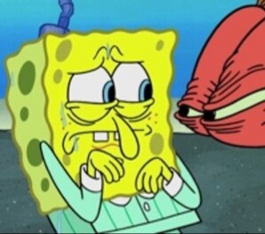
I really like this picture. I love his expression so much??
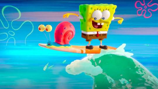
3rd movie - I heard that storyboard artists from the 1st season worked on this movie. Tbh it shows because a lot of frames looks like those photoshopped CGI version of Sponge's season 1 look. This movie was stunning visually. I like the style a lot. We can see parts of his older design like the narrower nose, more narrow towards the bottom.
Can't comment on season 13 because it just started, wait for that lateeer
#I should mention kamp koral but i dont feel like writing it#Talking about main series spongebob#The rest is for another day#Squarepantz#Hope ya enjoy!#spongebob#spongebob squarepants#sb#spongebon squarepants#the spongebob connoisseur#spongebob meme#Ask
48 notes
·
View notes