#my photoshop always ruins the gifs' quality
Explore tagged Tumblr posts
Text
updated stage settings: (that literally no one asked for!)
assumes knowledge of photoshop and a working vapoursynth. if you don't use vs, you can replicate with mpv - though sharpening will most likely need to be stronger, since i use finesharp in vs.
when using mpv/screencaps, i recommend importing as a dicom file! it loads faster and is a little clearer in my opinion. when using screencaps, only crop once. if you need to change the dimensions, zoom, etc., i would undo to the full size you imported at or it will lower your quality.
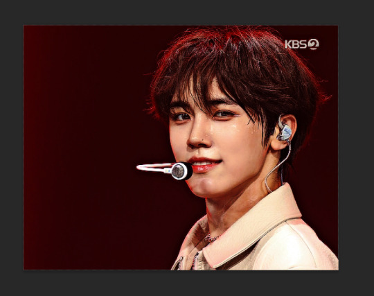
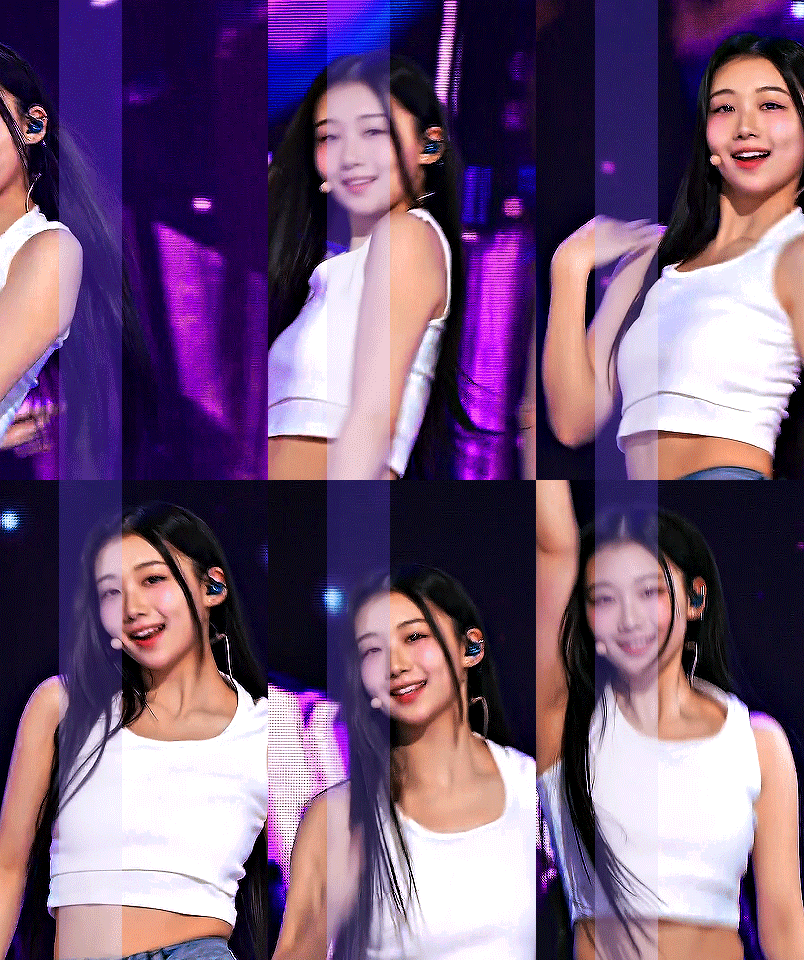
examples: an ending fairy of cravity's seongmin, and a typical stage set gif (using a close-up) of tripleS's kaede. shows the steps, effects, and goals of sharpening and coloring, but does not share psds or actions since i recommend using your own unique sharpening and coloring style. psds cannot be provided (i didn't save them) but i will share my actions if asked to! the actions i used are the two i almost always use (with a few exceptions) on stage gifs.
no keep reading because it ruins formatting (2 images side by side), so apologies for the incredibly long post!
ending fairy:
run through vapoursynth, resized (540 x 420) and sharpened with finesharp set to 0.7 (the last # in the fs code). not preprocessed, as i wanted the normal speed and exported it with a .04 frame delay!
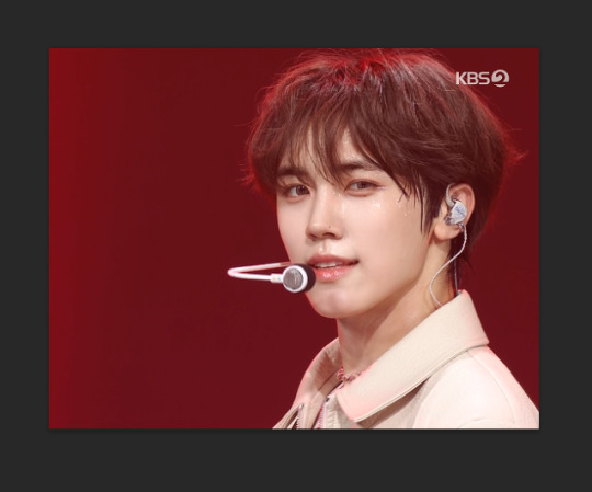
sharpened using my stage sharpening action (4 diff smart sharpens)

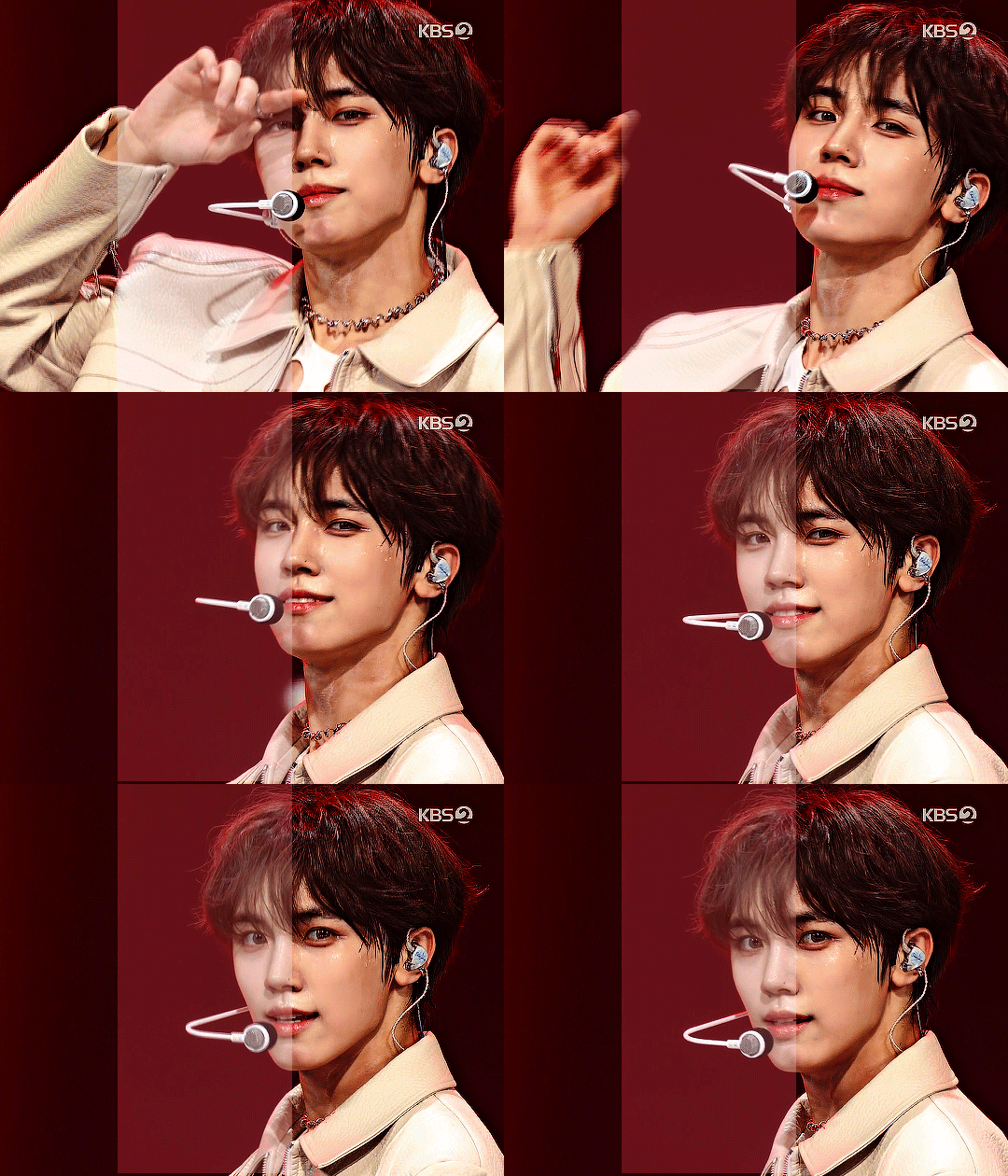
colored using levels (using the eyedropper on what i want to be pure black), and curves (done to add contrast, using only the rgb channel)
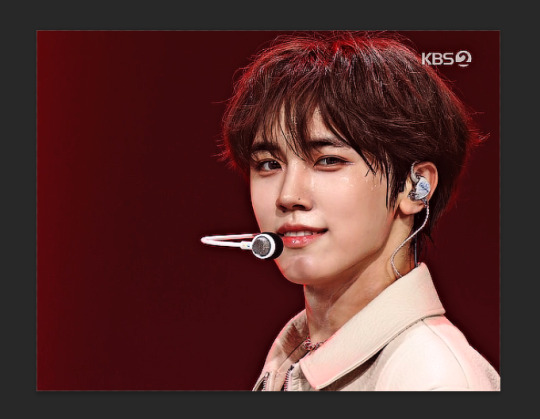
colored (prev step still visible) using exposure, with the exposure upped and gamma around .90. also used brightness and contrast to get the look i wanted, while also keeping highlights in a range that i can edit (going too bright or too high contrast makes my later adjustments less effective)
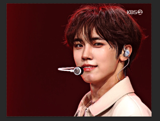
colored (prev steps visible) using hue/saturation (adjusting the hue, saturation, and lightness (to the negatives) of reds and yellows), and selective color (fine-tuning tone of reds and adjusting whites)
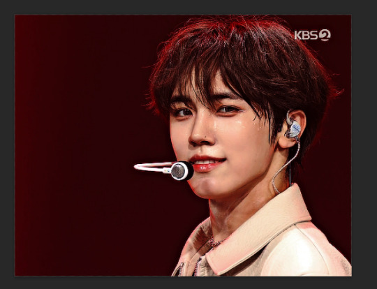
colored (prev steps visible) using selective color (adding back some white and adding cyan to it), and hue/saturation to further fine-tune (red + yellow), and brightness and contrast to get the final brightness and contrast/clarity i wanted.
the original (resized and with vs finesharp) masked over the finished
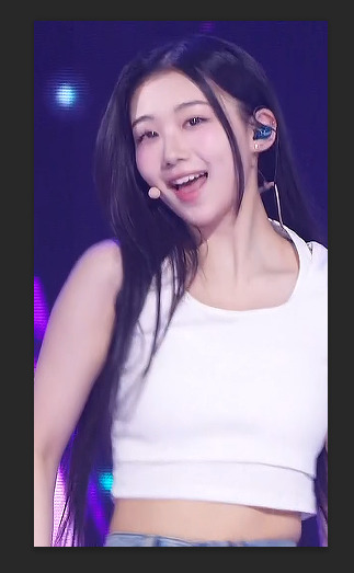
close-up:
run through vs, resized (268 x 490), preprocessed 60fps slow, and sharpened with a finesharp of 0.7

sharpened using my master mv sharpening (i changed the gaussian blur 500 from .04 to .03, + the unsharp mask is set to 50% opacity)
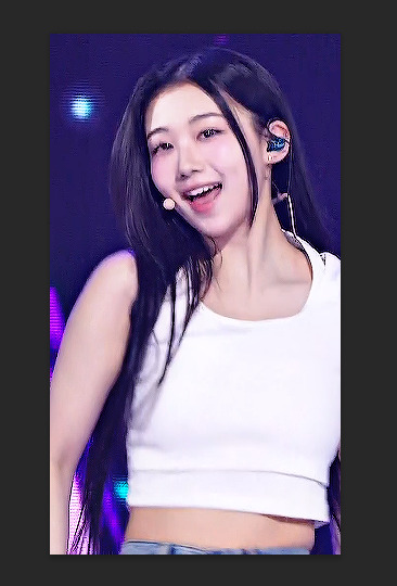

colored using levels (on what i want to be pure black, her hair by her ear in this case), and curves (unlike seongmin's which just adjusted rgb, i also changed the blue and green channels! i do this when it is not an ending fairy but several close-ups to try to make the coloring more consistent across lighting changes (i also do it on more challenging lighting from other sources))
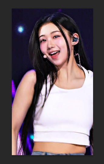

colored with exposure (prev steps visible), with exposure upped (+) and gamma adjusted (~.90), and brightness and contrast to get the look i want (same highlight forethought as before)
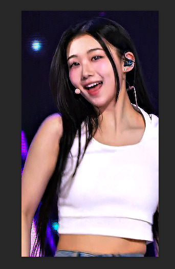

colored (prev steps visible) with hue/saturation (adjusting hue, saturation, and lightness of reds and yellows), selective color (fine-tuning tone of reds and adjusting whites)


colored with selective color (adding back whites and adding cyan to them), hue/saturation to further fine-tune, and brightness and contrast to get the final look and clarity
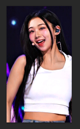

optional, but nice for multi-shot sets: another hue/sat above your last brightness contrast, only adjusting background colors for cohesion when paired with the other gifs of the set
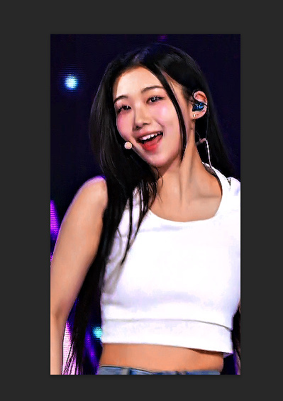

also optional: change speed to be faster, depending on the look you want. i tend to use ezgif.com/speed and do 105% speed
the original (resized, vs finesharp, preprocessed to 60fps slow) masked over the finished gif. the one on the right has been adjusted with ezgif at 105% speed

13 notes
·
View notes
Note
Hi! I love your gifs, you're very talented! They look amazing and so fluid and CRISP. Do you have a tip for beginners? Especially in preserving the quality, I've used Giphy but the page RUINS IT. Thanks❤️
hey! this is really sweet, thank you so much for the compliment!! i'm not the best at writing out tutorials or anything, but i am happy to share some that i definitely found useful when i was getting back into gif making during the pandemic.
so this tutorial for beginners by @hayaosmiyazaki is pretty fundamental! it's the one i rec to everybody. it's a few years old now, so some of the links might not be active anymore for all i know, but it does a wonderful job going through the ENTIRE process start to finish.
@saw-x also has a solid tutorial for beginners that has some more great explainers, especially about sizing and ratios for tumblr posting.
here's a beginner's guide to channel mixer by @aubrey-plaza which really helped ME out because tbh i went several years not using this layer feature bc i was so intimidated by it. don't be me!!
@aubrey-plaza also has another great tutorial on how to fix orange-washed coloring ESPECIALLY on poc actors. similarly, @ augustds has a tutorial on how to spot and stop whitewashing poc in gifs.
and then you can always go through my #tutorial tag to find any other posts i thought were worthwhile for myself to save!
regarding your other question, i'm gonna be honest, i'm not even sure how giphy fits into this question, so i guess?? my advice would be: don't use giphy. i have photoshop and save all gifs to my files (instructions available in the first tutorial) and then upload them to tumblr directly. i typically delete my gif files after posting them, but if i ever need to find/save them again for whatever reason, i find the post, open the gif in a new tab, delete the "v" at the end of "gifv" in the url, and then refresh the page. this should let you save the gif as is and you can post it elsewhere if needed.
anyway. hope this helps!! sorry it took me a few days to reply :)
#ask#bongazo#i'm bummed bc there used to be a GREAT tutorial i had saved that explained the different options for saving gifs in photoshop#like it talked about the difference between diffusion and others etc#but it looks like the creator has locked their blog and it's password protected now#i always referred people to that tutorial bc it was great and it REALLY helped me understand the best option for maintaining quality#tutorial
20 notes
·
View notes
Note
Hey! I was just curious what app do you use to make those gifs?? They always come out super good and high quality and I was just curious because I also make gifs and use GIPHY but it kinda ruins the quality and makes it grainy. So I wanted to ask which app / software you use for making your gifs because they always come out so nicely.
Thanks! 🖤
hi!! thank you so much for the love <3 i use photopea! it functions basically the same as photoshop, but it's all in your browser! :) i have a gif coloring tutorial here where i link to some tutorials by some of my mutuals about how they gif in photopea, and share my coloring and sharpening processes too :)
#kai.answer#let me know if u have any other questions!! im happy to help a fellow gifmaker <3#especially because photopea's a bitch to work with shdjbhfskfs
4 notes
·
View notes
Note
hi and belated eid mubarak!! i love your gifs and they have made me interested in gifmaking! i was wondering if you had any advice/tutorials for a photoshop illiterate who wants to make gifs? thanks!
aw thank you anon - both for the kind words and the eid mubarak :)
so I taught myself photoshop and the first bit of advice I would give is to let yourself be bad at it. I deffo think that is easier said than done esp if you're a perfectionist, but you're going to start out with basic things and you're not always going to get it right. and that's fine because ultimately gifmaking is for fun. for me, anyway, it helps keep me sane, lol, so if there are imperfections in my gifs - which there often are - I don't mind so much. I look back on a lot of my earliest gifs and I just hate them. the colouring, the text, the everything basically. it's so bad. but giffing is something that gets better with practice I think.
I've made a couple giffing tutorials here and here but I reckon you'd need to learn the basics before you can start thinking about selective colouring and sharpening and other things like that.
another tip would be to try and download high quality versions of whatever you're giffing. I'd say at a minimum you need 720p but ideally 1080p because it really makes a difference to your gifs' quality.
logos and watermarks - for the love of god, try to crop those out if you can. I'd much rather see less of a character's head if it means I don't have to see an ugly watermark that can ruin a gif. especially if you then add text on top of that.
if you have poc in your gifs, or even if you don't, just be aware that shows can often wash out characters' skin tones etc. you also don't want white characters to be too pink, lol.
when giffing, if you have any sort of "night light" (yknow the setting that reduces blue light to prevent eye strain) on, make sure to turn it off before you start colouring, as that will affect what your gifs look like to everyone.
I'd say start off with making gifs and focus on how to colour them properly, before you start making gifs with text. when you do make gifs with text, feel free to play around with different fonts - there are loads of free font websites on google you can use.
if you want, you can use something like trello or even a word or google doc to keep track of all your giffing ideas, and try to match the scene to the lyric or poem or whatever quote you're using, if it's that kind of text gifset. and of course remember to proofread the text on your gifs and on your captions.
I'm sure there are lots of photoshop tutorials out there for beginners. am not sure where to direct you for those as I mostly learned it by ear, and it was probably over eight years ago that I started messing around with photoshop myself. but I wish you luck, anon, and am flattered that my gifs made you want to start!
1 note
·
View note
Photo

scans by @nanbakapersonals
#nanbaka#taura twisters#jun#taura x jun#graphics#my stuff#ada and her weird otps#my photoshop always ruins the gifs' quality#grpx: nanbaka
67 notes
·
View notes
Note
Your gifs are always spot on. I’m thinking about starting a side blog for tlou gifs— but honestly I’m kinda lost on how to get that started. What’s your normal giffing process? (If you don’t mind sharing oc)
thank you! i'm fairly new to gifing as well, and use a lot of really good resources i found online to help me along. the process i follow depends on the scene i'm looking at (it is light, dark, does it have ugly colouring, words, or text, etc) and i adjust it to fit whatever i need.
but here is the normal gifing process i follow!
I grabbed the trailer of TLOU to use as an example.
Here is how I go from this to this:
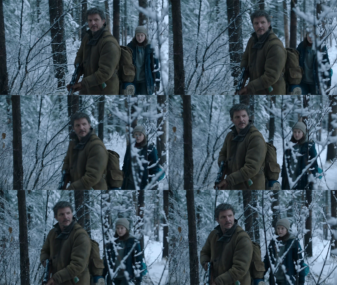

Once you know what scene you want to gif, you need to capture it. I usually download it through torrents (always 1080p, never under as tumblr tends to ruin the quality), buy them online (as a downloadable version), or with 4K Video Downloader (perfect for getting YouTube videos in 1080p), or screen capture to record them.
Since you can't put in a 45+ min video in Photoshop, you need to trim it down. I use Video Proc Converter (the full version also has a video downloader and a screen recorder!) to trim the video down to the clips I want. It also retains its resolution, too.
Then comes editing!
I primarily use these in PS:
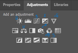
Once all my frames have been added, trimmed, timed, cropped, and converted to a Smart Object, the gif looks like this:

It's not bad, but it could be better! So, I always sharpen them next. I sharpen them twice with Smart Sharpen:
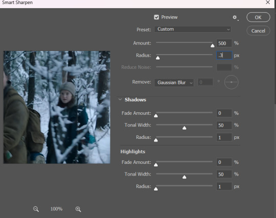
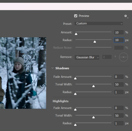
It looks like this now:

You can already see the difference!
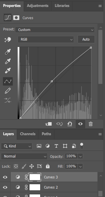
Next, I brighten the gif. I use Exposure, Brightness/Contrast, and Curves, and Levels (more so for gifs with heavy black). For this one, I used Exposure (+0.99), Brightness/Contrast (1 & 35), and Curves (I used the white eyedropper tool on the snow in the background - the whitest part of the gif), and then used the Line to add more brightness.
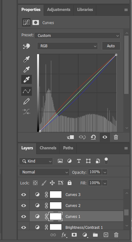
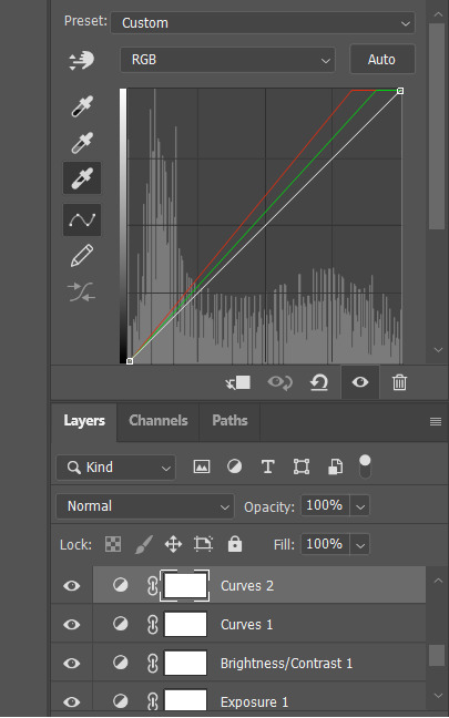
Now, my gif looks like this!
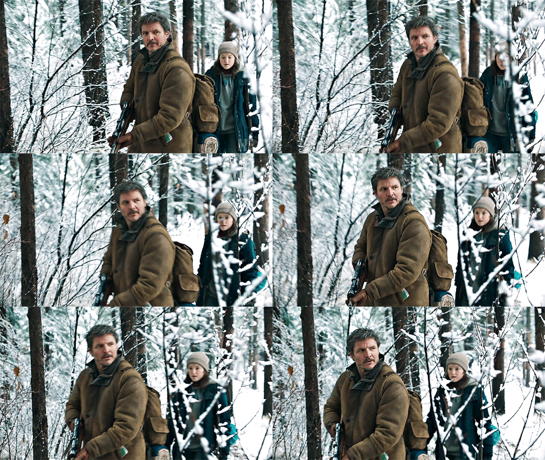
Next, I use Colour Balance I ALWAYS use this. There is no preset. You should play around with the colours to see which ones work for your gif. I rarely use Shadows, sometimes I use Highlights but I always just stick with Midtones.

I suggest playing around with this until you find something you like.
My gif with Colour Balance looks like this:

I then go into Selective Colour. For this one, you can try them out until you find what you like! I wanted to make the reds in the trees pop and make her rucksack a deeper blue, so I added:
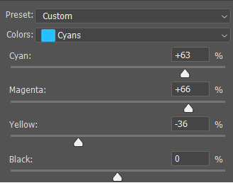
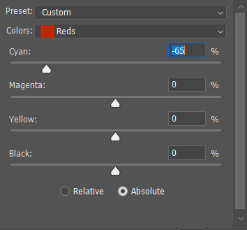
My gif looks like this:

And it's basically finished!!
If you want, you can add Vibrancy to make the colours pop (but is does saturate them so you might need another Colour Balance to even it out):
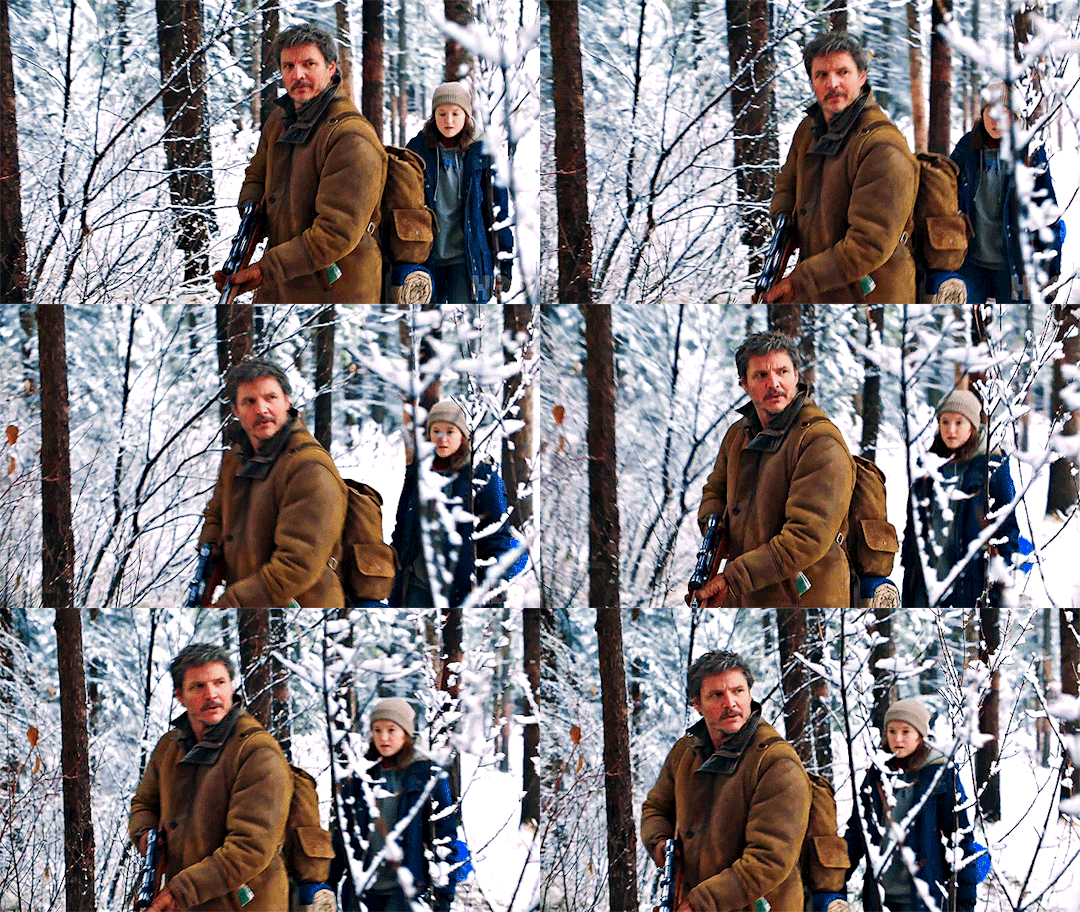
Since the red was pretty saturated and dark, I added Colour Balance to even the tones out.
Now my gif is finished!!!!
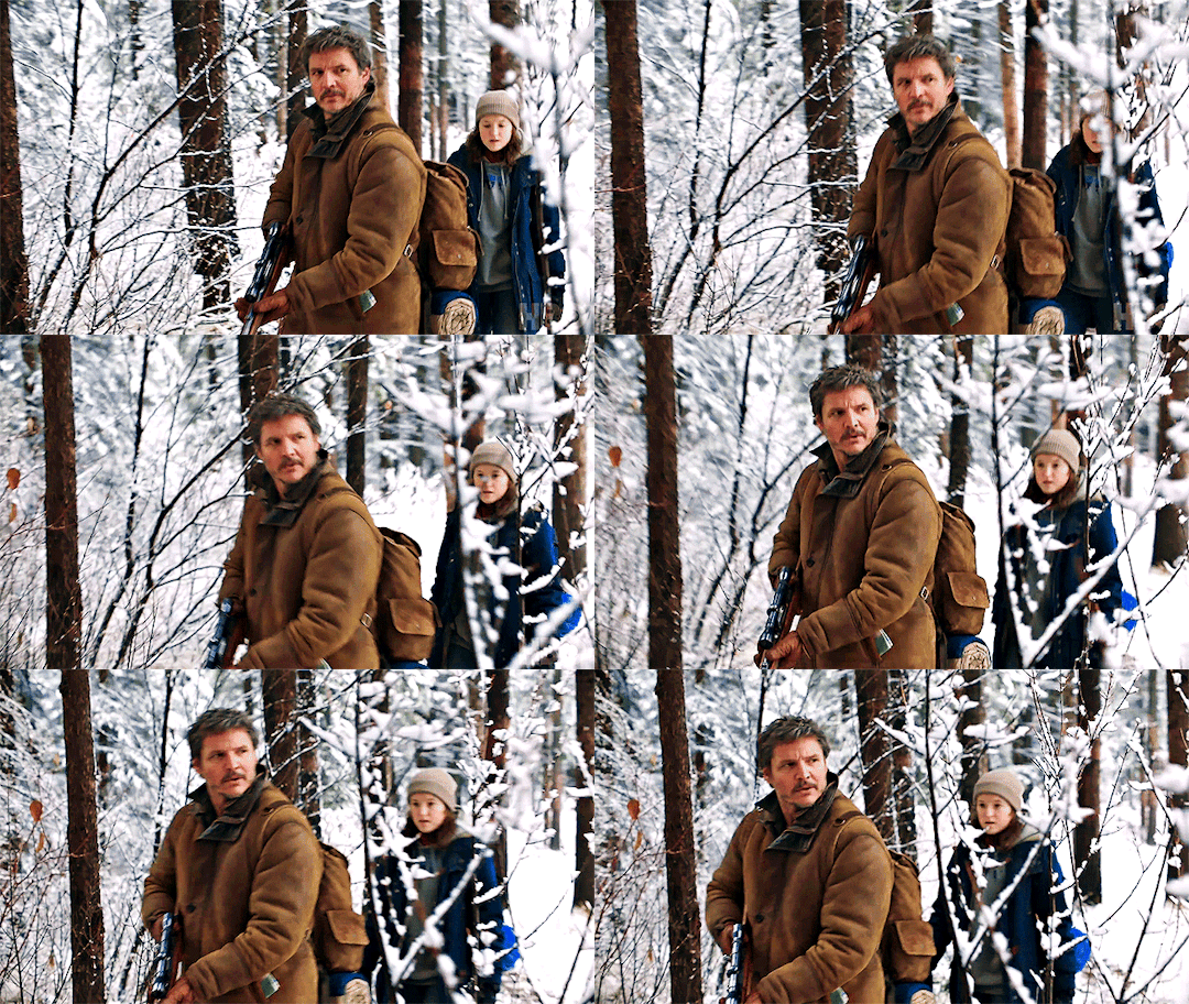
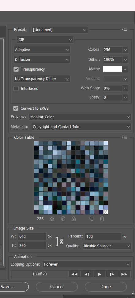
And these are the settings I use to save my gif:
#this isn't the best but it's the general idea of what i do!!!#i really hope this helps!!!!!!#gifmaking#gif tutorial#because of all the ugly gifs used i'm hesitant to tag this as tlou
37 notes
·
View notes
Photo


I was tagged by @minzbins to post a before and after coloring of my gifs! thanks for tagging me!
I always do my coloring from scratch just because I really like trying out different things in photoshop! lately my go-to tools have been curves, color balance and selective color. I’ve also been playing around with smart sharpen a lot!
I really enjoy trying to change the tone of a gif and pushing the coloring as far as I can go (without ruining the quality too much haha) so I’ll often play around with the background color or the overall tint of a clip. that’s why I like doing themed sets like a halloween series, it gives me an excuse to really play around with the coloring :)
tagging: @loversmore, @dreamaze, @starcatching, @kimtaegis, @wonjinist, @xuseokgyu, @skz-films and @charmerz <3 (feel free to ignore of course!)
#*tagged#I love when this tag game goes around <3#it's so cool seeing the different directions people take their gifs <3#and just how much time and effort people put into their coloring <333
17 notes
·
View notes
Note
how do you make your gifs?
i use photoshop :) and basically everything i do is a collection of tactics picked up from various tutorials. this is the tutorial i first followed, but i can give a brief overview of my current process (i can't tell if you're asking for a tutorial but i'll write one anyway) under the cut
first step is screen capping using kmplayer (free to download). screen capping is the best for high quality
open video file (always 1080p or better), scrub to the scene you want to gif (i'll use aotc. for fun)
right click for this menu:

make sure you have these settings:

by default, frames will go to the 'capture' folder, but i find it useful to make a unique folder for each gif i make to access it easier
click start and then play the video until the frames you want to gif have passed, stop frame extraction. simple enough
now, all the frames are in a folder and you can load them into photoshop
2. actually using photoshop
i always load my frames into a stack:
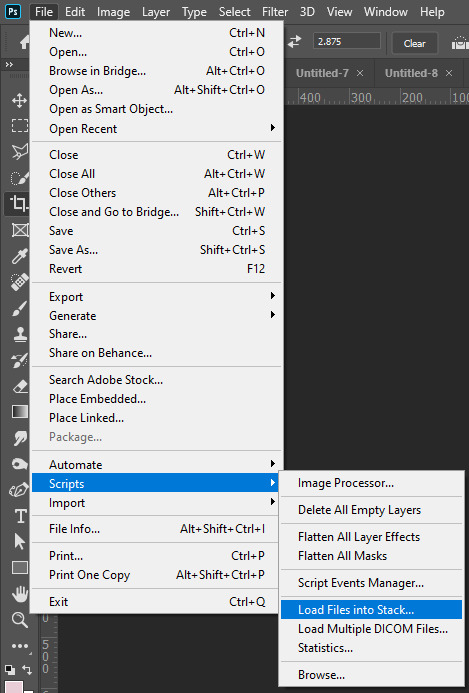
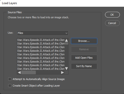
this takes a second, but i think it's worth it for high quality
with all layers selected, switch from the 'video' timeline to the frame-by-frame timeline, using the icon in the bottom left corner of the window
from:
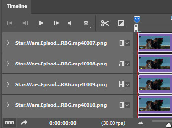
to:

right now, all the frames are in the opposite order. go to the three bars in the upper right hand corner of the timeline
first, make frames from layers

then, select all frames (again using the three horizontal lines in the top right). finally, reverse the frames.
3. cropping, timing, image size
this is the step where you have to do all three.
cropping: you can crop however you want, but i usually use the photoshop presets like 16x9. just make sure all your layers are still selected.

it's also important to trim any frames that are extraneous or you don't want. for tumblr, i try to aim for at least less than 50 frames on any given gif. ~30 is what i prefer
timing: most people put gifs at a delay of 0.05 sec. between frames. with all FRAMES selected, click the drop down at the bottom of any frame, change the delay as you please (Custom delay)

image size: every post on the tumblr dashboard is 540px wide. when making gifsets, this is important to consider
with everything still selected, go Image -> Image Size... (ctrl+alt+i on pc)

from there, you could export and have a gif appropriate for tumblr, but you probably still want to do some coloring.
here's my gif with NO coloring:
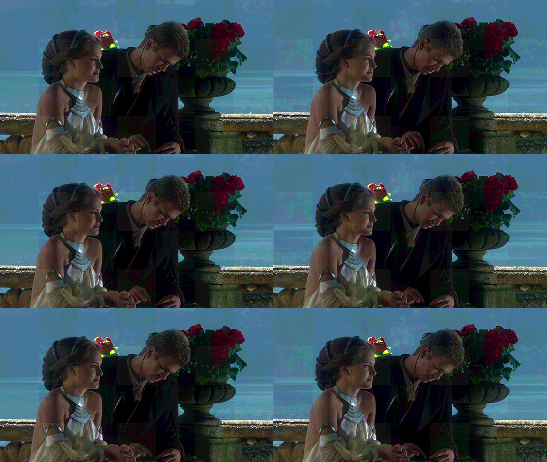
4. sharpening & coloring
everything after this part is pretty subjective in terms of what's "best" to do. this is just my method!!
to color, i convert my frames into a smart object. with everything selected (frames and layers), i switch to the video timeline again
then Filter -> Convert for Smart Filters. now every frame is condensed into one layer! yay!
i have a sharpening action, but it's just Filter -> Sharpen -> Smart Sharpen...
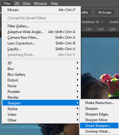
with these basic settings:
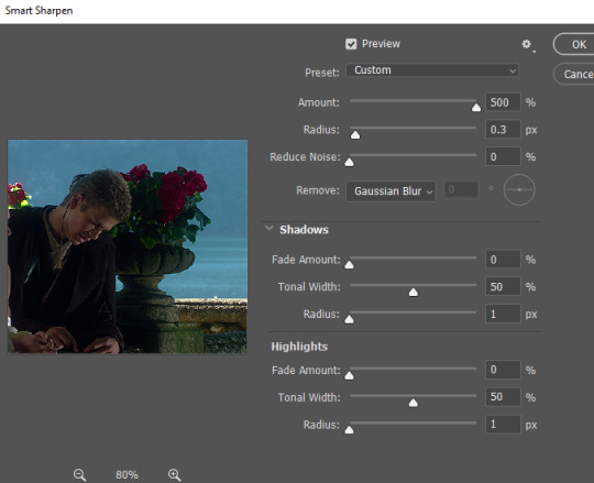
you can play around with these settings, though (FOR ANIMATION: set the opacity of this layer to ~30-40%). oversharpened gifs look low quality and unsharpened gifs look fuzzy
coloring is where you really get to have fun!! generally, my basic goal with any coloring layers is to brighten and balance colors.
go to the Adjustments windows and add a curves layer.

selecting white and black points (if they exist) with the eyedroppers can help balance colors AND brighten the gif

gif now:

next, i use a Levels layer to add contrast
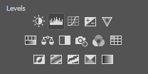
you can use white/black/grey points again, but i usually don't.

the left box can be from anywhere ~10-25 and the middle ~1.0-1.5
with levels:

from there, i use Color Balance and Selective Color layers to alter anything else.
in this gif, i think the midtones are too yellow, so i'll change that with a color balance layer. i'd also recommend playing with the shadow tones to shift the overall tone of the gif. never go too extreme with these values, it ruins quality
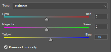
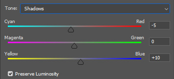
with these settings:
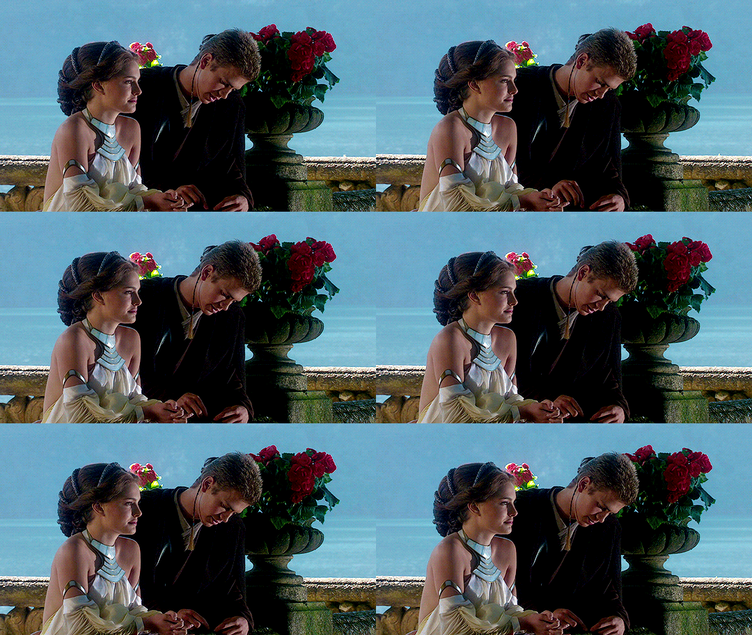
after that, i adjust any layers as needed!
5. caption (worst part)
add a layer of text, the box should span the entire gif:

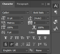

then, i use a stroke and drop shadow (triple click on text layer for blending options):

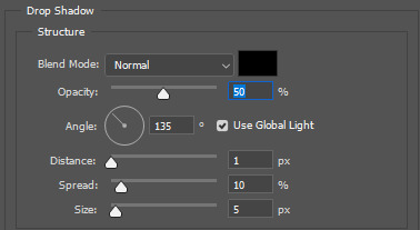
but, again, this is all up to you.
6: export
here are the settings i'm gonna use (File -> Save for Web):
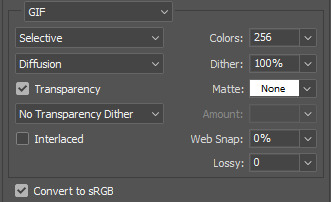
finished gif:
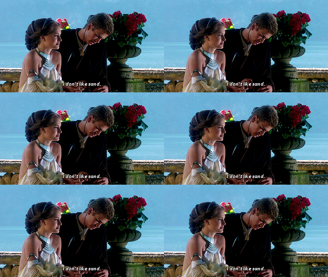
6 notes
·
View notes
Photo
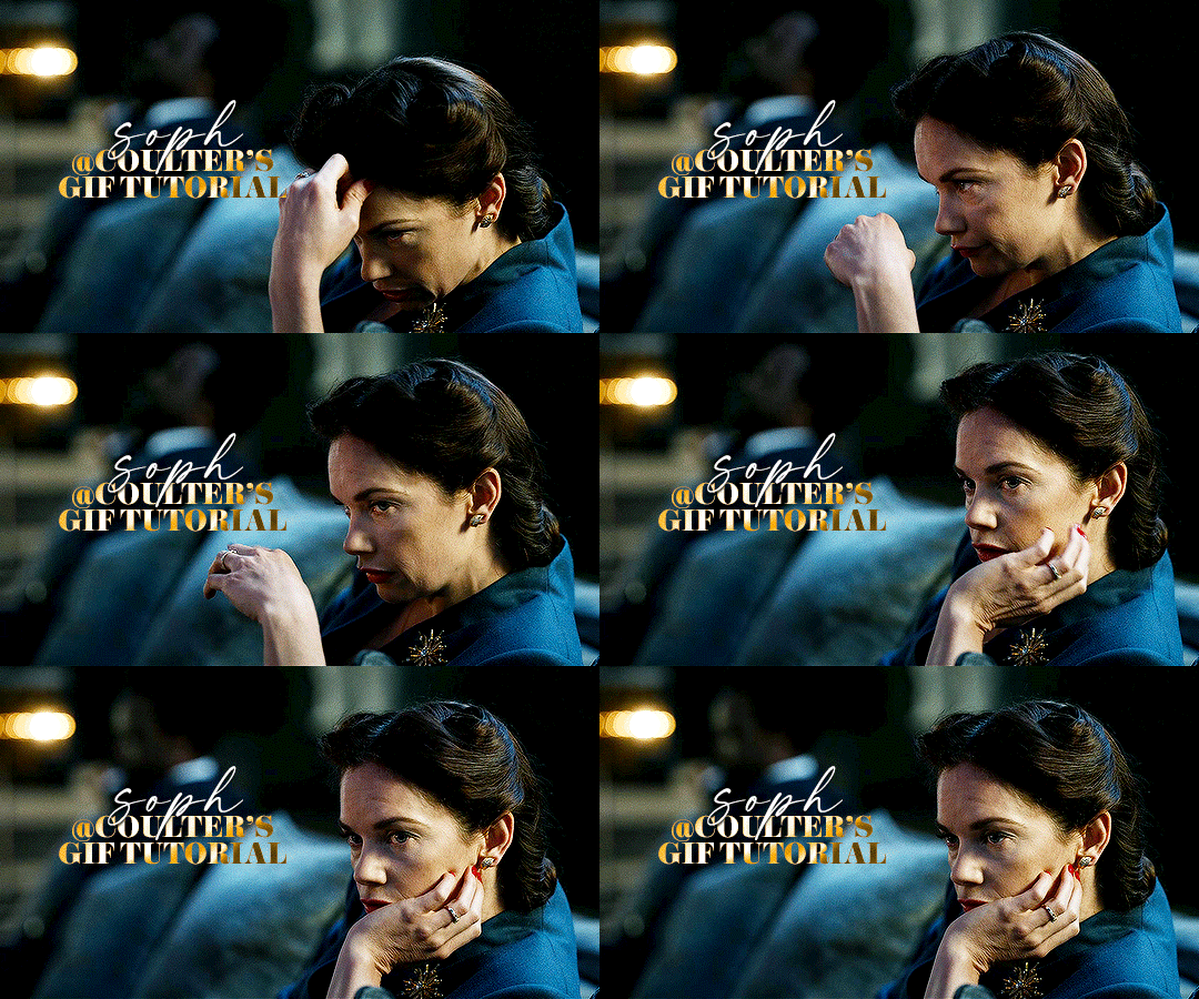
Hello! As requested, here is a tutorial on how I make my gifs. I would like to preface this by saying there are many ways to make gifs, and there’s no right or wrong answer imo. This is just how I personally go about doing so!
I will be using PS CC 2017, but as long as you have the video timeline option, it shouldn’t matter too much; on any version of PS, you should be able to adapt anything I mention here! You will also need some kind of screen recording software. I’ll talk a little more about that under the cut.
To start, you need the source material you will be making the gifs from! I get mine from snahp(.)it (avoiding links so tumblr hopefully doesn’t banish this from the tags lmao) and I always opt for either 1080p or 2160p. Not all laptops will support 2160p as it’s 4K, but either works great! You just want your gifs to be the best quality possible.
Next is where the screen recording comes in. I don’t use the screencapping method to make my gifs (where you use a program to cap a clip and then load those caps into a stack in PS). This isn’t for any particular reason… it’s just how my friends, (who very kindly taught me to gif), had always done it, so it’s now how I do it too. Personally, I find the quality to be just as good as the screencapping method, and have never noticed a difference between the two.
As I have a PC, I use the software built into it for screen-recording. If you go here: theverge(.)com/2020/4/21/21222533/record-screen-pc-windows-laptop-xbox-game-bar-how-to – you can see how to use the XBOX screenrecorder to record from files you have d*wnloaded. This also works on some streaming sites, but I think it depends on what browser you use. Personally, I recommend Firefox, as that seems to bypass a lot of the blocking and ads that occur when trying to do this sort of thing.
For MAC users, I have been told handbrake works well, as it converts MKV files to MP4, which can then be used to make gifs. You only need to convert part of the file to MP4 depending on how much you want to gif, and this also bypasses the screenrecording stage, as you can edit MP4 clips on Quicktime. I am told you can split them into smaller clips by going to edit > trim and it saves the new clip!
I have also used anyvideoconverter for small clips, but I can’t say what it does to the quality of your video, or how big of a file it lets you put in! With the XBOX screenrecorder, it doesn’t matter what type of video files you get, as the recording will save to MP4 anyway.
LOADING YOUR FRAMES
Now, go ahead and record whatever clips you want to gif. Make sure you have the video timeline open, by going to window > timeline. Then, go to file > import > video frames to layers.
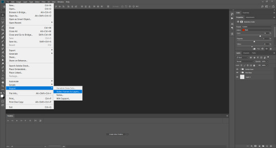
Next, select and open your clip from where it has saved (with the XBOX recorder, it saves in video > captures). You should see a little window pop up, where you can move the sliders back and forth to clip your recording to whichever part(s) you specifically want to gif. I recommend trying not to load a lot of frames into photoshop at once, but I would be a hypocrite to say that, since I do it a lot lmao. Just be patient if you do!
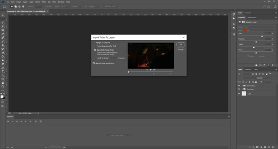
Once you have chosen the length, click okay. Never, EVER, I repeat NEVER click the button that says “limit to every __ frames”. This really ruins the flow and quality of your gif—it’s better to have shorter, but smoother gifs, I promise. And with tumblr’s new 10 MB limit, it shouldn’t be a problem anyway!
Then, your frames should open up. What we want to do is make them into a smart object, so we can edit all the layers at the same time. To do this, click the small button in the left-hand corner. ALWAYS click this first. If you don’t, it will only convert the first frame to a smart object and the gif won’t work.

Give it a second to sort itself out, then, on the right-hand side, select all your frames at once using the shift key.
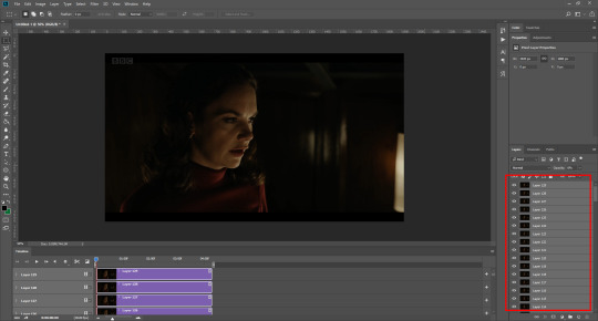
Then, go to filter > convert for smart filters. This might take a minute. Don’t click anything else in case PS gets angry lmao, just leave it for a second and it’ll do its thing. The more frames you have, the longer it takes! Now we have our gif, but it needs to be cropped, sharpened and coloured!
CROPPING
You want to start by selecting the rectangular marquee tool on the left-hand side, then drag it across by clicking and highlighting the area you would like to crop your gif to, like so:
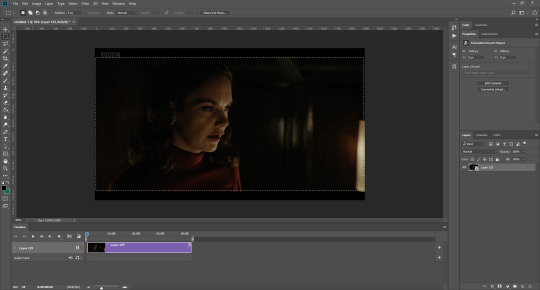
What I tend to do is select everything inside the black lines you sometimes get around your gif (this depends on what file you d*wnload), and also the tiniest bit inside the sides. This is because I’ve found if you crop it right up to the edge, you get a tiny bit of transparency on the sides of your gifs, which I’d rather avoid.
Once you have your desired selection, go to image > crop. Now, the dimensions for tumblr are 540px width, so all your gifs have to be that width. However, the length is up to you. I really like big gifs, so sometimes I even make a full square, or even longer. It’s entirely up to you, and what kind of set you want to make.
For the purposes of this gif, I will stick to what I usually go for, 540px by 350 px. This will mean you’ll have to crop some width off, but that’s okay, since Marisa isn’t central anyway. The cropping is always trial and error for me, as sometimes people move out of the frame within in the gif. The best thing to do is just try it, and then move the slider in the timeline window at the bottom to see if the person stays inside the gif, and if not, adjust accordingly.
Next, go to image > image size:
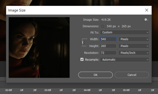
In this box, if I put the width as 540, the gif is a smaller height than I want, as it keeps to the dimensions of the gif when you load it into PS. That’s okay, just put the height you want instead, and we’ll crop off the excess.
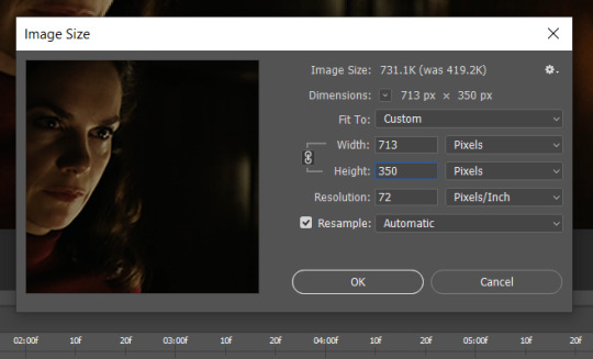
Then click OK. Using the rectangular marquee tool again, we need to remove the excess width. Part of the reason I like this version of PS is that it tells you the width of your selection as you do it, but you can always use the ruler as a guide, and check the size of your image by going to image > image size again.
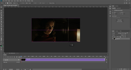

Again, use image > crop, and your gif should now be the correct size!
You can also use the crop tool in the timeline window to crop the length of your gif:
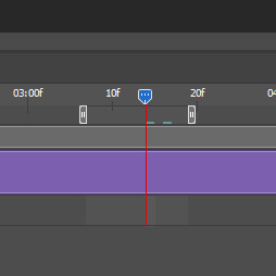
However, I tend to wait until later on to do this (which will be explained further down!)
SHARPENING
Next you want to go to filter > sharpen > smart sharpen.
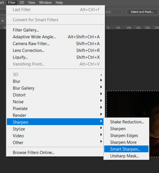
These are my settings. However, 0.4px is very sharp, too much so, but that’s easily fixed.
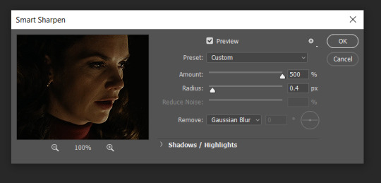
Go to filter > blur > Gaussian blur and then set it to 1.0.
Now on the right-hand side, we need to reduce the blur, so double click the little adjustment button, and change the opacity of the blur. I usually go for 20-30%!

Then click OK, and that’s your sharpening done!
COLOURING
I picked this scene on purpose as it’s dark, so good for showing how to colour a gif. I have a base psd which consists of some very basic adjustments, but it mostly exists so I don’t forget what adjustment layers I like to use. I adjust them every time I make a gif, essentially colouring each gif from scratch.
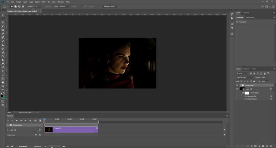
In this case, the psd actually makes it darker. So, what I will do is turn each layer off, and adjust as I go. A lot of people say using lots of adjustment layers ruins the quality of your gif… I have never found this to be true, as long as you are gentle with them. If you whack the brightness right up to the top, it’s going to ruin your gif no matter if you use 1 adjustment layer or 100. I would just say use your common sense, and adjust a little at a time!
I start with a simple black to white gradient map set to soft light, because I think it helps you see depth once you add some brightness to it. I usually do this on about 10%, or more if needed. It’s probably unnecessary, I just like how it looks!
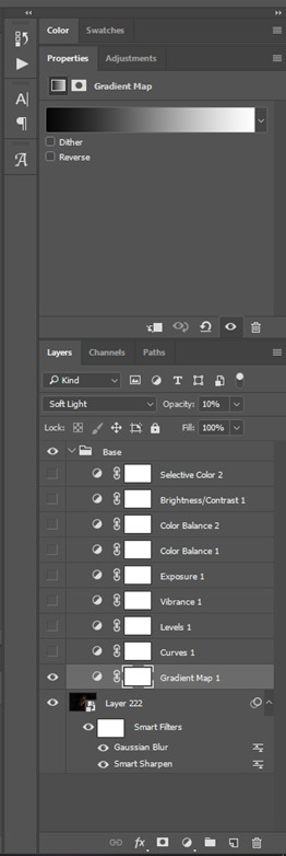
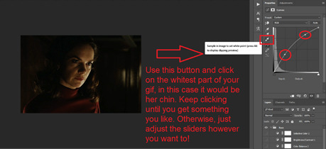
Then, I move onto using curves and levels. This is where things can diverge depending on who you’re colouring. If this person is white, it doesn’t matter too much. If they’re not white, you don’t want to white wash them. My best advice is to play around with it. By adding vibrance and other (usually the red) selective colour settings later, you can ensure you don’t change the person’s skin tone from what it originally was. You can also use layer masks at varying opacities (various shades of grey), on your curves and levels, to remove some brightening so that you’re not changing anyone’s skin colour. Just brighten slowly and check in with yourself honestly about how your gif looks.
Some people don’t like using levels, or curves. It’s completely up to you. I tend to use both because levels are good for bringing depth, even if not brightening (though I like to use them for that as well).
One thing you can do is use the white point of the gif to make PS adjust the curves itself, however I like to drag the sliders myself and see what it looks like. Just make sure it’s not too bright, as we will be using further layers to brighten more, after.
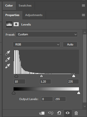
Next is levels. The slider on the left controls the black point, the one in the middle controls the midtones, and the one on the right controls the white points. The black brings depth, the midtones adjust the overall brightness, and the white points produce stronger highlights. Again, you’ll get a feel for how this works as you practice. Just don’t use the white point excessively, especially if your characters are not white.
Then I add vibrance (+20!), because we’ve removed a lot of it when lightening the gif. Next is exposure, which I find brings out the highlight and shadow areas more effectively:

Then colour balance! This helps with scenes that might be a certain colour, i.e. too blue, too green, too red, etc. Moving the sliders in the opposite direction of the colour your gif is will counteract it. The best thing to do when accounting for different colours, is to make a new layer every time you change colour, so that you don’t get confused. I always add a new layer for colour balance and selective colour if I want to change more than one thing. So one for red, one for yellow, one for pink, etc.
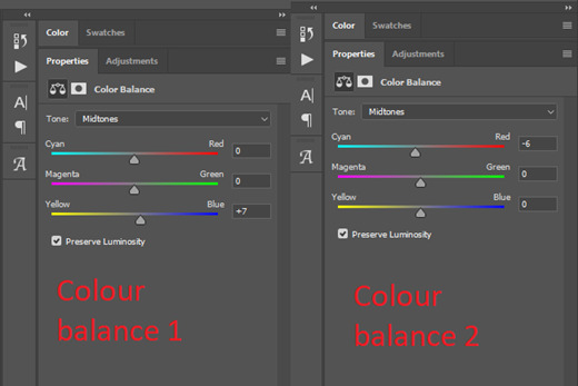
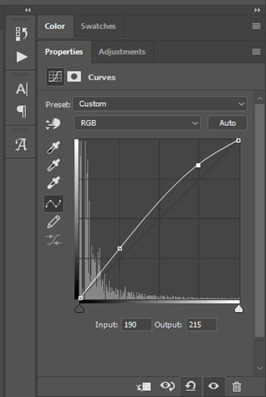
A layer of brightness just to make the gif pop, and because the scene is extra dark, I added a very gentle extra curves layer:
SAVING YOUR GIF
Time to save the gif. You can go ahead and file > export > save for web (legacy) now, but then you’ll have to reopen the gif to reset the frame rate from 0.07, to 0.05. Instead of doing that, I use a modified action. The original was made by the very talented @elenafisher! So I do not take credit for that at all. You can find the original here: elenafisher(.)tumblr(.)com/post/190817437374/gif-sharpening-action-2-preview-download and in my resources tag. Please reblog it if you’re going to use this!
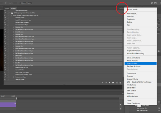
To use an action, first make sure you have actions turned on in window > actions. To load in your action, go to the little lines circled, and then load the action from your downloads:
Obviously if you don’t want to sharpen your gifs yourself, you can use the action as it is, and it will give you a beautiful glowing effect. If you’d just like to use it to flatten your gif into frames like I do, make sure to take out all the items I have highlighted:
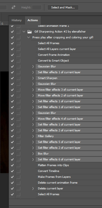
Until it looks like this!
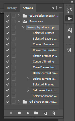
Make sure you have the layer under the file name highlighted, and then click the play button at the bottom! (If you get a screen saying select all frames cannot be found, don’t worry, just click continue!) You can delete the layer that does that if you want, I just keep it in case I realise I’ve forgotten to do something, because you can click cancel and edit your gif before you flatten it. Of course you can undo the steps to get back to the smart object version of your gif, it just takes longer!
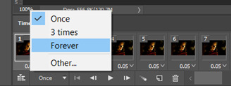
And now your gif is in frames and set to 0.05 already, so you don’t have to change the speed! All you need to do now before saving is change the gif cycle to “forever” in the bottom left-hand corner:
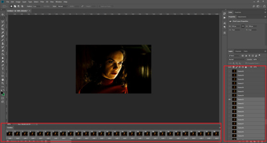
Then to save the gif go to file > export > save for web (legacy). Sometimes, the gif is bigger than the tumblr 10MB limit. You’ll be able to see this in the bottom left-hand corner of the gif save settings. If this is the case, I like to preview the gif, to see whether it would be best to cut frames off of the beginning or the end, or both. When you’ve decided, you can select the frames at the bottom, and in the right-hand side panel, and delete them both using the little bins/trash icons.
I keep checking and deleting frames until I get the gif under 10 MB! Just don’t delete frames from the middle, as then you’ll have the same issue as if you selected “every other frame” when making the gif: it won’t flow!
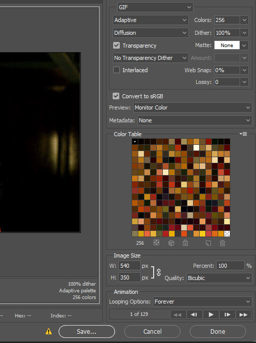
Lastly, these are my save settings:
So that’s it! That’s how I make all my gifs. Blending I do when the gifs are in the grouped, smart filter stage, whereas text I add on during the framing section above! Really hope this is helpful, please feel free to ask any questions you may have! 💖
#gif tutorial#tutorial*#completeresources#yeahps#chaoticresources#allresources#mikesmom#usergeo#userava#usertix#usersmile#usertom#if you'd like me to cover anything more advanced just shout#i wanted to show how i add text too but tumblr wouldn't let me add any more pics#but people can let me know if that's something you'd want!
516 notes
·
View notes
Note
Helloooo! I’ve been really loving your Star Wars edits (especially the ones of Rogue One/Diego Luna) <33 Thank you for the content! I wanted to ask, do you have any tips on managing a Tumblr & making edits? I’m planning to maybe post things like gifsets to start my blog :)) I’m new to Tumblr but I really wanna connect with the community so I’m taking all the advice I can get :>> Thanks in advance!
hello there! first, welcome to tumblr and thank you for the kind compliment! it's so exciting that you'll be making new content! and I'd be happy to share some tips under the cut :)
tips for your mental wellness: - set boundaries for yourself and your blog. tumblr should be a safe and happy place for YOU, so it's completely valid for you to make clear what you will and won't post about - as soon as creating feels like a chore, take a step back. it's easier said than done, but try not to feel the too-common pressure to constantly produce content - be selective with who you follow — don't let the bad apples ruin your experience here - don't feel bad about blocking someone! if they make you feel uncomfy in any way (or if they're stealing your creations), block 'em!
tips for managing your blog: - create a tagging system! this keeps your content organized and help your followers filter things like potential triggers - use the queue to keep your blog active even when you're offline! I currently have mine running to post 5 times a day between 6am-11pm (US/Pacific time). currently, tbobf is increasing the amount of new content — but I usually have it set to 3 times a day between 8am-12am when there's less new content - make a tracking tag so people can show you stuff they've made! generally, people use the #username format (like mine is #usernik) — but you can make yours whatever you want. put it in your blog description so people can see it when they visit your blog! (and again, be clear about what you don't want to be tagged in — I do this in my about/nav page)
tips for tumblr etiquette: - when applicable, ALWAYS link inspo in your caption! there are so many talented creators on this site who spend hours making gifs/edits — and it sucks when you see someone recreate your idea without linking back to what inspired them - if you "like" something, reblog it too! that's how we show support to fellow creators and increase their visibility - don't be rude in your tag commentary. no one wants to see #i love everyone in this set except [character name] - be kind and respect other people's boundaries! - post replies under a gifset aren't for conversations with friends, so use DMs instead - tag potential triggers to keep your followers safe! and if someone asks you to tag a trigger, be respectful and don't invalidate them - and of course, always reblog and never repost. even if you put an image source link under, the creator would prefer a reblog
tips for making edits/gifs: - use the highest quality files you can find. when I can, I always use 2160p files for gifs (aka 4K). if I can't get 4K, then I'll do 1080p with the biggest file size I can find. here's a helpful tutorial! - I use photoshop, but I know there are other software people use to make gifs. find what works for you! - here's a basic gifmaking tutorial! (I also love their sharpening action) - my ideal gif speed is 0.05 sec. this is a preference but 0.05 is pretty standard with most gifmakers I know! I sometimes use a faster speed when giffing video games like JFO - put photography credits in your caption if you edit photoshoots! - the file size limit for gifs is 10mb (more info here) and the maximum width is 540px (here's a guide on image dimensions!). also, the gutter size is 4px - establish a creations tag and link it in your blog description. for example, my creations tag is #myedit* - how to get your creations seen: tag other people in your fandom (most people love to be tagged, but you can always check with them if it's ok!), tag appropriate source blogs (for star wars creations, you can tag #starwarsblr — or for diego luna creations, you could tag #diegolunasource), tag appropriate edit tags (for example, #swedit for star wars)
tips for connecting with people in your fandom: - leave nice comments in the tags of your reblog! most friendships or follow-backs I've made have started with super kind tags in reblogs of my sets :') - see if there's a discord server you can join to connect with people who love what you love! I'm part of a few servers for creators and one with some of my mando friends <3 - again, tag people in your gifsets! - apply to source blogs and networks to be part of a group of like-minded people in your fandom! - start a conversation in DMs! or if you're feeling shy, you can submit an ask with one of those "chain mail" things like "send this ask to 5 people you follow to brighten their day" - make an about page! this will help other people get to know you and the things you love! but of course, be safe and don't give away info that could put you at risk!
I hope this helps! and again, welcome to tumblr!
#@everyone: feel free to add tips in the replies!#rogue-wan-kenobi#ask#tumblr help#tutorial#photoshop help#nik.help#resource
10 notes
·
View notes
Note
hey i'm sorry if this is annoying but can you give some pointers on how you make such a good hq gifs? they are so pretty
hi anon!! it's not annoying at all! i'm happy to share my tips!!
first, i make sure that all my footage is in high quality. i try to get everything in 1080p. i know some people use 720p, and i've used it too when i was unable to find a higher quality, and the gifs look absolutely, but i prefer to work with 1080p, especially when i'm making gifs sized 268px. i know nowadays it's easy to find footage at 2160p but i don't think it's necessary when it comes to gifing. please keep in mind that the higher the quaility, bigger the size, and it might slow down your gif making process.
secondly, once you have everything open in photoshop and you have resized your clip to fit the size of your gif, you must sharpen all the frames. there're different process and depending on who you ask they might give you different answers. i think it's more of a trial and error thing and you might need to try different sharpening sets to fit your style and your gif. there are also tons of sharpening actions here on tumblr that might help you out! here are the ones i've used or that have been recommended by friends/others creators: one, two, three, four.
and finally, i always try to not go too overboard with the coloring. sometimes when i try to fix the lightning or some colors i end up messing up the whole gif, so try to use a base coloring and then go from there. if the gif is too saturated, you might ruin the quality of it.
5 notes
·
View notes
Note
hi! sorry if this is a bother but i was wondering how do u make your gifs? they’re always so pretty 🥺🥺
hiii anon!!! aaaah thank you thank you!!!! its not a bother at all! honestly most of its self taught bc i play around with the way i gif quite often to see what i like or try something new, but i'm really happy with the way they look over the past couple of months!
so firstly, i always make sure the video source i'm using is atleast 1080p. 4K is The Dream to gif with, but it has to be atleast 1080p.
next, i choose my scenes to gif. overtime i've come to realise that when i'm making gifs of scenes, i like the set to be based around the same type of angle. that gives your set consistency and makes it look a lot more cohesive and pretty too. so i'll only use closer zoomed in shots if i want, or only far away panoramic style shots if i want. i try not to mix the 2 up into 1 set, unless i'm making a series of gifsets per episode of a show, then i'll do it in a pattern of like, far away shot gif - zoomed in shot gif - far away shot gif - zoomed in shot gif - far away shot gif. or sometimes it'll be in a pattern of faceless - with a face - faceless - with a face - faceless. or switching it up between 2 colours, so colour 1 - colour 2 - colour 1 - colour 2 - colour 1. basically, i like it to look cohesive and neat and symettrical in that sense.
so once i know what shots i'll be using, i resize and sharpen my gifs using vapoursynth. i've been Loving big gifs for quite sometime now, idk they just ... look nicer to me for some reason? so i size my gifs depending on how i'm feeling. if its a gifset of 6 gifs or more, i go with 540x400, 5-6 gifs is 540x425, sets of 4 are 540x450, and anything less, i'll experiment between 540x500 or 540x550. sometimes i like 540x600 too! so it all depends.
and i decide on my sharpening based on the size of my gifs and quality of my video. so it'll start from like 2.0 or 2.2 for the smaller gifs, and i bump it up the bigger it goes. if my gifs are 540x550, i'll sharpen at 3.5, for example. i don't use any denoise or preprocessors, and i bump my opacity up to 100, always.
then, finally, i colour in photoshop! recently ive been liking my gifs to look more natural, if that makes sense. i just like enhancing them. so i play around with selective colour and colour balancing mainly, and adjust the brightness and vibrance until i'm happy with it. what i will also say here is do not do not do not skip frames!!! that ruins your smoothness and flow of the gifs. and i set my gif speed at a frame rate of 0.3 or 0.4, just because personally i like my gifs to move faster.
and thats it! i hope that helps!
13 notes
·
View notes
Text
Poster Gif Tutorial
I’ve had some inquiries on how to make my poster gifs so I thought I’d try to make a tutorial. For sake of simplicity this tutorial assumes the reader has basic knowledge of photoshop and knows how to make a basic gif. Here’s the final result of what I’ll be making today:

First step load in your gif and start it as you would normally. Before you do any sort of formatting at all you’ll want to find your overlay poster because the poster will be the base for how you’ll make all your decisions. Google images will work fine but make sure the poster is of really nice quality. A tiny little 240x500 isn’t going to work. It’s best to find one with a shape you can cut out for a more dynamic work. This is my base gif and my overlay poster.


You’ll just want to load that puppy in over your gif already in progress. Make sure it’s the top layer so it goes over all the frames. Resize the poster so its vaguely in the place you think you’ll want it compared to the image in your gif. I use free transform for this so I can get the poster looking exactly how I want. It’s ok if you have to move the poster around or change the size later on. Just remember making it bigger later will make it lower quality so always try to shrink rather than expand.

TWO IMPORTANT BEFORE YOU DO ANYTHING ELSE: 1) Crop the image so the entire poster is visible. Otherwise you may lose part of the poster while messing with other crops and options. 2) make sure to click all the unify layer options so the poster retains the same changes on all frames.


Now because you’ve done all that it’s ok to mess with the position or size of the poster if things don’t look quite right. From here you’ll need to cut out the part of the poster you want to remove to see the gif. I like to use the lasso tools, but whatever you use to select different parts of your work will be fine. In this case I’m taking out the butterfly image so i can have an interesting shape for the gif within the image. For this particular one I also used the feather option in the select menu because it makes the cuts look smoother and more natural to the poster.


Next you’ll want to crop to the size of the poster so you can resize the image. Not too hard just crop as you would any other gif. Just make sure to cut it so no gif is visible outside of the poster as it will ruin the illusion.

No you should be able to resize, sharpen, and color how you want just like any other gif. The below step is resized, sharpened, and I’ve just started to color.

And there you are! You’ve got a poster gif!

Now things will change based on how much of the poster you’re removing and all that but those are the basic steps. I’m bad at explaining things but I’m always open to other questions if there’s something you need better explained.
#tutorial#gif tutorial#tools#jokerclown#this is part of the set i'm making right now#sneaking a peak
55 notes
·
View notes
Note
Hey Sameera! I absolutely adore your gifs and I would be eternally grateful if you could help me out with an issue I’ve been having for years... My sharpening and gif saving settings are the same as all my gifmaker friends’ but the saved gifs are still always blurry. My only idea is the way I load the frames? I use CC2019 and I load video frames to layers, could that ruin the quality? How do you load the frames into PS and with what settings? I feel totally hopeless and broken hearted 💔
hey! wow, i’m really sorry you’re having that issue :( i also load video frames to layers in photoshop, so check out this tutorial i posted detailing how i sharpen and load my frames, and hopefully that will help you out! let me know if that fixes your problem❤️
2 notes
·
View notes
Text
THE 100 GIF/COLORING TIPS
Okay, so I know nobody asked for this lmao but I’ve seen a lot of people complaining about the lighting on The 100 (which is completely understandable since it’s very bad.) And even though I’m not at all a pro, I’ve been giffing this show for awhile and I’ve found out some stuff that might be useful for other The 100 gifmakers out there.
Please reblog/like this if you save anything from this tutorial or if it helps you at all :)
WHAT YOU NEED
Photoshop (I use CS5).
General knowledge on giffing.
Patience because The 100 is a hard show to color.
COLORING PREVIEW

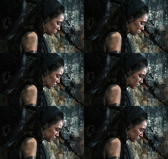
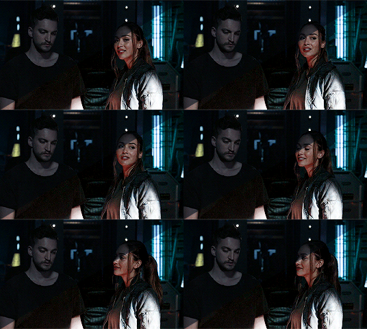
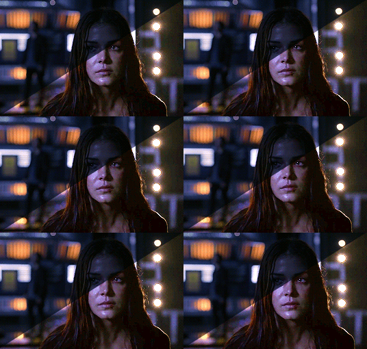
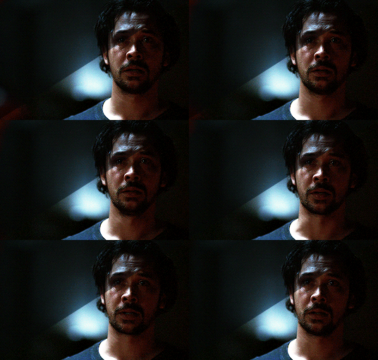
WARNING: This is very long. Everything starts under the cut!
GENERAL GIFFING TIPS
Get 1080p/720p downloads. Since The 100 is already a very dark and grainy show, anything lower will ruin the gifs’ quality.
Make sure you have cropped the gifs to the proper Tumblr size. Click here for reference. And get rid of the network logo when you’re cropping it! It always looks better without it.
Sharpen your gifs! I don’t see any reason why you shouldn’t. Sharpening your gifs will make it look more HD and show off your coloring better. My sharpening is a smart sharpen with these settings. You can go here if you want to experiment with other actions/settings, though.
Do not have any skipping frames. Please. Your gif will look sloppy and won’t be as smooth, therefore ruining the quality of it.
Make sure you have the gif timing right. I usually go for 0.05 seconds because personally I think it looks best, but I’ve seen some who went with 0.04s or 0.07s and that also works well. Go for 0.05s! I realized now other time settings doesnt work as well as 0.05s especially with The 100.
Save settings. My usual go-to settings are these. Though sometimes I went for selective instead of adaptive and it looks okay, too! :)
+ extras: subtitle!
The font you use for subtitles on your gif will also affect the way your gif looks. Fonts that are too big or too small will make it look less HQ, but having the right font with the right size (and the right position!) will make it look good. Here are some text settings you can use that I’ve found: [ one / two / three ]
COLORING TIPS
Now that you’ve kind of gotten the general giffing tips, I’ve listed out some coloring tips that I found out specifically for The 100. All PSDs will be linked at the end of this post.
Adjust your brightness before anything else.
The 100 is generally very dark, but even with scenes that are already not too-dark, you’re still gonna want to adjust the brightness so you can work on the colors better. I’ll go detailed with this one. We’ll be working on 3 scenes, bright, neutral, and dark scenes.
1. BRIGHT/YELLOW
For this one, I used a scene of Clarke from Season 5.
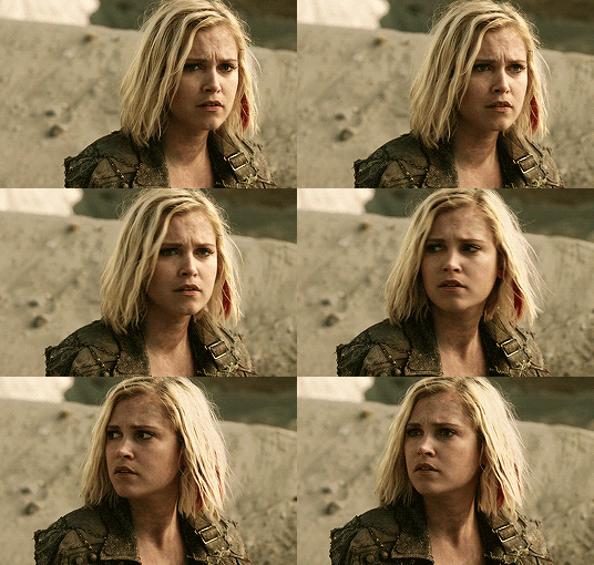
The scene is already very bright, so what we’re gonna do here is to adjust it so it’ll look prettier without being too bright that it hurts our eyes. First let’s do curves. I added two curves layer, the first one is to add just the tiniest bit more brightness to her face, and the second one is to darken the background. and then I’m gonna add brightness and levels for contrast:
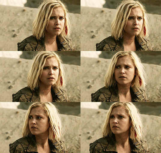
Alright, now that I’m already happy with the brightness, I’m gonna go and adjust the color. This is too yellow for me, so I’m gonna add a color balance layer to and pull up the blues/cyans/magentas

That’s good, but it’s too desaturated. I’m gonna go and add selective layer to make the colors pop up. I adjusted the red, yellow, and neutral and I got this:

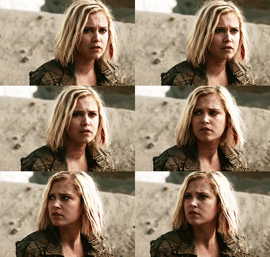
Now this looks great already! Unfortunately, I’m annoying so I have to add more adjustments lmao. This is the final result after being added with an extra brightness layer and a gradient map on luminousity.
2. NEUTRAL
For this one, I’m gonna use a scene of Lexa (reshop heda you’ll always be missed) from Season 2. It’s not very bright but it’s also not too dark.
Now the tips with scenes with enough clarity (doesn’t have to be super bright, but if you can still see things clearly) like this one, clicking the ‘auto’ button on curves saves a whole lot of time. I did so and this is what I have in result:

The auto curves will usually brighten the gif and balance the color on it. Often times you still have to adjust it again. But still this will save a lot of time. I added some more brightness and levels before adding color balance and selective colors layer, and here’s the final gif:
Keep in mind that this will only work with some scenes. This will work alright with the Clarke gif above, but it definitely won’t with this next gif we’ll be coloring.
3. DARK/BLUE
Okay now this one requires some work. I chose Octavia’s scene from the Season 6 trailer.
The original sharpened gif (notice that I got rid of the logo! It’s really annoying for me so I always find a way to get rid of it.)
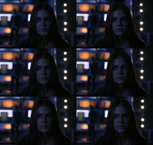
It’s reaally dark. So let’s start with brightening it up a little. I added curves, brightness, levels and more brightness because it was still dark as hell:

Now, you may think it’s already bright enough, but for me personally I can still make it brighter, so I added exposure. With dark scenes exposure works really well. But you have to take it easy with this layer since it affects the gif drastically with very minimal effort. I also added a black and white Gradient Map layer that I always set to luminousity:
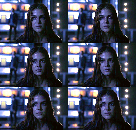
Now it’s time to go and adjust the hell out of the color balance to make it less blue! I also added an extra selective colors layer to make the reds pop out and get rid of the pixelated/grainy blacks on her hair. After that I added another brightness layer. Here’s my final result:

The quality on this gif is not as good as the others since it was from the youtube trailer (1080p youtube video are still low compared to web-dl’s) but that’s basically the gist on how I work on The 100′s darker scenes! :)
Color balance and selective colors.
The 100 lighting often makes your gifs not only too dark or too bright, but also too yellow or too blue. Balancing it out using a color balance almost always helps. Selective colors layer will also help when you want to pop up certain parts of your gifs. Here’s some tips on selective colors that I got from msmarvel’s coloring tutorial.
Selective colors and color balance layer usually go in the middle or on top of brightening adjustments for me. But I found out that color balance could also be done after you’ve done your coloring, but you have to put it under the other adjustment layers to have the most effect.
I’m gonna show you how I edit this gif here of Raven and Murphy with what I’ve said above.
Without any coloring:
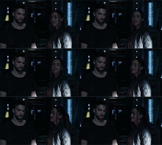
Yeah, I know. I can’t see anything either.
I brighten up this gif using my method above for dark blue scenes. Curves, brightness, levels, and add more depending on what you need. Here’s what I have now:
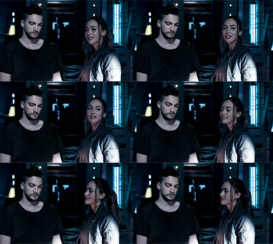
We can see both of them properly now, but it’s waay to blue. Also I’m losing some color from Raven’s skin so I’m gonna add color balance under every adjustment and pull up the reds and yellows.
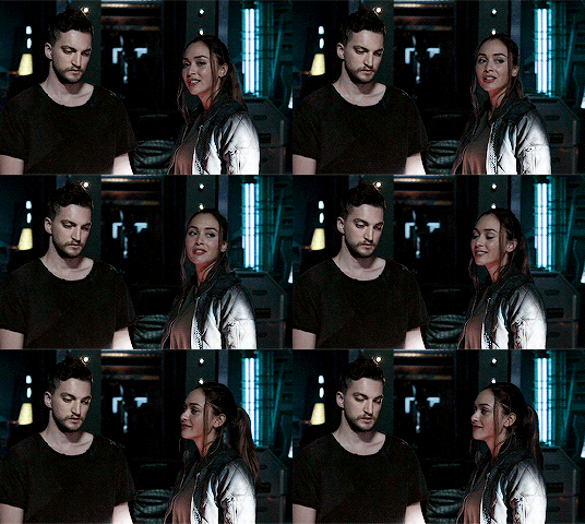
Now it’s better! You can totally leave it here and post your gif like this. but I added an extra selective colors layer to bring out the red, yellows and blacks, and here’s the final result:

I should mention that when it comes to scenes with POCs, you have to be very careful. With this scene with Raven color balance and selective colors helped bring back her color, but on other scene adjusting too much of the red/neutral/yellow might ruin her skin. You are allowed to adjust the colors on a gif extremely when necessary, but be careful about it :)
Some dark scenes are supposed to stay dark.
I realized that with the 100 (or any other shows tbh) brightening up a gif with a dark scene too much will make it lose so much quality and ruin it. So, what I’ve learned to do is to let it be dark. I’ve seen some people brighten their gifs too much and even though I understand your frustration, it’s gonna be better if you just let it be as it is. But, still, make sure it’s bright enough so you can still see the things happening on the gif.
Here’s a gif of Bellamy from Season 5. You can see how dark it is without any coloring:
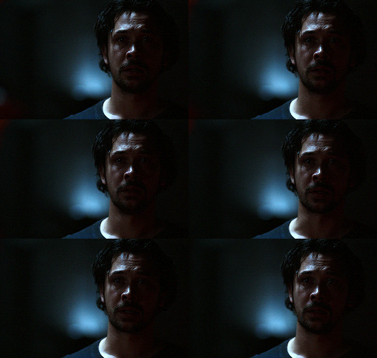
First, let’s brighten this baby up so we can see Bellamy’s face. I added curves and brightness, levels and more brightness:
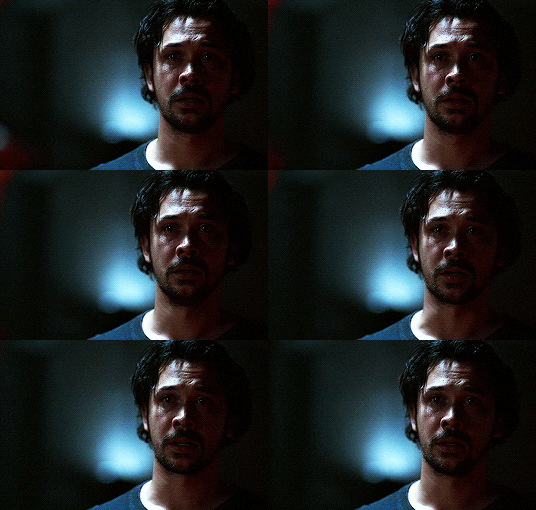
Now I know it’s still very dark, but instead of brightening it up too much I’m gonna go to color balance and add the tiniest bit of red and yellow, and then I’ll add a photo filter. These two adjustments are done so we can have more color on his face instead of the ugly dark red we had. With those adjustments, what we have now is this:
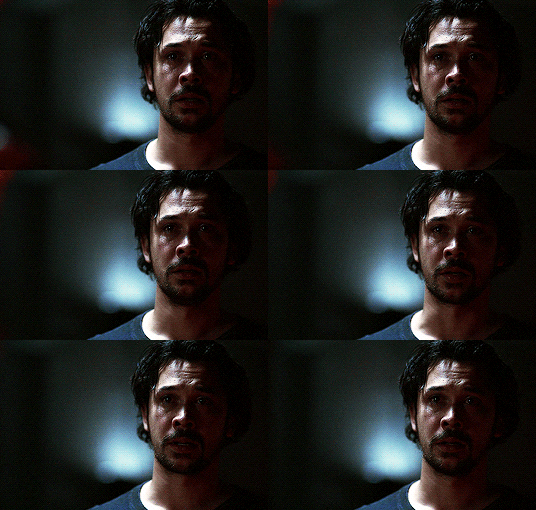
Next, we’ll move on to selective color. This is what I mean when I say you have to be careful with this adjustment. I want to brighten up Bellamy’s face by putting down the blacks on the red selective color. But by doing so I might erase all the reds from his face and whitewash him. To prevent that, while I put down the blacks, I bring up the reds (lowering the cyan) and yellows. I also pull up a bit of neutral and black selective color so I can get rid of the grain (adjusting the black on both selective colors.)
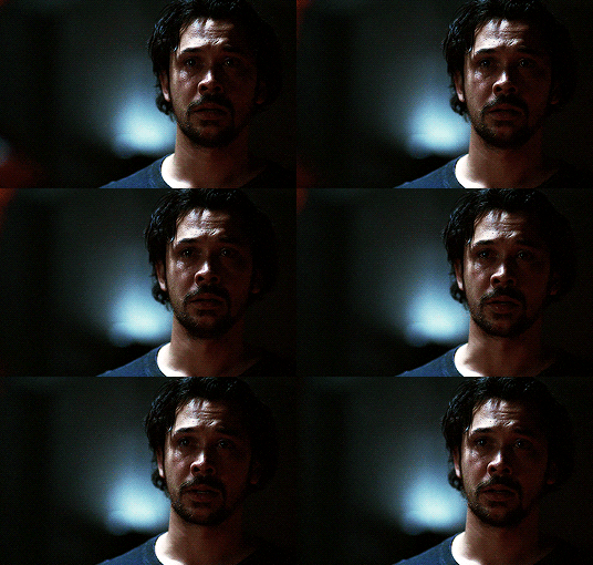
With a little more last-minute brightness, here’s the final result:

That’s pretty much it! You can add more brightness than what I did here (I was in a rush when I made this but I would definitely add a little more curves or brightness) as long as it doesn’t ruin the colors and won’t make the grain too visible.
Now as promised, here are the PSDs I made for this tutorial! Please don’t claim them as your own and feel free to tag me (#useraaya) if you make anything with them so I can check it out :)
[ clarke ] [ lexa ] [ octavia ] [ murphy & raven ] [ bellamy ]
I hope this helps! Don’t hesitate to message me on my main blog if you have any questions. <3
#itsphotoshop#yeahps#chaoticresources#the100edit#the 100#**#gif tutorial#coloring tutorial#*tutorials#*resources#aaya
423 notes
·
View notes
Text
webp? hell yea!
oh god, imagine thinking that gifv or webp formats are bad and blaming it all on Googel.
it’s not the format that’s bad, tumblr just needs to tweak it’s conversion algorithm, perhaps. and let us upload our own webp files. hardly anything can compare to webp’s file size.
as someone who makes animated files for nearly every page of my comic i had to constantly choose between making a gif with smaller dimensions or destroying the quality for the sake of smaller file size. and then i found out that webp exists and WHOO BOY. i can make animations with the same dimensions and at HALF THE FILE SIZE of what the gif would be???
it’s incredibly flexible when you can control the creation of your own files. there’s even a whole ass photoshop plugin which greatly simplifies the process of saving a file as webp. in fact, even though i’m someone who is tech savvy, i prefer to use it instead of the command line for simplicity (there’s a free libwebp library, and you can also convert files with ffmpeg in your console).
and then i hear some people scream that it’s only supported by chrome, which is a lie??
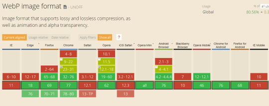
wait, did you mean old as fuck IE doesn’t support it? well it’s about time to GET A BETTER FUCKING BROWSER. as for Safari holding back on webp support - i can imagine why, but none of the reasons are “because webp sucks”. so while there is no webp in your precious Apple device.... GET A BETTER FUCKING BROWSER.
I wish I could attach my own webp files for comparison, but let me show you this instead:

These are the files I made for one of the pages of my comic. Take a look at the dimensions. GIF file at half the dimensions is twice the size. Webp is only slightly compressed and looks almost exactly like the original art, while GIF has lost background gradient smoothness and gained some artifacts. I can show you a bit of the background where this difference is the most evident:
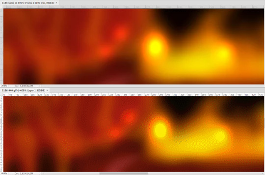
Webp is on top, GIF at the bottom. Webp can have somewhat visible “blocks” but it largely depends on the compression level. Gif has too much noise and gradient smoothness is completely ruined.
SO
one of the things that matters to me and matters to Tumblr is server space. what also matters to me is that my animations look just as good as my original art, and considering how many effects I like to use and how many colors there are, it’s nearly damn impossible to preserve with GIFs even at the best quality settings.
OK BUT WHAT ABOUT PIXEL ART
good question. i think webp can still achieve this. i’ve done a quick test with this image:
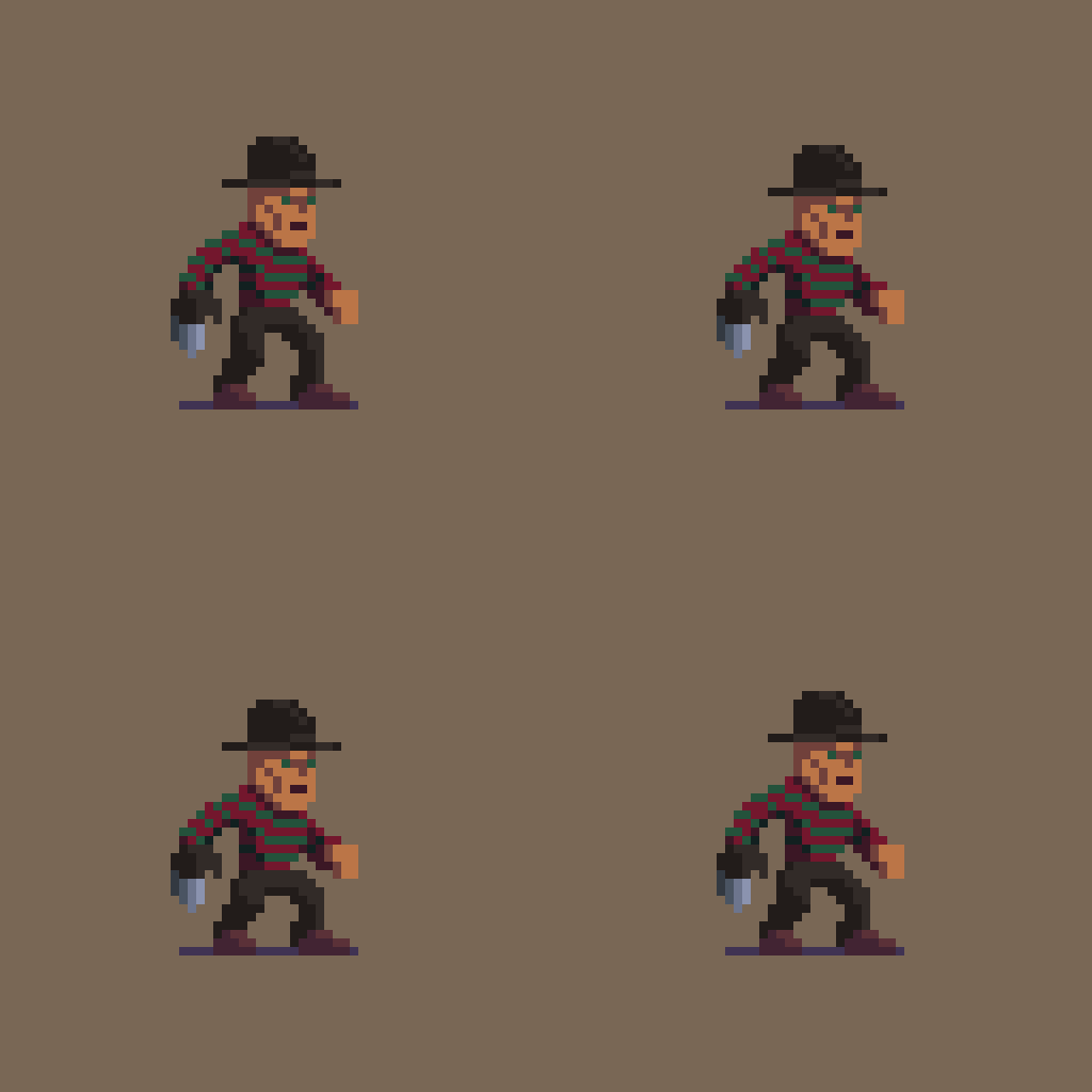
(credit: https://www.artstation.com/artwork/9YPWa )
opened it in Photoshop and this is what the output shows:
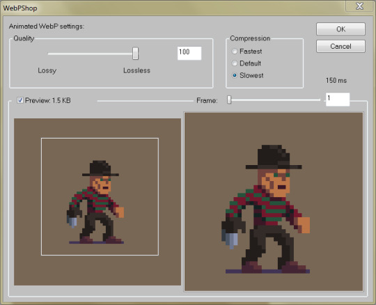
left is source file, right is webp preview. they really look EXACTLY the same. and you know what the best part is?

¯\_(ツ)_/¯
once again, the webp version is drastically smaller. okay, yeah, it says 1,5 KB in the preview and windows says 2KB, but that’s because the file is actually 1,58 so I guess it rounded up, here are the correct numbers (pardon the Russian language ui):
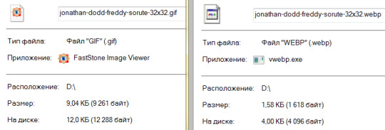
sooooo, stop demonising the entire file format? ask tumblr to let us upload webp files instead? if y’all are smart enough to bitch about it and find out how to turn it off in browser settings, you will learn how to make these files by yourselves too. it took me, like, one evening.
YEAH BUT TUMBLR FILES BIG, COMPRESSION HARD
i hear ya. and i already said: they need to tweak their conversion algorithm. what i noticed is that the gifv file your browser shows is always slightly bigger than the webp file it saves. i’m not sure what causes that, i’ll try to find out.
and again, as i said, we need to be able to upload our own webps. trust me, when you learn how to make them, it’s hard to look back.
30 notes
·
View notes