#my first layout manga
Explore tagged Tumblr posts
Text


( 전기소설적인 ) ⎯⎯ ✩ romantic ︖﹖

⠀⠀⠀⠀⠀⠀⠀⠀⠀⠀⠀⠀ ⠀⠀⠀⠀⠀⠀⠀⠀⠀⠀⠀⠀
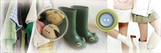
#͏ ͏ ͏ ͏ ͏ ͏ ͏ ͏ ͏ ͏ ͏ ͏ ͏ᡣ𐭩. ݁₊ ⊹ㅤㅤㅤㅤㅤㅤㅤ₊ ⊹ ͏ ͏ ͏ ͏ ͏ ͏ ͏ ͏ ͏ ͏ ͏ ͏ ͏ ͏ ͏ ͏ ͏ ͏ ͏ ͏ ͏ ͏ ͏ ͏ ͏ ͏ ͏ ͏ ͏ ͏ ͏ ͏ ͏ ͏ ͏ ͏ ͏ ͏ ͏ ͏ ͏ ͏ ͏ ͏ ͏ ͏ ͏#manga headers#messy layouts#manga icons#manga layouts#skip to loafer#skip to loafer layouts#animanga layouts#skip to loafer icons#skip to loafer packs#pastel#shoujo#mitsumi iwakura#skip and loafer mitsumi#mitsumi iwakura icons#mitsumi iwakura layouts#manga matching icons#mitsumi icons#shima sousuke#matching pfps#shima sousuke icons#shima sousuke layouts#skip to loafer shima#my first layout manga#red headers#pastel headers#green headers#messy packs#manga moodboard#skip to loafer moodboard
260 notes
·
View notes
Text


🍥 red-hot // naruto uzumaki icons pt. 33 🍥
#naruto#uzumaki#naruto uzumaki#uzumaki naruto#naruto icons#naruto uzumaki icons#uzumaki naruto icons#icons#anime#anime icons#naruto manga#naruto layouts#naruto manga icons#naruto uzumaki manga#manga icons#manga edit#manga aesthetic#manga#anime manga#aesthetic#red aesthetic icons#naruto aesthetic#naruto anime#my first attempt at making manga edits!! woohoo!#think i did a pretty bangin job if i do say so myself. def gonna be making some more of these in the near future yayyy#he's so handsome with his momma's hair i can't—#noice love it 🥰❤️#tarriel rae
71 notes
·
View notes
Text


might fuck around and elevate my expectations,
now i'm fine to leave you in a past life.
#cr to mmme0709 if u use the first icon#cr to sidexmice if u use the second icon#cr to esojiros if u use the third icon#kaveh#my wife#kaveh icons#kaveh layouts#genshin kaveh#genshin impact kaveh#kaveh fanart#haikaveh canon#bottom ass bitch#anime messy layouts#messy layouts#manga messy layouts#genshin impact#genshin layouts#yoimita
13 notes
·
View notes
Text


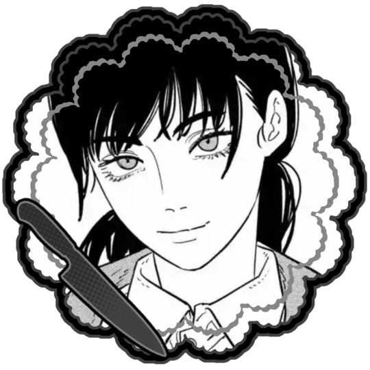
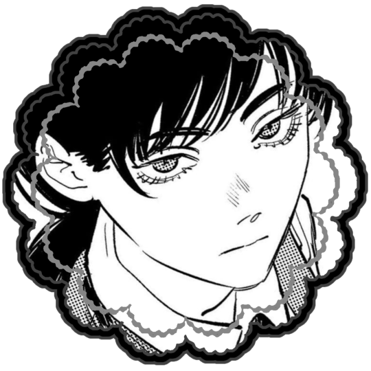
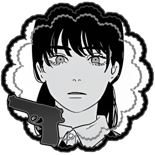
Asa Mitaka Layouts!
- - - - - - - - - - - - - - - - - - - - - - - - - - - - - - - - - - - -
Rqed by @sacrificesse ! No kin/id/me tags please!
#〔♱〕 a nephilim’s creation﹒⟢#yippee!! my first request finished!#i haven’t read this far into the csm manga hope these are all of asa and not yoru#tumblr layouts#chainsaw man#asa mikata#tw knife#tw gun
61 notes
·
View notes
Text


eroica 35th anniversary book
inside illustrations; poseidon 2000
#i skipped one of these bc it didnt fit the layouting here lol#you can find it on the first post of this tag ->#fewl35#from eroica with love#my scans#70s#yasuko aoike#shoujo manga#vintage shoujo#eroica yori ai wo komete#mine
4 notes
·
View notes
Text
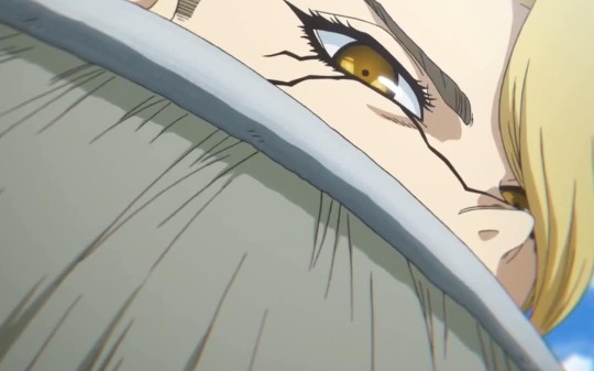
Dr.Stone Stanley Snyder’s S/O getting harassed by Ibara

A/N: I am back…? Idk i’m trying to get out of a writer’s block again. Been playing a LOT of Minecraft! Me and my friends made a Dr.Stone realms and I’m playing as Xeno lmaoo, we are recreating KoS and the American colony’s base (its big as fuck????) anyways, here’s the prompt I wrote and special thanks to @animeotakuf0rlife for sending in this ask and furthering the idea! I accidentally deleted the ask when I was layouting this post 😭
Genre: Fluff, Angst
Warning: Manga spoilers, harassment, Ibara himself should be a warning, violence, use of guns,
Fem!reader (or Fem presenting, reader will be called a girl, use of they/them is still present but Ibara will refer to reader as she/her)

With society back up and running again faster after the moon mission’s success, people have been getting revived left and right. You were part of the American colony back before the 2nd petrification happened and was revived to help out with the rocket for the mission. As time passed, you grew closer with the members of the Kingdom of Science, they’d tell you all about the adventures they’ve been on, sailing the world, and the fights they faced before they set foot to America. You learned that a lot of the kingdom’s members were once their enemy, like Tsukasa, Hyoga, Moz, Kirisame, and others. Quite ironic because at some point, you were also their enemy.
When the people of Treasure Island visited Japan, Kohaku and the others were furious to see a tall, middle aged man with a weird goatee. “Oi! What is Ibara doing unpetrified?!” Ginro exclaimed, pointing at the man with fear. “When did this happen?!” Chrome added, also shocked to see the guy. “Who’s that?” you asked Ryusui who was next to you in the docks, helping unload cargo. “Ibara. The biggest enemy when we were at Treasure island.” he said, voice was void of its usual cheer.
“I’m so sorry! One of the newly depetrified islanders thought he was another innocent person. He’s been tame lately after revival and kind of helping around. But we couldn’t leave him at the island, who knew what he’d do without us to guard him?” A bald man, who you presume is Soyuz from what the others have described, said. You looked up at this Ibara man and saw that he was already looking at you, for some reason, you felt a chill down your spine. “It’d be best if you stayed away from him, y/n.” Ryusui warned, you nodded. “Y/N! Xee needs you in the lab.” your boyfriend, Stanley called out to you. “Oh, alright. Bye guys! Doc called.” you bid farewell, glancing at Ibara who was still eyeing you.
Stanley, who decided to assist in the unloading of the cargo, was approached by Ryusui. “Hey, Stanley!” the sailor called, “I’d look out for that man, Ibara, if I were you. He doesn’t have a good track record.” Ryusui informed. “Huh, why?” answered Stanley. “He petrified their island’s leader and tricked everyone in the island. He has harassed multiple women when the “harem selection” was happening in the island. He’s not one to respect women. And from the looks of it, he has his eyes on Y/N. My sailor’s intuition is never wrong!” Ryusui explained. That made the soldier’s eyes darken. “I need info on the enemy.” Stanley said, to which Ryusui told him everything.
Ibara claimed to have changed his ways, now that everything was too much for him to understand, he claimed to not have interest in ruling the world anymore, which was met by doubts, yet he was still tasked to help around the area with small work. He seemed okay at first, no incidents, no bad things. Your interactions with him were normal to a fault; he seemed friendly, too friendly. You still kept interactions with him brief, remembering what Ryusui and the others told you.
One afternoon in the lab, the science team and Stanley were working on an experiment, Stanley there as the “bodyguard” and you as Xeno’s assistant, like you were back in the modern day. “Y/N, mind grabbing some materials from the storage? Here’s the list.” Xeno asked, handing you a piece of paper. “Sure, I'll be back shortly.” you said, walking out of the lab and towards the storage area, you didn’t realise that Ibara was near and saw you walk into an empty room and decided to follow you. As you were gathering the materials, you heard the door open, revealing the tall man. “Oh, Ibara-san? What brings you here?” you questioned, uncomfortable about the fact that he was in a room alone with you. “Ah, hello y/n-chan! I’m here to pick up some materials for the 3rd floor. “Huh? But you’re on the basement floor, each floor has its own storage unit.” you questioned, wary of his movement.
“The unit upstairs was out of the material, they told me to check here.” he answered, a smile on his face as he moved closer to one of the shelves. He looked to see that your cart was mostly ores, and jars. “They’re letting a pretty girl like you do the heavy lifting?” he asked, a shiver ran down your spine as you looked up to see him staring at you. “Wha- no, it’s normal. I’m working as Xeno’s assistant after all.” You answered, defending yourself. “You have a nice figure y/n-chan~ don’t damage it by carrying heavy things~” He said.
The man moved closer, you started to move farther, trying to focus on gathering your materials. In a flash, the man was directly behind you, body sticking to yours caging you between him and the shelf. He was reaching up the shelf, presumably also gathering materials. You tensed up, and Ibara took this opportunity to hold onto your shoulder. “Why don’t we get to know each other better, hmm?” he whispered into your ear. “Get off of me! I have a boyfriend!” you tried to pry him off of you, as you shouted, hoping someone would hear you. “Kukuku~ back on my island, it didn’t matter if the girl was married.” He said with a smirk as he gripped your arm. “Let me go!” you screamed, thrashed, and tried to move away.

When Xeno sent Y/N to get materials, he didn’t think much of it as it was a normal occurrence as Xeno’s assistant. However, the usual 5 minute wait time became 7, then 9, then 10 minutes. He got concerned, and told Xeno he’d go see what’s taking y/n long. As Stanley exited the room, he bumped into Tsukasa and the others, “Have y’all seen Y/N? She should have been back 5 minutes ago.” Stan asked, “Nah, we just got he-” “LET ME GO!” a scream was heard, a voice familiar to the group which made them run towards the storage area.
BAM!
The door flew open as another man entered the room, “GET AWAY FROM THEM!!” Stanley shouted, his voice booming as he rushed towards the man on you and yanked him off hard, followed by a punch, making Ibara land on the floor. A few other people reach the door, those being Tsukasa, Ryusui, Kohaku, and Sai. “Stan!” you exclaimed, glad to see your boyfriend here. “You dirty piece of shit!” Stan held Ibara down when he tried to get up. “Stan! Not here!” you shouted, holding onto him. “Bring him out of the room, please.” You asked the bystanders, Tsukasa coming in and restraining Ibara. “Bring him to the yard, I'm gonna teach that piece of shit a lesson.” Stan ordered, his commanding voice leaving no room for arguments. “All right, we’ll be waiting for you.” Ryusui answered, leading the group.
Stanley directed his attention towards you, holding onto you and scanning you. “You ok? Did he hurt you?” he started fussing. “Stan, I'm fine. You got here on time.” you said, hugging him with your face on his chest. He hugged you back. “Fuck, I’m glad you’re safe.” he muttered into your hair. “I’ll go back to Xeno, you go handle Ibara.” You whispered and he nodded, escorting you back to the lab door and giving you a kiss before you entered.
“What took you long?” Xeno asked, still focused on his work. You bring the materials to him, “Ibara cornered me in storage, Stan is dealing with him now.” your confession got Senku, Xeno, Chrome, and Suika to look at you. “Ah, well, I wouldn’t mind having a human guinea pig. That is if Stanley doesn’t break him first” Xeno said.

When Stanley reached the yard where they usually trained at, he saw Tsukasa and Ryusui there with Ibara tied up. “You dare touch my partner and think you’d get away with it? Let me get you off your high and mighty self throne. You.are.powerless.here.” Stanley’s voice was cold as he pointed his gun at Ibara, who recognised the item as similar to the thing that shot him back then. Fear crept up his whole being. “N-no! Don’t!” Ibara begged. BAM! Stanley pulled the trigger, but aimed it at the target just behind Ibara’s head. The other man looked behind and saw the bullet hole in the middle. “You see that? that will be you if you dare touch y/n again.” Stanley said. Ibara was panicking at this point, he doesn't want to die. “S-she was giving me signs!” He tried to reason.
That angered Stanley more, sending another punch towards the man, “signs…? SIGNS?! You dare blame them?!” Stanley raged, punching Ibara to the ground, and kicked him hard. He knelt down and gripped at Ibara’s jaw, making him look up at him. His eyes were clouded with pure rage. Not even Tsukasa would want to intervene with this. “You dare touch, talk, or even breathe near them again, I will offer you up to the science team as a gift. And I’ll tell you now, Xeno ain't above using humans for his crazy experiments.” He tightened his grip on the man, “understand?” he asked, Ibara was choking at this point. “un.der.stand?” Stanley repeated, to which Ibara forced a ‘yes’. He asked the others to lock Ibara up for the time being as he talks to the leaders about what to do with Ibara. Stanley let go of him and walked off, but not without his final words to the man.
“Just because you almost succeeded before with taking down the team, you think you’d succeed in taking it down again. I’ll kill you if you try anything else to harm us. And don't take this threat as a bluff, because I can.”

Masterlist
Navigation
#stanley snyder#dr.stone x reader#dr.stone fanfic#stanley snyder x reader#dr stone#dcst#dr. stone#stanley snyder headcanon#dr stone stanley snyder#dr.stone headcanon
173 notes
·
View notes
Text
—HAIKYU!! various ; how deep is your love?


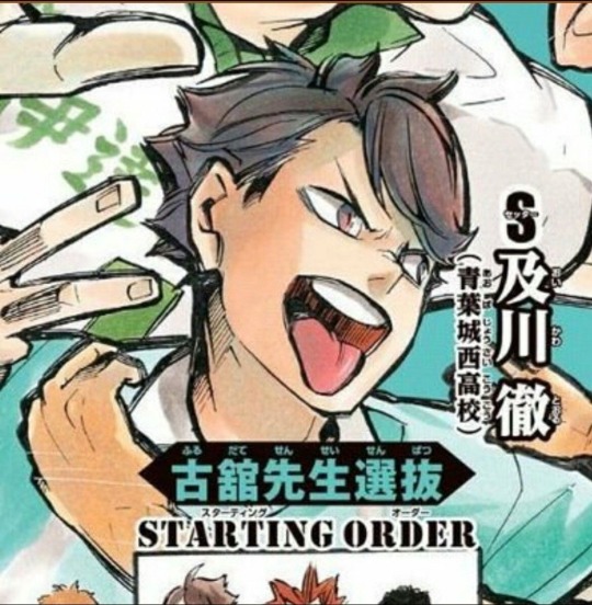
a/n ; [gn!reader] kinda fem implied in kawa's and kuroo's 😓 do yall like the new layout?? c: suggestive if you squint extremely hard in kuroo's .. i honestly dont know if im writing this timeskip or pre timeskip its 3am 😣
— characters : oikawa, osamu, tsukishima, hinata, sakusa, kuroo
part 2 ! ♡ akaashi, kenma, kita, semi, kageyama, suna
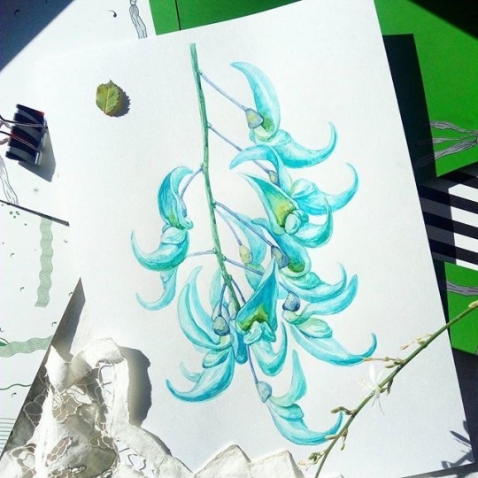
jade vine !

tooru oikawa ; SWEET / I THOUGHT YOU WANTED TO DANCE - tyler the creator, brent faiyaz, fana huez
has 'i love you' wars and he MUST win or he will tackle you (affectionate)
takes the BEST candid photos of you and puts so much love into the following insta post. has you as his wallpaper too (please match with him) (he'd also have a highlight just w pics of you😞)
please NEVER do that 'wipe their kiss off' trend because he will actually not talk to you for DAYS and gets all sulky until you apologize. (he will get all cocky all over again)
core memory from his teamates. bae was explaining to his teamates about new volley nerd talk blablabla and they notice his nails painted in a faint pink (for a fun date night, thinking no one will notice)
issei BURSTS out laughing and instantly points it out. now seijoh4 NEVER lets him live it down
always the first person to notice when you use a new shampoo or perfume.
cuddling, (you being the little spoon╰(*´︶`*)╯♡) you can feel his breath hitch when his lips reach your neck
before you could ask why he's stopped inching closer he's already manages to whisper out, "did you start using a new shampoo?" yes. yes you have
do his skincare with him please ! he loves it. he loves when he places you on the bathroom counter and you wrap your legs around his waist, he loves when you're so gentle with the toner, he loves when you graze your delicate fingers over his beautiful long lashes, he loves when you make sure you don't cut him when snipping the face mask so it fits a little more snug, EVERYTHING. (he is sunoo coded)
osamu miya ; good looking - suki waterhouse
loves your tummy SO much. doesn't care about shape or form, he just likes the feeling that you're being fed. squish. or pat. he loves it. have i mentioned he loves your tummy?
when his dad leave the twins at home its always osamu at the stove, please keep atsumu in a 5 mile radius AWAY from the kitchen
SPOON FEEDS YOU. please i need him. on days you're too tired to move a muscle, days where you're too sick to open your eyes, be prepared to feel his hand on the back of your head and one below your chin ready to feed you!! once you've sat yourself up he feeds you so gently... osamu miya i need you
when you're really tired from work, he will send meals to your workplace. if you work at home and sees you barely able to keep an eye open, you will see his hand under a spoon of your favourite meal. he's not the best with it, but he's trying 🥹 he means it with all his heart and hearing you say the food is really warm in your stomach, his heart feels warm too (о´∀`о)
my mans is SNATCHED. slide your hands around his waist, poke it a little do WHATEVER. your hands have probably been on his waist more than his hands on yours.
i think his core is pretty well built. have we seen it in the anime or manga? maybe. but from what i've seen, his physique is very 😳 (a tad bit better than his brother's i fear)
cooking together!!! different recipes each date, basking in each other's presence. its always so fun and the results are always almost flawless!
at one-point y'all were making cupcakes, it was literally osamu baking them and you decorated it.
AND OBVIOUSLY the basic, he would routinely give you handmade onigiri, in different shapes, flavours and whatever you like ✨
kei tsukishima ; the only exception - paramore
kinda scowls at you when you put your hands under his shirt but secretly really loves it so when you slither your hands away he instantly places your hands back and make sure your hands STAY there. bonus points if you have warm body temperature. he likes the feeling of your warm hands on his slightly colder body.
his wardrobe has drastically evolved from muted tones to slightly lighter and vibrant clothing ever since you insisted on getting matching stuff!!
WILL say he is not a jewellery person but collects, keeps and takes care of all the little trinkets you give him DAILY. he has a little sticker on the edge of one of his books and a little moon sticker on the end piece of his sports glasses
he also defineitely has really thick curly blond lashes. you say they are one of his charming points but he gets all flustered. when you insist to put clear mascara on them, he doesn't really look like he has a problem with it 🥹
what could his ahh possibly be listening to with those headphones on so often (real)
sends you playlists at an insane hour that go for insane amounts of time. but i KNOW his taste is immaculate. every song always gives you goosebumps or makes your heart tighten
please do a spotify blend with him (he was gonna ask you, but you beat him to it)(he was shy)
oh AND the shared playlists actually are insane!! so much good music all at once?? crazy yall 😭😭 (wave to earth, cody fry, the smiths, daniel caesar, rex orange county)
shoyo hinata ; intro (end of the world) - ariana grande
honestly, out of all these men HINATA SHOYO is the BEST candidate for taking care of a person except himself. has no limits in his stamina, and will only listen to you when you ask him maybe its time for a break. does he overwork? not necessarily. does he work too hard? yes, in a positive way. please remind him to eat because he will forget sometimes
he will NEVER admit he likes being the little spoon LMAO he finds being vunerable in your arms a tad bit silly, and it bugs him. after a long week of practice games and insisting kageyama and yachi to practice with him the instant he falls on the bed, he finds himself melting into your touch. your voice gets a little more buttery and he loves it, falling asleep instantly
hes probably a hard sleeper too 😭 he wont wake up till he feels your cold hands on his face or the sunbeams from the curtain literally bleed into the sheets and steal its colour
PLEASE STROKE HIS HAIR. he loves it. he absolutely loves it. again, melts into your touch like ice-cream. his heart will feel tight and he has a lil' blush 🥹 whats even more priceless is his lips slightly agape after hes fallen asleep... how can you NOT love this man
one of the only boys on this list who will LET you put little pink bows or style his hair in braids and clips. (if you're imagining timeskip hinata, you have attempted to put a little bow around his bicep but you underestimated its size and it BROKE. gosh what an experience)
DANCES WITH YOU EVERYWHERE!!! omg i love him so much. doesn't care if you have two left feet, he just loves the feeling in his heart when he sees your smile as he spins you around. in the rain, in big empty rooms, in the kitchen, anywhere.
loves the idea of promise rings or little trinkets that ensure he gets to have you forever!!
kiyoomi sakusa ; washing machine - VANISHING GIRL, rosemary fairweather
PLEASE braid this man's hair. 😞 he pretends to despise it and thinks you don't notice when he literally melts under your touch. he feels safe 'nd comfy and hopes it lasts forever, when your hand retracts he has a lil' pout
notices when you've been wearing your favourite hood for a couple days straight, has a little scowl under his mask and throws one of his jackets at you. he only gives you the wind-breakers that are 100% cotton or the ones he just knows you like.
he uses this as an excuse to share his clothes with you. its safe to assume its his love language under-cover!
HE IS SO ASS WITH PDA all you get is him giving you hand sanitizer before eating meals or snacks. its only you though, don't tell him that.
BUT sometimes when he feels like it, he will take your hand and put it HIS pocket so "your hands are always sheltered from germs" now what type of bs is THAT. (you love this bs)
can be snarky. sometimes he gets the slightest eenie meenie miniest bit cocky, and its very noticable. has the ability to be a little bit of a tease but not in a pestering way more like a little smartass way LMAO.
tetsuro kuroo ; never lose me - flo milli
always has his hand in the back pocket of your pants. that was it. thank you for coming to my ted talk. (to feel your butt? no idea.)
tutor sessions always unbearable. either you're too busy staring at his biceps, or you're sighing that he's made a little pop quiz for you!! tell him it sucks please
if he notices it gets a bit too much or overwhelming for you over the week or before study dates, insists to take you out instead (what a gentleman!! kuroo tetsuro come into my life)
extremely consistent with routine. good morning and good night text DAILY no matter how busy he is, he WILL find a way (i like to think its his way or the high way #kingofprovocation /hj). very good at getting the things he wants in a non-manipulative way but with simply logic and brains
yeah as captain hes no. #1 but he is also no. #1 waist CLUTCHER. his hands are always on you somehow even in the slightest way, but never pervy. he just likes having his hands on you! bonus points if you have hip dips, he loves it so much. he finds it as a perfect spot to place his hands on (btw ppl w hipdips yall are BEAUTIFUL!! 🥹)
i feel as he has a possessive side as well. small, but more noticable compared to someone else. will not hesitate to stare someone (or recite chemistry nerd stuff 🙁) down for looking at you a little too long :3
when he sees you post or sees himself in your instagram or tiktok dumps, his heart tightens a bit in the best way possible. when you mention him in the post he only reacts with a heart but he's actually going insane

#haikyuu x reader#haikyuu x you#haikyuu x y/n#haikyuu x gender neutral reader#haikyuu fluff#haikyuu drabble#oikawa x reader#osamu x reader#tsukishima x reader#hinata x reader#sakusa x reader#kuroo x reader
734 notes
·
View notes
Note
please please please please please do another TBHK fic, thank you!
━ 𝚂𝚆𝙴𝙴𝚃𝙷𝙴𝙰𝚁𝚃

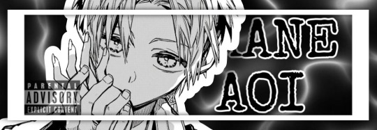

❏ 𝐘𝐎𝐔
˗ˏˋ꒰ 🔪 love interest ꒱ . . . yandere!stalker!akane aoi x fem!reader || I kinda changed the layout of my posts if it isn’t too obvious. I might change it back, idk yet
˗ˏˋ꒰ 🔪 warnings ꒱ . . . blood, delusions, murder, obsessive tendencies, stalking, yandere themes
˗ˏˋ꒰ 🔪 synopsis ꒱ . . . you, a new student at kamome academy, have caught the attention of a boy in your class who turns out to be an obsessive stalker; willing to murder anyone who could get in the way of their relationship. but he would never… right?
˗ˏˋ꒰ 🔪 authors note ꒱ . . . I’ve recently started watching “you” and i really wanted write a fanfic based off of it. I haven’t written a anything in first person, or a tbhk fic in general in a while so I had to reread the manga to grasp akane’s character (he might be a little ooc sorry) || I have the fucking flu so I posted this wayyy later than I wanted :( || tbhk fics: sweetheart
˗ˏˋ꒰ 🔪 word count ꒱ . . . 3.5k


The first day of the school year after summer break is always the worst. Everyone is forced to re-introduce themselves to the same kids they’ve had classes with since middle school; As if they’ve never seen them before.
Not only that, but trying to make a decent impression of yourself on you new teachers is a drag in itself.
And quite frankly, I’m over it.
The same uniforms as last year, the same school mysteries or wonders, the same crush you’ve had since elementary that would never, ever, dare to look your way�� why can’t life change for once? I’m not even asking for anything too drastic. Just a slight shift in the room that’ll make my life a bit more enjoyable, y’know?
And, as if answering my desperate prayers, — you entered the room.
Your uniform dress looked so nice despite looking the exact same as every other girl’s’. You walked slowly and had a resting smile on your face, yet you still avoided eye contact… were you nervous? I’m not surprised, I’ve never seen you before so I’ll assume that you’re a new student.
You paused for a moment, examining the class before you chose a desk to sit at. And where will that be?
Will you sit in the front back of the class? Or on the wall by the window? Maybe even—
“-Is anyone sitting here?” You asked, gesturing towards the vacant seat right next to me.
You… you want to sit next to me? Why me? Am I really that important to you?
“No. No one’s sitting there,” God, you’re even prettier up close… stop it! I can’t fall for you after only 5 minutes. It’s pathetic, really…
Nonetheless, I wasn’t expecting you to greet me first. well, you technically didn’t greet me, it was more of a question…
Pushing up my glasses, I cleared my throat. I guess I’ll have to introduce myself then… “I’m Akane Aoi.”
“I’m Y/n L/n, nice to meet you Aoi,” you smiled at me… your smile is the most beautiful thing I’ve ever laid my eyes upon. Ever since her—
-Once our first class had finally started, it was a struggle to pry my eyes away from you. I just… found everything about you so fascinating. From the way you styled your hair, to the way your (s/c) complexion seemed to glow.
Even the way you awkwardly glanced over in my direction enchanted me. Wait, you’re looking at me? Crap, was I staring for too long? Quickly, I diverted my gaze down at my paper.
Why do I feel this way around you, Y/n? This can’t be normal, right? No. It has to be. Then again, there was only one other person I’ve ever felt so strongly about before…
Despite my efforts to avoid staring, I just couldn’t stop thinking about you. You’re just so pretty, too fucking pretty…
I failed to notice the soft redness rising to my face until it was a bit too late. Why did I have to get like this whenever I like someone?
No, no, I couldn’t have became obsessed with you already, we’ve only just met. I only find you, Y/n, very, very interesting.
Is it even alright for me to address you as your first name ‘Y/n?’ I’ll just assume so for now, but I’ll make sure to ask you whenever we get close.
The second I got home from school today, I threw myself onto my bed after dropping all of my things on the ground. I’m too exhausted to do anything productive and my mind is too preoccupied with more pressing matters.
I believe it’s pretty normal when someone has a crush, said crush will only to circulate throughout their mind… 24/7. It doesn’t exactly have to be an “obsessive infatuation” as some may call it. But all things do have their limits — so why can’t I stop thinking of you, Y/n…?
I rolled over onto my side and reached for my phone, the least I can do it look for your social media right? I just want to know your hobbies, what shows you like to watch, your home address…
Your account was a bit difficult to find giving that you don’t use your full legal name unlike most people online… You’re an overall average person on the internet, posting mostly about your different interests.
Does this count as a form of stalking? No, it can’t! I’m just… browsing your reposts.
Not only that, but it took me an even shorter amount of time to find your house, believe it or not. Well, it’s mostly because i have your first and last name imprinted in my memory despite only hearing it once.
After a bit of digging, I would have your home address. Seriously, the internet shouldn’t make it this easy to find someone’s address. That’s how people get robbed and even kidnapped…
Comparing the picture from Google to the real thing, I wouldn’t have ever guessed that your home was this big. Yes, I know watching someone from outside their house at 10:47 PM while dressed in all black is… not morally okay. Maybe even a bit illegal in some countries, but I’m doing this all for your sake, Y/n.
I pulled up my hood up over my head in fear of being recognized as I stared into your bedroom window from behind a large tree, I’m glad I’m not wearing those damn glasses or anyone could’ve recognized me.
But dear God, you looked even more elegant out of your uniform and in your pajamas. I instantly tore my lingering eyes away when my gaze began trailing down your thighs.
Wait. Are you in there alone, Y/n? I don’t see any cars parked outside… but there could be cars in the garage, right? Unbelievable. Absolutely unbelievable.
I can’t believe your parents would leave you alone in your house like that for so long. Especially with the curtains wide open this late at night… seriously, haven’t you ever heard of personal privacy?
You never know what kinda creepy wierdos could be watching you sleep or even plotting your murder. Good thing I’m here, Y/n. I’ll always protect you.
❏ ᶻ 𝘇 𐰁
It’s been a few weeks after school has started Y/n, and I’ve kind of gotten used to this routine we have now. I wake up extra early every morning to get dressed and ready for school. I walk over to your home, which isn’t very far from mine, and watch you get dressed and leave the house for school through your window.
This actually helped me learn so many new things about you, you leave your home around 7:30 every day and walk to school. You know, it can be dangerous walking all alone like that, good thing I’m here to watch over and protect you, Y/n.
You do have a few friends, some a bit closer than preferred but I can’t really control who you’re around… for now.
We have most of our classes together which I thank God for, but our first one is my personal favorite. The reason is because you sit right next to me. Sure, you barely speak to me unless you, like, needed to borrow a pencil or something… but at least you acknowledge my presence.
And once you finally settle in your seat, I always pause time. Despite my supernatural power only allowing me to do this for five minutes, it still feels way too short for my liking. I just want to stare into your beautiful eyes and admire your stunning beauty for eternity.
God, why did you of all people have to steal my heart. I’ve always believed that… she would be the only one for me, but that just can’t be. Because if it were, why else would I be head over heels for you, Y/n?
My crush… no, my obsession with you has grown so bad that I can barely think straight when I look at you. Even frozen in time, you still find a way to drive me mad.
With only a few more seconds from the five minutes left on the clock, I looked away from you and sighed combing my fingers through my red hair. I couldn’t possibly be on the brink of insanity after only seeing you for a fucking week.
But no matter how much I criticize myself, I just can’t and won’t stop thinking of you. Of how you smell, how you feel, how you taste… oh, the feeling of your soft lips against mine would be simply euphoric—
“Akane, are you okay?” You asked, nervously laughing a bit. “You seemed a bit out of it a minute ago.”
Coming back my senses, I realized my fingers were delicately touching my lips as if we actually did just kiss.
“Actually Y/n, there’s something really important I need to tell you,” I began, urgency in my eyes as I stare into yours. Is this too soon to tell you how I feel?
Well it must’ve been because as soon as you opened your mouth to form a response, our teacher entered the room.
Great.
❏ ᶻ 𝘇 𐰁
‘Good morning You,’ is what I wish I was saying to you this dreadful day — but no. Sadly, only in my deepest, darkest imaginations can I hold you tightly in my warm embrace without a care in the world.
Call me delusional or whatever, but I can’t help it.
Because I’m so in love with you.
Sure, I haven’t forwardly told you this… well, every time I tried I was either interrupted or I couldn’t find you. I stal-follow you all the time, so why is it so hard to locate you whenever you turn the corner and get lost in a big crowd.
But still, I haven’t given up on you — on us.
Because my brain can’t go five minutes without you running through my head, I have to do something about it. From the second I woke up this morning, so for about 3 hours? I’ve been… innocently looking for your social media on every app that I can think of, but you barely post at all. So seeing your beautiful face was out of the question.
Beginning to grow agonizingly bored, I throw myself out of bed and walk over to my closet. My hands landed on a black hoodie and jeans, that’ll be fine I guess.
Now in the bathroom, I looked up at the mirror and was a bit taken aback at my appearance. Well, mainly the dark circles under my eyes that anyone could notice.
Dammit, have I even slept last night? Or the night before?
Whatever, I can’t change the past. But it’d be nice if I was given that power anyway.
I sent a text to my parents, making up a lame excuse as to why I’m abruptly leaving at… 10 AM!? Damn, I didn’t know that the thought of you, Y/n could keep me up for that long!
It didn’t take much walking for me to end up here, right in front of your house. And even after I (indirectly) told you, Y/n, you still have your curtains wide open. Letting anyone see the inside of your bedroom.
Oh, you look so peaceful laying in your bed… I could only imagine how it would feel laying next to you in the morning. The way your soft skin would ever so slightly brush against mine. The sound of your soft warm breaths escaping your lips—
“Well good morning to you, Aoi!” A voice rang out behind me, making my whole body stiffen. I didn’t realize I had been staring into your bedroom window for a few minutes until now. Fuck.
“Sh- Shit! You scared me, Minamoto!” I looked up at the taller blonde in frustration. “What’re you doing here anyway!?”
“Well I was just going on a walk but suddenly ran into you. But wow, Aoi, I never took you for the creeepy stalker type… Actually, I did.” He laughs a bit to himself, that same damn smile plastered onto his stupid face.
“Ha, ha, very funny Mr. President,” I scoffed, “Don’t you have a supernatural to exorcise or something?”
“Well, no actually.” He put a finger on his chin and looked over towards your house, “But I do have a question for you: Whatever happened to you and Akane? I thought you lover her unconditionally, hm, Aoi?”
“I…” My eyes narrowed at him. Did he seriously have to bring her up here and now? “What the hell are you talking about?”
“Nothing,” He sighed, “Just — forget I said anything.”
He turned on his heel and proceeded to walk away from me, “Enjoy whatever it is you’re doing, Aoi.”
I rolled my eyes at him, what was he even doing here? I don’t know, and, quite frankly, I don’t really don’t give a fuck either. Looking up at your bedroom window once more, you were… gone?
“The hell…?” I muttered under my breath, my hands reaching up to pull my hood over my head. Did you notice me watching and decided to move? No, there’s no way could’ve seen me…
“Dammit, did I really loose you?” I panicked, despite it not even being that serious.
Just calm down, maybe I can find you—
“Oh, hi Aoi! I didn’t expect to see you around here!”
Slowly, I turned around and pulled the hood off my disheveled hair; I could really take better care of myself before leaving the house.
But when did you…? You know what, I don’t even care.
You laughed a bit at my close to mortified expression. Oh, your smile is so beautiful…
“You uh- yeah! I just ran into Minamoto so I guess everyone from school’s here or something!” I responded as calmly as possible, obviously failing in the process.
You went silent for a bit and narrowed your eyes at me, “There’s something off about you… where are your glasses?”
You pointed to my eyes and I only blinked at you. How the hell did I forget my glasses!? No. I didn’t forget them. I didn’t bring them on purpose because I didnt think I’d need them so… shit, shit, I need to make up an excuse..!!
“I… forgot them. The glasses, that is,” I lied. I had to lie, Y/n, because your were asking too many damn questions. But that’s okay… for now.
“That’s a shame… but do I like you a bit more without them on anyway,” I’m glad that’s we’ve became close enough friends whereas you can trust me even after I blatantly lied to your face.
Wait did you just compliment me?
“I don’t have anything important to do today, so do you want to go to the movies with me? If you’re not busy, of course.”
And are you asking me out? I have to be dreaming.
A big, stupid smile illuminated my sleep-deprived face as I eagerly agreed, “Yeah of course! What Time do you want to go?”
“Why not now? If you don’t mind…”
I wasn’t expecting that… do you really like me that much, Y/n?
“O- of course! I don’t mind at all!!” God, i probably sound so desperate right now, but who wouldn’t when you’re literally asking me out, Y/n!?
As we were walking to the theater that was too damn far away, I read aloud the movies showing around this time today. When I got to the last on on the list, you stopped me.
“If you can read that well without your glasses, I don’t see why you need them,” you giggled. It’s so cute how oblivious about me you are.
Yet, it’s understandable. I can’t tell you that I gained the power to pause time and see supernaturals from school mystery number one but use my glasses to block them from my view. But that’d take way too long to explain, you know?
Oh shit, don’t I need to make up an excuse for that too?
“So which movie were you thinking of seeing, Y/n?” I’ll just act like I didn’t hear you.
❏ ᶻ 𝘇 𐰁
It was late afternoon when the movie was over, I asked if I could walk you home and of course you accepted the offer. My home is on the way anyway… well, if I were to go the shorter way.
We stopped at your front porch and you turned to me, “Thank you for going to the movies with me, Aoi! I knew it was sudden?”
Why are you so worried about that Y/n? I would literally do anything for you.
“Oh you’re welcome, really I should be thanking you.” I smiled, my hands fidgeting nervously in my pockets. Why the hell am I so nervous? Get you shit together Akane. This my perfect, only chance I get to tell you how I really feel!
“Y/n, I love—“
“—Hey, Y/n!!”
You turned around, your face lighting up at the sight of this random guy. I’ve never seen him be- wait I have. He’s some kid who went to your old school. He follows your account actually… and it pisses me off.
“Y/n you know him?” I forced out my mouth. But what I really wanted to ask was, “Y/n, who the fuck is this loser?”
“Yes, he went to my middle school!” You exclaimed, a bit too happy to see him.
His name is Ryota, a boringly average student with average grades, looks, and personality… he posts a bit more than you and seems a bit more on the extroverted side. Despite his average-ness, he has a blatantly obvious crush on you, but I think you would’ve caught on by now.
But who cares about him. I want to know what is and was he to you, Y/n? A close friend? A past crush? I have to know.
Wait a second, I just remembered he made a post about Kamome, does he go the—!?
“Aoi? You there?” You giggled, waving your hand in my face. I must’ve zoned out… again. “Akane Aoi, this is Ryota! My best friend from middle school!”
“Oh yeah, I’ve seen you around campus! Nice to finally meet you Mr. Vice President!”
So he does go to Kamome. Great.
I already hate this guy.
“You too, Ryota,” I plastered a fake smile onto my face then turned to you. “I’m going home now, don’t want to worry my parents! Bye, Y/n!” I turn and walk away.
When walking back to my home, I suddenly find myself eavesdropping on you and Ryota’s conversation. Completely by mistake! You both just speak very loudly…
“Why were you on a date with… him?” Ryota huffs. I knew he was a little shit!
“It wasn’t… really a date. We just went out…” You avoided eye contact with him. Were you embarrassed? For what?
“On a date.”
“Why do you even care? I thought you were over me!”
“I am! But Akane Aoi isn’t… he isn’t right in the head, okay.”
“What are you talking about, Ryota! You said the same thing abou—“
“-but I’m serious this time! He gets really, uh, really obsessive okay? There’s a rumor he’s killed someone over a girl he liked before.”
“that’s just a rumor it can’t be proven.”
“Whatever. Believe what you want. I’m going home,” and he walked away.
Why would he say something so… untrue about me! I’m perfectly fucking sane. And why would he feel those.. those lies to you, Y/n? I can’t let him try to brainwash you or anyone else at school with that stuff.
Y/n, you really need better friends.
❏ ᶻ 𝘇 𐰁
I spent my Sunday doing absolutely nothing. Not even stalking you interested me today. All I could think of what’s that stupid piece of crap Ryota. Why the hell is he even named that, I bet he can’t even animate.
At school the next day, I did what I usually do all day. Most of which is either me staring at you or thinking of you.
But that stupid Ryota has plagued my mind, and they weren’t the lovesick thoughts like I have with you. No, I cant go three fucking minutes without imagining myself bashing his skull in with my bat.
God, why can’t he just disappear!?
When school was finally over, I headed straight to my locker, the shoe locker, then the exit doors. I may haven’t mentioned this to you yet because the author forgot to write this earlier, but I sent an anonymous message to Ryota asking him to meet me behind the school.
Only an idiot could fall for something like that, but it guess it worked because he’s literally walking right towards me as we speak.
“Oh… it’s you. What do you want, Aoi?” Ryota sneered. Man, I really hate this guy.
“Oh, I just need to show you something really important…” I muttered through gritted teeth as I took my heavy backpack off and shuffled through the contents.
Why do I still have this thing in here?
“Oh, I found it!” I stood up in front of him with my hands behind my back.
He scoffed, rolling his eyes, “took you long eno—“
In the heat of the moment, I had swung what my hands had a firm grip on directly into his skull. I’m so glad I had kept this spiked baseball bat.
When the warm liquid splattered onto my face and his body had collapsed at my feet, I could only react with two words: “Oh shit.”

I hope it’s not obvious that I got lazier w/ my writing as the story progressed. I just realyyy wanted to post this soon lol :P
If this gets popular, I might make a part two!! :D

#yandere#male yandere#fanfic#fanfiction#yandere x reader#female reader#akane aoi#yandere akane#akane#tbhk akane#aoi#yandere Aoi#yandere akane Aoi#tbhk fanfic#tbhk#toilet bound hanako kun#toilet bound#toilet bound akane#yandere tbhk#yandere toilet bound Hanako kun#toilet bound hanako kun fanfic
68 notes
·
View notes
Note
Heya! I was thinking of making my own comic, and I was curious what app you used to make comics, and if you had any tips.
Anonymous asked: What program do you use to draw? (cant remember if this was already asked or not, sorry if it was)
It has been asked, but not in quite a while, so no worries ^^
I used to use photoshop, but it was an old version that stopped working when i got my newest computer, so I've switched to using clip studio paint. it works pretty much the same, so very little of my workflow had to change, which was nice.
i'm sure most other art programs out there would work just as well though; about the most specialized things i use in clip are some of the brushes--i don't even touch any of the tools that are supposed to help with making comics specifically XD
edit: oops, i forgot to answer the bit about tips for making comics
first off, start small. unexpected guests is not my first comic, and what i learned from past--even failed--attempts has helped me get as far as i have. doing a few short comics will help you get a sense for how to block out panels, how long it takes to draw a page, and how it feels to draw the same characters all the time. Project management is a whole other skillset, but it's important to learn if you want to take on bigger works.
I also recommend studying your favorite comics to understand how they achieved what you like about them. I've mentioned before how the manga Fullmetal Alchemist has been a huge inspiration for much of my work, and sometimes when I'm stuck I'll revisit it to see how its author handled action, how she paced scenes by changing the paneling layout, and so on.
these are far from the only things to know about making comics, but they're the tips that first jumped to my mind, so i hope they help at least a little ^^;
90 notes
·
View notes
Note
I imagine you have a lot of asks so please don't worry if this is too much to respond to, but I wanted to ask if you have any advice/could recommend any tutorials on how to lay out comic panels (or just choose what shapes/layouts to do)? I have some comic ideas but I struggle so much with each frame not just being like 'a rectangle, then another rectangle under it, then anot- etc.,'
Like I can't even figure out whether to draw the art first and then sort of crop it to fit a frame or if I should draw it directly into the frame.... Any help is much appreciated ;-;
No clue! I guess reading a lot of comics/manga you like can help, I keep a stack of my fav mangas around when i want to get ideas for staging types of shots and figuring out panels. (obsessed with Gachiakuta rn)
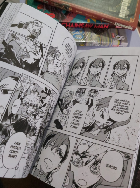
Even if you only use rectangles you can change the pacing by changing the amount and the size you put in a page, smaller panels usually are meant to read faster (a quick action, a conversation) while bigger ones are meant to keep your attention for longer (introducing a new character, a location, putting more importance in a conversation, expressions etc). Theres many ways to use them tho, so be sure to observe a lot of comics to get a better sense for it!
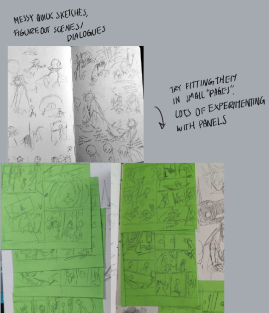
My process is kinda messy? I'll sketch the scene ideas and stuff in my sketchbook and then try and arranging them in panels.
176 notes
·
View notes
Text
OC GOJO GIRLFRIEND'S AU—CHRONOLOGICAL ORDER


don’t get blocked! did you read the rules yet?

MALS' NOTE
readers have asked how to read my fics in chronological order, so here it is! i've included the ages of the the characters as well. i know the ages are off by a year compared to the manga, but whateva lol.
as of right now, the baby gojo chronicles is sometime later than all of these fics in the timeline.

love at first fight — oc gojo girlfriend and satoru are 17-18
sleeping with the enemy — oc gojo girlfriend and satoru are 18.
the courage to try — oc gojo girlfriend and satoru are 18.
souvenirs — oc gojo girlfriend and satoru are 18.
meet the gojos — oc gojo girlfriend and satoru are 18.
fated to love you — oc gojo girlfriend and satoru are 18.
the honored one — oc gojo girlfriend and satoru are 18.
learn to love — oc gojo girlfriend and satoru are 18. megumi is 5. tsumiki is 6.
pinky promises — oc gojo girlfriend and satoru are 18. megumi is 5. tsumiki is 6.
learning from the strongest — oc gojo girlfriend and satoru are 18. megumi is 5. tsumiki is 6.
to be present — oc gojo girlfriend and satoru are 18. megumi is 5. tsumiki is 6.
back to school — oc gojo girlfriend and satoru are 18-19. megumi is 6. tsumiki is 7.
seeing red — oc gojo girlfriend and satoru are 18-19. sometime before graduation.
graduation — oc gojo girlfriend and satoru are 18-19.
safe haven — oc gojo girlfriend and satoru are 19.
fairytales — oc gojo girlfriend and satoru are 19. tsumiki is 7.
morning routine — oc gojo girlfriend and satoru are 20.
lilies & roses — oc gojo girlfriend and satoru are 20. megumi is 7. tsumiki is 8.
sugar daddy — oc gojo girlfriend and satoru are 21. megumi is 8. tsumiki is 9.
break up to make up — oc gojo girlfriend and satoru are 21. tsumiki is 9. megumi is 8.
butterflies — oc gojo girlfriend and satoru are 22. megumi is 9. tsumiki is 10.
the purrr-fect approach — oc gojo girlfriend and satoru are 22. megumi is 9. tsumiki is 10.
forget me not — oc gojo girlfriend and satoru are 25. megumi is 13. tsumiki is 14.
the cursed child: yuta — oc gojo girlfriend and satoru are 27. yuta is 16.
the cursed child: yuji — oc gojo girlfriend and satoru are 28. yuji is 15.
wherever you are — oc gojo girlfriend and satoru are 28. tsumiki is 16.
in case of emergency — oc gojo girlfriend is 28. megumi is 15.
sealed & delivered — oc gojo girlfriend and satoru are 28. megumi is 15.
EXTRA:
facts about oc gojo girlfriend
facts about oc gojo girlfriend part 2
facts about touya
the baby gojo chronicles
layout of oc gojo girlfriend and satoru’s apartment

© 2023 ASDFGHJKLMALS — all rights reserved. please do not copy, translate, or repost my work.
dividers provided by @/anlian-aishang
451 notes
·
View notes
Text
armin's room analysis
so i was analyzing armin's highschool room again lately since he has many references to real game series etc. and couldn't help but notice the big collection of mangas right over his computers.

it was obvious to me they must be real life mangas since the cover sides are pretty detailed and everything else in his room is a real life reference too.
so me and my friend did some research and found all of them!
starting from the top left, which is probably the biggest collection.

the quality of all the mangas is like really bad, but im like 100% it's bleach since the colors of text are very visible and this collection has something orange between the red text and the graphic at the bottom. i was struggling to find any other manga with orange color in this specific placement. the red text and the bottom graphic also seem to match.

2. the collection right underneath.

at first i thought the mangas with the black cover and the white cover were two different ones, but when i looked up naruto manga i figured it matches really well with the black ones, but the couple first volumes of naruto have white covers so they must be the same. it'd be pretty weird if armin started reading naruto from volume 20 something. also the side cover's layout looks the same on both. the only thing that made me unsure is that the text under the title looks blue on the white one and it should be black but since it's low quality i'm gonna assume the colors might be a little bit off. you can also see naruto's yellow hair on the bottom graphic so fsdhufd

3. collection next to naruto.

this is negima. i'm gonna be honest i've never heard of this series before. but the colors seem mostly right and the graphic being on the top of the cover rather than on the bottom. i generally think negima's cover is very characteristic and if someone was a fan they would recognize it right away.

4. collection next to negima.

this one's quality is like. particularly bad. you can't even see much of the middle text that's supposed to be the title. but if you look closely you can sort of tell its red? and that would make sense, because this manga is xxxholic! xxxholic has a title in a font that i can imagine almost disappearing on a low quality image. the side graphic is also mostly black and white and on the top, which would be fitting too. only the colors at the very top are slightly off but other than that i think it's a fairly good guess.

5. the top one on the right.

so this one is kinda impossible to be sure of because you can only tell it's a black text on the bottom of a white cover and theres a graphic over it. i wasn't planning on trying to find it initially but when looking for other mangas i saw one that's kinda similar and that would be blue exorcist. i can't be 100% sure but the bottom has the same colors and layout so i think it could really be it.

only picture of the bottom this time since i think it's easier to compare like this.
also i realize it's hard to compare them with the small ass images of the mangas i pasted in this post so i recommend finding the room image and zooming into the mangas on your own.
anyway that's all, i think those guesses are most likely right so yeah if you're curious what mangas armin reads it's naruto, bleach, xxxholic, negima and blue exorcist!!!
25 notes
·
View notes
Text
Rating labyrinths: Gertrud!
Okay! Let's go with the labyrinth ratings wheeee!!!
What I'm going to do is rank separate parts of labyrinths (eg. anthony's labyrinth from ep 1 is separate to gertrud's from ep 2) but I'll also give an average at the end.
I will (most likely) only be doing labyrinths that are in colour (so maybe not manga witches)


Anthony's labyrinth from episode 1
I think this is a really good one, especially as the first shown (not including walpy's). It really shows of the cut-out style of the labyrinths and the deep blue-hued colours are perfectly moody. The use of runes in the background is also really fun for secret messages. I feel the only downside is that it doesn't really scream Gertrud to me. Like, if you didn't know the series well and was shown this, I doubt you'd think it belonged to her. HOWEVER... I think this does work for Gertrud since all her precious roses are in her room with her. It makes sense that she'd keep them close.
You could say that it's weird that this labyrinth doesn't share colours with the main one but I think it works because it's a familiar's labyrinth. The photorealistic buildings also match the main labyrinth. I wonder if the butterfly and anthony traffic signs are meant to be a subtle warning to madoka and sayaka hmmm
I really like this one. A 5/5 for me


Gertrud's labyrinth from episode 2
There's a lot to it so it's kinda hard to summarise in images lol. But it's another great one. Great imagery, lovely colours and has themes brought over from Anthony's labyrinth. I think the orange tones, although relaxing, also give off this sepia feel that makes it a little unnerving too. Like looking through a tinted view makes things seem unreal.
One of my favourite parts are the doorways that lead to black nothingness. Really helps with the labyrinthine feel. Small touches like the portraits with slight things changed in them to make them scary. It's the kind of thing you don't notice unless you pause. I also like how it seems the labyrinth becomes more luscious as you get deeper. The trees start bare, then with black leaves, then Gertrud's room is fully in bloom.
I wasn't sure whether to rank the boss room separately, maybe I will... I think the ceiling that doesn't quite make sense works well to make it feel disorientating and it's a fun contrast to the kinda pretty garden around Gertrud. It's messy but in a good way. I also think having the boss room have a different theme to the rest works. Just as before I mentioned that roses are only in her boss room, I think it would make sense that her special place may be better taken care of or just look overall nicer. It's very good but I'd say, not my favourite segment. Maybe just because it's only one room?? That makes it a little unfair to compare to the rest...
I'll give the labyrinth a 5/5. Boss room is a 4.5/5


Gertrud's labyrinth from Magireco episode 11
Yeah... this one isn't it, chief... like, it has the things of her labyrinth but it's just not... uhhh I dunno it feels more like a set piece than a proper area...
Let's start with what I like: of course, I love the Gertrud motifs. The butterflies, the cut out images and the hidden text (although it's no different than the original anime iirc). I really like the halo above Gertrud's area. And the hanging loops. It's weird but pretty. Suits Gertrud!
Sadly that's where my positives end. The stark white is NOT Gertrud it's so weird... I guess the stone rose works better but not the rest. I kinda hate in the zoom out where... it just looks like a video game level, like I'm looking at mario 64 or something ToT that is not a labyrinth..! Just the overall layout is meh. I dislike the random fluff pile below it too. Just felt like they didnt know what to fill it with...
It's a dud but has some good things... I'm giving it a 1.5/5. I know there's worse which is why it's not a 1.
So overall Gertrud get's a.... 4/5 wow!!!
45 notes
·
View notes
Text
Had issues with layout in the ask post so here's the rest!
However 1 artist comes to mind for now and that's Murata Yusuke; I'm rereading Eyeshield21 (again lol) and each time his art makes me go "wah so damn good".


From colours, to how dynamic and alive pieces can feel, to lighting/shading, to textures, etc. Lot of the pieces also have this feel of mundanity in it which I really like, and I also how at time I feel like I'm there as well. I love the mixture of realism in lighting/shading (and at times anatomy) with the manga/comic style!
The last image also was a bit of an inspo for my latest Luffy art!
As for tutorial, I might elaborate in another post at some point (cus it's quite a broad thing to go about). Like I've mentioned before, I'm soaking up things along the way! Which includes things like colour theory, lighting/shading, composition, etc. But I personally don't recommend forced research/practice; art needs to be fun after all, take things at a time but it might be nice to try something new with each piece, however how subtle.
I can recommend Saito Naoki's YT channel! I watch his 'whimsical correction' videos during lunch at times haha - Each 'correction' (more like professional advice) has a certain goal/theme which can be improved upon, which can be story wise, appeal, anatomy, etc.
--
Anyway, some advice I have for now are kinda my 'cheats' will follow now! [Disclaimer: these are things that work for me and are by no means the 'correct' way of doing things. So if I say things like "avoid this", it's something I personally do.]
My strength lies I think mostly in my lighting/shading at this moment!


My flats aren't bad or anything, but I feel like it really comes alive after shading. And the first thing to do is to establish where the light source is. Try to avoid 'pillow shading', work in bigger shapes and don't be afraid to do so. Working digitally, I can recommend to take a big brush and just put it very roughly on your character. You have the means with digital art to easily erase parts that are too much and to refine shapes afterwards.
One cheat is bouncing light.
(This was a Multiply mode layer set back to Normal mode for sake of visibility.)


You gotta have a bit of understanding of volume of where to apply it, but it's light that's been reflected by e.g. the ground back up again. This little variation in shading can add a lot. Note that it's better to go from the OG shading colour and sliding it on the colour wheel (hue) to be either warmer or cooler and then sliding in the square/triangle (saturation and value).
More examples of bouncing lights:


It depends how intense the light is reflected; the more, the harsher the contrast is compared to the OG shading colour.
Second cheat is 'light terminator' and 'substance scatter', not sure if it's really the correct terms but oh well.


This reddish tone (again on the Multiply shading layer) is kinda the border line from light to shade. It's reddish on skin (if you have red blood haha) but you apply it on other things with other colours too!


Make sure you don't overdo it and put it everywhere, also note if you use harsh or blended brush strokes, maybe even both for variation! Try it out and see what works best for you!
--
That's it for now; this took more time out of me than planned 💀 you better appreciate this anon! /jk
My main motto regarding art is "fck around and find out". This mindset also helps with keeping art fun!
#hopefully it wasn't too overwhelming lol#this became kinda lengthy after all#with 'cheat' I meant something quite easily achieved to add an extra oomph to your art btw#ask kawaii
56 notes
·
View notes
Text
Excerpts from Shingeki Fly
I finally had time today to look closely at my copy of Shingeki Fly. I used my cell phone to translate bits of the interviews, so mileage may vary, but I am fairly confident the gist is more or less correct.
About the Shingeki Fly Color Art Book
Since Isayama prides himself on not being an excellent artist, he wanted the color art book to highlight the work Mr. Nakao, his colorist since the beginning of the series.
I really like this reflection regarding Mr. Nakao on his first chapter of Attack on Titan:
This is the first color manuscript that a presumptuous amateur, a newcomer who doesn't really know how to hold a pen left or right. The composition, panel layout, and everything else is terrible, but the way you colored it so nicely made me think that maybe I can make a living as a manga artist, and that manga doesn't have to be created by one person alone. I remember feeling hopeful that I would be able to participate in the unknown series that was about to begin.
Isayama's experience at Anime NYC in January 2022:
Isayama talks about how happy he was to visit Manhattan. Because he can't be normal for two seconds, he mentions that seeing the skyscrapers at night reminded him of the 1998 GODZILLA movie.
He also talks about the fan panel. My translation app says something like this: By actually seeing the crowd I was able to realize that Attack on Titan,'' which I had been drawing while holed up in my room in Tokyo, was connected to people far away from Japan and overseas. I was very happy to be able to see each fan's face and think, ``How happy are they?''
(I was able to attend that fan panel in person so I can attest how emotional he was by seeing us all there.)
Isayama's experience at Anglouleme in France in January 2023:
Being in France made him feel very far away from Japan because the city and architecture were so different from what he was used to. He described walking on the streets by the Eiffel tower in the middle of the night as thrilling.
While he set the landscape of Attack on Titan as French, German and Italian architecture, he understands now it was all from his Japanese perspective. Seeing the city is person was completely different from what he'd imagined.
How it felt drawing Levi after such a long time
Here is something I didn't know. At first Isayama was going to write a prequel set 100 years before the main story, but after meeting the fans in France he realized the idea of a one shot was to make them happy. Instead of an original idea, he settled the tea cup story, which is something he'd intended to write but had never had the chance.
He said is was surprisingly easy to draw Levi again after such a long break. The only thing he really had to think about is what Levi would sound like as a 10 year old.
"Bad Boy" was also his first time drawing manga on an iPad. Because he wasn't used to it, he had three assistants helping him. I really want a good translation of this bit because it seems funny. He mentions something about how what should've been digital remote work was more of an analog training camp. He said is was fun to reminisce about his "war era" when he would work while chatting with his assistants about trivial matters.
84 notes
·
View notes
Text
Ping-Pong The Animation: eps 1-3
So Masaaki Yuasa [AN12, AN28, AN150] can do no wrong, right? OK, well, I'll admit Ride Your Wave was kinda mid, and Devilman Crybaby goes hard as hell at the beginning and end but sorta treads water in the middle, but... generally speaking! No-one does it like Yuasa.
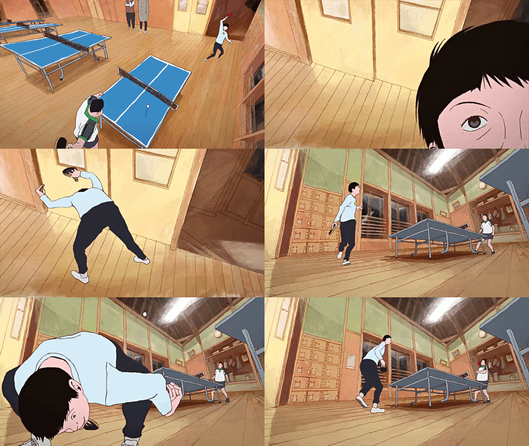
For reasons I don't really remember, I didn't get very far watching Ping-Pong The Animation some years ago. It should be entirely my shit: Yuasa pulling in a gang of wildly creative animators to put their unique spin on something. However, the first episode didn't entirely hook me, and I never got round to trying the second before something else punted 'watching Ping Pong' out of my brain. ADHD, y'know.
This is a shame because even the very next episode seriously goes, as does the one after that. But also this anime isn't entirely what I was expecting (crazy sakugafest full of Yuasa weirdness). Not to say it doesn't do a lot of really unique stuff with its cinematography and animation, but these first episodes at least are more about like... dissociation! ennui!
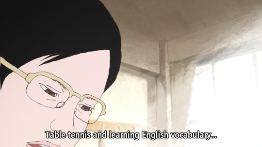
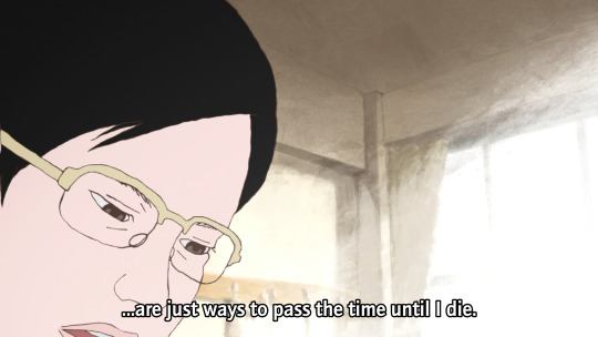
But more on that in a mo. First I wanna continue the thread of 'how do you animate sports'.
So, ping-pong, or table tennis. Not a sport I know much about, I'll be honest. (To be fair I don't know a lot about sports in general outside of some very specific niches. The sports I've pursued so far are rather eclectic: swimming, fencing, tai chi chuan, and roller derby; I never got particularly far in any and it's been years since I've done them.)
I'll inevitably be drawing a lot of comparisons to The First Slam Dunk, the other sports anime I've watched recently. I do think it's a productive comparison though! Both of them bring something of the visual language of manga into their presentation in unique ways. I have not yet read the Ping Pong manga, but it's by Taiyō Matsumoto, otherwise known for scifi manga like Tekkonkinkreet (god tier movie, still need to read the manga) and Number Five. So that's a pretty impressive track record!
If you go take a look at some scans of Ping Pong, what will immediately jump out is the shaky, rough line style and unusual camera angles and compositions.
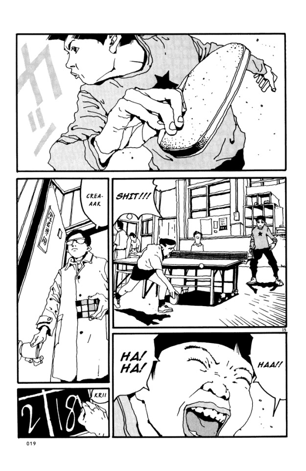
The stylisation is also very different from a lot of manga. Noses are fully drawn, eyes are realistically small, and in contrast, lips and mouths tend to get the emphasis - as well as hands.
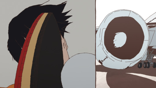
Knowing this makes a lot of the creative choices in the anime make sense! It also adopts a shaky lineart style, and makes use of heavy line weights and spotting blacks to add definition. It also has a lot of crazy closeups and layouts, and it loves a visual metaphor. But most of all, the most striking element of this anime is how often it loves to split the picture up into little panels...
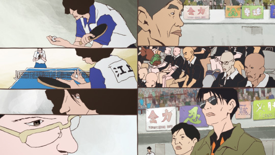
...which [eli]'s subs do a really good job of typesetting, incidentally, moving the dialogue to fit naturally into the split composition. And while this shot with 7 smaller shots is perhaps on the extreme end, splits of three or more are pretty frequent. It's a really interesting way to evoke the effect of seeing a whole page of manga
So, as you proooobably know, ping-pong is a game of bouncing balls off a little table and directing them into places the opponent will find it hard to hit them back. From watching this anime I picked up that there are a number of styles of holding the racket (e.g. 'penhold grip' and 'shakehand') and approaches to hitting the ball (e.g. 'chopping'). A lot of this pretty much went over my head, but honestly it didn't matter, since the narrative significance was pretty much always evident.
Compared to basketball, though, ping-pong is a pretty tricky sport to make visually interesting! Sure, you have the players running to and fro, and that can lead to some interesting poses, but how do you get the drama and tension into this?
Ping-pong additionally is all 2D, it doesn't have the sort of resources that Toei could throw at making the best looking 3DCG basketball game ever. It is limited to a TV-feasible drawing count. So it has to make use of clever limited-animation tricks to get the most impact out of fewest drawings.
Let's take an example sequence from episode 3. A minor character is about to get his ass kicked by Tsukimoto. Tsukimoto is something of a pingpong prodigy, and yet he is very emotionally closed-off and even standoffish; he doesn't particularly seem to like the game very much, and doesn't particularly feel inclined to flex on other players and get into the status games. But other players, like Wenge, have heard about him and want to see what he's got.
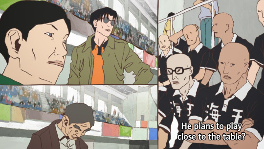
First we have the setup. Other characters are observing and discussing the game. Since ping-pong tends to involve very rapid exchanges, it can follow the classic shōnen model where there's a lot of talking, flashy fight sequence, more talking...

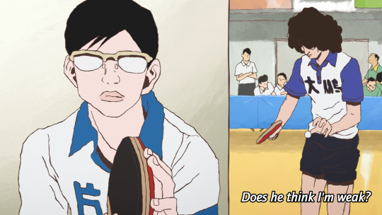
The cut happens in two steps, maintaining the vertical dividing line. This approach to cutting is used a lot in Ping-Pong, and it's quite a creative way to keep visual interest when it's using a lot of largely static shots. The panel on the right is more animated than the panel on the left, a naturalistic depiction of bouncing the ball off the table.
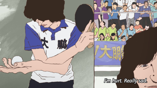

Things start moving faster here. A rapid pan on the image on the left disguises the fact that this anticipation pose is actually not moving at all. This then goes into a rapid, explosive moment as this guy serves.
The final pose is held for a couple of seconds while the voiceover line discussing his intended move finishes. This sort of elasticity of time is a very Osamu Dezaki type of move - it's something that Hayao Miyazaki and Isao Takahata actually really disliked.
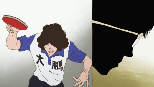
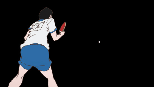
A sound effect hits as Tsukimoto appears on the right in silhouette, anticipating his reaction, and setting up the next shot which leaves the split picture and hides the background for just a moment, as if to put us in Tsukimoto's shoes: he only sees the ball.
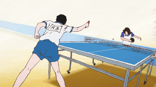

Tsukimoto follows through and holds this pose - the ball is the only thing moving here. The ball moves mainly on 2s while Tsukimoto moves on 3s and 2s, and he and the ball move on alternating frames. He holds the pose as the ball zips off to the right (bouncing off the corner of the table), with a speed lines-like effect. At the end of the shot, the ball freezes in the air for the moment while the sound echoes.
The actual table-tennis round lasts just seconds, and the drawing count involved is pretty minimal, but it does a lot with those drawings.
We go back to voiceovers and reactions in the next few shots, returning to the split video as Tsukimoto's opponent thinks about how he'd really rather be at the beach...
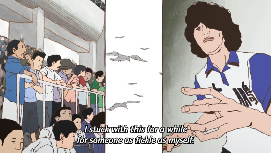
Often, these comic-like compositions will change one panel at a time, and while one panel is animated another panel will be still, naturally moving your eyes across the screen. It is an approach similar to some experiments I've seen in 'animated comics' viewed in a web browser, where the panels do not appear all at once, but enter with some animation.
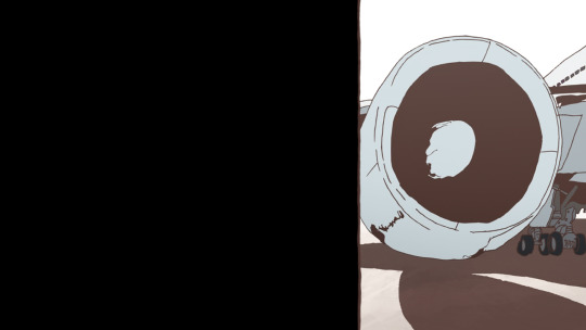
So this is the sort of animation technique that Ping Pong uses. It's effective! Elsewhere the cuts are used in a less direct, continuity-editing way and more in a juxtaposition/montage way. For example, Wenge's desire to return to China is symbolised by match cutting/fading to shots of an aeroplane.

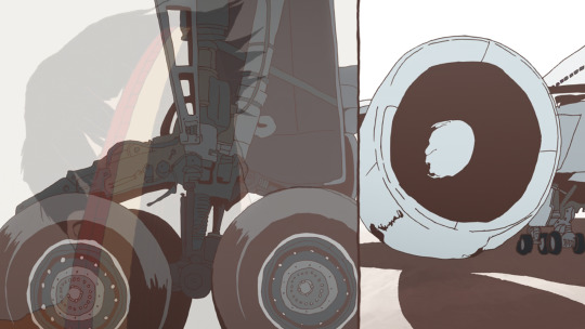
And there is a recurring image, which I'm sure will be expanded on, of Tsukimoto hiding in a cupboard and wishing for a tokusatsu hero to come save him from his isolation. As Tsukimoto's feelings about himself change, the toku hero is replaced by a robot. At this points it starts to feel like an outright Ikuhara anime.
There is occasionally a little bit of CG, mainly when Tsukimoto uses a different type of racket surface, and the way the ball and racket make contact is the crucial thing that the shot is trying to convey...

It gets the job done, but I'm glad they stuck with 2D for most of it.
So I went in the first time expecting like, crazy elaborate sakuga - and to be fair, the OP, animated by none other than Shinya Ohira, delivers on that front - but if anything what I've seen so far in Ping-Pong is actually a triumph of storyboarding and limited animation techniques. I think back then I didn't have the eyes to appreciate it in the same way.

OK, that's the film nerd stuff, but what about the story? Ping Pong follows two school friends, Makoto Tsukimoto aka "Smile" (right), and Yutaka Hoshino aka "Peco" (left). Smile is defined by a flat affect and a standoffish persona. He's just going through the motions. He's very good at ping-pong, but to him it's just a way to pass time, and he's scornful about the idea of caring all that much about it. Much like Shinji with his casette player, Tsukimoto is pretty much always staring at a handheld games console rather than make eye contact with anyone.
Peco on the other hand is the more childish one - playful, kinda arrogant, very much an 'emotions on his sleeve' kinda guy. He sulks when he loses and gloats when he wins, and is constantly seen with bubblegum or other kinds of candy. He provides a lot of our commentary when he chats with the other players.
日本語上手 readers probably noticed the tsuki (moon) vs hoshi (star) symbolism thing they've got going on here!
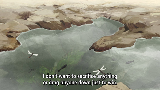
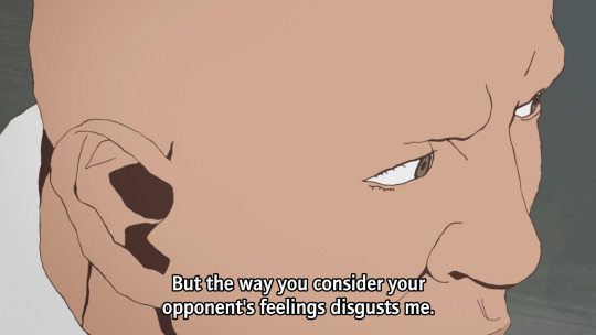
High-school table tennis in this story seems to be a rather 'tough love' kinda world. Most of these players tend to look down on those who can't meet their level. Going easy on someone is seen as weakness, or cultivating bad habits, by almost everyone. Tsukimoto doesn't play at his full potential because he isn't as invested in winning as all these weirdos, but it seems that might be starting to change...
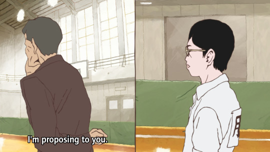

The coach is interesting. He's an old man and fairly disdainful of the club at large, and prone to speaking English randomly with a heavy accent. But he gets excited at the prospect of getting Tsukimoto to unleash his full potential, in terms that are repeatedly metaphorically compared to romance/marriage.
And when Tsukimoto gets sick of it, he challenges him to a game, with the stakes as...
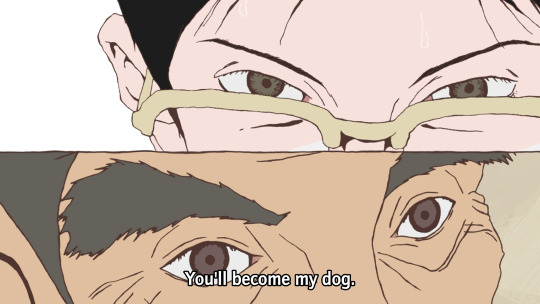

Cue Makima/Beatrice images here I guess.
Tsukimoto de facto wins when the coach collapses, but this episode marks a change of heart. He starts to think of himself as a robot - the affect of a robot replacing the affect of the toku hero in his fantasy. And in this way he does what people seem to want and plays ping pong with mechanical precision, expressed once again in visual metaphor (shot here from a cool transformation sequence)...

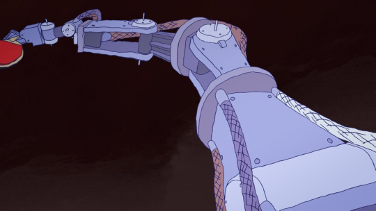
What if I just dissociate harder? This is gonna end well.
So it really is one of those kind of like 'ennui of being a teenager' kind of stories - c.f. say FLCL. 'Boy with complicated emotional landscape' is Yuasa bread and butter, but the particular variant here seems a little unusual for him - they tend to be a little more earnest. I'm curious to see how Tsukimoto develops.
I am definitely enjoying the arrogant Chinese player Kong Wenge. Dude's got a lot of screen presence, and while I'm sure he'll get shown up sooner or later, he makes for a very fun antagonist of sorts.
In comparison to Slam Dunk... one thing that's significantly different about table tennis is that it's an individual rather than a team sport, which means it's harder to have an ensemble cast all contributing to the protagonists' eventual victory - instead it's about a lot of individual arcs interweaving with each other, individual duels. Besides that, it does seem like it will be following a similar arc of a character in an emotional hole (grief for Ryota, depression for Tsukimoto) finding new meaning and purpose through sports - though I can't be sure how things are gonna go for Tsukimoto here!
The tone however is quite different. Even when it's silly, I feel like Slam Dunk is a very sincere story. There's little detachment or irony, or false consciousness - with perhaps the major exception of Ryota's mother, who lets her own grief and trauma get in the way of understanding her son. But ultimately 'why would you care this much about basketball' is not a question that anyone would ask in Slam Dunk. Even the judo guy in the manga who's trying to recruit Sakuragi is just as hot-blooded about his own sport of choice.
There's a difference in like, general affect about the players as well, which has something to do with the sport itself. Yeah, Sakuragi's superpower is his 'genius' ability to predict rebounds, and there is plenty of strategising in Slam Dunk - but basketball is still a sport that very much emphasises physical power, and as much as Slam Dunk will work hard to sell you on a clever trick pass, the visuals are also emphasising the speed that players are dashing, the height they're jumping, their physique. Table tennis by contrast seems to be a sport that's more about prediction and mind games.
That said it is equally just like Matsumoto's style being different from Inoue's. Now I know it's by the guy who wrote Tekkonkinkreet, a lot about this series falls into place! There's a sense of tension here, of being fundamentally at odds with the world. The autismfeels. This is reflected also in the drawings - the characters don't entirely seem comfortable in their embodiment.
So if that's what I'm getting from just three eps, I'm very excited to see what the remaining 8 have to offer. This series is probably too long to cram into Animation Night format, but we'll see...
86 notes
·
View notes