#moth food
Explore tagged Tumblr posts
Text
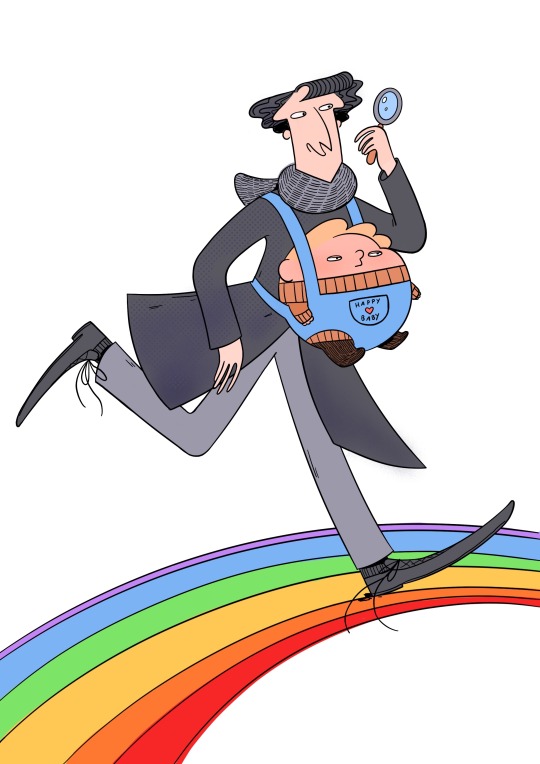
Hey hey hey may 31th anon! How's 2024 going? ☆ヾ(*´▽`)ノ This year I have for you a leaked Sherlock season 5 image. Thinking of you!! And everyone!!
#may 31th anon#Hello hello hello friends!! How are you!!#I miss you all I miss tumblr I miss drawing these silly men#work was soooo boring today I was really happy that I got to draw John in a baby carrier afterwards (*´︶`*)#what have you been up to??#my job is very boring most of the time unfortunatly!! I want to have a new job a little bit but I also never want to have a job interview#ever again and also I might get a lamp this year (!) I have heard that someone has already printed out the lamp form#are you excited for good omens season 3??#I am!! I have also been watching a lot of x-files#(*´▽`*) we also have moths in the kitchen#I do not know what they are eating we have been storing all of our food in the fridge since last week but new moths keep coming#yesterday one flew out of the forks and spoon drawer#it's her kitchen now#I also got a mole removed#now instead of the mole I have a scar the exact same size an color of the mole#I have also been working on a longer comic project!! I think it will be ready to be shared this summer and I really hope you will like it#it's about the old dragon bros characters and their life with the princesses (◍•ᴗ•◍)❤#I'm having a lot of fun drawing again!!#I hope you're having fun too#also I had to write an email today and I had to attach a pdf file but it was upside down#I could not fix it#I just hit send
1K notes
·
View notes
Text
4. comme des garcons: when the balance is just lost...
before i got myself into fashion, i was solely an art geek. i am a particular fan of anything that takes the art community’s obsession with realism and humanity by the arm and throws it into a ditch, namely movements such as suprematism and the war era avant garde in general. therefore i am as well a keen enthusiast of all things cdg... except for when i see them in motion. therein lies my query: why are cdg main line garments so truly awkward to look at?
my thesis: these garments have failed to find a balance between sculpture and human dress. not that they are too sculptural, nor that they are too practical. rather, they seem to completely falter from reaching either of these two ends, even while exerting so much effort trying to achieve something in between both. take, for example, the beloved spring 23 show. seeing these designs through photographs, i was amazed. they were beautiful, innovative, yet seeing them in video made me feel uneasy. a fashion picture does not communicate how a garment actually sits, for a fashion picture is no different really than any other flat media. it’s simply like looking at a picture in a gallery. but when fashion must actually serve its practical purpose, that is when the errors typically become visible. upon watching the video, i noticed how ill fitting the garments appeared, how strange they looked being on a person, being worn.
sometimes, art and wearable fashion should remain of two different worlds, and with comme des garcons, i unfortunately believe this to be the case. the aspiration to create these surreal ultramodern sculptures to be worn in a somewhat pragmatic way is too strong. it lessens the beauty of the design, makes it cheaper and attempts to restrict it only to the bounds of being something equivalent to a t-shirt. by both the model and the garment failing to compliment one another, the design cannot be counted as a wearable item, nor as a thing of fine art. the balance is neglected for the sake of promoting two ideas at once, and thus, it looks just plain stiff...
the designs at the comme des garcons main line are really something of a feat, something little art nerd me would much rather ponder upon as a sculptural work, rather than as a weird dress.
>parasitka პარაზიტკა
1 note
·
View note
Text
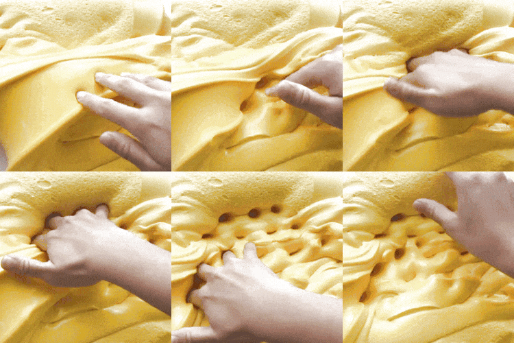
Cake Moth Plush (by Squishable) Stimboard! :3


🧁🌸🧁~🎉🎂🎉~🧁🌸🧁
#I need this plush 😭#had a lot of fun with this one#stimboard#stimmy#stim#visual stim#stim blog#stim gifs#stimblr#food stim#neurodivergent#moth post#moth#rosy maple moth#luna moth#squishables#plushies#hands tw#tw hands#tw bugs#bugs tw#food stims#slime stim#plush stim#partycore#kidcore#pastel#birthday cake#pink stim#Stelly's Stims 💖
464 notes
·
View notes
Text


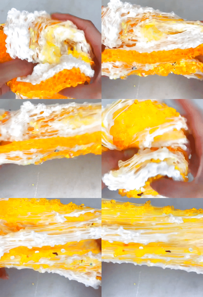
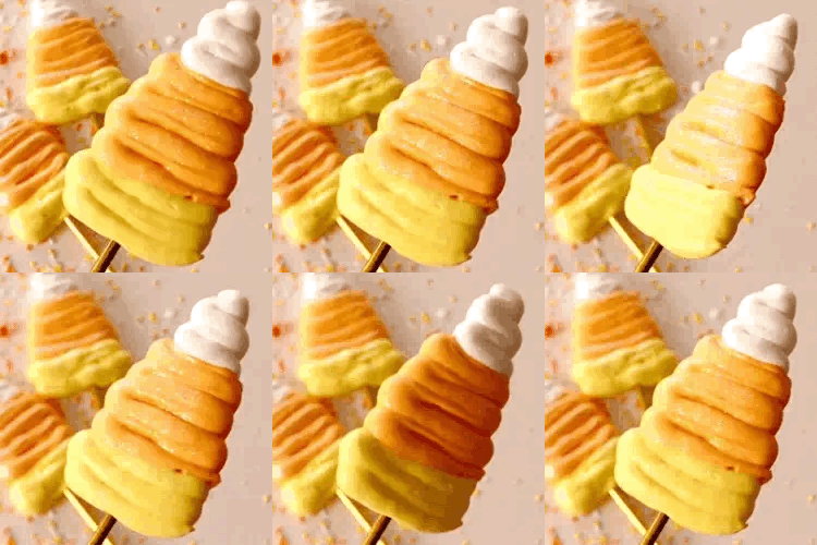

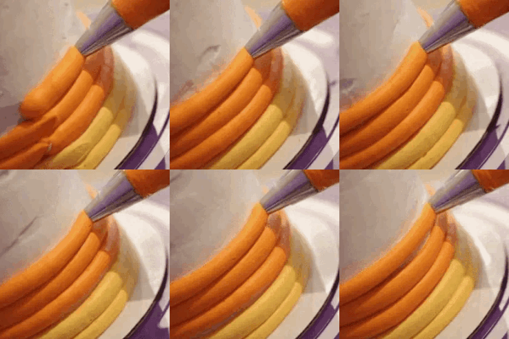


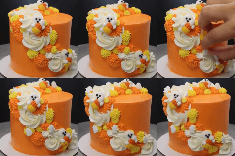

candy corn cinnamoroll (2024) for multiple askers
X | X | X || X | X | X || X | X | X
#mod moth [☃️]#stim#stimboard#cake#frosting#squishy#slime#food#shaker#cupcake#orange#yellow#white#sanrio#cinnamoroll#candy corn#halloween#hands cw#queue
482 notes
·
View notes
Text


🍓 trosia semirufa, also affectionately known as the strawberry cake moth 🍓
🍓-🤍-🍓 / 🖤-🍓-🖤 / 🍓-🤍-🍓
#stim#stimboard#moths#strawberries#sfw#red#white#black#pink#fruit#strawberry cake moth#strawberry shortcake moth#trosia semirufa#bugs#insects#animals#food#desserts#cakes#powdered sugar#slime#guitars#instruments#pianos#hands#plushies#kuromi#sanrio#utensils#long nails
274 notes
·
View notes
Text
He love moff
#her name is Aranea and shes the perfect familiar#sure she eats your food and pushes things of tables but#can you really blame her#phyx#dnd oc#moth#ranger#my art
232 notes
·
View notes
Text
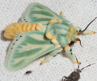


Southern African slug moth
x x x - x x x - x x x
543 notes
·
View notes
Text


Rosy maple moth board for @drinks-battery-acid
X-X-X X-X X-X-X
#stimboard#request#rosy maple moth#moth#bugs#hands#food#cake#icing#flowers#lantern#nature#pink#yellow#fave#stim
103 notes
·
View notes
Text


>> puncha.patisserie
#pink#yellow#white#pastel#pouring#glaze cake#cakes#cake#food#sweets#baking#butterflies#flowers#rosy maple moth colors#my gif#my gifs#stim#stimmy#sensory
88 notes
·
View notes
Text
Wrangling the Children onto some fresh leaves. The Cecropia Kids are over 40 days old and still growing, and I’m starting to worry they won’t pupate in before I leave on vacation . Granted, I’m sure everything will be ok but it’s in my nature to worry over multi-legged invertebrate children. I just love larvae.
(Forgive the frass, I cleaned it out shortly after getting all the cats onto fresh food)
#hyalophora cecropia#cecropia moth#caterpillars#invertebrates#larvae#bugs#insect#bug keeping#I love these guys so much#they walk right onto my hands and it tickles!#I wash my hands for their safety and only handle very lightly and only when coaxing them into new food#they’re very chill and docile#if they don’t pupate in a week I have to hunt down a box elder tree in a new neighborhood and I’m worried#will it be good enough for the children? I hope so
461 notes
·
View notes
Text


Lesbian pride flag stimboard
Source: ❤️ 🧡 💜 / ❤️ 🧡 💜 / ❤️ 🧡 💜
#lesbian#pride 2024#wlw#tigers#big cats#food#strawberries#paint#gemstones#art#stim#owl post#stimboard#cake decorating#woodworking#sunset#water#shiny#animals#pride#lgbtq+#cats#ocean#sea#beach#waves#moths#flowers#roses#fruit
109 notes
·
View notes
Text
3. prada womens autumn/winter 23-24 communism realness
i was perusing my twitter timeline and browsing through the shows at milan for a/w 2324 when i noticed a tweet regarding prada’s new collection and its “ode to communism”. alas, i scrolled past the tweet very quickly and now i have no idea what it actually was talking about or said, but!!! it has gotten me to think about this collection and its relations to mid 20th century communism, especially, as i see it, communistic propaganda posters.

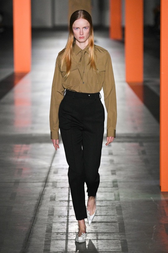
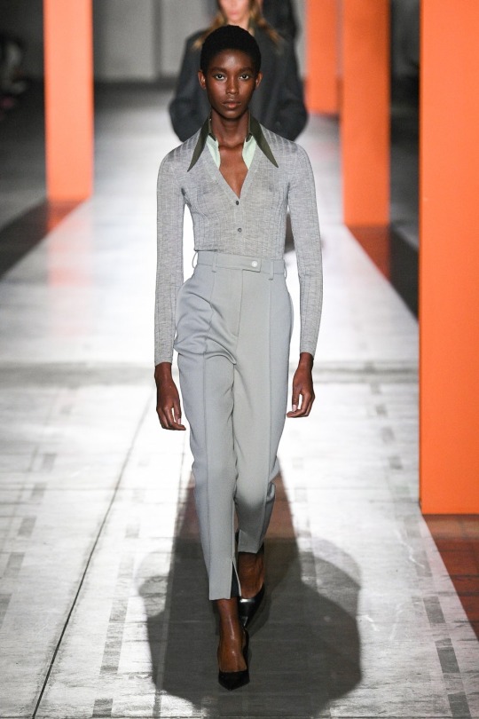
i will highlight the motifs i notice in these three particular looks.
look (1): very formal, white. conservative sleeves and neckline. reminds one of a 50s nurse. here can be seen the throwback retro inspiration of the collection. she’s a utilitarian, sexless female employee. the dress almost looks as if it is not meant to look nice at all. that’s because its not: the purpose of a uniform is function, not form. the dress certainly has many functions. its free with movement, and carries many pockets. it looks quite comfortable really. what struck me severely was the reflection of soviet nurse uniforms onto this garment, but of course, such was the traditional hospital garb in the soviet era, not only for the ussr, but in general internationally. yes, it’s a retro piece. however, the very plainness of it, the lack of embellishment or accentuation of the female figure of any kind is what makes it so perfect in communist idealism: a woman is equal to a man. a woman works, just as a man. why should she be more striking than anyone else.
look (2): here the motif is very militaristic, almost exactly an aviator’s uniform. the get-up is indeed quite unremarkable, save for the shoes, but i will get to those in a moment. as for the shirt and pants, it’s masculine, but in a unisex way. the female body is still not emphasized, even with the high-waist of the trousers. she’s still made to appear very boyish. she’s still a woman in a male way, a genderless way. it’s as if she were distributed a military-regulation uniform, a size not tailored, perhaps not even her own. just another shirt and pants, that what her male counterpart would receive as well. the shoes, however, caught my eye in this show. at first glance, they seem quite “avant-garde”. they honestly reminded me of the current cyber trend, but after analyzing the actual decoration on the shoes, i noticed the flowers. really, without the heels, she would look like she had rushed out in a boy scout uniform, but the heels add the femininity. was it needed? as a styling choice, very much so. with the theme, i must also admit, it reflects the soviet women’s obsession with pretty things, especially flowers. soviet women were very natural and simplistic, a mix of life on the countryside and in the city. on the ussr recognized holiday of international women’s day, it was warranted to gift women flowers.
look (3): this look returns to the retro aspect of the show. come on, the collar? the v neck? it looks like she just crawled out of a 70s family portrait. here i think is important the dull palette. this prada show actually showed a very controlled color variation, save for a few garments, but here, again, the “pop of color” is a very desaturated mint(?) under layer. she, once again, looks very genderless. androgynous, i do not believe describes this, because the garments, to me, clearly have gender, but when worn on her, they seem to lose it, or it becomes mixed. i can no longer tell if they are women’s or men’s wear, that sort of idea. i’d like to add that it even looks like the uniform of a young pioneer, worn out of age.
i’ve lost a little bit my thesis that this collection has something “communist” about it, so let me collect my thoughts. in the soviet era, there was the idea of equality for all, but not in the association that we have the phrase today. it was more so, everyone is a worker, everyone must contribute. there were no exceptions for woman or man, and so here is very much reflected the equal ideology. of course, there was the opening with male models in skirts, but i think that is a bit of a given in the fashion industry today. however, absolutely boring (and i mean that very positively, considering my love for prada) clothing, i would argue, is not. everything is trying to spiral more and more into discord, no? that’s the trend, despite niche movements like “scandi style” and “minimalism”. no, those trends still intend to compliment the wearer and present some sort of accent. this collection truly featured boring clothing, in every sense of the word. the garments were dull, genderless, unsexy, old, untailored, too big and too small. but really, this is the perfect depiction of equality. no one stands out. look again at the three looks i focused upon in this analysis; does any one protrude against the others? not really. they’re all absolutely equal. i suppose this is prada’s response to the equality zeitgeist. a little bit championing the soviet narrative, but i do agree. it’s inoffensive, in fact, it’s the type of equality that people hate. this is either prada’s response to the influencer trend of distinction, or prada themselves being distinct within the industry.
whatever that answer may be, it’s most certainly a soviet futuro fantasy, a utopian society of tantamount individuals. the clothes are practical, not tailored to a specific body, but rather to an amorphous group of similar sacs of skin and flesh. it’s clothing not for a person, but for a group.
>parasitka პარაზიტკა
p.s. i would like to also comment on the setting. those red beams, the color is very reminiscent of the red pigment used in soviet propaganda posters. they really frame the models, their characters, don’t they?
0 notes
Text
modern au where it’s common for druids to go into drive thrus shapeshifted. usually stag form if they’re polite. the bears are a little less appreciated. the many flight forms receive mixed reactions, mostly based on size, and how annoying it is to get the food bag into their mouths/beaks or claws.
#no one in those fast food places likes a druid showing up in moth flight form.#warcraft#mine#druids#modern au
84 notes
·
View notes
Text


boardtober day 2: candycorn or candy apple. i was gonna do candle apple but there really isnt much in terms of apple babs.. so, candy corn it is 🍬 sorry for how late this one is!
candy corn kitty (2010) with candycorn-themed stims!
X | X | X || X | 🎃 | X || X | X | X
#oh how i would love a her someday#but she sells for like. literal thousands bc of her rarity#heartnosehalloween#mod moth [☃️]#stim#stimboard#build a bear#halloween#candy corn#cake#food#feathers#soap#cats#animals#whipped cream#drinks#orange#yellow#white#hands cw#queue
170 notes
·
View notes
Text
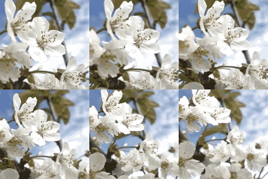


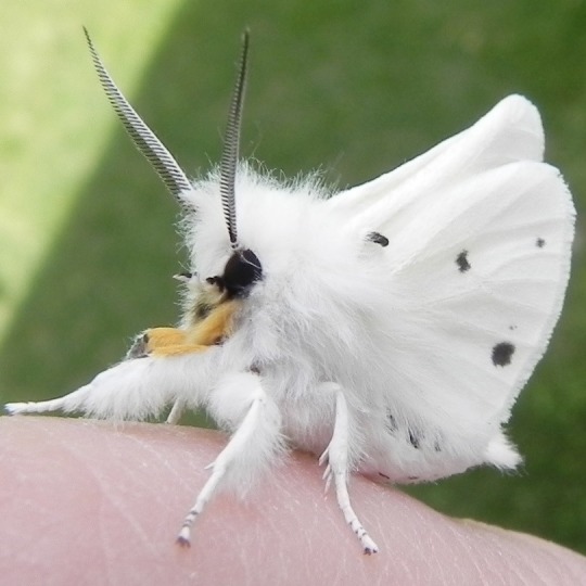


the virginian tiger moth (spilosoma virginica) with some flowers in a white color scheme for anon~
🤍-🌻-🤍 / 🌻-🤍-🌻 / 🤍-🌻-🤍
#stim#stimboard#moths#flowers#sfw#white#orange#black#brown#virginian tiger moth#spilosoma virginica#insects#bugs#slime#plants#squishies#stim toys#bunnies#rabbits#food#cakes#desserts#trees#petals#pocket watches#squishing#hands#utensils#inanimate object harm#requests
519 notes
·
View notes
Text


A Grian stimboard! ❀ requested by anon ┈ with general Halloween themes!
x . x . x / x . 🦇 . x / x . x . x
#❀ ┈ requests#❀ ┈ stimboards#bat stim#grian#hermitcraft#stimboard#red stim#black stim#plushie stim#moth stim#candy stim#food stim#halloween stim
35 notes
·
View notes