#mogai accessibility
Explore tagged Tumblr posts
Visit Tumblr Blog
Explore Tumblr blogs with no restrictions, modern design and the best experience.
Last Seen Tumblr Blogs


Fun Fact
The total number of visits Tumblr.com received during January 2021 is 327 million.
Text
🍵 blog promo 🍵
[PT: 🍵 blog promo 🍵 /End PT]
Welcome to accessibilitea!
This blog is a collaborative effort to provide image IDs and plain-texts (PTs) for the Tumblr LIOMOQAI community. We hope to split the demands of running an accessibility blog over multiple members, rather than having it all on one person.
You can get assistance from the blog through tagging (preferred), DMs or asks. We can do image ID assistance and accessibility advice as well as just ID-ing a post directly. Feel free to tag us as many times as you want!
Tags: (let us know if you want to be removed!)
@radiomogai @buntress @scr-ppup @boyrecluse @hrtluka @icwdtea @rwuffles @sevvys @angeltism @zoeynovie @the-astropaws @pupcoins @flutteringwings-coining @boingogender @acronym-chaos @catboy-autism @whimes @noxwithoutstars @dragonpride17 @robofox-mogai @theflaggerrrr @daybreakthing @brainkeeper-service @voidcoining @somniabyte
#🍵 background chatter#mogai#moqai#liomoqai#mogai accessibility#liom#mogai community#moqai community#liomogai community#liomoqai community#qai#qai community#mogai friendly
62 notes
·
View notes
Text
ok. i'm genuinely so fucking sick and tired of being nice about this and not saying anything. evidently it seems the people who try to be nice about this are just ignored, and this is seriously a massive issue with our community.
this is a not super kindly worded message to every single coiner who uses heavy typing quirks, excessive amounts of spaces, colored text, ascii symbols, and what have you especially when there's no translations or the translations are hidden under a cut or at the end of a post.
have a fucking sliver of respect for visually impaired people. please. your coining posts are entirely inaccessible to those who need screenreaders, and half the time even i'm struggling to read them without needing one. i've seen at least 5 posts about this in the last few months and there has been zero change. in fact, i think even more blogs who use this format have popped up!
so fix it. your passive ableism is not fucking cutesy and fun in the slightest. no excuses, especially since typing in plain text is significantly faster.
and if this post makes you upset, you should really re-evaluate how inclusive you actually are.
#liom#liom community#mogai#liom coining#mogai coining#mogai heaven#mogai friendly#mogai flag#liom term#xenogender#xenogender community#gender coining#new xenogender#imoga#imoga gender#liom accessibility#mogai accessibility#liomogai
419 notes
·
View notes
Text
post accessability
hey hi
ik im an *extremely* new blog but from my time in the community (just lurking in the shadows /silly) i’ve seen a lot about how the mogai community can be inaccessible for many
i would love to make sure that absolutely anyone and everyone can access my posts and not have to go through extreme hurdles to do so /gen
i dont use a screenreader, nor do i have close contact with anyone who does (that i know of). ive seen posts about colored texts and fonts that can “break” screenreaders. i may not fully understand how a screenreader works, or why it cant handle these things, but i do understand that in those situations its a simple step to make your post accessible.
i have an issue with my eyes and how they dilate which leads to bouts of extreme light sensitivity. even on my average days it can be extremely uncomfortable (and sometimes trigger a migraine) for me to see extremely bright colors (possible tmi?). i try to avoid the eyestrain tag when i dont think i can handle it. however there are still posts with brightly colored fonts (or images) that are untagged that impact my ability to access the post unless im on my bestest of days.
however, i dont fully understand anything past these two situations and want to make sure im not leaving anyone out when making sure every aspect of me and my blog are accessible.
please (gently) let me know things that i should be aware of/avoid doing (or even what i actively should be doing) as i enter the world of mogai blogging
tagging (bc ive seen accessibility posts through yall’s blogs mainly): @transflorall and @the-astropaws
#help me be accessible#accessibility#mogai accessibility#accessible mogai blog#liomogai#mogai blog#not a request
5 notes
·
View notes
Note
could you help me with adding image IDs??? you're the fifth person that I'm asking that!!!
Hello! I am not good at explaining, but I'll try -- apologies if anything is unclear. I will also be putting this in tags, as I believe it is important information. However, I will also preface this by saying I do not use or need a screenreader and have no vision problems that affect how I see color (as long as I wear my glasses), so I likely do not fully understand what it is like to need a screenreader.
What I do is focus on how many stripes there are and if there are any variances in stripes, such as shape, stripe thickness, if they are wavy or not, etc. Let's use the trans flag as an example (adjusted so that the colors are not so bright. I am unsure if the colors would count as eyestrain, but looking at the colors hurt my eyes a little as I typed this up, so I muted them a bit):
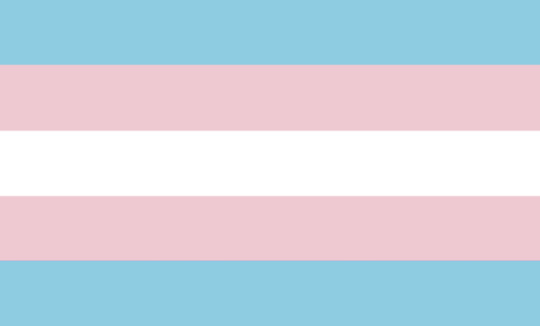
[ID: A five horizontal striped flag. From top to bottom, the colors are light faded bluish-cyan, light pink, white, light pink, and light faded bluish-cyan. End ID]
I would first describe the amount of stripes, in this case: five. They are all of equal size, with no patterns, and are all just straight. So I would just say "A flag with five horizontal stripes" or "A five horizontal striped flag" -- taking into account the amount of stripes.
Secondly, I will describe the colors. I try to focus on what the color is, how saturated it is, if it's light or dark, or if it's a blend of any colors. I use the Artyclick color name finder site (I am not sure if tumblr allows links to outside sites to be in tags, so I'll play it safe and not link it here. However, it's the first result when you search up "Artyclick color name finder" or just "color name finder.")
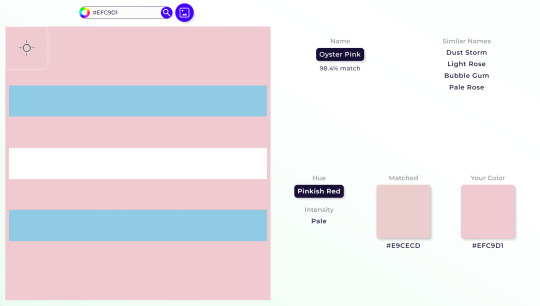
[ID: A screenshot from the ArtyClick color name finder site. On the left, the color that is focused on is the light pink on the (edited) trans flag from before, whereas on the right, you can see the color name, Oyster Pink, alongside similar names: Dust Storm, Light Rose, Bubble Gum, and Pale Rose. The hue is shown to be pinkish-red, intensity said to be pale, and to the right of hue and intensity, it shows a matched vs your color. End ID]
This site shows what a color is named, similar names, its hue, and intensity. It's very good for when you're really stuck on how to describe a color. I recommend going for color names that are clear instead of obscure or abstract. For example... "light pink" is a better descriptor than "dust storm." Also, you do not have to go with exactly the same colors that ArtyClick generates. Some of the descriptions can be inaccurate at times, but it is a good tool to use if you're stuck on how to describe a color.
Another thing I do is looking at other flag IDs for reference if I need help with formatting or describing something. This is especially helpful if the flag is from a gender system, and even more so if the original coiner of the gender system has an image description for the flag template.
I hope this post helped! Everyone, please feel free to reblog, add on advice in comments or reblogs, or send in asks with your own advice.
#info#asks#mogai#liom#accessibility#mogai blog#liom blog#mogai accessibility#liom accessibility#shoutout to my friend who told me about artyclick
2 notes
·
View notes
Text
“The mogai community has become really inaccessible lately because eveyone wants their posts to be formatted with dividers and symbols etc to be ~aesthetic~ and not enough people use IDs”
Damn. Couldn’t be me.
#this is not to make myself look good or say I'm perfect with accessibility. but I do hope people use my posts as examples of coining posts#that are only decent looking but still get their point across. your blog does not need to be aesthetic more than it needs to be accessible.#and before you mention my previous typing quirk that was 2 years ago. Shut up.#mourn says stuff#mogai community#accesibility#mogai accessibility
4 notes
·
View notes
Text
hi, i’m a scardey-cat who loves helping out with the accessibility side of tumblr! i love spending time adding plain text and image descriptions but get a bit nervous about opinions, so here’s my totally separate blog for adding ids and pt!!
i love spam like actually so much (please please please spam me)
in asks/dms/tagging, feel free to:
recommend blogs to add ids/pt to
send posts for ids/pt
ask me to go through posts before posted, adding ids/pt
literally anything else remotely related ^^
i may eventually add a byf sort of thing, but anyone can ask for id/pt on any posts! i think it’s important that everyone can access things, even if i don’t agree with them (which means posts i interact with aren’t signs of me agreeing with dnis/stances/byfs)
#id help#pt help#mogaiblr#mogai blog#liomogai blog#accessibility blog#mogai accessibility#liomoqai#liom blog#liomogai#liom#mogai#plain text#image description
1 note
·
View note
Text
sometimes it feels like the only accessibility mogaiblr has ever cared about is alt text. alt text is good, it's helpful, but i can't help but feel other things of equal importance are being glossed over.
eyestrain tags are important. some people have chronic migraines and will throw up (and, in some cases, lose vision temporarily) if they unwillingly have to view bright flags. "but i don't know what counts as eyestrain!" which is why it's an acquired skill, just like alt text.
plain text is important. aside from breaking screenreaders, you are also limiting who can use your terms to whoever can read the definition through the excess of symbols and fonts on the post. offering plain text is easy, it doesn't take much time out of your day, and i am tired of people pretending otherwise.
separating layers in your flag templates is important. some people are incapable of separating it themselves, whether it be because they get confused too easily, are too burnt out to do so, or even because the app/platform they use physically does not allow them to do so. please post your layers separately or combine them into downloadable psd files.
im sure there are a lot of others, but im not an accessibility expert. i only know what would be helpful for me and a few others ive seen. you don't have to do these things, this post is just meant to highlight different accessibility needs that often go ignored; it would be nice if some effort was put into it, though.
115 notes
·
View notes
Text
Maned Lioness and Maneless Lion pride flags
Pride flags for anyone who identifies as, or with the concept of a maned lioness or a maneless lion, for any reason, including But Not Limited To: being intersex, gender nonconforming, trans in any way (and of any gender), or alterhuman/otherkin!
The colors were picked from photos of real lions and lionesses, and are completely symmetrical to represent how there's no "wrong way" to be a maned lioness or a maneless lion. There is no gender requirement for either flag.
Other people with completely different genders to you might identify as the same one as you, and this is a good thing. Have pride in your community. There is no wrong way to be a maneless lion or maned lioness. There is no gender requirement or policing.
Insert pride puns here.
These pride flags and icons are Public Domain, meaning there is no copyright on them, and you can do Literally Anything you want with them, at all. (Because there's no point in making a "pride flag" if no one is allowed to actually use it as a pride flag)


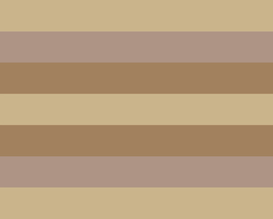


[ID: Three versions of two pride flags, both with seven horizontal and symetrical stripes, with the top, bottom, and center stripes being the same color. The first is the Maned Lioness pride flag, with stripes of: Black, tan, light brown, black, light brown, tan, and black. The first version of the flag has a white icon of a maned lionness in the center, with a spiky mane. The second version has just the stripes. The first version is the icon against a white background, with the flag stripes inside the lines of the icon itself. The second flag is the Maneless Lion pride flag, with stripes of: very soft gold, tan, light brown, soft gold, light brown, tan, and soft gold. The first version of the flag has the head of a maneless lion in the center in white. The second version has just the stripes, and the last version is the icon itself against a black background, with the stripes inside the icon. End ID.]
All of these images are archived on the Internet Archive. This post will be saved to the Wayback Machine as soon as it is posted. You are encouraged to download and share these anywhere and everywhere you want. Just please include the relevant sections of the image description for accessibility.
Again. Cannot stress this enough. There are no gender requirements for either of these terms.
You might identify with the same term here as a woman, or a man, or a nonbinary person. This is not a bad thing. This is fantastic. Celebrate your shared pride and have joy in your community.
Protect everyone around you just as strongly as lions defend members of their own prides, no matter the differences between you, whether you're a maned lioness or a maneless lion, or neither, or something in between.
Bare your collective teeth at those who want to harm us all.
#Pride flags#described images#accessible pride flags#maned lioness#maneless lion#gender nonconforming#gender nonconformity#gendernonconformity#gendernonconforming#intersex#trans#transgender#transsexual#nonbinary#pride#Queer#alterhuman#otherkin#therian#lion kin#gender#GNC#archived pride flags#LGBTQIA+#LGBTQIA#LGBT#Pride#MOGAI#LIOM#feminism
147 notes
·
View notes
Text
What Pride Flags Mean, Part 1: Gender and Attraction
Welcome to the latest installment of my autistic hyperfixation on flags! I wanted to figure out a common language of Colour X means Thing Y. Like how pink is consistently used for feminine.
Having a common language for flag meanings matters because it improves cognitive accessibility of flags. ♿️💙
But I didn't want to be prescriptive about what colours should mean what. Just because I think Thing X should go with Colour Y doesn't mean everybody else would.
So this turned into a descriptive, empirical project. I gathered a data set of 2060 pride flag colour choices to figure out what are the most common colour-meaning combinations. Some of the results:
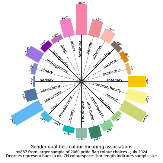
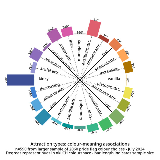
And here are the abstract modifiers: these are modifiers that were generally shared between the genders and the attractions. For example, black is used to indicate having no gender as well as having no attraction.
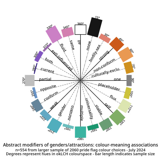
Click here for tables with okLCH values, hex values, definitions, and notes - I've put a more detailed write-up on my Wikimedia Commons userpage. (Mediawiki supports sortable tables and Tumblr does not.)
METHODS-AT-A-GLANCE
To make the figures above, I assembled a data set of pride flag colours. It contains 2060 colour choices from 624 pride flags, representing 1587 unique colours. Click here for a detailed description of how I gathered and tagged the pride flag colours and tagged them.
For each tag, I converted every colour to okLCH colour space and computed a median colour. OkLCH colour space is an alternative to RGB/hex and HSL/HSV. Unlike RGB/hex and HSL/HSV, okLCH is a perceptual colour space, meaning that it is actually based on human colour perception. 🌈
In okLCH space, a colour has three values:
- Lightness (0-100%): how light the colour is. 100% is pure white.
- Chroma (0-0.37+): how vibrant the colour is. 0 is monochromatic. 0.37 is currently the most vibrant things can get with current computer monitor technologies. But as computer monitor technologies improve to allow for even more vibrant colours, higher chroma values will be unlocked.
- Hue (0-360°): where on the colour wheel the colour goes - 0° is pink and 180° is teal, and colours are actually 180° opposite from their perceptual complements.
The important thing to know is that okLCH Hue is not the same Hue from HSV/HSL - the values are different! (HSL and HSV are a hot mess and do not align with human colour perception!)
You can learn more about okLCH through my little write up, which was heavily influenced by these helpful articles by Geoff Graham, Lea Verou, and Keith J Grant.
You can play with an okLCH colour picker and converter at oklch.com
🌈
MORE RESULTS: COLOUR DISTRIBUTIONS
Back when I started tagging my data, I divided my data into five main chunks: Gender qualities (e.g. masculine, androgynous), Attraction (e.g. platonic, sexual), Values (e.g. community, joy), Disability (e.g. Deaf, blind), and Other.
I'll talk about Disability and Values in future posts! But for an alternate view of the data, here are the full distributions of the colours that were placed in each tag.
They come in three parts: tags I created for Gender, tags for Attraction, and tags from Other. The abstract modifiers are spread between the first two, though their contents transcend Gender and Attraction.
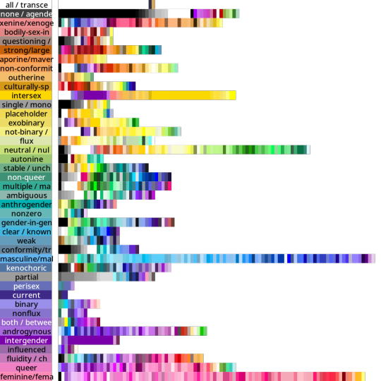
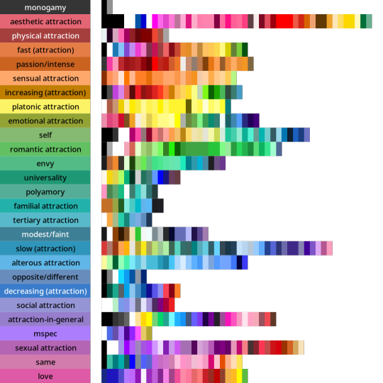
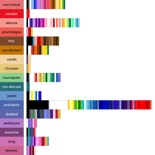
Some distributions have a lot more variance within them than others. Generally speaking, major attraction types tended to have the least variance: sensual attraction is really consistently orange, platonic is really consistently yellow, etc.
Variance and size do not correlate. Many of the smaller tags are quite internally consistent. I don't have a ton of tags in "current gender" but they're all the same dark purple. Xenine/xenogender has a whole bunch of entries, and there's a really big spread from blue to yellow.
Some tags, like intersex as well as kink/fetish show there are a small number of different colours that are very consistently used. Whereas other tags like masculine show a very smooth range - in this case from cyan to purple.
Overall I'm pretty satisfied with how things wound up! 🥳 It makes sense to me that an umbrella term like xenogender would have a lot of variance. What honestly makes me happiest is just how many tags wound up 180 or 90 degrees from their opposites/complements. 🤩
Not everything lined up nicely (the opposite of drag is .... neuroqueer? awkward.) 🤨 Some things lined up in hilarious ways, like how initially I had the opposite of kink/fetish being Christian (amazing.)
But as a whole, there's a lot of structure and logic to where things landed! I hope this makes sense for other people and can help inform both flag making as well as flag interpreting (e.g. writing alt-text for existing flags). 🌈
I'm hoping to post the Disability and Values analyses in the coming days! If you want to learn more, my detailed notes along with tables etc are over on my Wikimedia Commons userspace. 💜
Everything here is Creative Commons Sharealike 4.0, which means you're free to reuse and build on my visualizations, tables, etc. Enjoy!
#lgbt#lgbtqia#mogai#mogai flag#mogai flags#lgbtq flags#lgbt flags#lgbtqia+#vexillology#flags#colours#oklch#colour nerdery#colour theory#colour science#cognitive accessibility#design
201 notes
·
View notes
Text
image ids! top to bottom, left to right
image 1: a transparent light lavender dovetail banner outlined with a thin stripe of dark lavender, then a thicker purple outline, then a thin dark blue outline. in lavender, from top to bottom, there are graphics of a star, a crescent moon in a circle, and another star
image 2: a transparent banner. on either end, there is a star followed by a line leading to the center with text that reads “Team Moon.” all of the image is in light lavender, outlined with purple, then dark blue
image 3: a lavender transparent userbox outlined in dark blue. there is a purple square to the left with an image of a light lavender crescent moon. to the right, light lavender text reads “This user is part of the Moon Team in the Coining Fight!”
image 4: a transparent yellow dovetail banner outlined with a thin stripe of light orange, then a thicker pinkish orange outline, then a thin reddish brown outline. in peach, from top to bottom, there are graphics of a clockwise spiral, a sun, and another clockwise spiral
image 5: a transparent banner. on either end, there is a sun followed by a line leading to the center with text that reads “Team Sun.” all of the image is in yellow, outlined with peach, then reddish brown
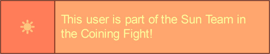
image 6: a peach transparent userbox outlined in reddish brown. there is a pinkish orange square to the left with an image of a yellow shining sun. to the right, light orange text reads “This user is part of the Sun Team in the Coining Fight!”
Hai! I made some cute little Coining Fight graphics! :3


[No ID right now, sorry!]
Moon on top, Sun on bottom!
(you'll also want to click to expand, as the way tumblr does image stuff is annoying, and also save these on computer for a similar reason)
@kiruliom !!!!
edit: oh yeah uh the banner are inspired by this[link]
Edit 2: there are also in this blog’s carrd in a new section i added, jsyk. Also i made the userboxes on here[link]. Might add blinkies, but I don’t have the spoons to do custom blinkies atm. Also I’m at school lmao
17 notes
·
View notes
Text
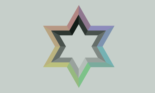
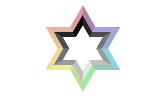
Jewish MOGAI Pride Flag
pt: Jewish MOGAI Pride Flag /end PT
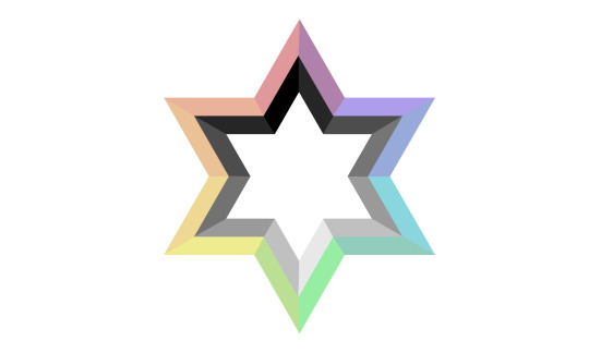
ID: a white flag with a big silhouette of the Magen David (six pointed star) in the center. The Magen David is divided in twelve parts, with different colors. The six outer parts are differents colors, placed in a way that it ressembles a rainbow while the six inside parts are differents shades of gray. END ID
ID: the same flag, with a greenish filter over it, making it darker. END ID
The original mogai pride flag is quite aggressive to the eye. So I've tried to make it more accessible, trying to not change the original design too much.
On the left, the flag has the colored parts of the Magen David less saturated. On the right, the flag has also the colored part less saturated but also a green filter added on top for even more relief since green is recognized to be the best color to relieve eyestrain and photophobia.
Since different individuals will be triggered by different components I think it is just better to have the two designs so that each person can choose the one that fits best for them.
Jewish MOGAI Symbol
PT: Jewish MOGAI Symbol /end PT
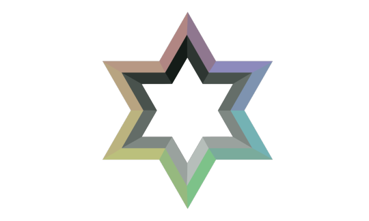
ID: the Magen David (six pointed star) symbol on its own, on a transparent background. END ID
ID: the same thing but this time the Magen David has the greenish filter over it. END ID
The symbols can also be called the MOGAI David! I'm not the person who came up with this clever play on words.
#Jewish#Jumblr#Jewblr#Judaism#Jewish mogai#mogai#liomogai#qai#liom#bipoc#indiqueer#cultural identity#ethnoracialized group#combo flag#queer#original post tag#long text#long post#accessibility#sensory friendly
39 notes
·
View notes
Text
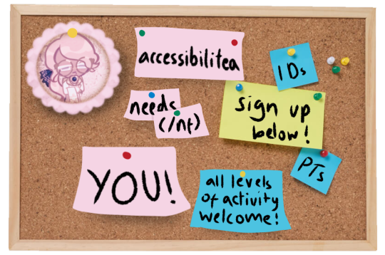
[Image ID: A stock photo of a corkboard with multiple pink, blue and yellow post-it notes edited on. In the top left corner is the blog's logo. Collectively, they read "accessibilitea needs (/nf) you! / IDs / PTs / sign up below! all levels of activity welcome"]
Interested in helping out the blog? Accessibilitea is always open to new members!
To apply, fill out the form below & send us an ask so we know to check the responses! Anyone is welcome regardless of consistency or activity.
#🍵 background chatter#🫖#mogai accessibility#liomogai accessibility#liomoqai accessibility#mogai community#liomoqai community#liomogai community#mogai#moqai#moqai community#liomoqai#liomogai#qai#qai community#mogai friendly
4 notes
·
View notes
Text
“no id sorry” “no spoons for id” booo booo 👎👎👎 booooo (you can wait until you have spoons to make a short description of an image, nobody is holding you at gunpoint to post your mogai flag right now 🙂 or!! you could even ask someone for help!)
#— jacks raging bile duct#if you feel called out. good#mogai#mogaiblr#mogai flag#mogai gender#accessibility#xenogender
98 notes
·
View notes
Text
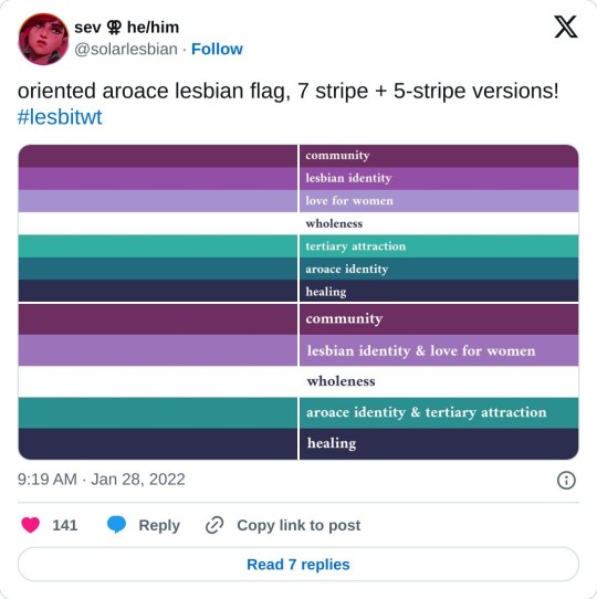
[ID: A screenshot of a tweet by sev / solarlesbian that was created on January 28, 2022, and reads, "Oriented aroace lesbian flag, 7 stripe + 5-stripe versions! #lesbitwt". This is followed by two versions each of two flags. The first has seven stripes, the second is a simplified version with five. The first flag's stripes are: Dark berry purple, medium purple, lavender, white, deep seafoam green, teal, and very dark blue. The stripes are labeled with their meaning in the second version, from top to bottom: community, lesbian identity, love for women, wholeness, tertiary attraction, aroace identity, and healing. The second version has dark purple, lavender, white, spruce green, and very dark blue. The stripes are labled, "community, lesbian identity and love for women, wholeness, aroace identity and tertiary attraction, and healing". End ID.]
Link to the original tweet here.
Archived version here.
#described images#described tweets#oriented aroace#aroace lesbian#oriented aroace lesbian#lesbian aroace#lesbian oriented aroace#pride flags#accessible pride flags#Queer#Lesbian#Aroace#MOGAI#Pride#LGBT#LGBTQIA+
229 notes
·
View notes
Text

How To Translate Your Posts!
[PT :: How to PT your posts]
I've noticed some people struggle to know when they should and shouldn't PT a post, so as someone with dyslexia who uses screen readers I am here to help! This will be a super basic guide, but I hope it helps!
───
When does a post need a post translation?
[PT :: When does a post need a post translation?]
Some good ways to know when a post needs a translation is the following ::
Excessive symbols with text
Examples :: 『 𖤐 ˚₊ 』 ❝ Slasherbun ❞ [PT :: Slasherbun]
( 💭) DARKMYTHIC ! [PT :: Darkmythic]
❛⠀⠀avatar of the web⠀。 𝜗𝜚 [PT :: avatar of the web]
These symbols can often break screen readers and also makes text difficult to read in general! A post translation is often necessary for this type of text. While a title with one emoji may be fine (ex :: Horgamplacomfic ⚓) titles with excessive emojis, symbols, as well as non-emoji symbols (𖤐, 𝜗𝜚, etc) need a post translation in order to be read properly by many screen readers!
All Caps
While this isn't the worst, it can often make it hard to read for screen readers and humans alike! Titles in all caps often get read one letter at a time rather than all one word, as it is read as an acronym by screen readers rather than as a word! So titling your labels like WEREBLUEHOURIC [PT :: Werebluehouric] is often bothersome for screen readers. So please, put a post translation under these!
Formatted Words
While I haven't had this issue, I've seen some say their screen readers have difficulty with some of the formatting people use on their posts! Things such as big titles, quotes, chat, etc seem to, for some reason, mess with screen readers. This may not always be the case, but for the moment please place a translation!
Typing quirks
I understand some people need these in order to feel comfortable speaking, however for things like coining a label it is absolutely necessary to translate your typing quirk. Screen readers cannot read this, and I understand it may be mildly upsetting to need to translate yourself for others, but those with screen readers and dyslexia will not be able to have access to your post. So please, translate your typing quirks.
Colored Text
From what I can tell, this doesn't necessarily mess with screen readers but boy howdy does it mess with dyslexic people. It is incredibly difficult to read colored text, it seems to make it infinitely worse on dyslexic people for some reasons I don't know, but I can confirm it definitely makes it harder on me. So please, please put a post translation on your colored text.
───
I think that's all I can think of for the moment. Thank you for reading, accessibility is so insanely important in this community so please try to do your part! - Mod ⭐

#personal#mod ⭐#mogai#liom#coining#liomogai#accessibility#disability#actually disabled#dyslexia#visually impaired
41 notes
·
View notes
Text


hypnoangeligender / cynoangeligender
a gender related to being a sleepy angel / a gender related to being a dog angel, can literally be a dog and angel or an angel who relates to dogs
these are very self indulgent lol but if anyone else happens to identify with them u are welcome to use them! please credit if using in edits or blog layout :3 (id under cut)
@radiomogai
four square shaped flags with 7 stripes, 2 go purplish blue, denim, periwinkle, light yellow, light warm purple, medium warm purple, neon warm purple, they are identical except one has an emoji of the yellow snoozing face with a halo over it. 2 go purplish blue, denim, periwinkle, light yellow, medium brown, dark brown, espresso, they are identical except one has an emoji of a dog with a halo over it end id.
#🧸 self indulgent#gender coining#xenogender#mogai coining#hypnoangeligender#cynoangeligender#angel gender#dog gender#mogai#accessible mogai
23 notes
·
View notes