#accessible mogai
Explore tagged Tumblr posts
Text
Download or read online the document of pride flag image description templates here on the Internet Archive. It took almost three hours of my day. I hope you appreciate it.
If you often post pride flags, please start using or making image description templates and describing your original posts rather than asking other people to do it for you.
If you make the original post accessible from the start, literally everyone benefits. It's not fair to ask physically disabled people to be the only ones putting in effort to make the spaces accessible.
You can also submit pride flags to this blog that need templates, and the document will be updated.
-
for easy reposting:
"https://describe-things.tumblr.com/post/754734279093895168/image-description-start-the-three-panel-do-you"
#MOGAI#xenogender#accessability#image descriptions#pride flag#accessible pride#accessible Queer#accessible LGBT#accessible LGBTQIA+#accessible MOGAI#accessible xenogender#accessible pride flags
83 notes
·
View notes
Text


hypnoangeligender / cynoangeligender
a gender related to being a sleepy angel / a gender related to being a dog angel, can literally be a dog and angel or an angel who relates to dogs
these are very self indulgent lol but if anyone else happens to identify with them u are welcome to use them! please credit if using in edits or blog layout :3 (id under cut)
@radiomogai
four square shaped flags with 7 stripes, 2 go purplish blue, denim, periwinkle, light yellow, light warm purple, medium warm purple, neon warm purple, they are identical except one has an emoji of the yellow snoozing face with a halo over it. 2 go purplish blue, denim, periwinkle, light yellow, medium brown, dark brown, espresso, they are identical except one has an emoji of a dog with a halo over it end id.
#🧸 self indulgent#gender coining#xenogender#mogai coining#hypnoangeligender#cynoangeligender#angel gender#dog gender#mogai#accessible mogai
16 notes
·
View notes
Text
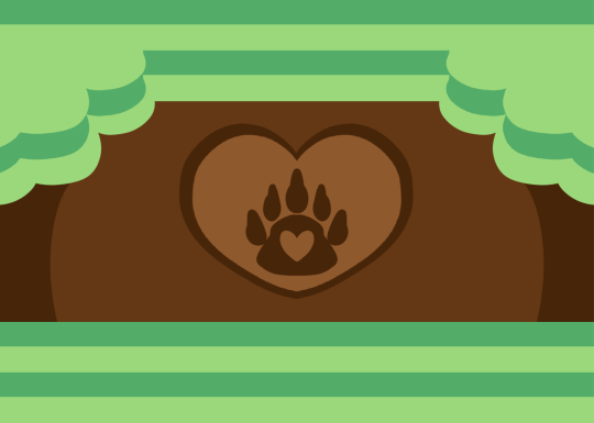
Syspapa bear
Who is this for? A system role/gender for an alter who either is a parent, takes care of a syskid (in their or another's system), or feels aligned with being a papa, bear, sysparent, or all three! Any system of any origin can use.
Pronouns; Grr/Grrrs, Roar/Roars, Ted/Teddy's, pop/papas.
Names; Theodore, Ted, Griffin, Grizz
Please tag Kandi if you turn Kandi's flags into buttons, userboxes, and more! Kandi loves seeing what people do with Kandi's labels! Anyone can use!
Candy is pro Endogenic, Pro Mogai, Pro Agere, and Pro Ship. NSFW blogs Do not interact
Original version here
4 notes
·
View notes
Text

[ID: The MOGAI pride flag, with stripes of: robin's egg blue, teal, green, yellow, grey-purple, and brown, overlaid with white text with a black border that reads:
"You cannot claim the MOGAI community is welcoming to everyone if you exclude disabled people by refusing to make your posts accessible!
Use plain text!
Describe your images!
Put the ID directly below the image!
Use paragraph breaks!
Use punctuation!
If someone makes an ID for your post, add it to the original and ask people to reblog the new version!
Make your posts accessible so everyone is actually included!"
End ID.]
At the very least if you don't care enough to add image descriptions to your posts, tag them as "no ID" or "undescribed" or "undescribed images" or something so that people can filter them!
Stop using colorful frilly text or tiny text unless you also include a plain text transcription!
Stop making your blogs have eye burning neon colors without putting a warning on every single post you make so people with photosensitivity know not to click on your icon!
Stop adding flashing or sparkling gifs to your posts without tagging it as "flashing"! And no, not "flashing tw" or "tw flashing" or "///flashing" or "here be flashing"! Hyper specific tags mean the post doesn't get filtered!
Start making your MOGAI posts accessible or stop claiming that the MOGAI community is welcoming to everyone! Stop prioritizing aesthetics over accessibility!
I don't care if it takes a lot of energy to describe your million and one pride flags -- it uses up more energy to make them in the first place!
And don't just stop at describing your new ones, go through your old posts and describe as many as you can!
If someone adds an ID to your post, copy and paste it directly into the original post! Directly below the image being described! In plain, normal sized text without any colors or italics!
Make your posts accessible or at the very least, let people filter them out!
I'd love to help add image descriptions to people's pride flags if only I knew my efforts weren't being wasted becuse the OP's gonna throw a fit about me making their post accessible.
If you don't have the energy to describe your pride flags, tag it appropriately and leave a note saying that if someone makes an ID, you will edit it into the original post!
It should not be solely up to disabled people to make things accessible! If you have the time and energy to make fifty one pride flags a month complete with paragraphs of description you have the energy to make a simple image description of your pride flag so that disabled people can actually be welcomed into the community too.
It's 2023. Leave ableism behind. Actually welcome disabled people into the MOGAI community.
#MOGAI#flag coining#term coining#gender coining#image descriptions#systemic ableism#pride#queer#LGBT#xenogender#accessible MOGAI#the fact that that needs to be a fucking tag is a condemnation in and of itself.
21 notes
·
View notes
Text
girlaccident/accidentgirl

when ur a girl on accident/ur a girl but that's a mistake. can also be calls oopsgirl which is a funnier name
2 notes
·
View notes
Text
What Pride Flags Mean, Part 1: Gender and Attraction
Welcome to the latest installment of my autistic hyperfixation on flags! I wanted to figure out a common language of Colour X means Thing Y. Like how pink is consistently used for feminine.
Having a common language for flag meanings matters because it improves cognitive accessibility of flags. ♿️💙
But I didn't want to be prescriptive about what colours should mean what. Just because I think Thing X should go with Colour Y doesn't mean everybody else would.
So this turned into a descriptive, empirical project. I gathered a data set of 2060 pride flag colour choices to figure out what are the most common colour-meaning combinations. Some of the results:
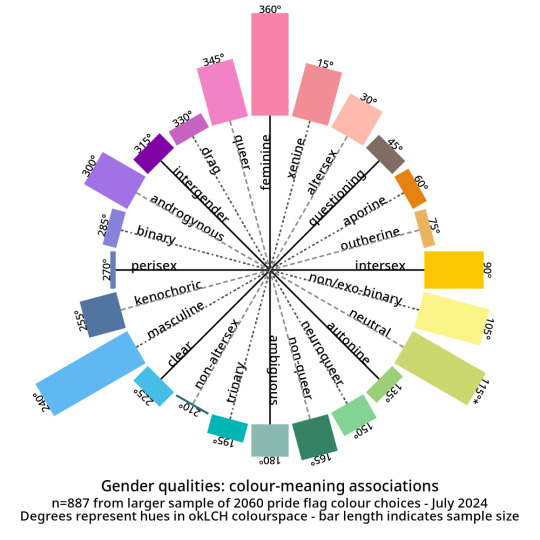
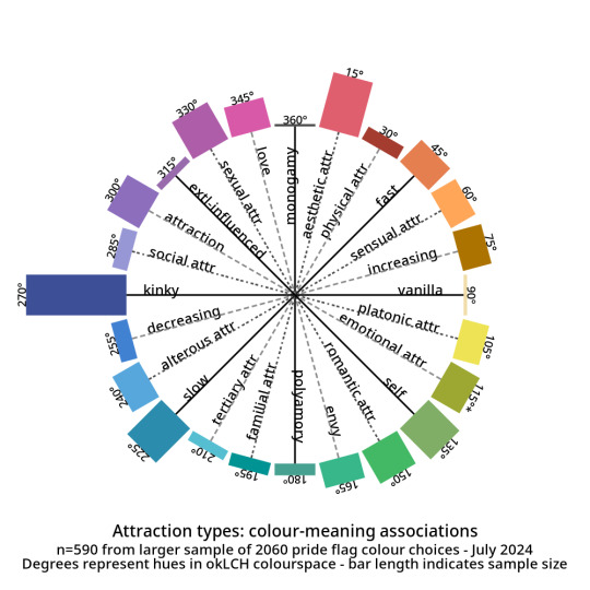
And here are the abstract modifiers: these are modifiers that were generally shared between the genders and the attractions. For example, black is used to indicate having no gender as well as having no attraction.
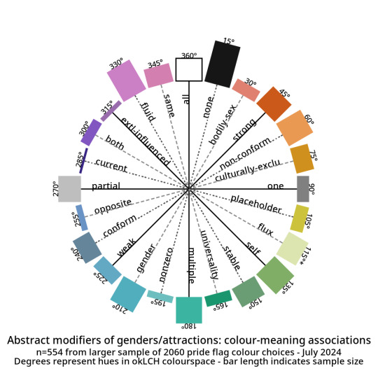
Click here for tables with okLCH values, hex values, definitions, and notes - I've put a more detailed write-up on my Wikimedia Commons userpage. (Mediawiki supports sortable tables and Tumblr does not.)
METHODS-AT-A-GLANCE
To make the figures above, I assembled a data set of pride flag colours. It contains 2060 colour choices from 624 pride flags, representing 1587 unique colours. Click here for a detailed description of how I gathered and tagged the pride flag colours and tagged them.
For each tag, I converted every colour to okLCH colour space and computed a median colour. OkLCH colour space is an alternative to RGB/hex and HSL/HSV. Unlike RGB/hex and HSL/HSV, okLCH is a perceptual colour space, meaning that it is actually based on human colour perception. 🌈
In okLCH space, a colour has three values:
- Lightness (0-100%): how light the colour is. 100% is pure white.
- Chroma (0-0.37+): how vibrant the colour is. 0 is monochromatic. 0.37 is currently the most vibrant things can get with current computer monitor technologies. But as computer monitor technologies improve to allow for even more vibrant colours, higher chroma values will be unlocked.
- Hue (0-360°): where on the colour wheel the colour goes - 0° is pink and 180° is teal, and colours are actually 180° opposite from their perceptual complements.
The important thing to know is that okLCH Hue is not the same Hue from HSV/HSL - the values are different! (HSL and HSV are a hot mess and do not align with human colour perception!)
You can learn more about okLCH through my little write up, which was heavily influenced by these helpful articles by Geoff Graham, Lea Verou, and Keith J Grant.
You can play with an okLCH colour picker and converter at oklch.com
🌈
MORE RESULTS: COLOUR DISTRIBUTIONS
Back when I started tagging my data, I divided my data into five main chunks: Gender qualities (e.g. masculine, androgynous), Attraction (e.g. platonic, sexual), Values (e.g. community, joy), Disability (e.g. Deaf, blind), and Other.
I'll talk about Disability and Values in future posts! But for an alternate view of the data, here are the full distributions of the colours that were placed in each tag.
They come in three parts: tags I created for Gender, tags for Attraction, and tags from Other. The abstract modifiers are spread between the first two, though their contents transcend Gender and Attraction.
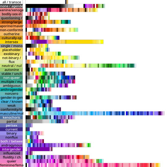
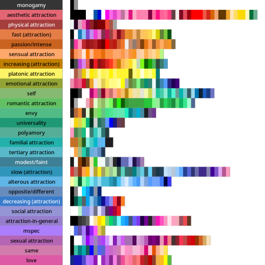
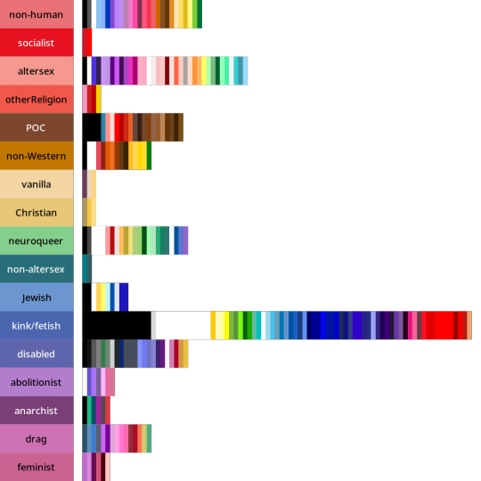
Some distributions have a lot more variance within them than others. Generally speaking, major attraction types tended to have the least variance: sensual attraction is really consistently orange, platonic is really consistently yellow, etc.
Variance and size do not correlate. Many of the smaller tags are quite internally consistent. I don't have a ton of tags in "current gender" but they're all the same dark purple. Xenine/xenogender has a whole bunch of entries, and there's a really big spread from blue to yellow.
Some tags, like intersex as well as kink/fetish show there are a small number of different colours that are very consistently used. Whereas other tags like masculine show a very smooth range - in this case from cyan to purple.
Overall I'm pretty satisfied with how things wound up! 🥳 It makes sense to me that an umbrella term like xenogender would have a lot of variance. What honestly makes me happiest is just how many tags wound up 180 or 90 degrees from their opposites/complements. 🤩
Not everything lined up nicely (the opposite of drag is .... neuroqueer? awkward.) 🤨 Some things lined up in hilarious ways, like how initially I had the opposite of kink/fetish being Christian (amazing.)
But as a whole, there's a lot of structure and logic to where things landed! I hope this makes sense for other people and can help inform both flag making as well as flag interpreting (e.g. writing alt-text for existing flags). 🌈
I'm hoping to post the Disability and Values analyses in the coming days! If you want to learn more, my detailed notes along with tables etc are over on my Wikimedia Commons userspace. 💜
Everything here is Creative Commons Sharealike 4.0, which means you're free to reuse and build on my visualizations, tables, etc. Enjoy!
#lgbt#lgbtqia#mogai#mogai flag#mogai flags#lgbtq flags#lgbt flags#lgbtqia+#vexillology#flags#colours#oklch#colour nerdery#colour theory#colour science#cognitive accessibility#design
189 notes
·
View notes
Text
🍵 blog promo 🍵
[PT: 🍵 blog promo 🍵 /End PT]
Welcome to accessibilitea!
This blog is a collaborative effort to provide image IDs and plain-texts (PTs) for the Tumblr LIOMOQAI community. We hope to split the demands of running an accessibility blog over multiple members, rather than having it all on one person.
You can get assistance from the blog through tagging (preferred), DMs or asks. We can do image ID assistance and accessibility advice as well as just ID-ing a post directly. Feel free to tag us as many times as you want!
Tags: (let us know if you want to be removed!)
@radiomogai @buntress @scr-ppup @boyrecluse @hrtluka @icwdtea @rwuffles @sevvys @angeltism @zoeynovie @the-astropaws @pupcoins @flutteringwings-coining @boingogender @acronym-chaos @catboy-autism @whimes @noxwithoutstars @dragonpride17 @robofox-mogai @theflaggerrrr @daybreakthing @brainkeeper-service @voidcoining @somniabyte
#🍵 background chatter#mogai#moqai#liomoqai#mogai accessibility#liom#mogai community#moqai community#liomogai community#liomoqai community#qai#qai community#mogai friendly
54 notes
·
View notes
Text
ok. i'm genuinely so fucking sick and tired of being nice about this and not saying anything. evidently it seems the people who try to be nice about this are just ignored, and this is seriously a massive issue with our community.
this is a not super kindly worded message to every single coiner who uses heavy typing quirks, excessive amounts of spaces, colored text, ascii symbols, and what have you especially when there's no translations or the translations are hidden under a cut or at the end of a post.
have a fucking sliver of respect for visually impaired people. please. your coining posts are entirely inaccessible to those who need screenreaders, and half the time even i'm struggling to read them without needing one. i've seen at least 5 posts about this in the last few months and there has been zero change. in fact, i think even more blogs who use this format have popped up!
so fix it. your passive ableism is not fucking cutesy and fun in the slightest. no excuses, especially since typing in plain text is significantly faster.
and if this post makes you upset, you should really re-evaluate how inclusive you actually are.
#liom#liom community#mogai#liom coining#mogai coining#mogai heaven#mogai friendly#mogai flag#liom term#xenogender#xenogender community#gender coining#new xenogender#imoga#imoga gender#liom accessibility#mogai accessibility#liomogai
417 notes
·
View notes
Text
“no id sorry” “no spoons for id” booo booo 👎👎👎 booooo (you can wait until you have spoons to make a short description of an image, nobody is holding you at gunpoint to post your mogai flag right now 🙂 or!! you could even ask someone for help!)
#— jacks raging bile duct#if you feel called out. good#mogai#mogaiblr#mogai flag#mogai gender#accessibility#xenogender
97 notes
·
View notes
Text

How To Translate Your Posts!
[PT :: How to PT your posts]
I've noticed some people struggle to know when they should and shouldn't PT a post, so as someone with dyslexia who uses screen readers I am here to help! This will be a super basic guide, but I hope it helps!
───
When does a post need a post translation?
[PT :: When does a post need a post translation?]
Some good ways to know when a post needs a translation is the following ::
Excessive symbols with text
Examples :: 『 𖤐 ˚₊ 』 ❝ Slasherbun ❞ [PT :: Slasherbun]
( 💭) DARKMYTHIC ! [PT :: Darkmythic]
❛⠀⠀avatar of the web⠀。 𝜗𝜚 [PT :: avatar of the web]
These symbols can often break screen readers and also makes text difficult to read in general! A post translation is often necessary for this type of text. While a title with one emoji may be fine (ex :: Horgamplacomfic ⚓) titles with excessive emojis, symbols, as well as non-emoji symbols (𖤐, 𝜗𝜚, etc) need a post translation in order to be read properly by many screen readers!
All Caps
While this isn't the worst, it can often make it hard to read for screen readers and humans alike! Titles in all caps often get read one letter at a time rather than all one word, as it is read as an acronym by screen readers rather than as a word! So titling your labels like WEREBLUEHOURIC [PT :: Werebluehouric] is often bothersome for screen readers. So please, put a post translation under these!
Formatted Words
While I haven't had this issue, I've seen some say their screen readers have difficulty with some of the formatting people use on their posts! Things such as big titles, quotes, chat, etc seem to, for some reason, mess with screen readers. This may not always be the case, but for the moment please place a translation!
Typing quirks
I understand some people need these in order to feel comfortable speaking, however for things like coining a label it is absolutely necessary to translate your typing quirk. Screen readers cannot read this, and I understand it may be mildly upsetting to need to translate yourself for others, but those with screen readers and dyslexia will not be able to have access to your post. So please, translate your typing quirks.
Colored Text
From what I can tell, this doesn't necessarily mess with screen readers but boy howdy does it mess with dyslexic people. It is incredibly difficult to read colored text, it seems to make it infinitely worse on dyslexic people for some reasons I don't know, but I can confirm it definitely makes it harder on me. So please, please put a post translation on your colored text.
───
I think that's all I can think of for the moment. Thank you for reading, accessibility is so insanely important in this community so please try to do your part! - Mod ⭐

#personal#mod ⭐#mogai#liom#coining#liomogai#accessibility#disability#actually disabled#dyslexia#visually impaired
36 notes
·
View notes
Text


⠀goodreambased⠀⠀⠀⠀⠀⠀⠀ dreambased ⠀⠀⠀⠀⠀⠀⠀nightmarebased


goodreambased ;; a -based term where good/comforting dreams affect the innerworld/headspace, headmate roles or even headmates themselves. however this isnt an origin.
dreambased ;; a -based term where dreams(in general) affect the innerworld/headspace, headmate roles or even headmates themselves. however this isnt an origin.
nightmarebased ;; a -based term where nightmares affect the innerworld/headspace, headmate roles or even headmates themselves. however this isnt an origin.

⠀⠀⠀⠀tagging ;; @radiomogai @plurplex-archive-dot-net ⠀⠀⠀⠀⠀⠀⠀⠀⠀⠀⠀⠀⠀⠀⠀⠀⠀@plurchive


id in alt text
#goodreambased#nightmarebased#dreambased#✧ vermins gift ~ coining#✧ cockroach we keep in the pipes ~ (🌻)#mogai#liom#mogai coining#mogai safe#plural coining#system coining#system terms#plural terms#-based#nightmare#dream#good dream#>> ik dreambased is already a thing but that was about accessing headspace through them and not dreams affecting the system
66 notes
·
View notes
Text
I hate how many mogai accounts are inaccessible to pw disabilities, vision issues, pw who use screenreaders etc. Accessibility over aesthetic ALWAYS. Putting your plain text after your shitty font and symbols doesn't help btw! it still breaks my entire screenreader and it won't read anything else on the post. I'm tired of every single account being inaccessible for a large amount of the community.
#mogai post#mogai friendly#mogai#accessibility#cpunk#actually disabled#disabled#mogai blog#liom community#liom
81 notes
·
View notes
Text
Anon, is there any he/it or he/him pride flag you like best? I can make a combo one as well as using the it/its flag!
Update 2 days later: January 9 2025: No reply still, so here's an it/he pronoun pride flag. It is public domain. You are encouraged to download and share it.
This post will be saved to the wayback machine once I'm done editing it to add this, and the flag will be uploaded to the internet archive. You are welcome to upload it to any wikis. It is public domain.

[ID: A pride flag with five diagonal stripes of: Sky blue, leaf green, pale yellow, gold, and dark red. End ID.]
If you repost this flag elsewhere or to your own blog, please include a copy of the image description above. They are like subtitles for visually impaired people. Do not put it in neon colors or tiny text, that defeats the purpose.
#pride flags#ititspronouns#hehimpronouns#it/he#it he pronouns#ithepronouns#it/its#he/him#multiple pronouns#neopronouns#pronoun combinations#trans#transgender#nonbinary#genderqueer#pride#Queer#LGBT#flag coining#pride flag#described images#accessible pride flags#mogai#queer#LGBTQIA+#public domain#pronoun pride flags#pronoun flag
6 notes
·
View notes
Text
Genderqueer, pan, and polyamorous flag :)
You can download the HD version here from the web archive:
"https://archive.org/details/genderqueer-pan-polyamorous"

[ID: A pride flag with nine horizontal stripes of dark blue, lavender purple, bubblegum pink, red, white, yellow, leaf green, medium blue, and black. End ID.]
Anyone can use this flag for anything you want, no credit needed, though if you post it online, Please include an image description! You can even copy and paste the one above! Don't exclude disabled people from Pride!
#pride flags#described images#accessible pride flags#accessible MOGAI#MOGAI#Queer#LGBT#Pride#Genderqueer#Pan#Panromantic#Pansexual#Pan-oriented#Polyam#Polyamorous#combination pride flags#eyestrain#eye-strain#eye strain
6 notes
·
View notes
Text


Naturapaxic: A gender related to feeling eerily calm and at peace when taking a walk in nature natura- Latin for nature Pax- Latin for peace
#i want to be graceful in everything i do! just like the queen of hearts ❤️#tusm! your crown is crooked >:(#mogai#mogai coining#mogai term#xenogender coining#xenogender#Very non accessible I’m sorry
10 notes
·
View notes
Text
some image description templates!
not need credit. use to heart's content!
plain flag: [id: a flag with (number) stripes. the colors, from top to bottom, are (insert colors). /end id]
gradiented flag: [id: a flag with (number) stripes. the colors, from top to bottom, form a gradient from (color) to (color). /end id]
w/ symbol: [id: a flag with (number) stripes. the colors, from top to bottom, are (insert colors). in the (position: middle, top right, etc) is a/n (color) (symbol). /end id]
gradiented w/ symbol: [id: a flag with (number) stripes. the colors, from top to bottom, form a gradient from (color) to (color). in the (position: middle, top right, etc) is a/n (color) (symbol). /end id]
wavy stripes: [id: a flag with (number) wavy stripes. the colors, from top to bottom, are (insert colors). /end id]
gradiented wavy stripes: [id: a flag with (number) wavy stripes. the colors, from top to bottom, form a gradient from (color) to (color). /end id]
#i can hardly make you mine — talking#mogai blog#mogai post#mogai coining#mogai friendly#mogaireal#mogai real#actually mogai#mogai#mogai help#mogai accessibility
85 notes
·
View notes