#mod walnut draws
Explore tagged Tumblr posts
Text

local sauced up ragdoll shows goblin genuine affection what the fuck
@ask-the-influenced-jester you’ve cursed me.
#mod walnut posts#mod walnut#mod walnut draws#influenced pomni#pomni x ragatha#the amazing digital circus ragatha#ragatha tadc#tadc ragatha#ragatha#ragatha x pomni#jesterdoll#ragapom
336 notes
·
View notes
Text
HEY IK THIS SUCKS BECAUSE I RUSHED BUT HERE

I know I'm fully capable to do it myself... but could someone draw this with pomni and Ragatha for me please 🥺 it just feels like them to me... (Ragatha being "finally!!!" and pomni being "oh no I'm gay")

42 notes
·
View notes
Note
I have a few ask for the mods Umm hey hello hi I love the characters and au itself and can't wait to watch the story unfold!!May the best of days and great memories and big digital hugs be yours I love you two and what you guys create!!!💖💝💗💖
Anyways,my first question is: As askers,do we exist in the scene the characters are in?Are we like an anon character that does nothing other than talk and watch and just exist?Are we multiple people since multiple people write asks?
My second question is:Does our asks sway the story or is there a certain plot already written?Do we have to follow a certain flow with our asks?
Thats all I have for now!Take care you two!
THANK YOU SO MUCH <333 that is very sweet of you OAu
to answer your first question, im not.... entirely sure??? ive thought about it before and i cant figure out a way that would make it make sense so i just keep it intentionally vague hxbdmbffm
second question, there is already a very specific plot set in stone :] to fit in asks and also just for my own sanity so i dont have to make one million drawings, some scenes may be cut/altered (for example walnut is supposed to strike the flower a few times but shes only seen hitting it once) - 🎶🌀
1 note
·
View note
Text
gingerbrave is trans thats it thats the post go home everyone
#mod fish#cookie run#gingerbrave#my love for this child knows no dephs#ive seen the uc before but i was sold on it after i redesigned how i draw him#also imagien rougefort teachign gingerbrave about transitioning 🥺#and his other halves adjusting to tw change with help from their older siblings#other havels beign bright and dozer btw i hc thaoe 3 r triplets#imagine brave wearing hero's old clothes cause he doenst know what style he likes yet#and having his older siblings help him pick a hair cut#both tk and rougefort have long hair so hed probably go to hero for help aaa imagine the bondign moment#bright and brave still have a strong bond jsut now its her and her brother istead of sister wich she doesnt mind#dozer also doesnt rlly care since dozer was nver big into gender in the first place#tho i think walnut and chesnut would take longer to adjust since their the yongest but they r tryign their best#i am jsut thinkign of so many dynamics with this hc its great with trans tk and trans rougefort plus trans uncle earl#dhmu onlt thinkign about one gingerbread man for the rest of the night/hj
36 notes
·
View notes
Photo
Yeah I’m an avid zine participant and I hate hate HATE how uptight people have gotten on compensation for zines vs the work you put into it. On average, my zine illustration pieces can range from 10-20+ hours, with me starting over many times.
Me personally, I do zines solely to make friends and to motivate myself to make more elaborate pieces on a deadline. Cause I tend to lean towards digital zines, I am prepared not to get compensated, but rather to build bonds. Despite that, if a mod gets uptight about the piece, then they can kiss my ass cause I sure as hell ain’t getting paid to tolerate that shit! Some lovely printed zines I’ve been in made sure to try and provide free shit to us, and I appreciate it to bits, but sadly it doesn’t cover the labour costs of the piece.
I’ve seen popular zines say they will only compensate in digital items cause fuck their contributors, am I right? :D I don’t even wanna get into a tangent on zines with messy management/inexperienced mods cause that adds a whole ‘nother level of stress onto the contributors.
Asking for IDs is fucking stupid tho, what’s next. Yall want my passport? My birth certificate? My SIN? Sit the fuck down, babes. Your bitch boner is showing.
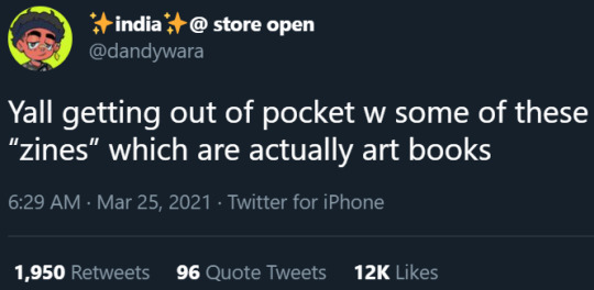
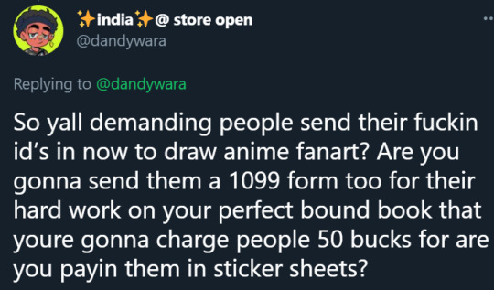

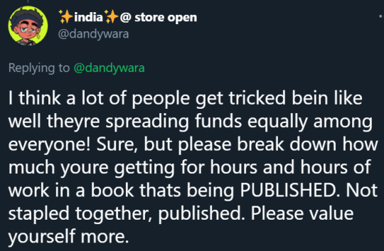


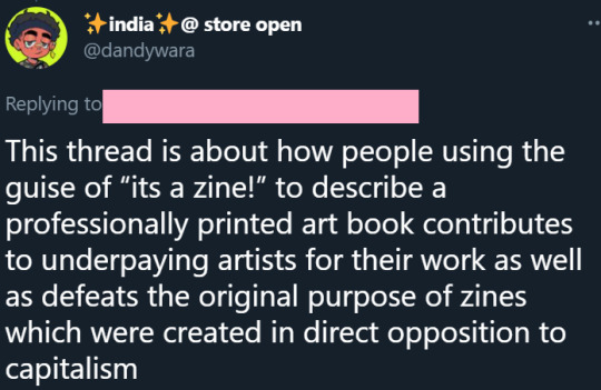
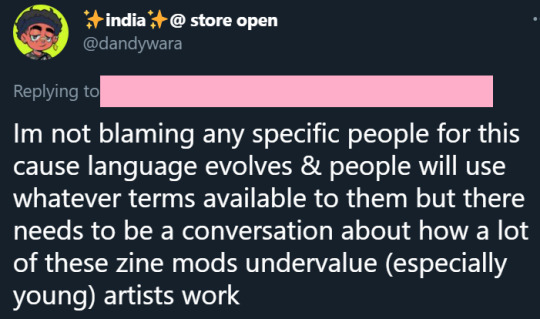
y’all need to stop making a living off of young, bipoc artists for nothing
#I'm not very good at making coherent thoughts on paper so sorry if this is all over the place LOL#I love participating in zines cause I met some amazing ppl there but I go in knowing that may be all I get#and im ok with that#Im not ok with mods thinking that that's an acceptable reason to ask for so much from your contributors or to not offer as much-#-compensation when doing a printed run#and fuck those ppl who shit on one-man personal zines#Im gonna shit on your doorstep#you soggy walnut#my personal mushroom zine will be epic and your wet nappies are damping my computer#ok I will get back to drawing memes now yeehaw
27K notes
·
View notes
Text
Intro post (Please read)
Heya! We colour pick pride flags from various cookies' sprites. We take requests both for cookie ships and individual cookies! Posts are uploaded from a queue and they go up at 10 am and 9 pm EST! Sometimes we might post a few when we feel like it as well.
Info about the mods, DNI and request rules under the cut.
~~~
Meet the mods!
• Mod Crepe (aka Kimi, Akari, Vanilla, Takeo, Kip, Moon or Waffle)
- Any pronouns (Including a boatload of neos!)
- White latine, American
- Minor
- Enby (leaning towards male in identity and female in expression), idfk what i am anymore
- I like messing around with art, dragons, playing video games, trying to write stories, the likes. I have Zero braincells in my thick skull.
- Fave cookies: I can't list 'em all but Strawberry Crepe's my #1, Cream Puff at a close second. Walnut, Croissant, Golden Cheese, Pure Vanilla, and a few others with those Vibes are somewhere after.
- Mod Nebbiolo (aka Kitsune or Chibi)
- She/her
- Adult
- White, idk American
- cis female, aroace
- I like to draw and write, as well as play video games. I sometimes post my cookie fanart on @dragocookie . Though tbh, I mostly lay around tired.
- Fave cookies: A lot. Like, too many to list. Pitaya, Ananas, and Lotus Dragon Cookie share my top favorite spot, then there’s Aloe, Cyborg, Red Velvet, White Lily, Sorbet Shark, Golden Cheese, Scorpion, and Pure Vanilla, to name a few.
-Mod Werehound (Aka Brute or Evelyn)
-He/They/It
-Adult
-Paper (white. Very white.), American
-Bisexual Polyamorous Enby.
-I write a lot, if you wanna read my stories you can find me on Quotev as Murderfox. My main blog is @mechanicalhoundz but it’s mostly reblogs and I basically never post original stuff.
-My favorite cookies are Walnut, Sorbet Shark, and Squid Ink, but my favorite Cookie Run character of all time is Choco Werehound Brute. I also pretty much adore any and all animal-based cookies like Kumiho and Moon Rabbit.
~~~
Do not interact:
- Bigots of any kind (rac*st, s*xist, lgbtqphobe, abl*ist, antis*mitic, etc)
- T*RFs, SW*RFs, ALM/Blue Lives Matter, exclus, identify as/support any “supers*xuality” (read above)
- Pr*shipper, anti-anti, (NO)M*P, ped*phile, z**phile
- Say "They're just cookies!" to excuse whitewashing
- Think "blackwashing" exists
- NS*W, k*nk, anything along those lines
- Fuj*shi, fud*nshi
~~~
Rules for requests:
- We won't do ped*philic/inc*stuous/ab*sive ships. (Refer to DNI)
- We won't do PomeStar, BruteLicco, any ship involving Moonlight or Sea Fairy with men, and anything with Milk or Goblin.
- Mod Moonlight won't do minor ships but Mod Crepe can. That being said don't submit ships involving young kids like Apple.
- Mod Moonlight has done one before, but we will no longer do Vincian (toothpaste) gay flags. Instead, we’ll do either Cinthean, rainbow, or alternate flags for mlm/nblm.
- We reserve the right to refuse to do a submission for any reason.
- Generally just be nice and patient! These generally don't take us too long to do but it can take us a bit to get to your request depending on the backlog.
- Let us know if you need something tagged!
- Reposting/usage is allowed with credit! Just tag us if it's on here or link back to our blog if it's offsite.
-Rules/DNI may be subject to change!
#Cookie run#mod Clover#Intro post#crob#crk#not a flag#mod moonlight#mod Nebbiolo#mod crepe#mod werehound
20 notes
·
View notes
Text
A retrospective of the development of design in the evolving styles of chairs throughout the years.
There are so many chairs and but so little time. In this light we've put together a list of the most famous chair designs from the past and explored the reason these gorgeous furniture pieces still grace the interiors of many homes. In this retrospective of famous chairs that date back to the 18th century until today we are struck by the reality that despite the trends of the past are now out of fashion (like corsets and wigs that were powdered and powdered wigs, thank God!) However, these chairs remain in style for a long time. When you look at these chairs, you may notice a different theme one that you will recognize is chair style has changed from intricately carved designs, changing dramatically to ultra modern and clean, before moving towards the stunning artistic mix of mod and ornate that is seen in the classics of today. This is a brief background of chairs.
1. AMERICAN Queen Anne SIDECHAIR JOHN ELLIOTT 1750
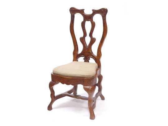
This sought-after chair has two strengths: European gracefulness and American durability. Although the Queen Anne is the current British monarch prior to this point (and independence was over a quarter century from the time of independence for this colony) The chair is usually made from mahogany or walnut draws inspiration from Dutch craftsmen who migrated towards in the New World. The design, which is with a shell design is beautiful and simple The legs and seat are more spacious than the norm. Imagine the fashions worn by women at the time and you'll see how easily this chair could accommodate guests. Dresses that were voluminous and with huge bustles across each hip may not be at ease in their corsets, but they'd have been relaxed sitting on these spacious seating areas.
2. LOUIS XV FAUTEIL 1755
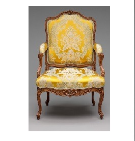
If you're hearing the phrase "Louis the 15th fauteuil" this is the perfect example of the subject. It is immediately identifiable due to its curving back, elegant lines as well as the way it appears like it's wearing exquisite elbow patches on its slender arms. It's possibly the most classic and well identified in the world of French antique chairs which was created during the reign of the King Louis XV. He and his powerful commoner lover, Madame de Pompadour, were not only lovers of one another, but as well of exquisite furniture, such as the plethora of options and light chair. With its lovely designs of ribbons, baskets and flowers It stands out to the heavy furniture of the earlier era.
Buy best quality Recliner chair at best price
3. GEORGE III, FAUX BAMBO OPEN ARCHAIR, 1775
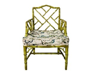
If there's a chair that is as elegant and welcoming such as the faux bamboo armchair we've yet to discover it. Made of walnut or mahogany These chairs are from the Georgian period of furniture that was a fashion from England which exuded airiness luxury and spaciousness. Although the exotic look of bamboo was popular in the days before the ease of transport, genuine bamboo was not utilized for chair manufacture in England in the past. The grass's rapid growth required to be brought in through Asia as it was not tough enough to withstand the frigid and humid English climate.
4. THONET BENTWOOD ARMCHAIR, MICHAEL THONET, 1830
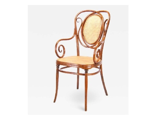
While curved wood has been all over the world since the development of the wheel, barrels, and boats, it was in the year 1830, German furniture designer Michael Thonet was the first to master the art of bent and steaming wood into light chairs which are still sought-after across the globe. In the 1830s things like household appliances were beginning to be manufactured in mass quantities; one of the main reasons to the chair's success was the fact that Thonet was able to sell his designs in catalogs and stores across the world in the words of the Brooklyn Museum. Bentwood chairs made by Thonet continue to be manufactured at the original plant that is now known as TON located which is located in Czech Republic.
Lounge chair at best price
5. WASSILY CHAIR MARCEL Breuer, 1925
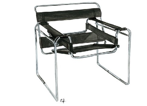
In the Jazz Age, Modernism was fully developed at Bauhaus which was the German Arts and Crafts school where the creator of the chair, Marcel Breuer, took classes. Simple lines, straight lines and restraint - these minimalist methods of design brought into the modern age. It's amazing how modern the Wassily chair appears, especially when you consider that it's more than 90 years old. Built from fabric and steel tubing the chair was first named B3. The name was later changed to Wassily to honor the famous artist Wassily Kandinsky as he was fond of the chair and also because Breuer as well as Breuer were close friends and coworkers. If you've ever been in one, you'll be aware that it's a comfortable chair. Wassily chair is extremely comfy.
Source: styleathome
2 notes
·
View notes
Text
Remade walnut over girlfriend drawing

Minus mod time lol

#walnut cookie
1 note
·
View note
Text
@ask-pomni-things get your food !!!

#mod walnut posts#mod walnut#mod walnut draws#jesterdoll#buttonblossom#ragapom#the amazing digital circus ragatha#ragatha tadc#tadc ragatha#ragatha x pomni#tadc pomni#pomni tadc#the amazing digital circus pomni#pomni#pomni x ragatha
217 notes
·
View notes
Text
Plants zombies 2 recover


However, you can enjoy this game on the big screen of your computer or laptop using the Bluestacks Android emulator. Moreover, there is a sequel called Plants vs. This plants and zombies game is also playable on Android devices. Zombies is a free to play game, although it does include in-app purchases. Other extra modes are made available at players' disposal when they go on and succeed in some levels.

Free printable coloring pages to download an print, over 50,000 pages available. Download and print these plants vs zombies 2 coloring pages for free. Printable 2 plants vs zombies coloring page.
Game modes: The gamer can profit from various modes that are the single-player, multiplayer and the Adventure mode. Zombies printable coloring pages for kids to download 800 x 1225 file type: Print coloring of zombie and free drawings.
You will surely fall in love with the many adorable Plants vs. Other unique and exciting levels enable you to battle zombies that are hiding in bases. The Quick Play arena gives the ability to replay levels. Zombies offers 50 fun-dead levels that are set in a swimming pool, in the garden or on the rooftop. He has to avoid zombies jumping, running, dancing and even eating plants to get into the house. To protect the residence from all harm, the gamer has to use all plants (peashooters, cherry bombs and walnuts) in the garden to fight against ghouls.
Gameplay: A gang of fun-loving zombies is about to enter the player's house by force.
Thats it Once you reboot and launch PVZ2 NA version itll load your progress and allow you to sign into. Greatest Hits guide! (Premium and non-premium strats') (Made by /u/Kabutus_Crepitus) Reboot into recovery and clear cache partition. Unfortunatly I think you have to do it again but who knows maybe someone else knows how to recover a deleted save If nothing else you can look at it as a way to do a challenge run such as choosing to use only 4-5 different plants max for each stage, or any other zany idea hat you come up with. Zombies Online Guide (Made by /u/The_Ninjadillo) Zombies 2 Chinese Version - Beginning Tips (1.8+) (Made by /u/The_Ninjadillo ) Ghost Pepper Manual (Made by /u/boynedmaster)Īll Glory to the Hypno-Shroom: A Hypno-Shroom Guide (Made by /u/Magnemania) This however led to my entire progress being wiped out. After researching, I tried to clear the cache as nothing else would work and you guys are so inaccessible. it would show the loading page at first them disappear and go back to my android's main page. Most of us here aren't sure how to solve some of the issues you may be having, so use the above link and look for the game you need help with! If it's an issue related to your progress being lost, make sure you give them your player ID which can be found on the title screen if it's PvZ 2 or by clicking the gear icon if it's Heroes. Today earlier for some reason my Plants versus Zombies 2 app stopped loading. Plants vs Zombies 3 Info Megathread Where to get PvZ games Exception for videos showing off BattleZ strategies, showcasing a brand new plant, or anything else new. Make your content unique and add commentary. Everyone has seen Day 1, we don’t need these videos posted. This is an English speaking subreddit all posts must be in English. Again, more info can be found on the wiki. You can find a more in-depth explanation of what this means on the subreddit wiki, which can be found here.ĭon't impersonate moderators/popcap employees DARK THEME NORMAL THEME Rules of the LawnĠ.5 Strong language is allowed as long as not excessive, please stoppppp reporting itīe civil. This subreddit is a hub for all of the games in the PVZ series. Zombies 2 made by goodpea2 and Mine Power, which mainly features the balancing of plants via the new plant tiering system Along with brand new challenging and unique levels, the mod aims for a redesigned. Zombies is an exciting series of games by Popcap, spanning over many genres such as tower defense, third person shooter, and a strategy card game. Zombies 2: Project ECLISE (yes, without a 'P') is a mod of the original (vanilla) Plants vs.

0 notes
Text
Architecturally Inspired Mid Century Modern Style Bird Houses
From Eichler and Bauhaus, to Frank Lloyd Wright, these stylish little birdhouses embody the cool mid century modern architectural style. Designed by Douglas Barnhard, these pieces are handmade with bamboo plywood, teak, and reclaimed redwood. High-end glossy laminates bring slick grey and white finishes, plus flashes of vibrant orange and green. You’ll never be content to offer feathered friends an uninspired bird box ever again!
$300BUY IT Sunnyvale Birdhouse: This eye catching birdhouse is inspired by the 60s style Eichler homes of Sunnyvale, California, which is where Joseph Eichler first began building his distinctive style. This mini Eichler house features a feeding platform at the back for its winged homemakers, with a convenient attached dish for seed.
$300BUY IT The piece is handmade from bamboo, brilliant orange laminate, and geometric metal screened viewing windows. Dimensions: 17 x 9 x 6.5 inches.
$330BUY IT Sunset Modern Birdhouse: Built with all the bells and whistles for a mid century modern homage, this birdhouse has its own miniature outdoor fireplace design, a floor to ceiling viewing window, a mini moveable garden planter box, and its very own green roof (succulents not included).
$330BUY IT This special piece was designed and made for the Sunset lifestyle magazine… for the more discerning bird homemaker!
$330BUY IT The mid century modern aesthetic is complete with bamboo and teak elements, plus high-end glossy white and orange laminates. The teak terrace makes a stylish dining spot for feathered guests once bird seed is piled up at the hearth. Measures 14.5 x 9.5 x 7 inches.
$330BUY IT Mixed Media Birdhouse: This beautiful design incorporates a number of different types of architecture and style, including Eichler, The Bauhaus and Frank Lloyd Wright.
$330BUY IT Made with cedar posts and beams, and bamboo decking, the piece is wrapped in grey and orange laminate for colour and shine.
$330BUY IT The mini marvel incorporates a metal trough for birdseed, and a living wall that can be planted with succulents (not included). Dimensions 15 x 9 x 8 inches.
$300BUY IT Highlands birdhouse: Inspired by the neighborhoods in Highlands San Mateo that were designed by Eichler in the 1950s and 60s, this birdhouse has a floor to ceiling window attached to a bamboo plywood and walnut deck.
$300BUY IT Grey and white laminates define the finer elements of this stylish little piece, which measures 9.5 x 7.5 x 14 inches.
$180BUY IT Seabright Bauhaus Birdhouse: These rustic yet chic birdhouses are handmade with reclaimed redwood from near the beach in Santa Cruz, which gives each of them a unique character.
$180BUY IT Bamboo plywood wraps the recycled redwood, topped off with light grey laminate for an antique meets modern design. Dimensions 8 x 9 x 7 inches.
$300BUY IT Kauai House: Aloha! Inspired by several trips to Kauai, Hawaii, this piece depicts unique Hawaiian architecture that integrates indoor-outdoor living–a style point embraced by mid century modern design.
$300BUY IT Two handmade surfboards lay ready for the aves to catch some waves! Made with bamboo and teak, this beach style bird holiday home measures in at 16 x 15 x 9 inches.
$180BUY IT Number One Birdhouse (Orange): If this one doesn’t speak mid century modern architecture love to you then what will! The slanted roof, sloping walls, the gloss orange laminate… mid century magic. Measures 8 x 9 x 8 inches.
$150BUY IT SIxties Mod Birdhouse: Incorporating clean lines and a flat roof, this Joseph Eichler inspired birdhouse is made from solid mahogany. A modern yet subtle piece to take your garden accessories to the next level. Measures 10.5 x 10.5 x 6 inches.
$180BUY IT Living Wall Bauhaus Birdhouse: The incredibly influential German Bauhaus School served as inspiration for this bamboo plywood and white laminate mid century form. The sharp cornered, retro piece includes a side for a living wall…
$180BUY IT … With the green wall in place, the birdhouse takes on a whole new charm (succulents not included). Dimensions 9 x 9 x 6.5 inches.
$170BUY IT Cubism Birdhouse: Perfect for anyone wanting to modernise their outdoor space, this geometric bamboo and gloss white laminate birdhouse is set to impress. Measuring 7x 6.5 x 6.5 inches, the piece includes a teak stand for table viewing.
$180BUY IT Pitched Birdhouse: Drawing inspo from many mid century modern home designs, this birdhouse has a pitched roof with a unique open air design. Dark grey laminate wraps the sides of a bamboo body, measuring 8 x 6.5 x 12.5 inches.
$180BUY IT Bauhaus Birdhouse: Between 1919 and 1933 the German design school created mid century modern architecture before its time, and now it inspires another birdhouse! Made with bamboo plywood and laminate.
$180BUY IT Number One Birdhouse (Green): A gloss lime green alternative to its orange laminate counterpart. Just don’t ask us to choose our favourite, because we can’t!
$130BUY IT Tea Garden House: Inspired by the Japanese Tea Garden inside Golden Gate Park, San Francisco, California. Handmade with bamboo and walnut accents.
$130BUY IT The oriental spirit of this adorable birdhouse makes it the perfect addition for a zen garden. Measures 10 x 7 x 5 inches.
$330BUY IT The San Rafael: Shrunken sixties style, inspired by Eichler homes in San Rafael, California. Bamboo builds a double sided fireplace for birdseed, a living roof for succulents (not included), and a deck with a lime green ceramic water dish.
$400BUY IT Fairhaven House: Grey, white, and orange laminate colours a birdhouse built in the style of the 1960s Eichler subdivision known as Fairhaven. Four frosted glass windows interrupt bamboo walls, beneath a shallow A-frame roof. Includes mini ceramic planter and custom house numbers to build a welcoming entryway! Dimensions: 22 x 11 x 7 inches.
Recommended Reading: Bird Home Decor: Beautiful Bird Figurines To Decorate Your Home
Related Posts:
Orange Kitchens
51 Grey Dining Rooms With Tips To Help You Decorate And Accessorize Yours
Colour-blocking: Creating room in small spaces
Grey And White Interior Design Inspiration From Scandinavia
Green Themed Home Decor Inspiration
100 Beautiful Bird Sculptures Made Out Of Paper
0 notes
Text
OAK KITCHEN CUBBOARDS THE ADVANTAGES AND DISADVANTAGES OF OAK WOODEN FURNITURE
RVs could be fitted with lovely wooden floors that may look merely as good in your RV as a result of it does in your kitchen at residence. For a lot of who favor tile, thats no draw back in any respect! Every kind and patterns of tile may be put in whether or not or not it is shiny stylish look or a floor match for a king, you resolve how grand the seems to be. Wall colors moreover have an effect on room brightness. Do you have to’re redecorating and getting new, customized-made furnishings, listed beneath are a few recommendations on tips on methods to distinction or pair wall colors along with your furnishings:
Lovely, customized-made wooden furnishings will gown up any room. Even better, the outdated one-wood-model-per-room rule not applies so don’t fret a few new piece -clashing- with others. In reality, mixing woods can make a room look extra fascinating, as House Beautiful demonstrates in a slideshow on breaking adorning guidelines. The pure light in every room will even play a process in deciding wood tone. Usually, darkish tones take up mild and look a lot much less, correctly, menacing in rooms with plenty of pure daylight. Lighter-coloration woods will brighten up rooms with oblique or little sunlight. Henderson, Nevada,
Delicate colored wood reveals up in the direction of darkish or robust colors Medium tones distinction correctly with softer, lighter colors and neutrals Darkish woods balance properly in opposition to deeper wall colours Shiny colours ship out picket’s pure tones The consumer experience isn’t simply restricted to an unbelievable amount of customization. CusZoom gives the shopper unmatched ranges of meeting, convenience, and long term high quality. Dining Desk Vogue and Coloration
Don’t get too hung up on the softwood versus hardwood designation. Whereas hardwood is often properly – tougher, some types like balsa are literally softer than softwood. somekeyword, counting on what it’s and how it will likely be used. Pine: a light-weight yellow colour Which dimension table must I buy? The next sizes and seating capacity are approximate.
Conifer timber-the ones that have cones, needles, and small leaves-current smooth woods. Examples include pine, firs, cedar, and spruces. Hardwood timber have broader leaves, produce fruit or nuts, and are found in colder climates. They embrace oak, maple, ash, cherry, birch, and mahogany. Giant furniture can incorporate utterly differing types of wood. For example, dresser drawers are often constructed from cedar, a gentle wooden with a lovely aroma that additionally repels moths. Pine is one other softwood that’s comparatively simple to carve and is a well-liked furniture wooden as effectively.
Best Kitchen Cabinet Ideas – Types of Kitchen Cabinets to Choose
MDF vs Wood Kitchen Doors
Kitchen Cabinet ratings for 2018. Updated reviews for the top …
Honey Oak Kitchen Cabinets with Black Countertops and green walls …
Dark floors vs Light floors – Pros and Cons – The Flooring Girl
MDF vs Wood: Why MDF has Become So Popular for Cabinet Doors | Home …
Advantages and disadvantages of – oak cabinets lighten …
Furniture , Durable Oak Kitchen Cabinets : Honey Oak Kitchen …
Light Oak Kitchen Cabinets Kitchen Wall Color With Oak Cabinets …
MDF vs Wood: Why MDF has Become So Popular for Cabinet Doors | Home …
The pros and cons of wooden kitchen cabinets | Smart Tips
MDF vs Wood: MDF Cabinet Doors Pros and Cons – Maplevilles Cabinetry
Soap Finish for Wood and Oak Furniture – Artichoke
Pros and Cons: Painted vs. Stained Cabinets
Traditional Light Wood Kitchen Cabinets with White Appliances. This …
Kitchen Cabinets Buying Guide
Painting Cabinets with Chalk Paint—Pros & Cons – A Beautiful Mess
Honey oak kitchen cabinets with gray Pergo Willow Lake Pine floors …
Advantages and Disadvantages of Lacquer in Woodworking | Home Guides …
Pros & Cons of Matt Kitchen Cabinets and Worktops | Designer Kitchens
Solid Oak Furniture vs Veneer – Your Questions Answered | U&E
Tips for Painting Oak Cabinets | Dengarden
The Pros and Cons of Different Types of Wood
Understanding Cabinet Refacing
Pvc Kitchen Cabinet Shaker | Rosen Kitchen Cabinet
What are Pros & Cons of PVC over Wooden Cabinets for Your Kitchen?
Gel Stain 101 – When and How to Use It – Bob Vila
Hot Look: 40 Light Wood Kitchens We Love
How to Choose Cabinet Materials | Better Homes & Gardens
Top 10 Characteristics of High Quality Kitchen Cabinets
Modern Style Solid Wood Kitchen Cabinet. Modern Wood Kitchen …
Modern Wood Kitchen Cabinets 18265 | Bedroom furniture
Modern Wooden Kitchen Cabinets Image Of Modern Kitchen Cabinet …
modern light wood kitchen cabinets – kulcha.me
10 Amazing Modern Kitchen Cabinet Styles
Modern Dark Wood Kitchen Cabinets Cabinet Doors Style Solid …
Modern Wood Kitchen Cabinets Modern Wood Kitchen Cabinets Modern …
Wood Kitchen Cabinets Just One Way to Feature Natural Material
Kitchen Cabinet Woods and Finishes – Bertch Manufacturing
15 Trendy-Looking Modern Wood Kitchens – Shelterness
How To Make Old Cabinets Look Modern – Networx
Beautiful Modern Wood Kitchen Cabinet Designs | House & Decoration …
China Oppein Modern Wood Grain Melamine Lacquer Wood Kitchen Cabinet …
modern oak cabinets kitchen – bhartamcsc.info
Modern Wooden Kitchen Cabinets Limed Oak Kitchen Cabinets Rift Plank …
Oak Kitchen Cabinet Modern High Gloss Finish White Color Lacquer …
Modern Wood Cabinets Kitchen Light Modern Oak Modern Light Wood …
Modern Plywood Solid Wood Kitchen Cabinet Furniture Image Definition …
Best Modern Kitchen Cabinets Awesome Modern Wood Kitchen Cabinets Or …
Modern Wood Kitchen Cabinets For Sale – Creator Interior Living Online
Modern Style Solid Wood Kitchen Cabinet. Modern Wood Kitchen …
Modern Wood Kitchen Cabinets 18265 | Bedroom furniture
20 Cool Modern Wooden Kitchen Designs | Kitchen | Oak kitchen …
A Dark and Handsome Kitchen | Classy Kitchens | Walnut kitchen …
Pictures Of Kitchens Modern Medium Wood Kitchen Free Standing Wood …
Modern rustic kitchen with modern wood cabinets. Wood floors by …
Modern Kitchen Cabinets – Best Ideas for 2017 – Home Art Tile
Modern Wood Kitchen Cabinets Decor Units – Homes Tips
Modern Kitchen Cabinets | Design & Buy Online | Mod Cabinetry
A Modern House That Fits into the Neighborhood | Architecture …
Modern Wood Kitchen Painted Kitchen Unit Doors Look Fantastic In A …
modern kitchen with oak cabinets – pilotfrixion.info
Modern Kitchen Cabinets (Ultimate Design Guide) – Designing Idea
Modern Dark Wood Kitchen Cabinets Cabinet Doors Style Solid …
Modern Wooden Kitchen Design Modern Wood Kitchen Cabinets – mbanotes …
Attachment Modern Wood Kitchen Cabinets 6 1729
View In Gallery Modern All Wood Kitchen Furniture And Cabinets For …
OAK KITCHEN CUBBOARDS THE ADVANTAGES AND DISADVANTAGES OF OAK WOODEN FURNITURE
0 notes
Text

i got bored
@ask-the-influenced-jester
#mod walnut posts#mod walnut#mod walnut draws#influenced pomni#tadc ragatha#ragatha tadc#the amazing digital circus ragatha#ragatha x pomni#ragatha
115 notes
·
View notes
Text

i love ragaribbons
#mod walnut posts#mod walnut#mod walnut draws#gangle x ragatha#ragaribbons#ragatha x gangle#the amazing digital circus ragatha#tadc ragatha#ragatha#gangle#gangle tadc#gangle the amazing digital circus#the amazing digital circus#tadc gangle#the amazing digital circus gangle#tadc fanart#tadc
91 notes
·
View notes
