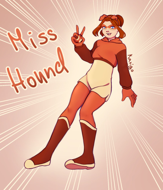
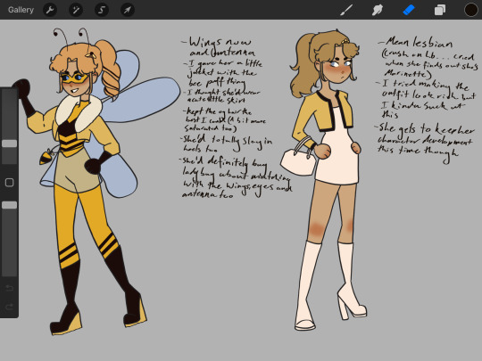
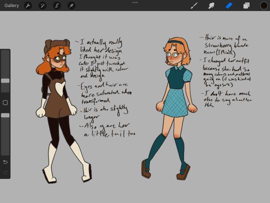
#miss hound redesign
Explore tagged Tumblr posts
Visit Tumblr Blog
Explore Tumblr blogs with no restrictions, modern design and the best experience.
Last Seen Tumblr Blogs


Fun Fact
Forty percent of Tumblr users are between the ages of 18 to 25.
Text

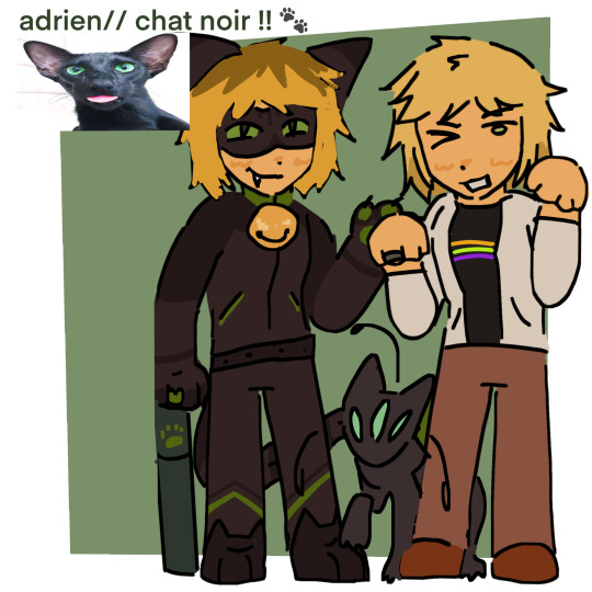
I can't believe they cheated us so hard on Sabrina here (and Rooster Bold, and Caprikid, and Minot-). They didn't give her a transformation sequence, and they even gave her miraculous to 2 other people! It's one thing if it was Ladybug and Chat Noir using them, but no. Both Alix and "Adrien" got to use Barkk's miraculous!
I don't think anything about any of the designs really scream Dog to me, but I think Sabrina's was the best in concept out of all of them. I think part of it is the colors, Plagg has the distinction of being specifically a Black Cat which combined with the green eyes makes it hard to mistake what animal the miraculous is based on. But Barkk has very similar colors to the Fox miraculous, and that definitely makes it harder to tell.
Personally I think basing the dog miraculous on a Dalmation, Cocker Spaniel, or Basset Hound.
But anyway onto the dog miraculous, I think I will also be changing the power. Instead my idea was that once the ball connects to something it can lead the dog user to the object via a trail only the user can sense. But the condition is, they have to know what object they hit. If they intend to track a person, they need to know that person's identity. So if Hawkmoth appears they would need to hit his cane or his miraculous in order to track them. But the trace on the cane would wear off as soon as he de-transforms. The one on the butterfly miraculous would last longer, but would wear off over time meaning he would just have to keep moving until then.
Gabriel is aware of this power, and knows it would be very useful if he could get his hands on it. But the risk is pretty high for him as well, since if they manage to trace his miraculous he'd be in trouble. So Hawkmoth is hesitant to appear in person.
As for Vanisher, I based on design on the Invisible Man. Specifically the 2005 french cartoon of the same name. I recommend it, I love Alan so much. She can appear as just the hat, glasses, gloves, and coat. Or she can turn completely invisible The akuma is hidden in the pin on her hat.
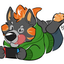
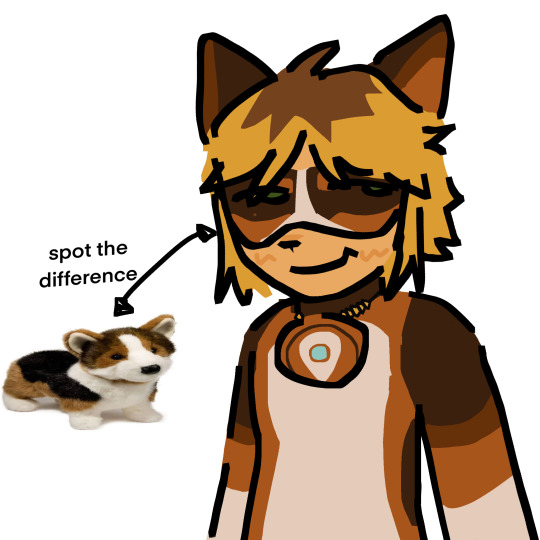
I like Sabrina's preppy style, so when I saw a pinafore dress in this dark orange shade I knew I wanted to use it for her Miss Hound design. I also love the beret, I wish they didn't steal it for Cani-girl. I did tie her hair back and altered the shade of orange to a more auburn shade. Her ball is attached to her bow, and I decided to keep the thigh high socks since they were cute.
#miraculous ladybug#miraculous fanart#miraculous redesign#dog miraculous#sabrina raincomprix#vanisher#miss hound#sabrina raincomprix redesign#vanisher redesign#miss hound redesign#miraculous rewrite
192 notes
·
View notes
Text
Miss Hound redesign
#i dont actually really have a problem with canon miss hound#but someone on instagram requested it so why not#my art#miraculous ladybug#kwami swap#sabrina raincomprix#dog miraculous#dog!sabrina#miss hound#miss hound redesign
77 notes
·
View notes
Text
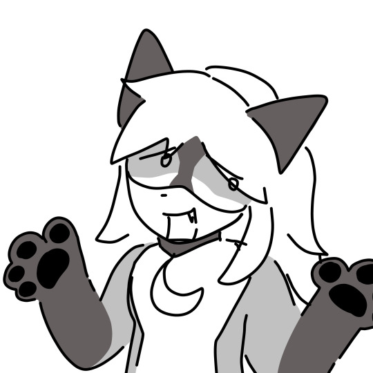
Miss hound redesign. If I’m being honest misshound had one of my least favorite designs of all the heroes.
(Sorry it’s so low quality)
The hat was awkward the shorts made it feel like a recolored version of her normal outfit and the mask just didn’t do it for me.
I thought flairmidables design was so much more appealing so I took some inspiration from him.
Bark has long ears and I thought they would be cute on miss hound so I got rid of the hat and gave her pigtails that resemble dog ears instead.
Personally I don’t love that Sabrina gets a miraculous as her character is not very heroic. She never stands up for herself against Chloe and even worse she stands by or helps Chloe do things that hurt other people. Like she broke into marinettes room and tried to steal her diary. I just don’t feel like she was worthy of a miraculous. If chloe found out that she had a miraculous I feel like it wouldn’t take much for her to hand it over to chloe. It would have been fun if she had an arc where she started standing up for herself more like in evillustrator so that she earned it but I guess her character was not important enough for the screen time.
Anyway I really disliked her design so but I’m pretty happy with my redesign 🐶
#miraculous redesign#mlb fanart#miraculous ladybug#dog miraculous#miss hound#miss hound redesign#miraculous ladybug redesign
105 notes
·
View notes
Text

Miss Hound Official Redesign because they did Sabrina wrong
#miraculous ladybug#miraculous tales of ladybug and chat noir#my art#kwami#barkk#sabrina raincomprix#miss hound#miraculous redesign#miss hound redesign#woof woof bitch#dog miraculous
48 notes
·
View notes
Text

Miss Hound with the Ladybug miraculous
#ml miss hound#miss hound#ml Sabrina#sabrina raincomprix#miraculous ladybug#miraculous tales of ladybug and chat noir#my art#ml art#miraculous#ml fan art#illustration#em doddles art#ml au#ml#ml kwami fusions#ml kwami unify#miraculous world#miraculous fanart#miraculous ladybug fanart#miraculous redesign#miraculoustalesofladybugandcatnoir#miraculous au#miraculous lb
30 notes
·
View notes
Text
a few simple miraculous redesigns or something idk I was bored (it’s mostly js rena rouge and miss hound ☠️)


oh and whatever these r I guess


also if you followed me for scott pilgrim or bottoms content um idk what to say but i mostly post miraculous or lis content sorry 😓
#mlb fanart#mlb redesign#miraculous ladybug#miraculous fanart#ml fanart#ladybug#ladybug and chat noir#chat noir#flairmidable#rena rouge#miss hound#marinette dupain cheng#adrien agreste#felix graham de vanily#alya cesaire#sabrina raincomprix#chloe bourgeois#plagg#tikki#tikki and plagg#art
155 notes
·
View notes
Text
SABRINA MY BELOVED!! WOLFHOUND MY DARLING
Seriously though Sabrina needs so much more love and I'm glad to have drawn more of her! (@ Canon: Give Sabrina her own spotlight episode please it's been 5 seasons!!)
87 notes
·
View notes
Photo


Lila, Felicity (Felix, she’s transfem in my au), & Sabrina! (Ik Volpina isn’t an actual miraculous user but it’s the closest I had to one at least until chrysalis’ design is revealed 💋)
#art#miraculous au#ml rewrite#miraculous redesign#lila rossi#felix fathom#sabrina raincomprix#volpina#argos ml#miss hound#femme argos turned out so fabulous I’m so proud of her design#Her tgirl swag is unrivaled#sabrina’s too#Sabrina’s design is one of my favorites that I’ve done I looooovvee her colors#tried to show how Lila isn’t using an actual miraculous bc I didn’t change her eye color#bc in my au ALL of the holders’ eyes change colors to match their kwami’s bc it shows that they’re being powered by the kwamis in a way?#I love leaving random tiny lore drops in the tags it’s so fun#forgor that chrysalis’ name was a leak 😭#ml leaks
233 notes
·
View notes
Text
Heyyyyyyyy I’m back with more redesigns here’s queen bee/Chloe and miss hound/Sabrina
#miraculoustalesofladybugandcatnoir#miraculous redesign#chloe bourgeois#sabrina raincomprix#queen bee#miss hound#miraculous fandom#miraculous chloe#miraculous sabrina#loz draws
86 notes
·
View notes
Text
Little Pomeranian Sabrina design

I know Pomeranians are a lot fluffier as they're 90% floof, but yeah, here we are.
I wanted something cute for her and gave her unique markings as all animals can have unique fur patterns that result in unintentional designs in them.
#miraculous#miraculous ladybug#miraculoustalesofladybugandcatnoir#au#alternate universe#miraculous au#fanart#miraculous fanart#digital art#design#miraculous sabrina#sabrina raincomprix#mlb sabrina#sabrina#miss hound#miss hound miraculous#miraculous redesign#mlb redesign#redesign#pomeranian#fan design#mlb design
48 notes
·
View notes
Text
This will be their season btw (ignore Miss hound's pose)


The new redesigns look so much better my god. CAPRIKID ESPECIALLY. (Credit to @chatonagresteof on Twitter for the render comparisons)
We are getting the transformations.

#mlb#miraculous#miraculous ladybug#ml season 6#ml spoilers#miss hound#caprikid#rooster bold#minotaurox
66 notes
·
View notes
Text
Miraculous Ladybug Superhero Outfits Ranking
Since Season 6 is fast approaching, and we will get some much-needed redesigns for the main hero cast, I decided to review the main superhero outfits from the past seasons and rank them according to my opinion.
Small warning... there will be a lot of salt in some of this. and I will be using some of @zoe-oneesama 's designs for Scarlet Lady as a comparison.
Without further ado... time to start this mess of a list
24- Argos

Where do I even start...
Well, I can start by saying that... NOTHING in his design works. It's painful to just look at.
The shade of green chosen doesn't clash well with the blue of the peacock. The green hair and the blue skin so close to each other makes the combo even worse.
The saturation of the blue isn't good either. If they wanted something more formal to Felix, they should have gine with a darker blue, Like Mayuras, or, Scarlet Lady's Blue blood.

My biggest problem with this design is the green, though. The moss tone, instead of some more vibrant just makes the design weird to me.
Also, why do all the Peacock holders skin turn blue when they transform? This doesn't happen with any other miraculous.
If Felix kept his hair and eye color, used a mask instead of a hood, used darker blues, and, MAYBE, some brighter shades of green, the design would work.
But this?!
It's painful to even look at it.
23- Ryuko

... Can someone explain me how a hero that has a DRAGON theme look so boring?
Just like a good majority of miraculous holders, her outfit is just a tight jumpsuit with little characterization...
Ryuko's, however, is specially bad, because, due to having the same color pallete of Ladybug, it feels unoriginal.
So, besides it being a simple jumpsuit like many other outfits I don't like, it also feels uncreative, which makes it love some points.


Besides using SL!Ryuko as a reference to what it could be... I would like to talk about one of my favorite ryuko redesigns.
One created by my friend @natedogx15 . Like, he used the fact that she was basically a knight, and made her outfit look like armor. Look at how badass it is!
It's said that canon Ryuko's design is basically ladybug's color pallete with some details to try to make it different.
22- Ladybug

This one was pretty obvious.
The suit is way too basic, especially considering that the hero behind the mask is a fashion designer.
It's also way to tight and it feels inappropriate for a girl Marinette's age to use.
It gets even worse if we remember that she was inspired by Spider-Man...
Like, seriously, this feels like a weird pajama a kid would wear. And even then, the PJ kids had better designs.
21- Chat Noir

The same problems that I have with Ladybug's design are here.
Basic and overly tight suit, that feels innapropriate for Adrien's age. And, although I think the Bell it's silly... it's what helps to keep this design from being entirely bland.
And hey, the green eyes are interesting, at least...
Still, it's not a design I like. They could have gone with something similar to Black Panther or Batman. But, instead... they chose this.
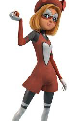
20- Miss Hound

Behold, the most uninspired design of miraculous ever!
It's literally just Sabrina's civilian outfits with a few differences. It's only a bit higher on the list because, the outfit is indeed more creative IN COMPARISON with the other hero outfits, and I like the beret.
But, seriously, Miss Hound design shows how little the show cares about Sabrina.
Her first, and main akuma, doesn't have an actual design, the second is a bit ugly, and the hero outfit is basically the civilian outfit with a new texture.
As a Sabrina Stan, I have to say... the girl deserved more.
19- Bunnix

Fun fact about me: I am a BIG Alice in Wonderland Fan. I also love this shade of blue... and that's why Bunnix's canon's design is disappointing to me.
The outfit is generic, I can barely see anything that reminds me of Alix, it has no reference to any card suit...
It just feels unispired, specially considering how good it could have been.
If it is Alice in Wonderland inspired, Bunnix could have a top hat, a coat like the white rabbits... but, it's just... nothing. inspired by Alice in Wonderland, Bunnix could wear a top hat and a coat like the white rabbits, but... there is nothing.
18- Minotaurox

Minotaurox is... an interesting case for me.
Because, honestly, I kind of like the design. Speically when people draw it on 2D.
But, a problem that the show has it's the rendering of uniform with darker colors... especially this shade of blue and black.
This colors just feel... lifeless in a way. They don't shine, or captivate... they are just there...
I just hope that, with the new animation style, the darker colors on the heroes look better.
17- Multimouse

Man, I don't get the fandom's love for Multimouse. It's not a bad design, but... it isn't good either.
I like the use of the colors, the hairstyle, and yes, it looks more creative than Ladybug's, but that's not saying much.
But, I also understand that they couldn't complicate the design too much because of how many fusions there were in the episode.
That being said... Multimouse is an acceptable design. Not amazing, but, okay.
16- Purple Tigress

Although I don't think the design is bad... it suffers from a problem of similarity.
Similar to how Ryuko's uniform looks too much like Ladybug's, Purple Tigress's looks too much like Rena Rouge.
Like, it's a lighter tone in the front, the main color of the miraculous is on the sides and back, and the character, who has her hair down on the civillian form, gets a ponytail after transformation.
Although I understand that Ponytails are probably more practical in battles... Purple Tigress and Rena Rouge's look too much alike.
I do admit I like the stripes. But, besides that, it's very unoriginal.

Particularly speaking, I like the jacket that Zoe gave her with the power up look.
15- Rena Rouge

Although it's not the worst design on the show, it's probably one of the most disappointing.
It looks too much like Volpina, and, even if Volpina's design was supposed to look like a fox holder, it doesn't mean that Rena Rouge couldn't look a bit more different.
Like, Queen Bee and Vesperia are both bee heroes. But, they look nothing alike.
Particularly speaking, I would have replaced the weird corset thing with a reporter trench coat.

Imagine a Trench Coat like this with the fox tail at the end? And the hat with the ears? I just think it would be neat.
14- Flairmidable

Flairmidable's design is one that... I don't care about.
It's very similar to Chat Noir's, it's true, but the use of colors make it more interesting. And it doesn't look as tight as Chat's uniform.
And that's what I have to say about the design.
It's not bad, but, I don't care.
13- Polymouse

Although it is a pretty generic design, there are certail elements that I like.
The change on hair and eye color, the mask, the ears on the hoodie.

And, once again, Zoe's redesigns proved that the concept could have worked.
12- Canigirl

Honestly, it's kind of a good design.
I like how it uses the colors brown, black and white to create it's combo. The mask is adorable.
And I like the detail of the black spot at the beret.
Kind of sad that her design is more creative than the one of the official Dog Hero.
11- Pigella

From now on, the designs are actually good, in my opinion.
Pigella's design is great. It's different from the usual jumpsuits, it reflects Rose's nature, and the ballerina tutu is great touch.
My only issue with it is that it doesn't feel like a Pig themed superhero.
Either way, it's one of the best female designs on the show.
10- Aspik

Although many people complain on the whole "bald thing", I don't think Aspik is a bad design.
He looks like a snake, has some cool patterns and textures on the outfit, and I like the color pallete.
Like, yeah, it would probably look cooler if Adrien showed his hair, but, it's not all bad.
9- King Monkey

It's a good design. Definetely not a jumpsuit, it has good sources of inspiration, it looks like a monkey...
It's one of the best designs on the show. It just isn't higher due to personal taste.
8- Carapace

It's a good design as well. It fits Nino's aesthetic, it's an outfit that has a clear turtle theme, and the details like the boots, and the knee and the elbow pads.
In general, it's good as well.
7- Viperion

Like Aspik, Viperion's uniform has some cool patterns and textures. But, besides them matching Luka more, his hair is the same color of his outfit, which I think it's neat.
6- Queen Bee

This design is iconic, and it has it's reasons!
The way it uses stripes, the subtle but noticeable change on the ponytail.
Out of the five, in my opinion, she has the best design.
5- Pegasus

Man, they were creative with this one.
Although his name is Pegasus, his shoes are a reference to Hermes, his uniform looks a bit like an armor (which makes sense, because he is kind of a knight), and the horseshoe on his neck.
They put a lot of effort on his design.
4- Vesperia

I used to be a bit mean with this design... but I noticed that it wasn't the designs fault, but the animation.
Like, there are scenes where the outfit looks great, and others where it doesn't. But, it's mostly because of the rendering.
The uniform is actually very creative, and it's really cool how they manage to create something so different from Queen Bee.
MY only issues are the masks and the black streaks on her hair. They... don't look that good in the show.
(If you guys want to see some cool ideas for a redesign, I recommend @nerd-chocolate 's post)
3- Rooster Bold

This design is FIRE!
The way they manage to incorporate so many Rooster details, like the claw, the beak, the comb and the tail.
Besides, it's different from every single other hero. It almost looks like a carnival costume on the best way possible.
2- Scarabella

Behold, the best Ladybug holder design.
This one feels like it's inspired by Spiderman.
The upper part looking like a jacket, the use of black, the hair... it's all so creative.
It's one of the few canon designs I don't think that could be improved.
1- Caprikid

This design had no right of being this good. But, it is.
The white and black contrast, the zipper, the fur, the horn. Just like Rooster Bold, it is also way different than the jumpuit pattern.
I only wished that they played more with Nath's hairstyle. Like, his miraculous is a pair of hair clips, and they do nothing with his hair...
But, still, out of all miraculous heroes, he has the best suit... in my opinion, a least.
#miraculous#miraculous ladybug#miraculous salt#astruc salt#caprikid#scarabella#rooster bold#vesperia
38 notes
·
View notes
Text
"Redesign" da Sabrina Raincomprix e Miss Hound 🤓🐾


Só um desenho q fiz hj, eu até gostei das roupas, mas ficou mt desproporcional anatomicamente
#drawing#art#my art#my draws#fanart#miraculous fanart#miraculous ladybug#miraculous fandom#miraculous lb#miraculous sabrina#miraculous#miss hound#sabrina raincomprix
32 notes
·
View notes
Note
https://youtu.be/5HcDwJ5TqGo?feature=shared
Disney just dropped a new trailer. Sabrina/Miss Hound redesign is in it.
Oh this is so much better! It's nice that it's a refinement of the OG look and we get to see tweaked Sabrina- also just a slight 'glow up' without a big shift!
Yaaaaaay! Sabrina!
Other heroes look good to, though poor Pegasus is probably the weakest from the quick look. Poor Max.
13 notes
·
View notes
Text
okay so here’s my opinions on the new trailer - also spoilers for s6 kinda?? under the cut

We have ladybug and chat noir - it doesn’t seem from the pic above that much has changed with his suit. Idk how to describe it but his face is uhhh longer????? In my opinion , I don’t really mind Ladybug’s new suit/outfit and her hair seems less blue than in s5 and the London special

More chat - he somehow looks younger in this photo and older in the previous one?? Maybe that’s just the angle of the frame

We have Rena Rouge and Carapace as well!! I love the look to Rena’s hair and Carapace’s overall redesign seems fine.
Chat Noir just looks uncanny idk how else to describe it imo. It looks like maybe he’s got like a longer collar to his suit or something too.

Tikki was in it too - she does look a tiny bit different

Miss Hound was in the trailer too - Sabrina looks cute and so does her overall redesign for Miss Hound which is so much better compared to the original imo
we also saw Pegasus - don’t see much of him tho

Imo I don’t really mind Marinette’s redesign but Adrien looks like he’s somehow de-aged. His outfit seemingly hasn’t changed much tho.
We’ve not seen any other of the miraculous hero’s but we did see quite a few akumatized villains by the look of it. I literally cannot wait to see how my favs , Ryuko and Viperion look.
That’s all I hv for now. No hate to any of the show staff at all - I’ve not yet seen the full season and the quality of the show has visibly improved. This is just my opinion and I’m really interested to see how they’ve adapted the old art style (although I do miss the old one).
This is also just my own personal opinion and observations - this might all change when I actually watch season 6 - also if y’all wanna discuss with me in the reblogs go ahead.
#miraculous ladybug#mlb#miraculous ladybug s6#Miraculous Tales of Ladybug and Cat Noir#Miraculous ladybug season 6#Miraculous ladybug season 6 trailer#Miraculous ladybug spoilers#Official miraculous trailer#Mlb marinette#mlb adrien#mlb Rena rouge#Mlb carapace#Mlb Pegasus#mlb miss hound
8 notes
·
View notes
Text

Miss Hound with the monkey miraculous
#miraculous ladybug#miraculous tales of ladybug and chat noir#miss hound#ml Sabrina#sabrina raincomprix#my art#ml art#miraculous#ml fan art#illustration#em doddles art#ml au#ml#ml kwami unify#ml kwami fusions#miraculous world#miraculous ladybug fanart#miraculous fanart#miraculous au#miraculous redesign#miraculoustalesofladybugandcatnoir#miraculous lb#miraculous sabrina#ml miss hound#ladybug fanart#tales of ladybug and cat noir
18 notes
·
View notes