#mine: tutorial.
Explore tagged Tumblr posts
Text
⭐ So you want to learn pixel art? ⭐
🔹 Part 1 of ??? - The Basics!
Hello, my name is Tofu and I'm a professional pixel artist. I have been supporting myself with freelance pixel art since 2020, when I was let go from my job during the pandemic.


My progress, from 2017 to 2024. IMO the only thing that really matters is time and effort, not some kind of natural talent for art.
This guide will not be comprehensive, as nobody should be expected to read allat. Instead I will lean heavily on my own experience, and share what worked for me, so take everything with a grain of salt. This is a guide, not a tutorial. Cheers!
🔹 Do I need money?
NO!!! Pixel art is one of the most accessible mediums out there.
I still use a mouse because I prefer it to a tablet! You won't be at any disadvantage here if you can't afford the best hardware or software.
Because our canvases are typically very small, you don't need a good PC to run a good brush engine or anything like that.
✨Did you know? One of the most skilled and beloved pixel artists uses MS PAINT! Wow!!
🔹 What software should I use?
Here are some of the most popular programs I see my friends and peers using. Stars show how much I recommend the software for beginners! ⭐
💰 Paid options:
⭐⭐⭐ Aseprite (for PC) - $19.99
This is what I and many other pixel artists use. You may find when applying to jobs that they require some knowledge of Aseprite. Since it has become so popular, companies like that you can swap raw files between artists.
Aseprite is amazingly customizable, with custom skins, scripts and extensions on Itch.io, both free and paid.
If you have ever used any art software before, it has most of the same features and should feel fairly familiar to use. It features a robust animation suite and a tilemap feature, which have saved me thousands of hours of labour in my work. The software is also being updated all the time, and the developers listen to the users. I really recommend Aseprite!
⭐ Photoshop (for PC) - Monthly $$
A decent option for those who already are used to the PS interface. Requires some setup to get it ready for pixel-perfect art, but there are plenty of tutorials for doing so.
Animation is also much more tedious on PS which you may want to consider before investing time!
⭐⭐ ProMotion NG (for PC) - $19.00
An advanced and powerful software which has many features Aseprite does not, including Colour Cycling and animated tiles.
⭐⭐⭐ Pixquare (for iOS) - $7.99 - $19.99 (30% off with code 'tofu'!!)
Probably the best app available for iPad users, in active development, with new features added all the time.

Look! My buddy Jon recommends it highly, and uses it often.
One cool thing about Pixquare is that it takes Aseprite raw files! Many of my friends use it to work on the same project, both in their office and on the go.
⭐ Procreate (for iOS) - $12.99
If you have access to Procreate already, it's a decent option to get used to doing pixel art. It does however require some setup. Artist Pixebo is famously using Procreate, and they have tutorials of their own if you want to learn.
⭐⭐ ReSprite iOS and Android. (free trial, but:) $19.99 premium or $$ monthly
ReSprite is VERY similar in terms of UI to Aseprite, so I can recommend it. They just launched their Android release!
🆓 Free options:
⭐⭐⭐ Libresprite (for PC)
Libresprite is an alternative to Aseprite. It is very, very similar, to the point where documentation for Aseprite will be helpful to Libresprite users.
⭐⭐ Pixilart (for PC and mobile)
A free in-browser app, and also a mobile app! It is tied to the website Pixilart, where artists upload and share their work. A good option for those also looking to get involved in a community.
⭐⭐ Dotpict (for mobile)
Dotpict is similar to Pixilart, with a mobile app tied to a website, but it's a Japanese service. Did you know that in Japanese, pixel art is called 'Dot Art'? Dotpict can be a great way to connect with a different community of pixel artists! They also have prompts and challenges often.
🔹 So I got my software, now what?
◽Nice! Now it's time for the basics of pixel art.
❗ WAIT ❗ Before this section, I want to add a little disclaimer. All of these rules/guidelines can be broken at will, and some 'no-nos' can look amazing when done intentionally.
The pixel-art fundamentals can be exceedingly helpful to new artists, who may feel lost or overwhelmed by choice. But if you feel they restrict you too harshly, don't force yourself! At the end of the day it's your art, and you shouldn't try to contort yourself into what people think a pixel artist 'should be'. What matters is your own artistic expression. 💕👍
◽Phew! With that out of the way...
🔸"The Rules"
There are few hard 'rules' of pixel art, mostly about scaling and exporting. Some of these things will frequently trip up newbies if they aren't aware, and are easy to overlook.
🔹Scaling method
There are a couple ways of scaling your art. The default in most art programs, and the entire internet, is Bi-linear scaling, which usually works out fine for most purposes. But as pixel artists, we need a different method.


Both are scaled up x10. See the difference?
On the left is scaled using Bilinear, and on the right is using Nearest-Neighbor. We love seeing those pixels stay crisp and clean, so we use nearest-neighbor.
(Most pixel-art programs have nearest-neighbor enabled by default! So this may not apply to you, but it's important to know.)
🔹Mixels
Mixels are when there are different (mixed) pixel sizes in the same image.


Here I have scaled up my art- the left is 200%, and the right is 150%. Yuck!
As we can see, the "pixel" sizes end up different. We generally try to scale our work by multiples of 100 - 200%, 300% etc. rather than 150%. At larger scales however, the minute differences in pixel sizes are hardly noticeable!
Mixels are also sometimes seen when an artist scales up their work, then continues drawing on it with a 1 pixel brush.

Many would say that this is not great looking! This type of pixels can be indicative of a beginner artist. But there are plenty of creative pixel artists out there who mixels intentionally, making something modern and cool.
🔹Saving Your Files
We usually save our still images as .PNGs as they don’t create any JPEG artifacts or loss of quality. It's a little hard to see here, but there are some artifacts, and it looks a little blurry. It also makes the art very hard to work with if we are importing a JPEG.

For animations .GIF is good, but be careful of the 256 colour limit. Try to avoid using too many blending mode layers or gradients when working with animations. If you aren’t careful, your animation could flash afterwards, as the .GIF tries to reduce colours wherever it can. It doesn’t look great!

Here's an old piece from 2021 where I experienced .GIF lossiness, because I used gradients and transparency, resulting in way too many colours.
🔹Pixel Art Fundamentals - Techniques and Jargon
❗❗Confused about Jaggies? Anti-Aliasing? Banding? Dithering? THIS THREAD is for you❗❗ << it's a link, click it!!
As far as I'm concerned, this is THE tutorial of all time for understanding pixel art. These are techniques created and named by the community of people who actually put the list together, some of the best pixel artists alive currently. Please read it!!
🔸How To Learn
Okay, so you have your software, and you're all ready to start. But maybe you need some more guidance? Try these tutorials and resources! It can be helpful to work along with a tutorial until you build your confidence up.
⭐⭐ Pixel Logic (A Digital Book) - $10 A very comprehensive visual guide book by a very skilled and established artist in the industry. I own a copy myself.
⭐⭐⭐ StudioMiniBoss - free A collection of visual tutorials, by the artist that worked on Celeste! When starting out, if I got stuck, I would go and scour his tutorials and see how he did it.
⭐ Lospec Tutorials - free A very large collection of various tutorials from all over the internet. There is a lot to sift through here if you have the time.
⭐⭐⭐ Cyangmou's Tutorials - free (tipping optional) Cyangmou is one of the most respected and accomplished modern pixel artists, and he has amassed a HUGE collection of free and incredibly well-educated visual tutorials. He also hosts an educational stream every week on Twitch called 'pixelart for beginners'.
⭐⭐⭐ Youtube Tutorials - free There are hundreds, if not thousands of tutorials on YouTube, but it can be tricky to find the good ones. My personal recommendations are MortMort, Brandon, and AdamCYounis- these guys really know what they're talking about!
🔸 How to choose a canvas size
When looking at pixel art turorials, we may see people suggest things like 16x16, 32x32 and 64x64. These are standard sizes for pixel art games with tiles. However, if you're just making a drawing, you don't necessarily need to use a standard canvas size like that.
What I like to think about when choosing a canvas size for my illustrations is 'what features do I think it is important to represent?' And make my canvas as small as possible, while still leaving room for my most important elements.
Imagine I have characters in a scene like this:
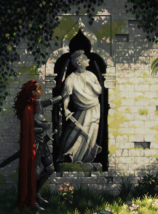
I made my canvas as small as possible (232 x 314), but just big enough to represent the features and have them be recognizable (it's Good Omens fanart 😤)!! If I had made it any bigger, I would be working on it for ever, due to how much more foliage I would have to render.
If you want to do an illustration and you're not sure, just start at somewhere around 100x100 - 200x200 and go from there.
It's perfectly okay to crop your canvas, or scale it up, or crunch your art down at any point if you think you need a different size. I do it all the time! It only takes a bit of cleanup to get you back to where you were.
🔸Where To Post
Outside of just regular socials, Twitter, Tumblr, Deviantart, Instagram etc, there are a few places that lean more towards pixel art that you might not have heard of.
⭐ Lospec Lospec is a low-res focused art website. Some pieces get given a 'monthly masterpiece' award. Not incredibly active, but I believe there are more features being added often.
⭐⭐ Pixilart Pixilart is a very popular pixel art community, with an app tied to it. The community tends to lean on the young side, so this is a low-pressure place to post with an relaxed vibe.
⭐⭐ Pixeljoint Pixeljoint is one of the big, old-school pixel art websites. You can only upload your art unscaled (1x) because there is a built-in zoom viewer. It has a bit of a reputation for being elitist (back in the 00s it was), but in my experience it's not like that any more. This is a fine place for a pixel artist to post if they are really interested in learning, and the history. The Hall of Fame has some of the most famous / impressive pixel art pieces that paved the way for the work we are doing today.
⭐⭐⭐ Cafe Dot Cafe Dot is my art server so I'm a little biased here. 🍵 It was created during the recent social media turbulence. We wanted a place to post art with no algorithms, and no NFT or AI chuds. We have a heavy no-self-promotion rule, and are more interested in community than skill or exclusivity. The other thing is that we have some kind of verification system- you must apply to be a Creator before you can post in the Art feed, or use voice. This helps combat the people who just want to self-promo and dip, or cause trouble, as well as weed out AI/NFT people. Until then, you are still welcome to post in any of the threads or channels. There is a lot to do in Cafe Dot. I host events weekly, so check the threads!
⭐⭐/r/pixelart The pixel art subreddit is pretty active! I've also heard some of my friends found work through posting here, so it's worth a try if you're looking. However, it is still Reddit- so if you're sensitive to rude people, or criticism you didn't ask for, you may want to avoid this one. Lol
🔸 Where To Find Work
You need money? I got you! As someone who mostly gets scouted on social media, I can share a few tips with you:
Put your email / portfolio in your bio Recruiters don't have all that much time to find artists, make it as easy as possible for someone to find your important information!
Clean up your profile If your profile feed is all full of memes, most people will just tab out rather than sift through. Doesn't apply as much to Tumblr if you have an art tag people can look at.
Post regularly, and repost Activity beats everything in the social media game. It's like rolling the dice, and the more you post the more chances you have. You have to have no shame, it's all business baby
Outside of just posting regularly and hoping people reach out to you, it can be hard to know where to look. Here are a few places you can sign up to and post around on.
/r/INAT INAT (I Need A Team) is a subreddit for finding a team to work with. You can post your portfolio here, or browse for people who need artists.
/r/GameDevClassifieds Same as above, but specifically for game-related projects.
Remote Game Jobs / Work With Indies Like Indeed but for game jobs. Browse them often, or get email notifications.
VGen VGen is a website specifically for commissions. You need a code from another verified artist before you can upgrade your account and sell, so ask around on social media or ask your friends. Once your account is upgraded, you can make a 'menu' of services people can purchase, and they send you an offer which you are able to accept, decline, or counter.
The evil websites of doom: Fiverr and Upwork I don't recommend them!! They take a big cut of your profit, and the sites are teeming with NFT and AI people hoping to make a quick buck. The site is also extremely oversaturated and competitive, resulting in a race to the bottom (the cheapest, the fastest, doing the most for the least). Imagine the kind of clients who go to these websites, looking for the cheapest option. But if you're really desperate...
🔸 Community
I do really recommend getting involved in a community. Finding like-minded friends can help you stay motivated to keep drawing. One day, those friends you met when you were just starting out may become your peers in the industry. Making friends is a game changer!
Discord servers Nowadays, the forums of old are mostly abandoned, and people split off into many different servers. Cafe Dot, Pixel Art Discord (PAD), and if you can stomach scrolling past all the AI slop, you can browse Discord servers here.
Twitch Streams Twitch has kind of a bad reputation for being home to some of the more edgy gamers online, but the pixel art community is extremely welcoming and inclusive. Some of the people I met on Twitch are my friends to this day, and we've even worked together on different projects! Browse pixel art streams here, or follow some I recommend: NickWoz, JDZombi, CupOhJoe, GrayLure, LumpyTouch, FrankiePixelShow, MortMort, Sodor, NateyCakes, NyuraKim, ShinySeabass, I could go on for ever really... There are a lot of good eggs on Pixel Art Twitch.
🔸 Other Helpful Websites
Palettes Lospec has a huge collection of user-made palettes, for any artist who has trouble choosing their colours, or just wants to try something fun. Rejected Palettes is full of palettes that didn't quite make it onto Lospec, ran by people who believe there are no bad colours.
The Spriters Resource TSR is an incredible website where users can upload spritesheets and tilesets from games. You can browse for your favourite childhood game, and see how they made it! This website has helped me so much in understanding how game assets come together in a scene.
VGMaps Similar to the above, except there are entire maps laid out how they would be played. This is incredible if you have to do level design, or for mocking up a scene for fun.
Game UI Database Not pixel-art specific, but UI is a very challenging part of graphics, so this site can be a game-changer for finding good references!
Retronator A digital newspaper for pixel-art lovers! New game releases, tutorials, and artworks!
Itch.io A website where people can upload, games, assets, tools... An amazing hub for game devs and game fans alike. A few of my favourite tools: Tiled, PICO-8, Pixel Composer, Juice FX, Magic Pencil for Aseprite
🔸 The End?
This is just part 1 for now, so please drop me a follow to see any more guides I release in the future. I plan on doing some writeups on how I choose colours, how to practise, and more!
I'm not an expert by any means, but everything I did to get to where I am is outlined in this guide. Pixel art is my passion, my job and my hobby! I want pixel art to be recognized everywhere as an art-form, a medium of its own outside of game-art or computer graphics!

This guide took me a long time, and took a lot of research and experience. Consider following me or supporting me if you are feeling generous.
And good luck to all the fledgling pixel artists, I hope you'll continue and have fun. I hope my guide helped you, and don't hesitate to send me an ask if you have any questions! 💕
My other tutorials (so far): How to draw Simple Grass for a game Hue Shifting
26K notes
·
View notes
Text
New Mature Content Warning Overlay (And How to Get Rid of It)
More fun community label "features"! Unlike the new mandatory label for #NSFW, this one is a bigger deal to me because it affects my entire blog and it can't be avoided by just using a different tag.
Apparently on custom blog layouts, if you happen to post or reblog even a SINGLE post that's been flagged with the mature content community label, a full-page warning overlay will appear blurring out your entire blog that must be manually clicked through every single time the page is refreshed. At first I thought this was just a bug due to my older layout but I've come to realize it's not. It's a feature (as confirmed by this recent changes post) that affects all custom themes. The formatting will vary based on your own theme but here's what it looks like on my blog:

I don't know about you but I find this is stupid and annoying. If it could be dismissed once and never seen again that might be one thing, but that's not the case. The vast majority of my blog is not "mature" enough to warrant such an aggressive and invasive warning. I also think pop-ups are obnoxious in general and I'll be damned if tumblr's going to force me to have one on MY blog.
After some desperate googling for a known workaround and being unable to find even a single mention of it, I decided to take on the challenge myself. I'm not a theme coder, so apologies if there's a better way to do this, but luckily it only took me like 10 minutes to figure out a simple fix, which I'm now sharing with anyone else who may want it:
.community-label-cover__wrapper {display: none}
Just copypaste that somewhere in your CSS and goodbye pop-up!
If you're not sure how to access your theme code, check out this help article. You can also add the code via the Advanced Options menu, which is actually even better (if you can get it to work, it depends on how your theme was coded), because it will then automatically be reapplied to a lot of themes without having to remember to manually add it every time if you change your theme in the future.
Obviously this will only remove it from your own blog for anyone who may visit it. If you never want to see this warning again on other people's blogs you can also add this custom filter to your ad block:
tumblr.com##.community-label-cover__wrapper
Unfortunately I do not have an easy tutorial on hand for this one as the method will depend on your specific ad block app or extension.
Some additional notes:
After adding the theme code and saving the changes, give it a minute to update as it sometimes takes a little while for the page to refresh.
The warning overlay only seems to appear if a "mature" post is on the FIRST page of your blog, which is still annoying and makes the whole thing even more pointless and stupid because what if someone visits any other page of your blog, and oh no, happens to see "mature" content they weren't warned about?!
The warning also appears on direct links to "mature" posts.
This hack has NOTHING to do with entire blogs that have been flagged as NSFW. It only works for non-flagged blogs with custom themes that happen to have individual "mature" posts.
#I'm not letting my entire blog be penalized for a couple rare singular posts that may or may not even be 'mature' enough to warrant it#tumblr may force us to use community labels#and they may have full control over the new blogview#but MY custom blog layout has always been and always will be MINE to format and present however I want#that's the whole point#tumblr#psa#tutorial#my words#tumblr themes#wendy's help desk
17K notes
·
View notes
Text


Are you intending to talk all the way through this?
#my lady jane#myladyjaneedit#jane x guildford#janeford#myladyjanecentral#janefordarchive#userninz#chrissiewatts#usertina#userelliee#tusermira#mine*#yeah. YEAH!#like. she got with the programme QUICK#its all about the hands#she had multiple opportunities to shut him up and took them#her hair is so good i need a tutorial asap#took a creative license with the caption but y'all get the idea
661 notes
·
View notes
Text
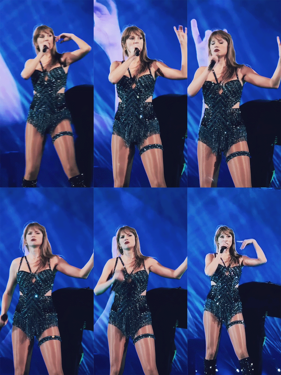
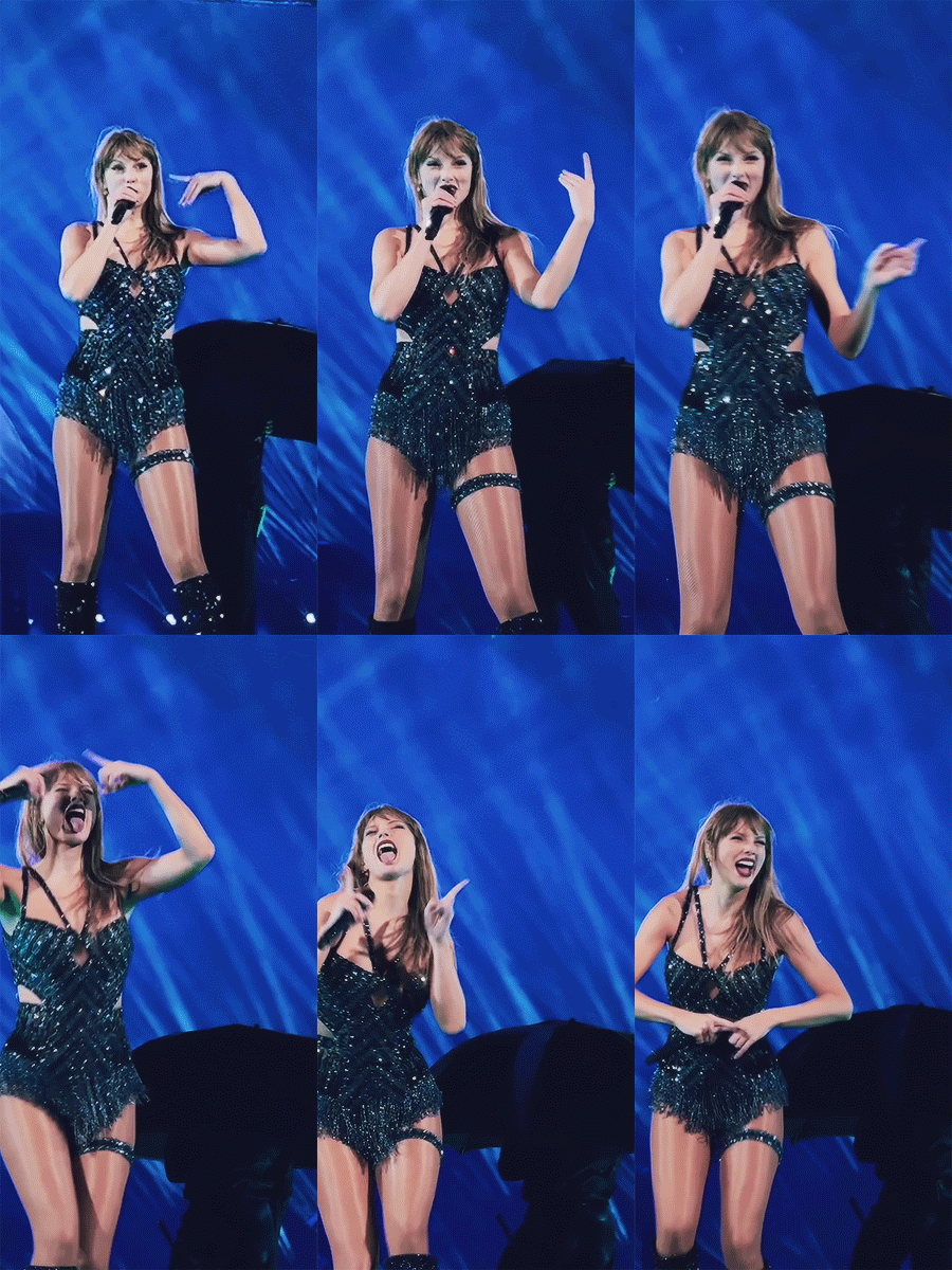
warsaw n3
#found a lifechanging gif sharpening tutorial#taylor swift#tswiftedit#taylorswiftedit#tscreators#tsedit#tswiftgif#candy swift#the swiftie tag#userrcmanticpoetry#networkthirteen#tswiftdaily#usertaylorswiftdaily#mine.#tegan .gif#warsaw n3#song: midnight rain#midnight rain#era: midnights#midnights#era: eras#the eras tour#best of teg#100.
220 notes
·
View notes
Text
A Micro Tutorial on Blending Face Presets for Sims 3 CAS by Papermint-Airplane

So I have this Sim here and I'm using this mouth preset. It's nice but it's a little downturned for my liking and I'd prefer more of a Cupid's bow.
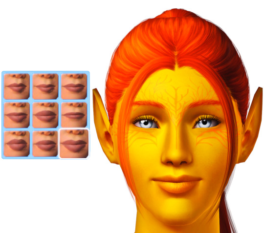
I choose the next preset which is more upturned and has the Cupid's bow I want but it's a little too sharp.
What if I merge the two presets?

I right click the first preset to blend it with the second preset. Now I have everything I want! It's not too downturned, not too upturned, and the Cupid's bow is nice and soft.
You can do this as many times as you want with as many different presets you want to get different effects. Experiment with it!
Happy Simming! 💚
#sims 3#ts3#mine#sims 3 cas#sims 3 tutorial#tutorial#tutorials#sims 3 cas tutorial#resources#sims 3 resources#just simblr things
432 notes
·
View notes
Text
I finally finally made these lines work, so here's Raphael acknowledging that you broke into his house but didn't steal the hammer (both variations depending on whether you made a deal or not)

(Those lines are currently impossible to get in the game because setting off the alarm in his house will automatically trigger his boss fight).
#if anyone was able to trigger these lines naturally please please let me know because I have no idea#also “chiding softly” really surprises me?#like he's not mad at all?#so this means you can go there fuck Haarlep steal his stuff (apart from the hammer) and he doesn't care lol#setting these flags manually is really easy I can make a tutorial if anyone's interested#video#mine#bg3#raphael bg3
280 notes
·
View notes
Text

made this for oomf but you can have it too. a little breakdown of my process with bird wings if anyone finds it useful
#art#art tutorial#im suuuuure there's a million out there but idc#also the things in red are pet peeves of MINE idgaf if you wanna draw like that i just think it looks bad imho#ME PERSONALLY. DONT LET ME STOP YOU#and on the little articulation bend cross sea bird wings would be the exception there the joint bend IS very noticeable and sharp#as well as hummingbird wings since those twist the humerus close to the body#rather than flapping from the shoulder
798 notes
·
View notes
Text
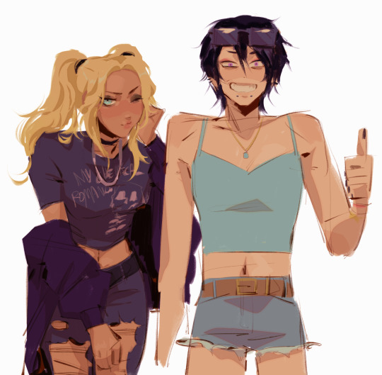
haley sebastian wardrobe swap
#haley reminds me of that one youtube goth makeup tutorial that was like just winged eyeliner and hearts under the eyes😭😭😭😭😭😭#i did not stay true to their og outfits sowwy#they have sm potential to be friends to me…#stardew valley#haley#sebastian#mine
2K notes
·
View notes
Text
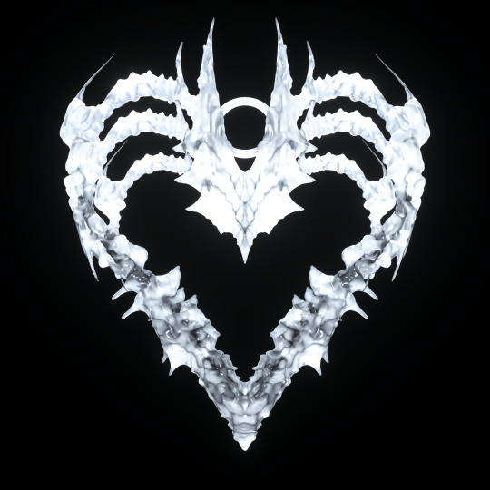
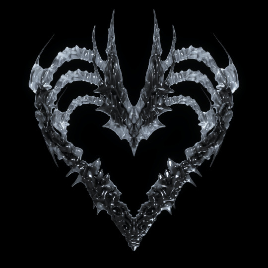
glass works sculpted by me
#mine#misc#aespa#3d art#fashion#y2k#art#pink aesthetic#y2k aesthetic#goth#y2k core#xg#chrome aesthetic#chrometype#my art#cocquette#ariana grande#metal#goth art#goth fashion#vampire#custom jewelry#kpop#newjeans#dropdead#gothcore#webcore#pastel pink#tutorial#lgbtq
620 notes
·
View notes
Text
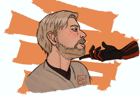
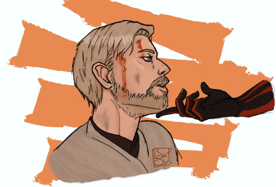
Yes hello, have an Obi-Wan with a pinch of ObiMaul
Don't know which version I like best, so there ya go
#obi-wan kenobi#darth maul#obimaul#my art#mine#got a drawing tablet last week#so I got myself some software and instantly had to draw Obi-Wan#like one does#I'm also too impatient for tutorials#so bear with me#learning by doing I guess
243 notes
·
View notes
Text
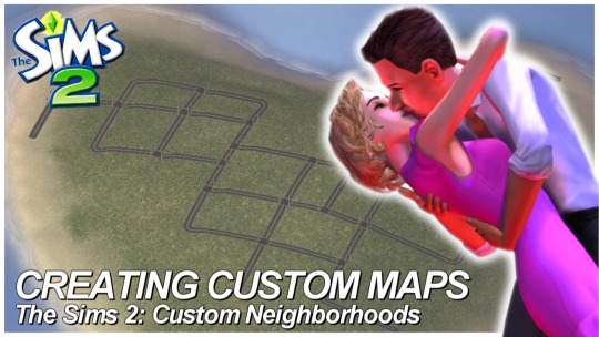
SIMS 2 • Custom Neighborhoods (4 Part Series COMPLETED)
Hey everyone! I think I forgot to share, but I finished my 4 Part Creating Custom Neighborhood series for Sims 2 on my Youtube Channel! All videos are linked below if you missed it!
I also have 2 separate tumblr posts with Map Templates and a quick Masterguide to plan 'hoods!
Best Neighborhood Templates | Links to Templates Planning Your Neighborhoods | Masterguide Creating Unique Sims Creating Custom Maps
#ts2#the sims 2#sims 2#sims 2 custom neighborhood#sims 2 custom hood#sims 2 guides#sims 2 tutorials#sims 2 youtuber#mine#edits#youtube#tutorials
336 notes
·
View notes
Text


Hello guys! Today ill make a tutorial on how to use psds! Dont be scared, its really easy and very fun too!

First, open photopea with the image you wanna use. click “File” and press open, after that, you open your files and select your psd!
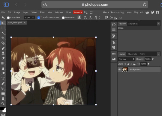


Great! Now we have the psd! But what do we do with it…?
well, first you need to check that youre on the right layer: Make sure youre selecting your psd folder before doing anything here!

great! Now click “layer” and after that, “duplicate into”

Now make sure you change it to the name of the project you wanna apply the psd to!


Enjoy your edits!
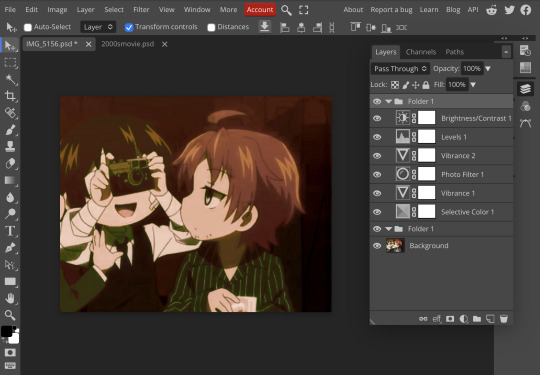
Feel free to send in an ask if you have any questions or something wasnt clear enough! Im always happy to help. See ya!

#⌗ 🍦 ⊹⁺ Marking what is mine#rentry decor#photopea psd#psd#psd tutorial#editing resources#edit tutorial#rentry inspo#editblr#rentry resources
334 notes
·
View notes
Text
*✶ please please please
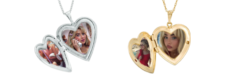
a template by cozysip.
by clicking in the source link you’ll find 02 different dash icon templates made by me from scratch. credit is not needed , but do not claim as your own ! if you enjoy this or you use it, please reblog or like this post . thank you !
#01. PSD TEMPLATES : mine.#template#free template#rp template#psd template#free psd#dash icon#dash icons#dash icons template#icon template#icon psd#psd#rpc#rph#graphic tutorial#free graphics
215 notes
·
View notes
Text
Digital Stamp Making Tutorial
Hello, and welcome to the long-awaited(at least on my part) digital stamp-making tutorial from neosprites! I’d like to preface that I learned what I was doing from this tutorial so it may be a bit redundant, but if anything I get a bit more specific. Thank you so much to @graphic--horde for your work, it changed me as a graphic maker. This is gunna be a long post so feel free to bookmark it for later. Now, onto the show!

The frame I will be using for this tutorial (which is the frame I use on 99.9% of my stamps) I found from the above linked post, which I believe is from a creator that OP lost track of. Its inner dimensions are 94x50 pixels and its outer dimensions are 99x56 pixels. Here it is!

Find your material! - I recommend using websites like Tumblr and searching with the “GIF” filter only on, or alternatives such as Giphy or Tenor. Your browser may let you directly save the .gif file; if not and you are noticing it restricts you to save it as a .webp file you can try an extension like “Save webp as PNG or JPEG” (for Firefox but I image other browsers have similar functions, but I really recommend you switch to Firefox). To use this you will right click on your source .gif like normal but instead of clicking on “Save image as…” click “Save webP as…” and then click “GIF”. You should be redirected to the website ezgif.com where we will actually be doing all of our editing! Here’s the .gif we’ll be working with.

Convert to GIF (optional) - if you used the extension from the above step you should already be ready to click the blue “Convert to GIF” button. If not, go ahead and open ezgif.com and click on “webP” and then “WebP to GIF”; then convert to a gif with the blue button.

Resize the GIF - now that we have a gif ready to edit, let’s make it the right size. The easiest method I have found is to change it directly to the frame’s inner dimensions, 94x50 pixels. [EDIT: Make sure in the aspect ratio drop drop menu you select "stretch to fit" and not "center and crop to fit" like I did in the photo example.] Click “resize” and then type [94] in for the width and [50] for the height. Next press the blue “resize image” button.


Add the frame - next click “overlay” then click the thin blue button that says “Extend canvas size(use if overlay exceeds GIF sizes)”. This will give us some extra room to add the frame onto the design. Next click “Browse…” and find the frame you have saved onto your device, then click the blue “Upload image” button.


After that it’s going to be misaligned, that’s normal! It will say you have the option to drag it into place, but don’t bother. That’s one of the reasons my old stamps look wack, it’s just harder to do. Instead type [44] in for the Left box and [22] in for the Right box. It took me a while to figure out these dimensions to be honest, and I’ve only tested it with this frame so I don't know if it works with others. Then click the blue “Generate image” button.


Crop the transparent edges - click on “crop”. You will have the option to check a box that says “trim transparent pixels around the image” however, I don’t recommend this as it tends to crop a few of the frame’s pixels with it sometimes. Next, set the Left position to [44] and the Right position to [22]. For the other dimensions we will use the outer dimensions of the frame which are 99x56 pixels, this will trim everything except the tiny spaces in between the stamp frame’s spikes. Type the width as [99] and the height as [56] and click the tiny blue button that says “set”. After that click the blue “Crop image” button.


Save and use! - all that's left is to click “save” and upload the graphic to your liking. (best seen on dark mode obviously)


If you’d like to tag me in stamps you’ve made using my tutorial I would love to see them, but it’s not required!! Make sure to always give credit for pictures/gifs when you can and try not to make stuff out of personal/fan art. Thank you to the person in my inbox who requested this tutorial, I had been meaning to for a while but it was just the kick I needed. :)
#carrd graphics#carrd resources#carrd stuff#rentry graphics#rentry resources#rentry decor#rentry pixels#rentry stuff#rentry inspo#deviantart#neocities#mine#my graphics#my tutorials#resources#tutorials#tutorial#how to#stamps#blinkies#graphics#web graphic#old internet#early internet#spacehey#da stamps#page decor#custom#old web#frames
99 notes
·
View notes
Text
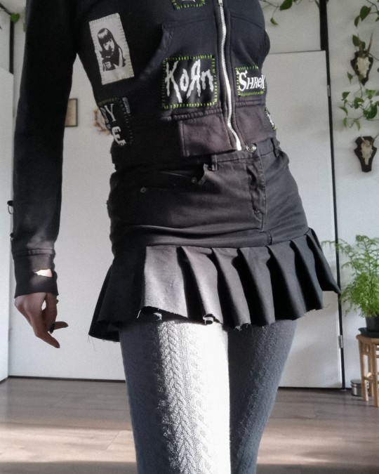
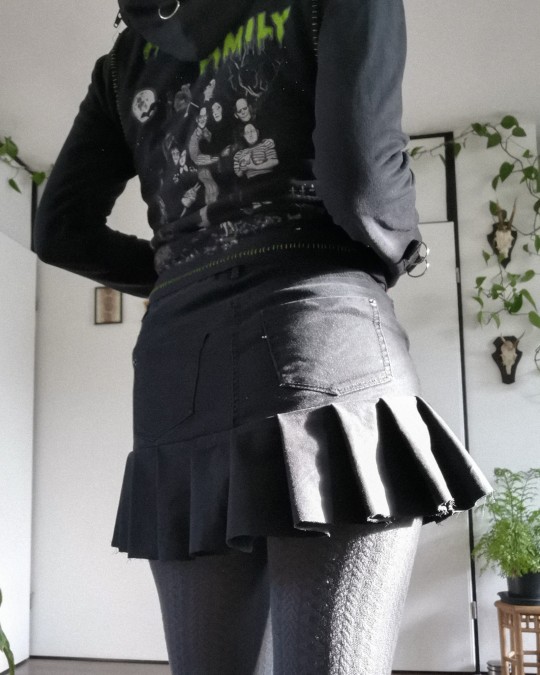
jeans to y2k/tripp inspired skirt ݁ ˖ִ ࣪✩₊ ⊹˚
I thrifted some jeans recently, not knowing if they would fit me, but buying it anyway bc 1) it was €1 and 2) if it didn't fit I could surely make something with it.
turns out it was wayyy too small 😂 so I decided it would be perfect to make one of those tripp/y2k skirts with!
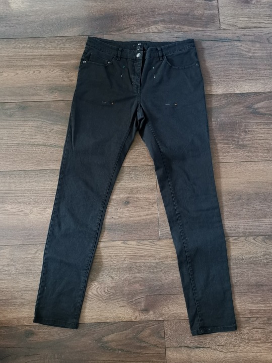
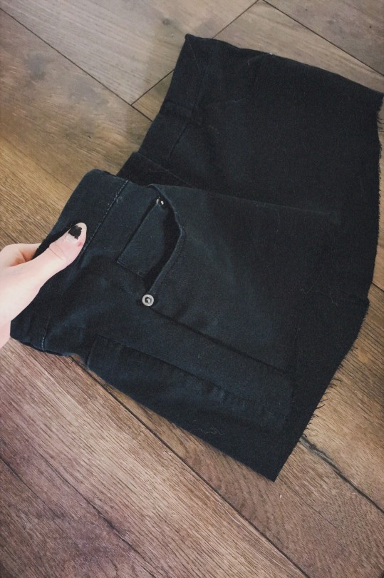
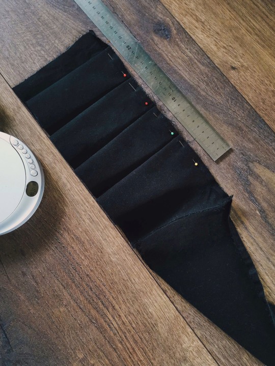
firstly I cut off the legs just above the crotch. I then tried it on, found it was too tight still, and added two strips of leftover fabric on either side. it fits perfectly now!
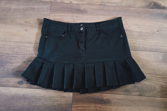
then I cut the remaining pant legs in even strips and connected them all to make one long strip. I folded ruffles of 5cm along the length, and sewed it in place before I sewed it onto the bottom of the skirt!
and just like that, I have a new skirt 𓆩♡𓆪 I might add some strips with d rings on it once I figure out the placement ^_^ but for now it's done
#mine#i showed it to my partner who immediately was like YOU HAVE SO MUCH TALENT#which was rly cool to hear actually#goth#alternative#diy#crafts#handmade#tripp#skirt#y2k#selfmade#tutorial? kinda???
326 notes
·
View notes
Note
I LOVE this set and i was wondering if you could pls explain how you did the text, including how you added texture to the ripped text and the highlighting/circling/etc of words? thank you for posting your beautiful gifs 😊
thank you!! 🥺 & of course! (photopea tutorial)
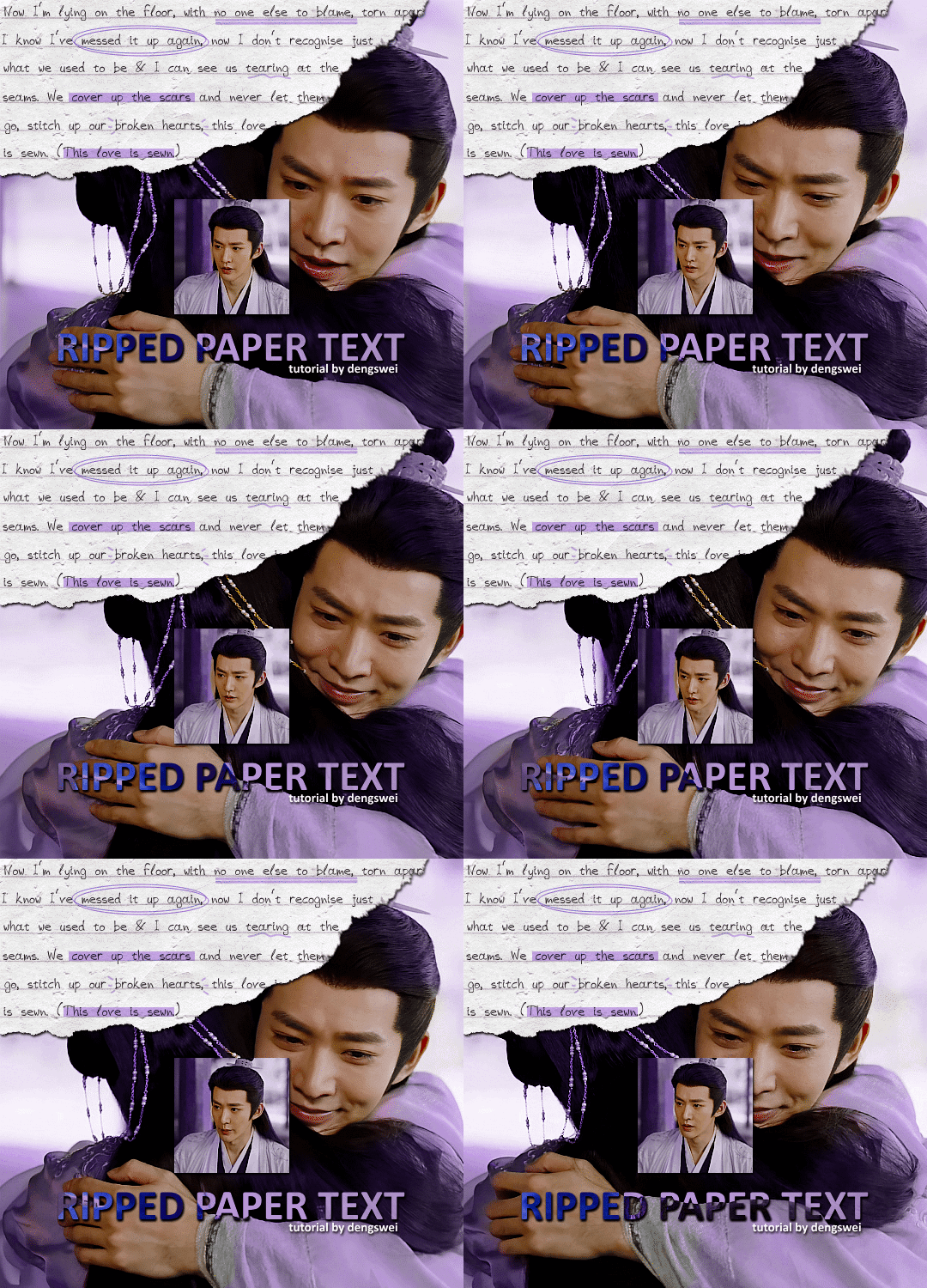
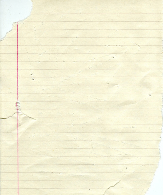
the majority of the texture for the ripped paper effect i can't really take credit for it's on the paper it's self all i did was make the paper white (because the texture was yellow) and used curves to darken the texture), i got the texture from one of photopea's templates but it seems their whole template section has changed drastically and no longer has like anything i used to see before ???? so i'll just share both versions here:
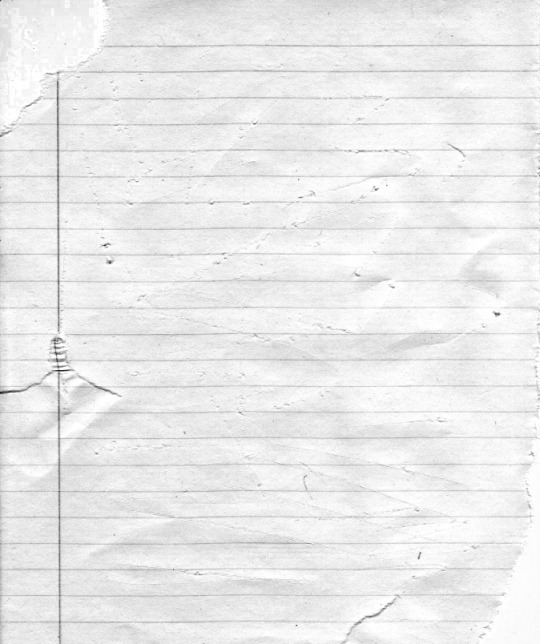
(original & my edited version)
for the ripped parts i just played around with this brush set in the plugins
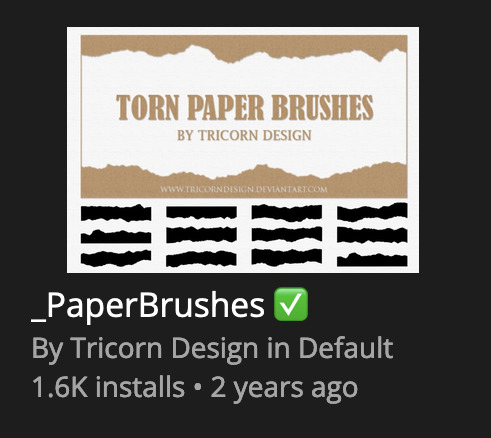
once i decided which of the paper brushes to use i had a new layer and used it where i wanted, so top left in the gif above, i clip masked the paper texture (and the adjustment layers as well) onto it so you get that ripped effect (if you don't like or want to add to that you can always use the brush tool again (or the erasure tool) set as the paper brush to add or remove sections i did this a lot when i realised certain words i wanted to show weren't on there (also changing the size of the paper brush when wanting to add a little bit or take a little bit away was a massive help)
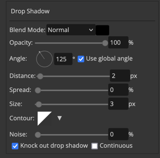
i also always add a drop shadow to my paper textures, the settings i used is mostly the same EXCEPT for the angle for all of the ripped paper (it's also my text drop shadow settings) because depending on how the ripped paper looks you might have to change the angle
also i know in the screenshot below it's on but make sure the use global angle is off if you're going to have multiple different angles of drop shadow in your one gif (so if you want your paper texture on 125° but anything else on 60° the global angle needs to be off but if you want them the same then you can keep that on, which is why it's on for me because the angle is the same for both the text & the ripped paper) (and by text this isn't the text on the ripped paper, there isn't any drop shadow on the text itself there, just to clarify this was for my "ripped paper text tutorial by dengswei" text)
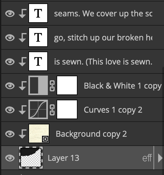
as you can see i also clipped my "handwriting" text to the paper layer this is so it stayed on the paper rather then going onto the gif itself (and it saved the fiddly part of masking it away & it felt more authentic this way too)
i found for me it was easier to seperate the text line by line so i knew exactly which part of the text was on which and if i wanted to change anything either it being a typo, changing the paper texture, or wanting a different word on a different line it was easier that way because it didn't end up messing up all of the text (though you don't have to do it that way, it's just what worked for me here)
font i used was: vag-handwritten (a default photopea font)
all of the next part needs to be above the text on your ripped paper:
for the highlighting, circles, and the lines it's pretty much all the same, i chose the colour which matched the gif (so say purple), for the highlight used the rectangle select & colour fill tools and set that to multiply & then played around with opacity (for most of my highlighting it's set to 50%), for the circles it was the same except the circle shape tool (no fill just stroke) set to purple, set to multiply, with 100% opacity (i found the circles looked better with 100% on some gifs depending on what colour i used), & then duplicated it once or twice and then just moved each circle to where i thought it looked best & the double lines is also the same using the line tool, set to multiply, & playing around with the opacity, & positioning them where i like
for the squiggly lines, the hearts, the 3 small doodle lines at either side of a word, & any other doodles i had on there i doodled them myself with my drawing tablet (you probably don't have to use a drawing tablet i just found it easier that way) using the free pen tool and then did the same thing set it to multiply and played with the opacity
if the colour you choose looks too dark or too light with it set to multiply either try a lighter/darker colour, try out something else like lighten, or screen, or increase/decrease the opacity more (i found i had this issue with the yellow being hard to see on the white paper so i used a darker yellow and kept everything at 100% opacity rather than 50%)
hope that helps! and please if anything is confusing or you want to ask any more don't hesitate to ask i know i ramble on a bit and it can sometimes get a bit confusing 🤣 or if there was anything i missed feel free to ask again 🥰
#replies#edwinas#mine | tutorials#gifmakerresource#photopeablr#photopea tutorial#photopea tutorials#gif tutorial#gif tutorials#usergif#tutorial#tutorials#photopea has so many great default fonts i just spend hours searching through them i barely download fonts now 🤣#i hope i didn't miss anything#also i don't know why the paper textures & my screenshots posted this way i had them side by side#okay they're side by side on mobile but not desktop ??? but mobile doesn't have the read more okay
73 notes
·
View notes