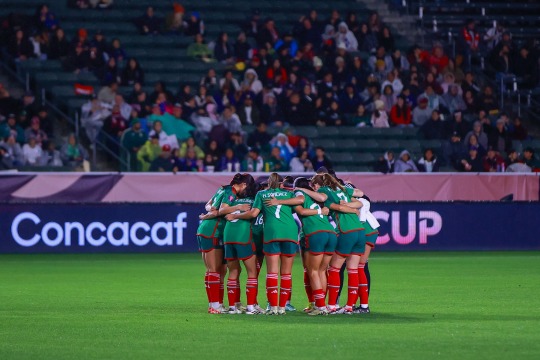
#mexwnt
Explore tagged Tumblr posts
Text

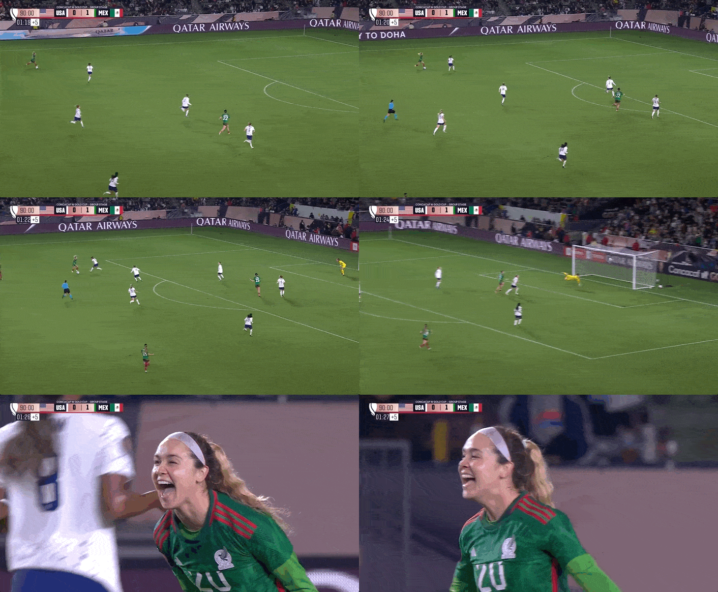
USWNT (0) v MEXICO (2) OVALLE, 38' PELAYO, 90+2'
#mexico wnt#mexwnt#uswnt#w gold cup 2024#DOS A CERO CABRONES!!!!!!!!!!!!!!#lizbeth ovalle#mayra pelayo#woso#*bedit
115 notes
·
View notes
Text
Hedge’s Unofficial Ratings of 2024 Adidas Kits That A Few People Asked For This Time
Let’s start strong with Germany! Did someone say kuntenserven?
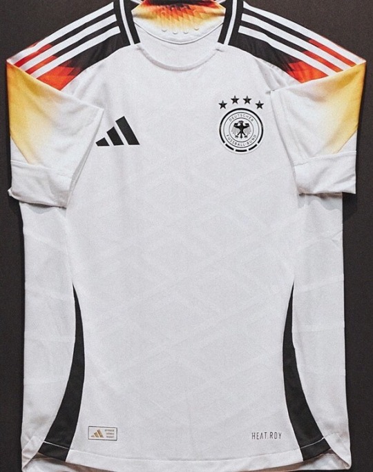

Everyone’s seen this home kit and rightfully, everyone loves it. It’s just so sexy, how could you not? The crisp clean white paired with the classic adidas stripes, but with that sexy germany flag gradient? oh lord i’m weak at the knees. Naturally it’s helped by the fact that the germans have a pretty sexy colour pallete to work with, but still.Even the diamond detailing like oml. It just looks fire, literally. i love it. -9/10
The away kit meanwhile is kind of spinning my head a bit. I genuinely don’t know if i love it or hate it. in theory i love hot pink kits, but i also fucking hate the purple gradient. if the whole thing was pink i’d say absolutely yes because i genuinely love garish eyesores, but this is just not hitting the spot for me. also what’s with the pattern? this is what i imagine you would see if a hedgehog went down on you. undecided - 5.5/10
Wales’s sense of style reflects their Euros qualifications… in that i’m yet to see either


don’t get me wrong the home isn’t bad, it’s just nothing special, and nothing we haven’t seen before. i like the green and yellow stripes up the side, that’s a nice touch, but other than that i’m left feeling uninspired, which is probably how the welsh feel when they watch their men’s team play. still, i’m sure hayley ladd serves in it so - 6/10
the away kit though? yep that’s fucking ugly. whoever decided that wales should include yellow in their red and green colour scheme needs jail time, and also probably an eye test. what the fuck is that shade? yellow is very hard to make look good so props for trying, but just no. plus they missed the chance for green kits, objectively the best kit colour possible, yet also the most underused. (and don’t say it’s because it blends into the grass because that’s blatantly not true). i like the fun zigzags down the side, but it’s giving reggae, which is absolutely not the vibe that wales gives. should’ve put a big dragon on the front and called it a day - 3/10
Spain, what did I just say about ugly yellow kits?
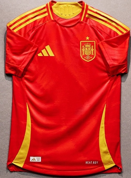
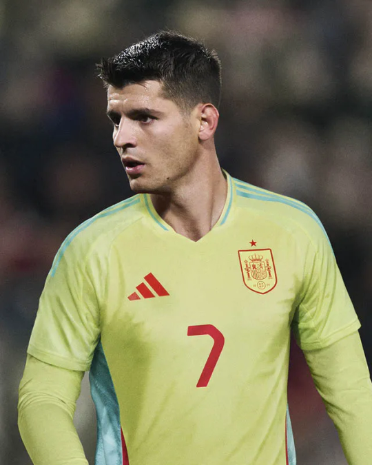
The home kit is lovely. They didn’t feel the need to push the boat out, but why disrupt a classic? These shades go so well together, and there’s also a very faint but very nice pattern on the shirt if you look closely. its bright, it’s energetic. it’s giving fire, flames and lightning mcqueen. kachow! - 8/10
Away kit is absolutely fucking disgusting. Are adidas capable of making two nice kits for one team? If you asked me to describe the absolute worst shade of yellow i’d picture exactly that. the word that comes to mind is putrid. and as if that wasn’t enough, they decided to pair it with an absolutely clashing shade of turquoise. no thank you. no me gusta - 3/10
No Scotland No Party? Well with this kit, I’m inclined to agree.


Who would’ve thought a tartan football kit could be a good idea? Not me, and yet here comes Scotland, with an actual fucking masterpiece. This home kit is just, wow. I love it. It’s so clever, such a good nod to the country, and it just looks absolutely incredible. I fucking adore it. I don’t have much else to say other than whoever made this knew what they were doing. Good job - 10/10
The away kit meanwhile, is again, astonishingly mid. It’s fine I guess. Very plain, kind of giving the colour scheme of a cartoon character but i can’t put my finger on which one, but it’s still decent. The colours do go well together, and i like how the side panelling, includes that tartan pattern again, which as i already mentioned, is fucking sexy. just maybe stick to the home - 6/10
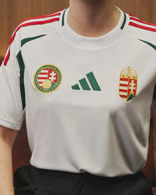
Hungary for more? Not really.
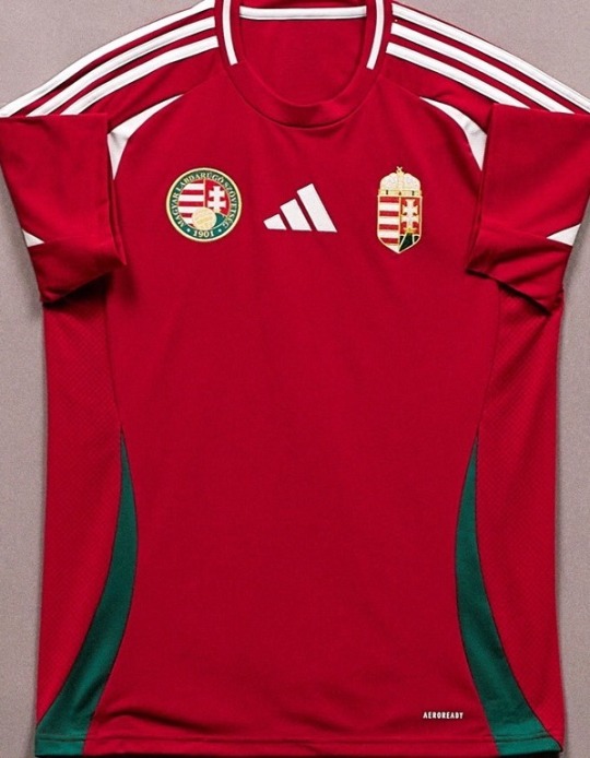
This is the wales kit. it is pretty much almost exactly just the wales kit. like it’s fine, but it’s just?? idk i’m bored. also why have they got two badges? greedy much? just a bit busy. idk it’s fine i have literally no other thoughts on this. boring! - 6/10
The away kit is boring as fuck too, but i actually like this one a lot. i think white kits have more license to bore. it’s a nice colour scheme too. does look a bit italian though. idk it looks good but i can’t say why. it’s just classic. the centre adidas logo looks good here. it’s the green im telling you. more green please! - 7.5/10
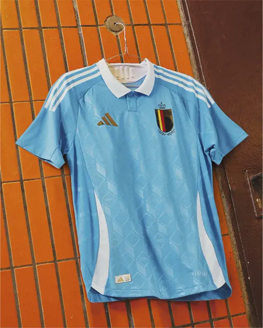
BELGIUM I AM KISSING YOU ON THE MOUTH

oh my god this home kit. i’m in love and i suddenly wish i was belgian. wow. holy shit. who did belgium pay to get a kit this nice? i’m in genuine awe. the sexy sexy maroon colour, paired with black and gold? fuck me sideways. i’m not joking when i say this kit oozes sex. that pattern?? oh my lord. it’s giving luxury velvet chaise longue. its giving old timey men in those smoking jackets, with a glass of whiskey and a cigar. i feel like i’m in the palace of versailles just looking at it. wow belgium, wow. - 11/10
not only that, they did it! they actually gave us two good kits! this one is based off tintin, and who doesn’t fucking love tintin? i adore it. lovely shade of blue, with this gorgeous pattern again, and the collar? collars should only be used if they add something to the kit, and boy does this add a whole fucking lot. thank you tintin you beautiful boy. what a kit. - 10/10
And now we’re back to normal programming with Italy
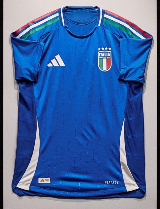

The common theme with adidas is boredom. At least when i was rating nike i actually had stuff to talk about. these are just okay. like yep okay it’s fine. there’s nothing wrong with it. i like the flag shoulder stripes. but yeah, it’s just there. i’ve forgotten what it looks like already i’m that bored - 6/10
the away kit is exactly the same. to be fair, i do like the asymmetric colour scheme, that’s quite nice. it’s simple, it’s clean, it’s just the italian flag really isn’t it? the collar is nice in fairness. it’s decent. - 7/10
Wow. Mexico. Holy fucking shit. Wow.


i literally am so in love with this kit that i’m lost for words. just everything about this is so stunning that i’m struggling to believe it’s a real adidas kit and not a fan made one from tiktok. this pattern has so much going on yet without being garish or busy, it just works. the colours go together so well, i’m just sat here staring at it with tears in my eyes. it’s art. i love it so much thank you mexico thank you - 11/10
and it just gets better with the away kit? this is so fucking sexy, so clean. it complements the home kit perfectly. it’s such a fun pattern but it’s also so classy, so beautiful. both of these kits invoke mexico without being either stereotypical or same-old same-old. i just love it. i love when kits are different!! more please, everyone else take notes!! - 10/10
Colombia took me a while but I’m actually a fan
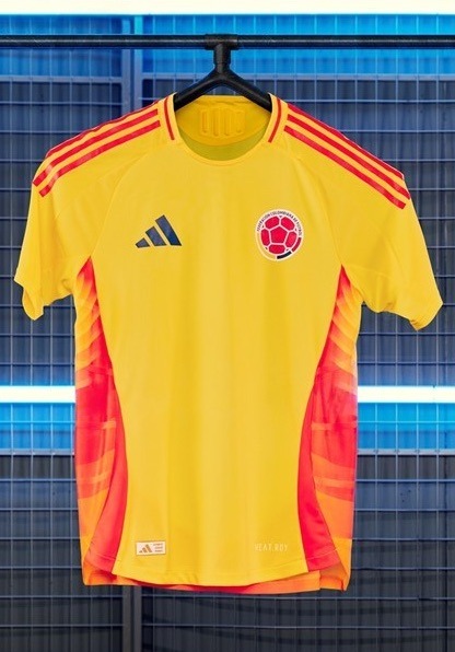
i hated this at first because i thought it was just a plain boring yellow kit but then i saw those sexy ombre side panels. i just love red orange yellow colour schemes, like yes they hurt my eyes but it’s just such a sexy combination. fire for real. the yellow prevents it from getting top marks bc yellow is just fugly let’s be real, but overall it’s not bad - 7/10
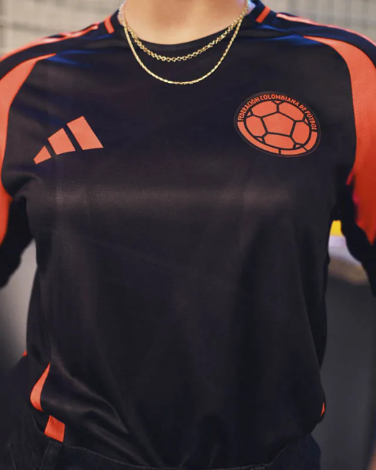
now, you guys now i feel about black kits. more please!!! black is always sleek, it’s always classy, it’s always cool as fuck! big fan. this also seems abnormally shiny, which like okay serve i guess? the only thing i will say is it’s giving training kits with the orange highlights, but we can’t all be mexico, can we? - 8/10
Peru couldn’t be fucked and resorted to clip art
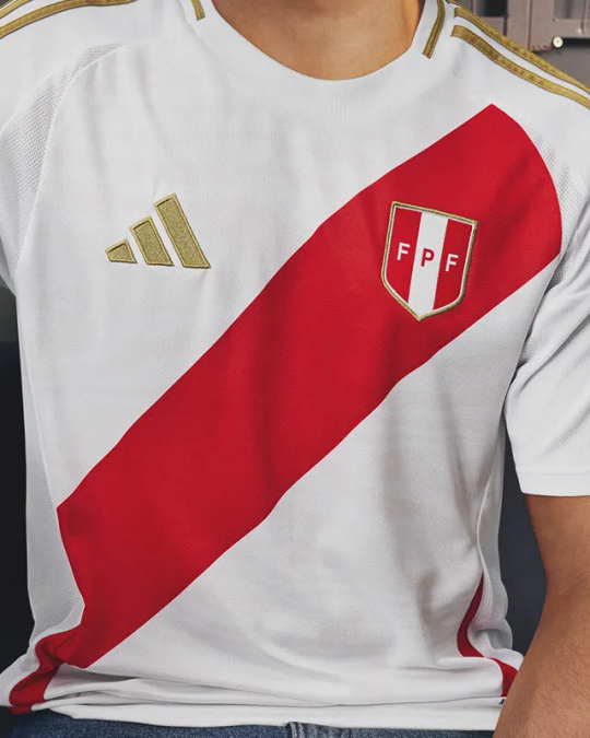

this home kit is like the definition of couldn’t be arsed. i could’ve done this on microsoft paint. i actually hate sash kits they’re just so fucking boring, and like, they just don’t look that good do they. boring. - 4/10
the away on the other hand? wow wow. this is what colombia wishes it was. this is a sexy fucking black kit, and pairing it with dark red and gold? oh lord yes please. sexy as fuck, plus a cheeky bit of animal print? okayyyy get it. even those little bits at the side that adidas seem obsessed with this year are sexy. it’s reminding me of a cheeky little leg slit in a cheeky little dress, and then you get a cheeky little glimpse of some cheeky little red zebra print thongs. okay word. peru you cheeky little minx, stop teasing me. - 9/10
Chile stayed solid, and you can’t go wrong with that.
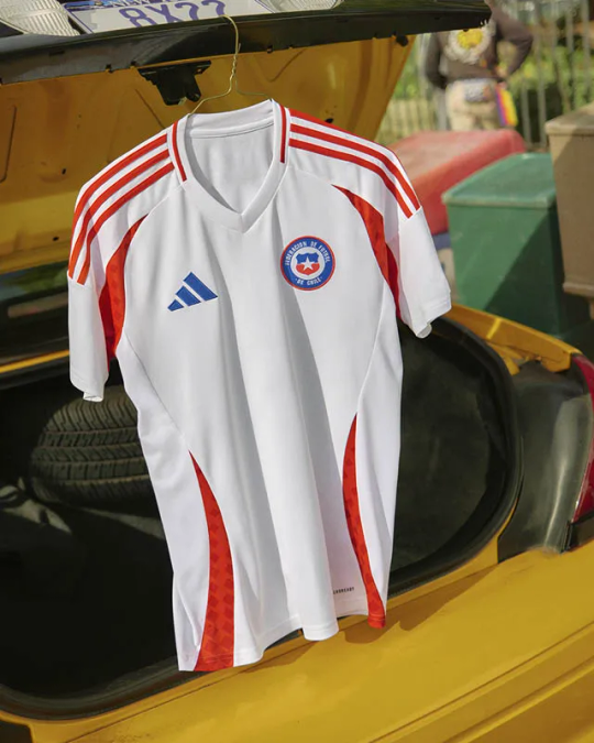

these are both just nice kits. the home is classy, it’s just a simple white kit but it looks fresh as hell, and the red swoops look so good. also love that the patterning they’ve used on the red matches the away kit. it’s very simple but it’s clearly thought out and i respect that. they saw the others going ham with crazy patterns and stuck to their guns. it just looks nice. - 7/10
the away is a similar story - nothing flashy, but effortlessly nice. i rate the little pixel pattern, it’s simple but it’s nice. it’s a decent kit. could’ve pushed the boat out a tiny bit more but overall it’s fine. it’s giving national league a tiny bit. respect chile - 7/10
Finally, you can always count on Argentina to serve.
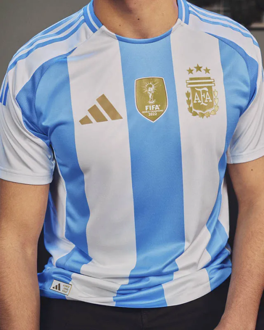

The home kit is just pure argentina innit? like there’s no way you see this kit and see anything other than argentina, and i respect that. it’s just a classic! it’s clean it’s crisp, we’ve seen it all before, but listen, if it ain’t broke, don’t fix it. can’t go wrong. also i’m a huge believer that gold should only be permitted on a kit if you’ve won something, and so mad respect for these sexy gold highlights.- 8/10
and the away kit? i’m a huge fan. it’s a nice simple kit, they’ve gone for a new shade of blue and it’s pretty sexy. the collar looks so fit here, i love it. what i love the most though, is how they’ve incorporated the usual kit into the swoopy bits? (that’s their official name now i’ve decided). anyway those blue and white stripes just look so yummy, very nautical, i’m a big fan. yay argentina! - 9/10
41 notes
·
View notes
Text
LA MAGAAAA 🐐🇲🇽
#lizbeth ovalle#tigres femenil#liga mx femenil#woso#mexwnt#woso community#woso soccer#woso appreciation
42 notes
·
View notes
Text
This half might be the best Mexico has ever played. Aside from all the yeeting of the ball, this is tactically the best I've ever seen them play. If they can keep playing like this, the sky is the limit.
#how dare Mexico make me root for them#this is illegal maams#theyre playing a BEAUTIFUL game#you can see the fact that theyve trained on how to defend and exploit the gaps in the US lines#don't you also love it when teams show the world that the USA have not a one tactical braincell?#Thats a lie they have one but its tied up with Rose Lavelle and she's busy trying to shake her 5 defenders#Also someone strip that 10 off Horan. Not a one play made. Literally not one futbol thought#and she had the guile to say the fans are the dumb ones. Lol#woso#w gold cup#mexico wnt#uswnt#mexwnt
23 notes
·
View notes
Text
We fucking did it, DOS A CERO!!! Finally we go out to play to win against the USA took us for ever but we did it! Golazos, actitud y por fin no perdimos la cabeza. Las pinches amo a todas mis jugadoras
14 notes
·
View notes
Text
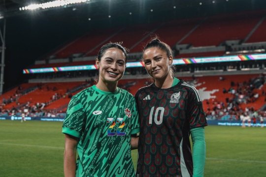
🥹🥹 #BayFC teammates scarnefer and LysianneProulx swapped jerseys after the Miseleccionfem v CanadaSoccerEN friendly!
via wearebayfc June 6, 2024
8 notes
·
View notes
Text
the present and the future of the national team, so happy for her!

2 notes
·
View notes
Text
mexico had an outstanding game! uswnt is just not it right now, but maybe they'll bounce back during knockouts. lots to learn from this match
sidenote, mexico is becoming one of the few teams (along with sweden) who are able to pick apart the uswnt so i wonder if theres a possibility of a rivalry brewing
7 notes
·
View notes
Text
INCREDIBLE goal from Mexico and Mayra Pelayo, wow that was beautiful
8 notes
·
View notes
Text

match announcement:
USA vs MEXICO
july 13 | impact 99 legacy match
📍Red Bull Arena
5 notes
·
View notes
Text
That hurt.
I'd be more okay-ish if it weren't for those ridiculously obvious fouls that didn't get called. That was uncalled for...
Was that a pun.
Very very disjointed. Connecting was.... well... they didn't know her this game.
Sam Coffey... I'm sorry but it's a no from me. Maybe some other time?
Also what was Becky doing? Is she okay? I'm so confused.
Alyssa I love you.
3 notes
·
View notes
Text

¿QUIÉN MÁS?
LA MEJOR 🥵🐐🇲🇽
#liga mx femenil#lizbeth ovalle#tigres femenil#woso#woso appreciation#woso community#woso soccer#mexwnt#summer cup
13 notes
·
View notes
Text
Guess who’s back, back again, tell a friend. I made another quiz, this one is kinda hard, especially compared to the World Cup quiz.
Give it a try to celebrate the inaugural W Gold Cup!
I actually have a whole playlist of Women’s Soccer quizzes, if you’re interested.
#WOSO#USWNT#CANWNT#CANXNT#MEXWNT#BRAWNT#Alex Morgan#Lindsey Horan#christen press#CONCACAF#W Gold Cup#W Gold Cup 2024
5 notes
·
View notes
Text

matildas | Everything is bigger in Texas 🤠 🇲🇽v🇦🇺 10.04.24 - 10am AEST 🏟️ Toyota Field, San Antonio, TX 📺💻📱: 10footballau
18 notes
·
View notes


