#master draftsman
Explore tagged Tumblr posts
Visit Tumblr Blog
Explore Tumblr blogs with no restrictions, modern design and the best experience.
Last Seen Tumblr Blogs


Fun Fact
Premium Tumblr themes are available from anywhere between $9 to $49.
Text
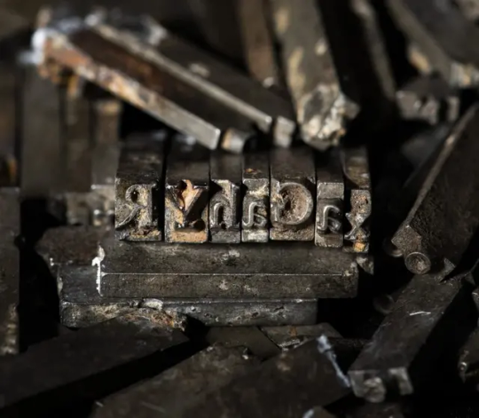
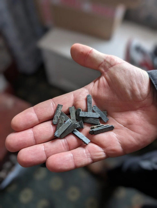
Remnants of a Legendary Typeface Have Been Rescued From the Thames River
Doves Type was thrown into the water a century ago, following a dispute between its creators.
The depths of the river Thames in London hold many unexpected stories, gleaned from the recovery of prehistoric tools, Roman pottery, medieval jewelry, and much more besides. Yet the tale of the lost (and since recovered) Doves typeface is surely one of the most peculiar.
A little over a century ago, the printer T.J. Cobden-Sanderson took it upon himself to surreptitiously dump every piece of this carefully honed metal letterpress type into the river. It was an act of retribution against his business partner, Emery Walker, whom he believed was attempting to swindle him.
The pair had conceived this idiosyncratic Arts and Crafts typeface when they founded the Doves Press in the London’s Hammersmith neighborhood, in 1900. They worked with draftsman Percy Tiffin and master punch-cutter Edward Prince to faithfully recall the Renaissance clarity of 15th-century Venetian fonts, designed by the revolutionary master typographer Nicolas Jensen.
With its extra-wide capital letters, diamond shaped punctuation and unique off-kilter dots on the letter “i,” Doves Type became the press’s hallmark, surpassing fussier typographic attempts by their friend and sometime collaborator, William Morris.
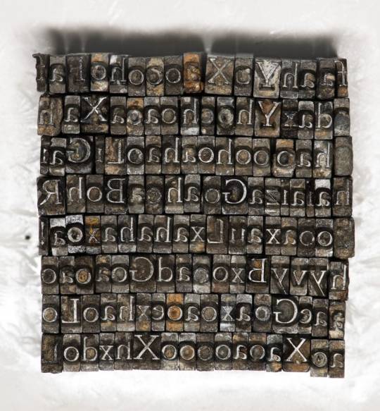
The letterforms only existed as a unique 16pt edition, meaning that when Cobden-Sanderson decided to “bequeath” every single piece of molded lead to the Thames, he effectively destroyed any prospect of the typeface ever being printed again. That might well have been the case, were it not for several individuals and a particularly tenacious graphic designer.
Robert Green first became fascinated with Doves Type in the mid-2000s, scouring printed editions and online facsimiles, to try and faithfully redraw and digitize every line. In 2013, he released the first downloadable version on typespec, but remained dissatisfied. In October 2014, he decided to take to the river to see if he could find any of the original pieces.

Using historical accounts and Cobden-Sanderson’s diaries, he pinpointed the exact spot where the printer had offloaded his wares, from a shadowy spot on Hammersmith bridge. “I’d only been down there 20 minutes and I found three pieces,” he said. “So, I got in touch with the Port of London Authority and they came down to search in a meticulous spiral.” The team of scuba divers used the rather low-tech tools of a bucket and a sieve to sift through the riverbed.
Green managed to recover a total of 151 sorts (the name for individual pieces of type) out of a possible 500,000. “It’s a tiny fraction, but when I was down by the river on my own, for one second it all felt very cosmic,” he said. “It was like Cobden-Sanderson had dropped the type from the bridge and straight into my hands. Time just collapsed.”
The finds have enabled him to further develop his digitized version and has also connected him with official mudlarks (people who search riverbanks for lost treasures, with special permits issued) who have uncovered even more of the type.

Jason Sandy, an architect, author and member of the Society of Thames Mudlarks, found 12 pieces, which he has donated to Emery Walker’s House at 7 Hammersmith Terrace. This private museum was once home to both business partners, and retains its stunning domestic Arts and Crafts interior.
Much like Green, Sandy was captivated by the Doves Type story, and mounted an exhibition at the house that displays hundreds of these salvaged pieces, including those discovered by Green, as well as mudlarks Lucasz Orlinski and Angus McArthur. The show was supplemented by a whole host of Sandy’s other finds, including jewelry and tools. An extant copy of the Doves English Bible is also on display.
“It is not that unusual to find pieces of type in the river,” Sandy said. “Particularly around Fleet Street, where newspaper typesetters would throw pieces in the water when they couldn’t be bothered to put them back in their cases. But this is a legendary story and we mudlarks love a good challenge.” The community is naturally secretive about exactly where and how things are found. For example, Orlinski has worked under the cover of night with a head torch, to search for treasures at his own mysterious spot on the riverbank.
For Sandy, the thrill comes from the discovery of both rare and everyday artifacts, which can lead to an entirely new line of inquiry: “The Thames is very democratic. It gives you a clear picture of what people have been wearing or using over thousands of years. And it’s not carefully curated by a museum. The river gives up these objects randomly, and you experience these amazing stories of ordinary Londoners. It creates a very tangible connection to the past. Every object leads you down a rabbit hole.”
By Holly Black.
#Remnants of a Legendary Typeface Have Been Rescued From the Thames River#Doves Type#printer#Society of Thames Mudlarks#mudlark#mudlarking#ancient#archeology#archeolgst#history#history news#long reads#long post
109 notes
·
View notes
Text


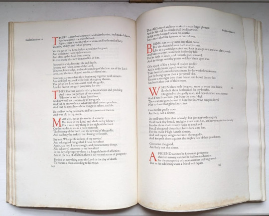
Book 531
The Complete Woodcuts of Albrecht Dürer
Dr. Willi Kurth, ed.
Bonanza Books 1946
At nearly 80 years old, this book is holding together quite well. It’s exceptionally clean under the jacket, which lists its price at $7.50. Which is what I think I paid for it around fifteen years ago—a hell of a deal for every woodcut Dürer ever made. The jacket copy says that the reproductions have been made from new plates in the original 9” x 12” size, and they do look good, albeit perhaps a bit over inked. The line thickness looks a little fat, but overall really nice. So with 346 woodcuts from a master draftsman, a brief biography, and a descriptive index, this is well worth the price of admission.
#bookshelf#personal collection#personal library#books#library#bibliophile#book lover#illustrated book#booklr#art#complete woodcuts of albrecht durer#willi kurth#bonanza books#renaissance art
11 notes
·
View notes
Text

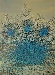

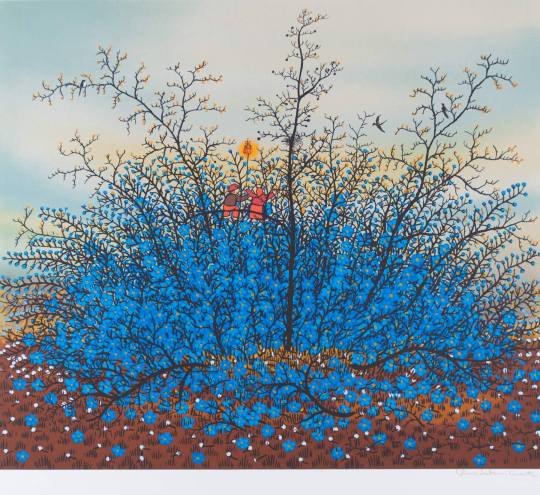


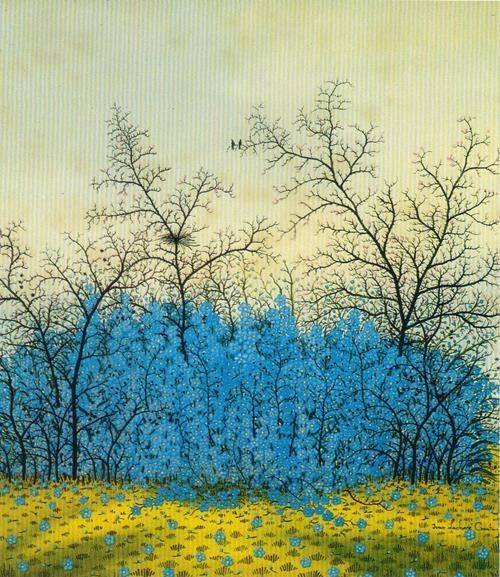


To continue with Croatian self-taught naive painters - next is Ivan Lacković Croata (1932 – 2004), born to a peasant family in the village of Batinske near Kalinovac. After completing his primary school, he worked as a laborer in fields and forests. His first watercolours, depicting village life, were painted in 1944.
When he moved to Zagreb, he worked as a mailman and post office worker, when in 1962 he met Krsto Hegedušić and occasionally worked in his master workshop. His first one-man exhibition in the HAZU Cabinet of Graphics in 1964 established his reputation as a masterful draftsman. He left the post office job in 1968 and became a professional painter.
He painted lyrical and surreal scenes from his native region of Podravina in tempera and with oil on glass (a traditional technique of the naive artists from north Croatia). Detailed winter scenes prevail in his early works. (from wiki)
34 notes
·
View notes
Text
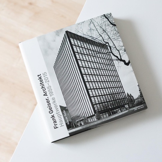

Throughout the 1950s and 1960s and well into the early 1970s the example of Mies van der Rohe inspired countless younger architects to follow the master’s idiom. The Swiss architect Frank Geiser (*1935) belongs to the successful adepts of Mies who undoubtedly belongs to the country’s most significant architects working in steel. But although Geiser still regards the first 1956 issue of „Das Werk“ dedicated to the work of Mies, Ludwig Hilberseimer and Konrad Wachsmann as a quintessential representation of his architectural thinking, his preference for the square and clear geometry harks back to Geiser’s early acquaintance with art: during his training as a draftsman in Berne in the early to mid-1950s Geiser moved in the circles of the local avant-garde and himself made artworks in the style of the Art concret.
Following his training in Berne Geiser in 1956 moved to Ulm in Germany to study architecture at the legendary Hochschule für Gestaltung (HfG) where Herbert Ohl was his teacher and from which he graduated in 1960 with a diploma project about social housing. Afterwards he returned to Berne where he also established his office as early as 1962 and in the subsequent two decades realized a number of very Miesian projects, among them the Radio Schweiz high-rise (1969-72), single-family homes and
These projects and many others are featured in Konrad Tobler’s monograph „Frank Geiser. Architekt – Hauptwerke 1955–2015“, published in 2015 by Park Books. Tobler, based on a multitude of interviews conducted with the architect, elaborates on his formation and work. But the major part of the book is dedicated to a selection of projects from the 1960s to the present, all presented in comprehensive dossiers including photographs and plans. The featured projects demonstrate Geiser’s ability to make the Miesian idiom his own and how he rigorously refined the grid as basis of his architecture. And even though the 1980s saw him introduce postmodern elements these were always subordinated to the grid.
Tobler’s book on Frank Geiser is a beautifully designed and highly readable tribute to a lesser-known yet significant Swiss architect that is warmly recommended!
37 notes
·
View notes
Text
Dutch Ships near the Coast Williem van de Velde the Elder 1611 - 1693 Oil and ink on Panel
Willem van de Velde the Elder’s Dutch Ships near the Coast showcases his mastery of penschilderij, capturing the intricacies of Dutch maritime life with remarkable detail. His use of light and shading through delicate hatching creates a luminous effect, while the dynamic composition conveys depth—foreground waves and smaller boats give way to grand warships in the middle ground and a hazy coastline in the background. The diagonal arrangement of the ships and the sails suggest movement, reinforcing dynamic nature of the sea. Human and animal elements add to the realism, with rowers navigating smaller vessels, horses pulling ships into the water, and marine creatures like dolphins or sharks appearing in the foreground. The ornate carvings and figureheads on the warships highlight the prestige of the Dutch fleet, while flags and rigging emphasize their naval dominance.
Van de Velde was a master draftsman of his time, frequently commissioned to accompany Dutch fleets and document their naval exploits. During the seventeenth century, the Dutch Republic was rising to global dominance in maritime trade and transportation. This success was driven by advanced naval technology, highly skilled sailors, and government policies that promoted commerce, stimulating the economy and generating immense wealth. This period became known as the Dutch Golden Age.

Note: This is a Baroque piece but unlike the usual dramatic and theatrical style we associate with Baroque art, this piece focuses on realism and an emphasis on everyday life. pretty cool!
Here's a closer view. Look at the insane line work!!

I got to see this over the summer at the National Gallery of Art, and after hours of wandering through amazing pieces, this one really stuck with me. I remember not feeling great that day—I was sick, sweaty, my heels were killing me, and I felt lonely and kinda out of place. But for some reason, this painting made me feel a little better. Maybe it was the energy in it, the movement, or just the idea of so many people together in one scene. I don’t know exactly why, but it turned a pretty shitty day into something a little more bearable :)
4 notes
·
View notes
Text


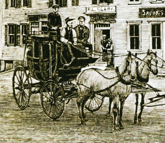
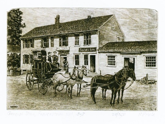
Wood Engraving Wednesday
R. P. HALE
Francestown, New Hampshire, named after Frances Deering Wentworth, the wife of colonial governor John Wentworth, was incorporated in 1772, and by the time of the first census in 1790, the town had 928 souls resident there. Today, the town has barely doubled in size with about 1,600 residents. The rural, but entrepreneurial nature of the town is captured in this 2019 wood engraving entitled General Store, Fracestown, N. H. ca. 1858 by New Hampshire artist R. P. Hale. The print was selected by my Wisconsin colleagues Tracy Honn and Jim Moran for inclusion in the Fourth Triennial Exhibition 2020-2022 of the American American wood engravers society, the Wood Engravers’ Network (WEN). This image is from the catalog for that travelling show.
R. P. Hale, who runs his press, La Imprenta Azteca, out of Concord, N.H., just a few miles northeast of Francestown, is many things: an artist, printmaker, scientist, educator, master calligrapher, medical illustrator, paper-marbler, draftsman, photographer, harpsichord maker, concert musician, historical re-enactor, and specialist in Mesoamerican astronomy. But it's his highly-detailed, photorealistic wood engravings that he is perhaps most well known for. Trained in medical illustration, astronomy, and chemistry, Hale is a long-time WEN member and comes from a long line of Mexican printmakers. Hale and his wife Alice, have passed on the family arts, crafts, and science traditions to their daughter Alicia who practices in New York.
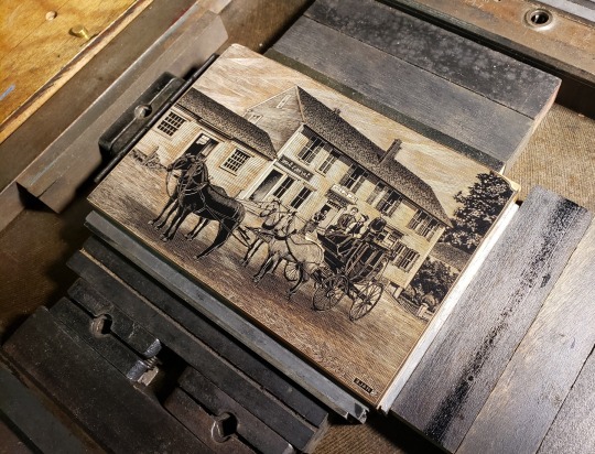


The image of the original wood block locked up on the press bed is from R. P. Hale's Facebook page.
View other posts withengravings from the WEN Fourth Triennial Exhibition.
View more engravings by members of the Wood Engraver’s Network.
View more posts with wood engravings!
– MAX, Head, Special Collections and juror for the WEN Fifth Triennial Exhibition.
#Wood Engraving Wednesday#wood engravings#wood engravers#R. P. Hale#New Hampshire#General Store Francestown N. H. ca. 1858#Wood Engravers' Network#WEN#WEN Fourth Triennial Exhibition#exhibitions#exhibition catalogs
17 notes
·
View notes
Text
Remnants of a Legendary Typeface Have Been Rescued From the River Thames
Doves Type was thrown into the water a century ago, following a dispute between its creators.
by Holly Black - Artnet, May 5, 2024
Doves Type recovered by Robert Green, 2014. Photo Matthew Williams Ellis
The depths of the river Thames in London hold many unexpected stories, gleaned from the recovery of prehistoric tools, Roman pottery, medieval jewelry, and much more besides. Yet the tale of the lost (and since recovered) Doves typeface is surely one of the most peculiar.
A little over a century ago, the printer T.J. Cobden-Sanderson took it upon himself to surreptitiously dump every piece of this carefully honed metal letterpress type into the river. It was an act of retribution against his business partner, Emery Walker, whom he believed was attempting to swindle him.
The pair had conceived this idiosyncratic Arts and Crafts typeface when they founded the Doves Press in the London’s Hammersmith neighborhood, in 1900. They worked with draftsman Percy Tiffin and master punch-cutter Edward Prince to faithfully recall the Renaissance clarity of 15th-century Venetian fonts, designed by the revolutionary master typographer Nicolas Jensen.

Doves Type recovered by Robert Green, 2014. Photo Matthew Williams Ellis
With its extra-wide capital letters, diamond shaped punctuation and unique off-kilter dots on the letter “i,” Doves Type became the press’s hallmark, surpassing fussier typographic attempts by their friend and sometime collaborator, William Morris.
The letterforms only existed as a unique 16pt edition, meaning that when Cobden-Sanderson decided to “bequeath” every single piece of molded lead to the Thames, he effectively destroyed any prospect of the typeface ever being printed again. That might well have been the case, were it not for several individuals and a particularly tenacious graphic designer.
Robert Green first became fascinated with Doves Type in the mid-2000s, scouring printed editions and online facsimiles, to try and faithfully redraw and digitize every line. In 2013, he released the first downloadable version on typespec, but remained dissatisfied. In October 2014, he decided to take to the river to see if he could find any of the original pieces.
Doves Type recovered and held here by Lukasz Orlinski at Emery Walker’s House. Photo: Lucinda MacPherson.
Using historical accounts and Cobden-Sanderson’s diaries, he pinpointed the exact spot where the printer had offloaded his wares, from a shadowy spot on Hammersmith bridge. “I’d only been down there 20 minutes and I found three pieces,” he said. “So, I got in touch with the Port of London Authority and they came down to search in a meticulous spiral.” The team of scuba divers used the rather low-tech tools of a bucket and a sieve to sift through the riverbed.
Green managed to recover a total of 151 sorts (the name for individual pieces of type) out of a possible 500,000. “It’s a tiny fraction, but when I was down by the river on my own, for one second it all felt very cosmic,” he said. “It was like Cobden-Sanderson had dropped the type from the bridge and straight into my hands. Time just collapsed.”
The finds have enabled him to further develop his digitized version and has also connected him with official mudlarks (people who search riverbanks for lost treasures, with special permits issued) who have uncovered even more of the type.

A mudlark by the Thames with Hammersmith Bridge in background. Photo: Lucinda MacPherson.
Jason Sandy, an architect, author and member of the Society of Thames Mudlarks, found 12 pieces, which he has donated to Emery Walker’s House at 7 Hammersmith Terrace. This private museum was once home to both business partners, and retains its stunning domestic Arts and Crafts interior.
Much like Green, Sandy was captivated by the Doves Type story, and mounted an exhibition at the house that displays hundreds of these salvaged pieces, including those discovered by Green, as well as mudlarks Lucasz Orlinski and Angus McArthur. The show was supplemented by a whole host of Sandy’s other finds, including jewelry and tools. An extant copy of the Doves English Bible is also on display.
The Doves Bible returns to Emery Walker’s House. Photo: Lucinda MacPherson.
“It is not that unusual to find pieces of type in the river,” Sandy said. “Particularly around Fleet Street, where newspaper typesetters would throw pieces in the water when they couldn’t be bothered to put them back in their cases. But this is a legendary story and we mudlarks love a good challenge.” The community is naturally secretive about exactly where and how things are found. For example, Orlinski has worked under the cover of night with a head torch, to search for treasures at his own mysterious spot on the riverbank.
For Sandy, the thrill comes from the discovery of both rare and everyday artifacts, which can lead to an entirely new line of inquiry: “The Thames is very democratic. It gives you a clear picture of what people have been wearing or using over thousands of years. And it’s not carefully curated by a museum. The river gives up these objects randomly, and you experience these amazing stories of ordinary Londoners. It creates a very tangible connection to the past. Every object leads you down a rabbit hole.”
“Mudlarking: Unearthing London’s Past” is at Emery Walker’s House, 7 Hammersmith Terrace, London, through May 30.
#Doves typeface#letterpress type#letterpress printing#T.J. Cobden-Sanderson#Emery Walker#Emery Walker's House#Robert Green#Jason Sandy#mudlarking#Artnet#May 2024#long post
6 notes
·
View notes
Text


For James Isherwood’s paintings for Thaw at Seizan Gallery he has created strange and beautiful worlds with features both foreign and recognizable. According to the artist the work “examines the context of architecture, landscape, subconscious imagery, psychedelic alternate realities, time, memory and place”.
From the gallery-
Writing in Flash Art in 2020, critic Pier Luigi Sacco characterizes Isherwood as a “master of deception.” Buildings and structures are presiding features in Isherwood’s works. They become architectural protagonists through which Isherwood invents alternate realities, inviting the viewer into visual paradoxes in hyper-saturated palettes.
These structures that populate Isherwood’s paintings, alluding to David Hockney’s pools, are always presented absent of people. Sacco writes, “Despite their obvious allusion to stereotypical built forms, they are clearly not inhabited — or possibly even inhabitable.” This absence of human presence enables the viewer to inhabit the structure in a waking-dream space, transported through a cosmos of the imagination. This space has the capability to offer a duality of feeling: playful yet dangerous, otherworldly yet recognizable. Isherwood’s color palette, likewise, engages this duality, evoking everything from a drifting snowbank or a night sky to a chemical burn or a black hole.
While Isherwood begins his process by referencing visual material—often images of particular buildings—his rendering of this material lands the viewer on another astral plane entirely. His method is highly technical, while retaining an improvisational and serendipitous aspect. His technique utilizes washes and often hundreds of layers, also adding renderings that show the hand of a skilled draftsman. At the same time, his compositions allude to Magritte and other Surrealists through his playful, trickster choices.
This exhibition represents a strong passage, following a highly inventive period in the pandemic lockdown, into a newly deepened visual vernacular of Isherwood’s own invention.
This exhibition is on view until 6/15/24.
#James Isherwood#Seizan Gallery#Architectural Painting#Art#Painting#Art Shows#Chelsea Art Galleries#Chelsea Art Shows#NYC Art Shows
2 notes
·
View notes
Text


Gardens in Perpetual Bloom
Botanical Illustration in Europe and America 1600-1850
Nancy Keeler
MFA Publications, Museum of Fine Arts, Boston 2019, 136 pages, 19,5x23cm, ISBN 978-0878467495
euro 25,00
email if you want to buy [email protected]
Originally developed as an aid to professional herbalists, botanical illustration quickly blossomed into an art form in its own right. The first flower books were intended as medicinal guides, or else illustrated volumes that catalogued the elaborate and extensive gardens of the well-to-do. But when Carl Linnaeus first classified the plant kingdom in 1735, the botanical book quickly took on a more scientific cast. By the nineteenth century, the flourishing of botanical publications reflected both the rapid rise of gardening as an amateur hobby and the desire of artists and decorators for new visual resources. Gardens in Perpetual Bloom: Botanical Illustration in Europe and America 1600–1850 traces the appreciation of flowers and their depiction, from the studious world of monks and princes to the era of the gardening enthusiast. The book's 110 prints and drawings―which include masterful engravings by Georg Dionysus Ehret, the eighteenth century's most accomplished botanical artist, and hand-colored prints by Pierre-Joseph Redouté, the premier draftsman of flowers for Marie Antoinette and Josephine Bonaparte―are remarkable for their technical virtuosity, delicate tonalities, scientific accuracy and seemingly infinite variety. Gardens in Perpetual Bloom is both a valuable historical survey and an affordable, attractively designed volume of jewel-like beauty.
95/12/23
#Gardens#Botanical Illustration#Europe& America#1600-1850#Ehret#Redouté#flowers#Museum Fine Arts Boston#fashionbooksmilano
4 notes
·
View notes
Text
The Origins of Origami
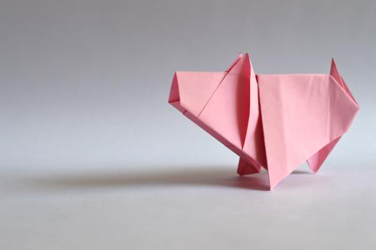
Origami, originally known as “orisue,” is a well-known Japanese artform with a long history extending back to 105 AD. While the creation of paper itself has been credited to Cai Lun in China, the art of paper folding has grown and developed in Japanese culture.
Following the import of paper manufacturing technology from China to Japan, the material’s popularity rose among monks, who used it for writing. A poem from the 17th century refers to origami butterflies called “ocho” and “meccho,” but the actual date of the first folded creations remains unknown. Due to its decorative aspect, origami was incorporated in gift wrapping. The Japanese referred to a folded paper attached to a gift as “origami tsuki.”
The 18th century was an era characterized by significant interest in origami. Sadatake Ise published the first manual providing origami instructions in 1764. The book covered more than 10 ceremonial folds. Almost three decades later, another manual, called Sembazuru Orikata, outlined the method of folding interconnected cranes.
During the Edo Era, Japan enjoyed political peace and economic prosperity. Consequently, paper supply increased and interest in the arts flourished. More than 70 common, present-day origami shapes (such as the crane) originated in the Edo Era.
In addition to its creative value, origami can be a beneficial form of meditation. The process of folding paper can be an exercise in patience. People can use origami as a method of mindfulness, as research shows that it can result in relaxation. It also improves memory and concentration.
Figures outside of Japan promoted the art of origami around the world. For example, the German educator and creator of the kindergarten, Friedrich Froebel, used origami as a tool to teach geometry. Soon, the Froebel method propagated on a global scale, traveling to Japan, as well. As Japanese schools slowly incorporated origami into their curricula, production of the European 15x15 thin square paper grew in Japan. Origami also had a significant impact on design education. The German Bauhaus school of design relied on paper folding to train design students.
Other avenues through which the influence of origami rose include literature and philosophy. Spanish author Miguel de Unamuno was a big fan of origami who frequently integrated it into his writings, referring to it in Spanish as “papiroflexia.” The spread of origami among Spanish-speaking populations can be attributed to the work of Argentine physician Vicente Sagredo, who published several origami manuals in the Spanish language.
Akira Yoshizawa is perhaps the most critical figure in origami history. A technical draftsman by trade, Yoshizawa mastered the art of paper folding and utilized it to visualize geometrical problems. After publishing the seminal book Atarashi Origami Geijutsi in 1964, Yoshizawa offered the world new insight into paper folding, a notation system for origami designs, and realistic diagrams of many animal shapes. Most importantly, he established a new origami form called wet-folding. This method entailed dampening paper to create softer folds that could be more easily shaped into origami models.
In the 20th century, mathematicians such as Robert Lang broke down the principle of origami folding to explore more complex designs. Lang’s work culminated in the creation of a computer software called Tree Maker. The software facilitated the development of highly complex, hyper-realistic origami designs, which continue to evolve today.
2 notes
·
View notes
Text


Master printmaker, draftsman and painter Martin King was born in Melbourne, Victoria in 1957.
Martin's life as an artist and print-maker has seen him travel the world. While born and raised in Melbourne, Martin has also been based in France, Spain and London. He's also worked across wide cross-sections of Australia, as well as teaching in varied locations such as Darwin and Canberra.
In 1996, was invited to work with Aboriginal artists on printmaking projects in Jilamara, Melville Island in the NT. Again, in 2000, he worked with Aboriginal communities in Millijidee, WA.
57 notes
·
View notes
Text
Utility Patent Drawings: What You Need to Know
Utility patents are essential for protecting inventions that offer new and useful processes, machines, or compositions of matter. However, one often overlooked but crucial element in a successful patent application is the utility patent drawing. These illustrations are more than just visual aids—they are a critical part of your submission and must comply with specific USPTO requirements.
Whether you’re an inventor or a startup founder, understanding utility patent drawing guidelines can dramatically increase your chances of approval. Let’s dive into what you need to know.
Why Utility Patent Drawings Matter
Utility patent drawings serve a key role in clearly communicating your invention’s structure and function. They help examiners understand complex details that may be difficult to explain using words alone. In fact, the USPTO often requires at least one drawing to accompany your application unless the invention cannot be illustrated.
Key Utility Patent Drawing Guidelines
To meet the USPTO’s standards, your utility patent drawings must adhere to a specific set of formatting and design rules. Here are the primary guidelines:
1. Black and White Line Drawings
Unless color is necessary to convey essential details, all drawings must be in black ink on white paper. Pencil sketches, grayscale, or shaded renderings are not acceptable.
2. Paper Size and Margins
While digital submissions are now common, historically accepted paper sizes are 21.6 cm x 27.9 cm (8.5 x 11 inches). Margins should be:
Top: 2.5 cm (1 inch)
Left Side: 2.5 cm (1 inch)
Right Side: 1.5 cm (5/8 inch)
Bottom: 1.0 cm (3/8 inch)
3. Numbering and Labeling
Each drawing must be sequentially numbered. Elements in the drawing must also be labeled consistently with the written description in the patent application. For example, if a part is labeled as “12” in the drawing, it must also be referenced as “12” in the description.
4. Legibility and Quality
The drawing must be clear and reproducible. This means avoiding overly thin lines, ensuring high contrast, and maintaining consistency in line weight and spacing.
5. No Text on Drawings
Text is limited to reference numbers and short labels. All explanations should be in the description section of the patent.
USPTO Requirements You Must Follow
The United States Patent and Trademark Office (USPTO) has strict criteria that every utility patent drawing must meet. Here are the highlights:
Scale and Proportion: The drawings must be to scale and proportionally accurate.
Multiple Views: You should include multiple views (front, top, side, sectional, exploded) to fully depict the invention.
Correct Format: Drawings must be submitted in the correct format, whether paper or electronic via EFS-Web.
Legally Binding: Drawings, once submitted and accepted, become a legal part of the patent document. Any discrepancies can lead to delays or even rejection.
Common Mistakes to Avoid
Submitting freehand or unprofessional sketches
Using color unnecessarily
Failing to reference all elements in the written description
Inconsistent numbering between views
These errors can cause rejections or Office Actions from the USPTO, prolonging the patent process.
Why Work with a Professional Draftsman
Utility patent drawings are not just technical art—they are legal documents. Working with a professional patent drawing expert ensures that every drawing:
Meets USPTO technical standards
Is correctly formatted for digital submission
Reflects your invention accurately and completely
This is especially important if your invention involves complex components or mechanical structures.
Final Thoughts
Mastering the utility patent drawing guidelines and understanding USPTO requirements is essential for anyone serious about protecting their invention. Clear, accurate, and compliant drawings not only streamline the approval process but also strengthen your intellectual property rights.
Don’t leave your invention to chance—invest in high-quality drawings and expert guidance to bring your innovation to life with the protection it deserves.
0 notes
Text
Understanding the Roles: Architect, Designer & Draftsman Explained
When planning a home remodel, especially in sunny San Diego, it’s helpful to understand who does what and why it matters. Hiring a Home Remodeling Contractor in San Diego or working with a Home Remodeling Company in San Diego becomes so much smoother when you understand the roles of architects, designers, and draftsmen. Each brings something unique to the table. In this step-by-step guide, we’ll walk through these roles, show when you need each one, and help you choose the right team for your dream home remodel.
1) Why Knowing the Roles Matters
First things first: why should you care?
– Every professional touches different parts of the remodeling process.
– Using the wrong person at the wrong time can lead to delays, miscommunication, or additional costs.
– And frankly, it gives better results. When you know who is responsible for what, you make better choices, and your builder can focus on building.
Your Home Remodeling Contractor in San Diego can pull everything together smoothly, but your clarity as a homeowner matters, too.
2) What Does an Architect Do?
Architects are visionaries with technical skills. Here’s what they bring:
Master planning: They create the big-picture layout flow, structure, and aesthetics.
Technical know-how: Architects design to code, ensuring safety, accessibility, and structural integrity.
Permit paperwork: They prepare and submit official drawings for city approval.
Creative problem-solvers: Need to maximize space without increasing footprint? An architect finds ways.
Architects bridge creativity and engineering, making them ideal for both deep renovations and new builds.
3) What Does a Designer Do?
Designers focus on how your home looks and feels, encompassing style, finishes, and daily functionality. Their strengths include:
Interior planning: They choose fixtures, paint, tile, and furniture layout.
Cohesive aesthetics: A designer ensures that your kitchen, bath, and patio blend seamlessly together.
Material sourcing: They know vendors, budget-friendly options, and custom upgrades.
User-centered design: They get how you’ll live in the space and design around that.
Pair them with your remodeler to create a beautiful and practical home.
4) What Does a Draftsman Do?
Draftsmen are invaluable behind the scenes. They:
Create detailed blueprints, including precise measurements, floor plans, and elevation drawings.
Translate ideas into plans: They take what an architect or designer envisions and make it buildable.
Ensure accuracy: Draftsmen catch inconsistencies and correct them early.
Aid permit process: Their technical drawings often match city standards.
A skilled draftsman avoids errors and keeps your project efficient.
5) When Do You Need Each One?
Let’s break it down by project type:
Minor Remodels or Cosmetic Updates
– Skip the architect.
– A designer or draftsman can lay out tile changes, paint plans, and cabinet swaps.
– Your Home Remodeling Company in San Diego may handle quick updates without outside help.
Moderate Remodels
– Do you need layout revisions, plumbing adjustments, or structural updates?
– Bring in a designer with drafting support.
– You still skip the architect unless structural engineering is needed.
Full Remodels or Additions
– If you’re reconfiguring layouts, adding rooms, or building new spaces:
– An architect leads design.
– A designer helps choose materials.
– A draftsman converts drawings to precise plans.
– Your remodeling contractor brings the vision to life on-site.
6) How the Workflow Typically Unfolds
a) Consultation Phase
– Share your ideas and budget.
– Use an architect or designer to explore options and visuals.
b) Schematic Design
– Choose layout direction (with architect).
– Select key materials and finishes (as specified by the designer).
c) Design Development
– Work with both professionals to finalize components.
– Draftsman creates precise construction drawings.
d) Permit Submission
– Your contractor or professional team submits plans to the city.
e) Construction Document Phase
– Detailed drawings guide the team during the build.
f) Construction Phase
– Remodeling contractors and subcontractors bring it all to life.
7) How to Choose the Right Expert
Ask these questions when vetting professionals:
– Have you worked on remodeling projects in San Diego before?
– Do you hold state licenses as an architect or designer?
– Who handles the drafting of your firm or a partner?
– What role does your remodeling contractor play in the process?
– How will you communicate architectural changes or finish selections during construction?
The more clarity you have up front, the better the results.
8) Design + Remodeling = Your Dream Home
Here’s how it all comes together:
– The architect visualizes your space and ensures compliance with the code.
– The designer gives it personality and usability.
– The draftsman turns vision into technical reality.
– The contractor builds and manages the project from start to finish.
It’s teamwork with a single goal: your dream home.
9) Common Mistakes to Avoid
– Skipping planning starting without documented designs equals costly surprises.
– Using DIY sketches avoids professional oversight and compliant drawings.
– Overlapping roles without coordination keeps each professional focused on their expertise.
– Not bringing the contractor in early means that contractors provide valuable feasibility input and cost estimates.
10) Working with a Home Remodeling Company in San Diego
A top-tier remodeling firm often offers integrated design services:
– They either employ designers or work in coordination with architects.
– They facilitate permit drawings or engage skilled draftsmen.
– They keep the design-build team in sync.
If you choose a reputable Home Remodeling Company in San Diego, they’ll help guide each step, saving you stress and ensuring consistency.
11) When You Might Skip a Pro
Some scenarios let you simplify:
– Paint refresh, new flooring, cosmetic upgrades, hire a remodeler.
– Minor kitchen cabinet swap work with a cabinet vendor and your contractor.
However, once you alter walls, plumbing, rooflines, or layouts, it’s best to bring in the professionals.
12) An Example of San Diego Remodel Workflow
Here’s a fictional but realistic example:
a) Meet an architect to open up your kitchen to the patio.
b) The architect drafts wall removal and supports door placement.
c) A designer finishes cabinets, countertops, and lighting.
d) Draftsman converts to build plans.
e) The remodeling contractor obtains permits and undertakes the construction.
f) The designer sources hardware, fixtures, and decor items as installation begins.
g) Your remodel will be completed in a matter of months, not years.
13) Maximize Value From Each Role
To get the most from your investments:
– Communicate how you want to use each space.
– Set a realistic budget from the start.
– Check professional references and portfolios.
– Keep everyone informed of budget changes or timeline shifts.
Smart preparation today saves you from tomorrow’s stress.
14) Why Hire a Licensed San Diego Contractor
A licensed Home Remodeling Contractor in San Diego protects you:
– They carry insurance and meet local regulatory standards.
– They bring skilled trades and trusted subs (plumbers, electricians, framers).
– They keep timelines, budgets, and quality on track.
– They help you coordinate architecture, design, and build.
Working with the right contractor ensures that your plans become a reality on time and budget.
15) Step-by-Step Summary
a) Define goals��cosmetic upgrade or structural redo?
b) Consult an architect (if needed)
c) Hire a designer for surfaces and details
d) Use a draftsman for accurate construction drawings
e) Engage a licensed contractor for build and coordination
f) Maintain communication between all parties
This clarity makes the remodeling process feel effortless and collaborative.
16) Talking the Talk—with Confidence
Here are key terms to know:
Schematic Design – conceptual flow plans
Design Development – detailed materials discussion
Construction Documents – build-ready technical drawings
Design-Build – combined design and construction under one contract
Renderings – visual mockups of finished spaces
Permit Sets – drawings submitted to the city
Speaking this language helps you track progress and ask the right questions.
Final Takeaway
Navigating a home remodel in San Diego becomes easier when you know who does what. The right architect, designer, draftsman, and contractor working together deliver a home that’s functional, beautiful, and built to last. When each role supports and connects, your remodel transforms from overwhelming to an exciting experience.
Thinking about your next remodel? Start by clarifying your goals and build your team with intention. With a clear vision and the right Home Remodeling Company in San Diego like Eco Home Builders, you’re set for a smooth build, stunning results, and a home that feels beautiful to you.
For More Info-
#remodel and construction san diego#bathroom remodeling san diego#home addition san diego#kitchen renovation san diego
0 notes
Text
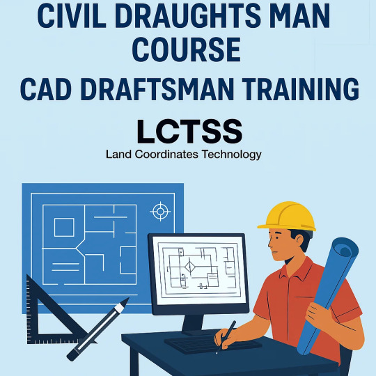
📐 Master the art of drafting with our Civil Draughts Man Course & CAD Draftsman Training! 🏗️ Gain hands-on skills for a booming career in civil engineering. 💻 👉 Join Now!
0 notes
Text
Future-Proof Your Civil Engineering Career with Professional AutoCAD Training

Introduction
In today’s competitive job market, standing out as a civil engineer requires more than just a degree. One of the most crucial tools every aspiring civil engineer must master is AutoCAD software. With infrastructure and construction industries booming across the world, having hands-on experience with AutoCAD for civil engineering is no longer optional — it’s essential.
Why AutoCAD Skills Matter in Civil Engineering
Civil engineering is really about being precise, thinking ahead, and getting things done the right way. AutoCAD helps professionals design and draft with pinpoint accuracy. From 2D drafting to 3D modeling, this software allows civil engineers to create detailed layouts, blueprints, and infrastructure plans.
When you’re working on real-world projects like highways, bridges, residential layouts, or drainage systems, knowledge of AutoCAD civil drafting can give you an edge. It ensures that you not only understand the technical aspects of design but can also bring your ideas to life in a format that's universally accepted across the industry.
What You’ll Learn in a Professional AutoCAD Course for Civil Engineering
A structured and professional AutoCAD training course focuses on all the key aspects of the software relevant to civil work. Here’s what you’ll be able to do once you’ve picked up these key skills:
Understanding of basic and advanced drafting tools
Civil-specific features such as topographic mapping, road alignment design, and site layout
Use of layers, blocks, and templates for civil engineering drawings
Creating plan, section, and elevation views
Working with contour maps, sewer systems, and road plans
Application of 3D modeling tools for better visualization of projects
These skills are not only useful for academic projects but also highly valued in job roles like civil drafter, AutoCAD designer, site planner, or civil project assistant.
Who Should Learn AutoCAD for Civil Engineering?
This course is ideal for:
Diploma and degree civil engineering students
Recent graduates looking to enhance employability
Professionals looking to level up their skills and stay ahead in their careers.
Site supervisors and junior engineers aiming for promotions
Whether you're a fresher or already working in the field, AutoCAD civil design training can future-proof your career by making you job-ready with practical, industry-relevant skills.
Benefits of Learning AutoCAD for Civil Engineers
Improved Employability:
Recruiters in the construction, infrastructure, and design sectors often prioritize candidates with AutoCAD certification and practical knowledge.
Increased Productivity:
Mastering shortcuts and features of AutoCAD can help reduce the time spent on manual drafting.
Better Project Visualization:
3D visualization and walkthroughs allow engineers and clients to understand the final outcome before construction begins.
Higher Accuracy:
With advanced tools and settings, you minimize errors in drawing — which is critical in structural planning.
Collaboration Ready:
AutoCAD is a globally accepted standard. Engineers who know how to work with DWG files can easily collaborate with teams worldwide.
Career Opportunities After Learning AutoCAD Civil
Once you're skilled in AutoCAD for civil projects, a wide range of career options open up for you:
Civil CAD Designer
Highway Design Engineer
Construction Draftsman
Infrastructure Planning Assistant
CAD Technician for Structural Firms
Urban Planner Assistant
Final Thoughts
The future of civil engineering lies in smart design and efficient planning. By learning AutoCAD for civil engineering, you not only gain a skill but also a competitive advantage in your career. The right AutoCAD training course gives you the confidence to take on real-world design challenges and contribute meaningfully to any project.
So, if you're serious about building a long-term, successful career in the civil engineering industry, now is the time to invest in professional AutoCAD training — your future self will thank you.
Suggested Links: –
AutoCAD Electrical Training
AutoCAD Civil Training
AutoCAD Mechanical Training
Architecture & Interior Designing
Revit Architecture Training
#autocad#architecture design#interior designer#autocad course in uttam nagar#autocad course in yamuna vihar
0 notes
Text
Designing a Future in CAD: Unlock Your Career Potential with Specialized Training in Pune
In today’s competitive design and construction landscape, professionals are constantly seeking to upgrade their technical expertise to remain relevant and marketable. From architecture to interior design and mechanical engineering, CAD (Computer-Aided Design) has become the foundational tool that empowers creators to visualize, analyze, and execute their projects with precision and efficiency. Pune, being one of India’s rapidly growing tech and education hubs, has emerged as a hotspot for individuals pursuing training in this domain. Institutes like PrimeCAD play a pivotal role in shaping the future of design professionals by offering cutting-edge training programs that meet the evolving demands of the industry.
Let’s explore how specialized courses in BIM, AutoCAD, interior design, and project management are transforming learners into industry-ready professionals.
Future-Proof Your Career with a BIM Training Institute in Pune
Building Information Modeling (BIM) has revolutionized how architects, engineers, and construction professionals approach project planning and execution. It facilitates collaboration by integrating design, documentation, and construction into a single cohesive model. For anyone aspiring to thrive in the construction or infrastructure sector, enrolling in a reputed BIM Training Institute in Pune is a critical first step.
These institutes provide practical, hands-on learning modules that cover advanced BIM software like Revit, Navisworks, and BIM 360. The growing demand for sustainable construction, smart buildings, and digitally integrated infrastructure projects makes BIM proficiency highly desirable. A well-structured BIM course doesn’t just teach software; it instills an understanding of workflows, interoperability, and project coordination. By aligning your skills with global BIM standards, you’ll position yourself for lucrative career opportunities both in India and abroad.
Elevate Your Creative Skills with CAD Courses for Interior Design
Interior design is more than just aesthetics—it is a science of space, functionality, and visualization. CAD software has become a vital tool in this field, allowing designers to create detailed floor plans, 3D models, and renderings that bring their creative visions to life. CAD Courses for Interior Design are designed to empower aspiring and experienced designers with the ability to produce professional-grade documentation and visuals.
Such courses often include modules on space planning, furniture layout, lighting simulation, and materials specification. By mastering tools like AutoCAD, SketchUp, and 3ds Max, interior designers can enhance their client presentations and improve project communication. Furthermore, these courses provide the technical confidence needed to liaise effectively with architects and contractors. Whether you’re a freelancer or aiming to join a design firm, CAD training gives you the competitive edge required in this high-demand industry.
Explore Your Technical Prowess with an AutoCAD Course in Pune
AutoCAD remains the industry standard when it comes to drafting and design across multiple engineering disciplines. An AutoCAD course in Pune serves as a robust foundation for students and professionals looking to enter sectors such as mechanical, civil, electrical, and architectural engineering.
These courses typically cover both 2D and 3D drafting, focusing on commands, layers, plotting, and dimensioning. The curriculum is tailored to meet industry expectations, ensuring that learners become proficient in developing accurate blueprints, technical drawings, and schematics. Pune’s vibrant academic environment, combined with its proximity to industrial zones, makes it the perfect city to pursue such a course. By gaining certification in AutoCAD, learners can validate their expertise and open doors to numerous job roles, including CAD technician, draftsman, and design engineer.
Master Organizational Skills through CAD Project Management Training
As CAD and BIM technologies continue to evolve, the need for skilled project managers who can bridge the gap between design and execution has become more pronounced. CAD Project Management courses address this demand by offering structured training on managing design teams, workflows, and resources within CAD environments.
Participants learn how to handle project timelines, budgeting, quality control, and client communication, all while maintaining alignment with digital design processes. These courses also delve into collaborative platforms, document management systems, and the integration of multiple CAD software tools. Whether you are leading a small team or a large-scale project, the ability to coordinate and deliver high-quality outcomes on time is a valuable skillset. By mastering CAD project management, professionals can move beyond technical roles and into leadership positions within design firms and construction companies.
Why Choose PrimeCAD for Your CAD Learning Journey?
PrimeCAD, a recognized training provider based in Pune, has been instrumental in guiding students and professionals toward successful design careers. With a curriculum that emphasizes both theoretical understanding and hands-on application, the institute offers a range of specialized programs tailored to different career paths within the design and engineering sectors.
The training environment at PrimeCAD is supported by industry-experienced instructors, real-world projects, and state-of-the-art infrastructure. Whether you are just starting out or looking to upskill, the institute’s commitment to quality education ensures that you are industry-ready from day one.
Transforming Ambitions into Achievements
In conclusion, the demand for skilled CAD professionals continues to rise across industries—from construction and manufacturing to real estate and urban planning. With targeted training in areas such as BIM, AutoCAD, interior design, and project management, learners in Pune can unlock their full potential and step confidently into dynamic and rewarding careers.
By investing in high-quality education from reputed institutes like PrimeCAD, you’re not just learning software—you’re acquiring a mindset of precision, innovation, and leadership. The future of design is digital, and now is the time to be a part of that future.
0 notes