#complete woodcuts of albrecht durer
Explore tagged Tumblr posts
Visit Tumblr Blog
Explore Tumblr blogs with no restrictions, modern design and the best experience.
Last Seen Tumblr Blogs


Fun Fact
Tumblr has 4 main sources of revenue.
Text


Book 531
The Complete Woodcuts of Albrecht Dürer
Dr. Willi Kurth, ed.
Bonanza Books 1946
At nearly 80 years old, this book is holding together quite well. It’s exceptionally clean under the jacket, which lists its price at $7.50. Which is what I think I paid for it around fifteen years ago—a hell of a deal for every woodcut Dürer ever made. The jacket copy says that the reproductions have been made from new plates in the original 9” x 12” size, and they do look good, albeit perhaps a bit over inked. The line thickness looks a little fat, but overall really nice. So with 346 woodcuts from a master draftsman, a brief biography, and a descriptive index, this is well worth the price of admission.
#bookshelf#personal collection#personal library#books#library#bibliophile#book lover#illustrated book#booklr#art#complete woodcuts of albrecht durer#willi kurth#bonanza books#renaissance art
11 notes
·
View notes
Text
Printmaking Workshop🌛


I took inspiration from Albrecht Durer’s witch woodcuts for these prints. In this workshop we created monoprints by drawing on paper over inked acetate. My first print was a practice run as I tried to decide on a layout. I created a second print of a witch reading her grimoire by a fire under a full moon. I wasn’t completely happy with this one because the lines looked a bit messy and smudged so I tried it once more.

I’m quite pleased with my third print. It’s similar to the previous one but I put more emphasis on the moon and the witch rather than random background elements.


(thumbnails/planning⬆️)
2 notes
·
View notes
Photo

MWW Artwork of the Day (4/2/23) Albrecht Dürer (German, 1471–1528) The Small Passion #6: Christ's Entry into Jerusalem (c. 1508) Woodcut, 12.6 x 9.8 cm. The Metropolitan Museum of Art, New York (Gift of Junius Spencer Morgan)
The "Small Passion" is a series of 37 woodcuts that Durer started after his return to Germany from Italy. He completed the series in 1510 and published them as a book in 1511. "Christ’s Entry into Jerusalem" was the first in the series. Jesus is the central figure in "Christ’s Entry into Jerusalem." He is the focus of attention through His ride to the gate of the city. He is surrounded by the crowd who plays a subordinate role as a supporting cast. An old man is placing a cloak before Christ as He is approaching the gate while another is holding a palm frond. In "Christ's Entry into Jerusalem," Durer surrounds Christ's head with intense light with the rays extending beyond the glow. Durer created most of his prints with letters "A" and "D" stylized. In "Christ’s Entry into Jerusalem," the "D" is reversed to read correctly when the art is pulled from the print.
3 notes
·
View notes
Photo
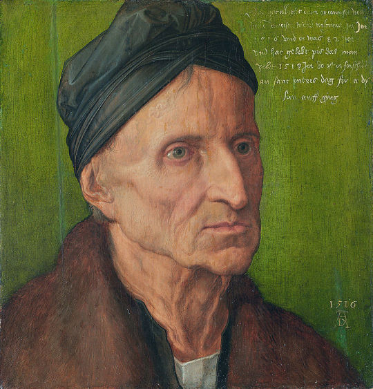
Albrecht Dürer - Portrait of Michael Wolgemut - 1516
Albrecht Dürer (21 May 1471 – 6 April 1528),[4] sometimes spelt in English as Durer or Duerer, without umlaut, was a German painter, printmaker, and theorist of the German Renaissance. Born in Nuremberg, Dürer established his reputation and influence across Europe when he was in his twenties due to his high-quality woodcut prints. He was in communication with the major Italian artists of his time, including Raphael, Giovanni Bellini and Leonardo da Vinci, and from 1512 he was patronized by Emperor Maximilian I. Dürer is commemorated by both the Lutheran and Episcopal Churches.
Dürer's vast body of work includes engravings, his preferred technique in his later prints, altarpieces, portraits and self-portraits, watercolours and books. The woodcuts, such as the Apocalypse series (1498), are more Gothic than the rest of his work. His well-known engravings include the Knight, Death and the Devil (1513), Saint Jerome in his Study (1514) and Melencolia I (1514), which has been the subject of extensive analysis and interpretation. His watercolours also mark him as one of the first European landscape artists, while his ambitious woodcuts revolutionized the potential of that medium.
Dürer's introduction of classical motifs into Northern art, through his knowledge of Italian artists and German humanists, has secured his reputation as one of the most important figures of the Northern Renaissance. This is reinforced by his theoretical treatises, which involve principles of mathematics, perspective, and ideal proportions.
Dürer has been credited with inventing the basic principle of ray tracing, a technique used in modern computer graphics.
Michael Wolgemut (formerly spelt Wohlgemuth; 1434 – 30 November 1519) was a German painter and printmaker, who ran a workshop in Nuremberg. He is best known as having taught the young Albrecht Dürer.
The importance of Wolgemut as an artist rests not only on his own individual works, but also on the fact that he was the head of a large workshop, in which many different branches of the fine arts were carried on by a great number of pupil-assistants, including Albrecht Dürer, who completed an apprenticeship with him between 1486-9. In his atelier large altar-pieces and other sacred paintings were executed, and also elaborate carved painted wood retables, consisting of crowded subjects in high relief, richly decorated with gold and colour.
Wolgemut trained with his father Valentin Wolgemut (who died in 1469 or 1470) and is thought to have been an assistant to Hans Pleydenwurff in Nuremberg. He worked with Gabriel Malesskircher in Munich early in 1471, leaving the city after unsuccessfully suing Malesskircher's daughter for breach of contract, claiming she had broken off their engagement. He then returned to his late father's workshop in Nuremberg, which his mother had maintained since Valentin's death.
In 1472 he married Pleydenwurff's widow and took over his workshop; her son Wilhelm Pleydenwurff worked as an assistant, and from 1491 a partner, to Wolgemut. Some consider Wilhelm a finer artist than Wolgemut, however he died in January 1494, when he was probably still in his thirties. Wilhelm's oeuvre remains unclear, though works in various media have been attributed to him.
25 notes
·
View notes
Text
Chapters 5-8
So reading these chapters gave me an entirely different feel. I found myself trying zoom all the way in to read or at least clearly see with detail the different examples/displays of work in the text.
I think my readings made understand the importance of different time periods as it relates to graphic design. It also made me home in more of the different designers and their impact to the world of graphic design.
Very early in the readings of Chapter 5, it discuss typography. The invention of typographic was compared to writing as one of the most important advances in civilization. In the previous post, we see how important writing is and its impact on world. There was also start a change world over with the use of paper. Paper was created by the Chinese and was distributed by the Chinese for a while until other countries found a way to create their own. Along with the spread of paper was the spread of block printing in Europe. Though block printing had made it to Europe, block printing remained popular mostly in China. The importance of printing is evident in chapter 6. Printing is an extension of typography (writing) because like the typography or writing, it stabilized and unified languages. The impact of printing led to revolution because printing is a powerful tool to spread ideas and information. Learning the difference between broadside and broadsheet was interesting because I’m not sure why would anyone would ever only want to use one side of a canvas. Broadsheets were useful announcements of deformed births (which is really messed up. Why is this an announcement? What about the families?),advertisement, the lottery, politics, invasions, disasters, and, of course, religion. :-) The broadsides or broadsheets evolved over time from the folded sheets to some things that we are familiar with today such as pamphlets and newspapers. Chapter 7 details the state of graphic design in the Renaissance period.
The following includes a few of the designers I found to be interesting:
Gutenberg: he was responsible for teaching a secret process for mirror creation; He was responsible for inventing a type mold which allowed him to increase his speed and accuracy;
Erhard Reuwich: Contributed illustrations to the Peregrinationes in Montem Syon (Travels in Mount Zion). Reuwich created illustrations in the form of regional maps, important buildings, and major cities. His contributions made history as the first book to have fold out illustrations.
Albrecht Durer: Is the creator of The Apocalypse and the Rhinoceros. Durer is also a writer and created a book called Underweisung der Messung mit dem
Zirckel und Richtscheyt. This book touch on topics such as linear geometry, two dimensional geometric construction, the application of geometry to architecture, decorating, engineering, geometric solids, linear perspective, mechanical aids, and letterforms. Durer is so awesome, he created grids to assist with drawing and grids are still in use today!
Konrad Sweynheym and Arnold Pannart: created the double alphabet by combining the Roman alphabet with rounded minuscules. These two later designed a full Roman alphabet that is still in use today.
William Caxton: Caxton has a place on this blog because he translated first typographic book in English. :-)
Nicolas Jenson: Talk about perfect timing! This guy capitalized off the death of one person that had a monopoly on printing in Venice (hub). Some of his credits include designing outstanding roman, Greek, and Gothic fonts and published over 150 books. The text provides an example of Jensons publications called Marie virginus secundum consuetudinem romane curie where he displays decorated borders and initial letters reflect illuminated manuscripts.
Erhard Ratdolt: is the creator of the Calendarium by Regiomontanus, second version (that part is important). The Calendarium has sixty diagrams of solar and lunar eclipses. There’s also the three-part mathematical wheel charts. This guy is just awesome for socking it to religion and superstition with science and better help people predict an eclipse.
Francesco da Bologna (Griffo): He had a project called De Aetna. While working on this project, Griffo, produced roman scripts better than Jenson’s work. Griffo’s style was so effective that it remains a model for punch cutters and is still in book text face Bembo today! Griffo also had the brilliant idea to make the ascenders taller to the size of the capitals to provide balance something that the roman font was lacking.
Geoffroy Troy: has a ton of accomplishment that as do the previously mentioned individuals. The contribution that make him stand out from the rest is his introduction to the apostrophe, the accent, and the cedilla. He also created a series titled Horae. This gave Tory influence because of his work, so much so that King Francis named him imprimeur du roi (printer to the king). He is also named the most influential graphic designer of his century.
Oronce Fine: a mathematic professor and graphic artist. He combined his skills in both math and graphic design to illustrate math, geography, and astronomy. Being able to crossover into multiple field, put him on this list.
There were a few events/designs/time periods I found to be interesting as well:
Psalter: The first book that has the printers trademark and imprint, printed date of publication, and colophon.
Rationale Divinorum Officirum: The first book to save space by use of small sized typestyle.
Incunabula period: There were over thirty-five thousand editions-a total of nine million books-were printed.
Rhinoceros: Is a woodcut illustration from a sketch and description sent from Spain. Though the illustration fills the entire frame and it doesn’t have a defined background, I’m actually ok with that. Viewer can instantly forget that they don’t know where the rhino is standing because of the detail in the illustration.
The Apocalypse: (I’m in love this work. I just appreciate the detail considering that the technology that is around today was not available.) Durer earned his renown in Europe because of the volume and depth, light and shadow, texture and surface in this work.
De Natura Stirpium Libri Tres: is work completed by Simon de Colines. This one particularly stood out to me because it emphasized the title by making the rest of the cover busy and leaving the title in a blank space in the center. This is also another one that captures me with all of the details.
Some things that I wanted to take note of particularly about religions impact on graphic design (everything!!!!):
The text speak of how Pope Nicholas V issued a pardon of sins to all Christians who had given money to support the war against Turks.
The text speak of censorship and how difficult it was to control in the 1500′s. The only entities (ever) interested censoring anyone is the church and the state. Pg112 in the text.
See ya next time :-)
1 note
·
View note
Text
An Art History Primer
by Kristian Krawford
I spent many years studying art history in school and dearly loved it. So allow me a few moments to share the fruits of my education with you. Here is your art schooling without the cost of tuition. And you can really impress your friends with all your refinement!
We begin in Egypt from 3,000 to 330 BC. The style was marked by stiff figures in profile, subject matter was gods and goddesses, kings and queens, jackal-headed deities and the occasional cat. Egyptians were strong believers in the afterlife and decorated tombs with things they felt one needed in eternity.
Greece from 1200-200 BC. Not much art has survived from this period other than pots, all decorated in geometric patterns—zigzags, chevrons, checkerboards, diamonds. Also Homeric scenes and later some Kouroi statues.
Rome from 700 BC- AD 500. Virtually everything we know of Greek art comes to us from the Romans. They were the ultimate copycats, conquering the Greek world and plundering their treasures. They did the same to Egypt. They were the first art patrons and art collectors. A tradition that continued for centuries.
The Dark Ages AD 600-1350. This title is a misnomer as it was a very exciting time in the world. This was the era of beautiful churches, of Charlemagne (my own great-grandfather), the university and of some really beautiful art.
Charlemagne was King of the Franks and the first Holy Roman Emperor. His empire was called Carolingian and he set out to change the world. He built monasteries and churches, basilicas, murals, sculptures and frescoes—almost none of which have survived. What have survived are beautiful illuminated manuscripts from this time period, which is also called Romanesque because it draws on Roman models.
One way it was Roman-like was in its bigger and better churches. The architecture at the time, centered in Paris, was called Gothic by Giorgio Vasari, who intended it as an insult. It means “crude and barbaric.” Gothic style was simply the over decoration of a house of God. Elaborate stone tracery, crested finials, painted details—miscellaneous doodads. All crafted by anonymous artisans.
A French historian (Jules Michelet) coined the term Renaissance, meaning “rebirth,” in the 1800’s. And because the subject is so broad and involves so many artists, I could go on for pages. So for the sake of brevity, some things will receive only a passing mention.
The Renaissance can be divided into High and Low or Early and Late. The major artists of the Early Period were Giotto (first to paint three-dimensional people); Masaccio (mastered groups of figures); Lorenzo Ghiberti (spent 21 years working on the bronze doors of the Florence Baptistery aka. Gates of Paradise); Donatello (invented relief sculpture); and Filippo Brunelleschi (architect of the Duomo and first to apply the rules of perspective to art).
The major artists of the Late Period were: Sandro Botticelli (known for sensuous human forms, i.e. Birth of Venus); Leonardo da Vinci (arguably the most famous artist ever of the most famous painting ever, i.e. Mona Lisa); Michelangelo (started out in Florence, moved to Rome to paint the Sistine ceiling); Raphael (another darling of the papacy and one of my personal faves. I love School of Athens); Tintoretto (he closes out the High Renaissance with a Mannerist style); and Titian (greatest Venetian painter, he painted a lot of mythological subjects).
Some interest tidbits about Leonardo before closing out the Renaissance entirely. Leonardo wasn’t just an artist. He was a scientist, architect, engineer, draftsman, inventor and jack of all trades. He studied the human body by dissecting cadavers and imagined flight hundreds of years before the Wright brothers. He was interested in everything, yet finished almost nothing. He was a master of unfinished work. In fact, the Mona Lisa is one of only a handful of pieces he ever completed. And it was his personal favorite that he carried with him until his death. For centuries, Mona Lisa has remained an enigma. Not just her identity but her unusual expression. Is she or isn’t she smiling? According to Vasari, Leonardo painted a very melancholy sitter. He employed magicians, jesters and theatre performers to entertain her while he painted. It was while painting this portrait that he developed his sfumato technique (Italian for “like smoke”) in which colors and form subtly merge. It would become his trademark.
The Northern Renaissance is also divided into Low and High. These are the best known Low artists: Jan van Eyck (founder of Flemish painting, he painted the Ghent Altarpiece); Rogier van der Weyden (known for attention to detail and portraits of nobles); and Hieronymous Bosch (known for fantastical landscapes of a dark, medieval world).
The High Artists of the Northern Renaissance are: Albrecht Durer (not to my liking but this German artist is known for his engravings and woodcuts); and Pieter Breughel the Elder (Flemish painter known for allegories and parables of peasant life).
Baroque came after the Renaissance. It was a time of courtly festivals and royal ceremony. The term meant to be an insult—“degenerate.” Caravaggio was the most famous Baroque artist. A rogue character (even tried for murder), he was a naturalistic painter known for dramatic light. He placed ordinary people in his paintings of religious subjects. Scandalous! Peter Paul Rubens painted nobles while El Greco was known for his elongated figures. Rembrandt, considered the greatest Dutch painter ever, was known for his unusual lighting in which he made the most ordinary of people look mysterious. Jan Vermeer, also known for interesting light effects, enjoyed painting the Dutch bourgeoisie. Lastly, Velazquez was a great Spanish painter most interested in royalty.
From the 1700’s to the 19th century, there were four major art movements: Rococo, Neoclassicism, Romanticism, and Realism.
Rococo (c. 1730-1800) was art of the boudoir. It was a flirty, fanciful way of decorating the canvas. The main artists (all French) were Francois Boucher, Jacques-Louis David (I can’t stand that guy), Jean-Auguste Dominique Ingres, Eugène Delacroix and Gustave Courbet.
Neoclassicism (c. 1750-1820) was a genre in which artists copies the simple designs and restrained ornament of the ancient Greeks and Romans. The main artists Jacques-Louis David (I still can’t stand him), Antonio Canova, Jean-Antoine Houdon (known for his amazing bust sculptures of Ben Franklin and George Washington) and Jean-Dominique Ingres.
Romanticism (c. 1780-1850) was melodramatic portrayals of imaginary subjects. The best known artists were Eugène Delacroix, Francisco de Goya and William Blake—a wonderful writer who illustrated his poems.
Realism (c. 1848-1875) was basically a reaction to the excesses of Romanticism and some Neoclassicism. In this movement, it was the Americans who led the way. Many were painting beautiful landscapes of their young nation on large canvases. The landscapists were Thomas Cole, Frederic Edwin Church, Albert Bierstadt and Thomas Moran. Realist artists were Winslow Homer and Thomas Eakins.
Ah, Impressionism! Who doesn’t love it? It all began in 1874 when a group of Paris-based artists who’d been rejected by the Salon were mockingly called “Impressionists” by the April 25th issue of Le Charivari magazine. The name stuck. The style itself was marked by a close observation of nature whereby marks of pure color are placed side by side to create the effects of light on the canvas. They also differed in subject matter, tossing out literary subjects, mythology, and even history. They focused instead on scenes of everyday life. They also abandoned contour, modeling and precise details.
Though Èdouard Manet is the founding father of Impressionism, it is Claude Monet who is most often associated with it. Other stars are: Edgar Degas (he favored ballet dancers); Auguste Renoir (young women and rosy-cheeked girls); Alfred Sisley (the only Brit in the mix); and Mary Cassatt (the only American and most famous woman).
From 1874 to 1886, the Impressionists exhibited together a total of 8 times, but long before they broke up, the members were moving on to other things.
Post-Impressionism is a catch-all term to describe all the art that came after Impressionism. It also relied on the use of bright colors and splashy brushwork, but differed in what artists were feeling and saying. The stars of this movement were: Georges Seurat (inventor of Pointillism and a personal fave); Paul Gaugin (the native-loving man of bright colors); Vincent Van Gogh (most mad and magnetizing); and Henri de Toulouse-Lautrec (decorative posters of cabaret life).
Expressionism was marked by sometimes violent colors, abstract forms and emotional subjects. The big Expressionists were: Edvard Munch; Henri Matisse (inventor of Fauvism); Wassily Kandinsky (inventor of Abstraction); and Amadeo Modigliani (lover of long, lean bodies and necks); and the Viennese love-chronicler, Gustav Klimt.
Cubism is my least favorite genre so will receive scant mention here. It was the first totally abstract art movement—not at all representational—relying on geometric forms. Created by Pablo Picasso and Georges Braque, they were influenced by Cézanne, modern science and African masks.
Dada was a brief European anti-art movement that sprang up after WW1. It spawned the likes of Marcel Duchamp, Max Ernst and Man Ray. I take back what I said about Cubism being my least favorite. Dada is.
Surrealism came after Dada and although it was primarily a literary movement, it translated well into art. Basically about the relationship between dreams and the unconscious, this movement gave us Marc Chagall, Joan Miró and Salvador Dalí.
Constructivism was another brief art genre, this one centered in Russia. It spawned no internationally known starts, only regional artists on a mission.
Abstract Expressionism was about bigness—big canvases, big brushes, big cans of house paint, big male egos. It was also almost totally American. The main men were: Jackson Pollock (big drips and splatters); Willem de Kooning (brushy abstractions); and Mark Rothko (large blocks of color).
Pop Art is populist art. It’s representational and easily comprehensible. It’s spawned some very famous artists—Jasper Johns, Robert Rauschenberg, Andy Warhol and Roy Lichtenstein, to name a few. These artists rejected nature and instead focused on the manmade.
Minimalism came after Pop Art and spawned Frank Stella and a few minor artists.
So what genre is the art of today and where is it headed? Well, all the art since is generally lumped into the category of post-modernism and involves artists deriving their work from both natural and manmade sources. Today artists even use a third source—the wonderfully human imagination. Artists also create their work from many different mediums. Today, we have oil painters, acrylic artists, watercolorists, charcoal and pencil artists, collage artists and even mixed-media artists who use a combination of all of the above to create their unique works. And let’s not forget digital artists who create their imaginary worlds entirely on computer. Though future historians will have a difficult time categorizing the art of today, one thing is for certain: they won’t lack for interesting and beautiful paradigms to study.
#art history#artessay#artists#artprimer#arteducation#essays#essay#fyi#so you know#valuableinformation#goodstuff#artthroughtheages#history
4 notes
·
View notes
Photo

Curators have found few remains of self-portraits completed during Antiquity, in Ancient Greek, Egyptian or Roman art. This is partly because only a tiny number of paintings have survived, and partly due to a lack of evidence concerning the individual artists involved. Sculpture, being more durable than wall or panel paintings, has survived in greater numbers. Early self-portraits sculpted in stone include one dating from 1365 BCE by Bak, the head sculptor of the controversial Egyptian Pharaoh Akhenaten. Bak also executed the portrait of Pharaoh Akhenaten (c.1364 BCE) and may be responsible for the bust of Nefertiti (c.1350 BCE). Records also suggest that the Ancient Greek sculptor Phidias inserted a likeness of himself in the frieze "Battle of the Amazons" at the Parthenon in Athens. Flemish and German Renaissance The earliest surviving self-portraits after Antiquity are believed to be those by the Flemish Northern Renaissance painter Jan Van Eyck (1390-1441) (Man in a Red Turban, 1433) and by Jean Fouquet (1420-1481) (Self-Portrait miniature, c.1450) painter to the French king. Van Eyck also painted The Arnolfini Portrait (1434), depicting a married couple. The bridegroom is supposedly modelled on himself. During the German Renaissance, the Nuremberg painter and printmaker Albrecht Durer was also a prolific self-portraitist, completing more than twelve paintings and drawings of himself, in silverpoint, gouache, oils and woodcut. See for instance, Self Portrait with Fur Collar (1500, Alte Pinakothek, Munich). https://www.instagram.com/p/CLEygULhv_l/?igshid=1e8vvt9alkjdf
0 notes
Photo

The Story of the Praying Hands Painting
June 14
Back in the fifteenth century, in a tiny village near Nuremberg, lived a family with eighteen children. In order merely to keep food on the table for this mob, the father and head of the household, a goldsmith by profession, worked almost eighteen hours a day at his trade and any other paying chore he could find in the neighborhood. Despite their seemingly hopeless condition, two of the elder children, Albrecht and Albert, had a dream. They both wanted to pursue their talent for art, but they knew full well that their father would never be financially able to send either of them to Nuremberg to study at the Academy. After many long discussions at night in their crowded bed, the two boys finally worked out a pact. They would toss a coin. The loser would go down into the nearby mines and, with his earnings, support his brother while he attended the academy. Then, when that brother who won the toss completed his studies, in four years, he would support the other brother at the academy, either with sales of his artwork or, if necessary, also by laboring in the mines. They tossed a coin on a Sunday morning after church. Albrecht Durer won the toss and went off to Nuremberg. Albert went down into the dangerous mines and, for the next four years, financed his brother, whose work at the academy was almost an immediate sensation. Albrecht's etchings, his woodcuts, and his oils were far better than those of most of his professors, and by the time he graduated, he was beginning to earn considerable fees for his commissioned works. When the young artist returned to his village, the Durer family held a festive dinner on their lawn to celebrate Albrecht's triumphant homecoming. After a long and memorable meal, punctuated with music and laughter, Albrecht rose from his honored position at the head of the table to drink a toast to his beloved brother for the years of sacrifice that had enabled Albrecht to fulfill his ambition. His closing words were, "And now, Albert, blessed brother of mine, now it is your turn. Now you can go to Nuremberg to pursue your dream, and I will take care of you." All heads turned in eager expectation to the far end of the table where Albert sat, tears streaming down his pale face, shaking his lowered head from side to side while he sobbed and repeated, over and over, "No... no... no... no." Finally, Albert rose and wiped the tears from his cheeks. He glanced down the long table at the faces he loved, and then, holding his hands close to his right cheek, he said softly, "No, brother. I cannot go to Nuremberg. It is too late for me. Look... Look what four years in the mines have done to my hands! The bones in every finger have been smashed at least once, and lately I have been suffering from arthritis so badly in my right hand that I cannot even hold a glass to return your toast, much less make delicate lines on parchment or canvas with a pen or a brush. No, brother... for me it is too late." More than 450 years have passed. By now, Albrecht Durer's hundreds of masterful portraits, pen and silver-point sketches, water colors, charcoals, woodcuts, and copper engravings hang in every great museum in the world, but the odds are great that you, like most people, are familiar with only one of Albrecht Durer's works. More than merely being familiar with it, you very well may have a reproduction hanging in your home or office. One day, to pay homage to Albert for all that he had sacrificed, Albrecht Durer painstakingly drew his brother's abused hands with palms together and thin fingers stretched skyward. He called his powerful drawing simply "Hands," but the entire world almost immediately opened their hearts to his great masterpiece and renamed his tribute of love "The Praying Hands." The next time you see a copy of that touching creation, take a second look. Let it be your reminder, that no one - no one - ever makes it alone! Make a difference today, Love Clint
1 note
·
View note
Text
The Praying Hands


Back in the fifteenth century, in a tiny village near Nuremberg, lived a family with eighteen children. Eighteen! In order merely to keep food on the table for this mob, the father and head of the household, a goldsmith by profession, worked almost eighteen hours a day at his trade and any other paying chore he could find in the neighborhood. Despite their seemingly hopeless condition, two of Albrecht Durer the Elder�s children had a dream. They both wanted to pursue their talent for art, but they knew full well that their father would never be financially able to send either of them to Nuremberg to study at the Academy. After many long discussions at night in their crowded bed, the two boys finally worked out a pact. They would toss a coin. The loser would go down into the nearby mines and, with his earnings, support his brother while he attended the academy. Then, when that brother who won the toss completed his studies, in four years, he would support the other brother at the academy, either with sales of his artwork or, if necessary, also by laboring in the mines. They tossed a coin on a Sunday morning after church. Albrecht Durer won the toss and went off to Nuremberg. Albert went down into the dangerous mines and, for the next four years, financed his brother, whose work at the academy was almost an immediate sensation. Albrecht�s etchings, his woodcuts, and his oils were far better than those of most of his professors, and by the time he graduated, he was beginning to earn considerable fees for his commissioned works. When the young artist returned to his village, the Durer family held a festive dinner on their lawn to celebrate Albrecht�s triumphant homecoming. After a long and memorable meal, punctuated with music and laughter, Albrecht rose from his honored position at the head of the table to drink a toast to his beloved brother for the years of sacrifice that had enabled Albrecht to fulfill his ambition. His closing words were, �And now, Albert, blessed brother of mine, now it is your turn. Now you can go to Nuremberg to pursue your dream, and I will take care of you.� All heads turned in eager expectation to the far end of the table where Albert sat, tears streaming down his pale face, shaking his lowered head from side to side while he sobbed and repeated, over and over, �No �no �no �no.� Finally, Albert rose and wiped the tears from his cheeks. He glanced down the long table at the faces he loved, and then, holding his hands close to his right cheek, he said softly, �No, brother. I cannot go to Nuremberg. It is too late for me. Look � look what four years in the mines have done to my hands! The bones in every finger have been smashed at least once, and lately, I have been suffering from arthritis so badly in my right hand that I cannot even hold a glass to return your toast, much less make delicate lines on parchment or canvas with a pen or a brush. No, brother � for me, it is too late.� More than 450 years have passed. By now, Albrecht Durer�s hundreds of masterful portraits, pen and silver-point sketches, watercolors, charcoals, woodcuts, and copper engravings hang in every great museum in the world, but the odds are great that you, like most people, are familiar with only one of Albrecht Durer�s works. More than merely being familiar with it, you very well may have a reproduction hanging in your home or office. One day, to pay homage to Albert for all that he had sacrificed, Albrecht Durer painstakingly drew his brother�s abused hands with palms together and thin fingers stretched skyward. He called his powerful drawing simply �Hands,� but the entire world almost immediately opened their hearts to his great masterpiece and renamed his tribute of love �The Praying Hands.� Moral: The next time you see a copy of that touching creation, take a second look. Let it be your reminder, if you still need one, that no one � no one � ever makes it alone! Read the full article
#prayinghandsdrake#prayinghandsdrawing#prayinghandsemoji#prayinghandsimagesfree#prayinghandsmeaning#storiesaboutunity#ThePrayingHands
0 notes
Text

Ernst Ludwig Kirchner, Potsdamer Platz, 1914
Although most of the modern art movements were centred in France in the early 1900s, one movement which was particularly reflective of the feelings of young artists at this time arose in Germany.
German Expression can be identified by the following features:
Focus on inner response to the world;
Expression of the human condition;
Extreme angles;
Flattened forms;
Garish or unnatural colours;
Distorted views;
Great use of print media, particularly woodcuts;
Exposure of pain, suffering and immorality of World War I.
The years before World War I (WWI) had seen rapid change across Europe, with the industrialisation of cities, and, as railways began to cross the continent, greater movement within and across countries. Electricity was being installed and other new inventions such as the automobile, gramophone, radio transmission, moving pictures and powered flight were introduced. It was also a period of widespread political change, increased access to education, a breakdown of traditional social classes and the beginnings of women seeking greater independence, including the right to vote.
As a result, many young artists wanted to completely change the meaning and purpose of art.
Die Brucke Manifesto
German Expressionism
Around 1904 a group of student artists in Dresden, including Erich Heckel, Karl Schmidt-Rottluff, Fitz Bleyl, and Ernst Ludwig Kirschner launched the first German expressionist group, Die Brücke (The Bridge). They believed that art could express the truth of the human condition.
They declared in their manifesto “We want to free our lives and limbs from the long-established older powers. Anyone who renders his creative drive directly and genuinely is one of us”.
Die Brücke felt it wasn’t important to reproduce an aesthetically pleasing impression of the artistic subject matter, but rather to represent vivid emotional reactions by powerful colours and dynamic compositions.
Erich Heckel, Portrait of a Man, 1919
Fritz Bleyl, Poster Die Brucke, 1906
Otto Mueller, Landscape with Yellow Nudes, c. 1919
Karl Schmidt, Rottluff Houses at Night, 1912
Ernst Ludwig Kirchner, Berlin Street Scene, 1913
Several years later, in 1911, a second group in Munich, Der Blaue Reiter, (The Blue Rider) was established by Wassily Kandinsky, Gabriele Munter and Franc Marc. This group placed more emphasis on mysticism and created work in a more lyrical style. They also shared an interest in abstracted forms and prismatic colours, which they felt had spiritual values that could counteract the corruption and materialism of their age.
The name “blue rider” refers to a key motif in Kandinsky’s work: the horse and rider, which was for him a symbol of moving beyond realistic representation. The horse was also prominent in Marc’s work, which centred on animals as symbols of rebirth.
Wassily Kandinsky, Composition IV, 1911
Gabriel Munter, Malade, 1917
Wassily Kandinsky, Horses, 1909
August Macke, View into a Lane, 1914
Franz Marc, Blue Horse, 1 1911
The artists who most influenced the Expressionists were Edvard Munch (for example The Scream), Paul Gauguin and Vincent van Gogh, who also sought to express their emotions through their art. However, for the Expressionists, the emotional strength of their subjects was as important at the colour. A number of the artists had also seen Henri Matisse’s Fauvist work, and they sought to incorporate his ideas about colour. You can also see echoes of cubism in some of Kirchner’s angular paintings of city streets.
Other influences were “primitivistic” art and “naive” Bavarian folk art and the abstracting tendencies of the bold, poster-like forms and flat patterning in��Jugendstil (literally, the “young style”) design (the German equivalent of Art Nouveau).
Most of the German Expressionists were interested in print making, and made prolific use of the three leading print mediums of the time – the woodcut, etching and lithograph. In particular, they were attracted to the woodcut’s long tradition in German history (for example, by Albrecht Durer).
The graphic techniques also offered a less expensive, more immediate way of developing their art than painting. The boldness and flatness that they developed in their woodcuts, in particular, helped them clarify their reductive style in painting. Their simplified or distorted forms and unusually strong, unnatural colours were meant to jolt the viewer and provoke an emotional response.
The Expressionists were most active until the outbreak of WWI. A number of both the Die Brücke and Die Brücke were either killed, injured or deeply affected by the fighting. As the war progressed, artists reflected their responses to the carnage in their art. For example, Käthe Kollwitz was a prolific printmaker who lost a son in the war, and many of her woodcuts showed the impact on families, particularly women and children.
Käthe Kollwitz, War, 1923
Käthe Kollwitz, Volunteers, 1923
Käthe Kollwitz, The Sacrifice, 1923
A third group, Die Neue Sachlichkeit (The New Objectivity) was a pseudo-Expressionist movement founded in Germany in the aftermath of the war. Many of the artists were anti-war. It was characterised by a realistic style combined with a cynical, socially critical philosophical stance.
Otto Dix, George Grosz and Max Beckman were the key artists who aggressively attacked and satirised the evils of society and those in power. They demonstrated in harsh terms the devastating effects of WWI on society, the general population and the physical damage to individuals.
Otto Dix, The Match Seller, 1920
Max Beckman, The Night, 1918-19
George Grosz, Republican Automations, 1920
This blog is just a short excerpt from my art history e-course, Introduction to Modern European Art which is designed for adult learners and students of art history.
In this e-course, you’ll find a full module on German Expressionism.
This interactive program covers the period from Romanticism right through to Abstract Art, with sections on the Bauhaus and School of Paris, key Paris exhibitions, both favourite and less well known artists and their work, and information about colour theory and key art terms. Lots of interesting stories, videos and opportunities to undertake exercises throughout the program.
If you are interested in German Expressionist prints, you can find a selection of 1957 reproductions at Kiama Art Gallery.


German Expressionism – A Brief Introduction Although most of the modern art movements were centred in France in the early 1900s, one movement which was particularly reflective of the feelings of young artists at this time arose in Germany.
#Art History#Der Blaue Reiter#Die Brucke#Die Neue Sachlichkeit#Erich Heckel#Ernst Ludwig Kirchner#Franz Marc#Fritz Bleyl#Gabriele Munter#German Expressionism#Geroge Grosz#Karl Schmidt-Rottluff#Kathe Kollwitz#Max Beckman#Modern Art#Otto Dix#Wassily Kandinsky
3 notes
·
View notes
Photo

In the early 1500s, a rhinoceros arrived in Lisbon as a gift from an Indian ruler to the Portuguese king Manuel. As the first rhino in Europe since Roman times, it caused quite a stir. The German artist Albrecht Durer created a woodcut which was based on the letters and sketches he received about the fabulous new rhinoceros. Durer's woodcut became THE rhinoceros, and circulated around Europe for the next two hundred years. This is despite its many inaccuracies—scaly legs, armored rivets, a gorget, and, perhaps most puzzlingly, a horn on the creature’s back. Oops!
King Manuel arranged a battle between the rhinoceros and a captive elephant, to test Pliny the Elder’s assertion that those two animals were “natural enemies.” Unfortunately, in a complete anticlimax, the creatures shied away from each other and refused to fight. King Manuel, disappointed, gifted the rhinoceros to the Pope. Great way to cover up his pseudo-scientific experiment's failure! Sadly, the ship transporting the rhinoceros sank, and the animal drowned before reaching Rome. But the rhino lived on, in Durer's woodcut.
399 notes
·
View notes
Photo


A year flew by...
16.02.2016 When Astral Mouse was discovered/born.
12.07.2016 After buying two used books on pen and ink drawing - robert w. gill - rendering with pen + ink Garry Simmons - THE TECHNICAL PEN.
16.02.2017 After buying The Complete Woodcuts of ALBRECHT DURER.
A pretty big progress, I think. All made possible by the few people who donated money to me. Wouldn’t be able to afford the books about drawing with pen/art materials otherwise. Also, gave me lot of motivation to improve. Thanks a lot!
#artists on tumblr#art progress meme#artist development#pen and ink#mouse draws#cute animal#mouse#rat#possum#mouse posts
5 notes
·
View notes
Text
THE STORY BEHIND THE PICTURE OF THE PRAYING HANDS
THE STORY BEHIND THE PICTURE OF THE PRAYING HANDS Back in the fifteenth century, in a tiny village near Nuremberg, lived a family with eighteen children. Eighteen! In order merely to keep food on the table for this mob, the father and head of the household, a goldsmith by profession, worked almost eighteen hours a day at his trade and any other paying chore he could find in the neighborhood. Despite their seemingly hopeless condition, two of Albrecht Durer the Elder's children had a dream. They both wanted to pursue their talent for art, but they knew full well that their father would never be financially able to send either of them to Nuremberg to study at the Academy. After many long discussions at night in their crowded bed, the two boys finally worked out a pact. They would toss a coin. The loser would go down into the nearby mines and, with his earnings, support his brother while he attended the academy. Then, when that brother who won the toss completed his studies, in four years, he would support the other brother at the academy, either with sales of his artwork or, if necessary, also by laboring in the mines. They tossed a coin on a Sunday morning after church. Albrecht Durer won the toss and went off to Nuremberg. Albert went down into the dangerous mines and, for the next four years, financed his brother, whose work at the academy was almost an immediate sensation. Albrecht's etchings, his woodcuts, and his oils were far better than those of most of his professors, and by the time he graduated, he was beginning to earn considerable fees for his commissioned works. When the young artist returned to his village, the Durer family held a festive dinner on their lawn to celebrate Albrecht's triumphant homecoming. After a long and memorable meal, punctuated with music and laughter, Albrecht rose from his honored position at the head of the table to drink a toast to his beloved brother for the years of sacrifice that had enabled Albrecht to fulfill his ambition. His closing words were, "And now, Albert, blessed brother of mine, now it is your turn. Now you can go to Nuremberg to pursue your dream, and I will take care of you." All heads turned in eager expectation to the far end of the table where Albert sat, tears streaming down his pale face, shaking his lowered head from side to side while he sobbed and repeated, over and over, "No ...no ...no ...no." Finally, Albert rose and wiped the tears from his cheeks. He glanced down the long table at the faces he loved, and then, holding his hands close to his right cheek, he said softly, "No, brother. I cannot go to Nuremberg. It is too late for me. Look ... look what four years in the mines have done to my hands! The bones in every finger have been smashed at least once, and lately I have been suffering from arthritis so badly in my right hand that I cannot even hold a glass to return your toast, much less make delicate lines on parchment or canvas with a pen or a brush. No, brother ... for me it is too late." More than 450 years have passed. By now, Albrecht Durer's hundreds of masterful portraits, pen and silver-point sketches, watercolors, charcoals, woodcuts, and copper engravings hang in every great museum in the world, but the odds are great that you, like most people, are familiar with only one of Albrecht Durer's works. More than merely being familiar with it, you very well may have a reproduction hanging in your home or office. One day, to pay homage to Albert for all that he had sacrificed, Albrecht Durer painstakingly drew his brother's abused hands with palms together and thin fingers stretched skyward. He called his powerful drawing simply "Hands," but the entire world almost immediately opened their hearts to his great masterpiece and renamed his tribute of love "The Praying Hands." The next time you see a copy of that touching creation, take a second look. Let it be your reminder, if you still need one, that no one - no one - ever makes it alone! -- Author Unknown
0 notes
Text
Hidden Art on Banknotes
The wads of banknotes that you carry around and so often spend are miniature versions of art treasures! Have you ever noticed what beauties they depict? Though the banknote designs in themselves are a work of art, they also sport some famous masterpiece paintings on them. Painting is an art which enables us to find and lose ourselves in it at the same time! It is such a beautiful depiction of complex human emotions, the nature and the unthinkable abstract. Going to the art galleries in the faraway lands cannot be feasible for all…but you can behold some of these beauties in your currency notes! Let’s embark on a journey that will reveal the unseen and the hidden art on banknotes…
a) 100 French Francs (1997): This deep brown, orange and green note has the famous French painter Paul Cezanne on its obverse. Paul Cezanne was a preeminent painter of Post-Impressionist era. Known as the “Master of Aix”, Cezanne is credited with introducing the emergence of twentieth-century modernism or abstract art. One of his famous painting “Apples and Biscuits” is depicted on the reverse. This painting is one of Cezanne’s most stunning masterpieces and symbolizes his great mastery of still life painting. This painting of 1880 hangs today in Musée de l’Orangerie in Paris, France.
b) 100 French Francs (1978): This 100 Francs note of 1978 shown in the image has another famous French painter Eugene Delacroix and his famous paintings. The obverse sports this French Romantic painter’s self-portrait along with his very famous painting of “Liberty leading people”. This painting commemorates the July Revolution of 1830, which toppled King Charles X of France. The reverse has the same self-portrait of Delacroix holding a quill pen and writing his famous diary set against the background of “Place de Furstenberg” a famous and one of the most charming squares in Paris, where Delacroix worked and lived at 6 Rue de Furstenberg while he was commissioned to paint murals for nearby St. Sulpice.
a) 5 Marks Germany: A 5 mark note issued in Germany from 1960 to 1990 depicts a beautiful “Portrait of a Young Venetian Woman” painted in 1505 by Albrecht Durer on its obverse. Albrecht Durer was a painter, printmaker and theorist of the German Renaissance. He established his reputation and influence across Europe due to his high-quality woodcut prints. His watercolour paintings also mark him as one of the first European landscape artists. “Portrait of a Young Venetian Woman” which decorates this 5 mark currency note hangs in Kunsthistorisches Museum Vienna today. This painting is a small bust-length oil on elm panel painting, executed along with a number of other high-society portraits by the artist in 1505. Painted in the autumn or in the winter, this painting emanates an extraordinary charm in the hues of brown and gold. The reverse of the note depicts an oak sprig in the centre.
b) 100,000 Lires Italy: Michelangelo Merisi de Caravaggio, a famous Italian painter’s paintings adorn the 100000 lire banknote of Italy of 1983 and 1994 series. Caravaggio’s technique was as spontaneous and he painted right into the canvas with minimal preparation. He made his paintings appear to be an extension of real space, deliberately making the viewers to feel as if they are taking part in the scene. Sounds like 3D, doesn’t it? His paintings combined the realistic observation of the human state, both physical and emotional with the dramatic use of lighting. This note sports the portrait of Caravaggio on the obverse along with his famous painting of the “Fortune Teller”. The reverse has his “Fruit basket” with a castle in the background.
a) 500,000 lire (Italy): A vibrant and colourful banknote from Italy in circulation in 1997 has one of the famous fresco “The Triumph of Galatea” depicted on the obverse along with the artist Raphael. Raffaello Sanzio da Urbino was an Italian painter and architect of the High Renaissance. He is one of the traditional trinity of great masters along with Michelangelo and Leonardo Da Vinci. Many of his works are found in the Vatican Palace. His best-known work “The School of Athens” which is in the Vatican Stanza Della Segnatura is depicted on the reverse of this note. It was painted between 1509 and 1511 in Apostolic Palace in the Vatican. The School of Athens is one of a group of four main frescoes that depict distinct branches of knowledge. The fresco has all the major philosophers and thinkers from Plato, Aristotle, and Socrates to Pythagoras and Ptolemy. Considered to be one of the masterpieces of Vatican this fresco has decorated this banknote too and indeed increased its beauty.
b) 20,000 Lire (Italy): A 1975 20000 Lire banknote from Italy features yet another master along with his famous masterpieces! The obverse of this green, brown and red note depicts Tiziano Vecelli or Tiziano Vecellio (Titan in English), a 16th-century Venetian school Italian painter. Titian was one of the most versatile of Italian painters. The note depicts his self-portrait along with a landscape from one of his frescos in the background. The reverse depicts Titian’s “Sacred and Profane Love” also called “Venus and the Bride” which is an oil painting by Titian, painted circa 1514 from Galleria Borghese, Rome.
a) 1953, 100 Pesetas (Spain): This beautiful note in the hues of brown has a famous Spanish Painter, Juan Romero de Torres on its obverse. Born in the family blessed with artists, Juan Romero de Torres took interest in painting and art from a very young age. He painted different styles of art together and mostly painted in the Symbolist style. He was particularly famous for his erotic paintings of naked women. The reverse of the note depicts one of his paintings ‘La Fuensanta’. This portrait painting depicts one of Torres’ models who is depicted with her arms resting on a copper cauldron. The painting was made in the autumn of 1929. This painting is rarely seen since it was completed. Recently in November 2007, this painting was bought by a private collector for a price of 1,173,400 Euros!
a) 1946, 100 Pesetas (Spain): One of a painting from the tapestry cartoon series painted by a famous Francisco Goya ‘The Sun Shade’ or ‘The Parasol’ adorns this 100 Pesetas banknote from 1946. Francisco, depicted on the obverse of the note, was an important romantic painter, printmaker and a Spanish artist of late 18th and early 19th centuries. Often regarded as the last of the Old masters and first of the modernist. ‘The Parasol’ which is depicted on the reverse is one of a cartoon series of oil on linen paintings. It was specifically made in order to be hung on the walls of the Royal Palace of El Pardo in Madrid, Spain.
“What is life if full of care, we have no time to stand and stare” Indeed instead of just spending the money, just for once let’s appreciate the beauty of their designs. Isn’t it interesting! Check out if you have such intriguing banknotes in your pockets. If you find any let us know!
Happy Collecting!
Share
The post Hidden Art on Banknotes appeared first on Blog | Mintage World.
0 notes
Video
Top 10 Albrecht Dürer Quotes | Inspirational Quotes | Painter Quotes
"Simplicity is the greatest adornment of art." - Albrecht Dürer Albrecht Dürer Inspirational quotes. Discover Albrecht Durer famous and rare quotes. Share Albrecht Durer quotations about art, painting and judgment. Albrecht Dürer was a painter, printmaker, and theorist of the German Renaissance. Dürer established his reputation and influence across Europe when he was still in his twenties due to his high-quality woodcut prints. -~-~~-~~~-~~-~-- Quotes of the Day Inspirational: "Time is the most valuable thing a man can spend." - Theophrastus -~-~~-~~~-~~-~--~-~~-~~ I upload New Videos Daily in Morning... ★★★ Subscribe & Turn on notifications so you never miss a Video!!!! ★★★ Subscribe my Inspirational Quotes Channel! ►►http://bit.ly/Sub2InspirationalQuotes -~-~~-~~~-~~-~--~-~~-~~~-~~-~ MOST RECENT POPULAR VIDEOS[Must Watch]: Top 10 Homer Quotes - https://youtu.be/W9LLCX22e4s Top 10 Franklin D Roosevelt Quotes - https://youtu.be/fLxU7bt1wuM Top 10 quotes by Aeschylus Quotes - https://youtu.be/pl36c0uZUb0 Top 10 Adolf Hitler Quotes - https://youtu.be/Vm5FF-CXcnw Top 10 Alexander Fleming Quotes - https://youtu.be/dehrhzmhU_Y -~-~~-~~~-~~-~--~-~~-~~~-~~-~ Top 10 Inspirational Quotes by Famous Peoples[COMPLETE Playlist] Click here - https://goo.gl/dRqD4q -~-~~-~~~-~~-~--~-~~-~~~-~~-~ If you like what we do then Please comment and share with your friends and family... Get Inspired[Join us Now] : https://goo.gl/sPMLHV
0 notes
Photo

A little indigo mouse is learning drawing from a new textbook by Alphonso Dunn. It starts promising, for example explains how to hold/move a pen for various applications.
Makes me wish I had competent teachers at advertisement school (I went there only because of drawing lessons and computer graphics lessons).
Buy mouse a coffee.
It’s not easy to be a little mouse!
Getting the book put me in a mood for summarising things.
Summing up the last year, I sold one print, getting 140pln from it (have spent it on other stuff so it doesn’t count) and received 497pln of donations. Taking into account how bad last the year was (even worse than 2012 and 2x worse than 2013 and 2014. The threat was so bad that I couldn’t study at all and couldn’t prepare myself for technician exams), I probably wouldn’t be able to draw much without help.
I’ve spent 122pln on 73 Gel Pens. Used up about 48 of them.
I’ve spent 67pln on paper:
10 A5 garbage paper sketchbooks 30pln 3 A4 garbage paper sketchbooks 27pln 1 A3 sketchbook 10pln
Other accessories:
kneaded eraser 5pln
Summing up, I’ve spent 194pln on stuff for drawing with gel pens.
6 sakura pigma micron pens 36pln
I needed higher quality paper for the pens to draw without bleeding and for erasing:
1 A5 sketchpad 7pln 1 A4 sketchpad 14pln 1 A4 marker pad 30pln (bought that one because the other one isn’t full A4 which would be a problem for prints)
Summing up, I’ve spent 87pln on stuff for drawing with sakura pens. Haven’t used it up yet (except for two 0.05 pens).
Two carrying cases:
A4 - 10pln
A3 - 17pln
Summing up, 27pln.
Summing up art materials: 308pln.
Textbooks:
Robert W. Gill - Rendering with Pen and Ink (The Thames & Hudson Manuals) 25pln
Gary Simmons - The Technical Pen 36pln
Summing up textbooks:
61pln
Artbooks:
Ian Miller - The Art of Ian Miller 92pln - unfortunately it was a quite stupid purchase. Bought it because it was in a deep discount - costed 25$ with shipping instead of 35$ and wanted to buy it because he was one of my inspirations. Unfortunately I realised I can’t learn anything from it because he’s simply way too skilled and his style is too specific.
Albrecht Durer, Willie Knuth - The Complete Woodcuts of Albrecht Durer 100pln. This was very useful. I should have bought it instead of the Ian Miller’s book. It made me understand his skill progression and how to start and progress with learning pen and ink drawing.
Overall, it could be said, last years art expenses have covered themselves - the Ian Miller artbook could count as my own purchase. (Well, not literally. For example I bought Durer’s book with my own money just as part of gel pens and gel pen paper and stuff. It just adds up neatly XD .)
Also, not counting coffee.
I was wondering lately where the going to coffee house thing came from, then I remembered that I started going to coffee houses every few days after I completely stopped eating confectionery. Oh. So that’s where the coffee budget was coming from! Completely forgot about it in late 2016, when finances have worsened for a few months.
In comparison to previous year:
Between May 2015 and the end of 2015 I have scanned 31 drawings.
Between May 2016 and the end of 2016, I have scanned 155 drawings.
When deciding to spend most of donation money on improving my art, I counted on finding more fans and starting a Patreon to gain some degree of security. Didn’t quite work out as I haven’t found the secret of having lots of people exposed to my drawings. Anyway it’s not like I could do anything besides drawing, so the time wasn’t wasted. The threat was too great to study IT stuff.
2016 included a pretty big improvement in my drawing skills. Starting with closer study of graphics of Wil Rees after finding them in high quality in my old Inquis Exterminatus artbbook and then buying pen and ink textbooks and of course putting much more effort in certain individual drawings due to donations. Money helps to apply standards of excellence to drawings.
Here’s a comparison:
Decaying Wonderland I
from 2012, pretty much my peak work until 2016.
A sketch of a remake, May 2016 after buying the sakura pens.
New Decaying Wonderland graphic from June 2016.
Apparently being a little mouse is more difficult than it seems. Thanks for help to those few who helped!
#mouse draws#mouse talks#astral mouse#ENFP#cute animal#mouse#rat#possum#artist development#artists on tumblr#pen and ink#mouse posts
1 note
·
View note