#made some edits to make the text more readable
Explore tagged Tumblr posts
Visit Tumblr Blog
Explore Tumblr blogs with no restrictions, modern design and the best experience.
Last Seen Tumblr Blogs


Fun Fact
Tumblr’s reach among the 26-to-35-year-olds in the US is 11%.
Text


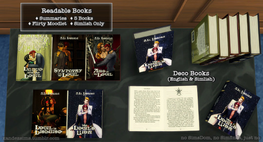


[Bodice Ripper Romance Novels]
'Roman Darkmoor Must Die.' The Devil of Darkmoor Collector's Edition, by Henford-on-Bagley's own A.D. Dorian. This (pretend) period romance series follows the varied loves of Roman Darkmoor, the man everyone wants, and wants to kill. Our hero is a bisexual disaster on a mission to get himself off--er, offed--and everyone is dying to help him.
Have you read this?
Happy Valentines Day! In honor of those who'd rather just read a book, we brought you a gift! Because why would you brave a date or spend money when you could be at home with a spicy novel?
Featuring fully-designed covers, familiar tropes, and an actual plot (!), the Devil series is bound to bring your Sims some joy. And it looks nice on a table--or, if you're shy, under a bed. We won't tell. Preview gifs, more info, and download below.
Like enemies to lovers? Hurt/comfort? Forbidden love? What about swordfighting? Magic? Time-travel? If any of these ring your bell, this is the fandom for you! Be braced: the forums are a warzone.


Download: Patreon (free) | SFS
All filed under Clutter or Storage > Bookshelf. The readable books can be bought from a phone or computer, just like any other book. They should also be in the catalogue, set apart by their preview style.
Starring: Etain Bishop as Juliana Lalune Frederick Duncan as Dr. Albert Sterling Fredette Duncan as Lucia del Sol David Duke as Captain Cyrus Astraean "the Traveler" as the Fairy Godmother(/father/parent) and Victor Gray as Roman Darkmoor
Some Facts About this Project:
Dez came up with this in 2022: Harlequin-style trashy novels as unique clutter. The original concept was 2 deco books. It turned into 3 deco books, a full book set, and 5 readable books. So far.
The titles are modeled after 1980s romances. Dez went through hundreds of Simlish fonts, and finally modified the title font character by character to better match the English font, Georgia.
Every bit of text in this is Xan's fault. He went overboard. Back cover blurbs, book pages, the lot. Don't let a writer do anything.
The book pages were meant to be cliche racy novel schlock, but they came out much better than expected. Oops.
We hope you like this--and that, if you do, you'll tell us. Between research, screenshots, photo-editing, font-editing, meshing, writing, testing, designing and redesigning, we spent actual, real-world months on this. And we're proud of it. But it was a lot.
Despite that, Xan is considering a semi-historical version. (Let's be real: dirty books are not a new invention.) So that might happen.
Mini-Credits:
CC on the covers courtesy of about a million people, including @soft-simmer @happylifesimsreblogs @lady-moriel @midnight-moodlet @trillyke @strangestorytellersims @plazasims @kotcatmeow @candysims4 @okruee and about a million other people. I'll make a proper shoutout when I have time to count it up.
Poses by @sciophobis @helgatisha @natalia-auditore @sewersims and @solstice-sims. Couldn't have done this without you.
@alwaysfreecc @maxismatchccworld @mmfinds @sssvitlanz
...If you made it all the way here, congrats! You earned a cookie. 🍪
#ts4#the sims 4#s4#simblr#ts4cc#s4cc#ts4 build buy#ts4 decor#ts4 clutter#ts4 stories#the devil series#victor#fred#fredette#etain#david duke#frederick
226 notes
·
View notes
Text


contains: toxic behaviour, toxic!reader this was itching my brain, idk what to tell you. i like having morally ambigious reader... or idk, is it too tame? i have no idea where the line meets and ends when it comes to dark shit cus i usually stay in the other side of the line. whenever i think of dark stuff its in a comedic-ish light and everything turns fluffy in the end idfk. tell me what else i should add in the warnings 😞
edit: i made it readable, i should really start readproofing.

hear me out..
reader who doesnt do anything when their boyfriend is mean. like theyre just generally pissed off and huffing at you when youre trying to greet them with open arms and a warm smile when they come home.
reader who doesnt confront them about their horrible behavior and how it affected them. no, just stay silent, take in whatever your boyfriend had to say or do and leave him be.
ohooooh, you mightve done nothing but youre going to give them something much worse than a silent treatment.
youre not a doormat. youre not a crybaby.
i want reader to be absolutely menacing. if that man doesnt come back crawling, apologizing to you, youre gonna make him.
do you understand me? the anger, the absolute disgust that bubbles in your stomach, that claws its way up your chest like an animal looking for a fresh breath of air before it starts to hunt.
youre silent all of the sudden, giving him the driest texts known to man, leaving him on seen with texts that dont technically need a reply instead of dragging the conversation longer with a picture of a cat you saw on your way home. youre picking up more work than usual, unable to cut some time, telling him youve got things to do—things more important than having to watch some tv with him, be in bed with him.
youre clever. you know your schedule, and you know his. rearrange everything, make sure to make as much commotion in your life that doesnt include him, so when he confronts you, youre technically telling the truth when you say youre busy.
because why bother coming home early, greeting him, surprising him with dinner and a loving kiss?
then watch it all go down. technically, youre not doing anything wrong, youve got your plate full with a screenshot of your planned calendar to pair with it as sweet, sweet evidence.
youre watching him slightly deteriorate. watch him panic. he'll buy you flowers, in which you put in a vase but never take care of like before. he'll buy you jewelry you wont wear because "theyre beautiful but i like the old ones too! ill wear them on a special occassion" that wont ever come.
the frustrated, panicked look on his face is priceless. it feels so good. he cant even be mad because youre not even cheating! you have all the alibis, all the witnesses. youre perfectly happy and sweet as before! just.. not as responsive, not as present. but thats not your fault, thats your job's!
if he pays for you, slowly start paying your half of everything. shows that you are stable and everything would be perfectly fine if he went up in left. in the end, thats why he got angry with you in the first place, right? he's so okay with being angry, not telling you his problems, that he can keep it to himself, right?
he doesnt need your lap to lay his head on, not your food that you prepare for him when he comes home, not the soft touches you leave on his overworked skin and definitely not the words that you coo at him everyday before he pissed you off.
make him know what the once delicious thought of takeout tastes like once he's left to fend for himself while you go out for overtime at work! trust me, its gonna taste a hell of a lot more bland, a lot more dull. depressing, really.
dont even get me STARTED on sex. (i wont, not now)
this is all justifiable, right? after all, this is how you communicate your feelings right? this is how you can show him how you felt when he showed you a cold shoulder at your warm embrace! let him have the full experience when you felt pathetic, miserable, useless.
plus, youre not wrong, arent you? you can leave whenever you want! who is he to tell you that you cant leave? as if he owns you—is that what he thinks? is that what he thinks of you? just a not-so-significant other that he can come home to whenever he wants and project his feelings unto?
no, no youre not. youre not gonna take that bullshit. he can roll it up, pack it in a bag and beat it if thats what he's thinking. no, both of you are holding an end of a rope in this relationship. a big, thick rope which you can cut off with that large ass scissor you both have.
this is just you telling him, reminding him that you can cut it whenever you like! its not threatening, not manipulation, straight truth! you CAN leave any relationship you like! its his problem if he doesnt like it, right?
your poor little boyfriend has to get his act together! start thinking straight! unless he wants to deal with your unyielding, harsh wrath for the rest of his soon-to-be miserable life.
after all, he made the first threat to your relationship, right? its just a reminder!
#man i fucking suck at taggin bro#to the dude who said why added smau to a non-smau post#honestly idfk i just click shit#is this considered vanilla if i never really read too much dark stuff or at least 'mildly concerning stuff' if it were to happen irl#oh well#highschool aus are my strong game 😞#to me at least#jjk#jjk x reader#jjk drabbles#gojo x reader#geto x reader#sukuna x reader#toji x reader#nanami x reader#choso x reader#higurama x reader#jujutsu kaisen#x reader#toxic!reader#i think 😞
292 notes
·
View notes
Text
every bond you break


Chapter 2: Georgia on My Mind
pairing: joel miller x female reader chapter summary: You and Ellie become closer and questions about your past start to come up. Joel confronts you to ask what your deal is.
tags: slowburn, seriously, like super slooowburn, mutual pining, blood & gore, tension, competence kink, enemies to friends to lovers, reader is age-appropriate, overprotective joel, eventual smut, eventual romance, found family
AO3 link here
A/N: I have the other chapters uploaded on AO3 for now! Trying to catch up and post the other chapters on here too. Thank you all for the likes and nice comments!
“You ever read this?” You called out to Ellie, holding up a water-logged copy of The Golden Compass. She popped her head above the bookshelves and made a face, “Hell no! You could hit someone on the head and kill them with that thing. How many pages are in that?”
This was your fifth supply run with Ellie and the rest of the crew. Things were going well, the two of you operated with a particular synchronicity. She’d stick by your side, making a two-person assembly line as you sorted through these abandoned places. Every so often, you’d pick up an item to gauge her interests.
For this particular week, Will had brought you all to an abandoned strip mall further out west. Most of the storefronts surrounding the parking lot were unrecognizable. You could still make out the tracings of a sign that once spelled out “Barnes & Noble”. You called dibs and dragged Ellie inside, promising that they also sold comics in these bookstores.
“Think the copy I had at home was about…400 pages?” You flicked open the book in your hands. The page numbers were smudged and illegible. The text itself though was still readable. “It was good.”
Ellie’s eyebrows raised, “When and why were you reading that?”
“Middle school,” You smiled, “For fun, I was a bit of a dork as a kid. Kinda like you now!”
“Ha-ha…” Ellie glared at you through a gap in the bookshelves.
“What? It’s not a bad thing, I was a lot more fun as a kid too.”
Ellie stepped out of the bookshelves and began hovering closer to you, “Well, what happened?”
You looked up at the dusty ceiling to recollect your thoughts. “I was very concerned about looking ‘cool’ once I got to high school.” You passed a book to her to survey, “Then you know, the world ended. You grow up pretty fast once that happens.” The next book you picked up you immediately tossed into your bag to bring back to Jackson. Webster’s Dictionary and Thesaurus, 2002 Edition. Could be useful.
Ellie tossed one of the paperbacks over her shoulder into the reject pile building in the corner, “So…what was considered ‘cool’ then? You know, back in your time?”
“Back in my time…” You grumbled. She looked up at you with a mischievous grin, “What? I’m curious! Like, what did you do all day?”
The question stumped you for a second. When the world went to shit, all you ever thought for about for years was the future that had been stolen from you. The past was painful and filled with broken promises. You decided it to be easier to just forget it and focus on the "now". Yet, as meditative as living in the present sounds, it can become dissociative without moderation. Now, you were scrambling for any semblance of who you once were.
Some things came to mind. “Well, I was on the equestrian team. I’d do fencing with my brother.”
“Did you just make a bunch of words up? What is a-quest-train team?”
Your realization of Ellie’s situation snapped your self-pity in half. She had no semblance of what life used to be. No idea of what the world was or what it was supposed to be for her. All she had were these strange scraps of a society. These words and concepts from your old life never made it into this one.
“Well, the equestrian team was a fancy word for horseback riding,” Ellie’s head tilted in confusion, “And fencing—actually you’d probably like it…it was basically sword-fighting.”
“What, like a pirate?” She exclaimed. You gave a half-smile and shook your head, “Sort of. We’d use these really skinny swords and wear this heavy protective gear, it was more like fake-fighting.”
Ellie looked disappointed, disappearing her face into a comic book she found earlier. You kept quiet and sorted around for more items to bring along.
“What were you doing alone for twenty years?” She asked, her voice surprisingly timid.
You kept your eyes on the books at first and continued sorting through, “What do you mean?”
“You weren’t like, alone for all that time, were you?” Her tone teetering between curious and cautious. You turned to look at her and saw her big eyes holding onto you closely.
“No, I had my family with me for a while,” You said lowly, “Then it kind of came down to me and my dad. We had visitors here and there. People like Maria and her father. They kept in touch, my dad helped her dad with setting this place up in Jackson.”
A memory set upon you suddenly. Times when you were stuck accompanying your father on these visits or “very important” meetings. He’d boss you around, making you wait outside locked rooms where he was in deep discussions for hours.
You didn’t want Ellie to feel that way. Shut out.
You tried to let her in a little more.
“My dad worked with a lot of people to try to ‘rebuild the future’” you took a deep breath in, “It obviously didn’t work.”
“Was your dad a Firefly?”
“No.” You asserted, trying to find a way to politely end this conversation. But you could tell Ellie was still looking to hear more, “He was…very supportive of their cause though, finding a cure.”
Your voice came out wobblier than intended. Ellie was sensible enough to stop asking at this point. The young girl started rubbing her nose nervously, she stood up and walked across the room, “I’m gonna check out the…DVD section down over there.”
"That's fine." You weren't sure who you were asserting that fact to.
The rest of the time, you both searched in silence. Separately.
-
Later in the day, you all arrived back in Jackson at sundown. Everyone began to head off to their respective families waiting nearby. Before Ellie ran off, you quickly tapped her on the shoulder, “Hey.”
She looked up solemnly. You handed her the copy of The Golden Compass you found earlier, “Take it, I’ve read it a million times already.”
She gave a soft smile, “Uh, thanks.” Her eyes wandered about, her attention obviously elsewhere.
“You don’t have to read it.” You added. Ellie shook her head, “No, no, it’s nice, really. Sorry...I just got tired earlier. I’m having trouble sleeping here still.”
“Well, I could give you a longer, more boring book to read then, maybe that’ll help you fall asleep.”
Her smile widened, “I’ll let you know. Thanks again.” Something else seemed to come over her, as she suddenly wrapped her free arm around your waist, pulling you in for a quick hug. The surprise burst of affection sent you into a brief shock.
You tried to recover quickly. Patting her awkwardly on the back was your best response. In a low voice, you could hear her say, “I’m sorry about your dad.”
There were a million things you wanted to respond to her. But you settled on a quick, “Thanks”. She broke apart, your hand lingering on her shoulder as she ran off.
“See you next week!” You called out, watching her run off to Joel in the distance. Even from this far away, you could feel his gaze locked on you. Was he watching this interaction the whole time?
Your rumination on his surveillance was broken by Will’s mention of your name. You looked over at him, “Hm?”
“I was just saying you’ve been doing great.” He nodded off in Ellie’s direction, “Especially dealing with her.”
Your eyebrows furrowed, “She’s been great to work with, actually.” Will shrugged, “I’m just saying, I told Maria she should really think about adding you to patrols.”
A part of you was excited to hear this, but you found your pride overpowered by a newer, stranger feeling, “What, why?”
“You could still do the supply runs. I just think you have a good eye. You know how to look out for others. Decent with a gun too.”
“Will, you saw me shoot a gun once,” You added, “And that…thing I shot was tied up.”
Sure, you had killed infected loads of times. You had been doing it for years. Always alone though. It was still taking time to get used to working with people again. Now, you realized you also had to get used to caring about other people again on top of that.
What if that infected from your first day hadn’t been tied up? What if it had attacked Ellie? Who would be the one to handle that?
“I’ll think about it. I think...I just need more training.”
Will nodded, “Yeah, of course, we’ll have you do some practice. I can ask Tommy about setting something up.”
You nodded, and the two of you walked over to the stables to put the horses away.
-
Will gave a quick goodbye and “See you next week!” as he hurried home for the evening, leaving you alone with the horse you’d been riding the past month.
The first week or two, you had privately named your designated horse Georgia. She had a reddish-orange coat that reminded you of a ripe peach. The other day, you realized her true name, Misty. It had been carved on her stall door this whole time.
You rolled your eyes at the sight of the carving. You liked the name Georgia for her better.
As you took off the horse’s gear, you began humming the song “Georgia on My Mind”. You hung up her saddle and sauntered back to the horse. With everyone gone for the evening, you wanted to take your alone time out here slowly and sweetly. You began stroking the horse’s mane, singing softly as you patted her snout.
A low voice came from behind you, yanking you out of your trance, “What do you want?”
You peered around the stall, spotting Joel in the doorway of the barn. He was leaning against the door frame, so casual in contrast to his demanding tone.
You kept your hand firmly placed on Misty, trying to hide the fact that your hand was trembling, “What do you want?”
“You know what I mean by that.” He snapped back.
“I don’t actually. ‘Cause I’m not a fuckin’ mindreader.” You held your hands up in the air as if to convey your innocence, your literal empty-handedness. Joel looked around you cautiously, as if you had fire coming out of your fingers.
Maybe you were delusional, but you refused to consider him a threat. Your defenses took over.
You stepped towards him and tried to take charge, “What exactly is the issue here? And why are you cornering me at night like a weirdo about it?”
Something was rocking around inside you now, conflicted between getting even closer to him or getting the fuck away from him. He placed his gaze on you, “Maria told me about you.”
Your ears prickled. It was your turn to talk now, but you knew to keep it brief, “Oh, really?”
“Tommy, too. Told me about your father.”
Your mind pulled back to Ellie’s questioning from earlier today. Curiosity was contagious. You wondered who caught it first, Joel or Ellie?
You got closer, feeling the front of your face tighten, “What did they tell you about my father?” Looking up at him, your chin pointing up like a knife to his throat.
His voice lowered as he looked down at you, “I don’t need you tellin’ Ellie about this high and mighty Firefly shit-”
“I haven’t told her a fucking thing!” You yelled right in his face. One of the horses in the other stalls cried out, clearly just as spooked as you were.
The conversation in the bookstore was the first time you had mentioned anything regarding the Fireflies to Ellie. You hadn’t said a single good word about the Fireflies and you never would. To anyone. The truth of that shot straight up your spine.
For the slightest second, you saw him falter. You could see the depths of his brown eyes waver. His gaze still held onto yours, searching inside for the slightest hint of insincerity. You stood there, letting him take it all in with no sign of deception. He suddenly shook his head, ending your staredown, “Why does she keep asking me about them then?”
“I don’t know, Joel. Talk to her, she’s curious.” You stated, “She’s allowed to learn about the world we live in.”
“I’m fully aware of that fact-” He growled, lifting himself off the door frame to stand taller above you.
“Are you? I’m not too sure of that…” You side-stepped him, slipping through the doorway to make your escape.
You were about to storm off to safety, but you stopped to turned back around. Thankfully, he didn't seem to want to chase after you. He was still standing in that stupid barn, the lantern’s glow beaming behind him. The light streaming out covered his features, making him just a silhouette in the doorway. A shadow that seemed to just keep following you.
“Since you seem so interested in my father, Joel, let me give you some insight,” You took a deep breath, ready to blow, “The whole controlling, obsessive thing you seem to have going on with your daughter? Doesn’t end well!”
You spun back around and charged off. The tears in your eyes made the whole walk home a blur. When finally made it inside your house, you kept your clothes on and laid on your bed, staring out the window until you finally fell asleep.
In your dreams, you dreamt of doors again. It was the closet door in Wilson Valley, but this time it opened to lead into the basement of your father’s house. You knew where it would lead you to. At the far end of the basement awaited a vaulted door.
You knew what was behind it.
And you knew you could never open it.
#joel miller#joel miller x reader#joel miller x you#joel miller x y/n#joel miller fanfiction#joel miller fic#game joel miller x reader#joel miller/reader#joel miller x original character#joel miller x oc#joel miller smut#tlou joel#joel smut#joel tlou#joel x reader#joel miller fluff#tlou hbo#tlou fanfiction#tlou#tlou smut#the last of us#pedro pascal x you#pedro pascal smut#pedro pascal x reader#pedro pascal#pedro pascal tlou#pedro pascal joel miller#pedro pascal fanfiction#pedro pascal fic#pedro pascal x y/n
42 notes
·
View notes
Text
Really Somthing Part 2
(found on pinterest)
Summary - After the events of the night before Joel finds you in the same place.
Word Count - 2.7k
Warnings - mdni 18+, angst, crying, some language, mentions of virginity and f!masturbation. Kissing, groping (none of the fun stuff yet im sorry) difficult conversations
A/N- i kinda feel like this is everywhere but i'm tired of looking at it so i hope its ok. i promise there will be smut in the next chapter, i've never wrote it so im a lil scared tbh but ok here, hopefully this is readable. *i have made a few edits but nothing much changed.
the lovelies who requested to be tagged - @preciosapascal @vixorell
Your birthday came and went. There was no class that day so you spent the hours at work. Your coworkers remembered and brought in cupcakes during lunch, your mom brought you a coffee on your break and you even got a text from a classmate. Your family took you to your favorite restaurant and it was nice. As far as birthdays went, it was great.
Time seemed to move too fast yet too slow and left you with that feeling in your chest like something was trying to claw its way out - a discontentment you knew all too well. There was something different though. It was something new though not completely unknown. Stronger, more persistent.
The ghost of tobacco on your tongue and the warmth of his hand spanning your stomach were the grounding reality to the images your mind conjured. Those lips trailing down your throat, top of those greying curls with your thighs wrapped around his head, him hovering over you, filling you.
You couldn’t really know what is was like. Your experience started and ended with your own fingers but lord, a girl could imagine.
You spent the entire day wondering, fantasizing at your desk, on the way home, at the dinner table with your parents trying to ask you about your day.
You felt guilty, for which part you didn’t know. Sure, you were inexperienced but you weren’t a prude. It wasn’t like any mention of sex had you flustered and stuttering. There was no morality attached to your virginity. It just hadn’t happened yet and you didn’t want to rush it.
In all honesty, you expected it to be awkward - all fumbling hands and clammy skin grating with a stranger, half-drunk and deliriously making the impulsive decision to rid yourself of a label you never cared about or hesitant, unfulfilling and boring with a boyfriend you liked just enough. It was going to be everything that sent your anxiety spiking through the roof.
So you ignored it, it wasn’t like you had a line of suitors down the block waiting for you. If anything you were a shut-in, introverted to the point of parental concern.
Obviously, your thing with Joel was another issue of its own. It was all in your head, you knew that. It lived on as some forbidden romance-esque fantasy. He was twice your age and your dad’s closest friend - anything more than a crush was dangerous territory.
Last night, you had crossed that line and you weren’t sure how you supposed to go back to pretending this was all in your head. You would have to, you knew Joel never meant for it to mean more than what it did.
The more naive part of you expected a text, some acknowledgement of what happened. The more logical part knew he didn’t owe you anything. He’d done you a favor more than anything, entertaining some girl’s half-assed teenage rebellion and that was that.
He was a busy man, there was a multitude of reasons for his silence. Contracting couldn’t be an easy job and Sarah, despite being nearly eighteen, never let the man breathe.
But still, the disappointment curled in your stomach as laid across the back porch swing, eyes closed and letting the breeze wash over you. Maybe it was better if you pretended that it didn’t happen, move on and forget about it. You could avoid the disappointment and embarrassment of rejection.
You swore to yourself, no matter what happened you wouldn’t be that girl. The one who makes a big deal out of one little kiss, the one desperately pleading for more than a man wanted to give, you wouldn’t make a fool of yourself in front of him. You were better than that.
The porch door creaked open. You lifted your head from where it laid on the swing’s armrest, legs still stretched out across the seat and peeled your eyes open. It took a second for them to adjust to the dark and make out the figure in the doorway. You expected your mom or sister but instead, you were met with those brown eyes, lit by only the moon and faint glow of the porch light. You didn’t know whether to be relived or worried. You adjusted yourself so you were sitting with your legs tucked into your chest, chin resting on your knees.
Joel had come from work, dirt crusted jeans and boots proof of his labor-intensive day. Arms crossed against his chest, that green flannel rolled up and pulled taut against his broad shoulders, his face was stern but the softness was there in the corners of his eyes, the slight upturn of his mouth. Despite your anxiety and disappointment, mix of relief flooded through you.
“Hey darlin’” He said, moving closer to the swing gently rocking in the breeze and wrapped his fingers around the chain suspending it, veins flexing on the back of his hand as he brought it to a halt.
“It's late.” was all you were able to say, not trusting yourself to speak further.
He huffed a laugh and shook his head, lowering himself to sit next to you. The chains clanked and the swing rocked against his weight, the tips of your toes brushing the denim of his thigh.
Silence lingered though you could tell he had something to say but the only noise that came was the rustle of his hand reaching into his jean pocket, pulling out his carton of cigarettes and a lighter.
It was the same as everytime you watched him do it in the last three years, the same as last night. He stuck one in the corner of his mouth, cupped the end to shield it from the air and brought the flame to the colored end and lit it a bright cherry red.
“Y’want me t’ go?” He said around the cig, a puff of smoke escaping into the night air.
“No!” The words came too quick and heat rose in your face. You had half the mind to make a run for it, to lock yourself and never come out. Instead, you kept talking. “I just- I guess I thought.”
“Thought what?”
He wasn’t looking at you.
“I don’t know. I don’t know what to think about any of it.” You said, quiet, arms hugging your legs tighter, you studied his profile.The strong arch of his nose, the little scar across it, those cheeks and that mouth, a curl falling across his forehead. He was so pretty it hurt. And it was like it hit you all at once, the realization of the situation you were in. “You kissed me, Joel.”
“Ain’t happenin’ again.” It was more of a grunt the way he said it, like he had to force it from his throat and your stomach dropped. The sting of rejection was one you would never acclimate to though you expected it. Your gut reaction was to yell and cry and ask why he would do that in the first place but you knew why, you knew it was a spur of the moment thing and didn’t mean anything. You let your eyes close and took a breath. “Ain’t right.”
You blamed the burn in your eyes on the smoke billowing next to you and blinked hard.
“Of course not. I didn’t think you - I understand it’s not like that for you.” You tried not to sound wounded, like a child with her feelings hurt. Instead, you plastered on a shaky smile and ignored the lump in your throat as you tried to lighten the mood. “As far as birthday gifts go though, it was pretty great.”
The words tasted like ash, thick and bitter in your mouth. It wasn’t his fault that what started as an innocent teenage crush had morphed into something more, something twisted and wrong.
His gaze lifted to yours. His brows were furrowed, that line appearing between them, lips downturned. You tried to look away in time, tried to pull away from those honey brown eyes tinted against the glow of the dying cigarette but the tears escaped. You turned, hands coming up to swipe them away and let your bare feet hit the wooden planks, trying to make your way across the porch. You needed to go, to move. You needed distance to breathe before you couldn’t hold it together any longer.
“Oh, baby no.” His voice was quiet and rough, like he felt guilty for telling you what you already knew. He came after you, quick footsteps and a heavy hand on your shoulder. You let him turn you towards him but didn’t look up, kept your eyes focused on the black sky and ignored the tears still streaming. “Hey, look at me.”
You shook your head and hugged your arms closer. Embarrassment and shame filled you. This is exactly what you said you weren’t going to do, be the girl who made a scene, who couldn’t let go of one stupid kiss. You were acting like a stupid fucking teenager and that excuse expired twenty-three hours ago.
Joel’s hands cradled your face, calloused thumbs swiping at the tears that were falling in slow droplets. He guided you to turn to him, eyes meeting without choice. Confusion mixed with your despair at his pained look, there was more emotion on his face than ever before and you didn’t know why. You had to suffocate the small flame of hope that flickered inside of you.
“I’m sorry, I didn’t want- “ You were rambling, voice thick with tears. Eyes roaming anywhere but his,“I know it’s not right and that you don’t- I didn’t mean to put you in a bad position. I don’t know what I was thinking last night.”
“No, sweetheart. Need ya to look at me.” You listened despite the anxiety and shame running through you. The sight of him ailed the panic a bit, making it just that much easier to breathe. You braced yourself for the placating, the it’s ok, but we won’t talk about it ever again but it never came. “You ain’t done nothin’ wrong. You ain’t put in any situation I didn’t wanna be in. I mean look at ya.”
He said the last bit like he hadn’t meant for you to hear it, like a though escaped. That flicker of hope building as he kept talking, the darkness of his eyes causing something else to kindle.
“Old man like me ain’t got no business wantin’ you the way I do. ‘m old enough to be your daddy. Hell, ‘m older than ‘im ” He let out a laugh, humorless around the edges. Your heart was in your stomach, mind trying to process what he was saying. “Baby, I ain’t putting you in that situation. Ain’t gon’ let you get hurt like that.”
It took a delayed second, your eyes tracking his face before you understood. Realization dawned, tears slowing and a small grin pulled at your face.
He wanted you, in some realm close to the way you wanted him. A girlish giddy feeling filled your chest and you leaned into his touch, just an inch. But the longer you stared, the more you understood.
“Joel.” You whispered, more of a plea, looking at him through blurry eyes as processed what it all really meant. Three years spent pining, dreaming and wondering of something so out of reach was in front of you. It was right there but you ran the possibilities through your mind and there was the catch.
It would change everything, ruin everything. This wasn’t only your heart on the line, there were people who existed outside of this. And you saw it, the destruction it would leave when they found out, the disappointed look on your mother’s face, the betrayal on your father’s, the confusion on Sarah’s that morphed into disgust as she ran the numbers and realized.
“I know, baby.” He said, pulling you into him as your face crumpled. An arm banded around your waist and a hand came up to stroke over your hair. He engulfed you in warmth, smelling like cigarette smoke, sweat and wood and something so familiar your chest ached. Your fingers gripping at the fabric of his flannel as your body shook.
And he stayed there, hand rubbing over your hair and murmuring words you couldn’t make out against the top of your head until your breathing evened and the tears slowed. When you were calmed down, you pulled back far enough to meet his eyes. to see the concern and worry written across his features.
The urge to ail it, to calm the despair, to smooth away the line between his brow and the frown of his mouth was too strong to ignore. You found yourself trailing your fingertips across his cheekbones, the rough hairs of his beard and tracing over his strong nose, coming to land on his jaw.
You should’ve moved away, took a step back and walked back into the house. That night a distant memory that no one ever spoken of again, to be forgotten in time but then you were pushing yourself to your tiptoes and pressing a kiss to the scar that was nicked into the skin there. His shoulders tensed underneath your hands and you thought he might push you away but his arms pulled around you, closer and he sighed quietly, barely there.
Its a memorization game of sorts - the way your lips drew a path down his face, the way they moved to his stubbled cheek and down to the corner of his mouth, the need to remember this, to bide more time until you figure out how to make this work.
“Baby.” He breathed and you felt his resolve waver. The fingertips against your back flexed, a shaky breath that brushes across your lips. “If we do this-”
“I know, I know”
And you did. This wouldn’t be a fantasy of happily ever afters with family dinners and wishes of congratulations, where everyone got out unscathed, where relationships weren’t beaten and bruised beyond repair. There was no guarantee of anything but hope was persistent, that flicker turned to a flame that licked up inside you until you were burning with it.
It would be the end of what you both knew but it was everything you wanted, something you never dared dream a reality for fear of the rejection that nearly shattered you a moment ago and he wanted it too. You couldn’t walk away.
There was no more pretense of teenage rebellion or forbidden birthday favor. Whatever this was, whatever it would be was real, tangible.
With one last look through your lashes, you were shifting, nudging with the hand on his jaw for his mouth to meet yours - careful at first as warmth invaded you, spreading sparks through you at the slightest contact and pooling in your stomach. His fingertips flexed into your waist, letting out a shaky breath that brushed across your chin and that thin thread holding you both back, the hesitancy snapped.
Then you were licking at the seam of his lips, barely there flicks of your tongue silently asking for more. He gave it, mouth opening so you could taste the tobacco that laced his tongue. You wound your hands into his hair, tugging on the curls enough to have him groaning in your mouth, the rumble against your chest sending shockwaves through your nerves.
Joel left your mouth to trail open mouthed kisses over the underside of your jaw and neck, your head falling back to give him better access. His lips pressed your pulse point once before his teeth were there, sinking into the skin and biting just hard enough that it had you gasping, a wave of arousal pulsing between your thighs causing your fingers to tighten into his hair.
You were hot all over, the kind of hot that had nothing to do with the summer air but with the hands that’s were roaming your body, smoothing over the skin of where your shirt had ridden up, the feel of him half-hard and pressed against your hip, the persistent way he was back on you, devouring you as he licked into your mouth. You felt it before, small and fragile more akin to a flicker than a flame but this was intense - all consuming and threatening to burn you alive.
“Joel.” You breathed, you couldn’t wait. You pulled back to look at him, hands sliding down to the back of his neck. “Need you to touch me. ”
You lost the fight the second he stepped onto the porch that night. You wouldn’t be able to justify it when it inevitable blew up in your face, there was no excuse for sleeping with your daddy’s best friend But Joel was there, wrapped around you all warm and solid and you couldn’t move, couldn’t bring yourself to break away from him,
He hesitated, eyes widening a fraction and you were worried he was going to push you away, send you back in the house like the night before but he nodded.
“Okay, baby.”
#joel miller x reader#joel miller#ppcu#ppcu fanfiction#pedro pascal#pedro pascal character#tlou fanfiction#joel miller x you
48 notes
·
View notes
Text
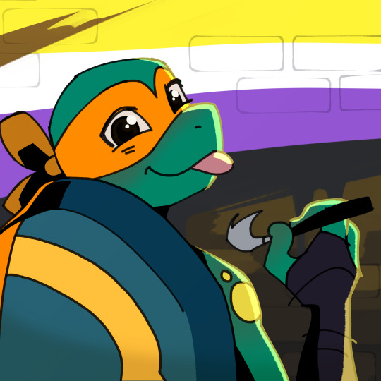
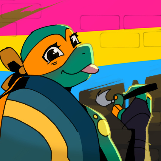
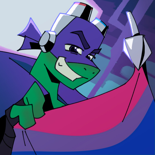
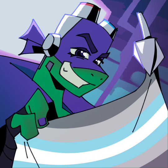
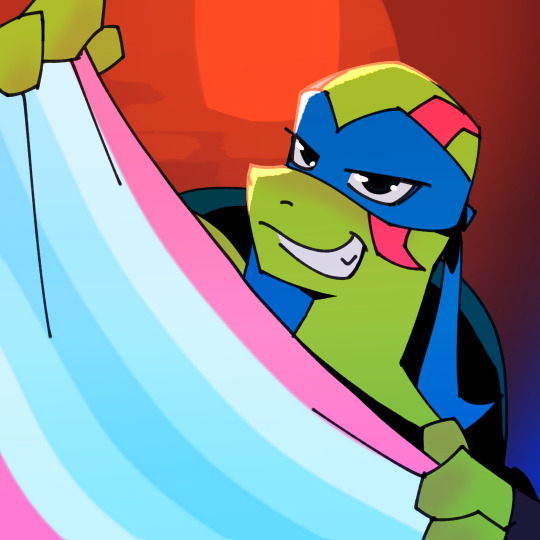
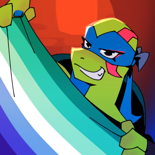
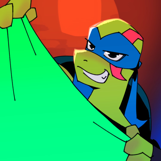
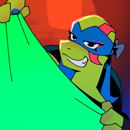
ROTTMNT Pride Flag Icons
The response to my last post about these was very encouraging so I finished them! Here are some examples using popular headcanons and/or headcanons that I like (so hard to pick cause there are so many great ones).
Below these examples are some rules for use and then below that are the blanks with the green flags for you!


Rules: First I wanna acknowledge that there's nothing I can really do to stop people using these however they want, and while I would disapprove, I'm not going to get mad and fight you about it. I won't give you the attention.
If you have any good faith/genuine questions or criticisms about these rules please let me know.
TLDR:Keep it respectful and PG.
Who can use these? I don't mind anyone using these if it follows the rules. Please credit me in some way if you use (even if it's just a text post), and don't claim that they are your own. If you would like to use it in a way that isn't specified here or with a flag not mentioned, feel free to ask.
Editing? I don't mind if you want to add small details, adjust colours etc, but I'd rather you didn't make large adjustments that could really change the overall picture.
How do I use these? I actually have no clue how to mask over a colour in a flat image, these are all clipped over the flag colour layer. If you do know please feel free to leave a comment. If you would like to request a specific flag go ahead and ask. If I only get a few requests I probably won't mind doing them for you. This is not a guarantee though, and it just depends on what I have going on and how I feel at the time.
What flags can I use? This is intended for flags that represent or support LGBTQIA identities. To be clear this does NOT include anything like TERF, MAP or Zoo flags. Also please don't use any flags representing kink and stuff.
Country flags? That is not the intended use and I'd really rather you didn't, however in the end as long as the flag isn't being used in a way that supports war, genocide or bigotry I'm not toooo fussed.
I really hope I'm being paranoid and this won't be an issue but I feel the need to say it cause I've been on the internet long enough to know it's full of trolls, grifters and creeps. If you see anyone being problematic, bigoted or disrespectful with these feel free to let me know. Free block list.
One last thing: There is a more "fem" leaning/alt version and a more "masc" presenting version. I tried not to get too carried away with changing their designs in the alt version. Also I'm still trying to figure out this style so it's not perfect but I was flattered that you guys were interested so I wanted to finish them off. Also they were designed to read well on a small scale so a lot of choices were made specifically to try and increase readability when they're itty bitty and some things might look slightly odd on full scale? Anyway.
Ok without further ado here are the blanks (I hope you can get some use out of them and enjoy ^^):


#rottmnt#save rottmnt#rise of the teenage mutant ninja turtles#rise of the tmnt#save rise of the tmnt#unpause rise of the tmnt#unpause rottmnt#rise season 3#rottmnt leo#rottmnt donnie#rottmnt mikey#rottmnt raphael#rise leo#rise mikey#rise raph#rise donnie#pride month#queer#queer headcanons#lgbtqia#rottmnt fanart#tcest dni
142 notes
·
View notes
Text
EXTREME VOLUME WARNING(probably)
ugh I spent wayyyy too long editing this video lmao
Anyways here's Tails getting slightly overcooked and turning slightly explosive for his second birthday this year
Happy birthday Tails (again)
Bonus stuff under the cut
Screenshot I took that looked cute, before turning up the saturation on Tails in the final video lol

So after the time I coincidentally microwaved Tails on his birthday back in October, I decided to commit to the bit again
Y'know... since he has two birthdays (16th October and 21st November)
Also. Because on top of these two screenshots, I've had some of my friends ask me to make Tails explode for some reason
hope i did good lmao
I tried a lot of new things in this project, mostly revolving around other methods for masking objects (Luma key my beloved and utterly despised), and a little bit of messing around with colors to get Tails to look a little bit more like he's behind the window rather than on top of it
I even made a crude texture to mimic the mesh over the microwave's window
Here's what the Fusion tab looks like in my Davinci Resolve project, it's... almost readable...
i had to fullscreen the window just so i could zoom in enough to see the text
There's still a ton of issues that I have with the video, mostly because I couldn't really get Tails to look like he's behind the door (without it looking even jankier)
Also throw in a good ol' dose of wack motion tracking (surprise surprise it's hard to track a reference object when it goes completely into shadow LOL)
But ehh for a first attempt I'm pretty happy with the result
I might try doing something like this in the future, when I have time
maybe
Ok ok one more thing
micro.wav has been living rent-free in my head since October, that song is catchy af lol (I've been listening to it nonstop since the first microwave video)
wait if it's been 32 years since Tails was born and he has 2 birthdays per year does that make him 64 years old
55 notes
·
View notes
Note
Hi April!
I have some of questions about the public-facing transcripts of Magnus Protocol.
They have a very “shooting script” vibe. Are these the same as what’s given to the cast, a very close derivative, or something else?
If they aren’t what’s given to the cast, when in the process do they get made?
A weird copyediting question: What drove the change from the monospaced font (I think Courier New) to the bolder sans serif font? And is there a reason the headers and footers are the old style?
An esoteric “my masters is in rhetoric” question: The scripts contain quite a bit of content that isn’t in the audio. In the other hand, I hear that The Magnus Protocol is a podcast. Are you able to talk about your personal opinion on their relationship to the text? I’m not asking for an answer on authorial intent or the “on high” answer, but I’m curious how various people involved in making Protocol think of them. (As an example, I’ve been thinking of them, to go back to the as “apocrypha”; I think of them as true, but also not as part of the text, if that makes sense. More like annotations or marginalia.)
Anyway, welcome to the public Tumblr stuff! It’s cool to have you here.
Oooooh very happy to answer this, mostly because I think it’s a neat example of how we work as a team.
The short answer is yes the transcripts are derivative of the shooting scripts but they aren’t the same.
Alex and Cathy are both very sensitive audiophiles who have worked together to make those layers and layers of interesting audio bits some people catch but others don’t (the lie glitches are an example as well as the whispers in episode 10) Conversely, I have mild progressive hearing loss and handle the transcription.
As I am also the producer, I know all of the plot points, beats, and important bits that need to be communicated for the story to work. I use the shooting script as a guide and listen to the final release audio along with the shooting script and make edits as I go. Sometimes different takes are used, sometimes audio cues change etc. I also try to obfuscate information that’s not yet revealed in the timeline.
I will admit I don’t catch everything, and definitely make mistakes, but ideally the transcripts are designed in such a way as to make sure people who may not be as keyed in to the highly detailed audio execution can get a similar experience by reading the transcript. I have such respect for Cathy for the work she puts in artistically, we want to make sure people know what they’re hearing.
Our audio team are exceptional in such a way that they are constantly trying to balance creative narrative with accessibility. You can get all of the information in the audio, but we recognize that’s difficult and we are often people’s first experience in audio drama, so we balance it with the extra information in the transcripts.
The layout and design of the transcript was influenced by external guidance for the visually impaired who recommend 14 point bold Ariel as the most readable. We also release Word versions so people can use dark mode or adjust font size and style if needed. Accessibility is different for everyone, we do our best to make sure we have options available.
—
For amusing behind the scenes mistakes I know I have made:
People may have remembered the old pilot had ‘Norris’ labeled as ‘Martin’ this was because we changed Norris’s name so many times I didn’t know what to call him and accidentally forgot to change the Martin placeholder. 😬
So yea. I’m not perfect and nor are the transcripts but we try our best.
73 notes
·
View notes
Note
hi lovely!! do you have any tips on making cool fun and sexy typography?
hey joanna!! this made me giggle haha, i'm not quiiiite sure how to answer that, but here are some tips i keep in my when i do typography, and some examples:
FONTS
don't be afraid to "shop" for fonts and try funky fonts you've never used/seen. i often try so many before settling. i almost always use at least 2 different font for gifsets, even 3 sometimes. i think a good font pairing can do a lot for a gif. it's usually something like:
serif + cursive/funky fonts (example)
sans serif + cursive/funky fonts (example)
serif + sans serif fonts (example)
two different cursive/funky fonts (example)
or even simply the same font but all caps + all lowercase (example)
in case you're unsure where too start or want inspiration, here's a great resource: usergif's font pairing guide and its fonts page
BLEND MODES & LAYER STYLES
i think playing around with different blend modes and layer styles will always elevate your typography game, in my opinion. it's usually a bit more dynamic than just an opaque color. tho this minimalist typography can also be really good.
when you double click on a text layer, you get all the layer style options, as well as the blend modes. a very popular layer style is setting the layer's blending option to difference, paired with a color and/or gradient overlay (often set to multiply/color dodge). a drop shadow is also important so the text is more easily readable. we often see a black soft drop shadow, but don't hesitate to be creative with it, for example a thick, hard line, colorful drop shadow.
i feel like this step often takes the most time for me because the possibilities are endless. definitely play around with layer styles, especially drop shadow, color overlay, gradient overlay, stroke. and also try different blending modes for these settings.
as for the layer's blend mode, also definitely play around with them. and keep in mind that the text's color will also give a different result, it doesn't have to be white + blend mode set to difference, even tho this is a classic that works well.
TEXT WRAPING & POSITION
a great feature on photoshop is definitely the text warping tool. to access it, right click on a text layer and go "warp text". from there you'll get a few different styles and setting sliders. my favorites are flag and wave (example). you can always go back to edit these settings once they're done by right clicking again. and you can even keyframe/animate these settings!
typography doesn't always have to be centered and straight, i often prefer it on a side and rotated a little. you can easily rotate typography by selecting the layer(s) and hitting ctrl + T. you can also play with the skew and pespective after hitting ctrl + T by right clicking the canvas and clicking on either. these will give different ways to move your text.
SIZING
i love playing around with different font sizes, it makes the typography more interesting in my opinion, and it's a way to emphasize some words.
so for that reason i usually put each word on a different layer so i can edit each word separately. sometimes i will also put each letter on a different layer, because it can be interesting to offset/rotate some letters sometimes (example) (another example).
i often pair a quite small serif or sans serif font with a much bigger funky font (example). and often that bigger font will also have different sized words (example). i play around a lot with this!
ADDED EFFECTS
there are some things than can be done to enhance typography:
adding a colorful rectangle block behind the text (example)
using text symbols such as quotation marks or backets (example)
using lines around the text (example) (another example)
these can definitely bring typography to a different level
MORE RESOURCES
great font website
usergif's typography tag
my fonts tag
this is all i can think of right now, i hope it helps :D if you have any question on a specific text effect let me know, i can definitely make a tutorial!
#alie replies#silversmists#typography#photoshop#*ps help#resource#completeresources#allresources#resourcemarket#usercats#userabs#userpjo
221 notes
·
View notes
Text
How could Serena have become Vivian? (theory)
more of a ramble, + extension of my previous posts about this. quoted text is from various wikis, reddit threads, etc (slightly edited for readability) & an hi3 tweet.


"Misteln was born from Ceclila's act of splitting her body and stigma, with the Schariac Stigmata Space, and with the Abyss Flower to cut into the Imaginary Space."
Cecilia Shariac had something called "Holy Blood", and only her and her descendants could wield the abyss flower. the holy blood is a result of Otto Apocalypse attempting to make "the secret weapon Spear of Destiny, which was the HSN-b46 serum that neutralizes honkai, also considered as the completed holy blood." very similar to the Exaltist's aim to create the Sacrifice Serum, meant to allow humans to exist in and outside the hollows.


"Cecilia had used one half of her power to repel Honkai away in a massive radius. Her holy blood, which Otto warned her not to use, was used. Sadly, it was used to the extremity to stop the Core. Since the core would be foreign to the Imaginary Space, she would succeed, and then die. [Basically, she sacrificed herself.] After some time, Misteln, without a name, appearing with what was now a human form, was now living stigma, one that manifested in the world after the Second Eruption... At that time, she would constantly slip out of reality itself, since she is a being from the Imaginary Space, and couldn't exist in reality."
The Abyss Flower, which holds the power of the Herrscher of Death, the Key of Creation.... "Can split into two separate weapons, with each taking either recreation or destruction (White Flower and Black Abyss respectively)"
from Vivian's trust event: "[Without much hesitation, Vivian picks out a small pot of purple flowers.] ... This is a purple-leaf violet, one of my favorites. ... These clusters of purple-leaf violets look like butterflies, ready to take flight. ... I can't help but think... when the blossoming season ends, even though their petals seem to wither... But in truth, they deceived everyone, shedding their old form and soaring into the vast sky."


Castorice/Thanatos:
— This sea of flowers blooms on dead land because we sowed it with our tears of loneliness... Yes, the only thing "Death" is allowed to create are flowers that bloom from blood and tears.
— "You shall wither, and through that, the dead will sprout again from the remains, and be reborn again with the dead flame..."
— You've been tempered by life and death. I know you'll be able to give this wasteland its first breath of life... Like a raven butterfly flying switfly into the nether realm, perching on the twig of death.
The Reaper ("Death was originally a pair of hands.")
— [Thanatos]: If the Reaper raises their left hand, the soul is granted death and allowed to enter the nether realm to await reincarnation. If they raise their right hand, the soul is rejected by the nether realm and returned to the mortal realm to continue walking the earth.
Hugo:
— Heads represents lies, and tails, death. Yet the result has long been decided.
— "When the musician's third string breaks, the Gatekeeper whispers to me: In which hand hides the coin for the underworld ferryman?" // "The left hand holds death, the right hand holds deception — but the raven has already flown away with the answer."
— Heads for the flowers that bloom in the abyss. Tails for the dawn that sets the world alight.
— A coin for the ferryman of the dead. Guess; is it heads or tails?
— You know, the world is full of contradictions yet remains unified. A cat can be both alive and dead, I can exist in both light and shadow...
Plus. there's a trust event thing with hugo where he asks you to pick which hand he's hiding a coin in, and you can choose "right, left, or neither". i've done all options and basically both hands are holding a coin. whatever you answer, he gives you a prize in return- he sneaks something into your pocket, a flower. specifically, a flower made of folded dennies. (dennies are money, usually coins)
#theories#pics#zzz#zenless zone zero#vivian banshee#vivian zzz#honkai impact 3rd#hi3#hi3rd#misteln schariac#honkaiverse#honkaiverse theory#zzz theory#zenless theory#zenless lore#honkai star rail#hsr#castorice#hugo vlad#serena ravenlock#hugo vlad ravenlock
11 notes
·
View notes
Text
Index of Enhanced Edition Con Videos
I'll maintain this index in a pinned post for easy reference. Click the links to go to the YouTube videos, or click here for a more readable Google Docs table which includes these links plus a tab noting which events I skipped, temporarily or permanently, and why.
Link to my YouTube channel. Playlist in chronological order by panel.
The below list is in the order I published them so you can easily see what's new.
2007-11-11, Chicago - J2 Breakfast (00:23:42)
2007-11-11, Chicago - Jensen Solo (00:21:55)
2007-11-11, Chicago - Jared Solo (00:29:44)
2007-11-11, Chicago - J2 Main Panel (00:38:24)
2008-07-27, San Diego Comic Con - SPN Panel (00:50:52)
2008-11-16, Chicago - J2 Breakfast (00:26:16)
2008-11-16, Chicago - Jared Solo (00:26:20)
2008-11-16, Chicago - J2 Main Panel (00:35:04)
2008-11-16, Chicago - Jensen Solo (00:34:36)
2009-08-30, Vancouver - J3 Breakfast (00:31:53)
2009-08-30, Vancouver - Jensen Solo (00:27:17)
2009-08-30, Vancouver - J2 Main Panel (00:30:25)
2009-11-15, Chicago - J2 Breakfast (00:32:24)
2009-11-15, Chicago - J2 Main Panel (01:08:50)
2010-10-10, Chicago - Mishalecki Breakfast (00:32:48)
2010-10-10, Chicago - Misha Solo Panel (00:24:22)
2010-10-10, Chicago - Mishalecki Main Panel (00:29:33)
2010-10-10, Chicago - J2M Main Panel (00:29:07)
2011-08-27, Vancouver - Misha Solo Panel (00:54:47)
2011-08-28, Vancouver - J2 Breakfast (00:30:40)
2011-08-28, Vancouver - J2 Main Panel (01:03:46)
2007-08-28, San Diego Comic Con - SPN Panel (00:41:09)
2008-01-19, Fangoria (Austin) - Jared Panel (00:42:55)
2008-03-30, Los Angeles - J2 Breakfast (00:25:42)
2008-03-30, Los Angeles - Jared Solo (00:25:04)
I'm now working on Jensen's solo panel from LACON 2008.
Thank you to everyone who has shown an interest in these videos. The reblogs and likes all made me very happy, and I especially appreciated the kind comments some of you left in your reblog text and tags. I'm unsure of the proper Tumblr way to respond directly to that in a way that won't annoy people, but I've definitely noticed and appreciated it!
An explanation of this project and my plans for it are listed below the break. A lot of it will be familiar if you've read my earlier posts, but it's more detailed -- and excessively long! There's also some info on how you can help, especially if you have any old videos or audio files that you'd be willing to contribute.
Why Do You Call These "Enhanced Editions"?
The videos I'm using are not my own, but I've spent many hours adding enhancements to them. My goal is to make these the most watchable and accessible versions of these older convention panels published to date. Credit and links to the original videos are in the video descriptions. These are the typical enhancements you'll see:
When possible, I'm upscaling the videos. This doesn't always work, especially on videos that are lower quality to begin with, but sometimes it makes a significant improvement in video quality.
When necessary, I'm correcting colors on the videos to try to make them look more natural and consistent. I'm very inexperienced in this area, and I don't consider it to be one of my strengths, but I'm learning.
The original videos are usually in multiple parts, but I'm editing them together into a single video as cohesively as possible. I may use videos from multiple sources to provide the most complete video possible, and I'll select the ones with the highest video quality and/or the best view of the action available. Sometimes I have to make difficult choices between the video with the best view (meaning a clear view of their actions and/or facial expressions) and the video with the best quality. I usually lean toward the one with the best view in those cases. I also choose the clearest audio I can find, so the audio you hear didn't always come from the video you're watching.
I'm adding extra content to help clarify references people make during the panels. The videos I've worked with so far don't take up the full width of a modern video frame, so I've taken advantage of that extra space to display the extra content to the side where it's less obtrusive. There are explanations for obscure references that are way funnier when you understand what they mean, plus episode references to help jog the memory for those of us who haven't rewatched the show a million times. In rare cases where I think it will enhance understanding, I'll insert brief episode clips that highlight what they're talking about.
I'm putting a LOT of time into adding good, color-coded English subtitles that can be turned on and off with YouTube's CC button. These videos can be frustrating to understand because the audience often drowns them out and Jared and Jensen tend to talk at the same time when they're together. I can't always figure everything out, but it's far better than the crazy, auto-generated nonsense that many videos have. YouTube can then translate my English subtitles into other languages, so this improves their accessibility. The color-coding helps with telling who's saying what: red for Jared, blue for Jensen, green for the general audience, yellow for the current fan at the microphone, and white for other people such as staff.
If there's missing footage that I can't find anywhere, then if I can find a source that seems to have reliable details about what was discussed, I'll add static images with a brief summary and a link to my source in the video description.
What Conventions Do You Plan to Enhance?
I don't want to make grand promises that I'll enhance videos for every old convention, although I definitely love the idea of doing so. How far I go with this will depend on how much sustained interest there is from other people and how much spare time I have myself.
My main focus is the panels with Jared and/or Jensen. They're the ones I'm most interested in and it takes a certain level of obsession to spend this many hours watching the same video over and over as part of the editing process! If I obtain any mostly-complete videos of Misha's solo panels that upscale well, I may also do some of those. I have done a couple of his already. He will also of course be included if he's in a panel with Jared and/or Jensen.
I haven't quantified exactly what "old" is, so I can't tell you I plan to work on all videos up through a specific year and then stop. For now I'm just plowing my way through with blinders on until one of four things happen: 1) I don't feel like I'm adding any value any more, 2) I no longer have the time or energy for the project, 3) everybody else has lost interest in the project and nobody's watching anymore, or 4) I've reached cons that are recent enough that the original video takers don't want their videos used for this project.
Can I Help?
If you have any old convention videos or audio files that you're willing to contribute, please message me! Maybe I can use them, maybe I can't, but the more I have to work with, the better chance I have of creating something more complete. If I do use your material, I'll credit you in whatever manner you prefer.
Even if your videos are on YouTube, it would save me a lot of angst if you could reach out to me and let me know about your channel in case I haven't found it already and confirm if you'd be ok with my using your videos. If you have videos that you don't want me to use, please let me know that too and I will respect that. I spend a good amount of time trying to track people down before I use their videos. If I can find a way to reach them, then I request permission first. I've managed to make contact with several very generous people, but a lot of people have also fallen off the face of the earth. If I can't find an active account for someone, then I go ahead and use their videos, but always with some trepidation that I might eventually piss someone off. Many of the older videos have already been republished by other people without credit, and I do always credit my sources, even if I only use a second or two of audio from their video.
If you send me videos that I'm able to upscale and/or color correct, then I'd be happy to send those updated versions back to you for your collection regardless of whether or not I use them.)
Even if your video looks terrible, you might just have a missing piece of footage that I couldn't find anywhere else, or your video might upscale more easily than another. Some of the footage I've gotten the most excited about has been audio-only footage or very low quality video footage that captured a few seconds from a panel that nobody else captured. If nothing else, I might be able to hear something in the audio that will help me fill in a subtitle I couldn't figure out.
I've greatly appreciated everyone who has contributed to this project by freely sharing their recordings. I also appreciate everyone who has watched my videos and especially those who have taken the time to let me know that you're enjoying them or benefitting from them in some way. Thank you!
#enhanced edition con video#j2#jared padalecki#jensen ackles#sam winchester#dean winchester#supernatural#index
146 notes
·
View notes
Note
Do you have any advice on how to learn to read faster?
not faster necessarily, no, pretty much all of my advice is abt learning to read slower sry. since most my problems are abt memory & fatigue & hitting yr cognitive threshold for the maximum amount of info you can absorb in one sitting, things like rereading & taking notes in the margins are abt forcing myself to go slower so i rly digest what it is im trying to read.
an app like instapaper, which can save articles in dark mode/large font/preferred line spacing reduces some of the difficulty for me, which i guess leads to being faster? and having the audiobook play at the same time as im reading can help too. covering up yr page (i usually use a bookmark) except to the line that yr reading is helpful to reduce the fatigue of yr eye jumping ahead on the page. i get pretty picky about the books i buy bc i try to avoid any editions where the text is too small & cramped on the page. if there is a hard passage im rly not getting, i read it out loud to myself. i use my pencil to follow along and point to the words im reading. i give myself lots of breaks so i don’t burn out. when its rly important (like having to read complex articles for my grad classes) i would try to read in bed around 10-11am bc that tended to be my best time cognitive energy-wise. difficult to do if u have other things that are higher priority, but sometimes you gotta be gentle with yourself and go “i had to prioritize [x thing] so i have less energy to spend on reading for fun, and it’s okay that im gonna be slower”
oh also! maybe look @ yr toolkit of pre-reading strategies. before i sit down to read something closely, i skim the abstract, the author bio, the section headings/chapter titles, the bibliography, the end notes, the index. i highlight anything that might be interesting or relevant. this helps give me an overall sense/shape of what im going to be reading. it gives me “anchor points” to tether information to. if you feel like yr rly wading thru mud, maybe u need to practice yr pre-reading strategies (like exercising a muscle, it gets easier to more consistently u do it)
also, you may just be reading something that’s rly hard! we had to read a lot of Elfriede Jelinek and like — she’s difficult to read, and deliberately so as a philosophical/stylistic choice. also, if yr reading a text in translation, i find that browsing a few translations beforehand or asking around which translations my friends like makes such a huge difference. a lot of public domain translations (like the cheap dover thrift editions you can get secondhand rly easily) are ASS when it comes to readability. like i had my Lattimore translation of Oedipus beside one of the public domain ones and it was like night and day in terms of readability.
lastly, idk yr reasons for wanting to read faster, but if it’s something like yr workload for a university course — i would usually email my profs to introduce myself in the summer before term or over winter break. i’d say i’m looking forward to their course & ask politely if they had their reading list on hand bc being able to read in advance made a big difference with how i could keep up with the workload during term time. and also importantly: if i was truly struggling, i would ask myself “is this a normal human being amount of reading to assign? or does this prof have expectations that are not grounded in reality?” bc sometimes the latter is v much the case! and you should just release yrself from putting undue pressure on yrself. try yr best but don’t beat yrself up for something that is an impossible task.
#future literature tag#most stuff online abt reading faster is by hucksters and charlatans#especially ai stuff#like proquest try to force an ai feature that summarizes articles?#my brother in christ that is what the abstract is for
8 notes
·
View notes
Text
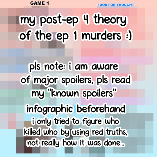
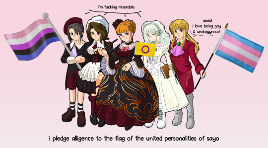
im back after ep 4 umibros.... and i come bearing my thoughts.
pls note.... i have a huge advantage as i know some major spoilers, but i still had fun trying to figure out who did what and why.
i did NOT know who killed who or how many killers there are, or how many accomplices there are or who they are, i went through the red truths and thought about it.
anyways. major spoilers and theory stuff undercut.
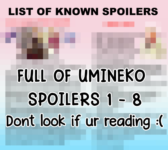
this is the list of stuff i already know. i wasnt planning on reading umi at the time, but i was curious and ended up looking some stuff up before i started.
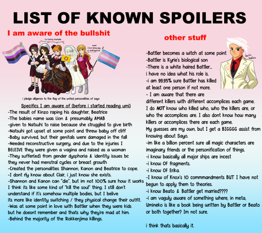
crop for fun & readability.
anyways. onto my thoughts.
when reading through the tips i kinda got surprised reading the note under Rosa, it immediately made me think of Maria because of what happens in ep 4. that + her kihihihihihi laugh made me think that anyone with the kihihihihi in their tips page was probably killed by maria. i have no idea how, but because all the heads were smashed, im assuming a GUN?
Not going to pretend I know how the Shannon body thing works. Everyone else lured out by Maria or Shannon.
you may be asking, okay. how dod they get into eva & hideyoshi's room. well. i am currently working under the assumption of a hidden passageway. "BUT THE RED TRUTHS" STOP!!! Beato says there is no more than 1 hidden passage way..... but... IF THEYRE ALL CONNECTED.... perhaps that counts as one? :) I have convinced myself that there are secret passageways throughout the mansions for quick traversal. With this premise, they can simply leave Eva & hideyoshis room via the secret hatch..... and its just Maria and Shannon/Kanon, so theres nothing really threatening about them as they're children, it's wouldnt be SUPER weird for them to be invited in. or they simply came in and left from the same secret entrance.
i do not know why the servants are going along with this.
I believe either Maria or Beatrice shot Natsuhi. My brain says Beato, but the text makes me thing Maria?
I explained most of everything else in the post, but i have no idea whats up with battler.
-------
EDIT: after chatting with oomf about why I think think the way I do about what happened, i have stumbled upon MANY ADDITIONAL SUSPICIOUS things.
1) HIDEYOSHI IS EXTREMELY SUSPICIOUS.
Iirc Hideyoshi & Nanjo are the only two people to really "see" Shannon at the beginning. I believe it is simply implied that she was the same as the others, but never actually seen by Battler.
Further more, this makes the Eva & Hideyoshi locked room much more sensible. It's possible Hideyoshi killed Eva, but I don't think he really would? I think it's more likely Hideyoshi helped kill & move the other 5 adults in the shed. And later on, Sayo kills Eva & Hideyoshi? I'm not 100% sure what happened there, but I now believe Hideyoshi is extremely suspicious and in on it. I also choose to bump Maria down to accomplice instead of active killer.
2) "Maria's" involvement
Due to the above, Maria's involvement now make more sense to me, as I didn't really think she could shoot someone. However, I will also say that the kihihihi's in the tips are probably Beato's delusion of Maria. In that this is what Beato's believes Maria would want / she is pretending they are doing this together in her imagination.
3) Something I'm missing
Currently, I believe I am missing SOMETHING, and I think that something is relates to accomplices. When thinking about the other episodes, I have now started to believe that someone is chosen at random for... some reason... and that they and their family temporarily become "in on it".
I was thinking about Hideyoshi & Eva with this & working with the assumption that, along with Hideyoshi, Eva was also in on it and maybe George? But only temporary. So basically:
-someone is chosen at random(?) to be an accomplice
-that person and their family temporarily become in on it
- that family can never survive and must always die in their given episode
I don't feel like typing it all out again, so here's what I said to oomf:
"I think, for whatever reason, each episode someone is randomly chosen to become an accomplice. Idk how or why. And the accomplice that's chosen, it's like... their family temporarily becomes in on it? But they almost certainly are killed by the end.
I'd have to think more about episode 2, I don't remember it well, but.
IF this is somewhat correct...
Hideyoshi is almost certainly in on it at this point. And to that extent, Eva & George may also temporarily be "in on it". I'm not too sure about this part. Anyways. Hideyoshi & Eva are killed with stakes and George is "missing" at the end.
I don't remember the details of episode 2 very well, but Maria & Rosa were a central focus and I THINK they both died in their end?
In episode 3, you kno I'm sus of Batter and his family for the Eva-Beatrice & Hideyoshi thing. They all died.
In ep 4, Jessica and Krauss are both sus, along with others. It's not as prevalent but it is there somewhat.... Jessica's family all died as well.
Curious....."
In conclusion, for episode 1:

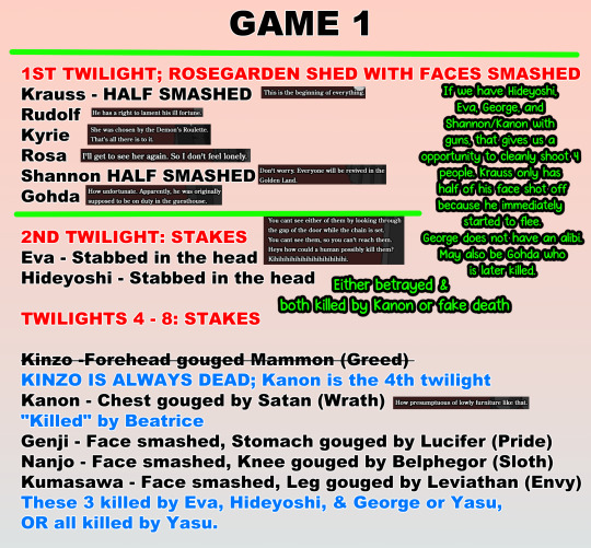
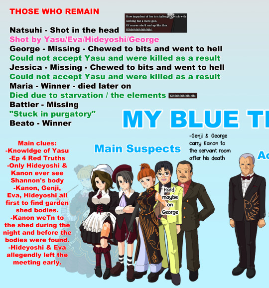
Thanks for coming to my Umineko Ted talk.
11 notes
·
View notes
Text
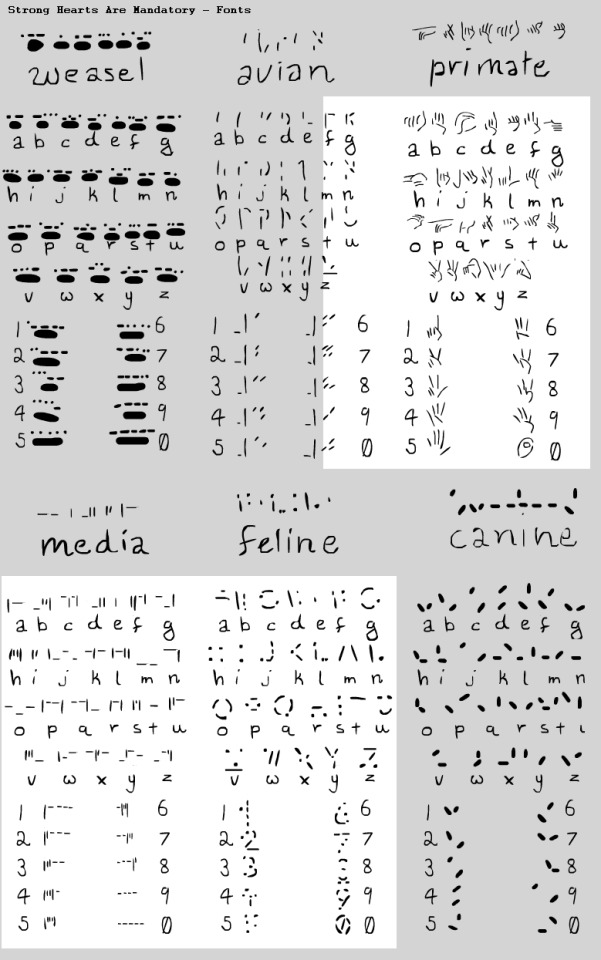
Still working on this but some alphabets for Mandatory!
Feline or Cats Scratch - is indented, so anyone can read it even without sight as long as they can touch since it's the clawmarks in the parchment that makes it readable, text is on textured rollers or haptic screens for monitors so they can read messages from their supervisors or the council. To become a Median you must have some knowledge of Cat Scratch and Cats Tongue to become verified and be given your handle.
Media's Type is directly related to Cats Scratch, but is designed for the computers and haptics, all Medians must learn this.
Avian or Birds Peck - works similarly and is both pecked and clawed, so there's more openness on interpretation of the letters but it's easier to do with a talon.
Primates Sign is written and signed often, it is the least used in Media but was made for ease of having an alphabet in Deviate. They also have a short-hand which is intensely more complicated but shortens sentences significantly. I may make it in the future or have it cameo in the comic!
Weasel's Claw is a new edition and is done with their finger tips and entire paw print for each letter, a much bigger font for some, not so much for ermines.
Canines Dig is the simplest, but can be the hardest to understand.
Each is referenced or inspired by certain alphabets to keep it mildly educational to myself and it's really fun so far! c:
60 notes
·
View notes
Text
Detail from "Miniature garden girl" official PV that hasn't been noticed for almost 16 years!
Official PV of "Miniature Garden Girl" was released on July 3, 2008, and has a lot of illustrations, not only Suzunosuke's. And there is this illustration among another ones that appears between 03:03 and 03:19 :
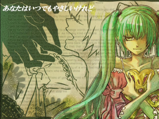
By the way, curiously, Michelle's arms in this art are placed the same way as Eva's in "Moonlit Bear" PV, that was released on the same date as "Miniature Garden Girl" song (but not clip) — June 22, but a year apart.

The fact is that the background of this illustration is text in English. What's it about? Well, it isn't "Lorem ipsum", and that's all able to know. If the illustration will be edited by right way, only some of the letters will be readable, the rest is unreadable not so much because of the quality, but because of the outline of Michelle's profile.

So, these are all words those are able to read:
my thought ... (will?) no (... c_agens?)
(use?) my (eyes?) ... (remember?)
to... words (and want?)
As for any kind of (future?)
(reach?) you (sometimes?)
(...time?) (memory?) (together?) (some...?)
(not come) back (anymore in...?)
that that
(quietly a memory want?)
(and for height?)
quietly a (memory?)
(something _and?)
(stillness?) ... of a (wing?) feeling
(...stars) who (beg?)
millions of (years?)
(us ... impression?)
... (if?)
(not?) stop (we?)
As you see, the text is difficult to index at least because there is nothing to type into Google for getting any result. But does this make sense, what if the text is inserted as decorative feature only? Yes, the probability of this is high, however...
The fact is that the clip was made imitating the about Victorian or Art Nouveau styles, and yes, inserts in the form of text from English-language newspapers of the early 20th century are sometimes used for creation of pre-WW1 epoch. But here the case is a bit different: firstly, the text looks more like a passage of a letter or a novel, and secondly, the font used in the background looks like a font from a simple HTML page, without the serifs mandatory for newspapers of more than a century ago. Yes, the lack of serifs can be explained by resolution, but if they were really there, it would be even more difficult to read with such quality. Another thing to point out is the "that that", which looks like an obvious typo or machine translation error from 2008, which raises two questions: where did the text come from, and, if the text was made up by mothy or the illustration author, where is Japanese original?
However, knowing that the canon of EC was changed a long time ago, this is already of archaeological interest. But it doesn't cancel the fact that no one paid attention to this detail for more than 1,5 decades.
28 notes
·
View notes
Text
Warhammer 40,000 Balance Update for October 16, 2024 - Munitorum Field Manual and Errata for Xenos Factions
After writing, I decided to split this document up into the super factions for ease of use. I've also changed how I format rules changes. Let me know what you think! Is this more readable, would you prefer a single post, or should I do a post for each faction?
Edit: The color coding for points changes breaks every time I edit it. To fix it, I have to go into the HTML and correct where it's marking things. I just don't have the spoons for manually correcting that much text.
Aeldari
Form their lofty perch, Aeldari have gotten to a point where they could use some love. While their win rate is near spot on, they're having trouble making it to top tables. And the players that are, usually run Ynnari. But will GW give them much of anything or let them ride until their Codex comes out?
Here we run into another issue. The changes are being made directly to the Index. This is good. GW should definitely do this. But do they tell us what's changed anywhere? Answer, they've put it in the document for the Index Cards. It's important they put it somewhere, but I really wish they had it spelled out somewhere where the changes are listed.
So what's changed? The standard Autarch now has the basic Captain ability as detailed in the last Balance Dataslate. That's an important change to have listed finally. For FAQ, we get another common sense answer for Wraith Guard and clarification on how to properly position a jumping Yncarne.
All Corsairs: -2 pts/model Falcon: -10 pts Fire Prism: -10 pts Shining Spears: -10 pts/3 models Warlock Conclave: -5 pts/2 models Warlock Skyrunner Conclave: -5 pts/model Wave Serpent: -10 pts Wraithblades (5 models): -10 pts Wraithguard (5 models): -10 pts Wraithknight: -15 pts
As for the points, it's all good news! GW really is getting much better at understanding what's going on in the game! The important stuff here are the buffs to vehicles and Wraith constructs. I don't know if this brings Wraithknights back to the table, but small groups of Wraithguard might be worth taking again. I'm not sure these changes will convince anyone to bring a Conclave on foot though. All of this is good news for Eldar players!
Drukhari
The article warned that nerfs are incoming. Still I hope they only get a love tap. Their rankings are greatly bolstered by skilled faction specialists. No one is currently running out and buying up Drukhari models because the faction is good. Granted if GW successfully brings down the factions above them, there might be an issue. But I hope they don't go beyond a love tap.
For Errata, the Archon is specified as having its own ability, not Lord of Deceit. I don't think there's anything Drukhari can take to stack with it, so that shouldn't be an issue. My guess is the team is considering changing Lord of Deceit in some way. It is really strong. So this makes sure that change doesn't affect Archons. They also get a couple more clarifications for Pain Parasite, but there's nothing unusual here.
Archon: +10 pts Beastmaster: +15 pts Court of the Archon: +10 pts Drazhar +10 pts Hellions: -2 pts/model Incubi: +2 pts/model Lelith Hesperax: +10 pts Mandrakes (5 models): +5 pts Reavers (3 models): +5 pts
Yeah there's a lot there. I think that's a whole unit gone from many Drukhari lists. We also see that GW is continuing to recognize that some MSU spam is just really good. This really is a good thing, and may be slowly turning me around on purchasing units in bricks. But it sucks when you're already really nerfing an army.
Drukhari could be hurting.
Genestealer Cults
I'm about to say something that might shock some of you. I honestly don't think GSC is doing that badly. They've actually got solid numbers, though this come from the fact they're a niche faction with skilled specialists. But I think that's okay. I think it's okay for some factions to be there for the fans and require a little skill to play. It's very obvious that while GSC can struggle in match ups, you can get results with them. What they mostly need is internal balance, and I think that will come to rules.
For errata and FAQ we get a revision that makes sure you take a GSC model as your Warlord in the Brood Brothers detachment. We get a common play clarification for Tunnel Crawlers, but a very interesting clarification for Brood Brother Kasrkin. Despite not having the Voice of Command Army Rule, Kasrkin can still give themselves orders. That makes them a much more powerful and versatile unit in the Brood Brothers detachment. Still not sure that's enough to make that detachment even close to good, but it's interesting at least.
Abberants (5 models): -15 pts All Acolyte Hybrids: -1 pts/model Acolyte Iconward: -10 pts Atalan Jackals: -2 pts/model Benefictus: -10 pts Jackal Alphus: -5 pts Neophyte Hybrids: -5 pts/10 models Patriarch: -10 pts Primus: -10 pts Outlander Claw: - Serpentine Tactics: -5 pts
Oh boy! Christmas just came early for my cults! Still, I'm actually going to say these aren't the best changes. A lot of these changes benefit Outlander Claw, the Mad Max style detachment. And that is currently the best GSC detachment and my personal favorite. While the other detachments will love these changes too, I'm worried that Outlander is going to become the only way to play GSC. There's already a Wolf Jail like list running around the scene, and no one likes dealing with that list. The only good news is I doubt this is going to bring a huge flood of players to the faction spamming toxic bike lists. So while GSC isn't going to become a problem, it's only going to be a rare problem list that will frustrate players now and then.
Leagues of Votann
The Kin are another force that looks good from win rates but is actually struggling quite a bit. Like Death Guard, the Leagues struggle to secure the points they need at mid boards and up. This will hopefully get better if GW continues to get them new units, as their roster is still quite small. But for now, points aren't really the answer here.
FAQ wise we only get a timing clarification for Grudge tokens. And points don't have much either.
Einhyr Hearthguard (5 models): -10 pts Hernkyn Yaegirs: +10 pts
Okay. Yaegirs probably did need to go up, but I'm not sure this was the time for it. With so many other factions that are performing better getting all buffs, this is bad news for the Kin.
Necrons
After a brief stint as our metal overlords, Necrons have shifted to a pretty good spot. The main thing they need is some internal balance for their Detachments, and I don't think points will do that. Hypercrypt is just such a strong way to play the faction. Nerfing the models in the Hypercrypt builds threatens to drop Necrons too low. I think maybe only the Monolith can take a nerf without too much interference.
For Errata we start out with some Keyword fixes. Obeisance now benefits all Nobles and not just Overlords. And the Silent King is now officially part of the Triarch! However Plasmancers have had their ability to target Lone Operatives removed. So it's not all good news there. The FAQs are just common play clarifications too.
Annihilation Barge: -10 pts Catacomb Command Barge: -10 pts Deathmarks: +1 pts/model Doomsday Arc: -10 pts Lokhust Destroyers (1 model): +5 pts Lokhust Heavy Destroyers: +5 pts/model Monolith: +25 pts Obelisk: -25 pts Tesseract Vault: +25 pts Triarch Praetorians: -4 pts/model Triarch Stalker: -15 pts
That's a lot of shifting things around, and it's going to take me a moment to dissect it. As predicted, they bumped up the Monolith and Tesseract Vault with it, though I don't think many players were taking the latter or that it could be used as substitute. The dropped the cost on the Obelisk, but I don't think anyone's gonna try it out. Points aren't the problem there. My biggest problem here is Destroyers. While Hypercrypt did often take them, so did all the struggling detachments as well. And while faction specialists are going to experiment, I don't think these changes are enough to make Obeisance Phalanx really viable.
Things could be getting bumpy again for the Necrons.
Orks
As was said earlier, Orks are not in a good spot. While the nerfs they took didn't seem all that severe, they turned out to be nerfs to pillars that were holding the faction up. Since then, Orks have fallen hard and are the worst faction that has actual rules or isn't competing for its own players. And they're likely going to need a lot to rise back up.
The first big change is a clarification change to many rules that might help with some timing issues and future proofing. All or most rules active when you call the Waaagh now read they are active while the Waaagh is active for your army. This means if they change the timing on calling the Waaagh, as many Ork players would like, you wouldn't lose these buffs during your opponent's turn if you went second. While this looks like it might be nerf to Bully Boyz, the FAQ specifies that their abilities still work. We also get an FAQ the clarifies that when Snikrot uses Kunnin' Infiltrator, he doesn't count as moving for the purpose of Fire Overwatch. Though, he does still count as being setup on the board when he comes back down for the same stratagem.
Beast Snagga Boyz: -1 pts/model All Big Meks: -10 pts Boyz: -5 pts/10 models Deff Dread: -10 pts Deff Koptas: -10 pts/3 Gorkanaut: -15 pts Hunta Rig: -15 pts Kill Rig: -15 pts Kommandos: -15 pts Meganobz: -5 pts/model Morkanaut: -15 pts Tankbustas: -20 pts
And that is a lot of green, and a lot more green you can put on your table! As expected, Meganobz got some of their nerf rolled back. But a lot of boyz, including the popular Beast Snaggas, got buffs. Also, at some point the Gorkanaut and Morkanaut have to become playable as just a pile of wounds and guns on the table.
This is not going to make Orks into one of the top factions, but it should go a long way to getting them back where they should be.
T'au Empire
Tau are in what I'd call an okay spot. They're not where they need to be, but they're not doing that bad. They're performing just slightly above par, and only one of their detachments is struggling. They're what I would consider a textbook example of an army that shouldn't be receiving any external balance passes, so that they can rise up to where they should be when the meta changes. Internally, Kroot need help. But I'm not sure points can fix that.
The big fix here is to the Puretide Engram, which I think has been broken since the Codex came out? It now does something, letting you get a CP back on 4+ when you target the bearer's unit with a Stratagem. The new FAQs start by clarifiying that Crisis Suits always have a Pivot of 0" regardless of how you model them. Then we get two clarifications that, while they are how the rules work, are doubtless going to feel bad to Kroot players.
Commander Farsight: -10 pts Kroot Carnivores: -1 pts/model All Kroot Shaper: -10 pts/model Kroot Rampagers: -5 pts/model Krootox Rider (1 model): +5 pts Piranhas: +5 pts/model Riptide Battlesuit: +10pts
It looks like they're trying to do some internal balance, and at least help Kroot somewhat. But I don't think this is anything close to enough to make them viable. I don't think the other changes are going to affect Tau much, though we might see Farsight a bit more.
Tyranids
My beloved bugs have really turned it around with the Pariah Nexus changes. Despite losing Spore Mines, the changes to Synapse and Shadow in the Warp means we can actually get some damage now. That means we aren't always on the losing end of trading games. Neurotyrant with Zoanthropes also make for a fun and interesting tech piece. I wouldn't be at all surprised to see them take nerfs, as well as the Swarmlord. Unnending Swarm could use some love though.
For errata, Surprise Assault gets some cleanup for timing and targeting. The Swarmlord gets the same treatment as Cypher, the Archon, and Ventris got, meaning it will keep its version of Lord of Deceit. Unseen Lurkers has been updated to the rules changes on Stratagems preventing your units from being targeted. Hunting Grounds, and all rules that trigger when a unit arrives from reserves, are clarified to trigger when a unit didn't go to reserves but was set back up on the battlefield. Rules that say "cannot arrive" on the battlefield during a turn take precedent over units that "must arrive" on that turn. While it doesn't specify, I do believe they can still arrive the next turn under normal Strategic Reserve rules. All the rest I believe are common play, though I was initially confused by the Neurogaunt/Neuroloid answer. But Neurogaunts specifically say that they have to be within range of a friendly model.
Carnifexes: -10 pts/model Lictor: +5 pts Old One Eye: +10 pts Pyrovores (1 model): +5 pts Von Ryan's Leapers: -5 pts/3 models Winged Hive Tyrant: -10 pts
This all seems fair to me. Carnifixes on their own got cheaper while Old One Eye got more expensive. The full unit still dropped in cost though. Pyrovores continues a trend as to how much GW wants you to pay for a single unit. And the Lictor has honestly been under-costed for a while.
I'm happy with this. I think we'll be just fine.
Final Thoughts
And with that, we have our balance changes for October! Space Marine players of all stripes aren't going to be too happy. Even Dark Angels, who initially thought would do well, will hate the base points changes in the Codex. Only Space Wolves . . . you know . . . THE ARMY THAT NEEDED NERFED THE MOST!!! . . . will be fine with these changes. Dedicated Ultramarines players will likely get something to work though, now that their Primarch is back in play. Sisters and Thousand Sons are in for a drop. Sisters probably won't drop too far, but, and I know I said this last time, I'm worried about KSons. Drukhari are really going to be hurting, though I'm sure Archon Skari will still find a way to win. I'm also worried about Leagues of Votann, Necrons, and World Eaters too.
Orks are looking like they'll start to rise again, but I don't think they're a top faction. CSM and GSC might be in a position to fight for the top spot. Wolf Jail is dead! Long live Jackal Jail! I also think Aeldari might have a reversal of fortunes too. The rest of us will only shift by percentage points, which is exactly what you want when the balance is this tight.
#live blogging#liveblogging#live blog#liveblog#warhammer 40000#warhammer 40k#warhammer#wh40k#games workshop#warhammercommunity#competitive 40k#wh 40k#40k#40k balance dataslate#balance dataslate#warhammer40k
5 notes
·
View notes
Text
WIP WEDNESDAY
got tagged by @aggravateddurian ! <3
again only writing:
Cyberpunk 2078 — Pandemonium:
Technically I can already start layouting the 2nd chapter as the written part is 100% done, but I am still missing some VP where I have to place Hizumi, Vijay and Ryder in the Afterlife and, ofc I am either too lazy to do that or I just forget about it bc I distract myself with other stuff (that also wants to be done). But as soon as I get to it you can expect the 2nd chapter! At least for those who are interested in it.
New pinned post coming soon:
I am about to make a new pinned post, yes it will be a brand new post but contain more or less the same my current one has. I just wanted to refresh my boys profiles, tweak the formatting a little and make them a bit better readable but they won't differ much from the current ones. I'll exchange the profile pics with given time tho as I'm not satisfied with most pics but have no time to throw each after another into the game just to get the perfect pic for it.
About Blorbos:
I am trying to sort out/clean up my boys' wardrobes. E.g. I noticed Thyjs has too much stuff and from every piece like up to 3 versions. I force myself to get it down to one piece, which doesn't work all the time, but I slowly get there. When he's done I'll have to do the same with the other boys thow Ryder is the most unproblematic of all as there's only one iteam in black for him in the first place of most mods.
I don't want them to wear all the same clothes unless it's basic stuff or shoes. I also try to get rid of most replacers unless it's stuff that hasn't been made as xl yet or need to be kept for color reasons and what not. It takes me so long because I also clean up my folders where I storage their original files as well sorting out those I have taken out. You know each of my boys has their own save file. I am also renaming some files to have a better overview as bru I tell you thjys is close to 300 mod files.
Chrome Chamber Rave concept:
Prepared some posts already but I am hesitating to push the post button bc my brain is stupid telling me shit I shall not listen to.
that's all for now. I promise next wip post will contain some pics or sth cooler than just text! I don't like it either.
tagging:
@astarionhistears, @nervouswizardcycle, @gloryride, @elvenbeard, @heywoodvirgin, @rosapexa, @streetkid-named-desire, @therealnightcity, @wanderingaldecaldo, @koda-shoulda-woulda-but-didnt, @breezypunk, @ouroboros-hideout and anyone who wants to or has to show something. No Pressure and if tblr mentions don't work, I'm not even trying to edit it as I am tired of it not working properly.
#wip wednesday#more like an update post rather than a wip post#but wll I just want u updated for those who are interested to read my brabbling#thoughts
9 notes
·
View notes