#love logo design
Explore tagged Tumblr posts
Visit Tumblr Blog
Explore Tumblr blogs with no restrictions, modern design and the best experience.
Last Seen Tumblr Blogs


Fun Fact
Tumblr was named as a finalist in Lead411’s New York City Hot 125 in Aug 2010.
Text
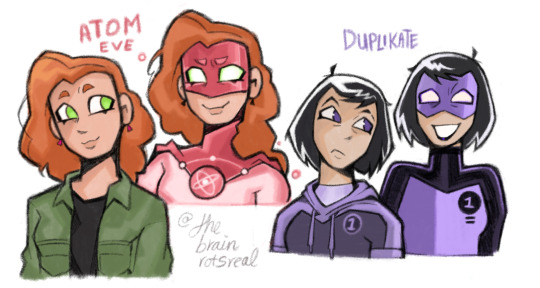
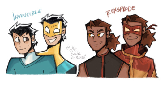
Eve, Kate, Mark and Rex! Nailing some ideas down on how I wanna draw them in the future, and enjoying messing with their designs like usual! Not a fix-it whatsoever just fun + ref for the future! I cannot do realistic styles so translating them into something I can do while still being recognizable is peak. I will mess with Rex's suit more. Trust. I Kate so much now. Look at her <333333
#the brainrotsreal's art tag ✧˖°:*♡#invincible fanart#invincible#mark grayson#digital art#fanart#procreate art#rex splode#duplikate#atom eve#eve wilkins#RAMBLE TIMEEEEEEEEEEEE#MARK: again he's got his mother's pearl earrings as a winky wink to batman reference + fun inkling that he is ALSO his mom's son#MARK: adding to the whole difference of civvie/hero persona he's a bit more miserable looking and anxious w/o the suit while emotional in i#but also means he's eager and confident when he does think he knows what he's doing. but is not as confident outside of it.#heroism is his chance to prove his worth in his eyes even after Dad Realization because know he has to prove he ISNT his Dad.#Basically Invincible will always need to prove himself but he doesn't know how to do that as Mark Grayson. so gold = joy/confidence#stays on Invincible. but not mark#REX: easy peezy a spiky hair style to wink more at his passionate and louder personality as well as wink to the explosion thing#REX: gold earrings and shoulders exposed as civvie because i know in my soul he WOULD. like i cant even explain he told me himself.#goggle change to lean more into the style change! pupil-less design!! and gold eyes cause he got experimented on/powers ingrained.#the dangling bit from the goggles screams fighter and since he does ALSO need to fight it makes sense#KATE: new haircut cause i cant stand her normal one istg. ugh. but keeping the same vibe! leaning more into ben 10 type of elements since#numbers ARE a point of her design AND power so it was only fitting! i love her suit so much#NOWWWWW since she is A REAL FIGHTER like her only thing is multiplying still mean she knows how to throw a punch and MOVE i figure#she works out a ton and has a more flexible sporty fit going on so she's got a hoodie crop top. ready to jog at all times.#once in my brain she's the vague sorta raven of the group (more isolated and withdrawn since she doesn't rlly interact with anyone)#added black made SENSEEEEE#EVEEE: easiest to do because she is starfire of the group so i got possessed! honestly kept all her colors except tried to move around the#logo a bit more and take slight inspo from Justice league Green lantern's design + tweak the logo cause i realized i hate it KSDKS
1K notes
·
View notes
Text
i need damian to be one of those babies who was decked head to toe in designer infant wear. the baby gucci slides. the baby tom ford shorts. the baby ralph lauren polo. you know talia has a louis vuitton diaper bag
#i love teeny tiny baby designer stuff. it's so funny to me#your baby doesn't give a shit what logo is on their diaper#damian would though. somehow. his fine taste is uncompromising#damian wayne
475 notes
·
View notes
Text
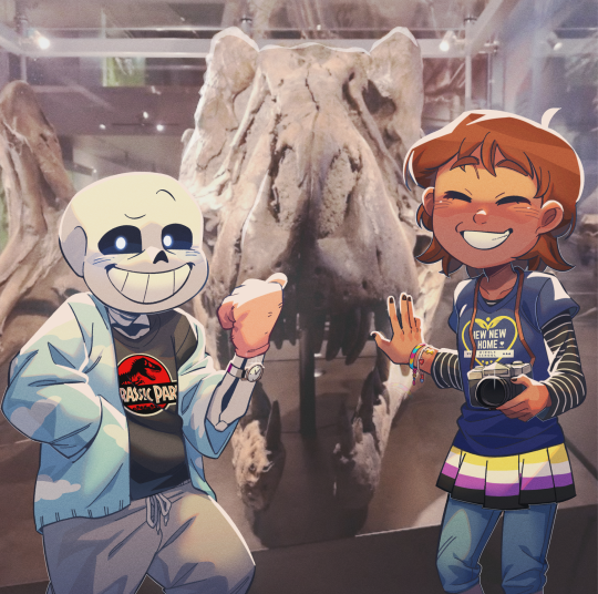
Three Earthlings
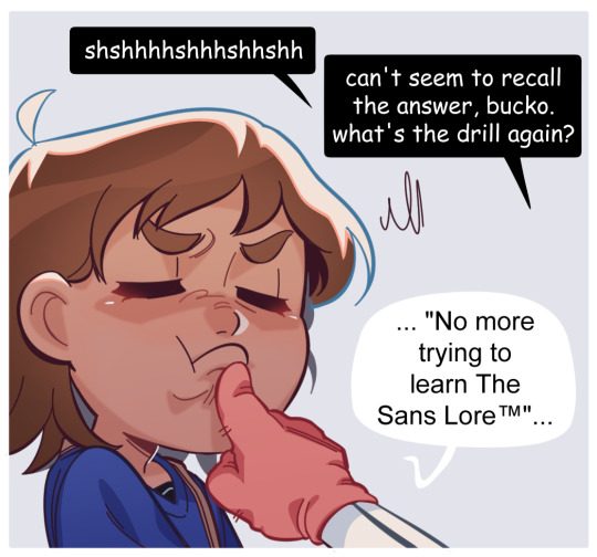
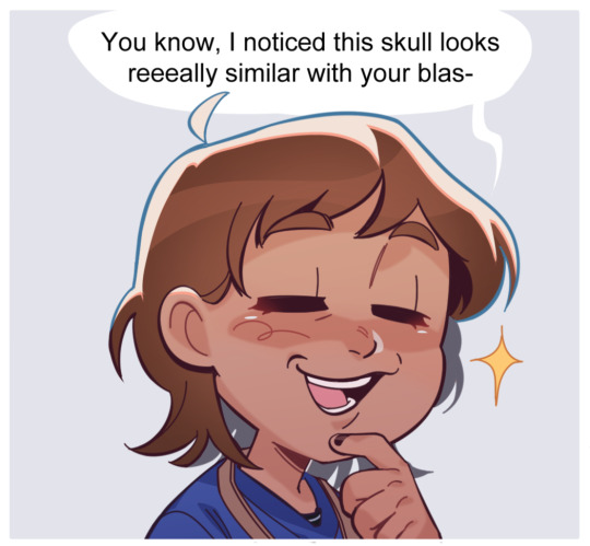
In which Sans was a dinosaur kid instead of a space one (.)
#i always wanted to redraw that painting#anyway i packed so many details on that first pic#3 pride flags in total and i designed a whole ass surface monster school logo in canva#and sans is wearing a cloud patterned cardigan cus do you really love him if you don't make him a pinterest girl#undertale#sans#frisk#babybones#lico arting#the deal was they don't try to learn each other's lore again lmfao
9K notes
·
View notes
Text
Lineart by @ovytia-art which was such a blast to color - I love the entire vibe of all of them hanging out together so much @green-with-envy-phandom-event
#greenwithenvy2024#danny phantom#i picked it for Dani originally but i really do love seeing all of them interact together it makes me really happy to see#fun fact the flats (including background) took almost 4 hours. + i had to spread that up over a few days due to eye problems slowing me dow#but it was so so worth it. no one else will really understand but working on it gave me the same kind of goofy fun stress free feeling as#when me and my friends hang out at our dennys. i have a newfound fondness for nasty burger.#anyway do NOT look too closely at the car background because i /know/ they're messed up perspective just. hush.#i designed some nasty burger logos for this based on the canon sign! it was very fun!!!! and i reused them for another piece#dp jbee
2K notes
·
View notes
Text


🌥️
Living the Day🌞Lightly
New
Again
brand new
To a beautiful day, hope, peace and love 🦅🤍🦅
#animals lovers#animal kingdom#wild animals#love animals#eagles#american eagle#wild birds#warren the eagle#eaglebones falconhawk#love birds#cute birds#pet birds#so cute#cuteness#bird photography#animals#animal#cute#cute animals#pet#funny birds#birds of prey#birdsong#animal life#photography#amazing photography#amazing animals#animal logo design#animals video#artists on tumblr
544 notes
·
View notes
Text
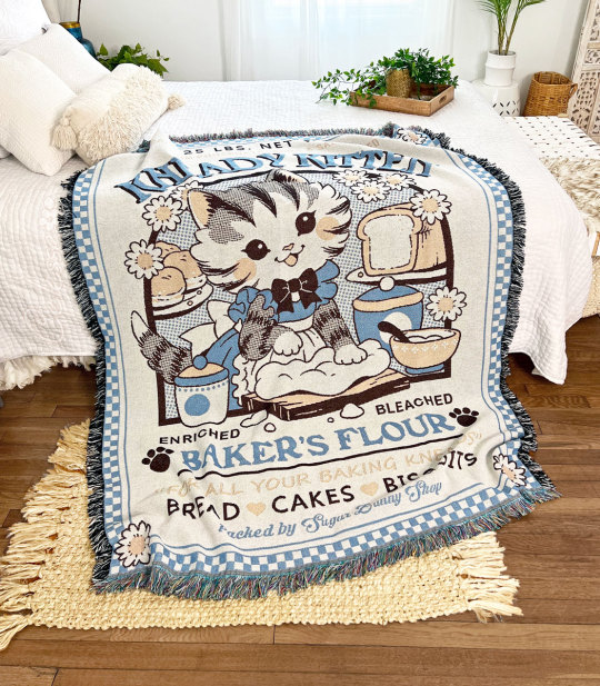
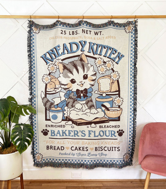
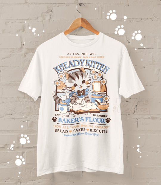
Knead a blanket? 🐱🍞💙
Available here! ✨
#blanket#blankets#fiber art#textiles#woven blanket#woven tapestry#cute blankets#blanket lover#kneady kitten#cats#cat love#cottagecore#countrycore#farmcore#baker's flour#vintage logo#logo design#merch#shop
858 notes
·
View notes
Text

#peter murphy#daniel ash#love and rockets#bauhaus#trad goth#gothic music#gothic#goth aesthetic#goth music#gothique#goth#dark music#darkwave#new wave#newwave#80s music#1980s#80s#80's#80#vintage music#vintage#80s nostalgia#80s aesthetic#logo design#gig poster#gig posters#poster design#80's new wave#80's nostalgia
292 notes
·
View notes
Text

More art inspired/for @playedcrowd5610 ‘s Danny phantom x transformers fic. Sorry not sorry, I’m having a blast drawing them. Though I may have gotten a little to into the bottom part lmao
This one is pretty self explanatory, Danny’s grumpy Soundwave won’t let him help, one cus he’s tinny he’s just a squishy baby and two cus he doesn’t want the autobots to get any ideas. Danny doesn’t just dip cus that would make Soundwave disappointed and he dose NOT want that
If you enjoy Danny phantom or transformers, I definitely recommend you check out their fic https://archiveofourown.org/works/60521740/chapters/154507732
Also some close ups cus I said so


#I haven’t finished a full drawing and actually liked it in two years I am freed from my curse#let’s jsut pretend this happened in season one cus I forgot to draw his logo#actually I noticed like halfway through but decided i wasn’t doing all that#I love the fact Danny is the youngest sibling in both his family units it’s great#danny phantom#danny phantom x transformers#transformers#rumble#I haven’t draw as much fanart for the main fic because prime designs scare me#while g1 dudes are just like#squares#peak character design
260 notes
·
View notes
Text
I want to be clear that I’m talking about this not to be mean, but because it’s something that has bothered me for years now, and have wanted to talk about for a while.
This Spindlehorse logo:

Is (in my opinion™) one of the least appealing designs for a logo and icon I have ever seen. I think it is so poorly designed, to the point that it took me around 1–2 years to finally see what it was—the “spindle horse” crammed into a tiny box.
Even then, the only reason I was able to figure it out is because I finally saw a version of it that was bigger. It looks even more muddled when it’s smaller—which I would assume is usually how people see it, and was the only place I saw it for a long time:


The way its legs are SO THIN makes them just look like zig zagging lines—the way they’re cut off by the circular logo kept me from realizing they were even connected to the body. They look really random and it’s completely unclear as to what they are.
The horse’s mane being the same color as the background heart kept me from realizing it was supposed to be just that, and the horses head is so slim and it’s eye is so big that I thought its head was part of the trademark big eyelashes a lot of Hellaverse characters have. 
For the longest time I thought the logo was like. An owl type bird’s profile? But a really weird abstract one—with the horses’s mane being the beak and then the horses head being the eyelashes?

Even then, I still had NO idea what it was supposed to be, until I saw the larger/non-cut off version of the logo. The heart in the background is also weirdly off center? Not that everything HAS to be centered but it doesn’t really add much to the overall design. It’s just a random heart in the background.
What’s odd to me though is that Spindlehorse DOES have, what I consider to be, another logo that is much easier to understand visually while also being WAY more appealing:


I really like this logo! I think it’s really well designed!
You can see clearly what it is, it has a really nice form and use of empty space. I love that the hip bone is also a little heart, it gives the design a little bit of extra character to it.
It is a simple design that is still unique and really pleasant to look at. You can immediately tell what it is, and even though the design is simple, it has enough variation to give it a personality, like the heart hipbone or the curl in the horses’s tail.
I just. Have NO idea why this isn’t the logo or icon used on all their channels. I think it’s genuinely a really good logo, and it’s weird to me that it’s not the logo used for Spindlehorse’s shark-robot shop and YouTube channel.
Obvs the company can use whatever logo they like, but I just find it REALLY ODD that the official channel continues to use the old one.
#spindlehorse critical#spindlehorse criticism#design critique#art design#I genuinely don’t understand#helluva boss critical#Hazbin hotel critical#like the second logo is also a circle. it would be so easy to just. have it be logo#watch me post this and they update the logo on the channel this week#which honestly they should!!! I would love that!!!#im not trying to be mean or rude it’s just confusing
140 notes
·
View notes
Text

왜 이런 내 맘을 아직 몰라? happy birthday, shinichiro ! (*꒦ິ꒳꒦ີ)♡
#fromaryg#anime#tokyo revengers#tokrev#tr#shinichiro#shinichiro sano#sano shinichiro#huh i dont have a favorite sano sibling...#HAHAHAHA#SHINICHIRO PANGITA NA UG UYAB PARA MAKA MOVE ON NAKO HAHAHAHA#2NE1 announcing their comeback made a huge contribution to this#yes the hangul there is from a 2NE1 song#i love u 2NE1 haha pakyu basta mahal babalikan juuuuyyy#details: dragon embroidery + dragon buckle for BD reference#flame embroidery bc he's a leo: a fire sign#smoke design on his inner kimono bc dude is a smoker#metal design on the collar is BD logo w/o the B and D#8 beads on the collar bc his birth month is the 8th month#11 beads on the other side for 11 generations of BD#flowers on the arm is gladiolus#the august birth flower#that's all thanks for coming to my ted talk
174 notes
·
View notes
Note
(totally out of the one piece loop sorry) WAIT HE'S WEARING A BASKET??? I THOUGHT IT WAS LIKE MUSHROOM CHIC FASHION OR WHATEVER
Wheezing for real over here. I don't know HOW far out of the loop you are, but the thing he normally wears on his head is absolutely mushroom chic fashion (more like snow leopard fur probably) so you wouldn't be all wrong about that BUT when he goes undercover in the One Piece Edo-era land arc HE WEARS A BASKET ON TOP OF THE MUSHROOM,
like this:

He wears the basket so that he won't have to take his extremely recognizable wanted-poster famous mushroom hat off while he's in disguise. He loses like 90% of his power if he doesn't wear it so it's really important.
this is what he looks like below the basket btw:

Edit: Including the tags in the post after being encouraged to do so.

#Law facts#trafalgar law#slutty in wano#what was he even undercover as? was that established?#a slutty doctor? very subtle#or was he really trying to pass off as a monk in that outfit?#“oh no they know our faces”#he has his whole fucking pirate logo printed on his kimono. twice#might as well hand out business cards#it's an amazing character design and it's so stupid. love it a lot#one piece
97 notes
·
View notes
Text
a new breakthrough! the wannabe graphic designer made some more logos but uhh on paper because her drawing pad decided to break 😭
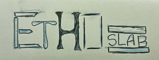
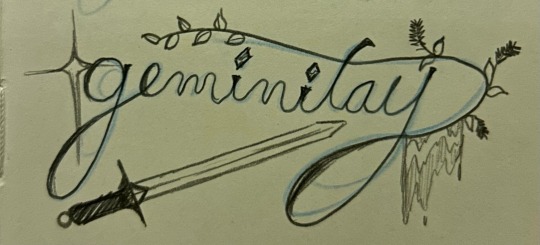
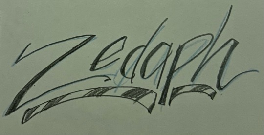
#cloudy speaks too much#geminitay#ethoslab#zedaph#more logos!!!#i love pretending i know how to design
152 notes
·
View notes
Text

Designs for Dmitri and Grigori! ❄️
#- i should talk about how much i really love the logo for The Wall at some point#traditional art#character design#fanart#thsc#thsc dmitri petrov#thsc grigori olyat
70 notes
·
View notes
Text


AHHH THE MERCH IS OUT
but I’m too broke for it atm

#formula 1#f1#lewis hamilton#ferrari#scuderia ferrari#forza ferrari#lh44#cl16#delulu4lewlew#charles leclerc#the red#give it to me now#I’m too broke to be a fan sometimes#they look so good#I also love the design#I cant live laugh love in these conditions#fan merch#everyone is a ferrari fan#hp logo is pmo frrr#hp logo is a menace#don’t put it in the bag I can not afford 😔
23 notes
·
View notes
Text

Encanto Popstar Au !!
meet dolores madrigal!
dolores is the leader of the group! though it may not seem like it from the outside looking in, she is responsible for the formation of las milagras! dolores is studying literature but in her free time prefers songwriting! she got the idea to form a group and asked the other girls if they were interested! and so las milagras were born! dolores is known for being especially cryptic in interviews, social media or general interactions with fans! she’s very secretive about her writing material and will opt for using riddles or codes to hint at announcements, often confusing just about everyone with it! though not the most open in person, dolores writes with such a passion and vulnerability that really connects with the fans! her absolute favorite songs to write are ballads as she pours her heart out on stage! dolores is leading in all the business and creative decisions regarding the group and the other girls will often go to her for advice on just about anything! dolores is insecure about her stage presence compared to the others as whilst she’s the lead vocalist she feels overshadowed by the likes of isabela who seems to captivate everyone. dolores loves bringing out her guitar for the slower songs and will often just sit on the stage taking in the moment! the hardest part is keeping all of this a secret from her (not so smart) boyfriend, mariano! having the popstar name dolores when her real name is delores doesn’t seem the smartest move but somehow mariano has not caught on. like at all.

ta da! last profile for popstar au!! dolores was one of my fave designs to work on and I’m lowkey super happy w how she turned out!
#encanto#encanto disney#disneys encanto#disney’s encanto#encanto fanart#encanto art#encanto popstar! au#dolores madrigal#dolores encanto#dolores fanart#dolores madrigal fanart#jacarandaaaasart#encanto au#the more glitter the better is my motto with this au#I did this one back in october !#see I did not forget about my own corny self indulgent au#I’m actually drawing them as the spice girls because why the heck not#yayyyy I love self indulgent art#encanto popstar ! au profiles#shoutout to a moot on instagram for the group name I’m obsessed currently designing a logo#love combining my major w my special interest
35 notes
·
View notes
Text
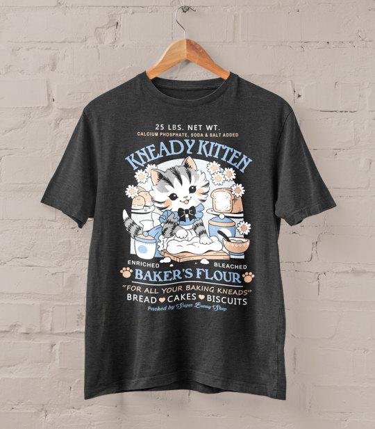
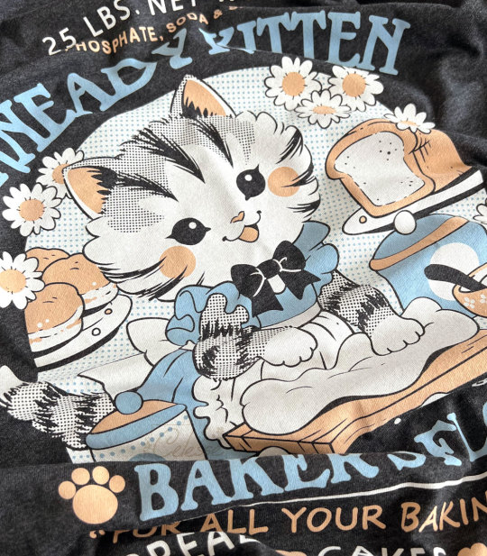

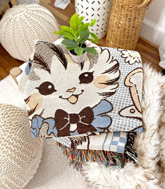
A new dark gray heather version of Kneady Kitten is here! I really love how this one came out 🐱💙
I was also able to add extra small as a size option to all the cat designs, and I'll try to include it on any future runs if I can!
Available here: https://www.sugarbunnyshop.com/collections/apparel/adult-tees-tanks
#shirts#shop#merch#wishlist#logo design#vintage logos#kneady kitten#baker's flour#cats#cat love#cat shirts#apparel#graphic tees#fashion#vintage chic#vintage style
898 notes
·
View notes