#look at that I can actually render ish when I want to
Explore tagged Tumblr posts
Note
hon what abt hee/hoon/jay/jake/whoever u want reactions to u actually reach ur limit and say ur safe word during the very steamy and animalistic fuck
hyung line + reaching your limit and saying the safe word
warnings: dub con(ish), use of color coded safe words, rough sex, double penetration/anal, instances of bruises being visible on your skin, jake loses his damn mind, choking, squirting/mentions of piss, attempts at fisting and being sunghoon's size queen lmfao
not proof read
★ heeseung:
he would be so deep inside of you, plunging in faster and deeper than you ever thought possible based on your previous intimate moments with him.
nothing seems to have happened to render Heeseung so...into it tonight. Calling you up and practically demanding you be at his door within ten minutes or he's never going to talk to you again. You could tell he was looking at you through tunnel vision when you showed up with a concerned look on your face.
you felt like something was wrong originally, but when his hands immediately pulled you inside and practically tore your pants off of you, you figured he must've just been really, really, horny. So horny that he doesn't even get your shirt off of you before sliding in dry, whispering words that slicken you right up along with the painful intrusion.
he doesn't even get you out of the entrance either. your back is pressed to his chest as he holds you there, taking everything he can get before wrapping his arms around your neck and squeezing. You pull back against him, allowing him to maneuver you to the kitchen just to the side, and there, he doesn't release his grip.
you're tapping his arms, trying to breathe, scream, moan, and whimper all at the same time. he's lost his damn mind, you think.
and when he does finally release his arms around your neck, you want to moan, but instead, you say it. the one word he never expected to hear from you.
"red."
you felt three more powerful thrusts as you said the word, slapping your hand over your mouth because...did you really even want to say it at all?
and then he buries himself into you as deep as he can and leans forward, grabbing your hair and pulling you back so that his lips line up with your ear.
"what did you just say?"
and his hips would be still, all of his movement would come to a halt waiting for you to answer him. waiting for you to confirm the color he thinks he just heard, though it was hard to hear because his ears were ringing due to the sheer adrenaline he has right now.
"red. heeseung." you repeat, out of breath.
Only then does he calm his breathing, still remaining deep inside of you before that little switch in his head flips.
"did I hurt you?" He asks, voice raspy and concerned as he tunes in to his surroundings, noting how he just grabbed you and started using you as if you aren't a living being.
But then you shake your head, skewing your face half into his view with a smirk.
"No, i'd just like to know what's gotten into you."
ah, only you would stop mid-fucking for a goddamn conversation.
☆ jay:
jay always wants to try new things and you're always more than willing to indulge him in it. Hence why safe words have been a pretty common occurrence in your bedroom. rarely yet have you ever had to use even a yellow, better yet a red.
jay always commits green light acts on you, to the point you almost question if he could ever receive a red at all.
tonight tests that limit. the new thing he wants to try involves not only his cock, but a lovely silicone one he secretly bought on his way home. and what does he plan to do this both of these cocks?
use them on you. at the same time.
and, well, while you were actually quite excited to get your chance to try double penetration with your doting boyfriend, he seemed to have missed the look of concern on your face regarding the size of the toy compared to the size of him.
jay is already big. thick enough to make you feel as though the fit is tight regardless of how wet you get for him. this toy though? it's at least an inch longer, at least an inch thicker.
so, yes. you let the dreaded color slip just seconds after jay slides into you after much prep. at the moment, it doesn't feel like any amount of prep could have prepared you for the feeling of two rather large cocks sitting inside of you. The toy is prodded deep in your pussy, skewed only slightly by jay's strong hand as he holds it there with your legs gripping around his waist for dear life. And he is bottomed out into your ass, squeezing his eyes shut briefly himself at the grip and suffocating feeling of your body clenching around both him and the toy.
"relax baby," he whispers out, skewing the toy up just a bit before slipping it down and out of you for a brief instance of relief. "you're squeezing me so hard."
and you do try to relax, the moment where the toy leaves your body does allow a bit of relief to you until, well, he slides it back into you in one push, mumbling a groan at the feeling of it.
"red," you choke out, your body nearly forcing him and the toy out of you from the instinctual clenching.
Jay goes full-stop in that moment, not only slipping the toy back out of you but also making an attempt to slide himself out without causing any more discomfort but then...your legs squeeze him tighter, pushing him right back into place.
"just give me a bit to adjust--" you choke out again, "it's a lot to get used to."
★ jake:
when jake gets in those moods, you know it's near impossible to reach him through actions, better yet through words. he can get quite desperate, which normally isn't too much of an issue because you're the one needing to take control.
on a rare night though, jake wont give in and just...goes. anytime previous to this where you've had to use a safe word involved jake in this type of mindset.
what mindset is it without consistently needing to just say the word desperate? a state where he loses all ability to control just how hard or fast his hips move. some would call it being pussy drunk, though jake's version of it is far more insane than most. like a dog with a bone, he has his mind set on one thing, and that's his pleasure.
you knew it was going to be like this tonight, watching the way his apologies for going too hard and not yet stopping turn into forceful grips and thrusts of his cock into you. it felt like you were being, quite literally, impaled. A wince here, a wince there, and now? Consistent pain with his angled hips, ramming into you repeatedly with no apology in the air.
your loving, sweet, pretty-eyed boyfriend is so fucking gone, and at this point he hasn't quite comprehended or even processed you saying the safe word three times already.
The first time you said it was when he gripped one of your tits to the point it hurt, still ramming into you with a painful spike of pleasure. The second time was when his eyes went dull, and all apologies were left sitting in his sober mind, and then the third time, just now, you had to make an attempt to overpower your lustful boyfriend, gripping his hair as tightly as you can to pull him down to you.
"red."
you saw his eyes flicker in realization at the word, but he kept going upon feeling you clench around him. another thrust, and then another, and then-
"Jake, you're hurting me." You say this time, holding back any moan of pleasure simply because if he hears it, he genuinely may believe you're joking about the pain.
and really, it's not that you don't love when he gets like this. he always gives it to you good, but you can tell he's losing it and he's going to crash after he's done with you. hell, you're going to crash if the lightheaded fuzz in your head is anything to go by.
upon hearing those words from you though, his hips stop immediately and he returns back to himself. the apologies come back, the drool on his chin gets wiped by the back of his hand through insistent and genuine apologies.
he pulls out quickly, only then recognizing the welts and bursts of color against your skin from his fingertips alone.
and when he looks at your face with a drowsy smile but eyes full of concern, he can only apologize again. feeling sorry for himself in that moment and fighting back the frustration of losing an approaching orgasm, he does stop. and he doesn't get off that night solely because you cannot convince him that it's okay. that you're okay.
☆ sunghoon:
safe words are very common in the bedroom, though rarely used because both of you have a deep level of trust and commitment in your relationship. it's to the point that even when you do feel like you need to say the word, more often than not you're too busy trusting him to make the pain and discomfort worth it.
and, well, he always does.
there was the time where he nearly choked you out, allowing you to feel your first orgasm with near to no breath, to the point of almost passing out. sure, that would be considered a red for most people, but you knew sunghoon would never hurt you nor literally fucking kill you. there was another time where he really, really, really, wanted to try and get you to squirt. which, you know, that's great for you!!! aside from the fact that all day he had you drinking water bottle after water bottle, barring the bathroom from you until he knew you were ready to burst. the only reason you would have given him a red would be because your bladder was hurting by the time he started ramming into you, and mayyyybe because he didn't put a towel down and surely you were about to piss yourself for his pleasure. ultimately though, that pressure paired with the feeling of being stuffed even more full led you to an orgasm that you still think about to this day. today though, sunghoon is really on something. lately, he's been making comments. "size queen" this, "size queen" that. it appears your boyfriend is now seemingly fucking obsessed with seeing how much you can fit into your cunt. or, rather, how much he can fit into you. there was plenty of prep of course. His cock always a pleasure, and then his cock plus a few of his fingers, and then-- oh. just his fingers??? then-- knuckles. you feel knuckles.
"Woah, woah-" You pause at the feeling of being stretched, Sunghoon not stopping as you glance down at the way he is entirely focused on fitting his whole goddamn hand inside of you. "Sunghoon, red. red!" He stills his hand, leaving it in place and feeling your internal walls bunch his fingers up inside of you. Still, he can't push the knuckles past your hole and honestly, he's a bit shocked to hear the color code come out of you in a panic.
"Red?" He asks for confirmation, already preparing to pull his hand back and take care of you in a different way when you clench again.
"Red." You confirm, wiggling your hips away from him, forcing him to pull out of you.
"Was it too much?" He asks now, carefully crawling over you to plant a kiss to the tip of your nose. "I just wanted to see if it would fit." You nod, embarrassed by the fact that he was really close to making it fit. Unfortunately, it didn't quite feel good for you to have something so large inching inside of you so quickly. He was eager, you could tell, but just as apologetic.
"I think, maybe if you want to try this, we need to use more lube, and maybe buy some toys to train me into it."
"Train you into it?" He repeats your words, eyes darkening in an instant. You smile at his expression, seeing his new obsession run freely in his mind at the implication that maybe someday you can take more than just his fist without seeing red.
#enhypen smut#heeseung smut#sunghoon smut#jaeyun smut#jongseong smut#enha smut#jake smut#jay smut#hardthots
1K notes
·
View notes
Text
Life Series Character Renders:
Featuring Martyn, Mumbo and Pearl
(I actually have quite a lot to say about two of these this time.)

Martyn:
Human.... ish. Hear me out on this one:
So Martyn has this fascinating background lore to the Life Series called Watcher/Eyes and Ears Lore. I'm quietly obsessed with this.
I love watching his lore streams after every series, and have come up with a few theories on my own: His thumbnails are always fully illustrated, so his character has a canon 'look' for every season, which I think is just, deeply cool.
But in his lore, there's also this space between SMPs, where the Watchers kind of... hold people until they can be used again. And since Martyn is the protagonist of the very cool story he's writing, I got it in my head that in this space between, Martyn isn't QUITE human. Maybe he was at one point.
Maybe he never was, I don't know.
But alongside all the cracks and stuff that have started to show up on his body; there's seams along the joints, and light shining within, as he starts to become more befitting as a vessel.
A vessel for what? No idea. I probably won't be drawing all those seams in any fanart comics of the series themselves - I imagine they get covered up when he's sent out into the world to interact with others in various SMPs - but I thought the idea was too cool not to draw at least once.
As a past winner, he gets his crown, and the burning eye of Mars by his name.

Mumbo:
Vampire Mumbo!
I know he doesn't have the grey streak in his life series skin but I love it too much I'm keeping it forever.
It makes him look so much more threatening and serious than he is.
Poor Mumbo. I was really rooting for you buddy. Better luck next series!
At least he still does damage with those End Crystals.

Pearl:
A lunar moth
As a winner, she gets her crown, and she gets her moon.
I'm not going to lie I want that lunar moth hoodie more than anything.
I had a lot of fun with Pearl: Her skin design is so simple (Well, maybe not this season, but usually) that it leaves so much room to interpret it. She's always going around with dogs, making her wolfish would've been really easy, but I think Moth suits her more.
There's a lot of mythology with moths being a little off kilter, mad, or leading people to madness that I think fits with Pearl's tendency to be a little bit of a loose canon, wild and unpredictable. Like a moth's flight patterns.
Red Hood Pearl had to put in an appearance here, especially with how it's sort of creeping to overtake her in Wild Life this season, and she just gets so earnestly threatening when she's on a red life despite still being all smiles and all laughs.
Unlike Gem or Cleo, I think there's an edge to Pearlie Pop on red that just reminds me of a horror monster, in the best, best, best way.
I haven't figured out heights but she's also the tallest.
#Life Series#Life Series SMP#Life Series Fanart#InTheLittleWood#ITLWArt#Martyn Fanart#PearlescentMoon#Pearlescent Moon Fanart#Mumbo Jumbo#Mumbo Fanart#My Art#Life Series Renders#Queued Post
153 notes
·
View notes
Text
Some dumb sims 3 updates/stuf
Or, how to develop severe brain damage in 10 easy steps.

Sooo… This is going to be more of a blog post than anything of any real substance, more of a whinge with maybe a few teasers for some stuff I may or may not release (probably not). Feel free to skip if you're after hot tips or coherent writing.
Stutter "fixer"
Sooooo…. The sims 3 has some stutter issueeesss… Incredible discovery, I know! I started looking at remedying them with settings, found some hidden settings that help reduce some of the issues but that can only do so much when the game was made in 2009 for 2009 computers.
So I had a looky at some things I thought could be causing it, mainly WinAPI functions because that's the easier route (h-haha…), and started to try to "optimize" some of the more common ones:
ReadFile: Was the first, and looking at the sheer volume of like 12783972198 calls a milisecond every time you move the camera, I thought surely I can speed it up a little r-right. Not really. I tried all sorts of… interesting things, file caching in memory, implementing the overlapped flag (took ages), etc. Oh and the performance increase? Literally nothing. It's called weirdly from wherever it's called and so we must suffer.
Threads: So, I had a look at other areas that were potential targets for speedup, ran an actual profile and it showed a problem areas namely threads and some other stuff I don't remember. ZwWaitForMultipleObjects and WaitForSingleObject take up a lot of time, so I very poorly attempted to optimize them, adding some timeout optimizations (and a bunch of other failed attempts). Despite being the most insane, this actually worked, and I got like a 40% speed increase in a very very niche metric that did not noticeably effect the game one single bit. I plan to combine all my failures into a single script eventually, maybe once combined they'll do something…
Actual insanity - Memory IPC: Then I had an idea, everyone hates e12, why don't we shove the games memory into another process and that'll fix it. No brain moment. No clue what past me was thinking, for some reason I thought you could like, access another processes memory if it was spawned from it, but uhh.. no, that's not how things work… I tried a few other things in a similar vein but it just crashed and crashed, so for now I'm just gunna work on:
Alloc/free mee - Current insanity: Currently, I'm still working on VirtualAlloc and VirtualFree (which is what I was redirecting to another process), but more from an optimizing memory usage standpoint than a… whatever the IPC thing was. There's a lot of things to try, and I've had some luck in some areas and some abysmal failures in others. There's a few promising functions calling VirtualAlloc/Free that seem to be potentially pointing towards memory leaks (004e54d0), but I'm too dumb to investigate that. At the moment, I'm going mostly just gathering more logs which takes forever and hurts my brain real bad.. On testing there's like 180 allocs that we could probably yeet no problem, which is like 750mb saved… Maybe idk.
I have plenty of ideas for deduplication, memory pool implementations to reduce churn/fragmentation, shoving things aggressively into pagefiles if they're not being used, etc. etc. Basically, there's a lot of avenues to explore, and I feel like there's potential… though I've definitely said that before and been dead wrong so…
Anyway, rambling over. I plan to release a dumb little renderer settings mod maybe-soon-ish that'll let you do dumb stuff that might be useful for reshade like turn shadows/drop shadows off and post processing off and on. I guess I could add max lots and other settings eventually too since they're static values.... Might also do a mythbusting post for some performance "tweak" stuff I see thrown around that isn't super accurate but I also don't want people to be angry at me so maybe not.
Sorry to whoever read all this, but also thanks :)
304 notes
·
View notes
Note
Hello :D
I have been following you for the last year or so (a few days after I got my Tumblr lmao) and I absolutely love your art!
I have been wanting to study your art style for a while but don't really know where to start,,,
Could you please show me a small portion of your art process, if it isn't too much trouble of course. Thank you and have a nice day!
hello. oh my god. this took forever to find.
im sorry it took 2 WHOLE FUCKING MONTHS for me to respond to this but i wanted to put it off until i felt happy with my art process again, so here it is
my fall 2024 rendering tutorial!
(this will be very very long)

FLATS AND WHATEVER YOU WANNA DO WITH LINES GIRL. then make sure to recolor the lineart to better match your base. trust me it helps, bold dark lines are Not your best friend when rendering. wait for that post-rendering
i start off with a doodle or a sketch, and then filling it in with flats and other details such as blush

FIGURE OUT YOUR LIGHT SOURCE. FIGURE IT OUT GIRL YOU CAN DO IT you can make it as simple as possible, make it as big as possible, dont even THINK about the details.........just make it really fucking big so you at least know where the shadows and the light goes THEN add smaller shading details LISTEN TO ME. LISTEN TO ME OKAY!!!!!!!!
my key point with this is for you to learn lighting fundamentals.
it's SOOO ANNOYING but alas......they are all correct. it helps a lot.
one thing i also really want to point out is that i like creating a big shadow shape first before fixing up the little details (such as folds and whatever) because it helps me focus on the way the lighting actually works instead of tunnel vision-ing into making the shading make sense on the clothing.

contact shadows (i dont remember if thats what theyre called okay) theyre fucking ugly because im not actually thinking sorry 💔
okay so basically:
contact shadows (if that's what they're called) are the spots in shading and lighting where light will NEVER hit.
shadows are still influenced by the colors and lights around it (it's why a blue shadow and a yellow shadow feel completely different, despite both being shadows) so it's not always COMPLETELY dark.
BUT! there are small points in shadows where light never hits, and they're almost always super dark or pitch black.
it's hard to explain shadow and light so briefly for a tutorial, but you'll notice it when watching fundamental studies and when trying it out for yourself


YES i unclipped the multiply layer YES its ugly and terrifying but it makes coloring the multiply layer easier okay the colors merged w multiply so now it looks cool and has depth overlaying colors that actually make sense
so basically what i did was color the multiply layer that i used to shade the overall drawing
adding a band of red/orange/yellow around where the light hits, and blue where the shadows get big and wide, gives it a fake ambient occlusion effect in the way that a person would get if they stood under the sun with a clear blue sky
the colors don't have to make sense, especially because i never draw backgrounds, but coloring the shadows really help it give a sense of depth and extra subtle detail and effect that just helps make the painting look nicer
around the end, i also put in colors (in an overlay layer with a low opacity brush) that actually make sense in context of the drawing, which is the lit cigarette and the yellow eyelights
mostly because none of the colors were making sense and i needed to actually make use of the lighting that DOES exist in the drawing lol

adding a muddy golden yellow pin light layer (opacity turned down to like 40-50%) to make the light colors less ugly lol
i SWEAR by the fucking pin light layer style. it's so useful and so so underrated.
i used an almost brown-ish gold color on stop of all the layers, and with the pin light layer, it helped make the bright (almost blue-ish) white colors more warm and more yellow. it just helps make things more warm (something i prefer)
i could probably show what it looks like without adjusting the layer opacity to truly show off what i mean (like in the coming section) but i sadly forgot to do that lol


make a layer on top of your drawing with this color in these ranges YES the drawing is fully merged NO don't be afraid, the base was fucking ugly anyway 💔 make this layer into an exclude/exclusion layer style TRUST turn down your exclusion layer opacity from a range of 10% to 40% literally until you're happy with the contrast and the way the color over the drawing. use your eyeballs. i know you can do it im so proud of you
this is pretty self-explanatory instruction-wise, so i'll go into why i do this instead
i really like art that seems like it has low contrast, with almost mid-gray shading and lines. i don't personally use dark and bold lines and shading, unless i find it necessary for the tone of the piece, so using this method helps lower the contrast of the art and make it look "pleasantly muddy" in the way that it's easier and softer on the eyes.
the inverted blue color also helps makes things warmer!
the exclusion layer style is still a bit of a mystery to me but i really like the effect it gives, even if i don't completely get how it works lol
if you want an alternative method to this, and if you have access to it (because i primarily use sai and sai only),
i absolutely encourage you to play around and experiment with gradient maps.
there are so many out there you can make yourself or even get from others that just give the painting an extra amount of depth and color variation. they're SO fun.
personally, if sai2 gets a gradient map update, it's over for y'all it will literally be so over no one will be able to stop me


then i merged everything and actually adjusted the contrast back up because it was looking too muddy for me 💔 but the color adjustments are still there so all hope is not lost here's a comparison of the adjusted contrast in black and white (adjusted on the left) (newly merged layer without adjusting the contrast on the right)
as you can see, i actually turned the contrast back up (despite talking all about how i liked things with less contrast lol)
i wanted to demonstrate that doing adjustments should be done in moderation, and is why i adjust layer opacity often when making color effects
you are free to play around with colors to help your style, but don't lose your initial idea and colors along the way.
you still need to trust your own colors and intuition!
along with that, i just want to say that it's completely okay to change your mind mid-painting, and it's okay to make somewhat drastic changes.
don't be afraid to change things you don't like or change your mind about certain aspects way later on
that's basically the whole thing of this!!! don't be scared!!!

now im gonna hold your hand when i say this..........but you need to learn how to render by yourself. it seems like i can teach you but i literally can't, because rendering is different on every piece and depending on how clean your base is. i have to render A LOT because of how fucking ugly my sketches are LMAO to simplify it, think of it as obsessively cleaning up every detail you can see, but with a color picker and a clean, hard edged brush. if you have shit lineart, you don't have to redraw it cleanly over and over, just paint over it. that's basically what rendering is
THIS especially is where you need to be brave and stop being scared.
like i said, i can't teach you how to render, and it's something you have to discover yourself because rendering is something that will always be personal to every single piece you make. the way you render on every piece is different.
on one piece, you will barely need to render, and on another, rendering is more than half of your ENTIRE process.
don't be afraid to paint over your old art.
rendering is a process that's both very perfectionist yet also very careless.
find your balance and just go for it.

and then that's it……..u did it………..now yuo know how to paint and render. it's literally just layering shading and lighting knowledge until you think it makes sense and looks okay lol additional note: since i render in only one layer (you don't HAVE to do this, but it'll be harder for you…), i also made slight adjustments with the transform (and liquify, if you have it) tool to make things more proportionate. (i drew the head too big lol)

if you compare the finished piece to the final unrendered base, you can see that a LOT changed, including a bit of subtle proportion adjustment.
particularly, the sleeves changed A LOT (because i really didn't like them)
but it's also over all cleaner and more coherent, instead of having haphazard colors and shading just thrown about.
rendering is when you finally use all 100% of your brain to finalize and figure out where the shading should go, where to clean up your lines, where to ERASE or ADD BACK in lines, and make sure all your colors look coherent.
it's not as intimidating as it seems, i only use a hard edged brush with a little bit of color mixing and my color picker.
it's like dragging and dropping colors to cover up mistakes, it's really quite fun when you get used to it
i wish i could explain it clearer but it's hard to describe without visuals!
i hope this helped, and i hope all my yapping isn't annoying (art as a special interest beloved)
have fun studying and trying to render in my art style!
#long post#art tutorial#rendering tutorial#art help#art tips#tutorial#kia doodles shit#artxstic-scr1bbles#tutoriel
193 notes
·
View notes
Text
Ermm...What the flip is a "Will Wood?"


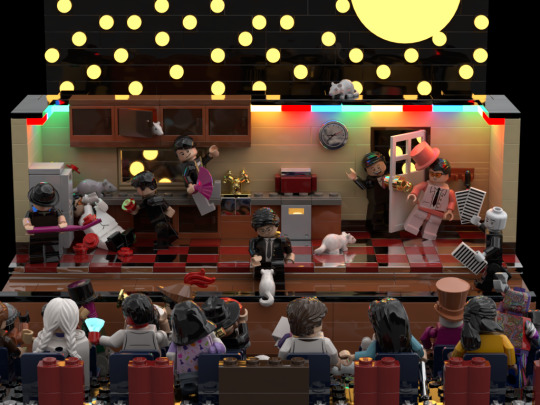

Awhile ago I made a Will Wood LEGO set in the program Studio 2.0 based off his album "In Case I make it," and just never posted it anywhere. Contains a bunch of references to his songs, his albums, those tapeworms that he has, stuff he has worked on with other people, etc. Some of the character's are based off preexisting stuff while others is more original I guess. Still not the best with captions cuz I got nothing else lmao
More photos below!!!


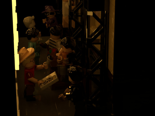
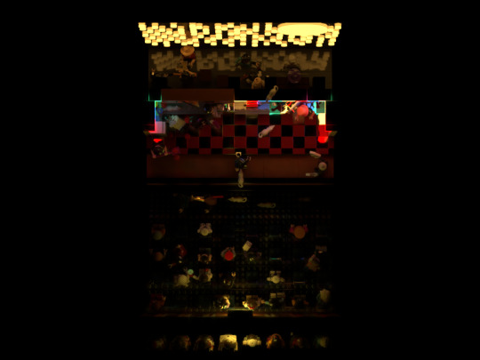
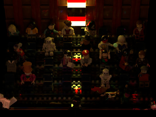

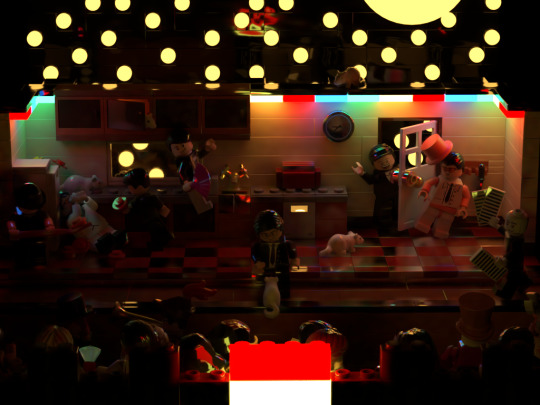
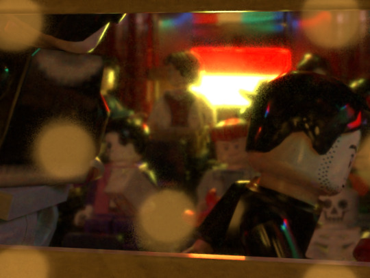
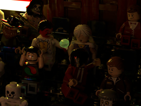
Some dark lighting here. This is how it's supposed to look but when I showed this to my friend they said the images were too dark and like fair it is pretty dark so I made a bunch of more renders but with brighter lighting so you can see better


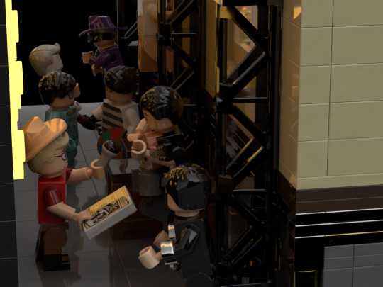

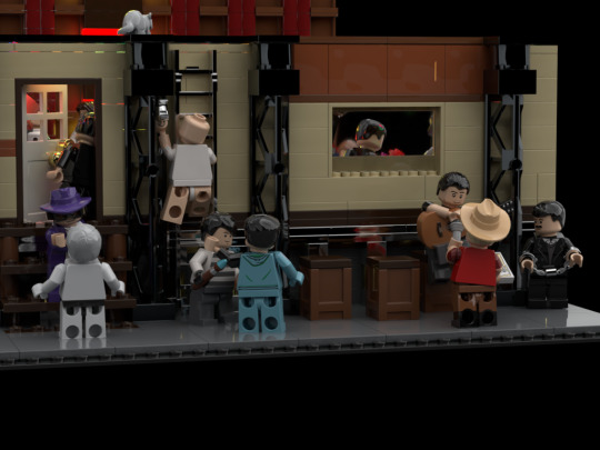


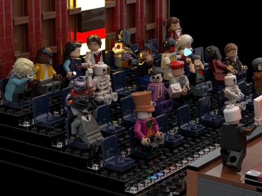
Ahh! so bright!! so so bright!!!
I'd probably make some changes to this like changing the designs of some of the figures and maybe add other designs but I don't got it in me to rerender everything so oh well it is what it is lol
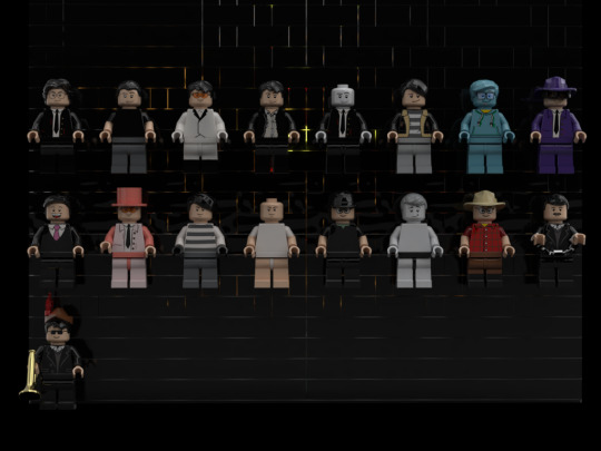

Can you guess the references? First person to name all of them wins a photo of a scary monster!!!! ahhhh!!!! so scary!!!!!!!!!
Okay here's the answers lol
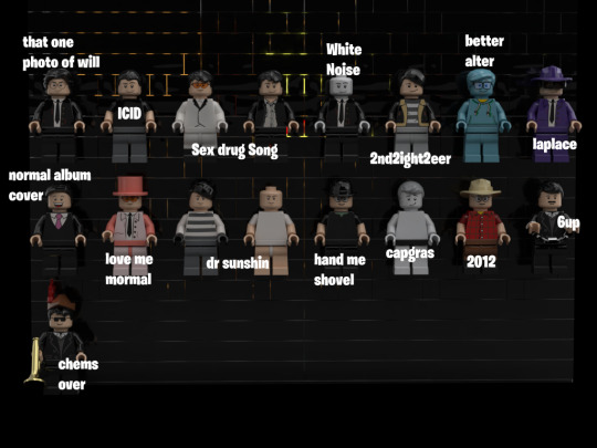

I feel like i complained a lot in the caption of this post but I actually do love how this came out and I really enjoyed doing all the fancy posing for all the figures and I really want to do more stuff like that
(and I already did get ready I got more of this stuff lmao)
For a lot of the character's I had trouble finding good parts that actually matched with the design so some of them are just real wonky looking. Part of me sorta wishes I made an original design for SELF-ISH but at the same time I think just having the actual art from the cover being placed on top of a LEGO dude is really funny.

like look at this shit lmao
I'm probably going to make a followup to this post showing off like the 800 wip renders I did of this anyways follow for 800 reblogs of random ass shit and NOTHING ELSE
#shit what was my art tag FUCK#EvilYodaArtCool#I remembered it yippee#Will Wood#wwattw#lego#will wood and the tapeworms#camp here and there#oh god is there a tag limit#cuz im bout to fuck shit up here#Everything is a lot#SELF-ish#self ish#the normal album#in case i make it#in case i DIE#a verbal equinox#jamface#big day for the jamface community#the real will wood#insert tag for obscure band that only like 5 people know and would require me to commit horrible atrocities for me to even know about#shit someone give me more tags
497 notes
·
View notes
Text
when the vegetable
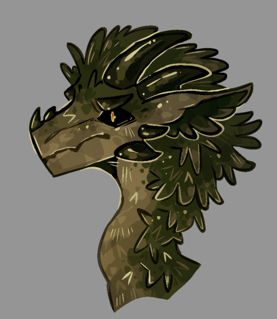
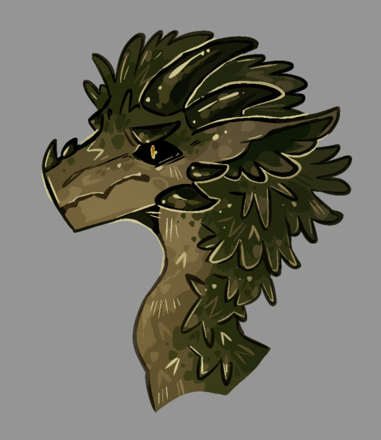
yayy tutorial for how to make your art look sorta like this? perhaps??
aka the way i render when wanting to make a doodle look more interesting without following any principles of light and color
yippee
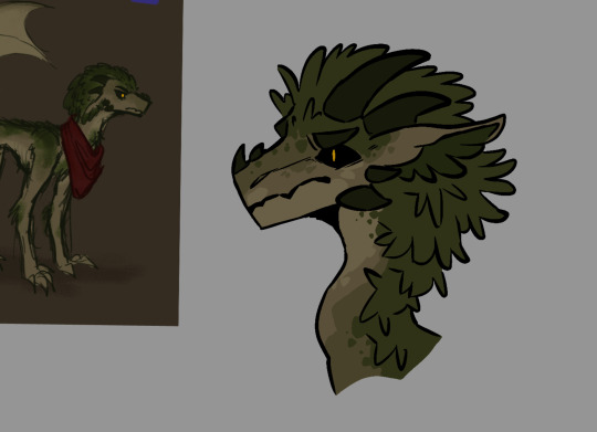
draw the lineart and the flat colors of your character. i’m drawing @chrometheraptor ‘s oc because silly, and using the syrup brush for everything but gradient overlays . (usually i use something more textured but this works for now probably maybe)
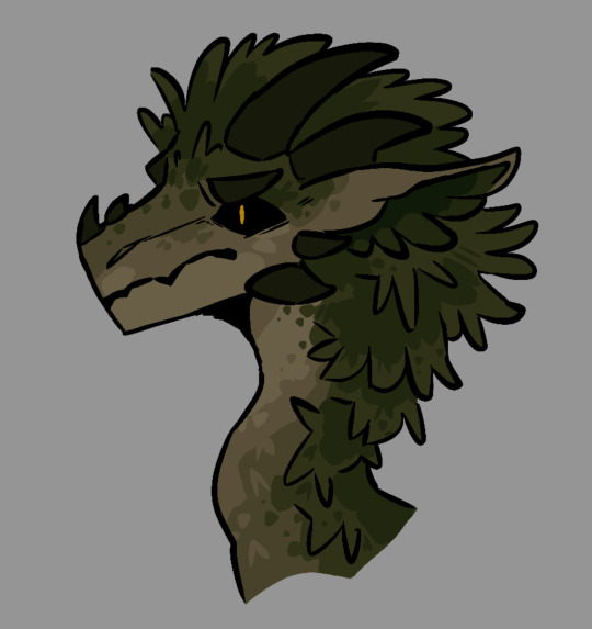
on the same layer as your coloring, use a darker color to add some basic shading to the more flat-looking areas of the design. bbut. not the whole character because i am lazy.
dots are good when you’re using a flat brush and don’t have the option of adding smooth painterly shading. they help to break up the planes to make everything look a little more natural
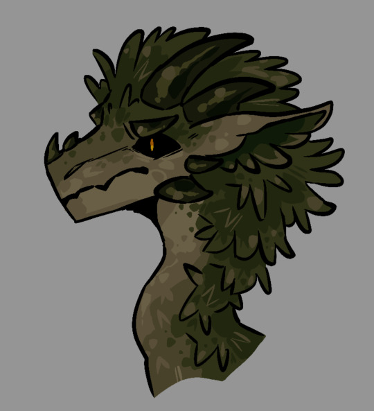
on the same layer, add minor highlights on places where the light would probably hit the character a little harder, like for here, the frilly edges of the moss. on moss. moss’ moss.
then, if there are parts of the character that would probably be smoother or more shiny, add lighter dots for highlights on top of the darker highlights. like on the horns. you can never have enough highlights.
you can also imply some texture while making the shading more complex. here, i put down some Gay Lines to make the moss texture look rougher, as well as the leafy v-looking shapes.
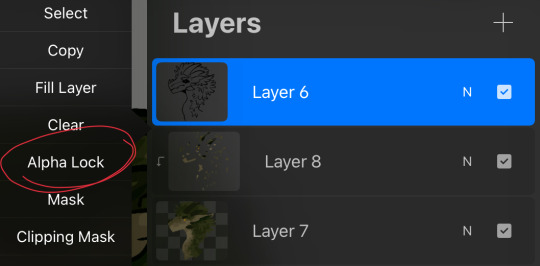
now, go to your lineart layer and set it to alpha lock. ignore the fact that the stuff i told you to put on the base layer is actually on a clipping mask
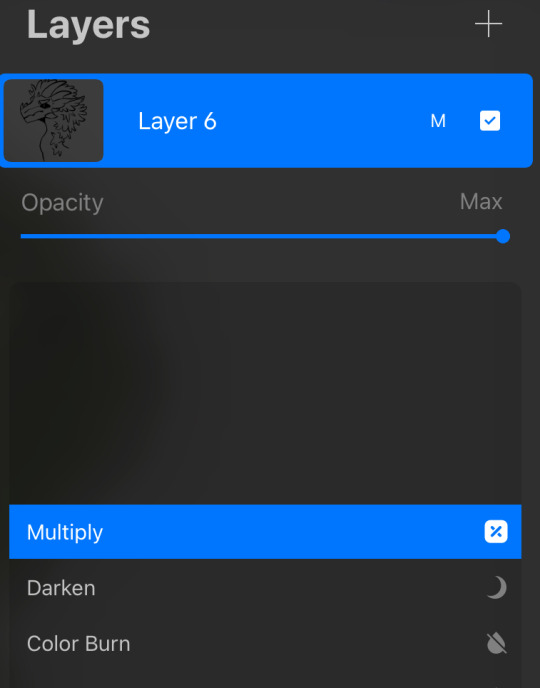
set it to multiply too. this way, you don’t actually have to bother with hue-shifting to make a darker color look decent
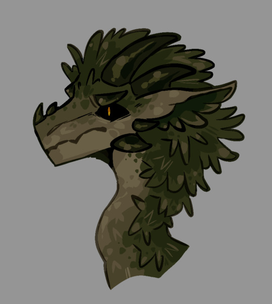
use the colors within the design to subtly color your lineart. i usually keep more important features like the eyes and horns black, and only lighten lesser details
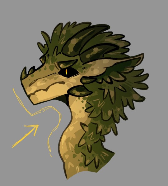
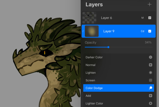
make a new clipping mask layer over your base colors. with a gradient or any soft brush, pick a side of your character where you want to pretend to have a light source, then add a gradual fade into a brighter version of a color found in the character’s design. (heheh. yellowe) set the new layer to like 30-50 percent
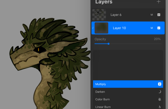
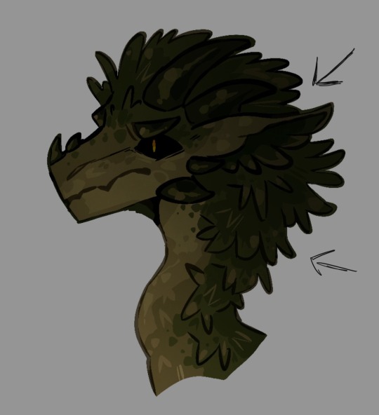
from the opposite direction, add a new clipping mask layer and make a gradient with a darker color found in the design. set it to 20 percent ish

make a new layer above everything else. with a really light color, in this case muted yellow, add more highlights. too many. this is a great stage to outline more important features, as well as imply more texture with extra v’s and Gay Lines.
since the highlights looked a little too gaudy, i muted them in the darker areas around the spine by setting the layer to alpha lock and coloring over it with the soft brush from earlier
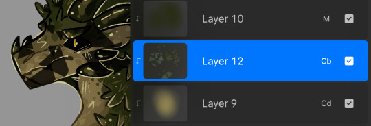
because this clearly isn’t textured enough, you can optionally add random markings with any textured brush. (i used a facet brush from my personal brushpack. might share that too if people want)
set it to color burn or overlay, or really anything that looks alright, and lower the opacity until it’s no longer stabbing your eyeballs out with contrast

wow look it’s a vegetable
@nevermore-ramblings hope this helps with. something
a
90 notes
·
View notes
Text
˚₊· ͟͟͞͞➳❥ when gojo has a crush on geto's childhood best friend

minors / ageless / blank blogs dni
ೃ⁀➷ notes: a little match up break because this has been running through mind all day & it was inspired by this fun quiz! my baby boy is so sweet and sincere when he's love, even though it's doesn't always come across that way x
ೃ⁀➷ tags: angst and fluff; unrequited(ish) love; pining wc: 970
♡ satoru's heart races when suguru introduces you to him for the very first time. of course, he's dated before but those were fleeting. the ones who came into his world swiftly left because he was too "emotionally unavailable" and "never made enough time". he wonders if his infatuation hit him this hard, and struck him this deeply to the point where it actually rendered him speechless, or if this sudden problem is simply because of you.
♡ my goodness, you're pretty. so, so pretty that he can't stop blushing. that he stumbles over his words and says the wrong thing. that he can't stop walking into doors and knocking over glasses. he can't compose himself and winds up coming across as a complete and utter fool. how is he supposed to keep an even keel when at the slightest look you manage to throw him off center?
♡ suguru eventually tells him that you were both neighbors, your families very good friends, and that you used to have sleepovers every weekend which have made you both inseparable ever since. he shares his memories with little anecdotes about you, but he pays attention to the intrigue in satoru's eyes. geto is extremely protective of you and warns his friend not to mess around. "satoru, she's just as important to me as you are," he lectures, "and I won't hesitate to kick your ass if you try and mess around with her". satoru raises his hand in surrender, and stammers out promises that his inquiries are completely Innocent.
♡ you don't take to him so quickly, but satoru insists that it's okay. he thinks it will all change once you get to know him a little bit better, but in the process of proving something to you, he can't seem to stop himself from falling for you. every interaction results in him crawling back to suguru for some guidance on how he can work his magic to win you over. "I just...I just want us to get along..." he murmurs, like a sad little puppy licking his wounds.
♡ at first, geto takes it all with a grain of salt. this isn't the first time a guy has tried to worm their way into your heart, and he isn't surprised that his own best friend would be so taken by you. over time he starts realizing just how serious it is for satoru. how failures on his part to earn your affection results in him wallowing in sadness and pouting with frustration. "you really like her, don't you?" he confronts one night, and to his surprise his best friend simply sighs in defeat as he gazes longingly into the distance. "yeah, I really do..."
♡ geto watches satoru go to extraordinary lengths just to impress you. an idiot in love, he thinks with a smile, but one whose heart is truly worthy of yours. he doesn't step in satoru's way, and offers his assistance wherever he can. he plays matchmaker on the side - removing himself from scenarios in the hopes that quality time can bring you both closer together. he notes all of satoru's gestures: like when he pre orders your favorite drinks so it's ready by the time you arrive, or how he sifts through the compilation of information that he's memorized about you to find you the "perfect" presents, and that he is always the first to jump at your every beck and call.
♡ and satoru...can see it's working; you no longer regard him with disapproving eyes, have dropped your reservations and allowed the most vulnerable parts of you to flourish with him around. he makes you laugh, and it's like walking out of a battle carrying a victory flag. he sees you inching closer when you both sit together, and his heart is so ready to leap out of his own chest just to rest comfortably on your lap. you actually enjoy his company, and he can tell because you both spend a lot more time together without suguru around...
♡ satoru is trying is best, and he thinks he's doing great. "I'm going to tell her tonight," he informs suguru - his cheeks so pink and his smile stretching from ear to ear that suguru thinks it might stay that way permanently. the two of them glance over to you speaking with shoko and utahime, and suguru sweetly pats him on the shoulder before grinning softly in his direction. "go for it," he encourages, "you've been holding out for so long, I think its about time"
♡ satoru approaches you - his palms clammy, his heart racing so fast that it makes him a little dizzy.
♡ but...you don't notice that he and suguru are just within your reach when you let the following confession slip: "satoru is really sweet, but...he's not my type..."
♡ his world stops there.
♡ there's a catch in his throat, and his cheeks turn about five shades of crimson as the three of you turn around to face the interruption of him and geto approaching. you're taken aback by his presence, and he can practically see the shock washing over you, but before you can say anything else he quickly excuses himself and heads outside.
♡ oh, he feels lightheaded, so much so that he needs to sit down. long legs collapse onto the front steps just outside the door and he's struggling to catch his breath. his chest is tight, the stretch extending from his torso down to the discomforting knot in the pit of his stomach. his face is hot with embarrassment, and tears prick his eyes as your words ring around his head in taunting failure.
♡ but you're perfect to me, he thinks with a slight upturn of his brows. you're all I ever wanted.
ೃ⁀➷ part two will be from the reader's pov. ps - im gonna squish this boy with so much love, I swear :ccc
#gojox reader#gojo x you#gojo x female reader#gojo x y/n#gojo angst#satoru gojo x reader#satoru gojo x you#satoru gojo x female reader#satoru gojo x y/n#satoru gojo angst#jujutsu kaisen fan fiction
563 notes
·
View notes
Text

Obligatory coffee shop au art
Close-ups and ramblings under the cut because I spent waaay too long on this
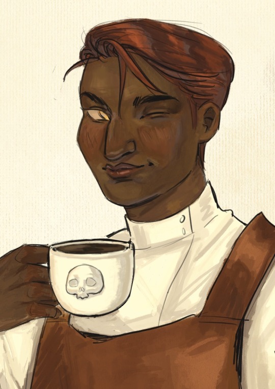
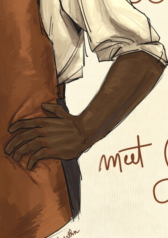
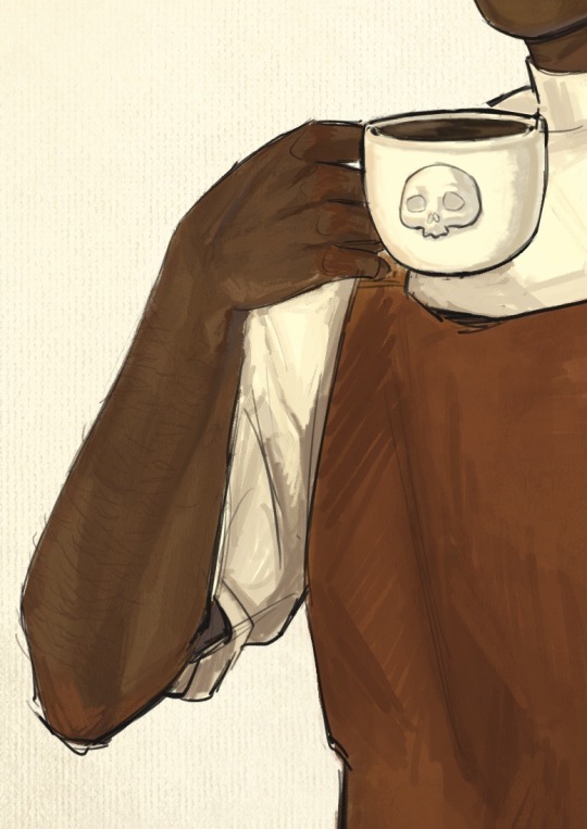
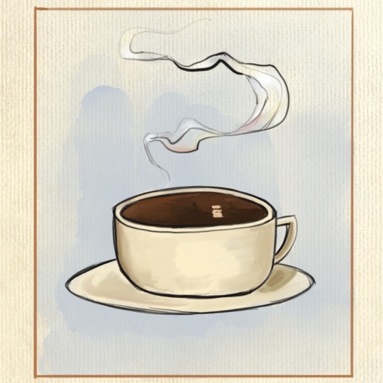
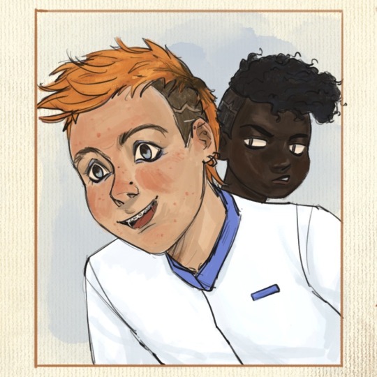
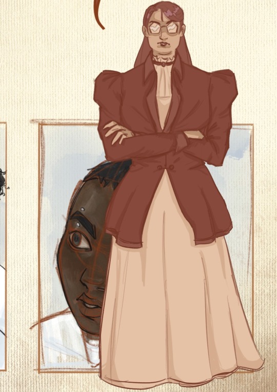
Welcome to my brain soup.
Disclaimer, I didn’t really plan this piece and just kept adding concepts as I went, so it’s kind of all over the place. It’s more a big patchwork of dumb ideas I got excited over, rather than a well thought-out drawing, but I like it as it is! It feels like my brain did when I was reading htn :]
1. The whole concept behind this is just "Vintage coffee ad but make it the griddlehark coffee shop au". I was aiming for cheerful but also not quite right, in a very stock photo kind of way if that makes sense. Gideon is smiling but she is not a willing participant in this. Also that coffee is cold.
I - very predictably - took inspiration from Leyendecker’s work, since his ads and posters are the first that come to my mind when I think "vintage ad", and also because I do feel like his painting technique is close to how I naturally paint. This is not meant to be a study of his style tho, I didn’t try to break it down on more than a very superficial level.
2. 3. Nothing special to say, just Gideon’s arms (her perfect biceps are hidden from view lest they cause a riot in the cafeteria). Also arm hair. I feel like it’s becoming a recurring feature in my art lol
4. I debated whether or not to add a foam skull on the coffee then ultimately decided against it. That’s one skull too many, and honestly Gideon neither has the skill nor the patience to attempt one. Let’s be real, if they let her have access to the pitcher she’d make tits. So here is your tits-free coffee, courtesy of the Cohort photoshop editors.
5. Isaac, sporting the Fourth’s blue not only in dress but also in his questionnable choice of eye makeup. They have matching haircut only so Jeanne can showcase how much better it looks on her.
6. This is where I finally have something clever-ish to say. Thoughts ! I have them ! Sometimes. So. Harrow. You can’t see it but she has a nose piercing as well - this is relevant to spreading my agenda that Harrow is full of bone (piercings, that is). Sue me, I forgot that they let her keep her face paint in this scene. Onto the actual thought process.
This is where Abigail interrupts the scene, before Harrow can catch a glimpse of barista!Gideon. Her interruption is shown by the unfinished look of this panel : the sketch lines peeking through (in a reddish hue, to mimic sanguine, the red chalk that artists used to draw sketches and studies - and also because the contrast of the colors makes it pop better against her skin) + the rendering is messier from the neck and down.
Abigail is blocking half of Harrow from view - I wanted to have her hide Harrow’s eyes and thus line of sight entirely, but I feared Harrow wouldn’t be as recognizable with more than half her face hidden, frowny eyebrows and all.
Abigail herself is meant to look out of place here, without taking too much attention away from Gideon. I drew her in a much simpler style, using a more monochromatic palette and cell shading, to contrast against the rest of the gang, where I used a lot more color variation and a more detailed & textured painting style.
That’s about all I have on this, if you got this far thank you! Your support is much appreciated. If you liked this drawing I’d be overjoyed if you reblogged it and left your thoughts in the tags/notes! I’m always happy when I read them, even just a "#nice" makes my day.
#my art#tlt#griddlehark#coffee shop au#you know the one#the locked tomb#harrow the ninth#htn#gideon nav#harrow nonagesimus#ft the terrible teens#isaac tettares#jeannemary chatur#and the woman the myth herself#abigail pent#artists on tumblr#tlt fanart
138 notes
·
View notes
Note
I'm making a memorial drawing for my parents' late cat, but he is black and white and i wanted to make a lineart with color and shading, but my color and shading isn't top notch
do you have any advice?
(i love your art and style so much btw, your lineart, color and shading is absolutely stunning)
Oh that's lovely! I'm gonna do my best to explain how I do my colours and shading for you :)
Black and white are both the hardest colours to shade because they end up looking boring very quickly, but there are some tricks you can use to spice up your rendering a little bit.
If you look at the examples below:

The base black of this boot is not only not a true black, but it's not a true grey either, it's a very desaturated pink, but it does have a colour to it. Something like that should be your starting point. You want to stay away from true blacks and true whites, and only use them in places where they'll have a lot of impact. Like your lines, or the white highlight in someone's eye!
When I shade anything at all really, but especially anything that is meant to come across as white or black I try to cram as much colour into my shading as possible. in the piece above you can see that the deepest point of my shadows tend to get another colour added into them, sometimes i use a cold tone, sometimes a warm one, it just depends on the rest of the piece. The one above has a bit of both!
Same goes for white:

The base colour of Røst's white fur is a cream, not white, the highlight is a very light teal, and the shadows are a warm-ish royal blue, though with the opacity turned down.

In this one, on Rudi's belly, the white of her spot is actually split into two colours, warmer on top, and cooler on the bottom, since the snow would cast a bounce light up onto her fur. On top of that though here you can see how wild you can get with mixing other colours into your base colour to make it pop a little more. You can get away with way more than you think! And it doesn't always have to make sense :)

Baisically the hue slider is your best friend. That's the slider on the outside of the colour wheel in this type of setup. You can achieve a lot of variation in your shading just by fiddling with the hue slider and a bit of saturation and then slapping some of that in there!
I hope this is actually useful and not just gibberish :')
#my art#digital art#honestly my best advice is to not be afraid to go a little crazy with it#I did a watercolour pet portrait for my friend a little while ago of their cat that has a lot of grey on her#and i filled those spots with little bits of blue and i think yellow too#just to make them a little less flat#anything goes if you're brave enough!#long post#ask
37 notes
·
View notes
Text
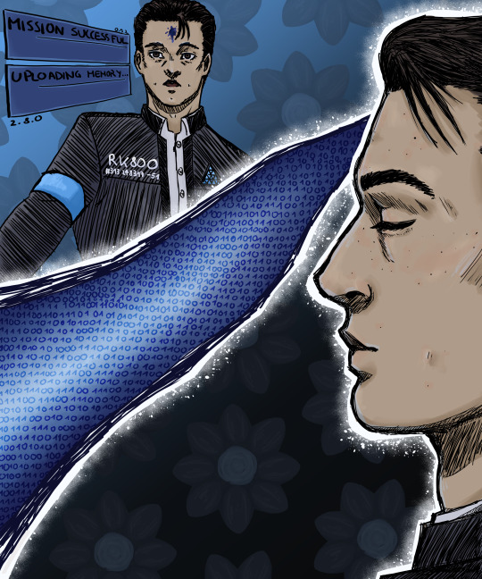
"Whenever I die... my memories are uploaded into a new body. But are they really 'mine'?"
aand my WIP is done! done-ish. idk what to add anymore; rendering is a social construct
ramblings + timelapse under the cut!
awright, so this piece was originally part of a comic-thing that i sketched out in my sketchbook. but it was just something i slapped on figuring i'd rework the composition later. well, i couldn't. it was too crowded. so this is severely reduced from the original plan.
the gist of it is that: obv the top left connor is connor-51. the side connor is actually connor-52. 51 died in "the hostage", but he did still manage to save emma! (i blame dbh youtube poop for making me think connor and daniel could shoot each other. so even tho thats not canon, let's just pretend that happened here lol)
now when you move files on your device, you aren't actually moving them. what you're doing is essentially copying the file into a new location and erasing the original. and based on this premise, i have inflicted an existential crisis on 52! :D it's sort of similar to soma, and their brain scans. is 52 the same person as 51? is it a continued existence or did 51 as a person die on that terrace, with 52 just simulating continued existence?
the game has conflicting stances there: on one hand, connor often says shit like "my predecessor was destroyed", implying that he thinks he's a different person. on the other, he also says shit like "i'll be back" and "this isn't over". and additionally, if hank has chosen to force quit life but connor still turns deviant, connor gets wrecked by 60 and to win, "transfers" himself into 60's unharmed body. and this is framed like an actual transfer.
i feel like if the data is "moved", it's not the same person anymore. to ensure the data transfer doesn't essentially kill the person and resurrect them as a clone of themselves, I think you'd need to physically disconnect, move and reconnect the memory storage device. if we're basing android physiology on currently existing tech, at least. but that's just my headcanon i use to inflict existential dread.
and here's the timelapse! :))
as you can see I've struggled a lot with this work :P i think i got to a point where this looks pretty fine to me (i still really like how i drew 52 here), although it could deffo be better.
i really want to also draw markus more. i've never even made a proper illustration for him but honestly i tried to digitally paint the grenade launcher scene bc its so pretty and i failed miserably. painting in digital is so hard?? idk i should research some stuff on how to do that because i really want to paint that scene still.
also north. north with the grenade launcher :O fuck i want north with the grenade launcher.
28 notes
·
View notes
Text
A CASE OF LIMERENCE | Chapter Six
PREVIOUS CHAPTER | NEXT CHAPTER

A/N: A sort of short and filler-ish chapter before the real events start unraveling


“Hey.”
“Hi angel.” With a worried smile, Leni watches Sarah prop her phone on something and rummaging in the space around her. She has her hair neatly wrapped in a towel; the bags under her eyes visible even from a mile away. “Whatcha doin’?”
She flashes her a tub of sunscreen, “Skin care. It’s the only thing I can do without losing my mind.” Leni nods somberly, and watches her best friend apply a large chunk of cream all over her tired, but pretty face.
“Sar, you should really get some sleep.”
“I know. It’s just… it’s this place…”
“What place?” And that’s when it hits her. There was a reason why she thought the back of Sarah’s room looked so strange and yet familiar. Sarah’s back in her childhood bedroom. In Tannyhill.
“Home.” She sighs, picking up her phone and giving Leni a small tour of the room they used to spend countless summer days in. On the bed, comfortably tucked under a pristinely white duvet lies a very much asleep John B. When Sarah comes closer he stirs a little and that’s when the snoring begins.
“Are you sure your childhood home is the reason why you can’t fall asleep right now?”
Sarah snorts, her frown finally replaced with a wide grin. “If only.” With that, she moves their conversation to the large dining area downstairs. “To be honest, I do kinda miss it, but at the same time, I really don’t like being here.”
“Maybe you just need time.”
“Maybe.” Sarah bites the inside of her cheek, gaze stuck somewhere in the far distance. “Leni, he still owes people money.”
“Rafe?” His name comes out in the form of a croak.
“Yes. That’s why he was in the hospital. Someone jumped him last night. He was out running and apparently this guy just attacked him right out of nowhere. Bashed his head with a rock… started kicking him… Leni… he could’ve died.”
Leni opens her mouth to speak but no words come out. She’s been rendered completely speechless. Not only that, she also happens to feel the slightest bit of guilt, but not for what she did. That’s all Rafe’s fault and she feels zero remorse about it. Okay, maybe not zero; a part of Leni does feel kinda bad about the way things transpired in the end. Especially the part where she helplessly watches her best friend in the entire world lose sleep because her brother told some bullshit story.
All because he wanted to protect Leni.
Just like wanted to protect Wade all those years ago and suddenly, her guilt isn’t completely unjustified.
She swallows.
“Is he… is Rafe gonna be okay?”
“Yeah. He only got a concussion so the doctor said he’s gonna be fine by tomorrow. He just needs to sleep it off.” A wave of relief washes Leni the second she hears Sarah say that. “And what about you? (“Me?”) A little birdie told me you and JJ were texting the whole night.” A mischievous grin spreads across Sarah’s entire face and fuck - Leni completely forgot to reply to his message!
He’s probably sat at home thinking he crossed a line or something and that now she’s ghosting him.
“Yeah, we were and then he sent me this text about how my pizza needs meat and I couldn’t figure out whether he was being flirty or just making a dumb joke so, I kinda ignored him for a second and went to cool my head off on Instagram and-” The image of Simon’s story flashes before her eyes. She should’ve blocked him when she had a chance; so many things would’ve been easier (or better said avoided) if she had done that.
“And?”
“Simon has a new girlfriend.”
“WHAT!?” Sarah’s face goes pale with shock. “But it’s barely been a month!” Leni nods, her eyes now slowly beginning to fill with tears. “You should’ve reposted JJ’s story on your main. Actually! - you should post a photo of JJ like immediately! That’ll teach him.”
“You’re right but… I don’t want JJ to think I’m using him to get back to my ex or something..”
“Why would he think that? Don’t you like him?”
“I do! It’s just… I don’t think I’m ready to do anything with anyone just yet.”
“I get it. Wound’s still sore.” Leni nods again. “You know what we should do? We should find the guy that jumped Rafe and hire him to do the same to your ex. Maybe that’ll teach him a lesson.”


When Leni arrives at The Wreck, Cleo is already there: sat on their table in the back while Kiara is running around, her hands busy with a tray full of orders. “Jesus what happened to you?” It was a question Leni expected to be hearing until the deep purple bruises slowly faded into a nasty yellow and then hopefully altogether.
She smiles sheepishly as if what she’s about to say it’s truly mortifying and embarrassing and in hindsight - it is. “Long story.” A sigh escapes her lips in such a perfect way, you’d think she’s out here gunning for an Oscar.
“I’m curious. Make it short.”
“Last night I found out my ex has a new girlfriend so I went for a run to clear my head but forgot to tie my shoelaces so I stepped on one and tripped and fell.”
Kie’s face scrunches into a grimace. “Well that’s embarrassing.”
“Yeah.”
“But hey - at least you didn’t get jumped by your ex- dealer.”
“My ex what?”
“You ex-dealer. Well, in this case Rafe’s ex-dealer. Who jumped him. Cause he owed money.” Kie says smiling. The people she’s giving out their order to, don’t seem as entertained though. “Enjoy your meal.” She says sweetly before turning back to Leni, “Oh, by the way - Sarah said you’re looking for a job?”
Leni blinks, “Uh, yeah.”
“Come work for us. You’ll get so many free meals plus we’ll get to hang out like - all the time.” In that moment she realizes just how hard it is to say no to Kiara. Especially when she’s smiling like that and even though working at a seafood restaurant wasn’t the fun summer job Leni had exactly in mind, it’s still a job and she could really use the money.
“Yeah. Sure.”
A squeal leaves Kie’s throat as she jumps, pulling Leni into a tight hug. “Awesome. I’ll go tell my parents! You have no idea how many brownie points you’ll be getting me by doing this Leni! I owe you!”
With an equally huge grin Leni watches Kiara disappear behind the counter before finally joining Cleo. “Kie roped you into working for her parents?” It’s the first thing she says after their hug, forcing Leni to furrow her brows. “Don’t give me that face. It’s a good thing. I’m only saying it because she’s basically asked everybody and you’re the only one that said yes. Well - that’s not true. JJ agreed, but her parents hated the idea.”
“Why?”
“Cause they don’t like him. I’m pretty sure they’ve always felt that way. I mean - why else would Kie be dating Pope instead of him?” Cleo’s eyes suddenly grow as large as saucers. “Shit. Pretend I didn’t just say that.”
“Say what?” An amused smile begins spreading in the corners of Leni’s lips all while Cleo actively avoids direct eye contact.
“Just… are you thirsty? Let’s order something.”
“Cleo. Look at me.” Cleo refuses to look at her despite the gentle tone in Leni’s voice. She’s too busy perusing the drinks menu. “I’m not gonna say anything. But I do want to know if there’s something going on between JJ and Kie.”
“Nothing’s going on between JJ and Kie. She’s with Pope and JJ and I are part of the No-Love Club. The end.”
“What the fuck is the No-Love Club?”
With an earth shattering sigh, Cleo finally stops hiding behind the menu and faces her. “It’s this stupid thing Pope came up with when Sarah and John B broke up for a hot minute. The friend group got totally disrupted and one night he was like: ‘Swear no more inner dating! If you wanna hook up do it outside!’ and we were all drunk and sad and just agreed with his bullshit idea.”
Leni blinks.
“So, wait… Pope and Kie are no longer part of the club?”
“No they are. They just bend some rules.”
“And each other.”
Cleo grimaces. “Don’t put pictures in my brain.”
“But why are they allowed to do the inner dating thing, but not … I’m confused.”
“Me too Leni. Me fucking too.” It’s what she says, but the answer is right there - all over Cleo’s forced smile.
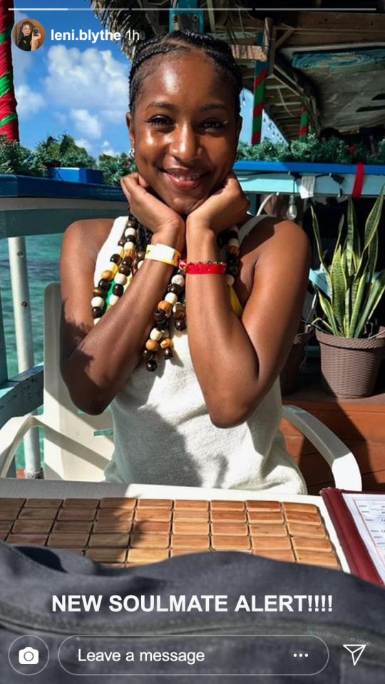
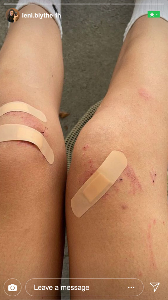
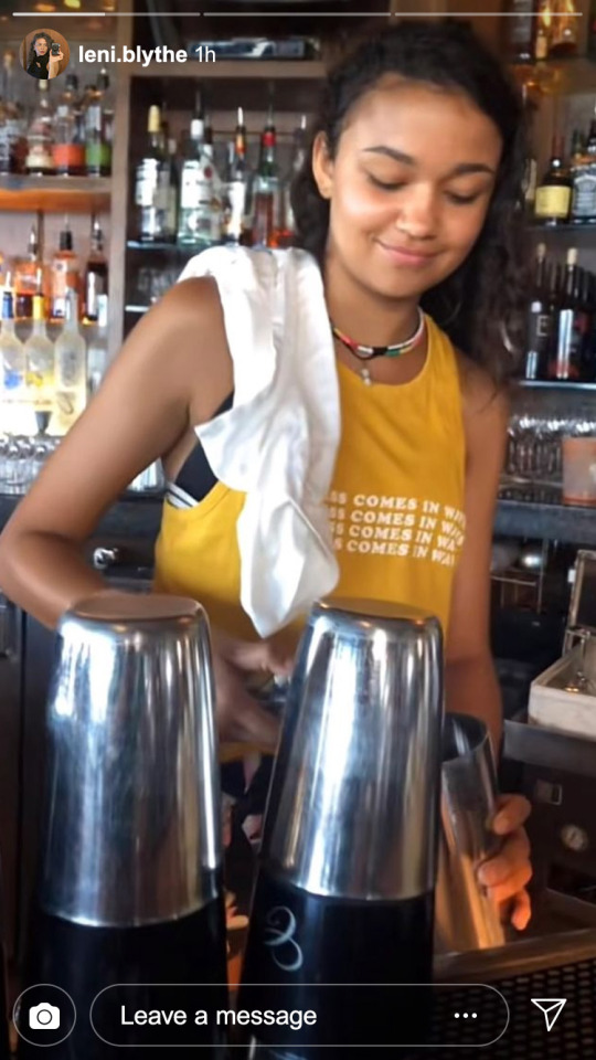
Rafe still hasn’t replied to her text.
Obviously, this is something that shouldn’t concern Leni one bit and yet, there she is - obsessively checking her phone every ten minutes or so. Cleo and Kiara have been aware of this, after all it was one of the many reasons why she totally blanked out not on one, but two of their conversations and missed out on very important information regarding last night’s get together.
JJ on the other hand, wasn’t so subtle. Not only did he make things incredibly awkward by refusing her hug with a fistbump, he also made sure to embarrass her by loudly asking whether she was expecting a text from her boyfriend.
“Stop being an insecure dick!” She overhears Kie saying to him through gritted teeth - amongst other, unintelligible things - before skipping away with Pope for a lovely sunset swim.
“Hey.” JJ plops right beside Leni. His voice is so quiet it almost sounds like a whisper. “Sorry for being a dick.” Their gazes meet.
Next to her, Cleo shuffles. “And that’s my queue to leave.”
The air between her and JJ is charged, but nothing like the kind she’s felt with others. With the corner of her eye, Leni watches him play around the sand with a stick; his long hair covering half of his face and suddenly she is hit by the strangest of sensations: she wants to run her hands through his hair. She wants to push it back; see just how far it’ll go and gaze into those blue eyes in the same way she used to gaze into Rafe’s last night.
Rafe.
Her heart skips a beat at the thought of his name and it takes all the power in the world not to reach for her phone and check whether he’s finally replied.
“I was gonna text you back, y’know. It’s just…” She awkwardly gestures at her bruised legs and sloppily places bandaids. “This happened.”
JJ takes her hands into his own, carefully inspecting the torn skin on the inside of her palms before intertwining their fingers. “I didn’t take you for a clumsy girl.” He says, making her laugh and he squeezes her hand a little before letting go of it entirely. “It’s cute.”
Their eyes meet and his are so… clear. Like the ocean on a beautiful sunny day; its color an enviable light blue and making Leni want to plunge in it without any hesitations. In a matter of seconds she can picture certain moments of her life with him; the early morning trips to the beach, lazy kisses that taste like warm beer and weed; the smell of sandalwood lingering on her skin and salt in her hair.
It’s the perfect summer romance.
The kind she’s dreamt of since she was a little girl and yet-
“Did you miss us?” John B’s voice cuts her daydream in half and Leni can’t help but think it’s for the better. Kie and Pope come out of the ocean and Cleo joins in soon after - her palms full of pretty shells.
They huddle together by the growing fire: shoulders touching and legs covered in sand. Beer bottles start being opened and Kie has the summer nights playlist softly playing from one of the portable speakers Sarah took from Tannyhill and everything is just like it’s supposed to be except there she is again: thinking about Rafe.
Why hasn’t he texted her yet?
She looks over to Sarah, as if she could be the one capable of providing Leni with this answer and even though she might be, she still remains the last person Leni would ever ask about Rafe. And that’s when she notices; the distant look in her best friend’s gaze, the very same she would be a witness of every now and then and Sarah doesn’t have to say anything. All it takes is for the two to lock eyes and in a matter of seconds, they find themselves standing.
“We’re… we have to pee.” Leni says sheepishly before reaching for Sarah’s hand and moving far far away from the others. “Sar… talk to me.” She says as soon as they’re out of earshot and that single question is all it takes for her best friend to have a complete and total meltdown. “What’s going on?“
“I can’t do this… I can’t sit around and pretend I’m fine when my brother was in the hospital and no one seems to care! Like - they were literally making jokes about it! Saying he deserves it…” Well, he did kinda deserve it, but Leni would never ever admit this to Sarah or worse - tell her she is the reason why her brother got concussed in the first place. Although she does have the sneaky feeling that Sarah might end up siding with her once she finds out why Rafe got knocked by a rock in the first place. “I know he’s a piece of shit, but he���s still my brother…”
Nodding, Leni pulls her into a tight hug, rubbing soothing circles all over her back, “I know… I know…”
“Wanna know the most fucked up thing? His ex was his emergency contact.” Sofia. The sole mention of her name makes Leni’s heart skip a beat and she hopes to god, Sarah wasn’t able to feel it. “If she didn’t have my number, I probably wouldn’t even have known he’s in the hospital. Like - you should’ve seen him Leni… He was so bloody.”
There it is again - the twinge of guilt that has absolutely no business being there. It eats away at Leni; the same way anxiety and all those other piled up regrets do in the darkest hours of the night.
“I thought he had relapsed. When they called me last night - I thought he had relapsed or, or overdosed or both and I just… he’s the only family I have left. With Wheezie and Rose off to god knows where, Rafe is all I have left...” Sarah pulls away, her pretty face wet with tears. “You won’t judge me if I try to fix things with him, right?”
As long as you don’t judge me for not being able to stop thinking about him.
PREVIOUS CHAPTER | NEXT CHAPTER
#rafe cameron#rafe cameron fanfiction#rafe cameron smau#rafe cameron x oc#rafe obx#rafe outer banks#drew starkey#harriet herbig matten#obx fanfiction#original character#rafe fanfiction#rafe x oc#rafe cameron social media au#rafe cameron angst#obx rafe cameron#obx fic#obx#outer banks#outer banks fanfiction
17 notes
·
View notes
Text
Obscure Far Cry Promos and Content
I'm a big far cry fan, which means I have to make my own food in this economy. But sometimes I just want some ACTUAL canon or canon-ish or even just canon-adjacent content, y'know? It has gotten to the point I go into youtube rabbit holes or watch a remarkably below average hallmark movies for 5 minutes of an actor's screentime to hopefully hear Jason or Ajay or whoever talk. And so in these quests, I've found a couple obscure promos. Gonna compile them here for myself mostly :)
Far Cry 3
Far Cry 3 - The Voices of Insanity: Doctor Earnhardt //a live action video with Alec Earnhardt's VA
Far Cry 3 - The Voices of Insanity: Vaas //same thing but with Michael Mando
Hoyt Audition Far Cry 3 //the last part of "The Voices of Insanity" videos, couldn't find the one from Ubisoft's own account but someone else had posted it on youtube
Far Cry 3 for PS3: TV Spot
Far Cry 3 -- Island Survival Guide: Psychopaths, Drugs & Other Dangers // video narrated by Willis Huntley
Far Cry 3 -- The Savages: Vaas & Buck // this video shows a rare render of vaas with tataus on his arm!
Far Cry 3 | The Tribe: Citra & Dennis //this video has a deleted scene where Jason hallucinates the tatau snaking up his arm
Far Cry 3 -- The Tyrant: Hoyt
Far Cry 3 - Insane Edition // this is a promo done for a special edition for the game, Michael Mando probably couldn't shoot the promo himself and just voice acted, and so they used another actor and made it so the camera never sees Vaas's face.
^ There is also a survival guide titled Face Your Insanity written by post-Rook events Jason Brody as part of the Insane Edition.
Far Cry 3 | E3 2012 Step Into Insanity Trailer [NORTH AMERICA] // this has a few close-ups of Jason and Vaas switching places with each other
Far Cry 3 Interviews (via @lulu2992)
Far Cry 3 Tweets by Jeffrey Yohalem, the lead writer. (also compiled by @/lulu2992! Thanks again!)
Far Cry 4
Divya Kandala's Blog (archived on the Wayback Machine) // Divya Kandala is a fictional journalist who wrote a blog about her travels to Kyrat, her blog's basically world-building promo for FC4. You could also find the house she stayed at in Kyrat!
Far Cry 4 TV Commercial
Far Cry 4 | Kyrat Tuk Tuk Stories //this is the MOST we see ajay in third person in promo content
Far Cry 4 - CGI Trailer // this isn't exactly RARE but it took forever for me to find that clip of ajay's eyes reflecting from the kukri. plus he looks EXTREMELY caucasian which really doesn't help the rumors I've heard that they originally wanted Jason again as FC4's protag
Comedy Central Far Cry 4 Commercial feat Danny Pudi & Donald Glover
Far Cry 4 and Childish Gambino: The Collaboration | PS4, PS3 // a music video for Crawl by Childish Gambino done as a collab
Old Archive.Org link to the Far Cry 4 webpage that had a choose your own adventure campaign
^ and the youtube video to promote it
Far Cry 4 | Behind the Scene Trailer 1/3 [Europe] // developer vlogs when they visited Nepal and interviewed the ghurka that became base for Golden Path, you can see the village that resembles Banapur a lot!
Far Cry 4 Performance Capture Interview // you can see Janina Gavankar, Amita's actress doing some mocap in this
Janina Gavankar Talks Far Cry 4 - ^ and the interview with her after
World Gameplay Premiere - Walkthrough E3 2014 - Far Cry 4 // this was to showcase gameplay but they eventually took out this entire mission where you have to wingsuit to Ratu Gadhi (Yuma's fortress), which is a shame because it looked very nice.
Far Cry 5
i'll be honest, im not a fc5 girlie, so i dont usually do a lot of digging, and im pretty sure these are actually not obscure at all. but these are trailers i found that really blew it out of the park. the marketing team for 5 really went HAM
Far Cry 5: Teaser Trailer | Ubisoft //this has a peggie banging someone's head to a church bell rhythmically with the gorgeous view of Montana mountains as backdrop and i for one, find it hilarious
Far Cry 5 | The Sermon - Live Action Trailer
Far Cry 5 | The Baptism - Live Action Trailer //somebody once mentioned this one has Joseph looking like Trevor GTA and i have never quite known peace ever since. it really also shows the reality of how Joseph is actually just really Unwell, and lore that Joseph killed Pastor Jerome's daughter that never showed up in-game.
Far Cry 5: Anything Can Happen, Everything Will - Live Action TV Spot | Trailer // mixes live action and game CGI renders, pretty cool actually!
The Making of Far Cry 5 | Behind the Scenes of Ubisoft [Documentary]
Far Cry 6 Comics
not gonna put in FC6 stuff because they're actually very easy to find! lots of trailers and mocaps and interviews on youtube :) Far Cry 6 actually has a more obscure lore in their comics
Far Cry: Esperanza's Tears comic // this is a Juan-centric prequel comic that features a completely new country, lore about Far Cry universe's political landscape, and lots of cameos from 3-6's characters! very interesting read especially if you're a sucker for backstories like me
Far Cry: Rite of Passage comic // this is more popular as it features Anton telling Diego the backstories for 3-5's villains.
There is also a book titled The Official Far Cry Survival Guide written by a fictional character called Hunter Nash, who supposedly grew up with Hope County-level of a doomsday prepper dad and winds up as a journalist who travels to the locations of 3-6 and wrote how to survive each location accordingly. It's adorned with official artwork of the games and plenty of survival tips. Not much lore-wise, but cool nonetheless! it also fuels my co-workers au ideas but that's personal.
i have actually found stuff like a really old MTV show called Undressed with Gianpaolo Venuta where he uses his Jason voice for his character, and how Patrick Kwok-Choon, the new voice actor for Ajay does voice acting in Thomas the Train Engine and Paw Patrol, and an indie movie with Greg Bryk where he wears fun sunglasses like Joseph, but that's neither here nor there to the franchise, so eh. // i'll edit this post if i find more, so maybe check back sometimes!
94 notes
·
View notes
Text
Written version of @thornowl's baking texture-based items for 4t3 conversion tutorial. (Part 1)
Yes, the original video is very useful and I think it's worth checking out for everyone who plans to do 4t3 conversions, especially in MM style. But, in my opinion, the realization is too messy, it took me a long time to understand what actually to do. So I made written tutorial, because many people prefer this format (and because my amazing mutual @nectar-cellar was interested in it). Hope you will find it useful. I had to split this tutorial into 2 parts because of the picture limit.
What You Will Need:
Knowing the basics of converting process: how to extract ts4 meshes and textures, how to make your own multiplier/mask/specular, how to import stuff to TSRW, etc. (@nightospheresims has a good tutorial for beginners: here or here, also don't forget about @sims3tutorialhub!).
Knowledge of basics blender controls and navigation: how to move and rotate the camera, basic shortcuts, how to change mode, editor type, viewport shading, rendering type, etc. (check Grennie's tutorial here, and "Helpful guides when you're a noob" from there too).
Required programs and resources: - Sims 4 Studio. - TS4 body mesh & texture(s), that you want to convert, I use @atomiclight's mix gloves for this tutorial. Also there will be some tip that I learned from converting Sentate's Audrey Corset Set. - Blender (I use version 2.79). - Photoshop (or any other 2D editor, that supports masks and .dds format). - TS3 Bodies template & UV map templates. - Plain normal & specular map, if you don't want to make your own. - TSRW.

STEP 1: ADDING MESHES AND TEXTURES IN BLENDER, PREPARING MESH FOR BAKING.
I already exported all the gloves presets that I want from S4S. And because they don`t have their own mesh, I exported base game swimsuit (you can also export mesh from any other stuff, that 100% is painted on body) I exported it like this: Open S4S → Create 3D mesh → Find it with filters→ Next → Save the package wherever you're want→ go to Meshes tab and press Export.
Open .blend file with ts4 swimsuit, delete the "rig" (you don't need it) and merge all other groups - Shift + click on them and press Ctrl+J on 3D viewport.
You need to export our gloves texture and remove swimsuit texture, go to Textures tab and in small window select "DiffuseMap": If you don't see DiffuseMap texture, switch type of texture data to "Show material textures" (brown-ish circle).
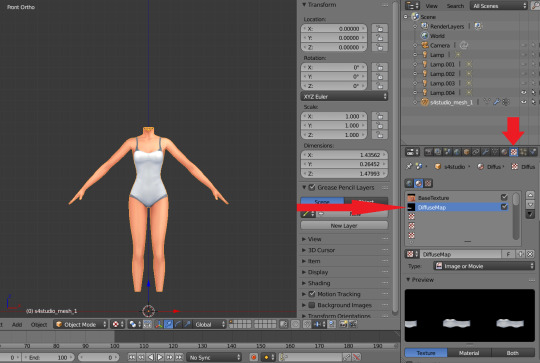
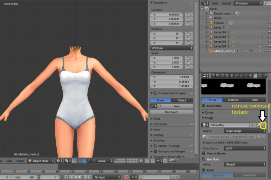
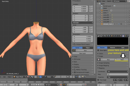
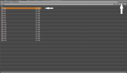
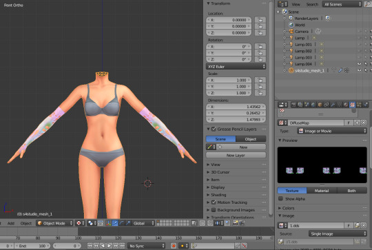
6. In the same way you need to remove skin texture, because you don't need it, only select BaseTexture instead of Diffuse:
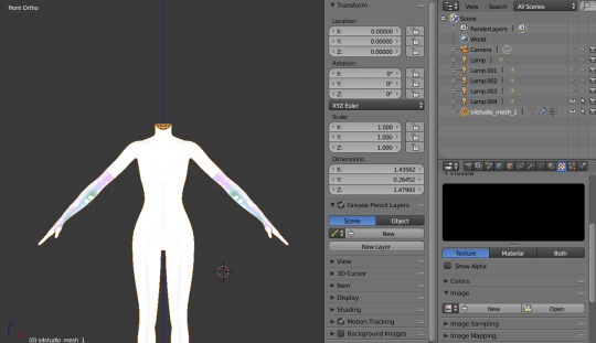
7. Import your Sims 3 body, also I merged the top and bottom, because TS4 mesh is full body too:

Tip: if your stuff have 3D parts, separate them in their own group(s) and hide them from baking (you can bake them separately and/or tweak them in Photoshop):
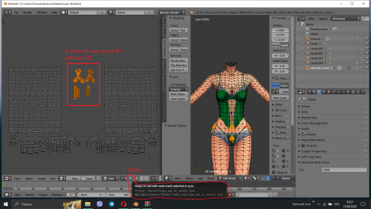
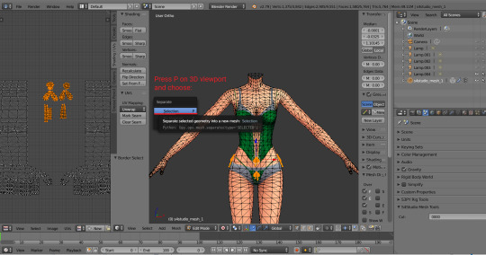


STEP 2: SHRINKWRAPPING THE TS4 MESH.
In this case it would be really easy to adapt TS4 body mesh to TS3, because they are very similar, for stuff that partially 3D (like dresses) or in case with non-standard bodies (like Venus Curves by Venusprincess) it would be harder, so I don`t cover this in this tutorial.
Select TS4 body, go to Modifiers tab, usually there are already applied modifier "geom_skin", just ignore it and in the "Add Modifier" window select Shrinkwrap modifier.
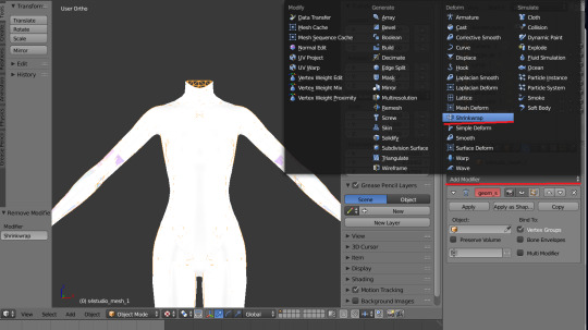
2. In the Target tab select TS3 body group:
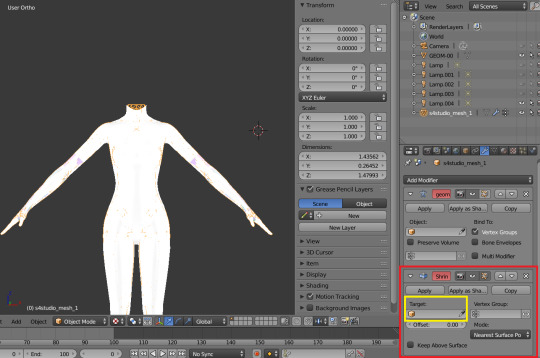
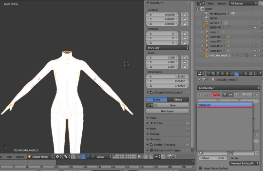
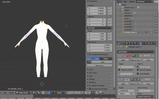
This is how TS4 mesh is supposed to look with this modifier, you may also apply modifier, but it's not necessary:

3. After that you need to hide TS3 Body mesh and now we're going to baking.

STEP 3: ASSIGNING MATERIALS.
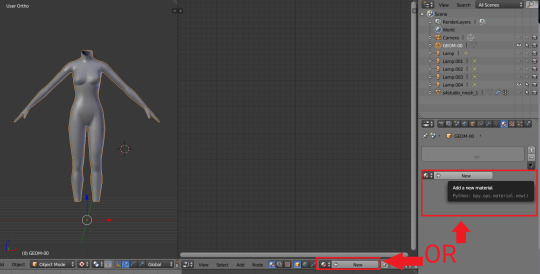
First of all, you need 2 windows — with your 3D viewport and with Node Editor, also you need to switch rendering type to Cycles Render. After you set it, select TS4 mesh, open Materials tab and press Use Nodes button:

2. After that two small boxes should appear on the Node editor tab. Then press Shift+A and select Texture → Image texture:
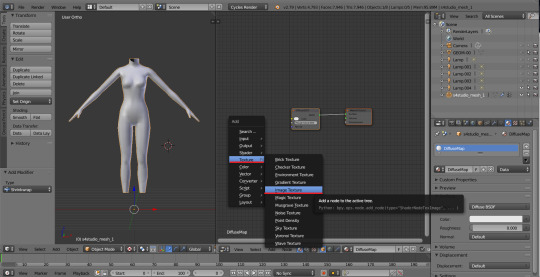
3. Connect node that you already added with Diffuse BSDF node, by connecting yellow dot (socket) named Color of Image texture to the same socket of Diffuse BSDF node. After that click on the image icon and find your texture:

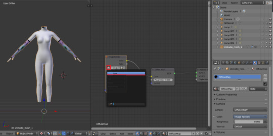
Don't worry about the black spots, we will fix that later.
4. Go to UV/Image editor and create new image for your bake, it must be 1024x1024 size or, if you want HQ texture - 2048x2048 or 4096x4096, but today I use non-HQ. After that, hide TS4 body and unhide TS3 body:
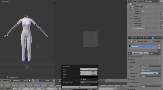
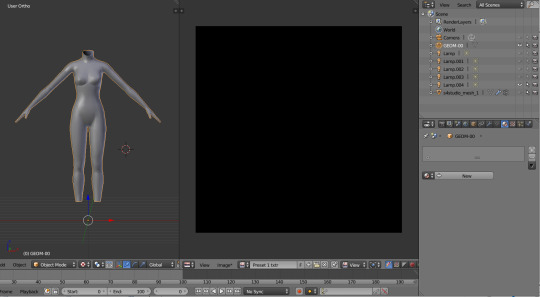
5. Go to Node Editor, create new material and assign our newly created image to ts3 body the same way, that we did with ts4 mesh and original texture:
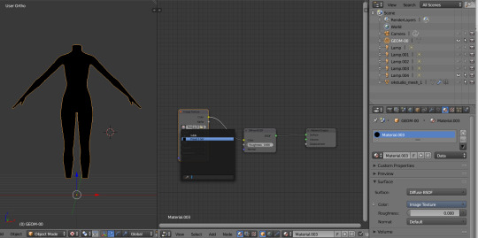
6. Press Shift + Click on the TS4 body firstly, and TS3 body lastly. It`s an really important step, because without it baking wasn't work right way.
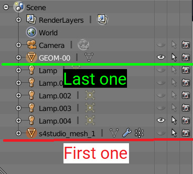
STEP 4: BAKING THE TEXTURE.
7. First of all, go to the Render tab and change default settings to the following:
Sampling Tab:
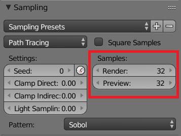
Bake Tab:
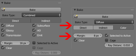
8.After that press Bake button and wait for it.
9. Look at the result, great, doesn't it?:

10. Save this texture as .png... But wait, that's not all! we need to bake alpha, so we can remove that black body texture in Photoshop later.
But that will come in part 2...
115 notes
·
View notes
Text
Behind the canvas: Painting 'Finally getting that drink'

This is a post about some of my thoughts while painting Rugan's pin-up for this month. Some technical ideas, rambling and mild nudity below the cut.
Inspo and references
The pin-ups of Gil Elvgren are on the left, and 'Elspeth Resplendent' by Anna Steinbauer is on the right.
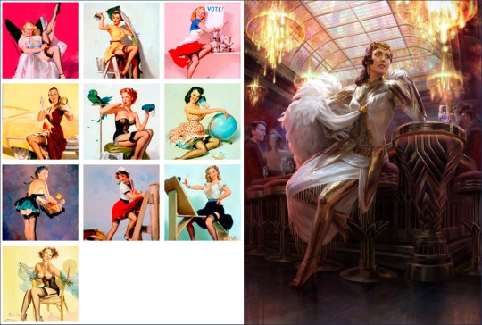
Elvgren is one of my favourite artists and I spent some time looking through a book of his collected work to see what ideas I could take for this pin-up project. The things that jumped out at me were:
The women felt like 'subjects' rather than 'objects'. There's some implication of hobbies, an inner life. They're often in the middle of doing something when they're captured on the canvas.
The subjects know they're being looked at, and they are taking it as an opportunity to flirt (signalled through eye contact, coquettish facial expressions and body language). It feels like a conversation between viewer and viewed.
Parts of the body may be exposed, but the eye is drawn back and forth between the subject's face and more titillating parts of the image.
I knew that I wanted to show Rugan in a similar setup, then; in this case, he's halfway through dinner and then catches sight of the viewer. His eye contact and smirk are flirtatious and mirror what you see of him in Act 1.
I initially wanted the pose to mirror Elspeth's in this beautiful Magic the Gathering planeswalker art by Anna Steinbauer, whose work I am obsessed with. Since I started taking art seriously, it's been my goal to paint for MtG, so I often try to study from artists whose illustrations I admire.
However, I didn't want to copy her pose or the composition of the piece. Don't get me wrong, I'm not above doing this - but I felt it just didn't work with the subject. The horizon line (shown in red) is very low. This is a gnome-level view of Elspeth. And I didn't want to place the viewer at the eye level of Rugan's penis.
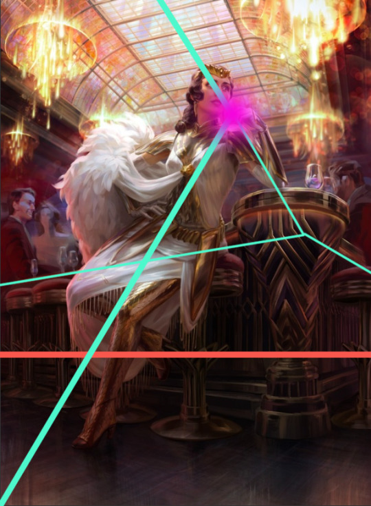
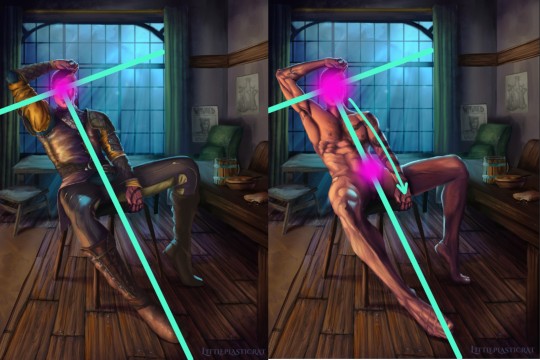
I kept the composition similar in some other aspects though - there's still a T shape (pale green) that draws the eye to the focal point (pink). I did some sketches where Rugan is leaning forwards/sideways in the same way as Elspeth is, but I feel that this final leaning-back pose demonstrates more dominant body language and allows me to paint the musculature of his torso in more detail. This acts almost as a 'ladder' that draws the viewer's eye up and down between the two focal points of the nude variant.
Painting
I've already said quite a lot on a post that was supposed to be short, so I'll keep it brief here and write more about the painting of Gortash and Raphael (February and March respectively).
It's been quite a while since I've tackled such a detailed painting, so I had to do some research/studies to remind myself of some helpful rendering rules:
Veins beneath pale skin might look blue, but they're actually just a desaturated version of the same colour. There are other parts of this image where the veins are particularly lovely. I'll leave that to your imagination.
2. Highlights on leather are not as saturated as you'd expect until you get to the most reflective part of the material. Also, a good texture brush can work wonders.

3. I try to use as few layers as possible when painting, but I remembered the importance of putting design detail on a separate Multiply layer. Multiply allows the layer to modify/darken the layers below, so you can more easily add detail that follows the shape of the object. For example, the body hair or the snake's head going over the chest. If I were painting traditionally, I'd have had to put in a lot more effort. With Multiply layers, it's one colour. Nice! I got a great tip from @dustdeepsea about the blue-ish tint that tattoos, particularly older ones, can get. I felt like this massive tat is not something that Rugan has had done recently, so I added a Gaussian blur as well.

Well, if you got this far, thanks for reading! This is a great way for me to reflect and record what I've learned from the painting. I want to paint sexy stuff, but I also want to keep improving as an artist!
Keep an eye out for updates on my next pin-up, who will be Lord Enver Gortash. Time to practice using my hair/fur brushes 🥵🥵
#rugan#digital painting#digital illustration#illustration#pin up#male pinup#bg3 fanart#bg3#painting diary#male pin-up#male pin up
45 notes
·
View notes
Text
So,, I got some input on my Shockwave in the replies of this post that really helped with my characterization of him for my AU!
Originally, my Shockwave was a Senator who wanted to prove that all Cybertronians, regardless of class or frame, were equal. And to prove that, he'd dissect them and study their frames to see if there was any physical difference (specifically in the spark) that proved an innate superiority or inferiority.
When he presented it to Sentinel Prime he was (rightfully) deemed insane and told to 'knock it off' because he had a genius mind that they didn't want to go to waste.
Instead he made a public broadcast showing off his research, and proclaimed he'd dissect Sentinel Prime as well to prove not even a Prime has an innate superiority.
Here's where I'm changing things!
Originally, he was forced to undergo an empurata (to conceal his identity so he could still perform experiments for The Prime) and had emotional inhibitors installed (in my AU shadowplay isn't really a thing, but there are inhibitors that can limit or dull emotions).
Shockwave fled because, realistically, he knew after his public broadcast proclaiming his plans he'd definitely be arrested. And because he fled instead of barricading himself in his office (which he did in the previous iteration), he gets to keep his original personality! (Which I talked about in the post linked at the top.)
This way I can keep the goofy scientist, but still have his hubris and twisted experiments be his eventual downfall without using the empurata.
Instead of undergoing an empurata, he meets Soundwave while on the run (who he still met in his previous iteration, but the circumstances will be different this time) who encourages him to switch to a combat-based frame so he can join The Decepticons without being useless on the battle-field. (Soundwave is the Decepticons spy and recruiter, and he knows of Shockwave's circumstances and potential usefulness already)
AND! Here's the perfect part! My Shockwave is constantly accidentally infringing on others copyrights, because he's a genius BUT everything he comes up with has been done before, (Which isn't a problem when you're a Senator who can buy the copyright, but IS a problem when you're a criminal working for a future Warlord.)
His new body he makes for himself, resembles an empurata victim.
It still fits with his characterization! Because, again, he's an objective and genuine genius, but he never comes up with original ideas!
'Faceplates are unnecessary, I'll just install a complex optic capable of scanning instead!' Etc, etc,
And the end result, is this:
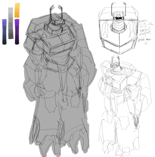
I'm pretty anxious to post my art, but I'm proud of this concept for his design. It's just messy sketches, and I have a few more ideas jotted down, but I think it fits him well! (I have no idea how to properly color or render, but I can sketch and do decent-ish line-art, I think.)
He wants his body to be functional and powerful, but he doesn't really know what a warrior looks like because he was a privileged senator.
So he installs claws, a massive gun, a loincloth, thick frame for tanking attacks, etc.
But also the classic Shockwave appearance, which is the classic 'empurata' appearance.
(If it wasn't clear, this Shockwave design is based off TFP, TFA, and G1/IDW)
After I design Soundwave, I might draw a comic or write a short story showing his reaction to seeing Shockwave's new body. (It would be silent amusement mixed with bafflement.)
-
But I'm really happy with his new iteration for my AU! Thank you to the people who left suggestions and recommendations for different approaches!
I might make an actual post going over the actual story in detail and going over some parts I glossed over, but I was just so excited with my new ideas for him that I just had to write it all out!
But I'll definitely be making a post going in-depth on his personality in the future!
14 notes
·
View notes
Text
talking about my art journey as of late, or more specifically how relying on 3d models actually worked out in my favor
so back in 2023, i started relying on 3d models for poses and proportions. i hated how my art looked and i was frustrated with trying to put something together, taking forever on it, and having it just turn out like ass in the end. the 3d models removed a ton of guesswork from the process and helped me focus on the things i was good at while gently training skills i was less capable of. i'd already been using 3d models sporadically before then, but it was around when i started drawing nate and ken together that i switched to using them all the time.
it's hard to find comparisons around the right timeframe... but here's a nate drawing (with a friend's oc) i did just before i made the switch, when art was so frustrating for me that i wasn't fully lining or rendering anymore, and then the first nateken i ever did, which was when i started using the models in earnest.
it gave me my confidence back. i drew nateken CONSTANTLY, and they overtook my present fandom interest (mgs) before too long.
i did lose some things, though... fluidity, namely. and i've spent a lot of time trying to make my art feel dynamic, make it flow even with the models underneath, but even when other people can't tell, i can. it's been bothering me for a long time. my art is better now, yes, but cursory attempts to not use 3d models were all the more devastating for it. i was scared. i'd grown too reliant.
i tried a handful of times to sketch simple things without models and every time i hated it so bad that i didn't finish it. the past year, time and time again, i've found the prospect of drawing freehand far too daunting to attempt.
some jokey sketches of animal characters came out recently-ish that read fine, and that was good, but... i knew the humans and humanoids i draw all the time were still beyond me.
this anniversary drawing for me and devot back in the summer made me think... maybe... just maybe... i might actually have some skill in conveying what i want in simple shapes while freehanding. not what i'd like to do in full, but i love these little doodles. it was a start. (the main part was in fact based on models.)
more recently, this joke comic i did based on something max said gave me a similar feeling. like yeah it's a sketchy mess, but it does the job. it's silly. you know what you're looking at.

a few weeks ago, i had a silly malix idea that i didn't want to bust out the models for. so i made a loose freehand sketch. and... it seemed okay. so i refined it. and honestly? i really like how it came out.
it has that fluid charm i always wanted my doodles to have. i started to wonder... has this year+ of using the models actually helped me improve my sense of anatomy and proportions? did i actually get something out of this?
the answer might be yes. here's all the things i freehanded recently:
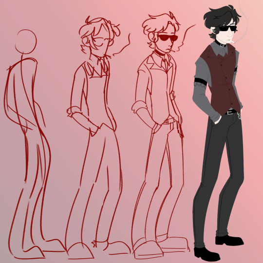
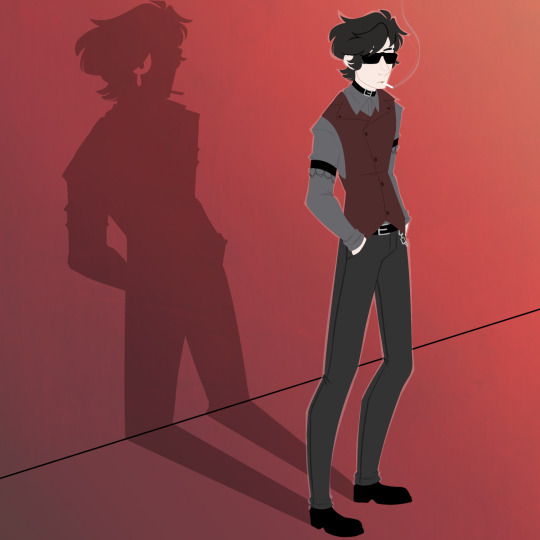
aside from the lineless one, these were all just quick silly things, and ultimately i still intend to use the 3d models for "serious" work or things i just want to make sure have a certain refined quality to them.
idk, i'm just... excited? happy? i thought my skill to just sketch something and refine it all by myself had surely atrophied. i thought my reliance on 3d models had ruined my art potential. turns out it's just been training wheels and i'm actually doing kind of okay taking them off sometimes.
i'll keep making silly simple things this way for a while. the lineless damien one was me having a bad night and needing a major distraction, and it served its purpose alright. i'm just happy i was able to actually finish it. i don't even hate it!
i guess this is me saying, yeah, it's fine to use tools and shortcuts. i know the fear of "cheating" but here i am, having done this for ages, and i'm doing better for it. i will say i think a lot of my ability to learn has been my willingness to compensate for what the 3d models can't do (like joints and muscles) and tweak things once those layers are hidden, but i've still been relying heavily on these shortcuts. it's just nice to realize it wasn't all a waste, in a skill sense.
7 notes
·
View notes