#live 2d cubism
Explore tagged Tumblr posts
Text
Live2D showcase of Parcha Satín. A Sonic inspired vtuber. And she's also free to use! Download link below!
https://ko-fi.com/s/b54fb2557a
Species: Dog
Fully rigged. Better used as a half-body model
#digital art#artists on tumblr#character art#2d art#sonic#sonic vtuber#sonic the hedgehog#procreate#vtuber#indie vtuber#vtube model#sonic fandom#sonic characters#live 2d cubism#live2d#vtuber art#vtuber assets
21 notes
·
View notes
Text
You may not know this, because i shared the progress only on instagram, but i went absolutely insane last week and started making this from scratch.
It's a vtuber rig! That I have no use for because I'm not a streamer!
I don't know what compelled me to make this! I don't know how to get the worth out of this thing that I spent many hours on, but it exists and I made it!
What do i DO with this???? idk man
#art#vtuber#live 2d#rig#digital art#vtuber rig#digital artist#live 2d cubism#idk what compelled me to make this#what do i even do#i just wasted several hours doing this bruh#idk why????
3 notes
·
View notes
Text

Being an artist sometimes is difficult, because you wanna try everything and there is so little time to do it...
#&&. Between drawing#&&. learning how to work in Blender#&&. and now I am interested in learning my way around live 2d cubism#&&. Just#&&. all the skills#&&. but that last one will come later someday LMAO
7 notes
·
View notes
Text
I forgot to show this funny lil thing I did with my sona, Paper I made my first rig like half a year ago


#I used the free trial of 2D Live Cubism to make this#this is definitely easier than 3D rigging#by now my free trial has definitely expired#vtuber model#my sona#live 2d
45 notes
·
View notes
Text
Live2D 5.0 Folder and File Naming
--Blog by iiiSekai Artist Bitsy--
Folder setup has never been more important than in Live2D 5.0
Your PSD folder hierarchy is now almost as important as the deformer hierarchy set up inside L2D.
Previously, I had my folders set up with bigger chunks and wiggle room. But now, for 5.0, it is much easier when rigging to set up your folders with more specifics in mind.
This is especially true for the Head and Face folders.
You want to make sure to have all the parts of your Vtuber Models Face cut up into separate folders like so:
[Eye_R]
[Eye_L]
[Nose]
[Mouth]
[Face]
[Ear_R] . . . and so on
Yeah, it can be pretty tedious. . .

Which is why I LOVE to prep things in advance!
If you want, you can use my pre-set Clip Studio Paint file too, it even comes with a perfectly placed symmetrical ruler! (And if you use CSP then you know how hard that ruler placement can be)
I also included a Live2D .com3 file that is set up in the same dimensions, has a ruler guide all set up, and comes preloaded with all the Parameters you could ever need!
And trust me, it helps a LOT.
Get my Vtuber Creation Prep files:
On Patreon
On Gumroad
On Ko-fi
#vtuber art#clip studio paint#live2d#live2d cubism#live2d rigging#live 2d#tutorial#file manager#clip studio ex#clip studio paint tutorial#clip studio paint brushes#csp#digital art#vtuber assets#rigger#l2d#live2d rigger#vtuber rigging#vtuber cutting#how to cut a vtuber#live2D 5#patreon#gumroad#ko fi#ko fi link#artist on kofi#buy me a kofi#vartist
9 notes
·
View notes
Text
Inochi2D beta, the Open Source alternative to Live 2D Cubism (the 2d rigging and puppetry software) has restarted active development after almost being abandoned in February 16, 2024.
Inochi2D is now using a one-time-payment model for optional pre-compiled "full" versions to become financially viable, alongside a "free" version with a "nagging" window.
Currently, $20usd for lifetime updates.
The source code and "free" version will still be available.
Support TransFem programmers like LunaFoxGirlVT if you want.
Inochi2D on Twitter.
Inochi2D website.
Inochi2D Github.
Inochi Creator Itch.io download page.
159 notes
·
View notes
Note
Hello! Sorry for the bother but do you know how the live 2D files of Tokyo debunker is accessed? I'm like so hyped about this help- Let me know if you could answer for me! THANK YOUUUU
I'm on the way to work so I'll just copypaste what i sent to someone else over DMs. Lmk if you run into any trouble, but it'll be like 8+ hours before I get to it
Hiya! No need to apologize for the sudden message. I just woke up so sorry for the wait!
I can explain the process for you and get screenshots to hopefully help out, and if you have any problems with it you can let me know!
You'll need:
An android phone and a way to transfer files between your phone and computer(a wire is preferable in my experience)
I think you need a windows or linux computer? I'm not sure if the necessary programs will work on mac.
AssetStudioGUI https://github.com/Perfare/AssetStudio
UnityLive2DExtractor https://github.com/Perfare/UnityLive2DExtractor/releases/tag/v1.0.7
First you'll need to transfer the game files to your computer. I assume you already have that part done so I won't walk you through it.
Next go into AssetStudioGUI and go into 'Debug' and turn off 'Show error message' to save yourself some headache
Now you need to open the folder with the files in AssetStudio. This will probably take a long time. Get yourself something to eat or play a game or read or something!
Once everything is loaded you'll need to find one of the live2d files. For tokyo debunker the easiest way to do this is just to go to "Filter Type" and filter to "Texture2D". I don't know the file structure or naming convention for Twst, but the image you're looking for should look kind of like this
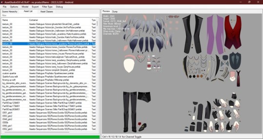
Right click and choose "Show original file".
Copy the FOLDER that this file is in to another folder.
If you haven't already extracted L2DExtractor, do that now. You should have these files.
Open the L2DExtractor FOLDER in another tab or window. Then drag the folder that you copied before to "UnityLive2DExtractor.exe" in the UnitLive2DExtractor folder that you have in a separate window. (You can also copy it and right click→paste it INTO THE EXE FILE if dragging is difficult.)
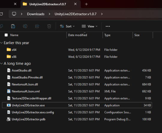
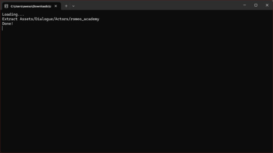
You should get a command prompt(the black box with text in it) with the name of the asset in it. Wait until it says "Done!" Close the command prompt.
Go to the folder that you put the asset folder in. You should now have a new folder named "Live2DOutput". That will have a folder in it. Go into the folder until you find the asset you just extracted.
You should now have the .moc3 file, textures, and motions! You can open the moc3 file with Live2D's Cubism Viewer which you get off of their website. It's free.
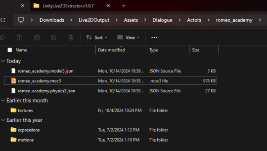
If you don't have the expressions in there you'll have to extract them separately! I always have to extract them separately and I'm not sure why, but it's easy enough once you know where they are.
Open AssetStuido back up and change your filter to "MonoBehavior"
Search "exp3"
Order by Container and find the character character and outfit you just extracted(in this case I just need to find "romeo_academy". The name of the asset you extracted should be in the container path.
Highlight only the .exp3 files that go to this asset.
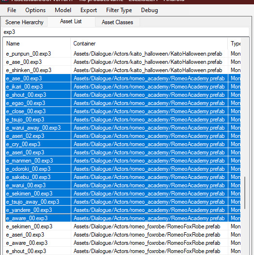
Go to "Options→Export options"
Change "Group exported assets by" to "Do not group". If you want to do any datamining in the future you're probably going to want to change this back to "container path" or else you'll just get a ton of files in one folder, so don't forget you did this! If you're only using assetstudio to get the l2d files however you can leave it as is.
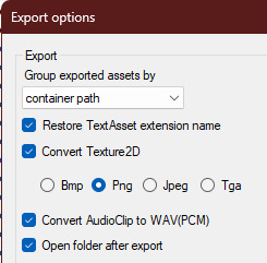
Press "OK"
Right click on one of your highlighted exp3 files
Choose "Export selected assets"
Navigate to the folder with the moc3 file in it. Make a new folder. The name doesn't matter because you'll have to manually move the expressions into l2d every time, but I just use "expressions" for simplicity
Extract the exp3 files into here.
Once they're extracted you can select them all at once and drag them into the Cubism Viewer window OF THE CORRECT CHARACTER. This will instantly import all of the expressions.
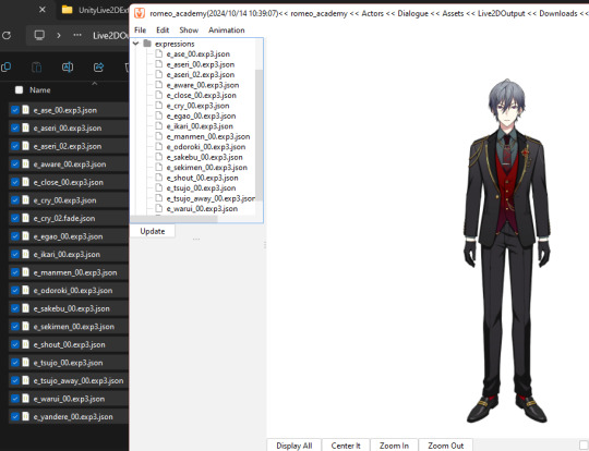
You're done! You can view and play with them all you want. But you'll have to do every character individually and then export their expressions separately.
Hope that helps. If you need anymore help let me know.
#ridiculous-reina#danie yells answers#do i have a tag for explaining this stuff? idr.#datamining cw#just so it'll come up if i search datamining or something ugh
13 notes
·
View notes
Text
I never thought know how to be a vtuber would be so hard. I just went: oh! I know to draw let's make my silly ocs onto cool vtubers.
I had to learn about 3D animation and basic programing.
In the spam of 3 days I had to learnt about:
-3D programas (Blender, Unity, UniVRM),
-Stream programs (OBS/Twitch Studio)
-Vtuber making programs (Vroid, Blender or learning how to draw in separate pieces)
-Rigging programs (Live2D cubism for 2D, Nebplug + Unity or Hanatool for 3D)
-Face capturing programs/ something that allows your character to move with your face (VSeeFace, VMagicMirror, VtubeStudio, 3tene, combining them with iPhone/android face id recognition for better use but idk at this point)
-Softwares for Vtuber and twitch interaction (VNyan and Tifa)
-Software for PNG vtubers (VMini and PNGtuber plus), because setting all that was not enough and I don't even know if the 3D vtuber it's even gonna work on live.
I AM TIRED
Anyway look at my progress


Curious how my vtuber it's also having a bad time.
I'm sorry budy, at least you don't have to make 52 blendshapes, but I will keep throwing pies at your face 100%
5 notes
·
View notes
Text
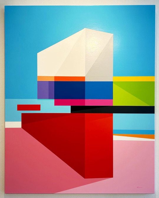
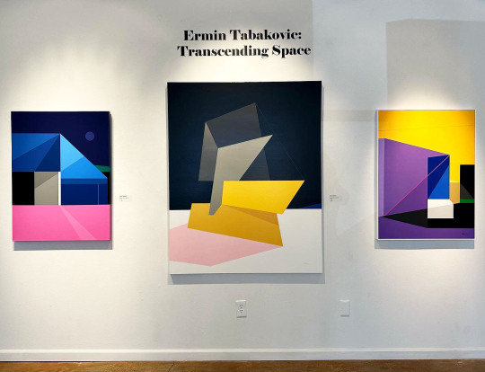
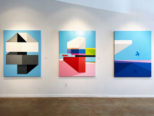
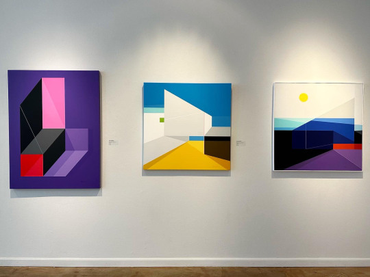
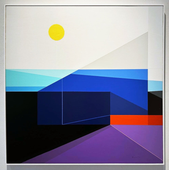
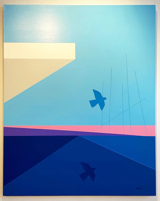
Ermin Tabakovic has created an intriguing world with his geometric paintings for Transcending Space, on view at Morean Arts Center in St. Pete.
From the gallery’s website-
Ermin Tabakovic was born in 1980 in former Yugoslavia (now Bosnia). In 1993 he and his family moved to Berlin, Germany where they lived between 1993-1998. As a teenager in Berlin, Ermin was involved in the city’s vibrant graffiti art scene and completed numerous murals. In 1998 he and his family emigrated to the United States, settling in the Tampa Bay area. Upon arrival in the US, Ermin took on painting and studied at St. Petersburg College where he focused on art and architecture. He went on to study art at the University of Central Florida in Orlando where he completed his BFA in Art Studio with Minors in Graphic Design and Art History.
Ermin actively exhibited his work between 2000-2008, taking part in many shows throughout Florida. He stopped painting in 2008 due to health issues and picked it up again in 2020 with a new vigor and a new vision. His new works are mature, colorful and bold representations of his core vision and aesthetic steeped in geometric form and a structural sensibility. Currently Ermin resides in Tampa with his wife Lisa and their beloved cat Maximus.
“Modern geometric painting has had a very big influence on my work, especially the Constructivist artists such as Malevich and El Lissitzky and the various other modern Art movements of the 20th century such as Cubism, Neoplasticism, Minimalism, and Surrealism. In my current work I tend to fuse all these different influences and combine them with my own personal aesthetic to create a new visual language that transcends the past and points to something new and different. We live in a digital age, so there is that digital touch to my compositions as well by using the hard-edge approach.
“I want the works to be visually striking, thus my use of vibrant colors, contrast, pure and robust geometric forms, clean lines, etc. I also like to add a surreal touch to my works to give them a sense of mystery and visual drama. Furthermore, I seek to create visual paradoxes by intertwining 2D and 3D space to add tension and ambiguity. My aim is to challenge the viewer’s perception of space and test the boundaries of what is possible by juxtaposing the seemingly impossible.”
This exhibition closes 10/26/23.
#Ermin Tabakovic#Morean Arts Center#Art#Art Shows#Florida Art Shows#Florida Artist#Florida Artists#Geometric Painting#Painting#St. Pete Art#St. Pete Art Gallery#St. Pete Art Shows
2 notes
·
View notes
Text
Trying my hand on Live 2d Cubism. Its pretty fun. This is my doggy character (Parcha) as a mobian. Are you ready to rock next week?
#vtuber#digital art#procreate#artists on tumblr#my art#character art#character design#2d art#vtube model#sonic#sonic fandom#live 2d cubism
2 notes
·
View notes
Text
2023 Summary of Art + Bonus art I haven't posted

Here's a look at what art I've done every month throughout 2023, plus a bonus section for Patreons where I show off artworks for each month that haven't been posted online. (Many are planned to be merch designs or are sketches, which's why I haven't posted them yet.)
Looking back through the year known as 2023 I'm proud with how my art improved throughout it.
Last year I improved on backgrounds, character design and poses, and by far my proudest achievement, making 3 Vtuber Live2D Models and learning rigging in Live 2D Cubism.
I'm also happy that I got my own website and shop designed. It's nearly finished and I hope to have it up and running properly this January. All ready for 2024. 💛💛💛💛
I have high hopes for becoming a full-time content creator and making an income from my work.
Progress on these things have been slow, due mostly IRL stuff (I'm working on it)
Here's to 2024. 🎉
#cute#artists on tumblr#character art#concept art#vtuber#artistontumblr#character design#art of 2023#patreon#patreon artist#pokemon
0 notes
Text
Okay now where’s Live 2D Cubism
“How arw you paying for photoshop” im not LMAO
440K notes
·
View notes
Text
page 8,9,11
On this part of my sketchbook, I decided to use 3 pages to visually communicate my narrative. Even though I used 3 separate, all 3 pages come together to communicate one holistic narrative. On the first page I have a picture of an eye, my eye.

I took the picture with my front camera, yes the process of taking the picture was easy but it would have been easier if someone had taken it for me.
The eye on this first page represents the younger generation and the way they see the world. Before I go into details, I was meant to represent the older generation starting from the left side to the right in my sketchbook pages. This layout- representing the older generation on the left side of my sketchbook is meant to be layout technique that runs throughout my sketchbook however, I've messed up the layout technique a few times.
With a knife cutter, I cut out the pupil and replaced it with a painting that visually communicate my narrative. I used the colours red, yellow, green, they represent the Ghana flag and orange represents optimism.

Ghana is going through a lot because of the way the older generation think but the younger generation are the once who are being penalised for their inconsiderate actions. I used 32 dots to represent the Ghanaian flag. I separated the dots to visually communicate how broken Ghana is as a country.
So even though the younger generation live on broken land they still persevere their environment through an optimistic lens
visually communicating/representing Ghana with 32 dots was an inspiration I got from 'the princes of polka dots'- Yayoi Kusama. She is a Japanese artist and polka dots is her main art style.
She had an exhibition in Salford in July 2023 and I had the opportunity to go and see it.
Yayoi Kusama uses one colour for her polka dots but I used different colours to visually communicate my narrative.

There isn't any significance behind the colours I choose, the aim was to construct a fabric with lots of colours to represent the younger generation. I achieved my desired outcome through the technique of heat pressing and disperse dye. In lesson, with synthetic fabric, i used a thick brush to make wavy patterns and this is the outcome.

When it was time to further develop my work in embroidery, I found that the fabric was too small and it couldn't fit the size of the hoop. To overcome this obstacle, I stitch on extra fabric so that it was big enough to fit the hoop. For there, I was able to, with a free hand stitch on the sewing machine, embrued on the tears outlined on the fabric.


After I was done, I removed the extra fabric and I was left with my desired outcome.
With a pair of scissors, I cut the fabric which I have further developed with embroidery into tear drop shapes and collage them underneath the eye.
It visually communicates how the younger generation have no choice than to be optimistic in a broken country and as a result of that they cry tears of hope.

On page 2/3, I use cubism to visually communicate my narrative. In the middle of the page is again, a picture of my eye. I have deliberately cut a hole where the pupil is meant to be. So, if you look through the hole and you direct your gaze onto either the left or right side of the page, you will see the pupil of either the younger generation or the older generation.
In my previous blog, I mentioned Ruth Faison Shaw and how she is known as an art therapist, here on this page, I was able to bring the concept of me being a mediator and an art therapist for both generation to life. So, the reason I am in the middle of both generation is because I can see both sides of the story.
. I used cubism to visually communicate a representation of myself. Cubism plays on perspective; it is a technique where artist like Picasso paints 3d images is if it was 2d. People consider cubism to be different from other art techniques in the world of art. This links to my narrative, I am different in my culture, sometimes, I often go against cultural norms and values, by doing this, I get stared at in a very uncomfortable manner by mainly people from the older generation. They have a mindset that doesn’t embrace chance. So, in this context cubism is used to visually communicate how I get singularise by the older generation whenever I try and do something outside the box.

Even though I was inspired by Picasso, I also got inspiration from Slawn Olaolu’s painting- Self-portrait. In the painting, he accentuates the lips and the eyebrows of his subject.
Reference
Artsy,2023,Slawn:on a darker note https://www.artsy.net/artwork/slawn-self-portrait,18/11/23.
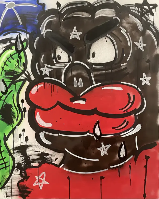
I transferred elements of Slawn’s work and applied it to my work.
The lips and the head are the same colour- red. The way the younger generation think is ever so apparent in the way they talk. However, because we are young, the older generation do not take into consideration what the youth have to say. They see us a joke, the way I have visually communicated it is by painting a pink tongue coming out of the red lips.
When you look closely, you will see a tear coming down my eye at the same time touching my “nose”.
I used a traditional Ghanaian instrument; ntwamu to visually communicate my ‘nose’.
REFERENCE
Ghanagoods (2013) Ghanagoods 2013 Available at: https://ghanagoods.co.uk[ Accesses 21 November 2023]

Ntwamu was used to make announcements in small communities. The person making the announcement, with a stick, will hit hard on the instrument which is made from metal. Now that I have explained the significance behind the nose and the teardrop, the between the tear and the nose is: tears are not enough to draw the attention of the people who are meant to be listening- the older generation. They are too close minded to listen.
On page 3/3 I have collage a picture of my eye, this time the eye represents the older generation. where the pupil is meant to be, I have replaced it with dark colours. This it to further put emphasises on how the older generation see and think in a ridged way.
With the same technique as the last one, I used free hand stitching on the sewing machine and embroidered on the black and white fabric. I used dark threads to visually communicate how the older generation even when they come across as vulnerable, they are still negative about it
I made the fabric in print lesson. I used technique called screen printing. I chose a print board which had my desired pattern. I cut a circle in scrap piece of paper to isolate the section that I wanted.

I further developed my work from print in embroidery to make one big teardrop. I call this mono-tear. Because the older generation are suffering from the same trauma, generational trauma that has been pass on from generation to generations. They are going through the same psychological pain, so they cry the same tears thus affecting the way their mind works.

0 notes
Text
Need a Vtuber パパ or ママ for your new Model?
Well, our very talented Bitsy_the_Alien has 1 full body slot open and 2 chibi vtuber slots open for the winter season <3
Check them out!
#iiisekai friends#vgen#vtuber#vtuber art#vartist#vtuber uprising#vgenopen#vgencomm#vgencode#vtuber commissions#vtuber community#vtuber assets#vtubr#vtubesona#vtubers of tumblr#live2d#live2d cubism#live2d rigging#live 2d tutorial#rigger l2d#live2d rigger#vtuber rigging#vtuber cutting#live2D 5#live2dcomms#live2d commission#live2d rig comms#indie vtuber#vtube model#vtuber for sale
2 notes
·
View notes
Photo

I made this as my final for my Drawing class. I stayed up late to be able to get this done and submit it on time. It’s not perfect. It’s my first time making one of these types of things.
#nahobino#live 2d#live 2d cubism#Shin Megami Tensei#smtv#smt5#smtv protag#art final#college finals#shin megami tensei v#atlus#smt#my art
40 notes
·
View notes
Video
tumblr
I was right! I knew what I did wrong yesterday so I learned how to not do that thing wrong again! Now my practice bunny can look left and right! Also baby needs a treat for working so hard these past couple days so I might finally upgrade to pro and then my bunnies will be able to blink, look left & right, and look up & down all in the same video
2 notes
·
View notes