#like no way i made digital art but traditional. with texture and everything as it should be
Explore tagged Tumblr posts
Text
Ive said this but gouache is so dangerous bc i paint something and i just want to drop everything and go look at what i made every 2 minutes bc of how matte + flat + beautiful it is
44 notes
·
View notes
Text
HOW TO GLAZE YOUR WORK WITHOUT A GOOD PC(or on mobile)/TIPS TO MAKE IT LESS VISIBLE
Glaze your work online on:
Cara app. It requires you to sign up but it is actually a good place for your portfolio. Glazing takes 3 minutes per image and doesn't require anything but an internet connection compared to 20-30 minutes if your pc doesn't have a good graphic card. There IS a daily limit of 9 pictures tho. Glazed art will be sent to you after it's done, by email. It took me 30 minutes to glaze 9 images on a default setting. Cara app is also a space SPECIFICALLY for human artists and the team does everything in their power to ensure it stays that way.
WebGlaze. This one is a little bit more complicated, as you will need to get approval from the Glaze team themselves, to ensure you're not another AI tech bro(which, go fuck yourself if you are). You can do it through their twitter, through the same Cara app(the easiest way) or send them an email(takes the longest). For more details read on their website.
Unfortunately there are no ways that I know of to use Nightshade YET, as it's quite new. Cara.app definitely works on implementing it into their posting system tho!
Now for the tips to make it less visible(the examples contain only nightshade's rendering, sorry for that!):
Heavy textures. My biggest tip by far. Noise, textured brushes or just an overlay layer, everything works well. Preferably, choose the ones that are "crispy" and aren't blurred. It won't really help to hide rough edges of glaze/nightshade if you blur it. You can use more traditional textures too, like watercolor, canvas, paper etc. Play with it.

Colour variety. Some brushes and settings allow you to change the colour you use just slightly with every stroke you make(colour jitter I believe?). If you dislike the process of it while drawing, you can clip a new layer to your colour art and just add it on top. Saves from the "rainbow-y" texture that glaze/nightshade overlays.
Gradients(in combination with textures work very well). Glaze/nightshade is more visible on low contrast/very light/very dark artworks. Try implementing a simple routine of adding more contrast to your art, even to the doodles. Just adding a neutral-coloured bg with a darker textured gradient already is going to look better than just plain, sterile digital colour.
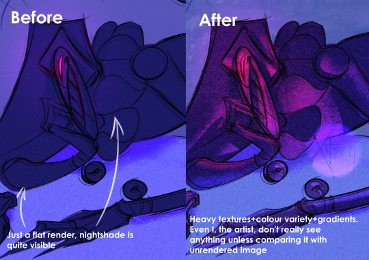
And finally, if you dislike how glaze did the job, just try to glaze/shade it again. Sometimes it's more visible, sometimes it's more subtle, it's just luck. Try again, compare, and choose the one you like the most. REMEMBER TO GLAZE/SHADE AFTER YOU MADE ALL THE CHANGES, NOT BEFORE!!
If you have any more info feel free to add to this post!!
7K notes
·
View notes
Note
hi broski ummmm what programs do you use for art and what brushes
I use procreate! For lineart/sketching I usually use a slightly modified version of the Shale brush in the default procreate “calligraphy” section- just w/ the streamline feature turned down to zero and more like…size variation? (Idk I modified it a year and a half ago I don’t completely remember what I did lol)
Then for my grayscale comics, like these,

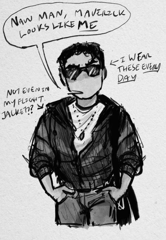
I use this Copic marker brush w/ just straight up black and varying levels of opacity. Usually I don’t use blending brushes in these, but in my most recent one I did.
For my colored stuff tho I use a lotta this pencil brush for everything (shadows, highlights, base flats, etc) and then depending on whether I want something more painterly (like the ocs on the left) or more cell shaded (like stevepop on the right), I either use soft texture brushes or a chalk brush (I cannot for the LIFE of me find where this chalk brush came from?? I’ve been digging but idk I can’t find it outside of my duplicate??) for highlights
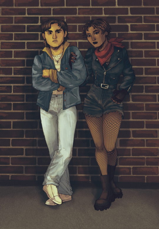
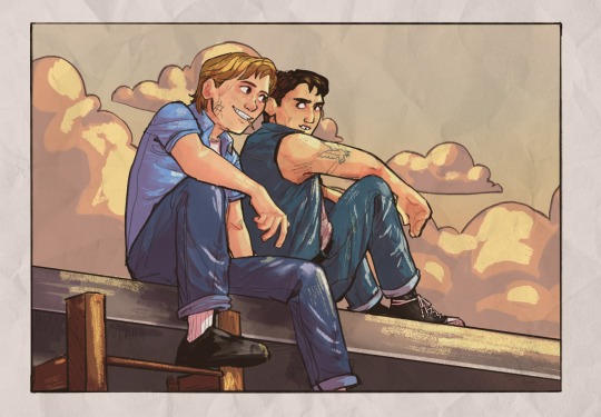
Some other brushes/brush sets I use (all of them are free as of rn ‘cuz I’m broke):
Habook Brushpack (specifically the rectangle one- it puts down flat colors nice and fast but also doesn’t annoy me the way most “ink” brushes do!)
Laurenillusrated Brushpack- I use these mainly for skin, they’re really nice. (Also, @laurenillustrated is on tumblr- her art is so pretty, it’s like a storybook istg. Check it out if you haven’t it’s AMAZING)
I’ve recently started using @loish’s brushpack too, and I ADORE these brushes. I used them a TON on the Christine poster. You can get them by signing up for Loish's Digital Art School, which is a great collection of art resources as a whole, and it’s totally free. Would absolutely recommend
And finally, for the halftone texture I like to put on everything, I use the Halftone Hospital Basic Tone Kit. All of their brushes are fantastic, definitely check them out if you like the look of traditional art but also like the lower supply cost of digital art lol. Or just in general, ‘cause they’re great
(Then for the paper texture overlays I love so much, I usually use stock photos tbh.)
Anyhow, these are some of my favorites. But I do use others too, and this all came from years of playing around and finding what I like! I had this phase about…1 1/2-2ish years ago where I hated my art style and nothing was coming out right. It pushed me to try a bunch of different brushes- in retrospect I don’t think the brushes were what made it better, I just improved over time, but I had a lot of fun trying out different brushes. So definitely try ‘em out and experiment, because it really is a fun time :))
(As for my workflow, I talk about that here if you wanna know more about how I draw!)
28 notes
·
View notes
Text
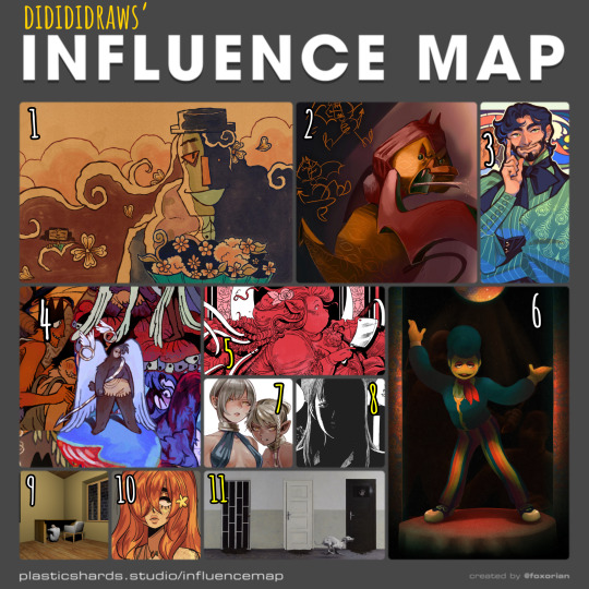
my tablet is currently halfway across the country for repairs (my brother's the most tech-savvy in my family and asking him to take a look at it was cheaper than taking it to a shop) so i haven't been able to draw lately. i've made a bunch of traditional sketches in the meantime, but none of them are presentable enough to post here, so i decided to take a trip down memory lane and fill out one of foxorian's influence maps!
below the cut are the names of the artists featured here, as well as a little bit of director's commentary on how they've influenced me :]
yugo limbo (website, tumblr, twitter) - some time last year, i realized something profoundly unnerving: i actually... don't like the art in smile for me's original release all that much? that's not to say it's bad, just that there isn't a whole lot about it outside of maybe its architecture that stands out to me. which is REALLY WEIRD, considering i wrote a whole retrospective about how much this game means to me. art-wise, however, it was only after smile for me's release that yugo limbo's art evolved in a way that really resonated with me; i love how textured everything is, i love the way they simplify clothing folds and the way that skin wrinkles around the joints, i love their love for puppets; all of those things ended up worming their way into my art style and tastes one way or another, and i couldn't be happier!! it didn't feel right to leave smile for me out of the equation entirely, though, so i chose a piece that was both related to that game and that i felt reflected a lot of what i love about yugo's more recent art.
echobsilly (twitter, tumblr) - oh god, speaking of yugo limbo - god. i fucking love echo's art so much i have no idea how to even do it justice in writing. like many people i first found him through his smile for me/limbolane fanart and animations - and those are some of his best work, don't get me wrong, but i really wanted to include one of his original designs to make a point that he's just fuckin great at art in general. character design, facial expressions, body language, composition, LIGHTING... he makes it all just. so so so gorgeous. i always liked "painterly" art styles for lack of a better word, but i think his art is what first pushed me to embrace that more in my digital art. i also like how he talks about dr. habit like he's his dead wife. i'm very proud to call him a friend these days :]
japhers (tumblr, twitter, instagram) - i first found japhers' art in high school and he very quickly became a HUUUUUGE influence on my taste in character and costume design. one of the big reasons i never fully bought into the idea that men's fashion is inherently harder to design is bc so much of his art is already dedicated to exploring fashion Without the restrictions of a gender binary in place which is to say that he's really good at drawing buff dudes in frilly outfits. i also think he gave me more confidence to draw more intricate costumes without having to worry about super dainty and clean lineart, bc a lot of his art looks like it's kinda been carved/rendered out of sketches, and it is Gorgeous.
moe suppe (website, tumblr, cohost) - another artist i found in high school, albeit originally from a long-gone instagram account. his art is what kickstarted my desire to have some Roughness in my art, some Texture. it may not have stuck to my lineart, but it Definitely stuck to my rendering. it helped that i was going through a pretty big angel/demon phase at the time, which meant i was pretty immediately drawn in by his delightfully weird worldbuilding. i should probably read fear not now that it's an actual serial...
val wise (website, itch.io, twitter, instagram) - a more recent influence, but a pretty significant one nonetheless. i featured the cover of délicatesse here because it was the first thing from him that i had ever read, but in general his grasp on the human body really blows me away given how deceptively simple his style looks at first glance, especially his faces. the way fat and hair sits on her bodies, and how much it varies from character to character... it's beautiful without being So glamorous that it feels untouchable. his costume design is also great. i recommend his comics for low fantasy/ursula k. le guin fans who are Dying to see more fat characters in leading roles. i also just found out that i am of two hearts is free on itch.io, so i'll be treating myself to that over spring break.
partycoffin (tumblr, twitter) - if you have known me for any amount of time at all then this should not come as a surprise to you. i actually wasn't going to include partycoffin in this map at first, because while welcome home has inspired me in Many creative pursuits, i didn't think visual art was one of them? i definitely picked up some of clown's love for dramatic lighting and thinner lines with just a smidge of well-placed hatching subconsciously, though.
ryoko kui - probably the most recent artist featured here? anyways i have a confession to make: i have yet to read dungeon meshi. i just know that when i saw a post compiling a bunch of ryoko kui's sketches from her daydream hour series, i was so overwhelmed with this feeling of, like… "oh, yeah, these capture almost everything i love about women as flesh and blood people. when i draw women this is the kind of beauty that i want people to see in them." of course, ryoko kui is a great character designer in general, but something about her women specifically really speak to me. the earthier color palettes and rendering also do a lot to endear her art to me.
shuzo oshimi - specifically his art in blood on the tracks. something that really stood out to me in that series was whenever the shadows would get really intense, and you'd get these big blocks of black with just the faintest bit of hatching to soften out some of their edges. it was always very effective in creating this sense of claustrophobia. i really want to keep incorporating that in my more intense pieces!
person918x (tumblr, instagram) - i don't work with 3d art often and i don't see myself doing so any time soon, but the composition of person918x's pieces is something i take a lot of inspiration of. i also love his sequential art, as someone who does a lot of dream journaling it's sick to see the exact Vibe of a dream be put to (digital) canvas. i also firmly believe that he's one of the only people out there who knows what he's doing when it comes to using generative AI in art.
oops i made this list too long so now i have to put the last two artists in a new block.
10. meatgiri (twitter, instagram) - definitely the artist i've known about the longest out of this selection. i think i've been following her since…. oh god. since i was in middle school. way before she was meatgiri, even. i think her influence probably shows up the least in my art, but there are definitely some characteristics that stuck with me for a very long time (the lil block of black accompanied by one or two lines for shading on the neck, the looser lineart making it really easy to incorporate soft curves and sharp edges, the Eyes, etc etc.) i chose this drawing of her oc juniper bc i thought it was both reflective of her current art And a good embodiment of a lot of things i wanted to emulate from her art as a young'un.
11. dragan bibin (website, instagram) - specifically his 'deimos' series. much like with person918x, it's his compositions that really stand out to me the most, and you probably know by now that i'm a sucker for high contrast. i find it interesting though that he uses high contrast to obscure more than he does to highlight... helps a lot with giving the deimos paintings that air of Quiet Unease. another thing i want to incorporate in my horror-adjacent art! manmade environments gone wrong!
#not art#influence map#artists on tumblr#yugo limbo#echobsilly#japhers#moe suppe#val wise#partycoffin#ryoko kui#shuzo oshimi#person918x#meatgiri#dragan bibin
25 notes
·
View notes
Note
if you have the time/energy to elaborate, what's your process like for coloring stuff you ink traditionally? i've figured out a few different methods over the years, but i generally stick to fully digital or traditional for a piece, so i'm curious to see how you do it! :0
This is such a fun question for me because I get to both ramble about my art process and have an excuse to throw some colors on this Breloom I drew ages ago.
I use Clip Studio Paint and an Ipad for my digital stuff so I'll be referring to the processes on that but I'm sure there is a work around for other programs as well :^)
I scan my traditional art at 400dpi because it's always easier to work bigger with digital stuff and resize it smaller then the other way around :^)

So here's our raw scan, which already looks very decent but when I want to color something I like for everything to be much cleaner/sharper/more contrast-y and to get rid of the noise from the paper texture lmao. A well lit photo will also do the job because that's what I did for many years before getting my scanner but tbh if you're a traditional -> digital artist like myself a scanner is like a best friend you can buy HAHA
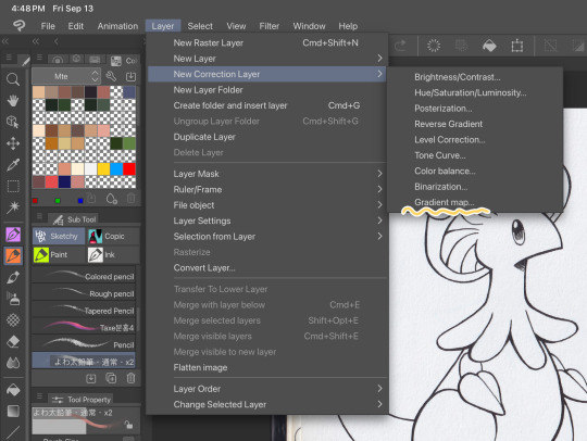
First things first, I apply a Gradient Map Layer > New Correction Layer > Gradient Map
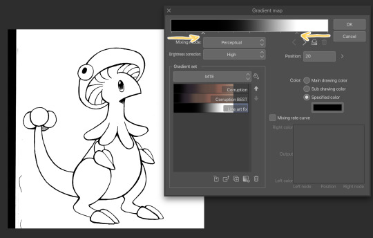
Clip has a really nice black and white map preinstalled but I made myself a custom map just by pushing the black and white a little closer, it completely clears up all the noise and makes everything really crisp! Make sure you check on your lines when adjusting things because super fine feather lines can sometimes be lost if you make the contrast too high. Extra tip! If you want to make Graphite Pencil or Ball Point Pen really nice looking as well, just add a dark grey point in the gradient map closer to the black then middle...works perfectly :^)!!
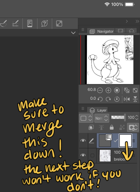
This is the point I look for stray pixels, cat hairs, ect and make sure to erase any surrounding doodles or sketches I don't want included.

GOD DAMN Those lines are CRISP-Y!!!
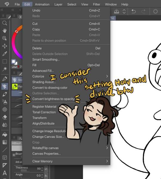
Next up we're going to want to go Edit > Convert brightness to opacity
Tbh If I didn't have this method idk what I would do with myself.... I've tried the whole "Lineart on top layer set to multiply" Method and ...ehh....
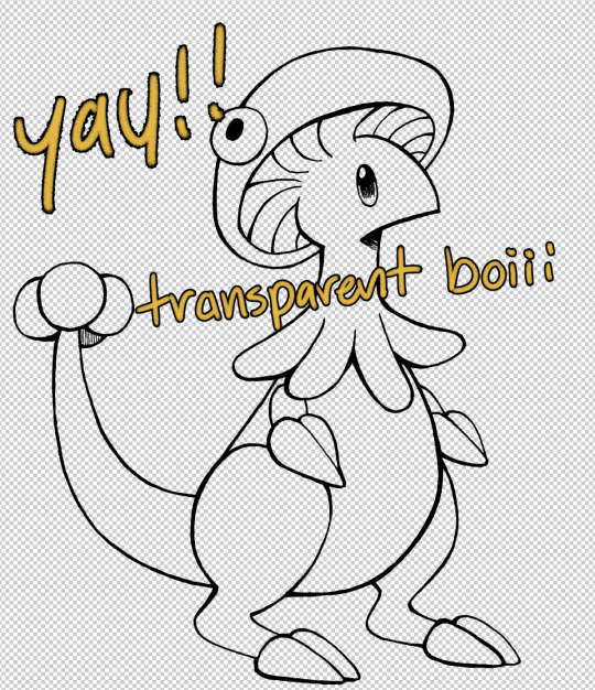
Now that I have a nice transparent line art I'll stick a new white layer down below it because the checker pattern hurts my eyes LOL
I'm going to add a read more here since this post is getting lengthy haha
I'm going to quickly go over the style I use for MTE! It has been refined to be quicker and easier to do since you know...I have a week time limit per page ... 😭 I have a completely different way I do colors for other things I want to spend more time on but I might explain that one in the future...I'm running out of steam tonight LOL

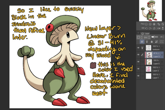
I use this really awesome brush pack that has a pencil like texture and I love it to bits...here's a link to it if your interested!
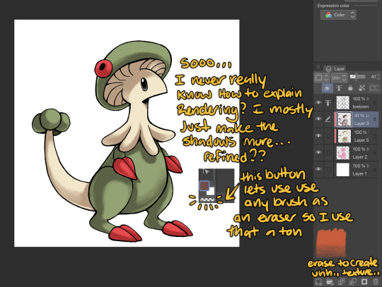
At this point I might add some overlay layers or play around with an airbrush but I think this guys done for now :^) I tend to stay away from highlights with my shading for MTE..My biggest goal is to make sure everything is clear and readable! That being said I break my own rules all the time for special panels that need the extra 'oomf!'

Slap a lazy square background and yay!! He's done!
Hope this was interesting aaaa Thank you again for the ask!!
#art#traditional art#digital art#digital colors#breloom#pokemon#ask#tutorial#art process#coloring tutorial
8 notes
·
View notes
Note
What set of brushes do you use
The way you draw everything is awesome btw
Nailed the art style
THANK YOU!!! your comments mean so much to me genuinely ;_;
I use a billion different brushes in Procreate- Simon's stuff and most of my more traditional looking work is primarily just a modified version of the 6B Pencil brush. I have it so that it takes a little less pressure to get a strong/dark line, and it doesn't rely on too much pen pressure, but the general grain and brush tip are unmodified.
For my more digital looking stuff with the homestuck ass hard, pixel-y edges, I actually use a brush I've made myself! You can create the same effect by using a solid square as your brush tip and setting the grain and shape settings to "No Filtering". Then you set the spacing to somewhere around zero, so the tips line up!! I don't know if that makes much sense, I might just slap a download link for my brushes on here one day. Unfortunately if you try to make a brush tip with something other than a full pixel (leaves, pencil texture, flowers, etc.), Procreate will inevitably still leave some aliasing in there. You can fix this by throwing the sharpen filter on your lines 300000 times. I don't know why this is so complicated in Procreate when every other art software can do this in like two clicks, but that's the way that I do it.
For textures, I like finding pictures of like crumpled paper online and setting them as the grain for an airbrush brush, though I've actually taken to just using my own photographs of used note paper more recently.
I hope this was helpful?? I am happy to elaborate, I might just make a brush masterpost one of these days because I am barely smart enough to articulate how this works jgdskhfsmh
6 notes
·
View notes
Note
Heya! First off i wanna say you are an amazing person inside out truly and so so talanted! You have inspired me to try out digital art after i gave up on traditional art and oil painting (which i used to be a pro at) because i couldn't afford it anymore, im still slowly learning what i like and dont like when it comes to texture and looking at your art helps alot with motivation (i hope its okay to do so ) i personally found i prefer alot of texture and made my own brush for that but im still not confident at all with drawing coloring and shading final lineart etc when it comes to faces so i thought i might ask you for advice? If its okay ofc! How do you keep your faces simple (color and shading wise) yet so expressive! Also i understand the final line art we see in your art is not the initial line art you started with how do you go about having such clean precise defined lines at the end ? Im always so scared to erase any of my line art or change it as im always slightly confused as to what im doing cause its so different to traditional and oil painting! Honestly any advice would be appreciated if you are up for it ofc! Thank you so much for everything you do ❤️


ACK
I'm so sorry, this really slipped through the cracks. To start, thank you so so so so so so much, this is so kind. You don't know how much it means to me to hear that my art's inspired you, what an incredible and flattering thing hear! Genuinely genuinely genuinely thank you so much ♥
For expressions, it sucks to admit but I honestly don't really know. A lot of what I do is more aesthetic than technical so I do things more in an 'add and erase things until it looks right' than a thought out process. Honestly, eyes and mouths go a looooong way and I've found that I use quick, short lines specifically when lining those two things which kind of transitions into your second question.
For line art, I usually use a soft, round brush for sketching to keep things loose, and then a slightly textured, somewhat soft, thick elliptical brush for line art. I have shaky hands so I lean very heavily on stabilizers when doing line art. The only parts I use little to no stabilization is when doing eyes, mouths and sometimes hair when I feel like it's coming out too stiff.
I like making my lines sharper and less smooth by attacking the line art with quick eraser strokes. I tend to make my lines really thick so I can chip away at it until it looks right to me.
I hope that helps and you're still here, sorry it took so long to get back to you!
5 notes
·
View notes
Note
Hi, I’m a real new shiny here (on Tumblr, but also at drawing), and it’s the first time I ask anything, so I hope it’s ok. I must say first that I love the way you draw TCW characters (especially the clones)! 😍 I just came across this sketch you made on canvas (if I remember correctly) https://www.tumblr.com/thepatchycat/729224397978828800 and I was wondering, if you don’t mind sharing, how do you get the perfect white background on non-digital drawings? I currently use a scanner app on my sketches and the results are always inconsistent and far from that white… thanks a lot in advance!! 😊
Welcome to the Tumblr crew, shiny! ;) And thank you kindly!
So my dirty secret for that sketch is... it actually is completely digital! I drew it in a program called Rebelle 5, which is designed to mimic traditional canvas/paper and pencils/paints. I picked it up for super cheap during a huge sale last year, and it's a lot of fun; unfortunately, it's usually pretty expensive, as many art programs are. I highly recommend keeping an eye out for sales though if you ever get into digital drawing--and if you'd like a free program, the one I use most of the time is MediBang. But those programs are really mostly helpful for digital art, not so much for scanning actual pencil sketches.
While I tend to stick to digital drawing nowadays, I definitely feel you on the scan cleanliness issue; phone pictures and even proper printer scans tend to end up either kind of dirty or faded. The short answer is that I don't actually have an easy and effective solution, but there might be some things you can try depending on what you have available. I wouldn't be surprised if you've already explored more methods than I have, and there are definitely people with better ideas and more experience than me, but I'll share what I've tried.
Long(er)-winded rambling under the cut!
So, I currently have an unfinished piece sitting in my files that began as a traditional drawing, one that I want to keep all the pencil details for. Here's the sketchbook page, scanned using a household printer:
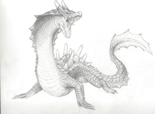
Not terrible, but it'd be nice to have clearer contrast between the lines and the background. In MediBang, I can adjust the contrast by going to Filter>Levels (or Ctrl+L), which gives me a little box that looks like this:
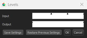
I don't technically know the nitty gritty of how it works, but by my understanding, the outer triangles for the input and output indicate the range boundaries. Adjusting the input--particularly the darker boundary--so that the output boundary exceeds it basically tells the program to make the darker parts even darker, resulting in this:
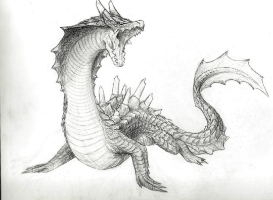
Better! As you can see, though, the darker parts of the background also show up a bit more. Rather than relying only on contrast adjustments, what I actually ended up doing was carefully erasing the background around the drawing after adding a plain white layer underneath, and also going over some of the lines digitally. I did this first in MediBang (the only art program I had when I started working on it), then transferred the file over to Rebelle.
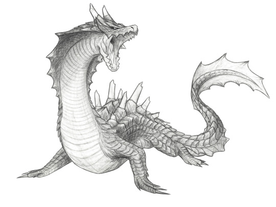

MediBang (left) has the pure white background, while the Rebelle (right) canvas settings I chose are a little off-white and more textured, which I think blends a bit better with the texture and shading of the image. It's possible to add textures and the like in MediBang, too, but Rebelle has it built into its design, so it's a little easier to figure out there; I'll likely finish this piece in Rebelle (whenever I get back to doing so, haha), since the canvas and brush settings will be easier to match to the texture of everything that came directly from the drawing.
Most of this is much easier to do with a drawing tablet/pen, unless you're a wizard with a mouse. As for traditional means... the best suggestion I can come up with is to try inking sketches, or at least darkening them further with a pencil. The more contrast you can get between your lines and the background, the more easily you can digitally tease that contrast out even further. I think most photo editors have at least some contrast, color, and brightness adjusters, and probably more useful functions I don't even know about--it never hurts to mess around with any program's filters and settings to see what happens!
Good luck, and happy drawing! :D
#Patchy Babbles#Asks#I love getting asks so it's more than okay!#Sorry the answer is basically that that sketch is a lie haha#Someone on the internet has probably figured out more effective tricks but that someone is not me#Also your art looks super good!#You have a great eye for detail~
5 notes
·
View notes
Note
Sorry to ask this as you’ve probably already said this somewhere, but how do you make your art? Do you use digital or traditional? If you use a program, what? All your stuff is really cool and id like to learn a bit more about the process.
I'm a bit of both traditional and digital. I started off as a traditional artist. I worked mostly in graphite or just used normal mechanical pencils till college where I learned and fell in love with Charcoal. I don't do traditional art anymore as I don't have the space for it due to my preferred canvas being as big as me...


I learned basic photoshop and illustrator in college back in...2010 i think it was. Since then, I taught myself everything else. I primarily use photoshop for everything, sometimes I will use Clip Studio but if I do, its just for a few brushes and then back to Photoshop. Reason being is mostly my workflow does best with PS.

Best way to show why is this drawing I think. This is uses just about all my techniques. Narec, the sword, the plants are all painted. The rest is all Shape tools, Bevel and Emboss, gradient effects and layers, Mask Layers, Drop Shadow and Texture Overlays.
Those Stairs were all made using that shape and pen tool, I just added on all those different effects and went from there to refine it.
I use the same kind of idea with the Tarot cards, just way less complicated. I use the Shape tools, the Pen tool and a Hard Default pen(no pen pressure) at pixel size 1.


Doesn't mean I can't paint, I can(as seen above), it just takes way longer for me at times, and never having learned color theory I prefer to just do lineart and flats, sketches, or what we dub as the Tarot card style. The reason I work this way is because pumping out these cards trying to do one a week was killing me and destroyed by wrist, I started working with the Pen and Shape tools more and more and its allowed my wrist to heal and not be as stressed than just trying to draw everything out all the time.
11 notes
·
View notes
Note
just popping in to say that i absolutely adore your art! you’ve become one of my biggest inspirations and so inspired me to finally make the translation to digital art. do you have any tips for a beginner? thanks so much and I hope you have a great day!!
oh my gosh!! thank you so much!! you really don’t know how much it means to hear that so thank you, you just made my day!!
i’ve been collecting resources for someone i know who used to only do traditional art years ago, and is recently making the switch to digital, so i’ll link my all time favorite spreadsheet which covers a lot art-wise!! and then i’ll give some of my own advice at the bottom :)
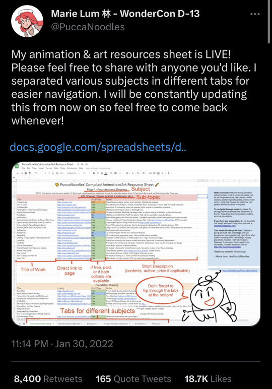
( it’s sorted by the type medium whether it be illustration / animation / storyboarding. they also have a whole section for foundational drawing and links out to websites for poses. it’s also updated every so often! :) it also lists resources and information about programs !! prices are included too! )
—————
now, i’m not too sure how to give advice about art, but i definitely want to try and offer some help! :)
i have been drawing digitally for maybe ~8 years. the switch was really hard, but don’t let it discourage you!! i went on youtube and watched a bunch of speed paints and timelapses of my favorite artists at the time to try and understand how they did certain things. and to be honest, my art was not great! and i’m still improving; things i look at from even 3 months ago i will put my head in my hands at.
anyone would probably tell you to just practice when you say “i want to learn how to draw digitally” but they don’t often tell you what to practice either. i don’t really like that advice (even though it’s mostly true— it just doesn’t feel very beginner-friendly!!). so here are a few things that i wish i was told instead of “just practice to get good”
1. i really recommend finding an artist you like and looking at how they do certain things. try to figure out what you like about it; is it the texture, the colors, the lines, the compositions, etc. maybe think about incorporating the way someone uses bright colors (for example) in your own art (if you like the way the artist uses bright colors).
2. reference photos!! they are key. especially having multiple references, maybe one for lighting, a pose, background, etc. the more the better! — i recommend maybe maybe a folder on your device for references ^^
3. keep your old drawings! — some people tend to get discouraged (me) when they think they’re not improving. best thing i ever did was keep my sketchbooks and try to keep as much of my earliest digital art as possible.
one of my first digital drawings ever VS my redraw from last year…. which i want to redraw again now!!
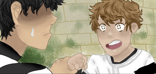
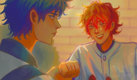
4. this one is going to sound a little funny, but draw your favorite character! - having a character to constantly draw helped me a ton. especially an original character;
5. if you are feeling uninspired, find a screenshot of some media you enjoy and try to redraw it or do a study of it :). i did this often when i didn’t know what to draw but wanted to draw!
6. experimenting with brushes!! — if you are also stuck, maybe try to download or even create some new brushes. …. i have too many brushes
—————
i really wish i could offer all the advice to help you succeed!! i’d love to see your progress as well!! the main thing i can say is that not everything you create will be a masterpiece, but not every work of art is a mistake either. don’t regret spending time drawing if you love it, even if you aren’t in love with what you create. if you can recognize that something may be off, whether it be proportion-wise, color-wise, ANYTHING, you’re still seeing a way for improving your work. which means you are still improving!
i wish you the best anon!! if you ever have any more questions i can try to help, and i am rooting for you!!!!
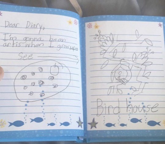
you can do it!!!!! :) (ft. drawing i did in elementary school)
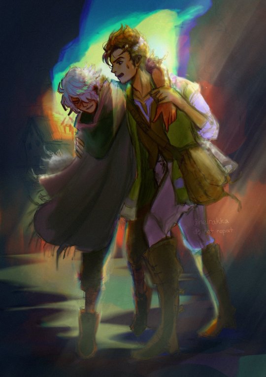
#zack speaks a lot tag#zack replies tag#long post#question mark (?)#i spent so long typing this the images got bugged i hope they work#seriously!! good luck! i hope you get to make the art u want to!!
3 notes
·
View notes
Text
ACTUALLY HELPFUL LINEART TIP
Go back over your finished lineart and add "mistakes"
What do I mean by this?
When we draw digitally we are given tools like stabilization, smooth erasing and ctrl+z that make it really easy to get polished results.
Is it wrong to want your art to look polished? HELL FUCKING NO. I won't even say I DISLIKE smooth and polished art, cause I don't! It takes a lot of effort and skill to do every kind of art and no matter my own personal preferences, I will show up to drool over any and all art i encounter no matter what level of polish it has
HOWEVER.
Something that i personally struggle with is a tendency to over correct myself due to insecurity and perfectionism, which causes me to take way more time than I would like to admit trying to "fix" minor mistakes for minutes at a time. By the time I get to the end of my lineart, it looks stiff and I don't like it nearly as much as I liked the sketch. I also didn't appreciate how SMOOTH my digital art was compared to the texture in my sketchbook.
So I started drawing in some extra mistakes. I started lightly petting certain lines, I started filling in solid blacks in a way where you could make out pencil strokes, I sometimes add in artificial guidelines over the top of everything before I finish rendering, and sometimes I'll also add extra specs to make it look like a bit was badly erased and drawn slightly to the left. I noticed that when I do this, it takes me about half the time it would take me to do lineart before and even less effort for a result that honestly is way more visually complex. You almost cant see the things i add once rendering is done. What i found out was that I spent much more time correcting myself and trying to be perfect than I did actually making progress, so my art would suffer because I was EXHAUSTED by the time I finished lines that I honestly was very rarely happy with.
I also noticed that this has made my traditional art skyrocket because I've been way less worried about perfectionism there. My lines are more confident now and my poses are looser, and my friends regularly comment on how much more expressive my faces are!!
Art is HARD, and there's no wrong way to create. But there are ways to create that may look good, but don't make you feel good.
0 notes
Text
Personal Reflective Evaluation
This is my personal reflective evaluation, where I will present a reflective evaluation of my personal methodologies of practise, knowing, making and creating.
Throughout my journey in the MA Concept Art course, I have developed and refined my creative process, integrating both traditional and cutting-edge digital methodologies. My approach is grounded in a blend of sketching, 3D modelling, and digital painting, each stage designed to enhance and build upon the previous one.
My creative process typically begins in one of two ways: either with thumbnail sketches in Photoshop or with 3D sculpts using software like ZBrush or 3D Coat. The choice between these two starting points depends on the nature of the concept I'm working on. If I'm focusing on ideation and exploring different forms, I gravitate towards thumbnail sketches, which allow for quick iteration and experimentation. However, for more complex designs that require a deeper exploration of volume and space, I start directly in 3D. 3D Coat, in particular, has been a recent addition to my toolkit - a software I learned during this course. Its intuitive tools and voxel-based modelling system have opened up new possibilities in my workflow, enabling me to quickly block out shapes and refine details.
Once the initial concept is established, whether through 2D sketches or 3D sculpts, I proceed to a more refined stage. This involves either a detailed painting in Photoshop, where I build upon the foundation laid by the thumbnails, or a more intricate 3D model. This stage is critical as it transitions the raw concept into something more tangible and detailed, setting the stage for the final touches.
The final step in my process is a detailed paint over in Photoshop. This stage is where everything comes together - textures, lighting, and final adjustments are made to ensure the concept is fully realized. It’s also at this stage that I incorporate one of the most transformative tools I’ve learned to use: ComfyUI.
ComfyUI has revolutionized the way I approach photo bashing and image enhancement. By setting up a workflow where I can sketch on one screen while ComfyUI, using fast models like SDXL Turbo, provides real-time suggestions, I’ve been able to streamline the creative process significantly. This technique allows for a dynamic interaction between my manual work and AI-generated suggestions, making the process akin to photo-bashing but with far greater precision. The AI suggestions often match the lighting and style of my work, making them easy to integrate into my painting.
Beyond this, ComfyUI offers additional features that have been invaluable, such as the ability to upscale and enhance images to any size I choose. The capability to render locally, without relying on online services, provides both flexibility but also ensures a faster and more secure workflow. Furthermore, the fact that ComfyUI is free only adds to its appeal, making it a powerful tool in my creative arsenal.
Reflecting on my methodologies, I’ve found that integrating new technologies like ComfyUI with traditional practices has not only enhanced my efficiency but also expanded the creative possibilities available to me. The synergy between manual artistry and AI-driven tools has allowed me to push the boundaries of my work, creating more polished and dynamic concepts than I could have achieved with traditional methods alone. This MA course has been instrumental in helping me evolve these practices, and I look forward to continuing to refine and expand my process in future projects.
0 notes
Text


Loewe FW23 Menswear
From Sarah Mower's review for Vogue
“I do feel like less is more. But in a new way,” said Jonathan Anderson. “I don’t think we’re heading into modernity like it was. It’s not like ’90s modernity; there’s something more peculiar happening.”
Anderson is one of the vanishingly few in the luxurysphere who believes that it’s enough to put clothes, and speculative thinking about them, first. It’s reached the point where it feels radical, avant-garde, and a huge relief that he chooses to show Loewe in a stripped-back way, in the traditional manner, with a file of models walking around a white space. “I think—I hope—that we’re going into a period where it is about being uncomfortable in design,” he added. “That we are trying to find something new.”
In Anderson’s world, the subject of clothes is multi-layered but startlingly focussed on clarity; what he called “a reductionist act.” His collection was about exaggerating the materiality of fashion fabrication into the realms of pure-lined 3D sculpture—full metal jackets beaten by artisans from copper and pewter; stand away structured coats molded by hat-makers.
We craned forward to understand what he’d done with the short, back-fastened shirts. Some of them were rigid, wrinkled vellum—the work of traditional book-binders. Others were delicately made in hammered silk, a match for the boxer shorts, worn with nothing but leather ankle-boots. “I wanted the idea of something which is quite sensual underneath, with something quite hard,” said Anderson.
Some of these boys wore angel wings. That’s where the reference spun sideways into the multiple art-historical/homoerotic sensibilities that focus Anderson’s vision. Partly, it was about resurrecting to modernity the iconography of old masters painters, specifically, the work of the French romantic allegories of Prud’hon and—more obviously in the space—the link Anderson has made with the young contemporary artist Julien Nguyen. His digital artworks—referencing traditional painting techniques—of Nikos, a favorite boyish model of Loewe, were blown up in the center of the stage.
What might end up sounding complicated was as distilled and to-the-point as could be. Anderson glorified Loewe’s craft skills in leather goods in textures of suede and shearling, shaved into sensuously tactile bulbous silhouettes in this show. But equally as head-turning were his pared-back, brilliantly on-the-money Loewe desirables: long, slimline coats in leather, and the reiterated wool shapes with deeply plunging cowl necklines.
They were worn with a gesture—one arm out, crooked in a way which played on the mind like a memory of classical portraiture. Simple, but way out of the ordinary. Anderson felt that arriving at that coat had hit the quintessential mark. “Sometimes, by getting that one look, it helps you to create a narrative throughout the show,” he said. “There’s something in that it says everything and nothing at the same time."
1 note
·
View note
Note
Hi! I’m a beginner artist when it comes to digital art and was wondering what app and brushes do you use for your art, or maybe if you have any tips on digital art. I figured I’d ask you since your art is so cool and looks so nice!
aksjskdjf hello there! thank you so much for the compliments, i'm flattered!! my art is super sloppy, but i'm happy you like it (꒦ິ꒳꒦ີ)♡ i'm honestly a little embarrassed to post this cuz i'm pretty much still a novice at digital art stuff, so there are probably better/more concise ways to go over all this, but i'll gonna try my best anyway!! sorry if i ramble ;;
to answer your questions, i use procreate! i'm also pretty lazy and i don't really like to switch brushes often, meaning i work almost exclusively with the 6B Pencil. i sketch with it. i line with it. i even color and render with it sometimes. i knew when i got into digital art i would want to use a textured, pencil-like brush bc my favorite artist did and i always loved the way it looked.
here's an example of just how excessively i use it lmao (with some Pro Tips™ /j):
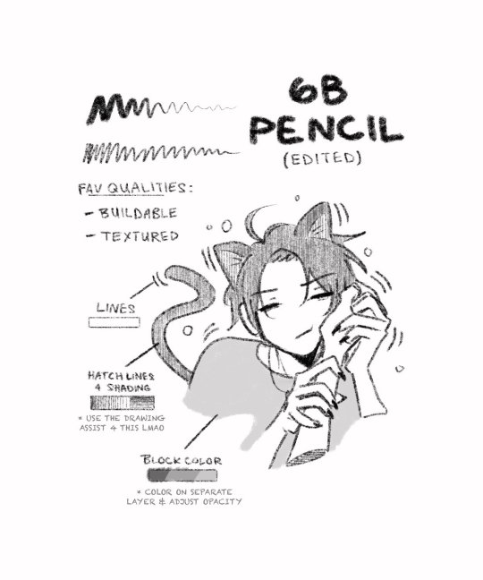
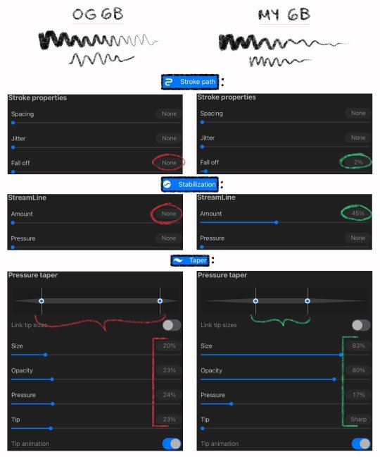
but ! because i use it so often, i've made some minor adjustments to the brush -- not enough to warrant calling it a completely different brush, but enough that there's a noticeable difference between the original and what i use when actually drawing.
personally, i like a tapered end when sketching and lining so i gave it a little fall off and adjusted pressure taper settings, and i also appreciate more control (less loose/shaky lines bc a pen tip on a glass screen is SLIPPERY), so i upped the streamline setting too!
here's a look at what settings i tweaked if you want to try it out yourself:
other brushes i tend to use are:
Round Brush for coloring. very super mega basic, but easy to work with!
and it's worth mentioning that lately i've been using Baskerville to line things! i used it in this itafushikigi piece. it gives me a lot of control and it's very tidy so i like it (bˊᵕˋ)b
and that's...really it lmao. of course these are all default procreate brushes. no matter what program you use, i just recommend testing out different brushes and adjusting settings until you find what works for you! you can always reset to default if you dislike it and duplicate the brush if you adore it. you can also download other brushes, but i don't have much (read: any) experience with that 💃
other tips would just be get familiar with your app and practice as much as you can. i'm very much a "pick one thing and draw it a million times" kind of person bc repetition gives me an opportunity to work on things i want to improve. 'if i draw yuutafushi enough times, eventually i'll perfect how i draw them' -- that kind of mindset?? idk if that method works for everyone, but, y'know...having a muse helps ;;
digital art was like a whole nother ballpark for me and i felt like i had to relearn how to do everything, so don't feel discouraged if your traditional art abilities don't immediately transfer over! it just takes time to get comfortable with it. drawing with your finger on a screen vs a pen on a tablet vs a pencil on paper are all very different experiences and there's a learning curve for each!
anyways, i hope that helps a little. sorry this is super long! good luck on your digital art journey ❤️
103 notes
·
View notes
Note
4, 5, 6, 10
Hoho, hello! Thanks for the ask!
I've already answered 4 here!
5 — Your proudest artwork
Right now? This one.

I'm sure I have other pieces by now I could be prouder of, like the pirate Jinx one I did for Trans Arcane week, wwho was done so fast, and without reference, while these are poses lifted right out of their character sheets... But it's my first work where I felt I finally got a decent grip of digital. I have never been one for painting. I avoided it back in art school, and was never taught digital. I feel this is just the piece I was actually proud of for the paint job and texturing, and it's a sick crossover to boot x'D
6 — Which piece took the longest
By FAR my 3D work. Although Thrawn in his kitchen will surpass it, Thrawn in his lounge took sooooo many days. You have to realise, most everything in the picture is made from scratch, and eaxh render can take from 30min to well over an hour (during which I can't use my laptop because it's chugging and SCREAMING just to render).

This is the current state of the piece. I only need to add a few things for it to be over tbh. Cans in the box o the fridge, a drying rack bu the sink, a little carpet askew on the floor... I've been dragging my heels because the render would take forever. Everything in this image has been made in low poly by myself, but for the plants, which I imported as free assets. Even then, fixing them and setting them takes time.


I'm very proud of my fridge and my gas stove lol
10 — Traditional or Digital
Well, I was raised and trained on trad, fell off practice for a very long time, which wasn't helped by my world travels and my favourite medium being etching, and using printing studios costs $$$ and buying the materials to print at home also costs $$$.
I got into 3D in order to make the winter rush at work more palatable. Made myself obsessed on purpose. It was great but like I said, a strain on the computer. Pulled out my 15yo wacom and started playing around with painter. I was frustrated easily and struggled a lot with the eye to hand disconnect... Now though, I'd say digital all the way, mostly because I can take my work further, paint, etc.
My love of traditional is not gone, and I often get the itch to etch (heh), but digital simply is more bang for my buck.
11 notes
·
View notes
Note
Hello there! I am absolutely blown away by all of your art. I'm just getting into digital art and was wondering if you had any shading tips?
Ah, thanks so much for the kind words! ^^
Fun! Have you done any traditional art before? If so, all the same concepts still apply, so it's more a matter of getting used to a stylus and finding a programs and brushes you like.
If you're a beginner at both, the best way to get better at shading is to learn how to shade simple objects like spheres, cones, cubes, etc. Everything is fundamentally made up of those basic shapes combined together, so once you learn how to shade them, you can use that knowledge to shade other things. Practicing with objects made from different textures is really useful, too, because light behaves differently depending on if it's touching glass or metal or fabric, etc. Lemme see if I can find any of my old studies...
Hmm, I don't seem to have photos saved of any of the really simple ones, but here are some examples, in case they're helpful to give you an idea of what I mean:


Those are traditional, and these are digital ones I did when I was freelancing (and was a lot better at painting than I am now, after taking like an 8 year break from art):


Oh! I did find a few spheres!


So, yeah, practice practice practice practice practice practice practice practice practice practice practice practice practice practice practice practice practice practice practice practice practice practice practice practice practice practice practice practice practice
87 notes
·
View notes