#like it goes beyond just an art style change
Explore tagged Tumblr posts
Text
Comparing the stylistic direction of P3R's cutscenes to the OG P3 cutscenes is the same as comparing the original Naruto cutscenes to either Shippuden's remaking of that scene or the 20th anniversary video.
It's just.....the SAME VIBE. Like if you know you know.
#persona 3#p3#persona 3 reload#p3r#naruto#the older ver just has more grit to it#while the new ver is prettier and maybe a bit more fluid but it lacks the same.........stylistic framing#i'm not saying personality is sucked out but the personality is noticeably different#like it goes beyond just an art style change#I think the reason the P3 movies/manga don't get compared the same way as P3R's cutscenes is because it's not the same medium#like the P3R cutscenes are REPLACING the OG cutscenes#while the movie/manga are looked at more as “oh cool comparison time”#similar to how the new naruto scenes can be seen as "replacing' the old ones (instead of just copy and pasting that scene in a flashback)#phew....needed to take a breather ok back to work
6 notes
·
View notes
Text
Tutorial: How I Render Accents
PART 2: COLORS
I usually do not recommend 'pixel hunting' aka going over your work with a fine tooth comb and picking out stray pixels to erase. However, for setting up a proper base layer for accents it is imperative to do so.
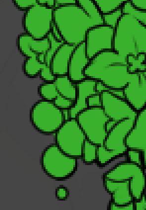
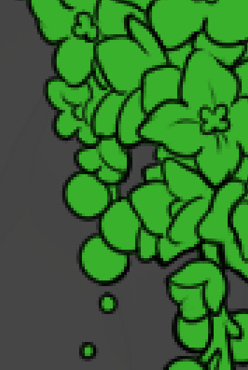
To explain my method of color blocking: I select everything outside of the lines, invert that selection, then fill in. This does a more accurate job than going into each and every section and filling them all in individually, and is also significantly faster. Only downside is small sections like above where you can see bits of the green (which I use bright green against a dark grey background to contrast the base color, lines, and background) poking out, as well as the inner section where it filled in a spot I did not want filled in. Getting all of this right in this stage will make your life easier as you go. (It's also the method I use to color block all my work, even beyond accents)
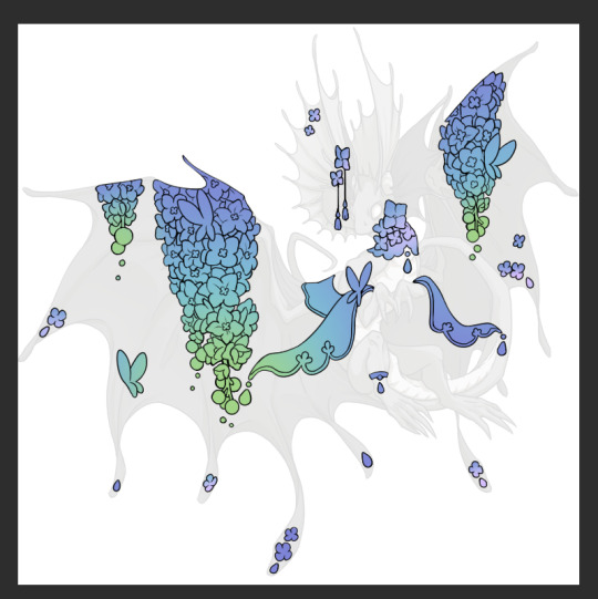
Now this where my style of rendering color may come off intimidating and, tbh it might be. I do gradients first and then I color over them with "normal" blend layers. I typically don't use multiply layers unless I'm shading something that has a lot of textures. If this scares you, it's okay I'll keep walking you through it. Here, my gradient goes from a pastel but deep periwinkle, to a soft more cyan blue, then to a lighter pastel green. Skipping steps and going from the periwinkle to green will give it a different look. There's also hints of a pinkish tone as an accent color.
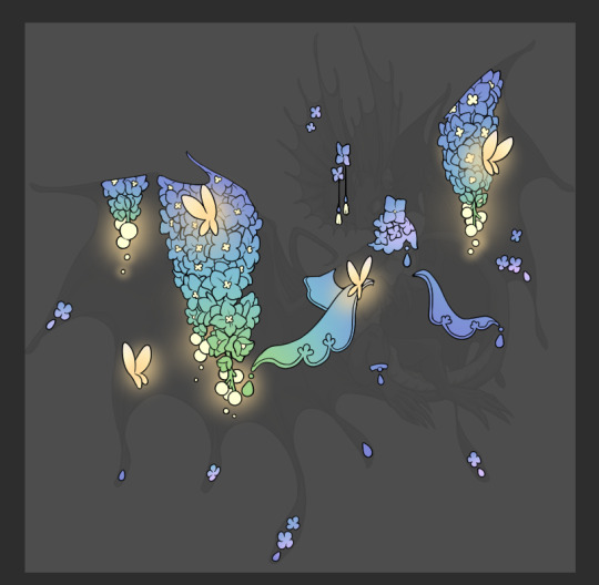
So as I said, these additional layers are done with regular "normal" blend mode layers. I've placed one in between the butterfly line art and the line art for the rest of the flowers, and then an additional layer under everything else. This allows me to create a glow effect specifically around the butterflies, and then specifically under the flowers. Going back and forth with the proper amount of opacity (by using the airbrush transparently) helps to make it glow but not be Too Loud. Also checking it against a dark background can help to check for spots where it spills past the borders, as well as really gauge how Bright it is. I've also color matched the butterflies with the flower pits and the bulbs. This adds extra cohesion and makes them all look uniform but different enough with the gradients.



The stages of how I render gems/dew drops. Take the base color, make it a bit darker and less saturated (as well as changing the hue a bit depending on what the default color is. For yellows I go more orange/red, for blues I go more purple or even pink. It depends), add a small drop light at the bottom thats a fairly saturated version of the base color, and then a stark white/ near white highlight. That's it. Don't over complicate it, it will not matter when it gets shrunk down. Note that I do not use multiply/overlay/screen layers for these types of things as it adds too much bulk to the files and doing it manually helps to strengthen your color theory skills.
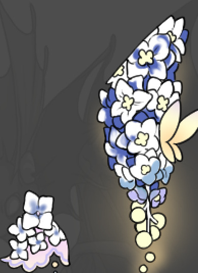
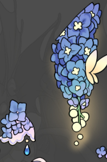
For shading and rendering, again, I create a "normal" layer and simply. Draw over what exists. Color picking and hand blending allow me to create the exact shades and effects that I want that multiply/screen/overlay layers may not be able to achieve. (which isn't to say I dont use them! i just don't use them for the main meat and potato part of my coloring) All of what is shown here is also achieved with the CSP asset SOIPEN (which can be found for free in the asset store)
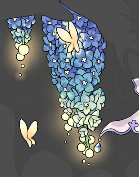

another example. The one on the right is showing how the layer looks without the gradient base layer under it. All of this is rendered by hand. I also specifically put a highlight color around where the butterfly is sitting to give a better illusion that it is properly sitting on the flowers rather than just in front of them.
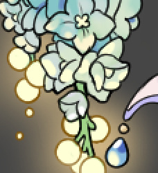
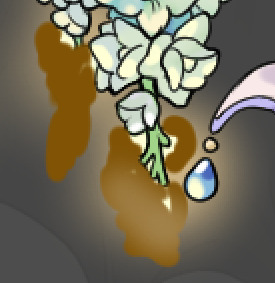
Next is changing the color of the lines, if needed. A method i'll use is I color just the sections I want (on a separate clipping layer) then lock that layer's alpha setting to them add in a gradient. It's a small and subtle effect that adds more depth without doing a lot of effort. (work smarter not harder)
Now we get to the Polish Layers!
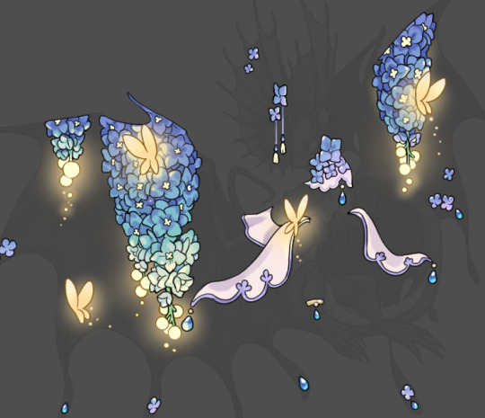
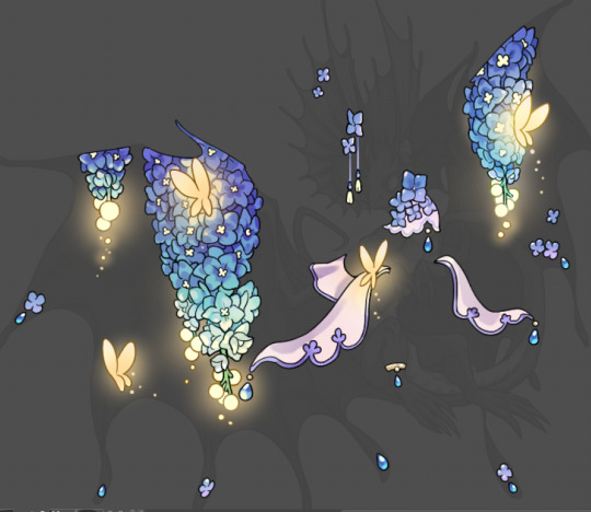
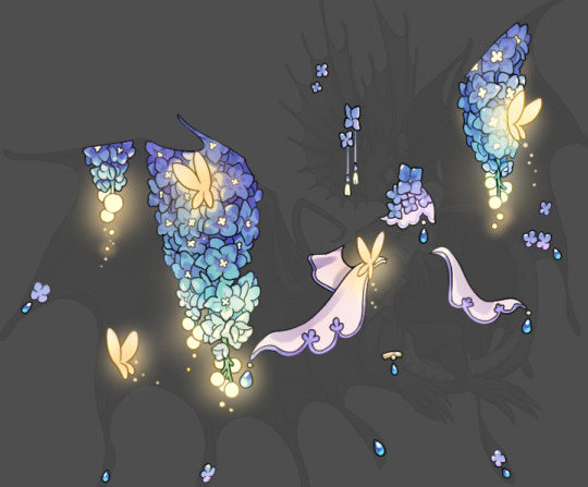
first image is how it looks as a base. second image is with an overlay layer applied. I've used some dark purples and mid tone desaturated greens to push the values a bit further (especially evident on the top left wing) Third image is with a screen layer applied, highlighting the inner most part of the flowers and adding some additional bounce light.
An important thing to note about making accents vs making full coverage skins: OPACITY AND LAYER TYPES MATTER OVER TRANSPARENT SPOTS. What I mean by this is that if you use a soft, light grey to shade with a multiply layer, don't clip it to anything, and have it go outside the lines - that will no longer appear as a 'shadow' when it comes to the final result. Instead you will have a section of soft light grey that is simply laid on top of whatever the image under it is. The same applies for overlay/screen/add layers and so on. If i use a very dark color on a screen layer (to give a soft highlight) and airbrush it over a bunch of stuff and don't clip it, it will end up with this horrible dark splotch over everything that isn't opaque. To this end, mastering normal layers is imperative to having well rendered and convincing accents.
Another thing of note: when it comes to sparkles/small details, note how 'large' the sparkles behind the butterflies are. They seem a bit chunky, yeah?
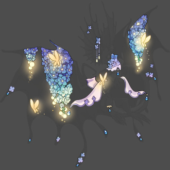
this is what they look like at proper size. If anything, I could have gone larger on the small metal beads connecting the dew drop jewels to the lace.
Another trick I also like to do is this:

a slight hint of transparency! It's just enough to let the dragon's lines underneath show through but not enough to be super noticable. I like to do this a lot when it comes to sparkly and magical effects.
Next is the worst part of all: destroying all that beautiful hard work with the shadow and line art layers! (sobbing)
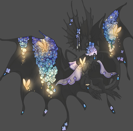
This stage always agonizes me. This is my first pass of the shadow/line layers and let's hope it's dark enough.
But yeah that's a start to finish look at how I create my accents. Unfortunately a lot it devolves into needing to know, yknow, line weight and silhouette importance, color theory and the ways that drawing applications actually apply color to a png vs how its rendered in app. All of these things impact the finesse of the accent, and are things you do have to learn gradually over time, but hopefully this has given yall some additional insight and perhaps some helpful tips.
And this should also explain why I get so mad when people go 'hey can I get this accent in another color' no! no you literally can't!
153 notes
·
View notes
Text
Allowing myself to go on a tangent about the nearly 26 year old virtual pet website that i am way too invested in.


So today they released the Candy Pteri. While I appreciate what they were trying to do here with it effectively having two designs that you get to choose between (The "Melted Candy Pteri" on the left is a Paint Brush wearable that can be removed to reveal the customizable base pet on the right), I think in this case, they have created two extremely boring designs when they could have easily created one strong design, or hell, even two strong designs if they wanted to do extra work.
Because with this release, we get a base Candy Pteri with no real lineart changes (like the rounded hair tufts and spines on the Candy Zafara), and an alternate design that's just... a drawing of a Marshmallow Peep™???
I would have WAY preferred a base Pteri where they did something like give it a little marshmallow dollop shape on its head and in place of the tail tuft, like my friend @darieyrie suggested. Or they could give it the Peep dot eyes and more rounded features! There's all kinds of ways you could do this concept.
I'd be less frustrated if the Peep wearable had any Pteri traits whatsoever, but its JUST a Peep that's been slightly microwaved. Which is a little funny, but even more than the Toy Poogle is just an iDog, the Candy Pteri does not have any deviation from its base inspiration at all. It's not actually an execution of the concept of "Candy Pteri thats based on a Peep" if there's no Pteri left at all!
(also are they just banking on the Just Born corporation (who make Peeps) never taking any action on this? it kind of goes beyond 'cheeky reference', its EXACTLY their product. I mean, it seems unlikely that they'll notice or bother doing anything if they do, but i don't really know why you'd risk that.) The saving graces of this design, imo, are that the pink and cream color scheme of the base pet IS pleasant (though the lineart and shading treatment aren't really my bag), and some people will enjoy the novelty of having a pet Marshmallow Peep™.
But really this is just the latest of a number of recent outfit and color releases that feel like they don't think people want Neopets. Like. This cardinal outfit that they also released today.

I love the idea of a cardinal Pteri! But this outfit literally takes away every distinguishing trait of the Pteri to make a high effort, nicely rendered, but stylistically incongruous generic cartoon cardinal????? Its not even a Neopet anymore!!! Even if I set aside my personal dislike of the overly rendered style they're using for more and more of the site assets, this wouldn't work with most of the rendering removed either, because it would still be a Pteri in pose and proportions only.
Not every new design and outfit that's come out in the past couple years has these issues and there have been a number I've really liked, and I DO think its great that the quality of the art has improved since the JumpStart era. But I would really appreciate it if the new pet colors in particular were designed a little more thoughtfully, so that they at bare minimum still resemble the species they're supposed to be outside of the rough pose and proportions. It sometimes feels like there isn't a rough draft or workshopping progress for new colors, and the members of the art team just kind of do their own thing and then the very first draft of an idea is what gets polished and released.
The current art direction for the customization aspects of the site just has me feeling like they've decided to throw out years of relatively cohesive art and world design for a strange jumble of ideas that don't really capture the appeal or feeling of Neopets to me.
#neopets#long post#i need a text post tag#sorry for my derangement#while this is frustrating to me at the end of the day like. there's years of stuff that they already made that i do like#so i'm not sitting around constantly seething. also i swear i have interests besides neopets as well lol#i'm just very invested in and opinionated about both neopets and design
72 notes
·
View notes
Text
Was thinking today about Cherry Magic Thailand, and all respect to the writing (which deftly navigated the challenging task of adapting a full-on classic) and the rest of the cast and crew, but has any QL series' success hinged so much on a single actor going above and beyond in a performance as Cherry Magic Thailand does on Tay Tawan's portrayal of Karan???
That character could have fallen so detrimentally flat. He is perfection personified. Even after Achi discovers his so-called 'imperfections' (which are just that he sings bad and is crushing extra hard on Achi), the writing doesn't ever let Karan come off his pedestal. He remains put together, impossibly patient, and admirably righteous. His stress in life is that people don't respect his hard work because he's so beautiful! This character, in theory, should not really strike an audience as likeable. The writers could have used the one facet of his family-drama that emerges in the penultimate episode to build a deeper character in the writing, but elect not to even hint at it any earlier in the series.

So much heavy lifting is left to Tay, and the performance is a wonder to behold. Tay Tawan is certainly attractive in the way Karan is supposed to be attractive--fit, tall, handsome--but Tay's face and earnest dorky demeanor are unique in a way that seem far too rare in the influencer era. The breadth of his nose, the goofy joy in his smile, the clownish clumsiness, the nerdiness of his interests (the GMMTV actor most likely to be reposting a popular science article or rare animal sighting): Tay brings all of these elements of himself to bear on the poised idol of Karan, playing all the parts of the romantic hero while letting his own characteristics distill onto it so that the character actually contains valuable tension for the audience between his faultlessness and the slow reveal of his sincerity. That dynamic lies at the core of the show, and it's a less explored one in media, so all the more challenging to do.
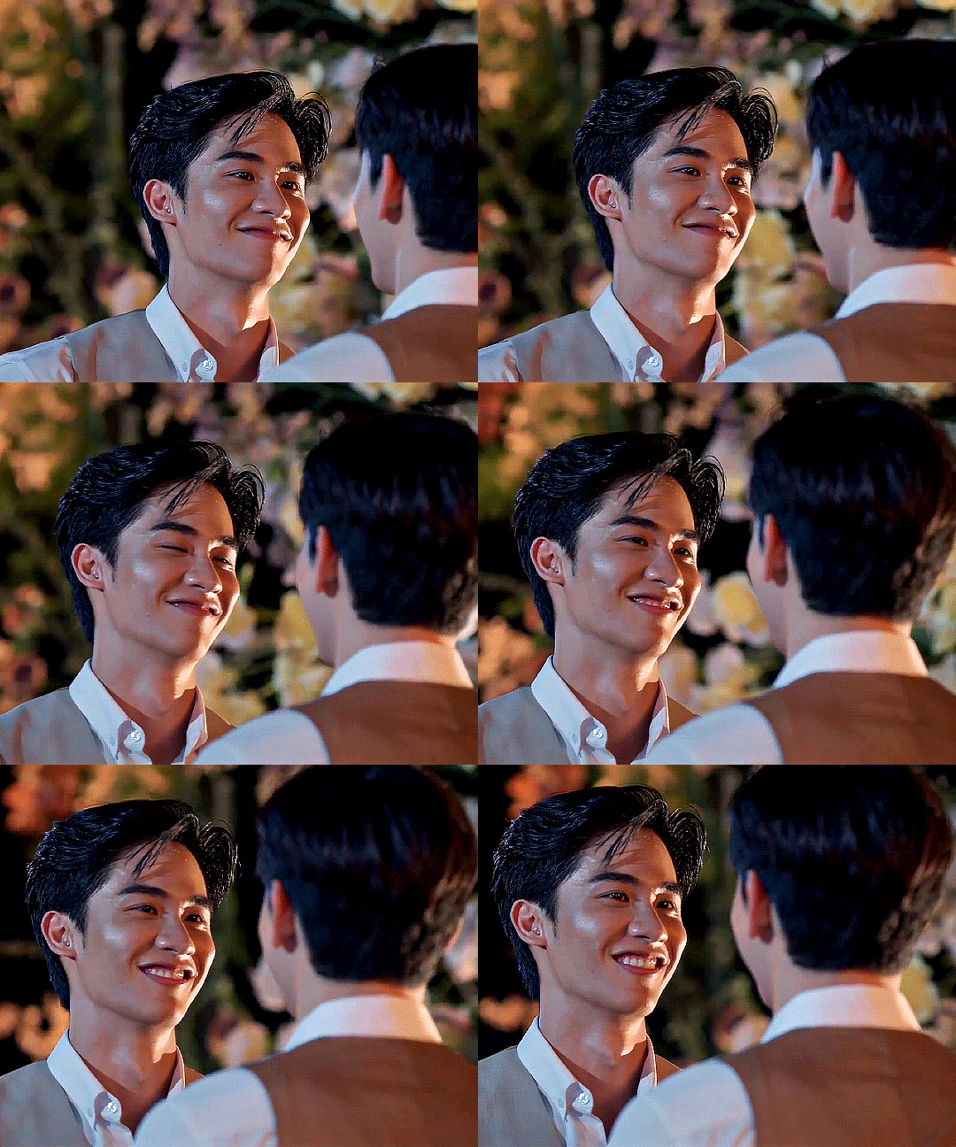
But Tay understands the assignment. He goes full-in when Achi hears Karan's inner voice, squealing and talking manically fast (a real-life Tay Tawanism as well as a wonderful connection to Japanese performance styles). Once the characters begin their romance, so much effort is put in to have Karan looking at Achi, not just with love, but with the deepest gratitude. That's what most often had me crying. In fact, it often looked like Karan was on the verge of happy tears, overwhelmed by the fortune to love and be allowed to love Achi.
Being able to appreciate Karan's sincerity opens up an avenue for the audience to care about his challenges that on the surface seem so superficial. Tay is able to take this character's struggle to be taken seriously and make it as worthy and pitiable as any narrative about women in the workplace struggling with that issue, and that's not an easy feat in this day and age. Whether in Karan's affections or disappointments, Tay exhibits such humility and unabashedness in his performance throughout the series, it renders the otherwise familiar messages about the value of the small unappreciated things in the world as enchanted and life-changing.

And incredibly amongst all this, the series REQUIRES by its very title for Karan to have a sex drive, and even that desire threads through Tay's portrayal of the character as he interacts with Achi, maintaining an incredible balance between a fun and dorky excitement about sex and a potent sensuality (it's such a great sex scene when it finally comes).

Tay took a paragon and made him such a fully fleshed-out and realized character. I just can't imagine the series working without such a masterfully crafted performance. The whole cast did great work, don't get me wrong. Tay's is just one of those magical reminders about what the art of acting can achieve.
#cherry magic thailand#cherry magic#karanachi#joy as an aesthetic value#very few times do we get to have performances that explore kindness with so much depth#Amy Adams in Junebug and Sally Hawkins in Happy-Go-Lucky and Yoon Jeong-Hee in Poetry and Setsuko Hara in Ozu's films are great examples th#just all women...#we could maybe add Joe Pera and Andy Griffith to that list on the men's side#Tay Tawan's performance just feels so special#taynew#tay tawan#specifically avoided tay's performances when i first got into bl tbh and i was soooo wrong#he brings very special kinds of queerness to roles for me#and to life lol
68 notes
·
View notes
Note
Hello! Sorry to bother you.
I noticed you are in JTTW fandom and wanted to ask if you know where can I find more info on Sun Wukong's make up and stage performance? I tried to find stuff on my own but quickly realised that I'm just one small weak goblin. I saw some blogs about chinese opera behind the scenes with SW images and couple of videos but that's about it... and since you look like you are way more knowledgeable I came here to beg a favour.
Do you know any videos, documentaries or blogs on this topic?
Thank you for your time ♥♥♥
Hi!
TLDR: Bold text are writings/videos linked to Peking Opera Culture and specifics surrounding Monkey King performances. Post has a mid-length summary of key aspects of his Peking appearances and core thematics. This mainly goes along visual design analysis, as I don’t focus in performance art as much! Read more divide for courtesy
(Also taking a moment to highly praise @/bonesmarinated ‘s Peking opera Wukong pieces!)
The Monkey King/Sun Wukong is a very well covered and well performed character in Peking Opera, I’ll give a short(ish) summary of the key aspect of his design across various performances based on work I can recall from my Undergrad as well as my own experience- and i’ll link any documents/websites/images I have on hand
Wukong’s Lian Pu falls under what is known the Jing role (complex hero) with similar facial decoration also being delegated to the Chou roles in Opera as well.
The dominant school of art in depicting him either on live performers or maskwear, have a fairly universal foundation for his appearance.

The oldest forms of Peking opera stick to Wuseguan (Five Colour Theory) with his Lian Pu sticking to a core 3 of White (Cunning), Red (Bravery), and Black (Loyalty). Even with Modernisation of the Peking Opera and developments in the science behind art and makeup, Lianpu is specific in its purpose of portraying the nature of a character beyond body language and aiding in accessibility for people at the far end of the audience.
The Monkey King’s Lian Pu is reflective of his mischievous and bold nature, combining it with the shape of an Old World Monkey’s furless face shape so that even those “uneducated�� in Peking Opera culture can at least see /what/ Wukong is before they see /who/ he is. The White and red placement are linked to yin-yang dynamics relating to the stone he was born from and the energy it cultivated) as well as general themes beyond the tale itself.
Zheng’s “Evolution, Symbolism, and Artistry: A Study on the Colors of Peking Opera Facial Makeup” Discusses this in more detail. ( DOI: 10.23977/artpl.2023.041207) (ISSN 2523-5877)
(General Mask colours in Peking Opera, separate from Lian Pu: The Cultural Connotation and Symbolic Meaning of Chinese Opera Mask Color - Hanbing Tu)
In more modern designs, the key foundation of Wukong’s face doesn’t change much, however some variations do add colour to Wukong’s eyelids- mainly pink or yellow/gold. Both of these relate physically to the ‘whites’ of Old World Monkey’s eyes, with the yellow face paint being representative of “barbarism” or “savagery”. Gold is used on the faces of various immortal creatures from all backgrounds as Silver is.


(Left: Chu Luhao as Monkey King, stedling divine peaches and wine in celestial realm, Kaohsiung ) (Right: Monkey King Wukong in Beijing Opera Journey to the West at Liyuan Theater)
As with Taiwans branch off in culture, This Lian Pu on the left shows the eyebrows as the top of the eyelid makeup, contrast to Chinese style and other Sino-influenced regions. This works in Chu Luhao’s production as it plays towards the character Wukong is before he’s sealed under the mountain and begun the journey- hence more “wide eyed”.
Mentioning Yellow within the Wuseguan, this is why most of his earlier outfits have such a heavy bias towards yellow cloth, barbarism being represented across his whole body (his form, as a monkey over his soul that achieves enlightenment) with costumes later down his hero’s journey adding more black, blue (simplicity).


(Left: Performer playing Monkey in Journey to the West, Chinese Opera performance in Singapore) (Middle: Chu Luhao’s production, Sun Wukong arrives at the Dragon Palace of the East Sea) (Right: CANTON, CHINA – CIRCA JULY 2019: Beijing Opera performance of “Monkey King Making Havoc in Heaven”)
Key Read -> The Artistic Symbolism of the Painted Faces in Chinese Opera: An Introduction, David Ming-Yüeh Liang. https://www.jstor.org/stable/43560653
Book -> Chinese opera: Images and stories, Peter Lovrick, Wang-Ngai Siu
Book -> Drama kings: Players and publics in the re-creation of Peking opera, 1870-1937, Joshua Goldstein. https://books.google.co.uk/books?hl=en&lr=&id=XT_1fZ9Jp18C&oi=fnd&pg=PP1&dq=info:49R3XREYwVoJ:scholar.google.com/&ots=3OF1F4SILK&sig=gQyW7bGJzgnxG62Y2TxU01ZPazQ&redir_esc=y#v=onepage&q&f=false
This analytical paper on Monkey King: Hero is Back showcases modern animated links to Peking Monkey King designs - https://fslmjournals.taylors.edu.my/wp-content/uploads/SEARCH/SEARCH-2024-16-1/SEARCH-2024-P5-16-1.pdf
A blog site I found interesting was an interview with Yao Yudong, the successor to colourful Peking Opera masks, where he discusses creating the mask designs (with a Wukong mask as a recorded example) and a more in-depth written post. He expresses the key two styles of Wukong’s red markings known as “Upside down Gourd” style, and the less complex “Upside down Peach” style attributed to a different art school. In which his mask is directly attributed to items that come into contact with his face.
Jiao Feng, Peking Opera Facial Makeup: The Art of Face Painting: http://www.chinatoday.com.cn/ctenglish/2018/ich/202001/t20200117_800190202.html
Connected is a video of an Opera performer who does his own Lian Pu, which depending on the time period could take up to two hours. Although this design is significantly more contemporary in the use of gold on white sections as markings like black paint. https://x.com/chinadaily/status/1365730927133958144?s=46&t=06bYiE12l6qVJUxPCBuvvQ
In regards to Wukong’s combat performances, he falls into the role of a Wusheng (武生), which is the strand of stage costume used in representation of his staple armour.

(Monkey King in Journey to the West Performance, Beijing Opera)
In this costume, Wukong’s Phoenix feather cap is mirrored by Lingzi (翎子) or Zhilling (雉翎), which likely play back and forth with influencing eachother as time progresses, due to Wukong’s theatrical personality being heightened by the Pheasant tails and their movements as actors play their roles. In his Wusheng roles, he is more likely to be adorned with gold eyelids to highlight his layered immortality and connect to the golden armour he wears. The trait of biting the pheasant tails as a theatrical act of frustration is seen across adaptations, most recently in Black Myth: Wukong’s Chapter 6 Animation.
This animation’s design seems to relay the Lingzi strongly due to the way the studio details the lowest connection points to the crown ornament.

As stated in Bond’s writings “BEIJING OPERA COSTUMES: THE VISUAL COMMUNICATION OF CHARACTER AND CULTURE”, Wukong’s in-game Suozi Set and various adaptations Dragon Palace armours split similarly to the Kao (Armour) on Peking stages, with the falling of the frantic drastically increasing the size of the actor and his silhouette.
Qing-era flags on the costumes of Wusheng were used to express social standing, gender, nature, and ranking. The image above showcasing them has them match the Kao pattern of the clothing, other flags often held zodiac patterns- with the monkey showcasing vain, egotistical, inventive and tricky individuals; and the peach included in a flag hinting towards immortality.

(Ching Dynasty Year of the Monkey Flag used in the Peking Opera) Zaricore Flag Collection: https://www.flagcollection.com/itemdetails.php?CollectionItem_ID=943
Due to the History of Lian Pu, and Wuseguan, despite modernisation of Opera arts vastly widening the colours and complexity of costumes; Wukong sticks to a key 5 colour scheme, with a emphasis on the original trio of red-white-black, and gold being reserved for Wusheng/Wuxiaosheng to showcase immortality and strength. The prevalence of Opera alongside fictional theatre means that the two constantly play off of eachother in mannerisms and influence, both at the time of JTTW’s writing to the 21st century. But as Opera is a physical performance, all aspects of Peking costume design is meant to make the emotional and psychological aspects of characters physical, to a large audience space needing to see facial expressions heightened and clarified by Lian Pu.
Read -> Cultural-based visual expression: emotional analysis of human face via Peking Opera Painted Faces (POPF)
#i hope that “’more’ button works bc this is so going to clog up everything otherwise#hope this helped! i mainly know written sources due to academia#however i find best learning written theory and watching recited peking is the best way to approach it#wukong is a fascinating one bc of how intertwined literature and theatre is in this context#sun wukong#journey to the west#jttw#wukong#peking opera#but just stick to the bold text to find written sources and academia#black myth wukong#son goku#chinese opera#also sorry if this is worded badly uni has kicked my ASS this week
47 notes
·
View notes
Text
Alrighty my dudes buckle up
GHOST RIDER D&D AU
also WOE. ART STYLE CHANGE BE UPON YE.
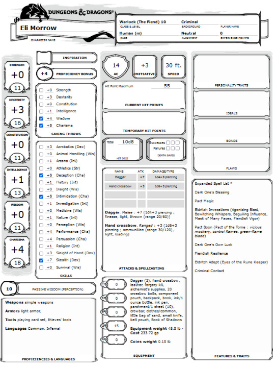
First things first thank you to my beloved mutual @moosemonstrous, who was basically the brains behind the operation I basically just wanted an excuse to draw tiefling Robbie and then got smacked in the face with an awesome story way beyond what I had ever thought of with KILLER fucking lore to match <3.
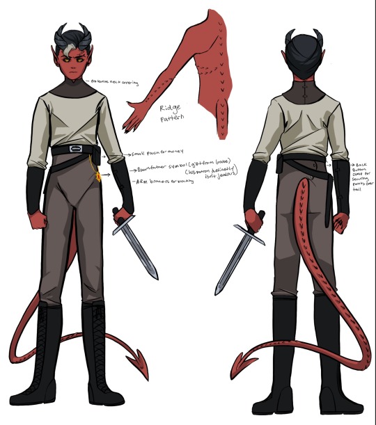
While I usually like to start with Robbie when introducing an AU, we're going to unfortunately have to start with Eli. A man who fucked up so monumentally that the kinda sorta god he's supposed to be serving went 'Bitch??? How about NO.' and humbled him faster than my DM can say 'roll perception'.
Ok I'm getting ahead of myself. Eli is pretty much the same personality wise as he is in canon. Insecure and desperate for power/control. He grew up surviving with Beto by doing jobs for the Myriad crime syndicate. Somewhere along the way he started serving his patron, Desirat, the twilight phoenix, in exchange for her power.
Im just going to directly quote what moose said about Desirat cause its phrased WONDERFULLY:
"Desirat, The Twilight Phoenix - companion and mount of Asmodeus during an ancient war, was torn from her master and captured by uppity mages. They were eventually killed, but she remained chained under a mountain, creating weird thermal phenomena in the area. Her sanity fractured in isolation so she thinks herself divine, and she lends through dreams and visions to those who 'carry a seed of fiery vengeance'. She now speaks to the minds of those who lie spurned and angry at night, calling them to unlock their inner flame and let Desirat aid them in their vengeance."
Desirat chose Eli as her champion to free her. She believed his faults would make him easy to manipulate for her purposes.
But eventually Beto wanted to settle down, and Eli refused to (to quote moose) 'Stop that warlock bullshit that EVERYONE SAID will get him in trouble'. And the brothers separate. During that time, Eli gets it in his head that he can steal more power from her by becoming a Litch. Great! In order to become a Litch he needs to have the most important person to him engage in a willing life sacrifice. Not great.
So he finds Beto and tries to get him to oblige to his sacrifice, and while there might have been a time where Beto might have laid down his life for his brother, he wont anymore. He has a family now. People who rely on him who AREN'T Eli. Unfortunatly, Eli is PISSED by this and kills Beto even though he isn't a willing sacrifice. Eli figures 'Whose really gonna care? A life is a life right?'
DESIRAT cares. She basically obliterates Eli on the spot and stores his lifeforce for later purposes.
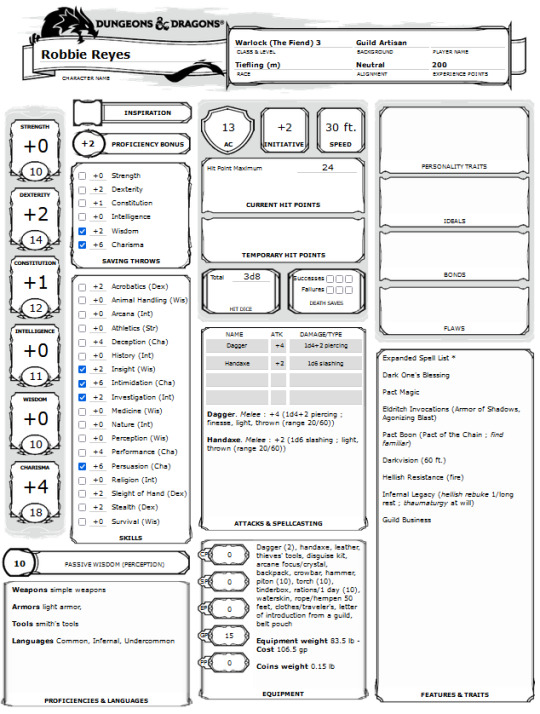
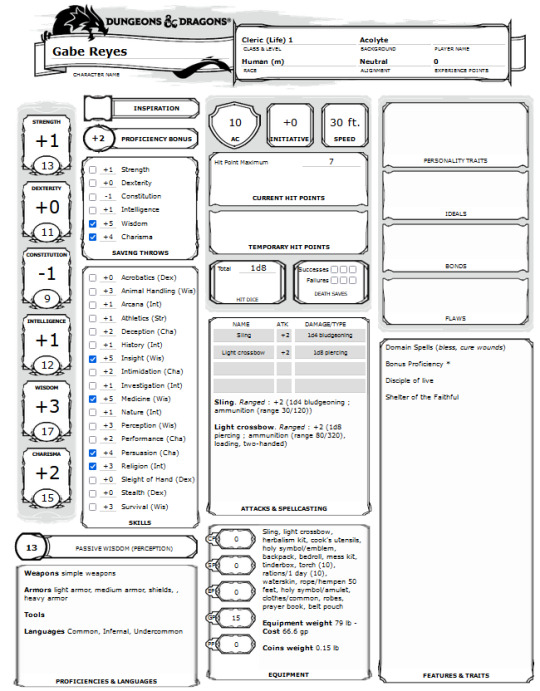
(all stat sheets curtosy of the great Moose. Also I feel obligated to mention there was a scary moment during the art process where Eli looked like a beautiful butch lesbian. Horrifying.)
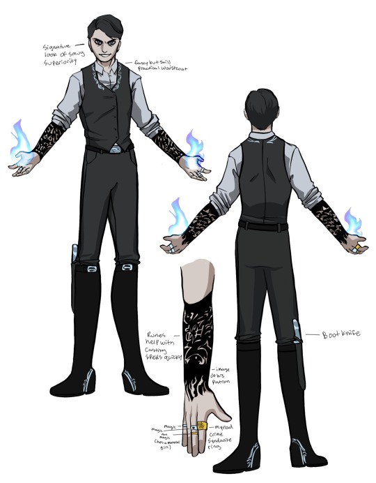
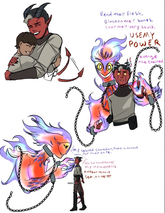
After Eli's spiritual, physical, and magical bitch slap, Desirat starts looking down his bloodline for a NEW champion. Lucky her, Robbie is RIGHT THERE. Protective of his brother, a strong sense of justice even from a young age, a hatred of when things aren't fair; he's PERFECT. She has plans for this one. Eli was a good test run. But she has IMPROVEMENTS planned for Robbie.
So Desirat waits until Robbie is old enough and strong enough to serve her purposes. In that time, Julianna goes out adventuring to get more coin so she can pay for Gabe's treatments of Greater Restoration and just. General food and water and general supplies. But she doesn't come back. She was responsible though and hired someone who was willing to take what she could offer to take care of the boys. Gabe still believes that she's still out there and trying to come back to them. Robbie thinks she's either bailed on them for a life of adventure or dead.
Around when Robbie turns 18, Desirat puts her plans into effect. Seeing as tieflings carry innate magical abilities (most commonly thaumaturgy, hellish rebuke, and darkness) it would be far more advantageous for her champion to be a tiefling than human. In the span of about 4 months, Robbie goes through a rather drastic transformation.
His fingernails harden, then blacken, then sharpen. Awful pressure builds in his skull that is only relived when the beginnings of horns break through his skin. A similar process begins with a lump forming at his tail bone and eventually bursting out into a long pointed tail. His canine teeth fall out and grow back in sharper and longer. His eyes cloud over to black and yellow, all the while his skin reddens and forms hard ridges on his arms, ribs and spine.
To say this is disorienting and painful is an understatement. Not to mention how it changes how the other people around the village look at him (not to mention how it changes how he looks at himself). Even though the stigma around tieflings isn't as strong as it once was, it eventually causes Robbie to be out of a job. So he decides to sell the house, pack up his things, prepare schooling money for his brother and move to the city where more opportunities will hopefully await.
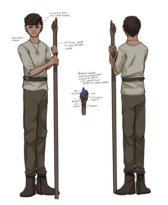
GABE!!! THE LITTLE ADHGH. Idk why but I got extreme cute aggression when drawing this version of him fdjkslaf.
Gabe still has CP like he does in canon, but with the magical advantages of ✨Greater Restoration✨ he can generally function pretty well. He still gets tired sometimes though, so he carries around a walking staff as an aid just in case he needs one (also he can go whack whack. at least thats what Robbie tells him when he gets a little self conscious carrying it around).
Robbie has saved up enough money for Gabe to get a months worth of schooling at the Dawn Father Chantry in the city so he can learn to cast Greater Restoration on himself. Gabe's recent growth spurt has been causing him to need more and more frequent healings, and the Chantry in their home village of Hill Rock has been less and less obliging as of late (partially due to Robbies recent uh... condition. not that anyone would dare say it to his face of course).
Some extra fun doodles with expressions and thinking about how Desirat might look and interact with Robbie. I love when gods have a kind of twisted love for their special chosen people (plus some fun transformation horror cause its ✨me✨ were talking about what did you expect).
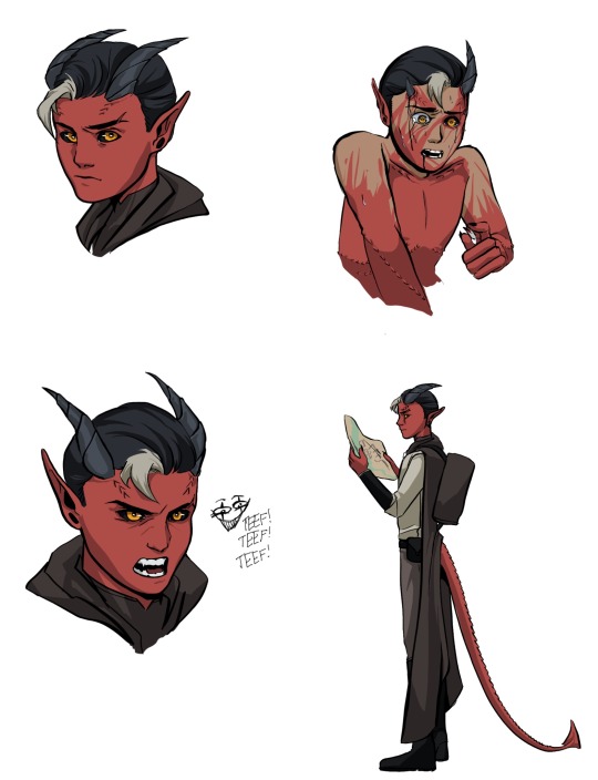
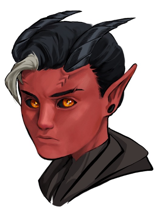
Also I really REALLY liked that top left sketch and got the rendering itch so I had some fun and painted it in.
Theres a whole fuckin. Second post to this au all lined up cause Moose when HAM on this. But its gonna take some more character designs so I'll need just a little time. but this will not be the last you see of this lol I promise <3
#I wanna make just a little resident evil au update rq but the sequel to this will be happening SOON.#i could not stop putting these guys into situations if my life fucking depended on it bby#not proofreading this bby cause I gotta go to bed but i ALSO need to get this out#I need to inflict yall with the b r a i n r o t#ghost rider D&D au#robbie reyes#gabe reyes#eli morrow#my art#sketch
47 notes
·
View notes
Note
what’s up with Patrick’s fashion evolution this past year? And his aura?? It seems like he’s finally completely comfortable with himself.
smth i have always loved about patrick is that he goes through these periods where he finds a style that he likes/is comfortable in and sticks with it for anywhere from months to years. neurodivergent king i see you. and real ones know that patrick has been slaying since pre-hiatus--thinking so fondly of his funky sneakers + all over patterned hoodies era circa ioh/folie--but i agree that he looks particularly good in the clothes he gravitates towards right now! i adore when he's more visibly punk. patrick stump battle jacket debut 2024 you changed my life forever fr
and yeah i know what you mean about his aura and how he just seems so confident and self-assured these days. it's definitely been building since srar era but something about tour/2ourdust... he came back from their little break with such a palpably strong belief in the art they were making, and then that just skyrocketed over the past year as the audience reception to their entire catalogue was overwhelmingly positive, which we know because he and pete have both talked about it. but i think with patrick specifically, even beyond his obvious confidence/pride in fob itself, he has level of confidence in himself as a performer that eclipses what we've seen from him before. he just seems SO happy. it's so lovely to witness and he couldn't deserve it more! even like. just thinking back to his very affected soul punk persona where he was going through the motions but clearly miserable compared to how he was strutting and growling and beaming at riot fest the other night. having fun on stage (and serving unfathomable levels of cunt while doing it) seems to come so much easier to him now because he's brimming with joy over what he's doing. and so so so much love for who he's doing it with :') obv i don't know patrick or the details of his personal life but he does seem to be completely comfortable with who is and how he's living and it's so lovely.
also i mean. he's a bear now and he's hot as fuck. i hope to god somebody is telling him how hot he is every day and that he believes them because it's insane that he just walks around on this earth looking like that
#jesus christ i wrote a novel. i just love him so much#he's also just. he's not forcing himself so deeply into certain boxes like he used to#i will leave it at that but. yeah.#man. getting misty eyed over patrick stump on a sunday evening...#answered
45 notes
·
View notes
Text
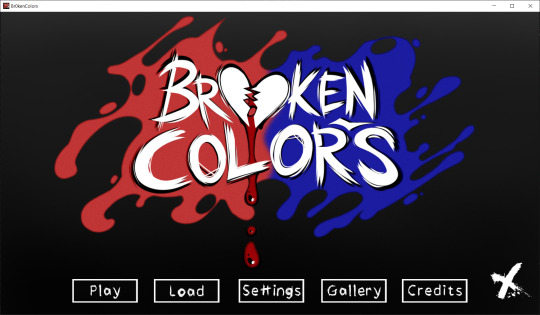
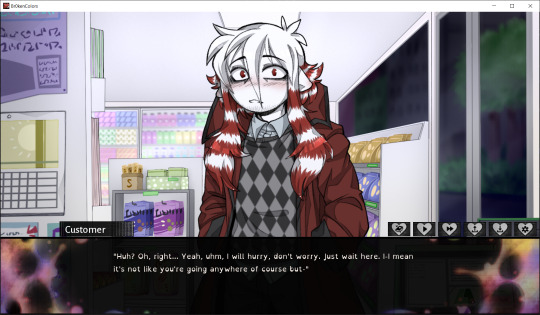

Broken Colors (Visual Novel)
Created by: The ⁍ Ink ⁌ Room
Genre: Horror/Romance
I've been waiting for this one from @inkly-heart for a while and it is very well made for a demo! From the easter eggs to the art style, it really does seem to go above and beyond. This game is an r18 game so while there's nothing of the sort in the demo so far, it is something to keep in mind of with future installments.
The story starts with the MC waking up and going to her job at a convenience store to meet their coworker, Ramus. Ramus is a snarky coworker that seems to dump all his work onto the MC. After meeting and serving some customers, the MC takes a quiz on a magazine as they wait, however are interrupted by Ramus who walks off to a party. From here, the options splinter off.
Daydreaming allows the MC to meet Dameon, a new customer that comes in after being rejected by his crush. Depending on the answer, it can go a couple of ways. Sympathizing with him allows him to develop a crush on the MC, with the MC attempting to make him feel better by complimenting him and reassuring him. After a nice conversation with him, he leaves promising to come back. At this time, he develops an obsession with MC and the item that they've given to Dameon becomes a sign of their love. The MC meanwhile is annoyed that they didn't ask for his name and heads home. After some intrusive thoughts about their family, they go to sleep, At night, Dameon breaks into the MC's place, learning their name and promising that they will meet later on. The MC can also just act normally with them or straight up ignore them, which either leads to a normal conversation or Dameon getting annoyed, and leads to being chased by DG in the alleyway.
Picking up a call with lead to Ramus telling the MC to deal with a delivery man that's coming over. Someone does come over to presumably rob the MC, but we find out that it's a prank from the delivery man named... Delivery Guy (or DG). After some small talk, Dameon comes in and greets both the MC and DG, telling DG that the person they confessed to rejected him in a rude manner. DG seems annoyed by the fact they treated his friend so rudely and goes to take care of the delivery. Dameon and the MC have a nice chat with Dameon falling for the MC. Afterwards, the MC goes to check on DG who scares them and finishes the delivery. The ending is the same as before where Dameon comes to stalk the MC in their house.
If the MC reads the newspaper, they will get a call from Ramus and then go home after, only to be chased by DG and pinned down. There are a couple of endings that follow this ending depending on choice.
Starting out, the game is extremely well made for a demo. This could just be because I'm biased towards the art style, but even so, the amount of details including how nice the backgrounds look, to the various cameos of other ocs they have, such as Angel on the magazine. I also like the little touches on the sprites when they emote, such as when they're angry there's a vein emote, which gives more personality. I also like the little changes to the nametags when each character talks.
The main yandere in this one is Dameon, or Stalker. The general idea with Stalker is presented in the story, where they generally jump from love to love, though in this game, they are specifically infatuated with the MC and seemingly refuses to let go. Dameon and DG have a sort of friend relationship, with DG "taking care" of those that disrespect Dameon and just generally being a serial killer. From what I remember, this might lead to a poly ending with the two in the future just based on how close they are, which is always interesting. Dameon is pretty much written to be a yandere, with his stalking tendencies, killings, though what is interesting is that he seemingly again jumped from person to person, but likely will stay with the MC based on the what's going on in the game. I am curious what happens if the MC doesn't gain Dameon's attention, since it will likely move towards DG's route of being more of a murder sim rather than specifically a yandere route. I'm also curious if Ramus will have a route as well or even get killed in the story.
That being said, I'm sure there will be much more characters that the MC will be able to interact with in the future considering the sheer amount of OCS that inkly has, as well as the various cameos that appear in the demo. I am curious how the interactions will play out and what the MC's relationship will be with them.
That being said, it's a very well made demo and I hope to see more promising updates in the future!
455 notes
·
View notes
Text


Tomcat Disposables (Will Wood)
Is there cheese in the great beyond/What's the moon made of?/Meet me there after I'm gone/Life gets short, our teeth grow long/Mind me not, and I'll/Mind my own, and my mind/Held the same light as the one in your eyes/Do I belong in right and wrong?/One dies alone, and why?/Don't know/Goodbye, so long
"Song is from POV of a mouse, wishing for someone to love and just to survive really. In the end the mouse is poisoned."
"This song. Is about a mouse. A MOUSE. it has no RIGHT being able to make me bawl my eyes out. so essentially will wood made friends with a mouse he found in his kitchen and was like feeding it and stuff. and his landlord said he had to kill it because mice carry diseases. so he had to set out a poison trap and kill it. and after he did so he wrote this song in tribute to it. it’s all from the mouse’s perspective and goes through the betrayal of being poisoned. ‘what’s the moon made of? meet me there after I’m gone!’ fucks me up so much you have absolutely no idea"
Real Life (Drawn to Life)
Faking it will make it better/Better than it was before/And lies could bring us close together/So I won't be lonely no more/Pretending it doesn't matter/Could help me pass the time/In make-believe he'll hide forever But this is real life
"(Spoilers for the game obviously) Picture this: You are 8 years old, playing a cute game about colouring in the world, where you draw your own playable character and platforms and all sorts of gameplay mechanics. All the characters are adorable little rabbit people. Then, at the very end, it turns out that the ENTIRE GAME was taking place inside the mind of a little boy in a coma, the villain was draining colour away to stop him from waking up, and the solution to all this is to DESTORY THE WORLD AND ALL ITS CHARACTERS to wake the boy. It then plays the end credits sequence with this song. The art style is really realistic all of a sudden, and shows a family coming home from a carnival and getting into a car crash in the dark that kills the parents, severely injures the sister, and leaves the brother in a coma. At the end, he finally wakes up, his sister hugs him, and there's a single shot of the two main characters of the game, revealed to be dolls they won at the carnival. This traumatised so many children that the sequence was changed completely in re-releases! TL;DR The song is about a sister singing to her little brother in a coma, trying to bring him back to 'real life' instead of the fantasy he creates in his head. This all happens at the end of a cutesy game made for children."
Real Life submitted by @mooseghost
36 notes
·
View notes
Text
hockey art tag game!! ^_^ hello @wehaveagathering thank you for the tag!! <3
rules: post your first ever hockey art, your latest hockey art, and your favorite hockey art. then tag three hockey artists
tagging artists first because um. gestures at the keep reading below? im shy hello ^_^
@puckpocketed
@stillfertile
@oensible
any other artists that see this!! please tag me i beg of you i would love to get to know other hockey artists! if you already did it tag me who care. i care! :)
lot of yapping because i love yapping, sticking this under a cut ^_^ did you know tumblr changed their image limit from 10 to 30?
as a forewarning a lot of these images are hella compressed because i pulled them directly from posts, maybe consider peeking at the original linked posts to see them in marginally better quality ^_^
first hockey art

i never posted this one! i thought blackwood and kahkonen looked vaguely kiki and bouba esque respectively which is REALLY funny because the name mackenzie blackwood is more bouba than kaapo kahkonen which is an incredibly kiki name
now that i sound sufficiently deranged.
which of these shapes is be named kiki and which is named bouba?

the kiki/bouba effect was a study about our association with sound and shape, in which people associated "kiki" with a spiky shape and "bouba" with a round shape. (wikipedia, image also comes from wikipedia)
this was from when i was first dipping my toes into hockey and had the hardest time telling players apart! the drawing, not the kiki/bouba effect . you can imagine what two men with similar hair color, eye color, and hair styles on the same team playing the same position was like for me. the biggest part of why i didnt post this was because it was incredibly embarrassing at the time . now i can freely admit i dont know any of the eastern conference and people will think im funny ^_^
first hockey art on this blog
mostly because i think its a fun bit of trivia, the goalie portraits for the teams i started out rooting for! (sharks edition and kraken edition)


i posted these the first game of their corresponding teams after i finished them! the completion order is less straight forward because i was actively jumping between all 4 drawings (3 kraken goalie portraits + 1 portrait of 2 shark goalies) when one of them got too hard :)
i dont remember the exact order beyond grubi being the last i finished LMAO something about drawing him just does not agree with my hands
theyre all a lil ugly to me now but thats the fun of knowing how you started <3
i remember also wanting to draw pwhl minnesotas goalies but not knowing at the time how to find nearlyyy enough references to feel confident to go through with it! (i was looking them up on search engine images HAHAHAHA)
good ol pwhl min ^_^ leave out a fire extinguisher for em will you all, one hell of a trashfire on their hands right now
^ this joke was written BEFORE the whole firing of 3 coaches pwhl min are we okay??????
latest hockey art
...at time of posting mostly because i take a long time to get tag games done...! hello from my drafts everypony ^_^
i lie to myself ft. devin cooley and joey daccord!
a fun fact is that despite animating a bit ive actually never made an animatic before! ^_^
one of the challenges of animating is that you have to draw the same character over and over without making big changes and how to keep doing it consistently
one of the challenges of drawing real people is that you need to figure how to simplify a person to their most basic shapes and proportions . even if you have a realistic style you gotta wrangle the underlying bones to it and it is harddd takin that step back from the human person to make em a cartoon .
so you can imagine the how it goes animating real people
i actually wouldve loved addin more motion and frames but experienced some minor limitations:
i do my drawings in an art program and stitch them together afterwards, which means i dont have a sense of the speed of everything . you can kind of see that problem around the 0:19-0:20 mark because i straight up did not consider time when i wrote a really long winded sign in the background LOL the unused frame for this was also a time issue, i tossed in an establishing shot because i didnt consider the fact that there isnt time for an establishing shot
time and motivation . the longer something takes the less i want to work on it . would you believe well over half of this was taken up by like . being stumped on 2 or 3 frames HAHAHA
doing animation in an art program not made for art is really cumbersome actually. i do most of my work in one layer so you can imagine how it feels to suddenly have to keep track of tens of layers (sprites, backgrounds, foreground elements, captions) , i merged certain layers (white blocks under lineart for readability and closed captions over the lineart are all one layer) so its difficult to actually go back and add anything. or alter anything! closed captions from 0:13-0:15 is inaccurate but i cant alter them without literally erasing it from the layer which is scary
despite the fact that anything involving moving pictures kills me crazy style, im INCREDIBLY proud that this is done and this animatic is like my own child. shout out to the reblogs on the post for pointing out jokes or talkin that they like it, yall inflate my ego <3
at some point i stopped using reference images which is really funny to ME because i actually have the hardest time drawin a devin cooley that LOOKS like a devin cooley . get simplified . theres like. a handful of players i feel comfortable drawing without reference? if you ever want to learn how to draw someone, animate them ^_^
favorite hockey art
frantically scrolling through my art tag... not because i dont like any of my art (my drawings are all awesome would you believe) but because i dont even remember what ive drawn LMAOO
we dont mind more than just one art right ^_^ (like ive not been doing that already LOL
the doodles


i habe something to contribute / i shoot the puck / devin cooley eating joey daccords hair
the most important aspect of my own art is whether or not it makes me giggle . if it doesnt make me cry laugh then is it really goin on the fridge?
something i do feel proud of is balancing expression and likeness ^_^ its way easier knocking that balance with fictional characters as opposed to people with actual physical faces . simplifying them into what is essentially a poorly drawn cat meme is more of a beast than realistic portraits would you believe .
i think my favorite subject to do this with would be buoy actually! theyre a mascot, IDK why it should be a surprise that fae takes easily to being simplified and drawn cartoonishly
i do NOT know what emotion i shoot the puck is supposed to evoke.
really fun observin my freakish little drawings developing more of their own style over time (compare my first gubbi drawing to my latest tomas tatar thursday) (again, latest at the time of writing) and the simplification definitely feels way more intentional ^_^
the funnier half of simplifying is that the simpler it gets the more complex it gets? like more dramatic perspective in barkov and tkachuk in the cup or buoys weird pose with tomas tatar with the dynamo pardubice jersey. id mention shading but i actually have a grudge against shading relative to art advice ("just add shading" is NOT the one size fits all advice we treat it like ITS NOT!!!!)


the nicer stuff
do i hear a break down on individual pieces?

jan rutta picking up mackenzie blackwoods helmet
i think i made it planny clear on the original post but i really truly love the composition of this shot. ruttas hand picking up mackblacks helmet? between the legs? CRAZY.
the refs stance was wild by the way. legs so far apart theyre naming the ice between em an ocean. so on.
i remember the original shot being so striking to me because of the contrast between the cold and warm, the hard and the soft fleshy bits which was something i really wanted to exaggerate with colors
yall can probably tell i dont take my references SUPER literally but for some reason in this one i asked myself if it was deceitful to be messin with colors to get a vibe, to which i asked myself WHAT was i going on about
anyways. intentionally made everything but jan ruttas hand way bluer . i guess mackenzie blackwoods helmet is also warm? but the focus is the hand more than anything hahaha this is also why i did the most complex coloring for it
also another point of interest! included the chromatic aberration (the red/blue 3d effect) mostly because the legs on the right side were blending into each other . but its a really interesting effect to observe in actual recording! :) im not a fan of pressing my face up to a moving picture unfortunately </3

sidney crosby with evgeni malkins helmet
ok ok okay can i be honest . that stray line next to the penguins head has bothered me ever since the day after i posted this. now YOU cant unsee it. no problem ^_^
if you look at the original post, this one has been a wild redraw because i was making up a whole new angle of an existing pose LOL. then again i dont do redraws super often so i guess its not really ridiculous but.
actually now that i think about it i was making up the angle (albeit less) with the bobrovsky stigmata drawing (though its worth noting that i referenced this gifset of the save that was less of a severe change than the original tweet) and ignoring foreground elements for the kiss redraw (theres a big ol hockey stick covering jordan eberles head IIRC?) and the mackenzie blackwood holding his partners head redraws (i was absolutely NOT drawing the audience LMAO)
but the gesture was easy enough to capture but the anatomy had me by the NECK. the THROAT. the SCRUFF!!! it still looks plenty wonky to me but IMO gesture trumps accuracy . someone in the notes tagged it with this:

to which i throw my hands up in celebration and say hallelujah he has been accepted by penguins fans he will survive the winter

kraken goalies as animals
i really like drawing animals . i really like drawing armor .
more detailed breakdown on the post LOL i just really liked this and its super different from the usual stuff i post
i havent even mentioned all my sacrilegious drawings... my art is so awesome and cool its so hard picking a favorite...
and some final notes
if you made it to the end of this one jesus christ um. hello ^_^ even i wasnt writin this in one sittin.
honest to god if this post showed you anythin i love talking about my process and thoughts behind my works and if you wanted to ever ask hi hit me up ? ask box open? dms open? i can buy you dinner or a very shiny fruit from the market?
28 notes
·
View notes
Text
Kusakabe's Hazy Moon - Jian Zhi and Tsuki no Ken Techniques
In my previous analysis post [here], I touched on Hazy Moon in the context of the Kusa vs Sukuna fight, but I'd like to go more in-depth to show the true genius of his swordsmanship. Kusakabe's expertise goes far beyond traditional Japanese martial arts and kenjutsu, and I want to highlight his remarkable ability to transition and blend various sword styles in real-time combat.
After Atsuya throws hands with Sukuna and dodges Dismantle, we see him make this move:

This is called Sword Hand—Jian Zhi (剑指), which is prevalent in Chinese martial arts but is known by different names in other martial arts around the world. The two extended fingers (index and middle) symbolize the blade of a sword, and the movement has several practical applications.
Directing Qi/Ki through the Body:
The fingers play a key role in directing the flow of vital energy (qi or ki) through the body. Jian Zhi can help concentrate this energy and enhance the precision and effectiveness of specific movements. This is the first reason Atsuya uses this gesture -- to gather cursed energy at his core and begin to direct it into his next attack.
Directing Qi/Ki through the Sword:
Just as Jian Zhi channels qi through the fingers, it can be directed through a blade. ***I'm breaking this application into smaller subsections, as each piece is connected to the overarching concept of Hazy Moon.***
Stability:
Jian Zhi helps maintain balance during complex techniques or transitions. As Kusakabe performs Jian Zhi mid-air, he conceals his broken katana in his suit jacket, holding it in his right hand. As he prepares to land, he quickly switches the jacket to his left hand, using Jian Zhi as a feint while also ensuring stability as he dodges another Dismantle and makes a safe landing.
Kusakabe's next movement has a different gesture with a different purpose.

Transition to Open Hand (Zhǎng Fǎ 掌法):
Kusakabe reveals the katana in his left hand, and his right (dominant) hand transitions from the Jian Zhi into an open-hand Zhǎng Fǎ gesture. He already channeled and focused his cursed energy with Jian Zi, and Zhǎng Fǎ leads us into Hazy Moon.

The purpose of Zhǎng Fǎ is to establish an initial point of contact for the gathered qi, then release and redirect it into the surrounding environment — in this case, Kusakabe's shattered blade. He draws the energy out from the break near the habaki and down to form the cursed blade.
Kusakabe uses techniques rooted in Chinese martial arts, but it is fascinating how he seamlessly blends them with his traditional kenjutsu.
Tsuki no Ken Technique:
While there hasn't been any official confirmation from Gege (as far as I know), I believe Kusakabe's Evening Moon Sword Drawing is based on Tsuki no Ken (月の剣), which draws inspiration from the moon and its changing phases. This sword style emphasizes controlled strength and precise timing rather than sheer power. Techniques often involve circular motions resembling the path of the moon, which can be used defensively to deflect energy or offensively to set up counterattacks.
Canon Kusakabe.
But wait, it gets better.
Here are some techniques from Tsuki no Ken:
Mikazuki Giri (三日月斬り - Crescent Moon Cut): A crescent-shaped cut made with a wide, arcing motion to generate quick power and cover distance. Battō Sword Drawing in a nutshell.
Tsukikage Sen (月影閃 - Moon Shadow Flash): Quick, darting movements to close distance and strike with precision for rapid engagement and disengagement. We witnessed this several times during the Sukuna fight and once in combination with the technique below.
Shingetsu Arashi (新月嵐 - New Moon Storm): A calm, defensive stance suddenly bursts into a flurry of rapid, aggressive strikes. This technique is designed to surprise and overpower with a sudden shift in speed. See this in action in the fight with Sukuna below.

Mangetsu Gō (満月剛 - Full Moon Strength): Channels the user's full strength into a single, powerful blow, often aimed at a vital point. This was, in essence, Kusakabe's decisive finishing move as he aimed at Sukuna's injured heart.
That wraps up my analysis of Hazy Moon -- just another example of his genius. WE RESPECT KUSAKABE ATSUYA IN THIS HOUSE
#respect on my mans name#kusakabesimp#kusakabe atsuya#atsuya kusakabe#kusakabe jjk#jjk kusakabe#jjk meta#jjk analysis#jjk#jujutsu kaisen#jjk manga#jujutsu kaisen manga
40 notes
·
View notes
Note
You mentioned multiple times that Persephone is a self insert of Rachel, how is that so?
Also, I love Lore Rekindled
So obviously it's not like Rachel herself has outright stated that Persephone is a self-insert, but there's a lot of narrative and visual evidence that points to this being so.
Disclaimer before I continue: a lot of this is speculation, take it with grains of salt, but understand that all of the following evidence is why so many people subscribe to the idea that Rachel is using Persephone as a self-insert power fantasy, myself included. This is going to be a long post.
First, the most obvious - Rachel and Persephone look virtually identical, especially when Persephone's hair is short. In a way that's not even reaching at this point, like there are times when Persephone literally looks like she was traced directly off Rachel's face. It's panels like these where you don't even have to squint or fill in the blanks with your own interpretations, Persephone literally looks like Rachel.

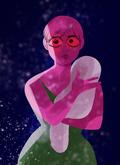
There was also that time she dyed her hair pink and her own audience called out how she looked like Persephone (unironically for the most part, which goes to show how much the implications of Persephone being a self-insert of Rachel has gone over their heads, sigh)

She's also made absurd claims in interviews that Persephone and Hades were her "muses" since all the way back in middle school.

I say these claims are 'absurd' because frankly I just don't think that's true, there's nothing from her early-mid 2000's online presence (which is still accessible via the Wayback Machine) that suggests she was into Greek myth content, most of her stuff from back then was medical fetish and lolita art and not a single piece of Greek work is mentioned on any of her profile bios, favorite book lists, or interests, not even once you get to the 2010's when she started shifting away from blatant medical fetish art and more towards marketable storybook-style art.
(she definitely mentions Lolita though 😒)

I firmly believe she's just making up that whole "Persephone and Hades were my muses" thing the same way she's made up her 'folklorist' label to hide the fact that she has no connection to Greek myth whatsoever and was just creating LO on a whim during the era of Hades x Persephone shipping prompts that were popular on Tumblr at the time. It just so happened to become massively popular so she stuck with it and tried to pretend like she always loved Greek myth as a way to justify her success when really it was just luck and circumstance.
But we can go further back than that.
You see, Rachel also really... really likes Mads Mikkelson. Like, beyond just enjoying his work and entering teenage girl obsessive cringe territory. I wouldn't be calling it out if she was a teenage girl or even a young adult, but she isn't - she's thirty seven years old.
Mads Mikkelson is, of course, her dream cast for Hades, and when you see how she views Mads Mikkelson, the rest practically writes itself.
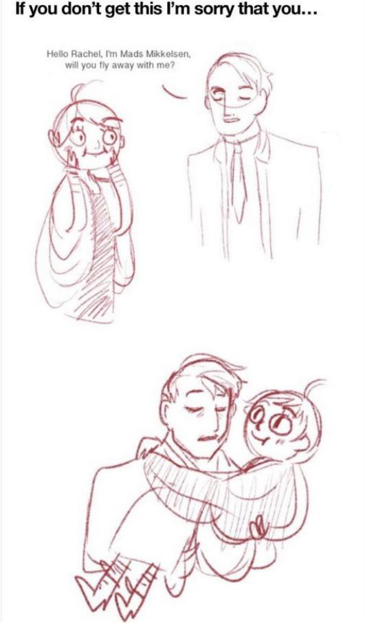
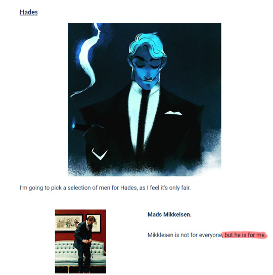
But we can go even further back than that.
Because, you see, Rachel has old art accounts from long before Lore Olympus. Normally I try to avoid posting a lot of this stuff because it's very much old skeletons that we usually understand to leave buried, but this particular piece is very relevant to this discussion.
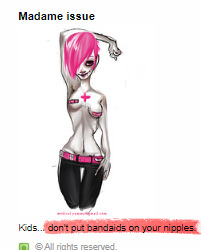
'Madame issue' was the screenname of her account where this drawing comes from. You may also notice this is very likely where the name 'used bandaid' came from. This character is meant to be Rachel. It was very common for her to draw herself with short pink hair back then and it seems that's barely changed now.
Just wanna also throw it out there real quick that Rachel's birthday is March 21st. Guess what date Rachel chose to make Persephone's birthday? Oh yeah, the first day of Spring, literally March 20th. Which shouldn't even exist yet as Lore Olympus is based on The Hymn to Demeter which outlines the creation of the season. But I digress.
Now, this may be a little irrelevant and nitpicky, but to circle back around to the point I made earlier about her not having any genuine connection to Greek myth, Rachel seems to have always behaved like this, in a way that tries to 'hide' the fact that she's not 'legit'. There are old FAQ's from her art pages that answer questions she's asking herself in a very arrogant "how dare you ask me this" kind of way. Like, she claims to have imposter syndrome, which I'm not saying is a lie, but if she does, she definitely uses blind arrogance as a way to cover up for it. It reeks of early 2000's 'mean because it's cool to be mean' energy and that seems to be an attitude that she hasn't left behind in the early 2000's where it belongs - she's just channeled it into 'girl boss' Persephone instead.


It's become abundantly clear after going through old LO asks/livejournal/flickr/etc. posts that Rachel herself 1.) romanticizes purity culture (again, like the Greek myth 'self-proclaimed folklorist' thing, she's trying to claim she's 'deconstructing' purity culture when her actual beliefs are the exact opposite), 2.) values naivety and youthfulness vs. experience and wisdom, especially with how she talks about Persephone and 3.) constantly tries to act like a 'boss babe' similarly to Persephone.
There's also the fact that the time skip perfectly aligned Persephone's age to be in the same range as Rachel - she's now 30 to Rachel's 37. The time skip didn't have to be exactly ten years, if it was purely to retcon the age gap problems then she could have made it far longer, but she made it specifically 10 years and I feel like it can't be a coincidence when we consider how close in age Persephone and Rachel now are. Recalling that earlier point that Rachel seems to be obsessed with naivety and youthfulness, she probably didn't like the idea of making Persephone 40 because that would be too "old".
That's not even getting into the actual way that Persephone is written. This is the part where I say there's nothing inherently wrong with writing self-inserts, even famous authors do it, but the issue lies in authors writing them as power fantasies and not actual fleshed out characters. Persephone is not a fleshed out character. She does not have flaws - at least none that are recognized as flaws - and she never loses. She does whatever Rachel wants her to do on a whim even if it contradicts previous actions or information we've been shown. Sometimes she's an inexperienced "uwu" teenage girl, other times she's attempting to be a 'boss babe' (but really it just comes across as her acting like a Karen.)
All that said, it's not uncommon for poorly written self-inserts to lack consistent characterization because the author is too hopped up on writing them to fulfill their fantasies, even if those fantasies don't align with pre-existing information. There's also the fact that Persephone herself never suffers any consequences for her actions, even when she's in the wrong, and terrible things that happen to her are more for the sympathy of the audience and less for actual character development, depth, or underlying meaning. The comic's universe and the characters that reside within it bend around Persephone and her wants and needs, and this is something that happens with poorly-written self-inserts a lot especially when they're being written purely as power fantasies and not actual character studies or reflections. Nothing bad will ever happen to Persephone, she'll never suffer real consequences for her actions, and she'll never make any real sacrifices, because Persephone is Rachel and Rachel can't write Persephone separate from herself.
This kind of goes hand in hand with the whole "she didn't make Persephone 40+ because then she'd be too old" thing, but I'd also like to mention real quick that Rachel has never written a female character who isn't like this. All of her main characters from all of her works are women, which is perfectly fine in isolation, but they're all written as the exact same woman, sharing traits of naivety, inexperience, youthfulness and innocence. None of her female characters are over the age of 21. Making Persephone a "doesn't know she's sexy" 19 year old who's often drawn very childlike was very intentional as it's the exact same kind of character she's been drawing for years now, and the fact that she's 30 now is simply Rachel trying to retcon the problematic age gap that she got called out on; with the added bonus that it makes Persephone even more like Rachel.

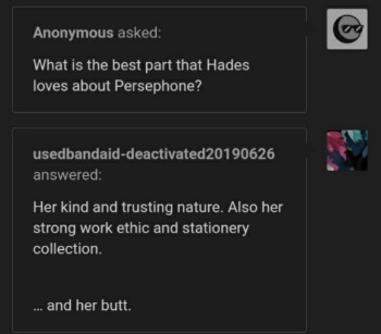

No, Rachel has never directly confessed to Persephone being a self-insert, but I don't think someone like Rachel - who already speaks with a veil of disingenuous arrogance - would admit to it anyways. The writing is on the wall: how she's written Persephone and every female protagonist who has preceded her is a deliberate choice based around Rachel's own beliefs and values - that women are only desirable when they're young and thin, that the "ideal man" is someone who's above everyone else in power, wealth, and status and will and should use that power, wealth, and status to get what they want, and that women should be as cute and innocent as they can be until any degree of opposition or questioning comes their way, in which they are justified in exercising outright cruelty and abuse towards those in their way, with no in-between.
And that's all I'm gonna say on that.
#lore olympus critical#lo critical#antiloreolympus#anti lore olympus#ama#ask me anything#anon ask me anything#anon ama
338 notes
·
View notes
Note
I’m so impressed with how many styles you have and that you use them regularly (realistic, semi realistic, 2d, and 2d, 3d & pixel animation)! How did you learn to balance this many and get so good in all of them?
THANK YOUUUU this compliment means so much to me because so often i feel so worried I will stagnate since I basically like to draw the same subject matter over and over again 😳 but I do like to periodically try new things that I'll become invested in for chunks of time.
i guess advice more than just 'practice' is to be willing to try out new things that you have an interest in, even if it doesn't work out at first and is frustrating. you gotta be persistent to learn something new BUT if you get bored then just move on! if it sucks hit da bricks.... I really like this bjork quote abt creativity

idk throughout my life in art i just try to learn about stuff i'm interested in and practice what i wanna practice. like i wanted to get good at pixeling when i was like 14 so i kept practicing and trying new ways to go about it until i started to figure it out. same with digital painting when i was 15 and i just kept trying again and again until it clicked, even though i was frustrated a lot, i never actually lost the interest when i saw people's pretty paintings and that feeling of 'man i wish i could do that!'.... so i literally couldn't stop myself from trying over and over at painting. it goes beyond just drawing too. planet earth is fun because ANYTHING u are interested in you can try........ i make fursuit heads and other crafts to see if i can! this year i started making my own songs and also learned leather-working because i saw a cool craft and wanted to try :3
part of it is letting yourself age too because as you get older you will grow interested in new things. i am 27!! i've been drawing since i could hold a pencil. that's a long time to encounter a lot of stuff to get obsessed about and wanna try out for myself. SUCCESS TIP!: i typically pursue things that are adjacent to other skills i already have invested in, like drawing to 3d sculpture to digital modeling, or start blending them like sculpture + coding skills = 3d animation rigging. The reason is because a lot of these skills are transferable and make it easier to pick up. like a skill tree in a video game... and you'll end up in weird places like sculpture to sewing to leathercraft. It's nice to have creative hobbies you can be sorta be mediocre at without attaching your self worth to it, but other people still often find it impressive anyways because it's stuff they've never tried to do. It's really healing and easier to like what you create And yourself by extension when you're just having fun and learning without having to worry about the end product being "good". Anything you try is not a waste because you are learning new skills and more often than not, something you've learned is transferable to some other area of your life!!!!!!!!! nothing is ever a waste of time.
this is also the secret cure to art block btw well actually there are two secret cures. a) is you have to embrace the art block and go get obsessed with some other creative thing for a bit. either that or b) go absorb other people's creativity to a bit and watch some shows and read books or talk to people. c) is a mix of both. eventually you'll return to art again feeling fresh and motivated if you're willing to give it a few months. I think art block really just means you're bored and need a change of scenery one way or another 🤔 that's just my onion though
TL;DR have fun pursuing things just because you like them. as you keep doing it you'll just get better at it through practice whether you really intend to or not.
#answered asks#i don't know if this actually helps but here are my thoughts.#sorry for long answer. i tend to overexplain everything. and go on tangents. oopie
18 notes
·
View notes
Note
dragon and history nerd raihan x art and pokemon battling nerd leon. thoughts?
Thank you for the ask!! I have a lot of thoughts on these two, SPECIFICALLY in the realm of their interests outside of battling (even though with Leon I think that can get a bit muddled). But I'll put them under a read more since it might get long >:3c
With Raihan, once I started looking into him as a character more, I found his fascination and love of history in the canon parts of the story (which to me always fall in the game and manga, as the anime does deviate and seem to have its own canon), and clearly he has a reverence and interest in Galarian history, despite battling in the tapestry vault. I've always pictured him as the sleeper intellect of the group, where it's obvious with someone like Sonia, but Raihan rolls up to the function listing off Galarian history facts like it's a Top 10 video. Honing in on that, I personally think Raihan's an architectural nerd kind of guy, where he's interested in Galar's historical castles, buildings, their style changes through the eras, ect. And of course this guy is the Dragon Type guy to end all Dragon Type guys. I don't think anyone who isn't locked in on every single aspect of how they work would also be able to manipulate the weather like that, while also giving other gym leaders, notably Kabu, help and recommendations on other Pokemon that aren't Dragon Types (they're Tor-colleagues!!). How that looks has been warped by my many hours of fic reading and talking with @beammeupbroadway about the subject, but I genuinely think he's interested mainly in two aspects: 1. the preservation of Dragon Type habitats in Galar and 2. ethical breeding and raising of Dragon Types for rehabilitation, training, or release into the wild. Raihan prides himself on the care and upkeep of his dragons, spending a lot of his free time dedicated to further research of that topic, all so he can keep up to date with it. I'm also a pretty big proponent of Raihan being the kind of guy who lets his Pokemon free roam around his living space, as it's also their space, and therefore it's a very dragon type friendly place.
Also, I know the ask says that Leon is the art nerd, but I genuinely think that's more Raihain, though I think Leon has an appreciation for it (I'll get into that). Raihan's thing is partly to do with his love of history and architecture, which turned into a deep appreciation and understanding of art, and Galarian artistic movements, while also being the selfie/Pokegram guy. As an example:

The back of his League Card made me laugh the first time I read it, because I do think he takes very stereotypical artsy pictures, uploads them, and confuses people because I don't think people quite get the vision or reference he's making.
For Leon, battling nerd goes way beyond just being on the pitch. I think canon has my back for that, with the Battle Tower, the two tournaments he's organized, and just his general love of the sport of it all. And, for once, I will credit the anime with showcasing that, where his battle with Ash was one of the few times I think it got Leon's characterization pretty well. More than that, Leon to me found his love of battling early, adapts easily, and at least always seems eager to watch a match, if not participate himself. I know Twilight Wings shows Hop watching reruns of matches, but I think Leon would as well. Sometimes his own, but often older matches, when they were first being recorded. Depending on how far back Mustard was Champion, some of those old matches (though Pokemon tech has always been something I'm iffy about in the timeline, and have been since I was a young kid). It's something he's genuinely hype about, and something he loves, to the point his experiences with Rose and being Champion couldn't kill that for him, and it's part of why I love him as a character. Cycling back to the art thing, I don't personally see Leon as an art nerd exactly, but I think he appreciates art. Kind of guy to like weird pieces of art in a museum and get weirdly attached to them. Museum dates between the two is just Raihan telling Leon why a painting is historically significant, and Leon staring at it like he's rewiring his brain. But, if you ask my opinion on his other big hobby, I think he's an avid reader. As Champion I don't think he had time for it, and I have a whole other tangent I'll save about my thoughts on his education, but I think he loves reading. If it's in book form, the topic could almost not matter, he would probably read it if it's well written.
How this all comes together? Both of them as a couple? First off, I don't think they stop talking, ever. They say goodnight, snuggle in bed, but one of them is still rattling on about whatever thing is stuck in their brain until sleep takes them. Second, when I think of them in my mind palace, they're always partaking in their hobbies together. Raihan is cleaning his dragons, caring for them, Leon is right there helping him, learning all that he can about it. Leon is working out his latest battle line up for whatever he wants to test out, Raihan is the guinea pig, happily, each and every single time. They're sitting in the sun, Leon reading his book and Raihan is posting his latest batch of pictures. Together, I think they have a lot of angst potential, but at the end of the day I think they settle into life where once they figure out how to channel all of the years of being made to be rivals and opposite the other, they come together in a harmony that works. I always picture them on very secluded dates, Raihan dragging Leon out to check on the dragon nests, or Leon begging Raihan to go get lost with him, or in those museums looking at old shit because why not? They have the time, each other, and they've spent years getting to know the other in battle, why not give the same energy and determination in life?
Honestly, going further in on this, my headcanon for Raihan, when he stops being a gym leader, is that he becomes a History Professor of some flavor. That isn't original, but I agree with it full stop. And I think Leon keeps up his battling facilities until it stops being fun for him, whenever that is. And they support the other, and it's nice to think about <3
#raileon#truerivalshipping#kbdn#champion leon#gym leader raihan#pokemon swsh#this feels like me once again rambling sdkljfskljdf but I do enjoy talking about these guys a lot#extra headcanon in the tags: I think Leon wears reading glasses and Raihan wears glasses in general just around the house#and they're always putting on each other's glasses because they bought the same frame shape#I also had my Leon and Raihan plushes sitting next to me as I typed this like I needed their approval skjdfskljf#but thank you again <3 I love the swsh cast with my whole heart
21 notes
·
View notes
Note
you brought up recently that the writers were going for the original feel of homestuck. I'd like to say what I think the feeling for Homestuck actually is. I am going to reference Act 5. 1. Almost every time something horrible happened to a character, they were eventually gifted something positive out of the experience. Example: When Terezi lost her sight, she was able to speak with her mom on prospit. 2. The character's relationships were clear, simple and didn't often change unless some major event happened. Example: During all of Act 5 part 1, Sollux is mad at Aradia and voices his frustration with her even when he apologizes to her, he gets angry with her. 3. The art style remanded relatively consistent. Example: Act 5's visual portrayal of the cast looked the same as the acts that came before. Hero mode had sharp edges and long limbs. Environments had a limited color palate. Talksprites were probably the most abstract art style at that time. 4. The characters main responsibility were tending to tasks involving the game so they always had something to actually do and they belonged in a team. 5. Bit by bit, the story would explore the character's unique powers and we could sometimes see how those powers worked with other's powers or aid. Example: Dave could travel through time, Terezi would tell him what to do. 6. The characters would be responsible for their actions, but because of their age or external forces, the audience could emphasize with them if they choosed to do so. Example: Scratch was manipulating Virska. Virska was also expected to kill for her lusus at a young age to keep her fed. 7. Information was given to the audience quickly. The pacing was extremely fast. Example: Some of the ancestors stories are a handful of sentences. (This has the added bonus of if there is a character in the cast that the reader doesn't like, the character won't be a focus for too long.) 8. We hardly ever saw characters that were not important to the story. The story only visually depicted characters that were actually going to have a role, making the world feel more condensed and smaller. More focused too. 9. The characters understood what was at risk and were at times pessimistic about playing the game. Even so, the cast usually leaned towards optimism. accomplishing their goals or fixing their relationships. The characters actually cared about their lives and what the rest of the cast thought of them. Example: Terezi at one point tells Sollux "1 W1LL H4V3 4 FUCK1NG BL4ST 4ND YOU C4NT STOP M3" in response to Sollux telling her that what they're doing is serious. 10. Chatlogs were as long as they needed to be and the conversations were engaging. Anything I missed?
I think you are pretty spot on with these. That's what the writing is like in the original Homestuck. I don't get that same feeling when reading HS2/Beyond Canon. One could argue that during that time, Andrew Hussie was just doing all this on the fly as it goes on. Perhaps it was that kind of freestyle that he is able to express it naturally in his way. He just writes what he likes without too much input or influence from audiences that read it.
#homestuck#hs2#homestuck 2#homestuck^2#homestuck2#hs^2#Homestuck Beyond Canon#HSBC#Andrew Hussie#James Roach#HICU#Homestuck Independent Creative Union
10 notes
·
View notes
Text
i’ve stopped expecting interesting animation from bones. the star and stripe fight is cool but like every other fight/moment in mha, it’s only cool bc the source material itself is cool; bones does nothing to elevate the manga
they rarely try to experiment with colour and style. i saw so many colourings of the moment star and stripe made a giant version of herself out of the air; people made her look like a cosmos, like it reflected and bent the sky around her, doing so many inventive things and for the anime to just make her an outline against that godforsaken sky? i’m disappointed
but people will take me saying i’m disappointed and spin it to me saying the fight was bad. it wasn’t, just like most fights and moments in the anime aren’t bad but that’s all bc horikoshi knows how to draw. they never do anything beyond that; they never try and adapt it. whether it’s bc of time, direction, budget, or what have you, they will never do something truly inventive with their colouring
i’ve said this before and i’ll say it again, it’s not just that the sky is blue; it’s what the blue sky represents and that is an unwillingness to broaden their colour palette or atmosphere to support the changes in the tone of the story. the story isn’t just “will midoriya get into his dream high school and achieve his dream job?” it’s child abuse and societal systems and their dysfunctions, it’s racism and morality and is it right to try and save someone who’s determined to destroy the world just bc they are also a victim?
look at the finale of atla, a show that mirrors the narrative tone of mha; it starts out bright and colourful and vibrant to match the happy and small stakes nature of the story and as the tone of the story changes, the environment changes to reflect that. the siege of the north pole? everything goes blood red when the moon spirit is threatened, then goes completely desaturated when it is killed with only fire bending having any colour. the day of black sun? uses a solar eclipse to change the lighting. the entire sozin’s comet fight? has red skies and lighting to show the threat
bones abject refusal to change anything about the art itself is a detriment to horikoshi’s complex narrative
#its not just about the colour of the sky#lets get that straight#we’re doing some real the curtains arent just blue shit here so keep up#colour and lighting are a very deliberate choice in any visual medium#and choosing to ignore it and not take advantage of it will just be a detriment to whatever youre creating#i see so many colourings of manga panels where they do insane things and really do next level colourings#and to then see the anime that has so much money and talent behind it just for it to be flat and emotionless with no atmosphere?#it sucks#when you can pick out a scene from something called the WAR ARC and it looks the same as the sports festival arc? come on#and i know theres more to making a scene out of a panel then there is to colouring one#but when these indie creators doing visually gorgeous colourings its hard not to feel like the anime is lacking#and when your colours are flat and your camera angles are uninteresting then what is the point of an anime adaptation#even if they do change things here and there like the endeavour v hood fight or all might v afo#it doesnt change that the majority of the time its the exact same#and when the storm eventually comes round? that wont satisfy me either enless they change the colors of everything as well to be desaturate#and fully embrace the new atmosphere that horikoshi has very deliberately drawn#class a v deku is the one time they did a sustained colour difference and theres a reason that went over so well#coming out of my cage and ive been doing just fine.txt#go beyond plus ultra#mha#bnha#my hero academia#boku no hero academia#star and stripe#shigaraki tomura#izuku midoriya#bakugou katsuki#save post
21 notes
·
View notes