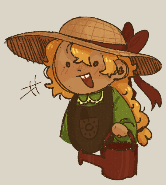
#like is this referring to adding extra details to scenes
Explore tagged Tumblr posts
Visit Tumblr Blog
Explore Tumblr blogs with no restrictions, modern design and the best experience.
Last Seen Tumblr Blogs


Fun Fact
Hackers stole 65M passwords from Tumblr in 2013.
Text
Actually while I'm thinking about it, I just wanna say that the more live-action remakes Disney shlups out like shoveled manure, the more amazed I am that Cinderella (2015) exists. It breaks literally every standard of Disney's LA remakes.
It's not a shot-for-shot remake of the original 1950 animated film, though it does include small references and homages to it, but only when such things can be incorporated organically into the story.
The creators understood and respected the cross-cultural significance of the Cinderella story. They didn't want to "fix" it, or add some wacky twist to it, they just wanted to make the best possible version of the Quintessential Cinderella that they could.
Everything that could be done practically was done practically. The carriage was a real, the horses pulling it were real, and all of the other animals (with the exception of the mice and lizards, since their performance was a lot more involved than the others') were real living animals, the lizard footman and goose carriage driver were wearing prosthetics instead of just having their animal features added in post, the Fairy Godmother's dress had little LED lights sewn into it so that it would actually glow for real, the ballroom set was built by hand and included real chandeliers with more than 2000 total candles that were all actually lit for the scene, and I could go on but you get the point.
There's a ton of attention paid to little details that make the world feel real and lived in. Ella's shoes are always a little scuffed and dirty. Her farm dress is faded and wrinkled. When she breaks down and runs away to the woods, she rides her horse bareback (which, once again, was a thing Lily James actually did, no stunt-double or editing in post), because not only is that something a country girl like her would know how to do, but it also makes sense that with as upset as she is, she wouldn't want to waste time with saddling the horse. When she's dancing with the prince, it's visually obvious that he is leading her and giving her cues because of course Ella wouldn't know the latest ballroom dances, and would need him to guide her through it.
Hey speaking of dancing, y'know what else this movie does that no other LA remake has been allowed to do (at least not to this extent)? ROMANCE. Land sakes alive, this is one of the most unabashedly and yet still tastefully romantic movies I've ever seen. Ella and Kit are just oozing romantic chemistry from the moment they lock eyes for the first time. It all comes down to the fact that these two characters both have the same core values of courage and kindness, which makes their admiration for each other feel grounded and believable. Richard Madden also really sells Kit's feelings for Ella with the way his eyes go all big and soft whenever he looks at her. And don't even get me started on Lily's performance as Ella. Her quiet awe that someone as powerful as the prince loves her. The timidity and fear that she's not really worthy of that. The selfless determination to protect him from her family's cruelty, even if it means she'll never see him again, I'm just-- *banging my fist against the table and screaming into a pillow*
Absolutely god-tier costume design. No notes, I think Sandy Powell's work speaks for itself. Btw, in case you were somehow still wondering, yes, Ella's ballgown is fully practical--those layers upon layers of dreamy silk skirts are real. CG was only used to brighten up the blue color to make her stand out from the crowd more.
Wicked stepmother was allowed to actually be wicked. The movie never tries to make you sympathize with Lady Tremaine, or shift the blame off to someone else. And her villainy is given an extra layer of depth with the reveal that she is a dark reflection of Ella. They've both lost people they loved, but where Ella refused to let her grief get in the way of kindness, Lady Tremaine became utterly consumed by it. She views the death of her first husband as a sort of twisted justification for pursuing all her worst impulses. She despises Ella for her ability to flourish even while enduring terrible suffering, for being everything Lady Tremaine was either unable or flat-out refused to be.
Also Cate Blanchet absolutely SLAYS in this role. Hands-down my favorite portrayal of the wicked stepmother character.
Anyways, TLDR: Cinderella (2015) is the only Disney live-action remake that can justify its own existence and that's because it actively defies everything the LA remakes are today.
3K notes
·
View notes
Text
What even is Kimetsu no Yaiba canon???
Good question, that's why I've done all this digging. But I've also been asked a lot about what officially released material is and is not considered canon. I am but one nerd on the internet and no authority on that and my attitude is that you should take and pick what you want to use in fan work, because it's yours. However, in a lot of my fics I love trying to stick to canon, and that also means trying to incorporate a lot of official material that Gotouge did not personally provide.
So instead of saying "this is canon, that is not canon," here is my tier list. This is especially relevant when you have two officially released materials that contradict each other. The manga has been self-contradictory too, so if you sweat too many small details, your fan work will never get done.
God-touge Tier: Content Penned by the Gator 1. The actual manga chapters, for this may be all someone has ever followed in the Shonen Jump magazines, and therefore they have no other context 2. All other material published in the 23 volumes, including Taisho Secrets, 4-panel comics, and expanded epilogue chapters 3. The two official fanbooks (also referred to by the fandom as under names like the databooks or encyclopedias), which are widely available in Japan, and (as I understand) have been at least partially translated into an official English version 4. Additional material provided for special events, like the Gotouge gallery and Mugen Ressha movie booklet for early showings (these have included Taisho Secrets not printed elsewhere)
Extremely Influential Tier: The Ufotable Anime Content 1. Ufotable's interpretation of the manga (except in cases when it contradicts Gotouge material, though these are slight, like animating a scene in the wrong season) in the TV episodes and movies as they first aired, including filler scenes based on but not found in Gotouge material (like the paper airplane contest) 2. Additional content Ufotable added later (like extra scenes for when the first arc was re-aired on Fuji TV) 3. Filler content only loosely based on the manga (like the Rengoku special)
Also Very Highly Regarded Tier: Official In-Universe Spin-Offs On the Same Shelves at Japanese Bookstores (none written by Gotouge) 1. The Tomioka and Rengoku Gaidens (except in cases when it contradicts Gotouge material, like how Rengoku got that hair color) 2. The light novels 3. Novelizations of the manga Like High-Quality Fanfiction: More Ufotable and Shueisha Content 1. Drama CDs produced by Ufotable (often just little side stories and character exploration, not major stories) 2. Kimetsu Academy, a.k.a. the official AU Spin-Off, and by extension, the "Total Concentration Drill" books that are a spin-off of the Kimetsu Academy spin-off 3. Additional art books and design books (though these are usually very careful to not introduce anything new, and merely reflect content already shown elsewhere) 4. Sometimes I am really tempted to put the Rengoku special all the way down here
Official material which I do not consider to have any baring on canon whatsoever, but which are simply fun and nice: 1. Any form of live stage performance (the musicals, the voice actors reading from scripts, concerts, the Noh adaptations, etc.) 2. Officially sanctioned games, especially the plot elements in a video game like the Hinokami Chronicles 3. Galleries like Zenshuuchuu-ten (though these usually stay entirely based on material already introduced in anime canon) 4. Tie-in collaborations 5. Any form of official sanctioned parody created by someone other than Gotouge (like the 4-panel comics compiled into a volume with the Gaidens) 6. Commentary from the directors, voice actors, etc.
Unofficial material which is fun for expanding on things but has zero baring on canon, nor should it have any influence on what the aforementioned officially sanctioned creators do with it: 1. Books that nerds have published with Kimetsu no Yaiba analysis while teaching fun facts about the Taisho period and demons and such (this is a bit of a trend in Japan, and maybe other countries have publications unabashedly capitalizing on the KnY trend) 2. Fans who create meta and headcanons 3. Fans who create fanwork out of love for the series, regardless of whether or not they stick to canon Things that make me say "nope" 1. Low-effort articles and videos that get the facts wrong 2. Fans who spread rumors by claiming something is canon, but that something is reflected nowhere in the aforementioned top four tiers 3. Anything AI-generated
#hope that clears it up for people who have asked 'is XYZ canon?'#'yes but also no' is how the reaction gif with the pirate goes right?#basic advice: strive for Gotouge canon above all else but otherwise chose what works for what you want to do with it!#fanwork is for fun#kny fandom theories and meta#kny nerdery
81 notes
·
View notes
Note
hiii!!! loving your locket comics!!!!!! just wanted to ask a few questions about your process, if you dont mind :D
whats your general process like?
do you do thumbnails, how do they look like?
roughly how long does it take you to complete a comic panel or page?
how detailed are your sketches? do you do multiple?
do you have any specific techniques for lineart?
do you typically use references for your comics?
generally, how much effort and focus do you put into your comics?
do you have any advice for drawing comics?
sorry for for the absolute bombardment of questions, lmao. just really enjoy your art and comics and very interested in the behind the scenes!! feel free to skip any questions (or this whole ask) well wishes and salutations!!! :D
Hello! I'm so glad you enjoy my comics, and I totally don't mind breaking down the process!
For a normal comic page, I would likely actually write a script since it's much easier to keep track of dialogue and actions. But since these are short, I just write it into my thumbnails.
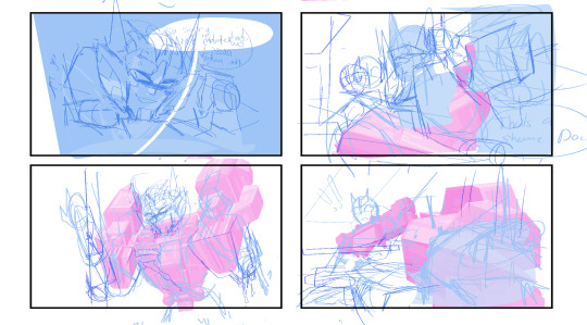
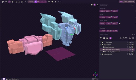
Step 1: Thumbnails. Easily one of my favorite parts, since I get to throw all my ideas down. I do these comics on a 2-panel grid, so I don't have to worry about actual paneling, and it allows me to focus more on the setup of each shot. Think of it like storyboarding!

Step 2: Add cleaner thumbs if needed. I actually made 3D models of Deadlock and Ratchet's chest in Blockbench, so I often trace them to save myself some time! (It might look insane, but I promise, for me, it's not.)
Step 3: Lettering! I actually like to get the lettering out of the way right away since it can take a while. Ever since I started treating lettering as its own form of art, my skills have gotten better, but it also takes much longer.

Step 4: Clean sketch! I'm just now finding out that people think I’m doing lineart for these? I am not… these are all just clean sketches. Maybe doing the blackwork gives the illusion of lineart?

Step 5: Color! Most of these comics are in black and white to save time, but it also lets me focus on values and shot framing again. I add my glow overlay to the eyes, and boom, done!

Roughly how long does it take you to complete a comic panel or page?
It really depends on how complicated the panels are. I like to step out of my comfort zone. I know the Grimlock and Misfire one took longer because of how many panels there were and the fact that I was drawing characters I’d never drawn before, but I’d say it usually takes around 5-8 hours for a whole page.
Do you typically use references for your comics?
I'm literally the reference GOD- we all know this. But yes, I love using references and doing character studies. I have yet to do a study on LL Drift, but I have a few references of him that I’ve made.

Generally, how much effort and focus do you put into your comics?
I mean, I wouldn't say I don't put in a lot of effort? I put in enough. I don't know… there's a point in the clean sketch process where you can kind of just turn off your brain. I'm passionate about comics, but we can all agree there's a point in a drawing where you just zone out.
Do you have any advice for drawing comics?
I think being able to balance dialogue and visuals is super important. I don't know if you guys have picked up a graphic novel from Barnes & Noble recently, but if you open a page, you'll see a character sitting with the biggest bubble you've ever seen, filled with paragraphs of text. While I get it—being a novel as much as it's graphic—I personally like to visualize emotions more. If it means adding two more panels to make an interesting dialogue setup, I don't mind doing it. Another thing to remember is that not all panels need to have details or 100% effort. Sometimes you need to simplify and move on, and that's okay! Those two extra panels that are giving you a better stage setup might be the ones that need fewer details and less time. I would consider my comic page work and my 4-panel work very different. One is about paneling, setup, and visuals, while the other is very much like storyboarding. Both are skills you learn with practice and study.
131 notes
·
View notes
Text
Gay Easter Eggs in BBC Sherlock
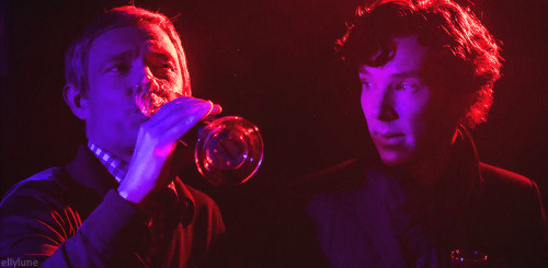
(I trust the above requires no explanation.)
Perhaps someone has done this before, but I wanted to put together a compilation of gay easter eggs in the show that I’ve seen other people point out and/or have thoughts on myself. So here it is!
When I say “easter eggs,” I’m thinking of small clues that the show creators included in the set designs, music choices, and other details of the show to reference that Sherlock and John are in love. I’m thinking of things you could miss at first, especially little clues that often require a bit of extra information or require observations across episodes to understand.
Of course, there’s also lots of subtext woven into the show, moments where interpreting the dialogue or visuals in a certain way tells us something about Sherlock, John, and/or the state of their feelings for one another. I’m not sure if I can clearly define “subtext” versus “easter eggs” and explain what distinguishes them, but at least to me, several of the things I’ve listed here seem a bit different from what people often refer to as subtext. Maybe subtext is about uncovering the layers to a piece of dialogue or an action that takes place in plain sight and seeing how that impacts our interpretation of the story, but easter eggs are about spotting smaller, hidden details. I’m not trained in literary or film studies, though, and I’m not trying to be doctrinaire about this at all! This list is just for fun, anyway. (The above image might not actually count as an easter egg, but I couldn’t resist including it here. Indulge me.)
The more I read about this show and the harder I look, the more I think that hardly anything is there on accident. All these easter eggs must have been included on purpose. The creators knew they were telling a love story all along.
I’ve linked to the posts where I initially saw people point these out or to other good sources, and for some of these I’ve added my own commentary/observations/interpretations. I’m sure there are many other easter eggs that I’ve missed! What have you spotted?
John’s PIN in TBB – When John tries to pay for his groceries at the beginning of the episode, we see that his PIN is 743. In ASIB, Irene’s code to unlock her phone is SHER, which would be 7437 on a phone keypad. So, John’s PIN is a clue that he is or will be in love with Sherlock. Source: @loudest-subtext-in-tv, here.
Shaftesbury Avenue, 20m from Piccadilly Circus in TBB – While investigating in Chinatown, Sherlock and John bump into each other at what used to be a cruising spot for gay men in London. Source: @the-signs-of-two, here.
Archer the American in ASIB – In the scene where the American CIA agents try to get Sherlock to open Irene’s safe, the head CIA agent pressures Sherlock by threatening to have one of his men shoot John. The agent says: “Mr. Archer, on the count of three, shoot Dr. Watson.” Ordering someone named “Archer” to shoot John could be a reference to Arthur Conan Doyle’s poem “The Blind Archer,” which is about Cupid and describes Cupid shooting two men who sound an awful lot like Sherlock and John. Source: couldntpossiblycomment, here.
“¿Dónde Estás, Yolanda?” in TEH – The song that plays during the scene with John and Sherlock’s disastrous reunion at the Landmark restaurant is a cover of the song “¿Dónde Estás, Yolanda?” performed by the band Pink Martini. The Spanish lyrics to this song are about searching for a long-lost lover, which is fitting for the scene where John sees Sherlock again for the first time since his fall. Notably, the creators didn’t use the first of the two versions of this song that Pink Martini has released. The band’s first version appears on their 1997 studio album Sympathique and features a man singing about a woman. Instead of using that version, the creators used the version from Pink Martini’s 2011 compilation album A Retrospective, in which China Forbes performs most of the vocals. So, the creators deliberately chose a remade version of the song in which a woman sings about a woman. They chose a gay song about searching for a long-lost lover for Sherlock and John’s reunion. abrae (@tea-and-liminality on tumblr) has a meta with more to say about the use of this song here.
John’s “oscillation on the pavement” in TEH – In TSOT, John observes a potential client standing outside 221B and trying to make up her mind as to whether to come in. Sherlock tells John “I’ve seen those symptoms before. Oscillation on the pavement always means there’s a love affair.” In the previous episode, John came to visit Sherlock at 221B but hesitated on the pavement outside, staring at the door and trying to decide whether to go in. Sherlock’s comment, “I’ve seen those symptoms before,” is a hint that we, the audience, have also seen those symptoms before—with John in the previous episode. Source: @bidoctor, here. (I saw someone else point out that last part about Sherlock’s hint to the audience, but I can’t find that post, sorry!)
Lilac dresses in TSOT – While planning John and Mary’s wedding, Sherlock chooses lilac-colored dresses for the bridesmaids. When John tells Sherlock that he likes the bridesmaids in purple, Sherlock pointedly corrects him by stating that the dresses are lilac. Apparently, “In Victorian times, giving a lilac meant that the giver is trying to remind the receiver of a first love.” So by dressing the bridesmaids in lilac, Sherlock is trying to remind John of his first love: himself, Sherlock. My heart breaks. Source: @asherlockstudy, here.
Putting the horns on Mary and Janine in TSOT and HLV – In TSOT, there’s a shot where Mary gives Sherlock and John a thumbs up before they head out on a case. The way Mary is standing, the horns on Sherlock’s cow skull thing on the wall behind her are placed right over her head. (I always thought this shot looked pretty weird, but now I see that it must have been intentional!) In the HLV scene with Janine at 221B, there’s a moment when Janine steps in front of John in the frame to kiss Sherlock, and her movement positions the horns right over her head. “Putting the horns” on someone means cheating on them. So in both cases, placing the horns right above Mary’s and Janine’s heads indicates to the audience that Sherlock and John are the real relationship in this show. Source: this post from multiple users on the @sherlockmeta blog.
The architecture of Sherlock’s mind palace in HLV – In the mind palace scene after Mary shoots Sherlock, the architecture of Sherlock’s mind palace is based on locations from ASIP. Sherlock literally built his mind palace out of places from his first case with John, illustrating that his relationship with John is what grounds him and that it means everything to him. abrae has some very helpful screencaps of this here (and I would recommend that whole meta, btw!)
The glasshouse scene in TAB – In TAB, the Victorian John tries to ask Sherlock about his sexuality and sexual history while they’re sitting in a glasshouse. In Victorian Britain, “glasshouse” was another term for a military prison. So John, a military veteran, asks Sherlock about his sexuality in a setting that represents where he would have been sent if he had acted upon his homosexual desires at a time when homosexuality was criminalized. Source: @haffieliesel, here.
What do we say about coincidences? The universe is rarely so lazy.
#johnlock#bbc sherlock#sherlock#tjlc#meta#gay easter eggs#subtext#sherlock x john#sherlock holmes#john watson#mary morstan#janine#janine hawkins#irene adler#tbb#asib#teh#tsot#hlv#tab#the blind banker#a scandal in belgravia#the empty hearse#the sign of three#his last vow#the abominable bride#the universe is rarely so lazy
162 notes
·
View notes
Text
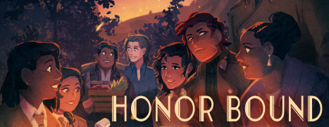
Honor Bound Chapter 7 Update!

I’m delighted to share Honor Bound Chapter 7 on Dashingdon and itch! You can skip any number of chapters to start at the chapter of your choice, or you can play through the whole thing. You can try loading a save you made before this update, but you will probably need to start a fresh one. If you encounter a bug when using a loaded save, please try replaying through the whole thing or using the chapter-skip to replay the chapter in which you found the problem - in some cases this will fix it!
If you have a minute, I’d love to hear your feedback! As before, there is some feedback that I’m waiting until later to implement, and a minor character who hasn’t been added in yet, but I always pay attention to all feedback being sent in.
This new demo is around 306,000 words, with Chapter 7 and various edits adding around 43,000 words to the whole thing!
This is going to be the last chapter that I put up publicly before the beta testing begins. I may put up edits to Chapters 1-7 before then, and will implement bugfixes, but we’re getting towards the home stretch now and I’d like playtesters to have the experience of playing all the later chapters so they can have a big-picture perspective on how the branches can go.
In this chapter you will encounter:
a lot of bad things (more detailed content notes below)
As well as the new chapter, I’ve made some significant edits to earlier chapters in response to player feedback - more about that below too.
Many thanks to everyone for their feedback - it’s been so helpful! Thanks especially to an anonymous Patreon subscriber who gave some really useful comments about some Chapter 7 one-on-one scenes which inspired me to expand on them and include some extra characterful moments.
Read more about Honor Bound on the forum thread
Play the Honor Bound demo on dashingdon and itch
Give feedback
Wishlist on Steam
Revisions:
Overall:
More references to trauma responses when PC’s health is low, more reference to cane use, a bit more flavour text about the injury, more flavour text referring to health improvements to reflect the PC looking after themself
Chapters 5 and 6: added talk with Denario about the PC being trans if it didn’t happen in Chapter 3
General typo fixes
Chapter 4
expanded a branch of the late-chapter Korzha scene for more breathing room
Chapter 5
added option to medically assess Korzha when they look sick
minor expansion of conversation with Catarina about what she thinks about the trip
minor expansion of letter-writing with Fiore
Chapter 6
tweaked Alva’s assignment offer, with clearer information and potential disadvantages of taking it
expanded end of Savarel’s one-on-one scene
fixed an error making end of Korzha’s goodnight scene shorter than intended
added a choice to enable an amorous PC and Raffi to hide what’s going on from Simone
added optional one-on-one Denario scene, including optional sex scene
Chapter 7 content notes: earthquake, quicksand, fire, building collapse, potential severe injuries to the PC and others
#choice of games#interactive fiction#honor bound#creme de la creme series#if wip#dashingdon#choicescript game#choicescript wip#text games#indie games#interactive novel
173 notes
·
View notes
Text
Attempt at Athy’s Novel-Accurate Debutante Gown (+extra Jetty)
Due to my own boredom and inability to focus on my schoolwork, i decided to detour from that and sketch what i imagine a novel-accurate debutante gown for Athy would look like with the description given for it in chapter 54.
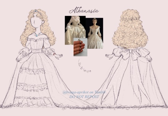
i try to stick to what was described and took heavy references from pinterest, especially with details such as the bow, bracelet, skirt, etc.. also, my first time drawing Athy with her platinum blonde hair as described in the novel! obviously in the manhwa Athy’s hair already looks more like Diana than Claude’s with it being lighter, but it definitely was on the subtler side (which i honestly think works with scenes where Athy emulates Claude). i also try to keep it fairy-like in terms of vibes and added sparkles to her bow and hair. overall, not too bad for a first attempt though i think it’s still a little far off. this design is basically one that i try to take the least liberties with since i’m aware of how many people want to see art of Athy’s novel dress and i’m one of them so i feel quite happy with this. though is it technically a sketch…
and as if sketching Athy’s dress from the novel description wasn’t enough, i decided to take my brain rot further and sketch out how i think Jennette’s debutante dress would look like. courtesy to it not being described and my brain going haywire at this point lmao.

i’m exposing my inner ASM stan again because this is the second time i used an iconic ASM lady’s hair (or, hairbow to be exact) as an inspiration for a WMMAP fan design. this time instead of Shuri i decided to reference Ohara because honestly that hairstyle is to die for. Jennette’s dress on the other hand heavily referenced from a dress that assume is from the regency era? i just think the vibes suit her. yes i did also give her a fan for some details (referenced a drawing of a character named Audrey Hall from Lord Of The Mysteries, never read it but i heard it’s great) and i know it doesn’t match her vibe in the slightest but like, she deserves some fun in this sketch.
so, yeah. that’s my attempt at sketching out what i would imagine Athanasia’s debutante gown would look like as described in the novel, with a bonus Jennette to boot. let me know if there’s anything in these designs i improve on as i would love to hear some feedback. see ya <3 ;3
#rosie's txt#my art#do not repost#who made me a princess#wmmap#wmmap fanart#fanart#wmmap novel#wmmap novel fanart#wmmap athanasia#wmmap jennette#athanasia de alger obelia#jennette margarita#also would like to note the bangless Jennette#since so far she isn’t described as having bangs in the novel
109 notes
·
View notes
Note
I think we all wanna know about the process for the last two pages
HAHA IM GLAD. THESE TWO PAGES TOOK FOREVER
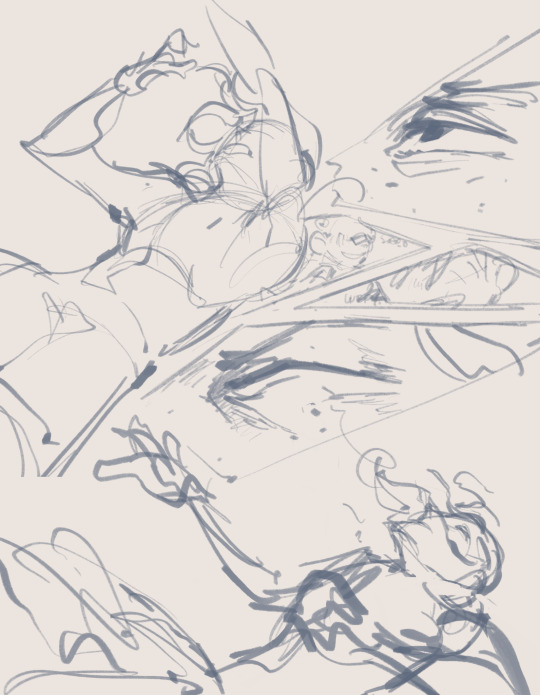

I was really proud of them when I sketched them out and you can definitely see a lot of details ended up staying the same between the sketch and the final! These were the pages that I probably had the clearest ideas on because I wanted especially Ace drowning and Tage saving him to be impactful and pretty memorable, hence all of the different viewpoints and poses. Getting the head angle on that final page was really annoying but there are some excellent references on referenceangle.com for heads turned upwards, like the following:


What probably took the longest this time around was the lineart, actually, because I got Really Into It and couldn’t stop adding more detail.
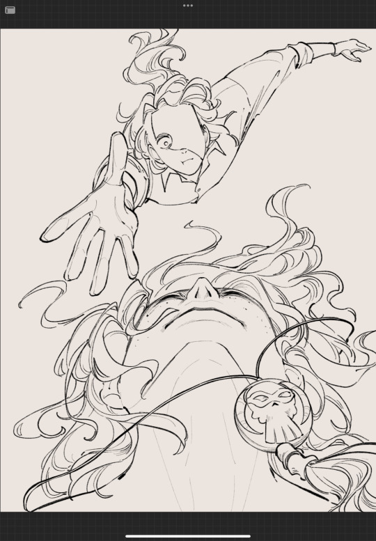
This becomes! A trend! Because that one panel of Ace’s hair made me feel like I had to keep that consistent quality of lineart for the rest of the chapter even after that. So that’s why I had to split the chapter lmao
Extra notes on coloring:
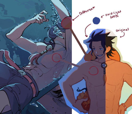
Doing underwater pieces is actually a really good exercise for color theory, since warm colors in cool lighting and in a blue environment are often quite different than you’d expect them to be. You can definitely do a shortcut by using hard light blending mode on full opacity, as I’ve shown here, but when you use hard light blending mode, sometimes some specific colors may turn out muddled or brown-ish, like the orange, so I find picking your own colors also gives you some nice freedom over like. Cohesion in your palette.
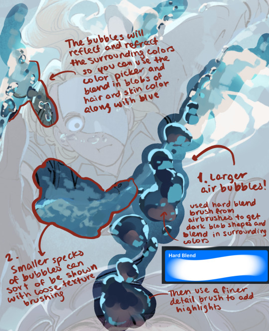
The other thing that really makes the underwater scenes is the bubbles which are honestly a lot of fun to do! After you realize that bubbles are fundamentally just weird little glass/ mirror balls that take even less effort because the shapes will get distorted anyways you can sorta just do whatever. The key is mostly getting sharp contrast between the darker blues and the bright highlights I think?. If you want a tutorial on bubbles let me know :)
168 notes
·
View notes
Text
FRESH DRAWING GUIDE:
Hello everybody, I've come to give you all this absurd reference guide for drawing Fresh. yep. I decided to spend hours slapping this together.
If I got anything wrong or should add anything PLEEEASE lemme know! All ideas welcome!
If you want to see my "research" on this character, let me know in the replies, because there's so much to talk about with him and I'd love to do a character analysis or two, I couldn't put much about his personality or source posts in this because it's just a drawing guide!
Link to all the full images
Transcript and close-ups of the text on the image: (May be in a strange order)
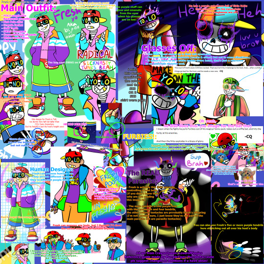
Fresh was created by @loverofpiggies (CQ)
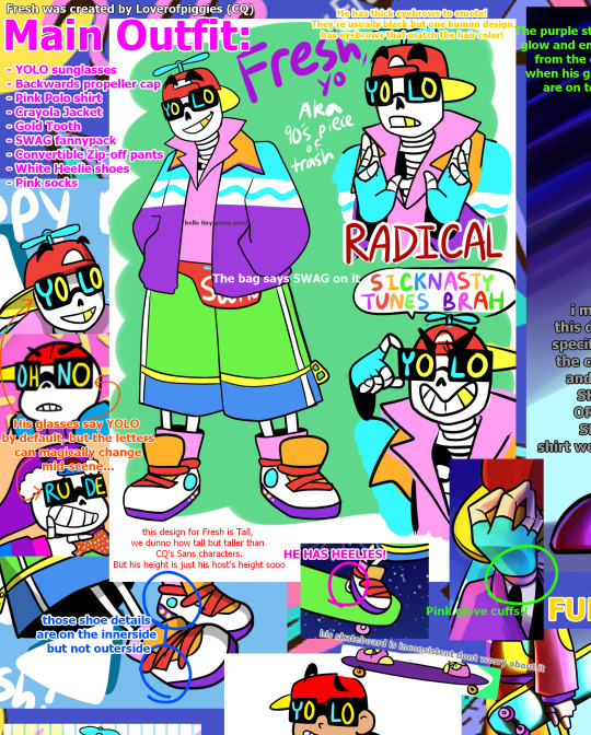
Main Outfit:
YOLO sunglasses
Backwards propeller cap
Pink Polo shirt
Crayola Jacket
Gold Tooth
SWAG fannypack
Convertible Zip-off pants
White Heelie shoes
Pink socks
He has thick eyebrows to emote! (The eyebrows are usually depicted with black hair but one human design has eyebrows that match the pink hair color!)
The bag says SWAG on it
His glasses say YOLO by default, but the letters can magically change mid-scene...
this design for Fresh is Tall, we dunno how tall but taller than CQ's Sans characters (or just Geno since he's literally sans undertale with some added steps). But his height is just his host's height sooo it can vary.
those (cyan and yellow) shoe details are on the innerside but not outerside
HE HAS HEELIES!
Pink glove cuffs!
his skateboard is inconsistent dont worry about it
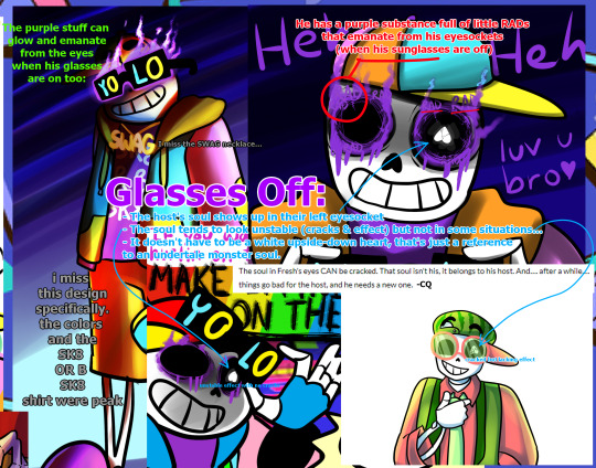
Glasses Off:
The host's soul shows up in their left eyesocket
- The soul tends to look unstable (cracks & a sortve stroboscopic effect.. i couldn't think of a better word.) but not in some cases...
It doesn't have to be a white upside-down heart, that's just a reference to an undertale monster soul.
He has a purple substance full of little RADs that emanate from his eyesockets (when his sunglasses are off)
"The soul in Fresh's eyes CAN be cracked. That soul isn't his. it belongs to his host. And.... after a while.... things go bad for the host, and he needs a new one." -CQ
(example of soul with unstable effect with no cracks) (example of soul with cracks but lacking the effect)
The purple aura(?) can glow and emanate from the eyes when his glasses are on too
i miss this one design specifically. the colors and the SK8 OR B SK8 shirt were peak
I miss the SWAG necklace...

Fresh leaves a rainbow cloud of smoke when he "poofs". Either teleporting him and his host body somewhere or leaving his host behind.
Human Designs:
Fresh can possess humans too.
They all look physically different because they're different people that he's possessing.
Fresh can possess pretty much any body, but I thought I'd show the varied examples of humans anyway
Don't forget the orange jacket flaps! or his hat propeller!
I dunno what's up with the multicolor tongue thing. I think it was extra parasites in the host's mouth? I feel like it was scrapped at some point... but I could be wrong

FURBIES!:
Oh yeah, he also does this: (no image for the bat tho)
"I mean when he fights he pulls Furbies out of his magical fanny pack. takes out a wiffle bat. and hits the furby at his enemies.
And then the furby explodes in a blaze of glory." -CQ
Despite using some furbies as explosives, he seems to 'care' about and treat these two like precious babies:
This one is potentially named McFreshby The Fresh Furbrah (Fresh is mentioned to have one named that, and this is the only other furby he's been depicted with)
It can also do THIS: (roll its eyes back into a spookier look)
This is DJ FurBs. that's all i know about him
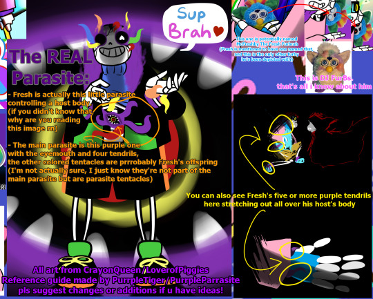
The REAL Parasite:
Fresh is actually this little parasite controlling a host body. (if you didn't know that why are you reading this post rn!?! but nah I love new Fresh fans, welcome!)
The main parasite is this purple one with the eyemouth and four(?) tendrils, the other colored tentacles are prrrobably Fresh's offspring (freshmageddon moment?) (I'm not actually sure, I'm just pretty sure they're not part of the main parasite but are parasite tentacles)
You can also see Fresh's five or more purple tendrils here stretching out all over his host's body
All art from CrayonQueen/@loverofpiggies
Reference guide made by PurrpleParrasite/@purrpletiger
pls suggest changes or additions if u have ideas!
That's all!
#fresh#fresh lucidia#fresh parasite#underfresh#fresh sans#sanzy fresh#true!fresh#eyestrain#bright colors#parasites#furby#dude why do people want to have sex with a 90s parasite#WHAT IS THAT LAST TAG WHY DID IT GET SUGGESTED HAHAHAHAHA#I JUST TYPED 90S LMAOOO WHAAT#DID I TYPE THAT ONCE A WHILE AGO AND FORGET BUT TUMBLR REMEMBERED???#90s aesthetic#luv this character sm#undertale au#utmv#underverse#fresh is really cool in underverse 0.7#someone send the RADs and heelies and glove cuffs parts to Jakei#or dont lmao shes a busy woman
641 notes
·
View notes
Text
☆━━━━━ ⋆⁺。˚⋆˙‧₊☾ ◯ ☽₊‧˙⋆˚。⁺⋆ ━━━━━━☆
✩ ‧₊˚ ⌞ INTRODUCTION ⌝
sampo analysis m.list
☆━━━━━ ⋆⁺。˚⋆˙‧₊☾ ◯ ☽₊‧˙⋆˚。⁺⋆ ━━━━━━☆
— hello & welcome to my dark twisted mind (full of sampo theories)
— this is the first major analysis project i’ve taken on, so i’m very excited to lay out all the evidence i’ve found — i’m trying to keep it as open-ended & -minded as possible, even though i’m biased out of sheer interest towards the aha!sampo theory.
— i’m sure there are things in here that are common knowledge, but since i tracked down every single sampo reference and voice line (literally) on the wiki during an obsession-induced state for the better part of two months, i’m hoping there’s some information here that may be new or less-discussed as well!
— i’ll be uploading each sub-topic as a separate post (because i have a lot to say about so many things), but depending on your preferences you can always follow/block the ⌞ 🎭 ⌝ tag, which is going to be the tag i use for anything relating to this project.
— here’s a brief outline of the topics i’ll be covering:
visual cues + art (aha splash art, kit, body language & confidence, performance & performative emotion, eidolons, etc.)
vocal cues + voicelines (third person references, voicelines, worldview, self-awareness, gender, etc.)
scene analysis (intro scene, belobog, sampo & sparkle’s conversation, fourth wall breaking, mr. cold feet, dream bubbles, etc.)
specific topics (placement in the narrative, jokes & situational comedy, the astral express, etc.)
specific theories (“retirement,” playing the long game, risk vs. reward, man or muppet?, “committed to the bit,” aha is not exempt from The Rules, etc.)
extra info on the masked fools as an organization, aeonic consciousness, and sampo character details outside of elation!sampo theories
as well as counterarguments and a conclusion + anything i feel like adding along the way!
— the next few posts i’ll be uploading will be my masterlists (yes, plural, i am insane 😔💔) so i can get ahead of the curve, then it’s onto the real meat of things. this is a passion project for me, so i am very grateful for everyone’s support thus far (seriously, y'all are so sweet) !!
— as always, feel free to send me asks if you want elaboration on one thing or another, or just want to talk about your own thoughts/theories. hope you enjoy!
☆━━━━━ ⋆⁺。˚⋆˙‧₊☾ ◯ ☽₊‧˙⋆˚。⁺⋆ ━━━━━━☆
© analysis by sunderingstars. do not copy, repost, translate, modify, or claim my work as your own.
#⌞ ✎ sunder.writes ⌝#⌞ 🎭 ⌝#sampo#sampo koski#hsr theory#analysis#hsr#honkai star rail#honkai: star rail#aha the elation#aha!sampo
177 notes
·
View notes
Text
The Final Part of Chapter 4 Mostly Is Now Live!
So, you guys are probably wondering what the mostly is about. Simply put, there’s a subroute in the final part that I still need to write. Not very long, it won’t be too big of a deal later on, but this scene was blocking me hard. After working on it for 2 months straight I just wanted to move on. Needless to say, if I had to write one more set of variations for how the PC fights the suspect, I was going to go insane. That being said, it is all mostly there. There’s simply one greyed out option is all. I’m going to come revisit this scene when it’s more fresh to me again and when I don’t have to push myself so damn hard and force myself to write it. Along with the final part, I’ll probably be adding a bit more variation to it in general. But, now that that’s out of the way, let me get to the patch notes!
Patch Notes:
Added most of the rest of Chapter 4, which includes another Text Box Investigation Scene!
Added an unlockable extra story of Ryder’s PoV before the after funeral scene.
Multiple gender variable mistakes have been fixed.
Fixed a mistake where Alvarez and Ryder were being referred to as ‘mommy’.
Added a small dialogue variation to Ryder’s train scene where, if you’ve already talked to Alvarez, the PC won’t ask Ryder to clarify details about Alvarez’s age.
Added a small dialogue variation to the talk with Hawks in Dennis’ Office where, if the PC didn’t answer the phone for their brother in Chapter 2, it will reflect that choice.
Fixed the error on my part where the hoplite in the painting in Hawks’ office was being referred to as ‘Roman’ instead of ‘Greek’.
Fixed a bug where, if you chose to talk to Lance first on the train, it wouldn’t give you the option to talk to a second person.
Thank you all so much for sticking with me while I’m pumping this stuff out! It feels like such a weight off my shoulders to be able to just moved on from this scene, and to give myself the room to just come back to it later. Expect the Patreon to pick back up to two posts a week again as I get to start writing all the in between stuff for Chapter 4.5! If you like this story, and you want to support either me or this story, head on over to my Patreon where you can get an early look at extra stories, audiobook readings of this story and other IF’s, original short stories with original characters, and so on.
Patreon Link ←
We’re getting close for sure everyone. Hopefully, bare minimum, by the end of the year, this story will be completed. I’m excited, scared, and worried all at the same time.
Thank you all again so much for sticking with me.
Stay Brilliant, -Vi
Demo Link: https://dashingdon.com/play/morbethgames/the-bureau-wip/mygame/
The Bureau forum page: https://forum.choiceofgames.com/t/wip-the-bureau-chapters-1-3-550k-total-words-updated-03-14-2024/99993
#interactive fiction#the bureau#interactive novel#writing#wip#work in progress#original story#choicescript#sarah ryder#samuel ryder#books and reading#reading#original game#writers of tumblr#indie game#interactive games#indie author#indie dev#mystery#romance#chapter 4
217 notes
·
View notes
Text
Snippets. 🐺💜
John: "one of the funnier quirks of game dev is you will never remember missions by their real names but instead by the name you called them by for several years of development it will never be 'In Your Heart Shall Burn' for me, it'll always be Setback" [source] / Blair: "there was that awkward period where half of the DA:V ones had "gods" in the title, so discussions were always some variant of: "Did you mean 'Gods Are Back' or 'Gods Are Bad'? I've heard people mention 'Egads! Gods!' but I'm not sure if that's new or a rework."" [source] / Malcolm (in reply to John): "I have one like this in DA:Ve and I can't share it yet because spoilers but I promise you it's delightful" [source]
John: "the only one i can ever remember is 'Wicked Eyes and Wicked Hearts' and it's because it seems to be the only DAI mission that people constantly reference by name online" [source] / Mary: "It's proper name is "Ham Ball." I put that in the file names, even." [source]
John: "idk how widely it’s been advertised but a reminder we are doing another Veilguard Q&A on Discord this Friday noon Mountain time (so 11 Pacific)" [source] / Malcolm: "Make sure you don't tell them about that one thing that happens in that place, with the guy." [source]
Trick: "BioWare released a new screenshot of Taash! I love how it captures the amazing detail work the character artists did." [source]
Image description on the Taash screenshot in Trick's post of the cap:
"A screenshot of Taash looking off to the side. The lighting is warm like either late afternoon or an interior with a fireplace, and it catches in the gold on Taash's armor and horns. Taash looks pensive or vulnerable -- not the deadpan stare or badass determination we've seen in other shots."
pensive or vulnerable.. ohh Taash. 🥺 Trick!!
User on the screenshot: "Taash looks *completely the fuck over this shit* in a totally exhausted sort of way, here. which is, mind, amazing detail work on the character artists' party!!" / Trick: "You know, it's a spectrum." [source]
Trick on DA:I - "Miss May is amazing in many ways, and especially in finding the balance of sweetness to pain for the Solas scenes. ❤️" [source] ((thankyouuu Miss May!!))
User: "it must be basically impossible to resist putting at least one extra moon around your fantasy world" / John: "if dragon age didn’t already have two you’d better believe I would’ve added another one. sitting next to a dial titled ‘number of moons’ and every so often I add another one. anyways the thing about Satina is- (a large hook drags me offstage)" [source, two, three] ((omg.. THE SECOND MOON shfuehfuehdbdh)
User: "i've been thinking about bellara's pockets and i need to know what her thoughts on cargo pants would be. would she be a fan for the utility." / John: "she wouldn't wear them all the time - she's a firm believer in a distinction between 'work clothes' and 'at home clothes' - but she is always in search of more pockets to carry more things into the field. she'd own at least three pairs" [source]
User: "The next two months are going to feel like the Fade section in DAO 😭" / Dragon Age: "Good thing we have a Veil Jumper to help you out! 💜" [source]
User: "MY SON LOOKS SO CUTE" (re: the new pic of Manfred from today) / Dragon Age: "MY BOY MANFRED 💀��" [source]
User: "Can we change the armor/gear on our companions?" / Dragon Age: "You can!" [source]
User: "thank you for the food 🙏🙏🙏" / Dragon Age: "Enjoy your meal!" [source]
#dragon age: the veilguard#dragon age the veilguard spoilers#dragon age: dreadwolf#dragon age 4#the dread wolf rises#da4#dragon age#bioware#video games#solas#long post#longpost#lul#feels#Ham Ball hhhh :D
93 notes
·
View notes
Text
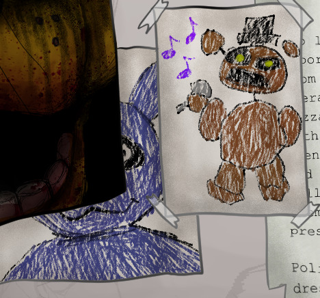
Like I said I would, I'm going to go through the details I hid in my recent FNAF painting. Not because anyone asked, but because I want to and I'm proud of everything put in
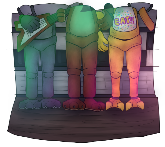
1. Michael's design is my own! I've pretty much had the same concept for the design since SB came out. I just really liked the idea of having part of his jaw missing for no particular reason other than it looks cool. But, I have since moved the jaw gap to the other side, as well as defining scars and wrinkles.
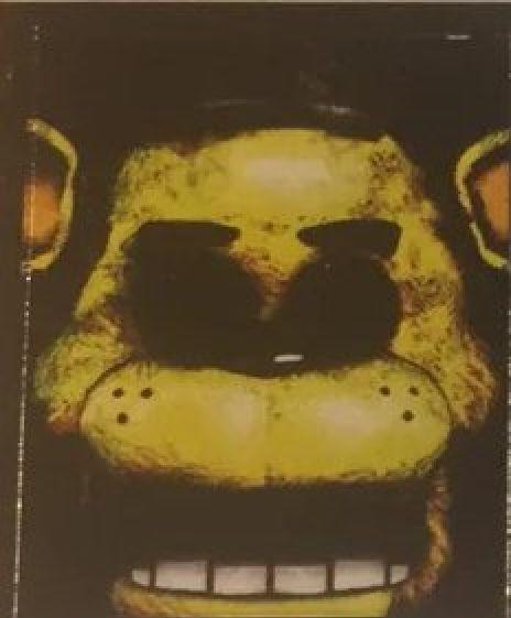
2. I've already posted Golden Freddy but here he is again. I redrew the original poster since I really didn't feel like I just should just slap the original on there. Since I had that freedom now, I decided to make references in the design to later games since it is appearing as a hallucination(?) to Michael. Obviously there are blood stains around the mouth to reference The Bite of '83 and I also added tear stains to reference Evan/CC, said victim of the bite.

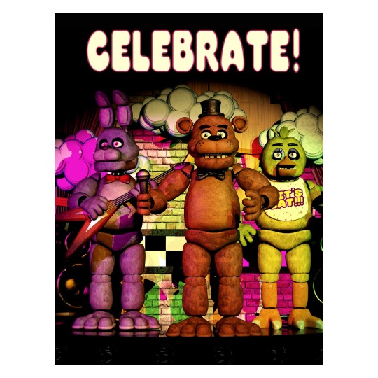
3. The classic "Celebrate!" poster. The same thing with Golden Freddy, I didn't feel like I should copy and paste the original so I drew it myself, but this time I only drew the bottom half of the crew since you'd only see that part anyway. Maybe one day I'll fully recreate the poster but for now, this is it lol (You may also notice that I gave each of them different leg shapes, to make them more distinguished from each other other than just colour)
4. And again, didn't want to just copy and paste, so I re-typed all of the newspaper clippings myself in Canva. They say pretty much the same thing as the originals, but I'll still put them here anyway in case anyone wants to take a look:

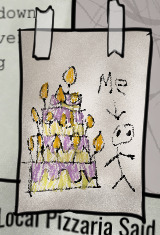
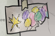
5. I also recreated the children's drawings myself. Fun fact: I actually used my NON-dominant hand to draw most the basic shapes. I figured that if I drew with my dominant hand, the lines might look too clean, showing my obvious years experience. It's silly but I really wanted it to look and feel like a child drew it
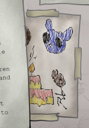
6. It ends up being pretty much invisible in the final painting, but on the floor you can see old confetti and blood stains on the tiles

7. If it wasn't obvious; cup from the Security office is here too
8. Now it should it obvious by now that I chose to not draw the security office. Why you ask? I'm still new to drawing more detailed backgrounds, and I really didn't feel like drawing the office in the moment lol so I opted for the hallway, and I think it still looks pretty good with what I was going for
9. As a bonus, here's the original sketch I planned out. As you can see, I was originally planning to have more posters, some featuring the missing children. But in the end, I decided to scrap it and leave room for the wall to be more detailed since I thought it looked bare. Also, if you look closely, you can see a faint plan for a shadow over Mike. I was originally planning to put a shadow of Freddy there, but when I really started finishing up the shading, I realised that the extra shadow would be too much for an already dimly lit scene
And that's pretty much everything! I had so much fun doing all the little details and references, even though it did end up being more time consuming lol. I also tried out a bunch of different rendering techniques and I think they really helped pulled everything together. I'm definitely going to try my hand and making more paintings like this in the future ^^
If interested in seeing the full process, here's a link to the speed-paint:
youtube
#art#digital art#fanart#artists on tumblr#fnaf 10th anniversary#fnaf#fnaf fanart#drawing process#Youtube
69 notes
·
View notes
Text
Fellow Peter Pan fans, if you haven’t yet heard the Ballarat National Theater’s dramatized audiobook version, I highly recommend checking it out! It’s available for free on Apple Podcasts or in the Audible app (and probably other places as well). I’ll include a link below. It sticks pretty closely to the novel in most places but departs from it in a few ways that I think, for the most part, actually really add to the story rather than taking away from it. (Note: If you don’t want any spoilers about how the audio version differs from the actual novel, stop reading now and go directly to the link. If you want all the details, keep reading below the cut.)
A few things I noticed and found particularly interesting that the audio drama changed or added to the novel include the following:
- We get an actual voice actress for Tink and even someone doing the “voice” of Nana’s thoughts rather than just having the narrator read them.
- There is at least one bonus pirate and one bonus lost boy because??? The bonus lost boy is named Pockets (assuming after the character in Hook). The bonus pirate is called Chameleon.
- Skylights breaks the 4th wall and tells the narrator he doesn’t want to die as a demonstration and the narrator basically comes back with, “Sorry, that’s too bad, but this isn’t your story so….”
- Hook has a middle name and it’s the one Disney uses in Jake-verse (Bartholomew).
- Tiger Lily’s people are called “The Neverlanders” and are generally treated much more respectfully than in the novel and most other retellings in general. Their tribe is said to speak a language that is a precursor to Latin.
- The fairies crossing over Peter are on their way home from a “fairy ball.” I cackled because, man, that’s one of those, “If you know, you know,” things that most probably wouldn’t pick up on but I found hilarious. (It was definitely a ball and not an orgy… 😂)
- More 4th wall breaking by Tiger Lily, telling the narrator she was perfectly capable of escaping from the pirates herself.
- There are a couple of short breaks with these extra scenes. In one, the Lost Boys are griping about how the narrator is taking forever to get back to the story and reading over reviews from listeners.
- During a fight scene when Mr. Smee pulls out “Johnny Corkscrew,” we get a “Heeeeeere’s Johnny!” 😂 Definitely not a reference I was expecting!
- In another very cute short interruption, Mr: Smee is making soup and claims it has a bunch of disgusting stuff in it but Wendy is sure he’s joking and says it’s actually alright but missing something. The boys all start helpfully adding things they’ve found or brought with them—some of which are questionable—and then they ask Smee to try it. He acts like it has poisoned him and they’re all very concerned before he pops up with a, “Boo!” and they all laugh.
- Also, it’s hinted at one point that Mr. Smee may be a “Mrs.” in disguise. This may simply be a joke about the fact that the voice actor for Smee in this version is a woman or it might be something else. I suppose it’s left up to the listener.
- Peter has a few interesting parallels with Hook. Near the part where he is flying away out of the nursery window to leave the children, he has a quote that is very similar if not the exact same as one that Hook gives during his soliloquy.
- I’m just gonna say it straight out… I LOVE what they did with Hook in this version. They kept the dual casting of Mr. Darling and Hook and he’s the perfect actor for it. He has the sort of “growl” and the way of rolling his R’s that reminds me in some ways of Hans’ performance. They also do some great but subtle parallels between George and Hook. And during some of Hook’s rambling/soliloquy moments, we get most of what is in the book but it’s interspersed with a few things references to Shakespeare and Pilkington (a character in The Little White Bird who was based on a real-life teacher and who was sort of an early inspiration for/iteration of Hook). The ending for Hook is painful but incredibly well done. This Hook reacts to the crocodile much like “my” Hook does… When he is thinking, “The crocodile is about to board the ship” and when he asks the men to hide him, he starts just…repeating himself over and over in an increasingly desperate tone… Then, later, he has this almost…sigh of relief when Peter kicks before, “Bad form,” which is said less as an exclamation and more like…he’s releasing this weight off his shoulders. After the narrator says, “He went content to the crocodile,” we hear Hook humming something which I believe is the same tune we later hear Mary Darling playing in the nursery on the piano as the kids are coming home (“Home Sweet Home”). There is a quiet splash and a growl from the crocodile…and he’s gone. It’s perhaps the gentlest and most poignant ending I’ve seen done for Hook, and I really loved it. Mr. Darling is later heard singing a snatch of a sea shanty (“The Maid of Amsterdam”) and it’s like this little piece of Hook lives on. It’s just…super lovely.
So yeah. Love this version. LOVE this Hook. Go give it a listen!
#captain hook#Peter pan#jm barrie#james hook#captain james hook#audio drama#audiobooks#ballarat National theater
29 notes
·
View notes
Text
COMMISSIONS OPEN!
Hey everyone! My commissions are officially open! You can check out the picture below for the basic price info, and see everything under the cut for everything else!!
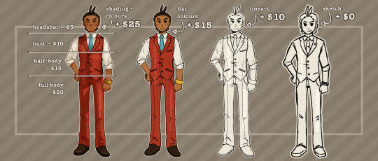
PRICE INFO:
BASE PRICES:
Headshot: $5
Bust: $10
Half-Body: $15
Full Body: $20
COLOUR PRICES:
Sketch: + $0
Lineart: + $10
Flat Colours: + $15
Shading + Colour: + 25
NOTE: These prices DO stack! Let's say you wanted to commission a half-body lineart! A half-body commission is $15 at its base price, and adding the lineart price on top of that is an additional $10. Your commission would come out to be $25 total.
—
ADD-ONS:
Any extra characters will be an additional 50% of your total. If you wanted a full colour bust commission of 2 characters, it would be $47.50 [Full colour + Bust price + 50% of that total price]
BACKGROUNDS:
Flat Colour: + $0
Simple Pattern: + $5
Simple Scene: + $10
Detailed Scene: + $15
NOTE: When it comes to total commission price, the background price is separate. The background price will not affect the 50% Extra Character fee.
—
WILL:
- Anthro/Furry, Pokémon, Humans, and Ponies (MLP)
- Character reference sheets
- Fanart/Canon Characters, and Original Characters
- Ships (OC x OC, OC x Canon, Canon x Canon)
- Mild blood, bones, and any kind of scars
WILL NOT:
- Full Armour or Mechs
- Fetish/NSFW, or heavy/extreme gore
—
T.O.S.
I, AS THE ARTIST...
- Maintain the rights to post my work in any form.
- Maintain the rights to post (WATERMARKED) commissions as marketing, so long as the client does not request otherwise.
- Maintain the rights to decline or cancel any commission, so long as payment has not been received. If payment has been received, I, the artist, will issue a full refund.
YOU, AS THE CLIENT...
- May NOT use my work in a commercial setting, regardless of how it is used. This includes prints, stickers, buttons, keychains, etc.
- May NOT feed my art into AI of any kind, or use my art to generate other AI works.
- May request changes and edits during the sketch and lineart phase. I will send progress pictures of both.
- May post your commission to your own social media or website, so long as I am credited or linked back to somewhere.
- May use your commission as an avatar, banner, icon, etc. so long as I am credited or linked back to somewhere.
- May crop, edit, or resize the commission to your liking. However, if you are sharing it publicly, please credit and/or link back to me.
—
HOW TO REACH ME
discord: @emptydoorways
tumblr: @emptydoorways
tiktok: @emptydoorways
email: [email protected]
ACCEPTED PAYMENTS
I do request that payment is given up front once the commission is confirmed. If you are not comfortable with this, please tell me, and I am willing to negotiate.
I take PayPal and Venmo!
If you don't have access to either, we can negotiate other routes of payment.
You can also donate to my Ko-Fi for tips!
HOW TO ORDER
Please do not dm me just going "hi!", or something similar. I will ignore any sort of messages such as this. If you are interested in buying a commission, please message me stating that you are looking to commission, and send a filled out order form for what you would like to buy. We can discuss other details after confirming your commission. :-]
ORDER FORM
Payment Type:
Commission Type:
Reference Image(s):
Details (Pose, Expression, etc):
—
SOME OF MY WORK!
#doorways art#doorways doodles#doorways chats#ace attorney#aa4#apollo justice#klavier gavin#oc#mlp#commission#commissions#commissions open#commission me#please#art commissions
53 notes
·
View notes
Note
hi! not exactly a request but i do wanna ask, whats your process when you're rendering more paint like art? (if that makes sense, English isnt my first language so apologies hdskhsjdbd) i really love how you use the colors and im curious how you do it :0
i’ve been meaning to answer this one for a while so here’s how i painted miku in today’s post (put under the read more because yeah prepare for a long post
i’d also like to preface this by saying that i never follow a set way of doing things, so in terms of what my personal process is like, these are only broad strokes of what i do! sometimes i’ll combine or skip parts entirely, depending on how i feel. also, this is not a tutorial, just how i do things, so please don’t treat it like one :’D this will read like the ‘how to draw an owl’ picture if you do
first, like every artist, i sketch. more specifically, i’m getting an idea of what i want to paint later on. this could be how a scene is set up or in this case, how a character is posed. here i’m not concerned about details or getting everything perfectly, i’m only planning how the thing will be composed. maybe a lot of canvas size changing, or adjusting what miku’s doing (note how busted miku’s right hand looks from all the transforming!) however, i still have to be concerned with how clear the sketch will be to future me, because the sketch won’t be any good if i can’t read what miku’s doing

after that, i lay down a flat gray under the sketch, mainly focusing on giving miku a clear silhouette. this is also a good time to make adjustments to the composition on the fly if i suddenly feel like something can be improved upon, like shortening miku’s left arm from the sketch!
after painting a flat silhouette, i start shading in grayscale, focusing only on lighting. i usually do it in two passes, one for the lightest and darkest tones i’ll use (not black and white) and then a second for midtones to blend them better with the base gray but i forgot to screenshot the result of the first pass 🗿 nevertheless, here is where i can start adding some amount of details. i’m not including any extra accessories yet, just focusing on the base design of the outfit and the character herself (for anyone wanting to draw characters from That Gacha Game, this is how i personally make the process more bearable for myself.) i still use the dark gray to separate where certain details (like the facial features and fingers) begin and end, mainly to make colouring more bearable later.
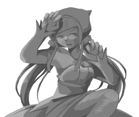
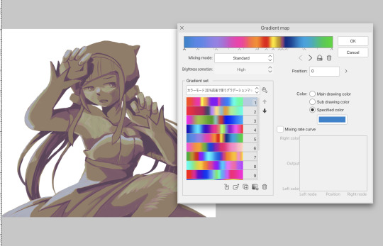
now here’s where i get the Good Colours. it’s a cheat lol. i put a gradient map layer over the grayscale painting so that there’s a little bit of color to start. some gradient maps can be applied as is, some need the layer settings adjusted to make it look good. this one, for example, is a (free) gradient map set from the csp assets store that needs you to set the layer opacity to 20% and to set the blending mode to color to achieve this result. in general, i tend to pick which gradient map i want to use based on vibes, or basically whether i want the work to be warmer or cooler, colour-wise. but this does do quite a bit of lifting for the colors in my stuff.
and then, finally, i add the colours. i add flat base colours in an overlay layer. at this stage, i’ve made the character silhouette clear enough that i don’t need to refer to the sketch anymore for what miku looks like. also, the gradient map layer does its magic by making the shading a bit more vibrant than it would’ve been without it. after that i paint over with a new layer to add details like the lace.
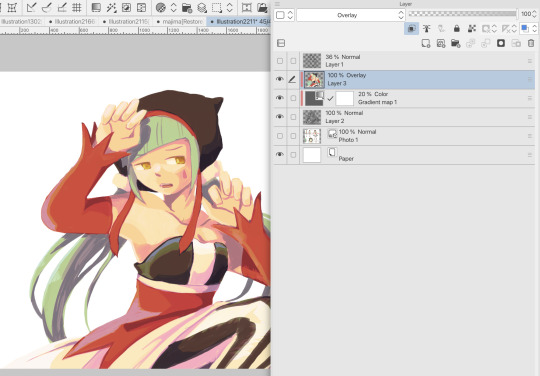
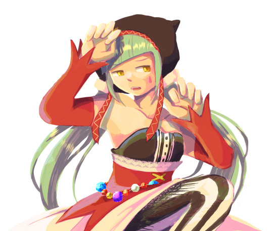
and then i put some extra shading on top. basically this is where the ‘better lighting’ happens. again, this isn’t a tutorial, so i’m not here to say what each part of the lighting is, but i’ve labeled which layers do which job. in other works where the lighting within a scene is more defined (from a window, from a small crack in the walls, etc) the glow dodge layer may be more opaque and sharper, but since this isn’t a work with that, the lighting was applied using an airbrush. the linear burn layer is also there to make the whole thing darker so the glow dodge doesn’t end up oversaturating miku. i also usually match the lights to the vibe i want, and use a complementary color for the shadows. so here you can see i have warm colors on the glow dodge layer, but light purple on both the linear burn and multiply layer.
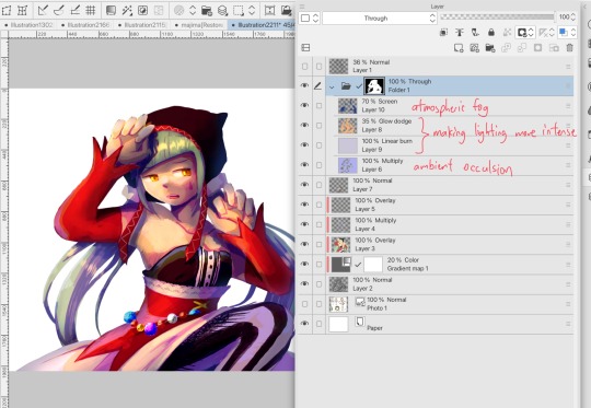
and that’s it for the character—here’s a gif showing how each layer adds to miku! (sorry it’s so toasty)

as for the background, depending on the complexity, it may go through a similar process, or if i can settle with flat image backgrounds, i just go for that. it’s ok to use external image materials. i didn’t have a background in mind for this miku in specific, so i got some default csp materials and threw together something
and that’s about a rough overview of what my process for more finished works looks like! again, art is a fluid process so i never specifically stick to certain steps all the time, and you shouldn’t either. i can probably answer why i’d pick this colour over another in one particular work, but it’s something that kinda has to be learned on a grander scale. i think everyone can already feel what colors work with what atmosphere or what setting, even if they can’t immediately explain why. colors and composition do take some level of experimentation to find what works best!
126 notes
·
View notes
Text
Comic-Con 2008 - Enhanced Edition of Supernatural Panel
youtube
Direct link. Warning: Some of the special content I added has big spoilers for season 4 beyond the original videos.
This video features Jared, Jensen, Eric Kripke, Sera Gamble, and Ben Edlund. If you've already seen the original videos and you're wondering why you'd want to watch this, see the details about the enhancements below. For other enhanced videos, check my YouTube channel or my Tumblr index post.
Video Improvements - Upscaled, fixed bad aspect ratios, improved colors

I received a great deal of help from @sensitivehandsomeactionman on the color correcting. They gave me tips on how to achieve better colors and they even took a screen shot from my video and corrected the colors on it with their own software to provide me with an example of what was possible. Having that example to reference was invaluable for me, because I'm not good with colors.
Without that help, Jared and Jensen would have looked like they were in training to become the world's tallest Oompa Loompas. Any remaining color wonkiness (Wonka-iness?) is due to my own failure to apply what I was taught and my failure to see the colors properly. But look at that difference! I was pretty excited about this.
Combined Videos to Cover Entire Event
As with my other enhanced videos, I combined multiple videos to create as seamless a video of the event as possible, from beginning to end. For my earlier videos, that meant combining maybe 5 videos. For this one, I used a total of 19 videos from 3 different sources. A lot of those were used for the talking head bubbles, explained further below.
None of the videos are my own. My video description on YouTube has links to the original videos I used.
Good, Color-Coded Subtitles
As with my other enhanced videos, I attempted to provide accurate and as-complete-as-possible subtitles. They're color-coded to make it easier to tell who's speaking. This is especially helpful when people are speaking at the same time, or when the speaker is off camera.
Since there were so very many people talking in this video, I doubled up on a couple colors if I thought I could do so without it being too confusing. Here's the complete color key:
Red = Jared Blue = Jensen Brown = Eric Kripke Pink = Sera Gamble Purple = Ben Edlund Green = General audience Yellow = The person asking the questions. In the first half this is the moderator, Alynda Wheat. In the second half, this is the fan at the mic. White = Mostly the publicist (Holly Ollis), but a couple times it's used for people off camera who I believe were Comic-Con staff. Two shades of orange = surprise guests
Additional Clarifying Content
As with my other enhanced videos, I've added some images to help add clarity to the references used by the speakers. I added images of characters and scenes referenced from the show, images to explain various pop culture references, as well as some explanatory text to help add details or clarity when I thought it might be useful.
I mostly kept this extra content to the sides so that, if it doesn't interest you, you can hopefully ignore it and focus on the main part of the video. Unlike my previous videos, sometimes this is on the left side and sometimes it's on the right side. The margins shift depending on where the talking head bubbles are.
Talking Head Bubbles - Jared and Jensen front and center, but other speakers visible too
This "enhancement" isn't anywhere close to perfect, but it sure as heck isn't from a lack of effort. This represented at least half if not two-thirds of the time I spent working on this video.
I always find the Comic-Con videos frustrating to watch. When the camera moves to other people who are talking, I want to see Jared and Jensen instead. I like to see their reactions and sometimes they do funny things that get missed. But when the camera is steadfastly focused on Jared and Jensen, I also get frustrated because I can’t see the people who are talking. Nope, you can’t win with me! I want to see everything.
I attempted to mitigate this frustration by adding talking head bubbles. The main source videos I used were the ones with the most constant and stable focus on Jared and Jensen. However, if one of the other source videos had a decent focus on another guest, I inserted a small window into that other video as seen below. Eric shows up on the left, because that's where he was seated relative to Jared. Sera and Ben show up on the right, because they were on the other side of Jensen.
Like I said, it's not anywhere close to perfect. Trying to make the bubbles look stable was an enormous challenge for me. Behind the scenes the person in the bubble was bobbing and weaving all over the original video frame, so I had to constantly adjust the position of the secondary video to keep the subject centered in the bubble. They also aren't always bubbles. The people taking the videos often had the writers on the edge of the frame because they wanted to capture Jared or Jensen too, so the bubbles start to collapse when they get too close to the edge because there isn't enough video surrounding them to form a circle.
I haven't decided if the end result was worth how much effort I put into these darn "bubbles", so I'd welcome any feedback -- good or bad.

#enhanced edition con video#j2#jared padalecki#jensen ackles#eric kripke#sera gamble#ben edlund#comic con#comic con 2008#Youtube
123 notes
·
View notes