#like i *could* make my own template uniquely but i like the layout and look of the offical ones yknow?
Explore tagged Tumblr posts
Text
has anyone made a edit template for the artfight id template before??
im wanting to do my own custom background for mine this year cause theyre kinda lackluster but theres soooo much antianisllizing on the sheet and letters on it that itd take soo much work idk if i want to put in to make one of my own
#like i *could* make my own template uniquely but i like the layout and look of the offical ones yknow?#i just want something acutally. stardust themed and not just the badge in the background with like 5 extra stars LMAO#artfight#artfight 2024
0 notes
Text
The Best Tools for Designing Your Own WordPress Theme
Designing your own WordPress theme can seem like a daunting task, especially if you're not a professional web developer. But what if I told you that with the right tools, it could be a lot more enjoyable and accessible?
Whether you’re creating a personal blog, portfolio, or online store, designing a custom WordPress theme can help your site stand out from the crowd. So, what tools should you use to build a theme that’s as unique as your ideas?
In this post, we’ll explore some of the best tools for the job. By the end, you’ll feel more confident and ready to dive in!
Why Design Your Own WordPress Theme?
Before we talk about tools, let’s take a step back. You might be wondering: Why bother designing my own WordPress theme? After all, there are thousands of free themes out there that are easy to use, right?
Here’s the catch – when you design your own WordPress theme, you’re in complete control. You can tailor everything from the colors and fonts to the layout and functionality. This is a great option if you’re looking for something unique that aligns perfectly with your brand or personal style.
Plus, it helps you avoid the cookie-cutter look that many free themes can have.
1. WordPress Theme Development Frameworks
So, where do you start? Frameworks are a great way to kick off your theme development. These pre-built templates offer a solid foundation, saving you from starting from scratch. Popular frameworks like Genesis Framework and Underscores are flexible, SEO-friendly, and responsive, ensuring your theme works well on any device.
Quick Tip: If you're working with a WordPress theme development agency, using a framework can significantly speed up the process, making it easier to deliver high-quality themes in less time.
2. The Right Code Editor
Once you’ve chosen your framework (or if you’re starting from scratch), you’ll need a good code editor. A code editor makes writing and editing code much easier. Without one, it’s like trying to write a book on a napkin – not very efficient, right?
Two of the best code editors for WordPress development are Visual Studio Code (VS Code) and Sublime Text. Both are lightweight, fast, and packed with features, including syntax highlighting, error checking, and auto-completion.
3. Designing Before Development
Before you dive into coding, it’s a good idea to design your theme. Tools like Adobe XD and Figma allow you to create high-fidelity prototypes of your theme, experimenting with layout, color schemes, and typography without touching a line of code. These tools also make it easy to collaborate with others, get feedback, and adjust your designs before you start coding.
4. CSS Preprocessors
When it comes to styling your WordPress theme, a CSS preprocessor like Sass or LESS can save you a lot of headaches. These tools add features to CSS that make your code more organized, easier to maintain, and more powerful.
For instance, Sass lets you use variables, nested rules, and mixins, which makes styling your theme much more efficient. If you're tired of repeating the same styles over and over again, preprocessors are a real lifesaver.
5. Image Editing Tools
Let’s face it, no website is complete without stunning visuals. So, how can you make sure the images in your WordPress theme are just perfect? Tools like Photoshop and Canva are perfect for editing and optimizing images.
Whether you're designing custom banners or tweaking logos, these tools allow you to ensure your visuals are crisp and professional. Plus, if you're short on time, Canva offers easy templates to help you create beautiful designs in no time.
6. Debugging Tools
So, you’ve developed your theme, but is it bug-free? Testing is crucial. Luckily, WordPress has plenty of debugging tools that can help you catch any issues before your theme goes live. Plugins like Query Monitor and Theme Check allow you to run tests on your theme to check for compatibility issues, errors, and even performance problems.
Before you launch, make sure your theme works well across all browsers and devices. You don't want your visitors to have a poor experience just because of a small mistake, right?
7. Theme Customizer
Once you’ve developed your theme, it’s time to make it live. But here’s the catch – you don’t need to write a single line of code to tweak certain settings like colors, fonts, and site layouts. With the WordPress Customizer, you can change things in real-time, allowing you to see the effects as you make them.
This tool is great for fine-tuning your theme's appearance without diving back into code, making the process smoother and more enjoyable.
8. Plugins to Extend Your Theme’s Functionality
Lastly, let’s talk about plugins. Plugins are important for adding extra functionality to your theme without having to write complex code. Whether it’s adding a contact form, improving SEO, or boosting site speed, there’s a plugin for nearly every need.
Some must-have plugins for theme developers include Yoast SEO (for SEO optimization), Advanced Custom Fields (ACF) (for adding custom fields), and Elementor (for building custom page layouts).
Conclusion
Designing your own WordPress theme might seem overwhelming at first, but with the right tools and a bit of creativity, you can develop a custom theme that perfectly fits your needs.
Remember, it’s about creating an experience that resonates with your audience. So, take your time, use the right tools, and enjoy the process. If you need assistance, don’t hesitate to reach out to a WordPress theme development agency. Our team of professionals can guide you through every step, ensuring your vision comes to life exactly as you imagined.
Visit our website today to learn more about services.
0 notes
Text
Notion - BASIC and EASY Note taking system FOR STUDENTS
Hello everyone!
I hope you are well!
For this weeks #Microbiologynerddweeklytips post, I shall be sharing my university note taking and organisation system using Notion.
I have been using Notion for roughly 1 year, and have used it to organise my second year university studies, in addition to my voluntary position as the VP of my society.
So below is a very BASIC and EASY to use format you could adapt for yourselves! Enjoy😊
Contents
As a directory to everything I need at university, I have a contents page. Here I have each of my modules, as though they were chapters of a book. Each leading to a separate page of their own.
After this I have the required ‘modules’ for my placement year. I have arranged this slightly differently to my regular university notes - more details on this later.
Below this you can find pages for my summer microtalks hosted by SFAM. I attend these weekly and make notes in that subsection.
And finally I have a section for Taekwondo, to organise tasks I have to complete as the VP of Taekwondo.

Module pages:
So i have tested 2 different methods for module layout, each only having a slight twist.


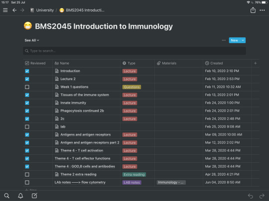
- Please click the photos to enlarge -
In the photos above, I visualise the 2 different systems. Each of the systems involves having a new cell per lecture. However, in the first 2 photos (from left to right) I have separate pages for my lectures vs my lab notes. Whereas on the right, I have my lectures, labs, extra reading and questions all formulated into one table. Clicking the See All button at the top left of the table, above the search bar, you can choose to view classes by type i.e. just see my lectures or just see my lab notes for example.
The second system I have found works best, otherwise you are just clicking too many buttons to get to the area you need. However, in future I shall implement the ‘breadcrumb’ at the top the page, like i did with the first and second photos. (Breadcrumb = univeristy/ BMS2037:cellu../lecture below the page titles). Breadcrumbs make it easier to shift between pages instead of clicking the back button all the time. They are essientally hyperlinks to other pages.
Tip: to insert a breadcrumb simply put /breadcrumb and a breadcrumb will appear. This works for anything you are trying to insert e.g. a table
You can also choose to insert materials e.g. any lecture slides or resources you used within that lecture. Personally I dont find this helpful, as our VLE is clearly laid out with our lectures. But it might be something worth trying, as you can also insert pictures or any sort of media you require.
I also use the tick box function to keep track of whether I have written the lecture into Anki cards (flashcards)/ attended the lecture.
Side note: Please ignore my spelling/ how I label lectures, they make sense to me, they dont need to be 100% correct - right?
Internship/Placement Page:
I have recently been dabbling in the layout I would like to use for my internship year, however, I shall update you at a later date with any additional details, as due to COVID-19 the formate of the year and my assessments has changed. I also will find out more when I start my internship... which is soon - yay!
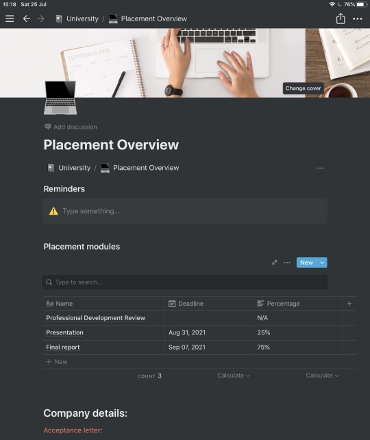
I’ve decided to have reminders at the top, which I inserted using /callout - you can change the emoji to anything you would like. This is for me to know instantly any important documents or tasks that I need to complete.
The external work to that provided by my internship is included in the table. This is essientally the coursework I have to complete on the side of the placement. Here i decided to note the deadlines and percentage of the year that it is worth. This is just to help me grasp the format of this year, since as mentioned above, it is slightly different.
Underneath this I have a selection of details to do with the company. This includes my acceptance letter and any insurance forms I need to send off. I just wanted to have them at hand so i can reference them at any time.
Summer 2020/Taekwondo pages:
These pages I format the same as the ‘Module’ Pages, so I haven’t included any pictures etc.
Miscellaneous things:
- NOTION IS FREE FOR STUDENTS - if you have an educational email, you can sign up for free! If not, packages start at $4 a month, which isn’t too bad for something you use frequently!
- This service is avaliable on tablets and computers, so anyone can take advantage of this organisational software!
- You can change the cover and icon at the top of each page. They include emojis and a standard image database, but you can also upload your own unique images if you desire.
- There are also template designs for pages, with different themes for different needs. So if you don’t want to start one from scratch you have lots of options to choose from. Use those as a base and edit them from there! For example, there are calendars, habit trackers, resume trackers and whole load of other things.
- Using a device for notes, such as notion, allows you access to any notes you have made at ease. It is organised, and you are unlikely to lose your notes. Paper is great until you scrunch up that important sheet, or it rains and the paper gets wet, or you are carrying every single note you have ever made - that can become heavy. Just something to bear in mind, especially if you can afford a laptop/ note taking device of some kind.
- You can create multiple pages for different aspects of your life (photo below). For example I have 2 additional pages, 1 for personal things and another for blog post ideas - to keep you guys entertained... haha! 😆
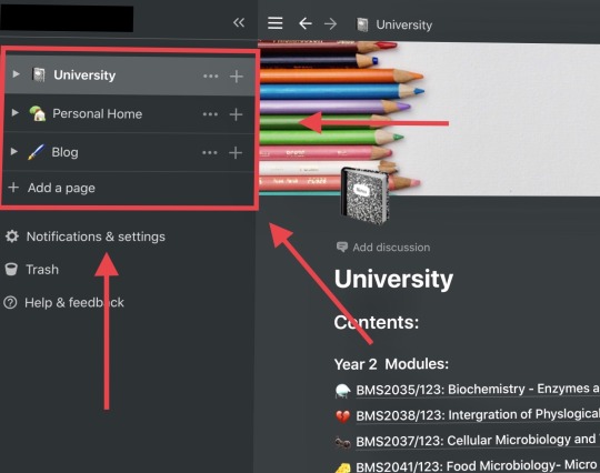
Conclusion :
What I have shared here is a very BASIC overview of how I use notion. If you desire a detailed in depth report of how notion works, it might be worth checking out Ali Abdaal, who can give you this information. As for me and what I require from the service, Notion has been working really well, keeping me organised with all my notes in one area. Knowing what I am doing, when, and being able to keep up with the speed of lectures - considering my writing speed is questionable. 😂
When you first download notion and look at all the templates, it can be a bit overwhelming/ exciting. Start with what you need, and then explore new ideas that you want to incorporate. There is no point setting up hundreds of pages if you aren’t going to use them, just like writing out pretty notes doesnt help you learn content - but more about that in a future post. Start small, being organised involves consistency, you can’t be consistent if you have given yourself too many things to do daily. Or at least you are unlikely to be.
One word of warning, Notion is not compatible with the Apple Pencil, so if you like writing notes on your iPad, this may not be the best software for you. As well as this, if you are a faster writer than you are typer, DO NOT USE NOTION. The whole basis of this app or at least how I use it, is to stay organised and write notes productively and efficiently. If you prefer writing, keep at it! Don’t just switch because suddenly you hear lots of tapping on keyboards in the lecture theatre.
Play to YOUR STRENGTHS , enhance what you are good at, not what everyone else is doing. As always, you’ve got this 💪
Let me know if you have any questions, or whether you’d like any further posts/details about my notion workflow. I’m happy to answer any queries you have.
Speak soon,
Lucinda x
#microbiologynerddweeklytips#new studyblr#newstudyblr#studyblr#student#studyspo#motivation#notion#note taking#organization#microbiology#bioscience#summer2020#summer studying#student advice#study tips#student to student#top tips#student blog#workflow#efficent learning#university
541 notes
·
View notes
Link
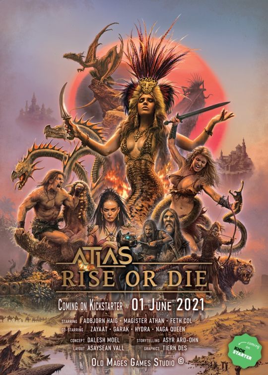
"Only a few understand adventurers. Most consider us insane driven by treasures, ancient secrets, fame, admirers, power, or what comes to mind. It couldn't be farther from the truth." /Adbjorn Haig/
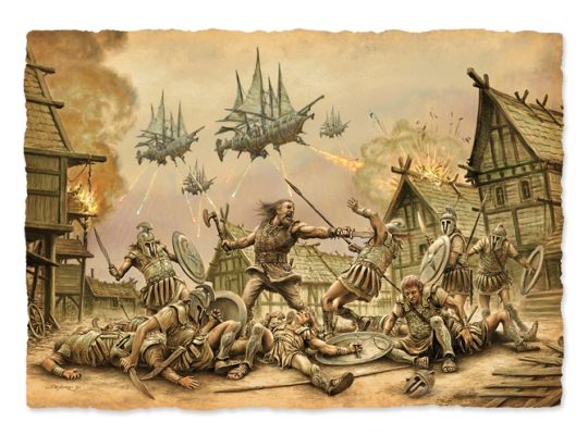
Enter the cruel and savage world of Atlas, where the ruins of forgotten civilizations are desecrated as the strange bones of the past begin to stir. Dark rituals mixed with corrupt technologies animate the ashes of the dead. As bloodthirsty hordes of barbarians and beasts alike roam the plains, the stern land can never be satisfied by the sweat and tears of the innocent. Mighty despots pass the time with their concubines behind high stone walls. Metal and magic have formed the land, erected floating islands, and twisted the deadly mountain paths. Take all you can before others plunder everything in this land of limitless possibilities! Rise as a mighty warlord or rot away like a maggot! Join us in the world of Atlas right here, right now!
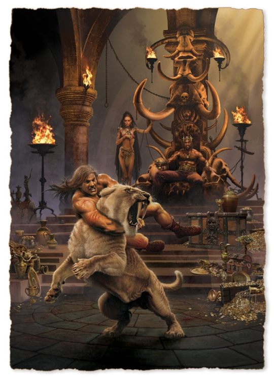
"I have seen many shitholes on my voyages." /Feth Col/
Atlas – Rise or Die is a classic, vintage sword & sorcery tabletop RPG. In its style and mood, Atlas brings about the renaissance of the epic RPGs of the '80s with a modern, clean design and breath-taking illustrations.
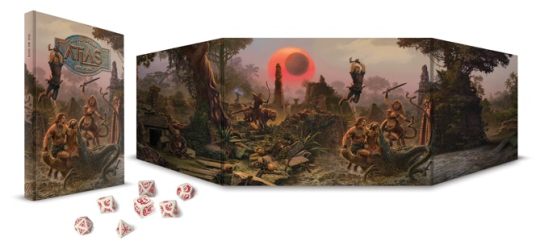
If you are interested, don't wait! Get a sneak- peek of the layout right now! Come and look at how we imagined the book's design and the base of the 2d10 system!

https://drive.google.com/file/d/1-e7_UOnNPa2cGsnwsowr55X9J2tFIPu1/view
The campaigns are housed in a brand new, progressive system that facilitates fast-paced and fluid gameplay. The system rests on the following seven main features:
A realistic, d20 compatible 2d10 system with low numbers. We believe that by using the result of rolls with 2d10s, we can eliminate some of the radical distribution of values often associated with d20s. This makes "Nat20" rolls even more epic and memorable, since their chance decrease from 5% to 1%.
We use a three-dimensional (race, class, archetype) character creation system, where by removing the traditional "alignment" aspect of characters and introducing the archetype system, well-rounded personalities can be created and played out.
The Atlas system allows for completely free character advancement, even maxing out a single stat is possible, though not encouraged by the system. It favors balanced characters and allows unique combinations of strengths and weaknesses.
Subsystems for NPC interactions, that allow overcoming obstacles by not only violent means. These make social interactions and investigations as enjoyable and manageable as combat encounters, resulting in immersive role-playing.
The XP system supports actual role-playing, not only combat.
The combat system is fast-paced and not roll-heavy. Alongside customary mechanics for damage distribution, it also emulates the dynamic physical positioning of combat participants. Combat maneuvers, boosts, and the decisions made in a fight scene this way become a fun activity instead of brainless rolls and damage calculation. Aiding our teammates and getting them in position come with substantive strategic rewards.
D&D 5th Edition compatible Setting on a brutal, bloodied, barbarian world of ancient technologies and dark rituals
“A great sword consists of three parts. You grab the grid, you defend with the middle and you kill with the point. It can’t be simpler.” /Adbjorn Haig/
Frankly speaking, ATLAS- Rise or Die, is not one but THREE unique books merged into one revised and united volume.
The first part is the Corebook which contains the basics of the game. This includes descriptions, explanations, added tables, and examples. All the presented sub-systems represent one, merged system that can be used as a core for any alternative games. It is with 5th Edition and with d20 system also compatible.

The second section is the Player's Handbook. This contains detailed information for players to create their character through the Handbook's unique 3D character creation system. Roles, Races, paths, highlighted classes, and much more are included in this book. Everything listed above serves the ultimate purpose of exclusive character creation to ensure that each player generates their unique character that is entertaining and cool to play with.

The third and last book is called Setting, which presents the wonders and dangers of ATLAS, a description of places, creatures, and everything that can be found on this barbaric land. It is full of adventures bringing you forgotten treasure, ancient monsters, and thrilling legends. The descriptions in this edition contain all the information a player needs to survive this brutal world. It is also "5th Edition-friendly".


All this will be brought to you in an old-fashioned hardcover book with the following parameters:
Hardcover, straight spine book
Classic portrait A/4 size
Matte art paper- core pages for stunning looks and to be easily readable
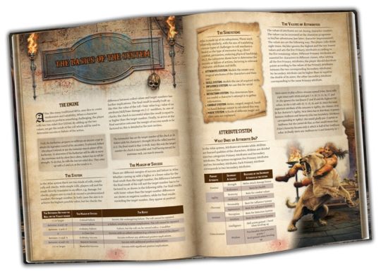
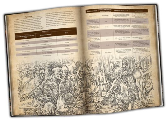
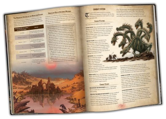
"When Enoon, our Dark Sun, arises, it shakes the calm waves of magic with its power. At such times, numerous disconcerting events manifest themselves all over Atlas." /Magister Athan/
Atlas – Rise or Die is more than another boring remake. Our goal is to bring back the atmosphere of classic game sessions in a unique new format, never seen before, through a completely modern, fresh, and trendy gamebook.
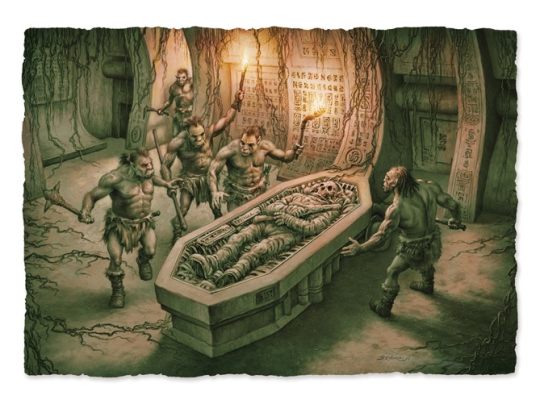
We are aiming to evoke a retro, vintage feeling with our design, all the while using high-quality, contemporary graphics, that would not have been possible in the ’80s.
Our own 2d10 system is less random and unpredictable than the classic d20, but it offers the same ease when it comes to calculation and keeping track of events. By using two ten-sided dice, average rolls are more frequent and exceptional rolls, like natural 20s, even more valuable - but is with D&D 5th Edition compatible.
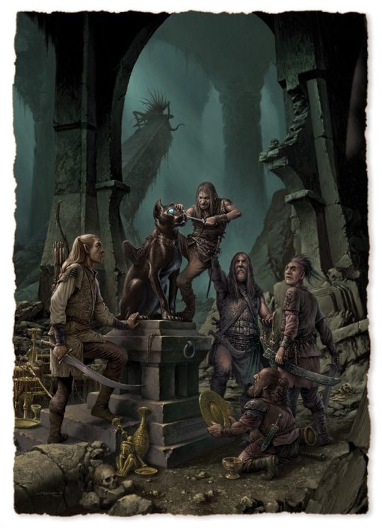
We were adamant to retain as much as we can from the proven template of classic sword & sorcery RPGs while adding a few twists to make them better suited for the brutal world of Atlas. Our elves for example are sickly, degenerate nobles who rule their people through intrigue. Their savage relatives are bloodthirsty head-hunters, protecting their ancient forests and hunting down all intruders. The dwarves are tyrannical conquerors at the head of an enslaved populous, dwelling in underground fortresses, that they call cities. They often make deals with subterranean creatures only to have their aid in their territorial clan wars.
The fast-paced, narrative, and tactical combat system goes a lot further than the classic, "attack roll–damage roll" format. The combat maneuvers infused in attacks alongside the collected bonuses make combat less hectic, more enjoyable, and realizable.
It is not only the lovers of fight sequences who can find something to please them. We have developed influence and intuition systems to support non-combat situations, which give flexible frameworks for meaningful interactions, information-trade, and realizing player goals through NPCs.
In the world of Atlas, everything is about brutality and blood sacrifice, and so it is with our magic system. It is optimized for coming up with unique combinations, while it supports the creation of your own spells. Magic twists and drains its user, should they become too greedy, the price could easily become their lives.
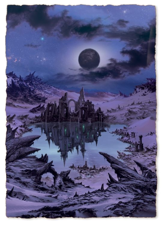
“Atlas is a cruel violent world, where barbarism, blood, and brutality dominate. But it wasn't always like that... A long time ago, ancient civilizations, advanced races, and rich kingdoms ruled this world, using their magic and technologies, rather than cold steel and muscle power.” /Magister Athan/
ATLAS is much more than a simple sword and sorcery world. It was shaped by barbaric realms, ancient monsters, and pioneer spaceships from forgotten civilizations.
Kickstarter campaign ends: Thu, June 24 2021 11:00 AM BST
Website: [Old Mages Games] [facebook] [instagram]
17 notes
·
View notes
Text
Best image creator tools online (On web, no need to install programs)
We live in an era when visual contents get more attraction than the normal ones. You can apply your creativity to attract your audience’s attention towards your contents.
It’s very important nowadays to create attractive and well designed images to enrich your written contents. Patent issues and piracy also need to be taken care of, to avoid legalisation issues.
Just like me, most newbie digital marketers start with MS paint and rely on it only for most of their image content needs. But once you come across beautiful tools available online, your life becomes much easier.
You don’t need to hire a designer for making good designs. There are few image creating tools available in the market. Some of them are free, some are partly free and some are paid tools.
Don’t confuse these tools with “Image Editing Tools”. Image editor tools require altogether different features. Please visit our article on “Best image editing tools”.
Remember, these tools will be used online only and you don’t need to download and install applications (programs) to use them. Just to make the designing simpler for newbies, this is the most important.
Let’s look at them one by one.
1. Canva
It’s easy to use drag-and-drop software. Create, mix, match, try whatever you want. Even if you haven’t created any image in your lifetime, just no need to worry. Canva is there for you.
From high-end design to logo to visiting card to letter head; you can create anything very easily. Almost all your design related needs can be fulfilled by Canva.
There are preset sizes for every purpose of images like Facebook Post, Instagram post, etc. Canva’s giant library with lots of images, icons, layouts, text styles and shapes will help you create your ideal images. You can upload your own graphics also.
Their premium plans offer even more of the resources to enable you to create professionals like images.
Price:- Free for 8,000+ templates, 1GB storage, and up to 10 team members; from $9.95/mo per user for Canva for work, which offers unlimited storage, access to 300,000 assets and templates, custom fonts, transparent backgrounds, and more
2. Stencil
Another easy-to-use graphic design tool for you. Stencil provides with you 650+ pre-designed templates, over a million images and few lacs icons and graphic elements to choose from. Free and simple image creating tool for beginners, social media marketers, bloggers and small business. With a free plan you can create upto 10 images per month.
3. Snappa
Snappa is another quick and easy graphic design software similar to Canva. It offers a free plan which includes 40,000+ free photos and upto 5 downloads per month. The free plan contains limited design templates to choose from and integration with 2 social accounts. You can upload your own graphics too in Snappa editor as well as import your custom fonts. Connecting your social media account allows you to share the graphic on the social platform right from the app.
Snappa goes all-in for this design, building its app around making vibrant, polished share images as quickly and easily as possible. While Snappa, like many similar apps, includes a thorough template library, they put more emphasis than other apps on getting the background image just right. With a library of free (and royalty-free) images, choosing the perfect background image is just a few clicks away, whether you’re using one of Snappa’s images or uploading your own. From there, Snappa offers an effects sidebar that helps you create the perfect image effects for your post–whether that means darkening or coloring the background image to make white text pop, or brightening the image to highlight dark text. (It’s important to note, however, that while Snappa has a library of additional graphics and shapes, these features are more limited compared to other apps.)
Snappa is similarly thorough when it comes to text. Easily edit your text from the sidebar, adjusting font, size, alignment, line spacing, opacity, and—my personal favorite–an optional drop shadow effect. It’s not an overload of features, but it’s more than enough to make your text, and therefore your message, really stand out.
Unfortunately, Snappa’s free plan is more limited than similar apps, allowing only 5 shares or downloads per month, which won’t be enough for many brands. You also cannot save designs in Snappa’s free plan. However, the free plan is a good way to test the app and see if it’s right for you.
4. Desynger
One of the easiest application especially for your phone, be it iOS or Android. Desynger can create graphics as smooth as Canva. Starting with a template or from a scratch, create a smooth design. Desygner’s library of free images and design elements will leave you speechless.
Even in its mobile app, Desygner doesn’t skimp on features. Multiple menus allow you to hyper-customize image and text settings, while never becoming cumbersome to use on a small screen. You can even pull up a list of all layers, making it even easier to select, deselect, and rearrange image elements with a few taps.
Desynger’s web app works almost identically, with sidebar menus to help you select the design assets and effects you need. The tool is simpler than Canva and provides fewer templates, images, and assets with its free plan, but combined with the mobile app, Desygner becomes a very versatile tool for quickly creating unique, professional social media images.
Desygner Price: Free; from $6.95 for more templates and assets, as well as features like versioning.
5. Pablo by Buffer
Pablo Created by the social media scheduling tool, Buffer, Pablo is as minimalistic as they come, making it drop-dead easy to add a nice-looking, customized graphic to your social posts.
Pablo has only a few features and really only one workflow. Choose a template or just an image for your blank template—all free and royalty-free, provided by sites like Unsplash and Pixabay. Pablo’s keyword search is fast and precise, so you can pick the perfect image for your post. From there, choose from one of three sizes, each fitted specifically for Pinterest, Instagram, or Facebook/Twitter.
Image customization is limited—choose from a few preset filters, designed to provide the right level of contrast between your image and your text. You can also add up to three text boxes. Pablo displays them as “Header,” “Body,” and “Caption,” but you can adjust size and font to redesign the text as you see fit. Add one adjustable logo or graphic, and you’re good to go!
When you’ve finished your image, you can either download it, put it into your Buffer queue, or share directly to Twitter, Facebook, Pinterest, or Instagram.
Pablo Pricing: Free—Buffer subscription not required (but certainly recommended!)
6. Crello
Crello is an alternative of Canva and offers similar features and functionality. This free online graphic design software allows creation of design using pre-created formats such as social media covers, ads, posters etc. Crello offers over 5000 free designs and collection of over 60 million images.
7. Gravit Designer
Gravit Designer includes many of the classic graphic design functions of tools like Photoshop, Sketch, and GIMP—such as layers, drawing tools, grouping, shapes, text, effects, and more—with a much more simplified, easy-to-learn interface.
As a self-described intermediate (on my best days) designer, Gravit Designer suited me perfectly. All the controls and effects I needed were easily available, so I could really make the design my own without spending a lot of time starting from scratch with Photoshop and its overabundance of tools. A tutorials tab in Gravit Designer’s main view also gives you ready access to all the knowledge you need to get started.
While Gravit Designer is ideal for building your own designs from scratch, it does come with a small library of templates pre-sized for uses like blog posts and social media images. Start with one of these preset canvases, or define your own. The app also offers a small library of shapes, illustrations, and icons. While not comprehensive as the asset libraries included with some other apps, it’s nonetheless a handy addition to a tool that already does so much.
Want to backup your design files or make them easily shareable with your team once you’re done? Gravit Designer is built to sync with the Gravit Cloud, which is also free. Simply create a Gravit account, enable the sync, and you’ll be set!
Gravit Designer Price: Free
Read full article on here
1 note
·
View note
Text
Hill House, and Audio Horror vs Film Horror
I got to thinking about this when an audio producer on Twitter asked what people thought the scariest parts of Haunting of Hill House, other than the jump scares. What struck me while reading the responses were almost all things that depended on the visuals, and would be very hard to move into the realm of audio.
I feel like many/most people think of horror movies as a template to build off of for horror audio fiction...which is fair, because for many of us, horror audio fiction wasn’t a thing we could find to listen to until recently (myself included). And it’s not uncommon to hear a successful, talent audio producer say something along the lines of “An audio drama is like a movie, without needing a million dollar budget.”
I agree with the thought, generally: audio fiction does have many similarities to film, but if you stretch it too far, it can be a dangerous approach. And it can be especially dangerous for Horror.
Let’s think about how we could move the Bent Neck Lady into audio (spoilers ahead). Except for one scream, she is silent and unmoving. To move it into audio, we’d either need a narrator (or someone to tell us what’s happening), or to make Bent Neck Lady move around. The first option would keep the nature of the ghost intact, but we would be robbed of having it happen in front of us. The second option would change the nature of the ghost entirely. This is before we even talk about the twist, that hinges on Bent Neck Lady largely being a silhouette, which obscures information without feeling like anything.
Horror is a genre that is especially dependent on craftsmanship, regardless of the medium. It’s a genre where--and you’re going to murder me for saying this--you don’t need a good story to be scary. You need a scary situation/scene, told with skill, but even if the scenes/plot/characters around it are terrible, you can still make the audience feel afraid (Looking at you, Argento).
That’s not to say the story doesn’t matter. In fact, a large part of what makes Haunting of Hill House so good is that it’s part horror, but also part family melodrama (and it actually spends more time on the melodrama than the horror), blended together so the ghosts have meaning. Bent Neck Lady is disturbing the first time you see it, but it’s the story behind it that makes her stay with you long after you’ve finished the show.
But if we set aside the story, and focus on the scary moments...they are pure filmmaking. Every aspect is working to create fear: the sets and art direction, the creature design, the pacing, the blocking, the editing, the sound design.
The same way a horror movie uses every weapon of filmmaking, a horror audio drama should use every weapon of audio to create dread/fear/suspense. But the flip side is, just as Haunting of Hill House isn’t using the tools of horror literature, your audio drama shouldn’t try to be a movie.
But I think we also need to own up to something: many of us (most of us?) have more experience watching horror movies than listening to horror audio dramas. So let’s get analytical here. What are films strengths? Audio’s strengths? Weakness? And how do these work in service of horror? Any tips for the audio drama producer?
Filmmaking’s Unique Gifts
Before I get into the list, I want to be very clear: I’m not to saying you can’t do versions of this in an audio drama. In fact, when these are successfully used in audio, they can be outright amazing. But they take a lot more work, either by carefully setting up signature sounds*, or by having narration, or some other creative way no one has done yet. The point of this list is that film does these things easily.
There are some obvious things, like, ya know, visuals. I don't think there's any amount of words or sounds that would allow me to imagine Giger’s Xenomorph. Some things just need to be seen.
One of film's special talents is it gives the audience an understanding of a location without even trying. I don’t mean the layout of a house (that can be confusing), but present an audience with one shot of a bedroom, and they’ll instantly understand where the bed is, the window, the door, the closet, the bedside tables. Films communicate small spaces so easily, they don't even need to stop to do it…a character walks in the room doing whatever, and as long as the space is seen by the camera, the audience gets it.
In horror, this is vital when the fear you're trying to create is that of a physical threat. Where is the killer? Behind the bookcase? Walking towards you from across the lawn?
Related to this idea of a physical space, films also have the ability to makes things appear--and disappear--quickly and unexpectedly. This is moments like Mike Meyers appearing in the closet in Halloween, or later, when Dr. Loomis looks over the edge of the Balcony, and Michael Meyers has vanished.
Perhaps film’s most famous strength is the montage. You can easily cut between different scenes and settings, without the audience ever getting confused.
There is one tool of film that I am very frustrated won’t work in audio: the Title Card. I don’t mean the title of the show, I mean those cards that say things like “Burbank, CA” or “CIA Headquarters” or “3:23pm.” Text on screen is a painless way to give the audience information without tripping up the storytelling.
Finally, let’s talk about one of film’s most powerful tricks...patience.
A film can stretch moments out, sometimes with slomo, but often with editing between close-ups. You can also have moments where nothing happens, you just linger in the mood/ambience/characters reactions.
A great example is the “Spielberg-Face”, those shots when the characters are reacting to something the audience hasn’t seen yet. In Jurassic Park, we spend a full 30 seconds watching jaws drop before we see the first dinosaur. This is pretty nuts, when you think about it. The true stars of the movie aren’t introduced with a speech, or a title card, or a curtain pulling back, but by the characters just staring in the distance for half a page.
Pausing the action, or even just stretching it out, is one of the fundamental tools of horror movies. It’s a way to create the mood: Show the spooky location, play the spooky ambience. It’s a way to create suspense in a scene, think of the long POV shot scanning the room for that noise. End the moment with something suddenly appearing, and you have the basic recipe for a jump scare. Even if you decide to be an artsy horror story, like Haunting of Hill House, silently drawing out the action is your primary weapon. Done well, the audience will be rapt, knowing that something could be about to happen any moment, even though as far as the plot goes, we haven’t moved much at all.
I’ll be honest, if I could go back in time and tell the younger version of me who hadn’t made an audio drama yet that you can’t draw out a moment the way you do in film, I probably would not have believed me. In my work as a TV Editor, it’s been one of the tricks that has really elevated my pieces...it feels like magic. But I’ll never forget editing my first audio piece, having a character fumble with a doorknob while trying to escape someone who was chasing them. They grunted at the door as the footsteps got closer and closer, and it was lousy. It felt like the manipulation it was.
Audio’s Unique Gifts
The thing that audio does better than any other media--and this is controversial--a narrator feels like they are talking directly to you, the listener (a narrator in a film feels more like they are talking to an auditorium). Now, here are people who find that narration is jarring and takes them out of the story. They aren’t wrong--you can’t argue someone’s experience--but that’s certainly not what happens to me. If you are one of these poor souls, I hope you take some time to listen to some narration and reprogram your brain, because you’re missing out on some magic.
The other great thing about sound is it activates the imagination. Films can also do this, of course, but audio does it be default.
Sound is also very good at evoking a sense of touch. Texture. Clothing. Almost anything you can feel in your hand.
While sounds is great at telling us about what’s very close, it also tells us about the world in the distance, i.e. ambiences. The sound of a forest transports us to a forest that exists in all directions. Distant traffic can tell us if the city is awake or asleep.
Audio also does an amazing plot twist that I’m gonna call the “Pull Back to Reveal” twist (yeah, that’s a film term). This is when, deep into a scene, something is revealed to the audience that the characters understood was there the whole time. While a movie can usually only sustain this for a minute or two, audio dramas can push this for a really long time. The Truth’s classic “The Dark End of the Mall” is a great example, as is the episode “Have You Seen My Mom?” It’s use in horror is more limited though...suspense works the best when the audience knows as much or more about the situation than characters (a.k.a. Audience Superior), and this is a twist that is Audience Inferior.
And, not for nothing: It’s way cheaper than a film. That’s not say the money doesn’t matter, but it doesn’t matter in the same way.
Film’s Failings
The hardest part of film is the flip side of its strengths: it’s so easily grounded in reality, it’s very hard to step out of it. That’s more of a problem than you think.
Take the sentence, “Andy called his sister-in-law.” While it takes just four words to write in a book, in a movie, you are going to be contorting dialog or some other clever trick, to get the audience to understand “that’s his wife’s sister.” (Non-narrated audio dramas also have this problem with exposition.)
Same goes for backstory. In the middle of a scene, a book can say things like “She’d been working on this for ten hours now, and was ready to scream.” One sentence. A film would have to lay out exposition, or clues for the audience to put it together.
Film also has a hard time conveying senses other than sound or sight. During scenes where a character walks into a place and says “Ugh, what’s that smell!”, I never really imagine the smell, I just see an actor pretending to smell something.
Visuals can be too intense. Gore or nudity are the first things that come to mind in this category, and are often alluded to in a film for exactly that reason. But even if they are merely hinted at, the film audience may spend a scene wondering “Are they going to actually show it?”, which knocks you out the movie a little.
Films are complicated to make, at every level. Casting is tougher---the actor needs to both sound and look the part. There’s the expense of sets and lighting, the effort of just getting a crew to a location can be monumental. And once it’s all shot, film editing is more complicated and time intensive than audio editing, and not just because it involves audio editing.
Audio's Weakness
The biggest: There's a big Blindspot right in front of the audience. Without some careful context, raw audio recording from real life is disorienting at best, intelligible at worst. Most sounds that come from the blank spot are descriptive, they generally tell us if someone’s shoes are wet, but they won’t tell who is walking around the room in wet shoes.
This blind spot can be especially dangerous to a producer, because in real life, our brain attaches sounds to the objects it sees, and when you understand what a sound is, it’s easy to place it. Because a producer knows what sound they are placing in the piece, it’s easy to think your sound design is intelligible. Sounds we don’t understand are also hard to place in the space. I personally find that while stereo and ambisonics can help make the sounds be more distinct from each other, they don’t really locate them precisely.
Another weakness of audio, characters are hard to tell apart. This can especially affect women's voices, who don't tend to have as much variation. This isn’t as true if the audience has seen the face of the actor talking, something about that seems to lock in our understanding of a voice (video though, not just a headshot). But without a face, it’s tough. EDIT: So I wasn’t very clear with that last point. To be clear, it’s not that you CAN’T cast people who sound different, or that you can’t direct people with similar voices to give different performances. It’s that you need to make a point of doing so. And while I have personally found that women’s voices are more likely to sound alike, that’s not the main idea. We remember face’s very easily, and names relatively easily (unless you’re me, I’m terrible at names). Voices without faces are easily confused.
This character confusion especially applies to large casts...I have a hard time imagining an audio only version of OCEAN’S ELEVEN, for example. Put twelve characters in a room for an audio drama, and it’s gets confusing for the listener really quickly.
If you aren't using a narrator, making time pass can be hard. A Rocky montage needs to be carefully setup. "Cut To: Five Minutes Later" is damn near impossible without narration.
Sound Effects need to be more meticulous. THE AVENGERS can sweeten a superhero punch so it hardly sounds like a punch at all, and the visuals on screen will lock it into place. Without a picture to give a sound context, they need to be much more realistic for them to be understood correctly.
So let’s put this all together.
Lets turn it into an “approach,” and design some scenes that work easily in the medium.
Ambiences are a strength, so we’ll pick a setting that has an interesting one, and avoid things like quiet rooms. We’ll have a small number of characters, let’s say four or less, and to make it easier for audience to remember who is who, we’ll cast actors with clearly different voices, and we can help on the script level by making sure they all have different motivations/goals/emotional states. To get that intimacy of the voice, we’ll have at least some of the characters close to each other (and the mics), and not shouting across the room.
The physical setup of the room will be straight forward, and our characters’ movements though the space will be clearly motivated and direct (“Does this key unlock this door?”), if a character has busy work that moves them through the space, the details won’t matter (like they are doing dishes). We’ll also want to have some moments that play on that sense of touch. Perhaps most importantly, we’ll want to paint some clear visuals for the listener to imagine.
For a horror scene, you really want to work your ambiences to make them add to the tension, vs just adding realism. We first want the monsters in the distance, say on the other side of a door or outside the house, or somewhere in the woods. Make our scared characters really close to the listener, play the sounds that you only hear when you are right next to them, like their breathing, swallows, adjusting the clothes or their make-shift weapon.
When the monster enters the room, have it spend as little time as possible in the blindspot, so avoid things like fist fights and fast-paced footchases. Instead get the monster right inside our character's personal bubble. If you’re aiming for a startle, instead of having it leap out in front of the hero like in a movie, you’d want to skip the blindspot, and have the monster pounce onto the hero--using those touch sounds that are so intense.
To me, that sounds like a scary scene.
It’s Not a Formula, and All of This is Nonsense
In fact, you probably wouldn’t want every scene in your piece to follow this, because a) it’ll get repetitive, and b) when you go against the medium, you’re more likely to make some magic (if you pull it off). But I do think it’s important to realize when the big moment of your piece is resting on some of the weaknesses. When this happens, you may want to make sure you’re leaning on something really strong to carry the weight. Other times, you may want to toss around some other ideas, make sure that it’s actually working, and to see if it could be improved.
Also, even though I’ve written a lot of words here, I fully expect someone has already proven every one of these rules wrong. But I also think it’s a good exercise to go through this and figure out why I’m wrong.
The medium matters. And I hate writing conclusions, so I’m ending it here.
*Signature Sound: A sound that the audience understands to mean something specific, such as a doorbell or a gunshot.
7 notes
·
View notes
Photo


https://digitalderive.neocities.org/
Following my research into the dérive and experimenting with carrying out my own digital dérive, I wanted to find ways of presenting a record of my dérive. I first put all the images into a powerpoint but I didn’t think this expressed these images in the most interesting way and didn’t think this format took full advantage of the digital medium. However, this could be something to return to in the future maybe when I have more time to fully explore and experiment with the software. Also, powerpoints are performative in nature so maybe I need to not only experiment with the software but also with ways of performing, either face-to-face or over zoom/video.
This led me to look towards website building particularly after seeing the websites of Molly Soda, Erik Bernacci , www.housefly.neocities.org, Movie Computer Interfaces to name a few. I had no experience of creating a website so I started by looking at websites that help you to create websites such as Tumblr, Squarespace and Webflow. However, I found that these sites didn’t give me the level of customisation and freedom that I was looking for. Each website builder encouraged me to pick a template (the standard ones being free and more complex or interesting ones costing), I really didn’t want to pick my site from a template as I wanted it to be unique and I wanted to experiment with the layout and elements of each page rather than be restricted to a certain look. This led me to a site called Neocities, Neocities is a free web hosting service that aims to revive the ethos provided by GeoCities before it was shut down. I really was worried about learning to code as I thought it would be too complicated or too difficult to accomplish the kind of site I wanted to make. However, I made a very basic start to my site which involved a header and an image. I then made more pages with links from each image to the next page so that the user could move through each page by clicking on the images, revealing a new page and image each time. I started learning to code from various online resources like HTML Dog which taught me basics like adding text, images, what CSS was and how to use it to make my website more attractive. I felt that i needed a guide that very clearly and simply explained the basics so that I could create a good foundation of coding knowledge before I moved onto more ambitious additions to my site so I bought HTML & CSS by Jon Duckett. I read through the basics of this book and now i use it as a point of reference/a guide when coding, so I will have it open next to me when working on my website to help if i’m stuck or if i need guidance on something. I think that learning to code and constantly learning more about website building, design and the internet as a whole/how it works has become an important part of my practice. I think it’s also very appropriate to the work I make, as at the point of the early internet there were no website builders and teaching yourself to code through online resources and books was the only way to create a website. My website, www.digitalderive.neocities.org, is a manifestation of my own digital dérive but also a digital dérive for the user. I used the images from my google maps dérive for the basis of each page and then collaged each image with GIFs, found images, more of my own images and videos. Some of the images and GIFs link to other pages on my site whilst others link to external pages. The point of this is to allow the user to explore and discover my website and parts of the internet they might not usually go to. Each page of the site is a different composition of elements and there are multiple ways to explore the site. Through this work I am showing that the internet is a platform for self-expression and creativity, not just social media sites or a place to scroll passively. The experience of the user is extremely important to the work and each experience will be different for each user depending on which links they click on, if the explore all links or just a few, whether they watch the videos on the site, whether they explore the external links or choose to stay on the site, even what size their browser or computer monitor is will change the experience. I want this to be an ongoing project that I can continue to add to as my coding knowledge and experience develops and as I gather more images and elements to add to each page. I think one of the interesting things about the internet as a a medium is that it is constantly changing and evolving, and the work created there does not have to be static or stagnant it can continue to change and be added to. But also the internet and the art created with/on it can be very self referential, like the use of ‘scammy’ looking ads on Molly Soda’s website or Daisy Richard’s use of word art in her digital works, this is why I decided to use found GIFs on my page and using a moving image for the background of my website is also very reminiscent of Geocities sites and sites from the early internet.
7 notes
·
View notes
Text
Digital Abstract Typography


I have created two of my own digital abstract typography, using new techniques that I've learnt on illustrator. These would be perfect for a poster or flyer, to spread a message and gain interest from others to join a movement. This is because it's super eye-catching and intriguing so any viewer would at least take time to look at it, and because it's simple it could be even better as part of a collection e.g. postcards, gifs, posters.
These outcomes came out better than I expected so I am really pleased, and even though the text alone was good, I think it's all the other elements that really brought it together. For example I found that the splodges of paint filled places that text couldn't, and when I incorporated colours the text really stood out. Overall I think I've created two really appealing and intriguing typography artworks, and experimenting with a new style was really fun. I've never been a fan of grunge art nor have I wanted to make this style of art, but during this task I really enjoyed messing around with paint splats and illegible writing.

I started off with a 3x3 grid of squares and wrote out the word 'individuality' with the type tool, I chose this work because it relates to all equality. We should all feel confident to be our own unique individual, and celebrate the individualities of other people, especially the minorities. To type the word out I made sure to use a bold font and in all caps, this made for better collaging and clearer shapes.
With this I created outlines for the type and ungrouped the object, this removed the fact it was a type face and left me able to edit/move each letter individually.

Next I selected a couple letters and duplicated them over to one of the squares, it was important to duplicate the letters and not just drag over so I could select them again if I wanted to. With these I resized them large and placed what I wanted to keep within the square, meaning some can be left outside the box.
I then sent the letters behind the square and selected both together, this allowed me to make a clipping mask which cropped the letter to just be seen if it was in the box. At the same time the box line cannot be seen where the text doesn't cover it, so you're usually left with an interesting shape of letters. I repeated this process to fill every square, experimenting with different sizes, numbers of letters and rotations. This in itself could be an outcome like an unfinished puzzle, except the pieces don't fit and there's plenty of space.

With these cropped letters I began to collage them together, building a larger shape to base the piece around. I did this simply by duplicating them over to a blank canvas, rotating and resizing them to create an appealing collection of these letters. However my first attempt didn't go so well, I attempted to make it so you can easily recognise the word but it still be distorted. Although I could see the word, the whole collage looked unbalanced and not very interesting.

My second attempt was a lot more successful, and I think it's because I let go of boundaries and went for it. I wasn't thinking about how legible it was, I was simply focused on the overall look of the collage. I've also shown an example of how I've used the digital advantaged of precision, where I've zoomed in close to parts where I want to line a letter perfectly with another. In the end I was pleased with how it looked, but there were still a few spots to fill and it in general looked unfinished. You may also notice how all the angles are either 0, 90 or 180°, this decision was inspired by Neville Brody and I think it worked out perfectly and made it easier to collage together.

Next I incorporated dripping splodges of paint/ink, of which helped fill the gaps that I couldn't fill with text because it didn't fit. To add them I copied it from the template and pasted it over, I then played around with the size and placement of the drips to find fitting combinations. Once I'd completed adding the splodges and drips, I felt the piece was much fuller and looked complete. I made sure not to over do it too, otherwise you would lose its effect from being too busy/messy.

Finally I added distressed halftone patterns and colour blocks, this finished off the design and made it really stand out. After downloading the patterns template they automatically appeared on my swatches, therefore all I had to do was select the pattern on my swatches and draw a shape with it as the fill. I then created a new shape but this time filled with a colour, the idea is to have the colour behind the pattern and type. Therefore I sent it to back, then because I changed the pattern from black halftone to white, I also had to send the pattern back. So rather than sending backwards many times, I selected the two rectangles together and send them to the back. I repeated this process multiple times, using different halftones patterns, shapes and colours.

To create the other piece I used the same process, but of course using a different layout, colours, patterns, shapes etc. However something I hadn't incorporated in the first piece was a dirt/dust texture, so for this one I coloured it as white and layer over the whole collage. This added a subtle detail of white specks, giving the black text some texture.
1 note
·
View note
Text
Just How Much Does It Cost For A Solicitor To Write Your Will?
Will Writing Solutions
Content
Cash
Frequently Asked Will Composing Questions.
Do I Get Approved For Company Residential Or Commercial Property Alleviation?
Will Composing Solicitors.
If you are replacing an old will, you also need to state on your brand-new one that it replaces all previous versions, which ought to be ruined. Be as certain as you can around what you intend to take place as well as see to it that there are no spelling errors, specifically for any kind of recipients. last will and testament manchester follow general rules in the criterion of writing and framework in order to reduce unpredictability.
To learn more about the phrasing to use and also how to make your will legitimately legitimate, take a look at the gov.uk web site. Any person aged 18 or above can be an executor of your will, even those called as beneficiaries. Given that the task of an administrator is to carry out your desires after you have actually passed away, it is best to choose a person capable of the role but likewise someone that you trust fund. For that reason, it is common for individuals to select a partner or developed youngster. You can select one member of the family as well as one specialist, such as a lawyer or accounting professional, yet bear in mind that expert executors are most likely to charge a fee. Look around and consider whether it is worth having a person independent with expert knowledge.
As an example, several on-line services advise Mirror Wills which in our sight, are simply not suitable for the vast bulk of couples.
Once more, choosing a company whose attorneys have a more comprehensive knowledge than the straightforward matching of an A-level can aid guarantee the guidance you obtain is contextual, taking complete account of all of your circumstances.
We spoke to numerous of one of the most prominent solutions as well as none can assure that their 'certified individual' would certainly in fact be a solicitor.
It is just difficult to write a comprehensive set of inquiries that will cover each and every single scenario and after that produce a customized Will at the end.
Additionally, the term 'qualified person' used by a lot of online solutions is extremely loosened.
Using a solicitor may be less expensive than you may believe, and it indicates that you have the comfort of understanding it's been done properly. You should most definitely take into consideration using a solicitor if your household position is complicated. The person that figure out your residential or commercial property when you pass away as well as performs the guidelines in your Will is called your administrator. It can be a difficult task even if your instructions as well as your home are quite basic-- it's not uncommon for the process to take several months and the task of an executor is sometimes hard. As an example, they could have to choose when to sell your property to make sure that individuals that inherit the money from its sale get the most money. Think about exactly how you want to divide your assets between the people you've provided. You might find it useful to consider what is essential to you.
Although no-one suches as to consider dying, it can occur suddenly to any of us and in this case, not having a will may indicate that your enjoyed ones don't get the benefits from your estate. You might also have certain sentimental products that you would love to go to certain individuals, but without a will these dreams may not be recognized. Would you like to learn even more regarding our Will creating solution? Call us on or call us onlineto arrange a telephone call with our Will experts. Making a Will guarantees that when you pass away, your estate as well as affairs are managed according to your wishes.
Money
Intestacy, which is the condition of the estate of a person that passes away without having actually made a legitimate will, complies with a set of regulations put down by legislation which state exactly how the estate is to be provided if there is no will. Ensure you seek professional suggestions when composing a will, and that every one of the proper actions are taken, including having actually the will seen. For instance, if you wish to leave among your kids the "black BMW" however you later sell this car after the will has been signed, it can lead to complication and possible disputes. If you have step-children with a companion, merely stating "my kids" in your will may lead to complication and also will not automatically cover them.
Your youngsters can not assert your estate so you must consider making monetary setups-- placing inheritance in trust, for instance. You need to select trustees that will manage the trust fund in support of your children-- these could likewise be your executors. And also you will need full names as well as addresses of legal guardians and also trustees. People normally provide their partner or partner as major recipient however you need to specify who ought to obtain your estate if she or he were to pass away prior to you-- your children or grandchildren, as an example. Nevertheless, these stages can show incredibly challenging and taxing if you do not have experienced assistance. Even if your estate is small and also your will is incredibly basic, we advise looking for expert recommendations to see to it that it is lawfully binding.
It is ideal not to make use of close family members, youngsters, those that have visual issues or those that aren't with the ability of recognizing what they are experiencing. It is also vital to remember that witnesses can't be beneficiaries or companions of recipients. Typically, your estate will cover any estate tax owing to HM Revenue & Customs, however you can stipulate in your will that whoever you are leaving a property or residential property to must be in charge of paying. Below at Perrys, we have a highly-qualified as well as recognized group of accountants with a lot of experience in probate and also estate tax problems. If you're thinking about creating a will, please do not wait to contact us. We'll schedule a casual, confidential preliminary conversation with a professional from one of our 7 branches in Kent or main London. Come and talk to our will lawyers in Epsom if you want to produce your will this year.
There utilized to be tax obligation benefits to making use of an optional trust as well as placing properties valued approximately the value of the nil-rate band into it. Those tax benefits are no longer so advantageous, however making use of an optional count on can protect your estate from claims by creditors or in separation negotiations or if your hubby or partner remarries. You can create a trust fund purposefully or by operation of legislation such as when you leave a present to small kids under 18 years of ages. You must consider making a Will whether you are young or old, if you have a family to care for, or if you have a property or other useful properties. This totally free layout develops a last will and also testimony where the testator leaves all his/her assets to one person after making certain gifts of money and ownerships. The formal demands for wills are set down in the lawful statute Section 9 of the Wills Act 1837, as amended by Area 17 of the Management of Justice Act 1982.
Is a post office will kit legal?
You may be tempted to try and save money by picking up a Will Kit from the Post Office. But be warned – there is a risk that a will made using a standard Will Kit may be found to be invalid. In this case, a husband and wife had both made wills using Post Office Will Kits.
Once finished, you can send this to us, or bring it with you when you meet one of our solicitors. Spouses and also children have particular entitlements from the estate of their spouses/parents.
Often Asked Will Creating Questions.
Our totally free design templates are most appropriate for less complicated estates that are valued below the IHT nil price band. One of the Internet Lawman free choice design templates should appropriate, we approximate, for around 60% of the UK population. You do not need a solicitor or Will writer to evaluate or to authorize your Will for it to be lawfully binding. The record becomes binding as an outcome of the process of authorizing it in front of 2 witnesses, not due to any kind of involvement of a lawyer.
The regulation divides the estate of a deceased right into 3 parts - the prior civil liberties; the legal civil liberties, as well as the cost-free estate. You can partially disinherit a spouse or kids, but the law places a limitation on that particular. Spouses and civil companions have the right of ius relicti or ius relictae as well as children have the right of legitim. You need to designate guardians that 'd deal with kids under 18 if both parents were to die.
Do I Qualify For Business Building Relief?
Fatality and also passing away Planning for the future Why leave a gift to Sue Ryder in your Will? Around a 3rd of our fundraised revenue comes from presents in Wills delegated us by our generous supporters. Gifts in Wills imply that even more individuals can be sustained through their most challenging times, as well as assisted to live the very best life they perhaps can.
Because of this, lots of people would be smart to choose an administrator with the suitable level of experience along with insurance coverage to protect them. Take into consideration whether you have control over where these assets will pass, or whether that is pre-determined incidentally in which you own them. Collectively owned residential property as well as checking account, for example, automatically pass to a making it through co-owner. It's critical to comprehend what you have actually obtained as well as who you wish to pass it to before you write your will. Think home, bank accounts, financial investments, shares, life policies and whether you have any kind of unique things you wish to pass anywhere particular. We will send you a letter, or if appropriate, a detailed report on your details conditions and also draft wills for you to think about, together with suggestions for adjustments where suitable. As soon as you enjoy with your wills, we will publish and send you bound copies with guidelines on how to authorize them.
For example, it might be things like seeing to it that your partner is provided for, or ensuring that your grandchildren obtain the most effective education. Things like your financial savings, any kind of home you have and any type of beneficial items - and an approximation of what they deserve. You should additionally consider any nostalgic items that you might desire certain individuals to have.
How do I make a simple will?
Writing Your Will 1. Create the initial document. Start by titling the document “Last Will and Testament" and including your full legal name and address. 2. Designate an executor. 3. Appoint a guardian. 4. Name the beneficiaries. 5. Designate the assets. 6. Ask witnesses to sign your will. 7. Store your will in a safe place.
This way when you're gone there can be no confusion or misunderstanding regarding how your estate is to be split up as well as your will carried out. You'll additionally need to select an administrator or executors of your last will and testament.
Will Creating Lawyers.
If you desire your step-children to be consisted of in your will, make certain you clearly discuss them. If you have little ones, it is necessary to think of that you wish to take care of them after you die. If you are the only enduring parent as well as you do not choose a guardian for your kids in your will, this decision could potentially go to the family members courts. Ensure this headache does not occur by naming the guardian in your will. When noting down the properties to pass onto enjoyed ones, lots of people keep in mind the substantial possessions; the automobile, your home, the watch. Very frequently, nonetheless, they neglect some of the a lot more abstract assets. Administrators bring a lawful obligation to do the work effectively, as well as can be accountable for any kind of loss arising from their failure to do so.

Basically, a will is the only certain way to make certain that your desires are fulfilled after you pass away. With a legitimate will, you can provide your money, home, ownerships as well as investments to individuals, organisations as well as triggers you value most. Heritage Wills & Estate Preparation Limited Registered in England as well as Wales No. at sixth Flooring, St Georges Home, St Georges Means, Leicester, LE1 1SH. BARREL Enrollment No. Heritage Wills & Estate Planning Limited is authorized and also controlled by the Financial Conduct Authority for credit report broking activities just (see FCA Register at FCA Number ). The Financial Conduct Authority does not regulate will creating or estate preparation services. By writing your own Will, you make the procedure of resolving your estate less expensive and also much faster. By reducing the quantity spent on legal fees, you can shield the value of your estate that is to be passed on to your beneficiaries.
Whilst the legislation bordering Wills as well as inheritance may be complex, the procedure of completing a Will shouldn't be. Heritage Wills & Estate Planning have a range of ways to make contact with us, either by email, message or telephone, and in some situations we even supply the solution of seeing you in your own house. As soon as you have actually given all the info we need, we will draft your Will, leaving you to simply check over the file and also indication. This guide would certainly reveal you just how to choose them, produce a checklist as well as write a Will. In In The Event Of Death, you additionally discover what to do in different situations - the in-depth treatments for each circumstance of death. In the last phase, you have an exceptional resource overview on the kinds available for various estate planning as well as Wills functions. You can leave it with a professional will storage space firm (Beyond includes will storage space with our ₤ 10 membership strategy), or with a close friend or member of the family.
youtube
Without a Will, your properties will be controlled by the state as well as may not be passed on just how you would have wanted. Once you have actually taken into consideration issues, you might locate the connected set of questions form valuable to set out your wishes.
These are individuals that will guarantee your wishes, as written in your will, are carried out. This can be a great deal of work, so make sure they comprehend the duty they're taking on or consider making use of a specialist executor, such as a solicitor or Beyond's administrator service. These have the benefit of being less costly (a solicitor will charge ₤ 200- ₤ 600 for a single will, compared to ₤ 90 for a will on Beyond), however not all will creating services are developed equivalent. On Beyond, we offer real-time assistance and also examine every will that is developed through us, so we can assist you avoid making any type of blunders that might make your will invalid. Planning ahead for your funeral service Thinking of and also intending your funeral can really feel extremely hard, and also some individuals choose not to review it.
As an example, Carbon monoxide op lawful services deals will creating solutions from ₤ 90 for a Living Will, from ₤ 150 for a Solitary Will, ₤ 245 for Mirror Wills and also a taken care of charge Lasting Power of Lawyer starts from ₤ 270. Keep in mind that our cost-free design templates do not consist of provisions that seek to minimise tax obligation. If this is necessary to you, you should take a look at the various other Web Lawman last Will and also testament layouts, a number of which cover standard IHT planning. If the worth of your estate can go beyond the nil rate band (₤ 325,000 for a private in 2020/21), then we suggest that you seek advice from a qualified tax obligation specialist before signing your Will. The reason that most people don't compose a Will is the financial price of doing so.
Few Will authors are totally legally certified, so if you do use a Will-writing solution, it is best to inspect that they belong to the Institute of Professional Willwriters or Society of Willwriters. The even more complicated your financial events, the much more reasonable it is to listen from a solicitor.
When Should You Use A Solicitor To Prepare A Will?
Getting proper legal advice can set you back a number of hundred extra pounds, yet it does suggest that you can be fairly certain your will stands as well as the people you wish to profit do. Financial institutions as well as several lawful companies also provide guidance and also will-writing solutions. Expert will writers as well as solicitors can all help, however typically expense. Your will is a legal paper which lets you decide what occurs to your cash, home and possessions after your death. The very name Will assumes the person making and signing it is doing so by their own intentional as well as considered choice. Hence, if that can be shown not to be so, after that the will can be struck down. However if 30-day trial aggrieved family member intends to challenge, he should do so in court, and verify by clear proof that the will is not legitimate, and that is a high hillside to climb up.
#how to write a will#free will writing#best will writing service#will writing in uk#will writing in united kingdom#how to make a will#make a will in UK
1 note
·
View note
Text
Post 1: CV & Online Portfolio
The first thing I did after been given this course module was deeply considered what future career I possibly wanted to get into after I finish university for I could use this module to build my client connections and/or my portfolio around this future career and help myself for when I finish university. Thinking hard and looking into the different career paths illustration could take me and remembering past university modules. I realised how much I really enjoyed book illustrating so I looked into that career path, looking online at existing book illustrators such as Dan Santat, and discovered that becoming a children’s illustrator appealed the most to me since I feel like my art style and passions work best for children media. So, going forward into this client studies module, I had the idea of a children’s illustrator in mind.
After talking to the work placement partner Laura, I realised I would need to do some preparations before applying to placements, such as creating a new CV and online portfolio. I have had a CV before but it was very basic and designed more for retail jobs, not illustration work, so I looked on Behance and Guru for existing examples to get some ideas on how to create an illustrator CV.

I discovered I gravitated towards the more graphic CV’s with illustrations instead of photographs, I liked how more unique and personal they felt and how they showed off their art styles and brand. With this in mind, I started to consider what my style and brand was, looking at my artwork I could see a running theme of bright colours, simple lineless art and a child-like charm which suited the children’s illustrator career path I had in mind thankfully; so, I decided to design towards this mindset.
I was unsure how to start but decided that the information was the most important since that is the purpose of the CV so I started to add that onto the page. I quickly realised that this was my first opportunity to make it more personal, so I when onto Calligraphr, downloaded the template and digitally designed my own font using my handwriting. This was fun and was a great skill to learn for the future especially if I want to do children’s book in the future since I won’t have to worry about the copyright of the font and can make it personal and stylised to fit alongside the illustrations.

After putting all the information I wanted to include such as my previous work experience, what software I use and some brief information about myself I realised there wasn’t as much room as I wanted for illustrations. I discovered that layout is not my strongest skill, I couldn’t work out how to layout the text with enough space for illustrations while not making the text hard to read, I tried to use the CV examples I found but I didn’t want to straight-up replicate them since I want my CV to represent my style and stay true to my strengths and weaknesses. I manage to somewhat fix this by cutting down some of the information and just briefly mentioning stuff by name and date only but there still wasn’t much room left. So, I prioritied the illustration I knew I wanted to include, an illustration of myself that show off my art style and the logos of the software I use, after doing this the CV still looked a little plain but I wasn’t sure what other illustrations I could do, so I thought maybe showing off another aspect of my style which was my use of bright colours so getting the colour I like the most that work best together I colour the text in my name and added spots of colour around the text to help separate it and make it more visually interesting; it also helps add to the child-like style I am trying to convey.
Looking back, I think after my experience during this client studies module and having gained more practice with text layout from personal projects, I think I would be able to improve this slightly; change the spots to more solid shapes to frame the text and add more illustrations such as a props/objects like pencils and maybe fun characters that would show off my character design skills. However, I do think this CV does best represent the style I wanted to present and helped me figure out a colour scheme I could use as an artist brand, it gave me more practice with text layout and taught me a new skill (creating a font) that will benefit me greatly in the future. I am also able to use the illustration of myself in the future to represent/market myself and I am happy enough with the final product to send this to future work placements and clients.
Next preparation I needed to do was create an online portfolio before I had just used my Instagram but it never allowed me easily show all my illustrations related to past projects, so using Wix I created an online portfolio in the same style (font & colour scheme) and my CV. I created the main page that shows an illustration from each of my projects, original work and fanart with a title when hovered over it which will lead you to another page when clicked.
Link to my online portfolio: https://chloeillustrations.wixsite.com/myportfolio

The other page show all the original illustrations and a brief description of the project. I also included an about me page, using the same illustration of myself from my CV and wrote a more detailed bio about myself to give new viewers and clients a better idea of how I am as an artist and person. I kept my portfolio simple and easy to see and navigate for all ages and to keep to my child-like brand. However, I may update it in the future to make the main page a bit more visually interesting and easier to see what each project is without the need to hover over the images but for now, the website works for what I need for this module. I may also fix the placement of the images since some on some of the pages, the images are too large, making it feel cluttered and could detract people away due to how much scrolling is needed to see my illustrations.

Overall, this taught me a lot, I hadn’t created a portfolio like this before so it was fun to experiment with website layout which slightly improved my basic layout skills, made me look into my past projects and see how much my style has evolved and made me consider who I am as a person and an artist as I wrote the bio; the bio will be helpful in the future when I may need to describe myself again in the future. Creating both the CV and the online portfolio helped me design a style from my brand as an artist and was a nice welcome back to the university course and this client studies module, warming me up for what is to come. Next, it was time to look into work placements now that most of my preparation was finished.
1 note
·
View note
Text
Best E commerce Solution For Small Business
This post walks through the 5 Top Ecommerce Solutions for little businesses, supported third-party reviews collected on WEBINFOMATRIX.
The top 5 products included during this post are, Webinfomatrix, BigCommerce, Shopify, Squarespace, and WooCommerce.
Information like common use cases, reviewer demographics, and favorite reviewer features are highlighted for every product.
Figuring out what sort of ecommerce solutions will suit your business best can desire an uphill battle, given what percentage options are available. this is often very true if you’re just starting your
Ecommerce Solutions services , or if your business may be a small ecommerce operation with tight budget constraints.
Based on reviews collected by Webinfomatrix, we’ve come up with a recommendation for the highest 5 ecommerce products for little businesses.
The products below are a mixture of various sorts of ecommerce software. The three sorts of software during this article include solutions designed specifically for ecommerce businesses (e.g. Shopify and BigCommerce), content management system (CMS) products (e.g. Wix and Squarespace) that have strong web design capabilities, and ecommerce plugins (e.g. WooCommerce).
Even though CMS products aren’t specifically designed for the ecommerce industry
E commerce Solutions services, this sort of software is usually wont to build and maintain ecommerce websites. the 2 CMS products included within the list below are a number of the foremost popular content management products employed by online sellers.
Inclusion criteria
Even though there are 183 ecommerce products listed on Webinfomatrix, not all of them are an excellent fit small businesses. Some platforms are specifically designed for enterprise-level companies and should be over budget. Other products could be marketed towards smaller businesses, but don’t have validation from third-party reviews that they’re the simplest options available.
Here are the three criteria products must have met so as to qualify together of the highest 5 ecommerce solutions for little businesses:
Products must be featured on the Ecommerce Platforms TrustMap for little Businesses (1-50 employees)
Products must have a Webinfomatrix of seven .5/10 or higher
Products must be ‘customer verified’ (indicating the merchandise has a minimum of 10 reviews published within the past year)
As of December 2019, here are all the products that are represented on the
Ecommerce Solutions services for small business Webinfomatrix for little Businesses:
Even though of these products are featured on the Webinfomatrix, not all of them meet the opposite two criteria. Here’s the list of products, so as of their TRScore, that meet all three requirements:
Webinfomatrix
BigCommerce
Shopify
Squarespace
WooCommerce
#1.WEB INFOMATRIX
Transactions of products and services or money over Internet or Intranet is named Electronic Commerce. This aspect has opened an altogether new world for businesspersons, especially within the world of Internet.
It doesn’t matter whether you’re alittle executive or the one that features a huge business, E-Commerce has something to supply to everyone! In some cases, it’s even made a couple of people very wealthy. However, it’s extremely important to settle on the proper and most credible platform to integrate your online transactions.
That is why we are here for you. We at Web infomatrix offer honest and competent E-commerce services arrayed with features like payment gateway integration, data management, handcart , social networking solutions and a good range of other services to take care of an ideal establishment with our clients.
#2. BigCommerce
BigCommerce is a cloud-based ecommerce platform designed for multiple types of online businesses, including B2B, B2C, wholesalers, international sellers, and multi-channel online stores. It offers users core ecommerce capabilities like a customizable online storefront, product catalog, shopping cart, and secure checkout with multiple payment options (e.g. PayPal, Square, Apple Pay, Stripe, Amazon Pay, etc).
In addition to these features, BigCommerce also includes onsite conversion rate boosting tools (e.g. SEO, coupons, discounts), shipping capability, and cross-channel selling options (e.g. social channels, and marketplaces like Amazon, eBay, Google Shopping, etc). BigCommerce provides access to APIs that can help users deeply customize store merchandise and checkout. Businesses can also integrate third-party data from ERP, or CRM systems using the APIs. BigCommerce reviewers appreciate how easy it is to input product information, the ease of placing shipping orders, and flexibility to customize both the frontend and backend of their ecommerce website.
“I use BigCommerce for our online store where we sell mainly CDs and film posters, as well as other entertainment memorabilia. I am the only user who does everything from design to shipping (it’s a small company). I love how easy it is to put in new products, sort them, get paid, and ship them. BigCommerce is the easiest online store program I have ever used.”
#3. Shopify
Shopify is a cloud-based ecommerce platform well-suited for individuals who want to start an online business or company that uses different selling channels (e.g. ecommerce website, online marketplaces, physical storefront, social channels, etc). Notably, Shopify has a ‘buy button’ that allows individuals to turn their existing blog, or website, into an online store by making the items available to be purchased. Users also have access to core ecommerce features such as an online storefront with over 70 available themes, unlimited product catalog, shopping cart, and secure checkout that accepts multiple payment types (e.g. visa credit/debit, Apple Pay, Google Pay, etc).
Shopify also has advanced features, including abandoned cart recovery, SEO and marketing tools, and inventory management. Shopify Reviewers on TrustRadius appreciate how easy it is to use the platform for individuals with little to no coding experience, the wide range of website themes available, and how scalable the platform is.
“We currently use Shopify as the platform for our official skincare e-commerce website. We have found it to be the best platform we have discovered thus far, especially if you are someone who is not very good at developing a website from scratch… Shopify offers limitless themes, some are free and others are available at a decent cost.
#4 Squarespace
Squarespace is a CMS platform that allows users to build their own websites, create and publish content, and optimize their website with SEO & marketing tools. Common types of sites built with Squarespace include ecommerce stores, corporate websites, blogs, and web portfolios (e.g. photography, music, media, art).
For users that want to set up an online store, Squarespace offers a range of core ecommerce features and additional capabilities. These include customizable website templates, unlimited product catalog, shopping cart, inventory management capabilities, secure checkout and abandoned cart recovery, and an automatic shipping cost calculator. Squarespace reviewers on TrustRadius value the beautifully designed site elements to choose from, the ease of editing templates, and overall ease of use for users that don’t have extensive coding experience.
“Squarespace provides solutions for our clients in the areas of blogging, eCommerce, gorgeous user experience, modern look, third party integrations, appointment booking and many other features…eCommerce: Squarespace provides a thorough and comprehensive solution for eCommerce. There are analytics, inventory tracking, variants, shipping, third party integration, easy to build and use options for users to build a secure store.”
#5WooCommerce
WooCommerce is a popular open-source ecommerce plugin for WordPress that’s managed through GitHub. As an open-source software, developers can contribute code that expands the platform’s functionality for all users. For example, WooCommerce currently has over 400 official integrations with various third-party software (e.g. payment gateways, shipping software, marketing platforms).
Users can customize their WordPress-powered online store using WooCommerce features like unique themes and web page layout design tools. Product categories, tags, and attributes also make it easier for shoppers to find the specific products they’re looking for. WooCommerce reviewers love how simple it is to integrate the plugin with WordPress, how user-friendly it is, and the wide range of other plugins and integrations available.
“Currently, I am at a Start-Up Website Marketing company. We offer numerous different services to help Small Businesses achieve success. I currently use WooCommerce to sell full E-Commerce stores, as well as different marketing packages for Small Businesses. I am currently the only person working for my company. WooCommerce makes it possible for a small business such as myself to sell products and services.”
Additional Product Research Resources
Wondering where you’ll find more resources to assist together with your product research?
Check out our ecommerce platforms category page for a fast rundown on what exactly ecommerce software is and therefore the main capabilities included. you’ll also find an inventory of ecommerce products with individually vetted, third-party reviews here.
If you’ve narrowed down your shortlist to a couple of key options and are able to do a deep dive on these products, our Buyer’s Guide to Ecommerce Platforms has in-depth information for 7 leading ecommerce platforms. It also includes feature comparison charts, reviewer demographic information, and customer satisfaction metrics for every product.
Talking directly with the seller are often an excellent source of data too. But before doing so, confirm you’ve got an honest sense of the key features your ecommerce software will got to have so you’ll confirm these with the seller .
Contact us Now!
Website –https://webinfomatrix.com/
Skype – shalabh.mishra
Telegram – shalabhmishra
Whatsapp – +919212306116
Email – [email protected]
Mobile – +919212306116
1 note
·
View note
Text
Elegant Themes Divi Review – Is Divi Worth It?
If you are in the marketing for a new WordPress page builder, you’re going to love Divi. In this Divi Review, I’ll share everything you need to know about Divi plus why it’s now my main theme for building websites.
Limited Time Bonus: If you purchase Divi through any of the links on this page, you’ll get a Free SEO Course as a thank you for supporting me! More info below.
youtube
Whether this is your first website build or your hundredth. It’s becoming easier and easier when it comes to making your own website. With all the software and tools available, you can save yourself thousands of dollars in development fees, and do it yourself!
Gone are the days where you need coders to create a website from scratch with basic text and images. With page builders like Divi, you now have the ability to create incredible websites with a few clicks of a button and customise them to however your heart desires.

What is Divi?
Divi is the flagship product from Elegant Themes which is a theme, and also a page builder plugin that can be used on other themes. Unlike most other page builders, it runs off shortcodes which allows the code to stay light but flexible.
The first version of Divi went live in 2013 and was revolutionary for it’s time. To be fair, it still is pretty revolutionary even today. With over 2.7 million installs of Divi, it’s safe to say it’s one of the most popular builders when it comes to WordPress websites.
But what makes Divi so special? There are a lot of reasons why it’s become such a bit hit, so let’s dig into them.
Divi Features
The first and main reason people buy Divi is because of its drag-and-drop visual builder. With this feature, you are able to manipulate the live website to however you want using your mouse and keyboard.
To make this manageable, Divi has created 3x main elements to any page or post. Sections, Rows and Modules. Having these 3 elements available makes it easy to create any type of page using Divi no matter the experience of the user.
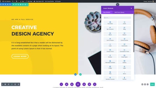
Divi Visual Builder
One of the most unique things about the drag-and-drop visual builder in Divi is the ability to drag out the margins and padding of the different elements. If you wanted more spacing between 2x sections, you could simply click and drag. Once you let go, it’ll automatically adjust the settings and once you click save, it’ll look exactly as you left it.
This is one of the main selling points for beginners. No longer are you required to hire coders to create magnificent looking websites, it’s easily achievable with Divi.
Pre-made Websites & Templates
If you are someone who is thinking of creating a web agency or you just love having options, you’re going to love what Divi has to offer. With over 175 premade entire websites as well as over 1250 premade page layouts, you’re never going to run out of templates to use.
The team at Elegant Themes have created all of these templates based on industries, so you can literally plug and play the websites where ever you want, whenever you want.
Divi Modules
The modules are what actually make a website look like something. There are over 40+ official modules you can use from Divi, and if you want to venture out, you can also download 3rd party plugins to add even more modules.

What is the difference between the Divi Theme and Divi Plugin?
There are two parts to Divi. The Divi Theme which has the Divi builder natively installed inside of the theme. Then there is the Divi builder plugin, which can be installed and gives you the ability to edit pages and posts on other themes.
Installing the Theme gives you a few extra customisations in the theme customizer tab. However, the plugin still has about 90% of what the Theme has. If you currently have a theme you want to keep using, adding the Divi builder plugin will allow you to keep your theme and add the power of Divi.
Is Divi bad for SEO?
No. Divi doesn’t have any effect on your websites SEO. The builder is light-weight and caters to the needs of Google’s search engine. Many websites use Divi and have no issue with search-ability, indexing or ranking. I have seen this first hand on my personal websites.

How much does Divi cost?
Divi has a few different pricing plans. You can either choose to pay $89 yearly or pay $249 for lifetime access. The great thing about this licence is there is no restriction to how many websites you can use Divi on. While other page builders limit you to 1x site, 3x sites or 10x sites, there is no cap with Divi.
When you purchase Divi though, you aren’t just purchasing 1x WordPress theme, your membership includes additional products too at no extra charge. You get the following products included in your Elegant Themes membership:
Extra Theme – Magazine-Style WordPress theme
Monarch – a Social Share Buttons plugin
Bloom – an Email Optin Popup plugin
Usually, the plugins alone would cost you upwards of $50 to get a licence for, but they are included free for you. The Extra theme is also a versatile theme I’ve used on many sites to quickly and easily create a magazine-style website.

Are there any cons to using Divi?
There are a few things that you eventually may face as a Divi user. Personally they haven’t stopped me using it, instead just caused a little frustration.
These things are:
While adding 3rd party plugins, if there is a compatibility issue between the 3rd party plugin and Divi, it can cause the builder to constantly load, but never load.
If you tend to create large pages with many working elements, it can draw a lot of CPU power and become slow. I have only run into this issue twice, but its an issue regardless.
If you use the native Divi elements plus plugins that are popular, you shouldn’t face these issues. It’s only when I’ve tried experimenting with new plugins or extremely long blog posts I have faced this.
Divi Review: Is Divi Worth The Money?
Short answer, Yes. The amount of templates, features, modules and ability to use Divi on unlimited websites is huge value for money. Top that off with the ability to own a lifetime licence for only $249 one-time and this will heavily reduce your website costs in the long term.
Similar companies don’t offer lifetime licences and charge by amount of websites it’s used on. This makes Divi one of the most affordable and customisable WordPress page builders available.
Hopefully this review has given you a little insight into Divi. If you haven’t yet, make sure you watch the Divi Review video so you can see the builder in action.
Bonus: Free SEO Course for BW Supporters!
If you decide that Divi is for you, I have a bonus for you. I’ve created an SEO Course which I’d love to give it to you as a gift if you purchase Divi from any link on this article. I’m an affiliate for Divi so I’ll get a small kickback at no extra cost to you, and you’ll get a free SEO course as a thank you from me.
I appreciate all who support this website and my Youtube channel, I hope you enjoy Divi!
source https://beginnerwebsite.com/divi-review/ source https://beginnerwebsite.tumblr.com/post/626023877829689345
1 note
·
View note
Text
Elegant Themes Divi Review – Is Divi Worth It?
If you are in the marketing for a new WordPress page builder, you’re going to love Divi. In this Divi Review, I’ll share everything you need to know about Divi plus why it’s now my main theme for building websites.
Limited Time Bonus: If you purchase Divi through any of the links on this page, you’ll get a Free SEO Course as a thank you for supporting me! More info below.
youtube
Whether this is your first website build or your hundredth. It’s becoming easier and easier when it comes to making your own website. With all the software and tools available, you can save yourself thousands of dollars in development fees, and do it yourself!
Gone are the days where you need coders to create a website from scratch with basic text and images. With page builders like Divi, you now have the ability to create incredible websites with a few clicks of a button and customise them to however your heart desires.
What is Divi?
Divi is the flagship product from Elegant Themes which is a theme, and also a page builder plugin that can be used on other themes. Unlike most other page builders, it runs off shortcodes which allows the code to stay light but flexible.
The first version of Divi went live in 2013 and was revolutionary for it’s time. To be fair, it still is pretty revolutionary even today. With over 2.7 million installs of Divi, it’s safe to say it’s one of the most popular builders when it comes to WordPress websites.
But what makes Divi so special? There are a lot of reasons why it’s become such a bit hit, so let’s dig into them.
Divi Features
The first and main reason people buy Divi is because of its drag-and-drop visual builder. With this feature, you are able to manipulate the live website to however you want using your mouse and keyboard.
To make this manageable, Divi has created 3x main elements to any page or post. Sections, Rows and Modules. Having these 3 elements available makes it easy to create any type of page using Divi no matter the experience of the user.

Divi Visual Builder
One of the most unique things about the drag-and-drop visual builder in Divi is the ability to drag out the margins and padding of the different elements. If you wanted more spacing between 2x sections, you could simply click and drag. Once you let go, it’ll automatically adjust the settings and once you click save, it’ll look exactly as you left it.
This is one of the main selling points for beginners. No longer are you required to hire coders to create magnificent looking websites, it’s easily achievable with Divi.
Pre-made Websites & Templates
If you are someone who is thinking of creating a web agency or you just love having options, you’re going to love what Divi has to offer. With over 175 premade entire websites as well as over 1250 premade page layouts, you’re never going to run out of templates to use.
The team at Elegant Themes have created all of these templates based on industries, so you can literally plug and play the websites where ever you want, whenever you want.
Divi Modules
The modules are what actually make a website look like something. There are over 40+ official modules you can use from Divi, and if you want to venture out, you can also download 3rd party plugins to add even more modules.

What is the difference between the Divi Theme and Divi Plugin?
There are two parts to Divi. The Divi Theme which has the Divi builder natively installed inside of the theme. Then there is the Divi builder plugin, which can be installed and gives you the ability to edit pages and posts on other themes.
Installing the Theme gives you a few extra customisations in the theme customizer tab. However, the plugin still has about 90% of what the Theme has. If you currently have a theme you want to keep using, adding the Divi builder plugin will allow you to keep your theme and add the power of Divi.
Is Divi bad for SEO?
No. Divi doesn’t have any effect on your websites SEO. The builder is light-weight and caters to the needs of Google’s search engine. Many websites use Divi and have no issue with search-ability, indexing or ranking. I have seen this first hand on my personal websites.
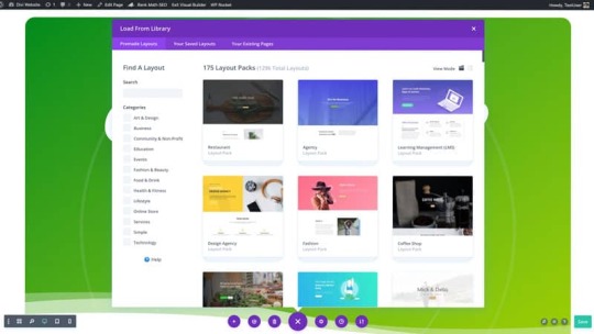
How much does Divi cost?
Divi has a few different pricing plans. You can either choose to pay $89 yearly or pay $249 for lifetime access. The great thing about this licence is there is no restriction to how many websites you can use Divi on. While other page builders limit you to 1x site, 3x sites or 10x sites, there is no cap with Divi.
When you purchase Divi though, you aren’t just purchasing 1x WordPress theme, your membership includes additional products too at no extra charge. You get the following products included in your Elegant Themes membership:
Extra Theme – Magazine-Style WordPress theme
Monarch – a Social Share Buttons plugin
Bloom – an Email Optin Popup plugin
Usually, the plugins alone would cost you upwards of $50 to get a licence for, but they are included free for you. The Extra theme is also a versatile theme I’ve used on many sites to quickly and easily create a magazine-style website.

Are there any cons to using Divi?
There are a few things that you eventually may face as a Divi user. Personally they haven’t stopped me using it, instead just caused a little frustration.
These things are:
While adding 3rd party plugins, if there is a compatibility issue between the 3rd party plugin and Divi, it can cause the builder to constantly load, but never load.
If you tend to create large pages with many working elements, it can draw a lot of CPU power and become slow. I have only run into this issue twice, but its an issue regardless.
If you use the native Divi elements plus plugins that are popular, you shouldn’t face these issues. It’s only when I’ve tried experimenting with new plugins or extremely long blog posts I have faced this.
Divi Review: Is Divi Worth The Money?
Short answer, Yes. The amount of templates, features, modules and ability to use Divi on unlimited websites is huge value for money. Top that off with the ability to own a lifetime licence for only $249 one-time and this will heavily reduce your website costs in the long term.
Similar companies don’t offer lifetime licences and charge by amount of websites it’s used on. This makes Divi one of the most affordable and customisable WordPress page builders available.
Hopefully this review has given you a little insight into Divi. If you haven’t yet, make sure you watch the Divi Review video so you can see the builder in action.
Bonus: Free SEO Course for BW Supporters!
If you decide that Divi is for you, I have a bonus for you. I’ve created an SEO Course which I’d love to give it to you as a gift if you purchase Divi from any link on this article. I’m an affiliate for Divi so I’ll get a small kickback at no extra cost to you, and you’ll get a free SEO course as a thank you from me.
I appreciate all who support this website and my Youtube channel, I hope you enjoy Divi!
source https://beginnerwebsite.com/divi-review/
1 note
·
View note
Text
HOW TO MAKE A SIMPLE BOOK COVER IN ADOBE SPARK

Read this post on Wordpress...
Making a cover for your upcoming project can help it feel more real and give you motivation to keep going. (After all, you spent time making a great cover, better not stop!) If you don’t need something elaborate, Adobe Spark can be a simple way to bust out a basic image. You can use this as your project thumbnail on NaNoWriMo or the cover of a draft print. Later I will do a tutorial about general cover design for more complex/unique images, but for now, here’s how to make a cover in about a half an hour or less.
So first, you will need an Adobe account to use at Adobe Spark. Once you’ve signed up, click ‘create a project’ and choose ‘Flyer.’ (It gives you a book cover-esque proportion, since they don’t have a special book cover option.)

On the right side of the screen, click ‘templates’ and browse around. The ones with the shield icon are premium, but there are still decent free ones. Search around until you find one you like and apply it. Be open-minded; applying different colors, fonts, and images to a template can make it look very different. I won’t hew too far from this base image for my example, but you could really personalize it with some effort.

So first things first, I click on the title and select ‘edit.’ A window will pop up for you to change the text. On the right side, you will see font options.

I’ve filled in my very creative title and author name and played with the font. You could move the elements wherever you like, but I will stick to the template for now.

That big X is actually an icon. There is a big selection of images to choose from, or you could upload your own. I changed it to a rose, because why not?

Now I’ve selected the top left picture. On the right I can move and scale the image, apply filters, etc. For now, I will replace it with a different picture.

I found a picture of a crow, zoomed it in and centered it. On the bottom right corner, you can see the shape vignettes that change the overall shape of the picture. Besides using the search to find a stock picture, you could upload your own.

Now I’ve changed the top right picture and selected filters to darken and make it black and white.

If you scroll below the filters, you have the option to blur the image, which can be useful if you want text in front of it to be more legible.

A fun thing to try is to select ‘Design’ and then ‘Variations’, and try out different layouts. Be sure to save first! It will automatically recolor and rearrange the images/text you selected. As you can see, it rearranged the text so the title is no longer on top, so you may need to adjust that kind of thing. Play with the variations but don’t select a new template, or it will replace everything you’ve done. (It automatically saves the old project and starts a new one if you do select a new template.)
A warning — If you close the window or navigate away, it will save your project in its current state. I’ve lost some important work that way! If you want to edit a project, be sure to duplicate it first on your projects page so you don’t accidentally lose your original work.

Don’t forget!
So here are some variants I made by just selecting different options. You can change the colors and images just like as before. Even if the variation shows a different orientation/size than what you have, it will automatically rearrange to fit your current dimensions.


Once you find a layout you like, you can select the colors option on the right side and choose a color palette that will automatically recolor everything for you. When you have a palette selected, you can randomize where the colors are used, or rearrange them manually.


You can also choose custom colors or select their suggested ones.

When you’re satisfied, be sure to title your project in the upper left corner, and make sure it’s saved. Then you can download the image in a larger size on the right side of the window. For free accounts, it may tag the image with the spark logo, but it’s very easy to crop out or paint over. All your projects will save to the ‘projects’ section on your main Spark page.

I’ve made a lot of quickie covers this way, that I usually replace down the road, but it can feel good to have a cool looking thumbnail for your story. Experiment with all the options and filters. At first you might end up with some wild junk, but you can make something decent once you get used to the tools.
I hope you found this tutorial useful, and I’d love to see what covers you make for yourselves! Feel free to share them with me, and I’ll write more extensively about covers in subsequent posts.
1 note
·
View note
Photo

WORKSHOP SHOUT OUT | SKATEISM | VANS US OPEN
It’s the last weekend of the Vans US Open of Surfing, but we’re not ready to go just yet!
We’ve still got some of our favorite workshops over the week to share –like the fun folks over at SKATEISM who hosted a zine making workshop at Van Doren Village. We caught up with Tobias from SKATEISM to find out what folks created, more about the zine making process, and what special gift they're giving out on this final weekend.
Introduce yourselves and tell us a little bit about Skateism. My name is Tobias Coughlin-Bogue, and I’m the online editor for SKATEISM. The magazine was founded by Christos “Moch” Simos and Oisin “Osh” Tammas in Athens. It began as just a little local Athens skate blog in 2012, but when Osh signed on they started doing more English-language posts and international coverage. Moch is one of the only out skaters in Greece, and at some point he and Osh realized that the stories they were most interested in telling centered around that… as well as some other areas of skateboarding they felt had been neglected like skate charity, global scenes, and women’s skateboarding. They also realized they wanted to make a magazine, as a place for underrepresented populations in skateboarding to see themselves in a proper print publication. Two years and four issues later, that’s exactly what they’ve done and we’re very proud to present Issue #4 as the Pride issue, focusing on the experiences of LGBTQ+ skaters.
Take us through your workshop and what were you doing with attendees at the Vans US Open? Essentially we facilitated everything to make a zine except shooting photos or binding the final copies. We had prints of images on hand for people to cut and glue onto cardstock, creating what’s called a “master” page. Masters are what zinemakers make photocopies of that they then bind together into their final zine. We started the workshop by talking a little bit about what zines are and why we think they’re so cool. We covered the zinemaking process, and then dived right into it.
What about zinemaking do you think is super fun and accessible? Zinemaking was a fundamental part of the pre-internet skate culture. While it isn’t exactly a necessity anymore, when it comes to communicating our own unique visions of skateboarding it’s still super fun to do. It forces you to take all the things that catch your eye at an event like the US Open, that might be a quick Insta story or something, and put them all down on a page together in a thoughtful way. Plus we like writing about skating, and zines incorporate a lot more text than some of the forms of storytelling we do on social media these days.
As far as being accessible, well zines were kind of the social media in skateboarding (and punk and queer scenes too) before social media existed. They were cheap to make and there was a broad network of people sharing and exchanging them around the country, all interested in the same kind of subcultural topics. If you had an idea you wanted to share, you could just paste the images and words that capture it best to some backing paper and get to photocopying. Then mail it out to a distro or drop it off at the skate shop and — boom — you’re a publisher.
Obviously a lot more work goes into what we do with something like SKATEISM, which takes hours and hours of reporting and editing and designing to make, but I at least got into the world of skate media via zines, and I have a huge soft spot for them. For what I do, and what a lot of people getting into media these days do, learning to publish fast and loose is actually really helpful, because that’s the pace digital media operates at.
What type of materials did you have on-hand for folks to work with? We shot a few photos of the first weekend of the event on Kodak Fun Savers (a very accessible and enjoyable way to source art for your zine!), and made photocopies of the best exposures. Plus, we had copies of some pages from past issues of SKATEISM… And of course all the scissors, glue, card stock, staplers, and other stuff folks needed to put together their own master pages. We encouraged attendees to supplement the images we’ve provided with writing and drawing that documents their own experience at the event!
Are there any rules to zinemaking? Have a good time doing it and don’t be hateful. That’s about it.
Any tips you’ve learned over the years for readers who may want to try creating a zine on their own? Just start doing it. To borrow a concept from Ira Glass, you know what you like to see on the page, so keep trying until the stuff you make starts to look like that. Don’t stress out too much if it doesn’t work out at first. Technically speaking, it’s really important to think in terms of spreads (two individual pages facing each other is one spread), and understand that a magazine is essentially a bunch of sheets of paper stacked up, stapled, and folded in half. Making sure that the individual pages in the spreads line up correctly can be tricky, so it might help to take a bunch of blank sheets of paper, bind them, write page numbers on them, then remove the staples and use them as a template for what to paste on each master page as you’re working.
What other zine techniques can people incorporate besides cutting and pasting? Doing it by hand is obviously the classic method, and will get you the most zine scene cred. But I am not ashamed to admit that, after two issues of cutting and pasting my first zine, I started scanning my photos and putting it all in InDesign. There is no shame in using layout software, and it will give you a whole new appreciation for how much thought and effort goes into every single print publication you ever read. It’s not just what they’re writing and which photos they’re publishing, but where on the page that stuff is, where it is in relation to the other stuff, what color and font things are, what angles they’re tilted at, what the background is, and so on... It’s definitely a different look and feel than handmade, but now that design software is so accessible, we think it’s every bit as DIY.
What did participants create and walk away with after the workshop? Well, besides hands on experience making zine master pages, we’re going to take our favorite masters and make a limited run of a compilation zine to give out on the final weekend of the event.
So we’d like anyone who enjoyed the workshop to come back and grab a copy of that! And failing that, just a better understand of the zinemaking, DIY ethos that skateboarding was built on. Skateboarders have always made their own spots, their own rules, and their own fun. That definitely applies to their media too.
Who are some of your favorite zine makers? In the areas we’re focused on, you can’t not mention Xem Skaters by the Swedish nonbinary skater Marie Dabbadie. They’ve been making a rad, unapologetically genderqueer zine for years, and have done loads to change the conversation around gender in skateboarding. Of course, The Skate Witches are killing it too. In terms of general zines that I like, I grew up volunteering at the Zine Archive and Publishing Project in Seattle, which had copies of really rare ‘90s skate zines like Pool Dust, so I tripped out on those a lot growing up. Not ‘cause I’ve ever actually skated a real pool, just because they had this really scrappy, no bullshit aesthetic and made skateboarding look so cool.
Recently, I was on a team for Thrasher’s “Zine Thing” Challenge in Seattle, which gave people two weeks to shoot a zine with Fun Savers; two weeks to do writing, editing, and layout; and then gave awards in different categories. Looking through the compilation book of all the entries still blows my mind. It’s a great reminder that skateboarding is full of cool, creative people, and everyone has a wildly different experience of it. I still can’t pick a favorite, although Leo Bañuelos' ’Skaters in Drag’ article is pretty legendary.
Three words that describe what Skateism is all about? The underground and overlooked. Sorry that's four!
Who or what were you most excited to check out at the Vans US Open? Personally, I’m excited to finally skate Cherry Park (nearby). But that’s just because my joints are falling apart and I can only skate low ledges. At the Open, I was excited to see all the pros skate the course, especially the women. Women’s skateboarding has been growing at an insane pace in the last few years, and the level of talent is out of control. When I started skating, I never thought I would see little girls back-smithing huge hubbas and female pros filming back-tail-kickflip-outs for their video parts, but here we are. The rate of progression is so exciting to me, and I feel like people will definitely be throwing down for the event.
FOLLOW SKATEISM | WEBSITE | INSTAGRAM
#Art#Vans#VANSUSOPEN#SKATEISM#ZINE#ZINE MAKING#WORKSHOP#HUNTINGTON BEACH#SKATE MAG#PRINTED MATTER#COLLAGE
14 notes
·
View notes
Text
Top 3 Ways to Create a Roku Channel
https://tvchannelpros.com

Are You a Material Creator or a Coder?
Most prospective Channel Publishers wouldn't have the moment nor the persistence-- nor in many cases, the sources-- to learn to develop a network this way. As a matter of fact, I've discovered that most ambitious Channel Publishers are NOT coders by any means, shape or type-- the majority of are material designers, and also material developers don't have the moment to find out just how to develop Roku Channels from square one. They would certainly much rather be doing what they do best-- producing web content.
Since that very first channel, I have actually developed and launched numerous channels for many years. The code itself hasn't changed (much), only the different procedures by which we code and also develop channels has transformed. Various software application as well as SaaS (Software Application as a Solution) items have actually because come into play (supposedly) making channel growth much easier for the Do-It-Yourselfer, however also for coders like me, they can commonly be time consuming and costly to discover. Some programs have reoccured, others have actually stood the test of time-- as well as are truly fantastic products for creating networks-- but once again, there's that finding out curve, and that time variable, which power element that go into producing them. For me, it's what I do. For TELEVISION Network Pros, it's what they do. For you, it's most likely not how you intend to spend your Saturday afternoon.
The 5 C's of Roku Programs
If you CAN diy, I would certainly recommend doing it. You might even intend to take into consideration taking my new Do-It-Yourself Roku network workshop. It will certainly be an enjoyable and gratifying experience to finally get it best and see your ended up Channel on the TELEVISION screen. Doing-It-Yourself CAN be costly, nonetheless. Along with the moment as well as energy, you'll need the vital parts that enter into every Roku Channel. I call these the 5 C's of Roku Stations:
1. Idea-- this is your CONCEPT for your Network, it includes the logo design, graphics, layout and also layout aspects of your channel that make it eye-catching to customers. This is the FUN part of establishing your Channel.
2. Code-- this is the actual shows (as in computer shows, not television programming) for your Network. It consists of the channel code as well as the network "feed" that requires to be developed for your Channel. (The feed is code that provides your web content to your channel from your Web content Delivery Network (CDN), both of which I go over following.) The network code must be written in Roku's exclusive BrightScript and the channel feed should after that be composed in either MRSS XML or JSON. This is the TECHNICAL component of establishing your channel.
3. Content-- this possibly do without stating, but your web content is the video clip material you intend to disperse using your Network. You must currently have that. (I'm going to tell you where to get more for FREE in a couple of minutes.) Content needs to gathered, uploaded, inscribed, after that links need to be produced for both video and also screenshots, after that those web links should be contributed to the code (above), and after that titles, summaries, periods as well as various other metadata in most cases must be included as well. This process is called, "Material Intake" as well as it is the most TAXING part of establishing as well as launching your Channel. Beyond the coding, the majority of the WORK will certainly remain in Web content Consumption, linking, etc., going forward.
4. Content Delivery Network (CDN)-- this is an unique server on which your content is stored AND from which it is streamed to your Channel. For a lot of, this can be the largest cost. A CDN resembles host, yet NOT. You can not make use of conventional web hosting to shop and also serve your video material to a Roku Channel. You CAN NOT connect your YouTube videos and offer them from YouTube to your Channel, either. If you could, then this would certainly all be a whole lot less expensive to do. But you can't. And it's not. Though Roku and Connected TV usage "Internet Method (IP)" to stream web content, they just can not stream directly from the Web. (There's a long as well as technological answer to this that is possibly beyond the extent of this book.) Rather, you require to make use of a CDN that is created especially for streaming to Connected Television platforms. The CDN alone can set you back anywhere from several hundred to several hundreds of bucks simply to establish, and afterwards in most cases there's month-to-month charges and TRANSMISSION CAPACITY fees. If you're Doing-It-Yourself, this is one of the most COSTLY component of establishing as well as launching your Network.
5. Commitment-- Once you have every one of the above in place, the MOST INTEGRAL PART of creating and introducing your Network is making the COMMITMENT to manage it, keep it and update it often. You can toss a Channel up on the system and also never touch it again, and you will still get customers-- a minimum of one or two times anyway. They'll visit your channel the first time, search your web content as well as possibly find something to see. After that they'll return a couple of days or a week or a month later on to see what's brand-new. If there's nothing new, they most likely will not come back again. The KEY to an effective Roku Channel is to maintain your web content FLOWING; to keep it upgraded as well as fresh, often. That takes commitment.
If every one of that appears easy sufficient to you, after that I entirely suggest you attempt Doing-It-Yourself. I'll also advise THREE programs right here that will certainly help:
Roku Direct Author
Roku uses its own, totally-free channel-building system readily available at http://developer.roku.com. You merely sign-up and also comply with the directions to develop and release your own network. It's all window-driven, much like adding a product to eBay. You give your Channel a title, you include summaries, you select shades, upload logo designs (in the required dimensions as well as styles) and more. Nevertheless, it does have some noticeable challenges for the amateur Channel Publisher
Getting Started with Roku Direct Publisher.
First, you will still need your very own Web content Delivery Network (CDN)-- once more, this can set you back anywhere from numerous hundred to a number of hundreds of dollars, plus month-to-month costs and also transmission capacity in many/most situations-- OR you can use TV Channel Pros's Material Distribution Service (CDS) which is a much less-expensive choice to costly CDNs. TELEVISION Channel Pros CDS gives the same high quality of service and reliable streaming as the more pricey CDNs but at a portion of the price, beginning at simply $12.95 a month, depending on just how much content you have to serve, without any additional bandwidth costs.
Next Off, Roku Direct Publisher requires every network to have its own channel "feed." This is a separate item of coding that provides instructions to the CDN (or CDS) above as to what video web content to reveal and also where. You'll need to create your feed in either MRSS XML or JSON. After that you'll require a place to ORGANIZE your feed. (The feed can in fact be held on typical host, whatever that costs you.).
The Feed File Obstacle.
Creating a feed documents is where most aspiring Do-It-Yourselfers struck a wall surface. Unexpectedly, the "very easy method" to constructing a channel ends up being much more complicated and lots of surrender. Never ever fear though, due to the fact that TV Network Pros currently uses customized MRSS XML and JSON Feed Themes that you can use (starting at just $49.95), in addition to simple-to-follow guidelines and also technology assistance to aid you obtain your feed right. You just copy-and-paste your web content links right into the feed file design template, add titles, descriptions, etc., for each video, as well as BOOM, you have a Roku-Ready feed for your Channel. TELEVISION Network Pros will certainly even HOLD your feed file for a small month-to-month fee.
Cost of Making Use Of Roku Direct Publisher.
All in, given you have your network logo and graphics to start, establishing a channel with Roku Direct Author (cost-free), plus TV Network Pros CDS solution, their customized MRSS XML or JSON feed, and organizing for your feed, you're looking at just $73 a month to introduce Do-It-Yourself, not consisting of the time and also power and also sources that go into ingesting your web content to the CDN, or into handling, preserving as well as upgrading your Channel every single month.
Instantaneous TELEVISION Channel.
Another great tool for the Roku Channel Do-It-Yourselfer is Immediate TV Channel (ITVC)-- http://www.instanttvchannel.com. This is a "cloud-based" Roku development service that sets you back $49.95 a month. I've personally utilized it for a number of networks and I enjoy it. It supplies better adaptability in creating your channel. You can develop various formats, you quickly incorporate sophisticated capability, you can incorporate more advertising and marketing streams than you can with Roku Direct Publisher, and a lot more.
With ITVC, you may find the arrangement part is a little difficult and also involved than with Roku Direct Publisher, but ITVC makes the "feed" part much easier by doing that help you. Rather than needing to code your video clip material directly into an MRSS XML or JSON feed, ITVC creates and also keeps the feed automatically. You simply include your video clip titles and also summaries, along with your video links and screenshot links right into ITVC's Interface, rather than right into a code documents, as well as results are instant. (Thus the name, "Instantaneous TELEVISION Channel.").
You Do Not Required a Feed Documents.
With ITVC, you won't require a feed data, however you'll still need organizing for it as well as for the different code files ITVC immediately creates and updates for your channel. With ITVC you don't truly have a selection for that since it requires you to use Amazon AWS, which incidentally, is totally-free for the very first year and afterwards $1-- 10 a month after that, depending upon how much web traffic your channel gets. With ITVC, you'll still require a Material Shipment Network (CDN), as well as once again, your best and least-expensive alternative for that would certainly be TV Channel Pros Web Content Distribution Service (CDS) starting at just $12.95 a month.
Expense of Making Use Of ITVC.
Done in, the price to launch a Roku Network utilizing ITVC ($ 49.95/ month), Amazon AWS (totally free for one year) as well as TV Network Pros Content Delivery Solution (CDS) can be just $63 a month. Once more, just like Roku Direct Author, that doesn't consist of the moment and power as well as resources that enter into consuming your content, or into managing, keeping and also updating your Network each month moving forward.
Network Screening and also Approval.
With both of these solutions-- Roku Direct Author and also ITVC-- the network testing as well as authorization process can take anywhere from one to six weeks. (As well as no one ever actually understands precisely the length of time.) So make sure to take that right into factor to consider when finding out your network's launch and also promotional schedule.
A Faster, Easier Service is on the Following Web page.
Keep in mind MOST OF THE FUNCTION (that is, the "labor,") involved in establishing, introducing and preserving a Roku Network hinges on Content Ingestion and also Channel Management. Prior to you determine to Do It All Yourself, you need to quit and also believe just how much your time is in fact worth to you. If you have the time as well as the patience to do it, as well as to find out exactly how to make use of the above programs, of course, do it. Otherwise, below's a much FASTER as well as SIMPLER way to develop and introduce your very own Roku Network, despite your budget. Time- as well as energy-wise, this is most definitely your least-expensive choice:.
TV Network Pros Complete Roku Channel Program.
TELEVISION Network Pros provides three channel plans. When considering which strategy is ideal for you, consider the quantity of time that would in fact go into consuming and creating links for each of your video clips, then literally linking them into your network code, including titles, summaries, screenshot links, and so on. You'll swiftly see why each plan is a great deal in connection with the amount of video clip content as well as job involved with each-- and on top of that, THEY do all the work for you on a continuous, monthly basis, as-needed.
There's just NO much better means to create and introduce a Roku Channel. Where it can usually take 1 to 6 weeks for authorization with the other remedies, with TV Network Pros, you can see your brand-new network authorized in as low as 7 days. https://tvchannelpros.com
1 note
·
View note