#lightbox trick
Explore tagged Tumblr posts
Visit Tumblr Blog
Explore Tumblr blogs with no restrictions, modern design and the best experience.
Last Seen Tumblr Blogs


Fun Fact
Tumblr was acquired by Yahoo for $1.1B in 2013.
Text

Demon King of Sitting in Ways that Kill Your Joints. Three Ways to Fuck Up Your Knees. Is this anything.
(click it!)


163 notes
·
View notes
Note
trick or treat! (I love merch pics and want to see more)
COME ON AND SLAM! AND WELCOME TO JAPAN!! for u yanyan it's kagami with the m&m dunk!!!

5 notes
·
View notes
Text
Some Tumblr Tricks
1. Get a random blogpost from a blog
You like the content of a blog but theres just so much content and you want to see some older stuff? Great, just append /random to the URL and a random blogpost from that blog will be shown:
BLOGNAME.tumblr.com/random
2. Use Keyboard Shortcuts
When you are on your dashboard you can use the following keybinds:
J -> Scroll forward K -> Scroll backward L -> Like the current post N -> See the number of notes Shift + E -> Add post to your queue Shift + R -> Fast reblog Z + Tab -> Quickly switch between dashboard and blog Z + C -> Quickly compose a post Space -> View photoset in a lightbox or start playing a video post
3. More URL tricks
Show all posts with a specific tag:
BLOGNAME.tumblr.com/tagged/<tag>
Sort entries with a specific tag in chronological order
BLOGNAME.tumblr.com/tagged/<tag>/chrono
Get all Posts from a date
BLOGNAME.tumblr.com/day/JJJ/MM/TT
PS: Do not forget you can go totally crazy with the custom theme editor by for example adding a music player https://www.scmplayer.net/ or whatever. Make personal websites cringe again!
2K notes
·
View notes
Note
Hi, I was wondering if there are any updated tutorials on how to make themes? Also, if you publish this message, maybe some might suggest tutorials, base codes? Thank you, have a great one *hug*
hello hello nonny! sorry it took me days to reply but basically:
start with the tumblr documentation and familiarize yourself with the post blocks. then, you can choose base codes. the most updated ones are by eggdesign which are:
npf based template (this one supports new posts)
and this basic base one
if you opt to build your own, it is important that you have these scripts:
unnested captions by magnusthemes and neothm
npf fix by glenthemes
lightbox tutorial by shythemes
then, there's the designing parts:
google fonts for fonts of any kind
learn html x learn css by w3schools
phosphor icons. or you may browse glen's collection of icon fonts.
flex-box tutorial to make your designing easier
and on the advanced side, learn how to make anything responsive/mobile friendly
additional tutorials maybe found in w3schools and css-tricks.
idk if you'd like modals/popups but this is the tutorial that i use. and as for multiple tabs, i use this script too.
and shamelessly advertising my credits page because it's a masterpost of some sort that helped me with my coding journey
also just a tip, when coding anything, picture the lines that u input as a language of its own and picture how it wants to portray a div ^^
12 notes
·
View notes
Note
hi! I saw your post on linocut (?) prints, and wondered if you have any tips for carving. I really struggle with working with flipped images and getting depth right (I also struggle with describing things, so hopefully all this makes sense). If they were some other kind of print, you can totally disregard. Your art looks cool! Keep up the great work :)
I'll certainly do my best! As far as flipped images go it depends on how I'm getting the images onto the block and what the material is (rubber vs real lino vs the gray stuff). The only time I really mentally deal with flipping the artwork is if I'm drawing directly on the block which is rare; I nearly always draw on paper or digitally first. Sometimes I can draw in heavy soft pencil and then just lay the drawing directly onto some materials, like the rubber blocks, and rub the back hard with a barren or spoon. With linocut or the gray stuff I either just use carbon transfer paper or I'll print the art as-is and glue it art-side-down onto the lino with PVA glue. You then very carefully and gently wet the paper and rub away the paper fibers while leaving the printer ink/pva glue layer in place. The carbon paper trick is to draw however you like, use either an old tv screen or a light box, flip the art over, lightly retrace the drawing in a colored pencil (it'll be mirrored), sandwich lino-->carbon transfer paper-->the artwork (mirrored side up) and then trace the image like normal. It'll appear flipped like your lightbox traced side, but will print normally like the original artwork. As far as depth goes definitely ask more printmakers than just me. But I handle depth one of two ways: 1) I picture how the ink squishes or spreads in my mind. Just a little; it's not huge. I then make sure to carve deep enough to hold that bit of squish over. Printing technique is huge here; it's easy to overink a block. 2) I imagine while I'm cutting that the lines need to be supported by the rubber/lino below them sort of like a buttress. If you could make a cross section of a linocut line on the block it should look more like a trapezoid and less like a square. The more negative space around a black line and the thinner the black line is the more important this is. Lines that are very close together tend to support each other & spread the pressure out so their buttress angles can be steeper. If you have a large black area with lots of small negative space marks (Like a black wolf with little white gouges for fur texture) you almost don't have to worry about this. I am FAR from an expert, but I hope this helps! Definitely ask other printmakers. Printmaking is newer art territory for me so I'm sure more experienced folks can offer you more or better tips. :)
17 notes
·
View notes
Text
I know we're all complaining about the new layout — I know, it's really stupid, it looks like Twitter — but I want to share with you this bug report I sent to Staff, as I believe it contextualises why the "changing features that aren't broken just because you can" ideal from Tumblr's higher ups ends up making the lives more difficult for a lot of its users; more specifically disabled folks.
Good afternoon, When using Lightbox View I need to click on the image for the caption to disappear — this is absolutely necessary as I'm visually impaired, and have the letter size on max, and when viewing an image the Lightbox View caption occupies an excessive amount of my screen, so seeing an image is not easy — however this made me discover two things:
1. If you click on the area where the caption is, even when it's hidden, it will take you to whatever blog was in the caption. This is quite annoying as I'm actually trying to zoom in but keep being accidentally transported to someone else's blog. (AKA the caption seems only to become invisible, but it's still there, so when I click around the caption is supposed to be it'll act as if it's still there)
2. If you try to zoom in in that caption area not only can you not zoom in but it will also make the caption appear again, however you won't be able to make it disappear again by clicking on any area of the image. The caption will be there without you being able to make it disappear. I will add obviously none of this was a problem in the old image viewer, I don't have any intrusive captions or accidentally going to other images and blogs that I don't want to go to. Please I beg you to give us an option to return to the old image viewer on the dashboard. You also made it more difficult to click on a post to only see that specific post, something I did a lot since it allowed me to use the old image viewer. Previously I could click on the user's name and it would open it on their blogs. That would do the trick. Now you have to click on the surrounding blank space but because, again, of my accessibility features I need to have on to be able to use Tumblr, there are almost no blank spaces available for me to click on! I assume you're aware this is not a problem of the accessibility features themselves, as I had no qualms about any of this previous to these new features being implemented, but a fault of your new features that are inaccessible and are causing more harm than good.
#Give it up for lighbox view biggest hater: me#we can also see that the new thing of sending people to OP's blog without showing the actual post we're clicking on#affects not only the prev tags problem#more than affecting the “Tumblr ecosystem”‚ which admittedly it does‚#it makes it extremely more difficult for me to use the old image viewer#which is the one that actually works best for me#tumblr#tumblr updates#lightbox view#prev tags#gle original#I don't care they keep saying they won't give the option to have the old image viewer back#I'm gonna keep complaining because it genuinely affects me#disability stuff#disability
20 notes
·
View notes
Text
it's very discouraging, sometimes, trying to run an accessible blog. every day more images without IDs are posted, every day the notes break and i save yet another post to my pile of drafts, every day it seems like more people ignore the image descriptions added to their posts.
staff isn't helping at all. every change they make seems to make the site and app more and more inaccessible to people with impaired vision, flashing light sensitivity, and so many more. did you know that twitter actively encourages adding alt text? on tumblr, you have to know to click the little dots on the image, you have to know what alt text even is, and then you have to write it with just one line of text visible at a time.
the new lightbox is bad. unequivocally and absolutely. it's basically impossible to zoom in to any image without scrolling (???) and seeing some completely unrelated image posted by someone who you do not follow.
i'm just tired, i guess. i'm tired of writing IDs that get ignored, i'm tired of asking OP to add them to the original post, i'm tired of requesting fast gifs be tagged as flashing lights and fake posts as unreality.
i know it's a universal good to write IDs. i know it's not all bad. i know there are more accessible bloggers to follow and discords to join and tricks to learn so it's not all bad! but it's hard to find the point in the face of more and more images being posted and reblogged and shared. i don't know. i'm tired.
#delete later#rant#vent#vent tw#long post#negative#i meant to write this more positively but it ended up being a rant. whoops#add image descriptions to the original post it's not enough to just reblog it ughhhhh#i got stuff to do. whatever
3 notes
·
View notes
Text
A Midsummer Night's Dream: the request was for a lightbox Moon assembly, with the ability to look like the Moon (illuminated from the inside) or look like--some other thing in some moments (illuminated from the outside).
It began with a steel frame and plywood:


with the interior done in white (for reflectance, of course), on which would be a piece of fabric (in this case a sheet, literally) with Moon details painted on. The "trick" was the details needed to be in reverse so that when not illuminated from within it would just be a blank white surface. So, working from one of the numerous photos I've shot of the Moon for reference, layers of white glaze were applied to stretched fabric

illuminated from beneath so that the amount of opacity could be seen during execution. I chose to work with white glazes so that any bleed-through would detract as little as possible from the original white surface of the fabric; there was some bleed, but it doesn't really read beyond a few feet away.
In the meantime, the interior and exterior of the box got LED tape:

and once the painting was done, the fabric was applied:

then it all went on a batten

cabled, patched-in, and voila: once cued up, there was a fair representation of

Moon. Turning on the outside LED tape resulted in this look:

Theatre magic.
Paint and photos: R. Jake Wood and Rachel Bradshaw.
Scene Design: Rosalind Isquith. Lighting Design: Nina Pebeashy.
0 notes
Text
My controversial opinion is that it's easy to see.
If you hold it up to the window or a lightbox so the knitting is backlit, the stitches are as clear as white yarn on a dark background.
I also use this trick with fur yarn.
i just want knitblr to know my current project is a lace shawl and i am using black suri alpaca for the yarn. please react accordingly
467 notes
·
View notes
Text
It's Okay to Have a Playing Card "Lost in the Shuffle," But Don't Let Your Eyes Stray During that Legerdemain
Playing later today @hotdocs is Lost in the Shuffle, a deft look at how #magic adapted the 52-card deck to every performers repetoire! and its evolutionary advances too! #documentary #moviereviews
Playing at Hot Docs May 1 8:15 pm at the TIFF Lightbox 1 Toronto, Ontario Everything that viewers want to know about how the deck of cards came to be, why it’s played in certain social circles and when stage magicians embraced it for their tricks is well covered in the documentary Lost in the Shuffle. Just when I thought it concerned revealing how a few tricks are done, there’s more to this stage…

View On WordPress
0 notes
Video
Stitch Brushes-Vol-3 from Raya Studio on Vimeo.
50 Seam & Stitch Brushes - Vol-3
Sometimes, in the projects we do, we need to do a seam of stitches in our work, especially seam and stitching fabrics. And one of the most important tools that can add to the quality and speed of our work while working are ready-made brushes, and today we are going to introduce one of these brushes called 50 Seam & Stitch Brush to you. We hope that we can add speed and quality in your projects and works Thank you for your time.
Let's get more information about this product:
- Zbrush Brush (ZBP) - 50 Brushes & 50 Alpha (4k Resolution ) - PSD (Alpha) - PNG (Alpha) - TIF (Alpha) - JPG (Alpha) - Preview - Help Text File
NOTE:
To use the ZBrush brushes you need to use at least ZBrush 2018 and Onwards.
How to Install:
Just copy the brush file in the path below:
C:\Program Files\Pixologic\ZBrush 20**\ZBrushes
Select the brush on your lightbox ''Brush'' Panel
Please rate and review this Product , It could be beneficial for me, and follow me to get information upcoming products.
If you have any questions please contact me through my email:
[email protected] . . . . . .
Other Product:
50 Fabric Brushes - Tension & Compression Folds - Vol-2 artstation.com/a/31255458
25 Trick Hard Surface Modeling artstation.com/a/13043345
101 IMM Chain Curve Brush - Vol-1 artstation.com/a/31065685
Ornamental Pattern - Vol-1 artstation.com/a/19526431
50 Brass Knuckles Base Mesh artstation.com/a/19797294
0 notes
Text
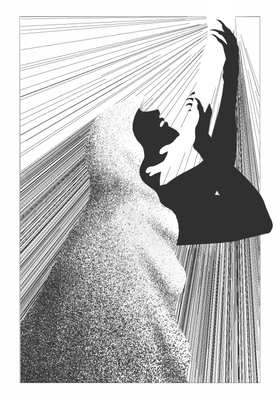
redraw (light mode users try clicking it! dark mode users there's a solid version below)
My favorite tags from @borealiszero that gave me the strength to finish this

#orv#omniscient reader's viewpoint#secretive plotter#art tag#ink#i wanted to draw the Plotter crying but i realized that with the silhouette i. i didn't know where his eyes were#but anyways yeah it's a lot easier to get the image i want digitally#especially that border#very important#it's implied in the original post but i felt like drawing it traditionally would make it stand out too much.#the original drawing is smaller than my palm. no room for details really#i was wondering whether i should have one of his claws reaching beyond the border but just his elbow is enough#the file name for this is 'holy elbow' because of that and because the origin of the light rays is the white hand's elbow.#as for who the white hand is#well they're drawing him out. you can interpret that sentence in a number of ways#but they're definitely not a part of his canvas. not drawn in the same ink. but their presence or lack thereof is felt#and maybe by his reaching for that person he begins to fill the empty space in their world#maybe by becoming a constellation they can share space on the canvas with him#lightbox trick
73 notes
·
View notes
Note
Happy Halloweeeen!!! Trick or Treat!!! <3
HAPPY HALLOWEEN!!! LIO FOTIA HAS A MILKY WAY FOR YOU

#inbox trick or treating#🥰🔥🍬#i should change the lightbox backdrop to black for today but i don't... know where i've put the other backdrops lol
3 notes
·
View notes
Text
Creating Beautiful Shots: Tips and Tricks for Liquor Photography in Louisiana
Liquor photography is a specialized field that requires attention to detail and creativity to capture the essence and beauty of the product. In Louisiana, where the beverage industry is thriving, there are various tips and tricks that can help photographers create stunning shots for liquor brands. Let's explore some of these techniques.
1. Lighting: Proper lighting plays a crucial role in liquor photography. Soft, diffused lighting works best to avoid harsh reflections and to bring out the rich colors of the drink. Using a lightbox or LED lighting can help create a professional setup.
2. Props and Background: Choose appropriate props and backgrounds that complement the liquor being photographed. For example, a rustic wooden table or a vintage bar setting can enhance the mood and overall appeal of the shot.
3. Composition: The composition of the shot is vital in creating an attractive image. Experiment with different angles, such as close-ups or overhead shots, to capture the unique features and details of the bottle or glass. Framing the shot with complementary elements can add visual interest and balance to the image.
4. Styling: Pay attention to the presentation of the liquor. Clean glasses, carefully positioned ice cubes, and garnishes can add an element of sophistication to the shot. Additionally, capturing the product being poured can evoke a sense of motion and liveliness.
5. Post-processing: After capturing the shot, use photo editing software to enhance the final image. Adjusting the color balance, sharpness, and brightness can help create a visually appealing image that accurately represents the product.
6. Creative Techniques: Experiment with creative techniques to bring out the unique qualities of the liquor. For example, capturing the drink in motion by using long exposure or photographing it against a vibrant backdrop can create a dynamic and eye-catching image.
In conclusion, liquor photography in Louisiana can be a stunning and creative endeavor that captures the essence of the drink production. By employing various tips and tricks such as proper lighting, composition, styling, and creativity in post-processing, photographers can create beautiful shots that highlight the charm and allure of liquor brands. Remember to let the product shine without overly promoting it and focus on creating visually appealing imagery that engages the viewers.
0 notes
Text
also i still fucking hate the new lightbox. and i hate how they’ve subtly implemented it even on blog view and original posts instead of just dashboard. it looks like absolute shit with transparent images. transparency trick art was one of the coolest things you could do here that was unique. now it’s just gone. all those artworks have broken. it’s sad. and infuriating. how does this make anyone’s experience better?
0 notes
Video
youtube
Divi Theme Wizardry: Expert Tutorial on Text Over Image with Lightbox!
Welcome to our YouTube channel, where we dive deep into the world of Divi Theme wizardry and present an expert tutorial on creating captivating Text Over Image with Lightbox effects! In this comprehensive video, we'll guide you through the process of elevating your web design skills with Divi Theme's powerful features, allowing you to effortlessly add dynamic and visually stunning text over images using the Lightbox effect.
Unravel the secrets of Divi Theme as we demonstrate step-by-step how to master the art of Text Over Image with Lightbox, enabling you to create an extraordinary user experience on your website. Whether you're a seasoned web designer or a beginner, this tutorial is designed to empower you with the knowledge to craft professional and captivating web pages that leave your viewers in awe. Get ready to take your website to new heights with this expert tutorial on Divi Theme's Text Over Image with Lightbox wizardry. Subscribe to our channel for more exciting Divi Theme tips and tricks, and embark on a journey of web design excellence with us!
THEMES AND PLUGINS USED IN THESE VIDEOS:
Try out the Divi theme: https://bit.ly/TryDiviNow
Divi Supreme Modules Pro Plugin 10% Off: https://divisupreme.com/system22/?ref=6
Divi Supreme Modules Light Plugin: https://bit.ly/SupremeFreeVersion
MY YOUTUBE PLAYLISTS:
Divi Supreme Modules Playlist: https://www.youtube.com/watch?
v=ZAO2MH0dQtk&list=PLqabIl8dx2wo8rcs-fkk5tnBDyHthjiLw
Playlist page for more videos on this: https://www.youtube.com/c/System22Net/playlists
Full Ecommerce Site Build Playlist: https://www.youtube.com/watch?
v=rNhjGUsnC3E&list=PLqabIl8dx2wq6ySkW_gPjiPrufojD4la9
Contact Form With File Upload Video: https://youtu.be/WDo07nurfUU
Divi 4 Theme Create An Ecommerce Store In One Hour: https://youtu.be/qP-ViPakoSw
Check out our playlist page for more videos on this: https://www.youtube.com/c/System22Net/playlists
Sub: https://www.youtube.com/channel/UCYeyetu9B2QYrHAjJ5umN1Q?sub_confirmation=1
Don't forget to drop any questions below, I will do my best to answer or make a video demo for you!
MY BLOG
https://web-design-and-tech-tips.com
0 notes