#lettermark
Explore tagged Tumblr posts
Visit Tumblr Blog
Explore Tumblr blogs with no restrictions, modern design and the best experience.
Last Seen Tumblr Blogs


Fun Fact
Tumblr’s website traffic is steadily declining.
Text
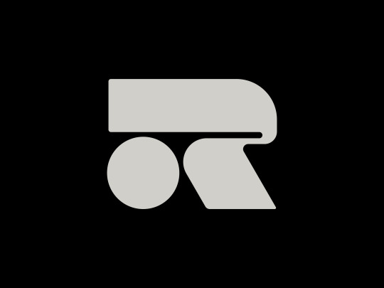
R Logo
180 notes
·
View notes
Text
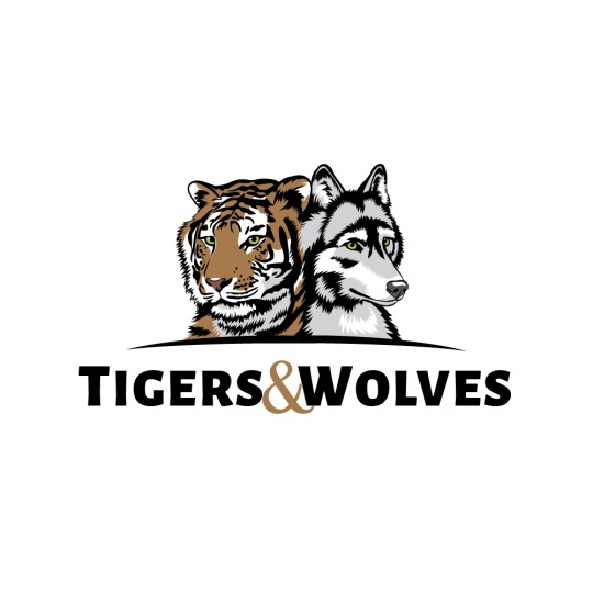
Created a make tiger head logo design for your business
I will design professional high quality tiger logos with unlimited revision. I specialize in logo design, branding / brand identity design, custom design ultimately improving their bottom line by crafting creative solutions to their business problems.
#tigerlogo#tiger#logo#logodesigner#illustration#logodesigns#animal#brand#graphicdesign#worldtigerday#designlogo#tigerday#logodesign#simplelogo#art#vector#logomaker#lettermark#tigerlove#graphicdesigns#logoidea#mascotlogo#graphicartist#gaminglogo#gaming#oberhavel#michaelwebdesigneranddeveloper#tigergraphic#lehnitz#vaporesso
2 notes
·
View notes
Text
Letter J Magic: Turn Basic Shapes into Branding Gold
Ready to transform basic shapes into branding gold with Letter J Magic? Dive into our logo design tutorial for beginners and discover how to create a standout letter J logo in Adobe Illustrator.
From sketch to vector, explore the creative logo design process, typography tips, and unique ideas for small businesses.
Whether you're designing a gaming logo or branding your company, these advanced techniques will elevate your graphic design skills. Let's make your Letter J logo unforgettable!
6 notes
·
View notes
Text
Adobe Illustrator tutorial
Check out this Adobe Illustrator tutorial for creating the perfect LP letter monogram logo using a triangle grid. Learn how to utilize the Pathfinder Tool on Adobe’s vector software to craft a precise and stylish monogram design. Ideal for those looking to enhance their logo design skills!
#LogoDesign #Monogram #AdobeIllustrator #PathfinderTool #GraphicDesign #TriangleGrid #VectorArt #DesignTutorial #CreativeProcess #DesignInspiration #LearnDesign #DigitalArt #LPMonogram #Illustration #DesignSkills #ArtCommunity
#logo design#modern logo#minimalist#minimal#branding#logo#minimal logo#identity#modern#adobe illustrator#lettermark
2 notes
·
View notes
Text

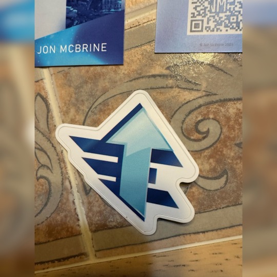
So my face doesn’t exactly show it but the stickers came out great
#booklr#fiction#author#books and reading#indie author#book blog#writers on tumblr#writerscommunity#novel#reading#book design#logo design#designer#design#stickers#creative logo#logotype#logo#emblem#symbol#insignia#mark#lettermark#book art
1 note
·
View note
Text
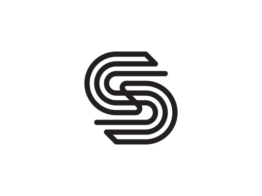
S by Artology https://lnkd.in/gbrHEnVt
Let's work together on your project! Send an email to → [email protected]
#LogoDesign#Lettermark#Typography#BrandIdentity#GraphicDesign#LogoInspiration#DesignAgency#LogoArt#MinimalistDesign#LogoMaker#CreativeDesign#IdentityDesign#Typeface#LogoLove#LogoMark#BrandLogo#LogoTrends
0 notes
Text
2 notes
·
View notes
Photo
Minimalist FLY&RAVE Logo Design
#logo#creative#minimalist#timeless design#icon#webdesign#typography#modern logo#visiting card#stationary#logo design#lettermark logo
1 note
·
View note
Text
Have you guys seen the new Detroit sign

Yeah, it kinda sucks ass
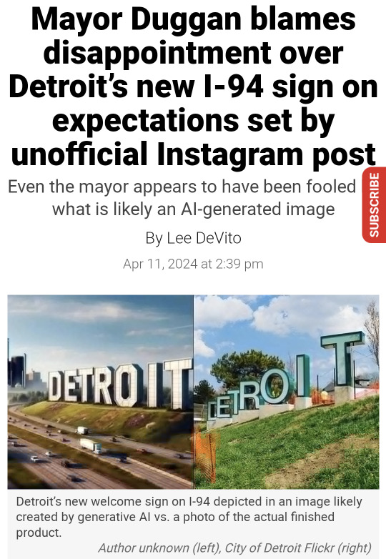
And no I'm not saying this because I saw the obviously AI generated image and my expectations were high, I'm saying this because I'm a graphic design student. Also, the first one still looks like shit and it lacks creativity. It's basically a copy of the Hollywood sign. Have the people who've seen the AI generated image seen what literally anything looks like? Are they stupid? Even the mayor is disappointed. Come the fuck on.
Not to worry, I've come up with a solution. I'm not saying this should be the final solution, but I think it's better than the one where you just use a masking tool to paint parts of the Detroit sports logos over the existing sign letters. I can't find a photo of it.
The solution? Random typography. Not many brands are bold enough to use it. The only one I can think of off the top of my head is the logo for CCS (College for Creative Studies), also in Detroit!
Top image is the acronym, bottom is the full logo. It even shows a grid system!
Maybe if we weren't such cowards, we could incorporate random typography into more brands. I'll be bold enough to take on that task.
You might wonder, how will you choose the typefaces? Using Detroit company logos and taking from those. But I won't do it randomly. In fact, I've done research on Detroit companies and when they were founded. Here are some that I've found.
Comerica: 1849
Carhartt: 1889
Ford: 1903
Faygo: 1907
Little Caesar's: 1959
DTE Energy: 1996
Oh yeah, those letters I filled in? They spell out "etroit." The D will be the Detroit sports logo used for the Lions and the Tigers.

Using some crude editing in Google Slides, I've managed to create this logo.

This uses the following:
The "D" in the Detroit lettermark
The "e" in the Comerica wordmark
A "t" in the Carhartt wordmark
A cursive "r" in the Ford wordmark
The "o" in the Faygo wordmark
The "i" in the Little Caesar's wordmark
The "T" in the DTE wordmark
Crazy? Yes. Maybe this is why most logos stick to just one typeface. But we're building a city sign, dammit! Why shouldn't we break the rules? This is certainly better than the Helvetica ass sign they have out there! There's been diss tracks made, that should be enough to convince the city to change the sign and get some real designers involved!
Also here's a better sign where all the letters are about the same size

I like this one better. There's even a consistent color palette of blue, black and orange, colors associated with the Lions and the Tigers. Where they are, however, is not very consistent. The tones are all different! Do we use all blue at this point? Maybe black? Maybe keep the D blue and also make "et" blue, then "ro" black, then "iT" orange? Or does it look fine like this?
Maybe later I'll find a way to 3D model this
10 notes
·
View notes
Text
Week 2
21-25 January
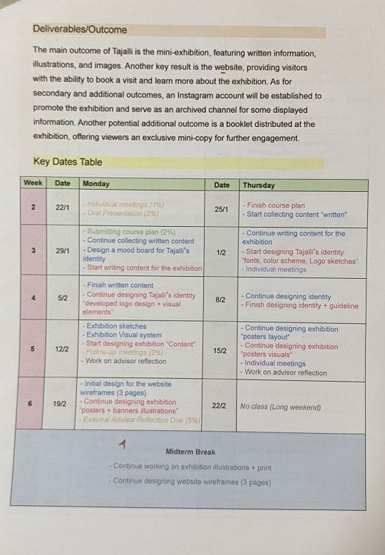
The plan for week 2 involved the following tasks:
Preparing the fast recap presentation.
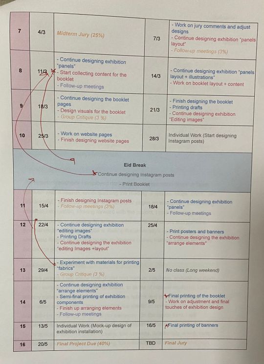
Creating a course plan (including the idea, goal, research methods, mediums, outcomes, and a key dates table).
Starting to collect content.
Creating sketches of the identity logo.
⸻⸻⸻⸻
Unfortunately, despite my intention to complete the entire list by Thursday morning, I was only able to finish 3 out of 4 tasks. The struggle to initiate the third task was mainly due to difficulties in managing my time effectively.
I began the week by focusing on preparing the presentation. This step was crucial for me to gain a clear understanding and recap of my graduation project and its outcomes, which served as a foundation for developing the course plan.
Below are screenshots of my fast recap presentation.


Once I settled on the main and secondary outcomes and completed the preparation for the presentation, I printed the course syllabus to initiate the planning phase for the term and to organize key dates.
The process of planning the key dates table proved to be challenging initially, as I was unsure of where to begin. However, after writing down the essential tasks that needed attention, the process became smoother.
Below is the 1st draft of my course plan
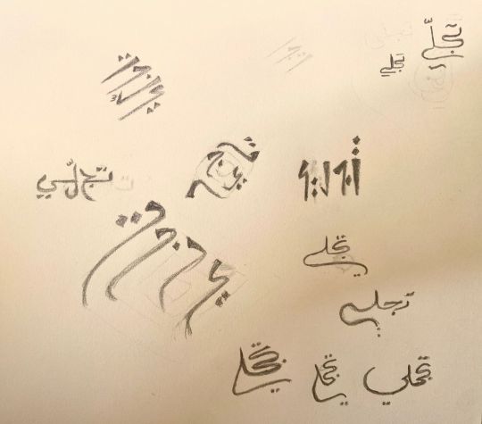
For the logo sketches, I began by searching for inspiration from various sources that relate to colors, patterns, and cultural elements. I conducted several experiments, considering lettermark logos as the main approach that aligns best with the concept of the name, idea, and exhibition. I intend to further the sketching process by generating a wider range of diverse and unique logos.
Below are sketches of my project’s "Tajalli" logo
In conclusion, I intend to finalize the course plan over the weekend and aim to initiate next week's plan a bit earlier, employing enhanced time management, determination, and resilience to adhere to all outlined points.
25/01/2024
2 notes
·
View notes
Text

3 Logo
4 notes
·
View notes
Text
Project 2 - Figma Curve
Okay well I assumed Figma to have a bit more of a learning curve than it did, I picked it up very easily. I really like how straight forward it is. I changed my colour scheme from red white and black to yellow, dark grey, white and black. My app is in 'dark mode' so all backgrounds are a solid dark grey colour. I chose Nave black italic as the typeface, I liked the differing weight lines and that it was not a linear font, no serifs and was eye catching, hence why I also chose to put the lettermark logo in all caps! More appealing to the eye.
I switched my colour from red to yellow because the red and black contrast was too much. I didn't want to do both yellow and red because that is very McDonalds-esque. I had read not too long ago that yellow and red 'increase the consumer's appetite' while other colours dull the appetite like blue. Hypothetically for a restaurant rating app you'd want colours that increase consumer's appetite.
Going forward with layout I chose to do something very straight forward, lots of pictures and easy to navigate. All icons will be made by me and hopefully be easy to understand in the right context.

0 notes
Text

Lettermark, imagen y manual de normas gráficas para GALGOS Group Chile.
Lettermark, branding and Graphic standards manual for GALGOS Group Chile.
0 notes
Text
Adobe Illustrator logo design tutorial
Adobe Illustrator tutorial on creating a geometric hexagon logo design using the Repeat Tool. Learn how to craft this intricate and modern logo design in just a few seconds. Perfect for those looking to enhance their skills in creating symmetrical and visually striking logos.
#LogoDesign #HexagonDesign #AdobeIllustrator #RepeatTool #GeometricDesign #GraphicDesign #DesignTutorial #CreativeProcess #ModernDesign #LearnDesign #DigitalArt #DesignInspiration #VectorArt #LogoCreation #DesignSkills #ArtCommunity
#logo design#modern logo#minimal#minimalist#branding#identity#logo#modern#adobe illustrator#lettermark
4 notes
·
View notes
Text
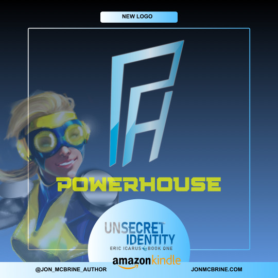
Even though my novel isn’t a graphic one, design plays a big factor. Visualizing logos, costumes, and settings all help bring the story to life. Powerhouse is a major character in Unsecret Identity, and I’m happy to have finally solidified her symbol.
#costume#logo design#logo#logotype#graphic design#typography#booklr#reading#bookish#author#writerscommunity#novel#design#concept art#book blog#illustrator#character art#books#ebook#link in bio#lettermark#creative logo#books and reading#indie author#ya fiction#superhero#ya reads#fiction#blog#digital art
1 note
·
View note
Text

Rustle Lettermark Wordmark Logo Design
How is it ?
#brand identity#branding#logo#artists on tumblr#911 abc#accounting#adobe#art#3d printing#agatha all along
0 notes