#led light diffuser sheet
Explore tagged Tumblr posts
Text
How To Choose A Light Diffuser Sheet for Your Needs?
Not sure which light diffuser sheet will best meet your needs? When selecting a light diffuser sheet, there are many factors to consider. It is important to select the correct light diffuser sheet for your light source. Read this blog to know how to choose a light diffuser sheet for your needs?
0 notes
Text
☾ ⋆*・゚I Love You, I Promise :⋆*・゚

Summer DaCosta x fem!reader
synopsis: After Bella die you and Summer break up because it was so hard on the both of you. But during your trip to Ghost Island where you have to share a bed and a failed game of charlie charlie brings feelings back to the light.
warnings: angst, one bed, and ghosts
a/n: hey guys I'm back and finally posting the Summer fic I've been writing since feburary. I had terrible writers block then forgot about it. This definitely isn't the best but I wanted to get it out to y'all because you guys have been waiting months.
wc: 1.7k

It's been a couple of months since you and Summer broke up. You guys broke up tight after Bella passed away. Bella was the one who got you two together in the first place. She knew you both had liked each other since the seventh grade, but were too scared to confess to each other and risk ruining your friendship. Eventually Bella convinced both of you to go to Winter Formal together sophomore year which led to more dates and finally you guys got together. Bella was one of your best friends, so when she died it was like a piece of you died. It was like that for everyone in the friend group. It was like with this piece missing, your heart didn't know how to act and neither did Summer’s. Which resulted in her snapping at you that then turned into a bad fight which resulted in a break up. _____________________________ Now you are on the boat to Ghost Island. Bella always wanted you all to go there together, with or without her. So that's what you were doing. Currently Summer and Leo are acting out the titanic, Ferris is hitting on Summer’s older cousin, and Kayla is sitting next to you. You finally reached the Island and arrived at the Veil Hotel. . Bella had always talked about visiting this eerie island with her friends, and despite her absence, you were determined to honor her memory by making this trip.
The evening was tinged with a sense of unease. The old hotel’s faded elegance seemed to echo with the ghosts of the past. As the night descended, you all made your way to the grand hotel suite you had reserved. The excitement of exploring the grand old building quickly turned into confusion as you entered the suite and realized something was off.
The suite was beautifully decorated, but there was a problem—there were not enough beds to accommodate everyone comfortably. The realization dawned on the group as you began unpacking.
“I thought we had more rooms,” Leo said, frowning as he surveyed the space.
“It must be a mistake,” Summer said, her voice tinged with frustration as she looked around. “There’s no way we can all fit.”
Ferris, ever the opportunist, quipped, “Looks like we’re going to have to get cozy.”
You and Summer exchanged glances. The arrangement meant that you two would have to share a bed—a prospect that felt like a cruel twist of fate given your unresolved issues.
“I can’t believe I have to share a bed with Summer,” you muttered, a mix of disbelief and frustration in your tone.
Kayla tried to diffuse the tension. “We can figure this out. It’s only for a few nights.”
The group made the best of the situation, setting up makeshift sleeping arrangements in the living area and trying to adapt to the unexpected scenario. You and Summer, though, were left with the task of facing the reality of sharing a bed.
As the night fell, you both tried to find some semblance of comfort in the cramped space. The bed felt smaller than it had before, the physical closeness a stark reminder of the emotional distance between you. Every rustle of the sheets and every shift in position felt amplified, and the silence between you was heavy with unspoken words.
Hours passed, and the emotional exhaustion from the day began to take its toll. The discomfort of the bed and the tension between you seemed to fade as sleep overtook you. In the quiet of the night, the proximity and shared warmth became a comfort rather than a burden.
You awoke the next morning to the surprising and intimate reality of being wrapped in Summer’s arms. Her body was pressed against yours, her breath warm on your neck. For a moment, you lay still, absorbing the closeness and the odd sense of peace it brought. The shared bed had, in the quiet hours of the night, become a cocoon where the walls between you felt softer.
Summer stirred beside you, her eyes blinking open. The realization of the situation seemed to hit her instantly. Her eyes widened in surprise, and she quickly pulled away, her cheeks flushing with embarrassment.
“Oh, um, good morning,” she stammered, her voice tinged with awkwardness. “Sorry about that.”
You turned to face her, trying to mask your frustration with a sigh. “Seriously, Summer? We’re sharing a bed. It happened while we were asleep. It’s fine.”
Summer looked at you with a mix of relief and lingering awkwardness. “I just... I didn’t want to overstep boundaries, you know? Things have been weird between us.”
You shook your head, your tone softening. “It’s okay. Just... let’s not make this more complicated than it is.”
Throughout the day, there was an unspoken tension between you and Summer that everyone in the group seemed to notice. Conversations felt stilted, and the usual camaraderie of the group was overshadowed by the weight of the unresolved issues between you two. You both tried to act normally, but the awkwardness was palpable, affecting the dynamics of the group.
After the ghostly encounters and attempts to connect with Bella, the group decided to try something different. They decided to play a game of Charlie Charlie, but with a twist—invoking Bella’s spirit. The mood was a mix of apprehension and hope as everyone gathered in the hotel’s grand living area, setting up the game in the center of the room.
The planchette was carefully placed on the notebook, the words “Yes” and “No” written out. You all took your places, hands trembling slightly as you prepared to ask questions.
“Bella, are you here with us?” Summer asked, her voice wavering with a mix of hope and anxiety.
The planchette moved slowly, settling on “Yes.” A collective breath was held as you all exchanged glances, the tension of the day momentarily forgotten in the face of this new attempt to connect with Bella.
“Bella, are you happy we’re here?” Kayla asked next. The planchette moved again to “Yes.”
The group continued asking questions, hoping to find some comfort or guidance. Then Summer, with a trembling voice, asked, “Bella, who am I in love with?”
The planchette moved, its path deliberate and unyielding. It stopped, pointing directly at Leo. The room fell into a heavy silence. Summer’s face fell, her cheeks flushing with a mixture of confusion and hurt. She stared at the board, unable to comprehend the message. “This isn’t Bella,” she said softly, her voice cracking with emotion.
Unable to bear the weight of the moment, Summer abruptly stood up and left the room in a hurry. The sound of her footsteps echoed down the hall, leaving behind a tense silence.
You quickly followed after her, your heart pounding as you navigated the dimly lit corridors of the hotel. You found her in the hallway, leaning against the wall, her face buried in her hands. Her body shook with silent sobs.
“Why did you ask that question?” you demanded, your voice sharp with frustration. “If you didn’t want Leo to know, you shouldn’t have asked.”
“That’s the thing though!” Summer snapped back, her voice rising with a mix of desperation and anger. “I’m not in love with Leo. I’m in love with you. God, you’re so stupid, Y/N!”
Her outburst was a mix of frustration and vulnerability, the raw emotion in her declaration cutting through your already fragile heart. You turned away, unable to keep the tears at bay, and headed to Kayla’s room. The comfort of her presence was a small solace, but it wasn’t enough to erase the hurt.
When you entered Kayla’s room, she looked up with concern but didn’t press you for details. You lay on her bed, curling up in an attempt to find some semblance of peace. Kayla offered a reassuring hand on your shoulder before quietly leaving the room, giving you the space you needed.
Later, Summer knocked on Kayla’s door, her face a canvas of regret and weariness. Kayla gave you a sympathetic look before stepping out, leaving you alone with Summer.
"I need to talk to you," Summer said, her voice trembling with vulnerability. Her eyes were red from crying, a stark contrast to the vibrant energy she usually exuded.
You looked at her, your heart aching at the sight of her distress. "Okay," you replied quietly, trying to steady your emotions.
Summer took a deep breath, her hands wringing together nervously. "I’m sorry for how I’ve been acting. I didn’t mean to hurt you. I’ve been lost since everything happened. I’ve been trying to keep it together, but I'm messed up."
You remained silent, listening intently as Summer struggled to find the right words.
"I love you," she finally said, her voice breaking. "I love you, and I’m so sorry. I should’ve never ended things like that. I was scared and angry and... I didn’t know how to handle it. But I love you, and I want to make things right."
The sincerity in her voice, the raw emotion in her eyes, cut through the confusion and hurt you had been feeling. Your own tears began to fall, mingling with the tears of regret and longing in Summer’s eyes.
"I miss you, too," you said, your voice choked with emotion. "It’s been so hard without you."
Summer’s eyes softened as she took a step closer, her hands reaching out to yours. "I know," she whispered. "I know I made mistakes, and I’m sorry. I want to fix things between us. I want to be with you."
In that moment, the pain and confusion seemed to melt away, replaced by a fragile hope for reconciliation. You embraced each other, holding on tightly as if trying to anchor yourselves in the midst of the storm. The past was painful, but in each other’s arms, you found a glimmer of healing and a promise of rebuilding what had been lost.
def not my best work I swear my Clarisse fic will be better
taglist: @asvterias , @mira-belcul18 , @ang5289 , @symp4nat
#wlw#dior goodjohn#dior goodjohn x reader#summer dacosta#summer dacosta x reader#x reader#x yn#lesbian#bisexual#sapphic#love#angst#fanfiction#percy jackson#clarisse la rue#are you afraid of the dark#show#fanfic#writer#oneshot#drabble#light angst#romance
95 notes
·
View notes
Text

blender lighting tutorial + tips.
requested by @thecrimsonsimmer + recommended viewing: youtube video one, two, three, and four. this post will be dealing with newer versions of blender (2.8+) and cycles since that's what i'm more familiar with + commonly used for rendering. this is coming from me as an artist with some dabbling in photography and things i've learned in college!
references and setting the mood
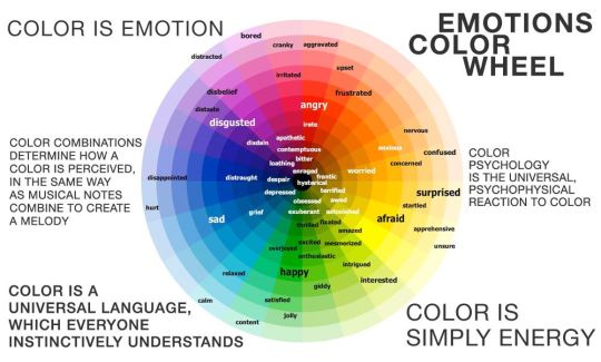
are you basing your render on an existing photo? study the light source and what direction it's coming from: that's what's going to tell you your set up for a similar effect. if you're not basing it on an existing piece, a good start is knowing How you want to set your subject (your sim) up - do you want them to be in the spotlight? are they in a specific environment that has neon lights? are you going for moody or something fresh, bright? definitely look up colors and their meaning (color theory, movie screencaps, etc.) to create a stronger image!
using resources to start the set up
it's always a good thing to mix your tools with different communities, such as the art community! many have lighting tools to figure out how to color their subject, such as this free-to-use head figure that depicts where the lighting source should be placed.

there's also the photography community and teaching people how to set up their lights for certain setups. video three and four linked in the beginning are from photography viewpoints.
spot? area? point? sun?
let's think of the lighting types as objects - a spot is like a plain lightbulb, area is a reflective sheet, spot is a flashlight, and the sun... well is the sun!
a spot is similar to an area light, but triangular/a cone. think of a helicopter search light, it's focused on a small area with the most light concentration. these can be used for lamps with lampshades, car headlights, or a lighthouse.
an area light is great for lighting up technology. a phone screen, tv screen, tablet, anything that's an LED screen emitting from a surface. the light is not as concentrated as a spot and is meant to cover more flatly (hence the rectangular source)
a point is best used for small pops of colors such as candlelight, lamppost, lightning bug tail, etc. a small source that has nothing covering it.
a sun covers the entire area and can be used as the overall mood setter. it can create filter over the entire render by just shifting the color like you would see in a movie. you'll be given a line with a sun light that gives the direction of where the sun is coming from. basically a spot light just on a much larger scale LOL.
power + coloring

this screenshot is mostly what you'll only use to start off with. watts is the unit of measurement and the higher you go, the brighter the light will be. examples with a white colored point light 10W-20W: general portrait lighting 30W-50W: bright source, close flashlight for example 60W+: blinding

coloring is just like the system for in game lights for ts4. shift it to whatever you want it to be (click the white bar, that's the color preview) and mess around with the vibrancy. the darker, more intense color, the less it's going to appear on the sim.

closeness and intensity
similar to what's shown in the head lighting tool shown earlier, the closer the light is, the more that specific area is lit up. go too close and your sim could be completely washed out. it helps to change the size of the light (change with the radius slider) to better imitate what you're wanting. the larger the radius, the more diffused and softer the light source will be. close + small = very clear of the light source shape, can obviously tell where it is in relation to the subject far away + large = soft lighting, more of a hazy lighting of the color you choose.


to quickly adjust the light, press "G" and hold down your middle mouse button to adjust which axis you'd like to edit along. green is the x-axis, blue is the y-axis, and red is the z-axis. you can also press "G" and type the letter of the axis you want to use. drag the mouse to change the placement on that specific axis to however you want. if you want to freely edit the placement, just press "G" to move it out of the axis bounds.
world lighting
take this step as setting your canvas color before you start painting. in order for the values to look their best, change the world color to the same hue of the color you are mostly using. for example, this is set in a red-toned environment:


this is essentially changing the cast shadow onto the sim. the default is gray and will muddy up your undertones if not changed properly. for this instance, if you were to still use the same red point light in a gray world color it'd look like this:

of course, this will be based on if you have an environment image or not that can affect your lighting overall. this post is based on the fact there is no environment image and what not! if you need a visual demonstration on how to mess with the world lighting, check out this short video.

i hope that helped anyone beginning to render or wanting to light up your own scenes! i'm no rendering expert, but here's some of the helpful tricks i've learned and collected over the years<3 if you have any other questions feel free to send an ask!
#ts4 blender tutorial#sims 4 blender tutorial#ts4 render tutorial#sims 4 render tutorial#lighting tutorial#lyko posts#tutorial#long post
231 notes
·
View notes
Text
December Twenty-Fifth
Written for Ficwip Discord’s November 1000 Words Event
Title: December Twenty-Fifth
Ship: None
Fandom: Yu-Gi-Oh! Vrains
Word Count: 1,000
Rating: T
Warning: None
Tags: Pre-Canon, Fluff, Christmas, Found Family, Presents, Surprises
Waking up on December twenty-fifth, was meant to be like waking up on any other day.
For Spectre anyway.
Seven years old, he was full of wonder and curiosity but not for Christmastime. He didn’t enjoy fried food, he didn’t like mushy-gushy romantic comedy movies for adults. He had never celebrated Christmas at the orphanage prior. Not enough money to go around to give the children more than colouring-in sheets and maybe a store bought card.
And so, that date on the calendar, remained innocuous and boring just like any other day.
Until now.
“Tada. Do you like it?” Ryoken asked.
He held Spectre’s hand, guiding him down the stairwells of the minimalist monstrosity which was the Kogami Mansion and yet… The sun room was a cacophony of festive spirit. It was kitsch and bright. Christmassy. Full of red and green amid the otherwise dreary, white walls and furnishings of the mansion. Wreaths hung up on the window panes, ribbons and sashes dashed through the room, fairy lights twinkled, and then there was the centrepiece: a fir tree which had yet to be decorated but was still accompanied by various presents.
Five of them, Spectre counted.
Spectre was dumbfounded as he was led into the sun room by Ryoken. Music which was whispered in a silvery voice played from a speaker, inviting them closer. The smell of breakfast was cooking nearby from the adjoining kitchen. He heard Aso’s voice call out good morning above the sound of sizzling eggs and bacon, a waft of maple syrup and something else sweet, too, like pancake batter.
“Good morning, sleepyhead.” Kyoko teased Spectre as she and Dr. Genome waited by the tree.
“Indeed, probably the first child in existence to wake up well after the sun has risen on Christmas Day.” Dr. Genome mused, stroking his chin.
“Well, um…” Spectre fumbled to explain his circumstances but he found himself at a loss for words, he was staring at the tree.
Both adults and Ryoken picking up exactly on his thoughts.
“We wanted to surprise you since its our first Christmas together, do you like it?” Kyoko asked.
“Yeah, it’s, um, really…” Spectre continued to fumble in his awe.
“I thought it was a waste of time, personally,” Dr. Genome added coldly and yet, in his own way, knew exactly how to diffuse Spectre’s shyness, “we don’t normally celebrate Christmas but the soft-touches insisted. So, you better enjoy or there won’t be one next year.”
Spectre giggled. Dr. Genome’s more abrasive nature always amused him. Kyoko rolled her eyes and gave him a playful nudge - or jab - to the side. That, too, part of the comedy routine and banter they found themselves in.
“Ignore that grinch, you two.” Aso’s voice called out. “It is a pleasure to celebrate like that, heaven knows we need it.”
Ryoken nodded, lips pursed, in agreement to Aso.
“Do you want your present now or do you want to decorate the tree first?” Kyoko asked gently.
“I get a present?!” Spectre exclaimed.
“Of course. You're my best friend, of course you get a present.” Ryoken laughed.
Spectre blushed, his tummy squirmed. “I want the present first.” he admitted in a tiny voice.
“Alright, you two first. We’ll open ours after breakfast whilst you two decorate the tree.” Kyoko decided.
“Here you go.” Dr. Genome said.
He picked up a box and handed it to Spectre.
The tactile feel of the glittery paper was unusual on Spectre’s hands as he carefully admired the box, the yellow and silver wrapping, the twirly white ribbon. He gulped, gave it a shake and tried to guess or imagine what might be inside but he failed. He had never been given a gift like this, wrapped up so nicely and with something completely brand new inside. It was a lot for the little pauper.
Unlike the prince beside him.
Ryoken, meanwhile, had no reverence for his present, tearing it open as soon as Kyoko handed it to him. It, too, was done up in the same paper and ribbons as Spectre’s but Ryoken was far more interested in what was inside to stop and admire the wrapping. The paper was clawed away, left in shreds that glittered on the floor as he revealed a toy which had some assembly required written on the box which featured an actor in a masked costume with plenty of pleather and latex.
“No way! This is the sword from Ranger Powers!” Ryoken gasped. That was the name of a television series that Ryoken was obsessed with, a tokusatsu aimed at tweens and teenagers rather than nine year old’s like him.
Encouraged, Spectre opened his present slowly and his eyes twinkled as the wrapping gave way to a boxed toy of his own.
“Pure Dandelion’s sceptre…” Spectre gasped as he recognised the magical girl anime weapon. He liked the anime a lot but had never dreamed he would ever see merchandise of it beyond strolls through a shopping mall with Kyoko or the others.
“I’m sure you two will have lots of fun chasing each other and bad guys this afternoon with these.” Dr. Genome laughed.
“Can’t wait!” Ryoken grinned.
They had played similar games of chase and role-play using sticks so it would be nice to have something extra and more in-character to use. It would hopefully warm by the afternoon, too. Being on the beach, it didn’t snow but the chill of winter still pervaded outside the foggy windows of the sun room transformed into a cheery hearth.
“M-Me too.” Spectre replied feebly, his heart racing out of his chest as he brimmed with gratitude.
A pause, and then Aso’s voice, “Breakfast is ready.”
Spectre smiled, mouth watering and holding dearly onto the plastic wand encased in cardboard. He glanced through the room again, finally seeing a box of decorations for the tree and his excitement heightened further. This was only his first Christmas but he already knew it was going to be the best Christmas ever.
#yugioh vrains#vrains#yugioh#christmas#writing tag#december twenty fifth#spectre (vrains)#kogami ryoken#dr. genome#taki kyoko#aso (vrains)
6 notes
·
View notes
Text
Random ask game asks
Starbucks or Dunkin Donuts?
What's one thing that's stereotypical about you?
I have the remnants of a british accent + I drink tea.
Play any instruments?
Piano, badly
A music artist everyone criticizes that you like:

Last show you watched:

Last movie you watched
Senior Love Me?
Last song you listened to
The Arc - The Light
Last book you read
Old Fashion Cupcake manga

Your top five most listened to artists this month on Spotify
Stray Kids
BTOB
Young K & Day 6
Kang Daniel
TRENDZ
Ever drank alcohol?
Every Friday and it’s Be My Favorite’s Fault

Every smoked anything?
Fish, mostly
Do you prefer to eat-in or take-out?
Both
If you could time travel what decade would you go to first
Am I invisible or do I look the way I do now? If #1 then the past, if #2 then the future.
An actor everyone loves that you don't like for whatever reason

Speak any other languages?
4 none of them well, including my ostensible original
Have any tattoos? Want any tattoos?
no
Have any piercings? Want any piercings?
yes
Do you prefer the hot or cold weather?
cold

Cats or dogs? Or some other pet?
none but those owned by others tend to adopt me (the house has a cat and he think’s i’m his)
Trendy over comfortable or comfortable over trendy?
trendy and comfortable, why choose?
Say one thing bad about something you love
the singing is terrible and the acting is usually pretty crap too

Do you prefer to read digitally or from a physical book?
digital
Do you put milk in your hot tea?
yes
Do you know how to play any popular gambling games?
no
A character you relate to for whatever reason?

A quote (from anything) you really love

How many pairs of shoes do you have
maybe 10?
Do you have trouble saying any words because of your accent/speech problems?
no, i’m good at words and public speaking
Earbuds or headphones?
buds
Showers or baths?

Early bird or night owl?
insomniac
Candles or scented spray?
fresh flowers
How often do you change your clothes?
as often as is necessary
Chess or checkers?
all board games bore me
Something you can do that you think is cool?

Perfume or body spray?
body oil
What's something that genuinely scares you
other people’s unhinged obsession
LED lights, the room light, or sunlight?
diffuse natural light

What's something you do differently than everyone else?
peel and chop fruit
If you have hair how often do you style it in some way?
spiky if i bother at all
Nail polish, press on nails, or acrylic nails?
short and tidy but nothing else
Do you have any fidget toys? If so what's your favorite?
I learned to sit still or get whacked, and i’m fine with the outcome
Do you drive?
yes
Your go-to genre of music?

Are you a good multitasker?
no one is a good multitasker
Silence or background noise?
kpop
A famous movie/show that you've never seen
i don’t know i haven’t seen it
Any sport you would like to play?
i don’t like sweating with other people around...
actually, i don’t like sweating at all
Can you write in cursive?
yes & calligraphy
Is your handwriting neat or at least easy to read?
yes very
Colored pencils, markers, or crayons?
black
How many pillows do you sleep with?
2
How many blankets do you sleep with?
3 (if the top sheet counts, ALWAYS top sheet)
Do you ever plan to get married one day?
fuck no
Do you ever plan to have kid(s) one day?
fuck no
Do you subscribe to any religion?
fuck no
Something in your room that you think is funny for whatever reason
the hotel room i am in right now has a teacup the size of my head painted with parrots and I have no idea why.
Would you rather be an actor, singer, comedian, or would you do something on YouTube/twitch/some other site
i would rather gouge out my own eyeball than be a celebrity of any kind
Are you scared of the dentist?
not at all, my dental hygiene is fucking amazing, they often get mad at me for wasting their time
(before you ask: good genetics + fucking flossing = the answer, just floss while watching your favorite bl, it’s not goodamn rocket science, take care of your teeth you slackwits)
Do you wear makeup?
sometimes
If you could be any character of the opposite sex, who would you be?
i already am
In the literal sense, are you an introvert or extrovert?
both
What's something in your room that makes no sense without context
aside from that dumb teacup, i don’t know, i’m not in my room, i’m rarely in my room
Favorite subject in school?
If you could visit any place in the world where would you go?
right now, i wanna get to taiwan before it isn’t anymore
A show/movie thats been on your watchlist forever but you for some reason keep putting off

Is the name you use online your real name? (Real name does not mean deadname)
never
Do you have a favorite sibling?
If you were to have a kid what names would you have in mind?
no fucking children, not mine, not anyone else’s, i am not interested, yours is NOT the cutest nor the smartest (trust me) and i don’t want to hear about them
Do you think things like anniversaries are a big deal?
no
Mobile games or PC/console games?
no games
Do you believe in things like ghosts?
no
Long sleeve + shorts or short sleeve + pants
depends on the weather and culture
Can you do any voice impressions?
no
What was the first fandom you were genuinely into
star trek
Do you prefer womens or mens products?
depends on the smell, price, and effectiveness
would you be fine having your partner completely provide for you?
never

Plain clothes or vibrant and eye catching clothes?
neither, i’m usually just stylish and quirky
Movie date or restaurant date?
food
Do you split the check or expect only one of you to be paying it?
split or I’ll pay if my friend isn’t holding
Favorite fast food place?
i’d rather not
How do you make your coffee?
in italy
Do you pay attention to the music or the lyrics more?
music
Are you more energetic or tame?
energetic
Are you witty?
only by accident
A show everyone criticizes that you like

37 notes
·
View notes
Note
it’s totally fine if not but would you ever consider posting some info on how you made your mirage head?id love to cosplay v2 but im lost on how to go about the construction of it lol
HI I LOVE THIS QUESTION AND I WAS ACTUALLY HOPING TO MAKE IT THIS MIRAGE MONDAY ANYWAYS!!! 🩷🤭
🩷Mirage Monday: Construction and Process!🩷
I dont have pics of the template, but if i ever remake it ill be sure to make one sorry ;; BUT before even constructing, ive found that making a small doll-sized prototype! (and fun bonus, if you dont lose yours like i did, you can use it with your monster high dolls!)
The line going straight across the horizontal center is a score line (not cut all the way through) to assist in shape! it helps to give it that little edge to it without having to glue it! i also scored it to make the rounded parts at the bottom of the neck and the inset of the eye :)
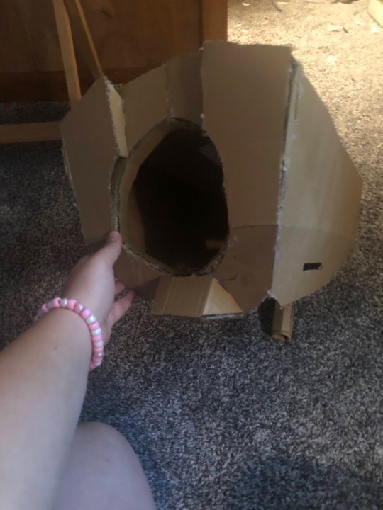
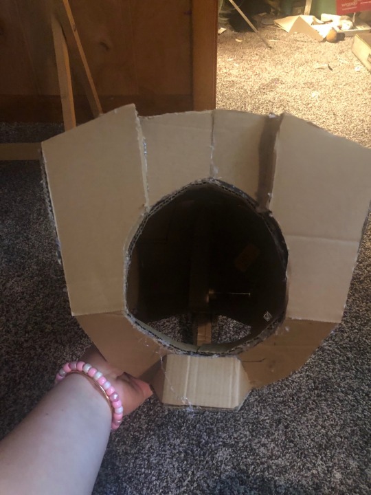
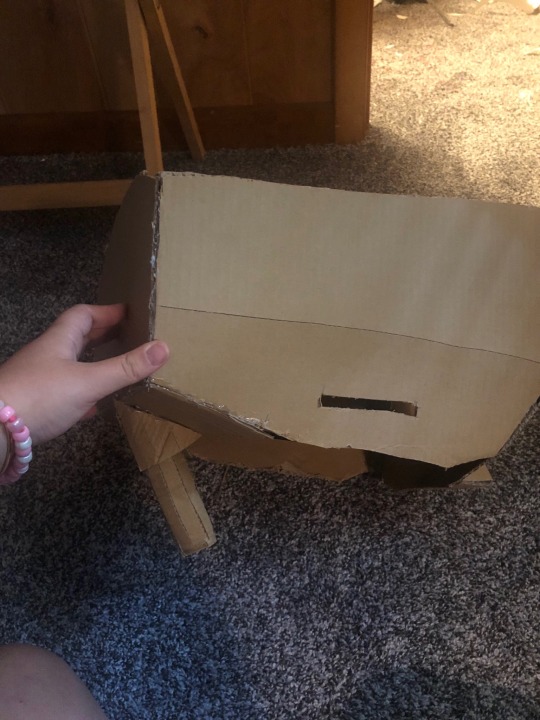
each side is its own panel, except the front that is composed of 5 panels (left and right sides, center top, chin, and under chin( and the optional stem, that i ended up ditching because it dug into my neck.
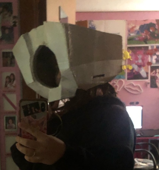
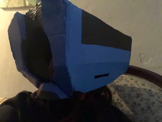
after hot gluing all the pieces together, i filled in the seams with clay foam, but that step is completely optional when working with sharp edges. after that, i spray painted it white (which i regret! it wont get the smell out of the cardboard!!!) as a base coat, but id suggest just using white gesso or white acrylic paint to help get that vibrant colors on. i used acrylic paints for the colors and a light shine finish on top! but if you wanna bypass that step, you can totally use glossy acrylics :)

the face mesh!! mine is made from patio screen, but if you can afford it, there is a mesh made specifically for prop heads that would look better !! acrylic paint also works great here. shown above is my first draft for the face that i ended up ripping off and starting over for, so be prepared to either have two in case you mess up, or start by drafting it out on plain paper to see if you like it.
theres a piece of foam at the chin for stabilization too! i put a headband on the inside for the same purpose, but ive found my hair is too long to actually use that without a wig cap, so its a little obsolete and i push it to the back while wearing it. it kinda hugs the back of my head and stabilizes it decently….. but honestly you could get that same effect with just the foam.
lastly, the mechanics!! i am by no means an engineer by any means, i just happened to have extra LEDs. The Eye is made of LEDs set into two painted ribbon spools glued on top of the mesh screen with a painted fabric-like plastic sheet (from a wig bag) to diffuse the light (and that little extra circle is just a piece of paper) .
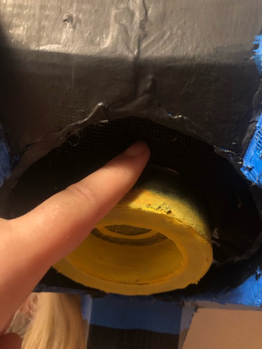
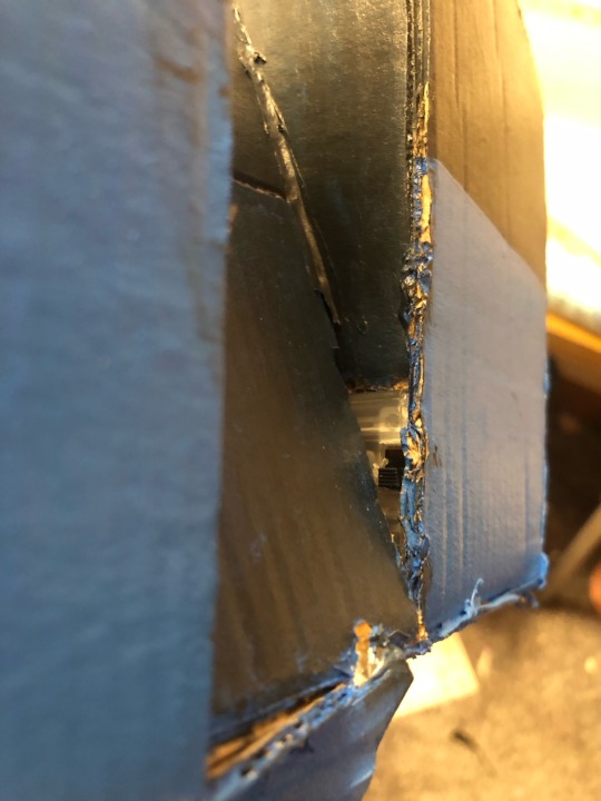
in the back of it, i have a little switch! it comes from a pack of string lights from the dollar tree, but i had to dismantle the battery pack because the LEDs only work with 9v batteries (sad!) so i had to figure out how to make a 9v battery cover out of the AA battery pack. its a bit cheugy but its functional! if youre planning on wearing it for a long time, totally install a computer fan!!!! it gets super sweaty in there (ew!) even though the entire face is ventilated :p
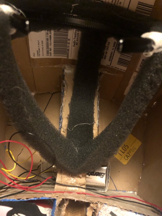
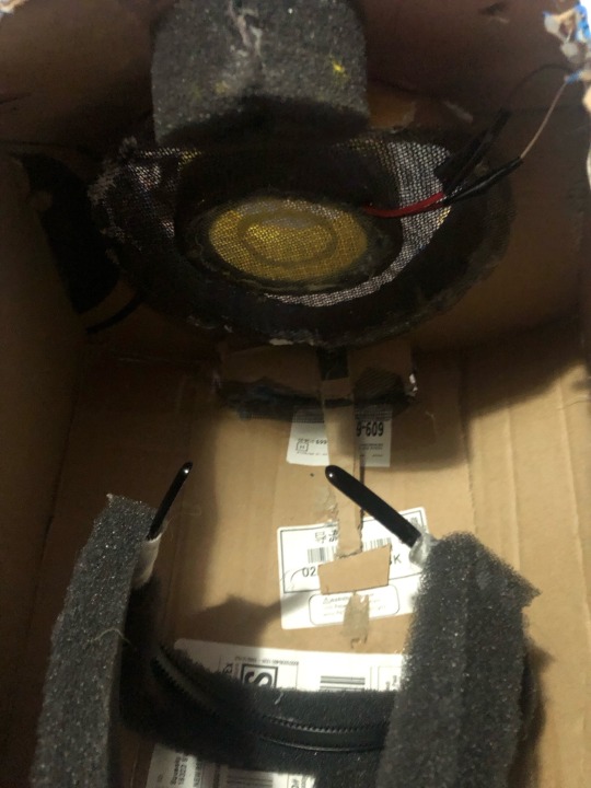
i am the worst person to ask about soldering, but im positive you could find a pretty good tutorial on youtube :,) my lights run from the back battery, to the left light, to the right light, and ends at the eye (mostly because the lights had input/output on both sides and the eye did Not).
if ive missed ANYTHING, feel free to ask me in comments, reblogs, asks, or DMs!!
13 notes
·
View notes
Text
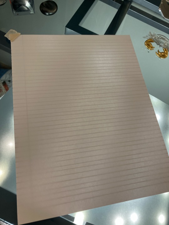
Part one of ‘what happens when my friends know I play ttrpgs and do calligraphy’, otherwise known as one of my favorite commission projects I’ve had to date.
What you can barely see under the glass desktop is a string of clearance LED lights wrapped under the support frame of the desk and diffused with a sheet of printer paper, effectively turning my entire desktop into a light board.
4 notes
·
View notes
Text
Cooler bulbs will be harder on your eyes so if you're sensitive to light you want to stick with the warmer ranges.
If you can afford the LED colour changing bulbs, eve just the white colour range and not the full RGB spectrum, those can be really helpful. Start with warmer colours first thing in the morning, move to cooler colours as the day progresses and once evening hits move back into the warmer ranges again. The colour changing LEDs also tend to be dimmable which is another added bonus particularly for us light sensitive folks.
Additional tip for light sensitive types, stay away from overhead lights and get standing floor lamps, wall lamps, and even table lamps instead. Make sure to have some sort of light diffuser rather than a bare bulb, even if it's just an old transparent piece of fabric or a square from an old sheet (or the entire old sheet over the floor lamp making it look like a helpful Halloween ghost)
There are so many different shades of white light bulbs, I am so overwhelmed walking down the light bulb aisle, and then I'm never happy with the one I choose, no matter which one I choose, I get it home and I put it in and I'm like, ugh, I don't like THAT white
31K notes
·
View notes
Text
youtube
This Video Covers: 🎥 Going over and showing some examples of 4 cheap or free cinematic lighting diffusion methods for low budget filmmaking. From bouncing light to on-lamp and large source materials, there is something here for everyone's budget!
📺 Related Videos To Watch:
+Softboxes vs Silks: https://www.youtube.com/watch?v=DCVQRHut8DM
+How to Make A Pizza Box Bounce: https://www.youtube.com/watch?v=iwpSX-9gU5M
📹 Gear Discussed and Used Affiliate Links:
+Loose Silk: https://amzn.to/3WRJDZE
+Shower Curtain: https://amzn.to/4hpZlDu (This is not exactly the one in my video, that one is out of stock, but this is almost identical)
+Tracing Paper: https://amzn.to/3WSS4DQ
+GVM p80s LED Monolight 2 Pack Deal + 10% OFF COUPON: https://collabs.shop/sbgtmk
📹 Gear Discussed and Used Non-Affiliate Links:
+Shower Curtain, Similar to What I Have: https://www.walmart.com/ip/Mainstays-Light-Weight-PEVA-Shower-Curtain-Liner-Frosty/152274762
+Tracing Paper: https://www.walmart.com/ip/WINTEX-Tracing-Paper-9-x-12-inch-100-Sheets-Vellum-Drawing-Printing-32lb-50gsm-Translucent-Printer-Transfer-Artwork-Crafts/5412563859
Affiliate Partner Discount Offers:
+SAVE 10% ON GVM PRODUCTS WITH THIS LINK: https://gvmled.myshopify.com/TRENTONHOSHIKOCINEMATOGRAPHY or with the code TRENTONHOSHIKOCINEMATOGRAPHY
+SAVE 10% ON DEHANCER PRODUCTS WITH CODE: THCINEMATOGRAPHY
#cinematography#youtube#micro budget filmmaking#support indie film#filmmaking#indiefilm#video production#Soft Lighting#photography#Youtube
0 notes
Text
How To Select The Right Light Diffuser Sheet
Light diffuser sheet is obtained by evenly spreading the light diffusing agent on the LED board. It has excellent light diffusion, light transmittance, good UV stability, and is widely used in the LED industry. Read this blog to know how to choose the right light diffuser sheet
0 notes
Text
The Future of Acrylic Plastic Sheets: Innovations and Emerging Trends
Acrylic plastic sheets, often referred to as Plexiglas, have become a staple material in industries ranging from construction and interior design to automotive and healthcare. Known for their durability, transparency, and versatility, acrylic sheets are now evolving to meet the demands of a rapidly changing world. With advancements in technology and increasing awareness of sustainability, the future of acrylic plastic sheets is teeming with exciting innovations and emerging trends.
Eco-Friendly Acrylic Sheets
One of the most significant trends in the acrylic plastic industry is the push toward sustainability. Traditional acrylic sheets, while highly durable, are derived from petrochemicals and can have a substantial environmental impact. However, manufacturers are now developing eco-friendly alternatives using recycled materials or bio-based sources. These greener versions retain the clarity and strength of conventional acrylic while significantly reducing their carbon footprint. Additionally, innovations in recycling techniques are enabling easier recovery and reuse of acrylic sheets, ensuring a circular economy for this versatile material.
Enhanced Durability and Performance
As technology advances, so does the performance of acrylic sheets. Researchers are developing enhanced formulations that make acrylic sheets more resistant to scratches, UV radiation, and extreme temperatures. These improvements are especially valuable in outdoor applications, such as windows, signage, and solar panels, where materials are exposed to harsh environmental conditions. With these enhancements, acrylic sheets can maintain their pristine appearance and functionality for extended periods, reducing maintenance costs and increasing their appeal across various sectors.
Smart Acrylic Sheets
The integration of smart technology into materials is another exciting frontier. Acrylic sheets are now being developed with embedded sensors and electronic components to enable new functionalities. For instance, smart acrylic sheets with touch-sensitive capabilities can be used in interactive displays, home automation systems, or retail environments. Additionally, innovations in light-diffusing and reflective properties are expanding the use of acrylic sheets in LED lighting, offering energy-efficient solutions for both residential and commercial spaces.
Customization and Aesthetic Appeal
Acrylic sheets have long been favored for their aesthetic versatility, and this is only set to grow. Advanced manufacturing techniques, such as 3D printing and laser cutting, are enabling unprecedented levels of customization. From intricate designs to unique color patterns, acrylic sheets can now be tailored to meet specific artistic or branding needs. Moreover, the introduction of textured and frosted finishes is broadening the design possibilities, making acrylic sheets a go-to choice for architects and interior designers aiming for a modern and sophisticated look.
Applications in Healthcare and Medical Devices
The healthcare industry is also reaping the benefits of acrylic plastic sheets. With their excellent clarity, lightweight nature, and resistance to shattering, acrylic sheets are ideal for medical devices, protective barriers, and equipment enclosures. The COVID-19 pandemic highlighted the importance of transparent barriers, and the demand for acrylic sheets surged globally. Moving forward, innovations in antimicrobial coatings and biocompatible formulations will ensure acrylic sheets remain integral to the healthcare sector, offering both safety and functionality.
Sustainability Meets Functionality: Lightweight Construction Materials
In the construction industry, the shift toward lightweight and sustainable materials is creating new opportunities for acrylic sheets. These sheets are increasingly being used as alternatives to glass in windows, skylights, and facades due to their superior strength-to-weight ratio. Advanced coating technologies are also being applied to acrylic sheets to make them self-cleaning, reducing maintenance costs and enhancing their appeal in green building projects.
Emerging Markets and Growth Opportunities
The demand for acrylic plastic sheets is not confined to developed markets. Emerging economies in Asia, Africa, and South America are witnessing a surge in construction, automotive production, and retail sectors, driving the need for versatile materials like acrylic. In these regions, the affordability, durability, and adaptability of acrylic sheets are making them a preferred choice for a wide range of applications. As infrastructure development accelerates, the market for acrylic sheets is expected to expand significantly, providing manufacturers with new growth opportunities.
Digital Printing and Signage Innovations
Digital printing technologies are transforming the signage industry, and acrylic sheets are at the forefront of this revolution. The compatibility of acrylic sheets with UV printing, screen printing, and other advanced techniques allows for vibrant, high-resolution graphics that are weather-resistant and long-lasting. This is particularly valuable for outdoor advertisements, retail displays, and event signage, where durability and visual appeal are paramount. As digital printing technology continues to evolve, acrylic sheets will remain a preferred medium for creative expression and effective communication.
Challenges and Future Directions
Despite its many advantages, the acrylic plastic sheet industry faces certain challenges. Environmental concerns related to plastic waste remain a pressing issue, necessitating further investment in recycling and bio-based alternatives. Additionally, competition from other materials, such as polycarbonate and tempered glass, requires manufacturers to continually innovate and differentiate their products.
The future of acrylic plastic sheets lies in balancing performance, sustainability, and cost-effectiveness. Collaboration between manufacturers, researchers, and end-users will be key to overcoming challenges and unlocking new possibilities. By investing in sustainable production methods and exploring cutting-edge applications, the industry can ensure acrylic sheets remain relevant and valuable for decades to come.
Conclusion
The future of acrylic plastic sheets is undoubtedly bright. With advancements in eco-friendly production, enhanced performance, smart technology integration, and aesthetic customization, acrylic sheets are poised to play an even greater role across various industries. As global trends continue to evolve, this versatile material will remain at the forefront of innovation, offering solutions that are not only functional but also sustainable and visually appealing. Whether in architecture, healthcare, retail, or beyond, acrylic plastic sheets are set to shape the way we design, build, and interact with the world around us.
0 notes
Text
Sola Glaze Solid Polycarbonate: Illuminating Innovative Applications
Introduction
Sola Glaze solid polycarbonate, a cutting-edge material in the world of construction and design, has gained immense popularity for its unique properties and versatility. This advanced polycarbonate glazing solution offers a wide range of applications that extend far beyond traditional glass. In this article, we'll explore the exceptional uses and benefits of Sola Glaze solid polycarbonate, shedding light on its transformative potential across diverse industries.
1. Sustainable Skylights and Roofing
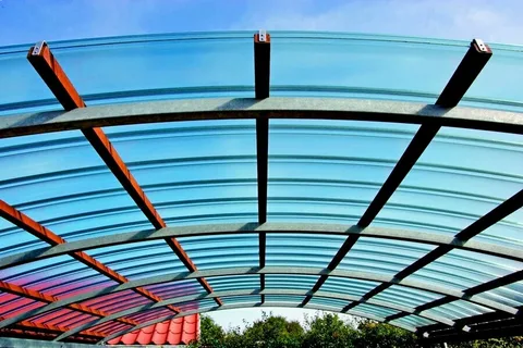
Sola Glaze solid polycarbonate sheets are an excellent choice for sustainable roofing and skylights. Their lightweight yet robust nature ensures durability, while their impressive thermal insulation properties contribute to energy efficiency. These sheets allow natural light to flood interiors, reducing the need for artificial lighting during daylight hours and consequently lowering energy consumption.
Moreover, Sola Glaze polycarbonate is UV-resistant, which means it won't deteriorate or yellow over time, ensuring that your skylights and roofing maintain their clarity and efficiency for years. This makes Sola Glaze a top choice for green buildings, homes, and commercial structures aiming to reduce their environmental footprint.
2. Protective Barriers and Security Glazing
In applications where safety and security are paramount, Sola Glaze solid polycarbonate shines. These sheets possess exceptional impact resistance, making them ideal for protective barriers, security glazing, and even riot shields. Their ability to withstand heavy blows, projectiles, and vandalism ensures the safety of people and property.
In environments like banks, government buildings, correctional facilities, and public transportation, Sola Glaze solid polycarbonate acts as a formidable shield against threats, adding an extra layer of protection without compromising visibility.
3. Modern Architectural Glazing
Architects and designers are increasingly turning to Sola Glaze solid polycarbonate to create stunning architectural designs that emphasize natural light and transparency. The material's optical clarity allows for breathtaking façades, interior partitions, and decorative elements. Its versatility in terms of shapes, sizes, and textures offers limitless possibilities for crafting visually striking structures.
Sola Glaze sheets are easy to work with, allowing architects and designers to incorporate curves, angles, and intricate patterns into their designs. This flexibility has led to the creation of remarkable buildings and installations that push the boundaries of conventional architecture.
4. Greenhouse and Agricultural Applications
The agricultural industry has recognized the advantages of Sola Glaze solid polycarbonate for greenhouse construction. These sheets provide an optimal environment for plant growth by diffusing light evenly, reducing shadows, and maintaining consistent temperatures. This translates to higher crop yields and healthier plants.
Furthermore, the impact resistance of Sola Glaze polycarbonate shields crops from hail, harsh weather conditions, and potential vandalism. The sheets' UV resistance ensures that they remain transparent and durable under intense sunlight, prolonging the life of the greenhouse structure.
5. Creative Signage and Displays
Sola Glaze solid polycarbonate offers a unique opportunity for businesses and organizations to create eye-catching signage and displays. Its exceptional clarity, combined with the ability to incorporate textures and colors, allows for striking visual elements that attract attention and reinforce branding.
Whether used for storefront signs, trade show displays, or artistic installations, Sola Glaze sheets are a versatile canvas for creative expression. Their durability ensures that these displays maintain their appearance and effectiveness over time, even in high-traffic areas.
6. Noise Barriers and Soundproofing
In urban environments, noise pollution is a prevalent issue. Sola Glaze solid polycarbonate can be employed in noise barriers and soundproofing applications to mitigate the effects of noise pollution. Its sound insulation properties, combined with its impact resistance, make it an excellent choice for constructing noise barriers along highways, railways, and industrial zones.
The transparency of Sola Glaze sheets ensures that visibility is not compromised, allowing pedestrians and motorists to maintain a clear line of sight while enjoying reduced noise levels.
0 notes
Text
Exploring the Role of Light Diffusion with BOPET Matt Film: The Science Behind Plant Growth
Environmental conditions complicate plant growth. Light is one of the most important components of photosynthesis, which converts light energy into chemical energy for plant growth. Recent agricultural technology has investigated how controlling light can boost plant development. BOPET matt, a biaxially oriented polyester film from China Bopet matt film suppliers, has revolutionized agricultural light diffusion. This article explores plant growth science and how BOPET matt film optimizes light exposure.
Light and Plant Growth
Plants rely on light for photosynthesis. Plants use chlorophyll to convert carbon dioxide and water into glucose and oxygen. Light quality, quantity, and duration affect photosynthesis and plant growth.
Plants benefit most from violet to red visible light. Blue and red light are crucial because they affect chlorophyll formation and photosynthetic efficiency. Too much or poorly distributed light can cause photosynthetic inefficiency, stress, and poor plant growth.
The Value of Light Diffusion
Direct sunlight helps plants grow, but it's only sometimes uniformly distributed. Light intensity in nature varies with time of day, weather, and location. Light distribution must be even, but consistent plant growth in greenhouses is difficult.
Here comes light dispersion. Light diffusion scatters light to distribute light intensity evenly across the plant canopy. This prevents hot patches of intense light from damaging plants and ensures that all plant sections receive enough light for photosynthesis.
BOPET Matt Film Improves Light Diffusion
A highly developed substance called BOPET matt film diffuses light well. However, due to its bumpy surface, BOPET matt film scatters incoming light in different directions, unlike clear films. The scattering effect distributes light evenly across the plant surface, improving photosynthetic efficiency.
The matt surface of the BOPET coating lowers glare and diffuses light. This is especially crucial in greenhouses or indoor growth places where sunlight may be filtered through glass or plastic, or artificial lighting may not cover all plant sections. BOPET matt film helps growers ensure light homogeneity for optimum plant growth.
Advantages of BOPET Matt Film in Agriculture
Enhanced photosynthesis: BOPET matt sheet evenly diffuses light to give plants the best photosynthetic light. Healthy, quicker growth boosts agricultural production.
Protection from Light Stress: Intense direct light can cause photodamage in vulnerable crops. The BOPET matt sheet softens light intensity, protecting plants from extreme radiation.
Improved Light Efficiency: The BOPET matt coating increases light in greenhouses and indoor grow rooms. The coating disperses light well, helping plants use more light.
Durability and UV resistance: BOPET matt film is UV-resistant and durable, making it a great long-term choice for agricultural settings requiring continuous performance. The film's UV resistance prevents solar damage, preserving its light-diffusing capabilities.
Application of BOPET Matt Film in Greenhouses
BOPET matt film works well in greenhouses due to its controlled atmosphere. Optimizing light dispersion with BOPET matt film in the greenhouse is crucial in places with fluctuating sunlight. The film can cover greenhouses' exteriors to improve natural light diffusion and interiors to improve artificial lighting.
BOPET matt film improves greenhouse temperature regulation. The coating diffuses light evenly, preventing greenhouse hot spots and making plant growth more steady and comfortable.
Future of BOPET Matt Film in AgTech
Advanced materials like BOPET matt film may become more popular as agriculture evolves. Growing interest in sustainable farming and indoor production drives demand for efficient light management technologies. BOPET matt film may boost crop yields while saving energy.
BOPET matt film, LED illumination, and sophisticated climate management could improve growth. More research on light diffusion and plant development will likely lead to new materials and uses.
Conclusion
In conclusion, light is crucial to plant growth, and manipulating and optimizing light exposure is crucial for crop productivity and plant health. BOPET matt film's light-diffusing qualities improve agricultural light dispersion in a novel way. BOPET matt film shapes sustainable farming and indoor agriculture by boosting photosynthesis, protecting plants from light stress, and optimizing light efficiency. This technology will improve plant growth and agricultural productivity, making farms healthier and more efficient.
0 notes
Text
What is Light Diffuser and Why Do You Need One?

Introduction
Lighting plays an essential role in setting the ambiance of any space, whether it's your home, office, or a commercial setting. A well-planned lighting setup can transform the feel of a room, making it more comfortable and visually appealing. One of the key elements of modern lighting design is the light diffuser. This guide will walk you through everything you need to know about LED light diffusers, LED light diffuser sheets, and light diffuser sheets, helping you make an informed decision for your space.
What is a Light Diffuser?
A light diffuser is an optical component that spreads lights evenly across a given space. It softens the sharp light coming from bulbs, especially LED lights, making the illumination more balanced and less harsh on the eyes. In simpler terms, a ensures that the light produced is uniform and free from excessive glare, creating a more pleasant and visually comfortable environment.
Why is a Light Diffuser Necessary?
Lighting, particularly from LED sources, can be intense and focused, often leading to high contrasts, shadows, and glares that can cause discomfort or eye strain. A Light diffuser mitigates these issues by spreading the light across a broader area. As a result, spaces like workstations, living rooms, or photography studios benefit significantly from the use of light diffusers.
Benefits of Using a LED Light Diffuser
However, they also tend to emit concentrated beams of light that can be overly bright. This is where a LED light diffuser becomes invaluable. Here are some of the key benefits of using a LED light diffuser:
Enhanced Quality: A LED light diffuser helps create a softer, more even glow. This can improve the overall lighting quality in spaces such as offices, homes, and even retail environments.
Reduction of Glare: Glare can be uncomfortable and even harmful to the eyes over time, particularly when working or reading. A light diffuser dramatically reduces glare by scattering the light.
More Uniform Lighting: Achieve an even spread of light across the room, minimizing bright spots and shadows. This is essential for workspaces where consistent lighting is necessary for tasks.
Energy Efficiency: Diffusers help you make the most of your LED lights without needing excessive energy. You can get the perfect lighting while keeping energy consumption low.
Types of LED Light Diffusers
Not all diffusers are the same. Depending on your lighting setup and requirements, you may need a specific type of LED light diffuser. Below are some common types:
LED Light Diffuser Sheets: One of the most flexible options available, LED light diffuser sheets can be cut to size, making them an ideal choice for custom lighting setups. They’re widely used in photography, offices, and retail spaces where specific lighting effects are needed.
Acrylic Diffusers: Acrylic diffusers are lightweight and durable. They offer excellent light-diffusing properties and are often used in both residential and commercial lighting fixtures. They’re ideal for situations where aesthetics and functionality are equally important.
Polycarbonate Diffusers: Polycarbonate-based diffusers are known for their impact resistance, making them a great choice for high-traffic areas like schools, hospitals, or retail stores. These diffusers are also weather-resistant, which makes them suitable for outdoor lighting applications Read more
1 note
·
View note
Text
Best Practices for Filming eLearning Videos on a Budget
Creating engaging and effective eLearning videos doesn’t have to be expensive. With careful planning, creativity, and a focus on key elements, you can produce high-quality educational content without breaking the bank. Here are some best practices for filming eLearning videos on a budget that will help you deliver impactful learning experiences without compromising quality. Plan Thoroughly Before You Start Before you hit record, it’s essential to plan every aspect of your video. Start with a clear script and storyboard. These tools will guide your filming process and ensure that you stay focused on your objectives. A well-prepared script not only keeps the content concise and relevant but also helps avoid unnecessary reshoots, saving both time and money. When storyboarding, visualise each scene, shot by shot. This will allow you to anticipate any potential challenges, such as lighting or camera angles, and solve them before filming begins. Additionally, planning ahead will help you stick to your budget, as you’ll have a clear idea of what’s needed, reducing the risk of unexpected expenses. Use Affordable Equipment High-quality equipment can be expensive, but there are budget-friendly alternatives that still deliver excellent results. Modern smartphones, for example, have advanced cameras capable of recording high-definition video. Pair your smartphone with an inexpensive tripod or stabiliser to ensure steady shots. These tools are essential for avoiding shaky footage, which can distract learners and detract from the professionalism of your content. For audio, consider investing in an affordable external microphone, such as a lapel or shotgun mic. Clear, crisp audio is crucial in eLearning videos, as poor sound quality can make content difficult to understand, leading to disengagement. Fortunately, there are many budget-friendly microphones available that offer a significant improvement over built-in smartphone mics. Leverage Natural Lighting Lighting plays a crucial role in video production, and good lighting doesn’t have to be expensive. Natural light is free and can be a powerful tool in your filming arsenal. Whenever possible, shoot your videos during the day and position your subjects near windows to make the most of natural light. This will help ensure that your footage is bright, clear, and professional-looking. If you’re filming indoors and natural light is limited, consider using inexpensive LED lights or even household lamps to enhance the lighting. Just be sure to avoid harsh shadows and overexposure by diffusing the light with a simple white sheet or a piece of parchment paper. Shooting during the “golden hour”—the hour after sunrise and the hour before sunset—can also add a warm, soft glow to your videos, giving them a polished, cinematic look without the need for expensive lighting equipment. Optimise Your Filming Locations Choosing the right location for your eLearning videos can significantly impact production quality without adding to your budget. Look for quiet, well-lit spaces that require minimal setup and won’t incur additional costs. Avoid locations with heavy background noise, such as traffic or air conditioning units, which can be distracting and reduce audio quality. Consider filming in a home office, a quiet room in your house, or even a local library. These spaces often have the necessary elements to create a professional-looking video without the expense of renting a studio. If you need a more polished backdrop, try using free or low-cost background options, such as a plain wall, a bookshelf, or a fabric backdrop. These simple setups can add depth and professionalism to your videos without requiring a significant financial investment. Edit with Budget-Friendly Software Editing is where your video truly comes to life, and fortunately, there are many free or low-cost editing tools available that offer powerful features. Software like DaVinci Resolve, HitFilm Express, and iMovie provide everything you need to create professional-looking eLearning videos, from cutting and trimming clips to adding transitions, effects, and titles. Online tools like Clipchamp or Kapwing are also excellent options for simple editing tasks and are particularly user-friendly for those new to video production. These platforms often include templates, stock footage, and other resources that can enhance your videos without additional cost. Remember to keep your editing simple and focused on clarity. Overly complex edits or excessive effects can be distracting and may take away from the educational content of your video. Aim for a clean, polished final product that effectively communicates your message. Incorporate Free Stock Resources To enhance your videos without increasing your budget, consider using free stock footage, images, and music. Websites like Pexels, Pixabay, and Videvo offer high-quality stock footage and images that can add visual interest and context to your eLearning videos. Similarly, platforms like Bensound, Incompetech, and the YouTube Audio Library provide a wide range of royalty-free music that can elevate the production value of your content. These resources can be particularly useful for illustrating concepts, setting the mood, or providing transitions between sections of your video. By incorporating stock resources, you can make your videos more dynamic and engaging without incurring the costs associated with original production. Filming eLearning videos on a budget is entirely possible with careful planning, the right tools, and a bit of creativity. By leveraging affordable equipment, natural lighting, optimal locations, and budget-friendly editing software, you can produce high-quality videos that effectively engage learners and convey your message. Incorporating free stock resources further enhances your videos, adding professionalism and polish without additional expense. With these best practices, you can create impactful eLearning content that fits your budget and meets your educational goals. Find out more about how we can help you create your next e-learning video : +44 (0)113 288 3245 | [email protected] Your Industrial Story Starts Here Press the button. Make the call. Transform your media. +44 (0)113 288 3245 [email protected] Contact Us
0 notes
Text
The Versatility of Acrylic Applications Across Different Industries
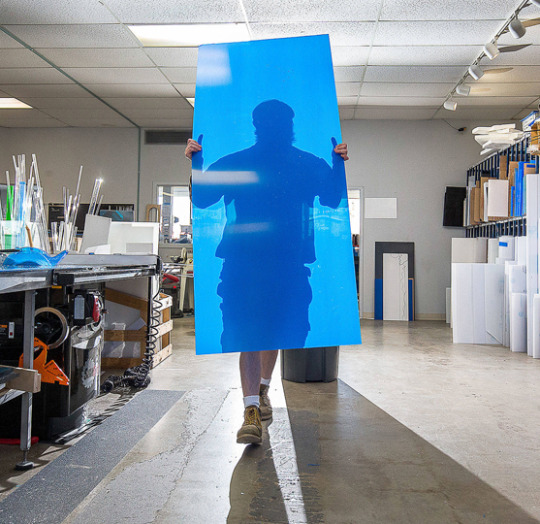
Acrylic’s adaptability across a broad range of industries highlights its importance in modern manufacturing and design. As industries evolve, the role of acrylic is likely to expand even further, contributing to innovations that shape the future.
Acrylic, also known as polymethyl methacrylate (PMMA), has become a widespread material in modern industries due to its unique combination of properties. Its clarity, strength, lightweight nature, and resistance to UV rays and weathering make it an ideal choice for a wide range of applications. From construction to fashion, acrylic plays a crucial role in many fields, proving its versatility time and time again. We will explore the diverse applications of acrylic across different industries.
1. Construction and Architecture
Acrylic is a preferred material in construction and architecture, especially where transparency and durability are required. It’s commonly used in windows, skylights, and facades, offering the clarity of glass but with significantly less weight and higher impact resistance. Acrylic sheets can be molded into various shapes, allowing architects to create innovative designs.
In addition to its structural applications, acrylic is often used in interior design. It’s found in furniture, partitions, and decorative elements where its glossy finish and the ability to be tinted in various colors add aesthetic appeal. Acrylic’s weather resistance also makes it suitable for outdoor applications like signage, light fixtures, and exterior panels.
2. Automotive Industry
The automotive industry heavily relies on acrylic for its combination of lightweight and durability. It is widely used in car windows, sunroofs, and headlights. Acrylic’s ability to withstand environmental stress, including exposure to UV light, makes it an ideal material for these applications. Its lightweight nature contributes to overall vehicle efficiency, improving fuel economy.
Moreover, the aesthetic versatility of acrylic allows automotive designers to create sleek, modern-looking components, enhancing both the functionality and appearance of vehicles.
3. Medical and Healthcare
In the medical and healthcare sectors, acrylic is valued for its clarity, biocompatibility, and ease of sterilization. It is commonly used in medical devices, such as incubators, surgical instruments, and protective shields. Acrylic’s transparency allows for clear visibility, which is crucial in many medical applications.
Additionally, acrylic is used in dental practices for making dentures, crowns, and orthodontic appliances. Its moldability and strength ensure a comfortable and durable fit for patients. The material’s non-toxic nature makes it safe for use in close contact with the human body.
4. Retail and Advertising
Acrylic is essential in the retail and advertising industries due to its excellent light transmission and ease of fabrication. It is frequently used for signage, point-of-purchase displays, and product stands. Acrylic Supplier says that acrylic’s ability to be laser-cut and engraved allows for intricate designs, making it ideal for customized promotional materials.
In the advertising world, acrylic lightboxes and displays are popular because they effectively catch the eye and convey messages. The material’s durability ensures that these displays maintain their appearance over time, even in high-traffic environments.
5. Electronics and Technology
The electronics and technology industries also benefit from the versatility of acrylic. It is often used as a protective cover for screens and displays due to its high optical clarity and scratch resistance. Acrylic’s insulating properties make it suitable for use in various electronic components, helping to protect them from dust and moisture.
Acrylic is also used in the manufacturing of LED light diffusers, enhancing the light’s distribution and providing a softer, more even illumination. Its lightweight nature and ease of machining make it a popular choice for custom electronic enclosures and cases.
6. Fashion and Jewelry
In the fashion industry, acrylic is celebrated for its ability to replicate the appearance of glass or gemstones while being much lighter and more affordable. It is used to create a wide range of accessories, including jewelry, sunglasses, and watches. Acrylic’s versatility allows designers to experiment with bold colors and innovative shapes, creating unique and fashionable pieces.
Moreover, acrylic is used in the production of fashion-forward clothing items, such as clear heels, bags, and statement jewelry. The material’s durability ensures that these items can withstand the wear and tear of everyday use, maintaining their style and integrity.
7. Art and Design
Acrylic has long been a favorite among artists and designers due to its workability and aesthetic appeal. Acrylic paints, for example, offer vibrant colors and quick drying times, making them popular among painters. The material’s ability to be cast, shaped, and polished allows sculptors and designers to create intricate and durable pieces.
In contemporary design, acrylic is often used for furniture, lighting, and home decor. Its transparency and ability to be colored make it a versatile material that can complement various design styles, from minimalist to eclectic.
0 notes