#leaded glass window door transom
Explore tagged Tumblr posts
Photo

Kitchen Enclosed Inspiration for a mid-sized timeless kitchen remodel with a beige floor and a medium-tone wood floor, soapstone countertops, raised-panel cabinets, a black backsplash, a metal backsplash, stainless steel appliances, and an island.
#steel backsplash#storage & organisation#leaded glass window door transom#soapstone countertops#kitchen cabinets
0 notes
Text
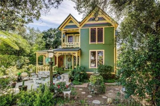
I looked at 25 homes this morning, expecting gorgeous interiors and all I got was smacked in the face with modern pure white renovations. Every damned one of them. Even a gorgeous Art Deco exterior was stark modern white inside. And, then I found this 1888 Gothic Revival Victorian in Redlands, California. 4bds, 2ba, $759K.
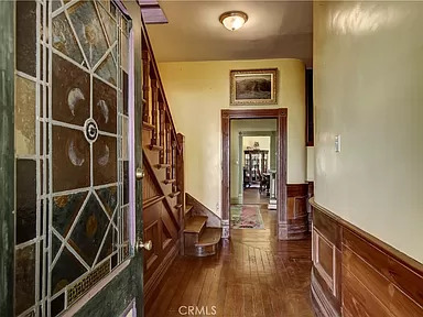

At last, an original entrance, with wood that's been lovingly stripped and redone. The house will need some work and updating, but it's livable.
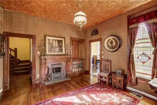
Off the main hall is a wonderful sitting room. I don't why it looks like they put chipboard on the ceiling, but the Victorian light fixture is beautiful.
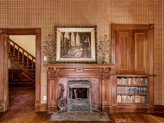
Interesting feature- a lovely original fireplace, but is the bookshelf original? Is that a half door, or is it just blocking it? The old wallpaper is stained and will need replacing.

Lovely antique furniture in the 2nd sitting room is, for some reason, placed around the perimeter of the room.

That looks like an original ceiling fixture in the dining room. I don't know why they chose these colors, though.

The kitchen is small and updated, and I'm glad that they didn't expand and modernize it. You can use it, while deciding what to do with it.
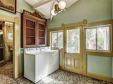
The back porch off the kitchen has possibilities.

I don't know why they went with river rocks in this shower room, but they did, and it would be difficult to remove.
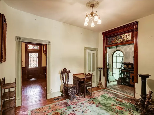
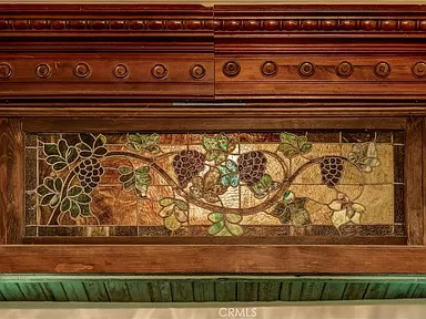
This other room off the main hall has a stained glass transom above the doorway.
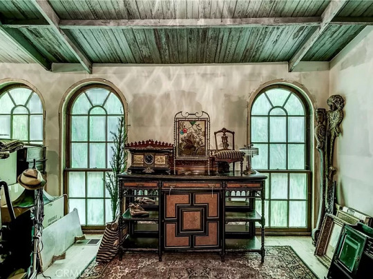
Love this room- look at the windows and ceiling.
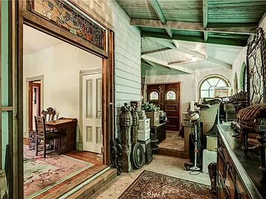
It's actually an enclosed sun porch. Looks like they're packing all the wonderful antiques up, getting ready to go.


The 2nd fl. landing. This home has exquisite stained glass windows.
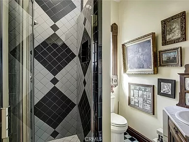

The 2nd bath up here has a tile shower and a sort of vintage sink cabinet.

The 2nd level hall leads to some lovely bedrooms.
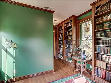

What a great library.

The details over the door.
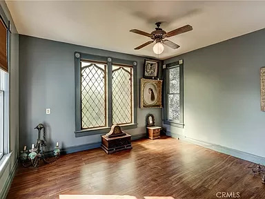
This bedroom has pretty windows.
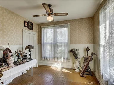
This one has some nice wainscoting. Some cheery wallpaper and it's good to go.

The home has a stunning porch and a beautiful front garden.
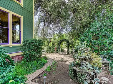


The rear gardens look like a secret garden.
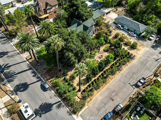
The aerial view shows all the greenery.
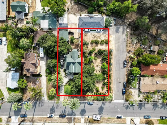
The 9,000 sq. ft. lot is a double corner lot.
184 notes
·
View notes
Text
#796: DADA Tower Breakdown - 2
<<< Part 1
Okay, so, here we are.
Fasten your coffee, this will get confusing very soon.
But first of all, that minute fact that not everything matches should not cast shadow on the designer teams' work. Hogwarts is majestically done, truly impressive, it can afford a mishmash or two at places of little importance. North Hall windows are small and insignificant compared to the insanely tall lancets of Faculty Tower or small intricacies oт the Library's windows.
Seconding this, look at the sight of DADA Tower's southern wall:
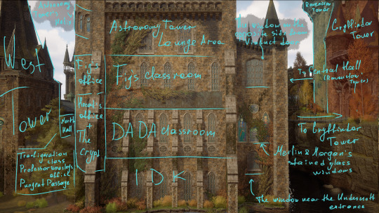
I'm certain where you're looking at.
The delulu hat is on so, look at these windows on the first floor, then at the Undercroft entrance window, and then at this:


The clock door should lead you inside the empty class, then you'd take the staircase to the office room in the adjusting tower (Fig and Hecat's offices have those, I assume, it's the same for every classroom for this particular floor design), and only then the Undercroft staircase takes you down to the crypt.
It potentially means that the Undercroft isn't as hidden and unknown as Sebastian thinks it is. In his own words:
I've never heard anyone else speak of it. And I've certainly never seen anyone else here.
You've never heard anyone speak of it because the staff is unlikely to mention to the whole student body composed of adolescents (that also includes certain Garreth Weasley) that there's a large, empty, and unsupervised space to be found just within the DADA Tower; to those smartarses piquing at windows (me) a curious lock was put up.
The hat is off my head so, windows of DADA class:


Windows of Theory of Magic / Fig's class:
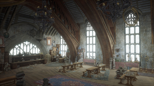
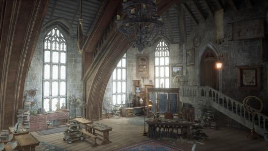
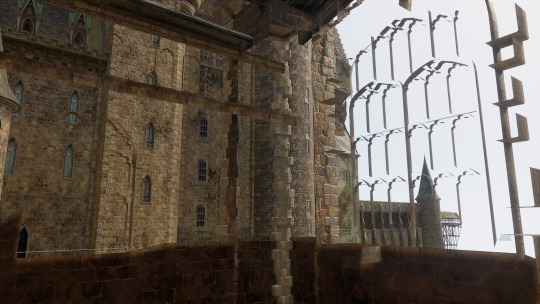
If you think something doesn't add up, you're correct. The angled window isn't present on the outer wall and the back window looks inside a wall as well as the window in the hall room outside the class:

The Lounge Area:

Professor Shah's windows:
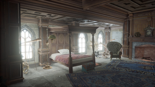
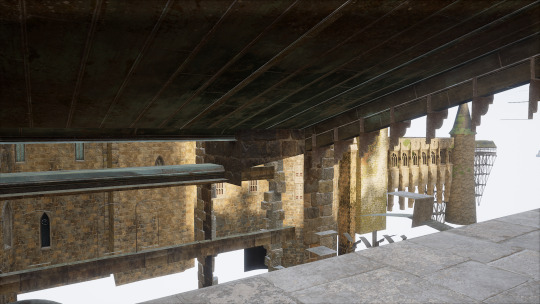
I am not going to lie: while I did stroll around the tower and checked if the hall's windows match with the castle's exterior, I won't include those for the sake of my own sanity; it would also put me on tight image count. To tell it short, many windows are placed on balconies that are inaccessible to the player and do not actually have any interior. Yet, many do have brightly lit windows.
My favourite example of this is Charms class.

The window row on the lower part of the wall is actually within castle's interior:

I'm not going to question this from the design standpoint as castles did have transom windows but I do have questions as to why would these be lit as brightly. Might be my graphics settings, though.
This you should be very familiar with:

The helix leading up the Astronomy class Room of Requirement.
Now to the section I pretend I don't see:
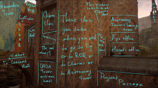
The cat alcove (from the Viaduct entrance):
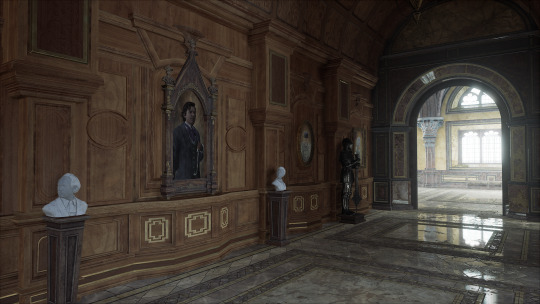

ToM Hall is the area outside Fig's classroom, Theory of Magic Hall:

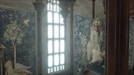
Speaking of which, if you look down from the ledge(?), you'll spot a large stained glass window that resembles an old HP2 game texture:

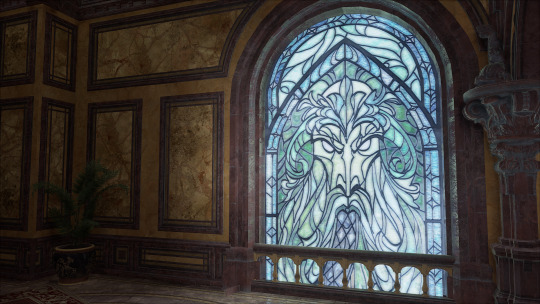
Outside view:

phew, I took me sorter than I anticipated. ^ ^ Before the post ends, however, I want to add a bonus: Professor Hecat's office.
Upon entering you'll face a round wall with a set of small windows. You could spot them from outside, but.
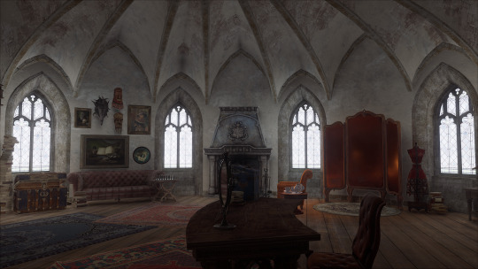
This is what actually behind those windows:


tags: @endeavour12345 @phinik-nonw @thriftstorebabayaga
#днявочка#hogwarts legacy#hogwarts inquires#eng tag#hogwarts legacy mc#dinah hecat#sebastian sallow#ominis gaunt#днявочка: hlegacy#днявочка: игры
41 notes
·
View notes
Text
1567 Pine Lake Dr, Naperville, IL 60564 | Home for Sale

Your dream home awaits in Naperville!
Welcome to 1567 Pine Lake Dr, Naperville, IL – where luxury meets lifestyle! This exceptional residence stands out with its blend of timeless elegance, cutting-edge features, and a welcoming charm that makes you feel right at home.
Nestled in one of Naperville’s most sought-after communities, you'll be drawn into a world of comfort, style, and unforgettable experiences. Let’s discover all that this stunning property has to offer!

As you step into the 8' x 8' foyer, you’re immediately greeted by the grandeur of a two-story ceiling and a magnificent chandelier that illuminates the space.
The hardwood floors gleam underfoot, leading your eyes to a niche with a window that allows natural light to pour in, setting the tone for the luxurious journey ahead.

The dining rooms are a host’s dream come true!
To your left, step through the charming French doors into the 15' x 12' formal dining room—the ultimate space for hosting elegant dinner parties and celebrations.
With its crown molding and rollout windows, this room sets the stage for unforgettable gatherings, offering a warm and sophisticated ambiance.
But wait, there's more!
This exquisite Naperville home boasts a spacious office, measuring 15' x 13', just a few steps away. Featuring gleaming hardwood floors, a striking chandelier, and a wide-open entrance, this space is perfect for work from home situations.

Five-star luxury in the primary suite
The 20' x 17' primary bedroom offers a five-star hotel level of relaxation! This grandiose bedroom boasts 11-foot volume ceilings, creating an open and airy feel. The centerpiece is a fireplace with a custom mantle and tile surround. Imagine cozy nights by the fire!
Double doors lead directly to a private patio, perfect for morning tranquility. Rollout windows, with stunning transoms above, let the outdoors in while maintaining your privacy.
The primary suite doesn’t stop there. Step into the 14' x 6' primary closet—custom built-ins and recessed lighting make it a haven for organization. This closet offers all the space you’ll ever need, complete with beautiful hardwood floors.

The primary bathroom: a spa-like sanctuary
French doors welcome you into this expansive 13' x 10' space, where a deep soaking tub with custom tile surround invites relaxation.
The walk-in glass-enclosed shower with intricate tile work is perfect for a refreshing escape. With double vanities and granite countertops, this bathroom is as functional as it is beautiful.
There is a second bedroom on the main level, featuring multiple windows with shades, plush carpeting, and a cozy atmosphere that makes it the ideal space for guests or a home office.

Experience entertainment at its finest in the great room
Head over to the great room (24' x 21'), where soaring 16-foot ceilings and skylights create a sense of openness. The floor-to-ceiling fireplace makes a bold statement, and built-in bookcases provide ample storage.
The room is flooded with natural light, thanks to large rollout windows with transom accents, and double doors that lead out to a spacious deck for seamless indoor-outdoor living.

Delight your inner chef in this gourmet kitchen
Right next to the great room is the 21' x 15' kitchen. This chef’s paradise features a large island with a gas cooktop, granite countertops, and a bay window that overlooks the sink, adding both functionality and charm.
Stainless steel appliances, including a double oven and dishwasher, make cooking a delight, while the planning desk keeps everything organized.

The 12-foot vaulted ceiling in the eating area, paired with recessed lighting and a chandelier, makes this kitchen truly one-of-a-kind.

Bedrooms and rec rooms galore!
Let’s head upstairs, where 3 additional spacious bedrooms await. Each room is bathed in natural light with rollout windows and blinds for privacy.
The 3rd bedroom features a walk-in closet, while the 4th bedroom, measuring 19' x 16', provides ample space for any need.
The upstairs hallway features a charming catwalk that overlooks both the foyer and the family room, adding an open, airy feel to the entire second floor.

Down in the basement, the possibilities are endless. The 41' x 19' rec room is perfect for a home theater or game room, while the additional 19' x 16' rec space offers even more room for activities.
A 5th bedroom, 15' x 15', with a double closet and bonus room, provides flexibility for guests or a home office.
With a full bathroom in the basement featuring a walk-in shower and double sink vanity, your guests will enjoy the same luxury as the rest of the home.
Outdoor living – a backyard oasis
Step out onto the 18' x 18' deck and enjoy the breathtaking views of the golf course, providing the perfect backdrop for outdoor gatherings. The concrete patio (20' x 12') off the primary bedroom offers a private retreat, while the 7' x 7' front porch and brick front with cedar siding add curb appeal.

The laundry room (12' x 9') on the main level includes a coat closet, exterior access, ample cabinetry, and an LG front-load washer and dryer. The home also features a concrete driveway, a roof with three dormer windows, and roll-out windows throughout, ensuring every corner of this house feels bright and welcoming.
This Naperville IL gem isn’t just a house; it’s a place where memories will be made, where every corner is thoughtfully designed, and where luxury and comfort are always in harmony.
Call Listing Agent Teresa Ryan or Broker Mike Loewer today for more information at 630-718-0424. Listing courtesy of Ryan Hill Group (Century 21 Circle - Naperville).
youtube
In case you can not view this video here, please click the link below to view Home For Sale: 1567 Pine Lake Dr, Naperville, IL 60564 on my YouTube channel: https://youtu.be/ivhvF7YRVYc?si=9Kt5uBlxddYNG0tF
0 notes
Text
The Evolution of Window Styles in Birmingham Homes Over the Decades

The architectural landscape of Birmingham, Alabama, has evolved significantly over the decades, and window styles have played a crucial role in this transformation. Windows not only provide light and ventilation but also contribute to the aesthetic appeal and energy efficiency of a home. Here’s a look at how window styles in Birmingham homes have evolved over the years, reflecting changes in design trends, materials, and homeowner preferences.
1. Early 20th Century: Classic and Ornate Styles
In the early 1900s, Birmingham's homes often showcased classic architectural styles influenced by the Victorian and Craftsman movements. Key features included:
Double-Hung Windows: These were the standard in many homes, allowing for ventilation by opening the top or bottom sash. They were often adorned with decorative trim and detailing.
Stained Glass: Many homes featured stained glass windows, adding an artistic touch and a sense of individuality. These windows were often found in entryways or as transoms above doors.
Transom Windows: Positioned above doors and larger windows in window replacement in Birmingham, transoms were common in homes of this era, providing additional light and ventilation while enhancing the overall design.
2. Mid-20th Century: Functionality Meets Simplicity
As Birmingham grew in the mid-20th century, the focus shifted towards more functional and simplified window designs. The post-World War II housing boom led to:
Casement Windows: These became popular due to their ease of use and ability to catch breezes. They are hinged on one side and open outward, providing excellent ventilation.
Picture Windows: Large, fixed picture windows gained popularity, offering unobstructed views of the outdoors while maximizing natural light. This style was often seen in ranch-style homes.
Aluminum Frames: The introduction of aluminum windows revolutionized window construction. These frames were lightweight, durable, and required less maintenance than traditional wood frames.
3. Late 20th Century: Energy Efficiency and Customization
By the late 20th century, energy efficiency became a significant concern for homeowners, particularly in Birmingham’s humid subtropical climate. This period saw:
Vinyl Windows: Vinyl emerged as a popular material due to its low maintenance, energy efficiency, and affordability. Homeowners appreciated the variety of styles and colors available.
Double-Glazed Windows: The introduction of double-glazing improved insulation and reduced energy costs. These windows have two panes of glass with an insulating space in between, minimizing heat transfer.
Architectural Variety: Homeowners began to embrace diverse architectural styles, leading to a wider range of window shapes, including arched, bay, and bow windows, enhancing curb appeal.
4. 21st Century: Sustainable and Smart Solutions
As we moved into the 21st century, the focus on sustainability and technology significantly influenced window design and selection. Key trends in window replacement in Birmingham include:
Energy Star Certification: Homeowners are increasingly looking for windows that meet Energy Star standards, ensuring high energy efficiency and lower utility bills. Features such as Low-E coatings and argon gas-filled panes have become standard.
Smart Windows: Advances in technology have led to the development of smart windows that can adjust their tint based on sunlight exposure, improving energy efficiency while enhancing comfort.
Modern Aesthetic: Today’s homeowners often prefer clean lines and minimalistic designs. Large floor-to-ceiling windows and sliding glass doors are popular choices, allowing for seamless indoor-outdoor living.
5. The Future of Windows in Birmingham Homes
Looking ahead, the evolution of window styles in Birmingham homes will likely continue to reflect changing design trends, technology advancements, and environmental considerations. Anticipated trends include:
Sustainable Materials: As eco-consciousness grows, there will be a shift toward windows made from sustainable materials and those that can be recycled at the end of their lifecycle.
Enhanced Energy Efficiency: Innovations in insulation and glazing technologies will further improve the energy efficiency of windows, making them an integral part of green building practices.
Customization: Homeowners will continue to seek personalized window solutions that match their architectural style and reflect their preferences, allowing for a greater degree of individuality.
Conclusion
The evolution of window styles in Birmingham homes over the decades reflects broader architectural trends, technological advancements, and changing homeowner priorities. From the ornate designs of the early 20th century to today’s emphasis on energy efficiency and modern aesthetics, windows have played a vital role in shaping the character of Birmingham’s residential landscape.
As homeowners continue to prioritize sustainability and customization, brands like Vinyl Window Solutions are well-positioned to meet these needs, offering a range of modern, energy-efficient window options. Understanding this historical context can help homeowners make informed decisions that enhance both the beauty and functionality of their homes for years to come.
0 notes
Text

Large Vintage Stained And Leaded Glass Transom Window Door Panel ebay Petraroia Antiques
0 notes
Text
[ad_1] Ariane and Andrew Vincent’s former house in Melbourne, Australia, was the sort of place folks dream about: a three-story home close to the seaside with views of Port Phillip Bay.However after years of climbing all these stairs — and chasing three rising youngsters (now 18 to 23) amongst flooring — “we had been able to stay on one degree,” stated Ms. Vincent, 55, a enterprise marketing consultant who has labored within the furnishings business. “We needed a pool and extra of a household house that was extra enjoyable.”Six years in the past, they discovered one thing in Brighton, a close-by suburb, that captured their hearts: an 1889 Victorian brick home coated in concrete render, on a quarter-acre lot with a sunny, north-facing yard and one of many oldest, largest olive bushes they'd ever seen.“It’s in all probability one of the crucial important olive bushes in Victoria,” Ms. Vincent stated. She and Mr. Vincent, 63, who owns a cell document-shredding firm, purchased the home in November 2018 for about 2.8 million Australian dollars ($1.8 million).The home wasn’t good. It wanted repairs and had awkward additions on the again, and the inside regarded prefer it had final been up to date within the Nineteen Eighties. “It was very run-down and unloved,” Ms. Vincent stated, “and had been renovated actually cheaply.”Seeking to restore the unique grandeur and replace the house for up to date dwelling, the couple employed Mim Design, a Melbourne agency, to plan a plan. “It was all about stripping again the extra kinds that had been added over time and taking the house again to its roots with this pretty rectangular form,” stated Charlotte McGill, the director of interiors. “Then, on the rear, we designed a brand new pavilion with an analogous form to accommodate the kitchen and dwelling and eating areas, and provides them views to the backyard.”To attach the outdated construction with the addition, which they clad in shou-sugi-ban siding, they added an atrium/examine lined in floor-to-ceiling steel-and-glass doorways.Within the outdated portion of the three,500-square-foot home — which they reconfigured to create a major suite, two extra bedrooms and a sitting room — they retained and restored as many authentic particulars as they may, together with an arched entrance with ornamental corbels close to the entrance door and crown molding all through. Then they added extra period-appropriate touches, together with ornate ceiling medallions and arched panels above inside doorways.The unique hearth mantel was lacking, so Ms. Vincent hunted down an Eighteen Eighties marble substitute. For the sidelights and transom on the entrance door, she discovered leaded-glass replacements made with vintage glass.Within the addition, nonetheless, the house feels decidedly extra fashionable. Many of the area is a wide-open expanse with room for cooking, eating and lounging. On one aspect is a kitchen anchored by a smooth island constructed from Bianco Lana marble and easy grey cabinetry terminating in a window seat; on the opposite aspect is a front room with low-slung furnishings and an extended hearth topped by Venetian plaster panels that slide open to disclose bookshelves, a stereo system and a TV.On the again, two units of glass sliders open to the pool deck and backyard, designed by Kate Patterson, a panorama architect. A walkway of pavers set in grass results in a pool-house residence beneath the olive tree behind the lot.After finishing plans for the renovation in 2019, the Vincents moved right into a rental across the nook so Tenet Development may start work in Might 2020, within the early days of the pandemic.“Melbourne was one of the crucial locked down cities on the planet,” Ms. Vincent stated. “However we nonetheless acquired via it. We thought it was actually essential to assist our builders, and in consequence, we had an excellent journey.” The fee was about 3 million Australian dollars ($2 million), and the household moved again into the home in September 2021.
To finish the designers’ imaginative and prescient, the Vincents purchased virtually solely new furnishings for the home, mixing up to date items, together with a bulbous Moroso Gogan couch by Patricia Urquiola in the lounge, with midcentury-modern classics like Cassina Capitol Advanced chairs, impressed by Pierre Jeanneret, on the kitchen desk.Now the household loves spending time at house, the place the rooms movement simply into one another and the outside. “It’s simply joyful and very easy to stay in,” Ms. Vincent stated. “You're feeling such as you’re in nature, not in an city setting.”For weekly e-mail updates on residential actual property information, enroll right here. [ad_2] Supply hyperlink
0 notes
Text
Aluprof at the Passivhaus Conference

Organised by the UK’s Passivhaus Trust, the 2023 UK Passivhaus Conference was a hybrid event held at McEwan Hall on The University of Edinburgh campus on the 16th & 17th of October. Over the two day conference over 600 speakers and delegates explored the adaptability of Passivhaus, its implementation and benefits over a diverse range and scale of projects around the UK, plus its future applicability for all homes throughout Scotland.
Aluprof were delighted, once again, to support the event as a sponsor taking the lead when it comes to the specification of high thermal performance windows, doors and facade systems used in Passivhaus construction. The event was attended by Paul Sherman, Aluprof Sales Consultant and Neil Garner, Aluprof Major Projects Consultant.

‘Scotland leads the way’ was the theme for the Passivhaus Conference, the biggest held in the UK to date. There was a great deal of interest at the event following Scotland. Parliament's decision to adopt a version of the standard next year. Keynote speaker Patrick Harvie MSP, ‘Scottish Government Minister for Zero Carbon Buildings, Active Travel and Tenants' Rights’, gave an update on how the ‘Scottish equivalent to the Passivhaus standard’ policy is developing. Leading the way, Scotland is the first nation to adopt the Passivhaus standard, or its equivalent, previous adoption by Brussels, Vancouver, Massachusetts, and Heidelberg have only been adopted on a municipality level.
The Passivhaus standard is not new to Scotland, it was recognised some time ago that upfront investment in the standard across new construction was beneficial in the long term with significant benefits to health and the reduction of carbon emissions. The conference showcased a wide range of new and completed projects which included schools and social housing across the region.
Sarah Lewis, Research & Policy Director, Passivhaus Trust, commented on the growth of school projects adopting the standard, “An innovative funding mechanism from the Scottish Futures Trust has encouraged the building of schools to the Passivhaus standard in Scotland. Projects receiving funding need to meet a clean energy target. Funding may reduced based on any performance gap post-completion. The Passivhaus standard effectively eliminates the performance gap, de-risking the securing of funding. It has been impressive how swiftly the industry, supply chain, and clients have adjusted to delivering to the Passivhaus standard in the education sector.”

With the growth of projects adopting the standard, Aluprof were on hand at the Passivhaus exhibition area to introduce their two curtain wall systems and two window and door systems that carry Passivhaus certification:
Aluprof’s curtain wall system MB-SR50N Hi+, offers a slim capped mullion transom system of just 50mm. The system uses polyethylene profiles to offer high levels of insulation, allowing the system to reach a Uf from 0.59 W/(m2K). The high level of thermal insulation is coupled with excellent weather resistance of up to 1,200 Pa for both airtightness and watertightness.
Aluprof’s curtain wall system MB-TT50 further enhances the abilities of the MB-SR50N Hi+ by allowing a greater thickness of glass to be accommodated. The system uses polyethylene profiles to offer high levels of insulation allowing the system to reach a class leading Uf from 0.5 W/(m2K). The high level of thermal insulation is coupled with an improved weather resistance of up to 1,350 Pa for airtightness and up to 1,800 for watertightness.
Aluprof’s window and door system MB-104 PASSIV SI and MB-104 PASSIV AERO offers openable windows that can offer an insulation value of Uw from 0.52 W/(m2K) whilst retaining high levels of weatherability, Class 4 for air permeability for an openable window and 1,800 Pa for watertightness for an openable window.
Aluprof UK takes pride in supplying Passivhaus certified windows and curtain walling systems for one of the world's largest Passivhaus-rated student accommodation projects, nearing completion. Situated at the Frenchay Campus, the new accommodation building for the University of the West of England (UWE) spans approximately 65,000m2 and offers 2,250 new student residences.
Additionally, Aluprof systems and products are featured in the ambitious 'Greenhaus' project, set to become the largest Passivhaus social housing scheme in Manchester and the North West of England. This nine-storey development, located in Chapel Street, Salford, comprises 96 affordable homes.
All Passivhaus enquiries received by Aluprof are dealt with by experienced technicians who can help choose the right configuration for any project. As important as the right choice of product, Aluprof are also able to offer design assistance for the structure surrounding the system to ensure reveal cold bridging is reduced an absolute minimum.
Aluprof are proud to be one of Europe's largest aluminium systems companies. Specification support is available through the company’s website at aluprof.co.uk, directly from their UK head office in Altrincham or from their London office at the Building Design Centre by phoning +44 (0) 161 941 4005.
0 notes
Text
Beyond the Ordinary: Exploring the World of Decorative Sidelight Windows

Introduction
Decorative sidelight windows are a charming and functional addition to any home, providing a unique blend of aesthetic appeal and practicality. These exquisite windows, typically installed on either side of an entry door, are designed to enhance the overall architecture and interior ambiance of a home. Beyond their ornamental value, decorative sidelight windows offer numerous benefits, making them a popular choice among homeowners seeking to elevate their living spaces. In this article, we will delve into the world of decorative sidelight windows, exploring their history, design possibilities, installation, and the myriad advantages they bring to a home.
Historical Roots of Decorative Sidelight Windows
The concept of sidelights can be traced back to medieval Europe, where they were often used in grand cathedrals and castles. These early sidelights, made of leaded glass and often featuring intricate designs, allowed natural light to filter into the buildings while maintaining a degree of separation from the outside world. Over time, the use of sidelights expanded into residential architecture, and they became a hallmark of stately homes and colonial-era buildings.
The Colonial Revival movement in the 18th and 19th centuries, which sought to revive architectural styles reminiscent of the colonial period, played a pivotal role in popularizing decorative sidelight windows in the United States. These windows were considered essential to the aesthetic of colonial homes, and their resurgence had a lasting impact on architectural preferences.
Design Possibilities
One of the most captivating aspects of decorative sidelight windows is the wide array of design possibilities they offer. Homeowners and designers can choose from an extensive selection of materials, shapes, and patterns to create a customized look that complements the overall style of the home. Some popular design choices include:
Leaded Glass: Leaded or stained glass sidelights have a timeless, classic appeal. They can be created with intricate, handcrafted designs, incorporating a variety of colors and textures to capture the play of light in captivating ways. Leaded glass sidelights often evoke a sense of nostalgia and elegance.
Etched Glass: Etched glass sidelights allow for a more subtle, sophisticated design. Patterns, motifs, or even personalized images can be etched onto the glass, creating a unique, artful appearance. Etched glass sidelights can range from minimalistic to highly detailed, depending on the homeowner's preferences.
Frosted Glass: Frosted glass provides privacy without sacrificing the inflow of natural light. This design option can be used to achieve a clean and modern aesthetic while maintaining a sense of openness.
Geometric Patterns: Geometric patterns, such as diamonds, rectangles, and squares, can add a contemporary touch to a home's exterior. These patterns are often created with leaded glass or by adding texture to the glass surface.
Nature-Inspired Designs: Floral, botanical, or nature-inspired motifs can bring the beauty of the outdoors into your home. These designs can be especially appealing for those seeking a connection with nature while enjoying the benefits of privacy and aesthetics.
Transom Windows: In addition to sidelights, transom windows located above the entry door can be incorporated into the design to create a cohesive and balanced look. These transom windows can complement the design of the sidelights or introduce a new dimension to the overall aesthetic.
With such a vast range of design options, homeowners have the freedom to personalize their decorative sidelight windows to align with their specific tastes and the architectural style of their home.
Installation and Maintenance
Installing decorative sidelight windows requires careful planning and skilled craftsmanship. These windows are typically situated on either side of the entry door, so precise measurements and alignment are crucial. A professional installer can ensure that the sidelights are level, well-insulated, and properly sealed to prevent air leakage and water infiltration.
Maintenance for decorative sidelight windows is relatively straightforward. Routine cleaning with a mild, non-abrasive glass cleaner and a soft cloth can help keep the glass looking its best. Periodic checks for seal integrity and weatherstripping can help maintain energy efficiency and prevent drafts. If the window is made with leaded or stained glass, it's important to inspect the soldering and lead caming for any signs of wear or damage.
Due to their durability, well-maintained decorative sidelight windows can last for many years, retaining their beauty and functionality.
Benefits of Decorative Sidelight Windows
Decorative sidelight windows offer a plethora of benefits to homeowners, ranging from enhancing the curb appeal of a home to improving its overall comfort and functionality. Here are some of the key advantages:
Aesthetic Enhancement: Decorative sidelight windows serve as an eye-catching focal point, adding character and elegance to the front of a home. They can transform an ordinary entryway into a grand and inviting space, making an immediate impression on visitors.
Natural Light: The primary function of sidelight windows is to allow natural light to enter the interior. This not only reduces the need for artificial lighting during the day but also creates a warm and welcoming atmosphere within the home.
Privacy: While sidelight windows let in light, they can also be designed to provide privacy. This is especially beneficial for homes situated in close proximity to neighbors or busy streets. Frosted or etched glass options allow homeowners to enjoy both light and privacy.
Energy Efficiency: Modern decorative sidelight windows are often equipped with energy-efficient glass options, such as low-E coatings and insulating gases. These features help regulate indoor temperatures, reducing energy consumption and utility costs.
Security: When installed with reinforced glass, decorative sidelight windows enhance the security of a home. Laminated or tempered glass can resist breakage, making it more challenging for intruders to gain access.
Curb Appeal: Decorative sidelight windows significantly contribute to a home's curb appeal and market value. They create a distinctive and memorable first impression, which can be especially advantageous when selling a home.
Customization: The design flexibility of decorative sidelight windows allows homeowners to express their individual style and taste. These windows can be tailored to match the existing architectural elements of the home.
Versatility: Decorative sidelight windows are not limited to the front entry. They can be incorporated into various areas of the home, such as hallways, stairwells, or even interior doors, adding a touch of elegance throughout the house.
Resale Value: Homes with decorative sidelight windows tend to command higher resale values. Their uniqueness and appeal can make a property stand out in a competitive real estate market.
Historical Preservation: For those who own historic homes, decorative sidelight windows help maintain the architectural integrity and authenticity of the property, ensuring its historical significance is preserved for generations to come.
Conclusion
Decorative sidelight windows are a captivating fusion of form and function, offering homeowners a myriad of design possibilities, enhanced curb appeal, and numerous practical benefits. With their historical roots and diverse design options, these windows have the power to transform an ordinary entryway into a statement of style and elegance. The advantages of decorative sidelight windows extend beyond aesthetics, encompassing energy efficiency, security, and privacy.
0 notes
Link
0 notes
Text
The Transformative Power of Leaded Glass for Colorado Springs Homes
New Post has been published on https://www.coloradospringsstainedglass.com/2023/07/06/the-transformative-power-of-leaded-glass-for-colorado-springs-homes/
The Transformative Power of Leaded Glass for Colorado Springs Homes

Welcome to Colorado Springs Stained Glass, your premier destination for exquisite leaded glass in Colorado Springs. If you’re seeking to elevate the aesthetics and functionality of your home, look no further than the timeless beauty of leaded glass. In this article, we’ll explore the wonders of leaded glass, its distinct characteristics, and why it’s an excellent choice for Colorado Springs homeowners. Get ready to be inspired!
Understanding Leaded Glass
Leaded glass, also known as leaded glasswork, is a form of artistry that involves the craft of joining multiple small pieces of colorless glass together using lead caming. This technique dates back centuries and has stood the test of time as a symbol of elegance and sophistication. Leaded glasswork offers a unique interplay of light and texture, creating a visually captivating experience for anyone who beholds it.
The Versatility of Leaded Glass
One of the distinguishing aspects of leaded glass is its incredible versatility. Unlike its vibrant counterpart, stained glass, leaded glass typically features colorless glass. This allows it to seamlessly blend with any architectural style and color scheme, making it a fantastic choice for Colorado Springs homes.
Leaded glass can be found in various forms, including windows, doors, transoms, skylights, and even room dividers. Its ability to transform ordinary spaces into extraordinary ones makes it a highly sought-after feature among homeowners looking to add a touch of elegance and sophistication to their living environments.
The Beauty of Beveled Glass
Within the realm of leaded glass, there is a technique known as beveled glass that adds an extra layer of refinement and allure. Beveled glass is achieved by cutting and polishing the edges of the glass at precise angles, resulting in a stunning prism-like effect. This technique not only enhances the visual appeal of leaded glass but also allows it to reflect light in a truly mesmerizing manner.
Enhancing Your Home with Leaded Glass Windows
Leaded glass windows offer a plethora of benefits that make them a fantastic choice for Colorado Springs homeowners. Firstly, they allow an abundance of natural light to permeate your living spaces, creating a warm and inviting atmosphere. This is particularly advantageous for areas where you desire ample sunlight, such as living rooms, kitchens, and dining areas.
Secondly, leaded glass windows provide an excellent balance between privacy and openness. The intricate patterns and textures of leaded glass not only add visual interest but also offer a level of privacy, making them perfect for bedrooms, bathrooms, and even street-facing windows. You can enjoy the breathtaking views of the Briargate neighborhood or the charm of Pleasant Valley while maintaining your personal space.
Transformative Applications of Leaded Glass
Leaded glass can enhance various areas of your Colorado Springs home, allowing you to infuse each space with a touch of elegance and sophistication. Here are some suggestions for incorporating leaded glass into your home:
1. Entryways
Make a lasting impression with a stunning leaded glass entryway. The intricate patterns and textures will greet your guests with a touch of elegance and charm, setting the tone for your entire home. Whether you reside in the luxurious Broadmoor neighborhood or the affordable district of Briargate, a leaded glass entryway will truly elevate your curb appeal.
2. Windows and Doors
Replace ordinary windows and doors with leaded glass alternatives to elevate the aesthetics of your living spaces. Leaded glass windows and doors not only bring in natural light but also add a touch of sophistication and visual interest to any room. Whether you’re enjoying the mountain views from your Rockrimmon home or appreciating the tree-lined streets of Pleasant Valley, leaded glass windows and doors will enhance the beauty of your surroundings.
3. Room Dividers
Create a sense of separation and elegance within your home by incorporating leaded glass room dividers. These dividers serve as functional art pieces, allowing light to pass through while defining distinct areas in an open-concept living space. Whether you’re dividing your dining area from the living room or creating a cozy reading nook, leaded glass room dividers add a touch of sophistication to your Colorado Springs home.
4. Skylights and Transoms
Introduce a touch of grandeur and natural illumination into your home with leaded glass skylights and transoms. These architectural features not only bring in an abundance of natural light but also serve as focal points, adding a sense of elegance and spaciousness to any room. Imagine the beauty of sunlight filtering through leaded glass in your Briargate or Black Forest home, creating a warm and inviting atmosphere.
Beautify Your Home with Leaded Glass in Colorado Springs
Leaded glass has the power to transform your Colorado Springs home into a haven of elegance and charm. Its versatility, timeless beauty, and ability to create privacy while allowing natural light to flow through make it an exceptional choice for homeowners seeking to enhance their living spaces.
At Colorado Springs Stained Glass, we specialize in creating exquisite leaded glass designs that cater to your unique vision and style. Whether you’re looking to install leaded glass windows, doors, or room dividers, our team of skilled artisans is ready to bring your dream to life.
Contact us today to schedule a consultation and discover how the transformative power of leaded glass can elevate your Colorado Springs home. Let us help you turn your vision into a stunning reality.
0 notes
Photo


1888 Home in Cuba, Missouri is a good buy for $395K. It has 4bds. & 2ba.


The front door opens directly into a large entrance hall.


Off to the right, with pocket doors, is the sitting room.


The dining room, off the kitchen is lovely. The owner set the table so beautifully for the pictures.

They use this built-in shelf as a bar.

A door in the dining room opens to the large porch in the back.


The kitchen was remodeled, but retains a vintage look with the original doors and footprint.

Check out the service stairs in the kitchen.

Interesting spider web leaded glass window on the landing.

Look at the floor in the powder room- it’s made of pennies.


The main stairs and hallway. The owner seems to have her wedding gown on display.


The main bd. is very large and has a sitting area.

Not crazy about the remodeled bath.

One of the other bds. Love the doors and transoms in this home.

The 2nd bathroom mirrors the other bath.

This is a very nice home office, should you need one.

This house has 2 porches. A large wraparound in the front and side.

Plus another big porch in the back.

Corner property with a nice yard.
https://www.zillow.com/homedetails/305-W-Washington-St-Cuba-MO-65453/124682942_zpid
#historic home#brick eastlake house#eastlake victorian architecture#houses#house tours#home tour#long post
69 notes
·
View notes
Text
5 Quick and Easy Kitchen Makeovers
We spend a lot of time in our kitchens—and it's worth investing in the space to ensure it functions optimally. A kitchen makeover may involve adding an island or extra cabinetry or replacing dated materials.
A new layout can remove bottlenecks that waste time as you prep food or maneuver around the room. These kitchen remodel ideas will help you turn this heart of your home into a beautiful and inviting space.
1.Redesign the windows
While you may think of gorgeous cabinets, luxurious countertops, or trendy backsplash tile when you envision a kitchen makeovers remodel, windows can make an impact as well. Look for unexpected spots for new windows in your kitchen to transform the design and add extra light.
For example, adding a transom window above your sink can break up wall space that may feel repetitive and draw the eye upward.
2.Add a wine rack
A wine rack is a stylish addition that can boost your kitchen's storage. It's also a great option if you want to showcase your collection.
Consider a built-in wine rack with cubed slots that allow bottles to sit at an angle to keep their corks moist. This can work well in a kitchen or wet bar.
Sweeten homeowners Alicia and Ed used this smart kitchen remodel idea in their home. Their new wine rack adds a dramatic and stylish touch to their room without changing the existing layout.
3.Hide the range hood
While it might seem like a small detail, hiding your range hood can actually make a big difference in the look of your kitchen. It also helps reduce dust, smoke, and grease in the air.
You can even add a fun pop of color to your kitchen by painting the vent hood cover. Try a bold blue, red, or green to make it stand out.
4.Install floating shelves
Open shelving can transform a kitchen in a flash. However, there are some best practices to adhere to when installing and upkeeping this design feature.
Decorate the shelves with colors used throughout your kitchen to create a cohesive look. This will make the space appear well designed and clean. This is especially important because floating shelves are more difficult to keep dust-free than cabinets.
5.Add a few farmhouse-inspired elements
One key element to creating a farmhouse-inspired kitchen is introducing natural wood elements. This includes flooring, cabinetry, and countertops.
Adding an apron-front sink is another way to add farmhouse style. This style shows off your favorite dishes and helps create a warm and welcoming space.
Other farmhouse-inspired elements include hanging racks to store your chopping knives, cutting board and pots and pans.
6.Add some wood
While sleek marble and stainless steel are popular kitchen staples, wood can add a warm contrast. Line your cabinets with wood veneer or paint them with a dark stain to create a wood-filled effect.
Installing a wood backsplash is another small change that makes a big impact. It can also warm up a modern kitchen with a classic material that won't date as quickly as trendy tile.
7. Redesign the cabinets
Empty space above upper cabinets is a kitchen design pet peeve and can be fixed easily by adding crown molding. This will fill in the empty space and make your kitchen feel taller and more finished.
Another option is to remove the doors from your upper cabinets and display your prettiest dishes behind glass. You can even get creative and add reeded, leaded or tinted glass inserts.
8.Add a few hanging racks
Using wall-mounted racks with hooks is an easy way to keep a kitchen organized. You can also add them to the doors of your cabinets to keep utensils and other items within reach.
Open shelving is a gorgeous addition to a kitchen, but it can quickly look messy without the right amount of balance. To avoid a cluttered look, color coordinate your shelves and carefully curate what goes on them.
9.Redesign the walls
A kitchen makeover isn't just about upgrading the appliances and surfaces. It's also about rethinking the layout.
New floor-to-ceiling cabinets help visually expand this narrow kitchen makeovers in sydney. A new backsplash and a custom island bring the space together.
Kitchens aren't just a place to cook—they're the heart of every home and a gathering spot for family and friends. Show off your style with a beautiful new kitchen.
10.Redesign the doors
A new kitchen layout can eliminate bottlenecks that make it difficult to maneuver or optimize storage. For this makeover, a peninsula was removed to visually expand the room, while white upper cabinets stretch to the ceiling for an airy look.
A new backsplash helps tie the new design together, and a simple DIY embellishment like wooden appliques on cabinet doors adds cottage charm. Changing only the doors can be less expensive than refacing the existing cabinet boxes.
0 notes
Text
Elevate Your Home's Elegance with Residential Stained Glass in Denver
New Post has been published on https://www.denverstainedglass.com/company-news/elegance-residential-stained-glass/
Elevate Your Home's Elegance with Residential Stained Glass in Denver
Stained glass has long been revered for its timeless beauty and ability to infuse spaces with elegance and natural light. If you’re seeking to add a touch of sophistication to your home, consider incorporating residential stained glass. In Denver, stained glass adds charm and character to homes while also providing practical benefits like indoor illumination, privacy, and more.
Below, we will explore some exquisite stained glass ideas that can enhance your entryway, bathroom, and home without compromising on style. Discover the versatility and allure of stained glass as we delve into these creative applications!
Elegant Residential Stained Glass Ideas for Denver Homes
Residential stained glass transforms Denver homes. It adds an unparalleled level of sophistication and visual intrigue while also enhancing your home’s functionality. From the grandeur of the entryway to the tranquility of the bathroom, stained glass offers a myriad of possibilities for your home. Here are a few examples:
Enchanting Entryway Designs
Your entryway is the gateway to your home and sets the tone for the overall ambiance. Adorn your front door or sidelights with stunning stained glass panels to create an instant wow factor. Choose intricate patterns, vibrant colors, or artful designs that reflect your personal style and complement your home’s architectural features. Whether it’s a grand floral motif or a captivating geometric pattern, stained glass in the entryway adds a touch of elegance and leaves a lasting impression on guests.
Luxurious Bathroom Features
Transform your bathroom into your own private sanctuary with the addition of stained glass elements. Incorporate stained glass windows, transoms, or decorative panels to infuse the space with natural light while maintaining privacy. Explore various designs inspired by nature, such as delicate flowers, tranquil forests, or graceful birds, to create a serene and relaxing atmosphere. Or opt for a more versatile look like Mission Stained Glass or Prairie Style. Whatever you choose, you’re sure to appreciate your newly transformed bathroom. The interplay of light passing through the stained glass creates a soothing ambiance and adds a touch of refinement to your daily routine.
Privacy for Your Home
Stained and leaded glass can be excellent options for adding privacy to specific areas of your home without sacrificing aesthetics. Consider using stained glass partitions, interior doors, or room dividers to create distinct zones within larger rooms or open floor plans. Or opt for a custom-designed entryway piece to give your family privacy from solicitors and strangers who approach your home. There are countless ways to integrate privacy stained glass into your Denver home and we’re here to help you with the process!
Schedule a Consultation with a Designer
Speak to a designer about residential stained glass in Denver. Call our office today to schedule an appointment or get more information.
0 notes
Text
I stand corrected. This is one of those "first floor main bedroom" setups. I was confused too. Here's a top view of the room with some labels:

I'm basing my assumptions on where fireplaces and chimneys are. And I think I got it. I think.
Like, I'm trying to match outdoor furniture to what I can see through the windows. But I think I got it. Spoilers: this bedroom looks out over the pool in the backyard. I'll get to the outdoor fireplace and the spoilers chimney in a bit. And I cropped this a lot to avoid spoilers (ohhhhhhhhhh my God this fucking houuuuuuuse).
Main Bedroom is, again, Castlecore But Make It Modern:
Actually it's more like Chateaucore But Make It Modern.

In another era, this whole place would've been shabby chic. (If you were around in the 90s and 2000s, you know the aesthetic). What is under the dresser/bedside table though???
Again, I unironically like the wall decal, even if it is set in a weird bed niche with recessed lighting?? (I almost didn't notice.)
Update: I just realized that all the outlets in this place are in landscape and not portrait. In the US, most outlets are in portrait layout, not landscape. Inch resting.
Other view:

I do want to send much love to whoever did the flowers in this whole place because those really are lovely. What the piece of wood or stone or whatever is doing on the table, I don't know. Charcuterie?
The fireplace is hilarious to me because it really is imitating those medieval-style fireplaces but then there's the bigass flatscreen on top of it.
Actually, this room has slightly more medieval vibes than I thought at first, so this one is a bit more Castlecore than Chateacore.
And now, the main bathroom. The part we all love.

Look at that fucking SINK GAP!! Unprecedented. I've seen separations between "his and hers" sinks before but never like this. I've seen sinks that are on opposite sides of a bathroom, sure, but this straight-up has a doorway between them. And that changes the vibe entirely.
Since this house seems to like separate gender things, I'm getting the far sink is For Him and the nearer sink is For Her. See, since it has two lights for those wimmin and their makeup. Manly Men just need one light, a bucket of water, and a piece of glass to shave--if they shave.
Of course there's a chandelier in here. That's just what you do. Also I'm enjoying these leaded glass transom windows.
Now, you can't really see it except in this picture, so:

Oh yeah, that's a two-person shower. Two shower heads, two doors. Oh ho ho~ So we have to have separate sinks and also separate shower heads but we can share a stall. (Are there two toilets too???) Anyway, this is not what "save water: shower together" means! You are not saving water!
Okay, okay. Turning around:

How is there another fucking sink??? Also, there appears to be a handheld shower head in the tub. Just get in the shower. Also I have no idea what is sitting on the armoire there.
Anyway, despite the bathtub being in another custom-made niche, it still feels like it's in the middle of the room to me. I hate it.
I don't think you're reading for the next part. I just don't. But we're going there.
It's the dressing room.

So here we are at 2029 Giovanni Ct, looking at this beast of a construction with 6 bedrooms, 9 bathrooms, more dining rooms than one would expect, so much space they literally don't know what to do with it, all coming in at a whopping 12,846 sqft (~1193 sqm). Let's go inside!!
Oh Jesus, oh God, oh no.

I almost don't know where to begin...
The swirly bannister that's all the fuck over McMansions anymore. No carpet on the stairs so that's great. I can't tell if that sofa is animal print or not. The shape of that mirror is hilarious to me. The chandelier is like "minimalist castlecore" or something. The single dinky wall light by the stairs. And there are two chairs on either side of the eucalyptus explosion by the way.
This is like baroque monochrome or something.
Also, a glimpse of Dining Room #1. Keep count with me!
Literally posting this one because the doors are killing me:

Is this a lawyer foyer? Like, it both is and isn't.
Also, all this white paneling just makes me think of the "human zoo" at the end of 2001.

The decorating inspo, we wonder to ourselves?
And now, Sitting Room #1: For Him

Some arts, that's for sure. The dark wood paneling lets you know that this is the Masculine Room. Fucking coffered-ass ceiling...
From what I can figure out, this room is immediately to the right as you enter the front door. (We'll get to the white room in the background later.)
Dining Room #1:

Seriously, there is no purpose for this gap between the foyer and the dining room except that the architect wanted it there for the window, I guess. Symmetry! (I unironically like the wallpaper/wall decal though).
But what is going with the fucking eyes top of the table, Todd???

An Table Art, apparently.
I like to imagine that those two giant concrete pawn statues were supposed to go in the garden but got put inside instead. They were too cold outside. If you're cold, they're cold: bring them inside.
Those chairs look like they're upholstered with chainmail.
Love that there's a chandelier in the butler's pantry. Yeah, that makes sense. Okay, in we go:

That's a built-in Miele coffeemaker. It'll run you about $5,000 US.
I think that's moar pantry off to the left because the kitchen proper is off to the right.
Sink #1. Keep count with me!

Sinks #2 and #3! But no pasta faucet? The fuck??? Untenable.
Those hanging lamps look like they're made of Styrofoam.
Now if we turn around...
44 notes
·
View notes
Text
Descent of Man

[Image source]
Pairing: Commander Joseph Lawrence (The Handmaid’s Tale (TV)) x femme!Reader
Warnings: SPOILERS, Canon-Divergence, Non-Canon, Post Season 3, Repression, Oppression, Dystopic Future, Dystopian Themes, Older Man/Younger Woman, Mentions of Pregnancy, Mentions of Death, Traditional Gender Roles, Religious Extremism
XXXX
“Straighten your back, dear. Don’t slouch.”
“Yes, Aunt Lydia.”
You tighten your grip on the handle of your red leather suitcase as you walk up the concrete path that leads to Commander Joseph Lawrence’s front door. Nerves in your legs tingle back to life. The drive from the Red Center was long, and Aunt Lydia had counselled you to mind your patience when you’d grown restless. But now, as you make your way to the crescent-shaped steps, you can’t help but hope for even one minute more in the van.
The overcast sky looms grey and ominous overhead.
“Remember, the Commander is a very powerful man.” Aunt Lydia’s cane clacks on the concrete alongside your footsteps. “He is very well respected, Ofjoseph. This is quite the opportunity for you.”
“Yes, Aunt Lydia.”
The old Victorian becomes grander and more imposing with every step you take towards it. Your gaze lifts higher and higher: first floor, second storey, then dormers and a tower that let light into what must be the attic. Stonework and Roman arches over the windows and doors signal the age of the house—it has to be at least one hundred years old.
“He has suffered great losses recently, as you well know.”
“Yes, Aunt Lydia.” She had recited the story over and over—and made sure you could tell it back to her, too. Your and Aunt Lydia’s footsteps fall into stride along the concrete path, fast approaching the stairs up to the house.
“His dear Wife, Mrs Eleanor Lawrence—may God protect and keep her—and then his Handmaid, too.” The Aunt tuts. “Oh, that wretched girl. I’d had such hopes, Ofjoseph—but you won’t disappoint me so, will you, dear?”
“No, Aunt Lydia.” The knot in your gut tightens.
“No, good girl.” Aunt Lydia modestly raises her brown skirts to ascend the concrete steps with grace. “Posture,” she says pointedly, brow arched, looking back at you with an appraising, approving glance before she knocks on the large black front door.
Just before you bow your head to look to the concrete beneath your feet, your eye is caught by something to the right, attached to the burnt-orange bricks that make up the gloriously antiquated home.
It’s a black wooden plaque, with three golden numerals in the centre framed by a golden ovoid ring.
132
You glance down quickly. You should not even be making an attempt to read, whether it be letters or numbers or anything. If Aunt Lydia saw recognition register on your face, she’d march you straight back to the van to return you to the Red Center for the swift removal of one of your fingers.
Leniency, for your first offence.
“The Commander has been very gracious in accepting you, Ofjoseph. You have a privileged place here.”
“Yes, Aunt Lydia. Praise be.”
“Mm,” Aunt Lydia hums in righteous agreement. “Praise be.”
…But still, it strikes you as unusual, as you stare at the grey concrete, that such a plaque should even exist, now. Such decorative tiles are relics from the time before Gilead—forbidden, now, and what’s more, utterly useless. How could such an inscribed plate remain intact when there are no more street signs to direct your way let alone numbered houses?
The front door swings open, shocking you out of your thoughts.
“Blessed day. Come in, Aunt Lydia.”
A female voice. Younger? Deferential.
A Martha: one of the two you’d been told to expect here.
“Blessed day, Sienna, thank you,” Aunt Lydia replies pleasantly. “Come along, Ofjoseph,” she says promptly, without a look back at you as she steps inside.
The interior of the Commander’s house greets you like, once, a warm hug might have done. Off the foyer is two sitting rooms, and they seem dark, but not sinister inside. The walls are papered with cranberry-red brocade and muted-toned, aging florals, or else—painted with rich, deep hues of colour. Dark-stained wood pocket doors with etched glass inserts lead to one sitting room and an archway with a stained-glass transom at the top leads to another. The heavy, patterned curtains inside make the sitting rooms feel cosy and private—even, dare you think, warm. Full and ornate bookshelves, rugs of paisley and Persian patterns, and an abundance of leather seating furnish the cluttered rooms.
“This way, please,” offers the Martha named Sienna, gesturing through the open pocket doors.
You follow Aunt Lydia, your eyes struggling to adequately absorb every detail of the room. Lamps on side tables, artworks from many different Schools arranged effortlessly on the walls, chests, sculptures, a chandelier, a fireplace.
Cushions and blankets strewn over the leather couches. Stacks of books lazing on armchairs.
An old, freestanding record player in one corner.
Knowledge, art, and music all reside here.
The house is lived in. Still. Even now.
“Can I getcha a tea, some coffee, Aunt Lydia?” comes a man’s voice from the far end of the room.
Before you can think better of it, your gaze snaps to the sound of his voice—relaxed, even casual in tone. He stands just inside another arched opening, hands tucked into the pockets of his trousers. A generous head of ghost-white hair tops his head. He has thick grey brows and a white beard peppered with silver and grey. Thin-framed glasses rest on the bridge of his nose. He wears a waistcoat, and a buttoned vest with a scarf tied like a cravat, in an ascot knot.
It’s the first you’ve seen a man of Gilead not dressed in a black suit and black tie.
“Commander Lawrence,” Aunt Lydia smiles, with only a slight waver in her voice. “Blessed day, Sir.” Your raised wings catch in her periphery and she glances at you with beady eyes.
You drop your head immediately, quickly and quietly pretending like you’d been studying the many colours in the Persian rug beneath your brown boots.
The Commander’s gaze flicks to you—not that you see it—before he looks back at the Aunt. “Hi, yeah,” he says, “blessed, good morning.” He calls down the hallway, “Sienna?”
You shift on your feet, tightening your grip on your own gloved hands where they rest in front of you. The Commander’s casual, informal, incorrect greeting stirs a sense of unease in your stomach. Was he merely distracted or… wilfully disrespectful? Could you even think such a thing, about a man like him?
Beside you, Aunt Lydia bristles, drawing in a sharp, quiet gasp. But she settles herself quickly.
“Sienna!?” calls the Commander again, louder this time before turning back to his guests.
Well, his one guest, who brought with her the newest member of his household.
“’d you say coffee, Aunt Lydia? I think Beth made scones.”
“Ah…” the Aunt hesitates, gathering herself in a way you’ve rarely seen her need to do. “Oh my. Tea would be a delight, Commander,” she recovers. “No need to waste your delicacies on me!”
“Hm,” Commander Lawrence huffs a mirthless laugh in response to Aunt Lydia’s self-deprecating smile, and the resulting silence is broken by a set of hurried footsteps that quickly enter the room.
“You called for me, Commander?”
The young Martha, her rich brown eyes wide, a sheen of sweat making her warm-brown skin glow, her voice slightly breathless.
“Auhm, yeah,” says Commander Lawrence, swivelling to address her. “Tea, please, Sienna—and bring three cups, would ya? Some of Beth’s scones, too.”
“Yes, Sir.”
Three cups?
“Thanks.”
“Three?”
Aunt Lydia’s incredulous voice cuts through the room like a warm knife in soft butter. It’s so abrupt, so much shriller than you are used to that your gaze flicks upwards.
The Aunt’s round, wrinkled face is dropped in an expression of pure shock. The room is silent, even Sienna’s retreating footsteps have ceased, as the three of you look between each other—stunned in the face of this blatant and brazen flouting of Gilead-sanctioned decorum.
It seems, as tested as Aunt Lydia has been since arriving at the Commander’s house, that this act of hospitality extended to you, a Handmaid, is the extent of what she can handle.
For the first time since meeting him, you spot a hint of a smile flicker across Commander Lawrence’s face, as elusive as the passing of a shadow, or a ghost. “Three, Lydia,” he says quietly, with a self-assured confidence that dares her to question him further—especially since he refused to use her title.
The air is thick with tension. You hold your breath.
Aunt Lydia’s lower lip quivers as she searches for words. Her brow creases, her small eyes flitting between his as she holds the Commander’s gaze.
You hear her suck in a breath before she speaks again.
“Th-hank you, Commander Lawrence.” Aunt Lydia swallows. “Praise be, you are most generous, Sir.”
Everything breathes again. Footsteps recede down the hall once more, the walls themselves sigh with relief. For a moment you almost think you hear birdsong outside—but that’s next to impossible, over all the radio chatter.
“Welcome,” the Commander replies, lazily omitting words in his speech once more. His tone is breezily self-assured once again, but his dark eyes have hardened into a cold stare. He turns his gaze on you. “Sit.”
You look to the floor so quickly there’s a twinge in your neck, and you drop into the nearest seat. “Yes, Sir. Thank you, Sir. Under His Eye, Sir.”
“Alright,” the Commander cringes at your nervous rambling. “No problem, just, yeah. Siddown.”
You clasp your gloved hands together in your lap, your eyes fixed on the tiny balls of lint that have gathered near the seams. Everything about this man, from his clothes, to his manner, to his home, is contrary to what you’d been told to expect.
“Please,” says the Commander to Aunt Lydia, gesturing and offering for her to take a seat also. He walks around one of the armchairs, picks up a stack of three books and unceremoniously drops them on top of the existing stack on a nearby side table so he can sit down, too.
Aunt Lydia, frazzled and just barely recovering from the disrespect afforded her by the Commander, uneasily sits down on one of the brown leather couches. She sits like she’s perching on it, not quite setting down all her weight, on an angle to take up only the smallest possible amount of space.
She clears her throat. “Commander,” she forces a smile, shifting to face him, “it is my great hope that Ofjoseph will bring some,” she pauses, anxiously looking around at the many artworks and stacks of books that decorate the room, “stability, to your household, Sir. By His Hand.”
“Thanks,” says Commander Lawrence. “’ppreciate it.”
“I…” Aunt Lydia stammers again, stumbling over the Commander’s audacious disregard for social custom. It’s unorthodox—or rather, much worse—it’s a deliberate, transparent, shameless violation of his role as a Commander in the Republic of Gilead.
Lost for words, Aunt Lydia merely nods her head in deference. Her fingers flex around the gilded handle of her cane.
The Commander hums to clear his throat as Sienna brings a laden tray into the room. One teapot, three teacups, a plate of scones, and one small ramekin of butter.
The Martha sets it all down on the coffee table and the porcelain rattles softly in the stifling silence.
“Thanks, Sienna,” says Commander Lawrence, leaning forward to pour himself a cup of tea as the younger Martha leaves the room. “Hey, uh,” he sits back in his armchair, cup and saucer in hand, “you.”
You feel his eyes on you. This is how he chooses to address you? To draw your attention to him? ‘You’?
The stillness in the room is expectant, now. You tell yourself to lift your head.
“Ofjoseph?” Aunt Lydia prompts you.
Commander Lawrence speaks over the top of her. “Look at me.”
You lift your gaze to meet his. There’s nothing hard or soft in his stare, nothing warm or cold in the way he regards you. He merely sees you—his eyes observing, his lips in a line that neither smiles nor frowns.
He’s a wall, but built to defend or protect, you can’t read right now.
“My last Handmaid was a bit of a rabble-rouser,” he says easily, his voice nonchalant, “so I'm gonna say to you the same thing I said to her, ‘kay?”
You swallow, absorbing his candour. Aunt Lydia had told you never to speak of the last Ofjoseph, even if it was asked of you. But this particular question posed by the Commander requires more than a passive response. You get the sense that a number of conversations with him will be like this, and so you steel yourself to speak with a clear voice. “Yes, Commander.”
He keeps his gaze locked with yours, and brings his steaming teacup to his lips. He takes a slow sip, eyes trained on yours, and you resist the urge to shrink and shrivel into yourself.
The Commander swallows and sets his cup onto the saucer. It clinks, and after letting the small sound land for beat he says lowly, “You’re not gonna be any trouble, are you?”
Your breath catches, your voice stalling in your throat. Staring at him heats your blood, makes your palms perspire in your gloves. The man is dignified; he holds himself almost regally wherever he sits or stands. Is it the power he holds that makes him handsome, or is innate attraction purling in the pit of your gut?
…What will the Ceremony be like with him?
“No, Sir,” you say, your voice so soft it cracks. You gulp and collect yourself. Timidity does not seem to be a quality Commander Lawrence respects—another lesson you’d ardently learned only to be proven useless in his house. With more confidence, but not too much, particularly for Aunt Lydia’s benefit, you say, “Praise be to you, Commander, and may He make me truly worthy.”
You can feel Aunt Lydia’s presence lift with pride. You can see the smile spread across her face without needing to look at her, and can hear her words in your head without her needing to speak them.
‘Very good, dear,’ comes the Aunt’s voice in your mind.
The Commander looks you over, stoic as ever. “Ya,” is all he says in reply.
“Ofjoseph is one of our most promising Handmaids, Commander, allow me to assure you,” Aunt Lydia chimes in, now, finally, feeling on equal footing again. “Since the horrendous tragedies that your household has withstood, we thought it right and just that you be unburdened in at least this regard, Sir.”
“Unburdened?” the Commander replies flatly, his stalwart gaze now fixed on the Aunt.
You’re not sure whether you can look away from him. Does he wish for your eyes to remain on him? Does he expect you to look at him and from him at your own discretion? Would he like you to use your own judgement?
Regardless, it is clear that the decision of the Red Center Aunts to provide a pious, docile new Handmaid as consolation for his wife’s death is—at the very best—unappreciated by the Commander.
But whether or not Commander Lawrence appreciates the gesture and the gift that the Aunts have made you into is, ultimately, not your concern. Your first and last and only priority is that you fall pregnant with Commander Lawrence’s child as soon as humanly possible—or it’s the Colonies for you.
However, you being his sixth Handmaid, the Commander needs you to fall pregnant with his child just as quickly—given, especially, the sudden exodus of most of Gilead’s children seemingly overnight.
“Forgive me, Commander,” Aunt Lydia frowns, her eyes softening apologetically. “I only meant—”
“’s fine,” he interrupts, setting his cup and saucer back on the tray. “Tea’s gone cold, anyway,” the Commander stands from his seat and straightens his waistcoat, clearing his throat. “You can find your way out, Aunt Lydia?”
“Certainly, Sir,” Aunt Lydia assures him, mirroring his movement and standing from the sofa, somewhat uneasily on her injured leg. On instinct, you rise to your feet too.
“Til next time,” the Commander says, his voice laced with sarcastic fondness, as he strolls from the room and into what must be his private study. He doesn’t spare you a single backwards glance as he pulls another set of pocket doors closed behind him.
Silence settles over the sitting room like night.
Just like that, the visit concludes, and the realisation washes over you.
You’re not leaving with Aunt Lydia, when she goes, which she’s sure to do in just a moment.
This is it. The transaction is complete.
Your place is here. This house is now your home.
“I’ll be back the day after the Ceremony, dear,” Aunt Lydia says, leaning on her cane to stand. “In about, oh!” she pauses, looks at you with bright eyes, “seven days! Oh, sacred number. Blessings, Ofjoseph. May God bring forth His miracle.”
You muster a smile for her. Despite how this woman screamed at you, berated you, withheld your food and your sleep and denigrated your sense of self until you believed you were worth nothing more than being impregnated and delivering a healthy baby, her absence from your daily routine will be an adjustment.
You say, “Under His Eye, Aunt Lydia.”
She cups your cheek. “Under His Eye, dear.”
The Aunt makes her way to the door, met by Sienna and the second Martha, Beth, who stand in the foyer to see her off. The front door closes behind Aunt Lydia, and as soon as the latch locks it’s as if a dark, heavy storm cloud lifts from the house.
The Marthas sigh and relax, chattering eagerly and bickering animatedly about tonight’s dinner and even complaining about the Commander’s fussiness as they strut down the hallway to the kitchen. From the other side of the house, you hear a flare of music go up: some kind of Big Band era song, with trumpets and tubas and horns playing vivace—lively and fast.
The sun peeks out from behind the shroud of overcast sky, lighting up the sitting rooms with the glow of mid-afternoon.
You take a breath.
This old house feels alive.
#commander joseph lawrence#joseph lawrence#commander joseph lawrence x reader#commander joseph lawrence x you#joseph lawrence x reader#joseph lawrence x you#the handmaid's tale#g writes
67 notes
·
View notes