#lake pigments and dyes
Explore tagged Tumblr posts
Visit Tumblr Blog
Explore Tumblr blogs with no restrictions, modern design and the best experience.
Last Seen Tumblr Blogs


Fun Fact
Premium Tumblr themes are available from anywhere between $9 to $49.
Text

Ajanta Colours is a leading company in the colours manufacturing industry with more than 75+ years of market presence. We have 5 eco-friendly manufacturing plants to meet the demands of our clients across the 6 continents. Our premium and high-quality colourants are highly demanded in various industries such as foods, beverages, cosmetics, sweets/mitha, chocolates, inks, pharmaceuticals, animal feed, confectionery, bakery, home care, agriculture, biscuits, desserts, personal care products, and many more.
1 note
·
View note
Text
I have discovered a lake pigment that smells worse than days upon days of cabbage.
Alkanet!
But wait, It’s Indigo with the steel chair!!
I didn’t even go for the fermentation method, I just took some powdered indigo (used for hair dye, got it at the Indian Market for like $5, so much cheaper than buying it from a dye shop, and yes I know the quality is probably not as high, but in this experimental state I am fine with that) and it reeks. Luckily making it alkali (a nice fancy 12 on the pH scale) didn’t make the smell worse like I was worried it would, but I had to drain it earlier than I intended to because every time I went to my kitchen island turned alchemy table the smell was just too much.
BUT I did get some indigo. I precipitated some onto chalk and it is a wonderfully pale indigo, and I got probably enough pigment to make a full pan and once it finished drying I will mull it up. I have almost a full bag so I can try to make more...once I get my nerve up to deal with stinky. I also need a better way to get oxygen in the vat to oxidize the indigo particles other than whisking and pouring the jars back and forth.
A lot of my lake pigment research is reverse engineering stuff about dyes and turning them into lakes. Sometimes it works beautifully, sometimes it fails catastrophically because pH is mean. But up next is some Indian madder root experiments, including dyeing a white cotton shirt into a lovely red.
21 notes
·
View notes
Photo

Cochineal
Cochineal is a brilliant red dye extracted from the crushed bodies of parasitic insects which prey on cacti in the warmer parts of the Americas. The dye was an important part of trade in ancient Mesoamerica and South America and throughout the colonial era when its use spread worldwide. Even today, cochineal continues to be used in foodstuffs and cosmetics.
Cacti & Bugs
The insects required to make cochineal red dye are females of the Dactylopius coccus which feed on the nopal cactus (aka the prickly pear cactus) in tropical and subtropical areas of the American continent and in some highlands in South America. A massive amount of insects is required, some 25,000 live insects or 70,000 dried ones to make around 450 grammes or one pound of dye. Only a few millimetres in length, the insects were so small that there was confusion over what they actually were, most thought them a worm that derived from a berry turning rotten. Not until the arrival of the microscope and the work of Nicolaas Hartsoeker in 1694 and Antoni van Leeuwenhoek in 1704 did science shed its light on the subject of just what was the source of this brilliant red dye.
The insects are collected from cacti and then subjected to extreme heat before being crushed, the precise method and temperature used dictate the colour shade of the resulting dye, produced by the presence of carminic acid. Cochineal red dye ranges in colour shades from orange to scarlet. Pure cochineal dye was also used to make other red-based colour pigments such as lake and carmine. Cochineal dye is particularly effective at bonding with natural animal fibres like silk, rabbit hair, feathers, and the wool of sheep, llamas, and alpaca.
Continue reading...
29 notes
·
View notes
Text
“The Last Sketch” Mycelial Mycosis storyline 2/3 main characters

Edgar Valden
Age: 23
Travel partner: Ithaqua Vilulf
Character song: Carve a Smile - Shayfer James
Since Edgar is canonically from the Material Research Facility in the coa7 lore, MM Edgar has a great interest in mycology and is quite knowledgeable for a civilian. He even keeps a journal of his time on his own and with Ithaqua and sketches the various Mushrooms and Molds he comes across in the margins.
The artistic uses of fungi are his specialty and his and Ithaqua’s treehouse is decorated with artist bracket sketches and he has small jars full of pigments and dyes he’s made from mushrooms.
Mentally, he’s more stable and less apprehensive than his partner is about venturing out into the city and formerly populated areas that were evacuated when the disease emerged.
Ithaqua Vilulf
Age: 21
Travel partner: Edgar Valden
Character song: 700 days - Shayfer James
The apocalypse has NOT been treating this guy kindly in the slightest. Poor thing cannot catch a break. His mother died, his shelter was compromised, he saw his friend crawl out of a lake horrifically mutated, and he’s nearly gotten mauled several times by infected. So naturally, he’s become quite the paranoid individual. He even keeps his mask on at all times to avoid spore inhalation and stays completely covered to prevent the possibility of any mycelium attaching to him.
It’s rare, but when things become scarce, he scavenges for supplies left behind in abandoned encampments and buildings. He ran into Edgar during one of these supply runs and took him to his camp where they began living together and formed a strong bond as partners.
He does think Edgar is a bit odd because of his fascination with fungi, but he admires his work and wouldn’t trade his company for the world.
#identity v#coa 7#coa vii#identity v fanart#identity v au#edgar valden#idv ithaqua#ithaqua vilulf#eta vilulf#ithavalden#ithagar#rarepair#they are my blorbos and I love putting them in situations#I put them 2/3 cuz chronologically they come second in the timeline#they’re after Frederick’s research team + Orpheus#I wrote oneshot about them for a college assignment but I got a rewrite the whole thing…#maybe one day I’ll share it if I don’t deem it too rushed and cringe again#one day…#mycelial mycosis#mycelial mycosis au
9 notes
·
View notes
Note
Do you have a favorite kind of plant? A favorite tree?
chinese hibiscus are my favourite flowers, next to star jasmine and tiger lilies. all grow in my grandparents' yard in malaysia ❤️
in a wider scope, i study dye plants and trees and thus the plants i can identify and feel most connected to are dye precursors, especially those used traditionally across southeast asia. when i think of my favourite trees i think of all these tropical hardwoods and plants. so here is a non-exhaustive list of southeast asian dye plants:
🌻 sappanwood (biancaea sappan) also called brazilwood not to be confused with another, different tree also called brazilwood; it was taken from southeast asia by the portuguese and brought with them to the americas - red, pink, purple
🌻 indigo (called tagom or tagum in various filipino languages, tarum in malay) - blue, blue, blue, there are several species but japanese indigo as well as a few other varieties are commonly grown
🌻 annatto seed (this is the most common of filipino dyes from what i've read) - yellow, orange, red
narra woodchips (national tree of the philippines) - brown, red, pink, pinkish brown
asthma plant (tawa-tawa) - yellow
indian almond tree (talisay) - the roots, leaves, bark, all rich with tannins, yellow dye naturally but can give greys and blacks
mahogany (mahoni in malay) - reddish brown
taro plant (called gabi, aba, abalong) - leaves give yellowish green
🌻 turmeric root (kunyit in malay) - yellow. not very lightfast so usually combined with other dyes
🌻 ceriops tagal (mangrove - soga tinggi in indonesian) - reddish rusty warm brown, a vital and very rare dye now due to deforestation. the dyers in bali i know who use it source it from a fair trade org in papua that harvests small, controlled amounts. i have been very lucky to use this and the colour is magnificent
yellow flamboyant bark or yellow flame (soga jambal in indonesian, peltophorum pterocarpum) - warm yellow to red to dark brown, using peeled bark
cudrania javanensis (tegeran in indonesian) wood - yellow
🌻 cockspur thorn (maclura cochinchinensis) - yellow, very strong high quality yellow
mango - leaves, bark, peels give yellow, especially when processed as lake pigment
angsana - wood shavings make honey brown
🌻 jackfruit heartwood - clear strong yellow
🌻 symplocos - natural bio-accumulator of aluminum, used as a mordant in dyeing
🌻 fire flame bush (woodfordia fruticosa) - flowers contain strong tannins, combined with mangrove mud and fermented to raise the iron in the mixture to create a dye that is the primary traditional way of achieving grey through black
pandan leaves, mangosteen leaves and peels, cassava leaves, and lemongrass are all also used as dye plants. i have seen recipes where cassava leaves and mango leaves are pounded together in water and left to ferment in the sun to create yellows and greens
🌻 = i have personally dyed with these
#several are not native but brought over from central and south america#but they are all naturalized afaik
24 notes
·
View notes
Note
Does your rewrite give an explanation as to how clan cats in the UK know what big cats like tigers and leopards are? Personally my headcannon is that big cats are seen as mythical creatures like unicorns or dragons and that kittypets introduced the idea of these giant ultra-powerful cats to the clan cats from seeing big cats in nature documentaries from twoleg's tvs
Anon, the answer will shock you
They don't actually know what leopards, tigers, or lions are. It's a translation 'error' the same way that we treat wyrms, longs, and nagas as "dragons" when they're completely different mythological reptiles.
The three Great Clans are mythologized versions of the three groups who once lived by the ancient lake, warping over time until they were unique fantastical creatures.
Behold, a "Leopard"!
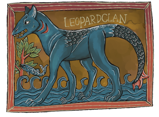
[Image ID: A blue creature in the style of a medieval manuscript. It has the head of a pike, the tail of an otter, the ears and body of a cat, with scales spotting its back and tail.]
A "leopard" is a symbol of skill, beauty, and grace. In tales of the Great Clans, leopards are often used as the heroes that must overcome the trickery of "tigers" and the brutish honesty of "lions." Sometimes they are industrious like beavers and badgers, creating large structures that "tigers" must infiltrate.
They're usually described with colors like a northern pike, in various shades of brown, green, orange, black, and white. When they're drawn, blue pigment is taken from woad (isatis tinctora) to traditionally display them as blue in contrast to lions (yellow, weld dye) and tigers (red, madder dye)
297 notes
·
View notes
Text
youtube
The lake making process is a great way to preserve colour from dye pots by turning a water-soluble dye into a non-soluble pigment.
Lake pigments can be used for making shelf-stable watercolours, pastels, crayons and other types of paint.
Check out my self-paced comprehensive online course to delve deep into the world of making sustainable botanical pigments.
https://lostincolours.teachable.com/p...
.............................................
Follow on:
Blog: www.lostincolours.com
Instagram: @jyotsnapippal
...............................................
Please feel free to share and subscribe!
Thank you for watching!
#Jyotsna Pippal#solarpunk#golden rod#lake pigment#how to#how to make lake pigment#diy#do it yourself#Youtube
30 notes
·
View notes
Text
The Chemistry Of Ink
The Chinese were the first to develop organic ink with the help of pulverised forms of black stone and lake colours. Chemically, ink is primarily composed of 3 substances, namely, a colouring agent (pigment or dye), a vehicle and additives. #forensics
Continue reading The Chemistry Of Ink
#Basic Components Of Ink#Different Types of Ink And Their Composition#Importance of Ink in Forensic Science#The Chemistry Of Ink
4 notes
·
View notes
Text
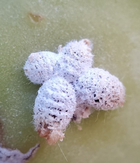
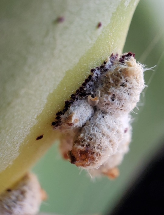

I discovered these interesting scale insects on my prickly pear cactus (opuntia).
It turns out these are cochineal insects (Dactylopius coccus), the source of the natural dye carmine. You can see some of this pigment in the third picture (purple splotch) where the bugs may have been injured. Carmine, aka crimson lake, is frequently found in cosmetics (blush and lipstick) and food (ice cream, yogurt, soft drinks, sausage, and candy). Farming these bugs began as early as 700 BC in South America, and carmine has been used by many indigenous cultures to dye textiles and create artwork.
While mature females are about 25% carminic acid, it still takes tens of thousands of them to produce one pound of pigment.
If I get enough of these, I may try making some dye myself XD
#cochineal#cochineal insects#scale insects#you’ve probably eaten bugs at some point#carmine#crimson lake#food additives#dye#nature#bugs#nature photography#biodiversity#animals#inaturalist#arthropods#entomology#insect appreciation#insects#dactylopius coccus#TIL#random facts#educational#interesting facts#opuntia#bugblr#eat bugs#nom nom nom#hemiptera#parasite
10 notes
·
View notes
Text

Sandra Monterroso, El Agua Se Volvió Oro, El Río Se Volvio Oro, El Oro Se Volvio Azul (2019).
In her work El Agua Se Volvió Oro, El Río Se Volvio Oro, El Oro Se Volvio Azul (2019), Monterroso appears lying under a large cloth hanging from the wall and on to the floor. The textile is made up of indigo-dyed güipiles, an indigenous garb hand-embroidered by women. This work interrogates extractivist practices in Guatemala that contaminate natural sources of water such as rivers, lakes, and oceans. By turning gold and then blue, the artist metaphorically suggests their initial appeal and consequently, the loss of their healing properties.
Monterroso also finds inspiration in nature and ancient practices of dye that she blends with three conceptual axes in her work: the materiality of the medium, a connection with spirituality and ancestry, and the history of coloniality in Mesoamerica, Abya Yala. In her works, she incorporates natural dyes for their political load – particularly indigo pigment or Mayan blue as it is known in Guatemala, was levelled up to the status of gold during the Spanish colony, as well as for their healing properties, symbolically appealing to the revival and appreciation of Mayan ancestral practices for the definitive healing of the colonial wound.
2 notes
·
View notes
Text
Understanding Pharmaceutical Colors: Types and Applications
Pharmaceutical Colors are essential in the pharmaceutical industry, serving purposes far beyond mere aesthetics. These colors contribute significantly to the identification, differentiation, and branding of medicines.
They also play a pivotal role in improving patient compliance by making medicines more appealing and easier to recognize. From tablets and capsules to syrups and ointments, pharmaceutical colors are carefully selected and regulated to ensure safety and consistency.
Pharmaceutical colors can be classified into various types, each with unique attributes and applications. Natural colors, derived from sources like plants, minerals, and insects, are widely appreciated for their eco-friendly and non-toxic properties.
Examples include carotenoids for yellow and orange hues and chlorophyll for green shades. On the other hand, synthetic colors, which are man-made, offer a broader spectrum of vibrant and stable colors. These synthetic options, such as FD&C dyes, are commonly used due to their cost-effectiveness and reliability in various formulations.
Another type, known as lakes, are insoluble pigments created by combining dyes with metallic salts, ideal for products requiring stability in coating applications.
Mineral pigments, such as titanium dioxide and iron oxides, are also prevalent due to their opacity and durability. The applications of pharmaceutical colors are diverse and impactful. They play a critical role in drug identification, helping to distinguish medications that may otherwise appear similar, thereby minimizing the risk of errors.
Pharmaceutical companies also leverage unique color combinations to establish brand recognition, ensuring their products stand out in a competitive market. Moreover, colors enhance patient compliance, as visually appealing medicines are more likely to be consumed as prescribed.
For liquid formulations like syrups, pharmaceutical colors, paired with flavors, help mask unpleasant tastes, making the medications more palatable.
In essence, pharmaceutical colors are indispensable in ensuring the functionality, safety, and appeal of medicines. Their significance will continue to grow as innovations in drug formulations evolve.
0 notes
Text
Artist Research (3/8): Barbara Ciurej & Lindsay Lochman- Processed Views
Barbara Ciurej is a photographer and graphic designer based in Chicago. She earned her BS in Visual Communications from the Institute of Design at the Illinois Institute of Technology. Lindsay Lochman is a photographer based in Milwaukee and a lecturer at the University of Wisconsin, Milwaukee. She earned her MS in Visual Communications from the Institute of Design at the Illinois Institute of Technology. Working together on photographic projects at the Institute of Design, Ciurej and Lochman developed a team. Barbara Ciurej and Lindsay Lochman have been collaborating as a creative team for over thirty years. Both nationally and internationally exhibited, their photographs are part of the permanent collections at the Art Institute of Chicago, the Museum of Contemporary Photography, the Walker Art Center, and the Milwaukee Art Museum. Barbara Ciurej works as a photographer and graphic designer in Chicago, while Lindsay Lochman is a Milwaukee-based photographer and lecturer at the University of Wisconsin.
Developing an extensive collection of collaborative work, they have documented the psychological landscapes and social architecture surrounding us. Their work continually explores the merging of history, myth, and popular culture as an ongoing theme. Processed Views is an ongoing, multi-part project that explores the current state of our food systems, examining everything from industrial food production to the fast-food values that have been eagerly adopted across the nation. Processed Views: Surveying the Industrial Landscape, as stated by Ciurej and Lochman, explores the frontier of industrial food production. This piece interprets the alarming and captivating intersection of nature and technology. The work was inspired by Carleton Watkins (1829-1916). The artists believed that Watkins reflected the widely accepted 19th-century belief in Manifest Destiny, the idea that America’s vast, fertile land was destined to be rightfully used and consumed by its citizens.

Barbara Ciurej & Lindsey Lochman
The first piece for Processed Views discussed in this blog will be Fruit Loops Landscape. Fruit Loops Landscape is a 2012 photo that depicts a lake, and mountains made entirely of bright colors and fruit loops. When looking at Fruit Loops Landscape, one can notice the big similarities between this photo and the one of Carleton Watkins. The photo simulates much of the landscape Watkins photographed, including the buildings. However, Ciurej and Lochman chose to use fruit loops as the houses, milk as the water, and colorful material to mimic the patterns of fruit loops. The photo can show a cereal brand's processed and artificial look today, with its color and overall look. Going for the idea of our natural world becoming processed and artificial is shown in the side-by-side comparison of Ciurej and Lochman’s work to Carleton Watkins.


Fruit Loops Landscape, 2012 Carleton Watkins (1829-1916)
The next piece is Blue Dye #1 Precipice which depicts a precipice made of blue sweets. Not only are they colorful, but the sweets in the photo are heavily pigmented, indicating the high amount of blue dye in the things people consume. Blue Dye #1 Precipice, similar to Fruit Loops Landscape, replicates the natural and raw idea of land and nature while still being able to show the artificial and man-made consumptions of the world. The cake can replicate mountains and land while working with the popsicles to simulate trees. The photo also includes water-like fluids to replicate a stream down the precipice. It is hard to tell what the liquid is, presumably water with blue dye or a drink that includes it. Ciurej and Lochman replicate what seems like a common landscape someone may know and create one with artificial and processed food consumed all over. It was not said what work of Watkins was used for this but looking at many of his pieces can show the general idea of what the artists were trying to predict.

Blue Dye #1 Precipice, 2014
Looking through Ciurej and Lochman’s Processed Views: Surveying the Industrial Landscape, it was very interesting to see all the different types of processed food they found and which landscape they chose to depict. There were ten different photos to choose from, but many of their photos ranged from sweets and bread to processed meats. I enjoyed scrolling through both Ciurej and Lochman’s work with Watkins' landscapes. It was interesting to see the new take on older more traditional pieces to the new artificial and technical consumerism the world surrounds itself with now. I recommend looking at Ciurej and Lochman’s work, not just Processed Views: Surveying the Industrial Landscape.
References:
“Ciurej & Lochman Collab Projects.” Ciurejlochmanphoto.com, 2015, www.ciurejlochmanphoto.com/Processed%20Views/ProcessedViewsStatement.html. Accessed 21 Oct. 2024.
Harmon, Jordyn. “Barbara Ciurej & Lindsay LochmanStill, Moving Moving, Still - Epiphany Center for the Arts.” Epiphany Center for the Arts, 5 Jan. 2022, epiphanychi.com/barbara-ciurej-lindsay-lochman/. Accessed 21 Oct. 2024.
https://lenscratch.com/author/grant-gill. “Barbara Ciurej & Lindsay Lochman: Processed Views - LENSCRATCH.” LENSCRATCH, 8 May 2014, lenscratch.com/2014/05/barbara-ciurej-lindsay-lochman-processed-views-2/. Accessed 21 Oct. 2024.
Space, Annenberg. “Barbara Ciurej & Lindsay Lochman - Annenberg Space for Photography.” Annenberg Space for Photography, 20 Jan. 2018, www.annenbergphotospace.org/person/barbara-ciurej-and-lindsay-lochman/. Accessed 21 Oct. 2024.
0 notes
Text
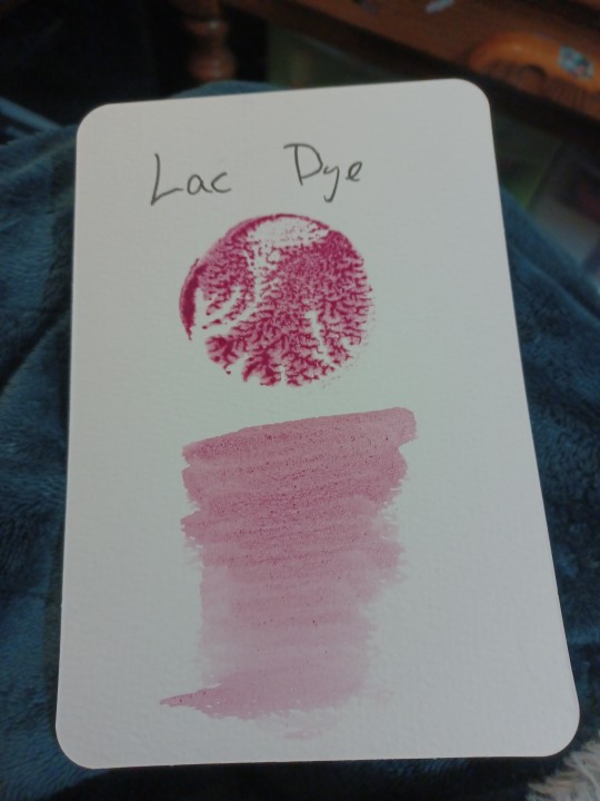
Fun story with this paint, I bought a paint called Lac Dye made from the bugs, but it was not a lake pigment mulled into watercolor like I thought it would be (fun fact this pigments is where we get the term lake pigment and lacquer) it was just bug bits mulled in binder and was awful. So I soaked the pigment to get the binder off, steeped it in hot water until the bug bits no longer gave color, and then make it into a lake like it should have been from the beginning. And now the color is beautiful and worth pursuing. I don't ask much, I just feel if someone is going to offer paints for sale that the do the barest level of research before selling, but maybe that is just me. Anyway, people should research Lac Dye, it has a very fascinating history as a paint, dye, and varnish.
2 notes
·
View notes
Text
Pops of colour
The artist Michael Craig-Martin and the architect Peter Cook are both in their 80s, and both great-grandfathers of the British art and architecture scenes respectively. Craig-Martin is known for his influence on the YBAs as teacher at Goldsmiths' College, while Peter Cook is known for turning the Bartlett School of Architecture at UCL into a world famous centre of architectural education.
Though grey, now, both men have embraced bright artificial colours in their work. Craig-Martin's vivid wall drawings, in a graphic linear style, use flat artificial colours — acid greens and magentas — to create an impression of freshness. Peter Cook is unafraid of artificial pigments, disdaining the greiges and pastels of minimalism, the grim "biscuit-coloured" world of correct and puritanical brick architecture and the earthy "Wiltshire loam" of ecologically inspired buiding, rammed earth, cob and the like. Both men are aware of the artificiality of synthetic colours, and their modernity. Cook has observed:
We live in a world where chemistry and artificiality exist to challenge the memories of mud and lime and baked clay. Yet colour is there to delight. Perhaps it is the delight itself that scares us?
One might link this sensibility to that of Goldsmiths' academic Esther Leslie's 2005 book Synthetic Worlds: Nature, Art and the Chemical Industry. The environmental impact of using, say, a dye derived from coal tar depends very much on whether coal is already being extracted for other purposes. Leslie takes an affirmative stance in relation to these beautiful byproducts of pollution as they manifested themselves in the first half of the 20th Century. I don't think Craig-Martin or Cook worry too much about the negative aspects of their "new" colours. Cook describes himself politically as a creative cynic, which to me is compatible with a general diagnosis of amorality. He's interested, like Warhol, in what he can get away with. Craig-Martin is also not politically beyond reproach, although he seems very conscious of the privileged freedom he has enjoyed as an artist.
Speaking about himself, perhaps, Michael Craig-Martin wrote:
By far the most important characteristic for anyone wanting to be an artist is desire: the passionate, inexplicable desire to make art. This desire is more important than talent. To have enviable talent but qualified desire is not enough; to have little obvious talent but overwhelming desire may lead to success. Desire can be encouraged but not taught. In my experience, a driven person lacking any recognisable talent may, out of necessity, invent a way to work at which they excel. This is what we call originality.
That characterization, of a career propelled by desire, could also be applied to Peter Cook's life, the life of an architect–conversationalist who persistently spends time at the drawing board despite not being very good at it. Their motivating desire doesn't seem to have much to do with conscience or with a sense of responsibility. It's more like the unprofound propelling force of pop art as described by Warhol: "Pop art is about liking things". Worthy, dreary earth tones are no fun, according to Craig-Martin and Cook. The bright colours in their work betoken the exuberance of the post-war boom, the aesthetics of a time before widespread concern about environmental damage.
Peter Cook has had a long relationship and fascination with Los Angeles, a city praised by Reyner Banham in spite of its dystopian aspects. One wonders whether Cook would agree with JG Ballard's 1974 description of the place.
Personally, I'm not that opposed to pollution — I think the transformation of the old landscape by concrete fields and all that isn't necessarily bad by definition. I feel there's a certain beauty in looking at a lake that has a bright metallic scum floating on top of it. A certain geometric beauty in a cone of china clay, say, four hundred yards high, suddenly placed in the middle of the rural landscape. It's all a matter of a certain aesthetic response. Some people find highways, cloverleaf junctions and overpasses and multi-storey car-parks — they find them ugly, chiefly because they are made of concrete. But they are not. Most of them are structures of great beauty. When Los Angeles is forgotten, probably what will remain will be the huge freeway system. I'm certain the people in the future — long after the automobile has been forgotten — will regard them as enigmatic and mysterious monuments which attested to the high aesthetic standards of the people that built them. In the same way that we look back on the pyramids or the mausoleums in a huge Egyptian necropolis as things of great beauty — we've forgotten their original function. It's all a matter of aesthetics. I think that highways for the most part are beautiful. I prefer concrete to meadow.
I suspect the two would be in agreement. In his recent autobiography, Cook describes the countryside as "a rather tiresome, smelly, eerily quiet phenomenon. Acceptable for an afternoon. Remote. Threatening."
As for Craig-Martin, his wall drawings consistently show familiar manufactured items, the results of product design. In some cases the objects depicted are design classics, in others just generically recognizable goods. There doesn't seem to be any implied critique, nor does the work take any discernible stance toward this world of objects. It's hard to imagine Craig-Martin quoting Victor Papenek's famous line "There are professions more harmful than industrial design, but only a few." His concerns are narrower and quite distinct: an intense focus on making things and on the forms of things that have been made. The synthetic and artificial, for him, is the air we breathe. It's a position that seems increasingly problematic: yes, we are surrounded by design, but it is all borne on the back of an embattled natural world. I can relate to his artistic limitations: "Curved objects have to be rigid: fire extinguisher, tin globe, disposable cup (a bunch of grapes entirely eludes him."
This affinity and capacity only for drawing things which were originally drafted rather than grown, for the test tube rather than the rose, feels like an uncomplicated reflection of the industrial society in which Craig-Martin spent his best years. It was a technological consumer society, one that was accepted uncritically by the Archigram group of which Peter Cook was a prominent member. The expectation was that technology would solve all problems of energy and waste. Whether this was admirable optimism or foolish naivety, it's hard to say. We still have the energy and waste problems, but confidence in our ability to solve them has been slipping away, at an increasing rate from the generations that followed Craig-Martin and Cook. These two old men represent the past. That, of course, is what modernism is now, modernism along with all of the other art movements of the twentieth century. Their work doesn't seem likely to hold answers for the future, listen as we might as attentively to them as their elder status warrants. The problem is that answers don't seem to be forthcoming from any other quarter either.
0 notes
Text
Carmine Lake: A Stable Red Colorant from Cochineal
Carmine lake is a bright red colorant derived from carminic acid, a pigment extracted from the female cochineal insect. This colorant is widely used in various industries due to its vivid red hue and excellent stability. Carmine lake is produced by mixing carminic acid with aluminum (Al) or calcium (Ca) salts, which results in a precipitate known as carmine lake. This process enhances the pigment's stability and ensures its suitability for use in diverse applications.
The creation of carmine lake begins with the extraction of carminic acid from the cochineal insect. After drying and processing the insects, the carminic acid is extracted using alkalized hot water. The resulting liquid contains the red pigment, which is then treated with aluminum or calcium salts. These salts react with the carminic acid to form carmine lake, a stable, red-colored precipitate.
One of the key benefits of carmine lake is its stability. Unlike some colorants that may degrade or change color when exposed to heat, light, or oxygen, carmine lake maintains its vibrant red shade under a variety of conditions. This stability makes it an ideal choice for use in products that require long-term color retention, such as food and beverages, cosmetics, and pharmaceuticals.
Carmine lake’s natural origin and reliable performance make it a popular alternative to synthetic dyes. As consumers increasingly seek products with natural and clean-label ingredients, carmine lake offers a solution that meets these demands while delivering a bold, consistent color. Its use in food products, such as confectioneries and beverages, as well as in cosmetics and health products, demonstrates its versatility and effectiveness.
In summary, carmine lake is a stable and vibrant red colorant derived from carminic acid and cochineal insects. Its ability to maintain color integrity across various conditions makes it a valuable ingredient in multiple industries, providing a natural and reliable option for achieving bright red hues.
For more information visit us:
0 notes
Text
Different Types of Pigments Used in Cosmetics
A pigment is a powder used to add color or change the visual appearance of a product. Pigments are a type of compound color when applied to any material. Fashion, art, medicine, and even computer displays have all been shaped by the simple application of this compound. The majority of their applications are in the textile, chemical, cosmetic, food, drugs, plastics, and paint industries.
When it comes to using products with these pigments, it is crucial to apply high-quality products to the skin. No doubt, almost every woman today uses some kind of cosmetics on a daily basis, making it crucial to understand what color additives they contain. Talking about superior quality pigment colors, Hridhan Chem Pvt. Ltd. is India’s leading manufacturer and supplier of dyes and pigments that follow stringent FDA safety measurements and quality standards to ensure 100% reliability and efficacy.
All right! In this blog post, we will walk you through different types of pigments used in cosmetics and personal care products.
So, let’s get started!
What Are Pigments?
A pigment refers to a powder that is added to impart color or change the visual appearance of any product, making it more appealing and attractive. Pigments are not soluble and chemically don’t show any reaction when dissolved in water or another medium. On the other hand, dyes refer to water-soluble color additives at some stage.
Pigments are colorants broadly classified into two types – organic pigments and inorganic pigments.
Iron oxides, chromium, ultramarine, etc., are examples of inorganic pigments used in cosmetic manufacturing. In contrast, Zinc oxide and titanium dioxide are white colorants most commonly found in every cosmetic. The colorants used to produce cosmetics and personal care products tend to be quite opaque and are more resilient to solvents.
Organic Colors
Organic colors are further classified on the basis of:
Botanicals:
These color additives are naturally derived for use in different cosmetic applications.
Beetroot powder and henna are the two most popular botanicals used in cosmetics.
There are limited botanicals approved and permitted for use in cosmetics.
These colorants do not stick well with makeup.
These botanicals are 100% safe to be used on any skin or body.
Synthetic Dyes:
These color additives are produced from coal-tar derivatives and petroleum and are refined in laboratories as they include toxic heavy metals.
It is possible for these pigments to be absorbed by the oral cavities around the mouth.
They can be harmful as they drain the oxygen when they get absorbed into the skin.
Synthetic dyes tend to have bright hues on their list.
Lakes:
Lakes are manufactured through the reaction of a binder, like a dye or metallic salt.
Lakes tend to have carcinogenic properties which are not good for health.
Lakes are best known for imparting bright colors.
It contains aluminum as one of its elements.
Understanding Different Pigments Colors
There is a diverse range of inorganic color pigments containing inorganic colorants, Lo Micron colors, and blended inorganic are used in the formulation of cosmetic product manufacturers. India exports these pigments as well as caters to the pigment needs of locally produced cosmetic products with the help of reputed cosmetic color manufacturers.
Organic color pigments are classified on the basis of regulatory requirements, such as D&C Lake Colors (Drug and Cosmetics Lake Colors), FD&C Lake Colors (Food Drug and Cosmetics Lake Colors), Non-D&C and FD&C Pigments, and EEC Lake Colors. To meet the needs of the European market for cosmetic products, EEC lake colors are prepared according to the directive from the European Economic Community (EEC).
To create cosmetics color solutions for the US market, leading pigment manufacturers in India like Hridhan Chem Pvt Ltd follow FD&C color guidelines.
Conclusion
In the bottom line, it can be said that the use of pigments is widespread for the manufacturing of cosmetics & personal care products. There are some stringent rules and guidelines by the FDA on the usage of these pigment colors to ensure the safety and efficacy of a product. They are advised to use only FDA-certified and approved pigment colors from reliable manufacturers and exporters of synthetic dyes and pigments for the formulation of cosmetic products.
Hridhan Chem is a leading manufacturer and exporter of cosmetic colors and pigments exporting superior quality dyes and pigments to clients worldwide. If you are a cosmetic product manufacturer in need a high-quality synthetic dyes or pigment colors, Hridhan Chem is your go-to choice for your business. For more information on a wide range of colors and pigments that we manufacture at our facility, contact us today!
0 notes