#krita tips
Explore tagged Tumblr posts
Text
Hello my fellow Kritters
Settings -> Configure Krita -> Display -> Grid Settings -> Canvas Border Color
Settings -> Configure Krita -> General -> Cursor -> Cursor Color
15 notes
·
View notes
Photo
Amazing!

Hi, my friend uses SAI to get this paste/crayon looking brush and they sent me 2 .bmp files(“form” and “texture” I assume) but I can’t seem to recreate them in krita.
Ok, sorry for the late reply, but given I’m investigating Sai fileimport right now, I can finally recheck these values.
First of all, your friend is using an old version of the Sai 2 technical demo, some of the sliders aren’t in Sai 1 nor in the newer versions of the Sai 2 technical demo.
Resave the two BMPs in to PNGs.
Then, go to settings->manage resources and import the ‘FuzyStatic’ png file as a brushtip, and the ‘CrayonCharcoal’ png file as a texture.
Select basic-2 opacity as a base to start with. Then f5 to open the brush editor. There, select brushtip->predefined brush tip, select the fuzystatic file set Size to ‘9′(you can rightclick the sliders to set precise values by keyboard).
Then, go to opacity, and turn off ‘enable pen settings’. Go to size, press the toggle before it. Then make sure that in the curve, the leftmost dot is at the middle to get a minimum size of 50%.
Select pattern, select the crayononcharcoal texture. Then switch to the ‘options’ tab at the top. There, you will need to play with the contrast and brightness settings. The scratch option seems to be similar to the strength toggle for us, but I am not sure.
Other things you might need to play with: 1. The spacing in the predefined brush tip settings might need to be lower, and 2. The sharpness setting, turn off the pen settings there, and then treat it as inverted version of the ‘intensity’ slider next to the ‘fuzystatic’ entry above.
I can’t tell you the exact number for all of these things, because I don’t have access to the two bmp files you are talking about. But this is how these options map in the Krita brush settings.
46 notes
·
View notes
Text
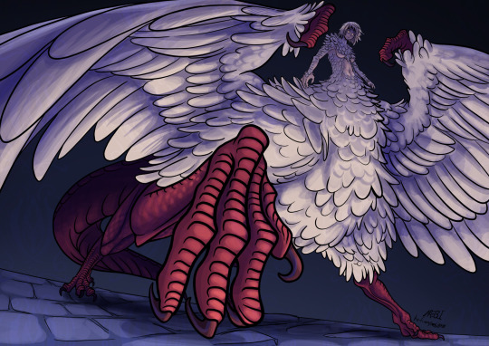
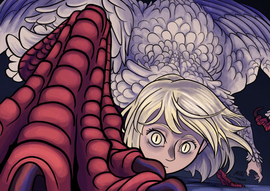
She is so cool
#mebi's art#fanart#dungeon meshi spoilers#delicious in dungeon spoilers#dunmeshi spoilers#dungeon meshi#dungeon meshi art#delicious in dungeon#dunmeshi#falin touden#falin dungeon meshi#falin chimera#faligon#dunmeshi fanart#dunmeshi falin#krita#digital art#that episode was so good I just had to draw her#please dont look too close into the wings feather layers#i also hope my lack of practice drawing humans doesnt show#also if you liked my drawing and read this far into my tags may I humbly request a tip in my kofi page?
8K notes
·
View notes
Text
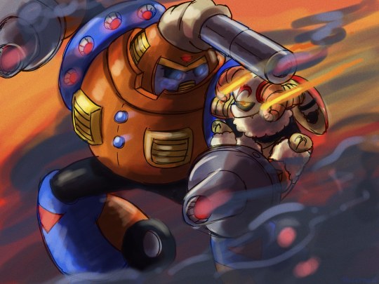
Mars and Aries.
Made Aries closer to average sized because I like contrast.
#mega man#mega man classic#stardroids#cosmodroids#constellationdroids#mega man v#rockman strategy#doodles#krita#rockman#stardroid mars#cosmodroid aries#the depression is hitting hard again#and yeah. the tips of his horns are on fire if it wasn't obvious. i just thought it'd look cool.
103 notes
·
View notes
Text

Brittany my beloved...........
#sticking with sketchbook for now I trust it the most#krita keeps messing with my colours ;_;#art#brittany!!#december 2024#thank you all for the tips though!!! I appreciate it <3
35 notes
·
View notes
Text

Art tip: You can use lasso fill (or in Krita, freehand path) to do lineart!
27 notes
·
View notes
Text
Hey guys! As I always post here, I posted the videos for my latest Ghost illustrations on my channel - the Missionary Man one and the one for I Believe.
I'll leave a link to both below, as per usual. They are long videos, but I talk a lot about how I think the illustrations, composition, coloring, style, random stuff (the papas being 80% legs, for instance) and all. I hope you at least have fun with it if you're interested!
It's just to show a bit of my process and blabber about art. I'm self-taught, so maybe I'll be able to give some weird tips here and there ;)
Missionary Man is 32min long and I Believe is 27min. It was the best I could to to speed up around 7h of drawing without looking TOO chaotic.
and now that I'm thinking about it I seriously hope yt won't take down the I Believe video because of "nudity" T-T
youtube
youtube
#illustration#art#my art#fanart#the band ghost#ghost#missionary man#I believe#draw with me#drawing timelapse#speedpaint#art tips#krita#illustration breakdown#oh the dread of being scolded for posting something 'forbidden' by modern platforms#but there's nothing too much on 'I Believe'#at least to my eyes#Youtube
20 notes
·
View notes
Text

baby you could kiss a hundred boys in bars~
#sdv#haley#sdv haley#haley sdv#stardew valley#haley stardew valley#stardew valley haley#digital art#krita#any tips or feedback would be super helpful!!#anyways i love haley so much#stardew fanart#stardew valley fanart#sdv fanart#sdv art#my art
46 notes
·
View notes
Note
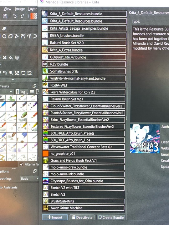
can you show us what krita brushes you use?
yes sir !! red for sketching, purple for lineart (which varies depending on how I’m feeling tbh), and green for coloring (first one flat color and cell shading, second for blush n texture)
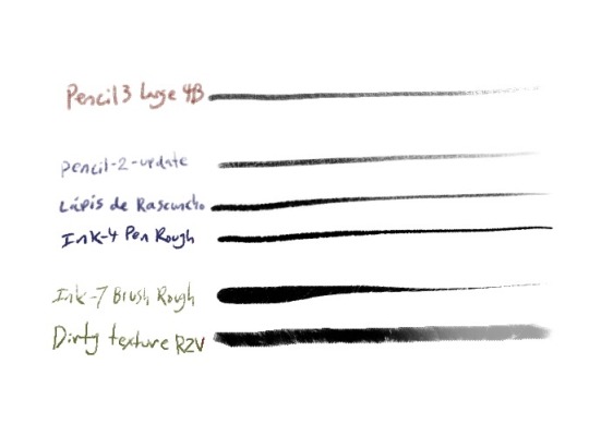
ALSO a pic of the brush packs I’ve acquired over the years bc I’m crazy (and bc some of the above are from packs, RZV, Krita 4 extras, and brush rush specifically)
#trying to find links to all the packs would be so. hard.#but I’m sure it wouldn’t take too long to find em online#and they’re all free !!#ask#krita#art tips
106 notes
·
View notes
Text


#comic#relationship tips#animation#not a lot of frames I'm away from home and drawing this all on a Samsung Galaxy Tab S7FE#krita#ezgif
43 notes
·
View notes
Text

It's raining somewhere else...
Undertale belongs to Toby Fox.
#undertale#undertale fanart#frisk#undertale frisk#waterfall#waterfall undertale#i don't know how to draw rain guys#or tutus#or backgrounds#any tips would be greatly appreciated#messing around with shading and different brushes in krita#found a lineart brush more similar to the one i was using in photoshop which is great#digital art#rose's art
27 notes
·
View notes
Text
Friendly reminder to donate to the small indie resources
If you use a free art software like Krita or GIMP
If you use free and open source 3D software like Blender
If you use a free resource like PureRef, Quickposes, or AdorkaStock
If you use a free game-making software like Renpy, Twine, or GBStudio
Your favorite digital brush makers, like Devin Elle Kurtz
Your favorite free font makers, such as Blambot
feel free to add more
A lot of these are made and maintained by one person or a small team of people, who likely have day jobs and other responsibilities, but also create these resources for us to use.
Obviously these are all free to begin with for a reason. So you don't need to feel guilty using it if you can't afford to donate.
But If you can afford just $5 or $10 dollars, show the creators of your favorite free software your thanks. Remember that there are real people behind these resources who make them free and open source out of the kindness of their own hearts. It's easy to forget the human behind the screen.
#art resources#art#poses#3d modeling#art help#art tips#artists on tumblr#krita#gimp#blender#pureref#quickposes#adorkastock#renpy#twine#GBstudio#digital art
17 notes
·
View notes
Text

I just got a drawing tablet! Exciting stuff.
Please be patient with me for a while here as I adjust. Thank you!
#i've never used one of these before so it'll take a hot minute.#lots of new stuff to learn.#if anyone has like tips for configuring this thing with krita pls share.#anyways hopefully this will make what i do easier or at least faster.
72 notes
·
View notes
Note
Hi!! I was wondering if its okay to ask what brushes u normally use in krita? I love your art!!
Thank you so much!!! I only use the ones available in Krita by default and I tend to jump around based on what I think will work best for each piece, but I can give a little rundown on which ones I use the most and what I use them for :)
Here's an image guide with each of the brushes I've used and that I recommend checking out:
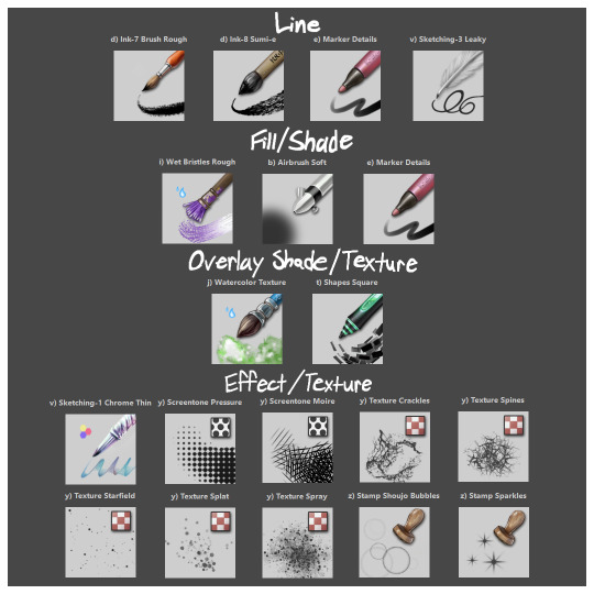
I'll highlight my favorites as well with some examples where they were predominantly used! (though in some cases multiple or even all of these brushes were used)
Marker Details:


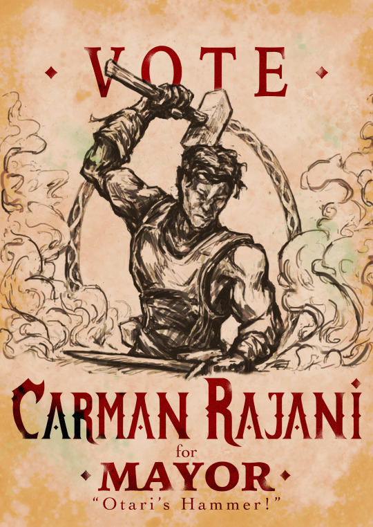
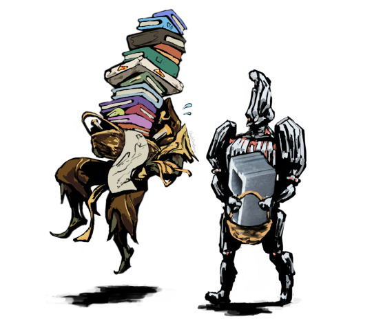
Varying opacity and size makes this one my favorites for sketching, especially since it can easily be nearly transparent or fully opaque which helps with value range.
I also like using it for silhouette sketches!
It can also be used for final linework, but it takes more work to get to a full opaque and its lack of texture makes it a little less interesting than Ink-7 Brush Rough imo.
Ink-7 Brush Rough:
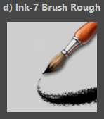
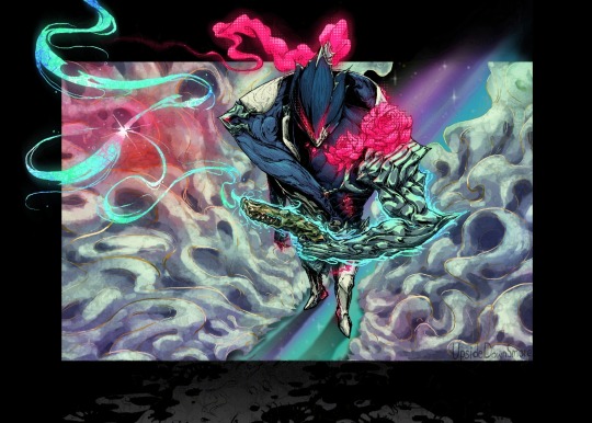
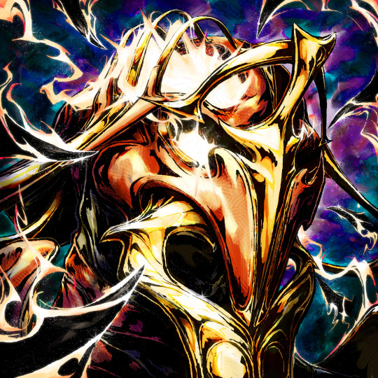
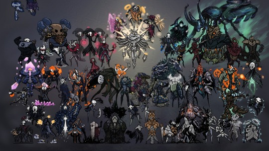
Really good for linework, especially for comic styled drawings with it's slight texture, varying weight, and opaqueness.
Also good for just filling in entire areas with a single color as well as non-smoothed shading!
Wet Bristles Rough:
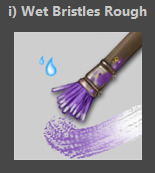
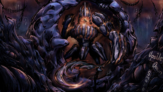
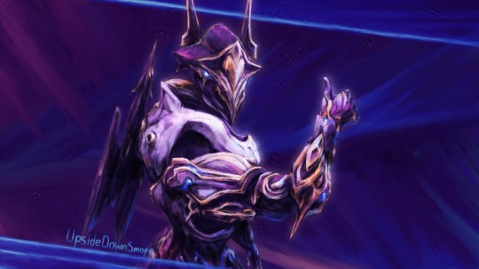
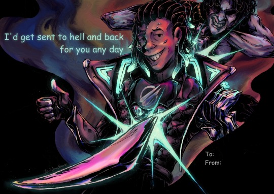
Actually just an amazing brush, its pressure sensitivity is crazy.
Blends strokes like paint and can vary in size and opacity.
Also has a nice subtle texture!
Amazing for smoother coloring and shading, especially if you want a more painterly style.
Watercolor Texture:

(hard to show examples of this, just assume that I've used it in any piece that has smooth shading lol)
Not the best for painting/drawing on its own, however I've found it to be really useful when set to white or black on an overlay layer for adding extra shading and/or highlighting on top of the shading I've already done.
I usually shade individual figures, objects, and parts separately, but using an overlay layer with Watercolor Texture (or even Shapes Square) on top of everything helps make the entire piece feel more cohesive.
Also adds a hint more texture!
Another thing to note is the importance of layer modes!
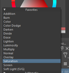
I know that you asked about brushes specifically, but many of these brushes (particularly those to do with effects and textures) work best when experimenting with different layer modes other than Normal. Overlay is generally a safe bet and most of the best for, well, overlaying multiple layers for interesting effects. But please try out all of them at any given opportunity, sometimes things like Burn, Color Dodge, Soft Light, etc can have more interesting effects!
In addition, mess with filter masks! You can even edit where they apply by drawing on the mask directly! HSV/HSL Adjustment (also accessible with ctrl+u) in particular is INSANELY useful for fiddling with the colors and balance of a piece, from individual layers to whole groups and drawings. I also really like blur filters, often times I'll duplicate a layer and make the bottom one blurred to add a glow affect to something without losing its definition.

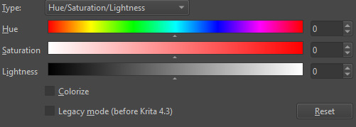

While this latter stuff isn't about brushes specifically, its generally very important to how I use and experiment with all these different brushes!
Anyways I hope this helps!! I kinda went overboard with this post, but I had a lot of fun writing it! Thank you again for the wonderful ask!! :)
#krita#krita art#warframe fanart#art#artists on tumblr#my art#UpsideDownSmore's art#art tips#art guide#art reference#long post#ask#didn't mean to spend so much time on this but ngl i'm actually so thrilled to talk about my art processes#like man i'm so grateful to be in the position where i can make an art guide like the ones made by people i look up to#sorry if this response is a bit long winded i just had to get a bunch out there lol#love asks like this :)#scheduling this 9 hours from now cause it is currently almost 1am lmao
39 notes
·
View notes
Note
Krita brush+brush settings?👉👈/nf
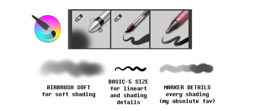
I use the Basic-5 Size brush for the lineart (default settings).
While for shading I use the Marker Details brush (default settings) + custom Airbrush Soft or a softer version of the Marker Details:
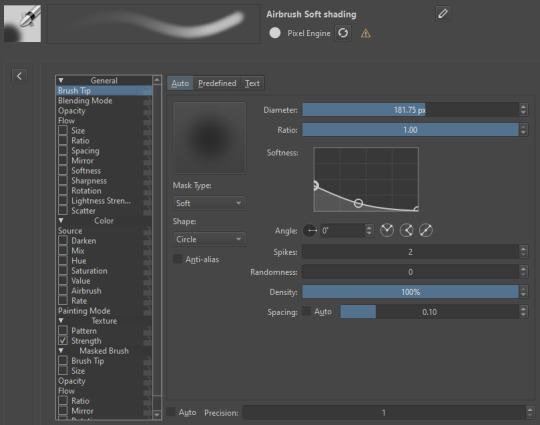
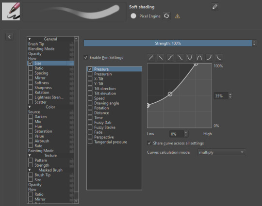
Hope it helps!
37 notes
·
View notes
Text

"You wanna die, and yet you can't - so why Don't you just feed on me so you can stay alive?" The both of us are the only sane ones here, Although your voice is heard by people far and near I wanna hurt myself and ask you how I breathe in happiness and breathe out poison clouds A perfect junkie hooked on big ideals Isn't it great that we're the only sane ones here?
got so fucking pissed off trying to clear low hacks eight's palette in side order that i went and drew my favorite wet cat and their fucked up codependent manipulator. also AGH just realized the stripy texture layer is too opaque but it's too late to go back and change it now WHY DID I FLATTEN THE IMAGE
oh well. the over-texturing kind of fits. i guess.
*the song linked (rachie's english cover of undead alice) is a romantic song but i do wanna note that i don't ship these two together. in my headcanon they have something extremely fucked up, but strictly platonic, going on. it's just that the first two verses (and some other parts tbh) of the song really do fit whatever the hell is going on with these two, to me.
bonus (mostly) raw photo of it in my sketchbook before all the editing:
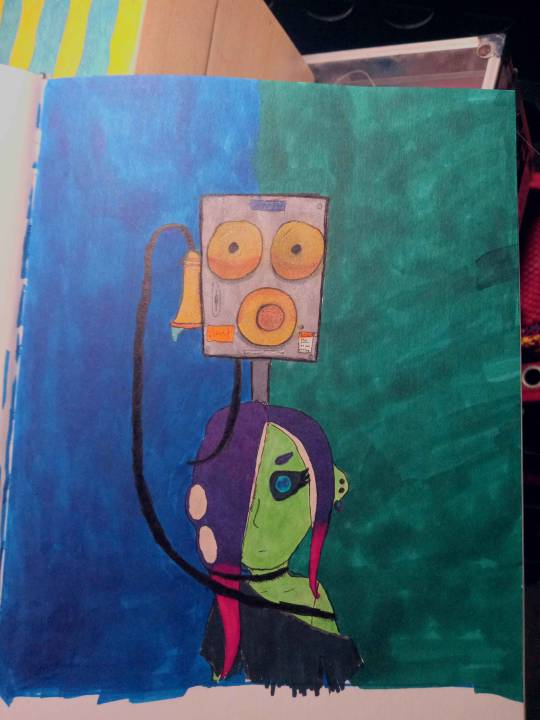
#img#splatoon#splatoon fanart#acht mizuta#dedf1sh#commander tartar#splatoon tartar#my art#i tried to have it with like. tartar's cord wrapped around acht not sure how good it looks fjkldlalfjkda#also outlined tartar with thicker and darker pen lines and also gave it more shading than acht to try and like#give it a more imposing presence on the page#i think it's more obvious in person on my sketchbook than here though fdjalkfjakd#also to be clear i don't care if anyone ships them i just don't jfldakjfkda#definitely not 100% happy with it but i spent WAY too fucking long on it to NOT post#done on paper lined in microns and colored with alcohol markers and some gel pen#and then adjusted colors and filters and stuff in krita#also fun fact i've had the same fucking set of microns for like. at least 10 years now. and they still pretty much work as if they were new#i bought the brush tip and the 003 tip a couple weeks ago but the rest? a decade old jflkdajfk#but this is also my first project using those 2 new pens you can see how much i used the brush there jfldafkda#had a slight mistake in the lyrics for like 2 hours there whoops fjldajflkda
7 notes
·
View notes